2 minute read
FRONT MATTER THE DESIGNER’S DICTIONARY OF COLOR
from 4bSurvey
by Amanda Mundy
End Sheets
The inner front cover of the book features a bright fluorescent orange color. It is a bold and bright color that draws the reader's eye to its energetic presence. It exudes a feeling of excitement and anticipation that serves as an first impression of the content within the book, and the bold orange color sets an exciting tone for the reader looking to learn more about color as an artist.
Advertisement
The title page spread in the book features even more color for the reader to look at, continuing to build anticipation about the book's content. The left page shows a green square bordered by a light blue gray color. The right page shows a white rectangle bordered by the same green color. The books title and author's name are written in the same typeface as the cover of the book, and are left justified, placed in the upper right corner.

Inner Front Cover
The inner front cover spread of the book features a bright yellow color on the left side and a simplistic title page on the right. The yellow color evokes a feeling of interest and anticipation for the reader about what the book's content will be. The title page on the left features a black and white photo on the bottom right corner, while the book title is written in a small sans serif font on the top of the page. This is a visually engaging layout for the viewer.

The title page of this book is particularly interesting. The book's title takes up the full spread of pages, with half of the title being on each page. The centered type treatment and typeface are the same from the book's cover, yet their placement is different. A brief paragraph appears on the bottom left hand side of the spread in a typewriter-like typeface. This spread is visually surprising and intriguing for the reader as it is different from other title pages.

Last Page
The final spread of this book consists of the last page of book content on the left, and the beginning of the book's index on the right. Both the image captions on the left and the index header and body text are set in a sans serif typeface.

Inner Back Cover
The inner back cover pages include the book's acknowledgments on the left and the same cream colored inner cover as in the front of the publication. The acknowledgments header and body text are typeset in the same sans serif typeface as the rest of the book.

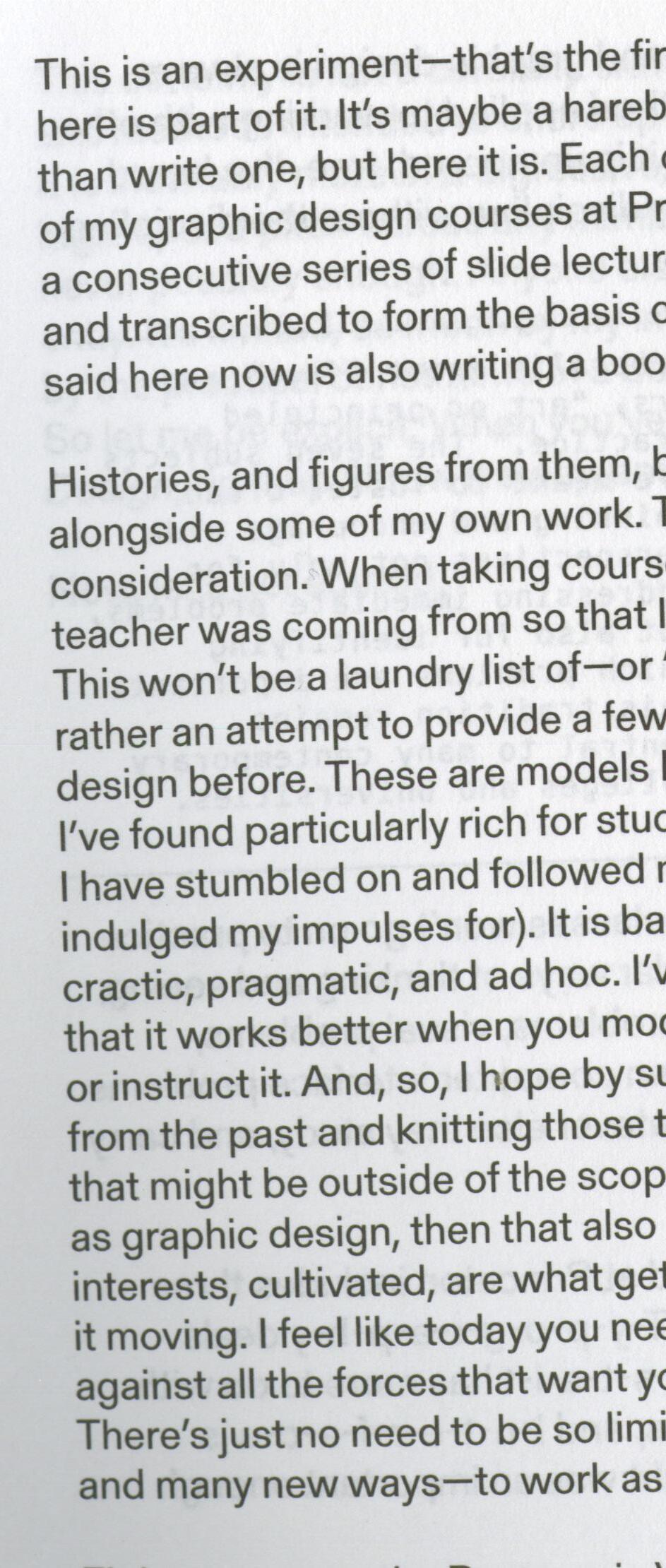
The headings and body text in this publication are set in a sans serif style typeface (similar to: This by Suomi Type Foundry).


The headings and body text in this publication are set in a slab serif style typeface named Sentinel.


The headings and body text in this publication are set in a sans serif style typeface (likely: Helvetica).
The headings and body text in this publication are set in a sans serif style typeface named Gerstner-Programm.


The headings and body text in this publication are set in serif style typefaces named Scala Pro and Thesis.


The headings in this publication are set in 16 point type. The body text is set in 8 point type.
The headings in this publication are set in 16 point type. The body text is set in 8 point type.


The headings in this publication are set in 9 point type. Additionally, the body text is set in 9 point type.


The headings in this publication are set in 11 point type. The body text is also set in 11 point type.


The headings in this publication are set in 11 point type. The body text is set in 9 point type.


11 points of leading.
12 points of leading.


Margins
Each full spread page in this book follows the same grid layout. The heading and body text about the spread is always placed at the top of the left page. The rest of the layout is used for images, a larger scale one appearing on the left page, and a smaller assortment of images and captions appearing on the right. The page numbers and headers are always placed on the outer edges of page at the bottom and the top.


