6 minute read
CONSTRUCTION

from 4bSurvey
by Amanda Mundy

Studying a book through its construction can provide valuable insights into the overall design and user experience. The cover, spine, trim size, binding, page count, front matter, and end matter are all important elements that contribute to the book's design and functionality.
The cover is the first point of contact with the reader, and its design can influence whether or not someone picks up the book. The spine and trim size can affect the book's shelf presence and readability. The binding can impact how the book opens and stays open while reading. The front matter and end matter can provide additional context and information about the book, and their design can affect how accessible and engaging that information is for the reader.
Advertisement
By examining these elements in detail, a deeper understanding can be found about the book's design and how it contributes to the overall reading experience.
Hardcover Paperback
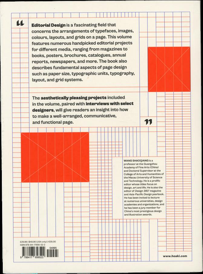
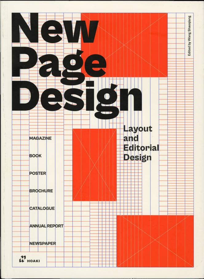
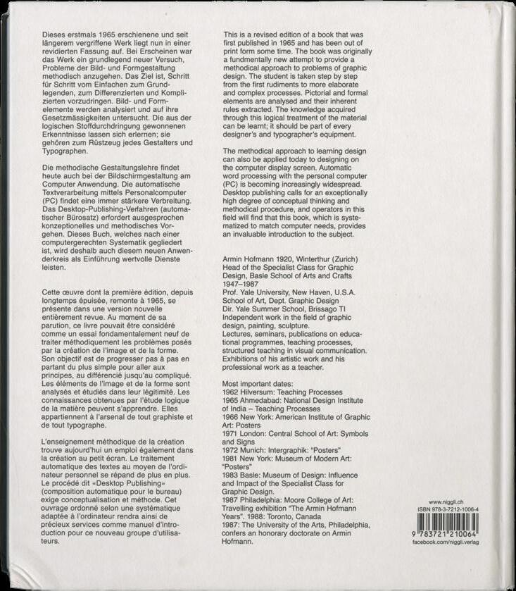
The front cover features a background image of a grid system, made up of orange and blue lines. This grid design is indicative of the book's content. On top of this, the book's title is written in title case, using a large sans serif font. The subtitle appears below this, in a smaller size, using the same font. The back cover features the same grid design, and more information on the book is written in the same typeface.

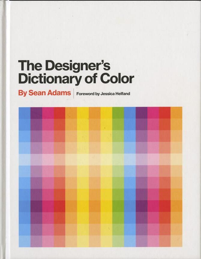
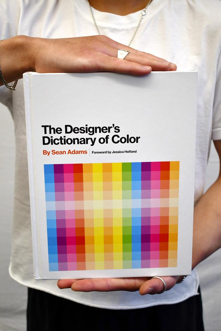
The front cover features a vibrant, multicolored design of a gradient of color making up a square grid system. The title of the book is displayed above this color grid in a sans serif font, featuring the author's name below it in a small font size. The back cover consists of more information on the book, displayed in the same sans serif font and features the same red spot color used on the front cover.
Hardcover Paperback Paperback
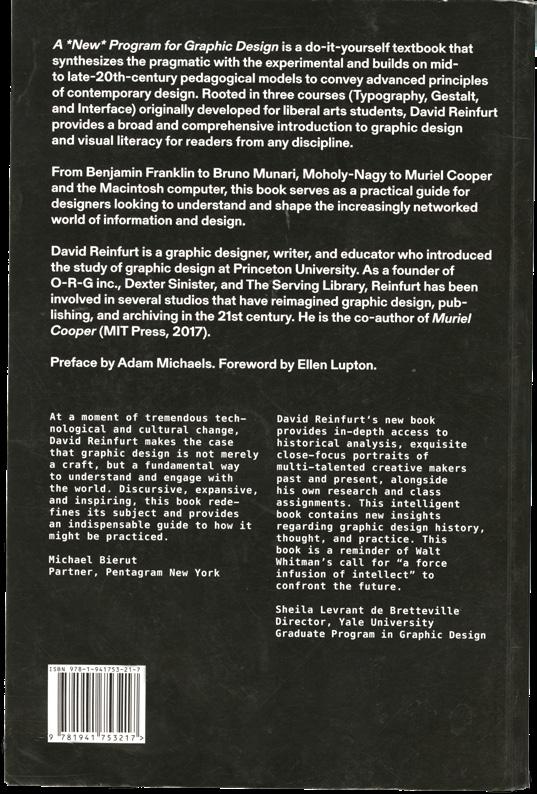
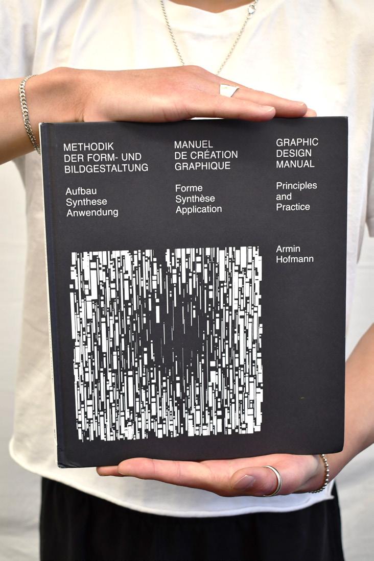
The color of the front cover is black, and it features a square, white lineart design. Above this, the title of the book is written in a sans serif font in all caps. The book's subtitle appears underneath the title in the same sans serif font in a sentence case. And below this, the author's name appears. The back cover features a white background color, and the same sans serif font is used for providing more information on the book.

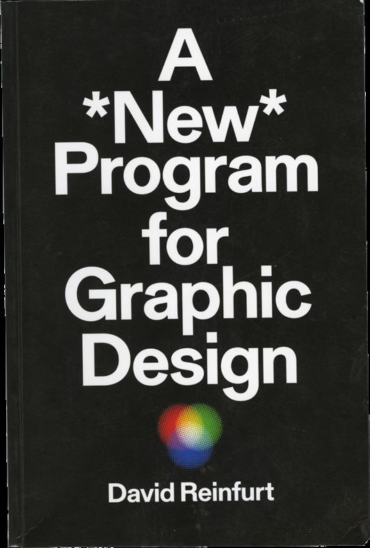
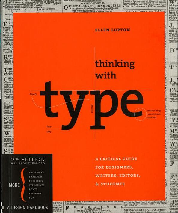
The front and back cover both have a black background color. The front cover features the book's title in a white, centered, sans serif font. Underneath the title, a three-circle color symbol appears. And below this, the author of the book is stated. The back cover features more information on the book in the same white sans serif font as well as a typewriter style font.
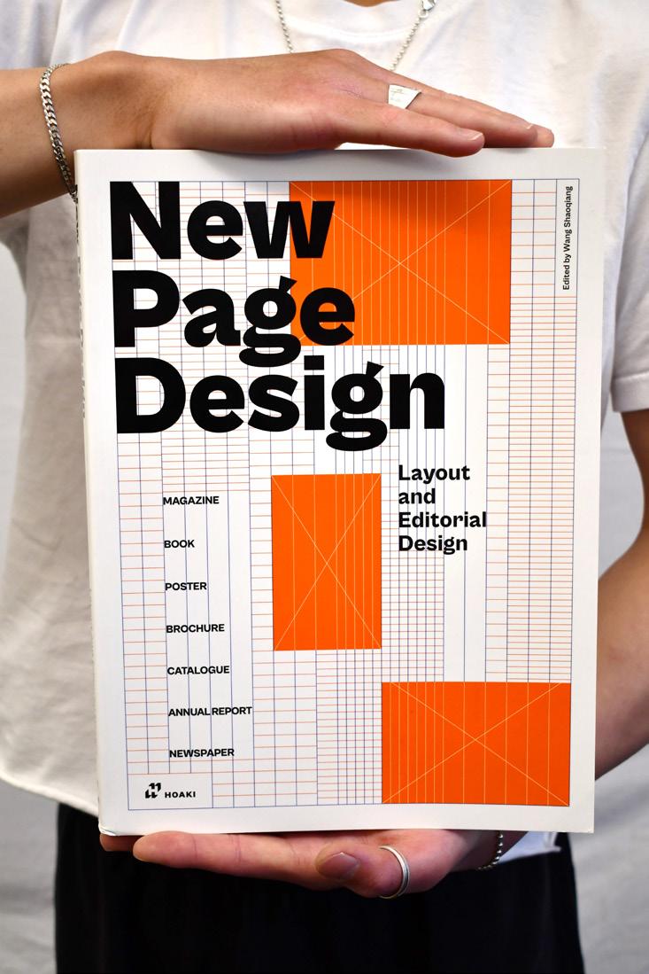
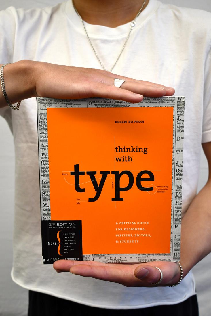
The front cover features an orange square in its center, containing the book's title written in an all lowercase, serif font. The authors name appears above the title, while the subtitle appears below. The boarder of the cover is filled with type pulled from what looks like a newspaper. The back cover features the same orange color, with reviews and more information on the book displayed in various typefaces.

The spine features the title of the book, written in the same sans serif font as the cover. The subtitle is also featured, written in a smaller size of the same typeface. Both titles are outlined by hairlines on the top and the bottom, referencing the grid system design used on the cover. The author's name is not noted on the spine. The publisher's logo is placed at the bottom.
The title of the book is written on the spine using the same sans serif font in black as the front cover. The author's last name is written below the title, using the same typeface and the red spot color as used on the front and back covers of the book. The publisher's logo is placed at the bottom.
The publisher's logo is placed at the top of the spine. Below it, the author's first and last name are written in the same sans serif font as is used on the cover of the book. Next, the book title is written in all capitals, in the same sans serif font as is used on the front cover.
The author's last name is written first, at the top of the spine. Below it, the books title is written in the same white color and sans serif font as the front cover. The same black background color that is used on the front and back covers is used on the spine as well. The publisher's logo is placed at the bottom of the spine.
The book title is placed at the top of the spine, written in all lowercase in a serif font, the same way it appears on the front cover. "2nd Edition" is written below the title, in an all caps version of the typeface. These words are also written in the same orange spot color as is used on the front and back covers. Next, the authors name is written in an italic version of the typeface. The publisher's logo is placed at the bottom of the spine.
Each cover representation is shown at scale.
8.2
The front cover features a background image of a grid system, made up of orange and blue lines. This grid design is indicative of the book's content. On top of this, the book's title is written in title case, using a large sans serif font. The subtitle appears below this, in a smaller size, using the same font. The back cover features the same grid design, and more information on the book is written in the same typeface.
7.5
The front cover features a vibrant, multicolored design of a gradient of color making up a square grid system. The title of the book is displayed above this color grid in a sans serif font, featuring the author's name below it in a small font size. The back cover consists of more information on the book, displayed in the same sans serif font and features the same red spot color used on the front cover.
The color of the front cover is black, and it features a square, white lineart design. Above this, the title of the book is written in a sans serif font in all caps. The book's subtitle appears underneath the title in the same sans serif font in a sentence case. And below this, the author's name appears. The back cover features a white background color, and the same sans serif font is used for providing more information on the book.

The front and back cover both have a black background color. The front cover features the book's title in a white, centered, sans serif font. Underneath the title, a three-circle color symbol appears. And below this, the author of the book is stated. The back cover features more information on the book in the same white sans serif font as well as a typewriter style font.
The front cover features an orange square in its center, containing the book's title written in an all lowercase, serif font. The authors name appears above the title, while the subtitle appears below. The boarder of the cover is filled with type pulled from what looks like a newspaper. The back cover features the same orange color, with reviews and more information on the book displayed in various typefaces.
240 Pages
256 Pages

200 Pages


255 Pages
224 Pages
Perfect Bound
Perfect binding is most commonly used when binding paperback books. The process involves gluing the pages, separated into signatures, directly to the spine of the cover, resulting in a durable and bendable book.
Case Binding
Case binding is most commonly used when binding hardcover books. The process involves sewing the books signatures together using thread or adhesive. A separate piece of board is attached to the spine of the pages, and the cover material is then adhered to the boards.


Case binding is most commonly used when binding hardcover books. The process involves sewing the books signatures together using thread or adhesive. A separate piece of board is attached to the spine of the pages, and the cover material is then adhered to the boards.

Perfect binding is most commonly used when binding paperback books. The process includes gluing the pages of a book directly to the spine of the cover, resulting in a durable and bendable book.
Perfect binding is most commonly used when binding paperback books. The process includes gluing the pages of a book directly to the spine of the cover, resulting in a durable and bendable book.