Brand Campaign
“Graphic designers are likely to engage with brand identity projects in their careers -- from working at brand specific agencies to designing within a brand’s system of core elements (kit of parts) to create brand assets, products, marketing, etc.”
During Spring 2023 I took Graphic Design I. The challenge was to break down a favorite food item of your choice into a Brand Kit-of-Parts in order to see and understand the brand’s elements and intended meaning.

PROJECT TITLE: La Croix Sweatsuit
CLIENT COMPANY: La Croix
DESIGNER: Alyssa Davidson
Phase01
By conducting research on the brand and competitors I was able to create a design brief.
ORGANIZATION/CLIENT PROFILE FRAME
The National Beverage Corporation sells carbonated drinks including, energy drinks, sparkling waters and juices. They believe in “creative product designs, innovative packaging, and imaginative flavors.” They are passionate about a healthy lifestyle and encourage “‘Better for You’ thirst quencher.”
The National Beverage Corporation cares about sustainability through the use of recycled materials, producing beverages in the U.S., supporting charities, and encouraging a healthier purchase.


PROJECT OVERVIEW / KEY PROJECT OBJECTIVES
The project is to create a micro-campaign that promotes and markets the La Croix Sweatsuit and will include social media marketing.

This will be a matching sweatshirt and sweat pant set. They will be high quality and comfortable. They will mimic the innovative and artistic design of La Croix packaging.
- Add to the apparel section of the La Croix brands
- Create a high quality, unique product
- Create brand awareness by people wearing the sweatsuits


TARGET AUDIENCE
The target market is young adults looking for a healthier alternative to soda. The focus is people who are passionate in fitness, health and wellness. The focus is in bigger cities with high social media presences, such as Los Angeles. Our target market would be wearing these sweatsuits around the house as lounge wear, heading to the gym, or out running errands.
COMPETITION
PepsiCo and Coca-Cola are our two main competitors. They are large global companies with a loyal following. They have both been around for a long time and apparel like this already exists.

STYLISTIC PREFERENCES
Using La Croix signature fonts will be very important when designing this sweatsuit. This will make our product match with the aesthetic of the already existing brand. Having an artistic feel to the product is important to match the art within La Croix’s packaging. Having a high quality, heavy weight sweatsuit is important because this will make us stand out against competitors. This is also important because this is what our target audience will want to purchase. Using similar shapes and colors as seen on La Croix packaging will also be important to mimic the La Croix brand.
PROJECT DELIVERABLES
A La Croix micro brand campaign that markets and promotes the new La Croix Sweatsuit through marketing and social media promotion.


Phase 02
By gathering inspiration from other brands and content creators I created a concept board.
Phase 03
By using my findings from previous phases I created three iterations of my concept.
Young adults are drawn to trendy, heavy-weight, high-quality sweatshirts and lounge wear. Having a large, artistic print on the back and a small logo on the front appeals to this target audience. The colors I chose are trendy and not too colorful, but also colorful enough that it fits with Lacroix’s brand. I do believe this product is something people would buy. Companies reach out to different influencer’s and have them post wearing or using their product. Because these influencer’s have lots of followers, the company can get awareness of their new product.


Resource Sharing


During Spring 2022 I took a Design Thinking and Process Innovation class. We were given an assignment using a macro theme of resource sharing.
Planning


“Your challenge is to apply the design thinking methodology as a broad framework in designing a new system for sharing products, services and experiences with a particular demographic.”
We were challenged to do so by embracing the iterative and ambiguous nature of design thinking.

I wanted to take the final solution to grocery stores themselves. I created an end cap where recipes and ingredients are found consumers can get anything they need at one stop. I can take this further and if someone were to order online the shopper could go to this and find exactly what they need. I think by having this solution is the best of both worlds. The concept poster really helped me visualize my idea and finalize what I wanted my solution to be.
Mise En Place
MEAL PLANNING MADE SIMPLE

Mea p ann ng s confus ng ove whe m ng, and expens ve fo new cooks M se En P ace is a new se vice n g ocery sto es whe e eve ything s aid out ready fo you to grab


STEP ONE
Get prepared for the busy week ahead of you by taking a tr p to the grocery store
STEP TWO
Head straight for the M se En P ace end cap whe e you find everything you need for th s week s ec pe.
STEP THREE
Take your po tioned ingred en s and recipe home and start cooking!
M se En P ace end caps w l house weekly ecipe cards o s mp e, yet de ic ous meals t w a so have he necessa y ingred ents r ght there n the end cap. Th s w l revo ut on ze the way new cooks mea p an
Zero Ink Re-Brand


During Spring 2022 I took a Color Innovation class.

We were given a color project exploring or designing using sustainable color opportunities in the design or merchandising industry.
We were given this assignment with the overall theme of “buying and selling color.”

Introduction
Sustainability is a growing topic always being discussed in the design industry. In this class I’ve learned more and more about the dying process and what it takes for something to have color. Many dyes are artificial and harmful to our planet over long periods of time. Packaging is also something that can be improved when it comes to sustainability. Companies have started to use more recyclable materials and are trying to be greener, but can they go one step further?
Research
Printer ink is the worlds most expensive liquids, costing anywhere between $13 and $75 an ounce (Prisco). Companies use ink to print their logo on almost all of their products. Packaging is one of the most ink consuming products. If companies were to re-design their logos to use less color, they could save millions on ink costs (Prisco). Not only is this more economical for the business this is better for our planet (Prisco). Many ink cartridges are not recycled and end up in landfills and these plastic casings can last hundreds of years (Prisco). It also takes a lot of water to print in color and dye products.
In the Universal Principles of Design textbook they talk about redundancy. This is “the use of more elements than necessary to maintain the performance of a system in the event of failure of one or more elements” (Lidwell, Holden, Butler page 204). Logos communicate a message and it is a symbol of someone’s brand. Sometimes branding can get redundant. We’ll see this in a fast food chains such as McDonald’s. They have their golden M on every piece of packaging that comes with your meal. You can argue to say that this is not necessary. Especially with all the ink and dying that goes into branding every piece of packaging when the packaging is just going to be thrown away after they eat the meal anyways. Some of these brands can save money time resources and save our environment just bye branding less when it comes to packaging.
Sylvain Boyer, a French designer, rethought logos calling it “ego branding” (Wilson). He is re-designing logos so they use less ink on every sign box and add (Wilson). World famous logos are printed millions of times over, and every drop of ink costs money(Wilson). Boyer wanted to see if these companies logos would still be recognizable with a rebrand. After some prototyping he found most all logos were still recognizable if they were hollowed out. Boyer says “it’s all about the shape of the logo without deforming it” (Wilson). This concept really works. Not only does the logo save the company money but it shows consumers they are trying to be a more greener brand (Wilson).
NIKE NIKE NIKE
Analysis
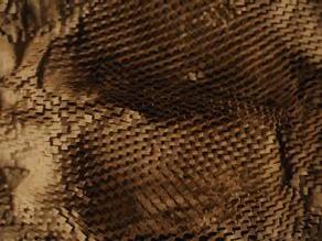
In class the topic of ink and logos came up. It got me thinking about all the printed logos on packaging. Nike for instants has brightly colored shoe boxes and colored logos on all their packaging. McDonald’s has branding on every wrapper, cup and straw they serve. With such large companies like this, why is it necessary to brand the cardboard packaging the product comes in? I wanted to think of new ways companies could brand their products without using so much ink. I thought of the use of embossing when it comes to packaging. This way companies can press their logo into shoe boxes or French fry containers without using color.

The thought of re-branding logos by making them more eco-friendly will be revolutionary. Going into the marketing and design industry I can take these thoughts and apply them to various projects I will work on in the future. Designing, branding and packaging for companies is something that I’m very interested in. And from the knowledge I gained during this project I have a new outlook on logos.
NIKE NIKE NIKE
An article supplied to the class from one of the color journal assignments talked about a French designer who rethought logos. This article showed it is possible to use less ink and still have the brand be recognizable. I thought this was inspiring because I feel like this is a big worry for some brands. If you take away color in their logo will people still want to buy from them. And I think the answer is absolutely. These companies are so large by taking away color will only show their brand but it’s trying to be more eco-friendly and make them stand out more (Wilson).
I discovered a Dutch company that started to create eco-friendly fonts (Prisco). This is a Typeface that uses 50% less ink (Prisco). This is really inspiring not only to businesses but to consumers, because ink is so expensive.
References
Elam, Kimberly, et al. Universal Principles of Design, Revised and Updated: 125 Ways to Enhance Usability, Influence Perception, Increase Appeal, Make Better Design Decisions, and Teach through Design. Rockport Publishers, 2010.
Prisco, Jacopo. “Designer Tweaks Famous Logos to Use Less Ink.” CNN, Cable News Network, 29 Nov. 2017, https://www.cnn.com/style/article/ecobranding-less-ink/ index.html#:~:text=We%20can%20estimate%2C%20 and%20I,gallons%20of%20ink%20a%20year.%22.
Wilson, Mark. “Ecobranding: Famous Corporate Logos, Redesigned to Use Less Ink.” Fast Company, Fast Company, 9 July 2018, https://www.fastcompany. com/90144121/ecobranding-famous-corporate-logosredesigned-to-use-less-ink.
