11 minute read
अआइईउऊऋॠऍऎएऐऑऒओऔअंअः कखगघङचछजझञट


Advertisement
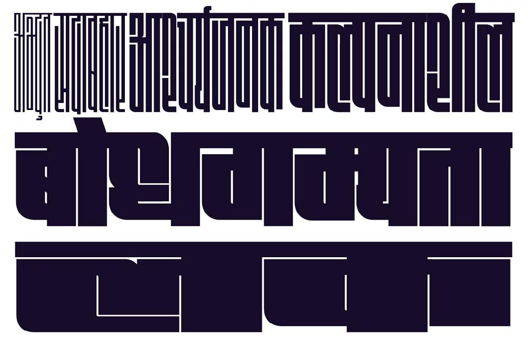
Devanagari is a writing system used to write several languages in the Indian subcontinent, including Hindi, Marathi, Nepali, and Sanskrit. It is a syllabic script where each letter represents a syllable. As with any writing system, the spacing between the letters plays an essential role in the overall readability and aesthetic appeal of the text. Kerning and tracking are two typographic techniques used to adjust the space between letters and words in Devanagari script. Kerning is the adjustment of space between two specific letters to improve the visual balance and legibility of the text. In Devanagari script, the most commonly kerned pairs are the conjunct consonants (e.g., क्ष, त्र, ज्ञ, etc.). A conjunct consonant is formed by combining two or more consonant letters to form a single consonant sound. The process of kerning conjunct consonants involves adjusting the space between the letters so that the characters are closer together and visually appear as a single unit. The degree of kerning depends on the specific conjunct and the typeface used.
For example, in the word उत्तर (uttar), the conjunct consonant त्र (tra) requires kerning to ensure that the letters are visually balanced and legible. In some typefaces, the top of the त (ta) character might extend into the space occupied by the र (ra) character, making it difficult to distinguish the two letters. By kerning the two letters, the top of the त character is moved closer to the र character, improving the visual balance and legibility of the word.
Kerning is also used to adjust the space between letters in other parts of the word where the spacing appears uneven or unbalanced. For example, in the word प्रकाश (prakash), the space between the प (pa) and र (ra) characters might appear too large, making the word look unbalanced. By kerning the letters, the space between the प and र characters is reduced, improving the overall visual balance of the word.
Tracking is a technique used to adjust the space between all the letters in a word, line, or paragraph. Unlike kerning, which adjusts the space between specific letter pairs, tracking adjusts the space uniformly between all the letters in a block of text. In Devanagari script, tracking is used to adjust the overall density and readability of the text.
Tracking is especially important in Devanagari script because the characters are relatively complex and require a certain amount of space to be legible. If the letters are too close together, the characters may appear cramped and difficult to read. On the other hand, if the letters are too far apart, the word may appear disjointed and unbalanced.
In general, tracking is used to increase or decrease the space between letters depending on the size of the text and the typeface used. For example, in larger text sizes, such as headlines and titles, the tracking may be increased to improve legibility and overall visual impact. In smaller text sizes, such as body text, the tracking may be decreased to ensure that the characters are close enough together to be easily read. When adjusting tracking in Devanagari script, it is essential to consider the specific typeface being used. Different typefaces have different design characteristics that affect the spacing between letters. For example, some typefaces have relatively tight spacing, while others have more open spacing. By adjusting the tracking, the spacing can be adjusted to ensure that the text is legible and visually balanced.
In addition to kerning and tracking, there are other typographic techniques used to improve the legibility and visual appeal of Devanagari script. One such technique is leading, which is the adjustment of space between lines of text. Leading is important in Devanagari script because the characters are relatively tall and require additional vertical space to be legible. By increasing the leading, the space between lines of text can be increased, improving the overall readability of the text.
Another technique used in Devanagari typography is font choice. Different typefaces have different design characteristics that affect the overall legibility and visual appeal of the text. For example, some typefaces have more distinct letterforms that are easier to read, while others have more ornate letterforms that may be more difficult to read at smaller sizes.
Typography is also affected by the size of the text. Larger text sizes require more spacing between letters and lines of text to be legible, while smaller text sizes require tighter spacing to be legible. The use of color and contrast can also affect the legibility and visual appeal of Devanagari typography. High contrast between the text and background can improve legibility, while low contrast can make the text difficult to read.
Finally, proper alignment and spacing of Devanagari text is important to ensure that the text is visually balanced and easy to read. For example, proper justification of text can improve the visual appeal of the text, while improper justification can make the text appear disjointed and unbalanced. Additionally, the use of proper margins, columns, and spacing can improve the overall legibility and visual appeal of the text.
In summary, kerning and tracking are two important typographic techniques used to adjust the space between letters and words in Devanagari script. By adjusting the spacing, the legibility and visual appeal of the text can be improved. Other typographic techniques, such as leading, font choice, and alignment, also play important roles in the overall legibility and visual appeal of Devanagari typography.
Typography hierarchy is an essential aspect of designing in Devanagari script. It refers to the arrangement of text elements in a visual hierarchy, based on their relative importance and purpose. The typography hierarchy in Devanagari typography is established through various design elements, such as font size, weight, color, and placement. In this article, we will explore the principles of typography hierarchy in Devanagari typography, and provide examples of how they can be used in practice.
Typographic hierarchy is established through various design elements, such as font size, weight, color, and placement. These elements are used to create a visual hierarchy that guides the viewer's eye through the design and highlights the most important information. In Devanagari typography, there are several principles that can be used to establish a typography hierarchy, including:
Font Size
Font size is one of the most important elements in typography hierarchy. By adjusting the font size, designers can draw the viewer's attention to important information and create a clear visual hierarchy. In Devanagari typography, the font size can be used to highlight important text elements, such as headings, titles, and subheadings.
For example, in the following image, the heading "लोकमत " is set in a larger font size than the rest of the text, which draws the viewer's attention to the title.
Font Weight
Font weight refers to the thickness or boldness of a font. It can be used to create contrast and hierarchy within a design. In Devanagari typography, font weight can be used to create emphasis and hierarchy within the text.
For example, in the following image, the word "शी�ा म नतिकता" is set in a bold font, which draws the viewer's attention to this important text element.
Color
Color can also be used to establish a typography hierarchy. By using different colors for different text elements, designers can create a clear visual hierarchy and guide the viewer's eye through the design. In Devanagari typography, color can be used to highlight important text elements, such as headings, titles, and subheadings.
For example, in the following image, the heading "सह " is set in a different color than the rest of the text, which draws the viewer's attention to the title of the article.
Placement
Placement is another important element in typography hierarchy. By positioning text elements in a specific way, designers can create a clear visual hierarchy and guide the viewer's eye through the design. In Devanagari typography, placement can be used to highlight important text elements, such as headings, titles, and subheadings.
Body Text
Body text is the main content of a design, and should be easy to read and understand. In Devanagari typography, body text can be set in a smaller font size than the headings and subheadings, as seen in the following example:
For example, in the following image, the subheading "दिरया क अदर चम�ार " is set in a larger font size and positioned above the rest of the text, which draws the viewer's attention to this important text element.
Now that we have established the principles of typography hierarchy in Devanagari typography, let's explore some examples of how these principles can be used in practice:
Headings and Titles
Headings and titles are an essential part of any design, as they provide a clear indication of what the content is about. In Devanagari typography, headings and titles can be set in a larger font size than the rest of the text, as seen in the following example:
Captions and Labels
Captions and labels are used to provide additional information about an image or graphic. In Devanagari typography, captions and labels can be set in a smaller font size than the body text, as seen in the following example:
Subheadings and Section Titles
Subheadings and section titles are used to break up the content into smaller, more manageable sections. In Devanagari typography, subheadings and section titles can be set in a slightly larger font size than the body text, as seen in the following example:
Typography hierarchy is an essential aspect of designing in Devanagari typography. By using various design elements, such as font size, weight, color, and placement, designers can create a clear visual hierarchy that guides the viewer's eye through the design and highlights the most important information. In this article, we explored the principles of typography hierarchy in Devanagari typography, and provided examples of how they can be used in practice.


Ek Type
Ek Type is an independent digital type foundry based in Mumbai, India. They specialize in creating contemporary typefaces that blend traditional Indian aesthetics with modern design. Their portfolio includes a diverse range of fonts for both print and digital media, and they have collaborated with major brands and agencies worldwide.
Indian Type Foundary
Indian Type Foundry (ITF) is a leading independent digital type foundry based in India. Founded in 2009 by Satya Rajpurohit and Peter Bil'ak, ITF specializes in creating high-quality, versatile, and contemporary typefaces for print and digital media. Their fonts are designed to support Indian scripts and languages, as well as Latin and other international scripts. ITF's typefaces have been used by major brands, publishers, and designers around the world, and the foundry has won numerous awards for their work, including recognition from the Type Directors Club and the International Society of Typographic Designers. In addition to creating fonts, ITF also offers workshops, consulting services, and custom typeface design.
Mota Italic
Mota Italic is a small independent type foundry founded by designer and typographer Rob Keller in 2009. Based in Berlin, Germany, Mota Italic specializes in creating unique and functional typefaces that are inspired by historical lettering, cultural artifacts, and contemporary design trends. The foundry's typefaces have been used by major brands, design agencies, and independent creatives around the world, and have received recognition and awards from organizations such as the Type Directors Club, Communication Arts, and the International Society of Typographic Designers. Mota Italic is known for their dedication to craft and attention to detail, and their typefaces are celebrated for their beauty, versatility, and usability.
Rosetta
Rosetta is a renowned independent type foundry based in Spain, established in 1994 by David Březina and Jose Scaglione. Rosetta has a strong focus on multilingual typography, creating typefaces that support various scripts and languages, such as Arabic, Cyrillic, Greek, and Hebrew. Their fonts are known for their high quality, elegance, and versatility, and have been used by major brands, publishers, and design studios around the world. Rosetta has won numerous awards for their typefaces, including recognition from the Type Directors Club, the European Design Awards, and the International Society of Typographic Designers. The foundry also offers workshops and seminars on typography and design, and is committed to promoting typographic education and excellence.
Universal Thirst
Universal Thirst is a small independent type foundry founded by Neil Summerour, a type designer, lettering artist, and calligrapher based in Georgia, USA. The foundry's focus is on creating unique and expressive typefaces that combine traditional techniques with modern design sensibilities. Universal Thirst's fonts have been used by major brands, design studios, and publishers, and have received recognition and awards from organizations such as the Type Directors Club and Communication Arts. The foundry is known for their passion for typography and their commitment to excellence, and their typefaces are celebrated for their beauty, legibility, and individuality.
Bollywood Cinema Showcards: Indian Film Art from the 1950s to the 1980s, 2011, Deepali Dewan, Royal Ontario Museum Press.
Chitrakshara, Kamal Shedge, 2002, Akshar Prakashan, Mumbai.
Collection of lettering samples for Marathi plays and Hindi movie titles.
English-Hindi Modern Lettering, A.H. Hashmi, 1988, Pustak Mahal,Delhi.
Shows lettering samples in Latin and Devanagari along with describing basic principles of lettering. Can be ordered directly from the publisher.
Ganesh Vidya, L.S. Wakankar, 1968, Script Study Group, Mumbai.
Presents data on Phonology, Scriptology from ancient Indian literature.
Non-Latin Typefaces, Fiona Ross and Rob Banham, St. Bride Foundation, London and Department of Typography & Graphic Communication, University of Reading. Essays describing the rich collections from St. Bride Library, Linotype Non-Latin Collection at the UoR.
Practical Guide to Lettering, K.C. Aryan, Rekha Prakashan, 1996, New Delhi.
A reference book for English and Hindi Lettering styles. It is in print but is hard to get because of an error in Amazon’s database – it links it to other books which screws up search results and can send incorrect order information to sellers.
Sahaj Sopi Modi Lipi, Shrikrishna Tilak, 2012, Vyas Prakashan, Thane.
Marathi book, gives a brief overview of Modi (a cursive adapdation of Devanagari) script.
The Art of Bollywood, Rajesh Devraj, Paul Duncan, 2010, Taschen, Koln.
Great illustrated and detailed account of the design of Bollywood posters in India over the years. It’s out of print in most of the world and Taschen is not planning a reprint. New copies of the Indian edition can still be found in India and in some U.K. bookstores.
The Palaeography of India, Pandit Gaurishankar Hirachand Munshiram Ojha, 2011, Manoharlal Publishers Pvt Ltd, New Delhi.
A descriptive and illustrated book that covers the various aspects of Indian palaeography.
The Printed Bengali Character and Its Evolution, Fiona Ross, 2009, Shishu Sahitya Samsad, Kolkata. Not specific to Devanagari, but an important account of Indian type history.
Think Visual, Shantaram Pawar, 2006, Navneet, Mumbai. A study in book cover design.
Typography of Devanagari, Bapurao Naik, 1971, Directorate of Lanuages, Bombay.
A comprehensive study of the history and evolution of Devanagari.
CALTIS, 1983, 1984, 1985, Navyug Printers and Manufacturers, Pune, India.
Collection of articles on different Indian scripts in the areas of
- Ambrose, Gavin, Paul Harris, and Sallyanne Theodosiou. *The Fundamentals of Typography.* Bloomsbury Visual Arts, London, 2020.
- Cardona, George. “Devanāgarī”. *Encyclopedia Britannica*, 15 Feb. 2023, [https://www.britannica.com/topic/Devanagari] (https://www.britannica.com/topic/Devanagari). Accessed 9 May 2023.
- Dalvi, Girish. *Terminology of Devanagari Typefaces*, [dsource.in/tool/devft/en/terminology.php](http://dsource.in/ tool/devft/en/terminology.php).
- Gandhi, Kimya, and Rob Keller. “Creating a Devanagari Font.” *Glyphs*, 7 Feb. 2018, [glyphsapp.com/learn/creating-a-devanagari-font](http://glyphsapp.com/learn/creating-a-devanagari-font).
- Gohad, Chitra. “D’source Design Resource on History of Devanagari Letterforms.” *D’Source*, IDC, IIT Bombay, 9 Oct. 2015, [www.dsource.in/resource/history-devanagari-letterforms](http://www.dsource.in/resource/history-devanagari-letterforms). Accessed 12 Apr. 2023.
- Hofmann, Armin. *Methodik Der Form- Und Bildgestaltung: Aufbau, Synthese, Andwendung = Manuel De création Graphique : Forme, synthèse, Application = Graphic Design Manual : Principles and Practice.* Arthur Niggli, London;Heiden;, 1988.
- Klanten, Robert. *Type One: Discipline and Progress in Typography.* Die Gestalten Verlag, Berlin, 2004.
- Kumar, Anu. “Hari Govind Govil: The Indian American Who Patented the ‘Hindu Font.’” *Madras Courier*, 14 Mar. 2023, [madrascourier.com/biography/hari-govind-govil-the-indian-american-who-patented-the-hindu-font/](http://madrascourier.com/biography/hari-govind-govil-the-indian-american-who-patented-the-hindu-font/).
- Lyon, Kinnat. “Designing Devanagari Type: The Effect of Technological Restrictions on Current Practice.” *Iceland Academy of the Arts Department of Design and Architecture*, 2015.
- Müller-Brockmann, Josef. *Grid Systems in Graphic Design: A Visual Communication Manual for Graphic Designers, Typographers and Three Dimensional Designers = Raster Systeme für Die Visuelle Gestaltung : Ein Handbuch für Grafiker, Typografen Und Ausstellungsgestalter.* Niggli, Sulgen/Zurich, 2008.
- Nedelka, Marek. *National Letters: Languages & Scripts as Nation-Building Tools.* Letter Books, Prague, 2021.
- Saxena, Pooja. “Devanagari Type Anatomy.” *TypeTogether | High Quality Fonts and Custom Type Design*, 1 Nov. 2018, [www.type-together.com/devanagari-type-anatomy](http:// www.type-together.com/devanagari-type-anatomy).
- Shaughnessy, Adrian. *Graphic Design: A User’s Manual.* Laurence King, London, 2009.
- Villagomez, Nikki. *Culture + Typography: How Culture Affects Typography.* How Design Books, Cincinnato, 2015.
- “Developing Opentype Fonts for Devanagari Script - Typography.” *Typography | Microsoft Learn*, [learn.microsoft.com/ en-us/typography/script-development/devanagari](http:// learn.microsoft.com/en-us/typography/script-development/ devanagari).
