
77 minute read
Why Devanagari Script?

As an Indian-origin design student, I have always been interested in the fusion of local art with contemporary design. I believe that the best design emerges when traditional and modern elements come together seamlessly, and I have always been drawn to the challenge of bridging the gap between the old and the new.
One aspect of Indian culture that has always fascinated me is the use of Devanagari script. Devanagari is a script used to write several Indian languages, including Hindi, Sanskrit, Marathi, and Nepali, among others. Despite its rich cultural and linguistic significance, Devanagari script is not as widely appreciated in the Indian graphic design scene as it should be.
Advertisement
One of the main reasons for this is the influence of Western design styles in India. Many Indian designers have been heavily influenced by Western design trends, particularly those from the United States and Europe. As a result, they have tended to overlook the rich cultural and artistic heritage of India, including the use of Devanagari script.
However, I believe that the Indian graphic scene is changing, and designers are becoming increasingly interested in exploring their own cultural roots. This has led to a renewed interest in Devanagari script, and I am excited to be a part of this movement.
For me, the main reason why I am working on Devanagari script is because it is disheartening when people refer to all Indian languages as “Indian” and assume that we all speak the same language. As someone who takes pride in my local language and culture, it is important for me to promote and preserve the unique linguistic diversity of India through typography and design. I want to ensure that people appreciate the nuances of each language and recognize the importance of embracing our differences, rather than homogenizing them into a single, generic category.
When we work with Devanagari script, we are not just designing a typeface. We are celebrating the cultural richness and diversity of India, and we are creating designs that reflect this diversity. Whether we are designing a logo for a local business or a poster for a cultural event, incorporating Devanagari script into our designs helps to connect us to our cultural roots and to create designs that resonate with a wider audience.
Another reason why I am working on Devanagari script is because I believe that it has a unique aesthetic value. Devanagari script is known for its graceful and flowing curves, which have inspired many artists and designers over the centuries. When we use Devanagari script in our designs, we are not just adding a new element to our work. We are creating designs that are more fluid, more expressive, and more visually striking.
At the same time, I recognize that working with Devanagari script is not always easy. It requires a deep understanding of the script’s history, structure, and usage, as well as a keen eye for typography and design. However, I believe that the challenge of working with Devanagari script is what makes it all the more rewarding.
As a designer, I am committed to creating designs that are both aesthetically pleasing and culturally relevant. By working with Devanagari script, I am able to achieve both of these goals. I am able to create designs that are visually striking and that reflect the rich cultural heritage of India.
My work with Devanagari script is driven by a deep love of Indian culture, a desire to fuse traditional and modern design elements, and a belief that we can create designs that are both beautiful and culturally relevant. As the Indian graphic scene continues to evolve and embrace its own cultural roots, I am excited to be a part of this movement and to help promote the use of Devanagari script in modern design.
How to use this manual?
This typographic manual on Devanagari script serves as a comprehensive resource for anyone looking to understand and apply the principles of typography in Devanagari script. With detailed information on Devanagari characters, typography basics, advanced techniques, designing with Devanagari typography, and resources for further reading, this manual covers all aspects of creating effective Devanagari typography.
As a graphic designer or typeface designer, this manual can help you to create beautiful and functional typography that is suitable for a range of applications, from branding and identity design to calligraphy and hand lettering. The manual provides a thorough understanding of the anatomy of Devanagari characters, Devanagari typographic terminology, type classification, typeface selection, font families, type size and leading, line length and width, alignment and justification, hyphenation and line breaks, paragraph and text spacing, typographic hierarchy, special characters and symbols, ligatures, kerning and tracking, diacritic positioning, glyph substitution, and OpenType features.
Furthermore, the manual is designed to be used as a reference guide, allowing you to easily look up specific information and techniques as needed. The glossary of Devanagari typography terms and index of characters and terms provide quick access to key information, while the appendices provide additional resources for further exploration.
Overall, this manual is an invaluable resource for anyone interested in Devanagari typography, from beginner to advanced level. It provides a wealth of information and practical guidance for creating effective and beautiful typography in Devanagari script, helping you to improve your skills and expand your design toolkit.
Akshar
Akshar refers to the individual letters or characters in Devanagari script. There are 48 akshars in Devanagari script, including 14 vowels and 34 consonants.
Anuswar
A diacritical mark used in Devanagari script to indicate a nasal sound.
Ascender
The part of a Devanagari letter that extends above the x-height.
Avagraha
A diacritical mark used in Devanagari script to indicate an elided vowel sound.
Baseline
The imaginary line on which the letters sit.
Body text font
A font used for smaller text in Devanagari script, typically used for body text and paragraphs.
Bold
A typeface in Devanagari script that has thicker and darker strokes.
Calligraphy
The craft of writing elegant letterforms by hand using writing tools.
Charecter
Any indivisual letter, number, punctuation mark, symbol or sign within a typeface.
Chandrabindu
It is a diacritic used to indicate a nasalized vowel sound.
Contrast
The difference between thick and thin strokes of a charecter design. Can also be reffered to in terms of size, colour and weight of different type.
Deep Matra Line
It is a horizontal line located below the lower matra line. It is used to accommodate some vowel diacritics and some other marks.
Descender
The part of a Devanagari letter that extends below the baseline.
Glyph
A single charecter (number of letter), punctuation mark or symbol within a typeface.
Halant
Another name for Virama, which means “without sound” in Hindi.
Headline
It is the topmost horizontal line that defines the height of a Devanagari letter. All the matras and other diacritics are placed above this line.
Italic
A slanted, script version of a Devanagari Typeface; a bespoke design incorporating distinctive and indivisual letterforms that appear handwritten. More often found in serif designs.
Kana
Kana refers to the combination of consonant and vowel in Devanagari script. It is formed by adding a matra to a consonant.
Kerning
The adjustment of space between characters in Devanagari script to improve legibility and aesthetics.
Leading
The vertical space between lines of text in devanagari script.
Letter Spacing
The adjustment of space between letters in typesetting, either uniformly or optically, to achieve optimum positioning.
Ligature
A combination of two or more letters in Devanagari script that form a single character.
Line Spacing
The vertical distance between lines of horizontal type, expressed in points, fractions of points or millimeters. Measured from the baseline of one line to the baseline of the next.
Lower Matra Line
It is a horizontal line located below the lower mean line. It is used to accommodate vowel diacritics and some other marks.
Lower Mean Line
It is a horizontal line located below the baseline of a Devanagari letter. It is used to accommodate some vowel diacritics and some other marks.
Matra
Diacritical marks used in Devanagari script to indicate vowel sounds and other sounds.
Mātra Bindu
The small dot that appears above the letters in Devanagari script is called mātra bindu. It is used to indicate nasalization of vowels or consonants.
Matra placement
The placement of diacritical marks on consonant letters in Devanagari script.
Nuqta
It is a dot used as a diacritic to modify the sound of a consonant.
Point size
A unit of measure of type based on roughly 1/72 in. in the Anglo- American point, system, one point typically equals 0.01383 in (0.351 mm).
Rakar
It is a vowel diacritic used to represent the sound “ra” in combination with a consonant.
Rastra Sign
It is a diacritic used to indicate a change in the pronunciation of a consonant.
Regular
A standard typeface in Devanagari script that is neither bold nor italic.
Rekhā
Rekhā refers to the stroke or line that forms the letters in Devanagari script. The shape and direction of the rekhās are important for legibility and aesthetic appeal.
Reph
It is a diacritic used to indicate the repetition of a consonant.
Sans-serif
A font style that does not have serifs in Devanagari script.
Serif
A small decorative line or stroke at the end of a letter in Devanagari script.
Shirorekha
The horizontal line on top of the letters in Devanagari script is called shirorekha. It is used to distinguish the letters with similar shapes, such as ka (क) and cha (च).
Stem
The main vertical or diagonal stroke that forms the basic structure of a letter. It is the most fundamental and prominent feature of a character, providing the backbone for the rest of the letter’s design. The width and thickness of the stem can significantly impact the overall visual balance and legibility of a typeface.
Stroke
The main vertical, horizontal, or diagonal lines that form the basic structure of a letter or character. It is the visible line that makes up the shape of a letter, and can be either straight or curved. The thickness and weight of the stroke can vary depending on the design of the typeface, and can greatly impact its overall appearance and legibility. The strokes in a typeface can be used to create contrast and hierarchy between different letters, and to convey a specific tone or style.
Style
The design characteristics of a Devanagari typeface, such as its serifs, x-height, and contrast.
Swar
Vowels in Devanagari script that are pronounced without any obstruction of airflow.
Tracking
The adjustment of space between groups of characters in Devanagari script to improve legibility and aesthetics.
Typeface
A harmonious design of a font as a collection of all the character elements (letters, numerals, and punctuation marks) that share the same design principles and / or construction elements.
Typeface family
A group of typefaces in Devanagari script that share similar design characteristics.
Upper Matra Line
It is a horizontal line located above the headline of a Devanagari letter. It is used to accommodate vowel diacritics and some other marks.
Upper Mean Line
It is a horizontal line located above the headline and below the upper matra line. It is used to accommodate some vowel diacritics and some other marks.
Ukar
It is a vowel diacritic used to represent the sound “u” in combination with a consonant.
Vartika
Vartika refers to the vertical line that appears on some letters in Devanagari script, such as ka (क), kha (ख), ga (ग), etc. It is used to distinguish these letters from similar letters without the vartika.
Visarga
A diacritical mark used in Devanagari script to indicate a voiced or unvoiced h sound.
Virama
A diacritical mark used in Devanagari script to indicate the absence of a vowel sound.
Vyanjan
Consonants in Devanagari script that are pronounced with the help of vocal cords.
X-height
The height of the lowercase letters in Devanagari script, measured from the baseline to the top of the x character.
Understanding the history of Devanagari script is essential for creating designs that are culturally relevant and visually engaging. Devanagari script has evolved over thousands of years and has been used to write many important texts in various fields, including literature, religion, and science. By understanding the origins and evolution of the script, designers can create designs that accurately represent the culture and traditions of the Indian subcontinent.
The Brahmi script, which dates back to the 3rd century BCE, is the precursor to many writing systems used in the Indian subcontinent, including Devanagari. The Picto Phonetic script, which emerged around the 1st century BCE, laid the foundation for the development of Devanagari script. Devanagari script evolved into its current form around the 12th century CE and has since become the most widely used script in the Indian subcontinent.
By understanding the history of Devanagari script, designers can gain insights into the cultural and artistic influences that have shaped the script over time. This understanding can inform their design choices, including the use of typography, color, and imagery, and help them create designs that are not only visually appealing but also culturally relevant and meaningful.

The Brahmi script is an ancient writing system that originated in India around the 3rd century BCE. It is considered to be the ancestor of most modern Indian scripts, including Devanagari, which is used to write many Indian languages including Hindi, Marathi, and Sanskrit. In this essay, we will explore the history of the Brahmi script, its evolution over time, and its role in the creation of Devanagari.
The exact origins of the Brahmi script are somewhat obscure, but it is generally believed to have emerged in the Mauryan period of Indian history, around the 3rd century BCE. The Mauryan empire was a powerful and prosperous kingdom that ruled over much of the Indian subcontinent, and it is likely that the Brahmi script was developed to serve the administrative needs of the government. It is also possible that the script was influenced by earlier writing systems used in India, such as the Indus Valley script or the Kharosthi script used in the northwestern region of the subcontinent.
The earliest known examples of the Brahmi script are inscriptions found on pillars and rocks throughout India, many of which date back to the 3rd century BCE. These inscriptions were typically written in Prakrit, a vernacular language spoken by the people of the time. The Brahmi script was also used to write Sanskrit, the language of the Brahmins and the religious elite of ancient India.
Over time, the Brahmi script evolved and developed into a number of different regional scripts, each with its own unique features and characteristics. One of the most significant developments in the history of the script was the creation of the Gupta script, which emerged during the Gupta period of Indian history, around the 4th century CE. The Gupta script was characterized by its flowing, cursive style and its use of ligatures and diacritical marks to represent complex sounds and combinations of sounds.
The Gupta script was used throughout much of northern India and had a significant influence on the development of many other regional scripts, including the Nagari script used to write the Sanskrit language. The Nagari script was characterized by its angular, stylized forms and its use of a horizontal line to represent the top of each letter.
The Brahmi script continued to evolve and change over time, and many different regional variations emerged, each with its own unique style and features. One of the most important of these regional scripts was the Sharada script, which emerged in Kashmir during the 8th century CE. The Sharada script was used to write a number of different languages, including Sanskrit, Kashmiri, and Punjabi.
Devanagari is a modern script that is used to write many different Indian languages, including Hindi, Marathi, and Sanskrit. The script is characterized by its distinctive horizontal line that runs along the top of each letter and by its use of diacritical marks to represent vowel sounds.
The development of Devanagari can be traced back to the Nagari script, which in turn was derived from the Gupta script. The Gupta script was heavily influenced by the Brahmi script, and it is likely that the Nagari script also inherited many of the features and characteristics of the Brahmi script.
Over time, the Nagari script continued to evolve and change, and many different regional variations emerged, each with its own unique style and features. One of the most important of these regional scripts was the Devanagari script, which emerged during the medieval period of Indian history, around the 11th century CE.
The Devanagari script was used to write a number of different languages, including Sanskrit, Hindi, Marathi, and Nepali. The name “Devanagari” comes from the Sanskrit words “deva,” meaning “god,” and “nagari,” meaning “city.” The script was originally used to write religious texts and manuscripts, but over time it became more widely used for secular purposes as well.
The Devanagari script is characterized by its distinctive horizontal line that runs along the top of each letter, known as the “shirorekha.” This line serves to distinguish Devanagari from other scripts, and it also helps to unify the letters and make them more legible. The script also makes use of diacritical marks, known as “matras,” to represent vowel sounds and other modifications to the letters.
The development of Devanagari was a gradual process that took place over several centuries. It was influenced by a number of different scripts, including the Brahmi, Gupta, and Nagari scripts, as well as the scripts used in the neighboring regions of Tibet and Nepal. Some scholars believe that the Devanagari script may have been influenced by the Tibetan “Phags-pa” script, which was used in Tibet during the 13th and 14th centuries.
The earliest known examples of Devanagari date back to the 11th century CE, and the script continued to evolve and change over time. One of the most significant developments in the history of the script was the creation of the Modi script, which emerged in the 17th century CE. The Modi script was a cursive form of Devanagari that was used for business and administrative purposes.
The Devanagari script played a crucial role in the development of Indian literature and culture. It was used to write some of the greatest works of Indian literature, including the Ramayana, the Mahabharata, and the Bhagavad Gita. The script was also used to write religious texts and manuscripts, and it became an important symbol of Hindu identity and culture.
In modern times, the Devanagari script continues to be used to write many different Indian languages, including Hindi, Marathi, and Nepali. It is also used in the digital age for typing and communication in Indian languages. The script has been standardized by the Indian government, and there are now many different fonts and software programs available for writing in Devanagari.
The Brahmi script played a crucial role in the development of many modern Indian scripts, including Devanagari. The evolution of the Brahmi script over time led to the creation of many different regional scripts, each with its own unique style and features. The Devanagari script, which emerged during the medieval period of Indian history, is one of the most important of these regional scripts, and it continues to be used to write many different Indian languages today.
The history of writing systems is a fascinating subject, as it provides insights into the evolution of human communication and the development of civilization itself. One such system is pictorial phonetic script, which combines pictorial and phonetic elements to represent language. In this paper, we will explore the use of pictorial phonetic script in the Devanagari writing system, and its origins in the early rock art of India.
The use of pictorial elements to represent language is a very old practice, as seen in the rock art of prehistoric peoples. The rock shelters of Vindhyan Sandstone hills in India are a prime example of this, where prehistoric hunters and dancers left behind complex and intricate designs that are thought to represent their emotional and enchanting experiences. These designs were likely the first attempts at visual communication by prehistoric tribal groups, which eventually evolved into the picto-phonetic script that we see today.
The development of pictorial phonetic script can also be seen in other ancient writing systems, such as the hieroglyphics of ancient Egypt and the Chinese script. In India, the use of pictorial phonetic script can be traced back to the Indus Valley Civilization, which existed around 2500 BCE. The Indus Valley script used pictorial elements to represent objects and concepts, while also incorporating phonetic elements to represent sounds and language.
Devanagari is an abugida writing system used in India and Nepal. It is the primary script used for the Hindi language and other languages of the Indian subcontinent, including Sanskrit, Marathi, and Nepali. Devanagari script uses pictorial phonetic elements to represent sounds and language.
The script is written from left to right, and each letter represents a syllable, rather than a single sound. The letters are arranged into groups based on the sound they represent, and these groups are called 'varnas' or 'aksharas'. There are 14 vowels and 33 consonants in the Devanagari script, and each letter is composed of a basic form and a series of diacritical marks that modify its sound.
One of the unique features of Devanagari script is its use of 'matras', which are marks that modify the pronunciation of a letter. These marks can indicate the length of a vowel, or the presence of nasalization or aspiration. The use of matras allows for a greater degree of phonetic accuracy in the representation of spoken language.
In addition to its use of phonetic elements, Devanagari script also incorporates pictorial elements to represent language. These pictorial elements include 'varnaksharas', which are pictorial representations of syllables. Varnaksharas are created by combining different elements, such as lines, dots, and curves, to form a unique shape that represents a specific syllable.
The use of varnaksharas in Devanagari script can be traced back to the early development of the script, when sages and ascetics used pictorial elements to represent the sounds produced by the chakras of the human body. These chakras are energy centers located along the spinal column, and they are associated with different sounds and syllables. The sages and ascetics used their knowledge of the chakras to create varnaksharas that represented the sounds of the spoken language.
The use of pictorial phonetic script in the Devanagari writing system is a testament to the ingenuity and creativity of human beings. It combines the visual and linguistic elements of communication to create a complex and versatile system of writing.
The Devanagari script is a writing system used for several languages, including Sanskrit, Hindi, Marathi, and Nepali, among others. It has a rich history that spans over two thousand years, and its evolution reflects the linguistic and cultural developments that took place in India during this period. In this essay, we will explore the origins and evolution of the Devanagari script, its unique features, and its significance in Indian culture.
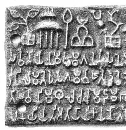
The true origin of writing in India has not been ascertained with any certainty, though scholars believe that the starting point was the Brahmi script used in the inscriptions of Emperor Asoka in 300 BCE. The Brahmi script confirms to the syllabic writing system and was used more for writing Prakrit, the language spoken by ordinary people. All the aksharas (vowels and consonants) of Sanskrit find a representation in Brahmi along with forms for medial vowels. The inscriptions of Asoka, seen in many places in India, though spread over several centuries, are all in Brahmi, suggesting that the script had been evolving. When new additions to existing structures were built, such as the Stupas and special Pillars, it was usual practice to record the names of the donors.
The Brahmi script underwent changes and noticeable differences (compared to the Brahmi of 300 BCE) and the writing became more ornamental with curves. The Brahmi of 200 CE shows these differences clearly. Yet, the set of aksharas remained the same, catering to the basic vowels and consonants of Sanskrit.
Conjunct letter formation is already seen in early Brahmi, but the rules were not strictly adhered to in many cases. It is believed that the job of carving the text or inscribing the same was given to a specialist, but the text itself provided by a scholar. Consequently, the variations seen in the rendering of conjunct aksharas have been attributed to errors introduced by the scribes. In some inscriptions, the rule of writing one consonant below the other was followed, but the consonants themselves were reversed for the same syllable (conjunct) in different inscriptions.
From about 200 CE, India was ruled by different Hindu Kings, and information dissemination continued through inscriptions in stone. In most cases, the text inscribed was Sanskrit and not Prakrit, thus giving credence to the fact that Hinduism was getting reestablished.
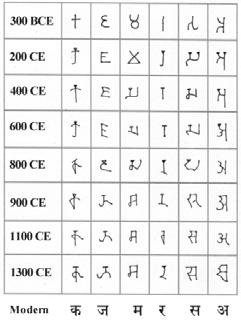
The chronological development of the script from the early Brahmi to the modern-day Devanagari is indicated below. The credit for creating the awareness that rock inscriptions provided the most important clues to the development of writing in India goes to western scholars. Brahmi was deciphered by James Prinsep in 1838. The methods used by Prinsep were somewhat similar to those that led to the successful decipherment of Hyeroglyphics a little earlier. Prinsep had the first clue from a Bilingual coin as well as the repeated occurrence of the same syllable in several inscriptions at Sanchi, where the oldest of the known Stupas from Ashoka’s time is situated. Subsequent contributions from other scholars, specifically Georg Buhler, established firmly the links between the language and the script.
The monuments and rock edicts where the Brahmi script was seen had remained either totally unexplored or in very dilapidated conditions, and India owes a debt of gratitude to these scholars for the wealth of information that followed.
The Gupta period (320 CE to 550 CE) was a golden age in Indian history. The Gupta Empire was founded by Sri Gupta in the 4th century CE, and it lasted until the 6th century CE. During this period, India witnessed remarkable advancements in all fields including art, literature, science, mathematics, and philosophy. This period is also known as the “Classical Age” of India. The Gupta period saw the development of the Devanagari script as well as many other important scripts and languages.
The Gupta Empire was a powerful and prosperous kingdom that extended over a large part of India. The Guptas were great patrons of art and learning, and many important works of literature and science were produced during this period. The famous Indian mathematician and astronomer Aryabhata lived during the Gupta period and made important contributions to the fields of mathematics and astronomy.
One of the most significant developments of the Gupta period was the evolution of the Devanagari script. The Devanagari script was derived from the Brahmi script and was used primarily for writing Sanskrit. However, over time, it came to be used for other Indian languages as well. The Devanagari script is known for its distinctive features such as the horizontal line at the top of each character known as the shiro rekha, the angular terminals, and the vertical stem.
The Devanagari script was not the only script to emerge during the Gupta period. The Gupta Empire was also responsible for the development of several other scripts such as the Siddham script, which was used for writing mantras and was considered to be a sacred script.
During the Gupta period, India was also witness to the development of several important languages such as Hindi, Bengali, and Marathi. These languages emerged from a common ancestor known as Prakrit, which was spoken by the people of ancient India. Over time, Prakrit evolved into several regional languages, each with its own unique characteristics.
The development of these languages was closely linked to the evolution of the Devanagari script. As more and more people began to write in Devanagari, it became necessary to develop new characters and ligatures to represent the unique sounds of each language. This led to the creation of a range of new characters and ligatures, as well as modifications to existing characters to reflect the unique phonetics of each language.
The evolution of the Devanagari script continued even after the Gupta period. During the medieval period (600 CE to 1200 CE), the script underwent further changes and modifications. Many of these changes were influenced by regional scripts and languages.
One of the most important developments of this period was the emergence of the Nagari script, which was an early form of the Devanagari script. The Nagari script was used for writing a number of regional languages such as Marathi, Gujarati, and Rajasthani.
The medieval period also saw the emergence of several important works of literature in regional languages. One of the most famous works of this period was the Ramcharitmanas, written by the poet Tulsidas in the 16th century. The Ramcharitmanas is a retelling of the Hindu epic Ramayana in the Awadhi language.
The modern period (from the 18th century onwards) saw further developments in the Devanagari script. This period saw the rise of modern Hindi, which emerged as a distinct language in the late 19th century. The development of modern Hindi was closely linked to the evolution of the Devanagari script.
In the 20th century, the Devanagari script underwent several standardization efforts. In 1949, the Government of India established the Devanagari Committee to standardize the script. The committee proposed a standard set of characters for the script, which was adopted by the Government of India in 1958.
Today, the Devanagari script is widely used for writing a number of Indian languages such as Hindi, Marathi, Nepali, and Sanskrit, among others. It has even been adopted for writing some non-Indian languages such as Sindhi and Indonesian. The script has continued to evolve over the centuries, with new characters and modifications being introduced to accommodate the unique phonetics of different languages.
In recent times, the Devanagari script has gained even more prominence with the widespread use of digital technology. It is now used not only for traditional purposes such as book publishing and official documents, but also in modern communication methods such as emails, messaging, and social media. This has led to the development of several Devanagari fonts that are compatible with computers and mobile devices, making it easier to use the script in the digital age.
However, despite the script’s widespread use and evolution over time, its rich history and cultural significance cannot be overlooked. The Devanagari script has played a pivotal role in preserving and disseminating India’s ancient traditions, including its vast body of knowledge in fields such as mathematics, astronomy, medicine, and philosophy. It has also been a tool for promoting cultural unity and identity across different regions and languages in India.
The Devanagari script has a long and fascinating history that spans over two thousand years. From its origins in the Brahmi script, it has evolved into one of the most widely used writing systems in the world, with applications ranging from ancient religious texts to modern digital communication. Its rich cultural significance and role in preserving India’s heritage cannot be overstated, and its continued evolution and adaptation to new technologies is sure to keep it relevant for many more centuries to come.
The characters of Devanagari script is essential for creating designs that are not only aesthetically pleasing but also culturally and linguistically accurate. Devanagari script consists of vowels, consonants, diacritical marks, and numerals. Each character has its own unique form and pronunciation, and understanding their intricacies is crucial for designing effective communication.
Vowels in Devanagari script are represented by standalone characters and are pronounced with a clear sound. Diacritical marks modify the pronunciation of vowels and are placed above, below, or next to the vowel character. Consonants in Devanagari script are represented by standalone characters and can be pronounced with or without a vowel sound. Conjuncts are formed by combining two or more consonant characters, and they have a unique form and pronunciation.
Numerals in Devanagari script are used to represent numbers and are written as a series of strokes that combine to form the numeral. Each numeral has a unique form and pronunciation.
Understanding the characters of Devanagari script is crucial for designing effective communication in various fields, including graphic design, typography, and branding. By understanding the forms and pronunciation of Devanagari characters, designers can create designs that accurately represent the cultural and linguistic nuances of the Indian subcontinent.
Devanagari characters, broadly classified into consonants & vowels.
Velar Palatal
Cerebral Dental Labial
Half - Vowels
Spirants
Empty Aspirant
Differentiated on the basis of speech
‘Root Letters’ and ‘Derived letters’ based on similarities between the structures
Differentiated on the basis of speech
Vowels play a crucial role in the Devanagari script, as they are used to represent the sounds that are pronounced in a language. Devanagari has a total of 14 vowels, which are known as “swar” in the script. These vowels can be written either as independent letters or with the help of diacritics and matras.
The 14 vowels in devanagari are divided into two categories: short and long vowels. The short vowels are pronounced quickly and with less emphasis, while the long vowels are pronounced ore slowly and with more emphasis.
The short vowels in Devanagari are represented by the letters अ (a), इ (i), उ (u), ए (e), ओ (o) the long vowels are represented by the letters आ (aa), ई (ii), ऊ (uu), ए (ai), and ओ (au).
In addition to these basic vowels, Devanagari also has few additional vowel sounds that are formed by combining town vowels. For example, the vowels sound “ai” is formed by combining the vowels अ (a) with the matra इ (i), while the vowel sound “au” is formed by combing अ (a) with the matra उ (u).
One unique aspect of devanagari vowels is that the consonants in the script carry inherent vowel sounds. This means that every consosnant is pronounced with a voewl sound even if there is no vowel symbol written next to it. The inherent vowel sound for most consonants is अ (a), which is pronounched as a schwa sound. However, the inherent vowel sound can be modifoied or muted using diacritics or matras.
In summary, Devanagari has a rich set of vowels that play a vital role in representing the sounds of the languagees written in th script. Understanding the nuance of these vowels is essential for anyone learning to read, write or speak a langauge that uses devanagari.
(a)
This is the most basic and common vowel sound in Devanagari. It has a neutral sound and can be pronounced with an open mouth. It is often used as an inherent vowel sound in consonant characters.
(aa)
This vowel sound is pronounced with an open mouth and a longer duration than the अ sound. It is used in words to indicate a long or stressed vowel sound.
(i)
This vowel sound is pronounced with a closed mouth and the tongue near the roof of the mouth. It has a short and sharp sound.
(ii)
This vowel sound is pronounced with a closed mouth and a longer duration than इ. It has a high-pitched sound.
(u)
This vowel sound is pronounced with the lips rounded and the tongue near the back of the mouth. It has a short and round sound.
(uu)
This vowel sound is pronounced with rounded lips and a longer duration than उ. It has a high-pitched sound.
(ri)
This vowel sound is pronounced with the tongue rolled or flipped back. It is used in words to indicate a short vowel sound.
(rri)
This vowel sound is pronounced with the tongue rolled or flipped back and a longer duration than ऋ. It is used in words to indicate a long vowel sound.
(li)
This vowel sound is pronounced with the tongue lifted to the roof of the mouth. It is used in Sanskrit and some other languages to indicate a short vowel sound.
(lli)
This vowel sound is pronounced with the tongue lifted to the roof of the mouth and a longer duration than ऌ. It is used in Sanskrit and some other languages to indicate a long vowel sound.
(e)
This vowel sound is pronounced with a closed mouth and the tongue near the roof of the mouth. It has a slightly longer sound than इ
(au)
This vowel sound is pronounced with a rounded mouth and the tongue near the back of the mouth, and a longer duration than ओ. It has a high-pitched sound.
(ai)
This vowel sound is pronounced with a closed mouth and the tongue near the roof of the mouth, and a longer duration than ए. It has a high-pitched sound.
(o)
This vowel sound is pronounced with a rounded mouth and the tongue near the back of the mouth. It has a short and round sound.
Devanagari script has a unique feature that sets it apart from other scripts: it uses diacritical marks extensively.
Diacritical marks are symbols that are added to a letter to modify its pronunciation. They are commonly used in many scripts, including the Roman script, to indicate stress, accent, or tone. In Devanagari, however, diacritical marks have a more extensive range of use. They are used to indicate the length of a vowel, nasalization, aspiration, and other phonetic features.
The use of diacritical marks in Devanagari is a testament to the precision and sophistication of the Indian linguistic tradition. The Indian grammarians were pioneers in phonetic analysis and had a deep understanding of the structure of sound. They devised a complex system of phonetic symbols to represent the sounds of the Indian languages accurately.
The Devanagari script has a rich history that dates back to the 11th century. It is believed to have evolved from the Brahmi script, which was used in ancient India to write Sanskrit and Prakrit. The Brahmi script, in turn, was derived from the Aramaic script, which was used in ancient Persia.
The earliest Devanagari inscriptions date back to the 11th century, and the script has undergone several changes since then. The use of diacritical marks in Devanagari can be traced back to the early period of its development. The earliest Devanagari manuscripts had no diacritical marks, and the script was written in a simple, unadorned style.
Over time, as the Indian grammarians developed a deeper understanding of phonetics, they introduced diacritical marks to represent the different sounds of the Indian languages. These diacritical marks were used to indicate the length of a vowel, aspiration, nasalization, and other phonetic features.There are several types of diacritical marks used in Devanagari script. Some of the most common diacritical marks are:
• Anusvara: The anusvara is a small dot that is placed above a consonant to indicate nasalization. It is also used to represent the sound of the consonant ‘ng’ in some languages.
• Visarga: The visarga is a small circle that is placed above a consonant to indicate aspiration. It is also used to represent the sound of the consonant ‘h’ in some languages.
• Chandrabindu: The chandrabindu is a small dot that is placed above a vowel to indicate nasalization.
• Nukta: The nukta is a small dot that is placed above a consonant to modify its pronunciation. It is used to represent consonant clusters and sounds that are not present in Sanskrit.
• Matra: Matras are diacritical marks that are used to indicate the length of a vowel. There are several types of matras, including the short vowel matra, the long vowel matra, and the extra-long vowel matra. Diacritical marks in Devanagari serve several functions. They are used to represent the different sounds of vowels and consonants, and also to indicate changes in pronunciation due to sandhi rules, which are rules of euphonic combination of sounds in Sanskrit and other Indian languages. One of the main functions of diacritical marks in Devanagari is to represent the different sounds of vowels. In Devanagari, there are thirteen vowels which are divided into three categories based on their length: short, long, and extra-long. The short vowels are represented by simple horizontal lines placed above or below the consonant they are associated with. The long vowels are represented by a combination of the short vowel mark and a diacritical mark placed above the line. The In addition to representing the different sounds of vowels, diacritical marks are also used to indicate changes in pronunciation due to sandhi rules. Sandhi rules govern how sounds change when they occur in combination with other sounds. For example, when a word ending in a consonant is followed by a word beginning with a vowel, the final consonant of the first word is often elided and the vowel of the second word is lengthened. This change in pronunciation is indicated by a special diacritical mark called the anusvara, which looks like a dot placed above the line. Another example of a sandhi rule is the assimilation of sounds, in which one sound takes on the qualities of another sound that is adjacent to it. This is indicated by a diacritical mark called the candrabindu, which looks like a dot placed above the line and to the right of the letter.
Diacritical marks are also used to represent sounds that are not found in the native phonology of Devanagari. For example, Devanagari does not have a sound equivalent to the English “v” or “f.” These sounds are represented by adding a diacritical mark called the nukta, which looks like a dot placed below the consonant to which it is attached. Another example is the retroflex sound, which is common in Dravidian languages but not in Sanskrit. This sound is represented in Devanagari by a special diacritical mark called the retroflex hook, which looks like a small curve placed above the consonant.
The use of diacritical marks in Devanagari is not limited to representing sounds. They are also used to indicate grammatical information, such as the gender, number, and case of nouns, and the tense, aspect, and mood of verbs. For example, the feminine gender is indicated by adding a diacritical mark called the visarga, which looks like a colon placed above the line. The plural number is indicated by adding a diacritical mark called the anunasika, which looks like a dot placed above the line and to the left of the letter. The past tense is indicated by adding a diacritical mark called the avagraha, which looks like a small circle placed above the line and to the right of the letter.
The use of diacritical marks in Devanagari is not unique to Sanskrit or Indian languages. Many other scripts, including Arabic, Hebrew, and Greek, also use diacritical marks to represent different sounds, grammatical information, and other features of the language. However, the use of diacritical marks in Devanagari is particularly important due to the complex phonology and grammar of Sanskrit, which requires a high degree of precision in the representation of sounds and grammatical information.
Diacritical marks are an essential feature of Devanagari script, serving a wide range of functions related to representing different sounds, indicating changes in pronunciation due to context, and providing important grammatical information. These marks are crucial for the accurate and efficient reading and writing of the language. Without them, the text would become confusing and ambiguous, making it difficult for readers to understand the intended meaning.
Furthermore, diacritical marks play an important role in the preservation of the language and its cultural heritage. They enable the correct pronunciation of words, which is an essential aspect of the language’s oral tradition. By using the diacritical marks, people can ensure that they are speaking and writing in accordance with the correct pronunciation and grammar of the language, as handed down by previous generations.
In recent years, there has been a growing concern among scholars and language experts about the decline in the use of diacritical marks in Devanagari script. This is partly due to the increased use of electronic communication, which often does not support the use of diacritical marks. As a result, many people are becoming accustomed to reading and writing Devanagari text without these important marks.
To address this issue, there have been efforts to promote the use of diacritical marks in Devanagari script. This includes the development of new software tools that support the use of these marks, as well as educational campaigns to raise awareness about their importance.
Overall, the diacritical marks in Devanagari script are a critical aspect of the language and its cultural heritage. They play a vital role in ensuring the correct pronunciation, grammar, and meaning of words, and are essential for the accurate reading and writing of the language. As such, it is important to continue to promote their use and educate people about their significance, so that the language can be preserved and passed down to future generations in its full richness and complexity.
आ की मात्रा (ā kī mātrā): Placed after the consonant.
इ की मात्रा (i kī mātrā): Placed before the consonant.
ई की मात्रा (ī kī mātrā): Placed after the consonant.
उ की मात्ा (u kī mātrā): Placed under the consonant.
ऊ की मात्ा (ū kī mātrā): Placed under the consonant.
ऋ की मात्ा (r. kī mātrā): Placed under the consonant.
ए की मात्ा (e kī mātrā): Placed above the horizontal line of the consonant.
ऐ की मात्ा (ai kī mātrā): Placed above the horizontal line of the consonant.
ओ की मात्ा (o kī mātrā): Placed after the consonant.
औ की मात्ा (au kī mātrā): Placed after the consonant.
अं (m. , अनुस्वार —anusvār): Placed above the horizontal line of the consonant.
There is an additional diacritic mark that is also a nasal
अँ (m., चन्द्रबिंदु — Chandra bindu): Placed above the horizontal line of the consonant.
अः (h., ब्वसर ्ग Visarg): Placed beside the consonant.
Devanagari script consists of a set of characters, each representing a sound in the language. These characters are divided into vowels, consonants, and dependent vowels. In this section, we will focus on the Devanagari consonants.
The Devanagari script has 33 consonants, each representing a different sound in the language. The consonants are further divided into five groups based on their place of articulation, or the part of the mouth where the sound is produced. These groups are called the velars, palatals, retroflexes, dentals, and labials.
The velar consonants are produced at the back of the mouth and include the sounds represented by the characters क (ka), ख (kha), ग (ga), घ (gha), and ङ (nga). The palatal consonants are produced at the middle of the mouth and include the sounds represented by the characters च (cha), छ (chha), ज (ja), झ (jha), and ञ (nya).
The retroflex consonants are produced by curling the tongue back towards the roof of the mouth and include the sounds represented by the characters ट (ta), ठ (tha), ड (da), ढ (dha), and ण (na). The dental consonants are produced with the tongue touching the teeth and include the sounds represented by the characters त (ta), थ (tha), द (da), ध (dha), and न (na).
The labial consonants are produced with the lips and include the sounds represented by the characters प (pa), फ (pha), ब (ba), भ (bha), and म (ma). Some of these consonants have voiced and voiceless pairs, such as क (ka) and ख (kha), or त (ta) and थ (tha). The voiced consonants are produced with the vocal cords vibrating, while the voiceless consonants are produced without the vocal cords vibrating.
In addition to these basic consonants, there are also conjunct consonants in Devanagari script. These are formed by combining two or more consonants to create a new sound. For example, the combination of क (ka) and ष (sha) creates the conjunct क्ष (ksha). The conjuncts are used to represent sounds that do not have a single character in the script, such as the sounds represented by the characters श (sha) and ष (sha).
Dependent vowels are also used with the consonants in Devanagari script. These are smaller characters that are written next to a consonant to indicate the vowel sound that should be pronounced with that consonant. There are 11 dependent vowels in Devanagari script, including अ (a), आ (aa), इ (i), ई (ii), उ (u), ऊ (uu), ऋ (ri), ऌ (li), ए (e), ऐ (ai), and ओ (o).
It is important to note that the pronunciation of the consonants and dependent vowels can vary depending on the language being written in Devanagari script. For example, the pronunciation of the character ज (ja) in Hindi may be different from its pronunciation in Sanskrit. Therefore, it is important to understand the rules of pronunciation for the specific language being written in Devanagari script.
In conclusion, the Devanagari consonants are an essential aspect of the Devanagari script, representing the fundamental building blocks of the language. They are the backbone of the script and the key to understanding and communicating in Hindi, Sanskrit, and other Indian languages.
(ka)
This is a voiceless velar plosive consonant. It is pronounced by stopping the flow of air at the back of the mouth with the tongue, then quickly releasing it. In Hindi, this sound is similar to the “k” sound in “kite. ख (kha)
This is an aspirated version of क. It is pronounced with an extra puff of air, which makes the sound more forceful. In Hindi, this sound is similar to the “kh” sound in “khaki.”
(ga)
This is a voiced velar plosive consonant. It is pronounced by stopping the flow of air at the back of the mouth with the tongue, then quickly releasing it while vibrating the vocal cords. In Hindi, this sound is similar to the “g” sound in “goat.”
(gha)
This is an aspirated version of ग. It is pronounced with an extra puff of air and vocal cord vibration, which makes the sound more forceful. In Hindi, this sound is similar to the “gh” sound in “ghost.”
(nga)
This is a nasal velar consonant. It is pronounced by stopping the flow of air at the back of the mouth with the tongue, while allowing air to escape through the nose. In Hindi, this sound is similar to the “ng” sound in “sing.”
(cha)
This is a voiceless palatal plosive consonant. It is pronounced by stopping the flow of air with the tongue against the hard palate, then quickly releasing it. In Hindi, this sound is similar to the “ch” sound in “chop.”
(chha)
This is an aspirated version of च. It is pronounced with an extra puff of air, which makes the sound more forceful. In Hindi, this sound is similar to the “chh” sound in “chhavi.”
(ja)
This is a voiced palatal plosive consonant. It is pronounced by stopping the flow of air with the tongue against the hard palate, then quickly releasing it while vibrating the vocal cords. In Hindi, this sound is similar to the “j” sound in “jump.”
(jha)
This is an aspirated version of ज. It is pronounced with an extra puff of air and vocal cord vibration, which makes the sound more forceful. In Hindi, this sound is similar to the “jh” sound in “jhoom.”
(nya)
This is a nasal palatal consonant. It is pronounced by stopping the flow of air with the tongue against the hard palate, while allowing air to escape through the nose. In Hindi, this sound is similar to the “ny” sound in “canyon.”
ट (ta)
This is a voiceless retroflex plosive consonant. It is pronounced by stopping the flow of air with the tongue curled back towards the roof of the mouth, then quickly releasing it. In Hindi, this sound is similar to the “t” sound in “stump.”
ठ (tha)
This is an aspirated version of ट. It is pronounced with an extra puff of air, which makes the sound more forceful. In Hindi, this sound is similar to the “th” sound in “thump.”
ड (da)
This is a voiced retroflex plosive consonant. It is pronounced by curling the tip of the tongue back and touching the roof of the mouth. The sound is then released by a sudden burst of air as the tongue is lowered. In Hindi, this sound is similar to the “d” sound in “dog.”
ढ (dha)
This is an aspirated voiced retroflex plosive consonant. It is pronounced by curling the tip of the tongue back and touching the roof of the mouth, and then releasing the sound with a burst of air. In Hindi, this sound is similar to the “d” sound in “dough,” but with a stronger burst of air.
ण (na)
This is a voiced retroflex nasal consonant. It is pronounced by curling the tip of the tongue back and touching the roof of the mouth, allowing air to escape through the nose. In Hindi, this sound is similar to the “n” sound in “no.”
त (ta)
This is an unaspirated voiceless dental or alveolar plosive consonant. It is pronounced by pressing the tongue against the back of the upper teeth or the alveolar ridge (the bony ridge behind the teeth) and then releasing it with a sudden burst of air. In Hindi, this sound is similar to the “t” sound in “top.”
थ (tha)
This is an aspirated voiceless dental or alveolar plosive consonant. It is pronounced by pressing the tongue against the back of the upper teeth or the alveolar ridge and then releasing it with a strong burst of air. In Hindi, this sound is similar to the “t” sound in “stop,” but with a stronger burst of air.
द (da)
This is a voiced dental or alveolar plosive consonant. It is pronounced by pressing the tongue against the back of the upper teeth or the alveolar ridge and then releasing it with a burst of air. In Hindi, this sound is similar to the “d” sound in “dog.”
ध (dha)
This is an aspirated voiced dental or alveolar plosive consonant. It is pronounced by pressing the tongue against the back of the upper teeth or the alveolar ridge, and then releasing the sound with a strong burst of air. In Hindi, this sound is similar to the “d” sound in “dough,” but with a stronger burst of air.
न (na)
This is a voiced dental or alveolar nasal consonant. It is pronounced by pressing the tongue against the back of the upper teeth or the alveolar ridge and allowing air to escape through the nose. In Hindi, this sound is similar to the “n” sound in “no.”
(pa)
This is an unaspirated voiceless bilabial plosive consonant. It is pronounced by closing the lips and then releasing them with a sudden burst of air. In Hindi, this sound is similar to the “p” sound in “pop.” फ (pha)
This is an aspirated voiceless bilabial plosive consonant. It is pronounced by closing the lips and then releasing them with a strong burst of air. In Hindi, this sound is similar to the “p” sound in “spot,” but with a stronger burst of air.
(ba)
This is a voiced bilabial stop consonant. It is pronounced by closing the lips together and releasing them, producing a vibration in the vocal cords. In Hindi, this sound is similar to the “b” sound in “boy.”
(bha)
This is a voiced aspirated bilabial stop consonant. It is pronounced by closing the lips together and releasing them with a puff of air, while also vibrating the vocal cords. In Hindi, this sound is similar to the “bh” sound in “abhor.”
(ma)
This is a bilabial nasal consonant. It is pronounced by closing the lips and releasing air through the nose. In Hindi, this sound is similar to the “m” sound in “man.”
(ya)
This is a palatal approximant consonant. It is pronounced by bringing the tongue close to the roof of the mouth without actually touching it. In Hindi, this sound is similar to the “y” sound in “yes.”
(ra)
This is an alveolar trill or flap consonant. It is pronounced by rapidly vibrating the tongue against the alveolar ridge, the bony ridge just behind the upper front teeth. In Hindi, this sound is similar to the “r” sound in “red.”
(la)
This is an alveolar lateral approximant consonant. It is pronounced by bringing the tongue close to the alveolar ridge without touching it and allowing air to flow over the sides of the tongue. In Hindi, this sound is similar to the “l” sound in “lion.”
व (va)
This is a labiodental approximant consonant. It is pronounced by bringing the lower lip close to the upper teeth without touching them. In Hindi, this sound is similar to the “v” sound in “very.”
श (sha)
This is a voiceless postalveolar fricative consonant. It is pronounced by bringing the tongue near the back of the alveolar ridge and creating friction as air passes through. In Hindi, this sound is similar to the “sh” sound in “ship.”
ष (ssa)
This is a voiceless retroflex sibilant consonant. It is pronounced by curling the tip of the tongue back and bringing it close to the hard palate while creating friction as air passes through. In Hindi, this sound is similar to the “sh” sound in “ash” but with the tongue curled back.
(sa)
This is a voiceless alveolar sibilant consonant. It is pronounced by bringing the tongue close to the alveolar ridge and creating friction as air passes through. In Hindi, this sound is similar to the “s” sound in “sing.”
ह (ha)
This is a voiceless glottal fricative consonant. It is pronounced by forcing air through the vocal cords without vibration. In Hindi, this sound is similar to the “h” sound in “hot.”
In Devanagari script, conjuncts are combinations of two or more consonant characters that are written together without any space between them. Conjuncts play a crucial role in Devanagari typography and are essential to achieving proper spacing and balance in text. Conjuncts are formed by stacking two or more consonants together, and they can be written horizontally or vertically.
Conjuncts are written in a specific order, with the first consonant being written on the left side and the subsequent consonants being stacked to the right. There are two types of conjuncts: half-form and full-form conjuncts.
Half-form conjuncts are formed by combining a consonant character with the vertical stroke called the halant. The halant symbolizes the absence of a vowel sound and is used to indicate that the consonant character is combined with another consonant. Half-form conjuncts are also called consonant clusters or consonant ligatures. Examples of half-form conjuncts in Devanagari script include क्त (k-t), ज्ञ (j-gn), and र्ध (r-dh).
Full-form conjuncts are formed by stacking two or more consonant characters together without the halant symbol. They are also called consonant compounds or joint consonants. Examples of full-form conjuncts in Devanagari script include � (k-sh), त्र (t-r), and ज्ञान (j-gn-aan).
It is important to note that not all consonant characters can be combined into conjuncts. Some characters, such as य (y) and र (r), cannot be combined with certain other consonants. Additionally, some conjuncts have special forms, depending on their placement within a word or sentence.
In Devanagari typography, conjuncts require careful attention to spacing and kerning. Proper spacing and kerning ensure that each character within the conjunct is legible and distinguishable. Additionally, some typefaces have alternate forms for specific conjuncts, which can be used to improve the visual balance and legibility of the text.
Designing a Devanagari typeface requires a deep understanding of the formation and usage of conjuncts. A well-designed Devanagari typeface should not only have well-crafted individual letterforms but also well-designed conjuncts that are both legible and aesthetically pleasing. Furthermore, the design of conjuncts can have a significant impact on the overall look and feel of a piece of Devanagari text. A typeface with poorly designed conjuncts can appear jumbled and difficult to read, while a typeface with well-designed conjuncts can appear harmonious and elegant.
To achieve effective and aesthetically pleasing typography in Devanagari, it is important to pay attention to the spacing, kerning, and overall design of conjuncts. Type designers should carefully consider the placement and design of conjuncts within their typeface, taking into account the unique features and rules of the Devanagari script.
Overall, conjuncts are an essential and distinctive feature of Devanagari typography. Understanding how to properly form and use conjuncts is crucial for creating legible and visually appealing text in Devanagari script. With careful attention to design and implementation, conjuncts can enhance the beauty and functionality of Devanagari typography.
Devanagari script also includes a set of numerals that are used to represent numbers. In this section, we will explore the Devanagari numerals and their use in design.
The Devanagari numeral system is based on the HinduArabic numeral system, which is also used in the Western world. However, the Devanagari numerals have their unique forms, and they are written and read from left to right, unlike the Devanagari script, which is written and read from left to right. The Devanagari numerals are used in a wide range of applications, from writing phone numbers and street addresses to representing years in calendars.
The Devanagari numeral system consists of ten digits: ० (zero), १ (one), २ (two), ३ (three), ४ (four), ५ (five), ६ (six), ७ (seven), ८ (eight), and ९ (nine). These numerals are simple to write and read, and their distinct forms make them easily recognizable. The numerals are often used in combination with other characters to create larger numbers.
In design, the use of Devanagari numerals is essential in creating a cohesive and culturally appropriate design. It is important to use the correct numerals for the language and culture you are designing for. For example, if you are designing for a Hindi audience, you would use the Devanagari numerals instead of the Western numerals.
When designing with Devanagari numerals, it is essential to consider their size and placement. The numerals should be legible and clear, and they should be placed in a way that does not interfere with the overall design. The size of the numerals should be consistent with the other characters used in the design, and their placement should be strategic to emphasize the importance of the number they represent.
Another important consideration when designing with Devanagari numerals is their style. There are several styles of Devanagari numerals, ranging from simple to decorative. The choice of style should be based on the overall design style and the context in which the numerals will be used. For example, if the design is minimalist, a simple style of Devanagari numerals may be more appropriate. On the other hand, if the design is elaborate and decorative, a more ornate style of Devanagari numerals may be more appropriate.
In addition to their use in design, Devanagari numerals are also used in various applications, such as in mathematics, science, and accounting. The numerals are used to represent numbers in various systems, such as decimal, binary, and hexadecimal. They are also used in various Indian calendars to represent years and dates.
Devanagari numerals are an essential component of the Devanagari script and are widely used in design and other applications. Their use in design can add a culturally appropriate touch to a design and help create a cohesive and meaningful design. When designing with Devanagari numerals, it is essential to consider their size, placement, and style, as well as the context in which they will be used.
The basics of typography is essential for creating effective designs that are visually engaging and communicate their message clearly. In the context of Devanagari typography, this understanding is particularly important, as Devanagari script has its own unique anatomy, characteristics, and terminology.
The anatomy of Devanagari script includes a range of elements, such as the headstroke, body stroke, and feet, that give each character its unique form. Understanding these elements is essential for creating designs that are visually appealing and easy to read.
The characteristics of Devanagari typography include factors such as legibility, contrast, and harmony, all of which are crucial for creating designs that are effective and engaging. Designers must also understand the various classifications of Devanagari typography, such as the distinction between serif and sans-serif fonts.
Font families play an important role in Devanagari typography, as they provide designers with a range of options for creating designs that are both visually appealing and culturally relevant. Typographic hierarchy is also crucial, as it helps designers to establish a clear visual hierarchy and guide the viewer's eye through the design.
Finally, designers must understand the principles of kerning and leading, which are used to adjust the spacing between characters and lines of text. By understanding these basics of Devanagari typography, designers can create designs that are both visually engaging and effective in communicating their message.
As a designer, working with the Devanagari script can be a daunting task due to its large and complex character set, with many moving parts and intricate shapes. One of the biggest challenges faced by designers is the lack of commonly agreed upon terminology for the anatomy of Devanagari letters and their metrics. This makes it difficult for native or fluent speakers to describe the various parts of a letter, especially to someone who is not familiar with the script.
To address this issue, various scholars and designers have attempted to simplify and unify the nomenclature for the metrics and anatomy of Devanagari letterforms. One of the first attempts in this direction was made by S. N. Bhagwat, who conducted a graphical analysis of Devanagari letterforms in 1961. Bhagwat categorized the letterforms based on their construction and shape, and also created a scheme for their anatomy.
Bapurao Naik, in his monumental three-volume work Typography in Devanagari published in 1971, further refined Bhagwat's approach. Naik categorized the basic Devanagari letters into five categories based on their vertical stem and how it interacts with other strokes. Both Bhagwat and Naik's schemes were focused on terms used for vowels and other signs, making them a good starting point for learners.
Mukund V. Gokhale attempted to formalize type anatomy by using the human body, in conjunction with the thickness of a pen stroke, as a reference to define the vertical metrics of Devanagari letterforms. Gokhale defined seven vertical metrics: urdhvarekha (upward or top line), shirorekha (head line), skandharekha (shoulder line), nabhirekha (navel line), zanurekha (thigh line), padrekha (foot line), and talrekha (bottom line).
However, unlike in Latin script, there cannot be a prescriptive model that tells us exactly where a part of every letter must come in contact with a given metrics line. The lines denoting the highest and lowest vowel signs help to demarcate the vertical boundaries of a design, but they do not indicate which particular vowel or other signs reach them. The remaining intermediary vertical metrics are even more flexible and vary from design to design. Thus, it is important to view the metrics, excluding the headline and baseline, as gradations in space that can be used to describe letterforms and their overall proportions, rather than strict guidelines.
Girish Dalvi's 2009 paper, Anatomy of Devanagari Typefaces, provides a more detailed and comprehensive scheme for Devanagari letter parts and anatomy. This scheme has been published online at Devanagari Search Tool. Dalvi not only defines parts like "knot" but also offers options for how it could be represented: open, closed, or filled. He has borrowed several terms from Latin type anatomy, such as contrast, axis, terminal, and counter, making the scheme easy to use in multiscript settings.
In conclusion, while the Devanagari script can be intimidating to designers due to its complexity, various scholars and designers have attempted to simplify and unify the nomenclature for its metrics and anatomy. These schemes provide a starting point for learners and help designers communicate more effectively about the various parts and features of Devanagari letterforms. However, it is important to remember that there cannot be a prescriptive model for Devanagari letterforms, and designers must view the metrics as flexible gradations in space rather than strict guidelines.


As a designer, understanding the characteristics of a script is essential to develop visual communication that is culturally sensitive and linguistically accurate. One such script is Devanagari, which is the mother script of several Indian scripts and has a rich history that spans centuries. In this essay, we will discuss the key characteristics of Devanagari from a designer's point of view.
Devanagari is a script that has evolved over time, but its foundation remains solid. The script's unique characteristics make it a specialized script for highly developed languages like Sanskrit.
Devanagari Needs No Spelling Arrangement:
The first characteristic of Devanagari that we will discuss is that it needs no spelling arrangement. Unlike Roman script, which requires spelling arrangement for sounds that have no signs, Devanagari has assigned definite modes of behavior for consonants and vowels, which eliminates the need for spelling arrangement.
Series Modulation by Vowel Signs:
The second characteristic of Devanagari is series modulation by vowel signs. Devanagari and all scripts of the Brahmi family have distinctive graphemes for all vowels to join with the consonant's representative signs, and these have evolved along with the script. This characteristic ensures that the script has accurate vowel representation, which is essential for pronunciation.
Differentiation for the Pronunciation of Vowels:
The third characteristic of Devanagari is differentiation for the pronunciation of vowels. The Indian grammarians have made a differentiation between the signs for the short and long sounds of the same vowel to manage pronunciation accurately. Vowels that are short flourish to the left, and their longer signs flourish to the right, a noticeable feature in Devanagari, Tamil, Malayalam, and other scripts of South Indians who were very careful in preserving their traditions.
The Vertical Line:
The fourth characteristic of Devanagari is the vertical line. The vertical line is an essential part of any Devanagari letter and is used to show the addition of the Aa matra to a consonant to fully pronounce and write it. The vertical line is canceled by a halant sign in the case of letters to represent the half pronounced phoneme. These half signs also help to form conjunct letters. The suggestion to make half letters from full letters by adding halant signs has been found helpful for pronunciation.
The Top Line:
The fifth characteristic of Devanagari is the top line, an integral and essential feature of Devanagari orthography. The continuous top line is a later development, and in old manuscripts, copper plates, and inscriptions, the top line was limited to the character only and did not join the next letter. The top line knits letters into distinct words, and a gap indicates a separation of one word from another.
Conjunct
Formation of Consonants:
The sixth characteristic of Devanagari is conjunct formation of consonants. Some reformers recommended the formation of conjunct letters with halant signs even in the case of letters with full vertical lines. For saving space, the conjuncts in Devanagari were initially written vertically, but the grammarians would not object to joining them lineally when half forms of letters with the full vertical line could be used by removing the vertical line. In the case of archaic letters, there is no other way than applying the halant sign, especially in case of composing with a machine like a typewriter.
Diacritical and Special Marks:
The seventh characteristic of Devanagari is diacritical and special marks. The script is capable of expressing many varieties of sounds, and various signs for a variety of long and short vowels were made in the language. However, since the signs vary from province to province, an effort in standardization is essential. Affricated words that came to India through the contact of the Persians and the Arabs left a mark on Hindi, and such sounds have been denoted in Devanagari by adding a point at the bottom nearer graphemes in Devanagari. There also exist another set of marks known as halant, which is a diacritical mark used to indicate the absence of any inherent vowel sound in the consonant. This allows for greater flexibility in forming complex consonant clusters, which is a common feature in Hindi and other languages written in Devanagari.
Direction from Left to Right:
The eight characteristic of Devanagari is direction from left to right. It's possible that this was the original direction of writing for all ancient scripts. Only Hebrew, Arabic, Persian, and Urdu kept writing in the previous orientation, whereas Brahmi, the mother script of Devanagari, shifted it to right to left. The Devanagari script is somewhat more similar to the Roman script in this regard.
Independent Grapheme exists for Pure Vowels and Consonants:
The ninth characteristic of Devanagari is independent grapheme exists for pure Vowels and consonants. The vowels of Devanagari are independent, much like in the Roman alphabet. Each fundamental vowel has a unique phonetic origin, hence it seems sense that each should have an own grapheme. The consonants that are expected to be uttered with the aid of these vowels are modulated into a modulating series using the representative forms that have been provided to these vowels.
Basic Arrangement of Phonemes is Phonetic:
The tenth characteristic of basic arrangement of phonemes is phonetic. The Brahmi script is entirely phonetic since it developed from phonemic studies in which the Dravidians had specialised. Some pronunciations are imported from other languages, and they are denoted by a dot at the bottom of the phoneme that is closest to it. A half-moon symbol is placed over a closer phoneme to denote half-open vowels that have been acquired from European languages.
Overall, the Devanagari script is an essential part of Indian culture and language. Its unique characteristics and versatility make it well-suited for representing the complex phonetics of many different languages, and it continues to be an important aspect of written communication in India today.
Basic Tool
Selecting the right tool (कलम, साधन, उपकरण) is a critical first step in creating a new typeface. The chosen tool will determine the strokes of the letters, the shape of the terminals, the contrast of the typeface, and other important aspects of its design.
There are several types of tools that a designer can choose from, including the Devanagari Pen (बोर), Roman Pen, Monolinear Pen, Brush, and more. Each tool has its own unique characteristics that can influence the final design of the typeface.
For many designers, the tool used is the primary parameter for classification of a typeface. While most typefaces use only a single tool to draw their letters, it is possible to use multiple tools to create a more complex design.
The tool selection process is a crucial decision that can greatly impact the final product. A designer must carefully consider the strengths and limitations of each tool and choose the one that best aligns with their vision for the typeface.
Grey Value
The grey value (काला मल्य, वजन) of a typeface is an important consideration in its design. The grey value refers to the overall darkness of the letters as perceived by typographers, and is mathematically defined as the darkness of a selected letter for a standardized area and size, represented by a numerical value.
The name or nomenclature of the weight is generally decided by the type designer or foundry, and is usually associated with a name within the family. For example, a typical typeface might contain Light, Normal, Semibold, Bold, Black, and Extra Black variations, each with its own unique grey value.
The grey value of a typeface can be perceived as light, medium, or dark, and can be classified discretely as such. However, it can also be measured mathematically using numerical values such as 200, 500, 800, etc., creating a continuous distribution.
As a designer, it is important to consider the intended use and audience of the typeface when determining its grey value. A lighter grey value may be more appropriate for body text, while a darker grey value may be better suited for display or headline text.
The grey value of a typeface is a critical design element that can greatly impact its readability and overall aesthetic, and should be carefully considered by the designer.
Construction
The construction (मास, गठन) of a typeface is a crucial aspect of its design. The construction refers to the appearance of the exterior boundaries of the stroke, which can greatly influence the overall look and feel of the typeface.
The majority of existing typefaces have a solid or monolithic build (अखड), which means that the strokes are uninterrupted and appear as a continuous line. However, there are also typefaces that feature broken or interrupted (खडित) flesh, such as Stencil and Dotted styles.
As a designer, the choice of construction style can have a significant impact on the final product. A solid construction can create a more traditional and timeless look, while a broken or interrupted construction can add a unique and playful element to the typeface.
When considering the construction of a typeface, it's important to keep in mind the intended use and target audience. A solid construction may be more appropriate for formal or professional settings, while a broken or interrupted construction may be better suited for more creative or casual environments.
The construction of a typeface is an important design decision that can greatly influence the final product, and should be carefully considered by the designer.
Constrast
Contrast (विषमता) is an important aspect of creating a visually appealing and readable typeface. Contrast refers to the difference between the thickest and thinnest parts of a stroke in a curvilinear letterform.
The amount of contrast present in a typeface can vary greatly depending on the tool used to create it. For example, a monolinear pen will produce a stroke with no contrast, while canted pens can produce strokes with medium to high contrast.
It's important to note that even in monolinear fonts where there is no intended contrast between strokes, there may still be differences in stroke width that contribute to the overall appearance of the letterform.
When designing a typeface, it's essential to consider the desired level of contrast and how it will impact the final product. Higher levels of contrast can create a more dynamic and dramatic look, while lower levels can create a more subdued and uniform appearance.
The amount of contrast in a typeface is a crucial design decision that can greatly affect its readability and visual appeal, and should be carefully considered by the designer.
Axis
The Axis or Stress (अक्षरखा, बलाघात, ताण) is a crucial aspect that contributes to the overall appearance and legibility of the typeface. The axis refers to the angle at which the thinnest parts of a stroke are located or the direction in which a curved stroke changes weight.
The axis can be easily observed in curvilinear letters, such as ठ. The direction of the axis can be classified as None, Vertical, Horizontal, Left Inclined, and Right Inclined. The choice of axis direction can greatly affect the visual impact of the typeface.
Traditional tools like the Devanagari Reed pen typically produce a Right Inclined Axis (दाए झका अक्ष), while roman and Arabic calligraphic pens produce a Left Inclined Axis (बाए झका अक्ष). A Flat pen, on the other hand, produces a vertical axis (ऊर्ध्वाधर, खडा, उभा अक्ष).
As a designer, the choice of axis direction depends on the intended style and visual effect of the typeface. A rightinclined axis can create a sense of movement and energy, while a left-inclined axis can convey a sense of stability and traditional elegance. A vertical axis can create a sense of formality and structure.
Overall, the axis is an important aspect of typeface design that affects the overall look and feel of the letters, and should be carefully considered in the design process.
Horizontal Terminal
As a designer, understanding the concept of Horizontal Terminal is essential in creating well-designed and legible typography. Horizontal Terminal refers to the shape in which the horizontal stroke of a typeface begins and terminates. It is important to note that the horizontal stroke may not always be perfectly horizontal; it can also be slightly vertical or canted. In the letterpress era, horizontal terminals were often cut vertically to ensure easier fitting and joining of letters.
When creating typography, it is important to consider the horizontal terminals of the typeface being used. The horizontal terminals should be consistent and distinct throughout the typeface to ensure legibility and readability. Letters with internal horizontal terminals, such as च, घ, छ, क्त, should also be considered when designing typography. Decorative initials and terminals can also be used to add personality and visual interest to typography, but they should be used thoughtfully and in a way that complements the overall design.
In addition, understanding the history and cultural context of typography is important when designing typography for different languages and scripts. For example, in Devanagari script, the horizontal terminals were cut vertically in the letterpress era to avoid creating cumbersome kerns. This historical context can influence the design decisions made when creating typography for Devanagari script, as well as other scripts with similar historical contexts. Ultimately, a designer should strive to create typography that is not only visually appealing but also functional and appropriate for its intended use.
Vertical Terminal
The Vertical Terminal (खडी, उभी रखान्त) of a font refers to the way in which the vertical strokes of the letters terminate. It is an important aspect to consider when designing a typeface as it can significantly affect the overall appearance and legibility of the font.
Depending on the tool used, a typeface can have different types of terminals. Traditional Devanagari text fonts, for example, usually have Right Canted Terminals with additional decorative elements such as a 'Swoosh', 'Tick' or 'Flick' that can extend either towards the left or right of the vertical. Fonts drawn with the roman calligraphic pen tend to have Left Canted Terminals if left untreated.
Monolinear fonts, on the other hand, generally have a Horizontal Terminal that can be modified to create a Slab Serif. Rounded monolinear tip pens produce Rounded Terminals or Rounded Serifs. The ends of the tilted terminals can also be flattened early in some cases to blunt the sharp corner at the end.
As a designer, it is important to carefully consider the type of terminal that best suits the overall design and intended use of the font, as well as its legibility and aesthetic appeal.
Angular Terminal
It's important to understand the concept of Angular Terminal in typography. Angular Terminal refers to the way in which the strokes of a font's letters terminate. This can be either angular or curvilinear in nature.
Handwritten or humanistic typefaces often have an oblique termination, with inconsistent visual forms throughout the letters. However, rationalist or geometric fonts require distinctive terminal endings that are either horizontal or vertical. Examples of such fonts include CDAC-Prakash NID-Maha, Univers, and Helvetica.
As a designer, it's crucial to choose the right typeface based on the project's requirements and objectives. Understanding the principles of typography, including Angular Terminal, helps designers make informed decisions and create effective designs that communicate the intended message clearly and effectively.
Basic Hand
As a designer, understanding the concept of Basic Hand is essential to create typefaces that are both aesthetically pleasing and functional. The term Basic Hand refers to the style or grammar of drawing and writing in typeface design. It encompasses the manner in which the strokes of the typeface are controlled by the designer. It is a subjective classification that varies based on the natural versus constructed dichotomy. In Devanagari, there are six different hands, each with its unique characteristics, based on the style of writing.
The first hand is the Handwritten Hand (हस्तलिखित). This style of writing is based on the forms seen in everyday handwriting. It is less regular and contains inconcinnities among the letters. The strokes do not have rationalized straight lines or perfect ovals or circles, but rather lines and base shapes that are easy and fast to write. The aperture is wide and open, and the curvilinear terminals are mostly oblique. The aim of this style is to emulate the traits of human handwriting used for everyday writings. This style is suitable for informal text settings, such as personal letters or informal notes.
The second hand is the Deliberate Handwritten or Humanistic (सविचारित). This style is based on the Handwritten Hand, but with some of the intrinsic lines following a strict horizontality and verticality. The circular shapes are much more deliberately drawn, and the terminals are intrinsically standardized. There is a higher level of consistency in the shape primitives within the typeface. This style is aimed at long text settings, such as books or newspapers. It is suitable for formal text settings, where legibility is crucial.
The third hand is the Calligraphic Hand (सलखन). This style is a combination of handwritten and deliberate writing, with the specific intent of creating 'beautiful' letters. The notion of beauty here is mostly traditional. Most typefaces in this style have fluid and cursive flowing letters, with terminals that have a distinct direction to them. They largely mimic the scripts seen in ancient Hindu, Jain, and Buddhist manuscripts. In recent times, several contemporary interpretations of calligraphic scripts can also be seen inspired by the Latin and Arabic schools. These typefaces are customarily used for setting small pieces of text in large sizes, in applications such as greeting cards and invitation cards, and sometimes also used in text settings to set traditional religious texts, to simulate a manuscript-like effect.
The fourth hand is the Display or Lettering Hand (अक्षरखाकन, प्रदर्शन अक्षर). This style of writing incorporates contemporary or recent aesthetics and is designed mainly for the purpose of large displays. Fonts with serifs or which are overly bold or dark can be said to have a lettering hand, such as typefaces like CDAC-Aakash and CDAC-Latika. This style is suitable for headlines, titles, and other display purposes.
The fifth hand is the Rational Hand (तर्कसगत). In this style, the type designer explicitly uses rational type design principles, such as optical correction of circular curves, rational (vertical or horizontal) terminals, etc. Examples of fonts using a rational hand in Devanagari include CDACPrakash (inspired by Helvetica) and NID-Maha (inspired by Univers). This style is suitable for all text settings, from short texts to long documents.
The sixth hand is the Geometric Hand (भमितीय, ज्यामितीय). This style of writing is based on basic geometric forms, primarily the circle and square for Devanagari. It can be considered as an extreme form of rationalization, where the type designer seeks to eliminate any inconsistencies or irregularities that may exist in the other hands, to achieve a precise and balanced look.
Curves
The treatment given to curvilinear shapes in Devanagari fonts is a crucial aspect of the overall design. The curves in Devanagari letters like क, द, ठ, and Matras can be treated in several ways, depending on the hand chosen for the font. The approach taken to the curves can significantly impact the font's overall feel and aesthetic.
In a Geometric typeface, curves are based on basic geometric shapes, mainly circular curves. This approach aligns with the extreme rationalization that the Geometric Hand represents. By using circular curves, the font's curves can be standardized and consistent throughout, reflecting the hand's overall design philosophy.
In Rationalist or Deliberate types of hands, the curves are often oval-shaped, which provides a slightly different feel to the font. This approach still provides a degree of standardization and consistency, but the curves are more organic and natural, reflecting the hand's intent to mimic human handwriting while still being rationalized and regularized.
In Display lettering hands, such as those used for industrial or mechanized purposes, the curves can have a squarish treatment. This treatment gives the font a distinct appearance and feel, making it stand out from other types of hands. The squarish treatment is often used to provide an industrial or mechanical feel to the font, reflecting the intended purpose of the font.
Other treatments, such as triangular or other unique shapes, have been used in the past, but they are rare in Devanagari fonts. The curves are a critical aspect of the font's design and should be chosen based on the overall intent of the font and the desired aesthetic. The chosen treatment should align with the font's hand and provide consistency and standardization while still reflecting the font's intended purpose and feel.
Turns
The Turn (मोड़, वळण) is a crucial element in the Devanagari script that determines how the horizontal stroke transitions into a curvilinear stroke in letters such as इ, ई, ङ, ड, etc. As a designer, it is important to pay close attention to the Turn to ensure that the font has a consistent and harmonious appearance. There are primarily three types of treatments that can be used for the Turn: curvilinear, angular, and squarish. If you are designing a font that follows a handwritten style, the Turn should be curvilinear, creating a natural and organic flow between the strokes. For fonts that follow a more deliberate hand, angular turns may be used, giving the font a more rational and geometric appearance. On the other hand, if you are designing a display lettering typeface in the mechanistic or industrial style, a squarish transition might be used, resulting in an angular turn with a ninety degree angle. As a designer, it is essential to carefully consider the Turn in your font design to ensure that it complements the overall style and appearance of the font, creating a cohesive and visually appealing result.
the message, and the overall aesthetic when making this decision. By carefully considering the open or closed center counter, designers can create typefaces that are not only visually appealing but also communicate the intended message effectively.
Counters
As a designer, counters are an essential aspect of creating visually appealing Devanagari typefaces. The counter is the negative or white space within the letters, which can greatly affect the overall look and feel of the typeface. While some letters have inherently open or closed counters, such as अ or ष, we define the counter in a narrower sense by moderating the definition of negative space seen in letters like क, व, ब, etc. These letters can have two variations of counters - open and closed.
The open center counter is a variation where the negative space in the middle of the letter is not closed and is left open. This gives the letter a more open and airy feel, making it appear lighter and more delicate. This style is often associated with Hindi or North Indian lettering, and it can be used to create typefaces with a more elegant or feminine appearance.
On the other hand, closed center counters are characterized by having a closed negative space in the middle of the letter. This creates a more solid and grounded appearance, making the letter look heavier and more masculine. Closed center counters are often associated with Marathi lettering, and they can be used to create typefaces with a more bold and authoritative look.
As a designer, choosing the right variation of counters for a typeface can greatly impact the final design. It is important to consider the target audience, the tone of
Vertical Stem
As a designer, understanding the Vertical Stem (तना) is crucial in creating a well-designed Devanagari font. This element refers to the main vertical stroke in Devanagari letters, such as क, त, ब, etc. The appearance of the Vertical Stem can vary based on the tool and hand used, making it a key aspect of a font's overall style.
There are several variations of the Vertical Stem that can be incorporated into a Devanagari font. The Parallel Vertical Stroke is a simple, straightforward stroke where both sides of the stroke run parallel to each other. The Flared Vertical Stroke, on the other hand, is where the sides of the stroke diverge and the trunk expands from thin to thick. The Receding Vertical Stroke is the opposite of the Flared Stroke, where the sides converge and the trunk shrinks in width. Finally, convex and concave trunks are seen in display/ lettering hands and can add a unique and dynamic look to a font.
Choosing the right Vertical Stem for a Devanagari font can significantly impact the overall style and legibility of the font. A Parallel Vertical Stroke may be appropriate for a more traditional or formal font, while a Flared or Receding Vertical Stroke may add a more playful or modern feel to the font. Convex or concave trunks can create a more stylized or artistic look, but should be used sparingly to maintain readability. By understanding and utilizing the different variations of the Vertical Stem, a designer can create a font that is both aesthetically pleasing and functional.
Inclination
Inclination is an important aspect of Devanagari type design as it affects the visual balance and overall aesthetic appeal of the font. The vertical inclination, which is the default for most typefaces, ensures that the letters are upright with the stem of the stroke at a ninety degree angle to the shiro-rekha. This provides a stable and traditional appearance to the font.
In contrast, the right inclination is commonly used in calligraphic and handwritten styles of Devanagari fonts. This approach involves tilting the letters to the right at varying degrees, with the stem of the stroke deviating from the vertical. Slightly Right Inclined fonts have a subtle tilt while Overly Right Inclined fonts have a more pronounced slope. The right inclination provides a dynamic and fluid appearance to the font, conveying a sense of movement and energy.
Some Devanagari typefaces also feature a left inclination, which is the reverse of the right inclination. These left inclined fonts are a rarity, but can add a unique and distinctive touch to a design. Ultimately, the choice of inclination depends on the specific requirements and intended use of the font, as well as the designer's personal preferences and artistic vision.
in display and headline typefaces where legibility at larger sizes is essential.
Curve to Curve Joinery
Curve to Curve Joinery refers to the way in which two curvilinear strokes connect with each other in Devanagari letters. The way in which the curves join can have a significant impact on the overall appearance of the font. There are two primary types of Curve to Curve Joinery, namely Looped Joinery and Unlooped Joinery.
Looped Joinery is more commonly seen in handwritten fonts, calligraphic styles, and display lettering. In Looped Joinery, the curve of one stroke loops around and connects with the curve of another stroke. On the other hand, Unlooped Joinery is more prevalent in fonts that follow a rational, deliberate, or geometric approach. In Unlooped Joinery, the curves of the two strokes meet at a point without any looping or overlapping.
As a designer, understanding the nuances of Curve to Curve Joinery is crucial to creating visually appealing and harmonious Devanagari fonts. Choosing between Looped Joinery and Unlooped Joinery depends on the desired style of the font, its intended use, and the target audience. By carefully considering the Curve to Curve Joinery, a designer can create a Devanagari font that is both aesthetically pleasing and functional.
Middle Knot
From a designer's perspective, the Middle Knot is an important aspect of Devanagari script typography. It refers to the manner in which one stroke overlaps over another and traverses ahead in certain letters, creating a knot-like feature. The Middle Knot can be seen in letters such as म and भ, and there are three variations possible in this feature.
The first variation of the Middle Knot is the Filled Knot, where the overlapped strokes create a filled (black) knot at the overlap. This type of knot adds a certain level of visual interest and complexity to the letterform, and is commonly seen in both handwritten and digital typefaces. The second variation is the Closed Knot, where a white counter-space is created at the knot. This type of knot gives a more open and airy feel to the letterform and is often seen in more minimalist typefaces. The third variation is the Open Knot, which is a rarely seen option and is typically reserved for more decorative or display typefaces.
The Middle Knot is an important visual element that can greatly impact the overall look and feel of a Devanagari typeface. A designer must carefully consider which variation of the knot to use based on the desired aesthetic and functional goals of the typeface.
End Knot
Stem to Neck Joinery
Stem to Neck Joinery (गर्दन is the way in which the neck of pegged letters such as transitions onto the succeeding stroke. This joinery is critical in ensuring legibility and readability of Devanagari script. There are two approaches to this joinery: angular neck joinery and horizontal neck joinery.
Angular neck joinery is commonly seen in handwritten and calligraphic typefaces where the approach to writing is relaxed and humane in nature. The angle between the neck and the succeeding stroke is typically obtuse, allowing for a smooth and natural transition. In rare cases, the angle can be acute, where the succeeding line traverses towards the shirorekha before beginning its curvilinear phase.
Horizontal neck joinery is more prevalent in deliberate and rationalistic typefaces. The transition between the neck and the succeeding stroke is horizontal, resulting in a sharper and more deliberate appearance. This approach is often used
As a designer, it's important to understand the different types of End Knots and how they can be used in typeface design. The Filled Knot, Closed Knot, and Open Knot (also known as the "dragged knot") are all possibilities for the End Knot feature. The Filled Knot creates a solid black knot where the strokes overlap, while the Closed Knot creates a white counter-space at the knot. The Open Knot, although rare in typefaces, can be used for display or calligraphic purposes.
When designing a typeface, it's important to consider the visual impact and readability of the End Knot feature. The typeface should be designed with the intended use in mind, and the End Knot should be consistent with the overall style of the font. Additionally, the designer should pay attention to the proportion and spacing of the End Knot, as this can greatly affect the legibility of the typeface. By carefully considering the End Knot feature, a designer can create a typeface that is both visually striking and highly functional.
Begining Loop
From a designer's point of view, the Beginning Loop is an important visual feature that contributes to the overall aesthetics and readability of a Devanagari typeface. The choice of whether to use an Open, Closed, or Filled loop depends on the style and intended use of the typeface.
Open Loops or Hooks can give a typeface a more informalor handwritten feel, and are commonly seen in calligraphic styles. On the other hand, Closed Loops are more geometric and can give a typeface a more rational and structured appearance. Filled Loops, as the name suggests, add weight and emphasis to the loop and are often used in display typefaces where the loop is a prominent feature.
The Beginning Loop is also important from a functional perspective as it can affect the legibility of the typeface. For example, an Open Loop that is too large or not closed properly can create confusion between similar letters, such as ध and घ. Therefore, designers must carefully consider the size, shape, and spacing of the Beginning Loop to ensure that the typeface is both aesthetically pleasing and legible.
Internal Vertical Proportion
Internal vertical proportion is an important consideration when creating a Devanagari typeface. The height of the shiro-rekha and kana height must be balanced to create a visually pleasing and readable design. Various calligraphers and authors have proposed different ideal proportions for the base letters, ranging from 6 to 9 times the height of the shirorekha. However, designers must exercise flexibility in these proportions to create typefaces that are suitable for different contexts and uses.
One factor to consider when determining the ideal internal vertical proportion is the weight and grey value of the typeface. As Gokhale suggests, different weights of the typeface may require different vertical proportions to maintain visual harmony and legibility. For example, extra-light weights may require a proportion of 1:12, while extra-bold weights may require a proportion of 1:5. Designers should consider these recommendations as a starting point, but should also experiment with different proportions to create typefaces that suit their intended use and aesthetic.
Overall, internal vertical proportion is an important aspect of Devanagari typeface design that affects the overall visual balance and legibility of the design. Designers must consider various factors, such as weight and intended use, when determining the ideal proportion for their typeface, and should also exercise flexibility to create designs that are both functional and aesthetically pleasing.
End Loop
As a designer, understanding the End Loop is important as As a designer, it is important to consider the End Loop in letters like ढ as a distinctive part of the letterform. The End Loop is the final stroke of the letter that gives it its unique shape and can be treated in three different ways. The first is an Open Loop, where the loop does not completely close and an open counter space is created in the area that is enclosed by the loop. In the case of the End Loop, one never sees an omission of this feature. The second is a Closed Loop, where the starting point of the stroke joins the traversing stroke to create a small closed counter space. The third is a Filled Loop, which is used primarily in display and lettering typefaces.
Designers should carefully consider the treatment of the End Loop in their typefaces, as it can greatly affect the overall look and feel of the letterforms. In some cases, an open loop can give a more informal or playful appearance, while a closed loop can lend a more formal or structured feel. Filled loops, on the other hand, are often reserved for more decorative or ornamental typefaces. Ultimately, the choice of how to treat the End Loop will depend on the intended use and style of the typeface.
By understanding the different variations of the End Loop and their visual effects, designers can create typefaces that are not only functional but also visually compelling. The End Loop is just one of many details that contribute to the overall design of a typeface, and careful consideration of these details can result in typefaces that are both aesthetically pleasing and highly legible.
Vertical Matra Proportion
Vertical Matra Proportion is an important aspect of Devanagari typography. It refers to the relative height of the upper and lower matras in relation to the height of the kana. The recommended proportion for text typefaces is ½:1:½, which means that the upper matra should be half the height of the kana, the lower matra should also be half the height of the kana, and the kana itself should be one times the height of the kana. This proportion helps maintain the legibility and readability of the text.
However, calligraphic and display typefaces often vary these proportions to create more visually striking and expressive typography. In some cases, the upper matra may be larger than the lower matra to accommodate more complex strokes or to create a sense of emphasis. Additionally, the width of the matra strokes may be considered in relation to the nib width of the pen or brush used in calligraphy.
Designers should be aware of these proportions when designing Devanagari typefaces and consider the intended use of the typeface, such as for text or display purposes. The vertical matra proportion is one of the key elements that affect the overall appearance and legibility of the Devanagari script, and a well-designed typeface should take these proportions into account. visual appearance of the typeface, which includes the spacing between letters and words, the rhythm of the text, and the texture of the page. The horizontal proportion is an essential aspect of Devanagari typography, and designers strive to create typefaces that are aesthetically pleasing and easy to read.
Vertical Total Proportion
Vertical Total Proportion is an important aspect to consider when designing a Devanagari typeface. While the internal vertical proportion and vertical matra proportion provide guidelines for the height of individual letters and matras, the vertical total proportion takes into account the height of all the glyphs, conjuncts, diacritical marks, and vocalization and cantillation marks that are required to make a complete typeface.
Designers must consider the complex top Vedic Cantillation and tone marks, such as the वदिक समस्वर अक and वदिक स्वरित ऊर्ध्व शर, which can lead to an extremely large and highly complex six to eight tiered vertical grid. The total internal ratio is defined as the total vertical proportion for a given typeface, which includes the topmost glyph to kana height to the lowermost glyph height. This means that the amount of space allotted to the lower Matra of a conjunct can be larger than that of the upper Matra.
Designers need to consider the intended use and context of the typeface when determining the vertical total proportion. For example, a text typeface may require more space for legibility and readability, while a display typeface may have more flexibility for experimentation and creative expression. The total vertical proportion must be balanced with other factors such as x-height, stroke weight, and letter spacing to create a harmonious and functional typeface.
Glyph Widths
Glyph Widths refer to the proportions of the width of the individual glyphs within a typeface. There are two main types of glyph widths: proportional and monospaced. Proportional width fonts have varying widths for each glyph, allowing for more efficient use of space and improved visual quality. Monospaced fonts, on the other hand, have fixed-width glyphs where each glyph occupies the same amount of space. While monospaced fonts were common in pre-digital printing technologies like typewriters and telex machines, they are now rarely used in digital printing due to their inferior visual quality, especially with regards to the placement of matras.
Horizontal Proportion
Horizontal Proportion in Devanagari typography refers to the ratio of the width of the letters. A common way to evaluate this proportion is by categorizing fonts into condensed, regular/normal, and expanded widths. These categories are based on the amount of space the letters occupy in relation to their height. Another method used to evaluate horizontal width is the AHO (अहो) length, proposed by R.K. Joshi. It is an un-spaced string of high-frequency syllables starting from अ to हो, which is used to measure the length of a typeface. The AHO length helps to compare the economy of space in different typefaces.
In addition to the above methods, designers also use other techniques to evaluate the horizontal proportion of Devanagari fonts. For instance, they may consider the stroke width and the counter space, which is the negative space within the letterform. The balance between stroke width and counter space is crucial to ensure legibility and readability of the typeface. Designers also take into account the overall
Neck Position
Neck position, also known as peg height, refers to the vertical position of the neck or peg of Devanagari letters in relation to the shiro-rekha, which is the width of the pen-tip. It is measured from the end of the shiro-rekha to the end of the neck and can be visually observed in pegged letterforms such as इ, ई, द, ढ, ड, झ, ठ. The neck position affects the overall appearance and readability of the typeface. As the typeface becomes darker, the neck position tends to become smaller in proportion.
Font families are a collection of related typefaces that share similar design characteristics. These typefaces can vary in weight, style, and size, but they all share a similar visual identity. In the world of typography, font families play an essential role in creating cohesive designs, providing flexibility and variety in design applications. In this section, we will explore the various types of font families available in Devanagari typography.
Serif fonts have small lines or flourishes at the end of their strokes. They are often seen as traditional and formal, making them popular for use in print materials like books and newspapers. Within the Devanagari script, there are several serif font families available, including Chanakya, Bressay Devanagari, and Times New Roman.
Sans-serif fonts do not have small lines or flourishes at the end of their strokes. They are often seen as modern and clean, making them popular for use in digital and web-based applications. Within the Devanagari script, there are several sans-serif font families available, including Arial Unicode MS, Lato, and Open Sans.
Script fonts are designed to look like handwriting, with varying degrees of legibility. They are often used for invitations, greeting cards, and other personal communications. Within the Devanagari script, there are several script font families available, including Adore, Charm, and Pradita.
Display fonts are designed to be used in larger sizes, typically for headlines or other prominent design elements. They are often highly stylized and have unique visual characteristics. Within the Devanagari script, there are several display font families available, including Mukta Vaani, Nirmala UI, and Samarkan.
Monospace fonts have a fixed width for each character, with all characters taking up the same amount of horizontal space. They are often used in programming and coding applications, where aligning characters in columns is important. Within the Devanagari script, there are several monospace font families available, including Courier New and Lucida Console.
Handwritten fonts are designed to look like natural handwriting, with variations in line weight and style. They are often used for informal communications, like personal letters or informal invitations. Within the Devanagari script, there are several handwritten font families available, including Dakshina, Kalimati, and Manjari.
Variable fonts are a newer type of font that allows for dynamic changes in weight, width, and other design characteristics. This allows for greater flexibility in design applications, with a single font file replacing multiple individual weights and styles. Within the Devanagari script, there are several variable font families available, including Mukta and Fit Devanagari.
Choosing the right font family for a design project is crucial to achieving the desired visual outcome. When selecting a font family, consider the tone and style of the design, the intended audience, and the medium in which the design will be displayed. Serif fonts may be more appropriate for formal print materials, while sans-serif fonts may be better suited for digital and web-based applications.
Additionally, consider the legibility of the font, particularly when using it in smaller sizes or for longer passages of text. Some fonts may look beautiful in larger sizes or for display purposes but may be difficult to read in smaller sizes or for extended periods. It's important to strike a balance between visual appeal and legibility when selecting a font family.
