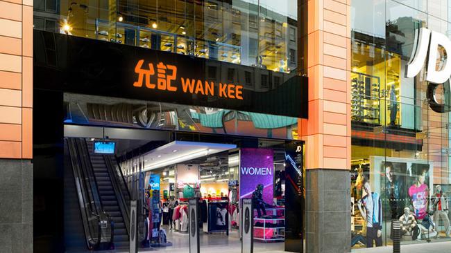
WAN KEE BRAND BOOK


The brand book sets out Wan Kee's essential brand elements and provides guidance to ensure the highest standards are maintained and maintained wherever the brand is expressed. The brand manual applies not only to internal staff, marketing or PR departments, but to everyone at Wan Kee and its partners. Every Wan Kee employee is responsible for conveying the values and attributes of our brand and committing to provide our customers with the highest quality and innovative service and experience.
There are a few points to note: When implementing a branding system, be sure to use official reproduction materials such as the digital artwork templates provided by Wan Kee Marketing and Publishing.
2.3
2.5
2.6
3.1
3.2

In 1970, the first Wan Kee tennis shop opened in Wanchai. In 1976, the first sporting goods retail store opened in Mong Kok.
In the 2000s, Wan Kee expanded its business to Hong Kong and developed into a sports retail enterprise mainly engaged in sports shoes, clothing, rackets and sports accessories. While actively exploring brand diversification, Wan Kee has also established cooperation with international sports brands to develop a franchise network.
Hong Kong is a place full of energy 24 hours a day. Wan Kee provides top-notch services for sports-related retail experiences, catering to the lifestyles of today's urbanites with attractive products.
This is the most important and dynamic point of our mission. Wan Kee provides a diversified, contrasting and diverse unique shopping experience, provides a pleasant shopping environment, and always brings informative, original and diverse products for customers to choose from.
Visiting any Wan Kee store is always unique and refreshing: from the sight, the smell, to the sound - it's a simple part of your lifestyle.
There are many reasons why Wan Kee needs to rebrand. include:

1.
Outdated image: If a company's brand appears outdated or out of touch with current trends and customer preferences, rebranding can help modernize its image and make them more relevant to its target audience.
2.
Changing Target Audience: As a company's target audience develops or expands, rebranding can help them appeal to new or different demographics.
3.
Diversification: If companies expand into new product lines or services, they may need to rebrand to communicate these changes to customers and stakeholders.
Overall, rebranding can help a company stay relevant, communicate changes or updates to audiences, and create a stronger brand identity that supports business goals.


PRIMARY LOGO
The brand logo is an important part of Wan Kee to express the core of the brand. It embodies our unique take on our brand beliefs. The main goal of the brand program is to protect and enhance our valuable assets. Everything that bears our logo must be evaluated for its contribution to the brand. Our brand mark is a unique logo design that spells out our name clearly and concisely.
SECONDARY LOGO
Where the primary logo above may be inappropriate or invalid, the secondary logo may be in a horizontal version. It can also use different layouts to better suit the environment in which it is used.

The three colors on the right are important elements in Wan Kee's brand system. In addition, Wan Kee brand colors consist of a set of color palettes: Logo Colour and supporting Color.
The logo color scheme is also set to a single color only. The Yun Kee logo should be the opposite of orange when you apply it on a black or dark background. When you apply to a white or light background, the logo should be black.
Imagery should carefully select relevant elements of movement and place them in a way that enhances the overall impact of the logo rather than distracting from it.


The space for the Wan Kee logo is protected by a minimum area of clear space to prevent its visual impact from being compromised. Space is also expressed in X-height.
For reasons of legibility, the Wan Kee logo should never be reproduced at a size with a W-height of less than 20mm.
The core element of the logo crossover system is the logo root “| Wan Kee“. This system root works as a crossover that add at the left the partnership logo or product name.
Partnership Brand Logo or Product Name / series acceptable area Wan Kee logo with partnership logoIn order to build brand awareness, the Wan Kee logo must be used correctly by anyone. Do not alter or reposition any element of the brand logo in any way. The examples shown here illustrate some common misuses that must be avoided when implementing tokens.

Do not adjust logo colour without enough contrastshape

Do not change the logo color without “Magi” color system


Do not place the logo on complicated photographic image or pattern


Do not obscure the logo Do not add any box
The is a sports retail enterprise in Hong Kong mainly engaged in sports footwear, apparel, racket and sports accessories. While we actively explored and brought diversity of brands to our multi-brand stores, we established cooperation with international sports brands to develop franchise networks.


Do not use the logo as part of the sentence.
XDo not create logo lock-up other than stated in this book
Do not miss any elements in logo lock-up.
Do not overlapping logo lock-up.
ENGLISH
Futura is a primary typeface that can be used for anything. All approved Wan Kee fonts are illustrated with illustrations for reference.
Medium Wear Your Passion Light Wear Your Passion
Medium Italic Wear Your Passion
Bold Wear Your Passion
EXAMPLE
Wear Your Passion
Display typeface
Content typeface
“華康粗黑體” is the chinese typeface and is used for display. For reference, .
Also,“華康細黑體” is the chinese typeface and is used for contents. For reference, .
允記集團是香港一家歷史悠久的運動 用品零售企業,主要從事運動鞋類、 服飾、球拍和運動配套用品的供應和 零售業務。集團至今已擁有超過45年 行業經驗,與多個運動品牌和供應商 保持長期緊密的合作關係,是香港體 育用品行業的翹楚之一,深得合作夥 伴和客戶信賴。
“MAGI” SYSTEM are significant color elements within the Wan Kee branding system. Moreover, anyone's proper use of colors is crucial to the integrity of the brand's expression.
Wan Kee brand color comprises a set of palettes: Logo colour and Supporting color. Orange is the color of passion and vibrancy, coupled with black which stands for excellence and smart. white color are selected for Supporting Graphic version for different background.


Wan Kee's style is dominated by imagery, with clear and direct themes, giving Wan Kee brand power and emotion, even light tones or day tones with orange elements.
For sports, scenes of persons with various activities should always be a core focus in sports grounds such as stadiums, and running track Imagery.


Capturing faces with serious and happy expressions that yearn for Honours, the tone of these portraits should always be lively, vibrant and energetic.
Sports activities: The main focus on the image should be human or objects in competition or successful result


Night style: Any application with photo can use the night style with orange object for a smart and passion feeling
Day light style: Use the day light style that reflects the clean and soft feeling at the image
The stroke design above symbolizes our passion and foresight, integrating into the customers cherished by Wan Kee. Wan Kee's vision can be reflected in the forward-looking stroke design.
Also, the above 4 objects can be combined into unique patterns, available in different color versions for black and white backgrounds.
A. B. C. D. WAN KEE “MAGI” COLOR SYSTEM WAN KEE ORANGE PANTONE 1585C CMYK 10 70 75 0 R236 G109 B60 #EC6D3C WAN KEE BLACK PANTONE BLACK C K100 R0 G0 B0 #000000ORANGE WITH DARK BACKGROUND
ORANGE WITH WHITE BACKGROUND
Supporting patterns are applied with two color set which reflects even black or white backgrounds. In addition, the pattern is an extremely long sporting track of horizontal strokes that are full of speed and power.

The supporting pattern incorporates various elements of Wan Kee into the language, translating into the brand image in an iconic way. Also, the supporting pattern is the most important element after the Wan Kee logo as it provides character. Provide examples for all applications to ensure the consistency of Wan Kee's brand image. All in all, this pattern should work for almost any application.
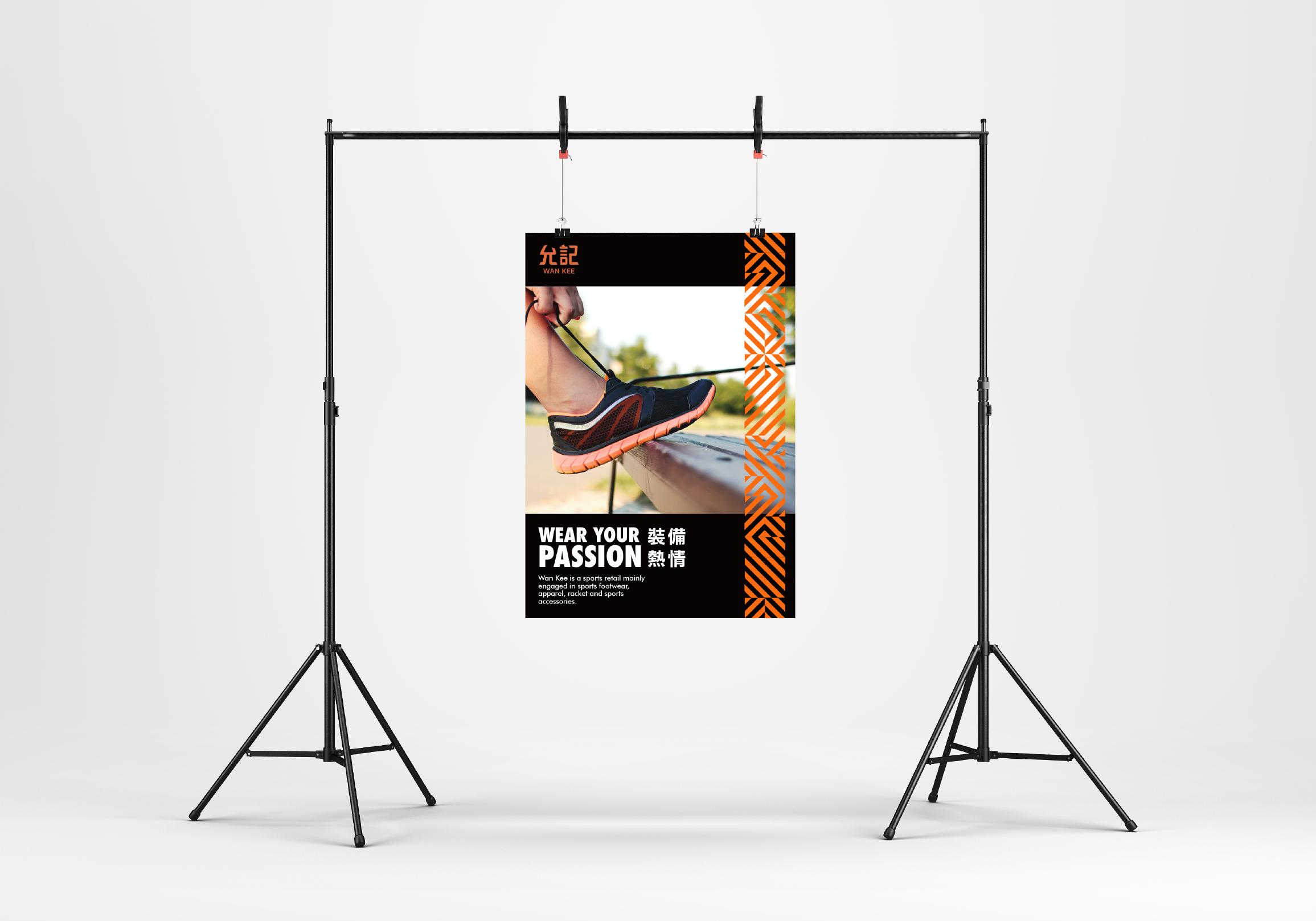
TYPE A WITH LOGO AND KEY MESSAGE
TYPE B WITH IMAGERY


#typography #color


Wristbands


Summer slippers

#logo #pattern


SHDS4502 BRANDING DESIGN
Tsang Ching Chung, Alex 20044294S