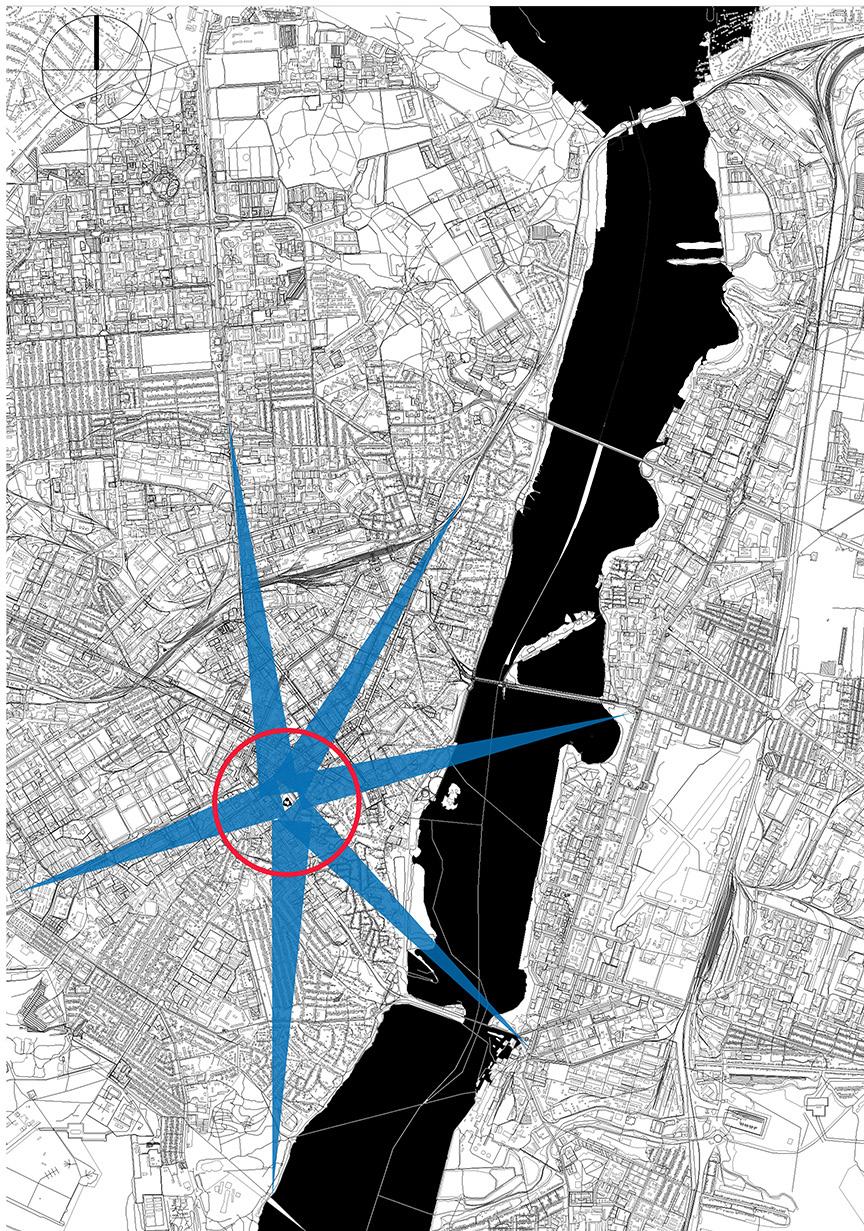
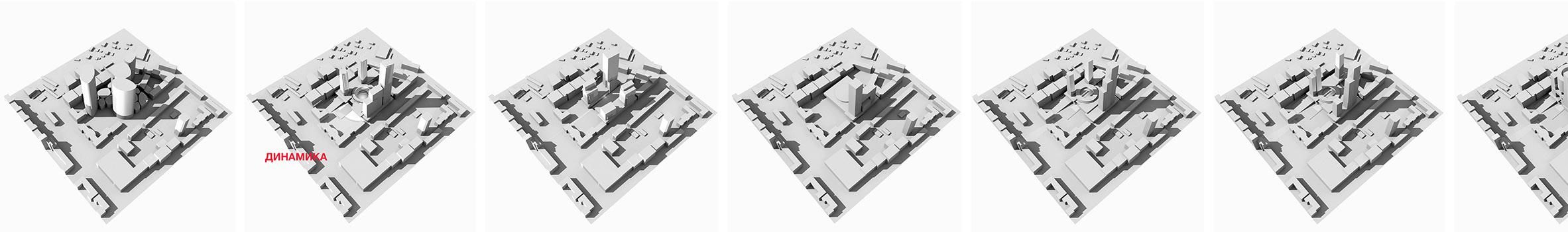
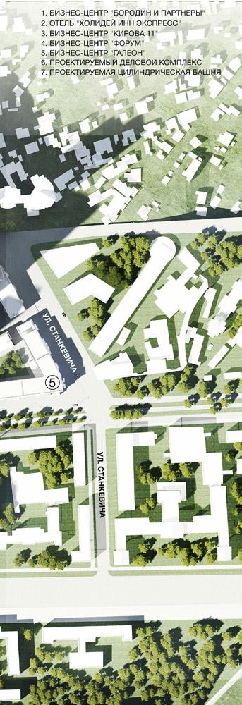
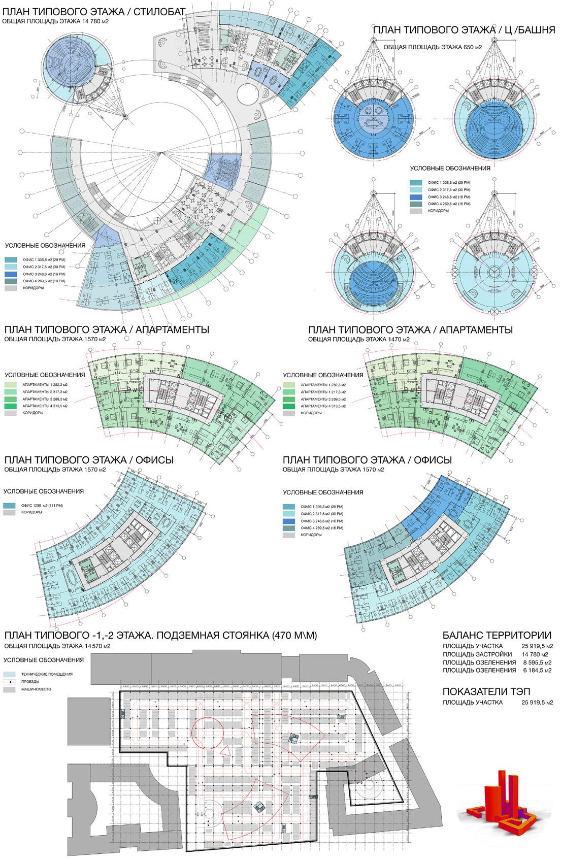
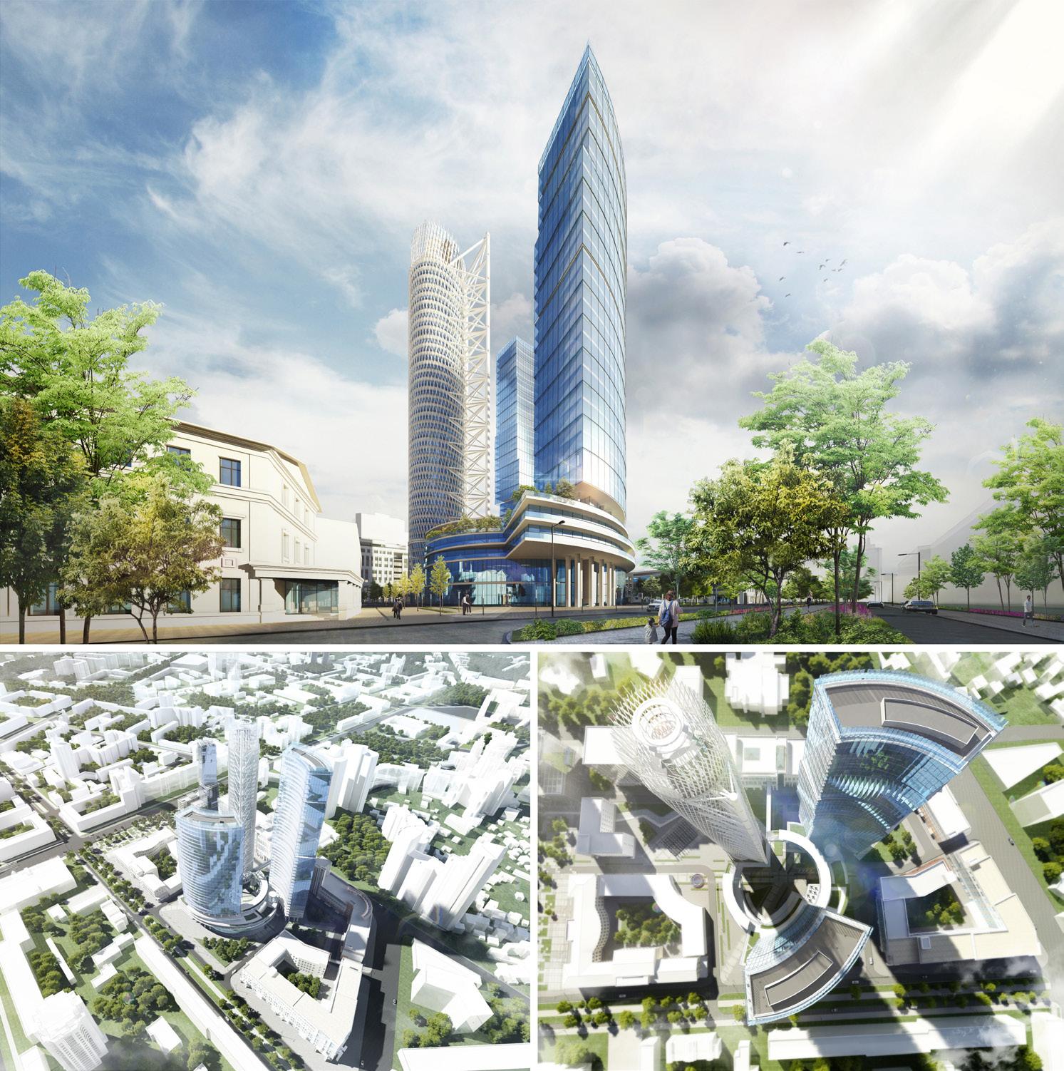
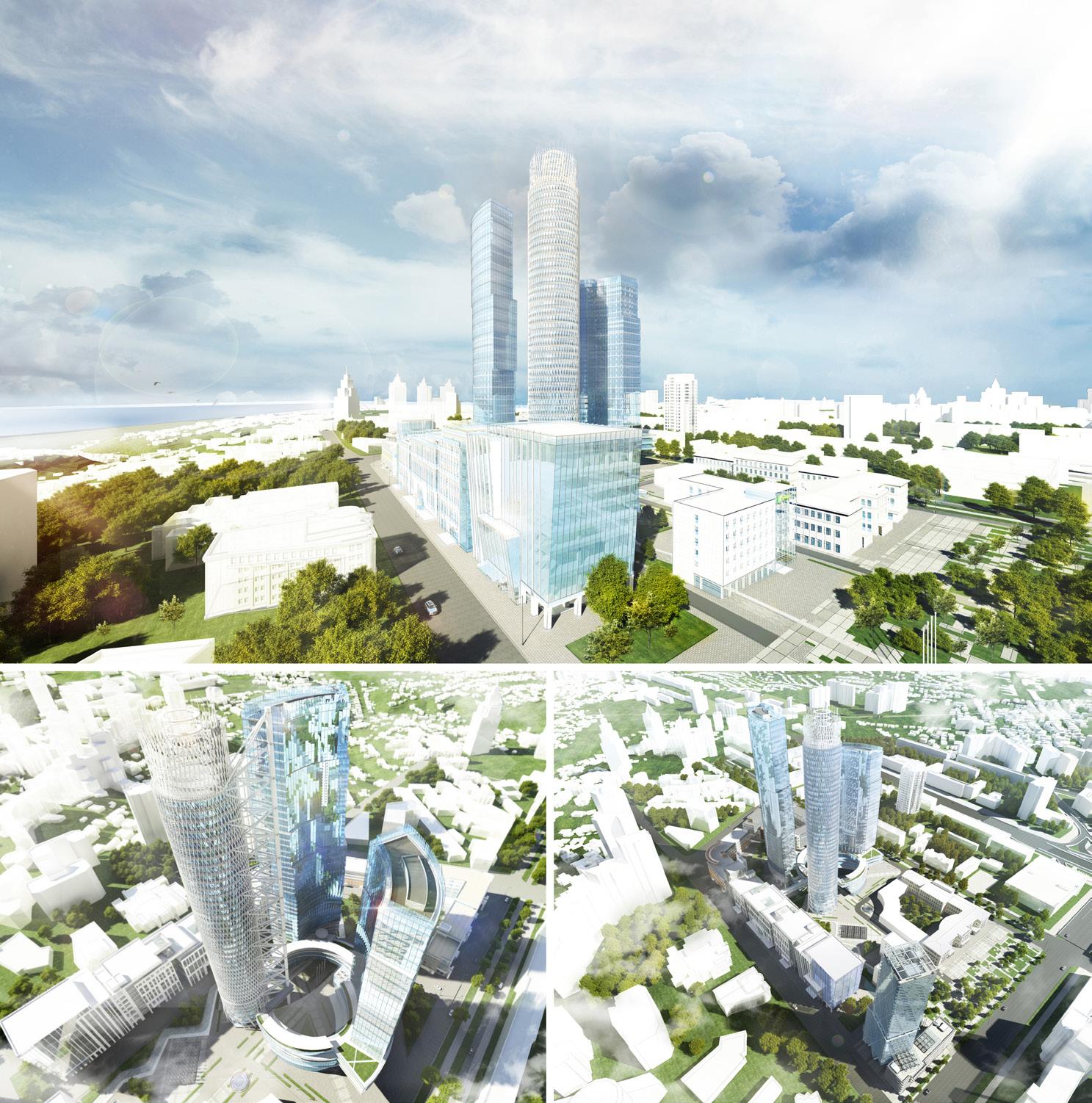
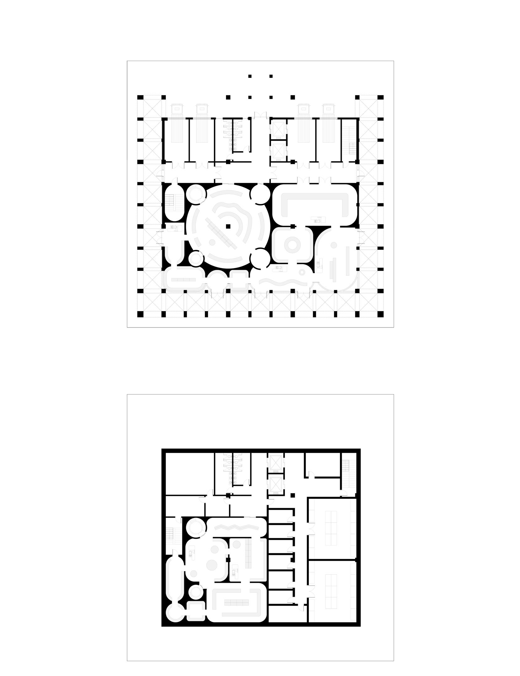
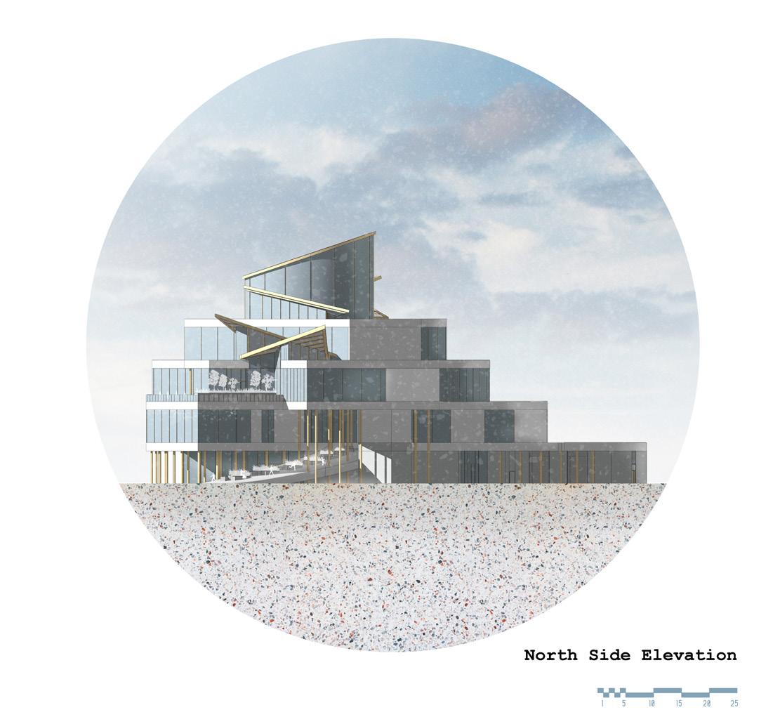
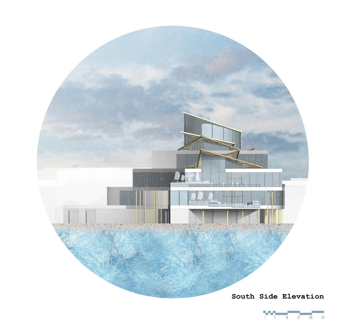
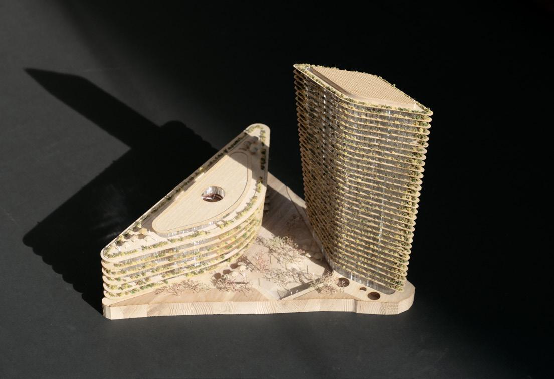
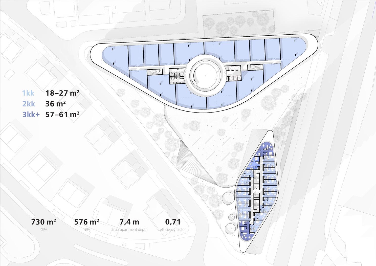
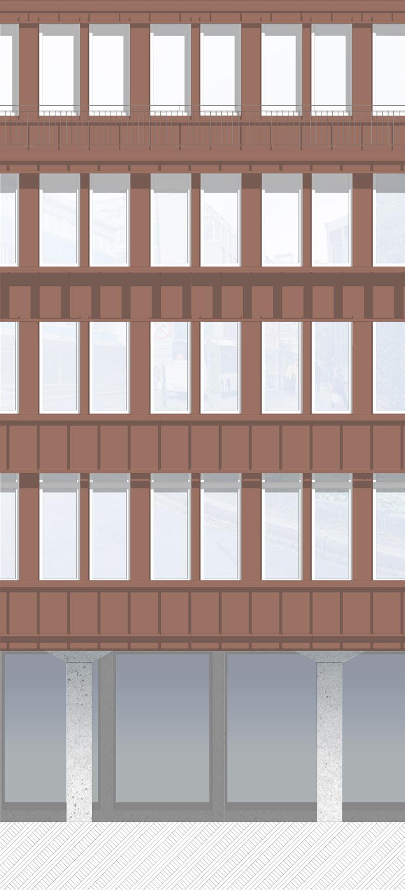
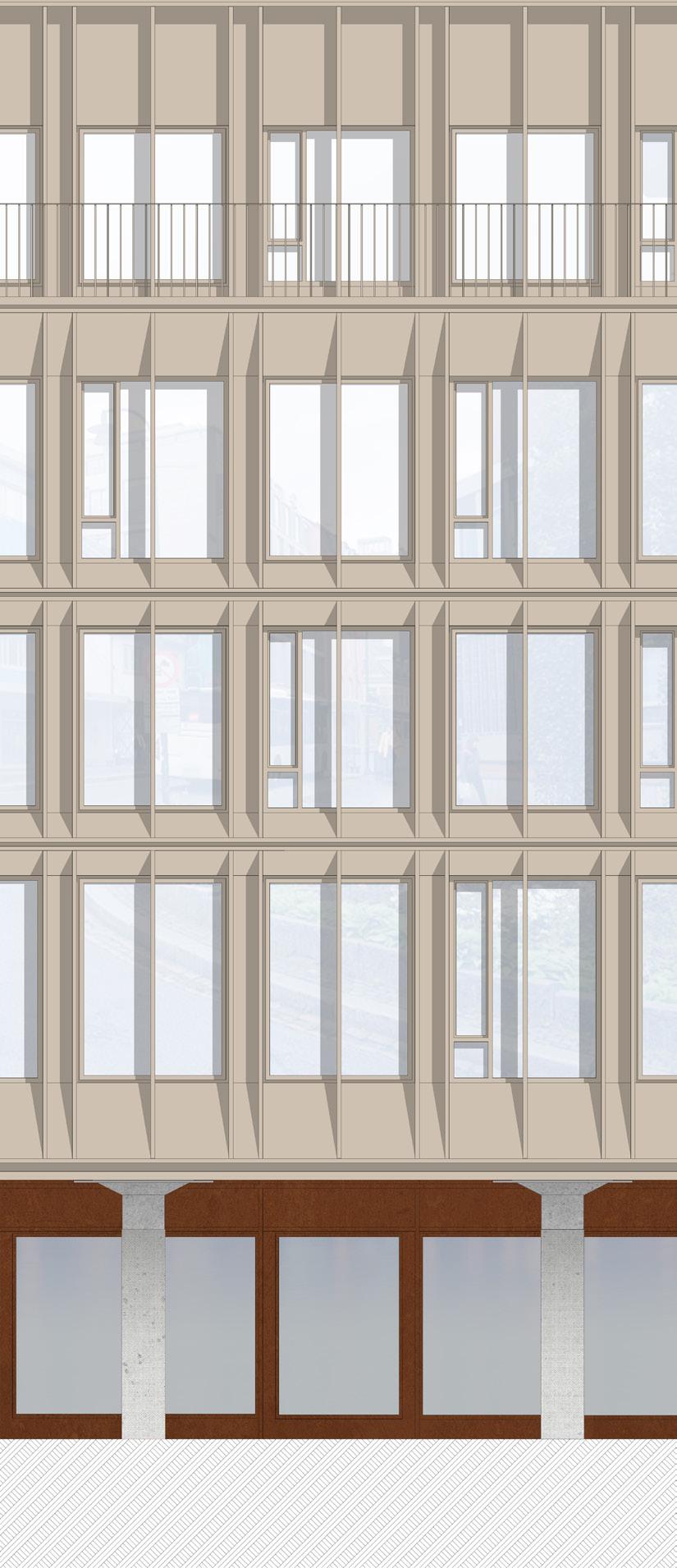
The complex is located adjacent to the city’s historic downtown area in a neighborhood that is planned to be turned into a new business center. It is a dynamic composition that consists of three towers, united by a round stylobate. The leading element in the composition is a cylindrical volume surrounded by two other similar buildings.
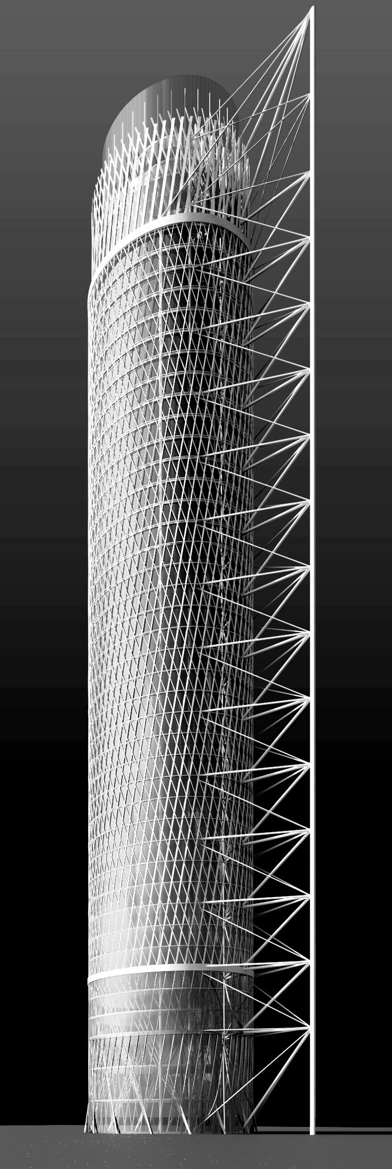
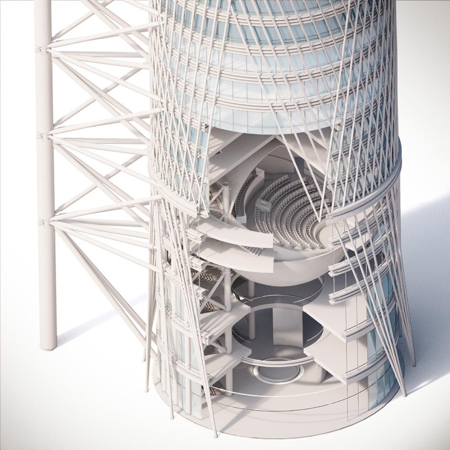
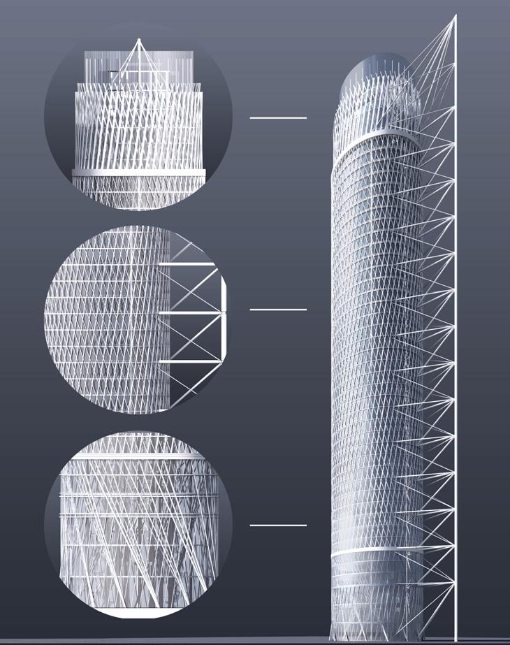
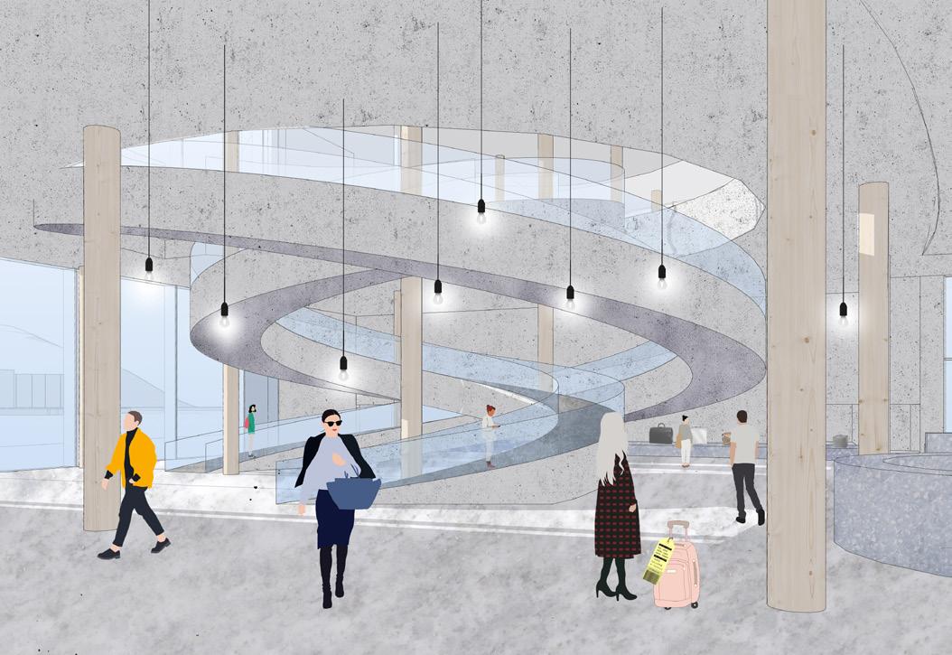
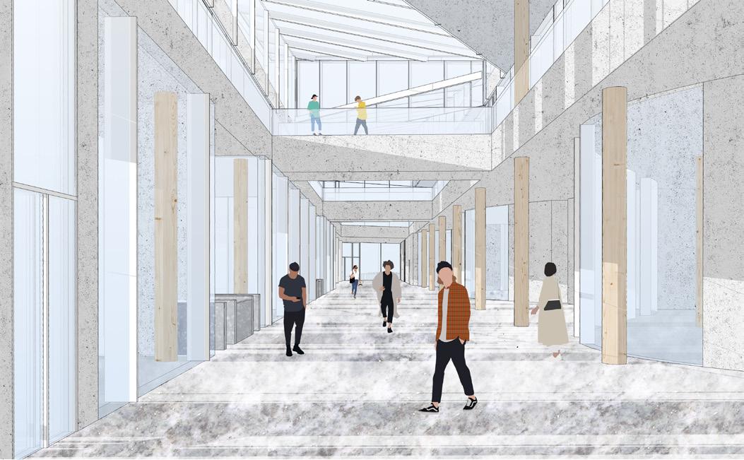
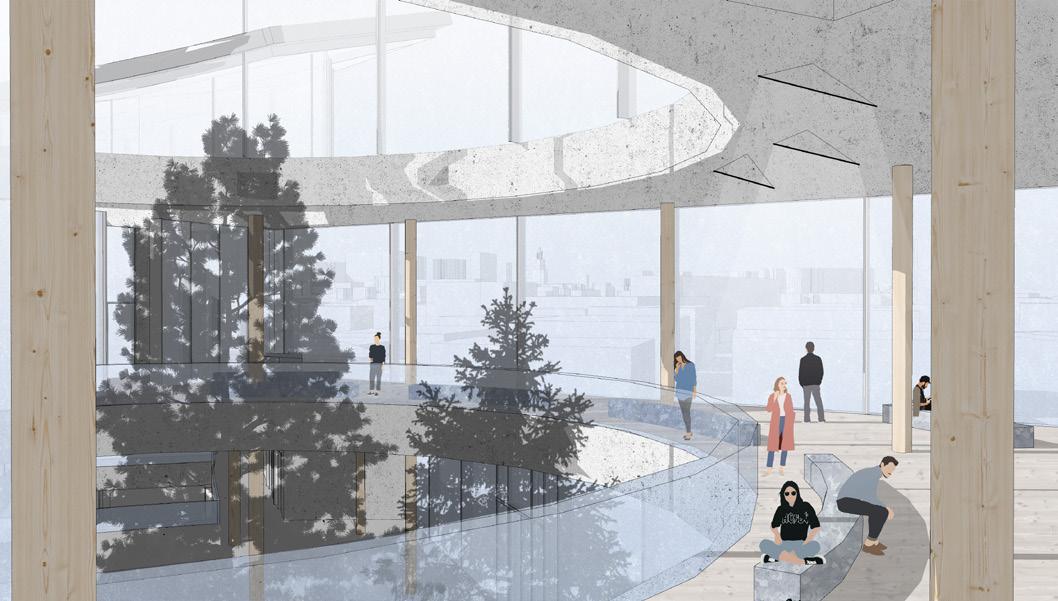
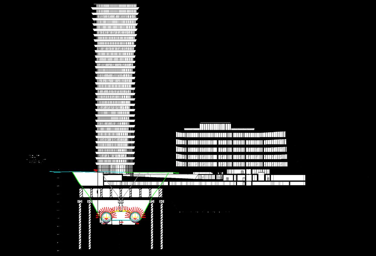
The cylindrical tower has such a shape for a reason, the main part of the supporting structure is brought outside the building. This object was conceived as an educational and entertainment center for mass use. It houses a 3D cinema, exhibition halls, digital and open libraries, spaces for commercial educational institutions, offices, and restaurants.
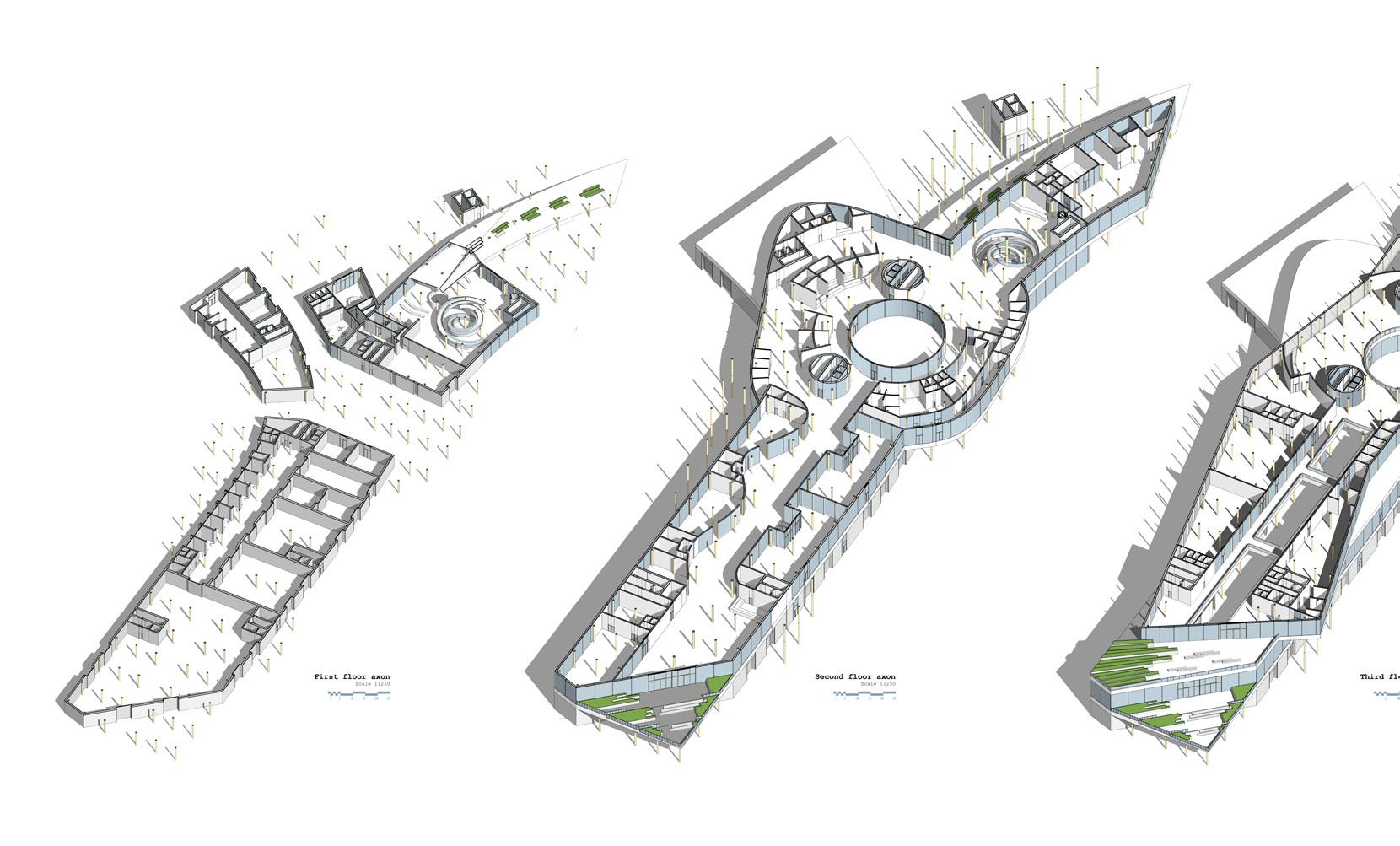
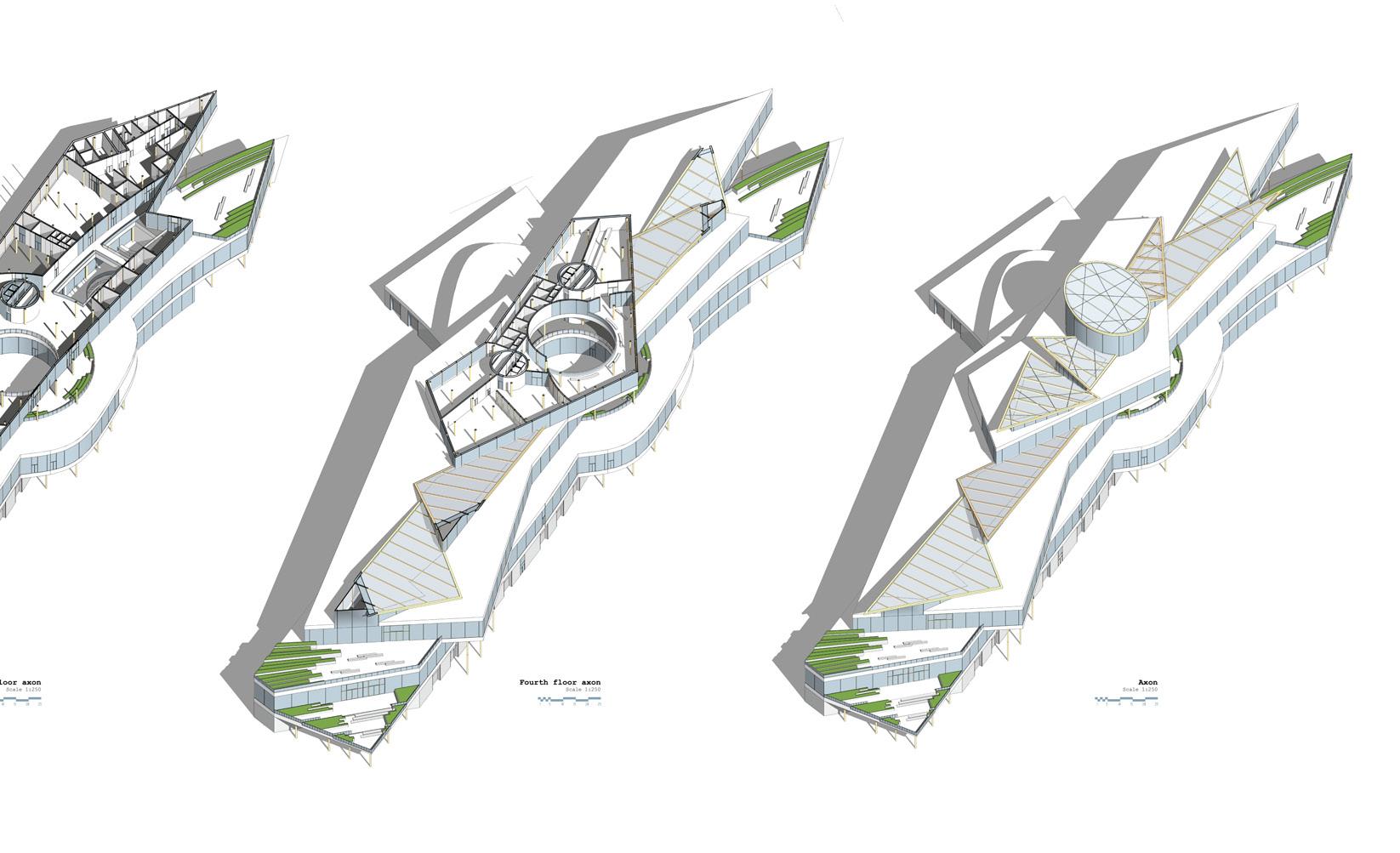
Building’s program required maximum plan flexibility that could only be achieved by the introduction of a special structural system.
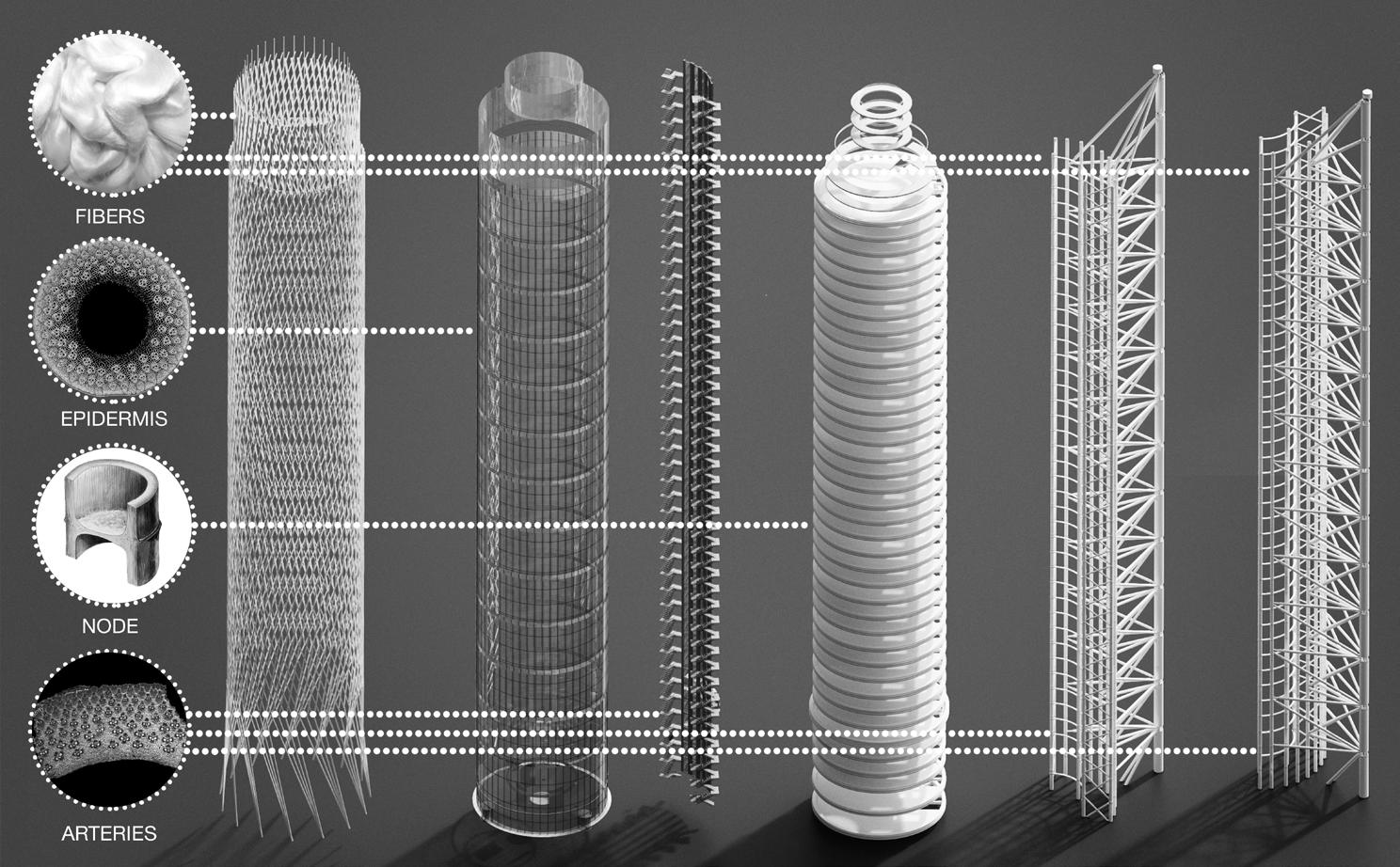
During the thesis semester, I was a student at the Algorithmic Design course at the MARCH Architecture School. The course’s topic was the use of biomimicry. I studied the properties of many living organisms in search of a necessary function - significant strength at high heights with a minimum footprint.
Main tower
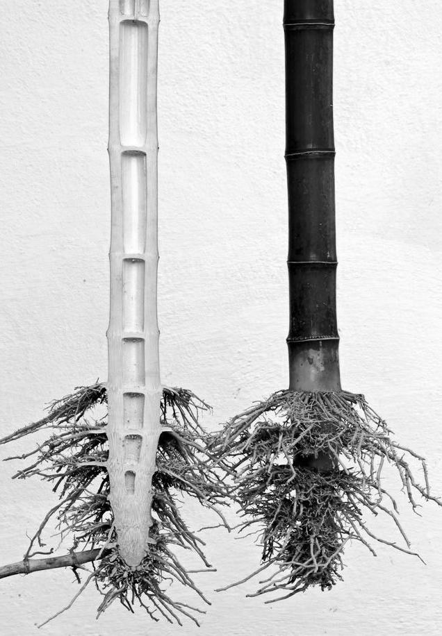
I found two natural structures with required functions: bamboo and Euplectella aspergillum (glass sponge).
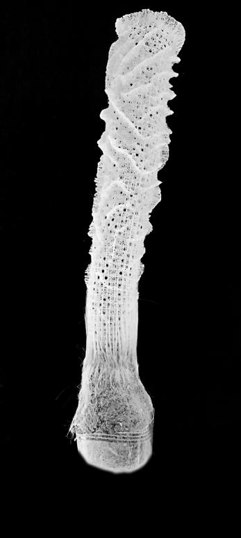
The walls of bamboo are penetrated by channels where nutrients move from bottom to top. Also, the main structural feature is the presence of fibers going from the root to the very top of the stem, they give the plant such strength and flexibility. It turns out that bamboo is a natural tensile structure with transport streams located inside the walls and empty space in-between.
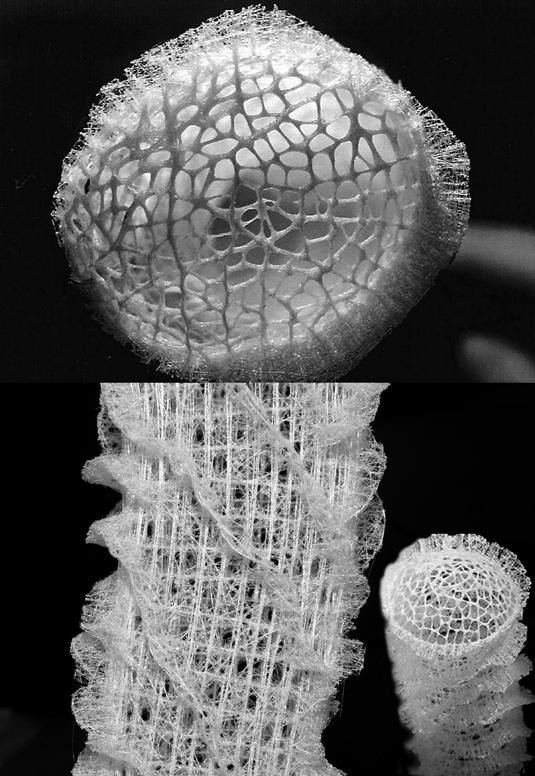
Glass sponge consists of the finest fibers that are woven together in a unique crosswise manner. During the course of the project, I found research confirming the increased strength of the sponge frame. A similar principle was used in my project in the form of cross tension cables entangling the tower.
Bamboo cutaway
Euplectella aspergillum
Tower cutaway (lobby area and 3D cinema)
Structural system
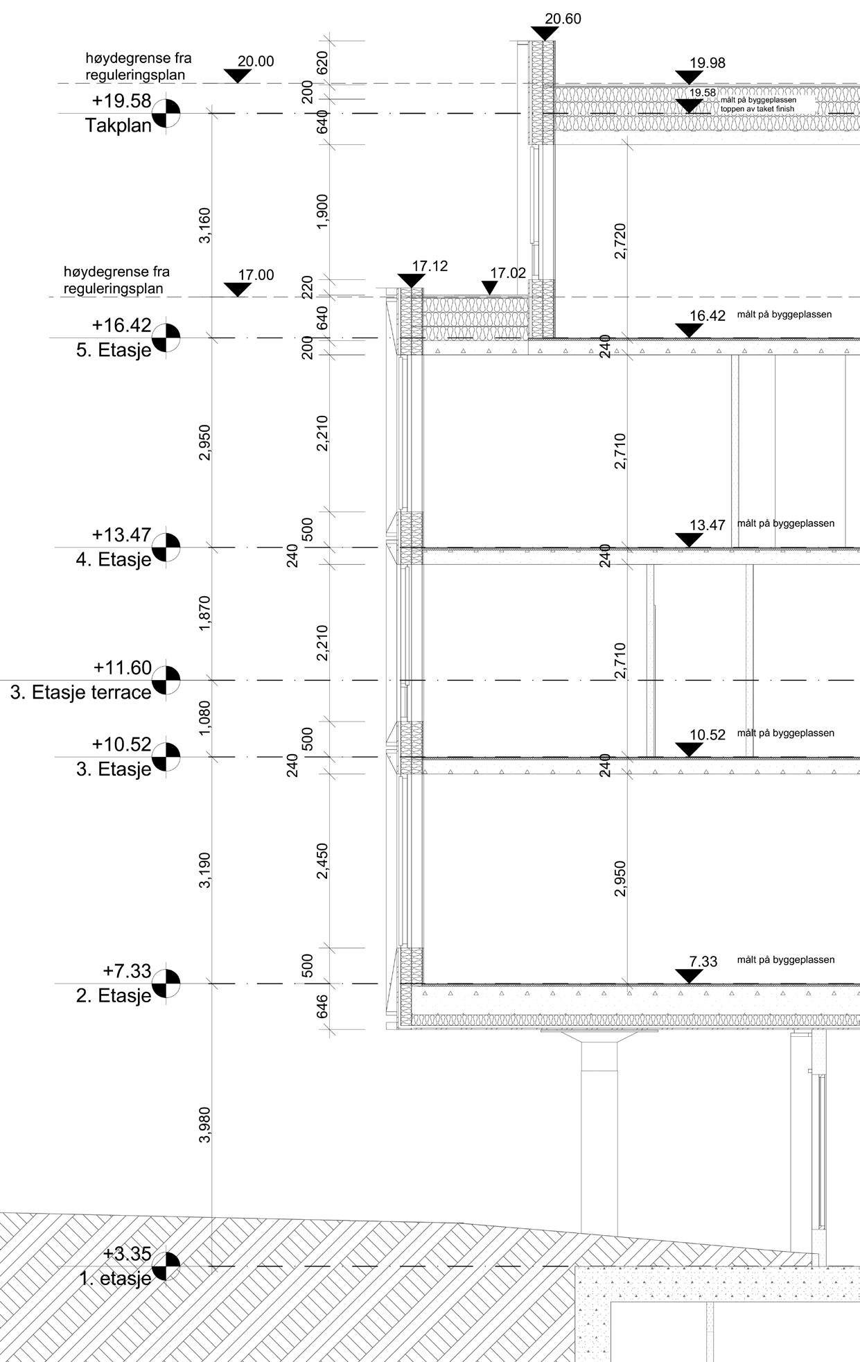
All vertical transportation (elevators, stairs) of the cylindrical tower is enclosed in the side steel segmental structure. The steel frame is balanced on one side by the external spine, on the other by floor slabs that are attached to the steel frame with elevators and stairs, and are held by the cables. This design allowed me to create free space, not fragmented by columns and other supporting elements.
CABLE SYSTEM
GLASS SKIN
CIRCULATION CORE FLOOR SLABS STEEL FRAME
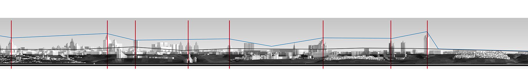
Visual perception
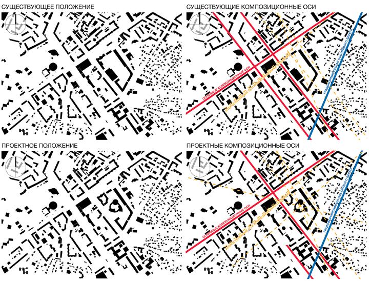
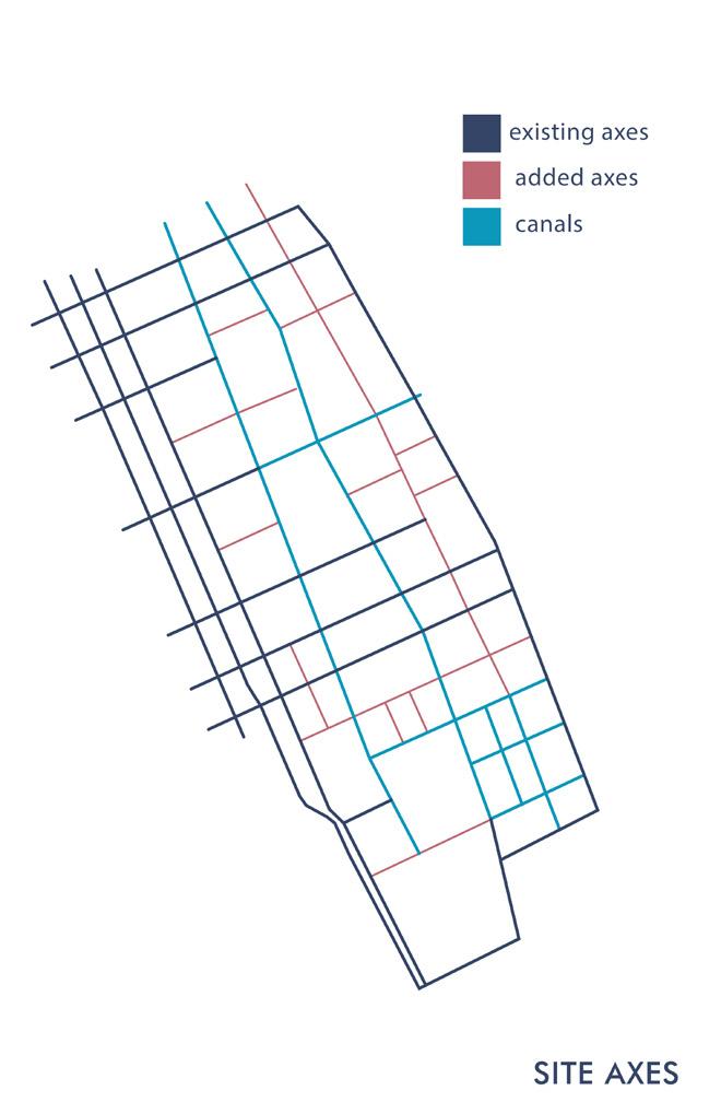
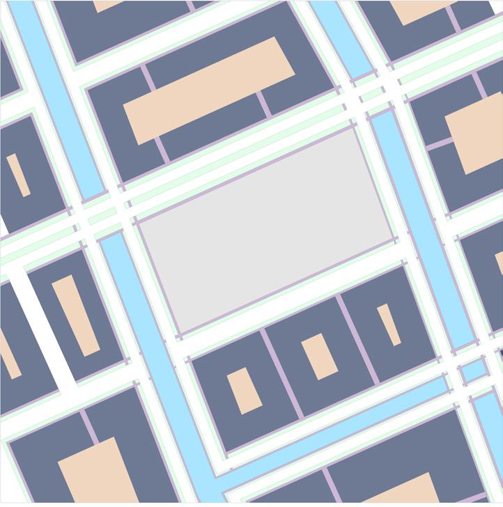
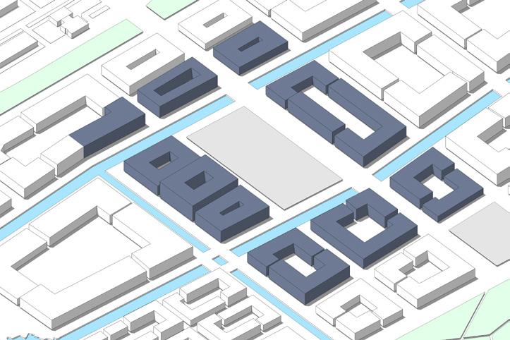
Existing vs proposed general plan, compositional axes
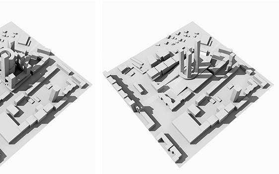
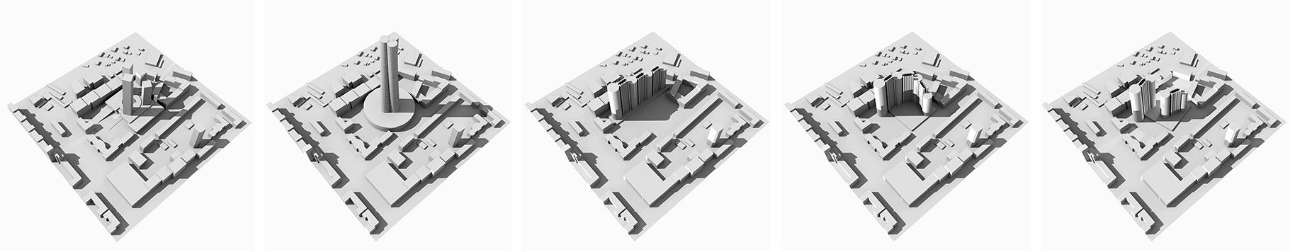
Various volumetric compositions
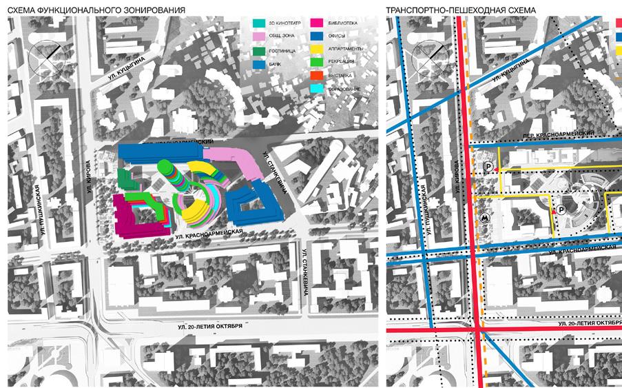
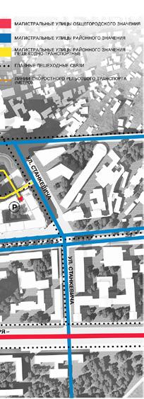
Zoning
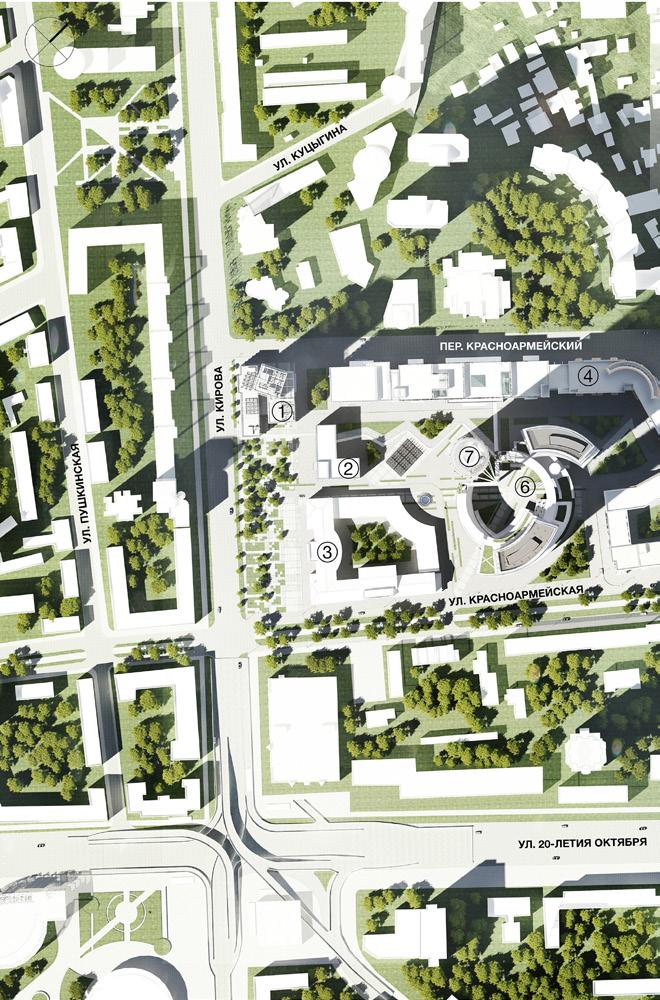
General plan Floor plans
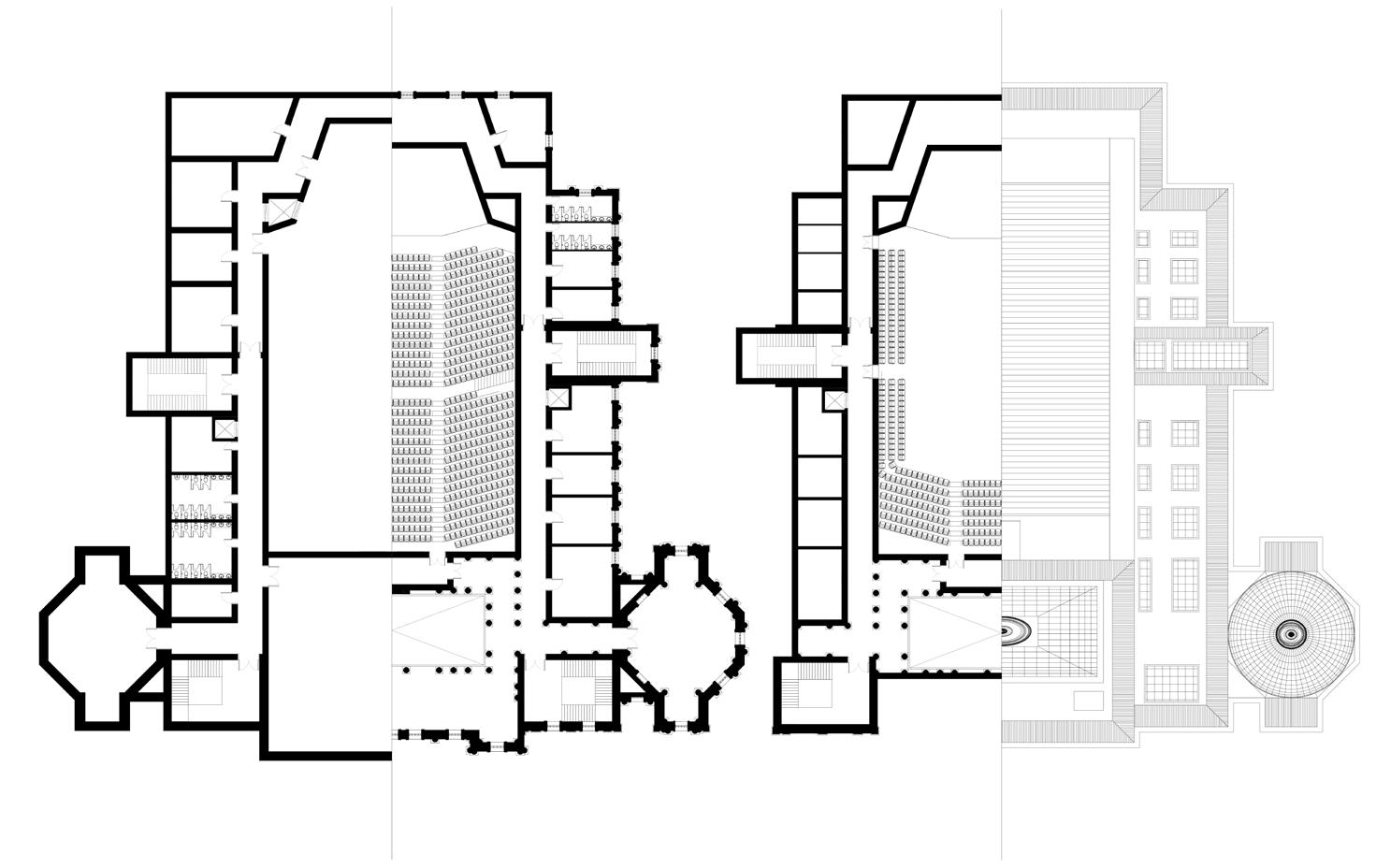
Symphony hall
University of Notre Dame
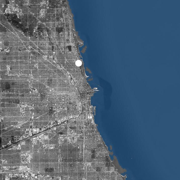
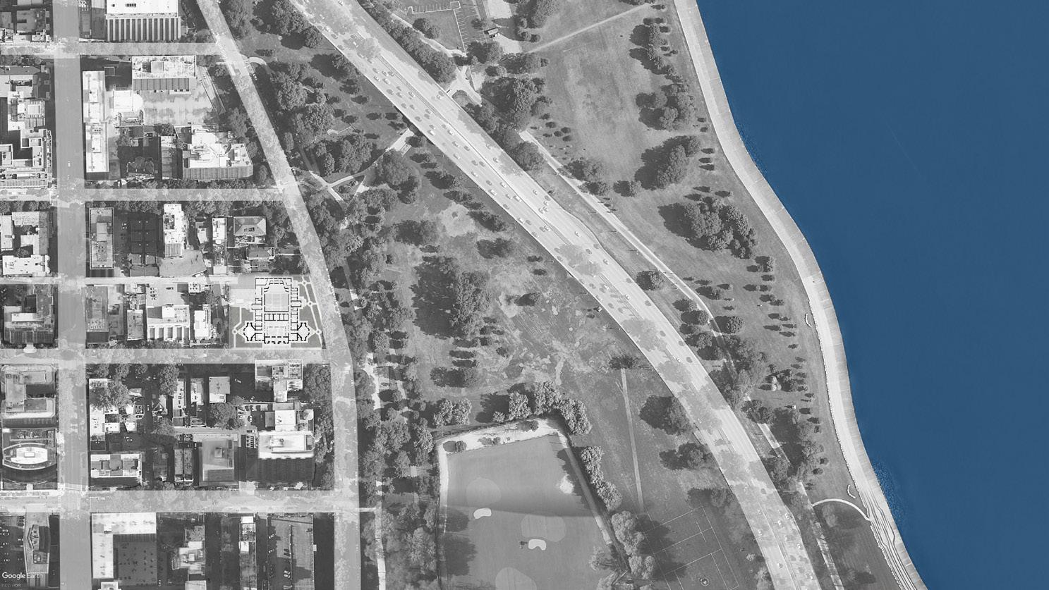
Location: Chicago, Illinois, USA
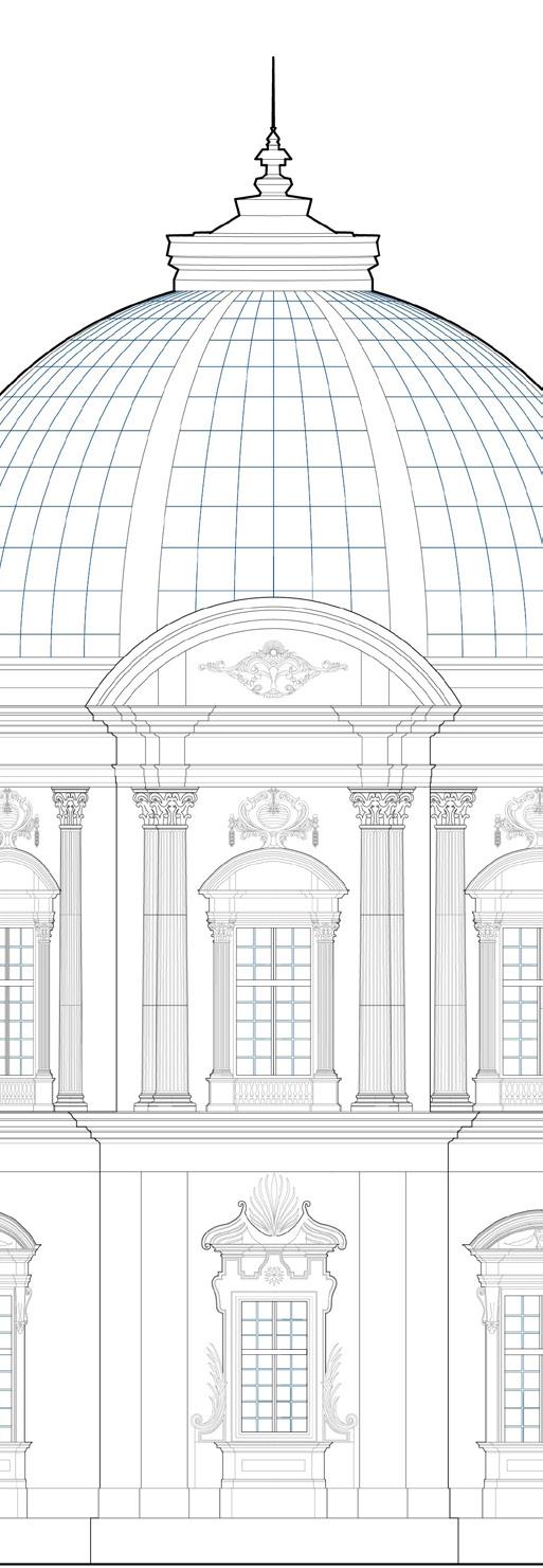
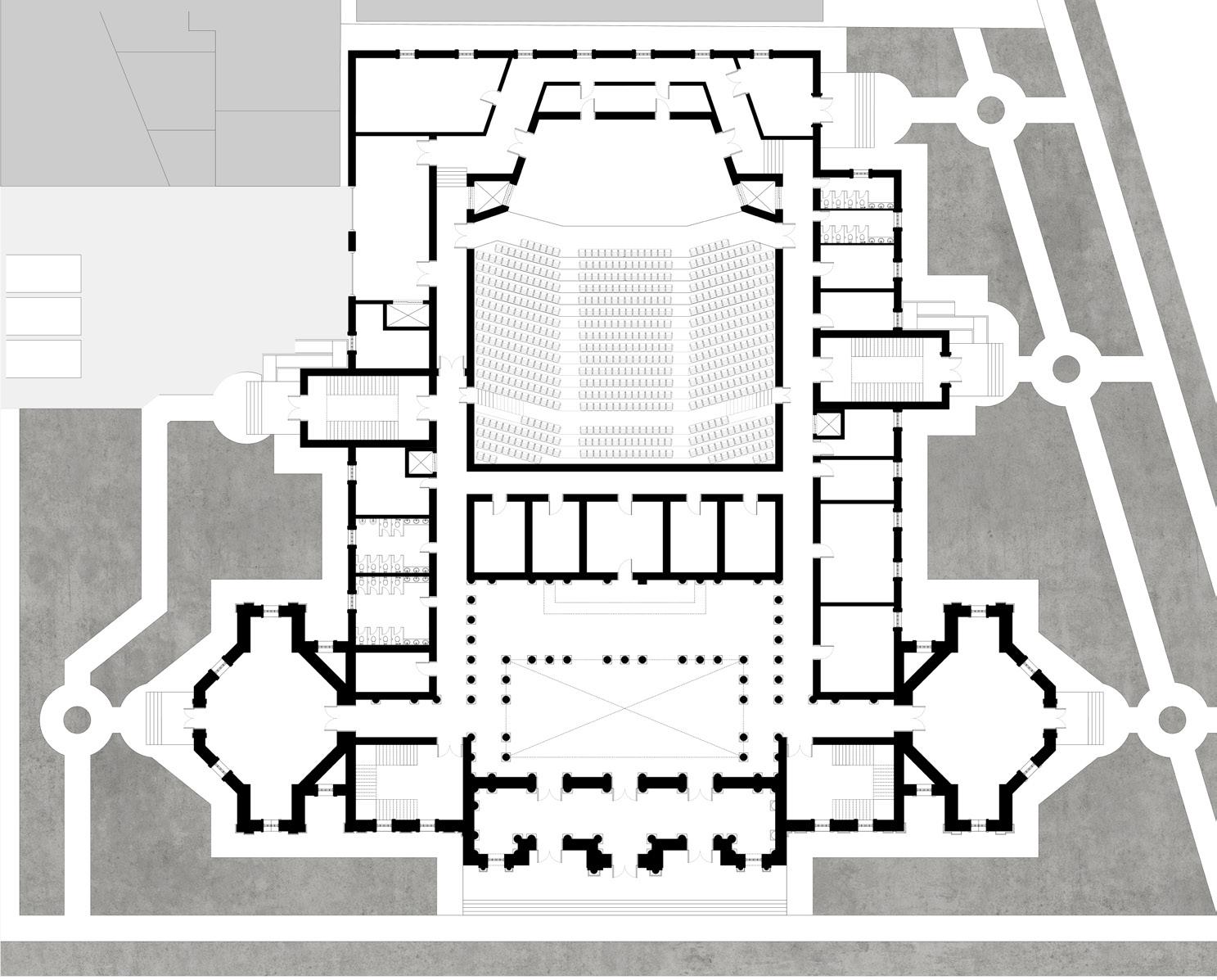
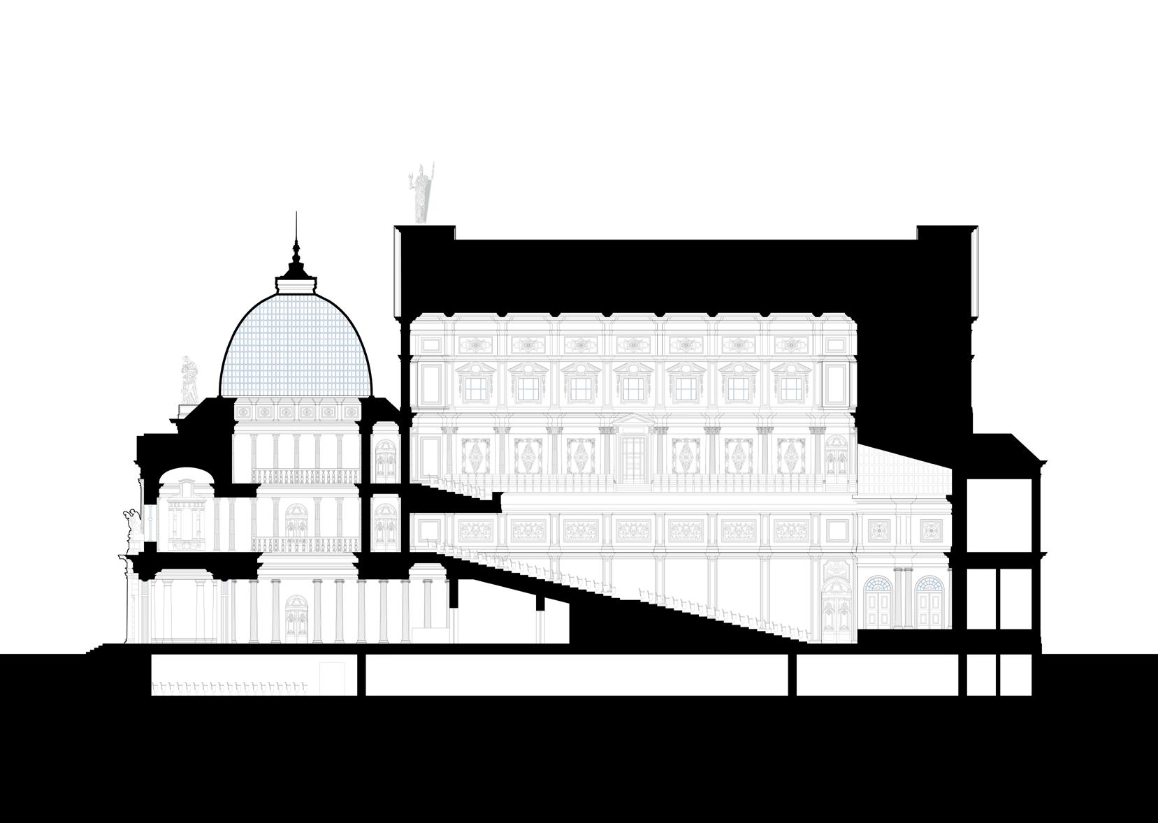
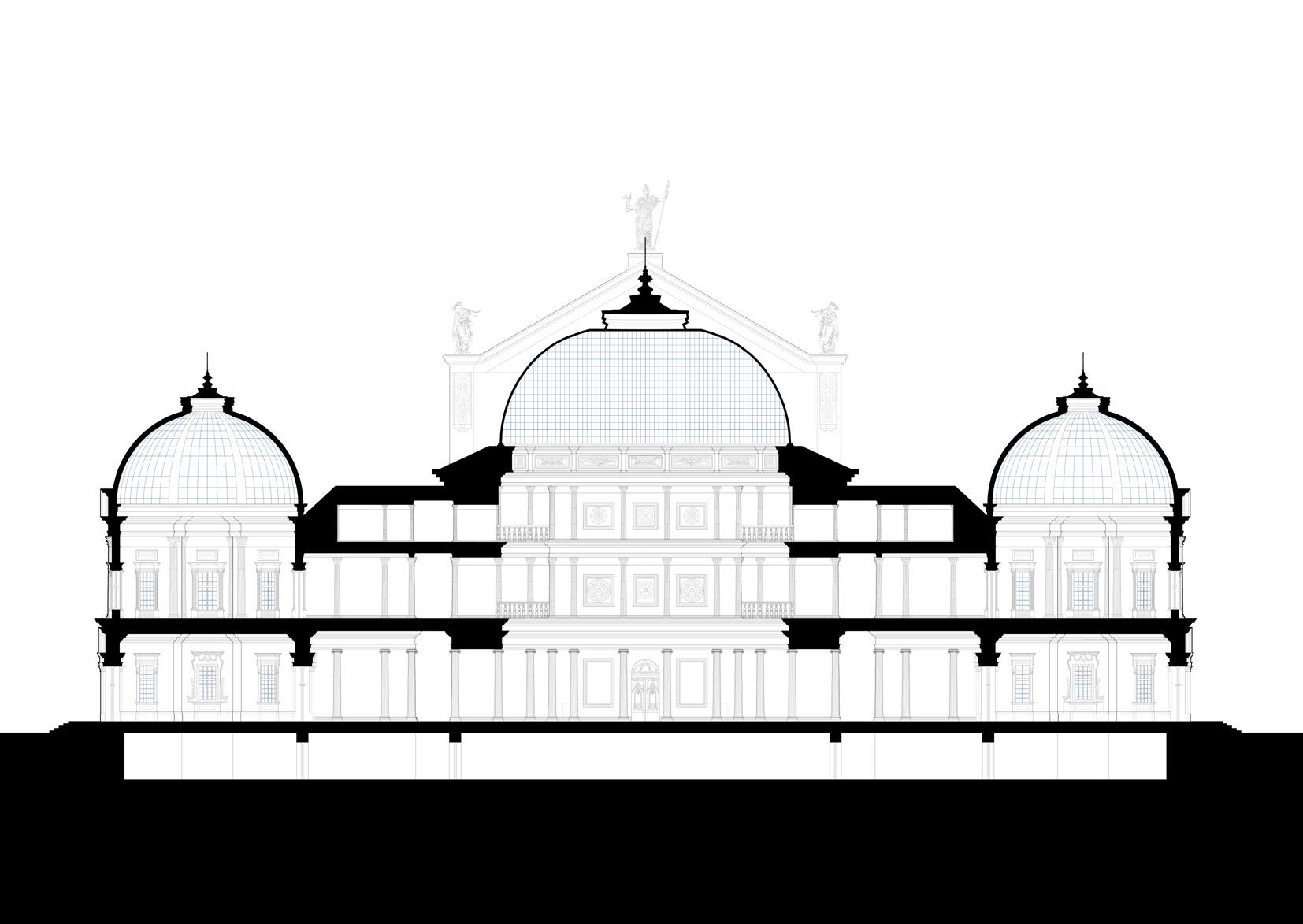
The project is located across Michigan Lake’s shore in the Lincoln Park neighborhood. It is a “shoebox” symphony hall which is considered to be the most suitable type of halls created solely for classical chamber music.
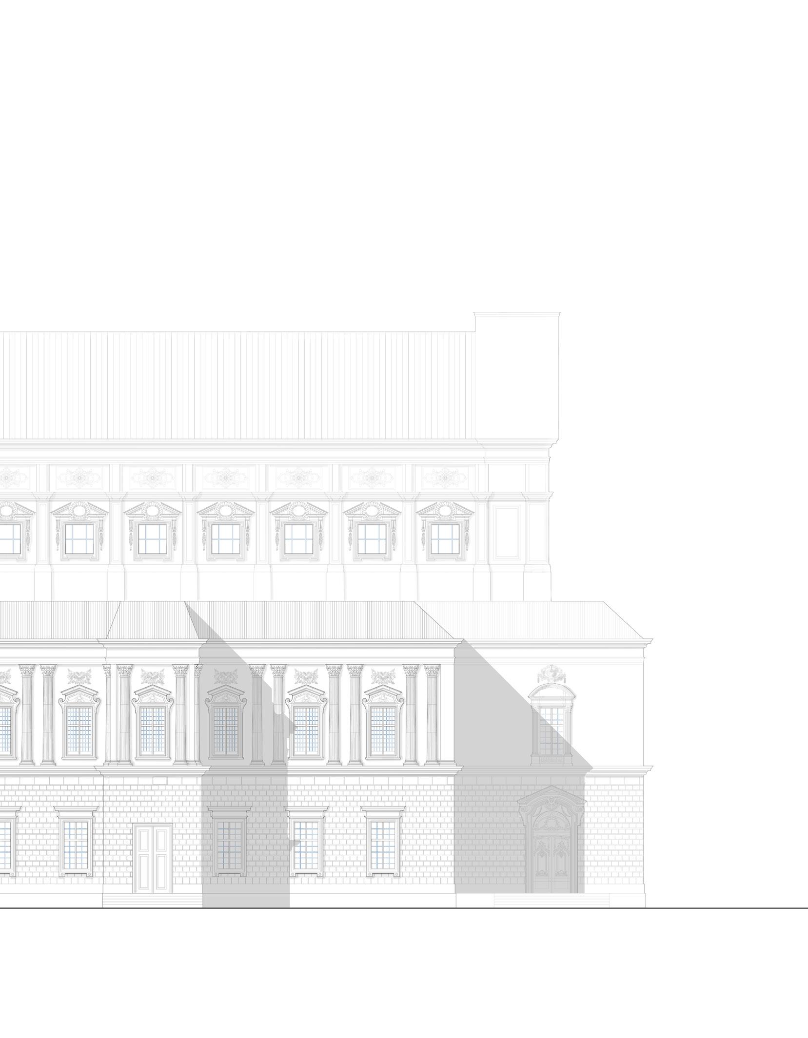
In order to better understand the shoebox type, multiple classical precedents had been analyzed at the very first stages of the project: the Musikverein in Vienna, Royal Concertgebouw in Amsterdam, and the Palais Garnier in Paris. One of the goals was to follow the main chosen example as closely as possible both in plan and volumetrically (I had chosen Palais Garnier).
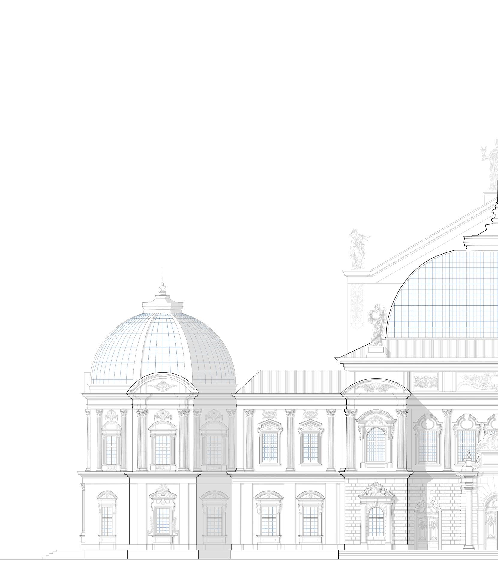
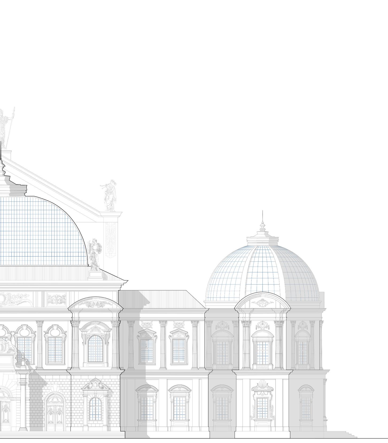
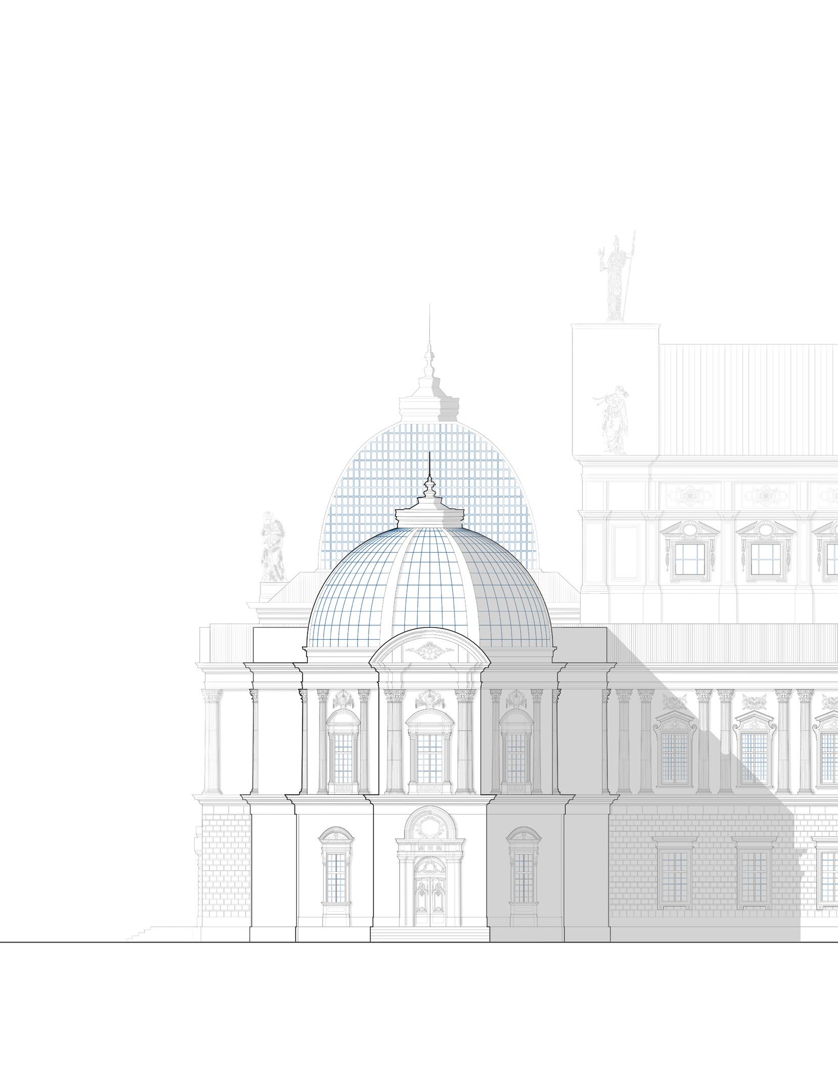
The main facade echoes the composition of the famous French building: it has three glass domes that create big atrium-like spaces inside and bring natural light to the central foyer, lakeside entrance, and a restaurant that is located in one of the flanking octagonal volumes.
The shape of the hall itself stayed rectangular as was required by the syllabus.
Three major classical orders were used in the project: Doric at the main entrance, Corinthian on the exterior of the second floor, and inside the main hall itself, Ionic in the interior of the foyer. Statues of the ancient muses decorate the main facade. Side elevation has a broader sidewalk with a narrow green area that helps to ease the traffic at the main exit after the end of a concert.
Elevation detail
Site in the context of the existing neighborhood
Site in the context of Chicago
First floor plan
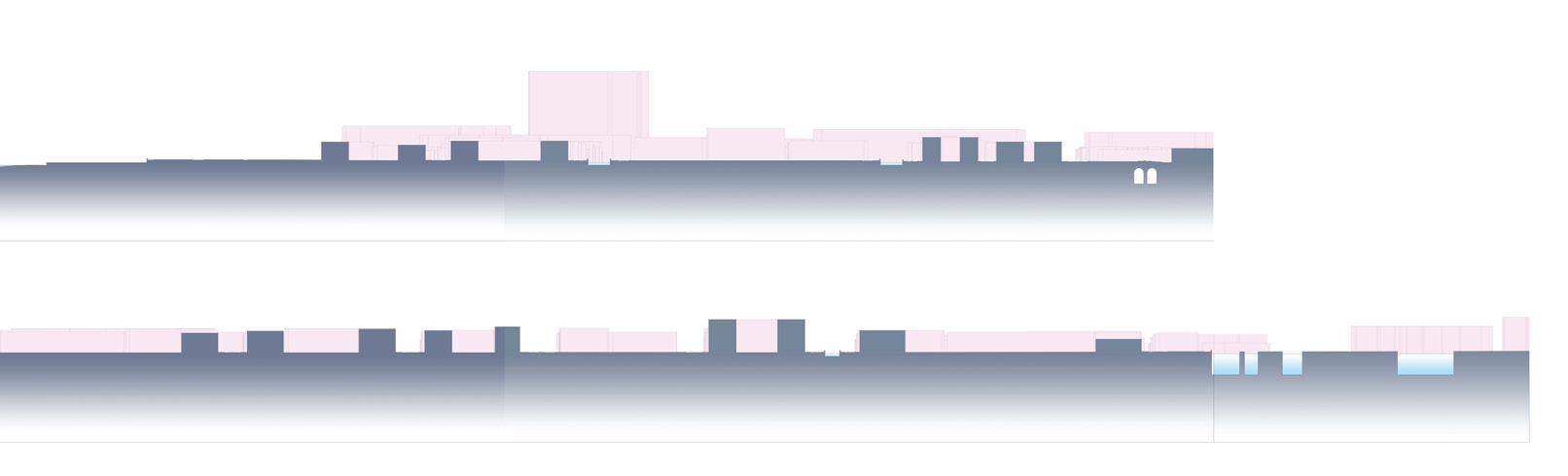
Front elevation (facing the neighborhood road)
Side elevation (facing Lake Michigan)
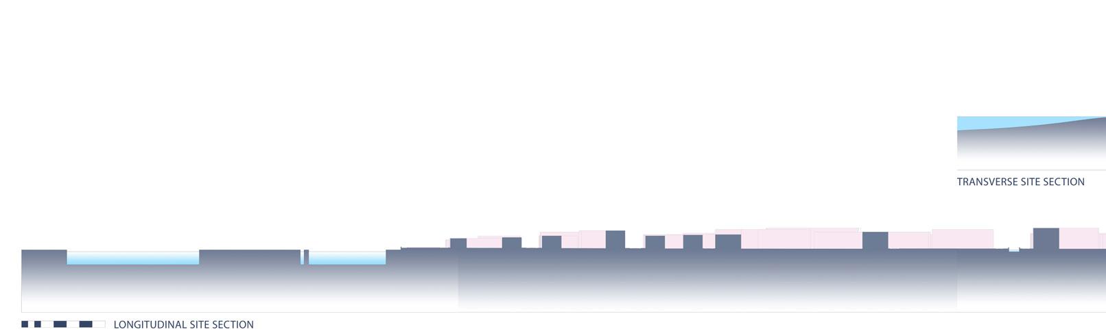
Longitudinal section
Transverse section
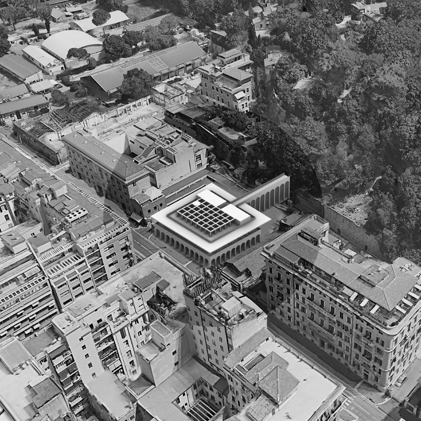
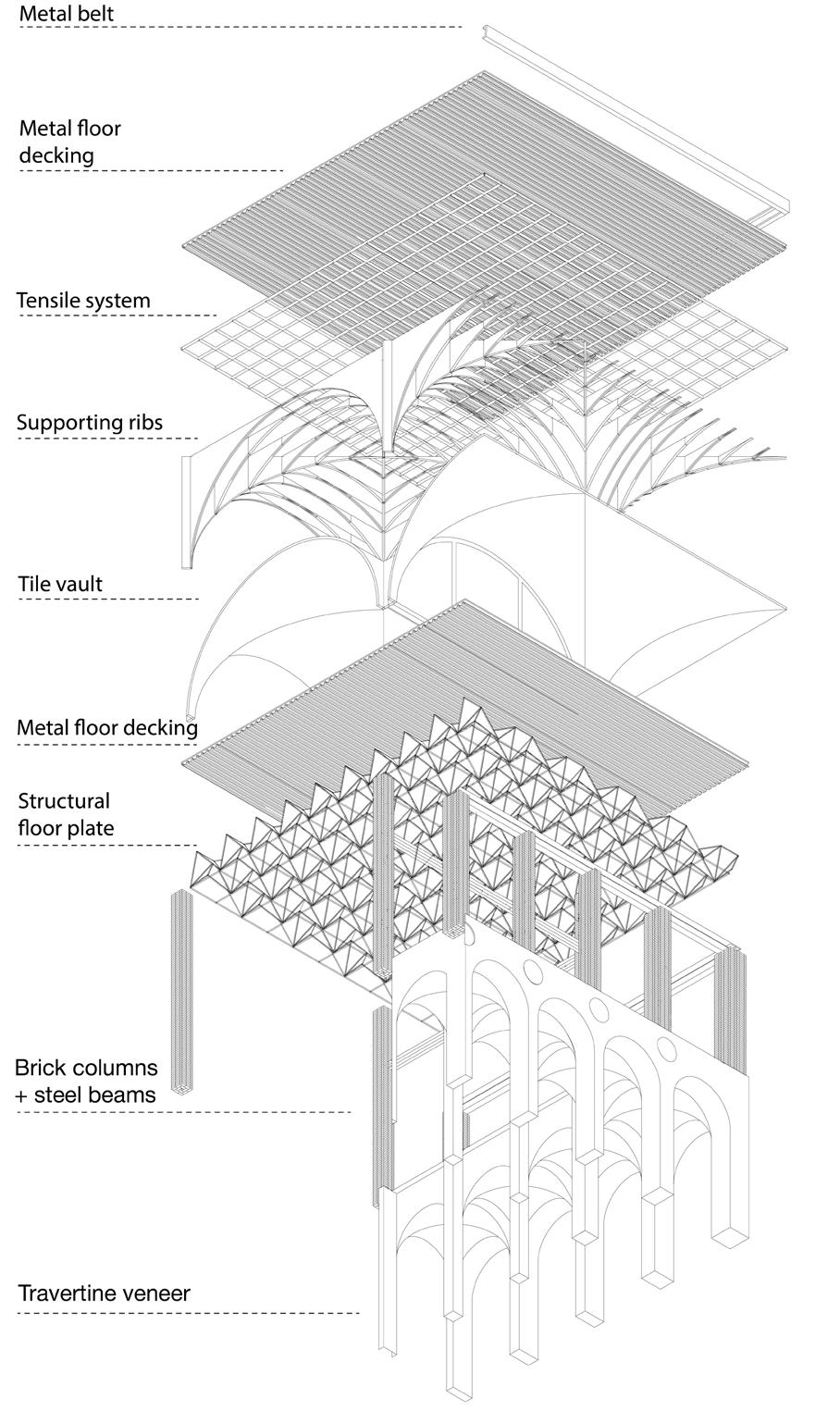
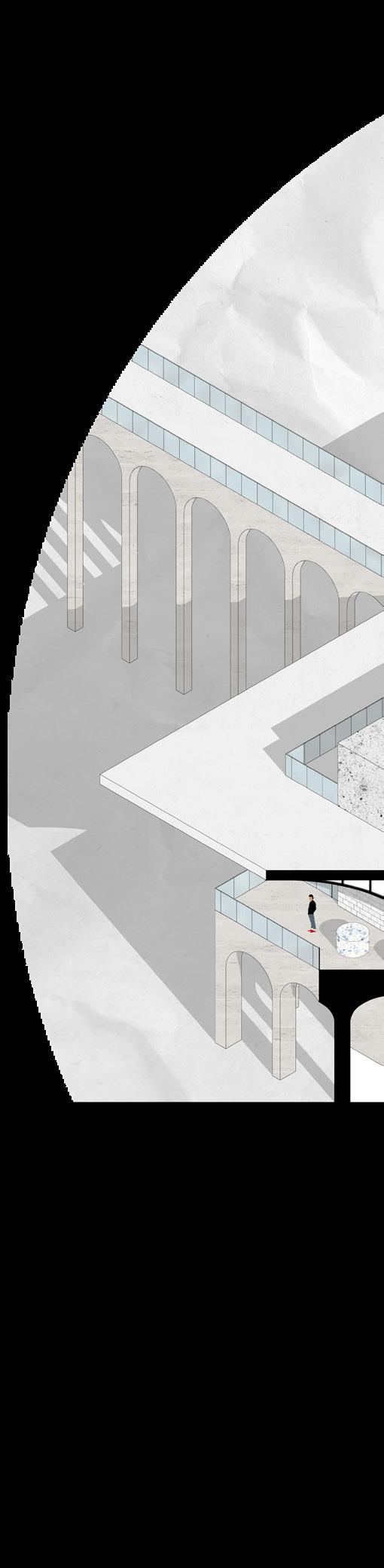
Market on Via Flaminia
University of Notre Dame
Location: Rome, Italy
The project was designed while studying abroad in Rome. The building is located in a residential area to the north of Piazza del Popolo next to the School of Architecture of the Sapienza University. It is supposed to replace the existing Mercato Rionale and connect busy Via Flaminia with residential areas on the Pincian Hill by a bridge.
Among the main precedents for the project were buildings in the EUR district. I was inspired by their simplified neoclassicism and added some contemporary minimalistic features while creating the facades of my building.
Perspective section
Via Flaminia context
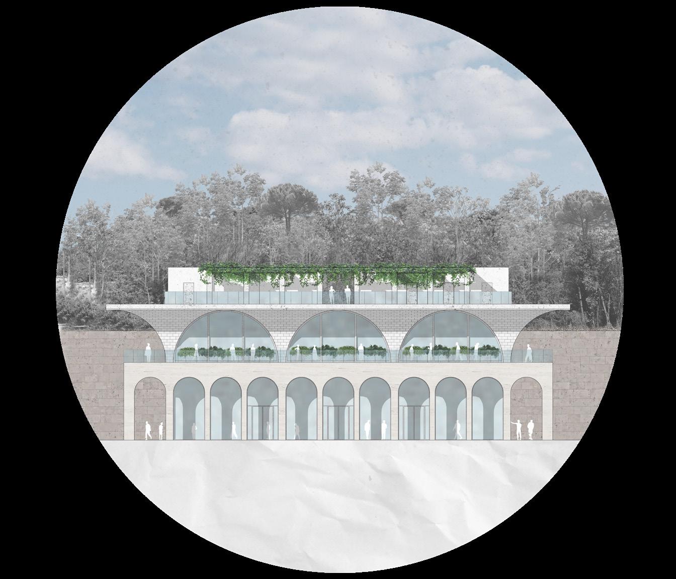
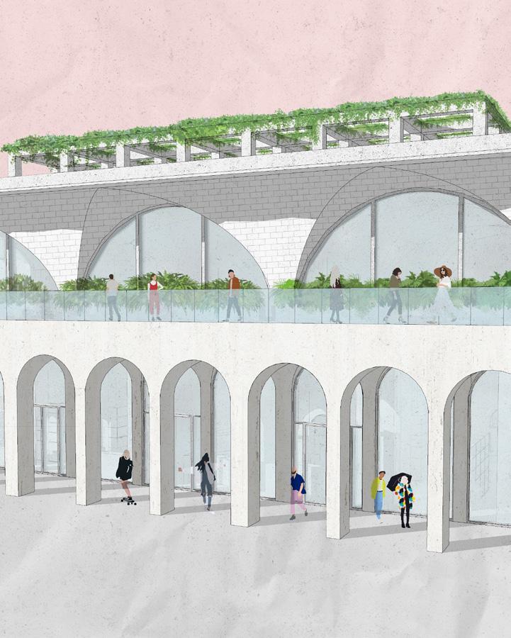
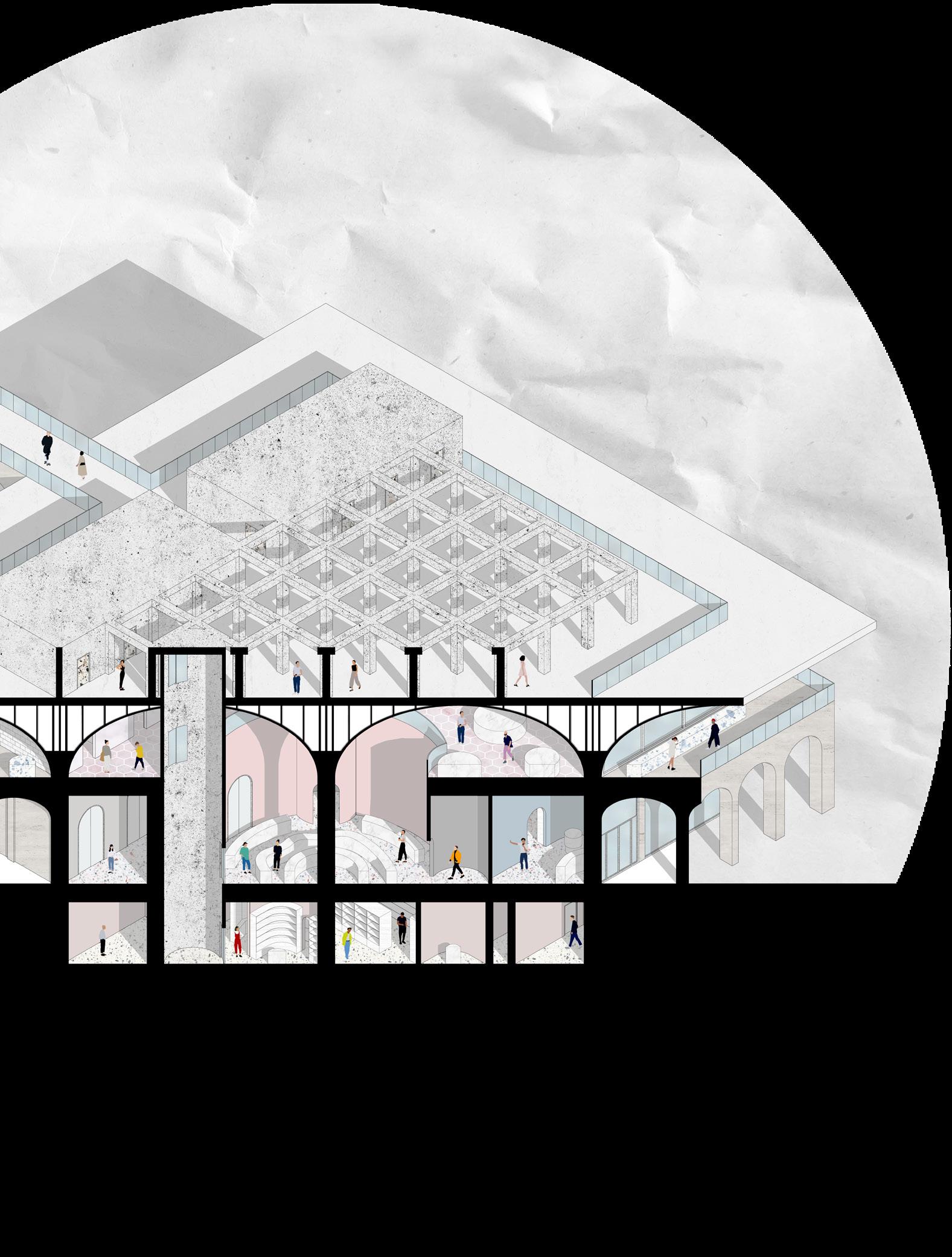
Travertine arcade on the first floor echoes Palazzo della Civilta Italiana, big openings on the second floor are typical Roman Bath windows linking the market to ancient building traditions, its vast spanning tile vaults create an airy space with bright volumetric features. The concrete hypostyle of the third level serves as a restaurant hall, its roof provides necessary shadow for the visitors. The integration of the building into the city context by looking back at the city’s past and the existing neighborhood scenery was the key for this project.
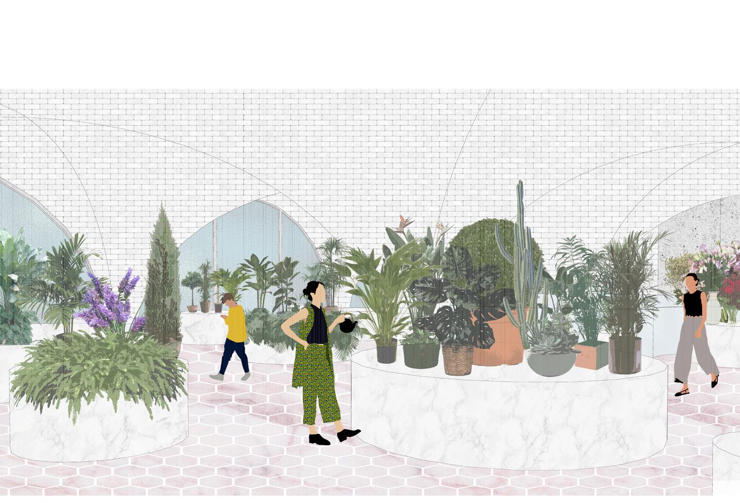
Flower market on the second floor
Explode diagram showing the structural elements of one bay
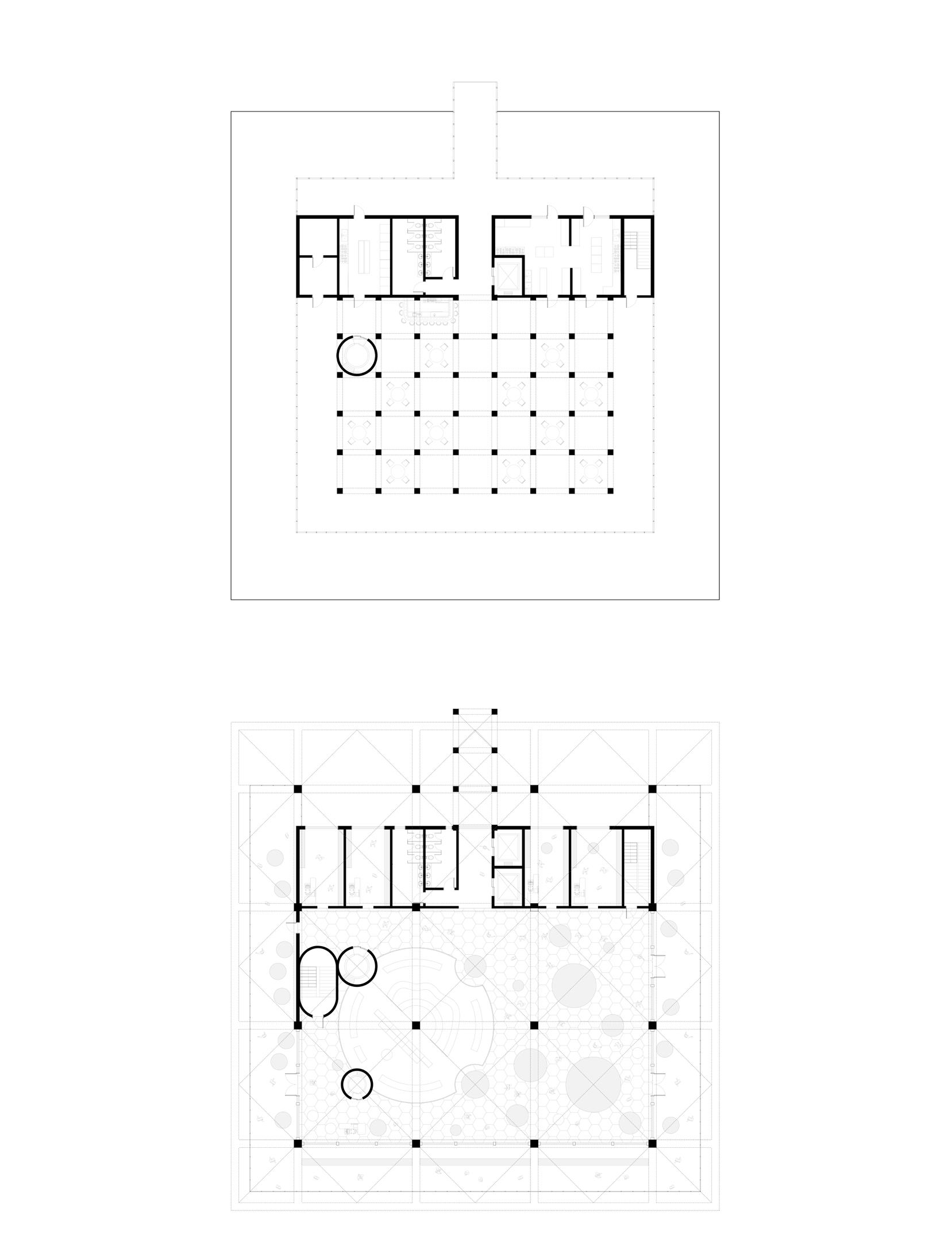
Smooth shapes of the interior space contradict the building’s exterior. I wanted to create a contrast between the facades that are matching the historical appearance of the city and its contemporary inhabitants and their needs. The first floor is occupied by grocery departments and is spatially connected to a flower market on the second level by a big atrium with a column-tree growing from the middle of the main shopping hall. The connection between the two neighborhoods is made by a bridge that leads from the hill to the roof of the building that hosts a cafe with local pastries, pizza, and a bar. The basement has extra shopping departments, a storage area, and several spaces for staff.
Axon cutaway section
Roof plan / restaurant
Second floor plan / flower market
Basement plan / grocery + storage
First floor plan / grocery + loading dock
Axonometric neighborhood diagram
Waterfront neighborhood
University of Notre Dame
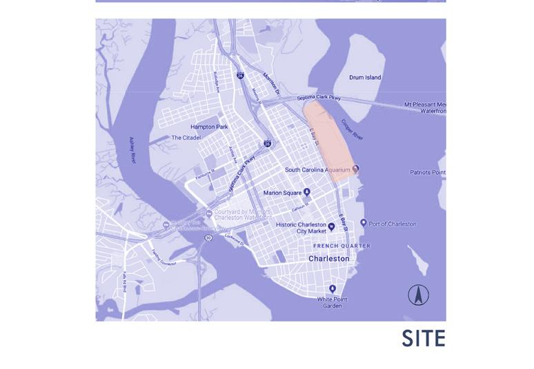
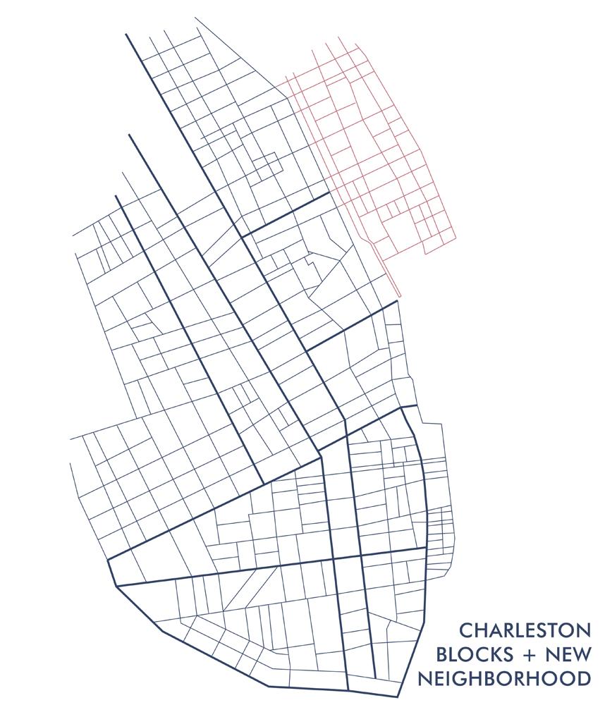
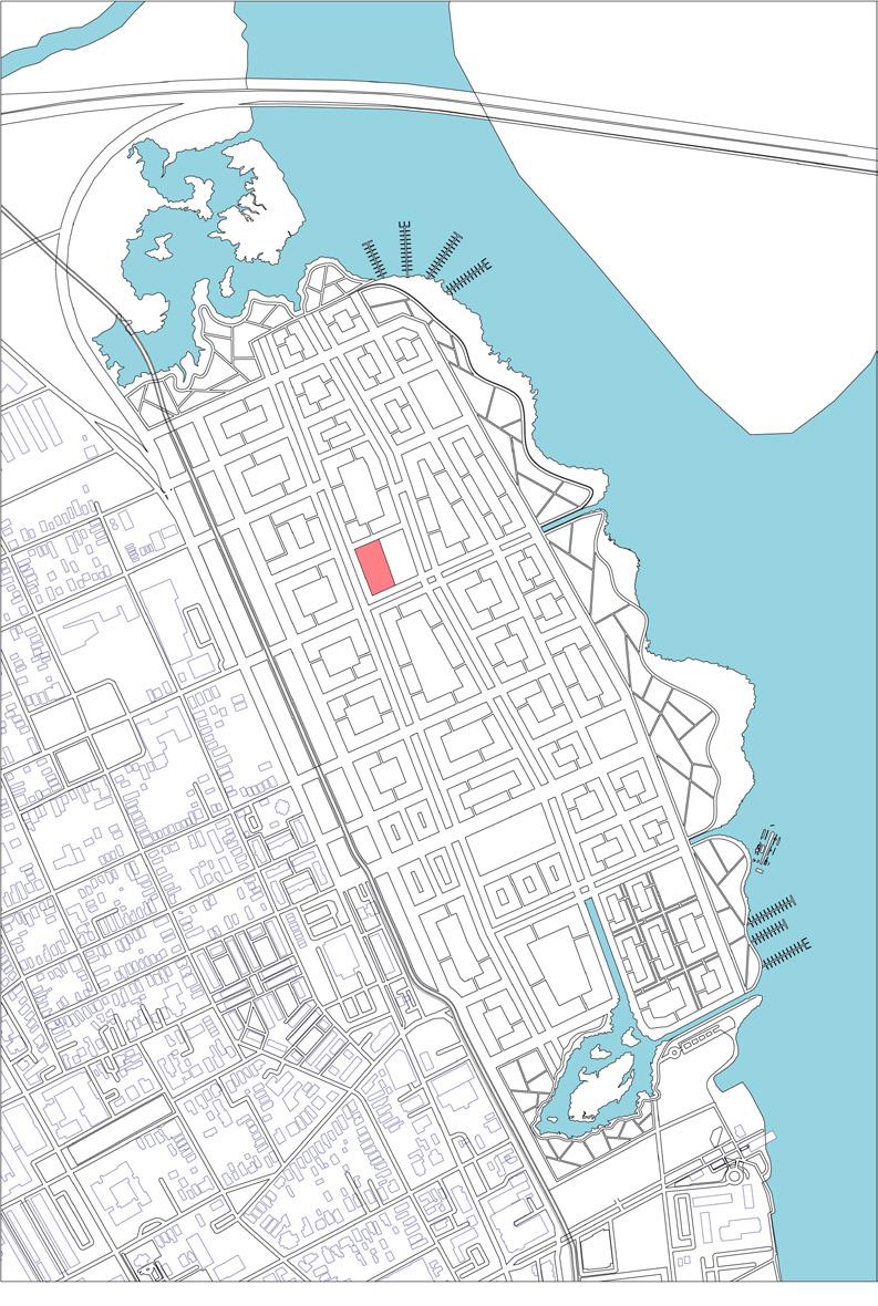
Location: Charleston, South Carolina, USA
Our studio traveled to Charleston SC, Seaside, FL, and Alys Beach, FL to document the site, study the architectural and urban character of Charleston and other similar coastal towns.
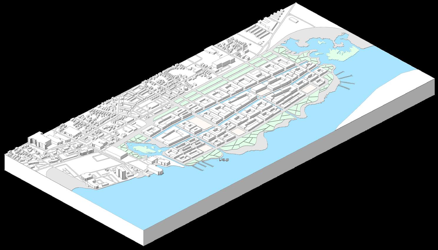
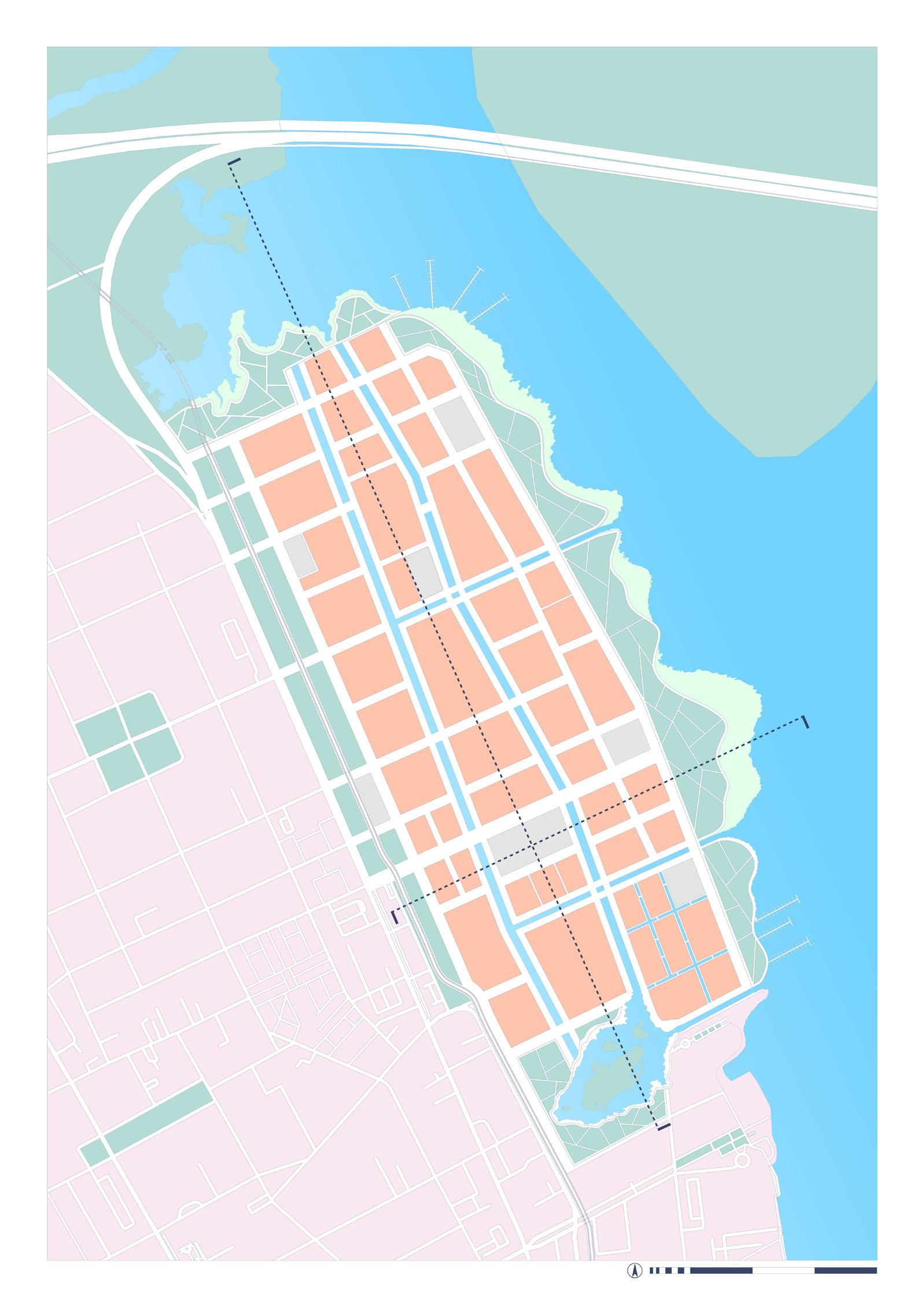
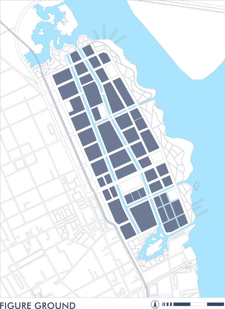
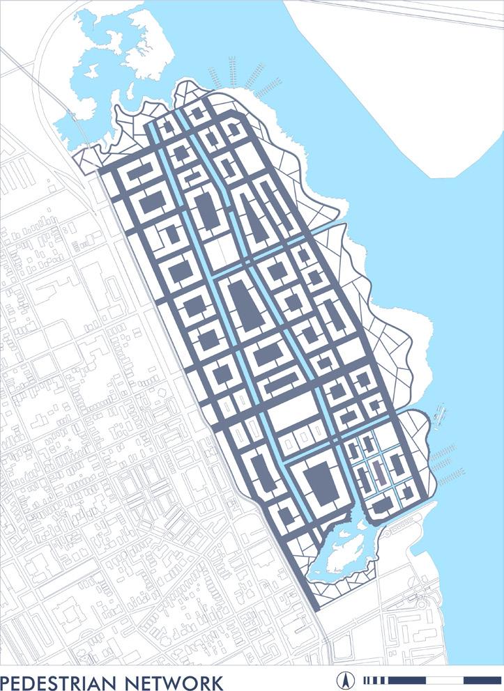
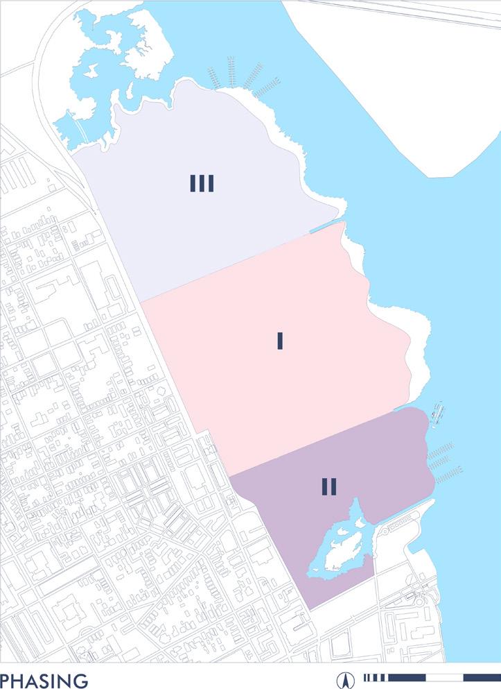
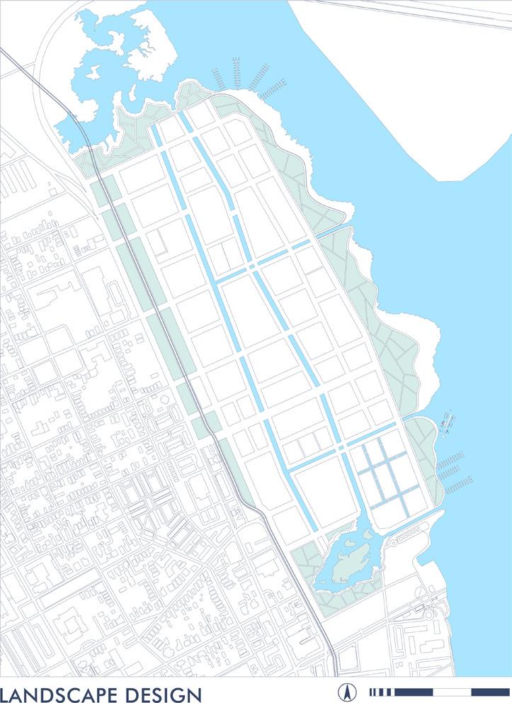
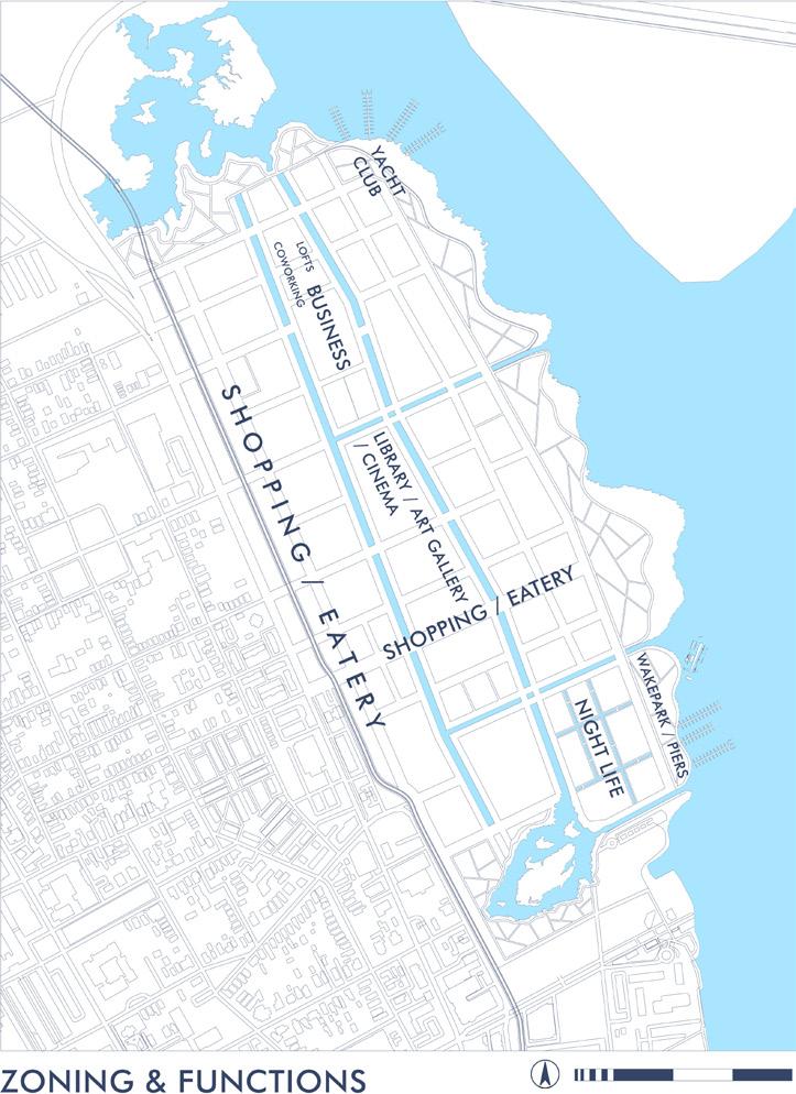
The designed neighborhood is facing the Cooper River and Arthur Bridge. At the present moment, a beautiful waterfront is occupied by an extensive concrete platform with a local
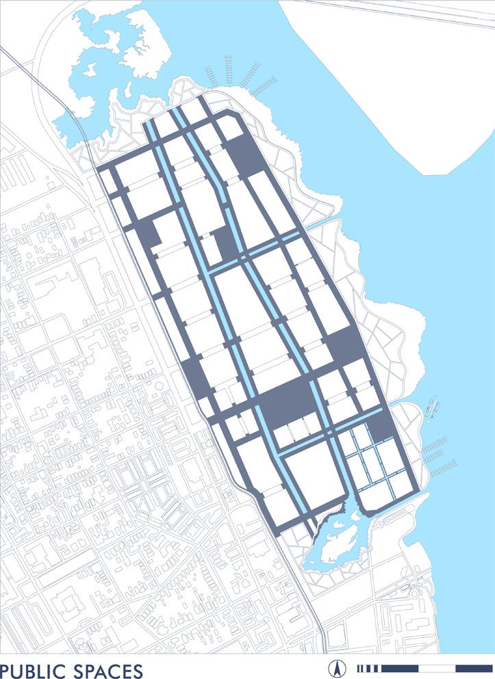
commercial port and a vast parking lot, the territory is fenced, access of citizens to water is completely blocked. The main goal of this project was to create a pedestrian-friendly, humanscale neighborhood with a system of public squares and revitalize part of the city’s abandoned waterfront area.
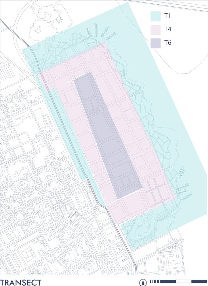
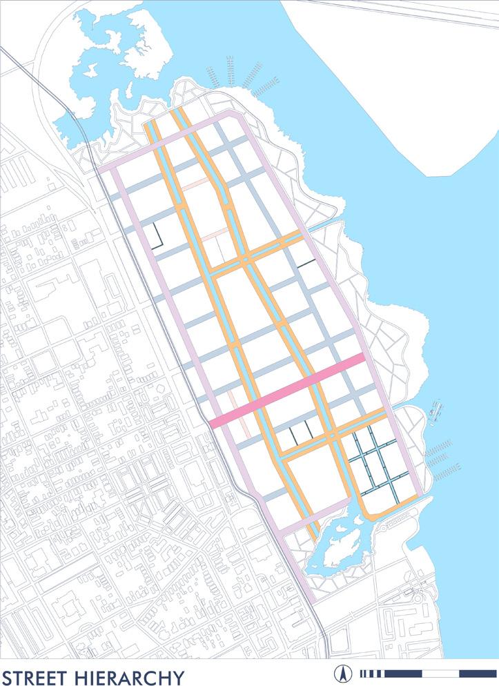
The proposed plan faces the adjacent neighborhood with a big shopping/eatery street that will bring some life into the existing area. It transfers into the mid-business spine with entertaining and cultural facilities, offices, several public squares, and the main boulevard leading to the green promenade along the water edge where the nightlife area and sports are located.
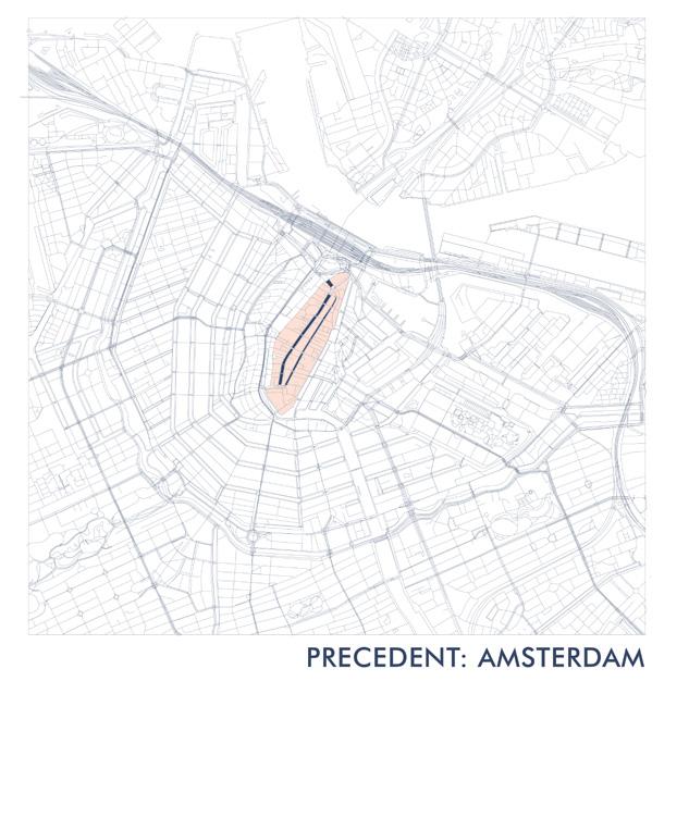
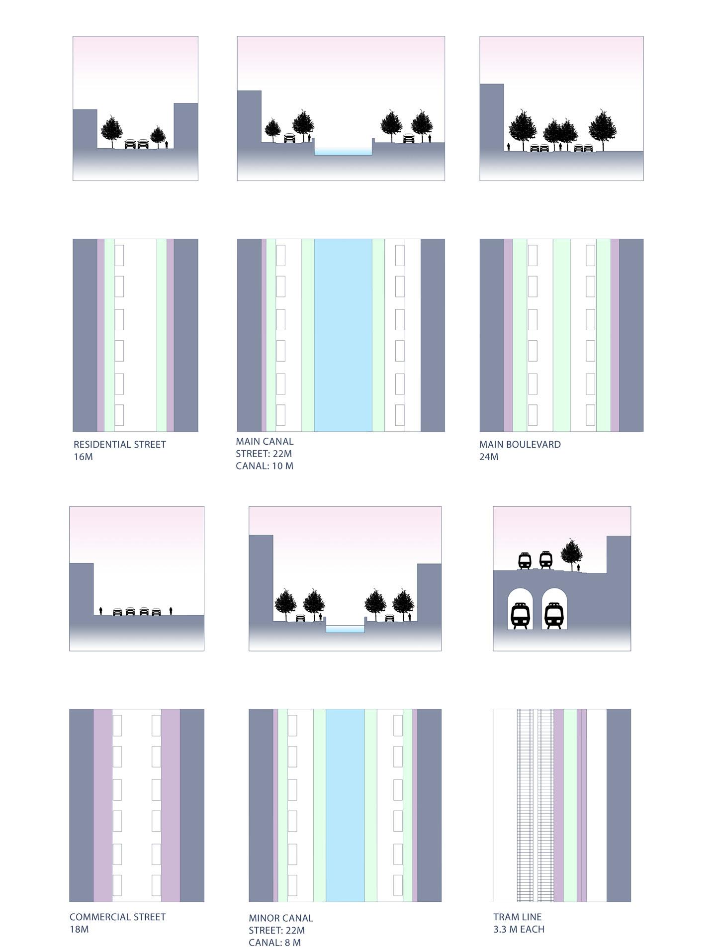
Since the current situation has completely deprived local residents of access to water, I decided to compensate for this by taking the center of Amsterdamas as an example, with its multiple channels that run through the districts. So, the looped canal system with two ponds on the ends is introduced to the neighborhood, it brings liveliness of fresh water and creates a special environmental system that prevents flooding and accumulation of standing water. Also, the whole neighborhood smoothly also slopes up 3 meters up above the existing water level to avoid inundation.
Existing commercial railroads are planned to be buried below the ground level, the public tram line is located above the cargo tunnels and connects the rest of the city with the neighborhood. The central business “spine” has the tallest buildings, while the blocks facing the river are significantly lower and allow visual access to the water from the houses behind them. The mid-spine helps to block the coastal side of the neighborhood from the existing noisy highway.
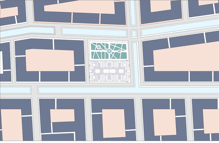
Main square axon
Main square plan
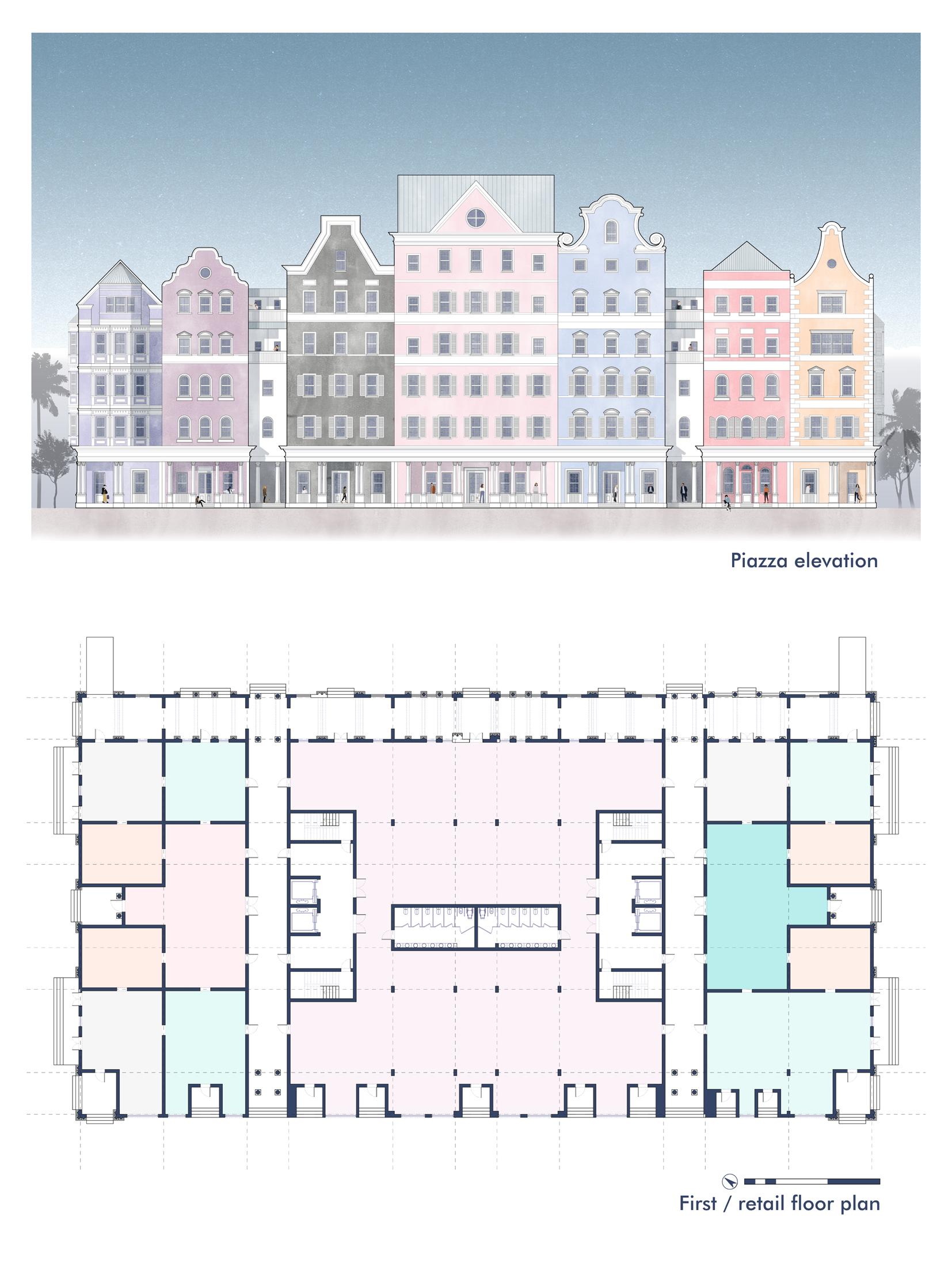
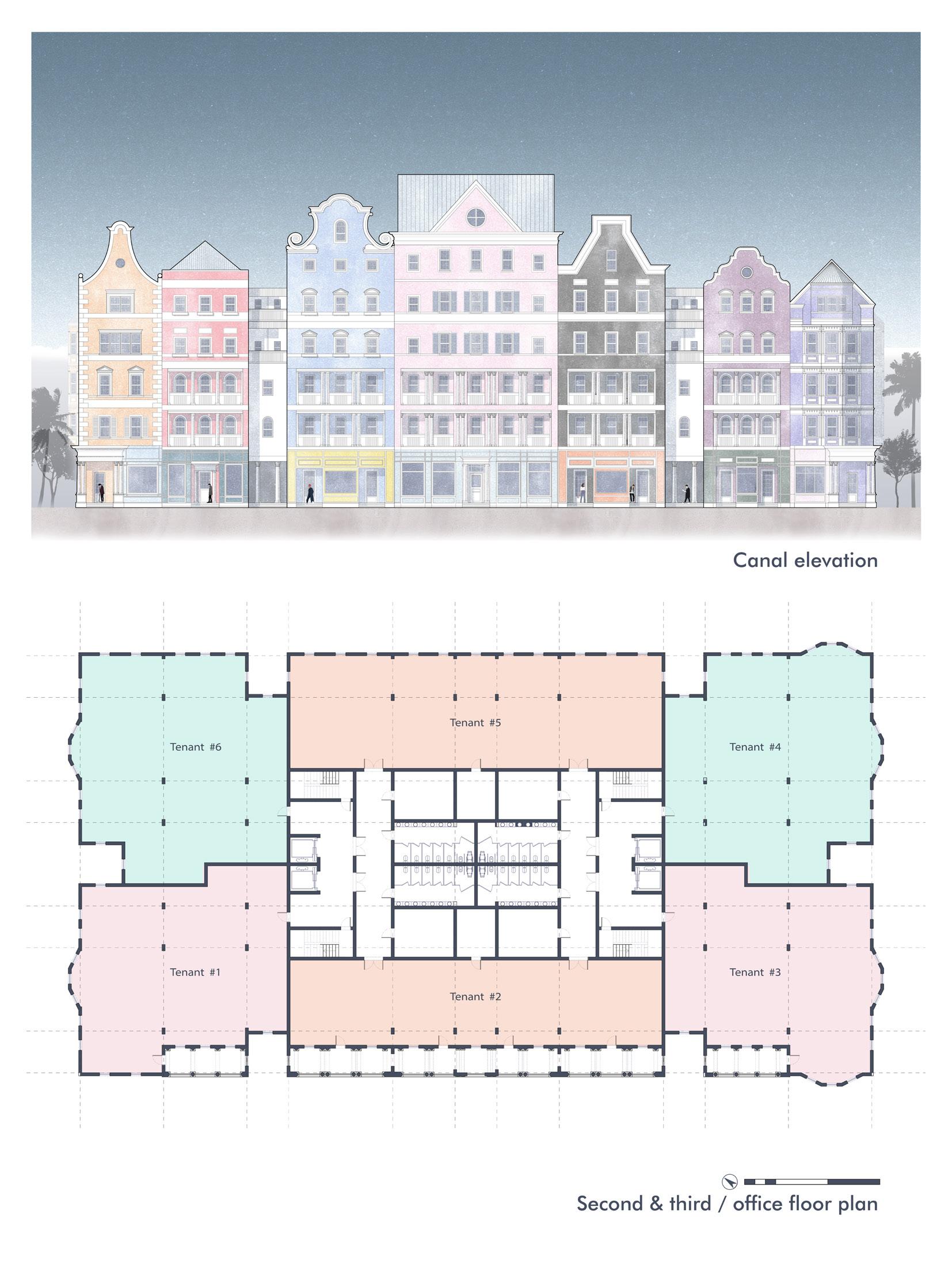
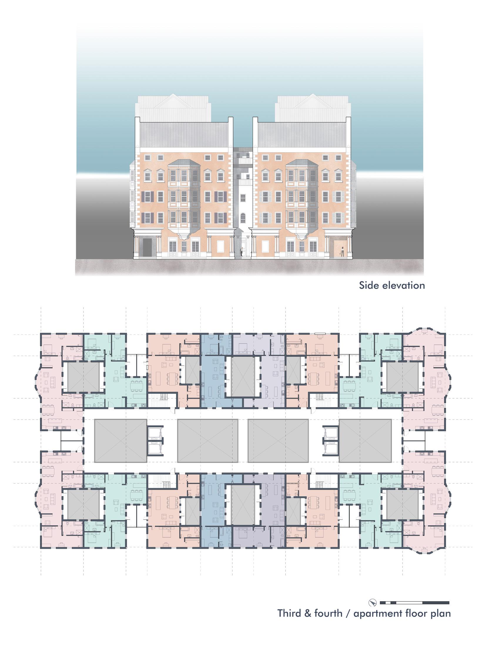
The mixed-use building is one of the blocks in a newly designed neighborhood. It is a part of the business spine, one side of it faces a square and the other one is overlooking a canal. Both streets are connected by two corridors that go all the way through the building’s ground level shopping area.
Programmatically, the building is divided into three parts: the first floor is occupied by shopping facilities, the second and the third ones are offices, while all the above levels are apartment units. Housing floors have a big inner court with bridges that is hidden inside the block. Flats are located one above the other and have inner small balconies with vegetation shared by neighbors from different floors.
The square facade has a typical Charleston porch that flows smoothly into the public green area in front of it. The canal side has multiple shop fronts with balconies on the office level.
The architectural character of the building is a combination of traditional Charleston and Amsterdam colorful residential houses. Even though facades appear as separate buildings each floor has a continuous floor slab and two circulation cores that solve circulation and structural issues. Connecting bridges between the main facades serve as balcony spaces for the apartments.
Block in the neighborhood context
Block site plan
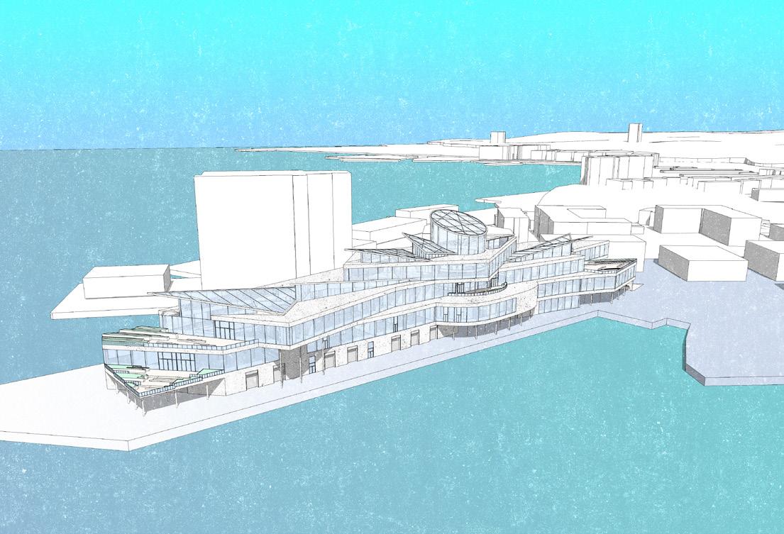
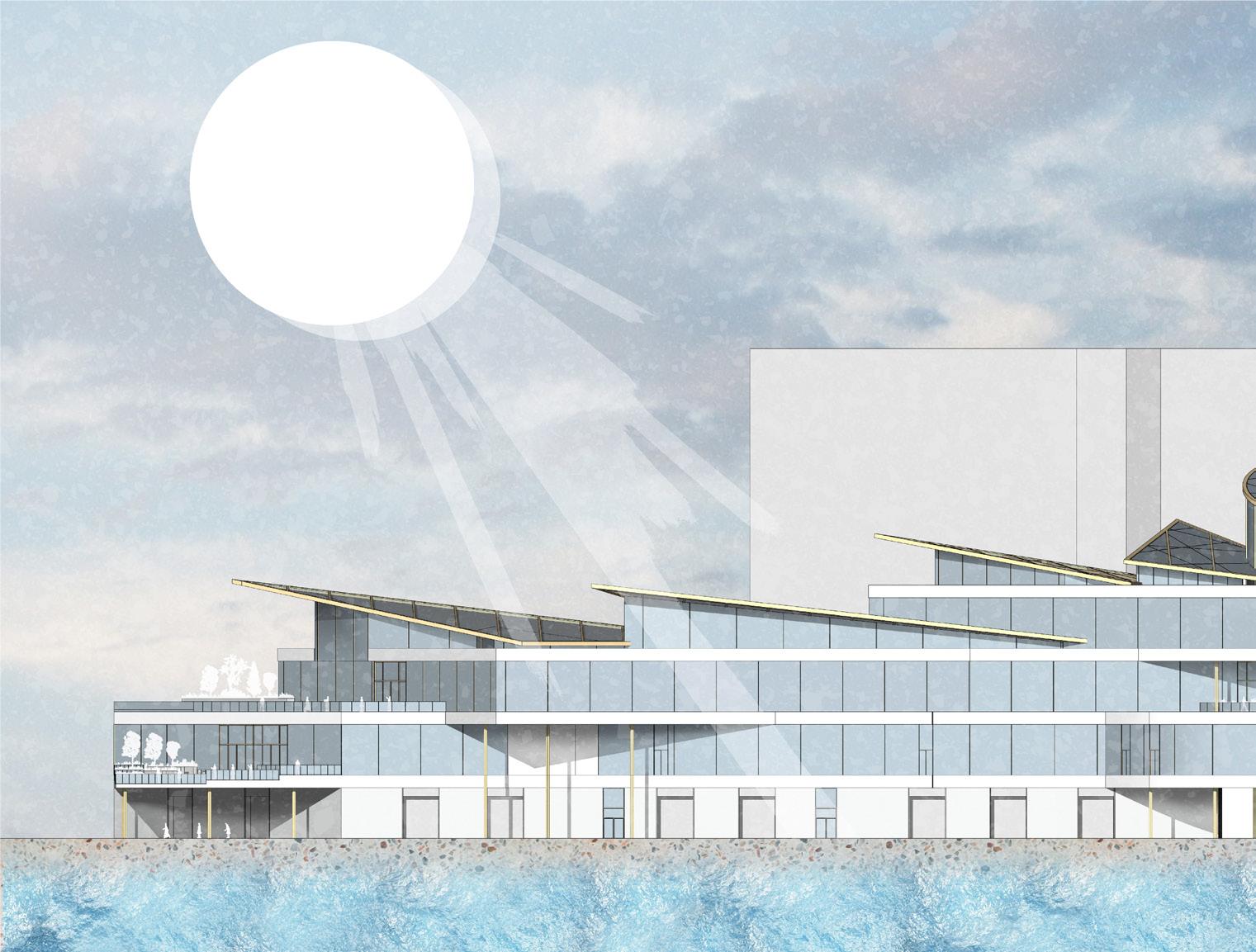
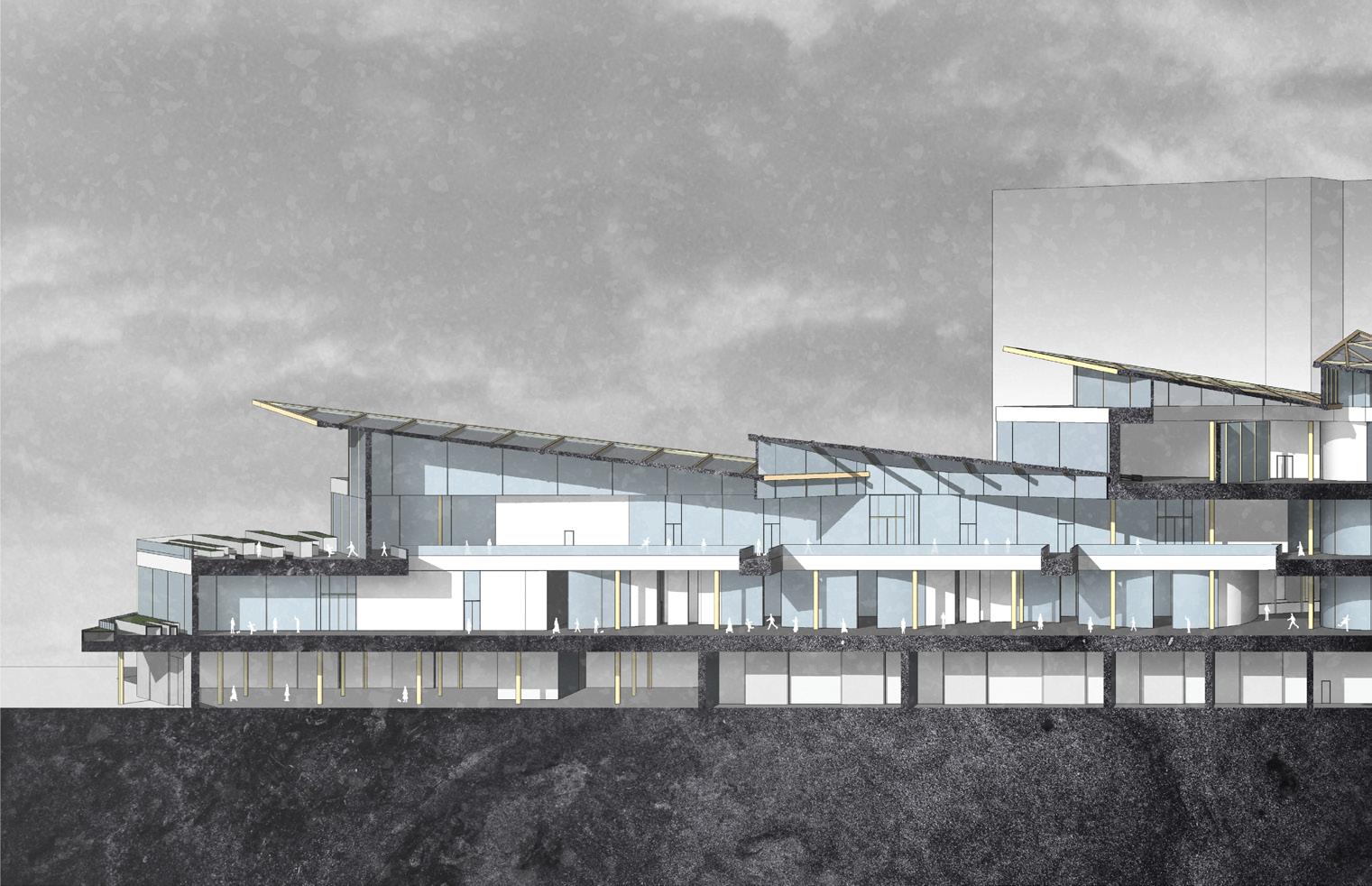
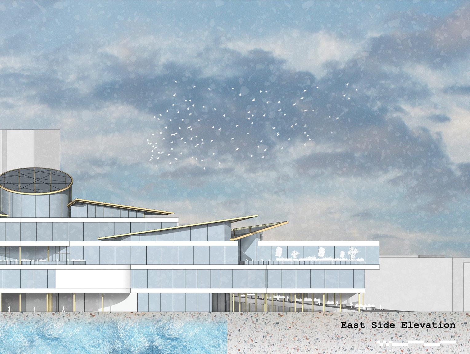
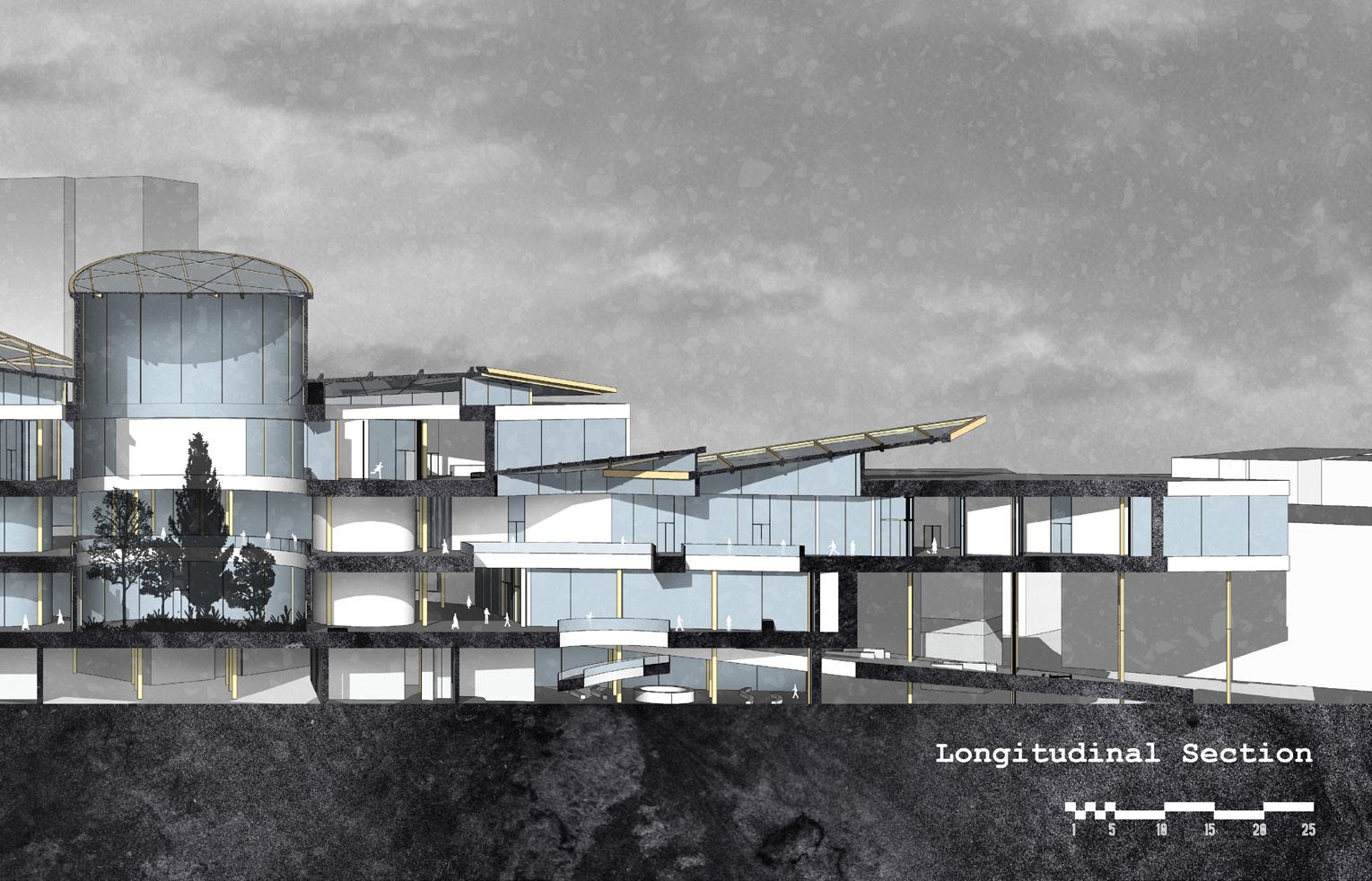
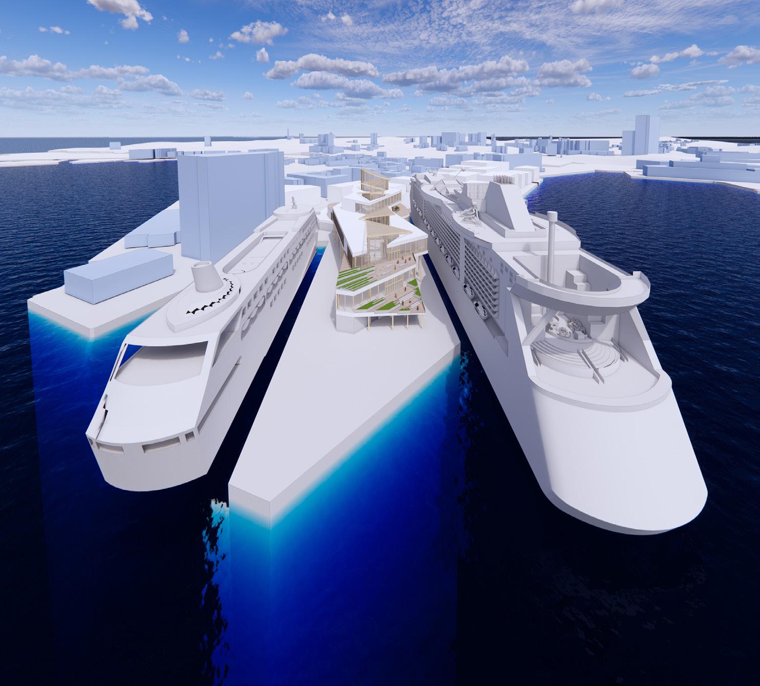
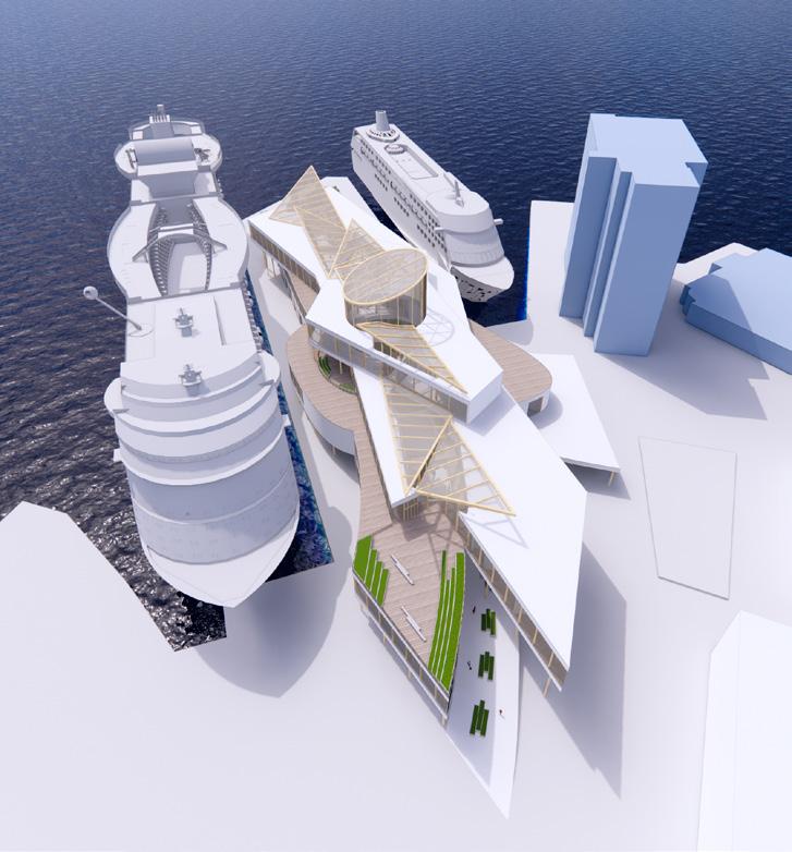
Marine passenger terminal
University of Notre Dame
Location: Oslo, Norway
The project is dedicated to the development of a Passenger Maritime Terminal (42 000 sq ft) in Oslo, Norway and a masterplan for its surrounding area (1.3 million square feet).
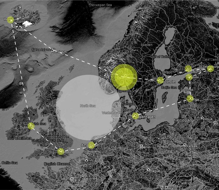
Norway has always been famous as a country with a robust, intimate relationship with water. Its capital plays a critical role as a marine-hub in the area of the North Sea.
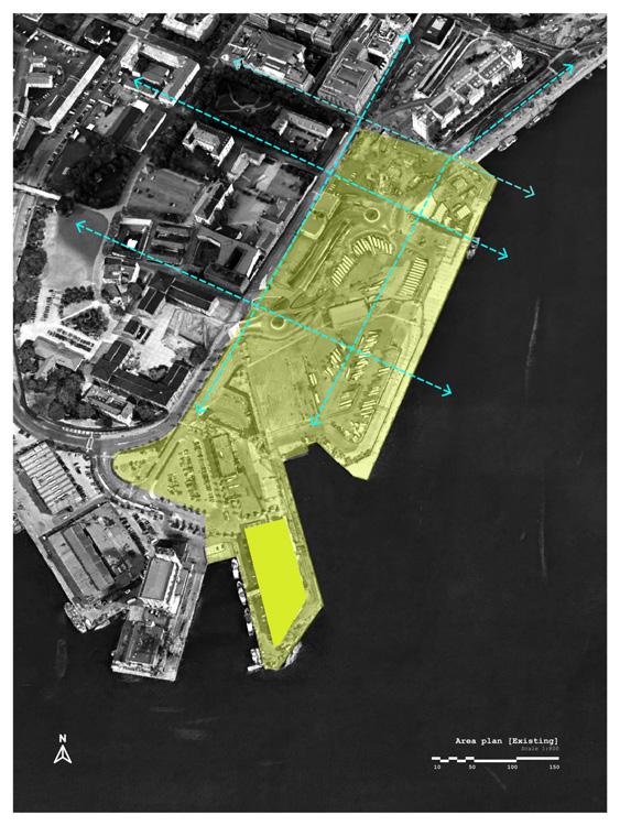
Oslo Port location imposes certain obligations on the appearance of the country’s main sea gate and surrounding area. Currently, the beautiful waterfront is occupied by vast parking spaces and cramped with
concrete surfaces of industrial-looking buildings. Most of its territory is fenced and has no connection to the city.
There is a big logistic, recreational, and compositional image potential in this area. One of the main problems is the inclusion of the terminal in the urban fabric, turning it into its integral part. Another issue is several traffic flows that should go through the building without interfering with each other: ship passengers, citizens, staff, taxis, buses, semi-trucks, and cargo altogether have to become parts of one organism that is linked to and fueled by the city.
Transverse section
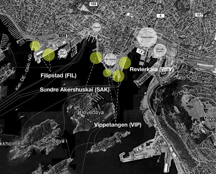
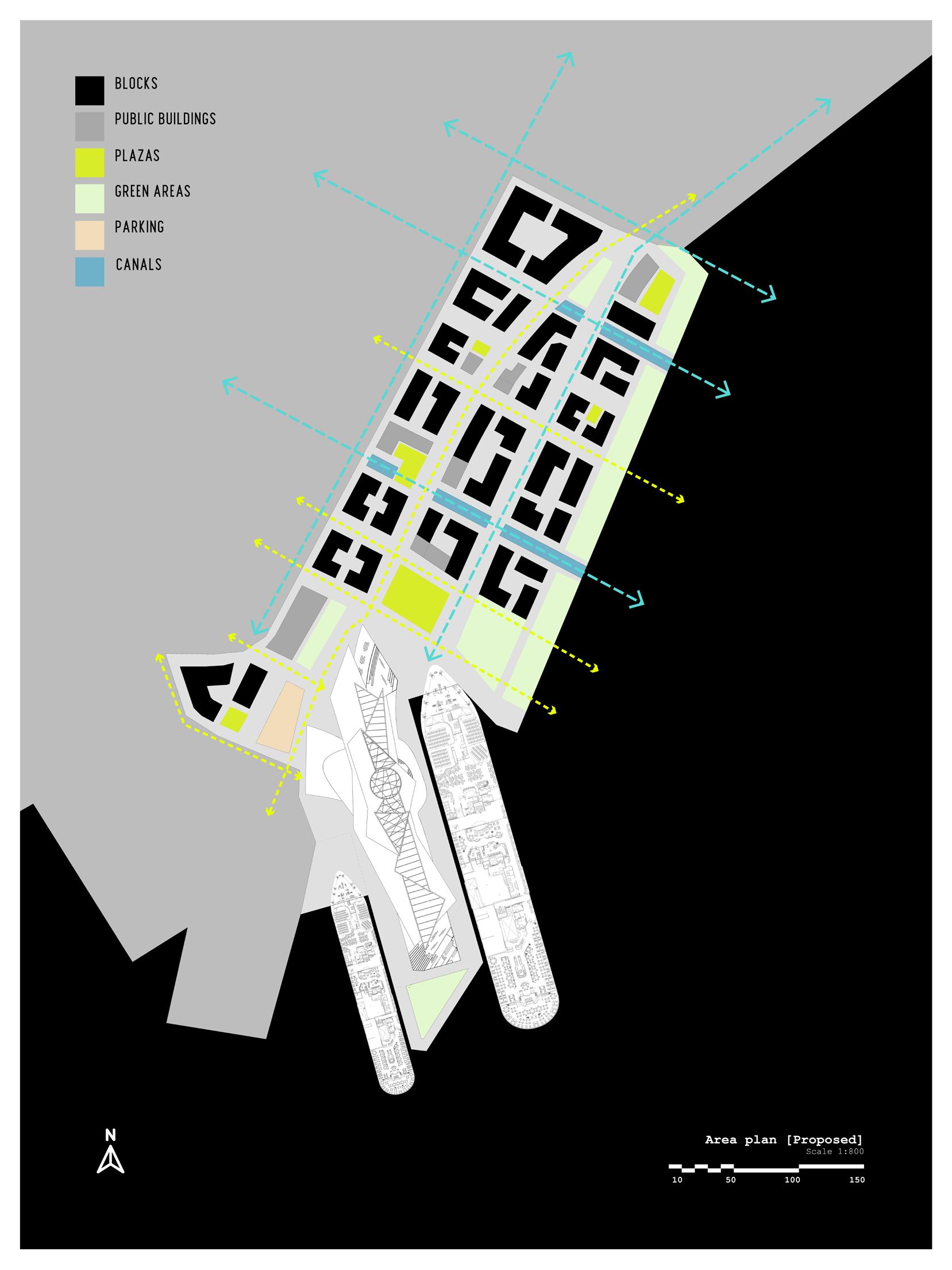
One of the main streets (Langkaia) leading to the area was extended all the way through it and split at the very beginning. Such a method allowed me to separate vehicular traffic from a pedestrian path that now becomes the heart of the new district. Akershusstranda is wrapped around the edge as before and diverts traffic from the area or provides an additional exit / entrance route if needed.
The main pedestrian and shopping artery leads from the city’s waterfront promenade and the Oslo Opera House through a traditional neighborhood and a couple of canals directly to the terminal and a big piazza in front of it. Once you reach the main square you see the terminal itself and a welcoming ramp that grows right out of it and reaches the street level.
Another semi-pedestrian green route goes along the water’s edge providing amazing views of the bay to pedestrians and to people who live in residential blocks on the street. It culminates in a full park that is facing the mooring quay. Two canals are cut into the concrete platform of the district, they bring additional movement and rhythm to the fabric of the territory.
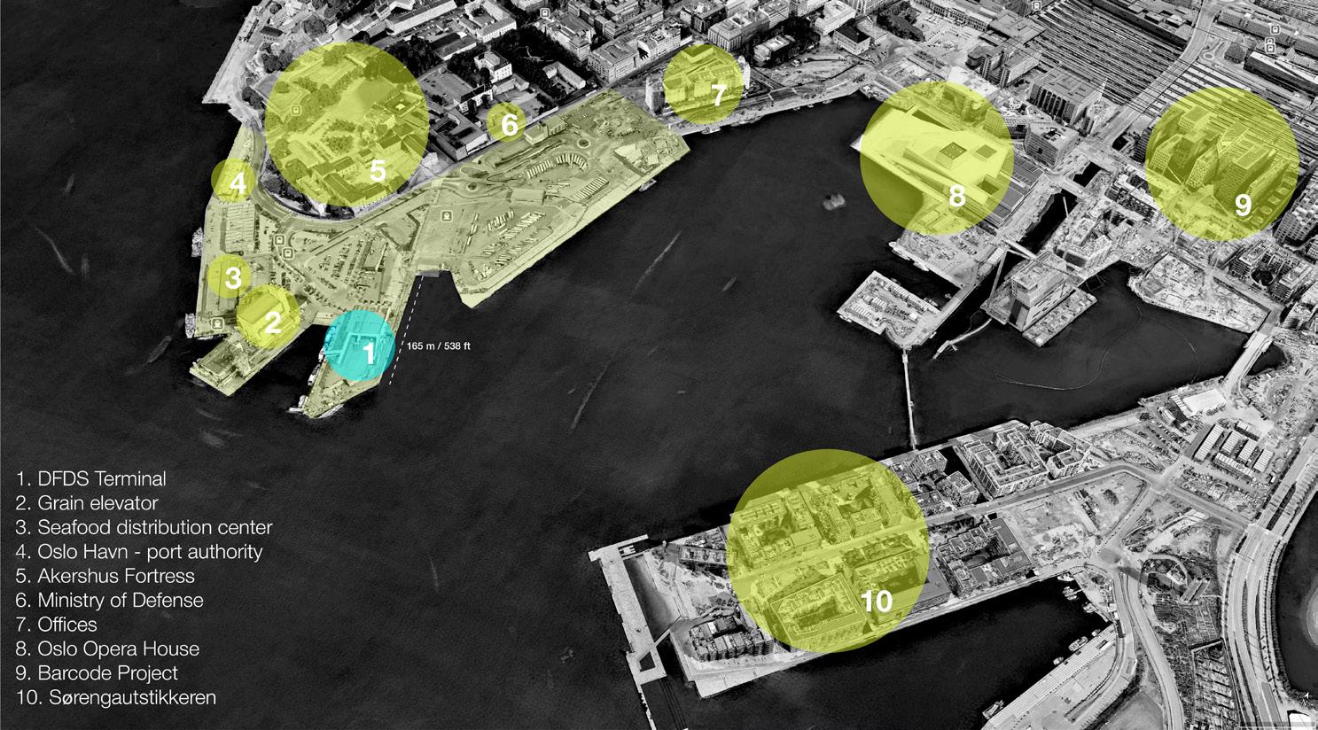
Surrounding landmarks:
North Sea water area
Existing Oslo mooring quays
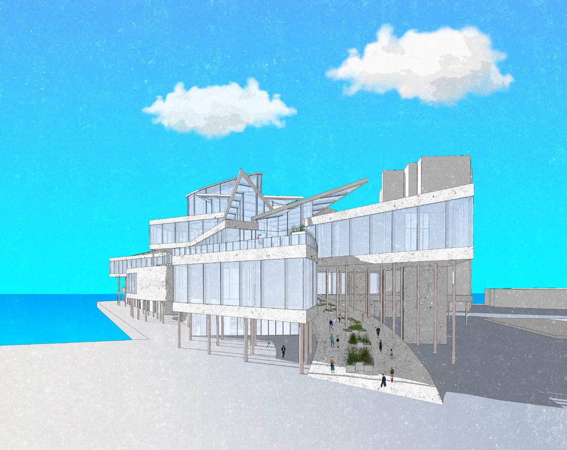
Entrance perspective
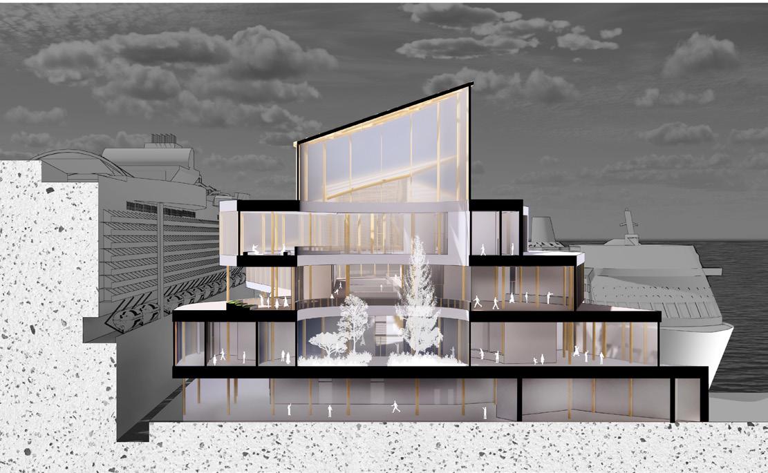
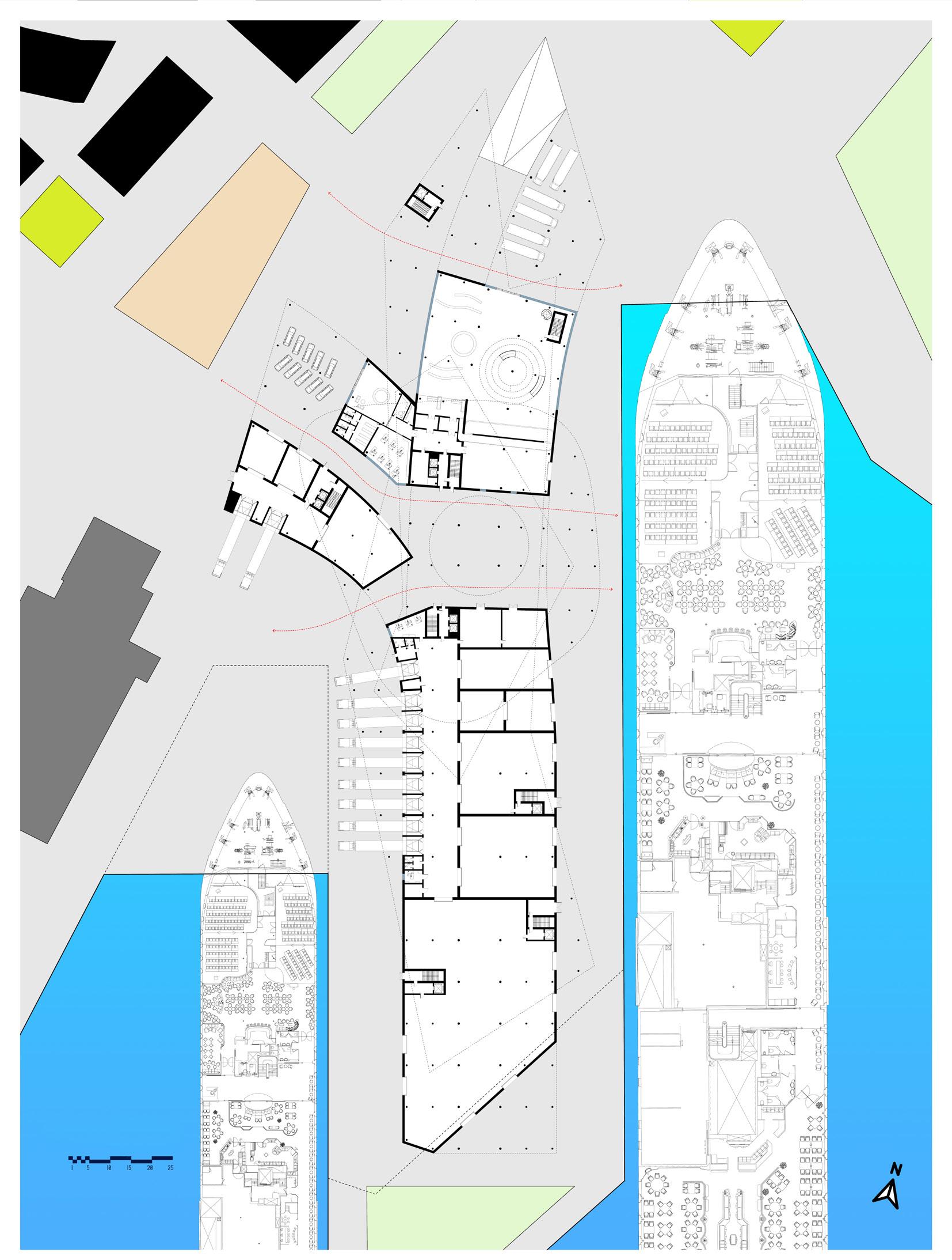
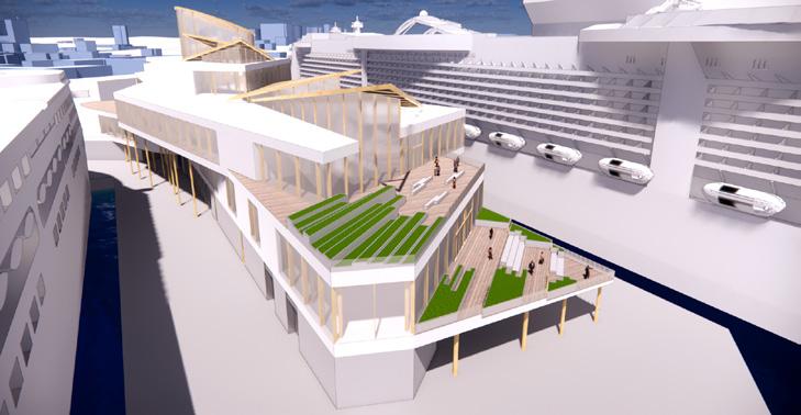
There are several scenarios of arrival depending on the visitor type. The first floor has three major entrances: a ramp for the citizens and passengers coming back to the ship from the city, a regular entrance with elevators, a rounded escalator inside, and several parking spaces on the outside. The last option is another wing of the building that accepts cargos and stores goods that later will be transferred onto the ship. The first two happen on separate levels, storage, and delivery area with staff entrance is located on the opposite side of the building that is hidden from the majority of visitors. The ground floor is split into separate volumes leaving some space in-between them providing an opportunity for the trucks to go all the way around the building.
Overall Perspective
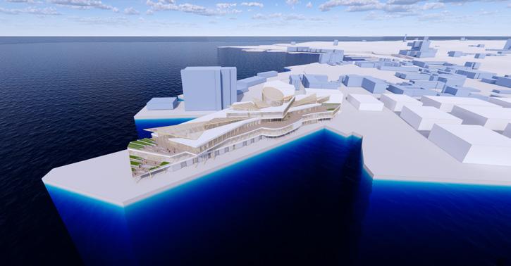
The second floor is completely dedicated to passengers and citizens. As you enter it you see a small version of a Scandinavian forest enclosed in a glass tube – a tall atrium that is open to the sky. In addition to the sensation of a natural hearth, this volume is a kind of a funnelshaped fork in the way of visitors. On the left they will see the arrival/departure zone with a waiting area in front of it, the right side of the stream is given to the shops, restaurants, and leisure facilities. Once a person goes around the cylindrical body of glass he or she ends up in a long corridor with a skylight over the head that is guiding the person to the outside terrace with a magnificent view of the bay.
The roof of the skylight is covered with glass triangular planes similar in shape to pieces of ice crashing into each other (linking the appearance of the port with the ice block-like volumes of the Opera). The various angles at which the glass floes are inclined to create a special play of light inside the building.
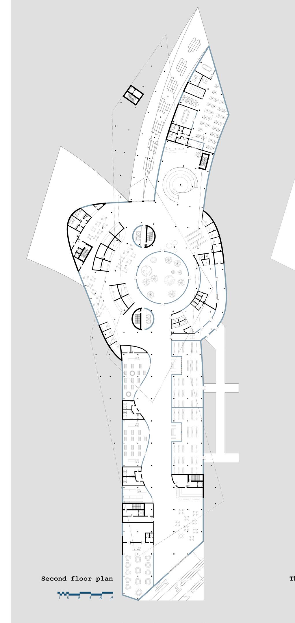
The third floor is given to staff and offices, port authority. It is not accessible to the public but visible because of the skylight that splits the floor slab into two pieces connected by the bridges.
The fourth floor has an observation deck with a restaurant and a bar. Two elevators enclosed in tubes bring people up there from the second level. The footprint of this floor is significantly smaller than the other two, it allows to create a vast terrace on the office level roof and let the visitors experience the building in a similar way to the Snohetta’s Opera House located across the bay.
The building has a mass-timber composite structural system. Wood is combined with heavy opaque concrete and light transparent glass surfaces. Such a combination brings warmth to the interior of the building while maintaining its modernity and a hint of a utilitarian function. Simple rectilinear shapes of the facade are replaced by smooth streamlined shapes inside the building, which sets the rhythm and forms the traffic flow.
Main entrance / first floor
Walkway between departure-arrival zone and shopping area / second floor
Observation deck / fourth floor
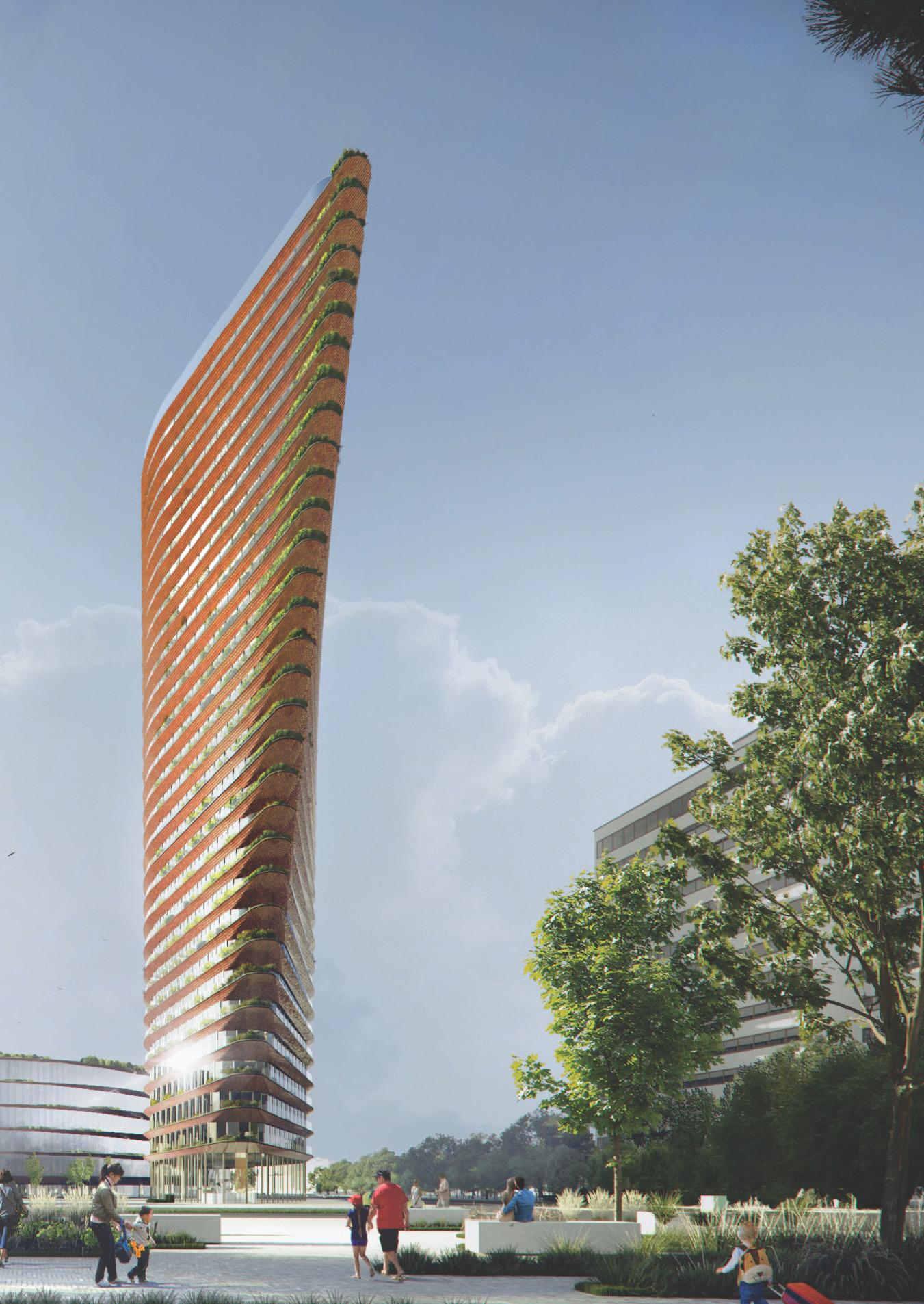
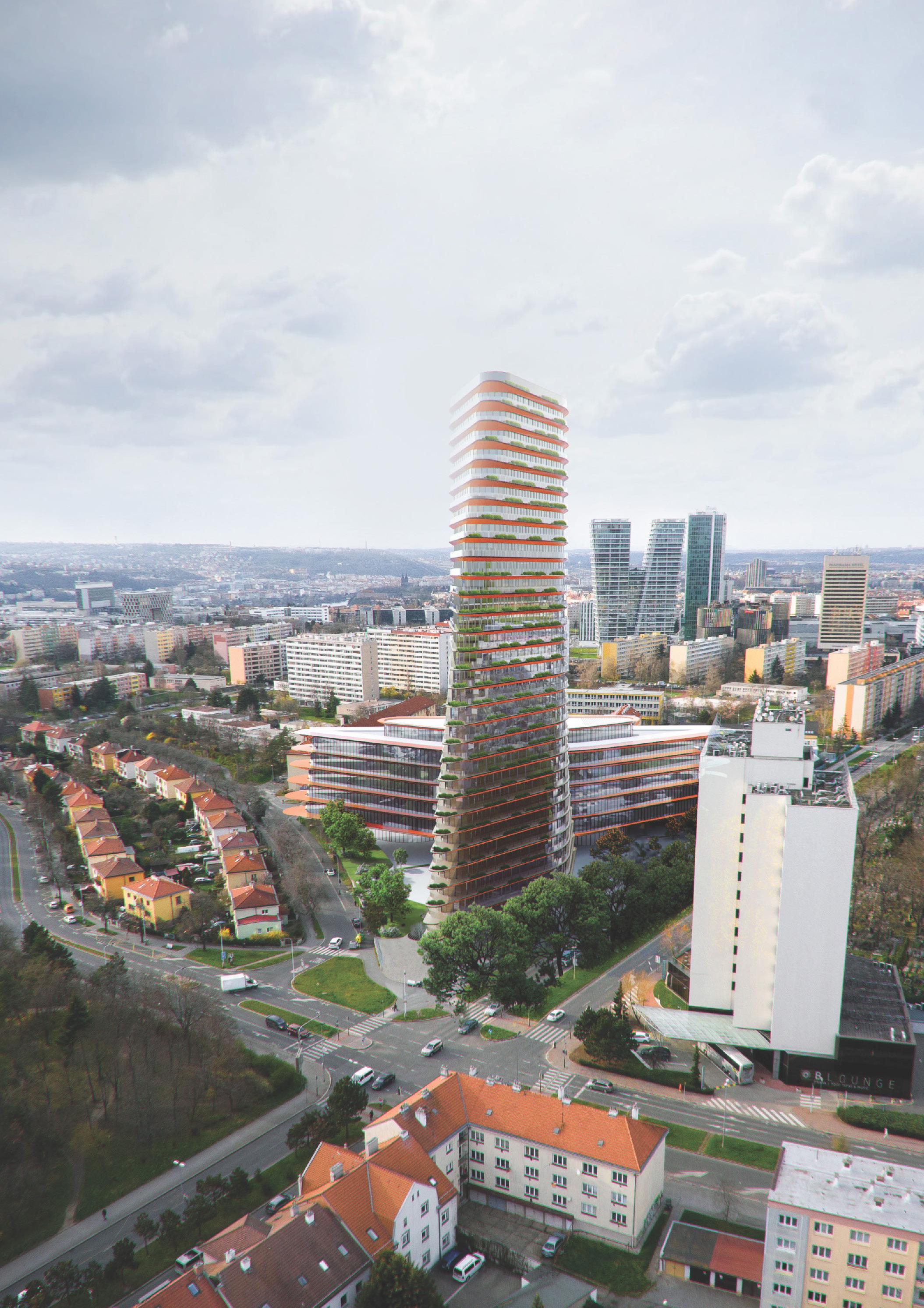
New Gate of Olbrachtova
UNK Architects
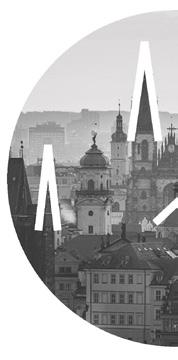
Location: Prague, Czech Republic
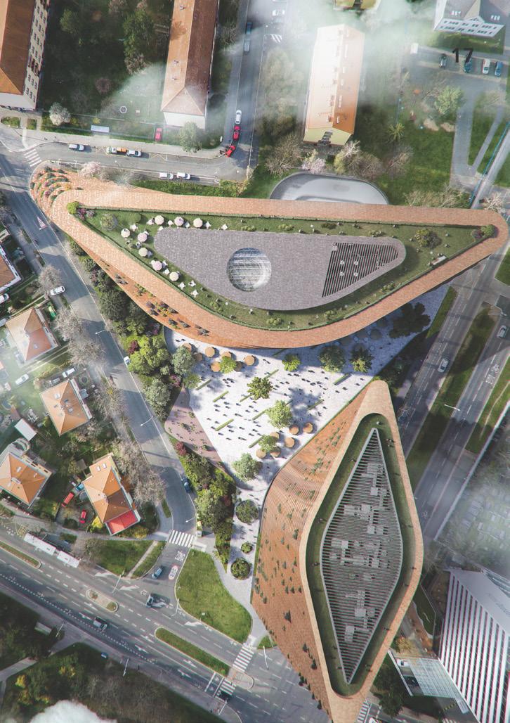
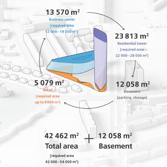
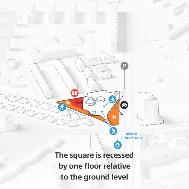
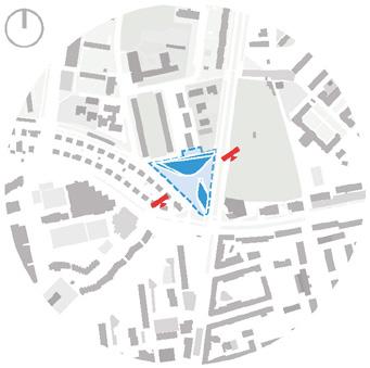
The aim of the project was to create a new development in the city’s biggest administrative district Praha 4. The municipality’s main features include the Pankrac neighbourhood with a high-rise business cluster, lots of greenery along with numerous panel houses grouped in vast residential neighbourhoods in the south.
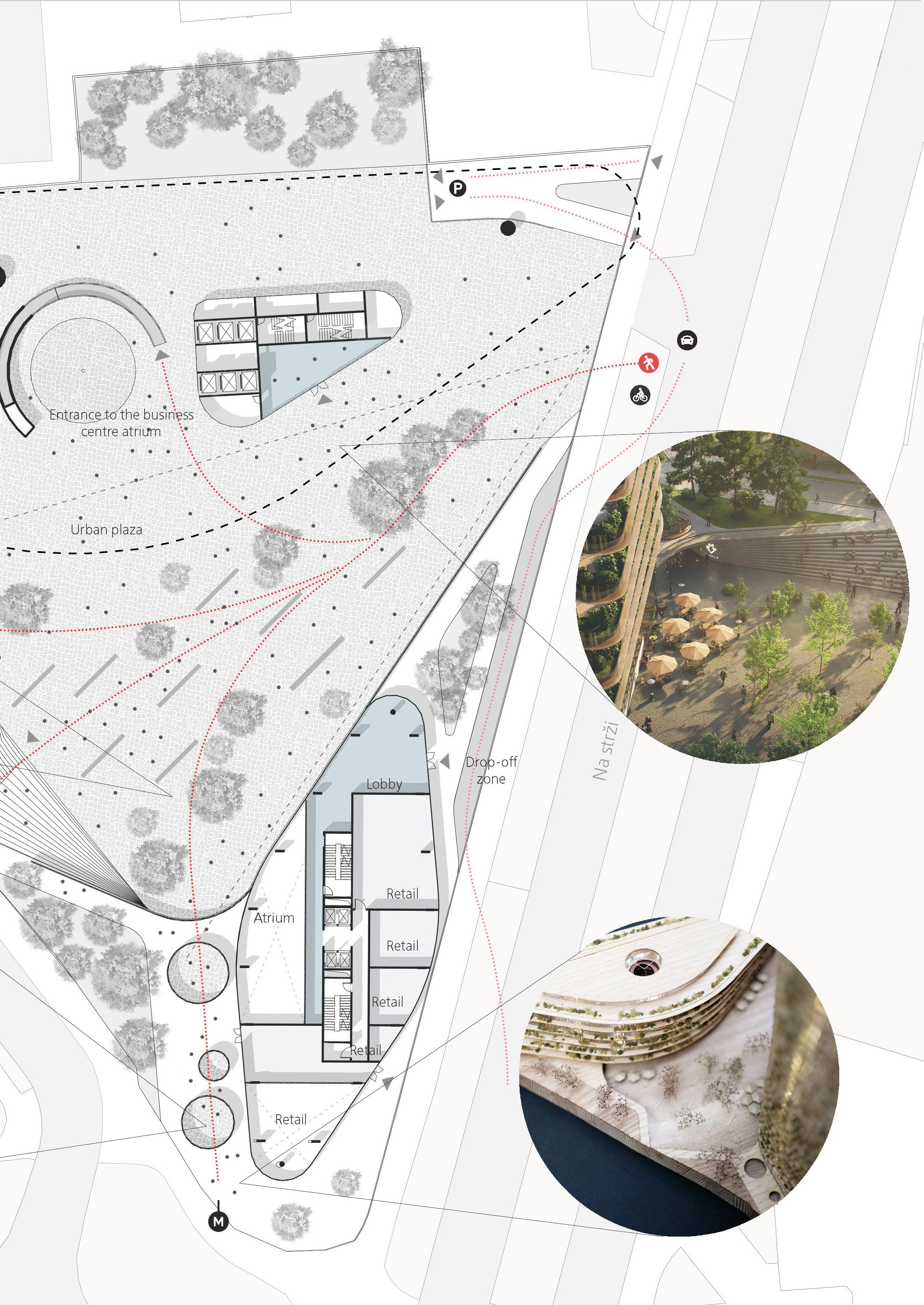
Major disadvantage of the site’s surrounding area was the absence of the metro station which is about to be built and rejuvenate local life with new human traffic. D Olbrachtova will be located right across the street, at the edge of a busy road intersection.
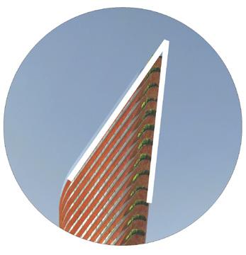
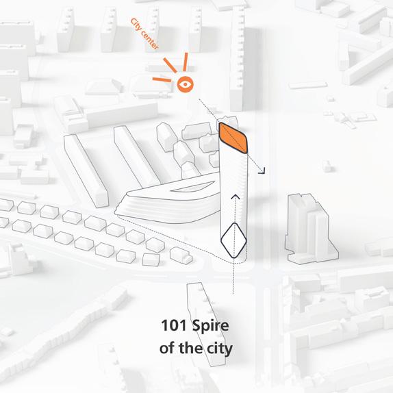
Prague is often called the city of 100 spires, this project proposes 101st spire to be put on the map. The development includes a residential tower, mid-rise office block and a spacious plaza with direct subway access (underground tunnel going from the major station). Most important old city’s features such as work, housing and trade are coming together.
The proposed project will become a new center of the area, complement the Pankrac business center with its functions and become a contemporary dominant at the southern gate of the city.
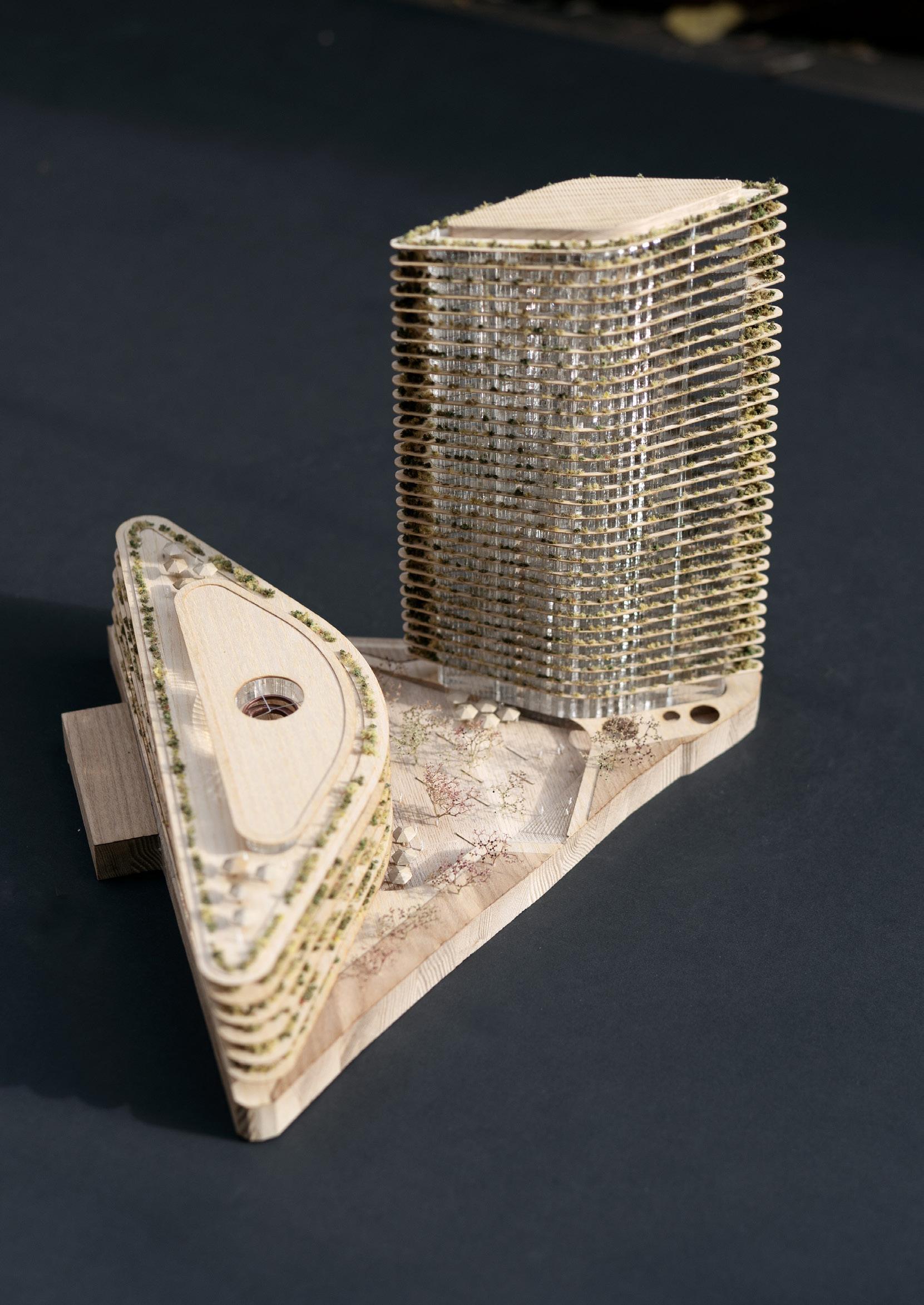
Physical model
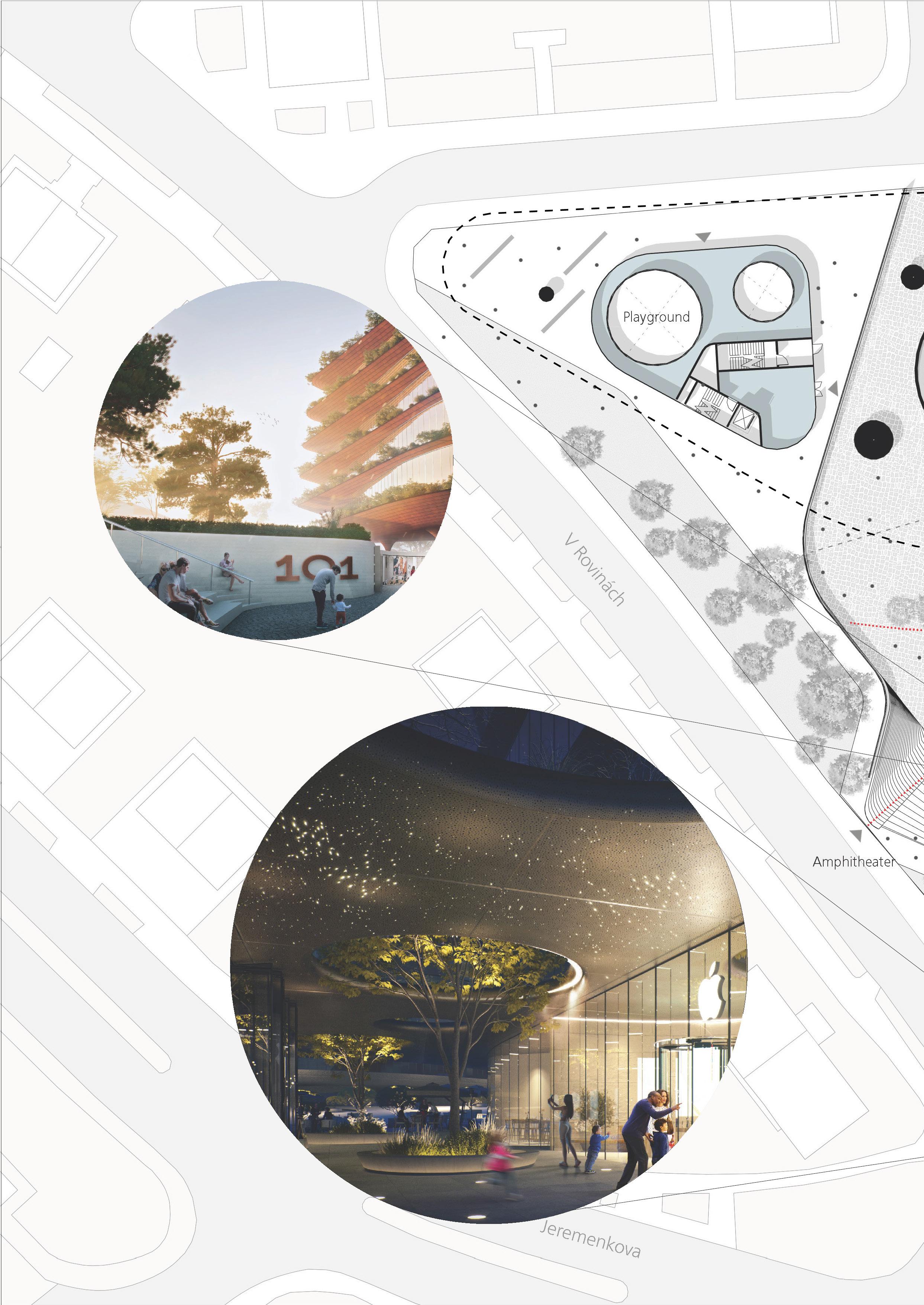
On the western side of the site, there are small twostory private houses, in the north - a block of panel five-story buildings, on the eastern side - a high-rise hotel. The site has been organized in accordance with the surrounding environment, a quiet zone to the west with a parametric staircase/amphitheatre and green spaces is located to the west, a mid-rise business center is adjacent to five-story buildings, and a residential apartment tower faces the hotel.
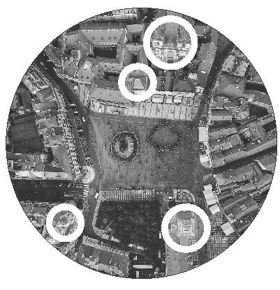
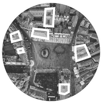
Spotting identity Prague’s centres
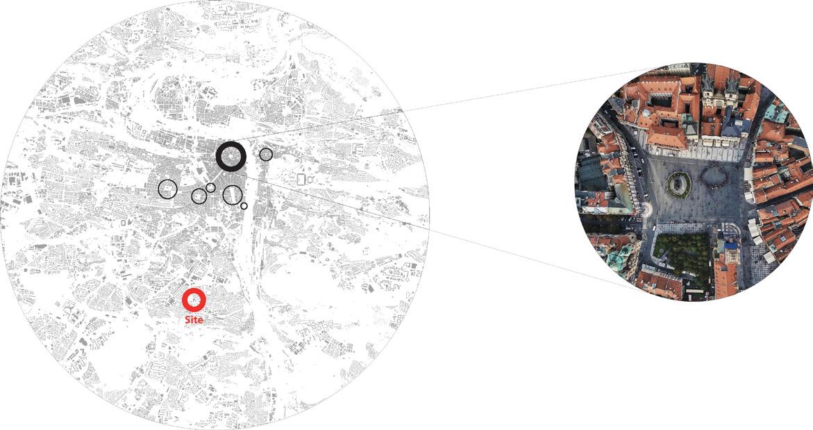
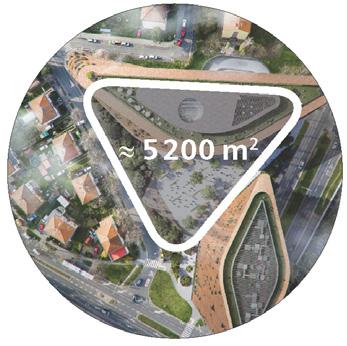
1. Area / size / functions. City squares promote in the neighbourhoods. The proposed
Staromestske square’s 5 600
piazza is about
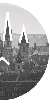
2. Pointed spires. Prague’s towers lord over a low-rise dominants of the city’s panorama. 101st spire will
3. Traditional ceramic tile rooftops. The tiled roofs can now be perceived from the bottom of the building.
4. Prazsky orloj - Staromestske square’s main business centre’s swirling atrium is another reason
Old Town
Analyzing major city’s squares and comparing them to the site
Spotting the identity of Prague’s local centres
area is ≈
600 m2
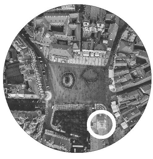
The core of the project’s concept is based on the city fabric analysis. Prague has a lot of unique plazas and piazzettas that are scattered around the Old Town and serve as connecting and meeting social points between major traffic flows.
Proposed project
promote social interactions and improve the quality of life about the same size as the traditional one.
low-rise historical core and serve as compositional become another city’s landmark.
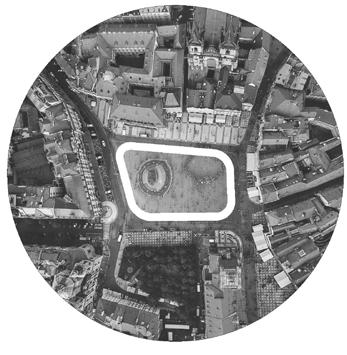
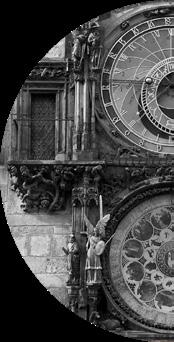
Staromestske square is the most significant square in the historical centre of Prague. Its history dates back to the 10th century when it served as a marketplace at the crossroads of European trade routes.
Staromestske
roofs of the city take on a new life in the project and building.
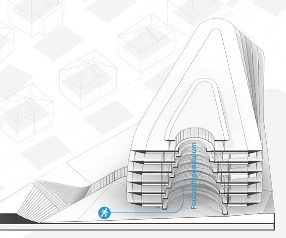
main gem. Foucault pendulum shaped by the unique reason to visit the new development.
Section through the business center’s atrium
New metro connection
Amphitheater and shopping zone
Dining area and metro entrance
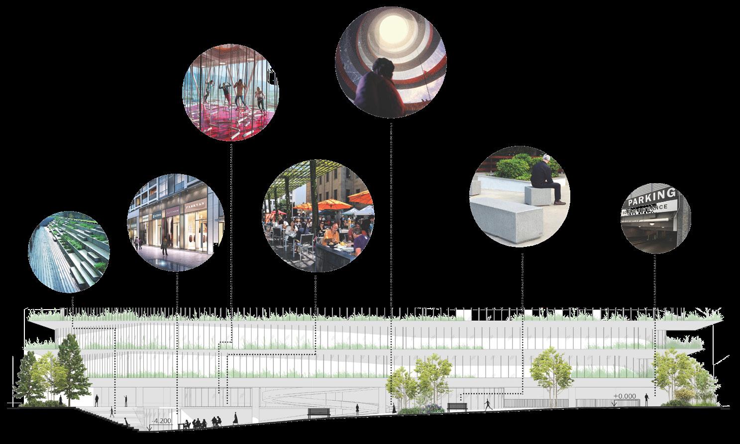
The square has a smooth slope starting from Na strzi entrance and going down to V Rovinach Street. It is shaped by traffic flows coming from the south (metro exit at -1 level, amphitheater) and northeast (taxi drop-off and underground parking entrance).
The subway exit is enclosed in a tunnel with skylights, equipped with multiple shopping destinations including the double-height one with access from both levels, cafes and a curvilinear amphitheater/ staircase that serves as a meeting point. The west corner is mostly occupied by a mall with a playground on top. In the north, there is an entrance to a spiral business atrium with the Foucault pendulum - a new point of attraction for tourists. The middle of the square is dedicated to the seating area with greenery.
Amphitheater
Shopping area entrance
Playground
Dining area
Atrium entrance
Seating / socializing area
Underground parking entrance
Section through the square
Combined floor plan
Section showing structural support of the tower above the subway tunnels
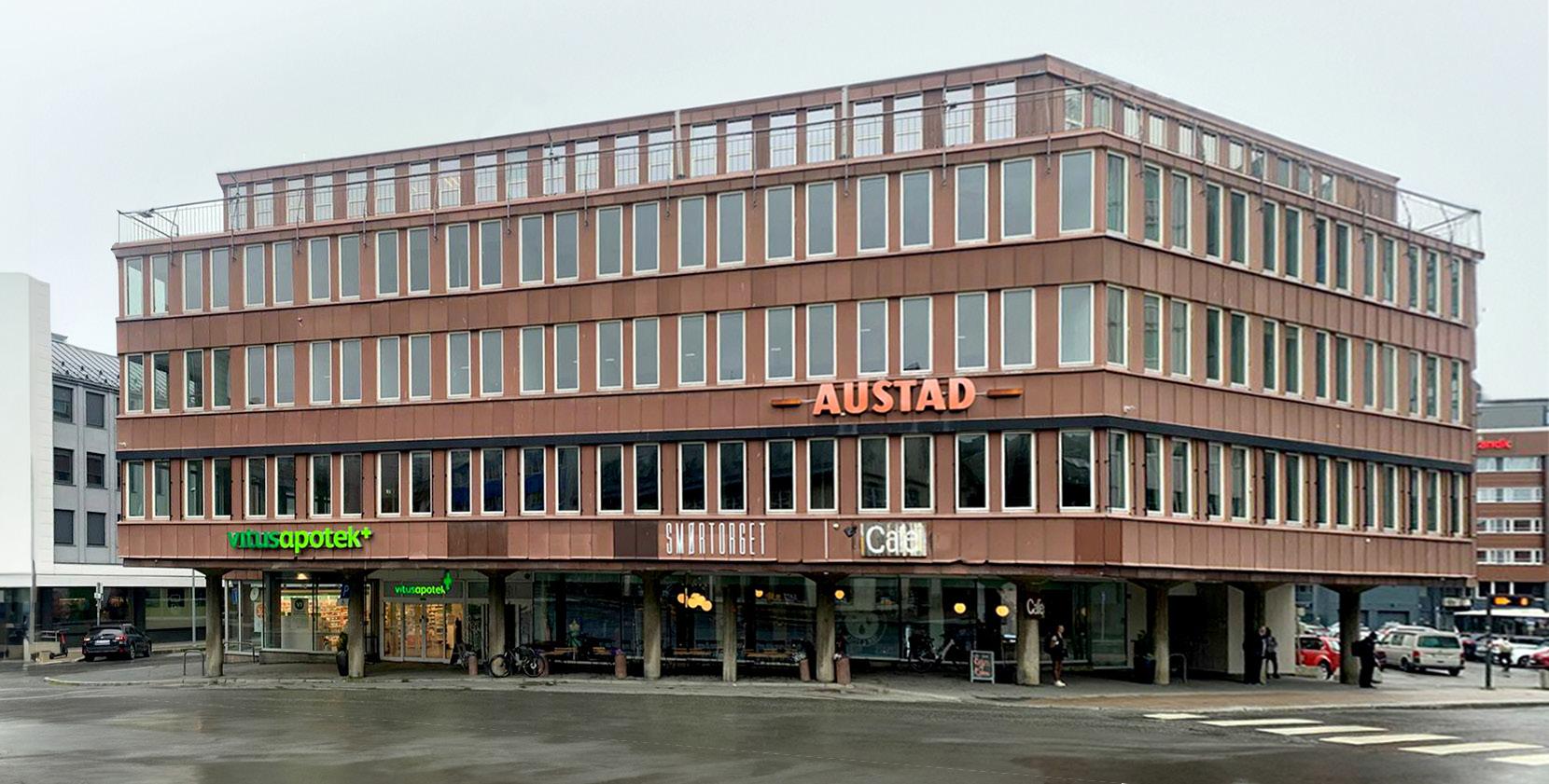
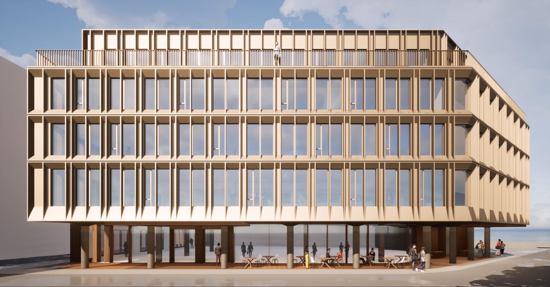
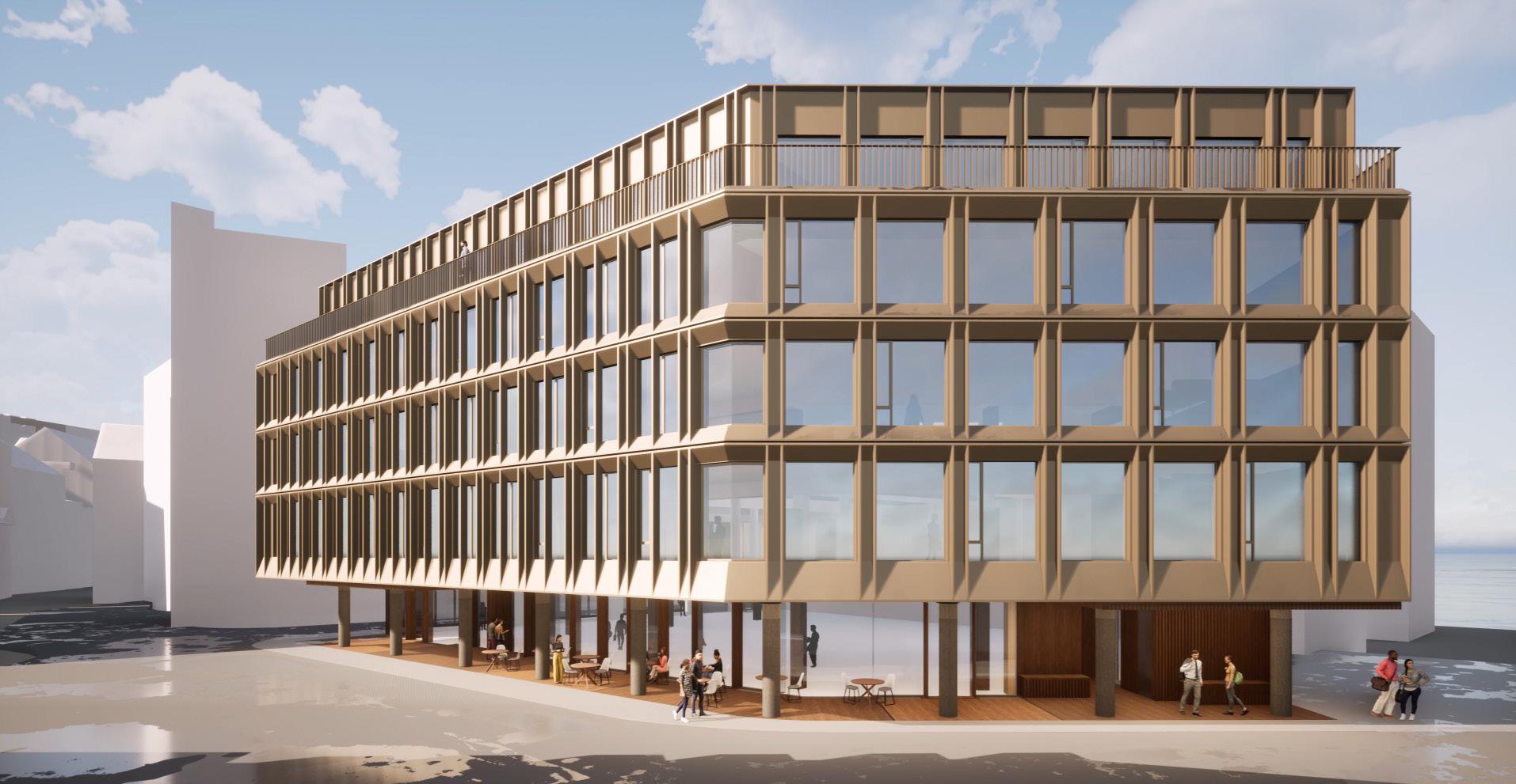
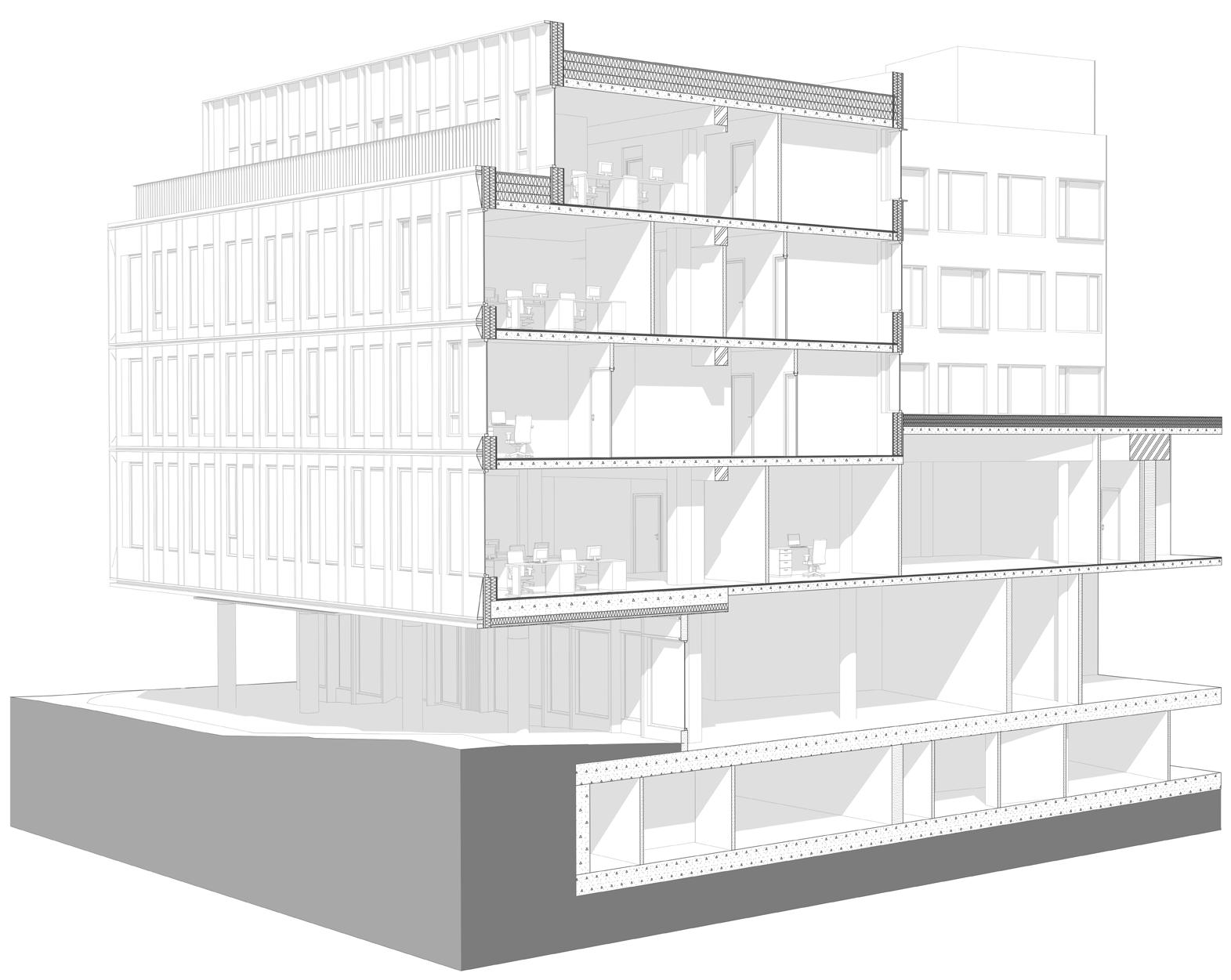
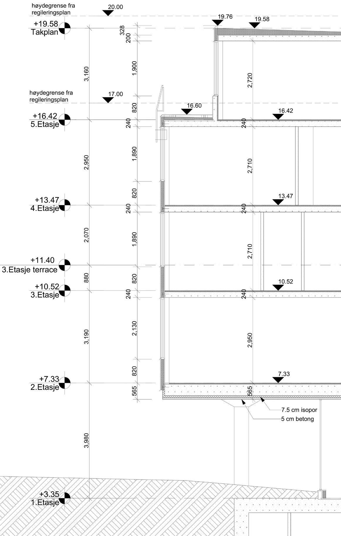
Austadbygget in Tromso, Norway is a renovation project of a five-story building in the city center, offices occupy 4 floors, the first level has a pharmacy and a big cozy cafe. The building’s first floor is recessed, has a gallery with uniquely shaped concrete columns and prominent continuous glazing. The main facade is covered with brick-colored metal sheets and has paired narrow window openings. Old facade section drawings showed insufficient insulation in the walls and an outdated wooden framework enclosed between concrete load-bearing columns, later disassembly of a wall on-site proved that.
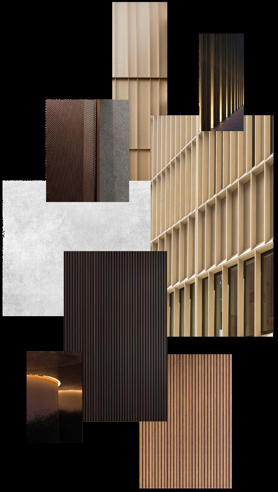
New materials’ mood board
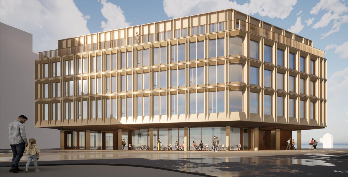
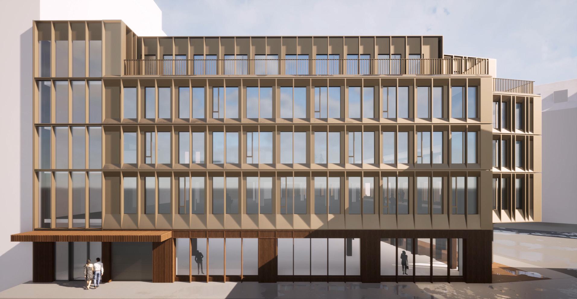
Austadkvartalet
AT Arkitektur
Location: Tromso, Norway
The Austadbygget in Tromso, Norway, a five-story building undergoing renovation in the city center, now houses offices across four floors, along with a pharmacy and a spacious cafe on the first level. Notable features include a recessed ground floor with a gallery boasting unique concrete columns and expansive glazing, and an upper facade adorned with brickcolored metal sheets and narrow window openings. Initial inspections revealed inadequate insulation and an outdated wooden framework between concrete columns, later confirmed during on-site disassembly.
A competition among architectural firms aimed to rejuvenate the facade and enhance the first-level gallery.
Joining AT Arkitektur, I designed and presented ideas within a two-week window, focusing on preserving the building’s character and adhering to regulations. New facade system, material palette change and insulation studies resolved heat loss concerns, securing our office’s win.
My continued involvement included site visits, detailed drawings, and design refinement through minor adjustments.
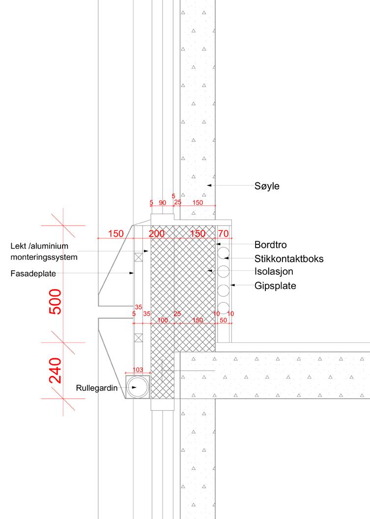
Wall section / Existing
Existing facade
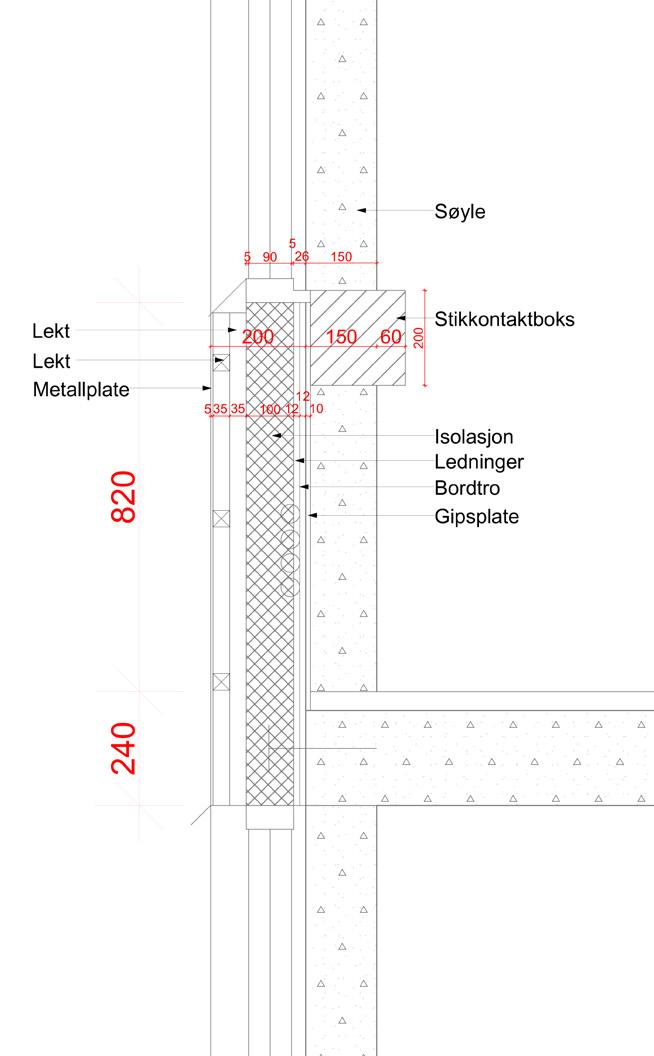
Wall section / Renovated
Renovated facade
Sjogata facade
Fredrik Langes gate facade
Transverse section
Wall section / existing
Bay elevation / existing
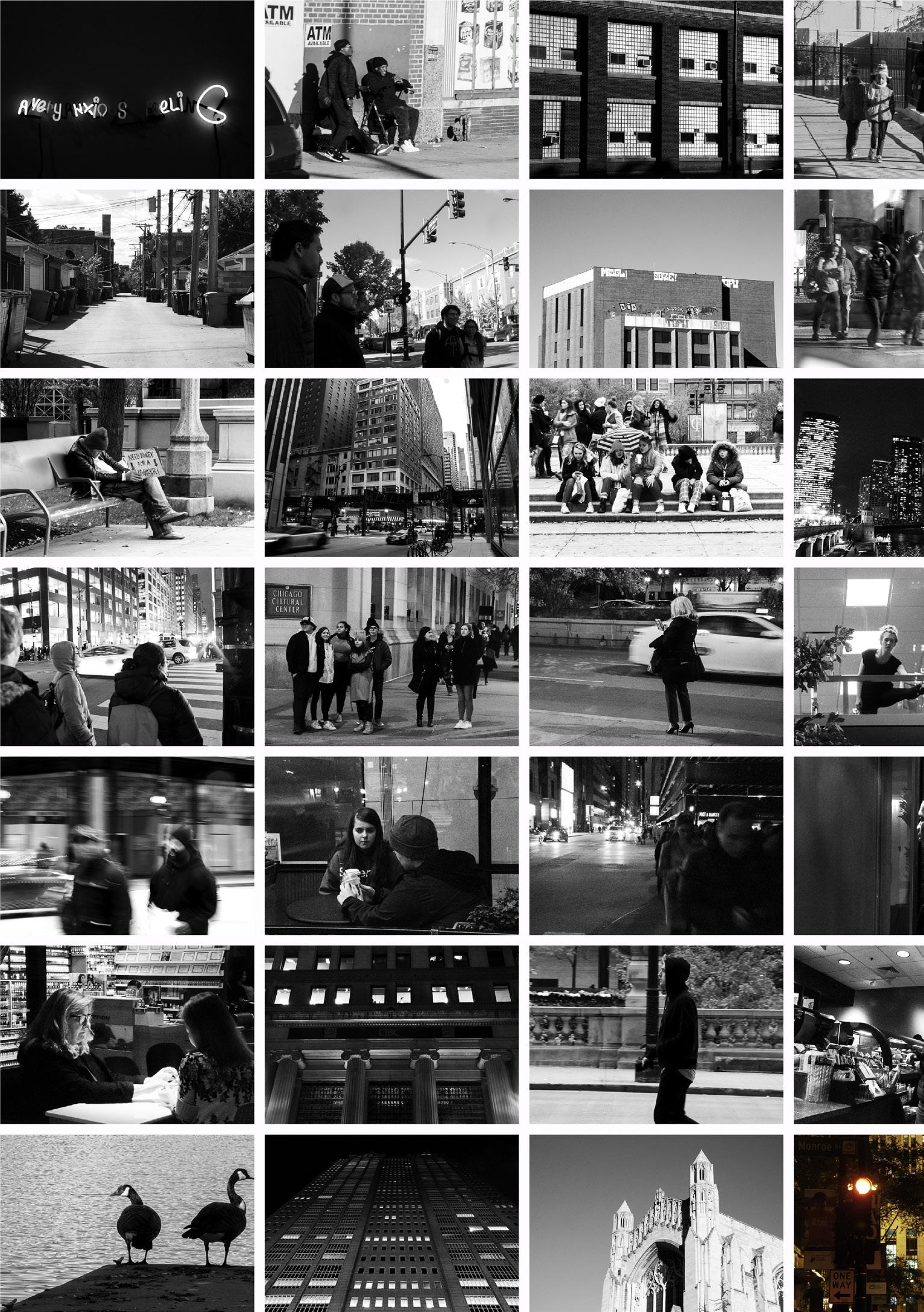
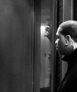
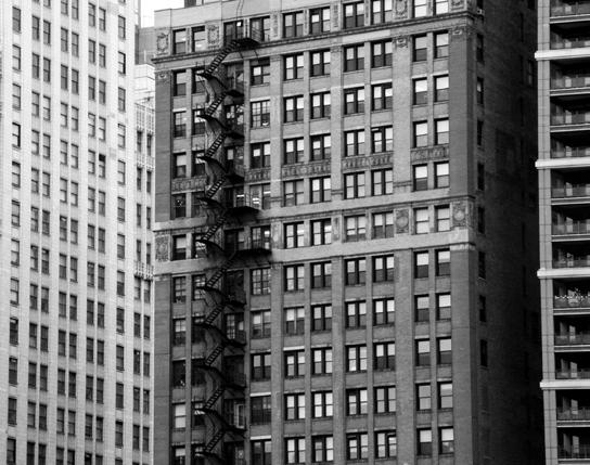
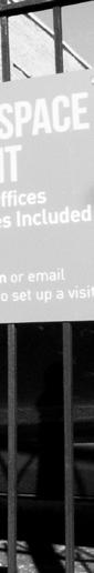
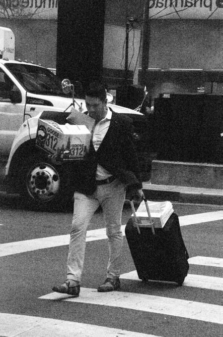
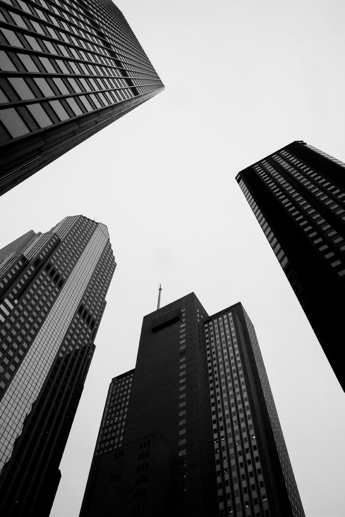
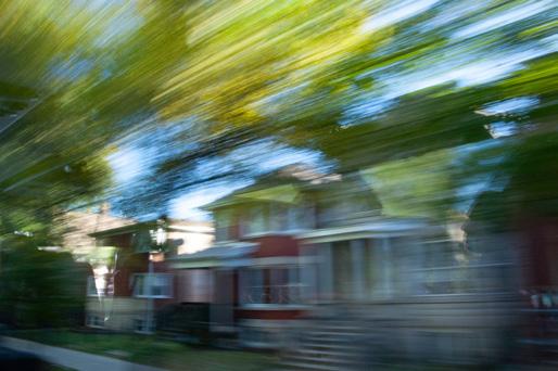
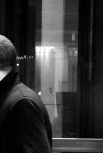
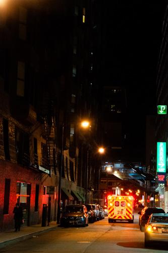
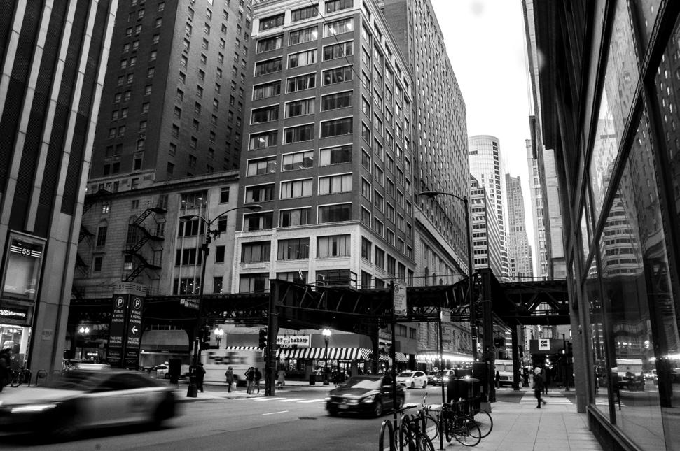
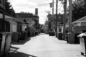
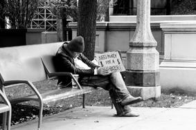
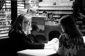
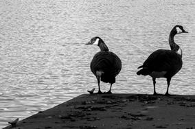
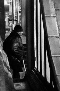
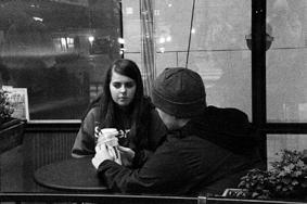
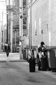
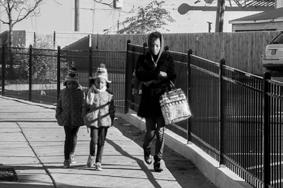
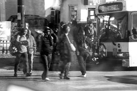
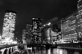
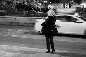
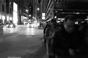
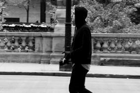
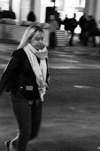
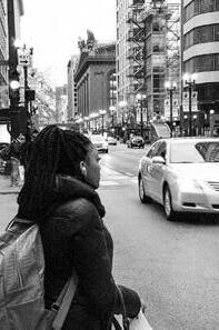
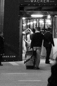
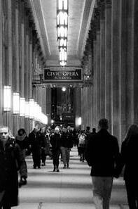
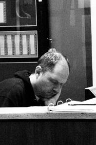
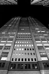
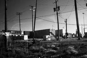
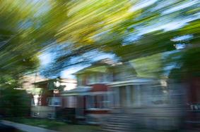
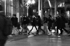
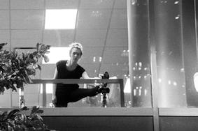
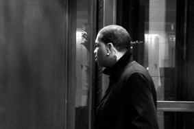
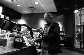
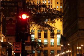
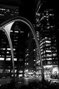
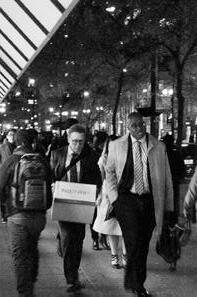
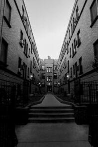
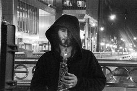
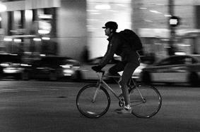
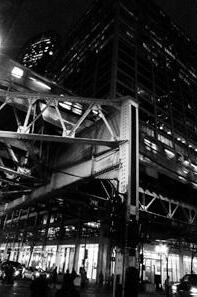
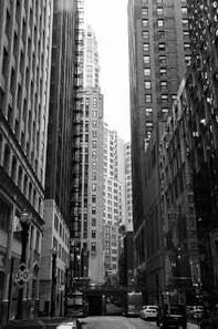
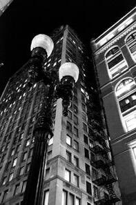
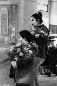
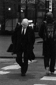
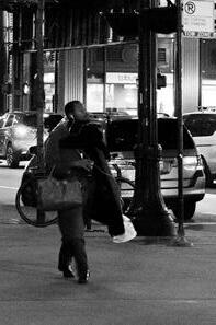
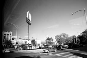
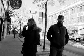
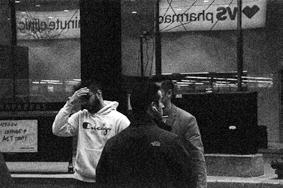
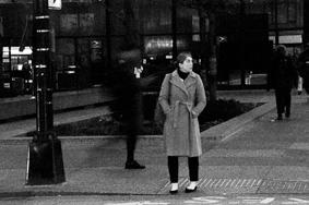
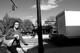
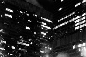
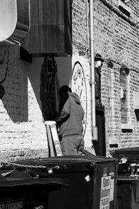
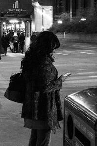
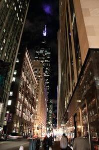
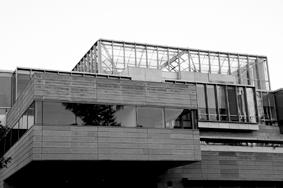
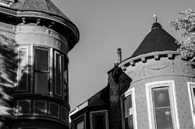
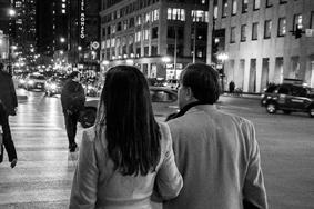
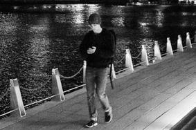
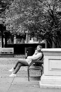
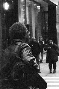
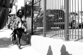
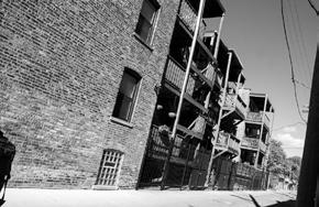
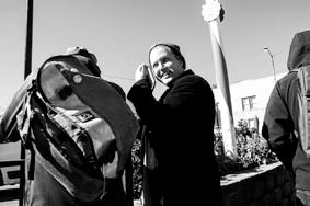
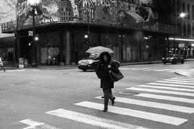
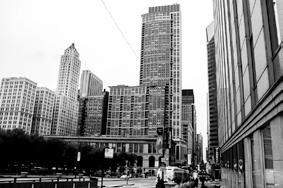
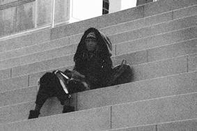
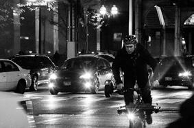
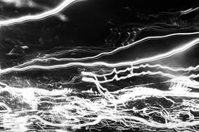
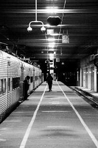
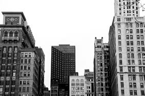
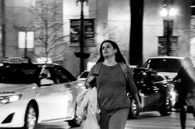
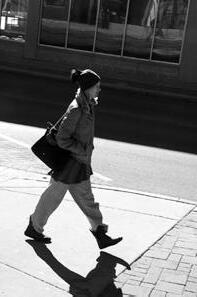
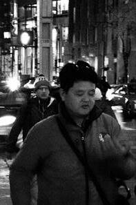
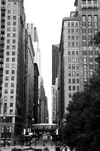
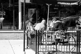
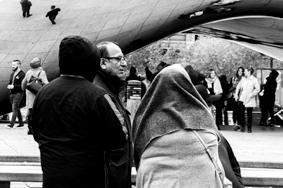
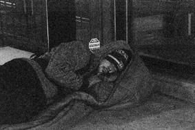
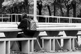
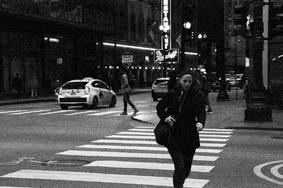
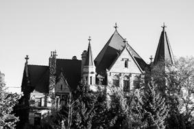
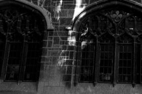
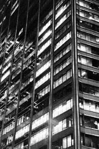
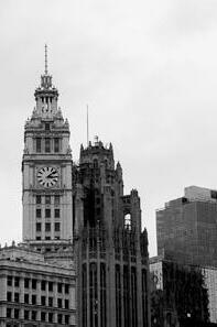
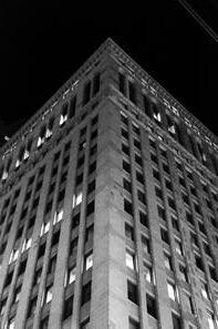
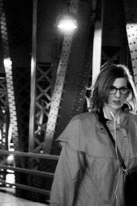
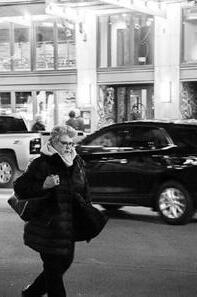
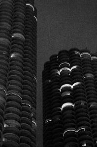
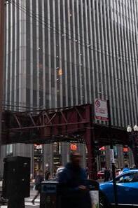
Sculpture / installation / photography
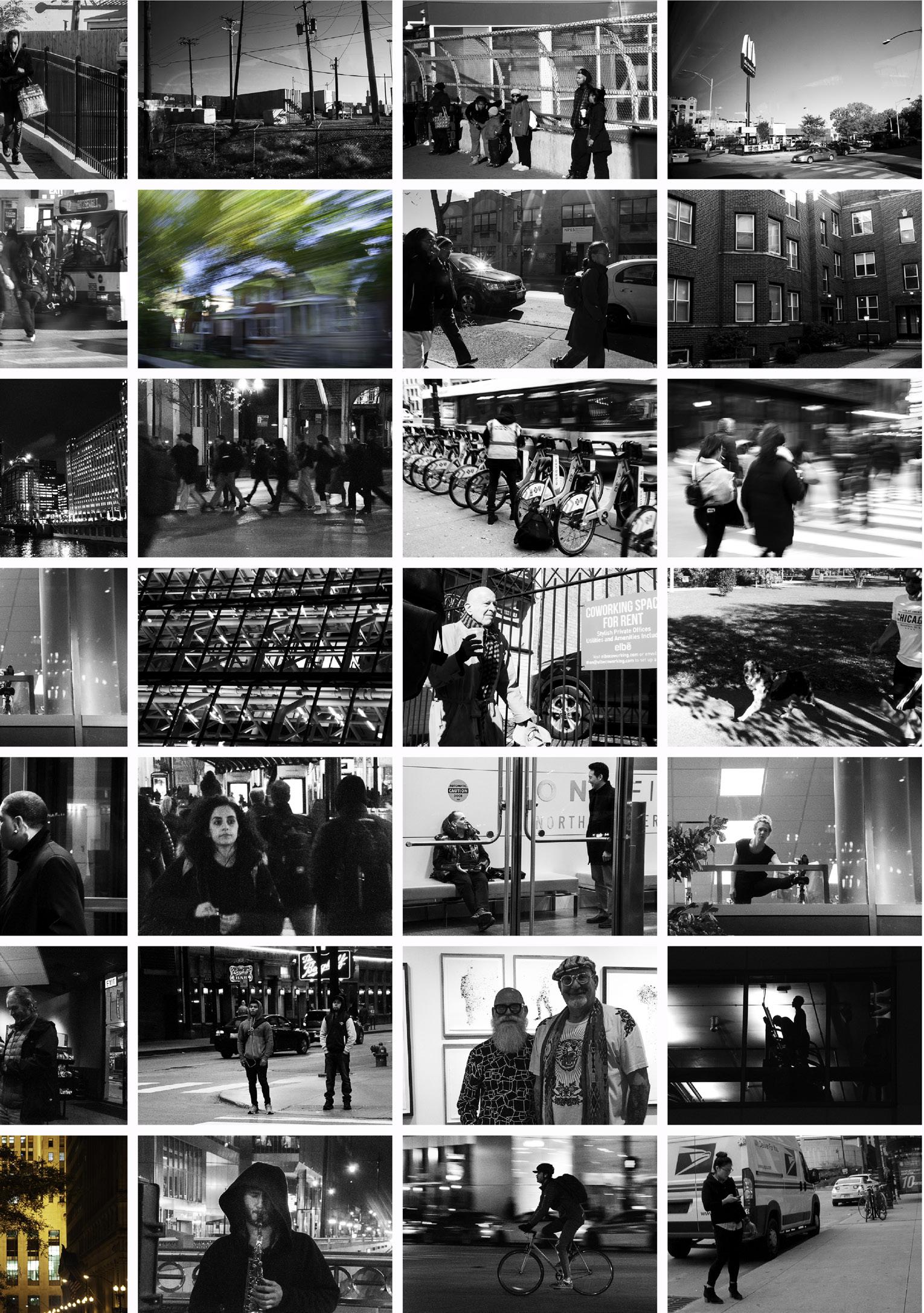
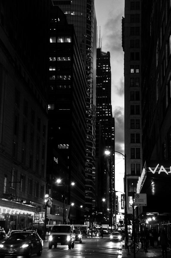
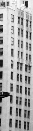
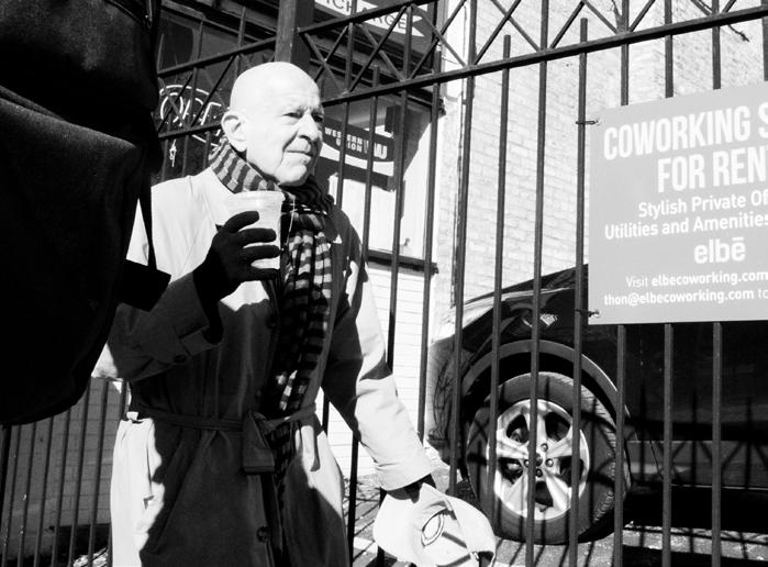
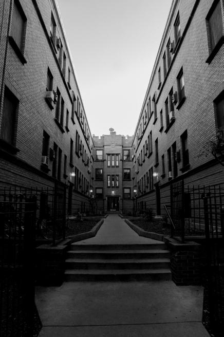
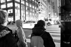
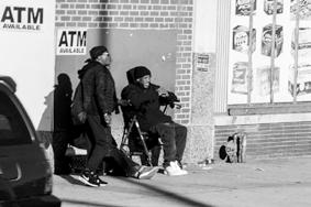
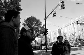
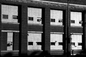
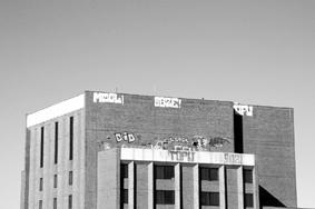
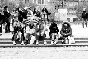
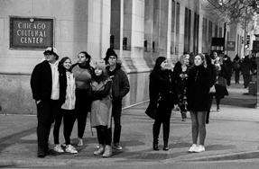
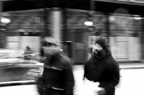
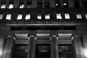
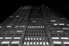
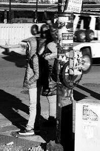
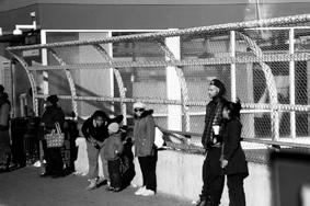
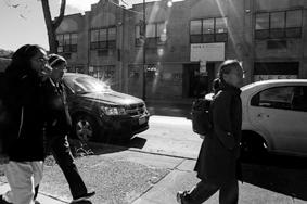
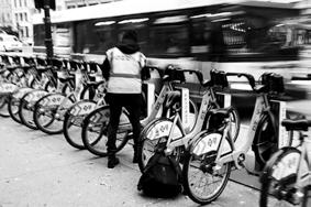
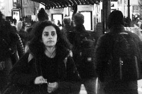
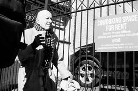
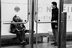
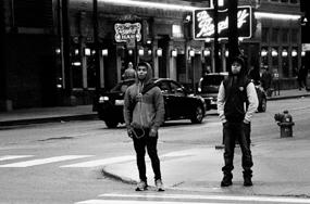
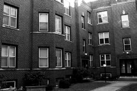
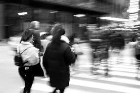
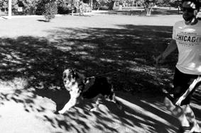
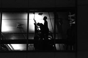
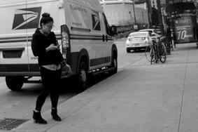
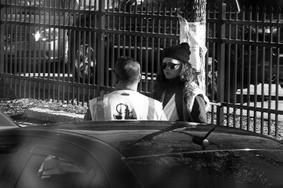
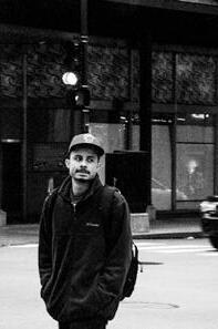
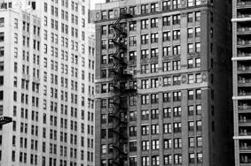
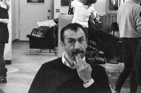
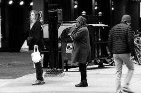
* street photography series from the “Document” project depicting life in Chicago
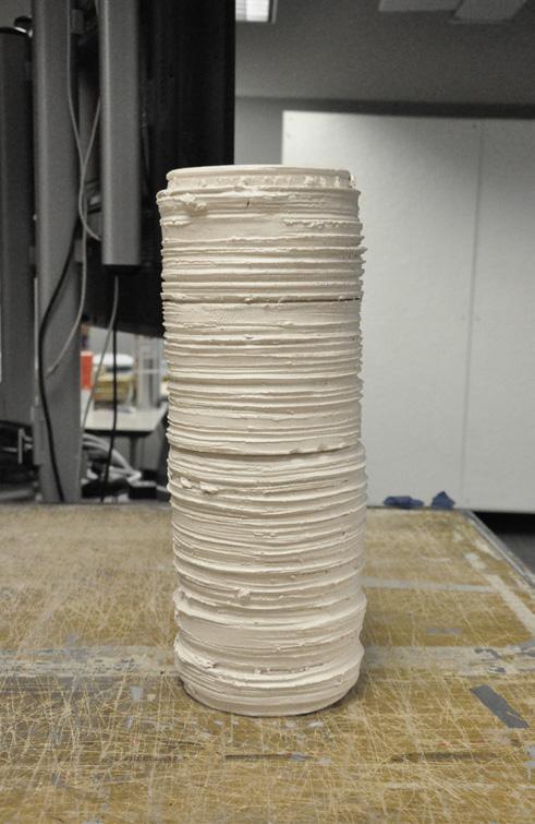
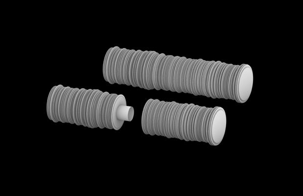
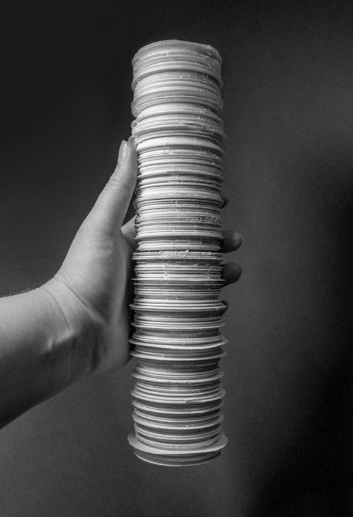
Burial Vessel / Cremation
University of Nebraska-Lincoln, USA
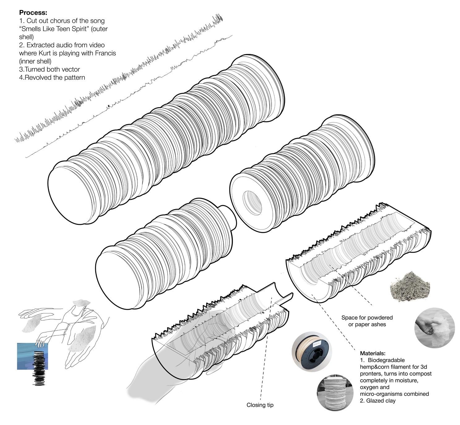
The project is about designing a burial vessel for a famous person. The final fabricated vessel is made from actual materials in 1:1 scale. At the core of this investigation is the development of form, space, use, material, and detail, and relating those design decisions to human form. This project helps to understand the relationship of the body to sculpture and architecture, meaning in architecture through ritual, and the ability for materials and detail to communicate intent.
Kurt Cobain - synonym to Nirvana band, extremely talented, loving father and husband. As can be judged from the facts of his biography, memories of friends and acquaintances, lyrics, and paintings Kurt Cobain was not only gifted but painfully sensitive and ironic. Nirvana’s frontman was a very controversial human being, an eternally rebellious teenager, who felt abandoned and
Metal and plastic CNC carved profiles for processing clay blank on a potter’s wheel
betrayed by his parents.
The designed burial vessel is a tube with a revolved pattern. It is a materialized Kurt’s voice: “Smells Like Teen Spirit” chorus on the outside and him talking to baby daughter Francis on the inside. The vessel depicts the contradictory nature of the singer: a chaotic outer shell and a hidden gentle timid personality. The vessel can be displayed and seen by his fans in a clay version with paper sheets that contain ash particles and given away to people to keep as a memory. A smaller 3D printed option is made using biodegradable hemp filament that can be filled with a certain amount of ashes and transferred to each family member. This special material is completely biodegradable and can be stored or buried.
3D printed vessel
3D model
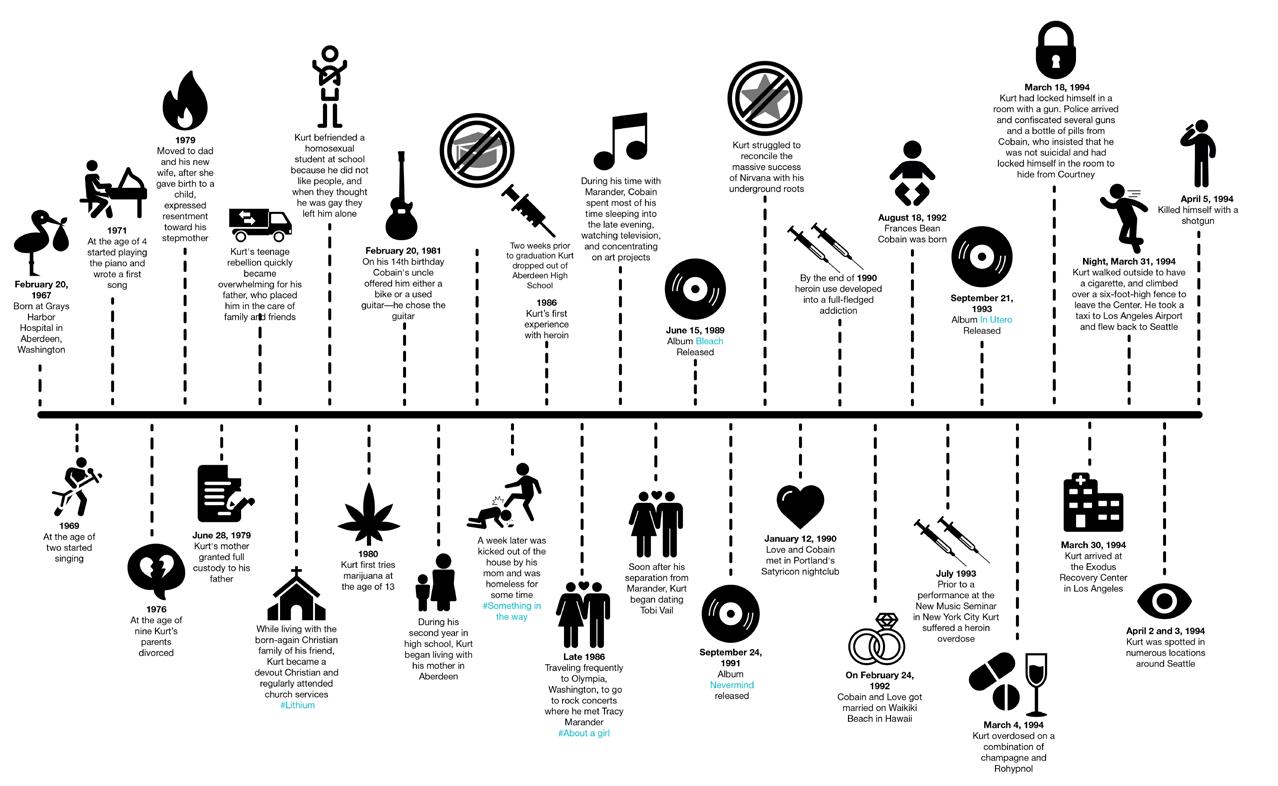
Kurt Cobain’s life timeline
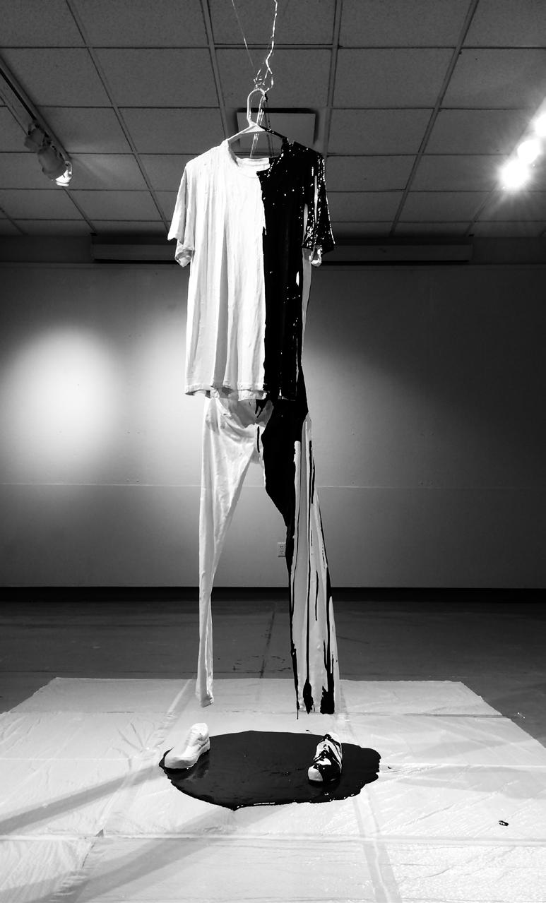
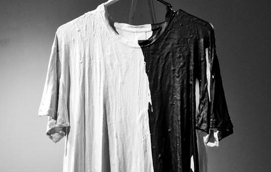
Shadow - my best friend
University of Nebraska-Lincoln, USA
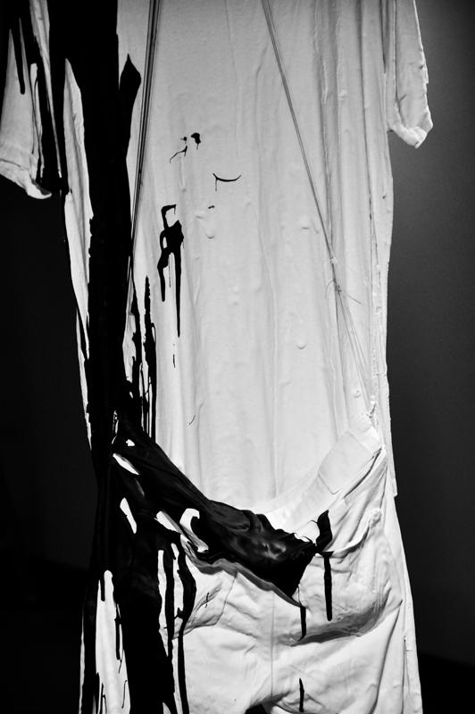
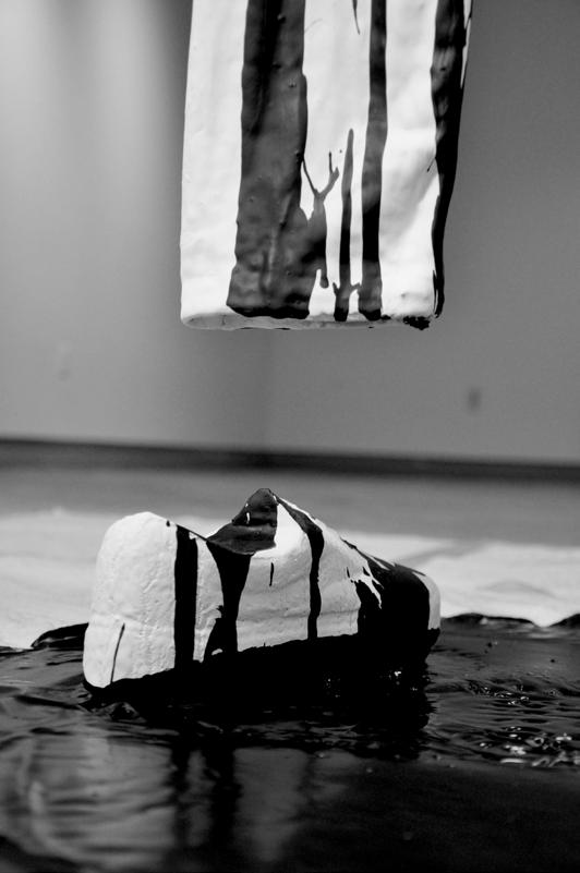
Have you ever thought about what kind of aftertaste remains after you leave the room? Does it depend on your face, clothing style, or manners? Once I opened my wardrobe and realized that there were only very similar things in two colors: white and black. Suddenly I realized that these two colors are haunting me inseparably as an architect and a person wherever I go. I decided to materialize the aftertaste of myself in an empty room and look at it from the side.
Materials: CNC carved foam Vans, plaster dipped T-shirt and jeans, glue mixed with black paint.
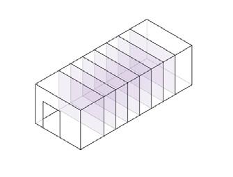
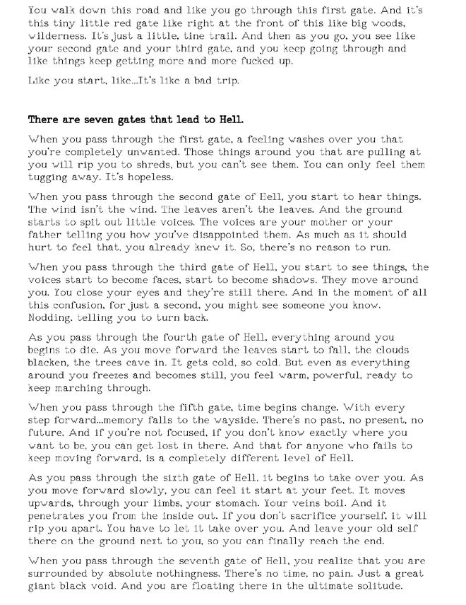
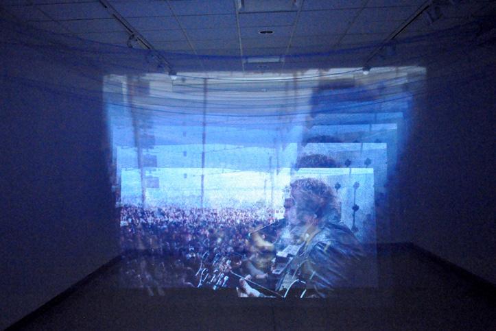
7 gates
University of Nebraska-Lincoln, USA
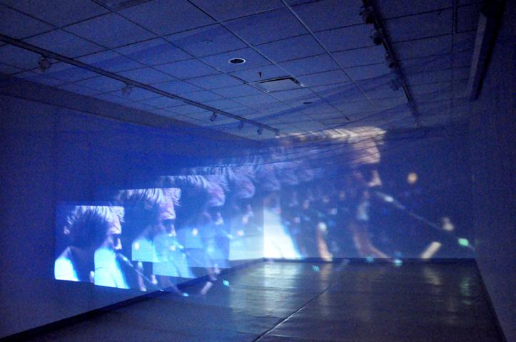
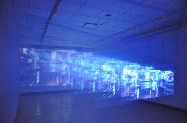
Every next generation understands life different from the previous one. Dante’s description of Hell has been interpreted many times, everyone sees something of their own in it. I stumbled upon the movie “Toad Road” by a young director Jason Banker offering a different, unusual interpretation of the famous image in tune with my generation. This gave me the idea to try to rethink the famous gates myself.
7 screens made of the same translucent mesh hang at the same distance from each other, the same image transmitted from the projector is broadcast on them. But each subsequent layer changes the picture and space, distorting it in its own way.
Just like the gates described in the movie, they don’t change you as much as they change your perception of the surroundings.
Movie monologue describing the gates
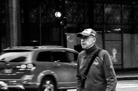
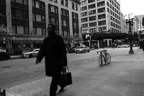
Photo project “Document”
University of Notre Dame, USA
Main goal of this project was to find some object or a process, observe and document it with your camera as a narrative that is telling a story about what was monitored.
I chose the whole city of Chicago as my project playground. I wanted to analyze the city through street photography, document the way it moves, feel the atmosphere, its unique dynamics and understand how does the architecture relate to the people of the city, what is the connection, and the relationship between those two.
I made multiple trips there within a couple of weeks. I would just come to the city and walk around the downtown and other areas for hours. As a result, I created a big print with a selection of the best shots that revealed my thoughts about the place visually.
Most of the shots are black and white, monochromaticity reflecting gray sluggish everyday life, while color pixels scattered here and there personify rare bright moments in the lives of ordinary citizens and outstanding buildings in the city fabric. I discovered that architecture and people of Chicago look alike in their special way, interconnecting with each other, sometimes merging into a single whole. Understanding this as an urbanist and as an architect is a vital aspect that helped me to feel the way the city works on a new deeper level.