Brandbook Guidelines
This manual provides the visual and communication guidelines for the Irrigation Checkup Program. It is designed to ensure a consistent, cohesive look and feel across all graphic and digital applications.
This guide serves as a reference for designers, vendors, and communication partners. Every application should reflect the program's core values: water conservation, trust, accessibility, and sustainability.
IDENTIFIER
Logomark
The Irrigation Checkup Program logo is built around a triangular shape that reflects UTRWD's institutional identity. Within the symbol, simple water-and-irrigation-inspired elements convey trust, professionalism, and accessibility.
IDENTIFIER
Variations
The logo has different versions to adapt to various formats and communication needs:
IDENTIFIER
Unauthorized uses
To maintain brand consistency, avoid the practices outlined below.
Following these guidelines protects the brand's clarity, legibility, and recognition across all communication channels.
x Do not modify the official colors.
x Do not distort, stretch, or compress the figure.
x Do not rotate or tilt the logo.
x Do not apply unauthorized shadows, effects, gradients, or textures.
x Do not change the identifier’s typography.
x Do not place it on low-contrast backgrounds that affect its legibility.
x Do not add external graphic elements that alter its original composition.
x Do not use it at a size smaller than the minimum recommended.
Color Palette
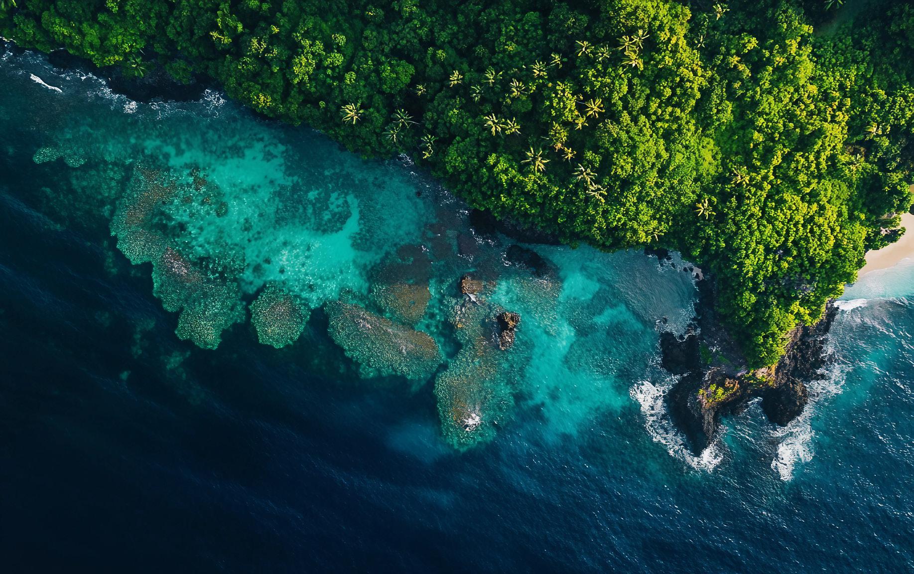
The Irrigation Checkup Program’s color palette is inspired by the natural elements it represents: water, soil, and vegetation.
Blue tones convey trust, freshness, and clarity, reinforcing the program’s direct connection with water resources. Green tones evoke nature, sustainability, and responsible growth.
Finally, accent colors such as orange add dynamism and energy, creating a link to the “Water Less Y’all” campaign and strengthening the visual identity across all applications.
Cód. Hex #03253e Navy Blue
Cód. Hex #0095d5 Blue
Cód. Hex #bfd624 Lima
Cód. Hex #99d3ee Sky
Cód. Hex #3dc0dd Water
Text Colors
The Irrigation Checkup Program’s text colors are designed to ensure readability, consistency, and clear communication across all platforms.
COLOR PALETTE
#9d9d9c
#706f6f
#606060
#006989
TYPOGRAPHY
Neue Haas Grotesk Display
The primary typeface selected is Neue Haas Grotesk Display, in Light, Book, Medium, and Bold weights.
Its clean, legible style ensures clarify across print and digital media while projecting a modern, professional tone.
AaBbCc
ICONOGRAPHY
GRAPHIC RESOURCES
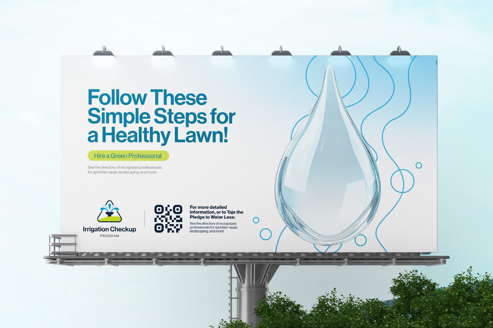
The Irrigation Checkup Program graphic system is inspired by water waves and bubbles, conveying freshness and dynamism. It can be applied as a background or pattern in both digital and print materials, and is available in all color variations of the palette to ensure visual consistency.
Brandbook Guidelines