F R I E N D S
O F
F A L L I N G W A T E R
S P R I N G
2 0 2 6
•
N U M B E R
4 2
FA L L I N GWAT E R C E L E B R AT E S 9 0 Y E A R S
T
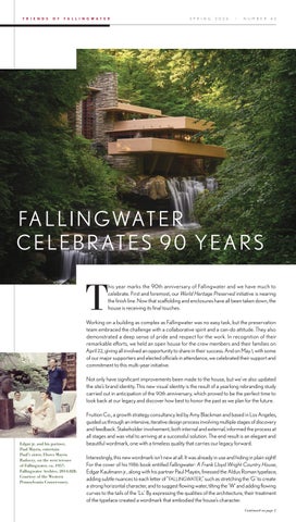
his year marks the 90th anniversary of Fallingwater and we have much to celebrate. First and foremost, our World Heritage Preserved initiative is nearing the finish line. Now that scaffolding and enclosures have all been taken down, the house is receiving its final touches.
Working on a building as complex as Fallingwater was no easy task, but the preservation team embraced the challenge with a collaborative spirit and a can-do attitude. They also demonstrated a deep sense of pride and respect for the work. In recognition of their remarkable efforts, we held an open house for the crew members and their families on April 22, giving all involved an opportunity to share in their success. And on May 1, with some of our major supporters and elected officials in attendance, we celebrated their support and commitment to this multi-year initiative. Not only have significant improvements been made to the house, but we’ve also updated the site’s brand identity. This new visual identity is the result of a yearlong rebranding study carried out in anticipation of the 90th anniversary, which proved to be the perfect time to look back at our legacy and discover how best to honor the past as we plan for the future.
Edgar jr. and his partner, Paul Mayén, entertain Paul’s sister, Flores Mayén Radoczy, on the west terrace of Fallingwater, ca. 1957. Fallingwater Archive, 2014.028. Courtesy of the Western Pennsylvania Conservancy.
Fruition Co., a growth strategy consultancy led by Amy Blackman and based in Los Angeles, guided us through an intensive, iterative design process involving multiple stages of discovery and feedback. Stakeholder involvement, both internal and external, informed the process at all stages and was vital to arriving at a successful solution. The end result is an elegant and beautiful wordmark, one with a timeless quality that carries our legacy forward. Interestingly, this new wordmark isn’t new at all. It was already in use and hiding in plain sight! For the cover of his 1986 book entitled Fallingwater: A Frank Lloyd Wright Country House, Edgar Kaufmann jr., along with his partner Paul Mayén, finessed the Aldus Roman typeface, adding subtle nuances to each letter of “FALLINGWATER,” such as stretching the ‘G’ to create a strong horizontal character, and to suggest flowing water, tilting the ‘W’ and adding flowing curves to the tails of the ‘Ls.’ By expressing the qualities of the architecture, their treatment of the typeface created a wordmark that embodied the house’s character. Continued on page 2