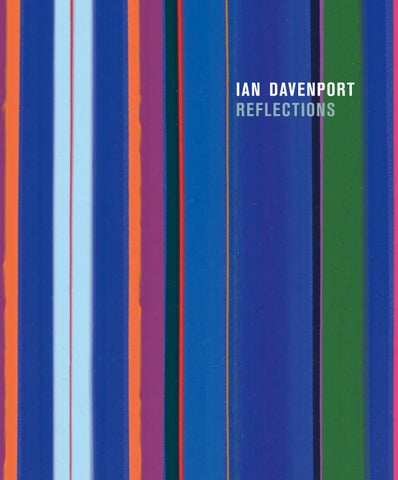
ian davenport reflections
ian davenport reflections
2
ian davenport reflections with texts by Michael Bracewell John Constable Ian Davenport Norman Rosenthal Richard Shone Michael Stanley Jonathan Watkins Sarah Whitfield and a conversation between Ian Davenport and Philip Davenport
on the cover Blue Mirrored, 2023 (detail) on page 1 Ian Davenport in the studio, 1990 frontispiece Ian Davenport with Lake No. 2 (Tectonic), 2023 Published alongside the exhibition Ian Davenport: Reflections Waddington Custot 11–12 Cork St London W1S 3LT First published in the United Kingdom in 2026 by Waddington Custot Official copyright © 2026 Waddington Custot, London Artwork images courtesy of the artist Texts copyright © 2026 the Authors Every effort has been made to contact the writers. Many thanks to those who have generously agreed to republish their texts. All Rights Reserved. No part of this publication may be reproduced or transmitted in any form or by any means, electronic or mechanical, including photocopy, recording or other information storage and retrieval systems, without prior permission in writing from the publishers. Editorial, design, reprographics, and production by Andrew Brown at Art Books Publishing Ltd Co-edited by Louise Malcolm Artwork photography by Prudence Cuming Associates, unless otherwise stated Printed and bound in Wales by Gomer Press ISBN 978-1-7397005-3-9 To find out more about Waddington Custot publications, please visit waddingtoncustot.com, where you can browse our catalogues and buy any titles that are of interest.
contents
6
Stéphane Custot Preface
10
Ian Davenport Notes on Painting
22
Norman Rosenthal Introduction
40
Richard Shone Untitled
54
Jonathan Watkins On Reflection
74
Michael Bracewell Ian Davenport’s Paintings
100
Sarah Whitfield Beyond the Limits of the Line
120
Michael Stanley Quick, Slow, Quick Quick, Slow …
130
Joseph Constable Ian Davenport: From Duration to Instantaneity
146
Ian Davenport and Philip Davenport In Conversation
158 160
Artist’s biography Acknowledgements
stéphane custot preface
In the summer of 1988, Leslie Waddington visited the Goldsmiths College of Art degree show, where Michael Craig-Martin
encouraged him to take a look at the work of one particular student: Ian Davenport. Leslie immediately recognised
something special. Not long afterwards, when Ian was just
twenty-two years old, Waddington Galleries took the decision
to represent him and held a landmark debut exhibition in 1990.
This marked the beginning of a long and rewarding relationship.
As we look back nearly forty years to that first encounter,
this exhibition celebrates the remarkable breadth of Ian’s
career. Reflections traces the evolution of his practice through
the different series that have shaped his work over the decades. To help tell that story, we have included texts from previous exhibition catalogues, and I would like to thank all of the
writers for their thoughtful and perceptive contributions.
Ian is perhaps best known for his ‘Puddle Paintings’,
but with this exhibition we wanted to look beyond the works for which he is most widely recognised. As well as the major
paintings, we have included a selection of experimental works
on paper, made alongside the ‘Arch’ and ‘Circle’ series, offering a broader insight into his way of working and the ideas that have continued to drive his practice.
Since becoming the youngest-ever Turner Prize
nominee in 1991, Ian has created ambitious installations
across the world. These include Poured Lines, a forty-eight-
metre-wide painting for Southwark Bridge in London in 2006, Giardini Colorfall for the Venice Biennale in 2017, and Poured
Staircase at Rome’s Chiostro del Bramante in 2022. His work is held in major public collections, including Tate, MoMA,
the Centre Pompidou, and the British Museum, and he has
presented significant solo exhibitions at Ikon Gallery, Tate Liverpool and Dallas Contemporary.
We are immensely proud to have continued working
with Ian throughout his career. Reflections marks his eleventh solo exhibition with the gallery, and our commitment to
his work remains as strong today as it was when Leslie first
encountered it all those years ago. It has been a privilege to
support Ian over the past four decades, and it is a partnership following pages Blossom, 2023 Acrylic on aluminium, mounted on aluminium panel (with additional floor section) 235 × 140 × 65.5 cm (detail)
that continues to inspire us. His work feels every bit as vital, original and relevant today as it did at the very beginning.
7
ian davenport notes on painting
First published in the catalogue for the British Art Show 3, 1990
I use household and industrial paints. The fluidity of the material and the quantity I can obtain excite me.
I dip a brush in a paint pot and then with a fully laden brush make contact with the canvas.
The rhythm of the painting comes from repetition – a kind of exuberant methodicalism.
The paintings are a whole – what happens in one section will reoccur in another.
Chance within a highly structured system. My paintings always surprise me, no matter how clear they are to me from the outset. In the studio, 1990
Each painting has a plan: this might change during
its execution, and often the painting is the result of many plans.
The structure of the painting is formed by the paint
running into itself. Each of my paintings has evolved from
a very deliberate process, not from intuitive mark-making. I always try to do very little but a lot of it. I don’t say this painting looks like this or that;
the whole painting might be about something,
more likely a phenomenon than an object. But the meaning comes from the making of the painting.
The realisation of ideas formulates taste. My work necessitates the questioning of good taste. September 1989
11
Study for Untitled, 1988 Household paint on paper 84 × 60 cm
12
13
Erased Lines (Six), 1988 Household paint on paper 89 × 64 cm
14
Erased Lines (Seven), 1988 Household paint on paper 88 × 64 cm
15
Study, 1988 Household paint on paper 52 × 39 cm
16
17
Untitled, 1989 Household paint on canvas 213.4 × 426.7 cm
18
19
Large Matt Black Painting, 1989 Household paint on canvas 274.3 × 548.6 cm
norman rosenthal introduction
First published in the catalogue for the exhibition Ian Davenport, Waddington Galleries, 1990 Sir Norman Rosenthal is a curator and art historian. He was a curator at the Institute of Contemporary Arts in London from 1974 to 1976 and was the Exhibitions Secretary of the Royal Academy of Arts from 1977 to 2008.
Every now and then, and in the increasing hurly-burly
of the contemporary art world, one is struck by something that one has not seen before, that assaults both the head
and the gut in a genuinely exciting way. Something that,
potentially anyway, seems to represent an addition to our knowledge of art takes place. It is, in other words, a kind
of making more precise within a given medium, here the
medium of paint on canvas, a precision that seems perfectly to represent the time in which it was made. I had just such a
pleasurable experience two summers ago when I saw for the
first time a painting by Ian Davenport, then twenty-two years of age [see previous pages]. He was just out of Goldsmiths
School of Art, whose best students now more and more seem to stand for a present renewal of art practice in England,
something analogous to the position of those at the Royal
College of Art in the late 1950s and early 1960s who took the In the studio, 1990
art world by storm and changed everything. The painting was in a show organised by these talented students with extraordinary professionalism (nothing wrong in that)
in a warehouse in London’s new-look East End Docklands. To approach that new world growing up on the fringes of
London, on a sunny summer’s day, resembles nothing less than an approach from afar towards Dallas or Houston. The painting in question was a large horizontal
black-on-black painting that at once seemed to challenge the black-on-black abstractions of Ad Reinhardt. At the
moment of seeing, this new work of Davenport’s made those
angular paintings of Reinhardt, done thirty to forty years ago, seem almost stiff, even awkward in comparison. For whilst
this painting was every bit as abstract and rigorous in its use of a repetitive motif taken from top to bottom and across the canvas, it seemed to achieve the almost impossible – namely
the combination of a totally rigorous and highly premeditated method with an apparent organic even musical rhythm
that was totally seducing. One hesitates to make further
comparisons with artists of the recent past (and they are
quite numerous) that Davenport’s painting seems to challenge,
23
Untitled, 1989 Oil on canvas 214 × 214 cm
for in the case of so young a painter such comparisons can
become burdensome and even invidious. Rather, we might
invoke here the spirit of John Cage, and not inappropriately I think, for certain of Davenport’s paintings remind me of
nothing so much as the black and white keys of an imaginary piano with an infinite range of octaves. For it is the attitude of Cage and his theories of controlled chance that have
enabled the composer to create works of exquisite and,
for the perceptive and sympathetic ear, complex control such as only nature itself can offer. Of course, sympathy
is important. For within the avant-garde (that continuing
phenomenon that Cage exemplifies so perfectly), a sympathy and a critical willingness to find the object of art, whether
addressed to ear or eye, beautiful, if at all possible, is essential. It is all too easy to laugh or dismiss out of hand the irrational rationality of genuine contemporary art practice.
24
Untitled, 1989 Household paint on canvas 243 × 243 cm
I suppose when I looked at the paintings of Davenport,
I was wanting to like them, but was nonetheless thrilled to find that I did. In the last two years I have seen many more works and groups of work. I have visited the artist’s studio on a few occasions and have invariably been astonished to find many paintings that in their own way confirm this combination
of rigour and lyric poetry. How do they come about? On the surface they appear perfectly and immaculately executed
and controlled. Using cheap household paints and emulsions,
Davenport achieves an extraordinary sharp light that emanates from the canvas, each painting achieving maximum density
of colour within (for the most part) a very narrow spectrum. But beyond his own control he allows the paint to work by itself for him, and to find its own natural position on the
canvas. The paint drips or drags or falls across the canvas making amazingly disciplined signs and signals by itself.
25
Now nearly thirty years ago, John Cage wrote in
his book A Year from Monday the following apposite lines: I have for many years accepted, and I still do, the doctrine about Art, occidental and oriental, set forth by Ananda K. Coomaraswamy in his book The Transformation of Nature in Art, that the function of Art is to imitate Nature in her manner of operation. Our understanding of ‘her manner of operation’ changes according to advances in the sciences.
We now might prefer to speak of changes in our daily
environment, rather than advances in sciences. The clue to Davenport’s work is his manner of operation.
Davenport’s paintings until now seem to me to
show much more than mere promise. He, amongst his
contemporaries, many of whom are producing fascinating and exciting work, seems alone miraculously to have
found a new way to produce beautiful paintings. They have within them extraordinary movement, sometimes capable
of evoking particular elements – perhaps water or the wind.
They might seem to resemble water reeds moving in the wind but equally they give rise to thoughts about the smoother
surface beauty of industrial production, or yet again, in their energy, of sexual force. But above all, Davenport’s paintings seem so precise because he has made a way for the paint
to speak for itself on the canvas. And because that nature
to which Cage refers is so astonishingly varied, it has been possible for Davenport to produce, within a tight and self-
imposed methodology that he himself sets for each painting
(or rather group of paintings), marvellously satisfying variety. The best thing of all about these paintings is that they hold out the hope of even more to come. That is the nature of
creativity. Nature, as Cage defines it, can indeed become
like paint and is indeed infinite in its possibility of satisfying
variety. The individual artist has just to find an entrance, and I firmly believe that Davenport has done just this.
opposite Satin Black on White from the Bottom to the Top, 1989 Household paint on canvas 259.1 × 259.1 cm (detail)
26
following pages In the studio, 1990
above In the studio, 1990
30
opposite and following pages Untitled (Large White), 1991 Household paint on canvas 213.4 × 640.1 cm
Watering Can Drawing: No. 1, 1992 Household paint on paper 100 × 153 cm
34
Watering Can Drawing: Diagonal Grid, 1992 Household paint on paper 121 × 80 cm
36
Watering Can Drawing: Diagonal Grid No. 2, 1992 Household paint on paper 121 × 80 cm
37
Watering Can Drawing: Scored, 1992 Household paint on paper 121 × 80 cm (detail opposite)
38
richard shone untitled
First published in the catalogue for the exhibition Ian Davenport, Waddington Galleries, 1993 Richard Shone is an art historian and art critic specialising in British modern art. He was the editor of the Burlington Magazine from 2003 to 2015.
‘They see poetry in what I have done’, Seurat once remarked. ‘No, I apply my method and that is all there is to it.’ Here, baldly stated and a touch disingenuous, is the artist’s
archetypal reply to those people who, when looking at a work
of art, confuse their own reactions with the artist’s intentions. Emotions and associations, unknown and even alien to the maker, frequently crowd out the obvious characteristics
of a work, there for all to see within its palpable physical
presence. Such reactions are not always invalid and can lead to a just reading of why a work takes the particular form it has. But paintings of the kind made by Ian Davenport are especially vulnerable to irrelevant interpretation. People
long to identify with his luscious runs of paint, extract some subcutaneous meaning from his method. Drawing a blank, they turn hostile and accuse him of making ‘meaningless
exercises’, of ‘lacking poetry or a spiritual dimension’. Isn’t In the studio, 1993
it enough that Davenport has given us something stunningly new to look at? ‘No’, people complain, still avid for content,
uplift, literature to bolster their psycho-biographical readings. Davenport’s colour-bound coming out, as seen in the majority of the paintings in this show, will no doubt feed further
speculation – colour is more dangerously emotive than line. Even here, it would be misguided ‘to see poetry’ in what Davenport has done. It’s far more interesting than that.
Although Davenport’s current practice hardly alters
from painting to painting, the results can be startling in their difference. All, however, begin with three layers of acrylic
primer on canvas or board, followed by two applications of
Dulux gloss, a two-day drying period between each. A small
scaffold is placed next to the canvas, which is positioned at a
slight angle to the vertical. The paint is poured from a vessel
with an adjustable head to regulate the breadth of each pour. Strict time is kept between the sequence of pours, allowing the paint to find its way down and off the canvas, before it
begins to meander or expire. Variations in timing establish the overall tempo of each work. Decisions include ground colour, width of run, gauging of overlap, where to begin each pour,
41
right Poured Lines: Cream, Yellow, Beige, Dark Blue, Light Blue, 1993 Household paint on canvas 213.4 × 213.4 cm opposite In the studio working and with Richard Shone, 1993
choice of colours and their number. Broad pours give a firmer,
more solid structure, which can be emphasised through strong tonal contrasts; slender pours are more fragile in presence
and wayward in destination, interlacing and obscuring earlier lines. Some runs retain their identity throughout; others surprise by their inflections and mergers.
The choice of colour is determined by the kind of
structure Davenport has in mind, invariably dependent
on an interweaving of dark, neutral and light. The weight
of colour within the whole is contingent upon its breadth: spaciously banded as an even palisade, or pencil-thin and encroached upon from either side, thrust back by near
superimposition. The variations are enthralling, especially
as the colour has no descriptive or illusionistic function but acts as drawing and presents itself as essence. Passages are
thick, buttressing their neighbours in lumpen sheaves; others are attenuated to provide welcome ventilation. Inevitably,
the warp of ground and the weft of paint runs exchange places and the resulting dialogue is indefinite.
43
Untitled (Drab), 1990 Household paint on canvas 213.4 × 213.4 cm
Untitled Matt Black, Gloss Black, Satin Black, 1990 Household paint on canvas 213.4 × 213.4 cm
44
Davenport’s earlier work – such as the paintings seen
at his last exhibition in this gallery (1990) – was achieved
through a wider repertory of marks but a narrower spectrum
of colour. He was the master of black and grey and a particular fatigued, sock-drawer grey-green. Splash and drip vitalised the surface, and gesture was more physically apparent.
In the intervening period, through trial and mistake, gloom and elation, he has immeasurably increased the refinement of his method and the skill with which he employs it.
The results are positive, carrying conviction and exhilaration. He has recomplicated the surface by giving himself more
freedom within the constraints of his process. Intuition plays a greater part.
In his return to the use of a wider selection of colour,
Davenport has attained a buoyancy conspicuous in many of
his works made in the late 1980s. This is not to denigrate the
unrepentantly uncoloured works in between – they have their own seductive qualities. What Davenport learnt from this
monochrome period is clear from the examples shown here,
the last of the present series. But when he says that he is not a colourist, he is insisting on the structural nature of his use of colour, not on its emotive or mimetic status. What in fact has happened is that the controls imposed by his method of painting are now so well assimilated that freedom to widen his effects has come about with no apparent effort. And
colour with all its possibilities has been regained through
this freedom. The paintings now have a mastery of means allied to an aggressive quietude of presence.
Although Davenport has proved himself an individual
with an unmistakeable look of his own, he inevitably
shares certain assumptions with his generation and owes characteristics to particular forebears. You can connect,
however tenuously, his runs of colour, methodical procedures
and nodal repetition with the work of several contemporaries. Further back, he has looked at Jackson Pollock, Agnes Martin, Morris Louis and Brice Marden. His manipulation of paint and formal vocabulary can be traced back to this bracing
American tradition. And though his connections with his
contemporaries are equally identifiable, they are gradually
being rinsed out with each new group of works. What he still shares with them, however, is a distinctly urban note, more
45
apparent in these paintings than those last shown here, almost ineffable in its hovering presence. It goes beyond the simple
facts of Davenport’s urban upbringing, residence in London, use of commercial paint and his methodical production.
The paintings have an artificial brilliance (even in the darker
earlier works, the light was sharp and competitive). They have zip and authority. There is no suggestion of the half-defined, amorphous, evolving inventions of the natural. Davenport’s is a world of straight lines subjected to chance. He is
more likely to be captivated by a long gleaming stretch of
corrugated-iron fencing or the coloured plastic strip curtains found in shop doors than he is by any natural phenomena. Part of his achievement lies in his learning how to pass,
what to reject or eventually exclude. Knowing what he doesn’t want to do and being adamant about it is in part responsible for the gravitas and integrity of his work.
Not so very long ago, painting that was confined to
repeated non-figurative forms, with little or no reference to the perceived daily world, was frequently regarded as
bearing the cool, steady flame of sanity. Such painting was
order extracted from chaos, impervious to mundane, allusive content. We have learnt in the last few years that not all was as it seemed. But in looking at Ian Davenport’s work, I feel
that this older conception still holds good. He orders chance
and risk; he shuts the door tight against insinuating metaphor or distracting connotations. Of course, there is cool obsession
here, but it comes about only through fervour and enjoyment.
He has to warm up to become cool. What I particularly admire is the intensity with which he follows through the tightrope
proposition that the way of making paintings he has evolved will transmit a fresh and resonant vision.
46
Poured Lines: Mid Grey, 1993 Household paint on formica-faced board 213.4 × 213.4 cm (detail)
Poured Lines: Mid Grey, 1993 Household paint on formica-faced board 213.4 × 213.4 cm
48
Untitled, 1995 Household paint on canvas 121.3 × 121.3 cm
49
Poured Lines: Light Red Orange Yellow Green Purple Yellow Red, 1995 Household oil on canvas 213.4 × 213.4 cm
50
Poured Lines: Violet, Grey Blue, 1993 Household paint on canvas 212.5 × 214 cm
51
Poured Lines: Grey (Twenty Three), 1996 Household paint on paper 40.1 × 30.5 cm
52
53
jonathan watkins on reflection
First published in the catalogue for the exhibition Ian Davenport: Paintings, Dundee Contemporary Arts, 1999 Jonathan Watkins is an independent curator and writer. He was a curator at the Serpentine Gallery from 1995 to 1997, and the director of Ikon Gallery in Birmingham from 1999 to 2022.
‘When I started these paintings, I couldn’t get the surfaces shiny enough. The shinier they got, the better I think they looked, the better I liked them.’ Ian Davenport
There is a formal simplicity in the work of Ian Davenport that belies its complex implications. Similarly, in the statement
above, the artist is suggesting a certain guilelessness when, in fact, he is foiling a philosophical position touching on
some of the most vital aspects of contemporary art practice. It is a position at once uncompromising and accessible.
Through emphasis on the reflective quality of his work,
Davenport is asserting its place in the material world and
thus a distinct realism. He makes paradoxical paintings that
are at once discreet and referential, simple and sophisticated, serious and playful, fast and slow.
The paradox in Davenport’s work engenders a
compelling drama, a tension that keeps us looking at it and, In the studio, 1999
through its reflection, to what lies beyond. The main part
of this exhibition consists of new ‘Poured Paintings’ made
specifically for the exhibition space of Dundee Contemporary Arts, informed by an acknowledgement of the architectural
interior. They become both causes and effects of the way the space is seen. Context is all, and the visual impingement
that occurs between one painting and another, between the paintings and the space and the viewer, again through
reflection as well as juxtaposition, connotes a more profound apprehension of the relativity of our perception, the fact
that nothing is seen for or in itself. Whatever is brought to
a work of art – as with any phenomenon – whatever frames it, metaphorically speaking, affects the way it is seen. Even the idea that it might be a work of art.
Davenport’s ‘Poured Paintings’ are the result of
a strict procedure. He pours paint of one colour onto a
monochrome ground, a meticulously prepared and painted
surface of aluminium or MDF, forming a naturally occurring, almost circular shape, before tilting that surface so that
excess paint runs off, leaving the remaining layer to dry.
55
He repeats the procedure using the initial ground colour, but stops its spreading movement just short of the edge
of the area covered by the first pour. A tense sinuous line
occurs, arching through a field of high-gloss unmodulated colour, an extraordinary elegance out of a set of basic physical gestures.
There is a limit to the scale of these works,
determined by the artist’s own physical capacity: how far he can reach, how much load he can bear in order to tilt them, and so on. Individually, they have an identifiable human scale. In response to the size of the Dundee
exhibition space, Davenport has conjoined some of them,
painted with the same finishes and colours – for example, black on light blue on black; white on black on white – so
that they form horizontal rows, what the artist refers to as ‘repeated paintings’.
The repetition that occurs through such arrangements
of ‘Poured Paintings’ not only reiterates the repetition of
action in the process by which they are made, concomitant with their reflective quality, but also it corresponds to the nature of the artist’s earlier work. The ‘Poured Paintings’
involve one focal point, that being where the successive pours
occur, but for many years since his first significant appearance as an artist in 1988, Davenport’s paintings were characterised by smaller repetitive gestures, more democratically covering the picture plane.
There is considerable variety in Davenport’s earlier
paintings, but they, like the ‘Poured Paintings’, always
counterbalanced conceptual stringency with unforced
formal quality, a remarkably easy rhythm in the application of colour. They involved paint poured with brushes and an assortment of watering cans, paint blown by electric fans, paint dripped from carpentry nails and dressmaker pins. Such is the technical inventiveness in Davenport’s work,
which, rather than necessitating a revolutionary aesthetic paradigm, constitutes a return to first principles, a sheer
delight in materials to hand and an infectious enthusiasm for the discovery of what can be done with them.
Davenport’s own description of the genesis of the
proposition underpinning his subsequent artistic career is evocative:
60
Electric Fan Study on Black, 1989 Household paint on paper 99.4 × 70 cm
Ian Davenport: Paintings, Dundee Contemporary Arts, 1999, installation view
I’d done so much stuff at college and got really confused with what was going on.... I’d tried lots of different things. In my third year, I got really lost and over Christmas decided to go into college when there was no one else around. I wanted to start again at the beginning and work out what painting is about, where does paint come from and what would one paint and how would one paint it. I was in the studio surrounded by paint pots and decided that they would be a great starting point. So I started making paintings of very realistic-looking paint pots. Gradually, the more I made these paintings, the faster I got. I started to paint lots of paint pots together, and as I was doing this, I let the paint drip to emulate the drips on sides of the pots. I loved their freedom. The more I painted these pots, the more I drew the ellipses of their openings, and that became a gesture in itself, a signature, in a way, like writing my name all over a painting. The more I did that, the more abstract these paintings became....
61
left Paint Pots, 1988 Oil on canvas, mounted on board 78.7 × 102.9 cm opposite Ellipse Painting, 1988 Mixed media on canvas 243.8 × 198.1 cm
I made a big painting of different-coloured ellipses with paint dripping from them. I was going along with this, getting lost then coming back again. I had tins of household paint. I didn’t have much money, so I thought l’d make a painting using them. I just dipped the brushes in and lifted them up to make contact with the canvas. They left trails where my movement had been, paint trails from where I’d made contact with the canvas in order to make these ellipse shapes, and I kept on doing it.... Basically, what’s happened over the last ten years is that the trails have become large shapes in themselves.
This familiar process of abstraction is significant
particularly for its starting point, the paint pots, and the
actual subjects of Davenport’s representation as he worked his way through it. By resorting to an immediate context, the ‘here-nowness’ of his studio, almost straight away the
artist was painting paint. His paint trails mimicking those on the side of the paint pots essentially became the same
phenomenon, fusing artistic subject with its representation,
at the same time as tracing his own movement in the process of painting. The self-referentiality is unmissable, but so too is a pragmatism and an openness.
62
63
When Davenport’s paintings first made their appearance
in exhibitions, most notably at Freeze in Surrey Docks, south-
east London, in 1988, they were signalling a refreshing change. Until then, the mainstream of contemporary art in Britain
during the 1980s had exemplified an increasingly academic post-modernism, all too often manifested in excruciating didacticism and pomposity. In painting, the Schools of
London and Glasgow had come to the fore as reactionary forces and there was a revival of interest in life drawing. Abstraction and minimalism had been virtually
excommunicated, simplistically dismissed as hidebound
late-modernist styles, ‘formalist’, and therefore out of place in an art world that had proudly detached itself from a
linear and progressive art history. In that context, at that
time, Davenport’s paintings looked positively transgressive.
Davenport often refers to his long-term interest in dance and sculpture, the precedent of Jackson Pollock – ‘he made sense
to me, when not a lot of painters did’ – and Jasper Johns, and
clearly each has had a formative influence on the development of his work. He explains; ‘Looking back on it now, I see that
I wanted an internal logic [in my work] with the freedom and spontaneity that Pollock had, and that sense of physicality.
Pollock and Johns are my goalposts as I go on acknowledging that I’m here every day, something about what it’s like to be
in England now and the sort of things that I see around me.’ Davenport’s work suggests an osmosis between
itself and a non-art experience, and thereby raises important questions as to where the art actually is. By insisting
on the sculptural nature of his paintings and the fact
that there is interference between their intrinsic qualities
and their circumstances – colour is reflected light, after all, not something in the painted surface – he encourages a
hastening to the conclusion that artistic experience is much more than the apprehension of an art object. On the other hand, it is definitely not mysterious.
The titles of Davenport’s paintings have a no-nonsense
ring to them. Poured Painting: Pink, Orange, Pink, for example, declares the colours and process involved without claiming
anything arcane, esoteric or extraordinary. Rather, it reinforces an idea that what is ordinary deserves closer scrutiny, the
ordinariness embodied in the paintings themselves as well
64
Poured Painting: Orange, Yellow, Orange, 1998 Household gloss paint on mediumdensity fibreboard 213.4 × 152.4 cm
as the ordinariness that inspires them. The artist refers to the pours of paint in his recent work as ‘stupid things’. In other words, what they do is in no way unexpected, an absolutely
natural occurrence resulting from the combination of liquid and gravity.
Davenport’s abstraction is as much an abstraction of
such phenomena as a formalist exercise, the configuration
of shapes and colours for their own sake. Furthermore, they make oblique reference to a wealth of everyday experience in contemporary culture outside the confines of high art.
The artist’s continued use of household paint and MDF asserts a DIY materiality, the colours and gloss are drawn from a
world of conspicuous consumerism, of cars, shops and TV.
A light-blue-and-dark-blue combination that features in this
65
Working on Poured Painting: Blue, Black, Blue, 1998
exhibition, for example, has its origins in the colours of a
London removal van. The repetition of same-sized panels, with their identical colours, implies prefab construction.
Computer technology, a pervasive feature of modern
life, is something that Davenport assumes without hesitation. He uses it to plan installations of paintings through digital scanning and superimposition. Computers are also there
in the mixing of paints by household paint manufacturers,
thousands of different colours – so many, in fact, that the artist does virtually no mixing in the studio. His colours, in that sense, are off the shelf.
66
References to the everyday in Davenport’s paintings
correspond to an artistic practice that is uncontrived and
unpretentious, going with the grain rather than wrenching
materials into solutions that do not suggest themselves. The
choice of paint and its application, the procedure that the artist follows and installation of the work are closely interrelated,
based as they are on the same logic and the way the real world works. Instead of illusion, the artist achieves a transparency
through which this is revealed, the viewer then able to ascertain the means by which the paintings have come about. As they hang in an exhibition space, the ‘Poured Paintings’ actually
indicate the direction in which paint was moved to make them, downwards through the tilting action. They are at a height, Poured Painting: Blue, Black, Blue, 1998 (in the studio) Household gloss paint on medium-density fibreboard 182.9 × 548.6 cm
within reach, at which it becomes clear that they are movable objects, and the resulting reflection, implicating the viewer,
encourages a more active engagement by virtue of the fact that one must move around to see them properly. At the edges of the paintings, Davenport deliberately leaves paint smudges,
67
fingerprints and other incidental marks, which bear witness to the handling that has taken place. These art objects thus
reveal themselves as obedient to the laws of physics, coexisting in the viewer’s space, and strenuously contradict any thoughts one might have of plunging through the picture plane into an imaginary, sublime (albeit brightly coloured) void.
Certainly there is a sense in which the ‘Poured
Paintings’ are engineered or manufactured, but this is subverted to some extent by a humanness epitomised
by the arching line, the difference between the layers of
paint left by the two pours. There is a subtle variation in the thickness of this undrawable line that betrays imperfections in attempts ostensibly to replicate a manual action. In Dundee, they exist not only within each painting, but
also between those that are conjoined, so that they become seen not so much as prefab but aspiring to the condition
of prefab. An edginess and a certain warmth arise from the artist’s attempts to defy the intrusion of accident, trying
to prove the results of his experiments by conducting them at least twice. He observes:
It depends on how steady my hands are, what the temperature is, the humidity and so on.… It depends on how I feel, how warmed up I am. I don’t want to stress too much a Zen-like philosophy, but there is something about focusing your mind and body to make a series of physical manoeuvres. I came to that through a very different route, being interested in dancers and athletes. I am fascinated by Olympic divers, for example. They do such amazing things. The dives appear to be identical, but they get different marks, 9.5 or 9.6 ... On TV, they show you slow-motion action replays, and then you see something like a slight unwanted twist of an ankle. I love that kind of thing.
There is a point in the paintings where the artist’s
control is lost, more or less, at the base where the excess paint runs of into a pool on the floor. Small bands of
colour move out towards the sides of the paintings and, again, this only serves to enhance the tension in the
arching lines. A particular excitement is communicated by the ‘Poured Paintings’, a ‘will it or won’t it?’ scenario that
the artist creates for himself, the lines signifying the precise
68
Working on ‘Poured Paintings’ in the studio, 1999
moments at which he stops the spreading movement of the
paint just before it goes too far. Davenport likens the moment at which the second pour stops to a tentative kiss, a climax in a sensuous process involving gallons of viscous fluid.
The nature of the paint lends itself perfectly to an eroticism of the touch that does not quite happen.
Davenport’s familiarity with the materials he uses is
remarkable, the care with which he prepares the surfaces
for the pours an exacting routine of sanding, priming and spraying, combined with an in-depth knowledge of the
properties of household paint. His studio in many ways
resembles a laboratory. On the floor, test sheets are laid out
in rows, bearing the marks left by different amounts of paint
poured and tilted at different angles and speeds over different lengths of time. The contrast between such attention to
technical detail and the way in which Davenport worked ten
years ago is significant, again consistent with a thoroughgoing In the studio, 1999
pragmatism. ‘With the first paintings I made,’ he explains, ‘I loved the fact that I worked with an enthusiasm born of
a certain innocence, but now I know more. And I don’t want to pretend that I don’t. You can’t unknow what you know.’ Davenport’s ‘Poured Paintings’ are authoritative
in that they are knowing, having a confidence born of
experience derived as much from outside as from inside the
studio. His observations on more practical considerations –
vis-à-vis the fact of life that you can’t unknow what you know – could equally apply to the history of abstract painting, but, above all, to an understanding that works of art do not have some ineffable, inherent artistic quality.
Works of art have a continuity with everything else
in the world, and their artistic identity is wholly dependent on the viewer and on the way they are seen. With an
impressive subtlety, a light touch, Davenport conveys
this liberating idea through his work, particularly through his use of reflection. When we look at Ian Davenport’s ‘Poured Paintings’, we not only see ourselves, we see ourselves looking.
69
Black, Red, Black (Arch), 1998 Household paints on medium-density fibreboard 183 × 151.2 cm
70
71
Poured Painting: White, Black, White, 1999 Household gloss paint on medium-density fibreboard 243.8 × 914.4 cm
73
michael br acewell ian davenport ’ s paintings
First published in the catalogue for the exhibition Ian Davenport: Large Scale Paintings, Waddington Galleries, 2000 Michael Bracewell is a writer, novelist, and critic. He is the author of books on Richard Hamilton, Gilbert & George, and Roxy Music, and has written for numerous publications, including Frieze, the Observer, the Guardian, the Independent and the Independent on Sunday.
The surfaces of Ian Davenport’s poured paintings are
extraordinarily satisfying to contemplate. They present
themselves complete, as it were, with a neatness of presence
which brings to mind the pristine newness of freshly machinemade components. Davenport has often said that he derives tremendous pleasure from the physical process of making his paintings. ‘I’m really good at pouring paint’, he once
stated. And he compares the pleasure of getting a painting right to the pleasure of scoring a goal. Davenport sets up
systems for making successful artworks. The artworks are
successful because they are fully realised on their own terms;
they require no interpretative skills to trigger their meaning. They exist as physical objects, literally defining the term
‘what you see is what you get’. For these poured paintings, Davenport has become expert at pouring household paint
onto a prepared surface, allowing it to dry and then pouring
a second layer. Vibrant with the colours of commercial colour In the studio, 1999
charts, the depth of these paintings is in their surface.
More recently, Davenport has been making multi-
panelled works on a large scale. He has now refined his
technique to the point where he can create a sequence of
panels simultaneously, thus revealing the sheer precision
of his practice. If a painting does not work for Davenport, the board is wiped clean and begun again. The haunting subtlety and mesmeric sophistication of these paintings
are the consequence of a distinct configuration of timing
and rhythm, through which Davenport recomplicates the
composition. If the sequence of these multi-panelled works is disrupted, the effect is altered. Thus, the entire sequence
must be made at the same time, releasing the particular mood of the paintings and harmonising the finished effect. The results, in keeping with the signature of
Davenport’s aesthetic, are remarkably tactile paintings that look as though they could have been computer-machinegenerated, but not quite. They have become encoded by
the presence of the artist, at a highly subtle level. It is this encoding, acknowledged in the very individuality of each
75
painting, that reveals the fallibility to chance of Davenport’s
art-making system as one of its greatest strengths: it elevates his system above the mechanics of mere process, and allows him to explore the dimensions of painting as a medium.
Importantly, Ian Davenport’s paintings do not collude
with theory. You could load his paintings with whatever
interpretative ideas you wanted, and they would remain fixed in their own aesthetic, neither confounding nor accepting those interpretations. The paintings are independent of
Davenport himself – being the consequence of a process,
rather than honed into shape – and so even their relationship with the artist is based on selection and approval.
With this in mind, it seems necessary to consider
Davenport’s paintings both as a sensory experience and as social objects. On one significant level, his paintings
pose questions about their cultural context. What does it
mean, at the end of the twentieth century, when an artist creates an art-making system that is neither a victim of
its own conceptual cleverness nor an intentional evasion
of contemporary aesthetic strategies? When you consider
the vibrancy and assurance of Davenport’s paintings, and
allow yourself to be absorbed by their colour and form, are
you looking at an object that is eloquent for anything other than itself?
In the past, Davenport has heard myriad suggestions
as to what his paintings might represent. To each individual viewer, the shapes on the surface of the paintings, or the impact of a configuration of the paintings, installed in a
gallery, can offer a different meaning. But what if, as Davenport himself has suggested, these paintings are not ‘about’ anything in the traditional sense. And what if, similarly, they are not
the product of a conscious development of abstraction, or a
last word in the potential of post-impressionism, or a defining statement about minimalism, or Pop?
Because in many ways, Ian Davenport’s paintings
could be coerced into answering to these academic
specifications – but the viewer seems to know at an
instinctive level that they would rather not. So, regardless of their aesthetic achievements, how do they relate to the
context of their times? Davenport has often remarked that his choice of colours can be inspired by the manufactured
76
In the studio, with a vessel for pouring paint, 1998
Poured Painting: Red, Black, Red, 1998 Household gloss paint on fibreboard 60 × 61 cm
materials in the modern world. Certainly, his use of household paints on MDF brings to mind the practically minded,
commercial world of DIY hypermarkets on the edge of urban conurbations. Similarly, Davenport’s working methods are
wholly open to the decision-making capacity of computers
as problem-solving tools. And this, too, could be regarded as another contributing strand of his aesthetic.
Here we have an artist who favours the commercial
colour chart over the traditional notion of a ‘palette’ (and
all of its associations), and who approves of the way in which Jasper Johns, for example, disposed of the need to select his subject matter by finding the ready-made subjects of flags
or targets or numbers. In itself, this approach to making art
could be seen as a simple postmodern tactic. But Davenport then confounds that interpretation by rejecting with equal certainty the irony that has become a regular feature of postmodern culture.
77
There is a link, in terms of response, between
Davenport and Andy Warhol. For Davenport, the whole idea of being an artist could be seen as the constant practising of a particular art-making system, the
unintentional by-product of which is a commentary on
the subliminal aesthetic of industrial and commercial mass
production with which we are all surrounded. Importantly,
however, Davenport did not set out to make any comments at all about mass production, or the postmodern condition.
In his book of philosophy, From A to B and Back Again,
Warhol describes watching an old film, a musical, in which
a line of dancing girls have to jump off their swings in a strict sequential order. Warhol was longing to know, he said, what would happen if one of the dancers lost their courage, and did not manage to jump off the swing at the right time.
Ian Davenport’s paintings address the fallibility of
a technological age. They do this, not by making a conscious
commentary, but by the demonstration of their own example. Davenport’s concern, as an artist, is to derive and donate
a pleasure from his process. In this much, his paintings are
extraordinarily generous to the viewer – not at all the tightlipped protagonists of unexpressionism. And yet, when one considers the impact of Ian Davenport’s poured paintings, as intensely coloured shapes like the imprint of a portal,
and when one studies the way in which he has explored this
process into new large-scale works, it is hard not to think of them as wholly eloquent of their times. They concretise the
tension of opposites, being at once redolent of stillness and of perpetual motion, silence and noise, activity and stasis.
These paintings refuse to exist as symbol or allegory,
and yet they share the enigmatic intensity of the famous black ‘monolith’ in Stanley Kubrick’s film 2001: A Space Odyssey.
In many ways, they articulate the new society of information technology, peripheral industrial space and retail service
parks more fluently than any figurative photograph. As social objects, Ian Davenport’s paintings achieve parity with their aesthetic significance. In fact, those two functions are entwined within the painting process itself.
78
above Poured Painting: Magenta, Green, Blue in progress in the studio, 1999 opposite Poured Painting: Magenta, Green, Blue, 2000 Household paint on aluminium panel 289.9 × 224.8 cm following pages Project Space, Tate Liverpool, November 2000 to January 2001
79
Untitled Circle Painting: Pink/Yellow/Pink, 2001 Household paint on medium-density fibreboard 40 × 40 cm
82
Untitled Circle Painting: Magenta/Green/Magenta, 2003 Household paint on medium-density fibreboard 60 × 60.2 cm
83
Untitled Circle Painting: Pink/Green/Pink, 2003 Household paint on medium-density fibreboard 60 × 60.2 cm
84
Circle Painting: Blue, Black, Blue, 2003 Household oil on medium-density fibreboard 183 × 183 cm
following pages In the studio, making a Circle Painting, 2003
Untitled Circle Painting: Orange/Turquoise/Pink, 2005 Household paint on medium-density fibreboard 60 × 180 cm
88
89
Splat Drawing, 2003 Household paint on paper 109.9 × 75.2 cm
90
91
Black Arch Study, 2003 Household paint on paper 76 × 57 cm
92
93
Large Circle, 2004 Household paint on paper 152.6 × 122.2 cm
94
95
Electric Fan Study: Red, Orange, Green, 2006 Acrylic on paper 84.3 × 59.6 cm
96
Electric Fan Study: Blue, Orange and Pink, 2006 Acrylic on paper 84 × 59.5 cm
97
Electric Fan Drawing: Turquoise and Orange, 2006 Acrylic on paper 84.2 × 54.6 cm (detail opposite)
98
sar ah whitfield beyond the limits of the line
Abridged version of a text first published in the catalogue for the exhibition Ian Davenport: Poured Lines, Waddington Galleries, 2008 Sarah Whitfield is an independent art historian, writer, and curator. She is co-author of the René Magritte Catalogue Raisonné.
Ian Davenport has always enjoyed what he calls ‘an element
of daring someone to say “you can’t do this”’. He is not alone. Carl Andre once told an interviewer about a dream he used
to have as a small child: ‘I was a great general leading a great army into battle. And then someone would come up to me
and say, “You can’t do this. You’re just a little boy.” And then I would be sent home.’ The beauty of Andre’s dream, as the
artist fully realised, is that it can be interpreted as an allegory about the role daring plays in the creative process. Just as
little boys are not allowed to lead great armies into battle, Chocolate Painting, 1987 Oil on canvas 112 × 126 cm
sculptors are not allowed to pile bricks on top of each other and, one might add, painters are not allowed to use electric
fans, watering cans or syringes. But then Davenport, who has made use of all three of these unorthodox tools, has always disregarded the cry ‘you can’t do this!’, and never more so when he is the one daring himself on.
During his second year at Goldsmiths College,
uncertain about what to paint and feeling a little homesick and hungry, Davenport began to paint a very large bar of
milk chocolate: ‘All you could see in this painting was cubes of chocolate going off into eternity.’ His teacher objected
that all he had come up with was a minimalist grid (the art of the 1970s that Davenport’s generation grew up with)
but as the young Davenport insisted, it might be a grid, but at the same time it wasn’t a grid. It was abstract and at the same time it was figurative and that was the whole point.
In the same way, the ‘Poured Paintings’ that Davenport made in 1999 for the exhibition space of Dundee Contemporary Arts dominated the interior like giant arches but were, as the artist enjoys pointing out, ‘just very large drips’. The
chocolate bar may have started out as an inadvertent homage to the minimalism of Donald Judd and Carl Andre, but doing it was an exhilarating experience. Paint, like chocolate, says
Davenport, ‘is gorgeous and seductive stuff’. The experience taught him something else. ‘I realised then that the dumb
stuff is really the smart stuff. The dumb things you stumble across – oh look, I can do that – are smart because they
101
lead you to free something up. How absurd to be painting
a large bar of chocolate! But I needed to do it.’ Davenport’s
love of the absurd has always been very liberating (a reason why he is such a fan of The Simpsons), liberating because,
unlike many artists, he is not afraid of absurdity and because he knows how to turn it to his advantage. The tools he has chosen to paint with might strike some people as absurd
(the staff at his local Boots where he used to buy his syringes clearly thought so), but a syringe is not chosen for any other reason than, ‘It is incredibly accurate at putting a specific amount of liquid where you want it to go.’
That precision was very much in evidence when
Davenport made his large wall painting for the Tate Triennial
of Contemporary British Art in 2003. A gallery label informed the public that the work had been made by dripping and
pouring. The artist witnessed more than one visitor to the exhibition read the label, take a quick look at the painting
102
Untitled Poured Lines (Tate Britain), 2003 Household emulsion approx. 609.6 × 1524 cm
and then turn to their friends in indignation, protesting,
‘It says here that it’s been dripped and poured, but it hasn’t.’ They were seeing an illusion of perfection that no amount
of drips or blobs and spatters could dispel. In a sense, they were right. The repetition of poured lines of paint over
several metres of wall sets up certain visual expectations, and not everyone looked long enough or hard enough to
see that the painting itself was playing fast and loose with those expectations. The process of pouring paint through a syringe may be accurate, but the effect is not always
predictable, which is why things happen that the artist may not expect to happen. The unexpected incident, sometimes welcomed, sometimes rejected, is an inevitable part of the
process. What the doubting visitors saw, what they took in
immediately even if unconsciously, was the rigorous overall control that determines the outcome.
Quite a lot has happened since 2003. Most crucial
has been Davenport’s experience working on large sitePoured Lines: Southwark Street, 2006 Vitreous enamel on steel panels 300 × 4800 cm
specific murals, the most recent of which is a work made
for the Qube building off the Tottenham Court Road. Before that came the highly ambitious wall piece that runs for
nearly fifty metres under a bridge on Southwark Street,
103
Everything (Warwick), 2004 Acrylic on plasterboard 914.4 × 1066.8 cm
and before that, a ‘Poured Lines’ painting for Warwick University. The experience of working on this grand
scale lies behind the paintings in the present exhibition.
Typical of Davenport’s approach is his ability to free himself up technically, to master the way the paint is applied. ‘Because I can control the paint so well now,’ he says,
‘and because there is a predetermined aspect to how these
paintings are made, ninety-five per cent of my attention and energy can now be spent seeing how colours sit next to each other and make something happen.’ This is not to say that he wants to be thought of as a colourist. On the contrary,
colour is a tool, a way of exploring wider painterly concerns
such as light, rhythm and surface. As he says: ‘The way I work is setting up a methodology, an approach that allows certain things to happen in the paintings. It’s the same things that
have been happening for the last twenty years, but they have different results, different emphasis, and they allow me to
explore different sides of myself. I work quite hard at finding
out how, by changing something, you get an amazing amount of variety. I am constantly fascinated at how by changing something even very slightly I can open up a whole new world for myself.’
He explains: ‘In the multicolour paintings, I am
exploring the possibilities of running wet paint into wet
paint, whereas in the two-colour paintings I am trying to
convey a sense of compression.’ For instance, he likes what he calls the ‘meandering’ effect that occurs when two lines lightly brush against each other as they travel downwards only to resume their separate ways, as happens in Poured Lines: Magenta & Green. Poured Lines: White & Black was
made by angling the support slightly differently so that the
lines become fatter, juicier, and the sensation of compression becomes more relaxed, allowing more air into the lines so that they appear to lightly bounce off each other.
Even a minor adjustment can have a huge effect.
While the artist was working on the Warwick mural, he
allowed the paint to run over the specially made plinth and he watched as the colours pooled and ran into each other.
He liked what he saw and decided to incorporate what he calls ‘puddling’ into other work. Having found sheets of aluminium thin enough and flexible enough to allow the ends to be
105
left Poured Lines: Mixed Coloured Inks, 2004 Ink on paper 38.1 × 28.1 cm opposite Poured Lines: Puddle, 2007 Water-based paint on aluminium 103 × 79 cm
shaped into shallow troughs, he has recently made paintings that deliberately create this effect. In Poured Lines: Prime, the lines run vertically and kick off to the left, whereas in
Poured Lines: Puddle, the three-dimensional effect is explored
to an even greater extent. Here, the painting process describes two different planes, thus creating a spatial tension. At the
end of their journey, the lines now swell as well as ‘puddle’,
and as they broaden out, they take on a swaying movement
as though ruffled by a light breeze. This feeling of buoyancy is helped by the lightness of the aluminium support, which,
when hung on a wall unmounted, can be easily mistaken for a sheet of paper.
106
Davenport takes a very obvious pleasure in mixing
new colours, in exploring new combinations of colour.
He likes to see what happens when one pigment is placed
next to another (as most painters do), and when he points out a passage that he feels is working well, he will run his finger up and down it as though relishing the feel of the paint as well as the colour. His capacity for enjoyment is evident in everything he does. The pleasure he gets
from watching The Simpsons, for instance, translates into using colour straight from the can (Homer’s anarchic
humour hardly lends itself to a delicately nuanced palette).
A combination of unadulterated yellows, hard-hitting greens and pure ultramarine perfectly captures the shrillness that
comes from the programme’s unapologetic lack of subtlety.
Davenport’s painting can be as physically demanding
as sculpture – lifting heavy sheets of aluminium, climbing
up and down scaffolding, sanding down and preparing large
panels – yet the paintings themselves bear no trace of all that
108
Working on the ‘Poured Lines’ paintings in the studio, 2007
Poured Lines: Green, 2007 Acrylic on aluminium, mounted on aluminium panel 150 × 120 cm
gruelling labour. Like Lucio Fontana’s slashed monochrome canvases (which Davenport greatly admires) the intense
physical effort required to make the work is absorbed into
an immaculate and apparently effortless finish. These latest paintings vary greatly in character, being in turn moody, ebullient, edgy, lyrical and, above all, grandly assertive.
Davenport likes working on a sizeable scale, which is probably
a sign of a newfound confidence, but however large the surface he takes on, he never relinquishes the delicacy of touch that
has been with him since the beginning. The paintings he made in 1989 with the aid of an electric fan had a gossamer-like
quality, and that sense of intricacy and fineness makes its way into the grandest, the most symphonic of the new paintings.
109
In Poured Lines: Permanent Red, the artist allows the colour occasionally to flicker around the edges of a line, to briefly
melt into its neighbour, to subtly alter its trajectory, and in
Poured Lines: Green, to stray beyond the limits of the line. Here, a stray blot of pink splashes over lines of ochre and violet
before sinking into a pea green. Expectations of perfection are again thwarted as the accumulation of paint at the base of the
painting creates an unruly tidemark sliding from left to right. The meanderings of the paint are one way in which
movement comes through in these recent works. On the righthand side of Poured Lines: Black, for example, is a pale creamy yellow line lightly marbled by the blue trickling through it. Nearby a line of fierce green is interrupted by a dribbling
thread of purple (these interruptions come about because the
residue of a previous colour has remained in the squeezed-out syringe and is picked up by the new colour). These wayward tricklings and dribblings follow the downward direction
of the pouring, but movement is also registered horizontally, that is to say, through the crescendos and the diminuendos
of the colours as they progress across the surface – the musical analogy is not out of place, as Davenport listens to music as he paints. His sensitivity to pace and rhythm (which
has always been there) seems more finely tuned than ever
in the way that the surface of a painting such as Poured Lines:
Black seems to pulsate with successive ‘sound waves’ of colour. Davenport says he has become ‘much tougher’
with himself recently, meaning that he has become more
merciless with the paint, finding it easier to do away with passages that he sees not working (a process made easier by using water-based paints). Yet, as with any classicist, he feels free to bend the rules as and when he chooses.
He likes it when he ‘gets the rules right’, but then he adds, ‘You get an awful lot right when you do things wrong.’
110
Poured Lines: Black, 2007 Acrylic on aluminium, mounted on aluminium panel 180 × 150 cm (detail)
Qube, 2007 Water-based paint on aluminium, mounted on aluminium panel 285 × 296.4 cm
112
113
Blue Flare, 2007 Acrylic on paper 63.2 × 51.1 cm (detail opposite)
114
Colours on Gridded Paper, 2007 Acrylic on paper 38 × 25 cm
116
Thick Splatter, 2008 Acrylic on paper 76 × 56 cm
117
Black Puddle, 2010 Acrylic on paper 63.4 × 51.2 cm
118
119
michael stanley quick , slow , quick quick , slow …
First published in the catalogue for the exhibition Ian Davenport: Quick Slow Quick Quick Slow, Waddington Custot, 2011 Michael Stanley was a curator and museum director. He was director of the Milton Keynes Gallery from 2004 to 2009 and director of Modern Art Oxford from 2009 to 2012.
It was Ian Davenport’s birthday the day I went to his
studio in anticipation of preparing this text. We arranged to meet early in the morning so that he could take an
afternoon walk in the country afterwards and a celebratory
country pub lunch. I am always taken somewhat by surprise at the thought of a London point of departure for a country walk, especially one within yards of the bustle of Peckham High Street, and from an artist whose body of work has
consistently been sited within a discourse of the urban and the street. However the conversation that day was to be
more than a ramble through the vagaries of nature versus the man-made, the bucolic as opposed to the urban, but
one of intimacy and distance, control and relinquishment, history and contemporaneity, and of the balance between quick and slow …
It was Buster Keaton, amongst others, who advocated
that the inherent key to comic success is the combination
of tragedy and timing. And whilst Davenport’s art is in no Paint Pot, 1988 Oil on canvas, mounted on board 126 × 79.4 cm
way simply irreducible to the comic, much seems born from
this convergence. On the one hand is his incessant pursuit of imbuing the passage of time within the very physicality of his work – ‘Think slow, act fast’, Keaton once said; on the
other, his continued intellectual wrestle with what might be considered the tragedy of painting: the burden of painting’s
history, its resolute materiality, its stubbornness to concede. All artists of significance seem to engender, whether
of their own choosing or not, a ‘creation myth’ and Davenport is no exception. The well-documented moment of lucid
realisation at Goldsmiths College, in which he returned to
painting following a period of frustration and respite in the sculpture department, is captured in his Paint Pot (1988).
It is a tautology, self-referential, with a clear nod to Jasper Johns – painting as object and object as painting. But for
the artist himself the painting seems to define a cathartic
boundary where one reaches the limit of near redundancy
and absurdity, until spilling over to unleash a new wave of creativity and potential. Of this period, Davenport almost
121
disingenuously commented, ‘I realised then that the dumb stuff is really the smart stuff.’
Whilst much has been made of Davenport’s
debt and lineage to American colour-field abstraction, especially to the often referenced Morris Louis and
Kenneth Noland, the trajectory of these seemingly ‘dumb’,
absurdist gestures intrinsic within his painting process has often been underplayed. Considering his ‘creation myth’,
I am reminded, for instance, of a similar energy that inspired the highly influential Marcel Broodthaers, whose Pense-Bête
of 1964 marked the moment of Broodthaers’s self-proclaimed arrival as an artist – a moment of transgression and artistic epiphany. Once more, Broodthaers’s description of his
art as ‘insincere’ and as simply ‘objects’ chimes both with
Davenport’s assertion of himself as more a sculptor than a
painter, and with his rather playful description of his pours of paint as ‘stupid things’.
There have been two distinct resulting developments
of such ‘Syringe Paintings’ or ‘Puddle Paintings’, as they have become known, and which are presented comprehensively in
this current exhibition. In the first instance, given Davenport’s exquisite control of the application of paint, a greater space has opened for the consideration of colour over form. In
addition, given the need of the paint to remain fluid and
wet – to ‘puddle’ and to ‘pool’ – all paintings are executed
at one, non-stop sitting, which for the larger paintings may
take between eight and ten hours at a time. This is a distinct contrast with some of his earlier paintings in which the
singularity and quickness of one action, one pour, one flip,
one gesture, marked a very different comprehension of time. Whilst Davenport is no stranger to this renewed
emphasis on colour, it may be argued that in the past, colour has been secondary to the physical and sculptural gesture of the painting process. This is evident if one looks at the gradual introduction of colour in his early works of the
1990s, in which the discipline of largely working in black
and white, monochromatically or with a restricted choice
of two or three hues helps articulate more emphatically the
structure of the work. Acknowledging the increased focus on
colour composition that has come with the ‘Puddle Paintings’, Davenport has commented: ‘Using a syringe enables me
122
Pots of coloured paint in the artist’s studio
to control the paint flow to such a degree that my focus is almost completely devoted to the colour sequences in a
work.’ In this respect, there is an important echo of the work of Bridget Riley that ought to be considered, not just for
its formal connectivity, but for the theoretical stance that underpins the shared concerns.
Such language is however more strategy than conceit.
The ‘stupid’ things that Davenport alludes to are the result of a myriad of unconventional and atypical painting processes that he ritually pushes to the point of mastery and then
ultimate exhaustion and collapse. These processes have
included pouring, flipping, dripping and dipping to physically manipulate the material qualities of the paint; pouring from watering cans, flicking from pin heads and using rotary
electric fans to cast fine spidery webs of paint across the
plane of the painting. Throughout all this experimentation
and desire to take to the limit the near futility of the painting process, he is driven by a genuine enquiry in which a
raw, aesthetic response to the resulting painted object is
paramount and the conditions within which accidents might literally happen are exposed.
This apparent tension between mastery and accident
is symptomatic of Davenport’s approach to painting over
the last five years or so, in which the adoption of the syringe as the predominant, though not exclusive, painting tool has been a distinct factor. Typically for him, the syringe itself
came as a chance encounter and an inspired moment, both
liberating and pragmatic: ‘It is incredibly accurate at putting a specific amount of liquid where you want it to go’, he once commented. And whilst Davenport’s focus rested on the
required skill and poise to control the thin skeins of paint down the painting surface, the resulting ‘puddling’, as he
calls it, at the painting’s base has become as idiosyncratic as the painting process itself, visually symbolic of the duality between control and relinquishment.
Riley’s progression from the renowned black-and-white
paintings of the early 196os to her gradual adoption of colour in the early 1970s similarly found form in the expansive field of the vertical line. ‘Colour energies need a virtually neutral
vehicle if they are to develop uninhibitedly’, she summarised
in 1972. ‘The repeated stripe seems to meet these conditions.’
123
But to what register of colour does an artist turn once
such a field of possibility has opened before them? With
Davenport, as could be seen with Riley, that register has
been pointed not just to the present, but to the past, and in particular to art-historical masterpieces. His mining of art history is nothing new. It was, after all, the impact of the
Masaccio and Piero della Francesca frescoes in Tuscany that inspired his move to paint directly onto the wall as opposed to the canvas or aluminium support, a practice continued
to this day, as in the recently exhibited Ingleby Wall Painting
(after Carpaccio) at the Ingleby Gallery, Edinburgh. However, in this new series of paintings, the explicit reference to such
historical works is brought to the fore, not just in the titles – Puddle Painting: Blue Study (after Van Gogh), Puddle Painting:
124
above and opposite Ingleby Wall Painting (after Carpaccio), 2011 Acrylic on wall 363.2 × 363.2 cm Ingleby Gallery, Edinburgh
Green (after Holbein), Puddle Painting: Green, Pink, Grey (after
Carpaccio and Gossaert) – but emphatically in the visual colour fields that these denote. Puddle Painting: Green (after Holbein) (2010), for instance, presents his signature syringe pours
down the painting surface, yet the colour choice is informed by a fixed frame of reference, that of the original source
painting: Hans Holbein the Younger’s The Ambassadors (1533), which Davenport frequently visits at the National Gallery.
It is not an overly faithful or doggedly scientific approach that he adopts. Instead, he scans the painting surface, often with
the aid of high-resolution computer imagery, to select various colours as he moves from left to right across the surface of
the painting. Uncannily, the painting simply oozes Holbein
with the amorphous pooling of paint at the bottom, evoking
more than a passing reference to the distortedly foreshortened skull at the base of the original. The title of the work is only a final affirmation to the viewer of the gut familiarity that the complex and sophisticated colour selection evokes
– an emotional familiarity conveyed simply through the
125
above Hans Holbein the Younger, The Ambassadors, 1533 Oil on oak 207 × 209.5 cm National Gallery, London left Colourfall: Ambassador, 2013 Acrylic on stainless steel, mounted on aluminium panel 248.3 × 248.6 cm
composition of colour. This is a radical shift for Davenport in many ways, in the psychological journeying that he provokes in the viewer, from the immediate point of reference of the painting to the stored and intimate image that the viewer
already mentally holds for themselves. The same can also be
said of the recent Puddle Painting: Blue Study (after Van Gogh). Here the vibrant blues, oranges, limes and lemon yellows
evoke an intrinsic and familiar tenor of Van Gogh, yet the painting is resolutely of itself.
Formally, what unites this passage of recent painting
and has preoccupied Davenport’s studio practice in recent
months is the colour experimentation of the painted ground.
Olive green provides the base for Puddle Painting: Green (after Holbein), whereas Puddle Painting: Blue Study (after Van Gogh)
floats above an unapologetic ultramarine. And in many ways these paintings do ‘float’, the shifting change in the coloured grounds creates a new layered depth in the paintings that hitherto has not been evident.
126
Such work also gives greater prominence to the
performative action of Davenport’s painting: the decision-
making that takes place as one colour is consciously butted against another. Indeed, whilst much has been made of his love of music – his drum kit occupies a central space in
his studio, awaiting purposefully to be played – these new
works arguably convey with greater alacrity a visual portrayal
of the ‘architecture’ of music, the base colours giving an almost audible support to the rhythm of colour and medleys that are played out on the painted surface. In addition, following the
same analogy, Davenport’s involvement in the making of the
Puddle Painting: Blue Study (after Van Gogh), 2011 Acrylic on stainless steel, mounted on aluminium panel 102.9 × 78.7 cm
127
work brings him closer to the position of conductor than lead soloist. Rather than being literally and physically immersed in the action, as he has so often been historically, he takes
on a more considered position, as a witness to the making of the paintings as they unfold under his guidance. His use of
colour may be interpreted as strictly functional to a degree.
For Davenport, the value placed on each colour is not specific or singularly inherent within, but always ‘in relation to’ the colour that precedes it or what comes afterwards.
In the most recent of these paintings, it is not just one
colour ground that is used to set the emotional temperature of the work, but several. In the multi-panelled paintings, vertical bands of green, indigo, magenta and red give
noticeable structure despite the optical veiling of the painted action above; and intriguingly, when looked at obliquely (as coincidentally one does at Holbein’s Ambassadors),
these hues gain greater prominence. It is, however, when Davenport restricts this to the coupling of two grounds,
as in Puddle Painting: Light Blue, Green (2011), that the inherent
duality seems to take stronger effect. It could also be described more astutely as ‘binary’, visually evoking a relationship
between the digital and the analogue that is more strongly evidenced in some of his more recent works on paper, for
instance. In these, there is an overt reference to both analogue musical notation on the one hand and a visual representation
of a graphic equalizer on the other, as the diagonal spikes and staggered lines of colour give heightened optical animation. Typically for Davenport, this new body of work
demonstrates the remarkable invention for which he has
become widely celebrated. It is a cyclical, regenerative process in which processes and methodologies are established and which, when seemingly driven to the very limit, when all
possibilities have been extinguished, reveal new directions, new beginnings, new pathways … ‘Never end,’ Giacometti once said, ‘only begin.’
128
Staggered Lines: Ivory Black, 2011 Acrylic on paper 112 × 76.5 cm
129
joseph constable ian davenport : from dur ation to instantaneit y
First published in the catalogue for the exhibition Ian Davenport: Colourscapes, Waddington Custot, 2018 Joseph Constable is a curator and writer. He was head of exhibitions at the De La Warr Pavilion, Bexhill-on-Sea, from 2021 to 2025 and has been director of Kunsthall Stavanger in Norway since 2026.
‘Every movement, in as much as it is a passage from rest to rest, is absolutely indivisible.’ 1
When looking at the paintings of Ian Davenport, the passages of moment to moment, action to rest and rest to action,
appear to coalesce upon the surface of each work. While the artist must, by necessity, divide his actions into individual paintings or series, what is notable about Davenport’s
commitment to his medium is a unique ability to mark out
in space the pure and uncontrolled flow of time. An idea that
the French philosopher Henri Bergson (1859–1941) continued to return to throughout his career was that what we call
‘time’ is nearly always understood through the constructed,
divisible experience of space. The pure continuity of time as it is experienced inside our heads, or durée (duration), as he In the studio, 2024
termed it, is quickly externalised, divided and rendered in
space. It becomes subject to the linear determinism of clock
time, where past, present and future are marked out around us, simultaneously shaping our environments. Through
its rigorous attention to rudimentary acts of mark-making within the medium of painting, Davenport’s work draws
our attention to the ways in which time can be expressed in
space and the movement from interior to exterior frames of experience. His paintings demonstrate a constant slippage between duration and instantaneity; from the continuous lines of paint that cascade down to the splats of paint that 1 Henri Bergson, Matter and Memory, trans. Nancy Margaret Paul and W. Scott Palmer (London: George Allen and Unwin, 1911), p. 246. 2 Karen Wright, ‘Ian Davenport, painter: “The drip is something from everyday. It is quite Duchampian”’, Independent, 14 June 2014 , <https://www.independent. co.uk/arts-entertainment/art/features/ian-davenportpaintcr-the-drip-is-something-from-everyday-itis-quite-duchampian-9532752.html>, last accessed 5 July 2018.
hit the surface, Davenport playfully alternates between the continuity of time and its potential division into marked moments of presentness.
Davenport has continued to explore the act of
pouring and dripping paint for more than twenty years, an act, he says, that is closer to directing than painting.2
Embedded within each of the resultant works, which bring a vibrant and ever-changing repertoire of colours into a
symphony of geometric gesture, is a continuous oscillation
between control, chance and accident. The latter two of these three variables are the paint itself and its unpredictability.
131
The Cra, Harvest (After Van Gogh), 2018 Acrylic on aluminium, mounted on aluminium panel (with additional floor section) 290 × 200 × 100 cm
The former is represented by the parameters that Davenport sets up, whether this is the method with which he pours
the paint, the restriction of the compositional frame, or,
in the case of his later drip paintings, the syringe, which
allows a certain precision for controlling the fall of liquid. As the artist has said: ‘I have to take the painting to the
point where I feel completely in control of the material, and after that I can let go to an extent. I need control in order to have that freedom.’ 3 Davenport’s words are reminiscent of
132
3 Michael Bracewell, ‘A conversation with Ian Davenport’, October 1999, in Ian Davenport: Large Scale Paintings (London: Waddington Galleries, 2003), p. 7.
the doctrines set out by Oulipo, the group of French writers and mathematicians who sought to create constrained
writing techniques throughout the 1960s and 1970s by
considering literature in ‘the conditional mood; not the
imperative’.4 In its reconfiguration of what painting could
be rather than what it is, Davenport’s desire to gain freedom through constraint is predicated on the knowledge that artistic expressions, be they writing or painting, are
always constrained by something. More often than not, above Vincent van Gogh, The Harvest, 2018 Oil on canvas 73 × 92 cm Van Gogh Museum, Amsterdam following pages Installation shot of Ian Davenport: Horizons at Dallas Contemporary, September 2018 to March 2019, showing Cobalt Blue Water, 2017 and Harvest, 2018
this constraint falls within the time and space of execution: the moments before the line of paint reaches the bottom
of the panel or overspills its edge. Davenport does not try
to sidestep the reality of painterly constriction, but rather he acknowledges and embraces its presence proactively;
he plays comfortably in the space of duration, subverting it from within.
What does the space of duration look like in
Davenport’s paintings? Writer and curator Adrian Heathfield offers what could perhaps be a fitting description. He says:
‘Duration will often be accompanied by the spatial senses of expansion, suspension or collapse or by reverential, chaotic or cosmic phenomena, as notions of temporal distinctions
are undone.’ 5 The drip paintings simultaneously hold within
their composition the elements that Heathfield describes.
Take, for example, one of Davenport’s most recent works:
The Harvest (after Van Gogh) (2018). From a certain distance, the vertical lines appear distinct and individuated – the
ordered formulation of a digital rendering – in an expanded palette stretching from straw yellow to powder blue to acid turquoise. On closer inspection, however, the physicality
of the paint’s textured surface starts to reveal itself, whilst
the fallibility of its liquidity leads certain lines to gradually merge with those next to them, like glitches within the 4 Daniel Levin Becker, Many Subtle Channels: In Praise of Potential Literature (Cambridge, Mass.: Harvard University Press, 2012) 5 Adrian Heathfield, ‘Thought of duration’, 2009, in Time (Documents of Contemporary Art), ed. Amelia Groom (London: Whitechapel Gallery, 2013), p. 97.
image. Moreover, the ostensible order and defined space of
each colour that is conveyed when viewing from afar quickly starts to undo itself in a beautifully chaotic blur of hues that appear to hum upon the surface. As the paint reaches the
bottom of the panel, the pressures of gravity disappear as
the horizontality of the studio floor allows the paint to curve at will, accumulating in an abstract puddle of colour and serpentine form.
133
There is a clear sense of enjoyment in these simple
painterly movements and the grace with which the liquid is permitted to move in real time. In his discussion of time’s
continuous movement, Bergson uses the figure of the dancer as a metaphor for this feeling, of grace in motion:
We are led to find a superior ease in the movements which can be foreseen, in the present attitudes in which future attitudes are pointed out and, as it were, prefigured.… If curves are more graceful than broken lines, the reason is that, while a curved line changes its direction at every moment, every new direction is indicated in the preceding one. Thus the perception of ease in motion passes over into the pleasure of mastering the flow of time and of holding the future in the present.… As we guess almost the exact attitude which the dancer is going to take, he seems to obey us when he really takes it: the regularity of the rhythm establishes a kind of communication between him and us, and the periodic returns of the measure are like so many invisible threads by means of which we set in motion this imaginary puppet. 6
Each of the vertical lines on Davenport’s paintings
holds within it the energy and rhythm of Bergson’s dancer;
like a chord struck firmly on a piano, it is emitted, held and
extended through space, while marking out the time it takes to fall gradually to the ground. As viewers after the fact,
what we see is the documentation of a past event; however,
the residual movement of the artist’s painterly performances
is plain to see, as pure time and movement remain marked out in front of us.
The temporal passage that Davenport follows across
the canvas is also related to the source materials from which he often conceives a new painting. In the current example, it is Vincent van Gogh’s The Harvest, from 1888, that is the
basis informing Davenport’s colour palette. Like with a music synthesiser, Van Gogh’s expressionistic brushstrokes are
extracted, defined and recast in a new rhythmic rendition. This process is not only related to colour, but one also
aligned with Van Gogh’s distinctive use of small, intersecting planes of brushwork that start to blend into one another
(passage), similar to Davenport’s own collapsing together
136
6 Henri Bergson, Time and Free Will: An Essay on the Immediate Data of Consciousness, trans. F. L. Pogson (London: Adamant Media Corporation, 2005), pp. 12–13.
Paul Cézanne, Forest Interior, 1898–9 Oil on canvas 61 × 81 cm Fine Arts Museums of San Francisco
of colour and form. The elements of passage that Van Gogh adopts in The Harvest, a technique that was pioneered by
his contemporary Paul Cézanne, leads to a sense of pictorial inevitability, a layering effect whereby the grounds of the
painting lead into one another in a flattening out of threedimensional space. This blurring of demarcated contours
within the painting’s composition, where colour and form start to move together in an expanded passage, is subtly gestured to within Davenport’s abstraction. As each of
his paint lines merge and flow in pools of multicolour on the floor, the expressionistic movement of The Harvest,
or even Cézanne’s Forest Interior (1898–9), come to mind.
Although Davenport’s painting sits firmly within the space
of abstraction, the sources that constitute the inspirations for each work, which range from historical paintings to fields of bluebells in nature, are based on an interpretation of colour
and form that extends beyond the realm of painting to a wider understanding of the multiple ways in which we intuit the time and space of our environments.
While in Davenport’s drip paintings, the sense of
duration is one of extended and continuous movement,
his ‘splatter’ paintings arise from a similarly temporal and
process-based concern. Echoing earlier works, such as when
he made paintings using an electric fan in the late 1980s, the
137
Blossom, 2018 Acrylic on paper 152.4 × 121.9 cm
splatter paintings themselves are a recent departure for the artist, arising whilst working with children to create a wall
mural. Noticing the children’s tendency to throw the paint at
the wall (and each other) in energetic pelts, the artist became interested in this action and the instantaneity with which he could record a single moment on the canvas. In contrast to
the precise and measured application of falling vertical lines, the splatter paintings hold within them a certain freedom
and release in the act of painting. Even more significantly,
each requires a near total submission to the forces of chance on the part of the artist, as he cannot entirely predict where
and how the paint will land. Each mark on the canvas is caught in a double bind: the instant the paint strikes the surface and
138
the slow aftermath of its messy dripping downwards. Like the splat of a paintball, each circular form traces in time a series
of self-contained expressions in space. Whereas Davenport’s drip paintings prevent us from dissecting and dividing their
flowing lines into fragmented sections, the splatter paintings represent a punctuation of temporal duration. They are a
compression of instants recorded in a manner not dissimilar
to the ‘One-Second Drawings’ that John Latham experimented with during his lifetime. Where Latham’s acts of mark-making were concerned with the ‘Least Event’, or the most minimal mark that takes a surface from state 0 to state 1, Davenport
uses the painting as a space where moments accumulate and cluster in a distinct layering of time.
In describing her particular version of painterly
abstraction, Bridget Riley once said that in each of her works ‘a particular situation is stated. Certain elements within that
situation remain constant. Others precipitate the destruction of themselves by themselves.’ 7 In Davenport’s work, a similar
statement is repeatedly made: by using ‘gravity to direct the flow of paint, if I look at a painting that I made twenty-five
years ago, it sits quite comfortably with something that I’m
doing today’. The words of both artists crystallise the complex layering of time that is traced through the act of painting,
which extends from the self-contained composition of one
painting to the continuing return to an idea, throughout one’s artistic career. In Davenport’s case, the question of time is the
thing itself; it is the downward cascade of lines in a seemingly continuous duration, the curving passages of accumulated
motion on the floor, or the instants of presentness hitting a
surface. Each of these temporal actions is made visible through the medium of paint, which Davenport exploits for all of
its variety, richness and liquid potential. Through a careful balance of control and chance, which is mapped across the
internal mode of the artist’s mind and hand and the exterior unpredictability of his medium, Davenport initiates each
situation by pouring, dripping and splattering, but then allows the work to resolve itself; some elements remain constant, 7 Bridget Riley, ‘Perception is the medium’ (1965), in The Eye’s Mind: Bridget Riley Collected Writings 1965–1999, ed. R. Kudielka (London: Thames & Hudson, 1999), pp. 68–9.
others undo themselves in the process. By accessing freedom
through these self-imposed constraints, Davenport imbues his
work with a lasting temporal energy. It is through the pleasure of looking that this energy is released.
139
Grey Burst, 2022 Acrylic on paper 185 × 145 cm
140
141
Blue Mirrored, 2023 Acrylic on paper 75 × 55.8 cm
142
143
Blossom, 2023 Acrylic on aluminium, mounted on aluminium panel (with additional floor section) 235 × 140 × 65.5 cm
144
ian davenport and philip davenport in conversation
Abridged version of a text first published in the catalogue for the exhibition Ian Davenport: Lake, Waddington Custot, 2023 Philip Davenport is a writer and poet. He constructs large multi-author narratives that address social justice, with projects at the Houses of Parliament, the British Library, and the Wordsworth Museum, Cumbria.
We’ve often talked about when we were children, playing with paints and pens at the kitchen table while mum cooked. She created a little haven, which we’ve both dipped into as adults, me with poems and you with paintings. At that table, we became very comfortable with who we
were, learning our potential by playing. Even then, I was
experimenting with paints and glue. When I was at Goldsmiths, I moved to the Sculpture Department in my final year. I
wanted to be with sculptors because of the way they explored materials. It was something I was drawn towards intuitively. Philip Davenport and Ian Davenport, installing Ian’s Goldsmiths degree show, 1988
Gradually, I learned that working with a very liquid paint,
pouring it and allowing gravity to interact, it starts to behave
like a sculptural entity. This was a turning point, realising that my practice could be between painting and sculpture.
A huge group of six hundred of your old works on paper recently came to light, and now a selection will be exhibited at the Burton at Bideford museum in Devon [see pages 13–17]. To me, they offer an alternative reading of what you’re about, the primary impulse. How do they speak to you now? They’ve revealed how close I still am to that young artist, the playfulness and the questioning.… Many pieces
I thought were lost, some I’d forgotten and others were too damaged to exhibit.
They feel fragile but full of adventure too. Do you think that there is a different kind of coherence to your works, now these sketches and experiments are back in the story? Seen in tandem with the paintings, they show a richer depth
of enquiry, riskier too. As paper was relatively cheap, it meant I could try things quickly, react spontaneously with ideas as they came. At Goldsmiths, we were encouraged to find and
trust our own language, especially by Michael Craig-Martin, who was our tutor, but also became our ambassador.
147
Inside Out, 2020 Acrylic on aluminium panel 162.7 × 132.3 cm
Saint Jerome Writing, c. 1605–6 Oil on canvas 112 × 157 cm Galleria Borghese, Rome
The darkest paintings in this current exhibition gave me a gut punch. I thought of Caravaggio, and he, or at least his colour palette, turns out to be your source of inspiration. You made these pieces alone in the studio at a time when Covid-19 hit? Yes. I had been to Rome just before Covid to do a site visit, and I took the opportunity to see the Caravaggios, such as
Saint Jerome Writing (c. 1605–6) in the Palazzo Borghese and others in the Santa Maria del Popolo church. Appropriating colours from historic paintings brings colour decisions that I might not normally make, with the bonus of a ghost artist
in the conversation. I liked pickpocketing Caravaggio; by all accounts, he appreciated a thief! His use of chiaroscuro was
adopted by his contemporaries, who were sometimes known as ‘Shadowists’, so I guess I’m a Late Shadowist.
Back home, I was alone in the studio during lockdown
– it was quite eerie, potent even – and I found myself mulling over this trip. How would Caravaggio’s darker palette speak
to this time? I let the atmosphere of the pandemic spread into my work. Looking at my paintings Inside Out and Outside In, you can see the black and red bleed into each other. Rise has a light section in the middle of the painting which fades to
darkness at the edge. There’s a drama taking place, though muted by the shadows themselves.
149
I didn’t see your paintings at the time, but I remember, during the pandemic, speaking to you over the phone one night, your distress coming down the line. Covid tripped all of us up at one point or another. And that vertiginous feeling is in these paintings. The way the colours fall away or leap out against the blacks. The compositions were divided in the centre vertically, with a colour sequence exactly mirroring the right and
left halves. As governments around the world began their
lockdowns, the mirroring and reflection seemed appropriate, given so many of us were isolated, with time to reflect and in some cases go down holes of fear or paranoia. Maybe Covid was a dark mirror, but that symmetry also gives me a sense
of being centred. I guess I was trying to balance myself while ‘normal’ was breaking down. My work is a kind of abstract diary, and if I’m feeling sadness, or joy, it will be there, whether I intend it or not.
Alongside the poured works are the newer splatter paintings, which reminded me that Leslie Waddington, curiously, always called your artworks ‘pictures’. Those splatter pieces do have a 3D quality; they’re an optical illusion, like still life, or a landscape – you could almost walk through them – but they’re also very wild compositions. How do you know when the picture is finished? The splatter paintings can happen over a long period.
It’s sometimes weeks until I sense the conclusion coming. And then quite suddenly they’re complete. It’s difficult to
spot, so I need to be really be alert to that moment. They are
a strong counterpoint to the poured lines. There are ricochets and splinters of colour. The paint hits the paper, becoming a firework display; the marks are so dynamic and active,
they keep dancing in your eyes. The initial idea came from watching the kids in a workshop I was running. They were
so enthusiastic, paint was getting thrown all over the place.
Their mischievousness was my springboard to these paintings, and I’ve tried to hold on to that amazing vitality.
You have described the flow of paint as mimetic of gravity, the primal processes that govern our world, often unnoted. They’re almost too big to comment on.
150
Red Blast, 2024 Acrylic on paper 185 × 145 cm
Night Dust, 2024 Acrylic on paper 243 × 305 cm
152
I’m drawn to certain fundamental facts of our environment.
It’s not just observation of nature, rather it’s about accessing the forces of nature, the world’s pull on our bodies. Not only
gravity, but wind, water, tides. I’ve used electric fans to make threads of paint skim across the paper on airborne currents. The floor sections of my ‘Lake’ paintings let the columns of paint suddenly dissolve and flow like lava or water.
Does this exhibition mark a wider moment of change for you as an artist? You’re moving into the wider world with your installations. You’ve been running hundreds of gallons of paint down staircases in the last couple of years. Then a whole body of disappeared works has come recently to light. To my eyes, the pieces in this show are enacting a pivotal moment. They’re split between the precision of the stripes that you’re known
154
above Lake No. 2 (Tectonic), 2023 Acrylic on aluminium panels, with additional floor sections 280 × 580 × 405 cm opposite Lake No. 1 (Tide), 2023 Acrylic on aluminium panels, with additional floor sections 280 × 592 × 447 cm
for and the unpredictability of the erupting paint flow, finding chaos in the order. More subtly in the ‘Lake’ paintings, the colour sequences include sections that are like passing chords in music, or pauses. Again, it’s the moment of transition … Change is at the core of my paintings, that’s why a splitsecond decision can make or destroy them. I let myself
sense and feel the way forward, slowing the looking process and really looking, thinking about the way the colours and shapes collide or divide from each other. Everyone should
be concerned how, as humans, we see and affect one another
and our ever-changing world. My approach comes from being alive to something so fundamental that I can’t ever quite
explain it. Explanations come afterwards, but they’re only words and I’d rather make a painting.
155
Speaking of Leslie, another thing he used to say
was that I was stubborn; I’d pursue an idea right through to the end. I would explain it slightly differently: I don’t force change to happen in my work, it moves forward naturally
and I follow. And even though the paintings are sort of mad,
there’s a strangely logical progression in how they’ve arrived. The two new ‘Lake’ paintings are the biggest departures.
They’re a synthesis of the site-specific work I made at Venice in 2017 and the steps at Chiostro del Bramante in 2022.
The ‘Lakes’ represent years of studio work, of getting lost
and then finding a clue again. They’re like tectonic plates, sliding in accordance with the forces that shape us, which
are hidden because they run so deep. Let’s not forget that we
are made of liquid, and paint is one of the primary metaphors for ourselves. Whatever we paint, it’s the material itself that
also speaks – I want us to listen to it. Allow structures to occur, but also allow breakdowns and recognise something just
happened. Often, it’s even bigger than the thing you intended.
156
above Giardini Colourfall, 2017 Acrylic on stainless steel, mounted on fourteen aluminium panels 300 × 1400 cm Giardini della Biennale, Venice opposite Poured Staircase, 2022 Acrylic on medium-density fibreboard and aluminium panel Chiostro del Bramante, Rome
artist’s biogr aphy
Born 8 July 1966, Kent
other gallery and museum shows
EDUCATION
2025 Holding our Centre, Sala delle Pietre, Todi Reflections and Variations, Carling Dalenson, Stockholm
1985–8 Goldsmiths College of Art, London (BA Fine Art)
SELECTED SOLO EXHIBITIONS representing galleries Waddington Custot, London 2026, Reflections; 2023, Lake; 2018, Colourscapes; 2011, Quick Slow Quick Quick Slow; 2009, Puddle Paintings; 2008, Poured Lines; 2003, New Paintings; 2000, Large Scale Paintings; 1996, Ian Davenport; 1993, Ian Davenport; 1990, Ian Davenport Galerie Andres Thalmann, Paris and Zurich 2026, Resonance; 2022, Mirrors and Light; 2016, Cadence; 2012, Ian Davenport Luca Tommasi Arte Contemporanea, Milan 2025, Holding Our Centre; 2022, Mirrors; 2019, Synesthesia Kasmin Gallery, New York 2024, Tides; 2020, Sequence; 2016, Doubletake; 2013, Colorfall; 2009, Ian Davenport; 1992, Ian Davenport Cristea Roberts Gallery, London 2024, Pathway; 2020, Chromatic; 2017, Melismatic; 2011, Prismatic; 2009, Fabstraction; 2006, Ovals Arches Lines Slewe Gallery, Amsterdam 2018, New Works on Paper; 2010, Ian Davenport; 2005, Ian Davenport; 2001, Ian Davenport
2023 Signals, Custot Gallery Dubai Ian Davenport: Works on Paper, The Burton at Bideford Museum 2018 Horizons, Dallas Contemporary 2017 Cascade, Custot Gallery Dubai 2016 Galleria Tega, Milan
2001 The Box Associati, Turin Galerie Xippas, Paris 2000 Tate Liverpool 1999 Dundee Contemporary Arts Patrick De Brock Gallery, Knokke 1998 Galerie Xippas, Paris 1997 Galerie Limmer, Cologne Galleria Moncada, Rome
2015 Pace Prints, New York Dan Galeria, São Paulo Galerie Flore, Brussels Melismatic, Galerie Xippas, Geneva
1996 Ridinghouse Editions, London
2012 Between the Lines, Art Plural Gallery, Singapore Reflex, Giacomo Guidi Arte Contemporanea, Rome
1992 Galerie Ludwig, Krefeld Galerie Michael Haas, Berlin Galerie Limmer, Freiburg
2011 Pavillon des Artes et du Design, Jardin des Tuileries, Paris, and Galerie Hopkins, Paris 2010 allerArt Bludenz, Austria 2008 Gallery Hakgojae, Seoul Ian Davenport & The Simpsons, Ingleby Gallery, Edinburgh 2005 Galerie Xippas, Paris 2004 Ikon Gallery, Birmingham
158
2003 Ingleby Gallery, Edinburgh
1994 Turner & Byrne Gallery, Dallas
SELECTED GROUP EXHIBITIONS 2026 The Nabis Shock, Waddington Custot, London Gravity, Fox Jensen Gallery, Sydney Le Choc Nabis, Waddington Custot, Paris Project Space, Cristea Roberts Gallery, London 2025 The Language of Colour, Galerie Andres Thalmann, Paris The British Connection, Carling Dalenson, Stockholm
2024 What Presence, Luca Tommasi Arte Contemporanea, Milan Counterpoint, Cristea Roberts Gallery, London Tête-à-Tête, Mucciaccia Gallery, Rome
Cream: Damien Hirst & Contemporaries, KIASMA, Museum of Contemporary Art, Helsinki Fast Forward: British Contemporary Art in Brazil, Brazilian British Centre Galleries, Pinheiros
2022 Crazy, Chiostro Del Bramante, Rome Accrochage, Galerie Boisseree, Cologne Welcome Back II, Galerie Has & Gschwandtner, Salzburg
2009 Setting the Pattern, Koraalberg Contemporary Art, Antwerp
2021 Colourspace, Mucciaccia Gallery, Rome 2020 Momentum, Museum Voorlinden, Wassenaar 2019 Summer Exhibition, Royal Academy of Arts, London 2018 Scorribanda, Galleria Nazionale Arte Moderna, Rome Line, Form and Colour: Works from the Berardo Collection, Museu Coleçao Berardo, Lisbon 2017 Pearls, The Bruce High Quality Foundation, Pippy Houldsworth Gallery, London 2016 Seeing Round Corners, Turner Contemporary, Margate 2013–14 Hidden in Plain Sight: British Abstract Art from the Collection, Plymouth City Museum and Art Gallery 2011 I Promise to Love You: Caldic Collection, Kunsthal Rotterdam 2010 The Future Demands Your Participation, Minsheng Art Museum, Shanghai Pictures on Pictures, Museum Moderner Kunst Stiftung Ludwig, Vienna
2007 Painting in the Noughties, Regional Cultural Arts Centre, Letterkenny, Co. Donegal 2006 Passion for Paint, National Gallery, London, Bristol City Museum and Art Gallery, Laing Art Gallery, Newcastle How to Improve the World: British Art 1946–2006, Arts Council Collection, Hayward Gallery, London Concrete Matters, Nieuwe Vide Gallery, Haarlem Thread, Ingleby Gallery, Edinburgh Abstract Painting and the University of Warwick Art Collection, Mead Gallery, Warwick Arts Centre Summer Exhibition, Royal Academy of Arts, London 2005 Minimalism and After IV, DaimlerChrysler Contemporary, Berlin Elements of Abstraction, Southampton City Art Gallery 2004 Painting as Process: Re-evaluating Painting, Earl Lu Gallery, LASALLESIA College of the Arts, Singapore 2003 Days Like These, Tate Triennial of Contemporary British Art, Tate Britain, London 2001 Complementary Studies: Recent Abstract Painting, Harris Museum and Art Gallery, Preston Jerwood Painting Prize, Jerwood Gallery, London; touring to Gallery of Modern Art, Glasgow
2000 Fact & Value, Charlottenborg Udstillingsbygning, Copenhagen 1999 Examining Pictures, Whitechapel Art Gallery, London; touring to Museum of Contemporary Art, Chicago; Armand Hammer Museum, Los Angeles 1998 Elegant Austerity, Waddington Galleries, London 1997 Treasure Island, Calouste Gulbenkian Foundation, Lisbon 1996–8 About Vision: New British Painting in the 1990s, Museum of Modern Art, Oxford; touring to Fruitmarket Gallery, Edinburgh; Wolsey Art Gallery, Ipswich; Laing Art Gallery, Newcastle 1996 Nuevas Abstracciones, Palacio de Velázquez, Museo Nacional Centro de Arte Reina Sofía, Madrid; touring to Kunsthalle Bielefeld; Museu d’Art Contemporani, Barcelona 1995–6 Real Art – A New Modernism: British Reflexive Painters in the 1990s, Southampton City Art Gallery; touring to Stedelijk Museum, Aalst; Leeds City Art Gallery 1995 30 Years of Northern Young Contemporaries, Whitworth Art Gallery, Manchester 1994 Here and Now, Serpentine Gallery, London 1992–7 New Voices: recent paintings from the British Council Collection, British Council touring exhibition 1992 Dumb Painting, Centraal Museum, Utrecht
159
1991 Metropolis Internationale Kunstausstellung, Martin-Gropius Bau, Berlin Broken English, Serpentine Gallery, London Turner Prize Exhibition, Tate Gallery, London 1990 The British Art Show, McLellan Galleries, Glasgow; touring to Leeds City Art Gallery; Hayward Gallery, London Painting Alone, Pace Gallery, New York 1988 Freeze, Surrey Docks, London Ian Davenport, Gary Hume, Michael Landy, Karsten Schubert Gallery, London 1985 Young Contemporaries, Whitworth Art Gallery, Manchester
PUBLIC COLLECTIONS Arts Council Collection Berardo Collection Museum, Lisbon Birmingham City Art Gallery Borusan Art Gallery, Istanbul British Council British Museum, London Centre Pompidou, Paris Contemporary Art Society Dallas Museum of Art Fonds National d’art contemporain Government Art Collection Grosvenor Museum, Chester Jerwood Space, London Museum of Modern Art, La Spezia Museum of Modern Art, New York National Museum of Wales, Cardiff Nuffield College, Oxford University Paintings in Hospitals Plymouth City Museum and Art Gallery Rose Art Museum, Brandeis University, Waltham, Massachusetts Southampton City Art Gallery Tate Unilever, London University of Kent, Canterbury
acknowledgements Ian Davenport would like to thank the following for their support with this exhibition and publication: Louise Malcolm and all the team at Waddington Custot; Antony Makinson; Andrew Brown; and the studio team, Sophie Sheppard, Fraser Sharp, Kate Burling, and Hannah Tilson. Special thanks, as ever, to Sue Arrowsmith. PHOTOGRAPHY CREDITS Sue Arrowsmith 41, 42, 55, 56–7, 66, 68, 69, 75, 76, 78, 86–7, 108 Henry Bond 1, 11, 23, 28–9, 30 Yvonne Burke 147 Ian Davenport Studio 122, 124, 125, 131 Hyjdla Kosaniuk 61 Prudence Cuming Associates 2, 8–9, 13, 14, 15, 17, 18–19, 20–1, 24, 25, 27, 31, 32–3, 34–5, 36, 37, 38, 39, 43, 44, 47, 48, 49, 50, 51, 53, 60, 62, 63, 65, 67, 71, 72–3, 77, 79, 82, 83, 84, 85, 88–9, 91, 93, 95, 96, 97, 98, 99, 101, 102, 103, 104, 106, 107, 109, 111, 113, 114, 115, 116, 117, 119, 121, 126 left, 127, 129, 132, 138, 141, 143, 145, 148, 151, 152–3, 154, 155, 157 Todd-White Art Photography 156 Kevin Todora 134–5 Unknown photographer 58–9
160
Museum Voorlinden, Wassenaar Von der Heydt Museum, Wuppertal Whitworth Art Gallery, Manchester
PRIZES 2010 Artist Residency, The Josef and Anni Albers Foundation, Bethany, Connecticut 2002 Awarded first prize Prospects (sponsored by Pizza Express), Essor Project Space, London 2000 Prizewinner Premio del Golfo, La Spezia 1999 Prizewinner John Moores Liverpool Exhibition 21 1991 Nominated for Turner Prize