Please use all caps when referring to our brand in external communications.
Company & Brand Name
Our name is HOMELINK. When referring to our organization, always use HOMELINK in all capital letters.
* The term “VGM HOMELINK” should be used only in special contexts, such as copyright notices, and should not be used in marketing or brand communications.
The registered trademark symbol (®) should be used on the first reference to the HOMELINK name within the body copy of external communications. The symbol is not required in headlines or on subsequent references within the same piece.
BRAND MESSAGING
Brand position & messaging pillars
The strategic, integrated solutions partner of choice for patient-centered care with national coverage — including the capability to deliver comprehensive ancillary care and advanced clinical oversight.
The strategic, integrated solutions partner of choice for patient-centered care with national coverage — including the capability to deliver comprehensive ancillary services and a directly contracted PPO network built for cost
Medicare alignment, and flexible access.
WORKERS' COMPENSATION MESSAGING PILLAR 1
patientcentered care Complete, integrated,
HOMELINK handles all facets of ancillary care coordination for our clients from referral to resolution. We are a national leader in ancillary care that is fully patient-centered in our service delivery — including our people, process, and technology.
• A centralized, holistic view
• Complete assessment of patient needs
• Comprehensive offering
• Continuous, patient-engaged coordination
• Integrated care
• Patient Care Managers (PCMs)
• Patient follow-up
• Specialized service
• Surgical support
that’s in a class all its own Service
From intake to scheduling and patient satisfaction follow-up, HOMELINK provides industry-leading customer service with a tech-forward execution, making claims management across multiple service lines simple, flexible, and personal.
• Accelerated return-to-work (RTW)
• Advanced cybersecurity
• AI-driven communication
• Automated trip management
• Available 24/7
• A culture of continuous improvement
• Data analysis in discharge planning
• Increased oversight
• Ongoing training and education
• Operational excellence
• Personal dedication
• Real-time customer experience guidance
• Timely communication and turnaround
WORKERS' COMPENSATION MESSAGING PILLAR 3
Responsible recovery
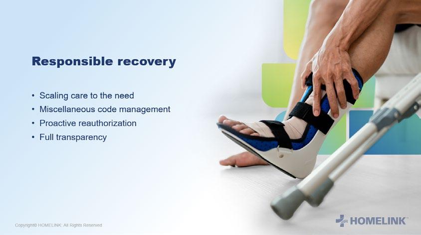
We believe in responsible recovery, and in providing the right equipment to the injured worker at the right time. This allows us to deliver appropriate care to the injured worker that is outcome- and return-towork focused while controlling utilization and containing cost.
• Centralized visibility
• Constant communication
• Dedicated fraud/waste/abuse team
• Device and equipment monitoring
• DME substitutions
• Full transparency
• Miscellaneous code management
• Proactive reauthorization
• Rent to purchase
• Retro trends
• Scaling care to the need
• Traditional transportation vs. rideshare
Engaged clinical oversight
HOMELINK delivers advanced clinical oversight as a value-added service to clients. We ensure each patient is progressing toward recovery with appropriate care through condition-based flags and triggers, ongoing case evaluation, and direct-to-provider engagement.
• Clinician-to-clinician peer reviews
• Clinical impact reporting
• Direct network contracting
• Enterprise approach
• Evidence-based care
• High touch on complex/catastrophic cases
• In-house clinical team
• Nursing reviews and proprietary acuity rating
• Value-add oversight
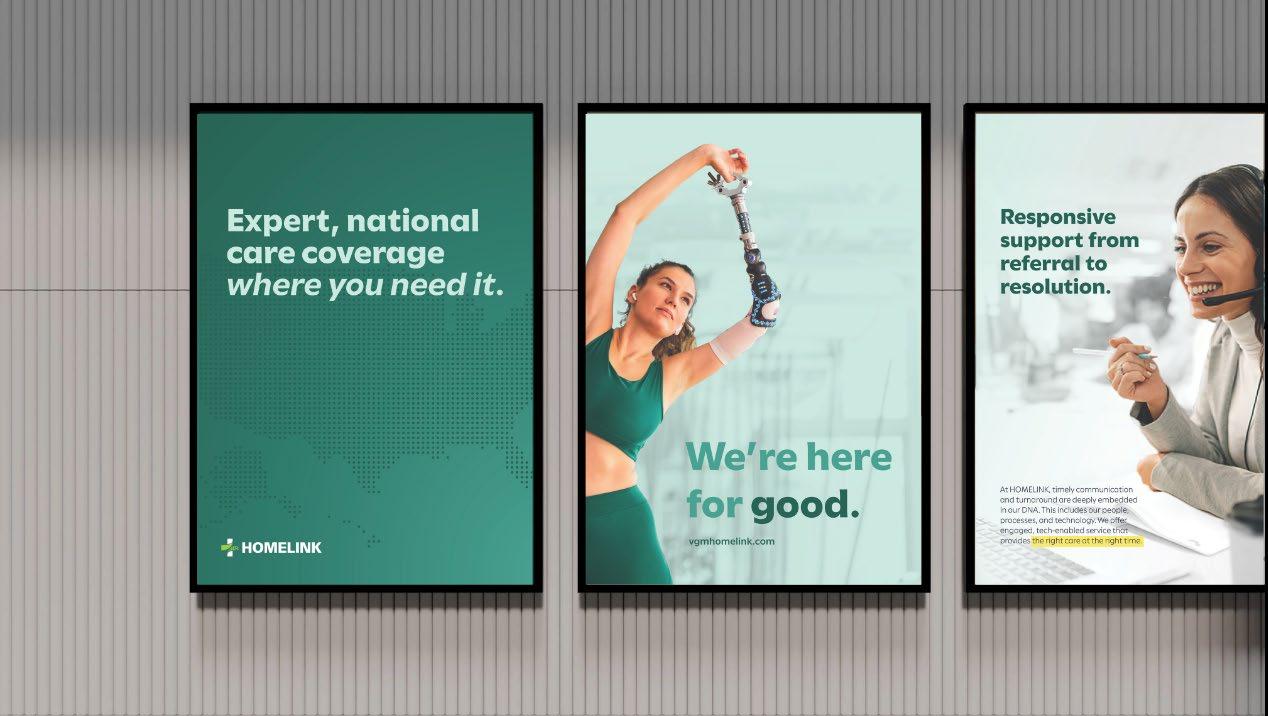
Expert, national care coverage
At HOMELINK, we believe network strength is fundamentally a measure of coverage and quality. We own and operate a homegrown network that is national in scale, ensuring you have coverage where you need it. And because we build and maintain the relationship with each provider in our network, we ensure total accountability to quality and performance standards.
• Coverage where you need it
• Ensuring network coverage
• Network management
• No passive networks
• Retrospective savings and network penetration
• Rigorous credentialing
• Strategic growth
• Total accountability
• We own the network
GROUP HEALTH MESSAGING PILLAR 1
patient-centered Complete,
HOMELINK handles all facets of ancillary care coordination for our clients from referral to resolution. We are a national leader in ancillary care that is fully patient-centered in our service delivery — including our people, process, and technology.
• A centralized, holistic view
• Complete assessment of patient needs
• Comprehensive DME & Home Health offering
• Full-service, person-to-person coordination
• Patient follow-up
• Reduced member grievances
• Scaled to your needs
• Single point of contact
HOMELINK PPO enhances our patient-centered model by ensuring members have access to high-quality, directly contracted providers — with fewer delays, clearer communication, and better outcomes. Our network is built to reduce friction in the care journey, support timely access, and align with benefit structures that protect both the plan and the patient.
• Aligned to benefits
• Low appeal rate
• Minimized disruption
GROUP HEALTH MESSAGING PILLAR 2
that’s in a class all its own Service
From intake to scheduling and patient satisfaction follow-up, HOMELINK provides industryleading customer service with a tech-forward execution, making the patient and client experience simple, flexible, and personal.
• A culture of continuous improvement
• Advanced cybersecurity
• AI-driven communication
• Available 24/7
• Benefit-aligned service delivery
• Clean claims, fewer headaches
• Direct connectivity
• Efficient care coordination
• Increased oversight
• Ongoing training and education
• Operational excellence
• Patient satisfaction
• Personal dedication
• Real-time customer experience guidance
• Timely communication and turnaround
HOMELINK PPO brings the same standard of excellence to network management that HOMELINK is known for in ancillary care — with direct contracts, fast turnaround, and a team that’s easy to work with. We don’t just deliver access; we deliver accountability, responsiveness, and clarity at every step — all supported by a tech-forward infrastructure.
• Data-driven insights
• Direct provider relationships
• Fast, transparent implementation
• Real-time claims repricing
• Responsive support
• Seamless system integration
GROUP HEALTH MESSAGING PILLAR 3
Responsible care
We believe in responsible care, and in providing the right equipment to members at the right time in alignment with their plan benefits. This ensures appropriate utilization, prevents fraud, waste, and abuse, and helps control costs without compromising member satisfaction.
• All services are verified
• Centralized visibility
• Constant communication
• Dedicated fraud/waste/abuse team
• Device and equipment monitoring
• Full transparency
• Miscellaneous code management
• Proactive reauthorization
• Responsible rental management
HOMELINK PPO is designed to support responsible care delivery by aligning provider reimbursement with Medicare benchmarks, eliminating unnecessary markups, and ensuring members receive only what’s appropriate and covered. Our direct contracting model gives us greater visibility and control — helping prevent overutilization, reduce billing errors, and protect both the plan and the member.
• Competitive reimbursement rates
• Custom savings analysis before implementation
• Medicare-based pricing
• No leased networks or hidden markups
• Real-time claims repricing
• Transparent claims review
GROUP HEALTH MESSAGING PILLAR 4
Expert, coverage national care
At HOMELINK, we believe network strength is fundamentally a measure of coverage and quality. We own and operate a homegrown network that is national in scale, ensuring you have coverage where you need it. And because we build and maintain the relationship with each provider in our network, we ensure total accountability to quality and performance standards.
• Coverage where you need it
• Ensuring network coverage
• Network management
• Rigorous credentialing
• Strategic growth
• Total accountability
• We own the network
HOMELINK PPO delivers expert, nationwide coverage through a fast-growing network of directly contracted providers — built for strategic access, quality assurance, and total transparency. We don’t lease networks. We build them — and we manage them with the same rigor and responsiveness that defines HOMELINK’s ancillary care model.
• Branded or unbranded access
• Disruption reports and savings analysis
• Fast, strategic buildouts
• Flexible access models
• Medicare-based reimbursement
• No leased or stacked networks
• Rapidly expanding network
We’re here for good. We’re here for good.
WE’RE HERE FOR G OOD.
External
The HOMELINK brand tagline is a reference to both our mission and our commitment to providing the best in integrated patient care. Period. It may be set in different ways as appropriate based on the objective of the overall communication. It may be set in Utile Black (either all one color or a combination of colors or weights to accent the word “good”) as a signoff at the bottom of a document or as a design element (set in an ALL CAPS combination of Utile Light and Utile Black here) to complement a larger, more branded communication.
Humanize. Simplify. Raise the bar.
Internal
This tagline serves as both a mission and a rallying cry for our internal team. It captures the essence of the service we strive to provide to our patients, clients, and partners every day.
Humanize: We lead with empathy, treating every interaction with care, respect, and a deep understanding of the human experience behind every case.
Simplify: We remove complexity and confusion, delivering clear, streamlined solutions that make life easier for those we serve. Raise the bar: We set new standards of excellence, continuously pushing ourselves to deliver better outcomes, better experiences, and better results.
It’s more than a tagline — it’s a daily commitment to how we show up, support one another, and improve the lives of those we serve.
Taglines
Our brand uses two distinct taglines to ensure we connect meaningfully with both internal and external audiences. Each tagline plays a critical role in reinforcing our brand promise — externally to the market and internally to our people.
Our core values define how we work, how we lead, and how we hold ourselves accountable.
Core Values
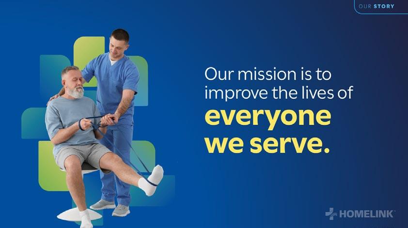
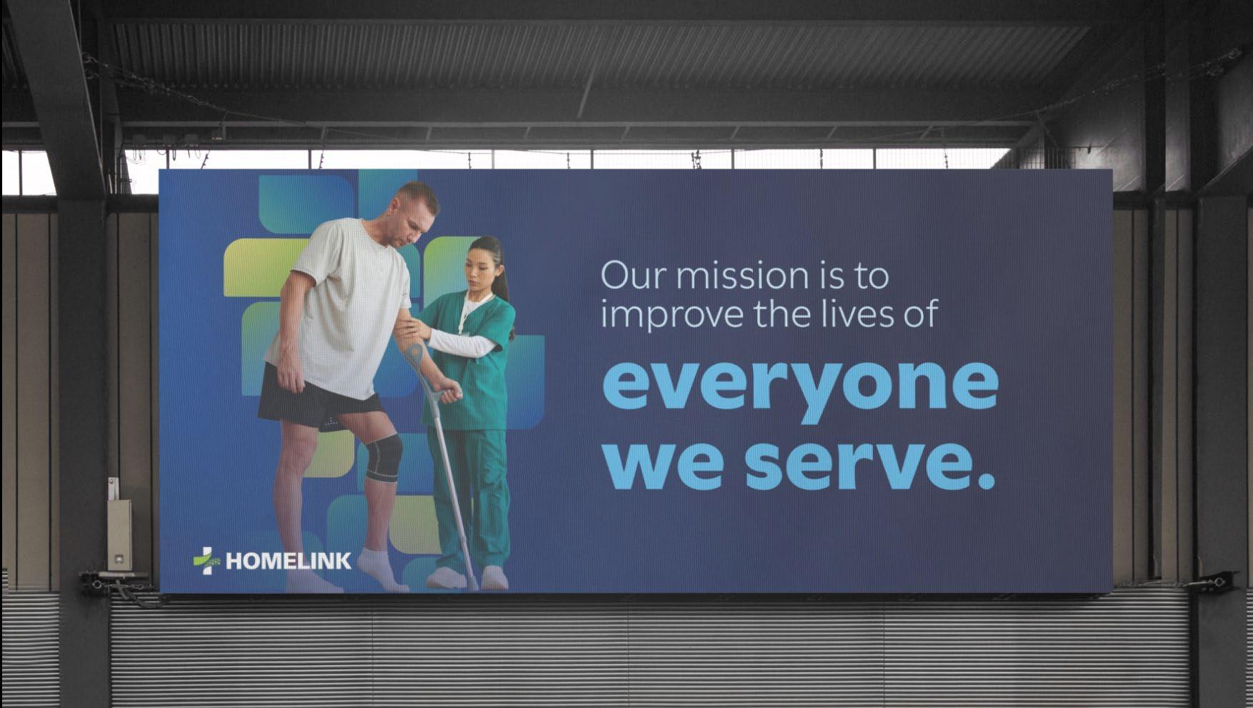
Improving the lives of everyone we serve.
Mission Statement
This mission reflects why HOMELINK exists and how we show up every day for patients, clients, partners, and one another. It guides our decisions, shapes our service model, and reinforces our commitment to patient-centered care across every interaction.
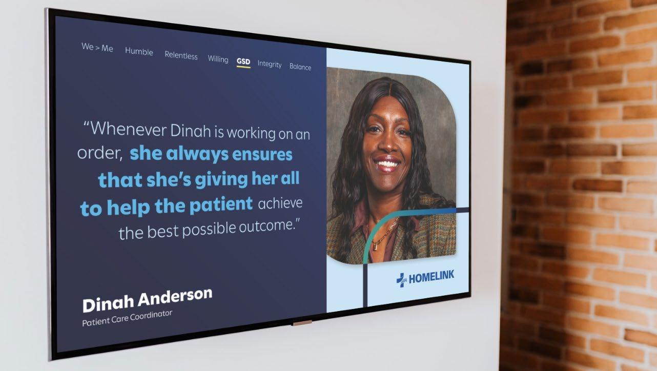
We > Me
Prioritizing the team above ourselves and being invested in others' success as much as our own.
Humility
Limiting our sense of self-importance to focus on great work rather than recognition.
Relentless
Persistently and unwaveringly committed to seeing things through.
Willing
Being ready and enthusiastic to take on challenges and meet needs.
Who We Are and How We Show Up
HOMELINK’s mission and core values define what guides our work across every interaction. They shape how we care for patients, support our clients, and partner with one another, and they anchor our brand in purpose, accountability, and respect.
GSD
Ensuring great execution and delivering results.
Integrity
Operating with honesty, transparency, and accountability in every action.
Balance
Thriving in all roles, both at work and in personal life.
LOGO & IDENTITY
The HOMELINK Logo
The logo may be used in two different configurations, with the icon and word mark arranged horizontally or vertically. When possible, use the horizontal configuration. Use the vertical configuration sparingly, when the layout lends itself to a centered orientation or horizontal space is limited.
The HOMELINK wordmark now includes a service mark (SM), which will transition to a registered trademark symbol (®) once registration is complete.
Logo Clear Space
Clear space is the area surrounding the logo that must be kept free of other graphic elements. For the horizontal and vertical logo orientations, maintain a clear space that is equal to the width of the icon. Minimum width of the logos should be 1”.
Light & Dark Versions
The primary usage of the logo should be the full-color version. On dark-themed background fills, use the white/green version when possible.
Single-Color Options
In situations where a background does not allow the full-color mark to have adequate contrast, the one-color version of the logo may be used. For example, a one-color logo may be appropriate when placed over a solid fill color (as above), a gradient, photograph or texture, or other special circumstances.
Always choose a logo that makes the word mark have adequate contrast and legibility. If the logo is placed on a photo, make sure that it is an uncluttered image so that the mark is legible. Place the logo in a space of the photo that won’t be in competition with the content, color, or composition of the image.
Watermark Logo Option
Transparency: Use a 10%-30% transparency so the watermark supports the content instead of competing with it.
Placement: Place in a consistent location (commonly bottom-right or centered). Do not obscure key text or imagery.
Size: Scale proportionally to the canvas — clearly visible but unobtrusive.
Color: Use approved single-color logos only (white, black, blue, or teal). Ensure sufficient contrast without drawing attention.
Consistency: Apply the same watermark treatment across all pages or screens within a single asset (e.g., slide decks, videos).
Do not stretch the logo horizontally or vertically.
Do not use the word mark or icon by itself.
Do not rotate the word mark or icon.
Do not alter the color of the logo outside of the approved color versions.
Logo Misuse
Do not add effects to the logo.
This is a quick guide to common mistakes to avoid when using the logo. Avoiding these misuses ensures brand integrity and consistency in creative execution.
Do not manipulate the logo to be a stroke.
Do not place the logo on color fills that don’t have sufficient contrast (Example 1)
Do not place the full-color logo over a clashing photo or texture.
Logo Color Misuse
Do not place the logo on color fills that don’t have sufficient contrast (Example 2)
Do not place the one-color logo in white over a light photo or texture.
This is a quick guide to common mistakes to avoid when using the full-color logo on background fills, or the one color version of the logo.
Always choose the version of the logo and its color combination that enables the mark to have contrast and legibility from the background it is placed on.
Do not use the one-color logo when the full-color version is possible.
Do not place the one-color logo in black over a dark photo or texture.
HOMELIN K PREMIUM CARE
HOMELIN
K PREMIUM CARE
HOMELINK Premium Care
HOMELINK Premium Care is the approach we take that differentiates us from our competitors. When referenced in literature, it may be complemented by this icon, which incorporates the brand pattern in a small, rounded-corner bug.
This icon is intended to support messaging that highlights our premium level of service. It should not be used on its own or in place of the HOMELINK logo, as it is not a standalone brand mark.
HOMELINK PPO Logo
The HOMELINK PPO logo is the preferred mark to use when referencing or promoting the HOMELINK PPO network. It should be used in contexts where the PPO offering is the primary focus of the content.
This logo follows the same usage guidelines as the primary HOMELINK logo, including clear space. It should not be altered or re-configured. There is an option for a light or dark background.
PALETTE & TYPOGRAPHY
Primary Blue Palette
ELECTRIC BLUE
#004f9d
C100 M75 Y0 K6 PANTONE ® 661
Secondary Teal Palette
#8dc3ac
CORE NAVY
#223972
C100 M89 Y27 K13
MIDNIGHT BLUE
#20213f
C91 M87 Y45 K50
CORE TEAL
#3f9e8e
C74 M18 Y51 K1 PANTONE ® 7475 SEAFOAM
DEEP GREEN
#015c4b
C90 M40 Y72 K33
Accent Colors Neutral Colors
LIME GREEN
#9aca3c
C45 M0 Y100 K0
PANTONE ® 375
BRIGHT BLUE
#fbe765
C80 M22 Y0 K0 PANTONE ® 292 BUTTER YELLOW
#209cdf
LIGHT BLUE
C3 M4 Y73 K0 PANTONE ® 2003 WHITE
#cce4f7 C18 M3 Y0 K0
Color Palette
The HOMELINK color palette consists of a primary blue palette, a supporting teal palette, and additional accent and neutral colors.
Accent colors should be used sparingly to add energy and draw attention to key elements within a layout.
Neutral colors complement the primary blue and teal palettes and can be used throughout designs. White can be used both as a background and text color, while black is approved primarily for text.
Primary and secondary swatches can be used to create gradients to add depth and energy, explained on a later page.
Primary Blue Palette Secondary Teal Palette
These allowed combinations also apply to our
* This color must be font weight bold or black and 14pt or larger to have enough contrast in this color combination (or book and 18pt or larger).
Accessible Color Pairings
HOMELINK is committed to using accessible color combinations when pairing text with background colors. Our color pairings are designed to meet WCAG (Web Content Accessibility Guidelines) contrast standards, helping ensure content is readable for as many people as possible, including those with visual impairments.
To support consistent and accessible design, this guide identifies which colors can be layered on top of each color swatch to achieve optimal readability.
This commitment reflects our company values — prioritizing clarity, inclusivity, and respect for the diverse audiences who interact with our brand.
Colors
blue gradients.
This allowed combination also applies to the Teal → Seafoam gradient
These allowed combinations also apply to the Deep Green → Teal gradient
Basic Fill Gradients: 3-Color
Basic Fill Gradients: 2-Color
Gradients
BASIC FILL GRADIENTS: These gradients provide a subtle way to enhance visual interest. They can be used in design to add depth, layering, emotion, and contrast. The gradients palette consists of three approved swatches (illustrated above). They were designed to effectively combine HOMELINK colors while still offering design flexibility, including options for both lighter and darker themed designs. They can be either linear or radial.
PATTERN GRADIENTS: These are solely to be used within the HOMELINK pattern — nowhere else.
Navy Blue
Electric Blue
Midnight Blue → Navy → Electric Blue Deep Green → Teal → Seafoam
Blue
Navy Blue Deep Green
Blue
Bright Blue → Light Blue → White
AaBbCc
Do not use illegible color combinations, particularly colors with similar value or depth. Only use the approved text and background color pairings shown on the previous page.
Do not modify brand colors in tint or hue unless specifically outlined in this brand guide.
Aa Bb
Aa Bb
Do not overlap Electric Blue and Lime Green. This is reserved exclusively for the logo, where there is sufficient white space.
Color Misuse
Do not set white text on lime green or butter yellow. Conversely, do not set lime green or butter yellow text on a white background.
This is a quick guide to common mistakes to avoid when choosing colors to create HOMELINK branded communications and materials. Avoiding these color misuses helps ensure legibility and maintain brand consistency.
Utile Light
Aa
0123456789
Utile Book
0123456789
Utile Regular
0123456789
Human Approachable Professional
Utile
Utile Semibold
Aa
0123456789
Utile Bold
0123456789
Utile Black
0123456789
Typeface
The font at the heart of the HOMELINK brand is Utile, used for the majority of brand touchpoints. The Utile font family is a modern, sans-serif typeface known for its clean lines and geometric shapes. It features a minimalist design that makes it highly legible and versatile for various applications, from web design to print.
The font has a slightly condensed structure, which allows for efficient use of space while maintaining a contemporary feel. Its straightforward aesthetic makes it suitable for both headings and body text for a polished and professional look. Overall, Utile combines functionality with a touch of personality.
Headlines and Titles:
Utile Black or Bold
Responsive support from referral to resolution
Subheadlines: Utile Semibold
Engaged, tech-enabled service that accelerates return to work.
Body Text: Utile Book or Regular
At HOMELINK, timely communication and turnaround are deeply embedded in our DNA. This includes our people, processes, and technology. We believe in maintaining constant communication to ensure responsible recovery and expedite the path to healing. Every new referral follows our proven processes and gets the same personal touch.
Utile Hierarchy
When creating layouts using Utile, clear hierarchy can be established by varying the weights and scale appropriately. We recognize there may be times where flexibility is needed. For example, in a subhead, we may use Bold and not Semibold.
WEIGHTS:
• Utile Black or Bold is used for display headlines or titles. Consider the scale and length of the headline, and use Bold for short/large-scale messages.
• Utile Semibold or Book can be used for subheadlines.
• Utile Book or Regular is used for body text.
Responsive support
from referral to resolution
We are your strategic partner for on a national scale.
patient-centered care responsible,
Stylized Titles
Styling text creates a dynamic visual hierarchy that emphasizes key messages. Variations in type weight and scale draw the reader’s attention and create visual interest.
Headlines may be styled in a staggered or cascading layout to introduce energy and movement, guiding the reader’s eye and helping present complex information in a clear, engaging way.
Although HOMELINK headlines are typically set in title case, stylized text blocks should use sentence case for all words that aren't proper nouns. When using two shades of blue within a title, choose colors with strong visual contrast — Electric Blue and Navy are too similar in value, while Electric Blue paired with Midnight Blue or Bright Blue provides clearer distinction.
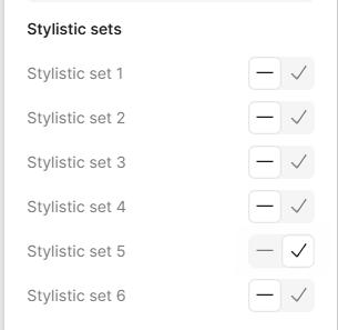
Under OpenType Features / Stylistic Sets, the following should be selected. This has also been updated in the HOMELINK CC Library.
To get your fonts to work in Figma, open Adobe CC. Click on the "fonts" button in the upper right:
Select the fonts you need and click the install icon to install for non-Adobe apps.
Figma & CSS
Under "Type Settings / Details," the following should be selected. This has also been updated in the HOMELINK CC Library.
Glyphs
Utile Text Glyphs
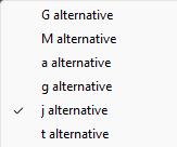
We’ve updated our character style guidance for glyph usage. Alternate glyphs for the letters a and G are no longer used. The default Utile font also correctly renders the lowercase g, so no alternates are needed — just be sure it appears rounded and not looptail (e.g., g).
This change aligns our print and digital typography. Because CSS applies a single font set rather than individual character glyphs, our print styles now follow the same approach for consistency. The examples above show the correct glyph treatment in Adobe and Figma.
Ensure you are using the appropriate Utile alternative j glyph. Use Character Styles in our Adobe Library, or highlight the letter and select the correct glyph.
giant
Utile Black
Be cautious when using Utile Black in large-scale activations. At certain sizes/weights, the text can appear too playful or comical.
Text Misuse
The strategic, integrated solutions partner of choice for patient-centered care with national coverage — including a comprehensive offering of ancillary care products/services and advanced clinical oversight.
Do not use colors that are not accessible. Ensure contrast.
The strategic, integrated solutions partner of choice for patient-centered care with national coverage — including a comprehensive offering of ancillary care products/services and advanced clinical oversight.
Do not set paragraph text in bold.
The strategic, integrated solutions partner of choice for patient-centered care with national coverage — including a comprehensive offering of ancillary care products/services and advanced clinical oversight.
Do not use unapproved fonts.
Following good typographic rules is extremely important in all of our communications. It adds clarity to messaging and maintains our look and feel. Here are some common mistakes that weaken legibility and should be avoided.
The strategic, integrated solutions partner of choice for patientcentered care with national coverage — including a comprehensive offering of ancillary care products/ services and advanced clinical oversight.
Do not justify-align text.
Arial
Arial Regular
Aa Bb Cc Dd Ee Ff Gg Hh Ii Jj
Kk Ll Mm Nn Oo Pp Qq Rr Ss
Tt Uu Vv Ww Xx Yy Zz 0123456789
Bold
Tt Uu Vv Ww Xx Yy Zz 0123456789
Arial
Black
Aa Bb Cc Dd Ee Ff Gg Hh Ii Jj Kk Ll Mm Nn Oo Pp Qq Rr
Ss Tt Uu Vv Ww Xx Yy Zz 0123456789
Important Note:
• Always use Utile when possible.
• Do not use Arial on the HOMELINK website or in externally designed marketing materials.
• Arial is only intended for functional use in internal documents or environments where custom fonts cannot be embedded.
Arial: Our System Fallback Font
Our primary brand typeface is Utile, and it should be used in all branded materials whenever possible. However, we recognize that Utile is not universally available as a system-installed font, which may lead to display or compatibility issues in certain environments. To ensure consistent and professional communication in these situations, Arial has been designated as our approved fallback font.
Arial should only be used when Utile is not available or practical — such as in system-generated emails, Microsoft Office documents, and PowerPoint presentations. This approach helps maintain visual consistency while allowing flexibility where needed.
Arial
Headlines and Titles: Arial Black or Bold
Responsive support from referral to resolution
Subheadlines: Arial Bold
Engaged, tech-enabled service that accelerates return to work.
Body Text: Arial Regular
At HOMELINK, timely communication and turnaround are deeply embedded in our DNA. This includes our people, processes, and technology. We believe in maintaining constant communication to ensure responsible recovery and expedite the path to healing. Every new referral follows our proven processes and gets the same personal touch.
Arial Hierarchy
In emails and other technical circumstances where it is not possible to use Utile, we have a simple sans serif fallback to lean on. Do not use Arial on professionally designed materials such as the website, brand campaign advertisements, social media graphics, or any other external-facing communications. This nononsense, sans serif font is available to nearly all users and will provide the most consistent look across these digital platforms.
DESIGN ELEMENTS
Pattern | Photography
HOMELINK
Unique. Energetic. Organic. Human. pattern
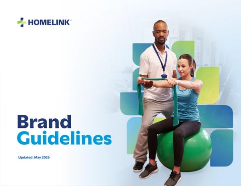
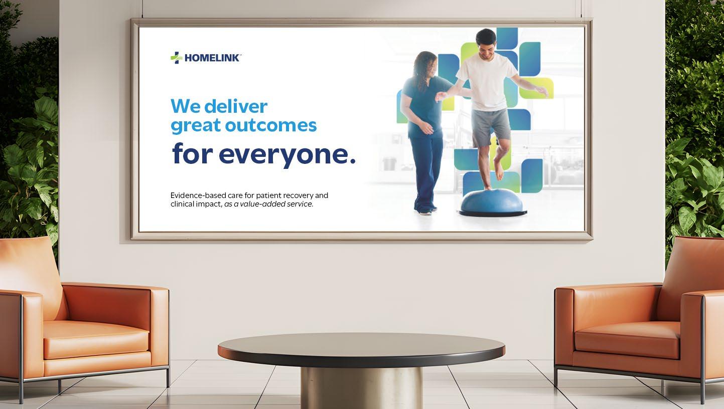
We start with real, authentic imagery. Often, these images are sourced from stock photography and feature models in staged or clinical environments that can feel sterile or impersonal. To bring warmth and energy to these visuals, we use the pattern as a transformative layer. By embedding the pattern into the image itself, we reshape the visual narrative. A once-generic physical therapy office becomes dynamic — more human, more organic. The result is imagery that reflects our brand’s warmth and humanity, while remaining grounded in the real, everyday experiences of patients.
The pattern is not merely decorative; it is a tool to add meaning, depth, and authenticity. It also transforms stock imagery into something ownable and distinctly ours. For this reason, the pattern should only be used in relation to people — never as a standalone design element.
Additional guidance:
• The pattern should never draw attention to itself. Its role is to support and emphasize the people in the foreground.
• Pattern elements (“leaves”) should be largely obscured by the person or people in front of them. Avoid having many unobstructed leaves hanging out the sides of the image.
Do not scale the “leaves” to different sizes, or place them into a floral arrangement.
Do not use the pattern on its own. Do not use the pattern as a stroke.
Do not use a solid fill on the pattern.
Pattern Misuse
The pattern should be used sparingly to enhance an image. Do not use it in a way that distracts from the main subject of the imagery. Avoid overusing the pattern, applying it too heavily, or using color outside of the approved pattern gradients.
The pattern should never obscure key subjects, compete with text, or feel purely decorative without purpose.
Photography
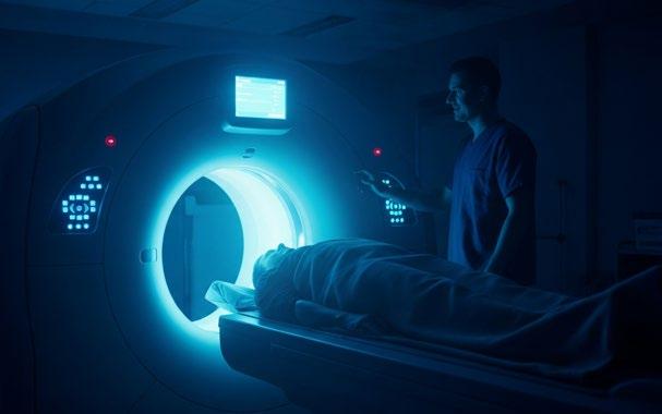
When original photography is not available, stock photography will often be used to help communicate the HOMELINK message in marketing materials. Stock photos selected should have an interesting composition. Photo subjects should be age-appropriate for the service being portrayed. For example, Workers’ Compensation subjects should appear to be of working age, not children or adults over age 65.
Photos of patients in recovery or receiving treatment should portray them with more realistic expressions, rather than overly happy as is all too common in stock photography. We want to be sensitive to the end customer and their situation. Photos representing those giving care or treatment or providing service may, but are not required to, include more smiles.
Stock photos should always be properly licensed through a service such as Getty Images or AdobeStock.
DO:
• Use high saturation and warm, rich grading. Photography should feel warm and authentic while staying true to the HOMELINK brand.
• Choose natural, candid selects.
• Choose unique points of view/angles.
Photography Best Practice Examples
This is a quick guide of common mistakes to avoid when sourcing photography. Avoiding these misuses helps to ensure consistent use of brand imagery.
DON’T:
• Choose images that feel staged, awkward, and inauthentic.
• Choose patients that seem overly happy about their injuries.
• Use imagery of individuals that don’t seem of working age in Workers’ Compensation materials.
XNote:
• Use brand-compliant colors like blue, teal, green, yellow, and neutrals for clothing and key elements. Adjust hues in Photoshop if needed.
• Avoid tight or busy patterns that distract from the subject.
• Use post-production to enhance warmth and ensure brand consistency.
Complex Rehab Technology
Dental Care
Diabetic Supplies
Diagnostic Imaging
Durable Medical Equipment
Hearing Health Care
Home & Vehicle Modifications
Home Health
Home Sleep Testing
Orthotics/Prosthetics
Physical Medicine
Post-Acute Care
Respiratory Care
Translation
Transportation
Iconography
HOMELINK’s icons are versatile tools used to highlight services and simplify complex concepts. They are intended to be displayed at a small size.
Our icon library is made up primarily of Google’s Material Icons, which use simple, geometric, and consistent shapes to represent concepts clearly. This approach supports a clean, modern visual language aligned with the HOMELINK brand.
Additional, custom icons have been developed where needed to ensure all service lines are represented. The full library is available to designers in our Figma Brand Library
Strategic Relationships
Patient-Centered Care
Pipeline Growth
Network Security
Pictograms
Pictograms are used to represent broader or more abstract concepts, rather than specific services. They help simplify complex ideas through visual storytelling. Use pictograms sparingly — for example, one per section on a webpage or up to four on a slide — to highlight key themes.