1 minute read
INTRODUCTION


This chapter aims to explain how achieving balance in design is important to create visually pleasing and functional designs and how designers should consider the different design elements and principles to achieve balance effectively in their work.
WHAT IS BALANCE?
Advertisement
Color balance refers to the even distribution of color in a design or artwork. It involves carefully choosing and arranging colors to create a sense of harmony and visual interest. A balanced color scheme typically consists of a mix of warm and cool colors in equal proportions.
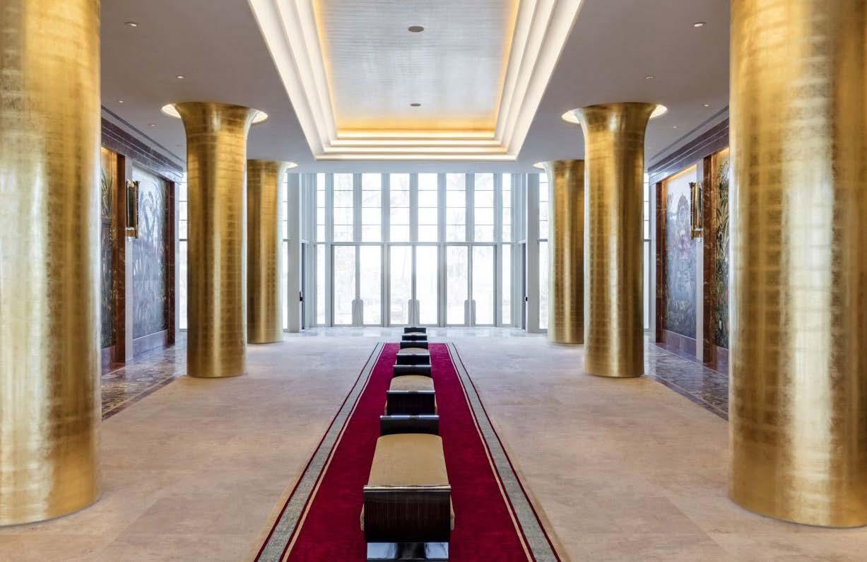
Symmetric
occurs when design elements are evenly distributed on either side of a central axis, creating a mirror image. This type of balance can create a sense of stability and orderliness in a design.
Asymmetric
occurs when design elements are distributed unequally, yet still achieve an overall sense of balance. This type of balance can create a more dynamic and interesting design by breaking away from a static, mirrored image.
Radial
occurs when design elements radiate out from a central point, creating a circular or spiral pattern. This type of balance can create a sense of movement and energy in a design.
Temperature
Ranges from cool (blue) to warm (orange).
Tint
Color of the image, and can range from green to magenta.
Saturation
Intensity or purity of a color, and can range from muted or desaturated to bold and vibrant. Low saturation will appear as more muted or faded, while with high saturation will appear more vivid.
Contrast
Can greatly affect the overall look and feel of a design. A space with high contrast will have bright whites and dark blacks, while a space with low contrast will have less pronounced
Hue
The actual color of an object, and can range from red to blue to green, etc.