COLOUR COLLISION
BY KEIRA SAUL
This zine is a visual exploration of colour theory, focusing on complementary colour relationships and their perceptual effects within photographic composition.
All images © 2026 Keira Saul. All rights reserved. Images were created as part of an academic photography practice, investigating how colour contrast influences visual perception and spatial hierarchy within the frame.
Designed using Adobe InDesign and Adobe Photoshop.
STATEMENT
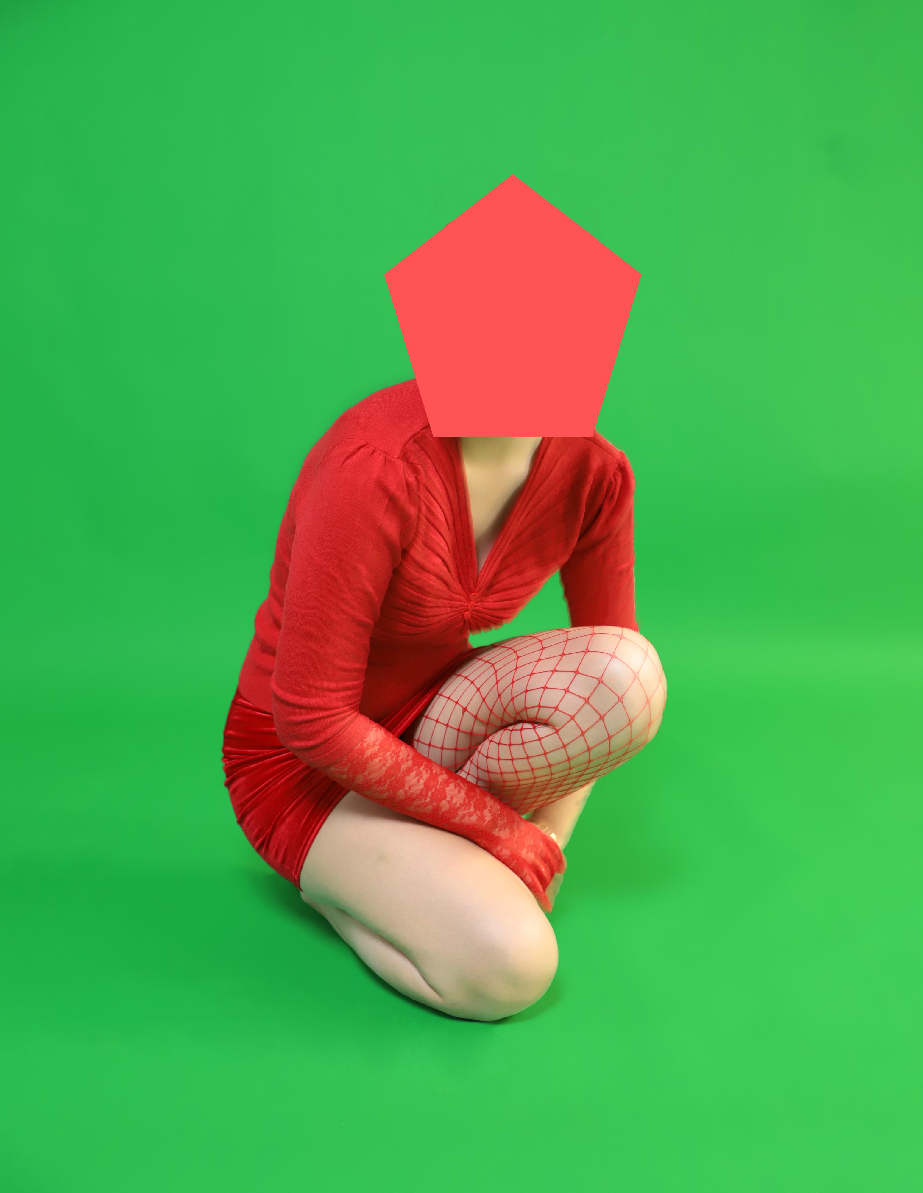
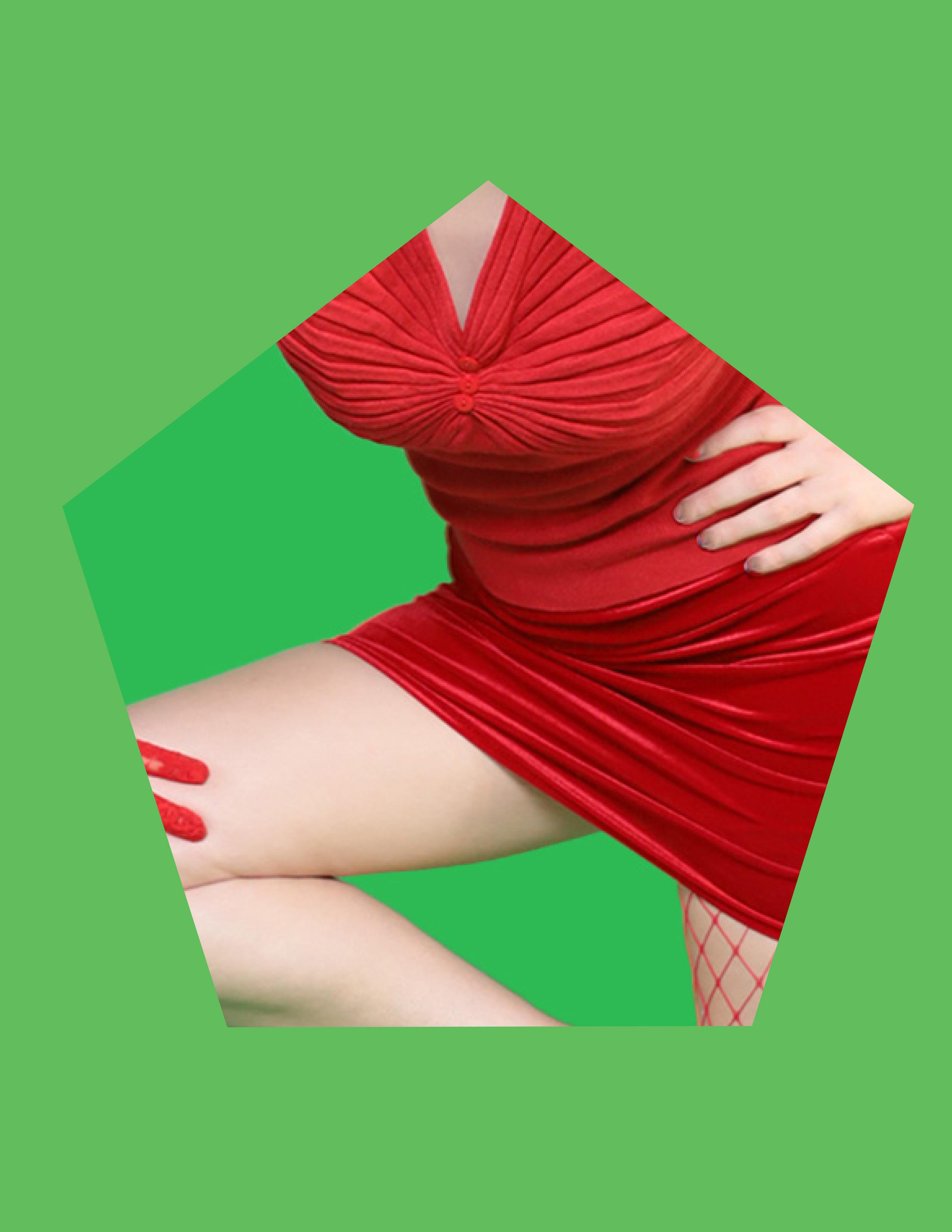
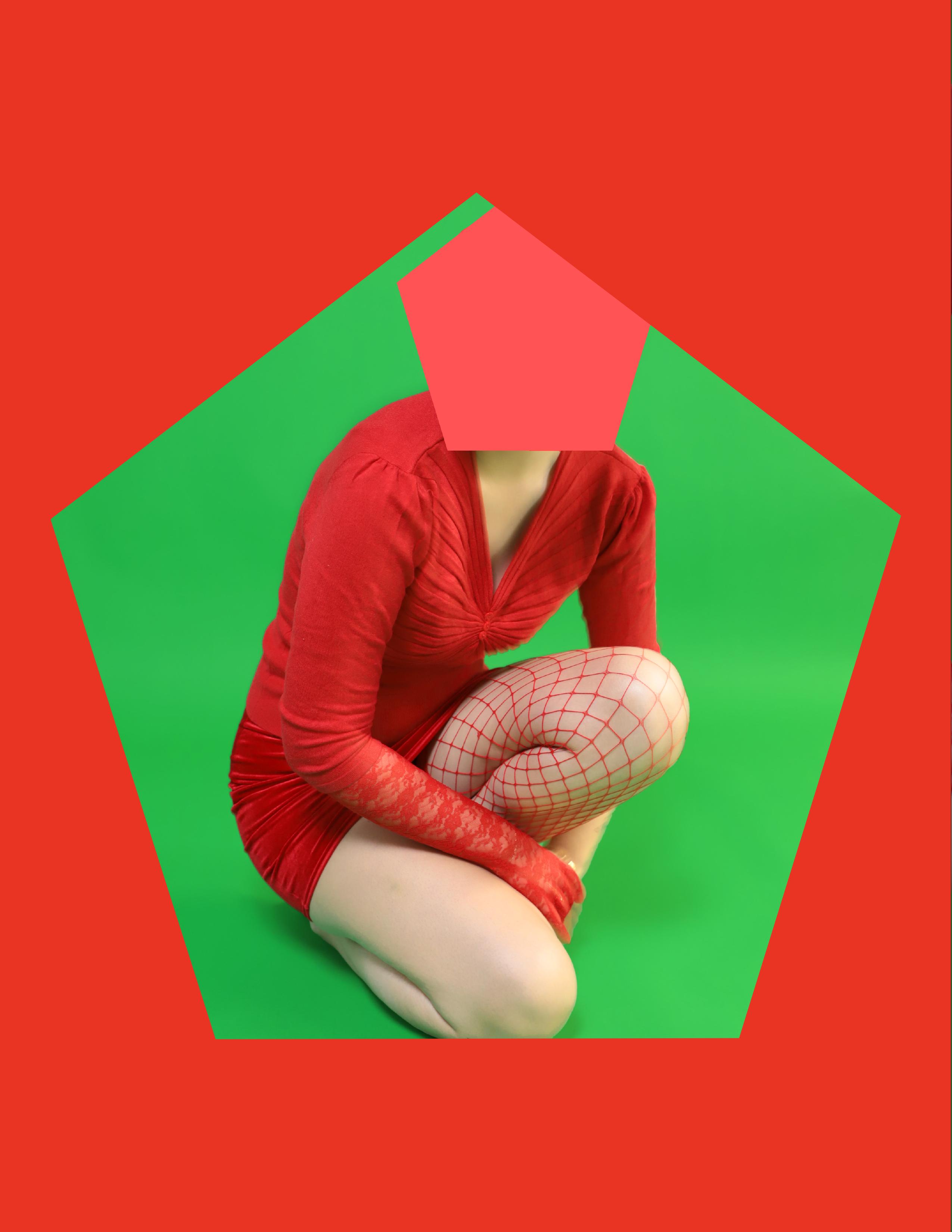
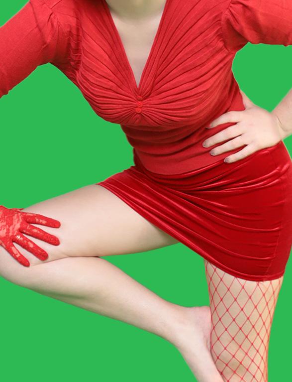
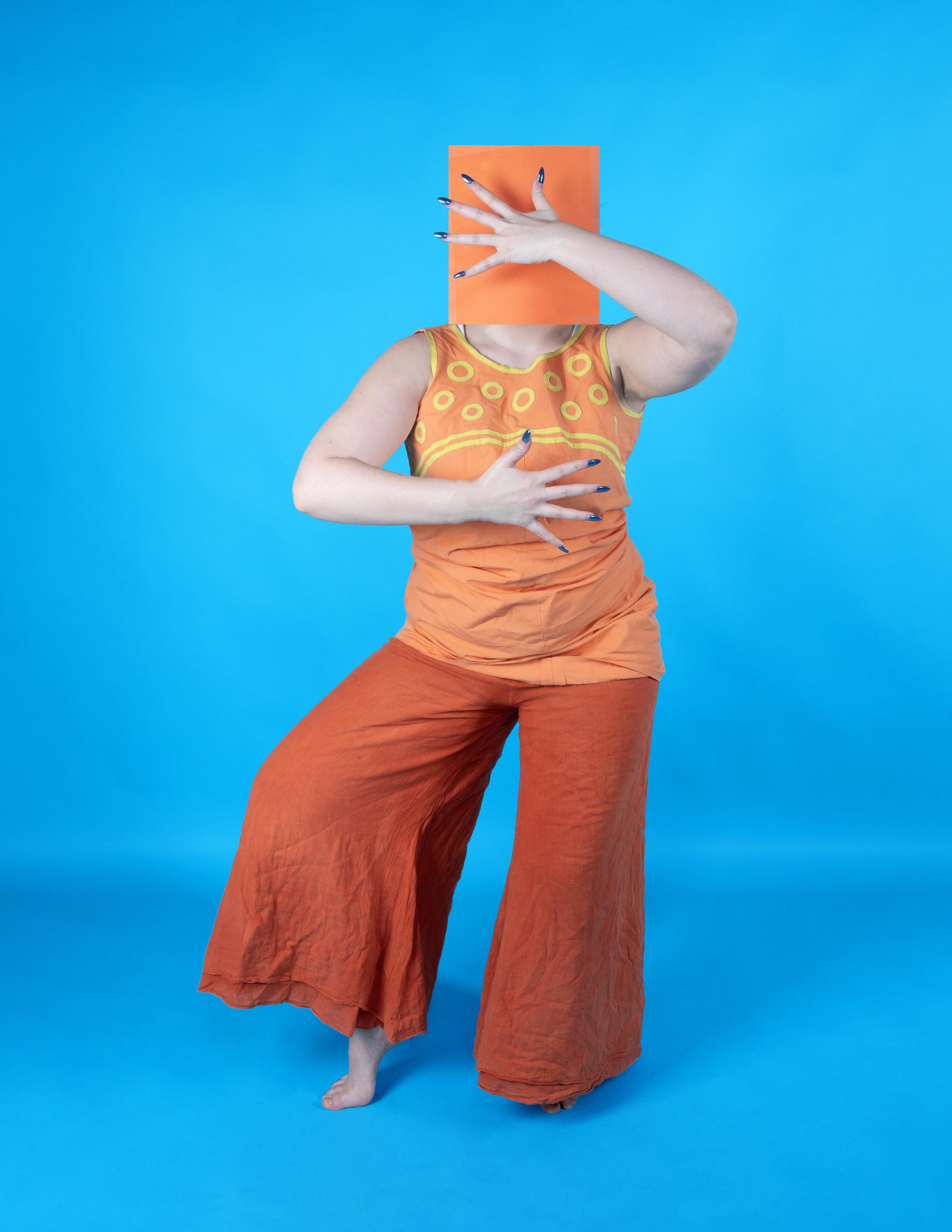
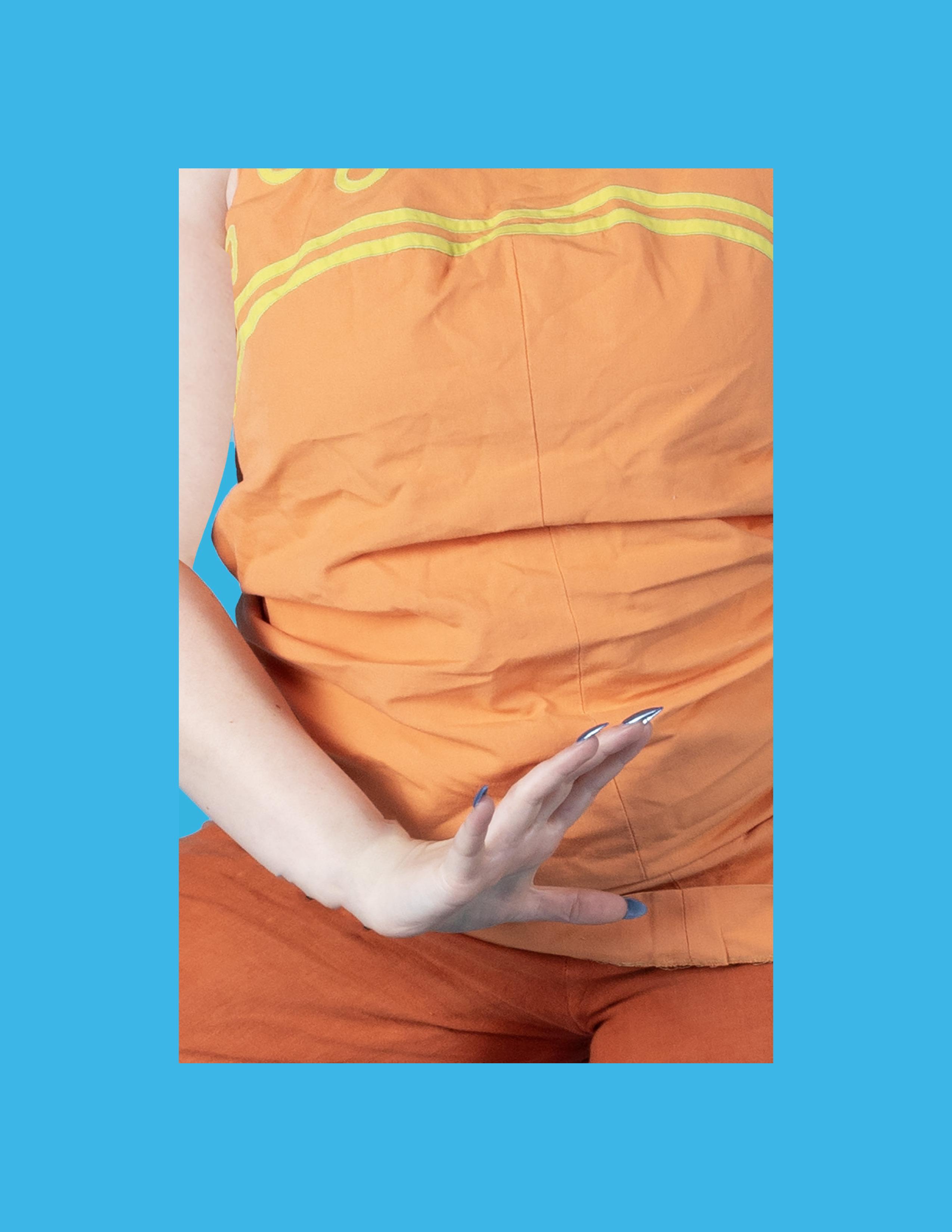
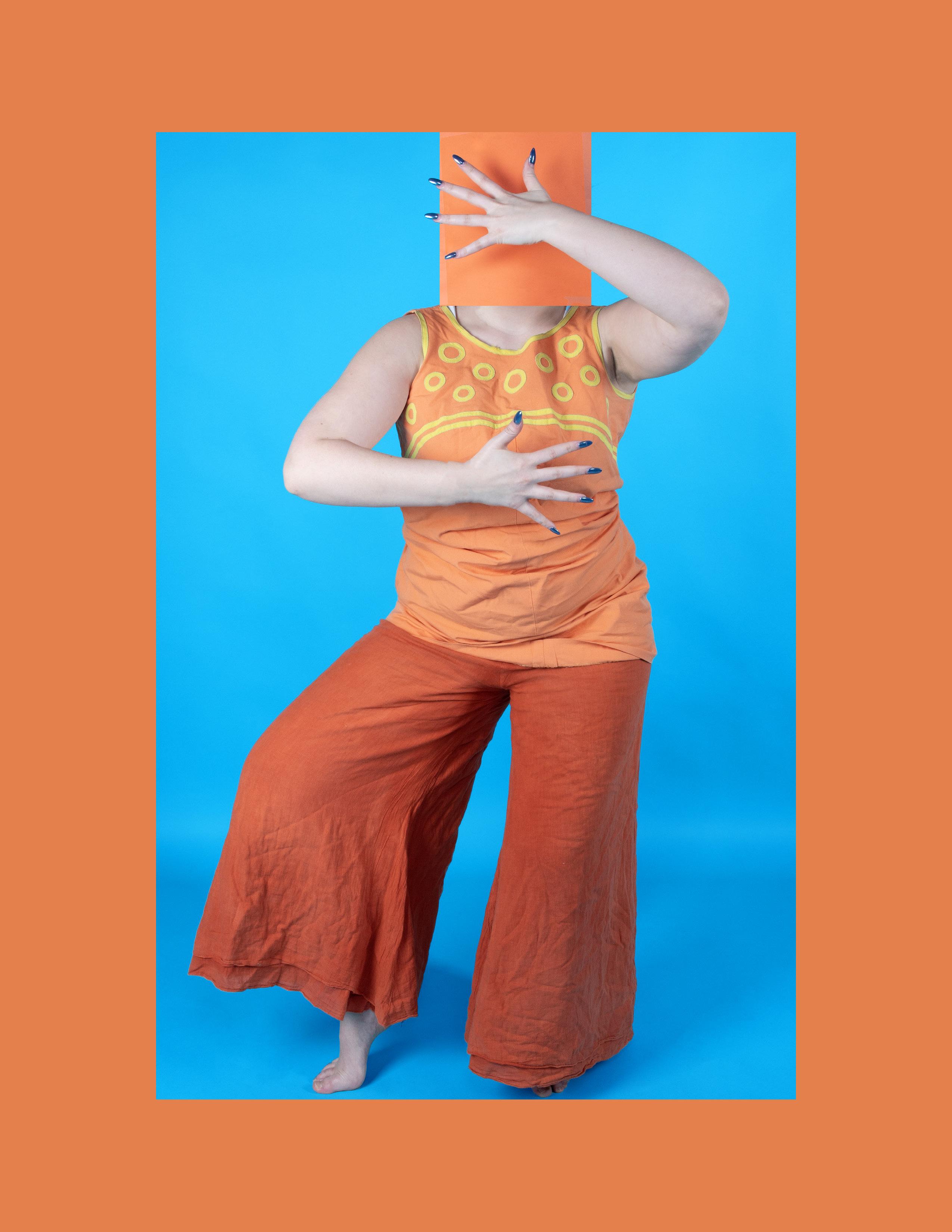
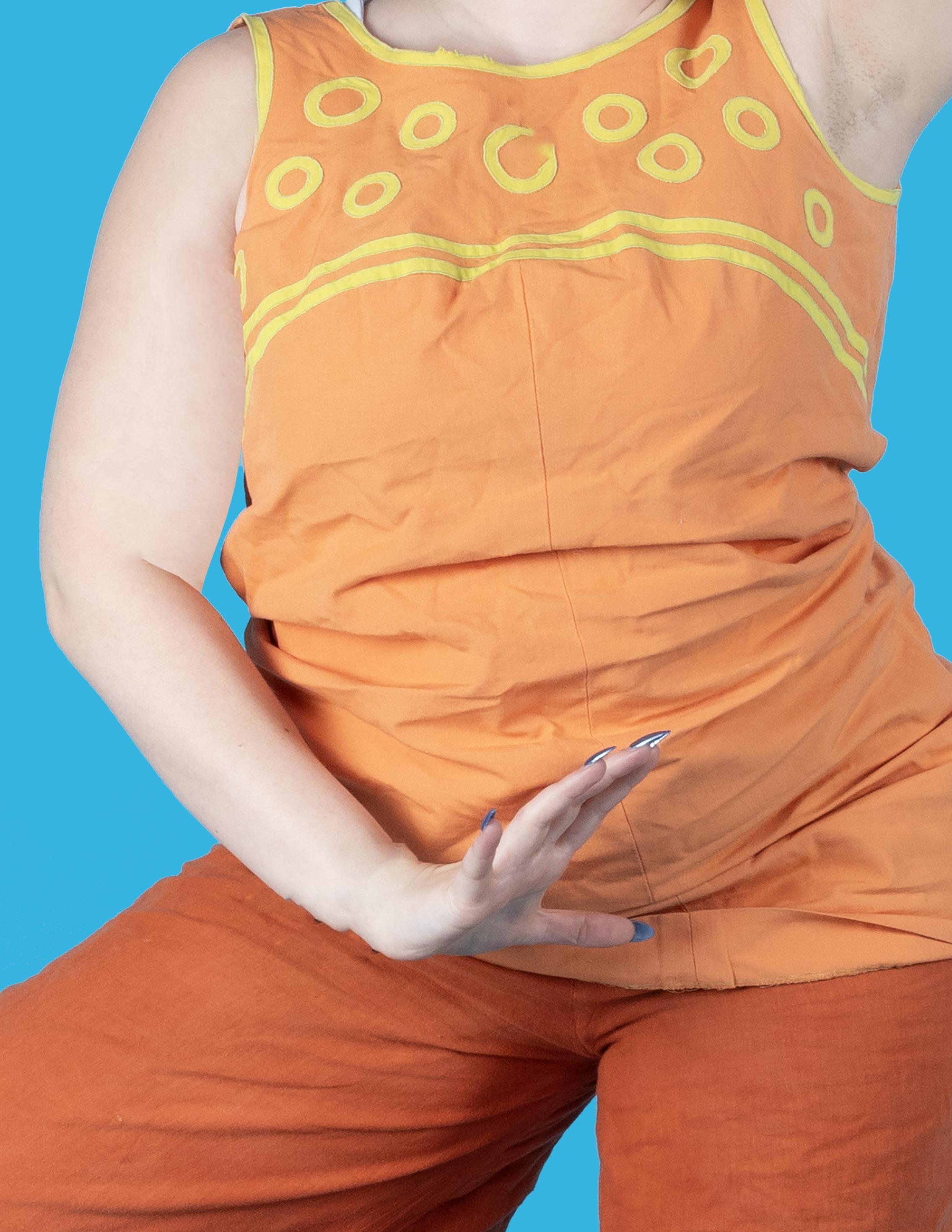
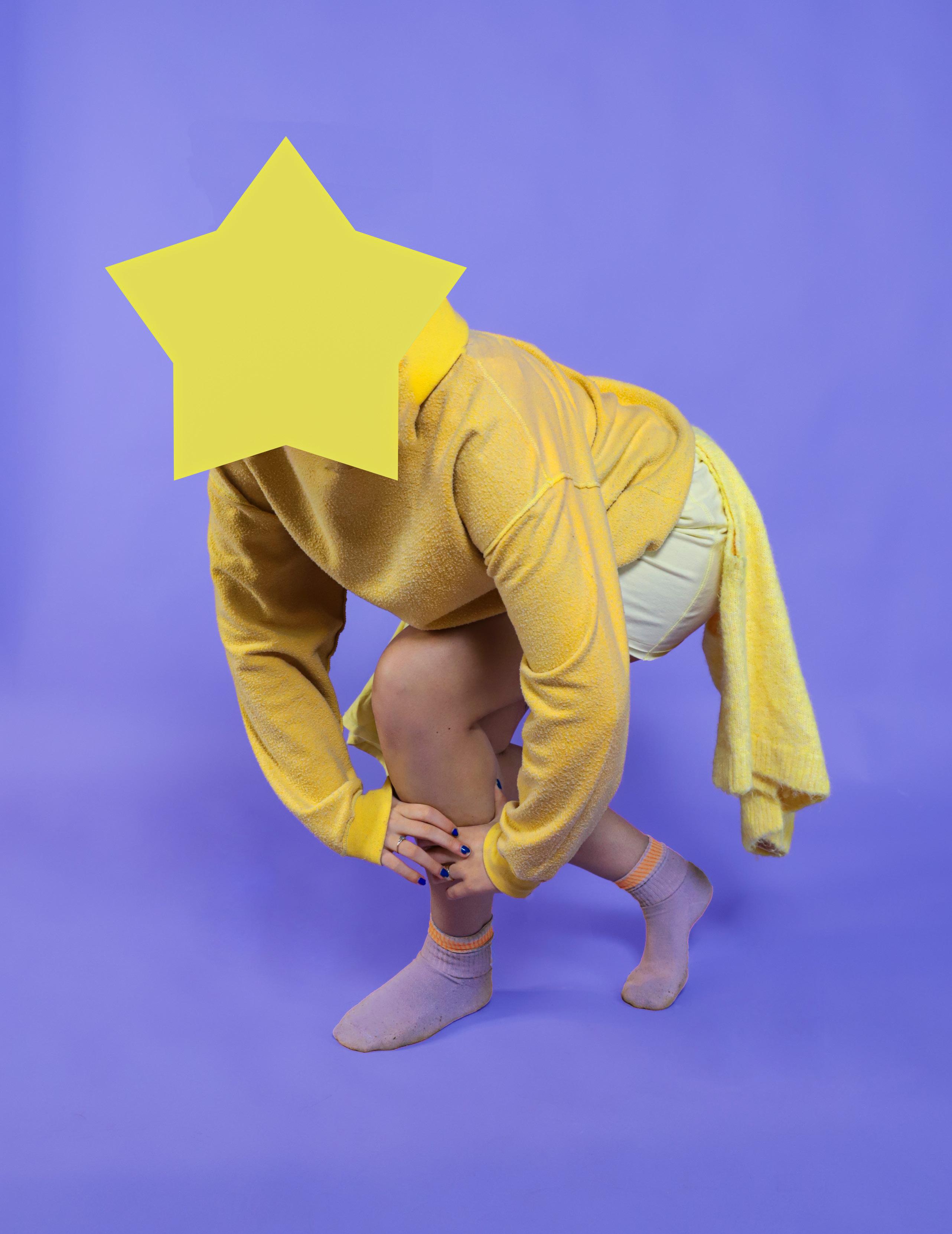
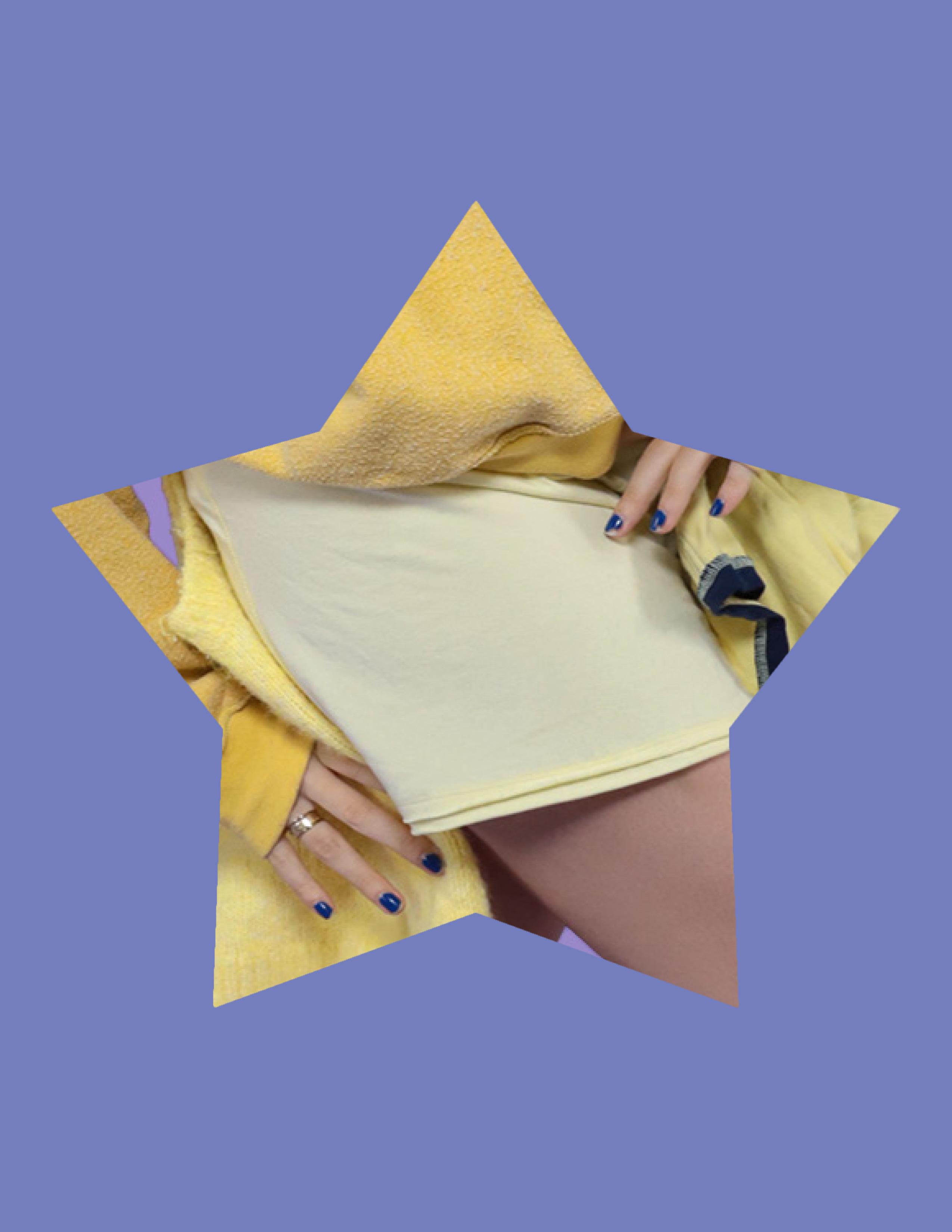
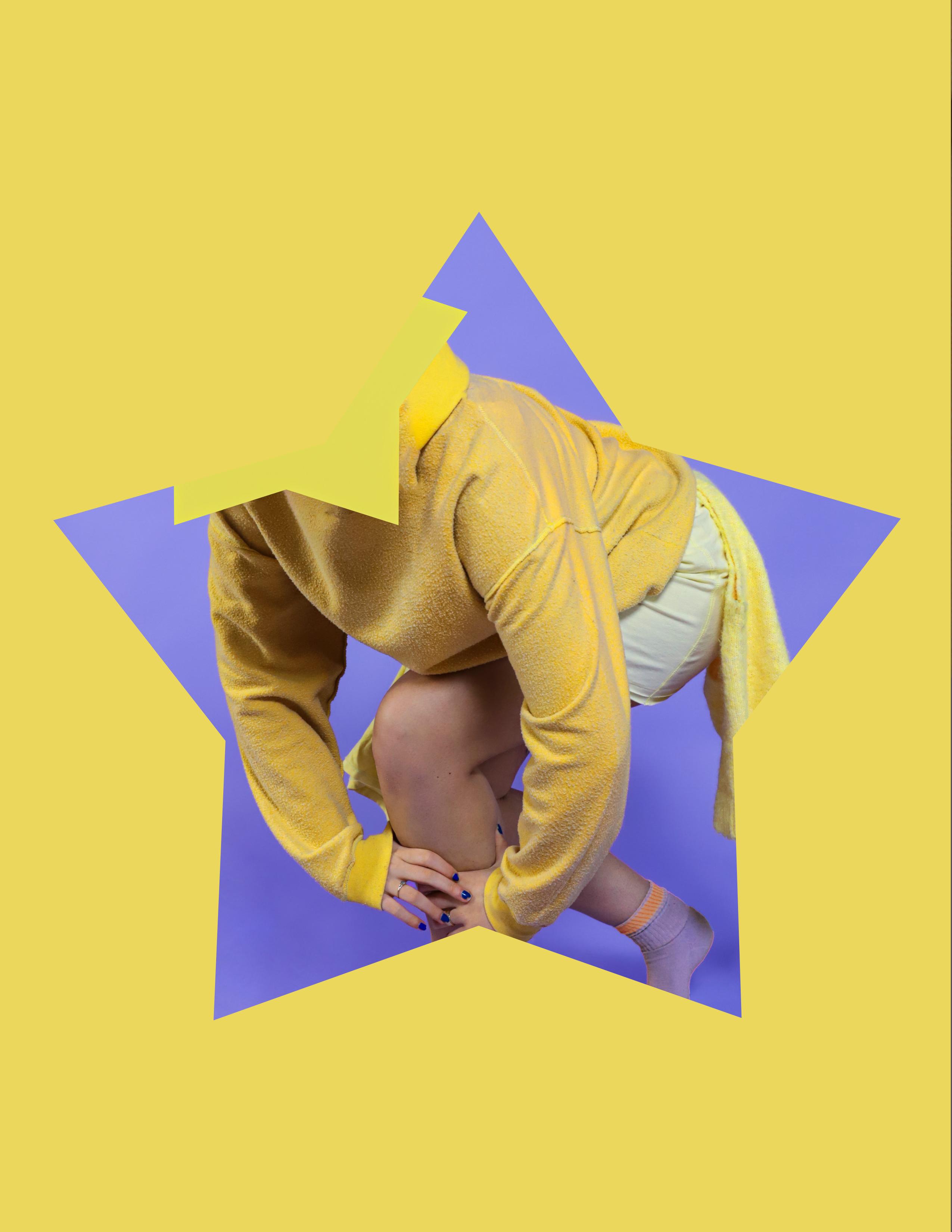
Colour Collision is a series of portraits that shifts focus away from identity and towards colour, shape, and composition. The images use bold, contrasting colour pairings to create an immediate visual impact, encouraging the viewer to respond instinctively rather than searching for narrative or personality.
By obscuring the models’ faces, the portraits remove the usual point of connection between subject and viewer. Without expression or eye contact, the figures feel more distant and less individual. Instead, they become part of the overall composition, where the body is treated as a form made up of lines, angles, and blocks of colour. This challenges the way we usually read portraits, raising questions about how easily identity can be reduced or overlooked.
The poses play an important role in this shift. The exaggerated, sometimes awkward positioning of the body creates shapes that feel unnatural and slightly unfamiliar. This adds to the sense that the images are constructed rather than spontaneous, placing them somewhere between portrait, fashion, and graphic design. Colour is central to how each image is experienced. Different combinations create different emotional responses, even when the composition remains similar. Some pairings feel energetic and playful, while others feel more intense or uncomfortable. This repetition across varying colours highlights how strongly colour alone can i nfluence meaning and mood.
There is also a deliberate sense of artificiality throughout the work. The clean lighting and flat appearance give the images a controlled, almost cut-out quality, similar to advertising imagery. However, instead of promoting identity or individuality, the images do the opposite, stripping those elements away and leaving something more ambiguous.
Overall, Colour Collision explores how portraits can be understood differently when familiar cues are removed. By focusing on colour and form, the work encourages viewers to reconsider how they interpret images, and how much of that interpretation is shaped by visual elements rather than the subject itself.