2 minute read
Split Personality


THIS HOME MAY HAVE THE LOOK OF A NEUTRAL ENGLISH COTTAGE ON THE OUTSIDE, BUT THE INTERIOR IS BURSTING WITH MODERN COLOR AND PATTERN.
TEXT BY JILL WALDBIESER
Outside, it has all the hallmarks of a traditional English cottage: limestone-washed brick, a cedar shake roof, half-rounded copper gutters. But inside, this home’s Old-World charm gives way to a delightful burst of color and pattern that’s surprisingly playful and modern. “These are not showy people,” says Frank Smith, the residential designer who worked on the plans. “They’re elegant, and they wanted an understated look.”
For Smith, that meant keeping proportions in check and using every inch of the home’s less than 5,000 square feet efficiently. As such, Smith differentiated the primary living areas from what he calls “gray space”—space that’s not meant to be seen but is still important for living. Living areas are laid out in clean lines with hidden gems filling the gray space. “I love hiding spaces like home offices,” he says. “Even from the foyer, you can’t see the stairs, so no one is distracted from the sightlines.”
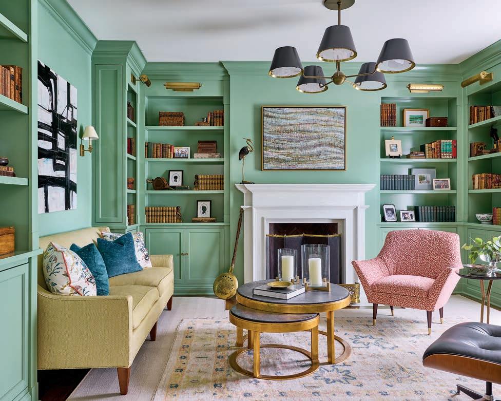
LEFT: A coat of green paint gives the traditional library an eclectic vibe, which suits the assortment of furniture and accessories that include an Eames chair and Century Furniture cocktail tables. The painting above the fireplace was done by a family member, and the chandelier is by The Urban Electric Company.
BELOW: Designed around thirteen hand-painted de Gournay panels, the dining room is impactful. The table and chairs are by Century Furniture with Stark carpet underfoot.
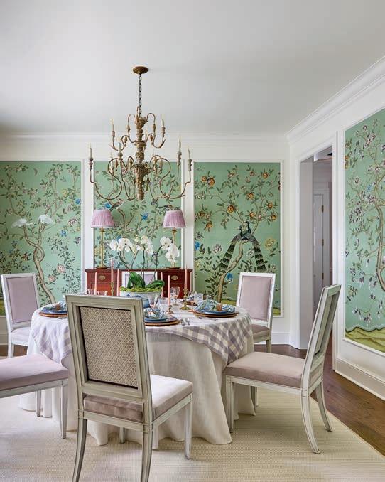
Modern touches include ten-foot ceilings and large windows in the dining room that bring a contemporary feel and “a huge piece of drama,” says Smith. Designer Amanda Patton Swaringen adds that “the dining room is one of the biggest wow factors in the house.” She and designer Jaime Tokarczyk from Carolina Design Associates LLC were pulled in at the project’s outset and began selecting colors and fabrics while it was still in blueprints.
“The owners loved traditional elements mixed with cleaner lines—but not too clean,” notes Swaringen. They also embraced color and pattern, and wanted their home to feel warm and livable. “They said, ‘We live in our home. It’s not a showplace.’”
One of the first things Swaringen and Tokarczyk did was inventory the homeowners’ previous home before it was razed to build the current cottage in its place. “They didn’t want to start over with a clean slate because they
Adele Yonchak Solo Exhibition

landscapes that evoke a unique sense of belonging loved their belongings,” says Swaringen. “It was important to them to use some of their antiques, but we also added new furniture, textiles, and rugs that complemented them.”
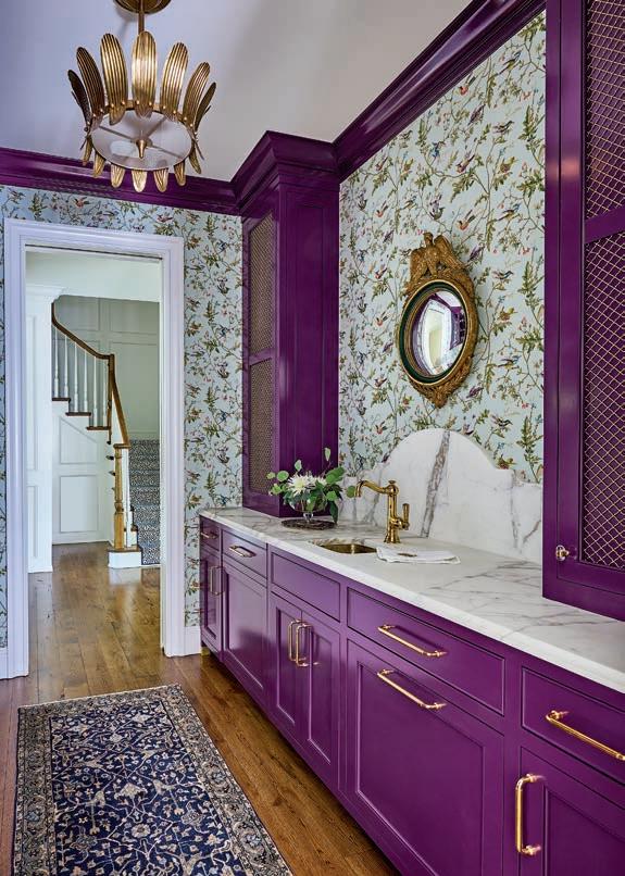
TOP RIGHT: The scullery and bar area sits at the center of the house and is one of Frank Smith’s signature elements. The plum color, pulled from the Cole & Son wallpaper, is elevated with a high-gloss finish.
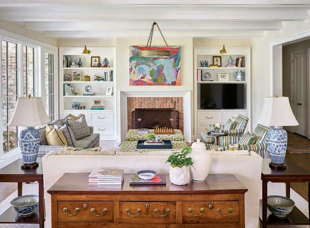
BOTTOM LEFT: In the living room, Smith and Swaringen aligned aesthetics to create satisfying symmetry. The Urban Electric Company chandelier is understated to allow the elements to speak to each other, like the Hickory Chair sofa with Romo fabric and the Century Chair swivels that flank the room. Heirloom antique lamps set the stage.
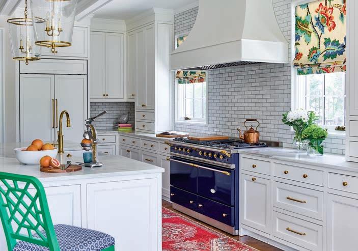
The homeowners’ few specific requests, usually one element in each room, became the driving force behind the design. In the dining room, it was handpainted de Gournay wallpaper panels; in the kitchen, it was the Lacanche range, which Swaringen and Tokarczyk had refinished to match Roman shades, fashioned from drapes with a beloved pattern that hung in the previous home.
Despite intentional statement-making rooms, including a plum-hued high-gloss scullery and a cheery green library, the overall aesthetic is classic and timeless—a multifaceted showpiece where this family can live comfortably ever after. u