2023
Sufyaan Chuttur
Craig Moller
PORTFOLIO
AD1 ARCHDES 700
04
Affordability (definition, possibilities, and precedents)
07
Initial Concept Designs
09
Sustainability and climate solutions (materials, systems and resources)
11
Te Aranga Māori Design Principles
13
Engineering Consultations (discussion and development)
14
Mid-semester Presentation, discussion and feedback
19
Design Development
20
User Access and Movement
21
Detailing (designing and developing pertinent details for realising the project)
22
Final Presentation, discussion and feedback
2023 PORTFOLIO
CONTENTS
BUILDING DESCRIPTION
This is a multi-use four-story building with a library and bookstore on the first 2 levels and residential spaces on the upper 2 floors. The building provides visitors with an interesting, adventurous, and relaxing atmosphere. Visitors move through various levels and thresholds in a maze of bookshelves and books concealing another world within. The first world the library contains is a lighter more popular library containing various general books ranging from children to non-fiction books. Running parallel to this world is a darker quiet world where books are more educational for students. It provides a space for people to sit down within a shield of bookshelves and study or relax quietly. While the library floors contain two worlds, so does the whole building: a library and a private residence. The theme of worlds running parallel to each other is exhibited throughout the whole structure. The entrance to the library is loud and inviting while the entrance to the residence is hidden in plain sight and more private. The two worlds however constantly meet each other to provide a more interesting space in which ‘ghosts’ reside. The scheme looks to retain attributes of the existing building while providing a new world of architecture and atmosphere while making the most of the contours of the site.
Site restrictions and Possibilities, Relation to wider context, Mt.Eden Station and Uptown past present and future. The proposed master plan will see an increase in residents and businesses around Mount Eden Station. However, Uptown lacks a library and space for students and people to study and relax with books. My design is situated on the north end of the site, bringing me closer to Uptown’s centre. A library here will be accessible to the new residents of the development and existing Uptown residents. An increase in Students living out of the city will demand library and study spaces. My design responds to this. Our master plan aims to retain the nature of Uptown. My design aims to retain the façade and parts of the existing building situated on my site. The old façade coupled with new architecture ensures the building relates to the older uptown aesthetic and historical context while providing new and better architecture. My site is on the edge of the boundary making the relation to old Uptown paramount. The location tucks the building behind others, this adventurous curious nature of Uptown will be reflected within my building. ‘Turning corners to reveal hidden gems.’ Located behind the PowerStation results in my site gaining minimal sun and potentially suffering from noise pollution. My design, therefore, should contain strategies reducing sound travel and take advantage of design techniques prioritizing the sun.
PA G E 4
My site contains an intense slope towards Mount Eden Station. This allows for a clear visual connection from my site to the station, especially with the proposed central park. Using the old structure means I have a building Pad upon which to build, however, my design should make use of the natural contours of the site. This will come in the form of terracing and relation to the site’s verticality with my play on levels within the structure.
Diagonal House - Daisuke Ibano, Ryosuke Fujii
Bradbury Works - [Y/N] Studio
The designer thus proposed: why don’t we build two bookstores? The general bookstore requires a larger internal space to accommodate activities, while a bookstore for liberal arts could run in a narrow space like the library stacks. The way to organize and mix these two function is the key. A bookstore is a place for books, knowledge and ideas. To design Yueyue/zhida bookstore is to create a space for good books and booklovers. All strategies and details were to serve this purpose.
We responded with a building comprising staggered floors, which brought about spatial continuity and smooth vertical circulation. The countless diagonal lines, which resulted from careful examinations of the level of visibility and the relationships between the spaces, became a design feature gesturing connectivity to the exterior space beyond the interior and terrace.
The building is wrapped in a homogenous polycarbonate façade. The lightweight and reflective skin creates the appearance of a singular form, however, on closer inspection the translucent character of the material allows the white-painted brick façade and the terrace to remain visible from the outside. Behind, the façade allows for plenty of light to enter the workspaces and breakout spaces. During the daytime, the cladding reflects the changing colors of the sky and external environment while glowing at night to reveal internal activities.
Critical Reflection
Critical Reflection
Critical Reflection
The idea of two bookstores in one building is very interesting. The idea of having two worlds running parallel to each other is also fascinating. I like the layout of the plan, and the different atmospheres in the building highlighting the different spaces.
The vertical connections and continuity is really interesting. The use of angles in the house to have continuity and almost hidden areas is really nice. The use of levels and terracing to layout spaces is interesting and could help in my structure to have more vertical relationships rather than just horizontal.
The semi-transparent walls are a very cool feature. They create a soft boundary. Allowing sillouhettes and light to go through but retains a level of privacy. The changing nature depending on light is also a very interesting concept. This will allow my building to have the ‘ghosts’ effect as people move around in the two worlds created.
The use of different materials, colours and design clearly portrays the atmospheres.
PA G E 5
Yueyue Bookstore - Atelier Archmixing
PA G E 6
Fusuma-e House and Office- Knof
House with a Small Library - Hiroshi Kinoshita and Associates
Rosenthal Center for Contemporary Art - Zaha Hadid Architects
The plan was to overlap the living and working areas rather than separating, and the nine fittings that appeared, as a result, were treated like a canvas for a “fusuma (sliding door)” painting. Barrier paintings such as fusuma-e (sliding door paintings) create a “depth out of phase” that differs from the xyz axis, in which people’s imaginations move back and forth through space.
A private library that could be opened to the city whenever the owner felt like it. The six glass doors at the entrance were then utilized, allowing for the ground floor to be used as an open space such as a dirt floor, a guest room, or a small library connected to the arcade. The circular benches would be possible to use in various situations. The upper floor is a single room, which was the client’s preference, taking advantage of the large building frame. Renovated with minimal expense.
The “Jigsaw Puzzle.” Hadid used the term to illustrate the complex arrangement of differently-sized concrete volumes that house the gallery spaces of the center; the variegated intersections between the volumes and the voids between them could be viewed as a three-dimensional puzzle. The circulation connecting the two had to be equally dramatic. The primary means of vertical egress is a series of stair-ramps running back and forth along the rear wall of the museum.
Critical Reflection
Critical Reflection
Critical Reflection
The depth created with the painting and the sliding doors able to manipulate reality and imagination is very interesting and will be nice to use. The overlaping of spaces rather than separation works great with my idea and the concealment of spaces to create certain atmospheres is interesting.
The modest and humble design is very intriguing. The personal atmosphere is something i’d like to incorporate into my design. The multiuse floor space is also an interesting concept. The re-use and transformation of an existing structure is also nice.
The manipulation of spaces to accomodate differnt needs is interesting. The exploration of vertical spaces and floor plan layouts are viewed as a puzzle, an interesting concept for spatial layouts. This is helpful to create a puzzle of threshholds and spaces with different atmospheres within the structure while retaining a sense of continuity and comprehension of spaces.
Initial Sketches
Initial Sketches
Collection of Initial sketches. Exploring existing building shape and footprint. Drawing context and facade in order to gain better understanding of existing building.
Gaining more in depth understanding of the site and its restrictions (sun and sound). Creating more detailed floor plans and uses. Visualising entrances and 3 dimensional forms to gain better understanding of and aid design.
Continuing exploration of floor plan and simultaneously exploring 3 dimensional form of building. With each step, a more detailed concept is created.
Critical Reflection
Critical Reflection
Critical Reflection
Initially began designing within the shell of the exising building without much intervention to the structure. Indoor outdoor flow and Sun were being considered, hence the Atrium with the tree. Vertical separation of uses was emphasized early on. With the separation of private from public with a detached structure.
Trying to create a quiet and concealed entrance which opens up to the northern, more privatecourtyard. Sound from Powerstation was considered, with the garden and walls put in place in order to help mask the sound. Spaces were laid out considering sound, sun and views.
Attempt to create private space entrance but proved difficult with initial layout.
Playing with initial ideas in plan views to visualise them and understand how they relate and fit into the building.
PA G E 7
Initial Sketches
PA G E 8
Development of Initial Sketches
Development of Initial Sketches
Development of Initial Sketches
Continuation of concept design though critical analysis and development. Designing new entrance as previous design was unsuccessful. The new entrance is stronger, more welcoming and provides better layout and circulation. Provides bike storage and creates strong vertical and horizontal connections. Exploring through plans and perspectives. Beginning to look into accessibility.
Developing plans to reinforce design theory of translucency, circulation and parallel worlds within the structure. Exploring the parallel staircase and floor plan angles to influence circulation and atmosphere; concealing and revealing spaces.
Developing more complex floor plans to explore circulation, view points, axis and spatial qualities. Working both in plan and 3d perspectives to constantly have a strong visual of the space being designed.
Critical Reflection
Critical Reflection
Critical Reflection
Initial layout was too restrictive therefore a new layout was needed. A stronger and more succesful entrance was created. Public and private route separation was considered, an earlier split of the functions meant a more comfortable design for both types of occupants. A more hidden entrance of the privatespace was created. (Yueyue Bookstore). Bike storage for public and private was considered along with accessibility.
Vertical and horizontal thresholds were considered and emphasized. The idea of ghosts and hidden gems was pushed further. Parallel staircase idea with semi translucent screens were introduced. (Bradbury Works, Yueyue Bookstore).
Floor plan became more complex and derived from considering spatial quality of concealment and spa tial reveal according to axial lines and circulation.
Sustainability and climate solutions (materials, systems and resources) Materials My Material choice is the result of minimising my carbon footprint. Initially my structure was made from GLULAM, concrete and high-performance glass. After talking to the engineers, in consideration for the span of my building in relation to strength this changed to a hybrid of timber and steel. A Hybrid structure is more sustainable than a complete steel structure. The long life of the steel will help reduce waste in disposing ageing materials in the future. I retained the footprint of the existing building when designing and instead of demolishing everything and retained the building pad to have the least impact on the site. The white polycarbonate facade can be melted after use for recycling for new purposes. The white facade materials reflect heat, keeping the building a comfortable temperature.
Systems and Resources My building uses passive and technological systems and resources to maintain a sustainable operation. The green roof is a step towards minimising the urban heat island effect while also keeping the building cool. Solar panels and a water collection and purification system help offset the consumption of the users. Garden lightwells and a green facade filter the light and temperature to the interior of the structure. In winter the leaves shed allowing more light and heat whereas in summer the leaves thicken to reduce heat and harsh light. The green facade is a vertical garden, providing organic fresh ingredients to the residents.
PA G E 9
Louvres help residents control light penetration into the structure while providing a nice aesthetic infuenced by the folding of books to the structure.
Description of Image
Description of Image
Description of Image
Images of existing building on site.
Exploded Isometric of structure showing services, structure and performance.
Floor plan of residential spaces
(Max. 70 Words)
Critical Reflection
Critical Reflection
Critical Reflection
Since the building pad is already there, instead of destroying everything and forming the earth again, we can re-use the building pad.
Using sustainable materials to make the structure is the first step. Supporting the structure with technological solutions to reduce the buildings lifetime emmisions are solar panels to offset energy consumption. Special care has been taken in the facade design and planning of the structure to reduce heating needs, reducing future energy consumption for heating. Water collection and vertical gardens help move the building towards a self-sustainable future.
The Lightwells provide necessary light to the living quarters of the structure. There is abundant sun to the north and west of the site, therefore large openings make the most of this. Minimal openings to the south reduce heat loss and allow for each residential block to have an almost private garden to look into. The greenery not only provides visual comfort but also food and will also control wind flow and tempearature into the structure. A passive and sustainable solution.
PA G E 10
The concrete structure and existing windows and doors however and not sustainable or well performing. Demolishing the structure but not forgetting it is shown through my design, with the spacing of my columns following the same pacing of the existing structure.
(Max. 70 Words)
TE ARANGA DESIGN PRINCIPLES Incorporating Te Aranga Incorporating Te Aranga was a beneficial design process to my structure. Providing the library with a more in depth communal aspect linked with gathering and storytelling, linking to reading storybooks. My design goes in depth with the Mana Tangata, Whakapapa and Kaitiakitanga values. The Te Aranga principles enforce community and provides a more beneficial student lifestyle with a more familial feel within residents. The emphasis on the protection and use of natural resources was a key driver for my design, with minimal damage to the land and the incorporation of self sustained technologies and gardens aims to protect and use the natural resources.
PA G E 11
Using Te Aranga also allowed me to create a building that is usable to a wider scope of the population, with a huge emphasis on accessibility.
PA G E 12
Description of Image
Description of Image
Description of Image
Interior perspective of Library 1
Floor plan of Level 0
Perspective of interior garden light well and vertical garden.
Critical Reflection
Critical Reflection
Critical Reflection
Following Mana Tangata values. The building is accessible friendly everywhere. The slope nature of the site was a challenge, hoewever designing with ramps and accessibility in mind, we are able to provide a more inclusive experience for everyone.
Following Mana Tangata values, The architecture is also split into 2 libraries, Library 1 the light and vibrant library is suited for familes and children whereas library 2 provides a quieter space for a different type of user. Library 1 posseses a TV room and a theatre around a tree encouraging the act of communal gathering and storytelling. The activation of both laneways is also representative of this principle. Including the surrouding structures into the atmosphere of my building while providing security to users of the laneway creates a safer environment.
Kaitiakitanga promotes self sustainability, low impact on the environment while benefiting from natural resources. The vertical garden and atrium bring nature back into spaces which they would have traditionally not been present. Merging architecture and nature together creates a better living environment. It is a two way relationship where the inhabitants maintain the nature and the nature in turn helps the in habitants with food and/or protection.
Description of Image
Description of Image
Initial layout of structure.
New layout of structure.
Section B-B
The Engineer did not advise huge changes, other than the worry of structural strength and the torsional stress on the structure. Therefore he asked for internal walls to help with torsional stress.
The new layout had a more regular shape for the residential blocks and utilised clt wall panels for bracing. The library levels utitlised the eastern clt wall panels for bracing and the bookshelf walls were reinforced to act as a bracing element against torsional forces.
Steel beams run under the CLT floor panels as an added layer of strength for the structure. The steel beams however have a timber veneer to maintain the timber aesthetic of the structure.
PA G E 13
Description of Image
SITE PLAN
“Through the screens, ghosts move through the building, raising the question, is there another side?”
The 1:1000 at A3 site plan shows the building location in relation to the proposed masterplan. The Site plan shows context of Uptown and the masterplan. A sun diagram is included to give solar information of the site.
This render depicts the parallel staircase viewed from the garden as two occupants move through the building. The image allows us to understand the darker more quiet private area’s atmosphere. It shows us the ghosts of the building, a key design idea. The light coming through the screens without detail, only hinting at the presence of another world.
PA G E 14
DESIGN CONCEPT RENDER
FLOOR PLAN - LEVEL 0
FLOOR PLAN - LEVEL 1
Ground floor plan showing arrangement of spaces. Part of the existing facade is retained, otherwise the new entrance takes away from the original facade. A strong welcoming feeling is created as we move into the library, with the angled wall guiding us in. Tucked away and hidden in plain sight is the private residence’s entrance, a shift in axis and narrowing of the path creates a darker threshold and hides the entrance. Moving into the library, bookshelves and screens exhibit and influence our circulation through the space. The layout is derived from the axial lines and use of spaces. Tucked away behind the reception is a long screen concealing the stairwell and restrooms, the treshold allows the space to gain a more secluded atmosphere. The ampitheatre is a double height space, making the most of the contours, the terrace allows for a smooth transition into the courtyard behind while providing a beautiful seating area. The parallel staircase runs up to the first floor with screens concealing the library’s and private residents’ circulation.
Moving up into the first floor, we emerge within similar screens which we entered the stairwell from on the ground floor. This provides a concealment aspect of the staircase and the first floor space. Wall angles are used to conceal and reveal spaces to create secluded and open spaces. The double height space allows more maximum solar gain into the building. Screens continue on this level to hint at the circulation of both private and libary spaces.
PA G E 15
Critique: More exploration of the screens and ghosts throughout the building.
FLOOR PLAN - LEVEL 2
FLOOR PLAN - LEVEL 3
Moving up into the private residences located above the libary, we enter a communal space before the private houses. The original facade’s aesthetics are continued onto this level. Moving into the houses, the floor plan is linear with a circulation space in the center. The screens and circulation themes continue, with screens (not directly in front of doors and private spaces) hinting at the circulation occuring in both homes. A light corridor is placed between the two blocks to allow for more sun penetration into the homes. The living room is a double height space opening up to a balcony looking into the smaller courtyard.
The double height space allows for more sun penetration and views while also creating a stronger connection between the two floors.
PA G E 16
Critique: Light corridor is not useful, rather use it for more floor space and gain more sun along a larger northen facade and larger balcony. Circulation and screens in the centre reduce privacy.
SECTION - AA
SECTION - BB
Section showing vertical relationship of spaces. The separation of the public library and private residence through a separation of structures. Garden and walls to mask sound from exterior and Powerstation.
Long Section through building. Showing double height space influencing more communal activities and allowing for better sun and view capture.
PA G E 17
Critique: garden on ground floor will not receive much light.
PHYSICAL MODEL
Model giving a 3 dimensional understanding of the building and its spatial arangements and qualities. Showing clear separation of public and private spaces through vertical structural separation. Depicting entrance in which the library has a strong attraction with the angled wall guiding us into the public space. Hidden in plain sight is the alleyway to the private space.
PA G E 18
The model illustrates the intricate layering of walls and semi translucent openings to create more secluded and private thresholds within the structure. Showing how the angle of walls relating to the design theory to create secluded and inclusive spaces while influencing circulation.
DEVELOPMENT FROM MID-SEMESTER CRIT
DEVELOPMENT SKETCHES
Development from personal and Critic Feedback.
PA G E 19
More ghosts in the building, exploring more verticality and understanding whats old and new in the structure. Private residential space should lose the central light well corridor as it is not very useful. The following drawings are still in progress and will be developed. I decided to introduce a stronger mix of the two world concept throughout the building. Bringing them closer and making the separations stronger. Introducing verticality into the two world and ghost concept. Old and New building has been determined as using just the southern facade and building behind it. The new design has a quieter library living within the walls/bookshelves of the standard general library. From the general library it is hard tounderstand how the quieter library is accessed. Circulation in the structure has been emphasised. The floor plan has taken a more closed and tight layout approach in order to create a more adventurous and concealed nature.
Sketches understanding relationship between old and new facade. Exploring vertical ghosts and trying to emphasize the design theory throughout the structure. Exploring both horizontal and vertical thresholds. Developing more complec shapes and bringing the two worlds closer. Beginning to create a concept in which the quiet, darker library resides within the walls of the public lighter library. Playing with vertical levels and access and orienting shapes based on adventure, axis, views and spatial qualities.
Description of Image
Description of Image
Description of Image
Floor plan level 0
Section A-A
Location Plan
Critical Reflection While the corridors are long and there is an emphasis on the journey in the plan, the library is well connected, and exiting the building to an open courtyard is very accesible with a multitude of openings. All spaces have access to a stairwell in case of an emergency. My design provides plenty of space for storing of bicycles due to my group masterplan’s focus on foot and bike traffic.
PA G E 20
The plan is designed with accesibility as the first priority.
The ground floor is terraced into the site, but the main circulation is built with ramps, with flat bays serving as rest stops. This ensures everyone walks the same path, creating a more inclusive space.
My building is located to the north of the site towards Mt.Eden Road. This area of the site is particularly steep, my building tackles this in its terracing of the landscape to provide a better experience.
GLULAM Green roof and water catchment
Solar Panels and insulation
The climate of Auckland in summer consists of very high temperatures and in winter, high amounts of rainfall. In accordance to Te Aranga principles and a sustainable future mindset, GLULAM is an appropriate structure. Documented by the RIBA is Jonathan Nicholls stepped green roof supported by GLULAM, proving that this engineered timber substrate is suitable given the right waterproofing. This detail allows for greenery to grow on the roof but also acts as water catchment, filtering through into the plumbing of the structure towards the urification and storage tanks.
Along with a green roof, solar panels are attached to the roof to offset energy consumption. GLULAM is naturally a good insulating material, however cold winters and an aim to rely less on appliances to keep us warm, demands high performing insulation to retain heat within the building envelope. The details above are situated in open spaces therefore while the insulation has a tight seal on the roof (because this continues into living spaces), the exterior wall is not insulated as it doesnt need additional insulation in these open spaces.
PA G E 2 1
DETAILING
FINAL PRESENTATION CRIT Feedback
Personal response
cons: 1. The library was planned in depth however the residential blocks were somewhat lacking of planning. 2. Critics felt that the shared balcony could potentially be a breach of privacy. 3. Should a library allow us to get lost or is it better to know exactly where you want to go?
1. I agree with the critics thought, after discussion more care could be taken to create a better living space. This is shown in my final submission with residential blocks taking advantage of more space, better studio planning encouraging a more organised lifestyle. 2. The shared balcony and its breached privacy is a concern, therefore the new planning of the studios ensures only living spaces such as the living room is exposed and it conceals the private spaces such as bedrooms and bathrooms. 3. While it is different to traditional libraries to take the user on a journey in which they aren’t exactly sure where they are or what is on the other side, I believe it embodies the feeling of uptown, a curious journey, looking for hidden gems and it is derivative of a book telling its story, we dive head first into the story and follow it to the end. The three storylines of the library take us on different timelines and places, playing with our senses and idea of space.
PA G E 12
Personal Improvement Residential blocks were angled 30 degrees towards north west to make the most of the sun, however with the introduction of light wells and the existing vertical garden wall, I found it to be better if the plan was more regular. This was a good descision as I could benefit more from a regular shape floor plan. Such as better separation and no unnecessary complexity.
Location Plan
Site Plan
Exterior Perspective of Building
My site is located to the north of the masterplan close to Mt.Eden Road
My building is situated on steep terrain, sloping to the north and north-east of the site. Adjacent to my site is Powerstation and a tall apartment complex. This causes excessive noise at night and a lack of sun on my eastern facade. There is a laneway to the west of my site which I share with my classmate Mya Dixon. The laneway leads to an internal courtyard, providing a pocket of light within the surrounding structures.
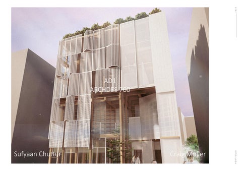
The building looks towards the green corridor created in my group’s masterplan. I want my building to be humble in the landscape with a simple but illustrative facade. The facades play on translucency and folding of louvres hints at the play on world dimensions, ghosts and pages of books of the library.
PA G E 2 3
Our masterplan aims to revitalise the area and create a space for everyone to enjoy.
FINAL DESIGN Ground Floor Plan - The mise en scene and pacing The Plan shows three spaces running at different time rates compared to one another along with differing spatial qualities. The entrance greatly emphasizes entry into Library 1, the vibrant and light library encouraging families and the general public to gather inside, whereas the entrace to library 2 is more concealed. Library 2 is the quieter, darker library running within the walls of library 1. They run parallel to each other influencing each others atmosphere and spaces. Tucked away is the entrance to the residential space, a private entrance. As mentioned before each space runs at a different time, library 1 running slower than library 2 and the residential running at the fastest time scale. (time taken to reach second floor). This creates a more intensive disparity between the spaces, like a story, different storylines unfold differently.
Planning and constraints The north eastern facade is burdened by the noise of powerstation and neighbouring buildings, to numb this noise, walls and spaces are populated on this side acting as a buffer of sound. The eastern facade does not receive sun therefore minimal windows at ground level are created to reduce heat loss. The eastern facade is semi translucent activating the adjacent laneway. The western side of the building faces a laneway activated by me and my classmate. The slope was originally quite intensive but terracing of the laneway to the courtyard along with a ramp allows for easier access.
PA G E 2 4
The western facade opens to the laneway but the bookshevles ensures the privacy and concealment of interior functions. These pockets of space provide a blended threshold to the exterior and interior for a more cohesive experience.
FINAL DESIGN First Floor Moving to the first floor, the disparity and timelines are further stretched. Library 1 runs at floor level 4000 whereas Library 2 runs at floor level 3000. The hierachy is switched when library 2 suddenly wraps around library 1. This creates an illusion both inside and outside, inside thinking how did we end up looking outside when we used to be within the walls and from outside thinking that by entering library 1 you would end up on the first floor viewing out. This overlaping of spaces creates an interesting story within the building, further getting the user lost within its architecture. The first floor is quiet for both libraries, with its study spaces, maybe by the library 2 wrapping around library 1 it allows library 1 to close off for a bit to provide a better study experience.
Planning and constraints
PA G E 2 5
Louder activities are located to the northern side of the building, where the libraries converge and the quieter spaces are kept to the south of the building, with an intermidiate space in the middle. The entire exterior facade on the western, southern and eastern facade are either covered or filter light through as this space is more private and secluded compared to the ground floor.
FINAL DESIGN Residential Floor plan The studio blocks separate the bedroom from the bathroom, as opposed to the traditional studio layout in which all spaces are mixed into one. Learning from the Covid-19 Lockdowns and the struggles of being stuck in one place, separation of uses and a dedicated living space allows for a more organised living condition. Work life Balance. Following Te Aranga Principles in designing with Maori Values in mind, The bathroom is tucked far away from the cooking and eating space. The northen facade of each block opens to a light well, giving each block abundent access to light and fresh air. Protecting privacy, the south facades contain no windows, allowing each block to enjoy their garden in peace. The shared balcony is retained as it provides a deeper sense of community and the new layout ensures privacy is maintained.
communal spaces
PA G E 2 6
The new design ensures each floor consists of some type of communal gathering space and activity space to allow residents to build a community making a safer more comfortable space. Level 3 - TV and Games room, Communal kitchen and dining, Level 4 - TV and Games room, Gym, Level 5 - Library and study space.
Interior perspective of parallel library 2 and residential staircase
Interior perspective of Library 2 (first floor)
The circulation was created with accesibility in mind, therefore ramps are the main circulation space, with flat terraces as rest stops. Here we see a pocket of space opening to the laneway while still concealing the depths of the library.
This parallel staircase represents the structures adjacent dimensions well. With the original idea of ghosts moving through this was continued into the final design. Here we can see the difference in spatial qualites and level changes.
We see the bookshelves against the exterior wall filtering the light into the space, creating an ever changing atmosphere as people take and return books.
PA G E 2 7
Interior Perspective of Library 1
STRUCTURAL ENGINEERING CONSULATION Section A-A The building terraces with the topography, to have a stronger connection to the land and be less disruptive to the land it sits on. On the first floor we see library 2 terracing up to library 1, matching its pace until the final scene where they are greeted to a double height space with a tree filtering the light and air into the space. At the end of the building to the north is a double height space with a huge mechanical door opening up to the courtyard. Here you can sit around the tree in a gathering space, listen to stories or read a book.
PA G E 2 8
The residential block we can see the garden light wells, filtering light into the space. These spaces provide visual comfort to the residents and control the climate inside the residences. In summer they protect from harsh sun and hot temperatures and in winter allow more light and heat inside. This creates a closer connection to nature.
FINAL DESIGN Section B-B The section shows the structure of the building, with the developed existing concrete building pad, CLT and GLULAM walls and structure. The residential space always runs at FL3000 variances while the public library runs at FL4000 variances to create a stronger separation between the public and private while allowing interesting moment and circulation spaces while packing more residential floors in a smaller (but still comfortable) space.
PA G E 2 9
We can see Library 2 wrap to the exterior of the building around Library 1. We can also see the public private public alternation in the residential space with walkway, residence and shared balcony vertical garden. The vertical garden allows people to benefit from natural resources while taking care of natural resources.
PA G E 3 0
Exterior Perspective of building (north side)
Perspective of Garden light well and vertical garden on shared balcony
Exterior perspective of eastern laneway at night
The white semi translucent facade with the filtering garden walls conceal and reveal the interior functions with a humble and soft aesthetic on the landscape. The large door opens the theatre up to the courtyard creating a more immersive and cohesive environment. The building’s timber and white canvas and polycarbonate materials complement the greenery softly, showcasing the warmth of the interior and freshness of the green spaces.
This provides a deeper connection to nature in the heart of the city, providing our natural environment to co-exist with us. As we take care of our environment and natural resources it in turn takes care of us.
The semi-translucent facade follows and hints at the interior circulation as it breathes the building’s warmth into the surrounding environment. This activates this laneway making it safer for people to use.
Some might see this is as a waste of real estate space, however, I think that if we are moving towards densification anyway, why not provide these dense buildings a more comfortable living environment benefiting not only us humans but the nature losing its space in the cities as well
FINAL DESIGN Model
PA G E 3 1
The model comes apart to reveal internal floor plans and their relationships in a 3 dimensional space.