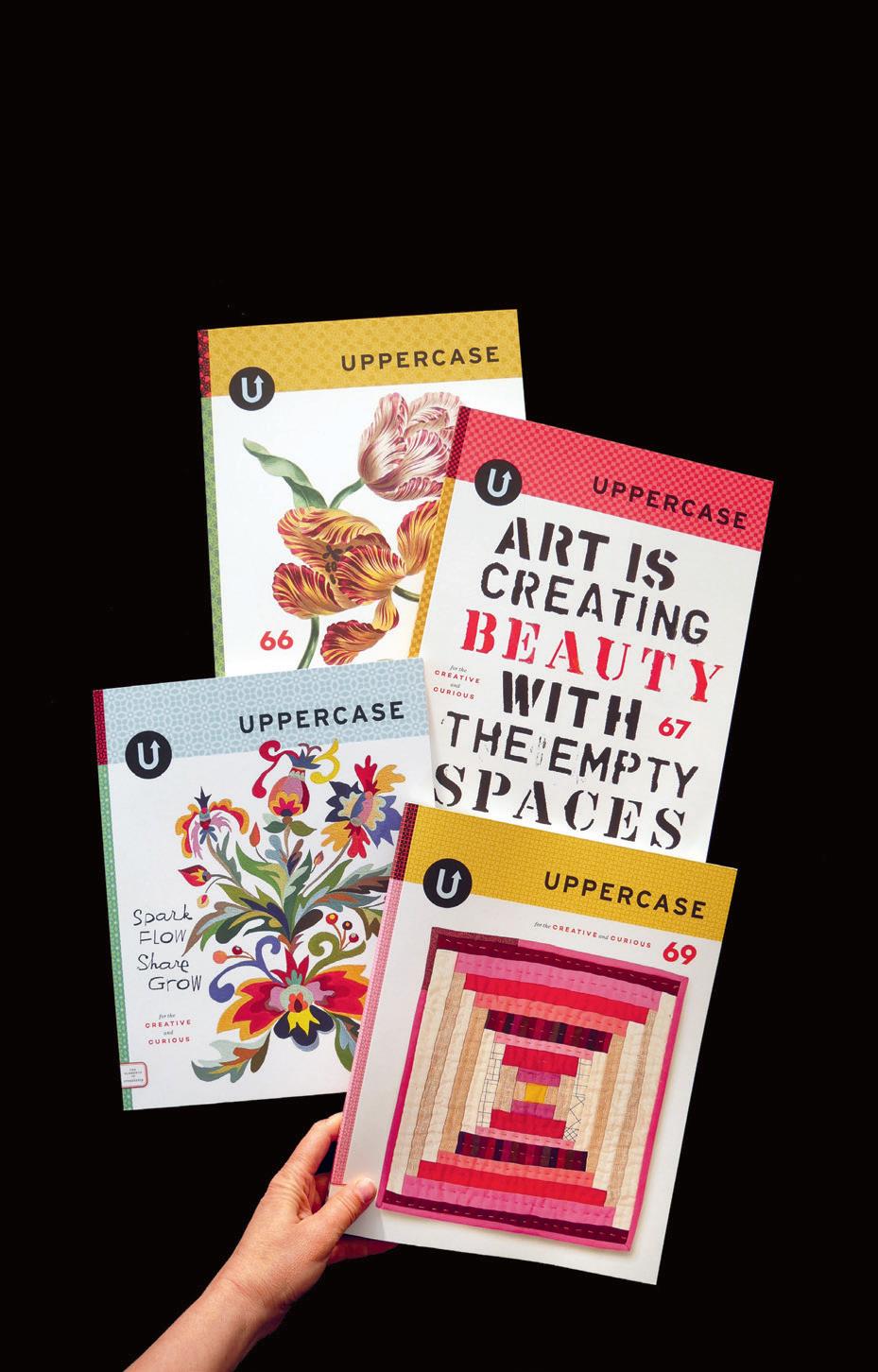
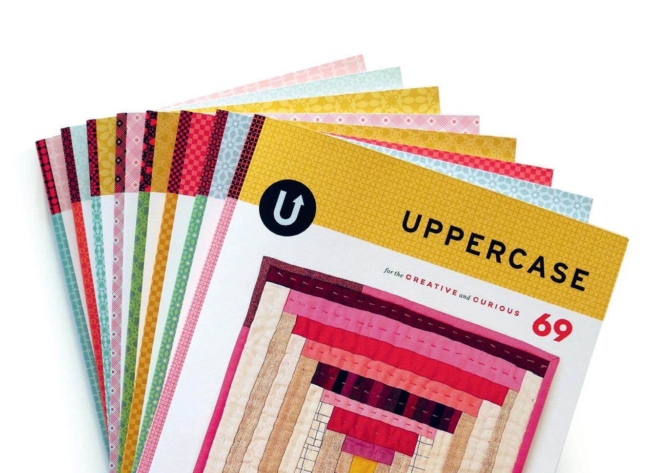
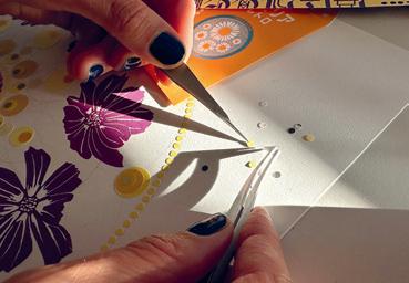
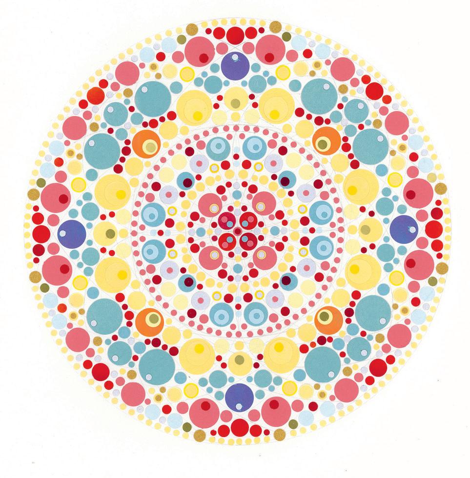
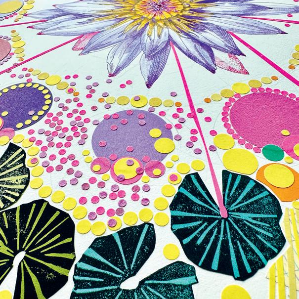
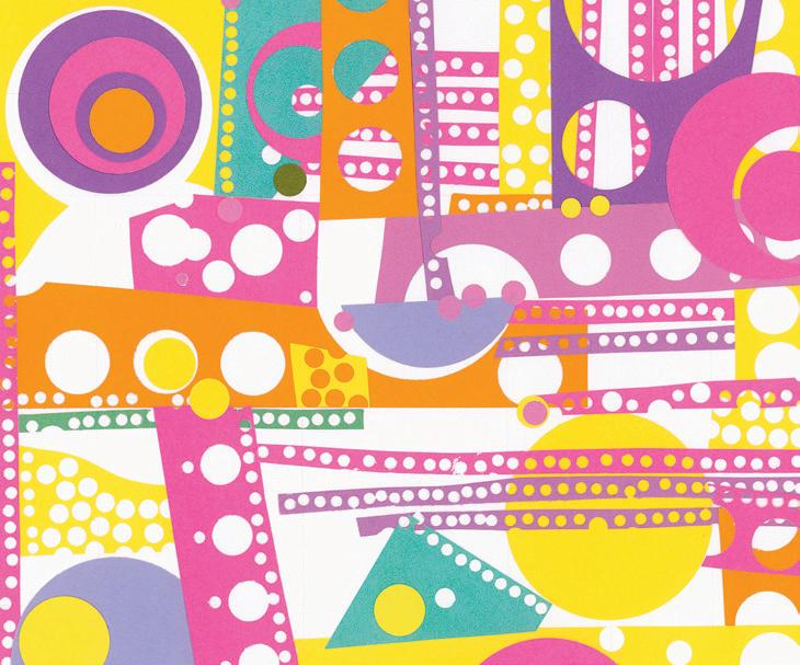
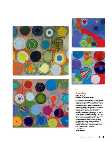
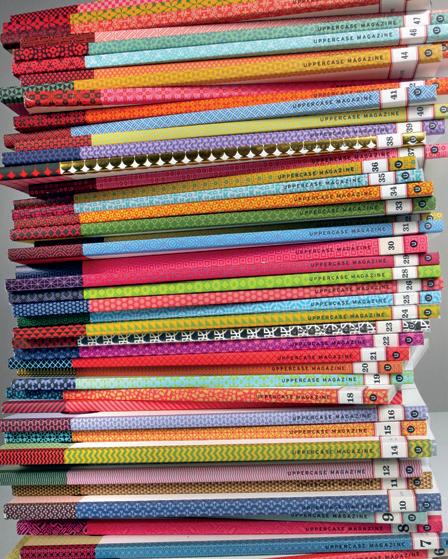
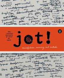
This is the 70th quarterly print issue of UPPERCASE magazine. Seventeen years is a very long time to do something over and over! There is satisfaction and familiarity in the repetition. It’s the same, yet different, every time. The challenges of publishing an independent print magazine are many, but it is still gratifying to hold this printed publication as the result of my editorial eye and the tremendous talents of its contributors and readership.
Looking through the back issues, I can see recurring motifs and ideas, but also how much the magazine has evolved through the years— and how much I’ve changed with it.
This observation and introspection is how the theme of “practice makes perfect” came about for issue #70. When it comes to perfection, though, we’re being very loose with the interpretation.
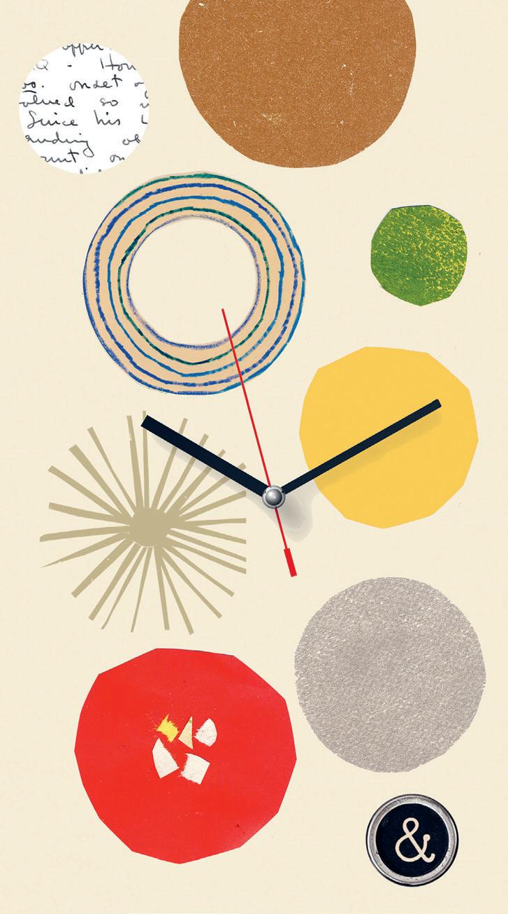
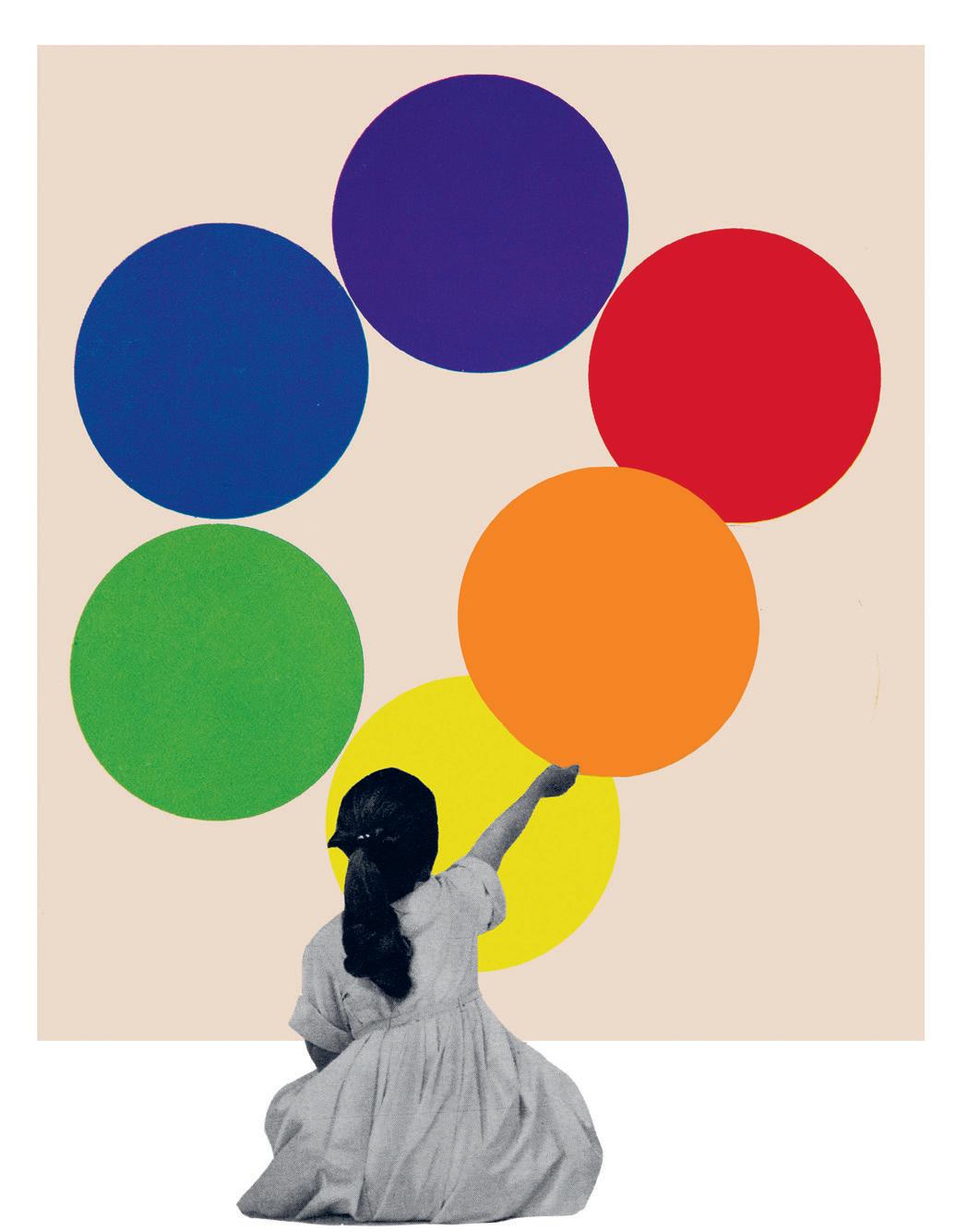
Striving for perfection is often a matter of repetition. Try again, and again. It might sometimes feel like you’re going in circles. And so the circle as concept, symbol and visual motif is another theme for this issue.
Perfect!
Janine Vangool PUBLISHER, EDITOR, DESIGNER
Receive my weekly musings, delivered to your inbox!
uppercasemagazine.com/free
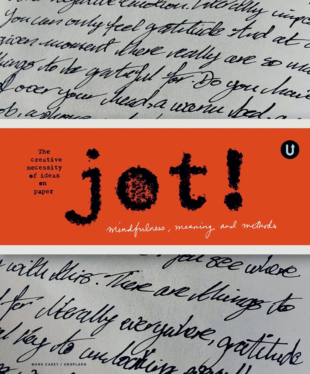
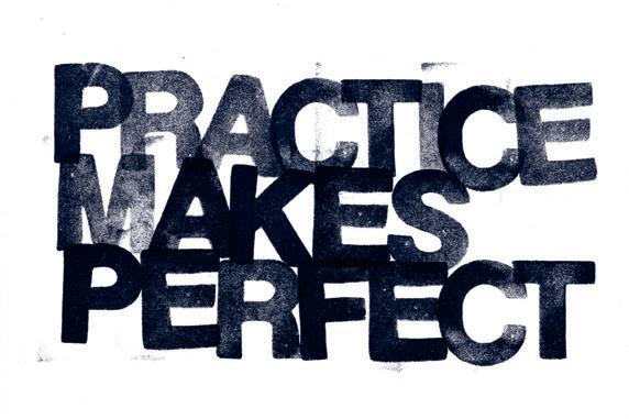
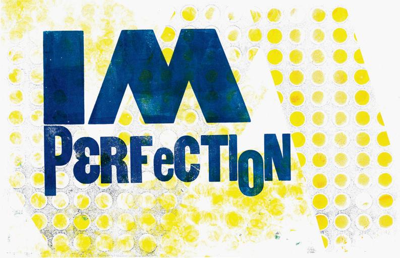
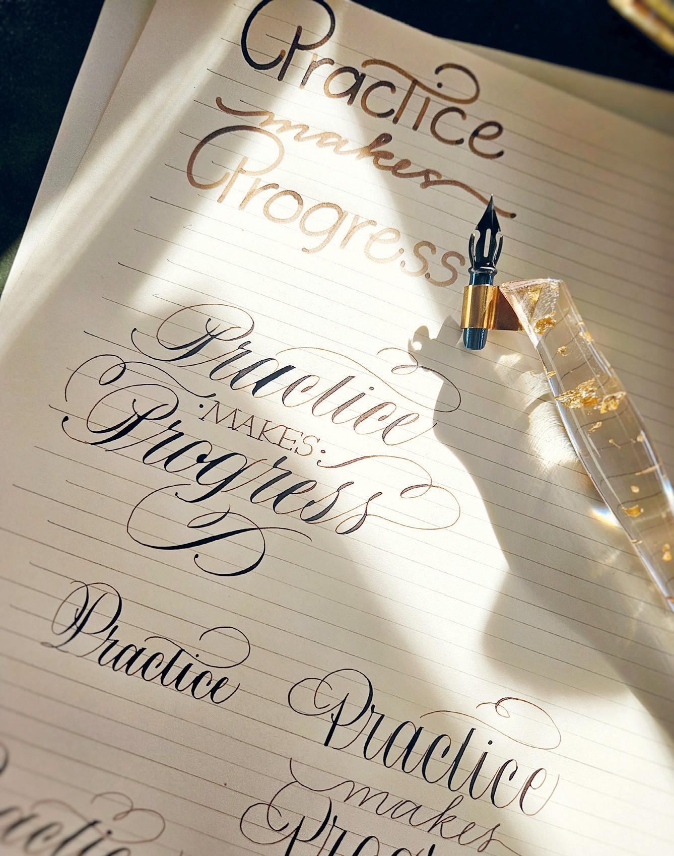
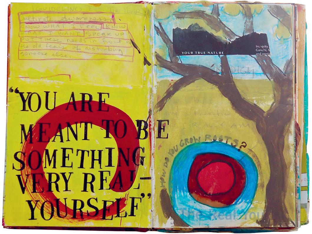
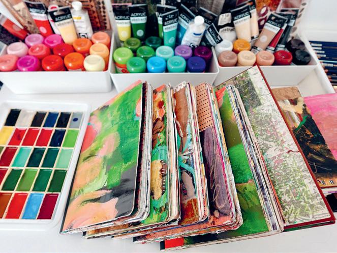
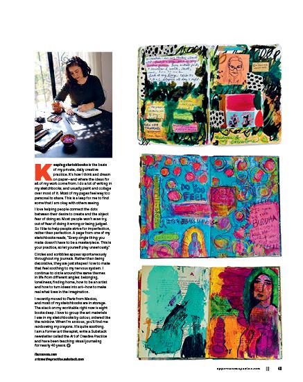
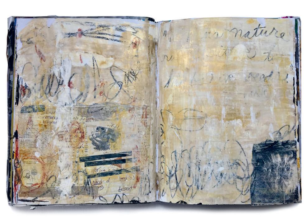
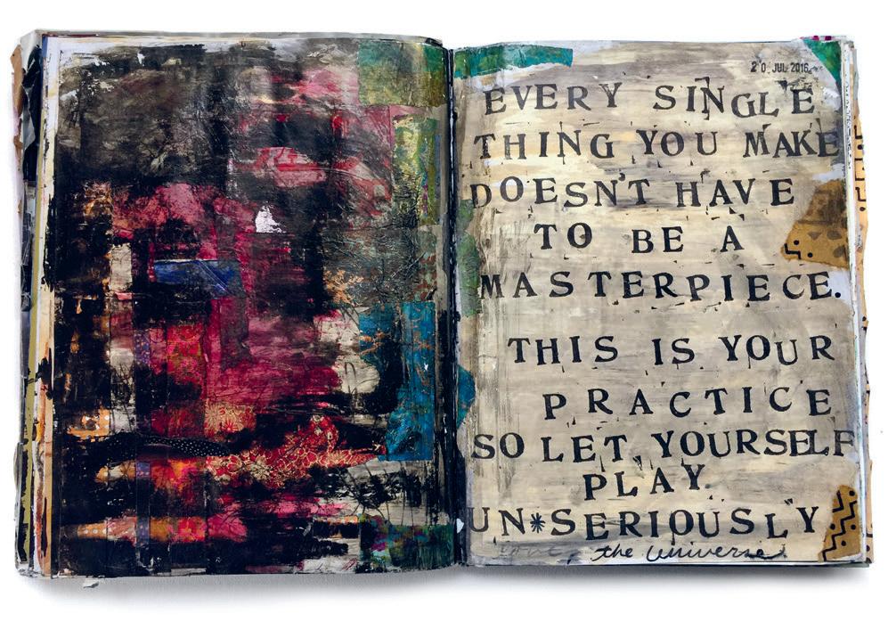
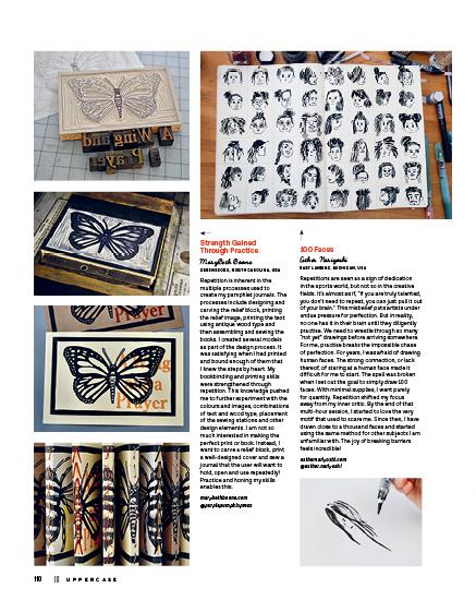
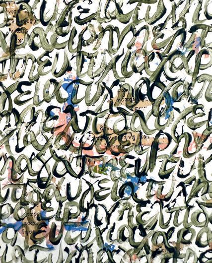
I stamped this phrase in my “text” book (what I call my sketchbook that solely explores words and letters). Getting inky and easing control of the outcome is the perfect stress-releasing activity.
UPPERCASE
1052 Memorial Dr NW Calgary, Alberta, Canada T2N 3E2
Interior pages are printed on 100% post-consumer recycled Rolland Enviro 100.
Sustainability Initiatives
Through the Wren Trailblazer fund, UPPERCASE pledges $250 per month towards offsets. This pooled fund goes towards technologies that permanently remove carbon from the atmosphere, as well as traditional offsets. Please join fellow readers in the Wren Impact forest. wren.co/groups/uppercase uppercasemagazine.com/eco
In the spirit of reconciliation, we acknowledge that we live, work and play on the traditional territories of the Blackfoot Confederacy (Siksika, Kainai, Piikani), the Tsuut’ina, the Îyâxe Nakoda Nations, the Métis Nation (Region 3) and all people who make their homes in the Treaty 7 region of Southern Alberta.
SUBSCRIBE
This independent magazine thrives because of you— its loyal subscribers!
uppercasemagazine.com
SUBSCRIPTIONS
This quarterly magazine is released in January, April, July and October. CANADA
CAD $96 UNITED STATES
USD $80
INTERNATIONAL
CAD $144
Our shop will do the currency conversion for you.
RENEWALS
You will receive a notice by email when it is time to renew. Renew online anytime to add issues to your current subscription.
GIFTS
Simply enter the recipient’s name and address in the shipping information and your name, email and billing address during checkout.
STOCKISTS
To view our list of stockists or to carry UPPERCASE in your shop:
uppercasemagazine.com/ stockists
Thank you to all of the talented writers, illustrators, creative collaborators and loyal readers who contributed their talents to this issue of UPPERCASE.
QUESTIONS?
Have a question about your subscription or a change of address? Email us: shop@uppercasemagazine.com
NEWSLETTER
Sign up for the UPPERCASE newsletter to receive free content and behind-the-scenes peeks at the making of the magazine— plus a welcome discount on your subscription!
uppercasemagazine.com/free
Thank you to everyone who submitted to the open calls for this issue. Even if you weren’t featured within these printed pages, your effort was noticed and appreciated!
SUBMISSIONS
UPPERCASE welcomes everyone and all identities, ages, talents and abilities. We share an inclusive, positive and community-minded point of view. Everyone is welcome to explore our creative challenges and submit to the magazine. Pitch your own work, propose an article or suggest a topic through the Open Pitch submission form. Be familiar with the magazine and its writing and visual style.
uppercasemagazine.com/participate
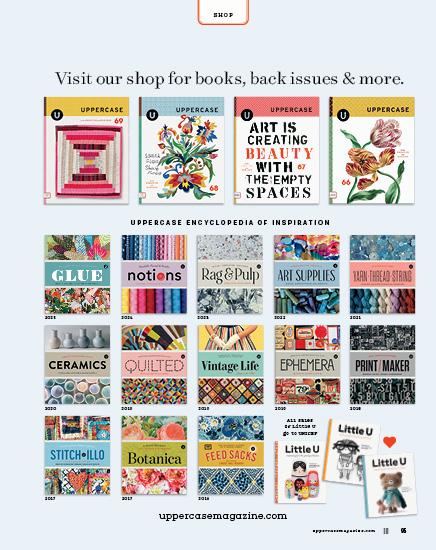
Magazines are not reprinted— get our back issues while you can! Out-of-print issues are available digitally in the Archive. uppercasearchive.com
JULY AUGUST SEPTEMBER 2026
HARRISON
Ceclia Feld, Loo McNulty
VENTURA, CALIFORNIA,
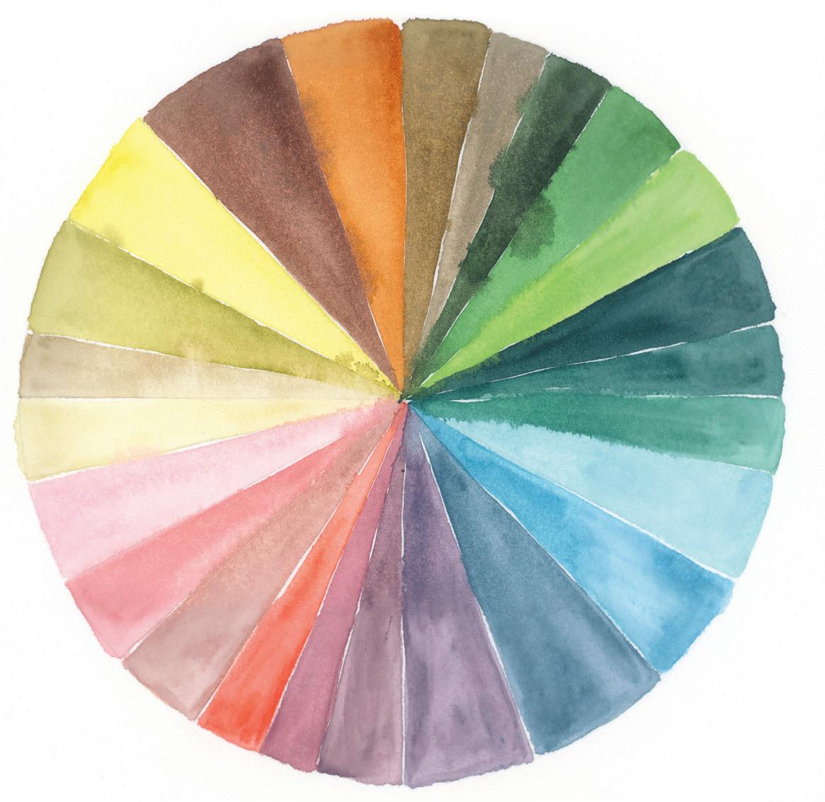
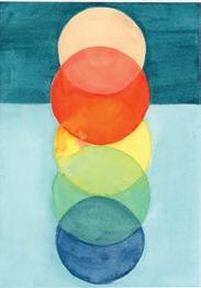
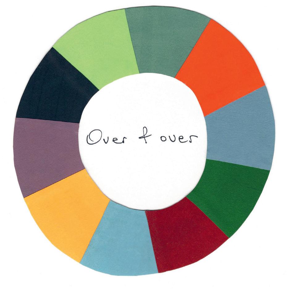
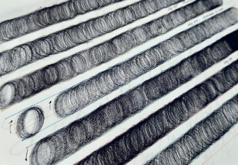
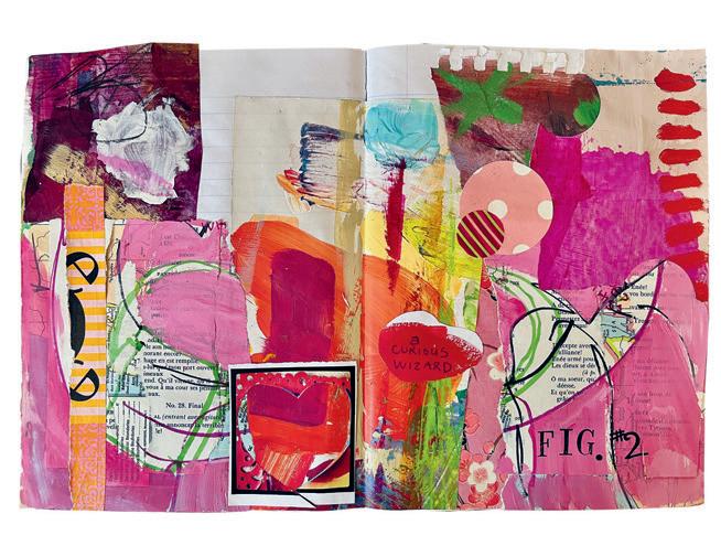
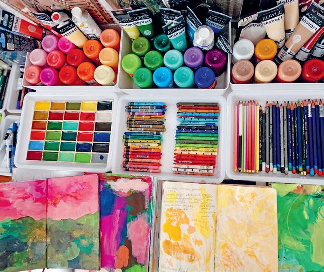
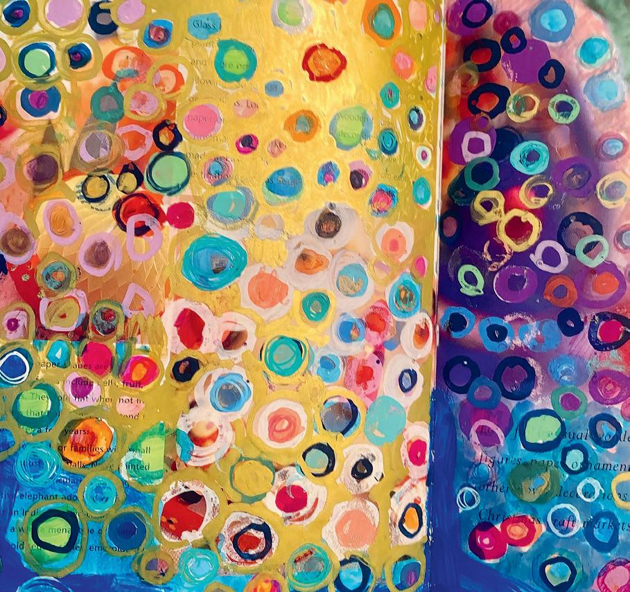
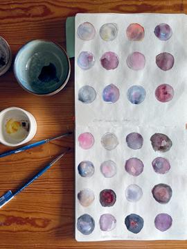
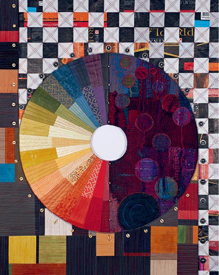
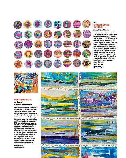
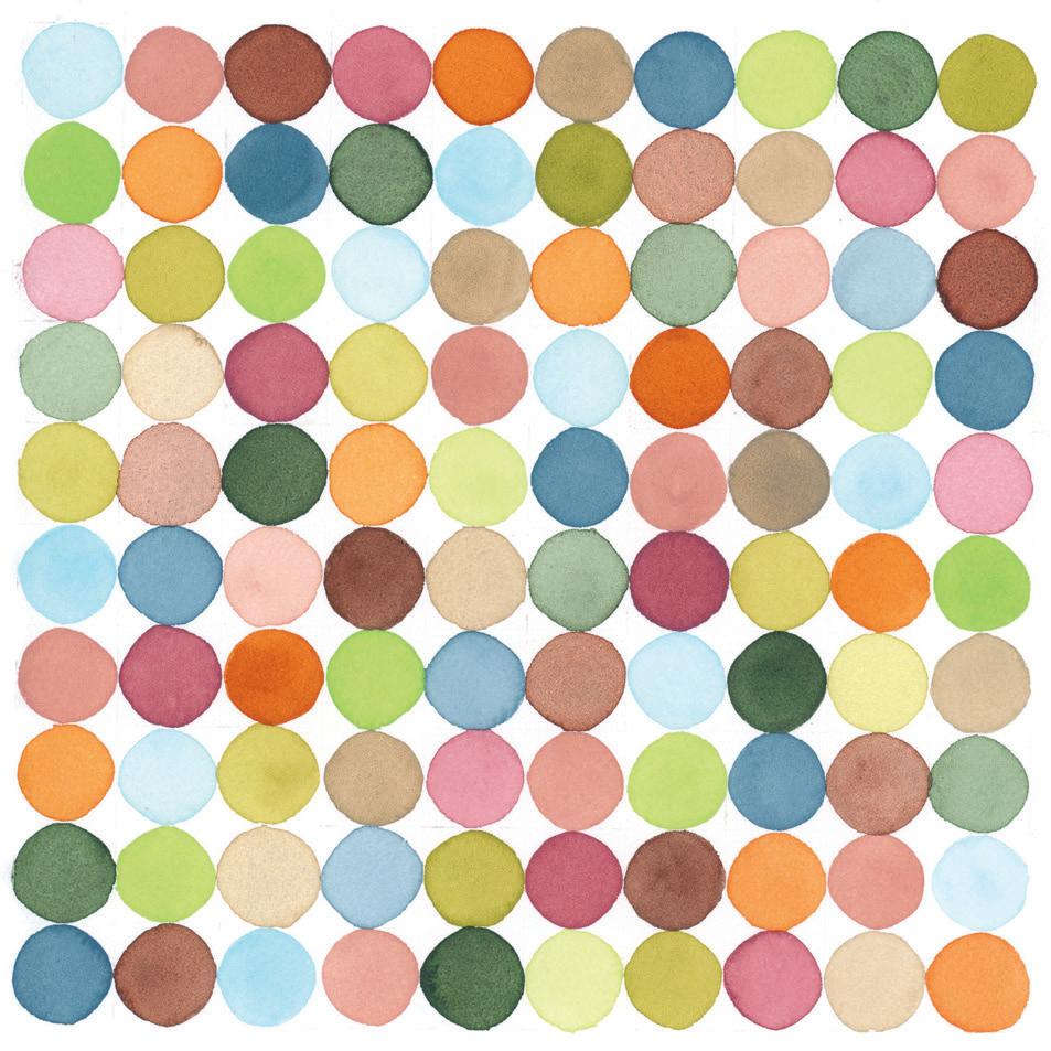
For a recent 100 Day Project, I chose a seemingly simple theme to focus on: circles. I wanted to leave a lot of room for exploration. From colour wheels and sketchbook studies, using a circle as a starting point allowed me to approach my project with the ease and flexibility I had hoped for. This marked the seventh time I have completed the 100 Day Project. Each one taught me a lot about myself and my creative process. I highly recommend any creative to try it and see what they discover.
SNIPPETS
FAMILY TIES
Gel-Printed Portraits
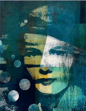
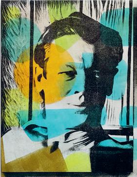
“The circle has been a recurring theme in my artistic work for decades,” says artist Jennifer Love of Gibsons, British Columbia, Canada. “For me, any variation on a circle has always evoked a feeling of belonging and joy.” Her recent creative exploration is Family Ties: Reframing Memory, a series of portraits in which she exploits the imperfection of monoprinting on a gel plate with image transfers. “Family photo albums are inevitably replete with happy smiles and joyful remembrances. Yet photography is not a passive medium. Sometimes it also brings forth bittersweet aspects, considerations of conflict and contradictions. Relationships can evolve and change over the years, even when some relatives are no longer with us. Yet most of us keep coming back to those most fundamental connections that encircle and sustain us.” jenniferanneloveart.com
A CREATIVE PAIR
Over & Over
Over & Over is an edition of 50 artist’s books featuring 18 haiku poems written out by Owen Bullock and paired with collages by artist Laura Crehuet Berman.
Laura is a professor at the Kansas City Art Institute in the printmaking department; in 2024, she was a Fulbright Scholar at the Centre for Creative and Cultural Research at the University of Canberra in Australia. “Owen Bullock and I met in Australia, where he is the discipline lead for creative writing and literary studies at the University of Canberra,” says Laura. “We share an open-hearted approach to travel, people and learning, which has made this collaboration a lot of fun.”
The books are produced with risography and screenprinting by Oddities Prints in Kansas City, and hand-bound by Laura.
“Over & Over is a book that shares small, fleeting instances as a reminder of how entire worlds can be present in a single moment.”
lauracrehuetberman.com
PLAYFUL IMPRESSIONS
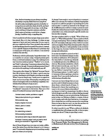
“What if this was fun?”
When you’re feeling stuck in procrastination, that’s a good question to ask! Through hands-on letterpress, our business columnist, Arianne Foulks, had the opportunity to explore the themes of this issue while printing phrases from her article. Read her article, “Growing a Business Imperfectly,” on page 20.
aeolidia.com @aeolidia
SECRET PATHS
The Secret to Success
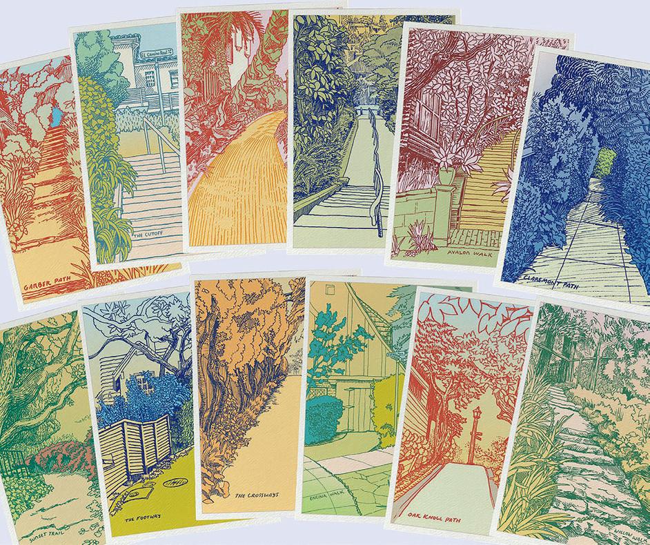
There are more than 100 “secret” paths in Karen Kemp’s home city of Berkeley, California. Pathways, shortcuts and stairs, they are a unique local attraction. “They’re hidden between houses and gardens in my town,” Karen explains. And she has dedicated herself to drawing each one. “Each drawing begins outside, sketching for 10 to 20 minutes on a path. Then, at my studio, I hand-draw it in black ink, and colour it digitally.”
Karen has been working on the project for over a year. “The real practice, though, is learning to keep starting. Sketching helps with that, but after days of not drawing, I just start anyway.” She has been surprised by what this dedication has brought her: “What changed me most wasn’t the output. It was the repetition of showing up, then sharing—in person!” After eight months, Karen had a wholesale business, with 12 cards in eight shops and more launching soon. “Sketching connects me to neighbours, and to nature. Delivering the cards connects me to the neighbourhood. Sharing makes it matter.”
karendrawssecretpaths.com
fresh talent
Whether you’re a fresh graduate or mature artist, it is often a dream to be published for the first time! You are welcome to submit your art for consideration.
uppercasemagazine.com/participate
Textiles & Wallpapers inspired by craft
Thalia Botsari
BERLIN, GERMANY
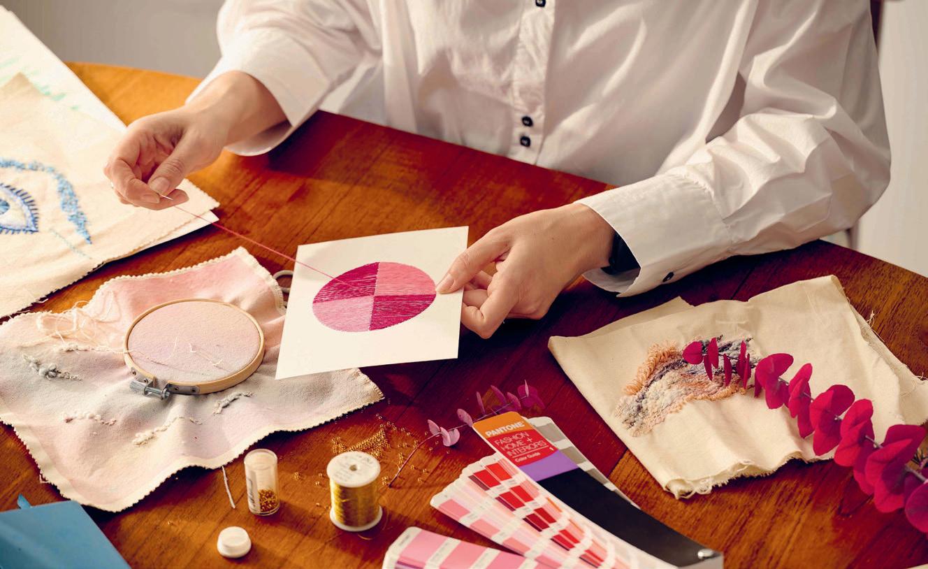
I am a long-time creative, designer and artist. I have changed practices and tried multiple paths until I got to where I am today. I studied fashion, textiles and footwear design, worked as a materials and print designer, had my own creative studio teaching crafts like embroidery and weaving, and changed careers, working as a UX designer after moving to Berlin.
Now I have come full circle by starting my own textile and wallpaper brand. I missed colour and texture, and wanted something of my own that could bring craft, beauty and sustainability into my life and other people’s lives.
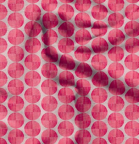
I decided to use my passion for all the crafts I have learned and weave them together, using artwork I make with embroidery, marbling and painting, looking to create unique patterns.
I scan this art and then print the patterns into repeats, either for wallpaper or textiles.
I am originally from Cyprus but have lived in the UK, Italy, Greece and now Germany. All my experience has shaped my work, but my love for the sea, warm weather and beautiful colours in the Mediterranean comes through most in my art; I want to capture that feeling and bring it into a room. I want my products to feel personal and dreamy, with art that inspires others.
thaliabotsari.com @thaliabotsaridesign
Stationery & Gift Designs
Katie Morone
SAN DIEGO, CALIFORNIA, USA
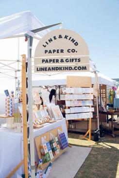
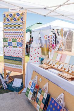
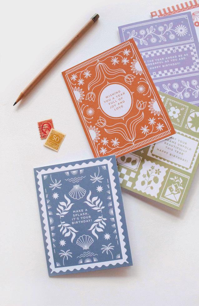
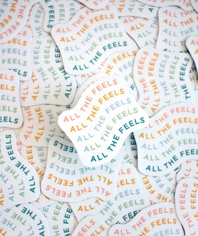
I’m Katie Morone, the founder and designer behind Line & Kind Paper Co., a stationery and gift brand that grew out of my love for illustration and human connection. Before starting L&K, I spent over 10 years as a professional ballet dancer and freelance graphic designer, bringing other people’s stories to life. I was always sketching in my own style as a personal creative outlet between rehearsals and client work, and somehow those drawings became greeting cards. Seven years later, I have a line of 175-plus designs for cards, prints, stickers, notepads and more, made to celebrate, share and connect.
Through my work, I aim to create designs that feel thoughtful and modern: full of colour, meaningful messaging and my signature flat, line-work style. I hope my designs inspire people to celebrate the little moments and to connect with the people around them in a meaningful way.
I approach paper goods from the perspective of someone who truly values human connection. As a former dancer and freelance designer, I know that one’s audience is everything. That relationship, the power to evoke emotion, is at the heart of every design I create. Each card, print or sticker is meant to be a small gesture that sparks joy and meaningful moments between people, turning “just a card” into a keepsake that can be returned to again and again.
lineandkind.com
@lineandkind
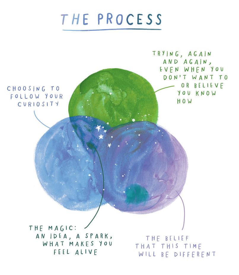
the process
ARTICLE AND ILLUSTRATION BY MEERA LEE PATEL
why familiarity (and failure) are necessary when creating something new
It’s not the beginning or the end that matters. It’s the middle bit, the part we struggle through—that’s where our senses awaken and become alert, where we feel most alive. As an artist, I strive to create environments that step off the page, enveloping the viewer with colour and feeling. The path towards this goal is littered with failure and self-doubt, but it’s during this very process that I also uncover inner understanding, validation and surprise.
Letting curiosity lead
As soon as a new project is conceived, I’m swept up in the glorified idea of what the final product will look like. Rather than beginning a series of experiments and seeing where they lead, I hardwire my brain to the exact image I’ve conjured in my mind.
This fast-forward thinking steps between me and my creativity. I’m so much more invested in my final painting matching the image in my head that I forget to play—to relax, let loose and have fun. I exponentially maximize my potential for failure: what we create will never, ever live up to the idea in our minds. This is a reality. I also erase any possibility of creative surprise; I’m unwilling to try new media or experiment, because it feels like wasted time and effort. Although it feels preventative to do so, removing the space necessary for repeated failure is a mistake, a disservice to myself and my creativity—the rigid adherence to an initial concept prevents my work from evolving and taking on a life of its own. The most striking pieces we make and the many layers that contribute to the atmosphere within our work come from the process: the countless concepts, revisions, marks and erasures that give each piece its shape, structure and story. This very process is when our unconscious is given the opportunity to play: to discover, generate novel ideas and shed light on the unknown.
Consider the following:
What brought you to this endeavour in the first place? Where do you hope it will take you? What do you hope to learn while making it? Write these three things down and pin them up next to your workplace. In moments of discouragement or uneasiness, look up at your goals and remember that you are where you are meant to be: at the sticky, uncertain beginning.
The art of affection
In his book Outliers, Malcolm Gladwell popularized the 10,000-hour rule. The idea is that to achieve mastery in any complex skill, a person must devote 10,000 hours of focused effort towards it. For me, the sheer volume of hours isn’t the intimidating part: cultivating genuine affection for the practice is. For many, the idea of being great is more important than the effort and discipline it takes to become great.
Developing the art of affection for your craft, and for failure, is a necessary precursor to the development of the craft itself. Joy is what will push you forward when discouragement and failure visit you. Fun is what will return you to your desk even when the mistakes keep piling up. If you enjoyed the hours you spent on a project, that time will feel meaningful even if the project didn’t turn out the way you’d hoped. If you accept that progress takes time and repeated failure, you’ll understand the difference between failing and being a failure: as long as you keep trying, you are developing your practice and on your way to mastering your chosen craft. That’s what winning feels like.
Consider the following:
What are you afraid of? Why does practice feel like time wasted? Eliminating the concept of failure, what chances would you take in your practice?
The belief that this time will be different
If you are a pragmatic person, like me, it’s easy to trick yourself into believing that hope is reserved for the naïve. Over the years, I’ve interrogated the concept of hope within myself: Why does it feel foolish to hope, to hold hope, to allow it to comfort me? I’ve discovered that hope itself isn’t the problem, it’s hope without action that strikes me as naïve. Believing that past mistakes aren’t endlessly doomed to repeat themselves is necessary for moving forward, for taking any sort of action towards beginning something new. We must remain childlike if we want our creativity to strengthen. This means giving ourselves permission to hope, to embrace irrationality and to push against the boundaries of the way we believe things ought to be.
Like a child, we must care less about fitting in, or being on time, or what others think of our process—and dive deeper towards what frightens us most.
Consider the following:
In your practice, what are you most afraid of? If it could take you anywhere, where would your creativity take you? What does a state of creative flow feel like for you?
Recognizing your own creative process and the cycle of emotions (excitement, drudgery, despair and satisfaction) that spins for you each time you begin a new endeavour is a strength. The more you recognize the rhythm of your own process, the more you can lean into the comfort of familiarity: each setback isn’t unique or frightening; it is the next expected piece of your puzzle. The process of creating something new isn’t always shiny, but it is fruitful. If you lean into it with your entire being, you will find that it is always ripe with new musings, confidence and meaning.
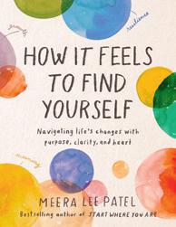
Essay adapted from How it Feels to Find Yourself: Navigating Life’s Changes with Purpose, Clarity, and Heart
Meera Lee Patel
Meera Lee Patel is a self-taught artist, writer and internationally recognized bestselling author who writes books that help people connect with themselves, each other and the world around them. Her work advocates for greater mental health awareness in children and the grown-ups who care for them.
meeralee.com @meeraleepatel
FINE PRINT
“perfect” not
THE FUTILE, NECESSARY SEARCH FOR ARTISTIC PERFECTION
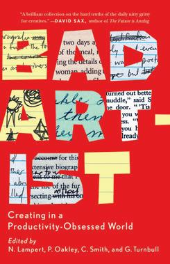
Bad Artist: Creating in a ProductivityObsessed World
EDITED BY NELLWYN LAMPERT, PAMELA OAKLEY, CHRISTIAN SMITH AND GILLIAN TURNBULL
“This anthology seeks to be an antidote to the toxicity of the current productivity narrative as well as the negativity of those who will have you believe that you must justify your yearning for an artistic life.”
First things first, the title is a bit misleading. This book is not about visual artists; the 21 essays are all from the perspective of writers. However, no matter your means of expression—whether paint on canvas or poetry on paper—the struggle is real. Being productive and earning a living when your product is your own creative output is challenging in the best of times. Beyond self-doubt, procrastination and writer’s block, these personal accounts attest that there is always something else to deal with: illness, disability, grief, mental health, familial responsibilities and assorted calamities. With wit and compassion, these “bad artists” reflect on existing within or writing through, when the act of creating is both a lifeline and a livelihood. touchwoodeditions.com/ collections/brindle-glass
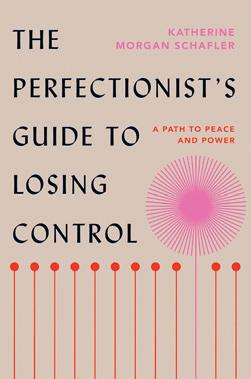
The Perfectionist’s Guide to Losing Control: A Path to Peace and Power
BY KATHERINE MORGAN SCHAFLER
“Perfectionists are people who consistently notice the difference between an ideal and a reality, and who strive to maintain a high degree of personal accountability. This results in the perfectionist experiencing, more often than not, a compulsion to bridge the gulf between reality and an ideal themselves.”
I feel seen. I think one reason I became a graphic designer was because the problem-solving aspects of the profession allow me to control an environment— the printed page—with precision down to the point or pica.
The Perfectionist’s Guide to Losing Control is a catchy title. The reality is that none of us are in control. The author, a psychotherapist, draws from patients struggling within themselves or against circumstances that are far from perfect to identify five distinct types of perfectionists: Classic, Parisian, Messy, Intense and the Procrastinator. Which one are you? Take the quiz! There was no surprise on my results: I am 71% Intense Perfectionist, 29% Classic Perfectionist. perfectionistsguide.com
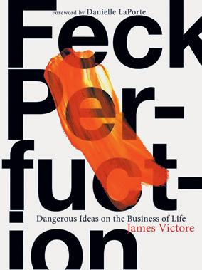
Feck Perfuction: Dangerous Ideas on the Business of Life
BY JAMES VICTORE
“Let all your loves, fears, and interests saturate your work and make it memorable. Who you are is the most important part of your work—never leave it out.”
This manifesto, published in 2019 by self-taught artist-designer James Victore is a no-nonsense call for you to let your creative voice be heard. “Don’t waste your efforts trying to please other people. Make work that is meaningful to yourself first,” he insists. That work can be messy, unfiltered, experimental. “When people see their own struggle reflected in yours, you create the potential for shared humanity.”
Reading through the book, which I signed out from the library, I became aware of a disconnect between the text and illustrations. A few pages in, the cause of dissonance became clear: roughly hewn paper stumps jutted out from inside the book’s gutter, vandalized by a page thief.
Were the best pages with the greatest insight now missing from the book? Should I get another copy to review? “Feck perfuction,” Victore says. So I read on, imperfectly. jamesvictore.com
ROUNDABOUT
This issue of UPPERCASE was curated around two themes—“practice makes perfect” is the less tangible notion. The second, more obvious visual theme is the circle as a motif in art and design. While the books reviewed at left explore what perfection means to creativity, here is a quick book list to start you heading off in circles.
The Book of Circles: Visualizing Spheres of Knowledge BY
MANUEL LIMA (2017)
A showcase of information design that revolves around the circle: charts, maps, diagrams and visualizations wherein the spherical shape is integral to their meaning.
Reinventing the Wheel BY
JESSICA HELFAND (2002)
An extensive collection of graphically appealing volvelles: multilayered discs constructed from paper that can be rotated to reveal representations of data or other calculations.
The First Six Books of the Elements of Euclid BY OLIVER
BYRNE (1847)
In 1847, Oliver Byrne interpreted Euclid’s (c. 360–285 BC) geometrical understandings with coloured diagrams and symbols “for the greater ease of learners.” Reprinted by Taschen in 2022 with a contemporary essay.
past perfect
A NEW BOOK PUBLISHED BY THE LETTERFORM ARCHIVE
CELEBRATES THE ELEGANCE OF BELLE ÉPOQUE SIGN PAINTING
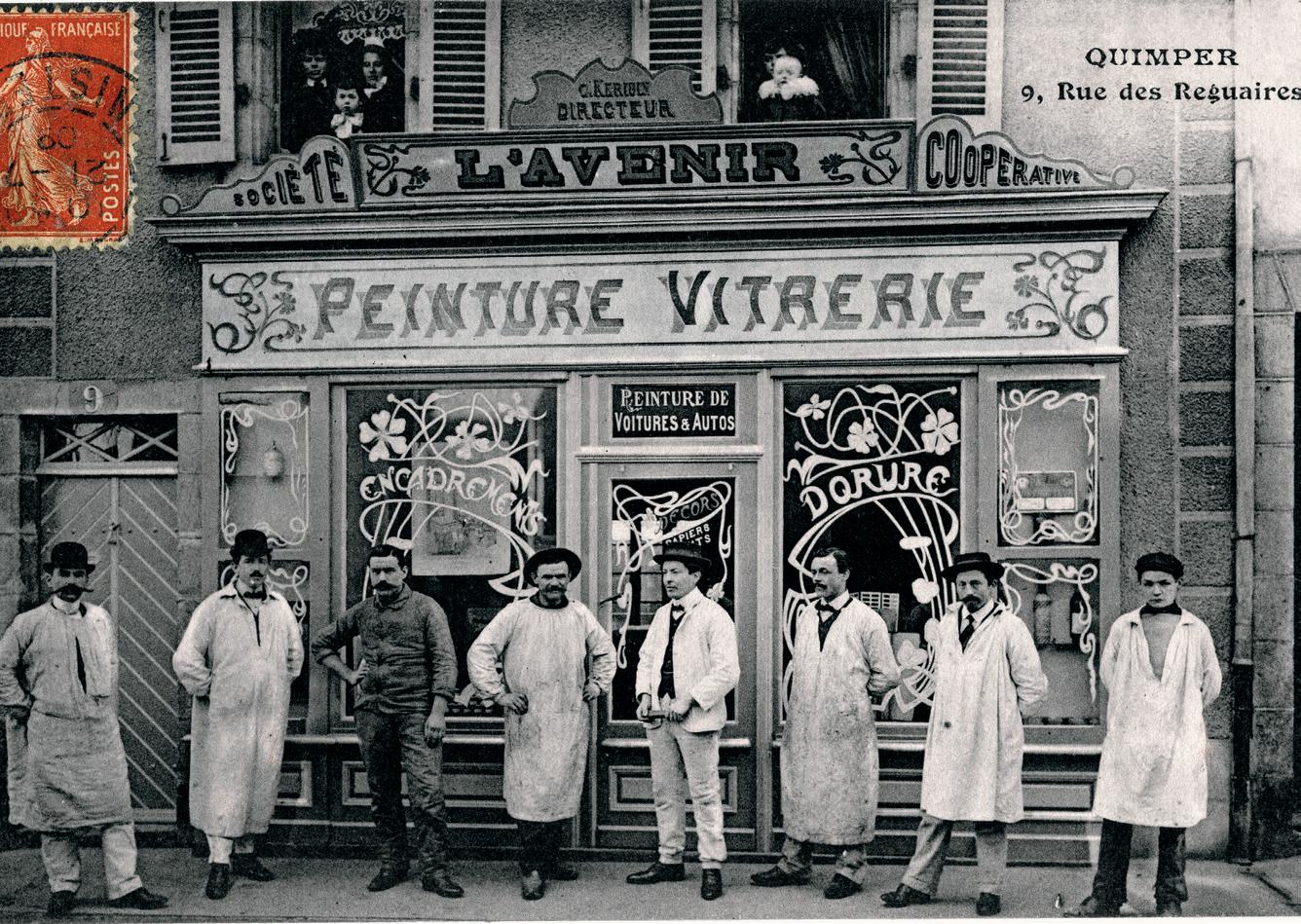
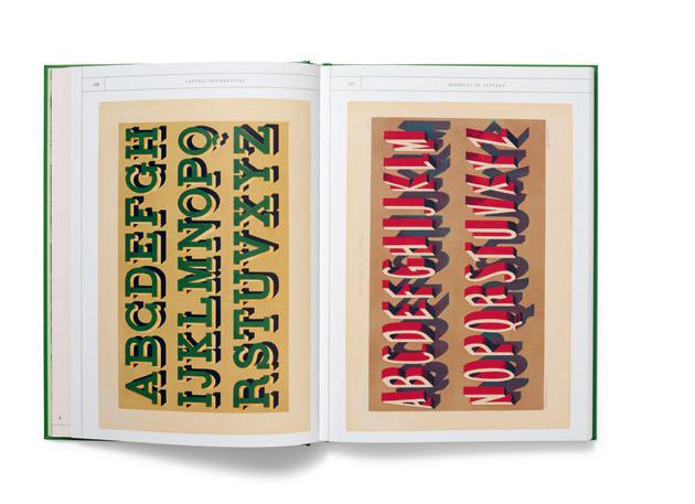
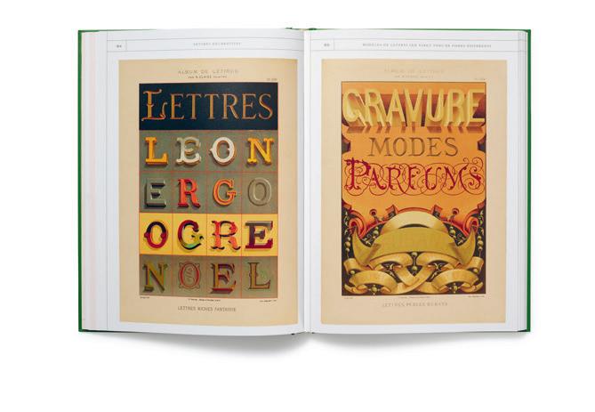
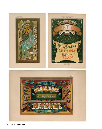
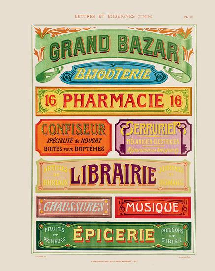
In the 19th century, French commercial buildings were adorned with informative and decorative text advertising to passersby the specialty offerings of merchants and their products. The public signs were often beautifully and artistically rendered. Streets were decorated with evidence of the sign painters’ craft, but these artists also produced printed portfolios to highlight their design skills and technical experience, both to attract clientele and to instruct others on the art of letter design and sign painting.
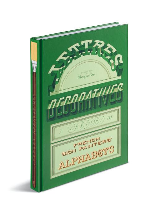
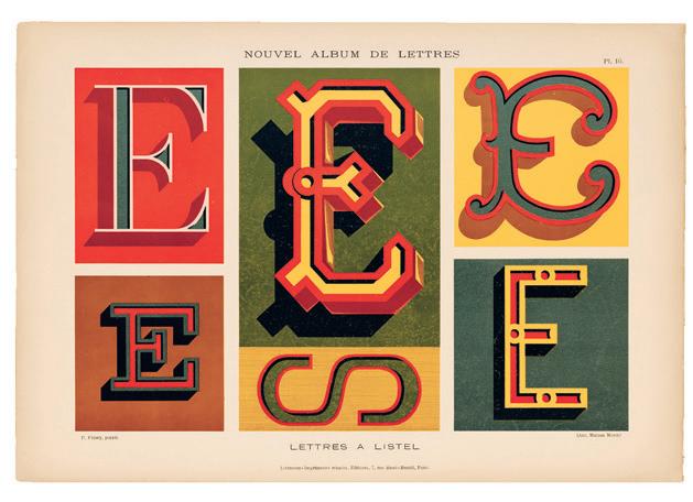
Lettres Décoratives reproduces more than 100 samples from the chromolithographic portfolios of a dozen French sign painters of the 19th and 20th centuries. The examples are a lettering tour de force—renderings of the alphabet with complex layers of dimensionality, colour and shadow, with styles ranging from sophisticated to ridiculously playful displays of mastery.
Morgane Côme, who writes the introduction to the book, describes how “it was with letterforms that painters made their greatest mark on the city. These often broke free from shop fronts, running up and down walls, expanding across gables, and appearing on a range of public surfaces.” Decorative painters added text and images to signage, façades and murals.
“The creative explosion of letterforms continued throughout the century that gave rise to la peinture en lettres . Traditions took shape over decades, and trends emerged with commercial advances in French cities. From the mid-19th century into the 1900s, grands magasins, new multistorey cathedrals of retail, spurred the demand for large painted ads, called affiches peintes.”
In the book, a commentary and history introduces each portfolio selection, which are presented chronologically. The book’s large format shows off the alphabets in all their aspirational grandeur. The book was expertly designed by the French studio Violaine & Jérémy, who have created a book-as-object that complements the exuberant beauty of the sign painters’ portfolios. The green hardcover has divine gold foil highlights, perfectly placed. The artists who originally showed off their lettering skills in printed portfolios and across the French streetscape would be proud to see their work commemorated in such a gorgeous tome designed and printed in the 21st century.
letterformarchive.org @letterformarchive
OPPOSITE
A postcard documenting a sign painting cooperative in Quimper, France, circa 1910
ABOVE
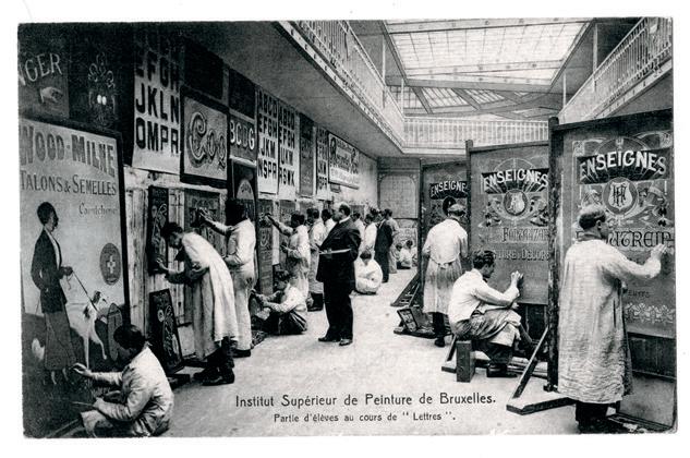
Students in a lettering class at the Higher Institute of Painting in Brussels, circa 1910
THIS IS A LOW RES PREVIEW OF A HIGH QUALITY
QUARTERLY PRINT MAGAZINE
PLEASE SUBSCRIBE
growing a business imperfectly
STORY BY ARIANNE FOULKS
ILLUSTRATION BY ANDREA D’AQUINO
When I am stressed or overworked as a self-employed business owner, I can’t complain to management—it’s me! I’ve noticed that most of my work-related trouble is self-imposed. I am leaning into imperfectionism this year, and I would like to tell you more about it.
I spent the first 10 years of my career learning and testing dozens of productivity tips and tricks. I would sort tasks in quadrants to prioritize them. I divided my work day into “pomodoros” of 25 minutes each. I “ate the frog” by doing my most dreaded task first. My second decade has been spent trying to “work smarter, not harder”: hiring and delegating, systematizing and moving my team to a four-day work week.
And now? I am fed up with being productive. I want a sense of ease in my day and to not always be rushing to swat my tasks like they are a swarm of bees. Oliver Burkeman’s book, Four Thousand Weeks, hit me at just the right time. His ideas feel like one step further down the path I am on:
Get as much work done as I can—exhausting!
Maximize efficiency and delegate—dissatisfying!
Take time to do the meaningful things well—blissful? Time will tell.
One concept I like from his books is the idea of doing things “dailyish”:
The point isn’t to spend your life serving rules. The point is for the rules to serve life. “Dailyish” is one that
B-CORP CERTIFICATION
the loop that keeps
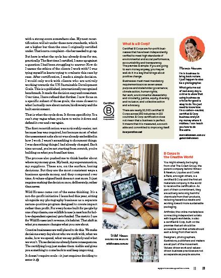
Icertified my business as a B Corporation (B Corp) in 2021. It is an independent verification that my for-profit business meets high standards of social and environmental performance alongside profit—not instead of it. At the time, I was Australia’s only certified B Corp photographer (I think I still am!). A solo operator, no staff, running a business from Victoria, Australia, with a very strong opinion about what kind of work I wanted to do and why.
People often assume that certification is for bigger businesses—companies with sustainability managers, corporate social responsibility budgets and someone whose entire job is to think about this stuff. But that assumption is wrong, and I am the proof. If you run a creative practice—any size, any discipline—your business already has impact. The only question is whether that impact is intentional.
The B Corp certification process is built around a loop: measure, reflect, adjust, repeat. The new standards, which came into effect in 2025, introduce a continuous improvement framework with formal milestones at year zero, year three and year five—raising the bar progressively rather than treating certification as a one-off achievement. They have also dropped a points system in favour of mandatory requirements across seven impact areas: no more offsetting a weakness in one area
A SHORT MEDITATION ON circles
||| FROM THE COLLECTION OF MARK E. SACKETT
ARTICLE BY MELANIE ROLLER
|||
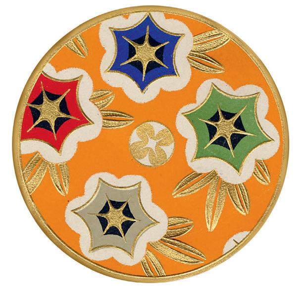
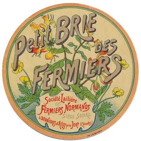
The circle is an ancient, primordial image central to the human psyche and our understanding of the world around us. From the shape of the Earth and planets themselves to the round iris of the eye, circular imagery entwines its way through and around our lives in an inextricable way. When we are small children, getting a sense of the building blocks that make up our world, the circle is one of the first shapes we learn to identify and understand. We continue to recognize it as we grow, like an old friend, running into it again and again as we make our way through our days. As a symbol, the circle stands for balance, geometrical perfection and the connection between all things. It is also something of an enigma, simultaneously representing a beginning, an ending and an infinite loop in which the two blend together as one.
As a visual motif, the circle can serve as a framing device or as its own singular creation, drawing the eye to the centre of an image to delineate meaning or importance. Because of their smooth lines, lack of edges and perfect symmetry, circles are aesthetically balanced and inherently appealing to the logical human brain. In design, circles facilitate the organization of information, establishing hierarchies of meaning through their natural, recognizable frames, as well as with their scale and weight. A circle also serves as an
anchor on a page, defining the negative space around it while containing that space within it. As they are logical and complete, they have the ability to establish order amid the chaos of elaborate or intricate design work—a steadfast and solid shape to guide the viewer, while allowing the eye to rest on the familiar.
Like the circle, paper ephemera demonstrates the cyclical nature of things, as well as the lifecycle of an object. What we now consider collectible paper started its life with a singular short-term purpose. This purpose is usually straightforward, such as advertising, product awareness or general communication. Once fulfilled, the primary intention for any single-use object becomes its disposal. In the case of ephemera, this intention is thwarted by an industrious or well-meaning person who saves the object from destruction, thus imbuing a piece of ephemera with a new purpose. The object’s lifecycle is effectively restarted when a new person recognizes the object’s value and purchases or obtains it for a new use— no longer fulfilling the original intended use, but a renewed use as a collectible, bringing its existence full circle.
Collecting is itself a circular pursuit. As a true collector is never content to sit idle for long, the process becomes iterative, repeating itself over and over. The search, the thrill of the hunt, the finding and the subsequent addition to a collection, transforming over time back into the intractable need, like an unstoppable itch, to find more: the collector chasing that brief flurry of dopamine anew. At the same time, the act of collecting antiques and ephemera disrupts the linear flow of time, as reintroducing something from another era causes it to dip its wing in and out of our own. While remaining firmly rooted in the past, the act of reclaiming a disused item draws small concentric circles of rediscovery and reuse atop our current chronological timeline, allowing ripples of the past to traverse the otherwise limpid surface of our modern era.
Whether metaphorical or physical, circles or cycles materialize in many different forms throughout our day-to-day lives and over the course of our lives. They remind us how we are interconnected with all things, even the inanimate. They also demonstrate that nothing is a straight line, and that there is a wholeness and balance to the material world that we can take comfort in, even in the most chaotic and uncertain of times.
theboxsf.com @theboxsfmercantile
ART & DESIGN
THE psychology OF circles
STORY BY KERRIE MORE
Kellette
Elliott is a collage artist and art educator based in Portland, Oregon.
Portals
Kellette Elliott
PORTLAND, OREGON, USA
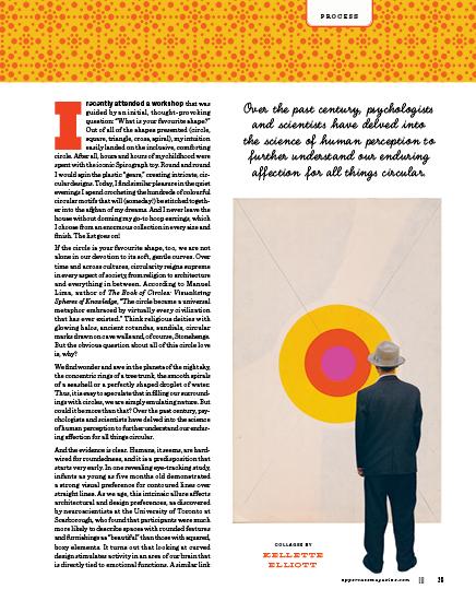
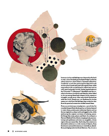
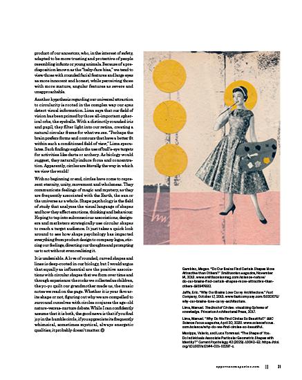
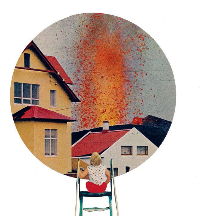
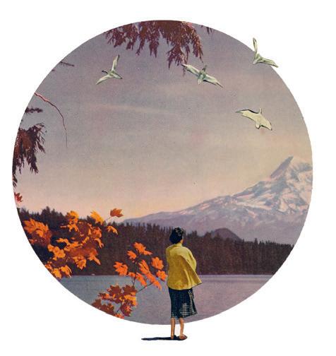
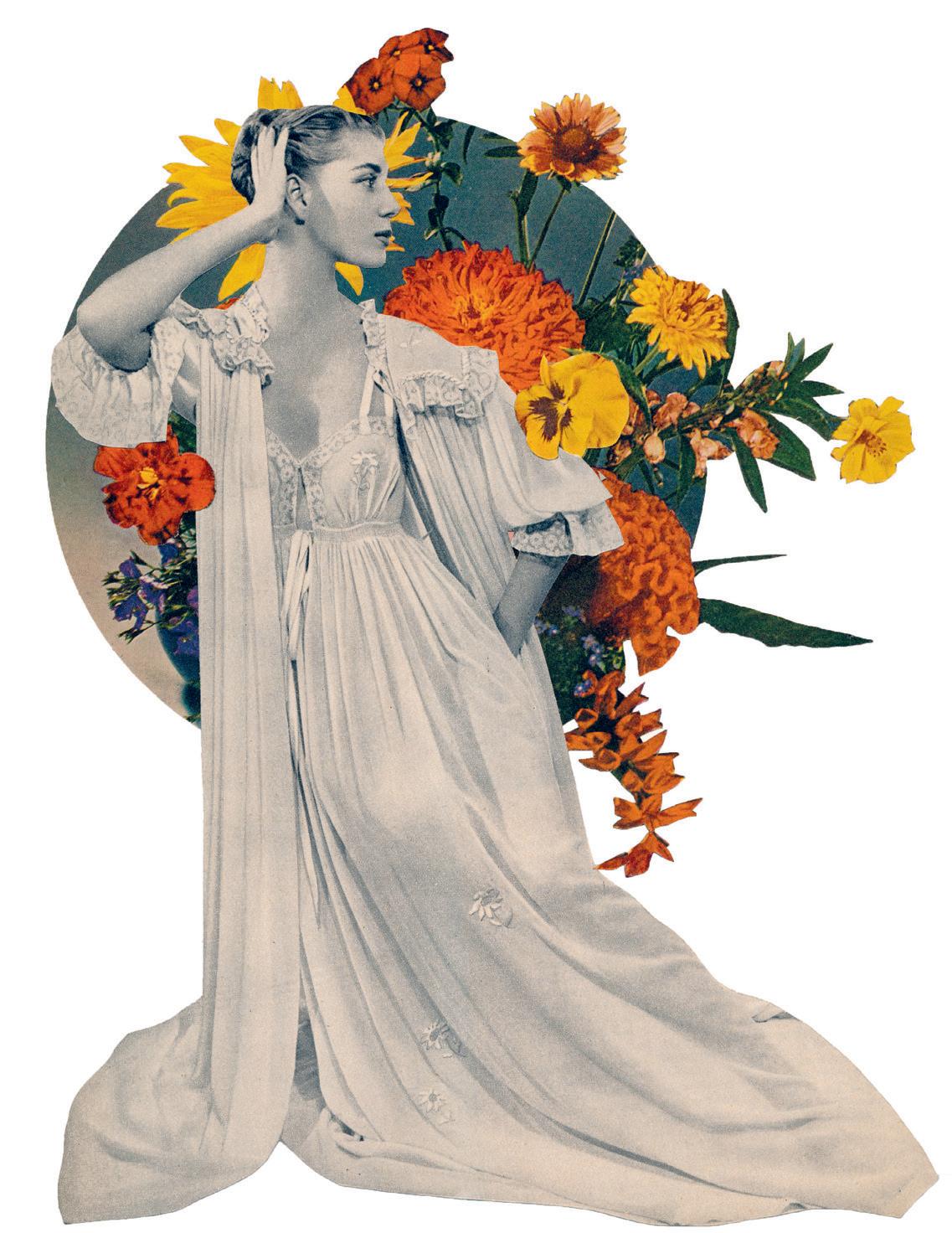
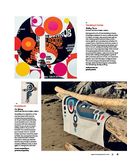
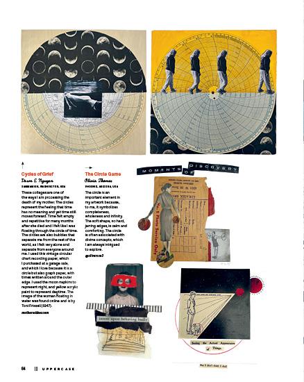
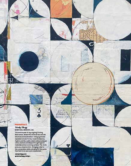
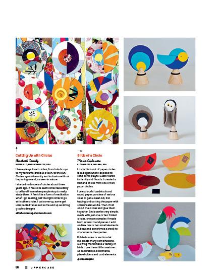
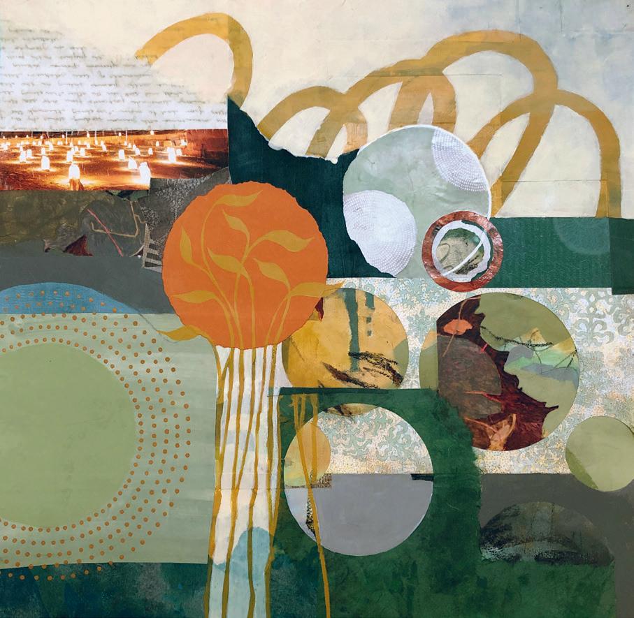
I take a minimalist approach to collage and like to play with shapes, but the circle is definitely my favourite! I love the soft curve. I love that they are gentle on the eye. I love that they can represent so many different things. While studying art history in college, I was always fascinated by the way medieval artists used circular halos to signify the divine, so I often place circles behind characters in my own work to suggest importance. I particularly love the idea of using circles to create portals into another world, and it has always been cathartic for me to express my emotions with circles and collage. For seven years, I was mostly homebound as I dealt with chronic pain. Images placed inside circles often represented places I wanted to visit. I felt joy in creating these imaginary journeys, but also sadness that I couldn’t experience them. Fortunately, a recent surgery changed my life in the best way possible. Even as I rehabilitate, I find myself drawn to circles, realizing that my journey is ever-evolving and revolving.
kelletteworks.com @kelletteworks
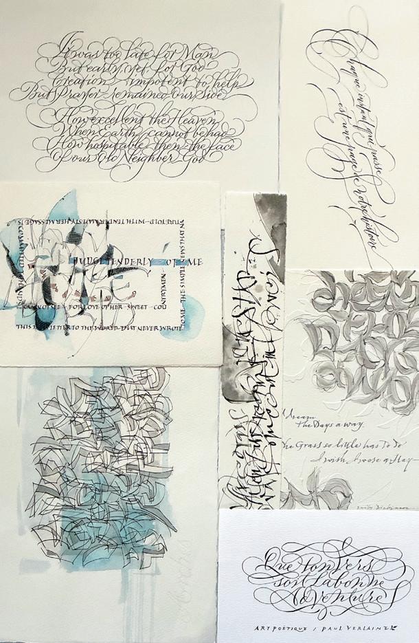
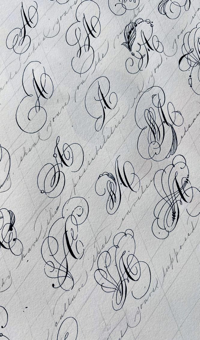
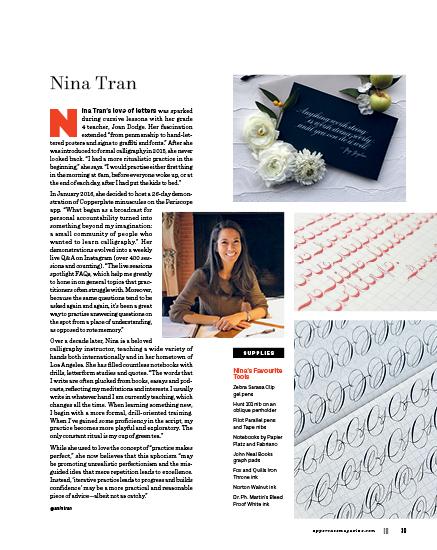
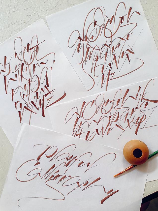
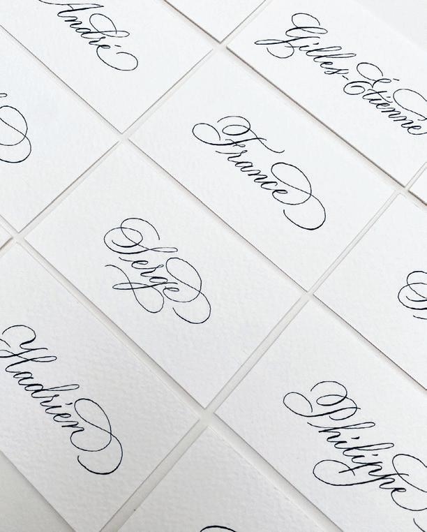
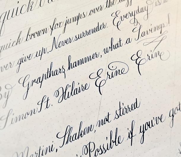
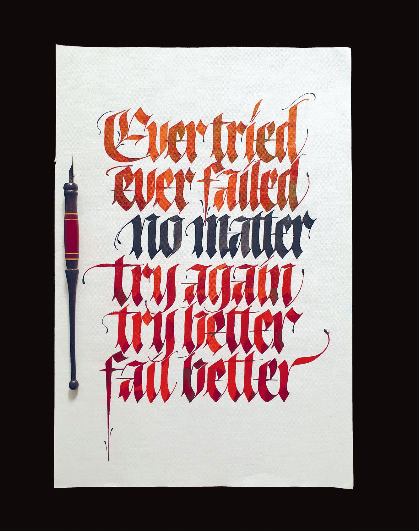
OPENING CALLIGRAPHY BY
ERIN NEILSON
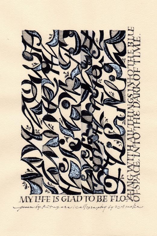
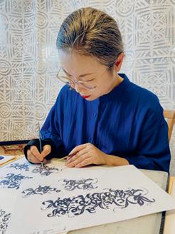
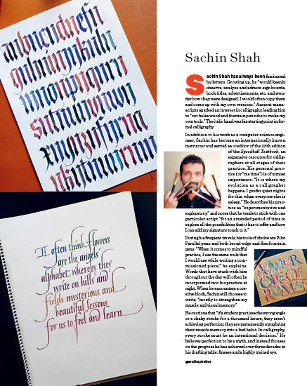
Chisato Asaoka
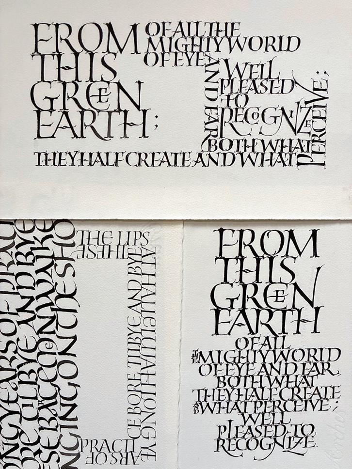
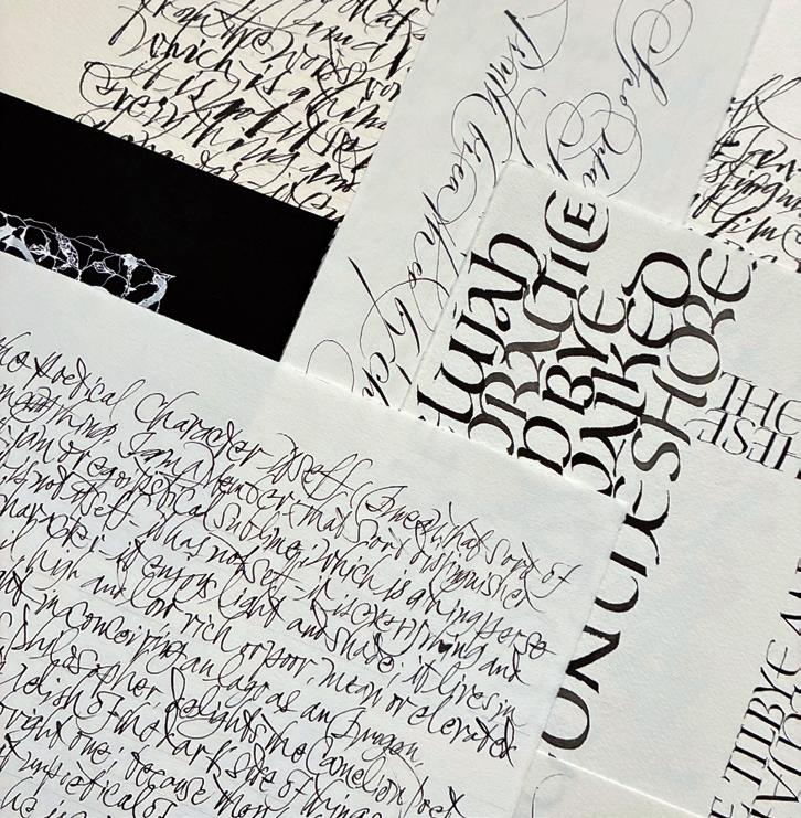
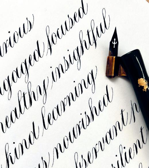
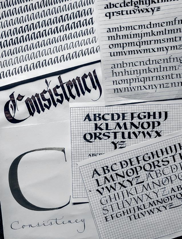
Chisato Asaoka fell in love with letters as a child, when her grandfather taught her Japanese calligraphy. “As a teenager learning English, I was introduced to cursive writing. I was fascinated by the way my teacher wrote on the blackboard—it felt expressive and almost musical. I would spend hours carefully copying the lyrics of my favourite musicians in cursive.” While working as an assistant in the development of an electronic typewriter, Chisato discovered Western calligraphy. “The first hand I learned was italic—one that I still find both challenging and endlessly fascinating.”
Chisato recalls that she used to practice “extensively on inexpensive paper before moving on to high-quality paper for the final piece. As I later discovered, different papers require subtle adjustments in everything—the speed of the pen, the density of the ink and the pressure of the hand.” Chisato now opts to practise on the paper she intends to use for her final pieces, so she can “understand its character from the beginning.” She also notes that she used to focus “intensely on writing each letter correctly, carefully following the model. Now, while I still care about the quality of each letter, I am equally attentive to how the letters come together to create a unified texture across the page.”
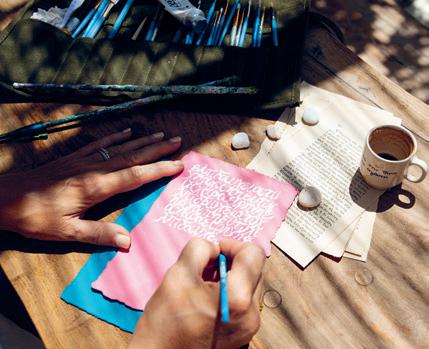
Chisato loves using slightly diluted sumi ink and 5mm Kokuyo grid paper, as it “provides a gentle structure without feeling restrictive.” Her daily rhythm includes mornings dedicated to calligraphy (and often a bit of gardening). She favours a “calm and focused environment,” with a pot of herbal tea and no music. She has learned that “even fifteen minutes of daily practice can slowly transform what once felt impossible into something achievable. For me, practice is not about perfection—it is about persistence and the quiet transformation that comes with it. I believe deeply that dedicated effort never betrays you.”
@_ch_is_art_o_
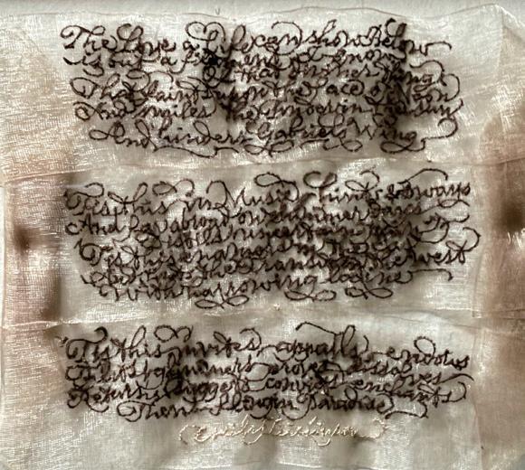
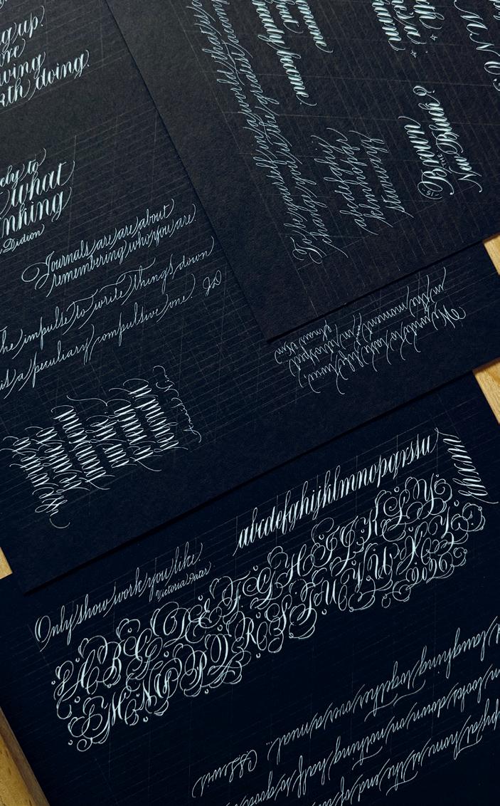
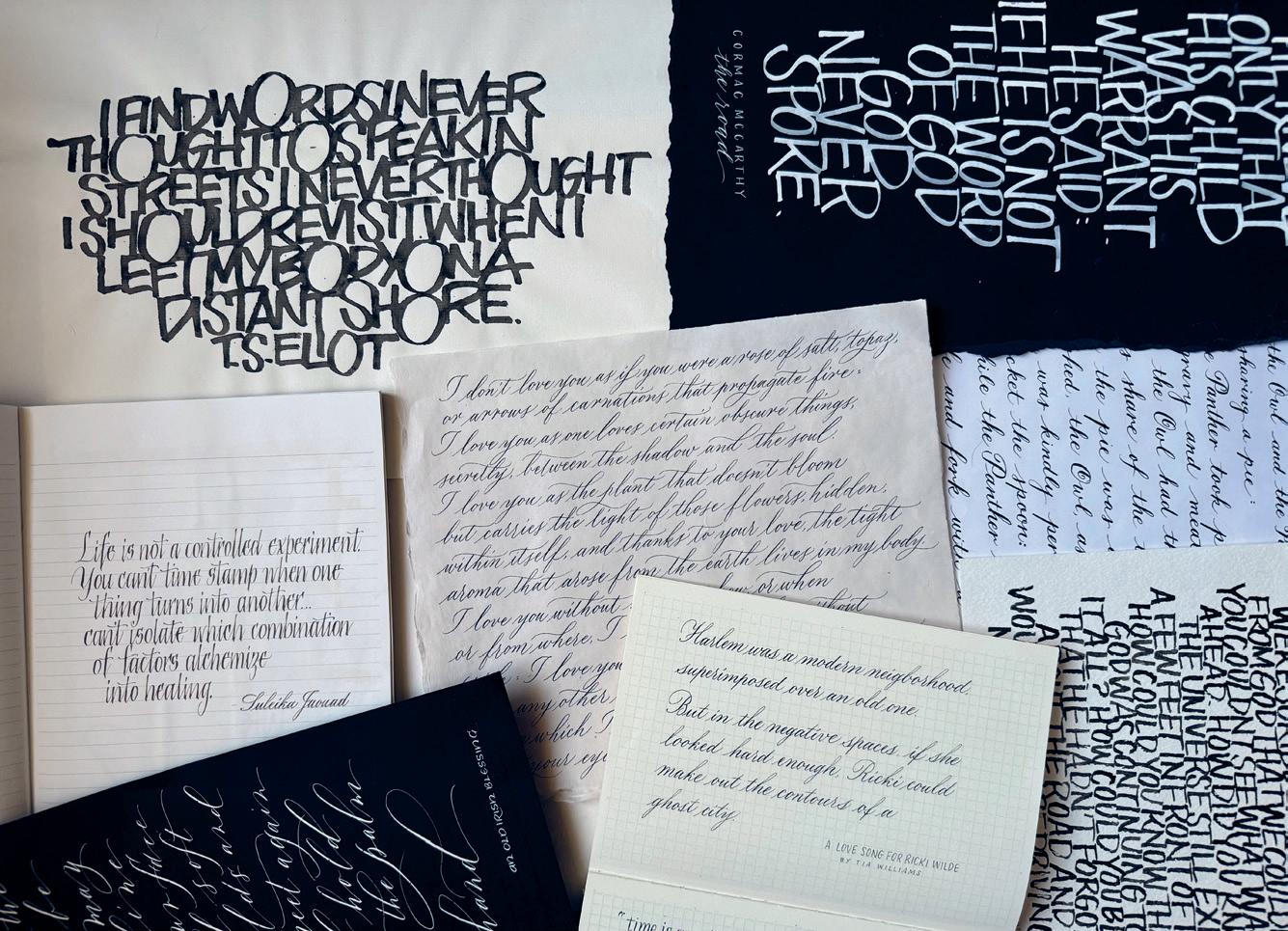
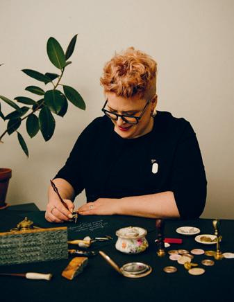
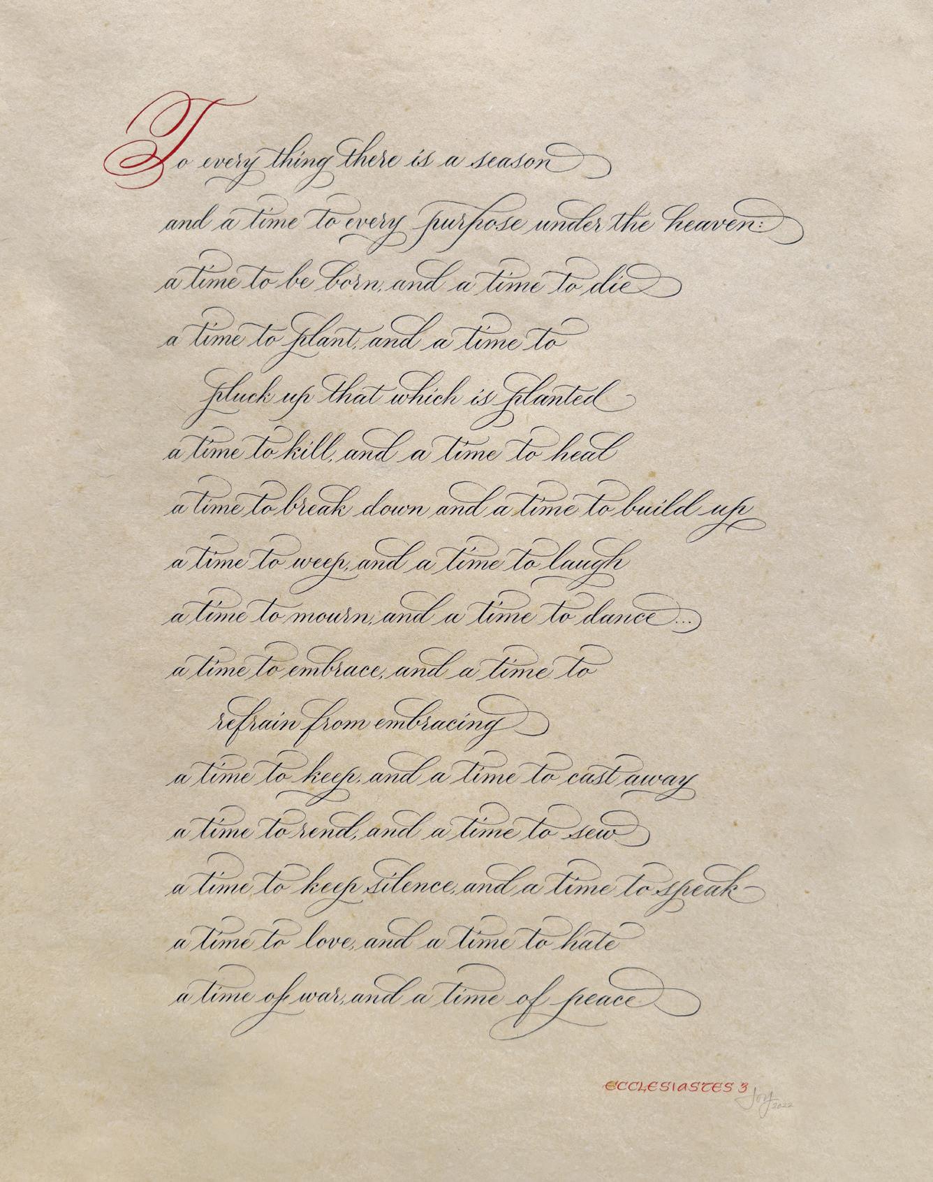
Joy Vanides Deneen
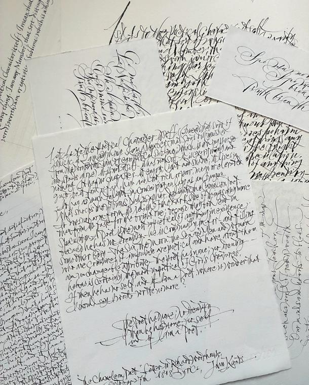
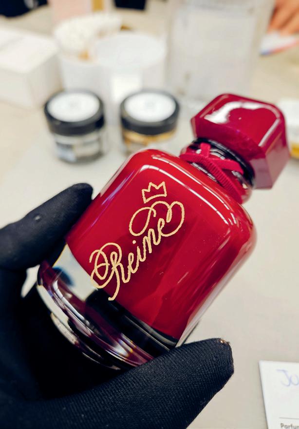
My love of calligraphy was sparked in my family’s living room in the early 1980s, as I was fascinated by a large calligraphic piece that hung above our couch. It was a passage from the Book of Ecclesiastes, calligraphed by my father in 1978. I would nestle in the cushions, gazing up at the letters and tracing the forms in the air with my tiny index finger.
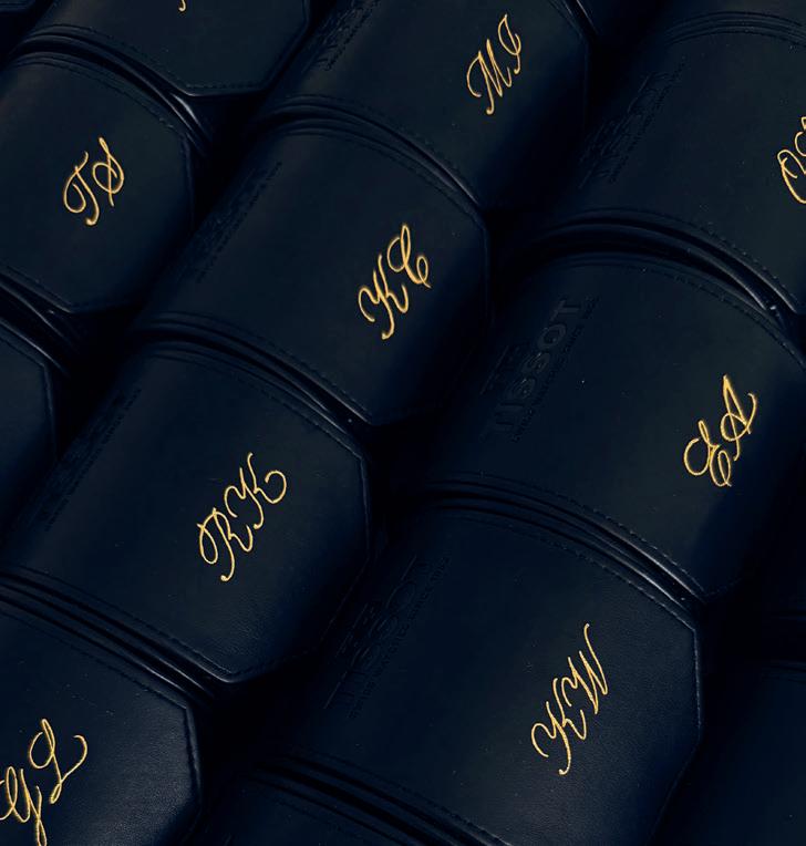
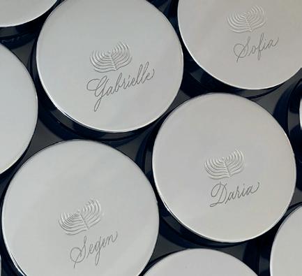
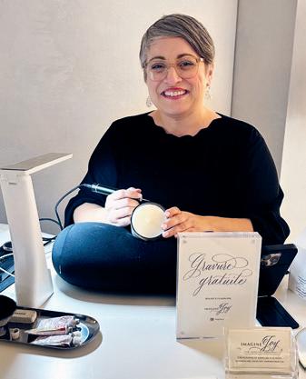
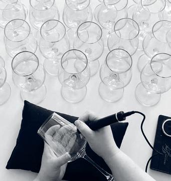
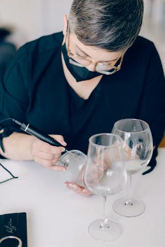
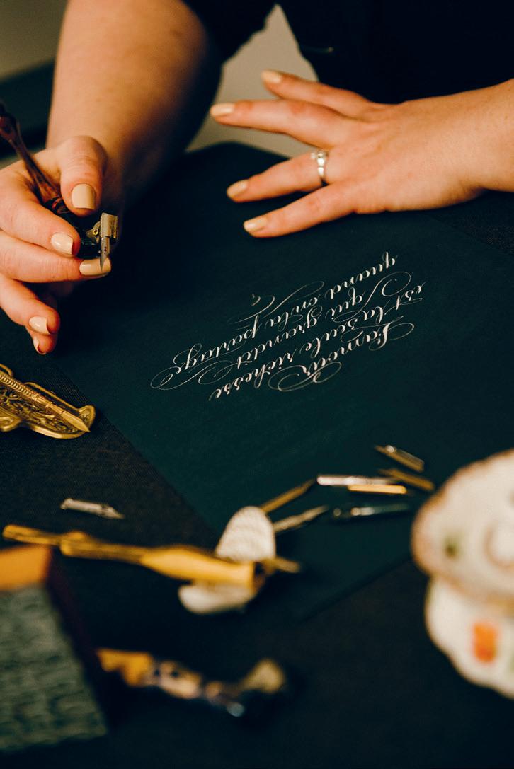
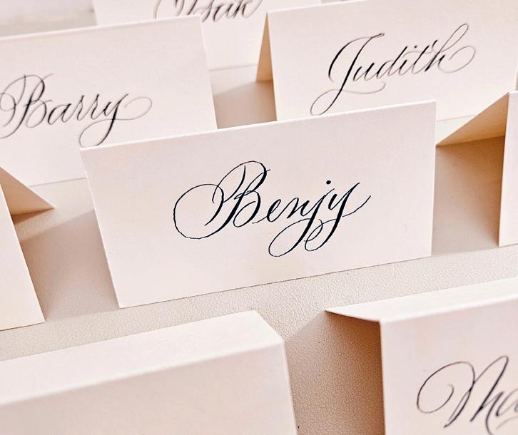
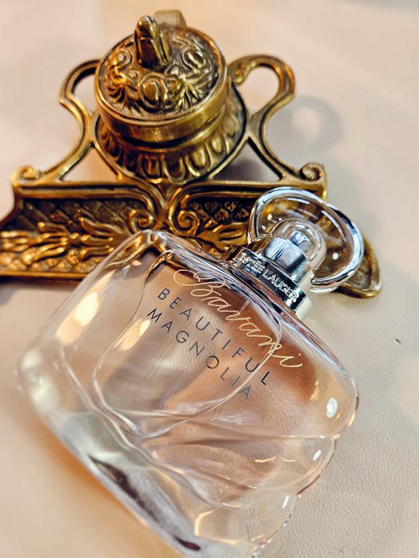
My formal studies began in 2010, at Xandra Y. Zamora’s dining room table in Southern California, where I learned Copperplate calligraphy. When I moved to Montreal a few years later, I began to do wedding calligraphy and teach classes. In addition to my often playful personal practice, I learned so much by regularly showing students how the basic strokes are the building blocks to forming beautiful letters. I now specialize in calligraphy and engraving for PR events and brand activations, and my foundation in the fundamentals has been essential. Those basic strokes are deep in my muscle memory, resulting in a precise and steady hand—which is especially important when permanently engraving on a glass or metal keepsake.
I have also discovered that progress is not necessarily linear. I have seen marked seasons in my life, like when my son was born in 2019 with medical challenges. I learned the importance of allowing yourself grace when circumstances require you to pause your practice. You can always come back to your creative work—and you will likely be surprised by what blooms after you adopt new rhythms and routines.
@imaginejoy
Finding the Words
Your bottle of ink is open and a fresh page awaits. But what to write? Here are some evergreen ideas to consider:
Pangrams
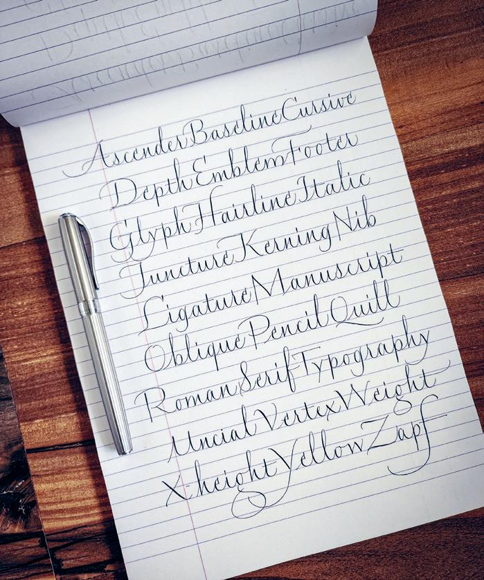
A pangram is a sentence that contains every letter of the alphabet, such as “The quick brown fox jumps over the lazy dog.” Search online for more pangrams, or make up your own!
A to Z Lists
Choose a subject that is meaningful to you (family members, favourite writers, botanical names of flowers, places you want to visit, etc.) and select a word for each letter of the alphabet. You can pull inspiration from the Abecedary (see page 100), which appears in each issue of UPPERCASE.
Historical Exemplars
Look to classic penmanship books like the Universal Penman or the Zanerian Manual of Alphabets and Engrossing, and choose a writing specimen to copy.
Longer Texts
Explore extended rhythm and texture by calligraphing poems, song lyrics, passages from novels or concepts from a textbook that you want to commit to memory.
Nothing Is Sacred
There is often an impulse to practise by writing uplifting quotes, but I would also like to suggest simply amusing yourself! Calligraph all of the character names from your favourite romance series or superhero franchise. Flourish every nickname that you have ever given your pets. Compile a list of creative insults and euphemisms. Don’t be afraid to get silly or irreverent!
KEEP PRACTISING
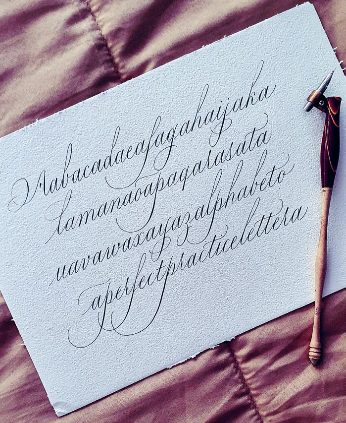
2016 vs. 2026
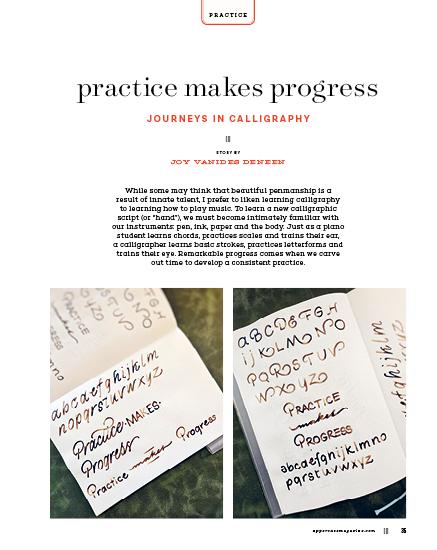
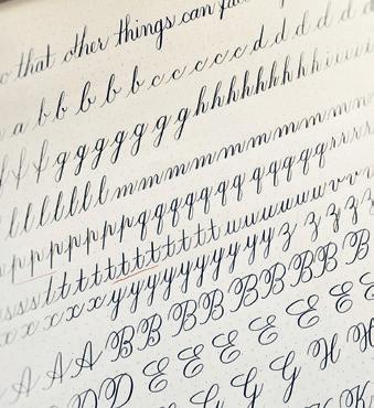
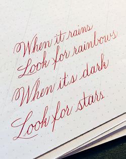
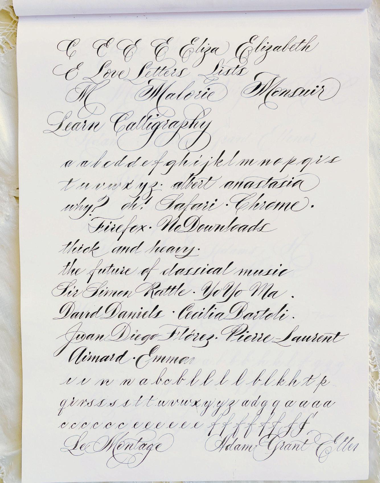
On this page, Erin shares some of her old practice pages to show how her calligraphy skills have changed with time and practice.
Erin Neilson
While working in retail management at a stationery store in 2014, Erin Neilson discovered writing videos on social media. Her husband gifted her with a weekly calligraphy class with me (Joy), not knowing that student and teacher would eventually become friends and colleagues. Erin practised every evening after work, as she found calligraphy to be a wonderful way to “decompress and reset my brain.” Her practice started very formally, working through warm-up drills, basic strokes and letter groups, and she would return to class with stacks of pages for review and feedback. “On weekends, I liked to carve out time with a tea and just lose myself in the repetitive motions.” Over the next 10 years, Erin would go on to take dozens of classes and workshops, and serve as president of the Société des calligraphes de Montréal. She now works as a full-time calligrapher, specializing in live events and engraving. She now finds that her calligraphy practice is more exploratory. “I still value structure, but I allow myself freedom to play and experiment,” she says. She gravitates towards an EF Principal nib, alternating between oblique and straight penholders. She often uses walnut ink and loves gouache for “control over colour, opacity and consistency.” However, she will also often grab a pencil. “It is such an underrated tool, and there’s very little barrier to entry. It’s also less intimidating if you make a mistake—plus, you can practise on your couch without worrying about spilling ink.” She also loves to experiment with different mediums, making beautiful letters with embroidery, foil and linocut stamps.
Erin’s calligraphy has evolved greatly, thanks to her dedication and an insatiable creative spirit. When she looks back at her early practice pages, she “can see the hesitation and stiffness. Now, there’s more ease, more intention, and a stronger sense of rhythm in my writing.” She is a firm believer that practice makes progress. “I don’t think perfection exists, especially in a craft made by human hands. Slight imperfections are what make the work interesting,” she says. “I do think it’s valuable to strive for excellence. As long as there’s improvement, I consider that a win.”
@neilsonletters
@sachinspiration
SACHIN SHAH
personal matters
circles, considered
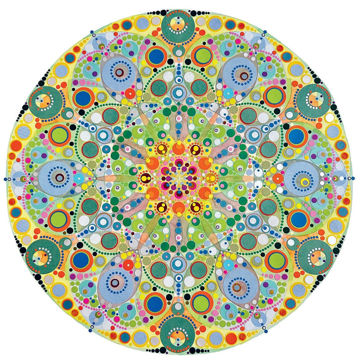
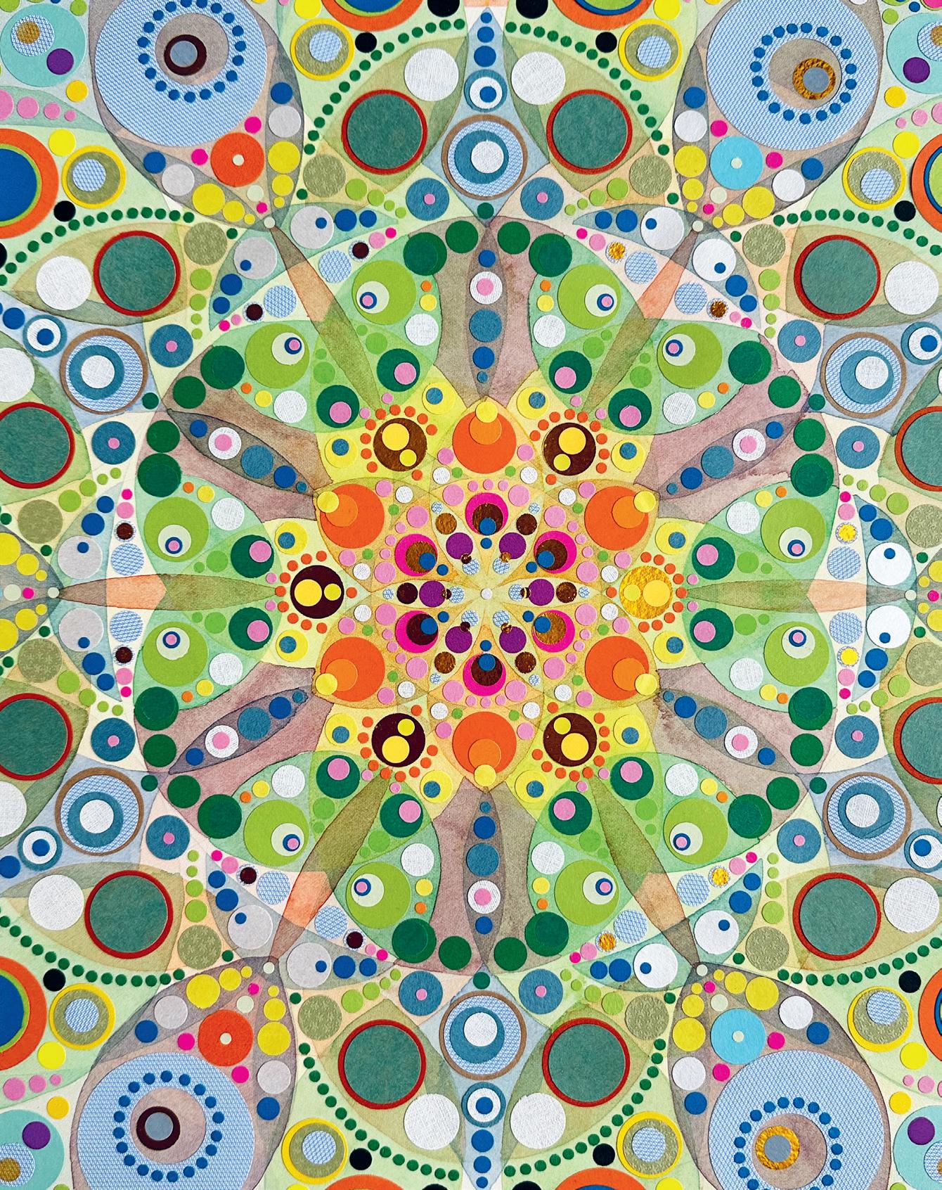
This piece took four months to complete. Its creation provided me with moments of peace in times that were otherwise rather turbulent. Watercolour and collage on paper (55 cm by 55 cm).
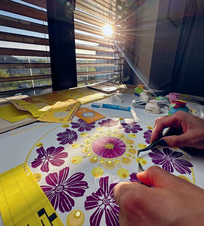
Early one morning at the beginning of spring 2023, I found myself sat uncomfortably in the corridor of my Tokyo apartment, drawing a framework of overlapping circles. Within this structure—somewhat reminiscent of a mandala—I began filling the enclosed spaces with freehand-cut circles of coloured paper, each bespoke to its own space. This moment and the methods I explored proved to be a key catalyst for the series of circle-based compositions that followed.
ARTWORK AND STORY BY ELEN DELAFOUGE JONES
I had been taking an online course in art psychother apy that, being based in the UK, required me to wake up at 3am to attend the live sessions. The course, which I had hoped would help me discover new approaches to enrich my work as an art educator, would ultimately lead to a significant personal creative journey. During the last session of the course, we were given one hour to create an artwork without a prompt. The moment described above—and the circle-based piece that emerged—would lead to a fruitful period of creativity.
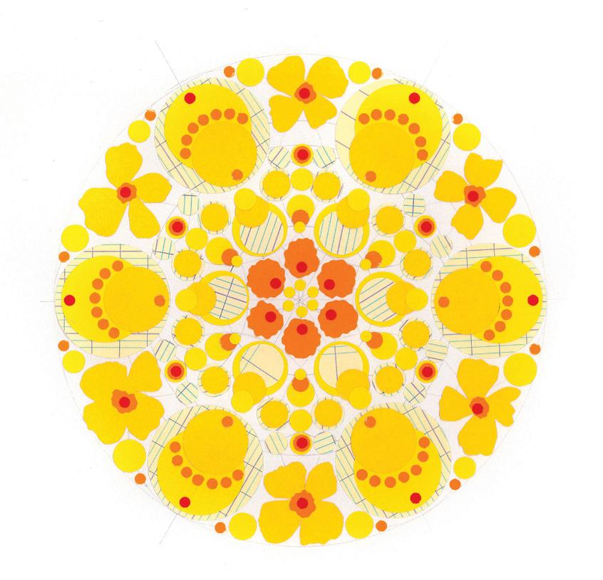
This art-making process—drawing overlapping circles filled with collaged circles of various colours and sizes—seemed to offer endless possibilities. It proved to be both meditative and unsettling: meditative in its repetition, pattern and motif, yet unsettling in its lim itless scope, iterations and adaptations. I believe that this was partly due to the freedom I felt when collag ing this piece, but I also attribute it to the mighty circle, often considered the most perfect of geometric forms. There was no pressure; I could simply play.
Within the repetitive nature of this process, there was time for the mind to travel—to think and not think— something freeing and curiously peaceful as the work took shape in front of me. I later posted it on Instagram, and wrote in the caption: “I’m now going to start another.” And I did, many times. This cycle, the circles, the process—all continue to captivate me.
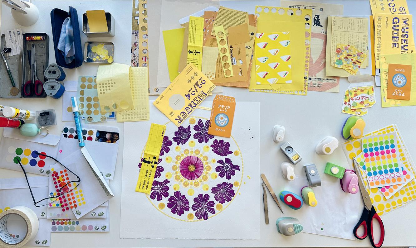
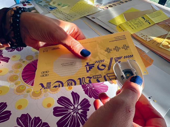
Collage and the circle are now constants. I have replaced the freehand-cut circles with near-perfect circles, cut with a range of different-sized craft cutters.
I use a variety of found and purchased papers. One of the pieces seen here is made entirely from the catalogue brochure of the Cité musicale in Metz, France. I was instantly attracted to its muted, unusual colour palette, and this in turn imposed a creative limitation: the work is constructed solely from this brochure.
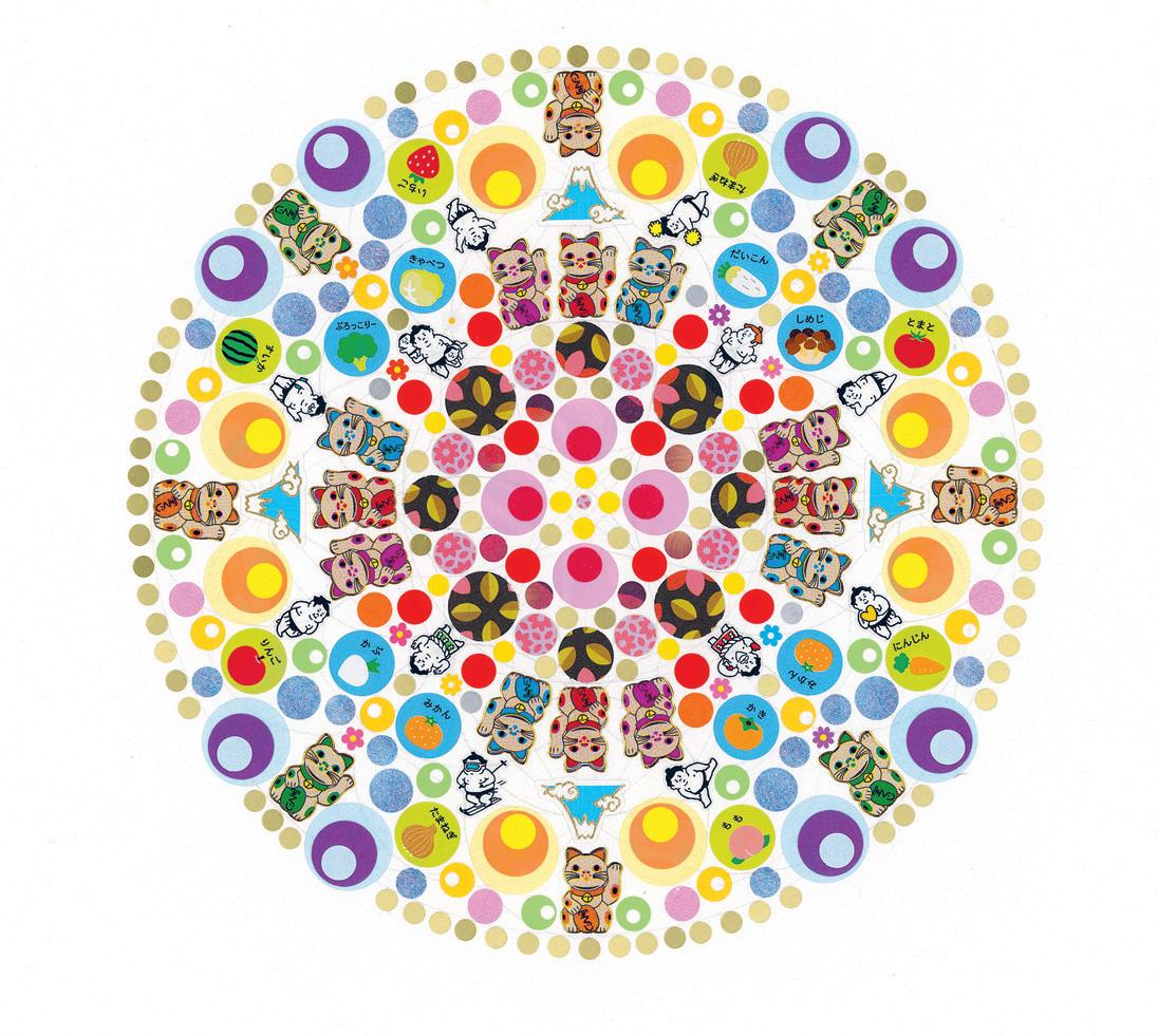
I enjoy incorporating other methods, techniques and motifs into my practice. They are often inspired by my teaching or by places and aspects of personal interest. For example, lino printing has become a newer addition, following a printmaking project I developed for my students; watercolour painting appears frequently, following a weekend course I attended; and the Japanese motifs and imagery that I use are inspired by my time living and working in Tokyo.
Each piece begins with a symmetrical compass-drawn composition, something that is often intuitive and evolving. Then the collage takes centre stage. I sit, cut, place, analyze, reflect, move things around, add, subtract, leave, come back, glue, repeat. Pieces grow organically, without a predetermined vision. The work influences what should come next.
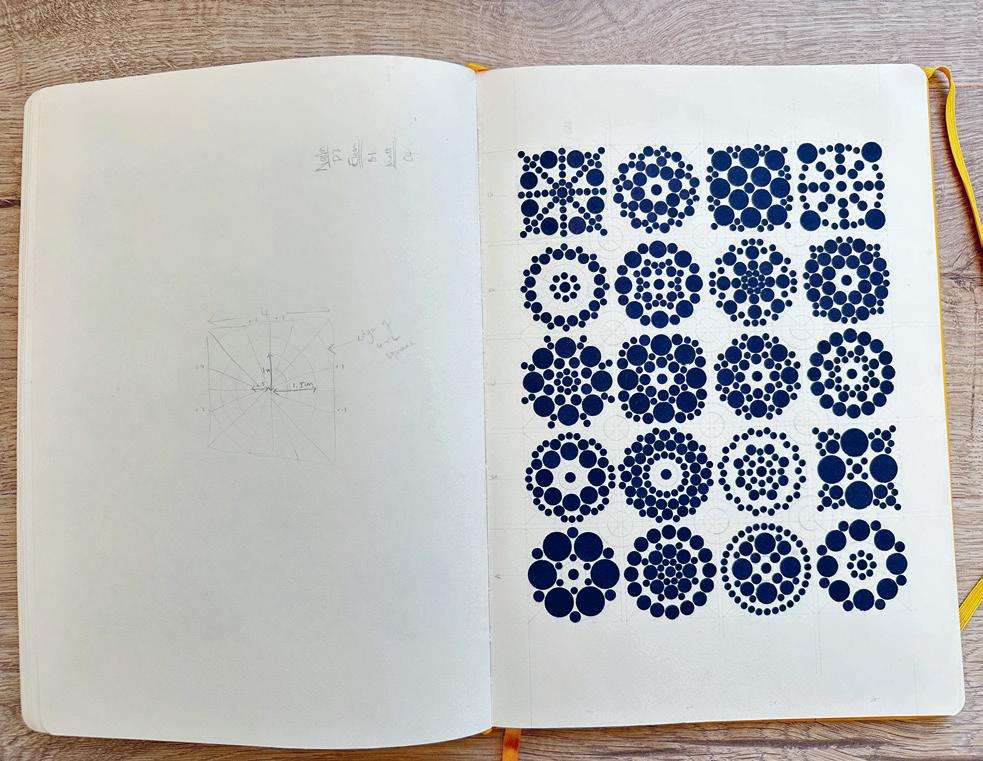
My current exploration is reminiscent of the instruction-based works of Sol LeWitt. The outcome is largely dictated by the chosen process. My instructions are limitation-based. On each page of my sketchbook, I’ll create circular compositions made up of six sizes of smaller cut circles. Each page is limited to one colour of paper, and the size of the circle pasted in the centre of each composition on a particular page is a constant. This exploration requires six completed pages, for a total of 120 explorations. While the process could be seen as tedious, monotonous and repetitive, there are moments of precious calm in which I lose myself, and time becomes irrelevant.
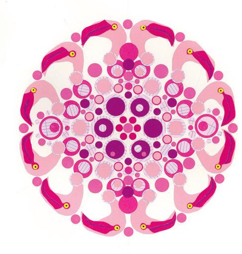
The circle as a concept, symbol and motif is central to this body of work. My process is cyclical and balanced, echoing the conceptual, or even the symbolic, nature of the circle. The circle is also the dominant visual element, providing rhythm and unity through repetition and structure. In my work, the circle is ever-present and commanding; it is pleasing and comforting; it is the perfect geometric form.
The pieces published here show different moments in this ongoing exploration: the initial discovery, the introduction of other techniques and motifs, the use of offcuts to create sister pieces, and my most recent instruction-based experiments. Together they offer insight into an enriching journey that I know will continue to inspire me as an artist.
Elen Delafouge Jones
Elen Delafouge Jones is an artist and educator based in Luxembourg. Her work is centred on process, with a long-standing interest in labourintensive, repetitive methods that run through both her earlier embroidery and her more recent collage practice. She studied textiles and embroidery in Manchester, after which her work evolved towards drawing, collage and printmaking, informed by her experience as an educator and further study in illustration and book arts in Cambridge, as well as an online art psychotherapy course. She is of Welsh and French background, and her work has taken her internationally, including time spent living and working in Japan.
elendelafougejones.com @elen.delafouge.jones
Soothing Circles
Elizabeth McEntee
WINSTON-SALEM, NORTH CAROLINA, USA
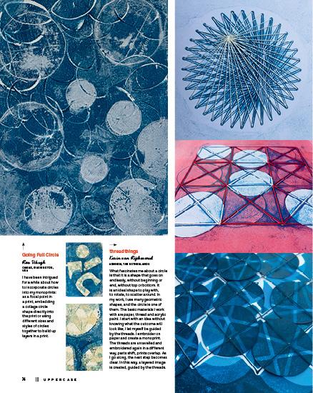
In an early altered book, I found myself spontaneously making circles, my hand moving easily across the page, effortlessly creating circles. I remembered art teachers through the years telling us to avoid circles in our work. Were they too unwieldy, too self-centred, too eye catching? I reassured myself that this was a passing phase. Some say the circle is a healing shape, others that it is worthy of meditation. I drew and painted them again and again. The mark making of these orbs relaxed me, tension flowing out of my hand and onto the pages. Eventually other symbols interested me and I included them in my art. However, my affection for the circle was not a passing phase. As long as I play with mark making, circles of all sizes are here to stay.
@liz.mcentee.art
The Serenity of Circles Jayne Elliott
SAINT-SAUVEUR-LE-VICOMTE, NORMANDY, FRANCE
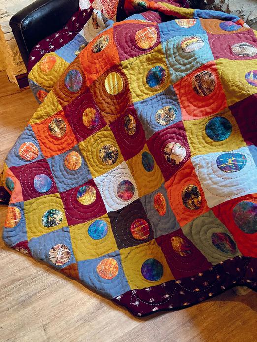
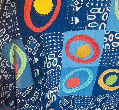
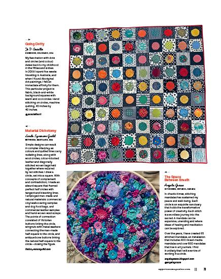
Over the years I have become more of an appliqué artist than a patchwork quilter, and one of my most repeated motifs is the circle. I believe that a circle represents oneness, unity, infinity and balance, all concepts that I want to build on in my work. On a practical level, I find the action of needle-turn appliquéing a circle to be calming—it has a rhythm to it. The sight of a perfectly turned stitched circle is very satisfying.
I have sometimes used a circle as a full stop in a quilt design. Often, adding one to an appliqué block will lift it from being mundane to being exciting, because circles have the ability to draw the eye and create a focal point. I’m happy that the circle has become one of my signature motifs.
@normandy_stitcher
Orbs of Hope Chandra Junck
NORTH VANCOUVER, BRITISH COLUMBIA, CANADA
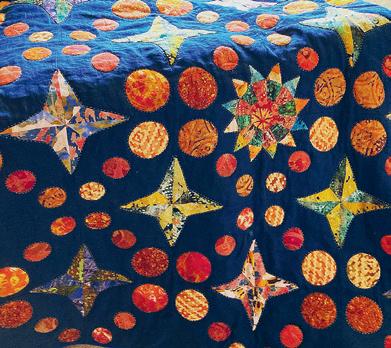
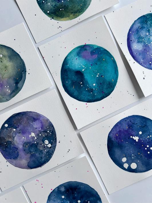
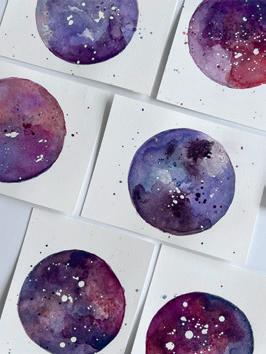
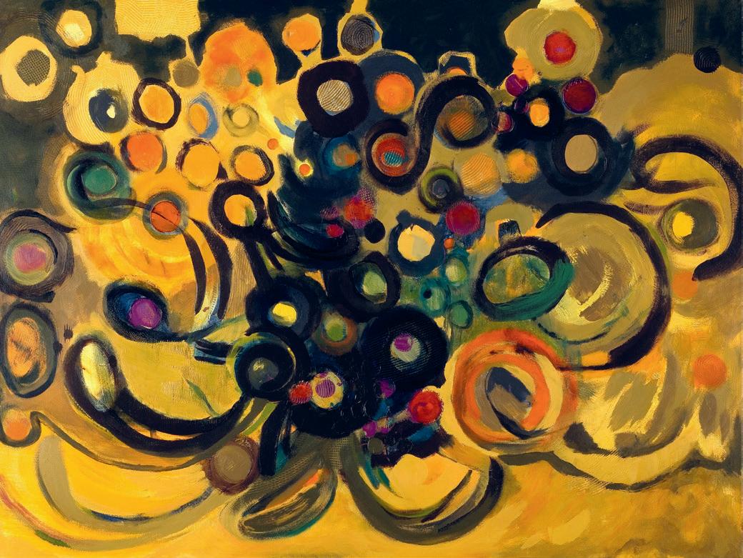
My connection to celestial themes feels inherent, as my name means “moon.” Since childhood, I’ve been mesmerized by a full moon’s spherical form and the moon’s gradual transformation to wholeness. I am inspired by galactic imagery—nebulas and supernovas—and the ways we occupy space. As individuals, our stories and memories hold space within us, mapping our emotional landscapes. Working as an abstract expressionist painter, I contemplate tensions between grief and joy, longing and belonging, loss and recovery. These hidden narratives are layered into my paintings, secrets safely contained within ethereal watercolour orbs.The circle’s dual function serves as the painting’s boundary and a portal to the infinite. chandrajunck.com @chandrajunck_art
Underwater Moments
Stephanie Liszewski
SEATTLE, WASHINGTON, USA
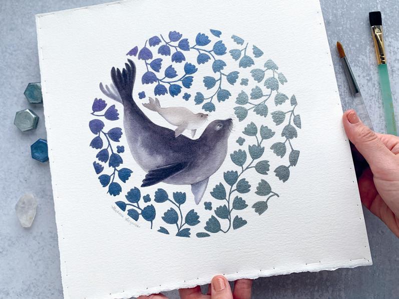
I learned in design school that circles were the most calming of all the basic shapes. Since then, I have found myself drawn to circular compositions in my art practice as a way to express my love of nature with design. In this series of watercolour paintings, I wanted to convey the intuitive connection and bond between parent and child. The circular framing allows for a sense of watery flow and movement of the underwater botanicals, while still providing reassuring structure and safety for the marine animals nestled inside. Reminiscent of submarine windows, it is a glimpse into an unseen underwater world— one filled with calm moments of tenderness, exploration, play, protection and love.
seamello.com
@sea.mello
Circling Back to Circles
Joan H. Ranzini
WAYNESBORO, VIRGINIA, USA
I’m saving this title for a future painting because circles, dots and rings just keep showing up in my work. I don’t usually start with the idea of round things, but looking back over my portfolio I realize it’s been a frequent motif. Maybe that’s why my mom once called me her “Polka Dot Girl”?
joanranzini.com @joanhranzini
Autumn Memories
Kathy Ferguson
EDWARDS, COLORADO, USA
Autumn Memories began with colour. Avocado green. Harvest gold. Burnt orange. The colours of the kitchen where I grew up in California in the early 1970s. They carry the feeling of fall for me. Leaves in the yard. Breathing crisp autumn air. Family close by. I did not want to paint one exact scene. I wanted to paint how those memories feel now. Softened by time. Reduced to shape, rhythm and colour. The circle became central because it suggests both a lens and a cycle. It holds a moment in focus, while also echoing the return of seasons, family rituals and memories that come back again and again.
kathyfergusonart.com @kathyfergusonart
Not Perfect
Gabriella Éva Mezei
BUDAPEST, HUNGARY
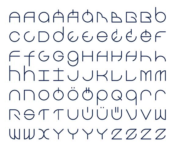
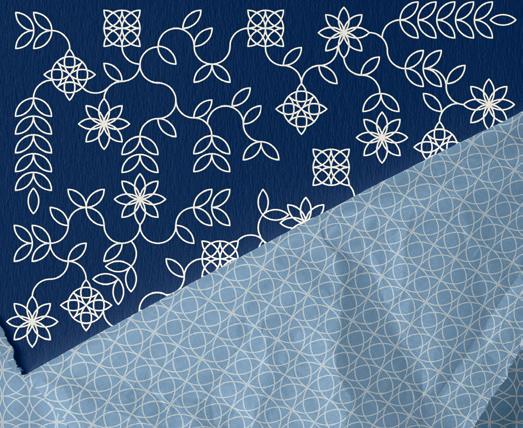
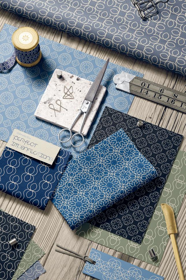
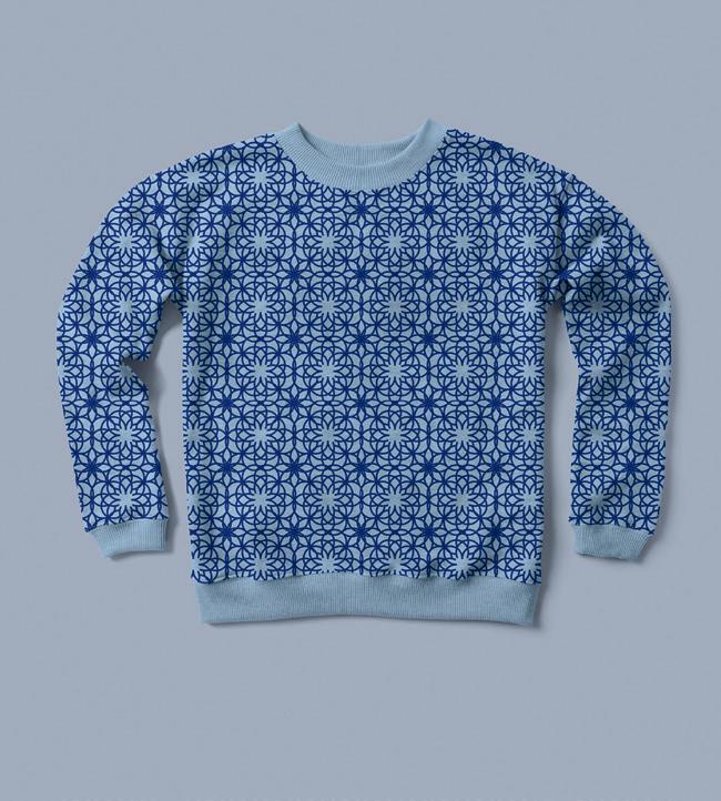
This project started as a logotype design for the Hungarian town of Sopron. The basis of the letters was a circle, but the “S” had to be opened up to make it readable. This led to the design of the whole alphabet and, later, seamless patterns. The broken circle can lead to endless interesting variations in small illustrations, seamless patterns and fonts with the added meaning: perfect/imperfect. I love playing with simple shapes to create more complex designs and seeing how many different things can spring from the same source. The metaphorical meaning of the (not so perfect) circle is the added bonus. Do we have to be perfect to create something meaningful and interesting? Do we have to close the circle to be able to get going? Is it only perfection that creates beauty and a satisfying result?
GabriellaEva.com
@GabriellaEvaDesigns
Nature vs. Technology
Lisa Steed Davey
HEREFORD, HEREFORDSHIRE, UNITED KINGDOM
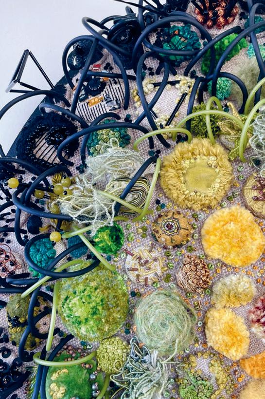
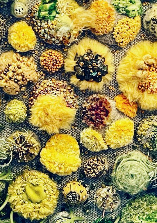
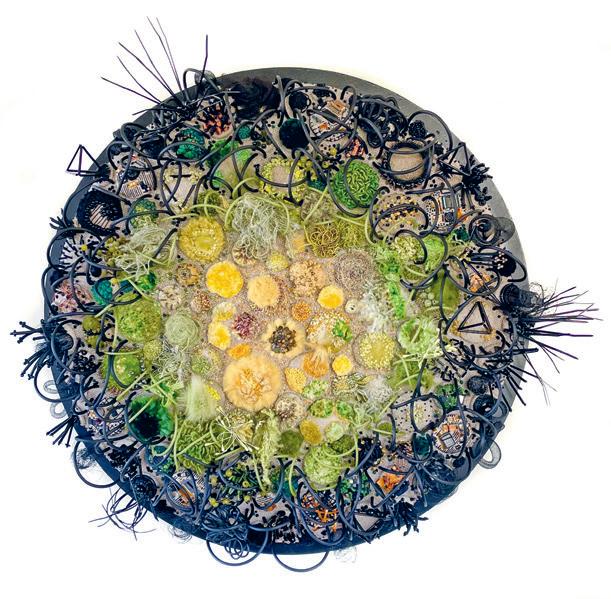
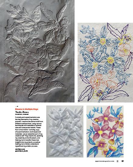
This piece of work questions whether nature is being taken over by technology/ e-waste or if nature is fighting back. The work is constructed by using a variety of embroidery stitches. Circles figure a lot in the work due to circles surrounding us in nature, and the cycle of life. The circle has no beginning and no end; the circle represents continuity and sustainability. Each little piece of embroidery is created on linen, then stretched over a cover button. These are then pieced together on a large, covered wooden circle base.
@lisasteeddavey
Circularity Tanya Fenkell
TORONTO, ONTARIO, CANADA
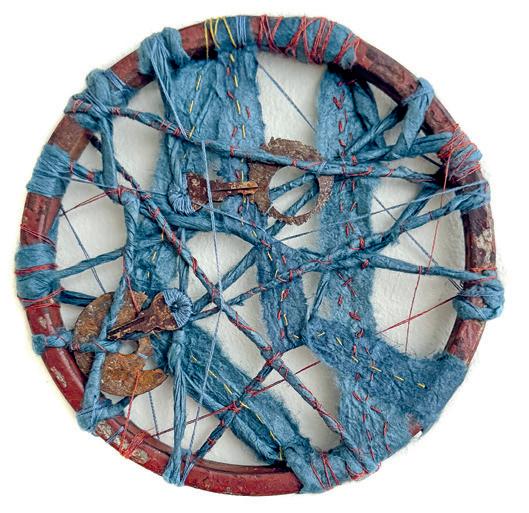
The circle fascinates me as a shape, unending and eternal. A closed circle is a particular type of perfection, and the spiral, its circular cousin, is also very compelling, as it evokes patterns of journeys, stories and evolutions. These are the shapes of lifetimes and the gradual process of personal growth that slowly emerges from our experience. These artworks are created from and contained within found metal circles. The rusty metal underscores the passing of time and the erosion of decay, even as new beauty is emerging from it. For me, the containment of the circle invites creation.
tanyafenkell.com
@tanyafenkellart
Circles and Dots
Jennifer Wilkin Penick
WASHINGTON, DC, USA
I lead free creative sessions called Creativity Jumpstart, and recently our weekly prompt was “dot painting.”
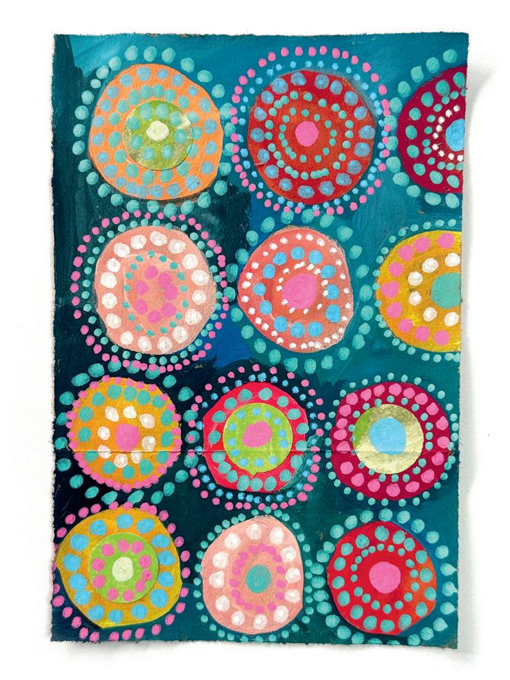
I had seen a wonderful exhibit of contemporary Australian Indigenous art at the National Gallery in Washington, DC, and I took liberal inspiration from some “dot paintings” that I saw there. Since I always encourage my class participants to use whatever materials they have, I painted circles and dots on a scrap of a paper grocery bag.
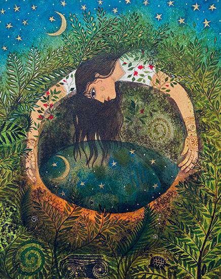
The Deep Dark Well Jane Ray
LONDON, UNITED KINGDOM
This illustration was made for a fairy tale collection first published by Walker Books (Candlewick in the US). The beautiful retellings of 12 traditional stories were by Berlie Doherty.
“Fairy stories are enchanted dreams,” she wrote in her introduction, and this is how I approached the illustrations, too. For my main illustration for the story “The Frog Prince,” I painted the princess dreaming of the well that features in the story, where she could smell the red roses trailing across the mossy walls of the well. The whole composition was conceived as a circle.
Fariba Kalantari
OTTAWA, ONTARIO, CANADA
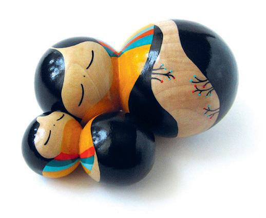
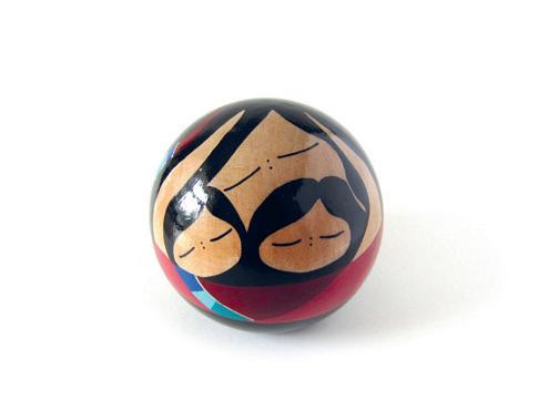
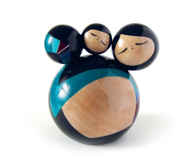
At the heart of much of my work is the people who have shaped me, their stories, their struggles and the traces they leave behind. In these works, visual narratives take shape through arrangements of wooden spheres, assembled into abstracted forms and linked by minimal lines and restrained colour. The spherical wooden objects help communicate tranquillity and a sense of stability. faribakalantari.com
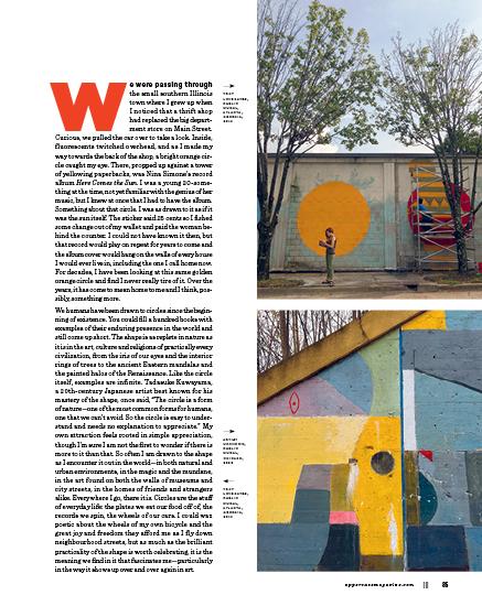
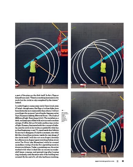
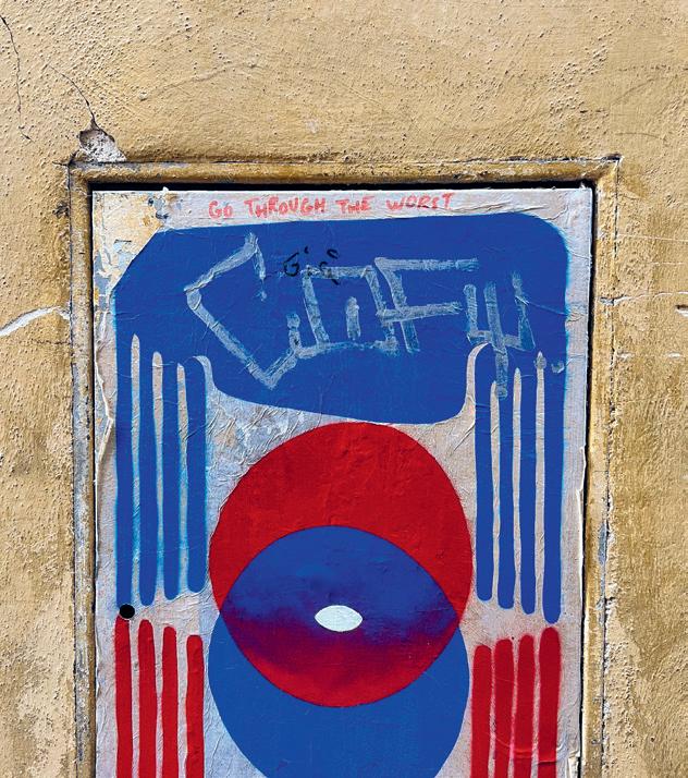
ARTIST UNKNOWN, FLORENCE, ITALY, 2022
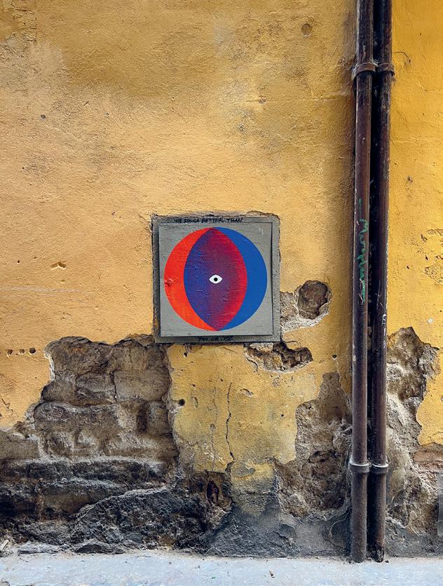
ARTIST UNKNOWN, FLORENCE, ITALY, 2022
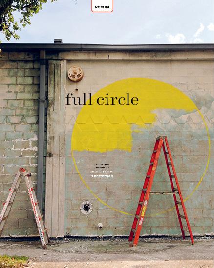
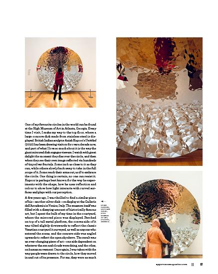
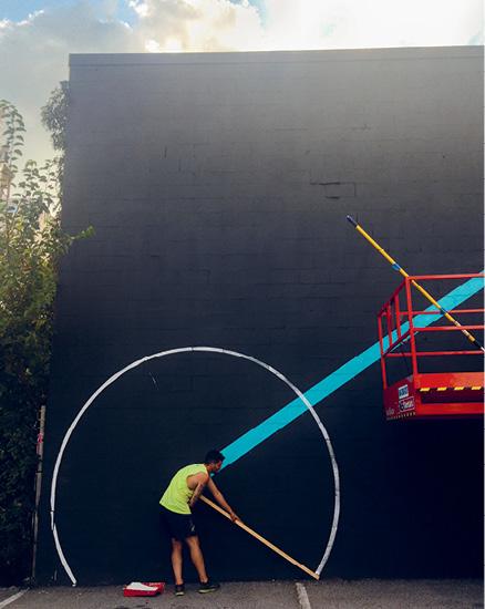
including myself, found themselves completely transfixed. It pains me to say that the mural no longer exists, but the circles of Moneyless will stay with me forever.
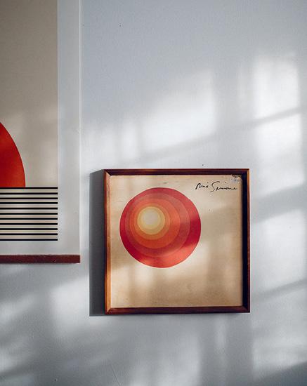
In taking a deeper look at the Nina Simone album, I realized I had no idea who created the cover that I loved so much. I am embarrassed to admit that it never once occurred to me to find out, until now. The artist, I discover, was Bernard Casey, who was more known for his work as an actor and American football player than for the paintings he loved to make. In looking through his art, particularly the work he made around the time he designed the album cover, I found circle after circle. In almost every painting, there they were—sometimes appearing as a sun, sometimes faint and small, but always evident. It’s no wonder then that Casey’s art was chosen for the cover—the album’s title track, “Here Comes the Sun,” Nina Simone’s cover of a song that George Harrison wrote for the Beatles’ 1969 album Abbey Road, uses the sunrise as a hopeful symbol for the end of a long, hard winter.
While I was writing this piece, Artemis II, the first crewed moon mission since 1972, made history. During work breaks, I watched in awe, along with the rest of the world, as those four astronauts circled the moon. The moon (which is not technically a perfect circle or sphere but appears as one to the human eye, from where we view it here on earth) was photographed by the crew while in orbit, and thanks to modern technology and the miracle of the Internet, shared in real time with the world at large. And I marvelled, not just at these extraordinary new photos of the moon and the earth, but in the way they felt like art, and in the way we were all so taken with them. Circles (moon circles, earth circles) flooded my feed, and online conversation bubbled over, all of us in celebration of what felt gloriously infinite and whole. All of us, if only briefly, unified in our wonder.
Maybe that’s what it is about the circle—maybe it reminds us of what is possible. And where there is possibility, there is hope. When I look at that bright orange circle on my wall, I see more than just a symbol of home. What I see now is something that looks and feels, inherently, like hope.
andreacorronajenkins.com @hulaseventy
PLEASE SUBSCRIBE
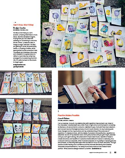
When I get stuck, I say “hi.”
Hi to the “stuck.” And then I try something else.
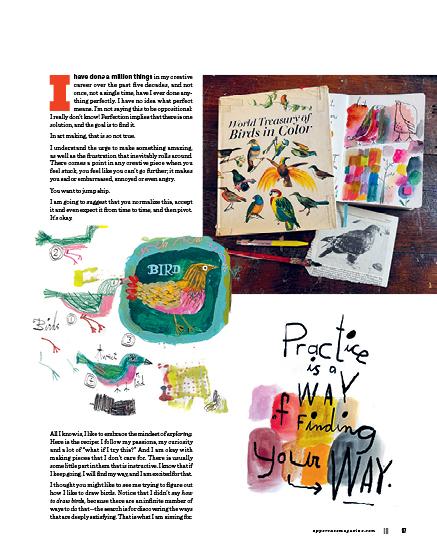
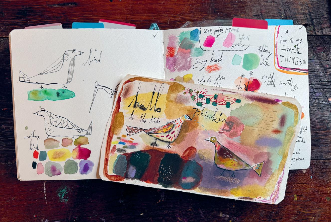
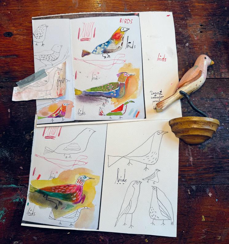
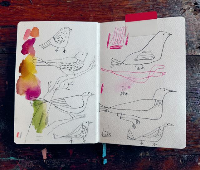
I hope you enjoyed my bird exploration, and I hope that it nudges you to try some new things, and to play, play, play!
Be you with a vengeance. XO
lillarogers.com @lillarogers
practice makes perfect ?
PROJECTS OF REPETITION AND THE SEARCH FOR PERFECTION
Is there truth to the saying, “practice makes perfect”?
Do you often repeat an idea, a motif or a creative process? How does repetition inform your creative practice? Does repeating something over and over change you or your work?
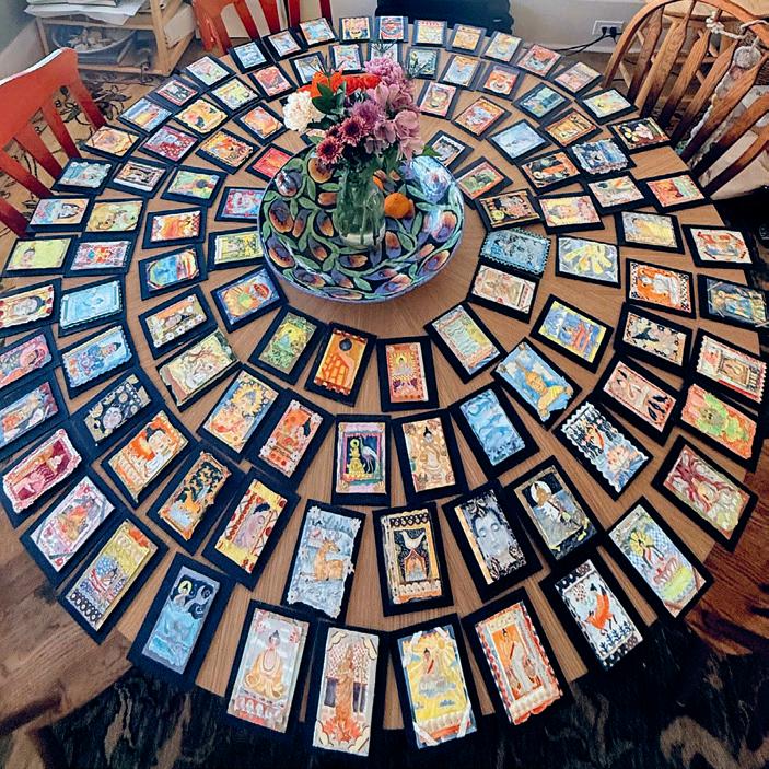
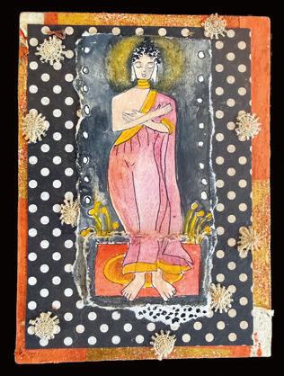
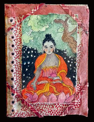
Buddhas: 108 Interpretations
Kim Howard HAILEY, IDAHO, USA
While attending a wellness retreat in Sri Lanka—a lush country steeped in ancient Buddhist heritage—I began sketching small paintings of the many Buddhas scattered throughout the countryside. Creating these little pieces deepened my daily meditative practice. The handwork allowed me to integrate watercolour painting and decorative collaged borders into my day-to-day life during the retreat. I found the process so fulfilling that it followed me home for an additional two months of art making.
Repeating the same theme wasn’t about making identical images—it was about discovering the depth that appears when you return to the same subject again and again.
Repeating the same subject can deepen one’s attention and awareness. In many contemplative traditions, repetition is a way of going further inward rather than doing something new each time.
When I paint the same theme repeatedly, several things tend to happen:
1. The subject becomes familiar. Instead of figuring out what to paint, your mind settles into how you are painting. That familiarity frees your attention and can make the process feel meditative.
2. Subtle details emerge.
3. The act becomes a practice like chanting.
4. Depth is emphasized, rather than novelty. kimhowardart.com @kimhowardart
Repetition in Bloom
Susie
Batsford
EXETER, DEVON, UNITED KINGDOM
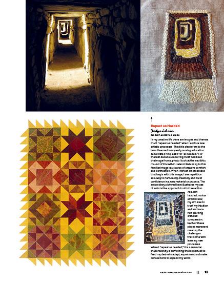
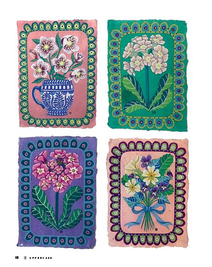
This body of work is the result of a daily painting practice I began this spring. Working in acrylic gouache, a new medium for me, I found myself returning again and again to botanical motifs such as auriculas, hellebores and other seasonal flowers, each framed within a decorative border that has become a consistent element of the work.
Repetition became a way of refining decisions: adjusting colour relationships, simplifying forms and building confidence through familiarity. While each piece follows a similar structure, small variations in palette, composition and detail have allowed the work to evolve organically.
I wanted my daily practice to remove any pressure for perfection and allow the work to unfold in its own way. Through this process, I’ve come to understand how repetition can create depth, rhythm and a visual language of its own. It has taught me that improvement comes not from a single outcome, but through sustained attention over time.
theillustrarium.com @theillustrarium
Finding Your Voice in Practice
Toni Federico WICHITA, KANSAS, USA
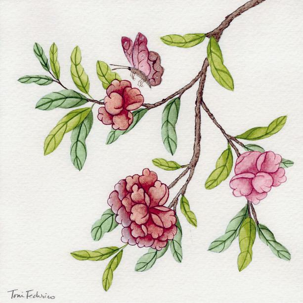
When I decided to learn to paint chinoiserie, I committed to practising. I painted 100 leaves, 100 petals and countless branches. I knew that if I wanted to become proficient, it would take muscle memory, not just desire. I often grew impatient. I wanted to paint! But I’m glad I put in the practice, because when it was time to paint a full composition, my hands knew what to do, and I’d gained enough confidence to put my own spin on things. Truthfully, I’ve always been impatient. I wanted the finished product now! But, as I’ve matured in my creative practice, I’ve grown to not just accept practice, but to embrace it as a cherished part of the journey. I’ve discovered that it’s in practising that you discover your own voice, within that endeavour.
owlmedicinedesigns.com @owlmedicinedesign
Through Repetition Gloria Gelo
CALGARY, ALBERTA, CANADA
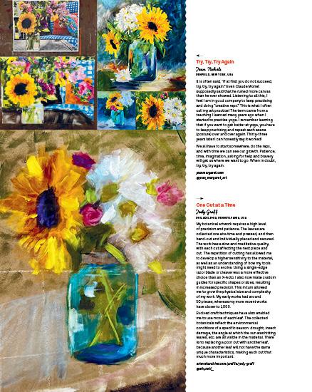
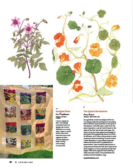
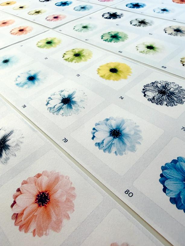
I often start with perfection in mind, but this time, repetition led me somewhere else. This project was a 100-day study of a single dahlia bloom. I revisited the same photograph daily, transforming it through digital tools and visual variation. The subject remained constant, yet my perception and emotions continually shifted.
Returning to the image again and again wasn’t about improving it; it was about allowing something new to emerge. It gave me permission to slow down, notice subtle shifts and respond. Each iteration became a conversation with the one before, revealing new possibilities. The result wasn’t perfection, but rather a bouquet of images that expanded my visual language.
gloriagelo.com
@gloriagelo
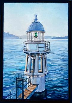
Lighthouses for Dark Times
Anthea Ben-Naim
SYDNEY, AUSTRALIA
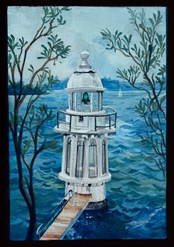
I have never repeated a subject, that is until I recently discovered the joys of returning to one, in my case a lighthouse that represents safety and nostalgia. Each time I paint it the urge to return to it calls me and I explore it in a new way. It is almost imprinting itself on my soul, as though something is unfinished and it is calling to me. I’m not sure if the work improves but it definitely evolves, along with my skillset. It feels important to repeat it.
antheabn.com
@antheabn
Practice to (Almost Perfection) and Love of the Landscape Anne Gagel
PRAIRIE VILLAGE, KANSAS, USA
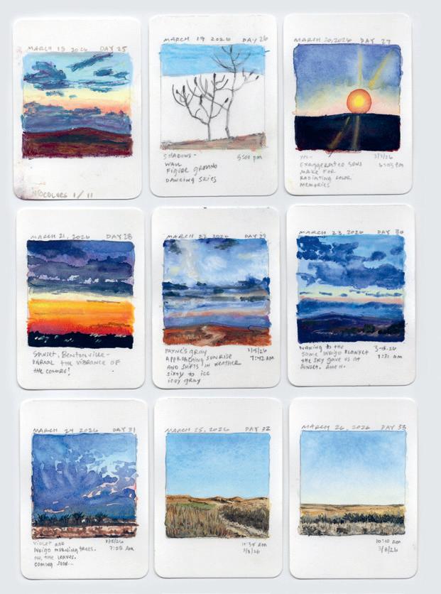
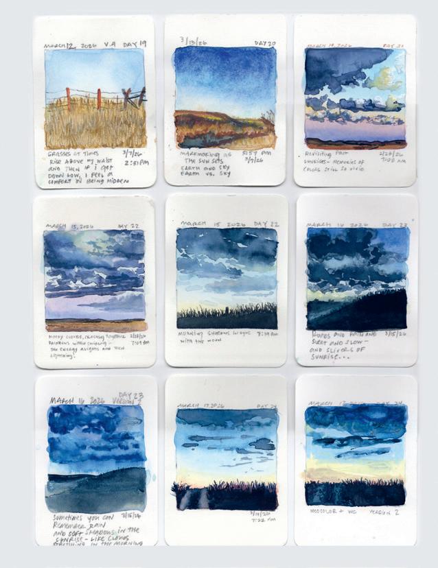
In the late winter and early spring of 2024, I decided to focus solely on the landscape for my 100-days project. I started with two-by-two-inch images. I wanted to grasp the colours in the landscape better and develop better watercolour skills and habits. After painting 101 pieces, I asked myself, what is next? Continuing on, I painted one-inch-square landscapes and then three-quarter-inch landscapes, 100 of each. I have become obsessed with the repetition of painting watercolour landscapes. Last year, I painted 100 at three-inches square. Currently, I am back to making two-by-two-inch paintings, with a slightly different format. My understanding of colour has really shifted, and I intuitively know which colours I can find in the Flint Hills skies in Kansas. Like people, each landscape has its own identity. To understand the landscape takes time and patience and practice. After over 400 paintings, I feel like I could now, from memory, draw and paint specific hills. It is an obsession, but also a deep love for the colours and the specific place, making it an extension of me as an artist, the story of a landscape in images.
@anneinstudio
Working in Series
Donna Deaver
TUCSON, ARIZONA, USA
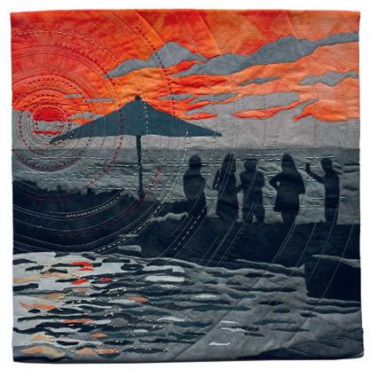
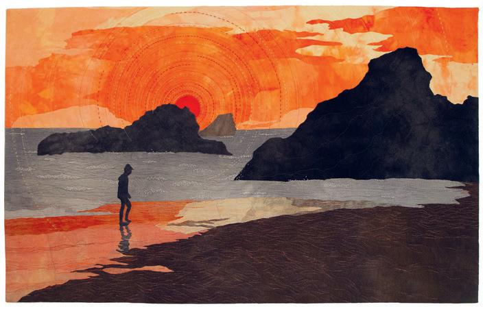
In my textile artwork, I usually work in series, so that I can explore an idea or concept more deeply. My Illumination series explores the darkness when a single light source is introduced. I start with a daytime photo, then imagine the scene as it would appear in the dark. By studying shadows closely, I better understand how the placement of light from a different direction can make a subtle or dramatic change to the whole scene. I spend a lot of time looking at shadows and experimenting by making my own shadows with objects placed in front of light sources from different directions. Circle elements imply radiant light. For these motifs, I employed free-motion machine embroidery, hand embroidery and free-motion machine quilting, all used in different combinations and placements. With these two major parameters, my depth of understanding and mastery of techniques evolves significantly from artwork to artwork.
donnadeaver.com
@donnadeavertextileart
Ocean’s Power
Deborah Mellom
KIHEI, HAWAII, USA
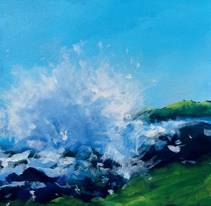
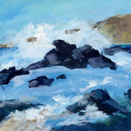
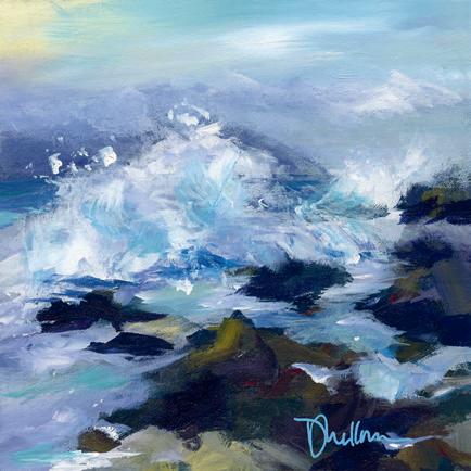
Is anything we create “perfect”? If we’re referring to our creative practices specifically, perfection isn’t really the goal. Every artist has their own reason for choosing an art practice; I paint to evolve, to become more self-aware and to understand the interactions and power of colour, shape, value and movement. Ocean waves fascinate me: how they build, crest and crash. I’m still on a quest to capture that thunderous sound and power of the sea in a painting. These paintings are a sampling of an evolution over several years, after many beach walks and numerous photographs near my home in Kihei, Maui. As a result of repeated study, my work has become less representational, and more open to experimentation and play. It has opened an avenue of abstraction that feels more authentic to me as an artist, and that I believe has more of an impact for the viewer.
@mellomdeb
Practice Playing Around the Alphabet
Lorraine Douglas
SIDNEY, BRITISH COLUMBIA, CANADA
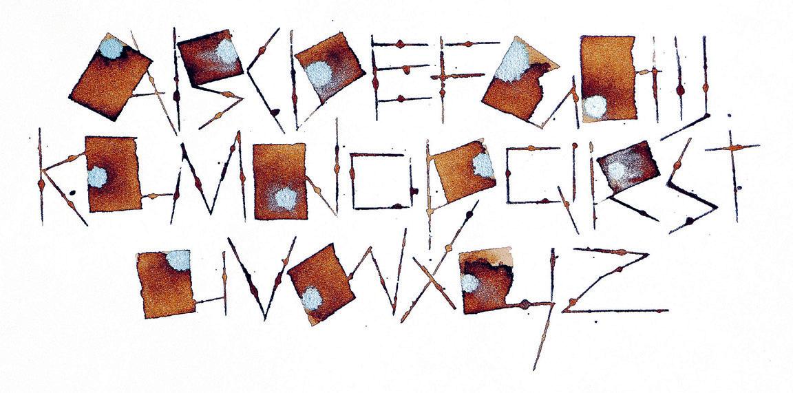
I love creating new kinds of calligraphic letterforms with tools that invite playfulness. I often use an alphabet composition or one line of poetry, and repeat it as I search for something new. I find that using the same content helps me to be more creative, as I have to push myself to break away from what I have done before. One of my favourite tools is the folded pen, which can make wonderful thicks and thins, and marks that no other tool can make—even spritzes of ink and blobs!
lorrainedouglas.ca
The Power of Positivity
Theodora Miller
RICHMOND, VIRGINIA, USA
When I was recovering from a traumatic brain injury, I felt isolated and depressed. My doctors recommended doing something with my hands, and I began painting as a way to release frustration and sadness. In doing so, I discovered the power of repetition. The more I painted, the better I felt. My breath slowed, my racing thoughts ceased. I eventually healed, and the power of creativity remained as I pivoted to become a professional artist. As life continued to bring challenges, I returned to the meditative power of painting. When I lost my mother and longed for the wisdom of her Greek proverbs, I turned to Greek poetry. The poems that resonated, I memorized and painted in the language of my ancestors. A favourite from Nikos Kazantzakis is, “You have the brushes; you have the colours. Paint paradise and get in.” Hope was restored and my courage grew. Over time, I developed my own artistic voice and created 7 Wishes, repeating the Greek words for hope, health, luck, love, happiness, joy and peace.
theodoramiller.com
@theodoramillerfineart
Practice and Perfection
Elizabeth Firth
NEWCASTLE, AUSTRALIA
When tutoring a group of 10-yearolds on clarinet, the subject of practice quickly arose. One student declared, “practice makes progress,” and another responded with, “practice makes permanent.” The suggestion was that practice is not about achieving the (unattainable) idea of perfection, but about gradual improvements and lasting habits.
In my own creative practice, repetition has been a lifelong friend. Repetition has been fundamental in developing technique and skill. Repetition allows my mind to settle, my hands and body to release tension, my focus to sharpen, and importantly, it allows muscle memory to build and develop. Beyond the technical aspects, repetition allows play and creativity to feel more natural and non-restrictive.
Perfection is in many ways an illusion. The Book of Kells, created by Celtic monks in the late 8th to early 9th centuries, is widely regarded as a masterpiece and known to contain numerous imperfections. Yet these imperfections do not diminish its value; rather they affirm its humanity—created by human hands, not by divine intervention, as folklore has suggested.
As Salvador Dalí famously said, “Have no fear of perfection— you’ll never reach it.”
lilyandfarron.com
@lilyandfarron
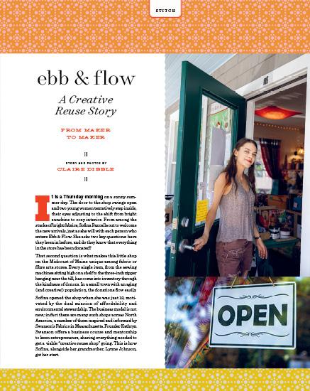
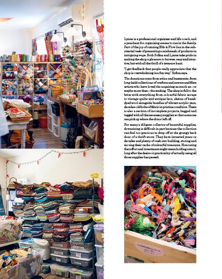
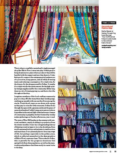
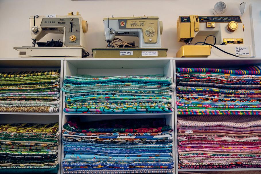
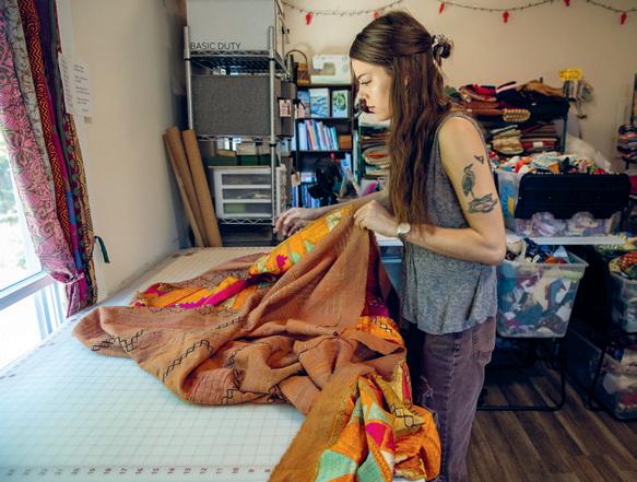
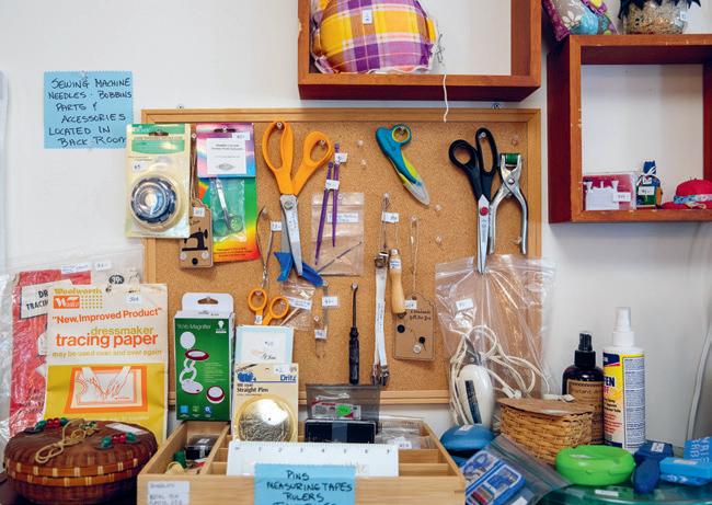
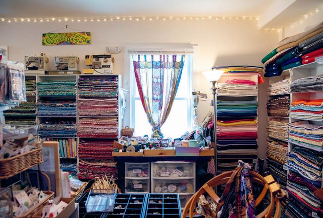
As we come to grips with the climate crisis, interrupted supply lines and our dependency on slave labour in faraway countries to produce our cotton and fibre goods, we need another way to approach the fabrics in our lives. We have a massive resource of textile goods in our country and it is time to tap into it. Our attics, basements, thriftstore donation bins and dumpsters are brimming with discarded fabrics. It is time to start making and trading for the things we need, and stop buying so much new stuff we don’t. We need to see ourselves as trash rich.
—KATHRYN SWANSON swansonsfabrics.com
“People are really sweet,” Sofina says. “As a young person, I’m finding myself. And being validated by all of these people with so many years of experience of human connection, all saying that I’m doing a great thing and contributing something meaningful… it’s very fulfilling.”
Sofina is not alone in her success when it comes to building community by running a creative reuse shop in a small town. Kathryn Swanson has seen a significant number of her students generate thriving businesses using this model all over the US. “It’s an incredible feeling to see one’s own ripple effect,” Kathryn says.
That ripple effect may be felt for years to come. These shops are diverting fibre from landfills, the likely final stop for an estimated 50 to 85% of donations to thrift stores. By promoting upcycling and the reuse of even the tiniest of scraps, Sofina is helping to reduce overall waste while also encouraging the people around her to think differently about the supplies they acquire, and where they come from.
“Having a local source for sustainable fabric, where we’re using what we already have, feels great to me,” Sofina says. “It feels great to a lot of people.”
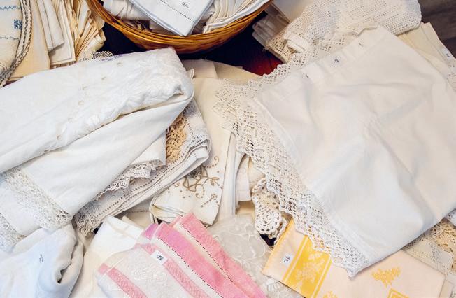
She is helping to reframe what is valued in “new versus old” when it comes to fibre art supplies. The items at Ebb & Flow carry an additional layer of value: embedded love from the previous owner. Sofina feels a profound sense of responsibility as she helps steward these beloved collections from the hands of one maker to the next.
ebbandflowfiberarts.com
@ebbandflowfiberarts
an imperfect circle
STORY BY BRENDAN HARRISON
It’s the curse of every parent to become their child’s math tutor. I have tried to embrace this role, helping my daughter learn not just from her mistakes, but from my own. She is a good student, but her focus on art and languages means that math homework often transforms our kitchen table into a last-minute battleground. In these moments, I try to get her to see that learning math isn’t any different from learning how to act or sing, even if it doesn’t feel that way when she is staring at a page of fractions. Neither one gets any easier until, suddenly, it does.
I often find myself sitting with her at the table, trying desperately to resurrect whatever I once knew about dividing fractions or turning them into percentages. There’s a quiet humiliation in Googling “long division steps” while your child watches, but also a sense of kinship—two generations grappling with the same bewildering ideas. What starts as “how do you do this?” becomes “why does math matter?” and suddenly we’re debating whether numbers can be beautiful. This occurred recently while scrambling to finish the week’s geometry homework. While we worked through the formulas for calculating the area and volume of circles, my daughter eyed a suspicious interloper amongst the usual letters and digits. “Where did this ‘ π’ come from?” she asked distrustfully, pencil hovering over the strange symbol. Our search led us, as so many have before, to the Greeks.
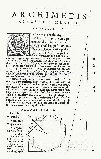
You can’t measure a circle without pi ( π )—the constant ratio of any circle’s circumference to its diameter. Archimedes famously calculated it using 96 - sided polygons, searching for the perfect fraction to capture this relationship without realizing it could never be found. I explained this to my daughter as we worked our way through the logic and a bag of chips—π is an irrational number, its decimals stretching toward infinity without ever repeating. She nodded, more interested in the snacks than the math. But after a few problems, something clicked. She saw that the same number could work on pizzas, plates, and the circumference of the earth. Repeating these exercises didn’t just make π familiar—it made it make sense.
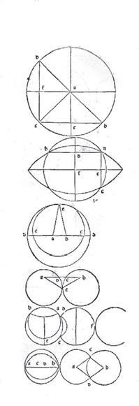
As she worked away on her homework, I found myself wondering why the Greeks devoted so much time to circles. This led me to a passage from Euclid’s Elements in which he described the circle as an “ideal form” because every point on the circle is exactly the same distance from the centre, a shape that could never occur in nature. This impossibility was exactly what made circles so fascinating to the Greeks, and, I suspect, why they kept returning to them as a symbol of balance and symmetry. As I reflected on Euclid’s ideal circle, I remembered how the idea resurfaced centuries
ABOVE
A Latin version of Archimedes’ Measurement of a Circle, published in Latin in 1558 by Paulus Manutius, Venice.
BELOW
Diagrams from the first printed edition of Euclid’s Elements, printed by Erhard Ratdolt in 1482.
later, during the Renaissance, when artists and thinkers began to rediscover Greek ideas that were giving shape to the era. One story from that era has always captivated me.
Vasari’s Lives of the Artists recounts how the legendary Florentine painter Giotto— whose church frescoes were already famed across Tuscany —caught the attention of Pope Benedict IX. Intrigued by Giotto’s reputed skill, the pope sent a courtier to his studio, asking for a drawing to prove his talent. Giotto simply took a sheet of paper, dipped his brush in red pigment, and with one steady motion, drew a circle so perfect that the messenger was astonished. Realizing that there would be no other drawing, the courtier brought this single page to Rome. The pope, struck by the audacity and perfection of that circle, declared it proof enough and hired Giotto on the spot.
I have always loved this image—a circle so perfectly rendered that all who saw it recognized the genius behind it. It’s a seductive idea, that Giotto, by practising diligently and developing his skills to the utmost, could bring to life something that otherwise only existed in the realm of ideas. But for some reason, this story also always makes me think about another type of circle entirely—one drawn not to impress, but to reveal.
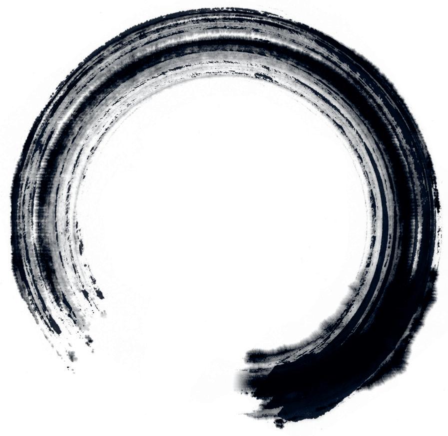
The ensō in Zen calligraphy is a single-stroke circle painted in one breath. A Zen colleague of mine used to draw one each morning before work, capturing a physical trace of his presence in that exact moment. Unlike Giotto’s flawless orb, each ensō he drew was perfectly imperfect, with gaps and wobbles showing the tension between control and release. Drawn without judgement or comparison, just breath and ink. The goal of his practice wasn’t perfection. It was to become present.
Which brings me back to our crowded kitchen table. Whether my daughter is calculating a circle’s volume with π or sketching lopsided rings in the margins of her notes, I keep seeing the same pattern. She tries. She stumbles. She starts again. None of it adds up perfectly, but it keeps us circling back to the same questions, the same shapes, the same kitchen table.
Want to be featured? Submit your studio story! uppercasemagazine.com/ participate
My Studio, My Refuge Cecelia Feld
DALLAS, TEXAS, USA
subscriber studios
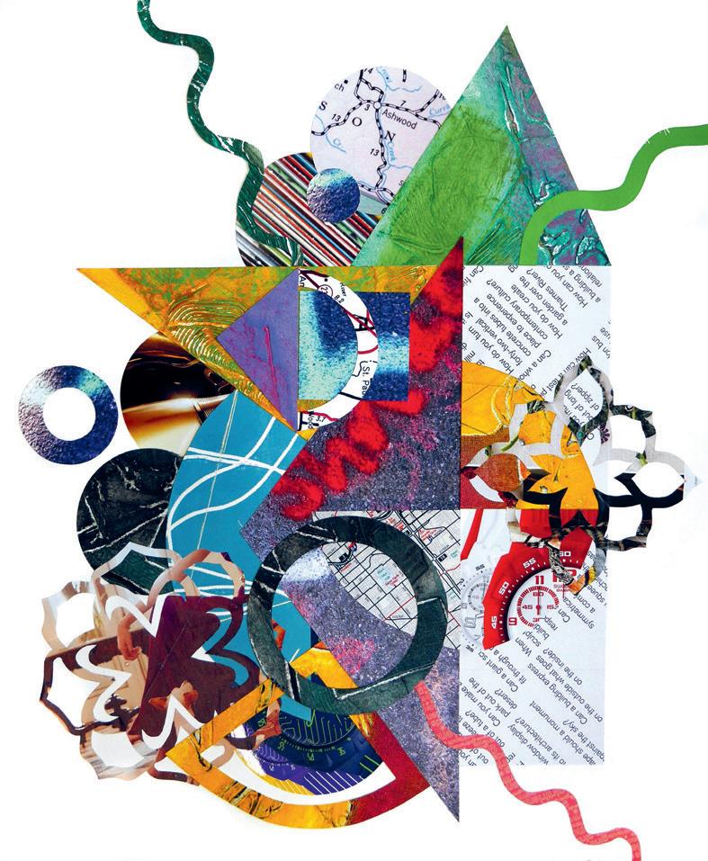
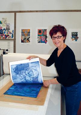
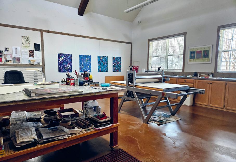
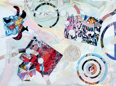
My studio is a large, well-lit space at my farm in North Texas, Woodcreek Ranch. My collagraph and monotype prints sometimes become the basis for collage. They may be background or foreground, and provide texture and colour that play off against shapes of found paper. Old original prints may be cut up and repurposed. An acrylic painting on paper might be the foundation for a newly created collage. I often compose collages on marbled paper, which I make using the Japanese suminagashi technique. The relationship of visual components in my work is like what happens in jazz. There is theme, variation and improvisation. Anything can spark an idea—something seen, heard, imagined. Each step, expected or unexpected, is the impetus to continue the journey. It is an exploration of emotions as much as media. Serendipity is the hallmark of my work. I love the unpredictability of working with paint, paper, ink and plate.
studio7310.com
The View From Here
Loo McNulty
COLLINGWOOD, ONTARIO, CANADA
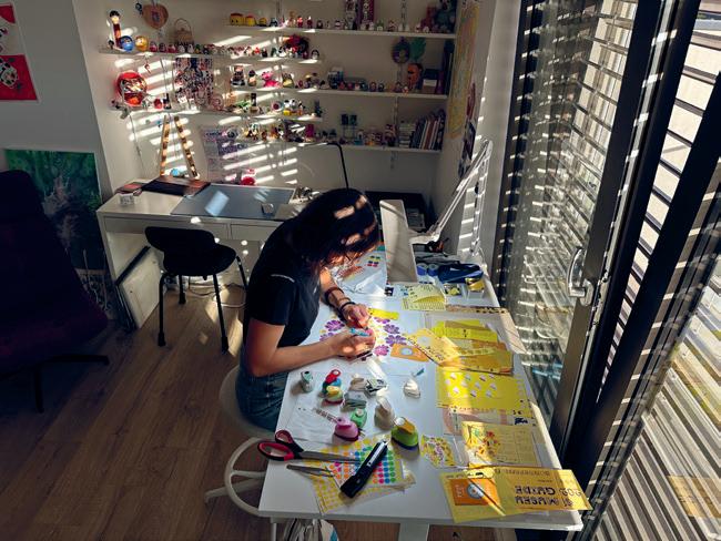
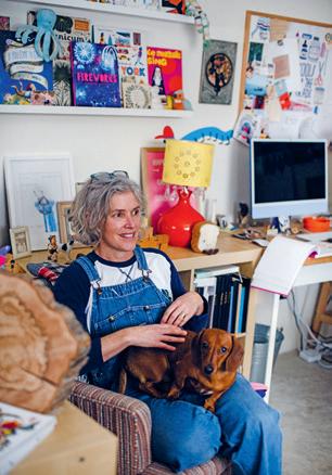
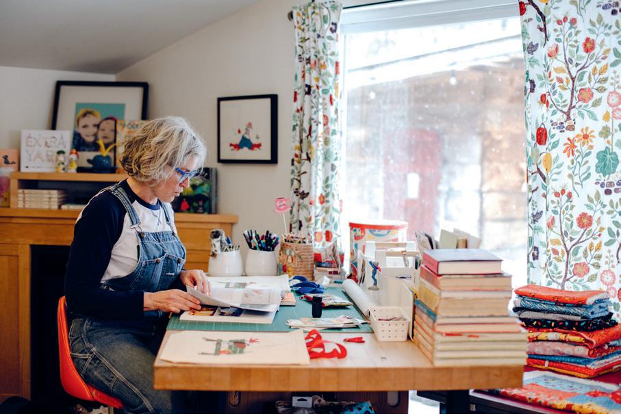
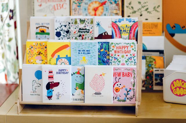
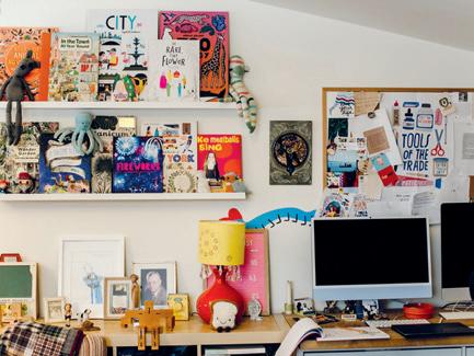
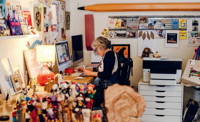
I’m an illustrator living in a small town in Ontario. Once a carport that was attached to my bungalow, my studio is a lightfilled sanctuary packed with toys and games from my childhood, new and vintage picture books, comics, photographs, dogs and art supplies. Every item, from the smallest figurine to the giant wooden pencil that hangs on the wall, informs my creative process, and the lovely patio and garden that this room opens onto makes for a welcome gathering place for family and friends. This is my favourite room in my house and my heart.
happyjusthappy.com
@loomcnultydesign
creative reuse
creative reuse
Finley Dresser used old UPPERCASE magazines, some National Geographic maps and a gardening catalogue to make this collage for his grade 10 art project.
Have you made something with the kraft envelope, upcycled the magazine or reused the postcards in an interesting way?
Share your pictures and stories of UPPERCASE books and magazines on Instagram and in our community, the UPPERCASE Circle. @uppercasemag uppercasecircle.com
Reuse and upcycle your mailer
UPPERCASE subscriptions are mailed in a 100% recycled and recyclable kraft mailer. Give it a second life and make something creative!
VISIT OUR WEBSITE FOR IDEAS AND PROJECT TEMPLATES. uppercasemagazine.com/kraft
Looking for more inspiration?
There are over 50 digital back issues available in our online Archive!
Enjoy digital editions of long-out-of-print back issues in the UPPERCASE Archive. Access is available via monthly or yearly plans.
uppercasearchive.com
Make connections, nurture your creative spirit and grow your business!
The UPPERCASE Circle is our online home for print subscribers. Membership is included with your print subscription!
Members can also enjoy a free preview of the UPPERCASE Archive to read digital versions of beloved back issues long out of print. (Ongoing Archive access is available via paid plans.)
Connect with kindred spirits in an algorithm-free environment that is kind and uplifting.
uppercasecircle.com uppercasearchive.com
Posts from Janine about all things UPPERCASE. There’s also a Video Library of all past broadcast events and interviews.
Inspiring graphics, articles and shares to keep everyone’s spirits up through creatively challenging times.
Share your UPPERCASEinspired “krafts” using the mailer envelope, postcards and upcycled magazines.
Links to what’s currently inspiring, interesting and informative, shared by Janine and community members, plus monthly meetups.
Hundreds of creative prompts to scroll through—you’ll be sure to find something that ignites your creative spark!
Focused topic areas for posts and discussions, including Surface Pattern, Textiles Love, Make it Worthwhile and more.
Connect with eager customers through the Marketplace—post your wares, courses and other creative offerings.
ISSUE 71
Oct-Nov-Dec 2026 ISSUE 72
Jan-Feb-Mar 2027
ISSUE 73
April-May-June 2027
ISSUE 74
July-Aug-Sept 2027
Calls for Submissions
Sign up for my weekly newsletter for behind-the-scenes updates and the latest on open calls for submissions for UPPERCASE books and magazines. uppercasemagazine.com/free
Pitch your article ideas and suggestions! uppercasemagazine.com/participate
Volume J: Jot!
Published in whimsical, nonalphabetical order. Thirteen books in this series have been released since 2016: F, S, B, P, E, V, Q, C, Y, A, R, N and, most recently, G. J for “Jot” is in progress!
Make sure you are subscribed to the UPPERCASE newsletter to hear about the next volumes and how you can audition to be profiled in them.
Just for fun, earn badges when you post and share in the UPPERCASE Circle.
echoes of myself
WANDREA JENKINS
e stood shoulder to shoulder at the 26th Street flea market in Manhattan and rummaged through crumbling boxes of old photos. The table was crowded with collectors, each of us quiet and resolute in our pursuit. A woman casually squeezed into the spot next to me and asked what it was we were all looking for. Old photos, I told her. Oh yes, I can see that, she said, but what exactly are you looking for? I stopped what I was doing and looked at her. I had been collecting found vernacular photography since I was a teenager and had been asked the question before, but couldn’t remember anyone ever posing it quite like this. I don’t know, I said. I guess just whatever catches my eye. Which, at the time, was the truth. Sort of. I don’t think I knew exactly what it was I was looking for, but now, after nearly 40 years of collecting, I think I know what I have found. The continued
practice of sifting through hundreds of old snapshots, of holding each one in my hands to more closely examine composition and light, to note recurring subjects, settings and details, and then deciding, sometimes in an instant, what makes a picture interesting (and thus, worth holding onto) has been, for me, an enduring lesson in the power of repetition.
The practice of observing and recognizing visual repetition—both out in the world and in the art of others and our own—can be deeply revelatory. Whether what we repeat is intentional or not, what shows up again and again raises one question: why? And to ask it, of yourself or of others, is to enter into a kind of conversation that may or may not yield answers. The magic, I think, is in the asking. A while back, I brought out all of the found photos I had picked up over the last few years and laid them out across my bedroom floor. I had been drawn to snapshots in which the shadow of the person taking the photo fell (usually unintentionally) inside the frame. I knew I had collected a good amount but was not fully prepared for the visual impact of just how many. There they all were— shadow after shadow after shadow. Some time afterwards, I was looking through the archives of my own work and noticed more shadows in frames. This time, they were my own. Every photographer I know has a collection of images like this, but I could not shake the feeling that there was more to what I had been doing, that maybe the shadowed strangers I had been collecting had somehow begun to seep into my own work. Or maybe it was the other way around—I’d been specifically drawn to collecting images that mirrored the work I had been making. Either way, I’d been looking for something. Maybe what we repeat in the art we make is just another way of asking the same question over and over again. I can’t help but think about that woman at the flea market all those years ago, how her question would echo in my head, on repeat, for years to come. But then, good questions are like that. The ones worth asking, anyway—even if the answers are slow to come.