HOPE & PURPOSE
Main Logo
A logo is a visual representation of your organization and will become the shortcut in people’s minds to the work you do. The more your logo is exposed to people and utilized in conjunction with real value, the more this logo will be recognized for that value; even when it stands alone.
Hope & Purpose Logo
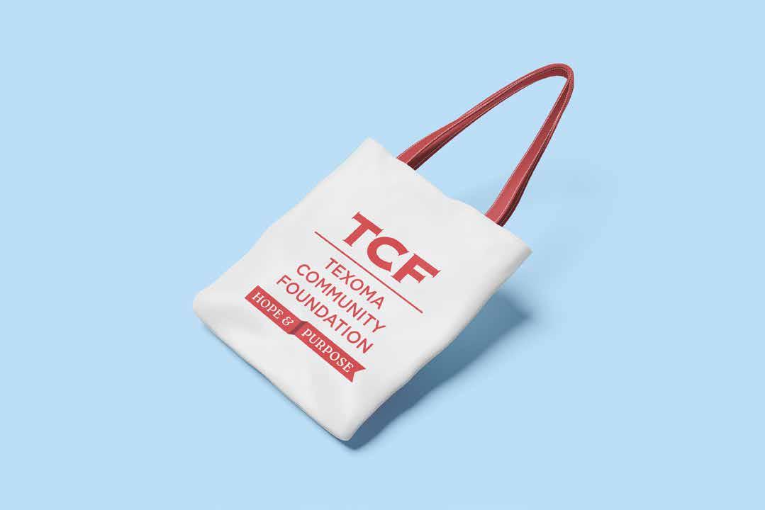
This logo is to be used for any Hope and Purpose campaign assets. This is not a replacement of the main TCF logo.
HOPE & PURPOSE
Responsive Logo
The logo has a re-flow system that allows maximum flexibility to use. The symbol alone should only be used in small applications or where the brand is highly recognizable.
Spacing
To stand out, you must stand apart. Give our logo space to breathe and ensure it is easily recognizable and uncluttered.
Minimum Size
Make sure your logo is easily viewable and that its details are not lost due to small reproduction

Misuse
To maintain consistency, it is important to maintain the integrity of your logo. Do not alter, change or add anything that to the logo as it is presented in this guide. Here are some examples of misuse:
HOPE & PURPOSE
HOPE & PURPOSE
HOPE & PURPOSE
COLOR + HUES
Color is an attractive way to make the Hope and Purpose brand stand out. To ensure consistency for years to come, the following color codes for both digital and print reproduction have been provided. Every time a logo or brand asset is being utilized consider its format and choose the file with the right color format.
COLOR + LOGO
It is important to use the logo treatment that works best with other colors. It needs to have high contrast and easy readability.
TEXOMA COMMUNITY FOUNDATION
TEXOMA COMMUNITY FOUNDATION
HOPE & PURPOSE
TEXOMA COMMUNITY FOUNDATION
HOPE & PURPOSE
TEXOMA COMMUNITY FOUNDATION
HOPE & PURPOSE
TEXOMA COMMUNITY FOUNDATION
HOPE & PURPOSE
TYPOGRAPHY
Two important factors when choosing fonts are legibility and readability.
• Legibility is a function of typeface design and a measure of how easy it is to recognize one letter or word from another and how easy blocks of text are to read. Font size is critical to legibility.
• Readability is a function of how typefaces are used. White space between letters, lines, paragraph breaks, and images affects readability.
Roca available for use at: fonts.adobe.com/fonts/roca
Lato availabe for use at: fonts.adobe.com/fonts/lato