



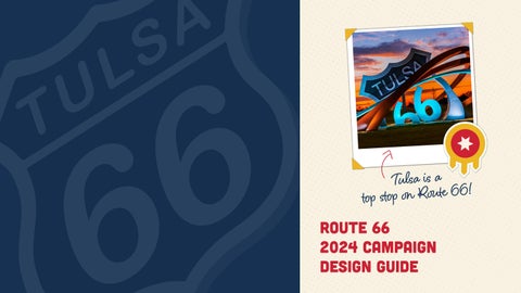
These branding elements will be used consistantly for all design collateral across the 2024 campaign. Colors were pulled from the Tulsa flag to help create a sense of unity in designs. The fonts were selected for their flexiablity across many mediuems, ensuring any language will be easily read no matter the application.
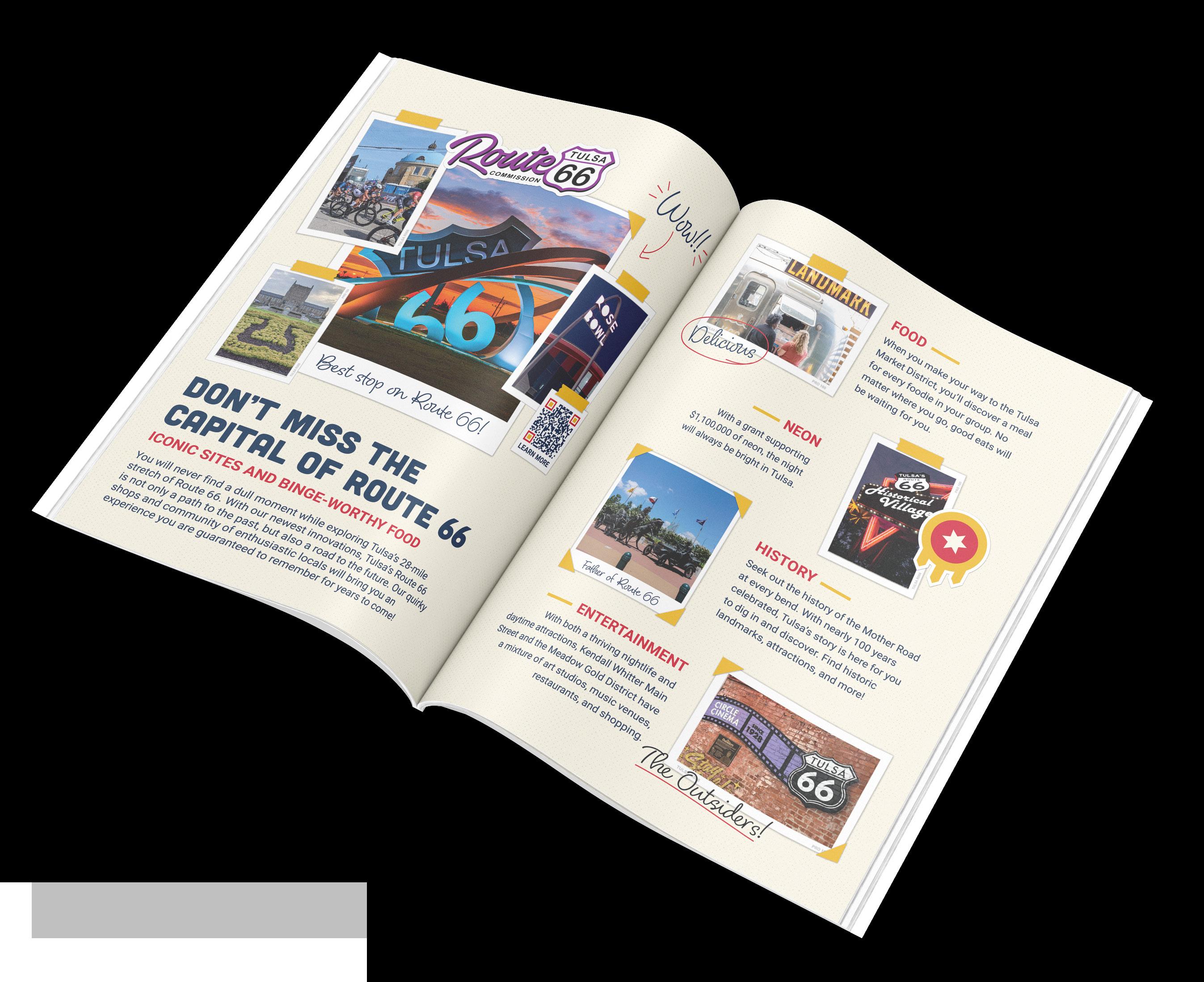
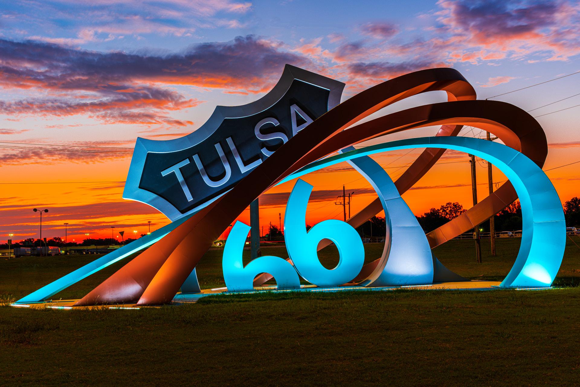
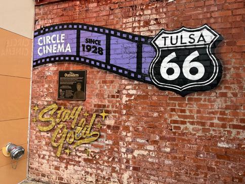
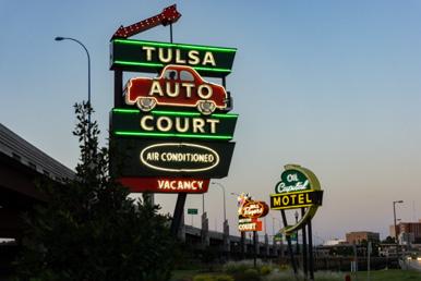
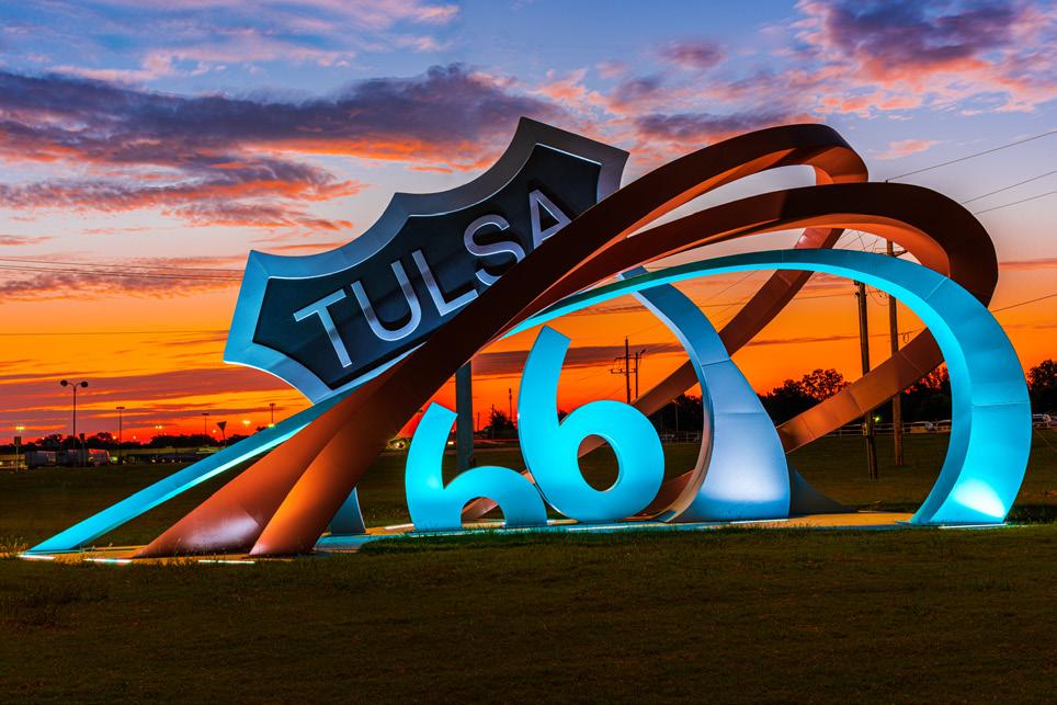
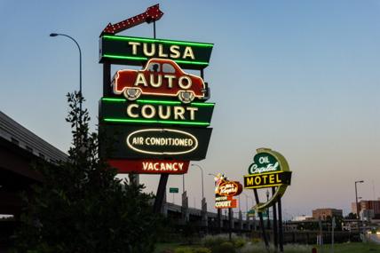
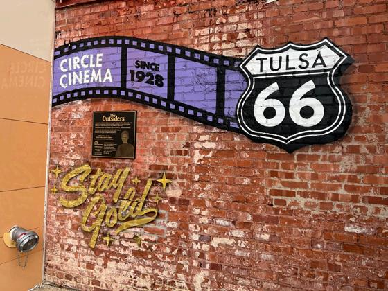
For this year’s campaign we will focus on vintage style photographs and a scrap-booking aesthetic to communicate how Tulsa is a retro, fun, and memory making place to stop on Route 66.



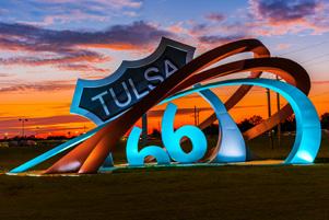





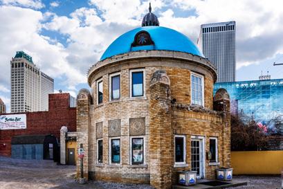



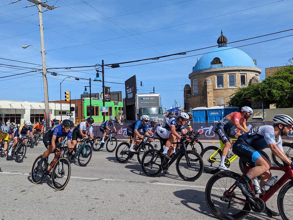




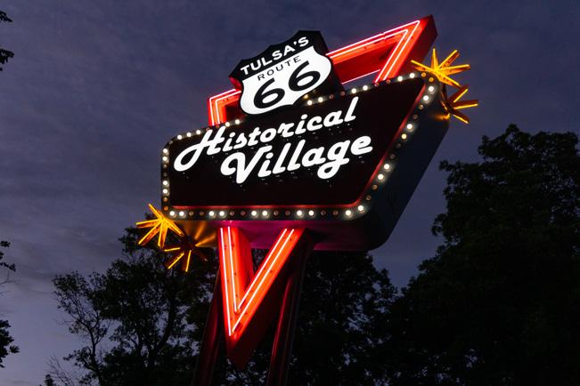


















Digital ads will be simple with short impactful language. Because digital ads act like billboads on the web they will be designed to communicate the message to the view in a matter of seconds.
We continued the branding executed with print ads in order to keep messafing consistent across all mediums. This will help the viewrs retain content more efficiently.

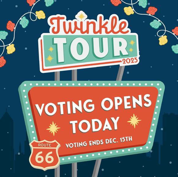
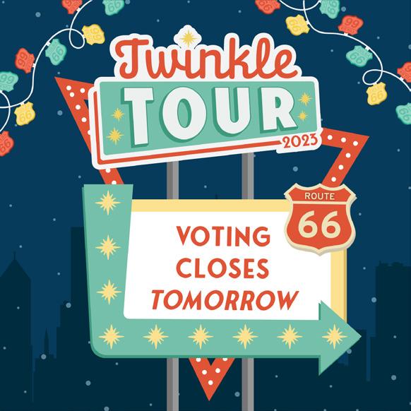
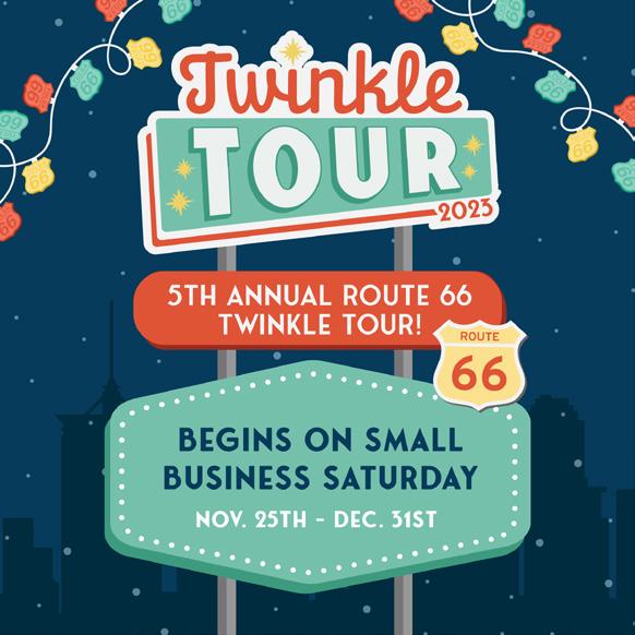
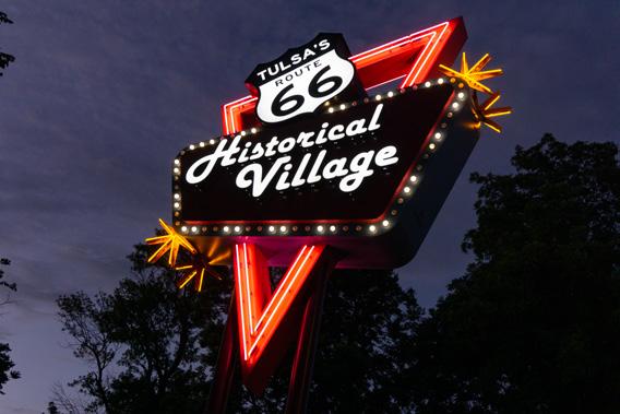
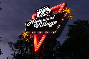
Some events may utilize unique colors, fonts, and other visual expressions in order to better represent the event. In example, Twinkle Tour has its own branding standards as established in 2023. It relies on illustrated graphics that focus on Tulsa’s iconic neon.

THANK YOU