2025/26 Visual Communication Review - UCA Canterbury School of Art, Architecture & Design
BA VISUAL COMMUNICATION
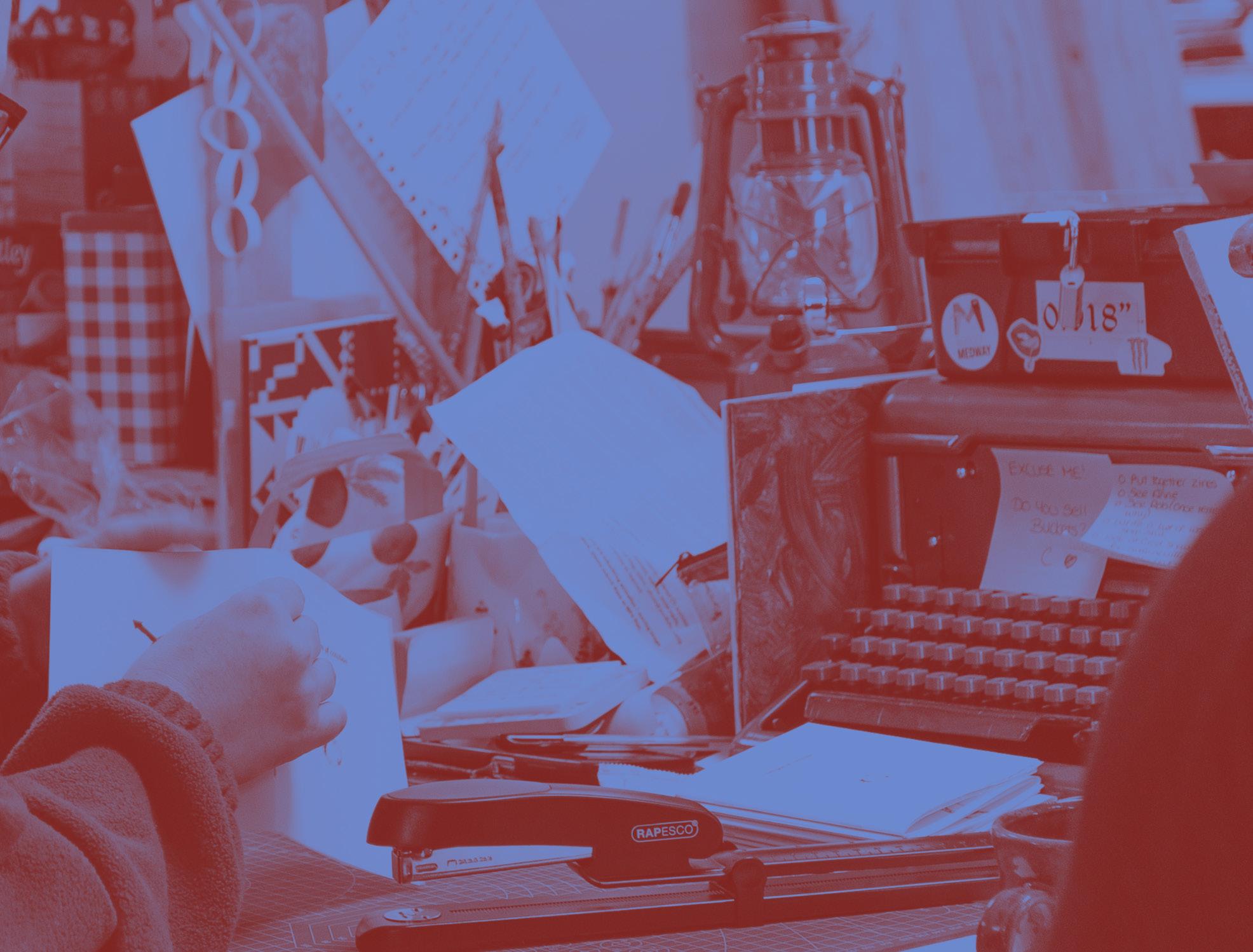
Photo by Jeremy Ignacio Mcmahon
FOREWORD
Visual Communication blends graphic design, illustration, moving image and photography, without confining us to one pathway alone. This grants us leave to move between them and develop real, practical skills we can bring to our work.
Starting with a Launch unit bolstered by work from summer assignments, each year of the degree has used its structure to cover a huge range of material.
Our introduction to year 1 had us work in teams to create triptychs, developing a nascent sense of meaning in our work by using a starting point of anger or injustice.
The next unit, appropriately named What is Visual Communication, introduced us to the potential of what visual communication can do, how it develops in response to a changing zeitgeist and how it can be a force for good when equality, diversity, and inclusion are taken into account.
In Defining Your Practice, our tutors took us through potential workplace applications for
the different fields contained within Visual Communication, and gave us an opportunity to experiment with those fields we might be less familiar with.
Practice-Based Fundamentals had us developing observation skills and applying them to our making, with workshops designed to build our confidence in noticing and recording our surroundings.
To round off the year, Preparing for Professional Practice had us writing a research piece on a journey, exploring the social and political contexts surrounding it.
Our group expanded at the beginning of year 2, when students from the Studio Practice course joined us.
Year 2 kicked off with a trip to the Beaney gallery, letting us respond to the collection and interrogate what gets to be exhibited, and what is omitted. This led us on to The Conscious Practitioner and Visual Storytelling, giving us a grounding in ethics and perspective for our experimental outcomes.
For the Interdisciplinary Electives unit we could choose to explore moving image, hand-drawn animation, ideas in space, experimental typography, printmaking, and drawing, painting and mixed media.
Spatial Practices pushed us to apply our work to a real-world setting, using themes of play, wellbeing, promotion, community,
show, and transit as a jumping-off point. We could also use a live brief to get some early experience of working to a professional brief.
To set us up for our year 3 dissertations, we used our proposal questions to begin our research. This was followed up by heading off into short placements within the industry.
Our group expanded again at the beginning of year 3 when more students from the Studio Practice course joined us.
We started year 3 with Critical Research and Practice, each diving into our own research rabbitholes to produce either a researchbased written project, or a practice-driven outcome and accompanying text.
We each took on a live brief from the D&AD New Blood competition for the Professional Practices unit. The Self-Directed Final Major Project had us take a project from first proposal, to research and experimentation, and finally putting together a full Graduation Show and producing this catalogue.
The last three years have taken us on many types of journeys. Physically, we’ve been as far afield as Italy and London, and been closer to home with trips to Margate
and the Beaney. We’ve taken ourselves to museums, galleries, and studios up and down the country. In a more metaphysical way, we’ve been taken through so many different practitioners’ work with a weekly dose of Art School talks. We’ve used their experience and advice to further our own practices.
The Creative Futures team have supported us in getting our feet on the ground in the industry, constructing CVs and portfolios.
Hullabaloo Creative Market has gone from strength to strength on the back of the work submitted to it, showing what can happen when we come together for a common cause.
Despite the ups and downs of the last 3 years, we’re all leaving with the skills and the confidence to forge our own paths in life. Our creative practices have shifted, our personal lives have changed, but we still have the same dream to keep on making the world a more creative place.
Our thanks are due to the wonderful tutors, technicians and support staff, without whom UCA simply wouldn’t be the same. In particular, we owe a great debt of gratitude to Anne Sørensen, Molly Okell, Sara Andersdotter, Lucy Howarth, Maud Whatley, and Rob Roach for their support and contribution throughout.
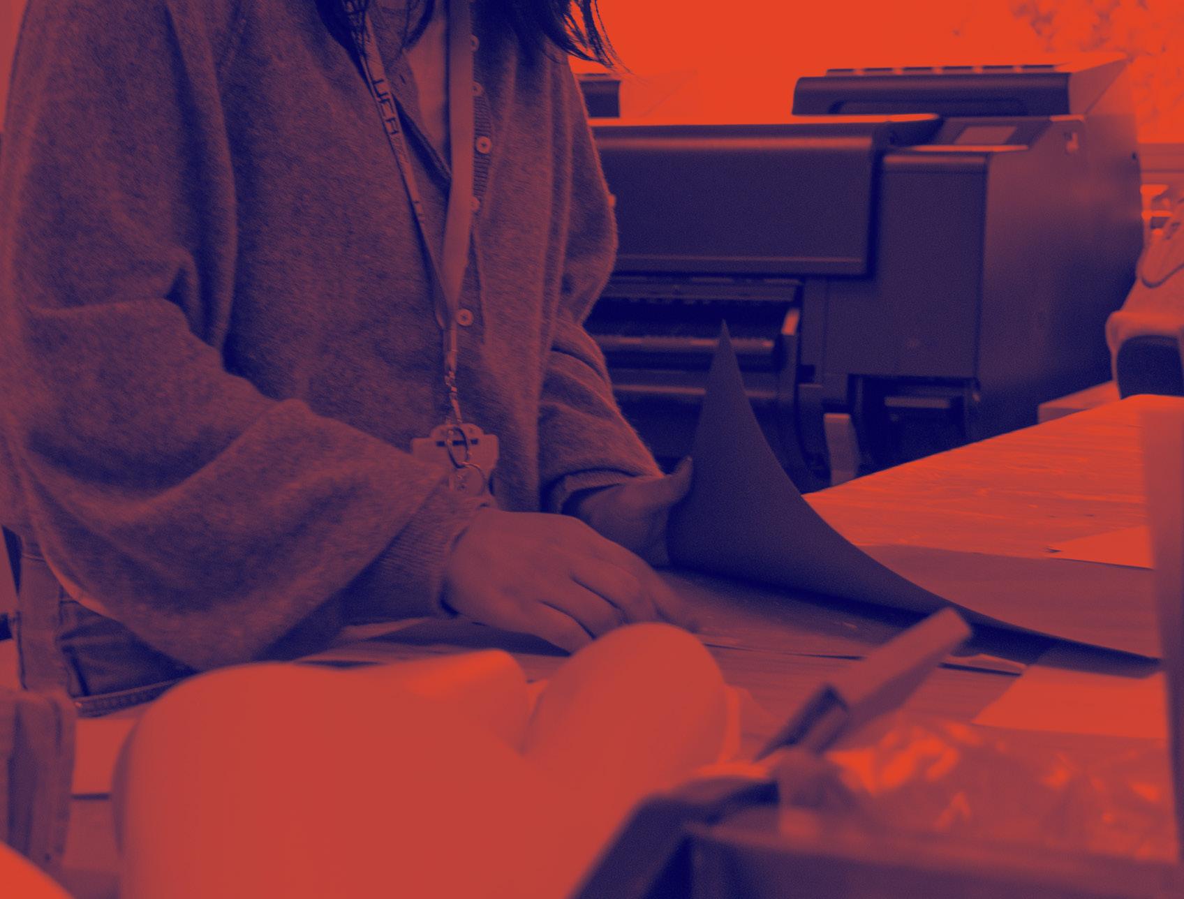
Photo by Jeremy Ignacio Mcmahon
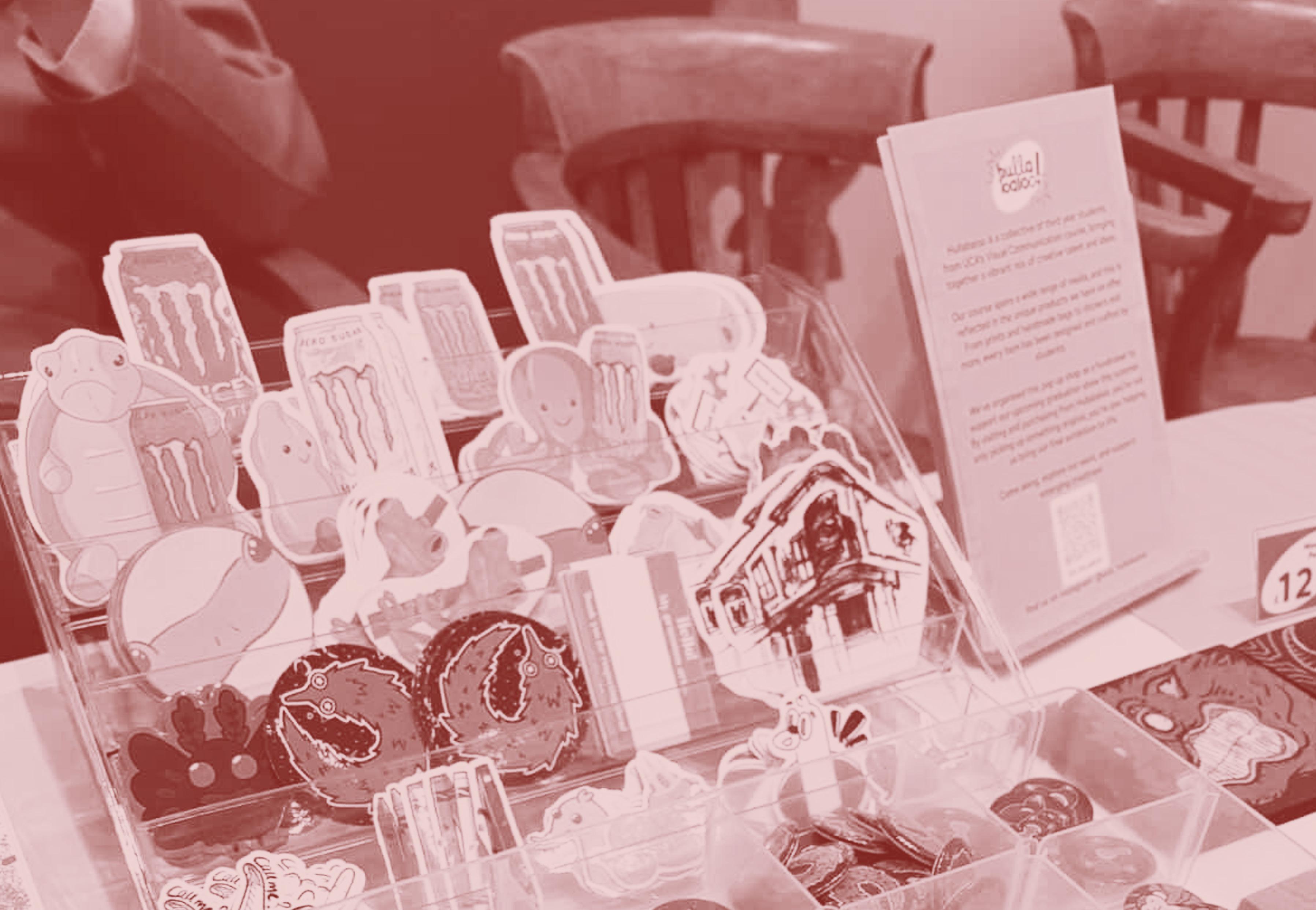
HULLABALOO CREATIVE MARKET
Hullabaloo Creative Market began life several years ago as a student-led project to raise money for the graduation show. It was then handed down to the incoming third-year students so they could contribute their own creative skills to the project. This has now become a tradition.
Over the past few years, Hullabaloo Creative Market has gone from strength to strength, bringing the creative skills of third-year students into the community and beyond. We have been involved in local art markets, pop-up shops, and university events.
We were also very lucky to host a popup event at The Beaney House of Art & Knowledge, where we had a wonderful time interacting with the local community.
Photo by Kristina Thompson
KHUSHI AGGARWAL
I am fascinated by the potential of design to convey inner states of mind such as uncertainty, hesitation, and development, in addition to final solutions. With my projects, I want to question the idealised concepts of creativity and instead convey authentic, human experiences. I am particularly interested in experience design, storytelling through interaction, and emotionally driven digital worlds. As a designer, my aim is to create work that brings people together, rather than just completing a task. I would like my projects to inspire people to reflect on their own creative journey.
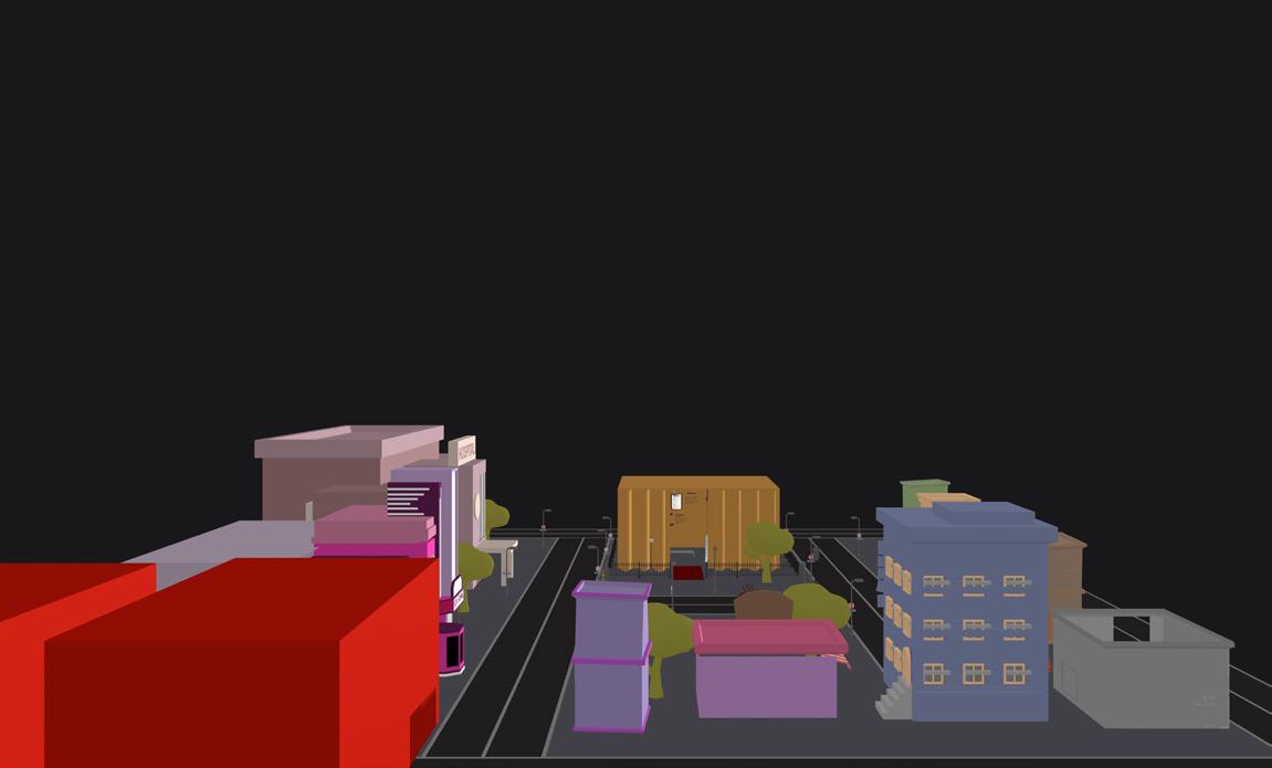
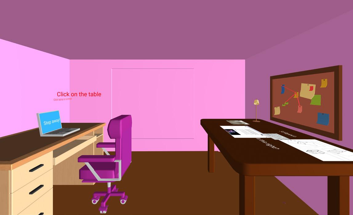
City of Creativity
This project transforms a professional portfolio into an interactive, navigable city environment. Rather than display work through static pages or scrolling formats, this portfolio creates an immersive experience that users enter and explore. Visitors navigate environments and complete brief, task-based interactions to discover my design projects, processes, and reflections.
ZIGGY ALLEN
I am an illustrator driven by exploration and curiosity. I do not confine my practice to a single medium or theme. I am passionate about queer representation in art and archiving practices, navigating accessibility in art and exploring lived experiences through visual storytelling. Although I have experimented with many processes and mediums, transforming my drawings into linocut prints and gouache paintings are the methods I enjoy the most. I also use digital processes and software in my work, but I much prefer to work in a traditional way, creating physical forms of media that are not perfected and can be interacted with.
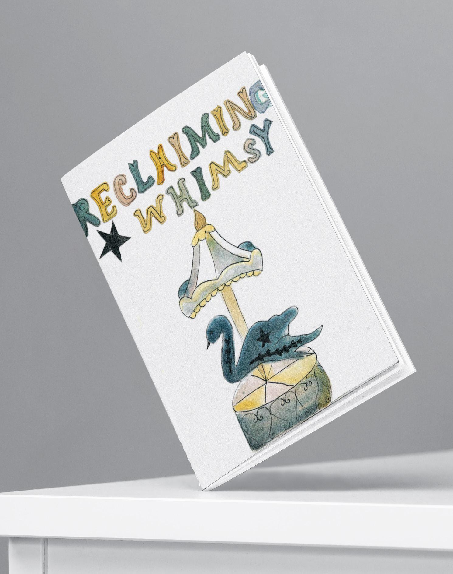
Reclaiming Whimsy
My project is an exploration of how leading a slow, creative life can be a form of resistance against a capitalist society, and favour sustainability rather than overconsumption. I am interested in how practices rooted in nature, craft and childlike imagination can act as a form of rebellion.
KIRA BAKER
I specialise in illustration. With a strong passion for storytelling, I enjoy writing and illustrating children’s books. I bring a friendly, positive approach to my work and enjoy collaborating with others to bring imaginative ideas to life. Eager to continue developing my skills in visual storytelling, I am committed to producing engaging, meaningful work that inspires young readers.
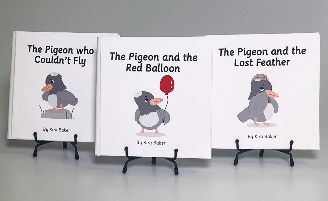
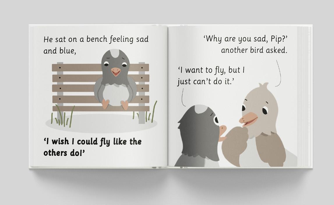
Between the Pages
In this children’s book series, we join a curious character named Pip as he explores the world with wonder and questions. Through gentle, engaging adventures, young readers discover creativity, friendship, and confidence, while uncovering meaningful lessons and messages Between the Pages.
MASON BEE
I’m an illustrator, interested and specialised in character design and visual storytelling. I aim to sell the personal stories that I create across different places in the world. My dream is to be responsible for both the writing and illustration of the stories that I create and possibly one day, I may get a once in a lifetime chance to make one of my own into a film or series.
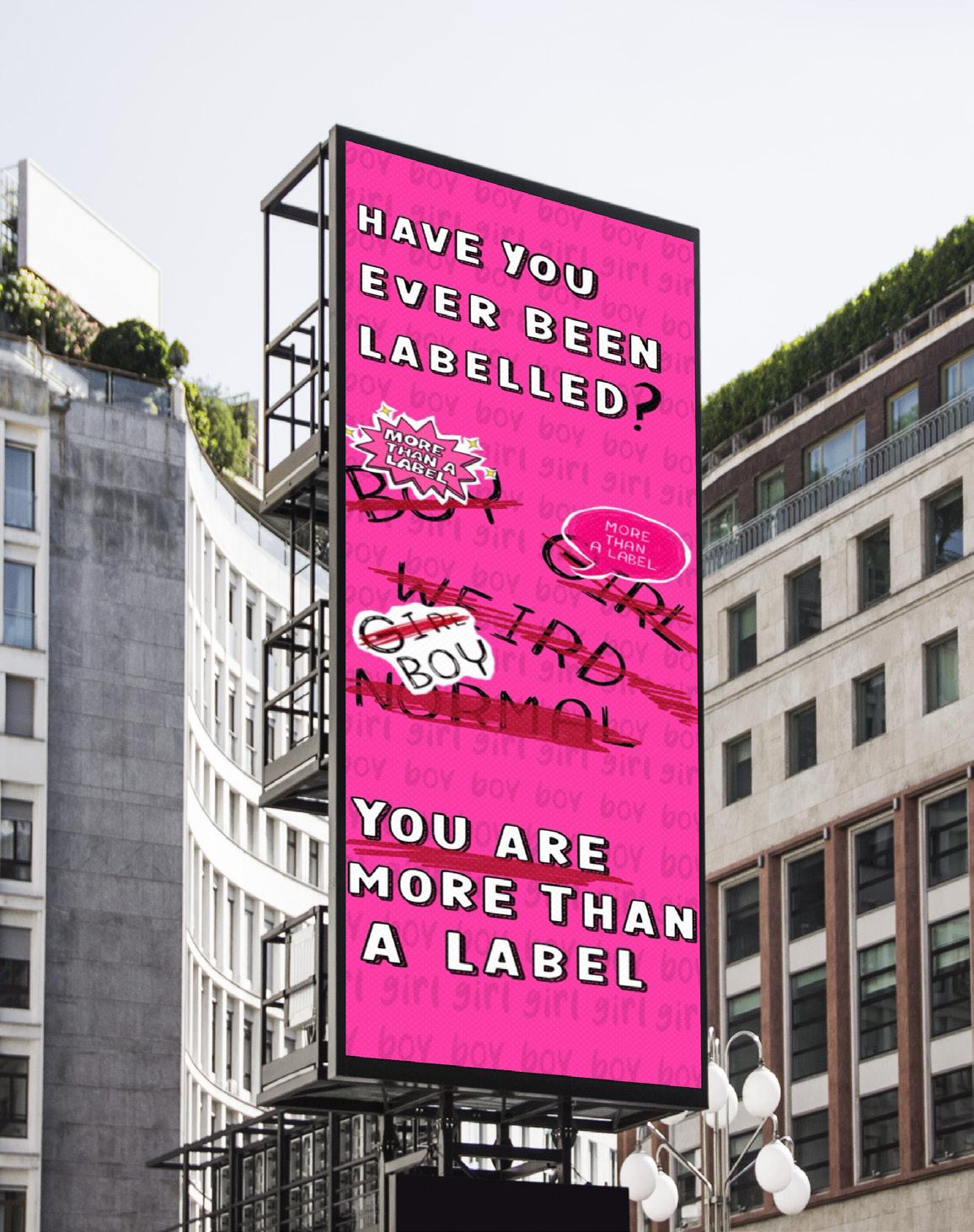
More than a Label
My work is a campaign-based project exploring the concepts of identity and how labels that are imposed can have a significant impact on people. Using a bold consistent colour palette, stylised hand drawn typography and character illustrations, the intention is to represent how societal expectations can cause pressure and the act of rejecting them can be beneficial. The inclusion of specific crossed out words are a symbol of how labels can feel restrictive to some people. I aim to encourage viewers to consider and question these labels and whether they should exist. I also want to use this project to educate a younger audience and teach them that it’s okay to be different.
MADZ BISHOP-WARD
I am a multidisciplinary artist who uses illustration to convey storytelling and emotions. My work is bold and unique; I do not tie myself down to one practice and I’m constantly learning new techniques, elevating my practice with each skill gained. I love to create works that invoke a sense of nostalgia to the viewer using colour to my advantage. In my spare time I am always working on personal projects that hold sentimental value or significance to me.
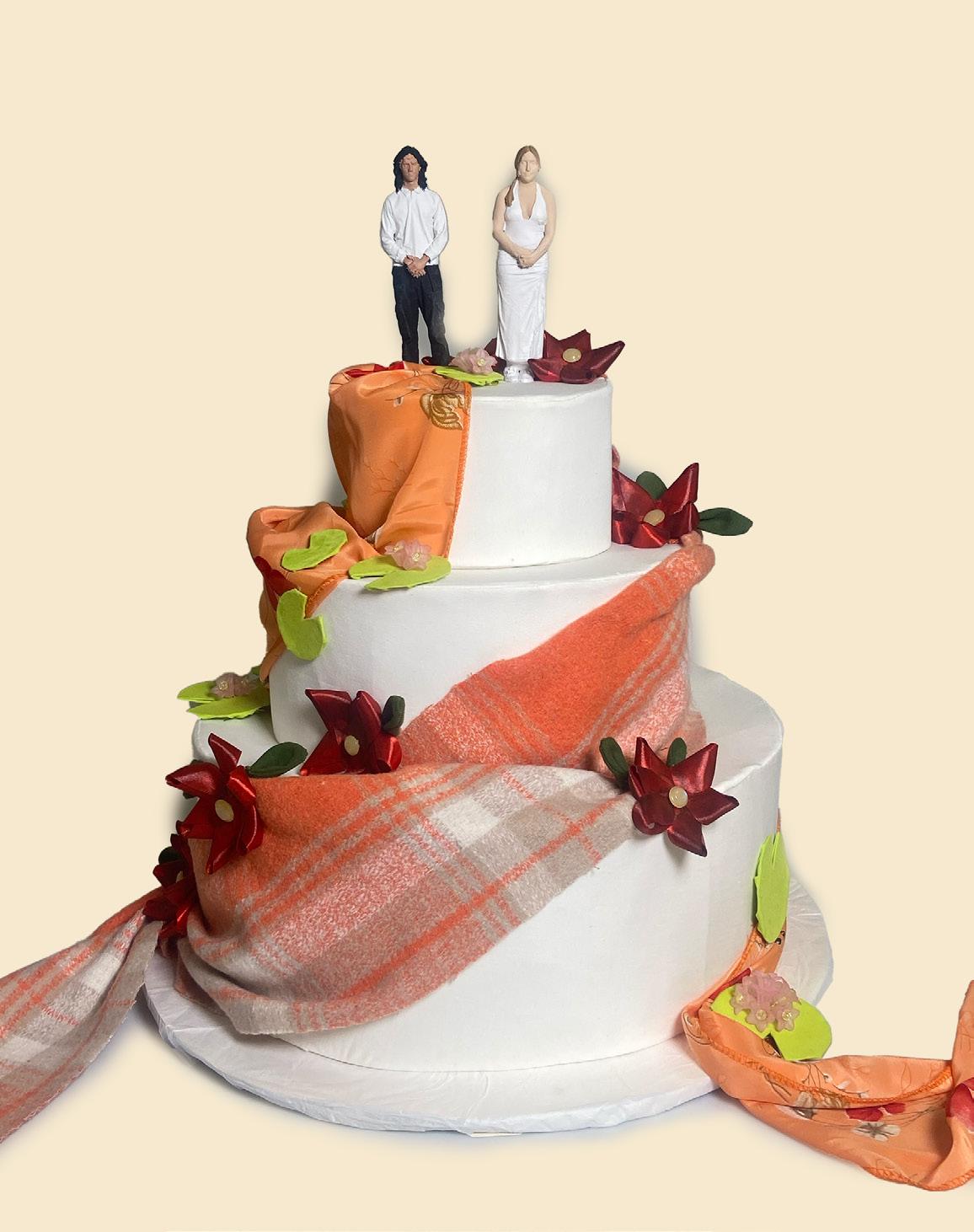
Mixed Fabrics: Intertwined Together
This project is a celebration of mixed-race relationships. I want to highlight not only the beauty of these relationships but also the racism that still persists towards these couples even today.
LIV BOWMAN
I am a multidisciplinary artist working primarily in graphic art, photography and animation. My passion for music, lyricism and poetry has inspired my work, as well as people and relationships. I strive to reflect deep connection, love and intrigue with my digital work, and let these themes visualise and drive my experimentation in my practice.
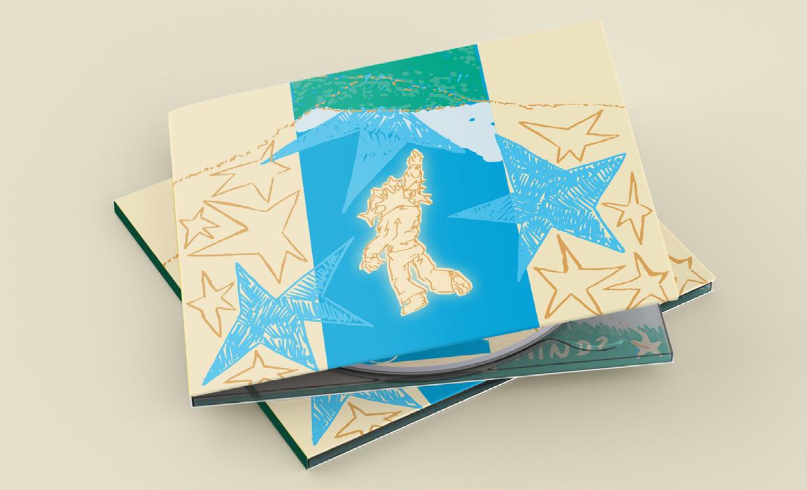
Delicia: Music in Motion
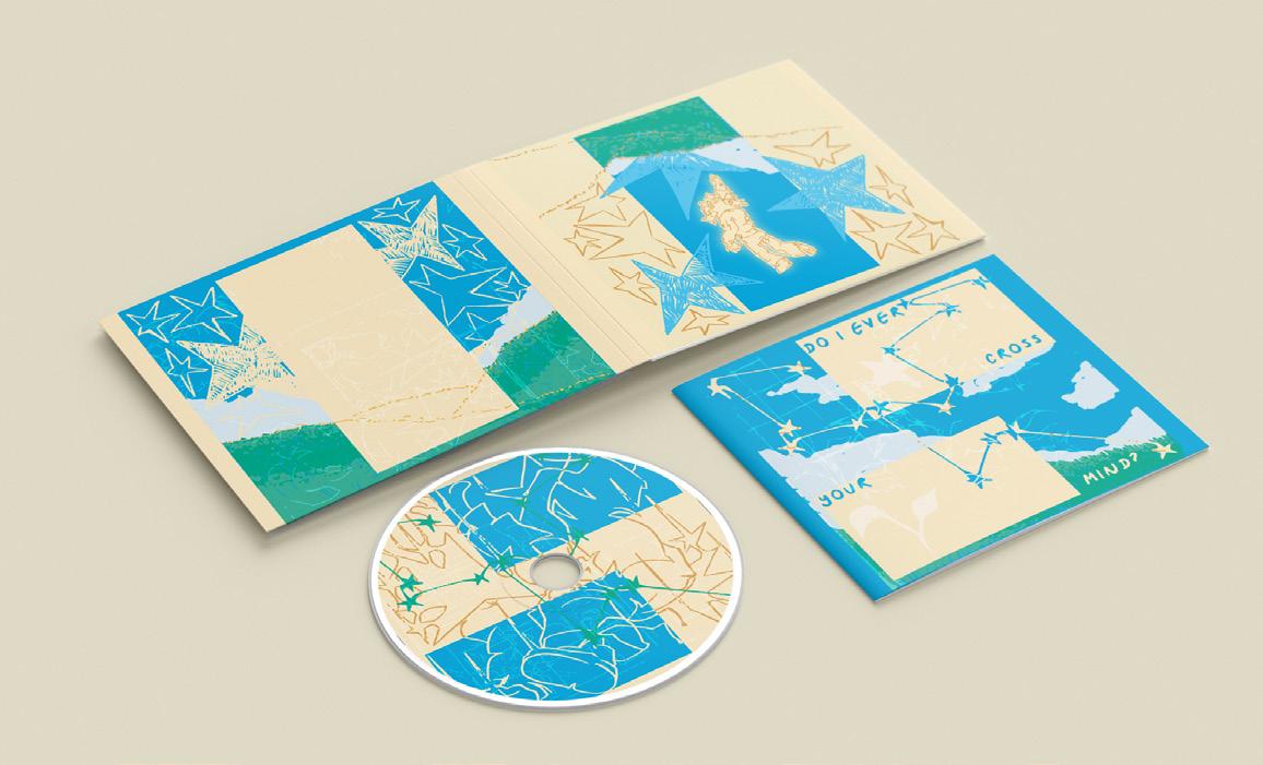
Delicia: Music in Motion is an expansion of my dissertation project, embedded in research and analysis of the effectiveness of moving image in the music industry, especially considering the rise of shortform social media content and shortening attention spans. While some argue that the music video is a dying art, I have evolved it into a moving image CD cover for this project. Working with local band Delicia, I designed an alternative cover for their new single Talk About It with an animated visualiser triggered by AR.
TILLY BUTTIFINT
I am a creative and community-focused visual communicator with experience in branding, murals, and workshop delivery. Confident using Adobe Illustrator, InDesign, and Photoshop to develop concept-led design for both digital and physical spaces. I have a strong interest in socially engaged design, education, and community-based creative projects.
Signs You can See
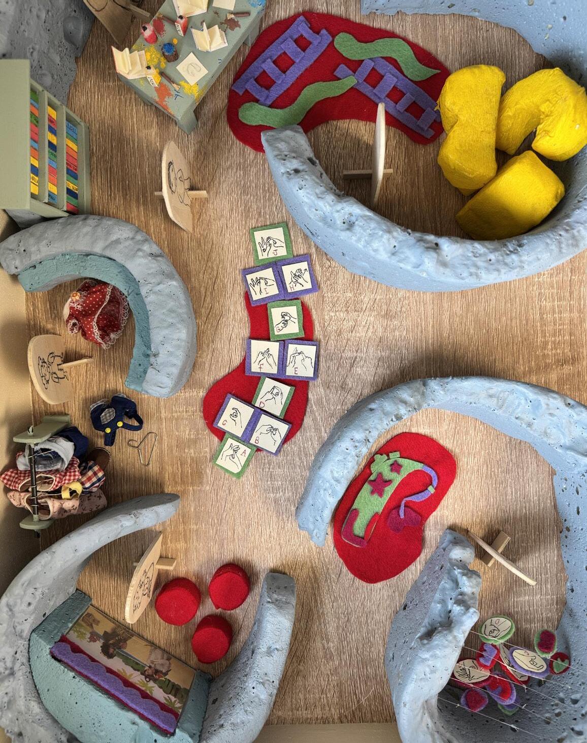
For this project, I am expanding my research on the suppression and sidelining of sign language. I want to address the fundamental right to community and explore new possibilities for understanding between signed, written, and spoken language. This project is a socially and environmentally focused campaign, where I advocate for the rights and inclusion of deaf individuals.
PATRYCJA
CHICIAK-SKORA
I am a designer exploring subtle and profound stories found in unexpected moments and places, working across drawing, mixed media and printmaking. Growing up in Poland in a brutalist housing block taught me to notice beauty and potential in overlooked spaces. My work is informed by the tactile qualities of traditional processes, adding texture and depth. I believe art can connect people, tell stories and bring meaning to everyday life.
Stepping into Wellbeing
The starting point of this project was the NHS 5 Steps to Mental Wellbeing: connecting with others, being physically active, learning new skills, giving to others, and paying attention to the present moment. During the development of this project, I explored how these ideas shaped my everyday life and practice. The work aims to resonate with those concerned with wellbeing, offering understanding and encouragement during challenging times. The outcome is a self-authored body of work.
LILLI DADKHAHKANDOVAN
Hi! I’m Lilli, a multidisciplinary storyteller that has a passion for history, the fantastical and mythological.
A World Away from Here
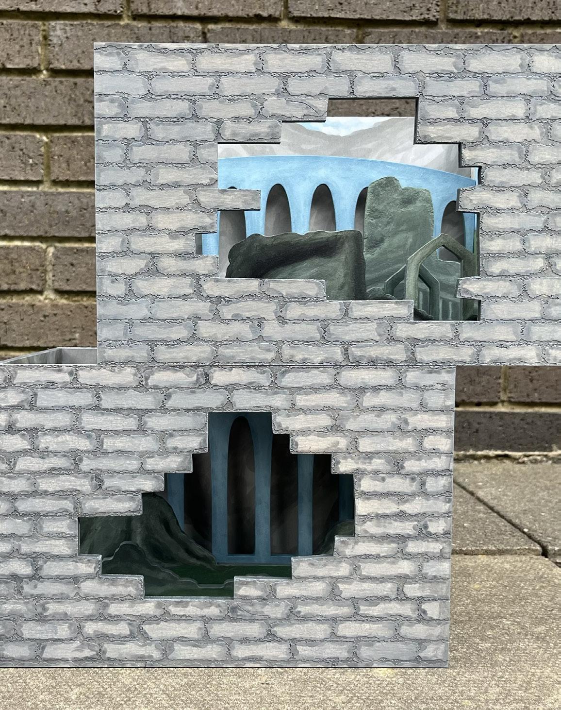
My project comes from my struggles and coping mechanisms; visualising a pocket of space to retreat into. Escapism can take many forms, for me it’s daydreaming of a world held stagnant in time.
A World Away from Here, is a 3D space that stems from my mind, allowing you as the viewer to peak into where I hide and seek solace from. The bricks you are faced with are reminiscent of ruins, concealing a window into this hidden world. To endlessly wander ruins with evidence of existing life surrounding you, brings a comfort that even if you are alone someone has walked the same path as you have before. Leaving marks of hidden stories for you to forever interpret and unravel.
MARTEN DARKIN
I work with printmaking and hands-on analogue processes, making clunky, quietly irreverent nonsense. I enjoy getting covered in ink, yelling at the government, and making bad art. I blend traditional methods with forwardthinking themes, collecting skills and brute forcing them into modern sensibilities.
Weapon of Creation
Pulling apart the threads of oppression, agency and empowerment, this project unravels the question of why people make by hand. Why do we need to create? Why put the effort in? With the world doing its best to divide us, making can bind us back together again. This installation works to give a space for people to create together and have a reason to make with your own two hands.
MEGAN DAVIES
My illustrative work always starts with drawing, whether in ink, with watercolour or using pencils. I am drawn to Gothic themes and like to weave historical contexts into my work. I have designed tarot cards and explored stained glass as a motif for editorial projects.
Nature Spirits
This project focuses on folk horror. I’m interested in the way landscape is used as a liminal space for past and present to meet. As part of this, I have investigated my local landscapes.
ISABELLA DEAN
The work I create often centres around shared experiences, whether it is through collaboration, collective memory, or creating connections between people. I’m inspired by the mundane moments of everyday life, using them as a way to spark conversation and bring attention to what is often overlooked.
Homesick
Homesick is a project that explores my personal experience of homesickness while at university. Over the past few years, I found that homesickness was the hardest obstacle to face. Adjusting to new spaces and being far from familiarity can easily become a lonely and exhausting experience. I wanted to capture some of the emotions I have struggled with and bring attention to the unspoken feelings of homesickness.
MOLLY DIAMOND
I’m a graphic designer and illustrator making loud visuals with attitude. My work mixes raw illustration, bold design, and DIY energy to create pieces that feel chaotic, honest, and alive. Inspired by punk culture, street graphics, and underground art, I use design to challenge, communicate, and leave a mark that sticks.
Punk 101
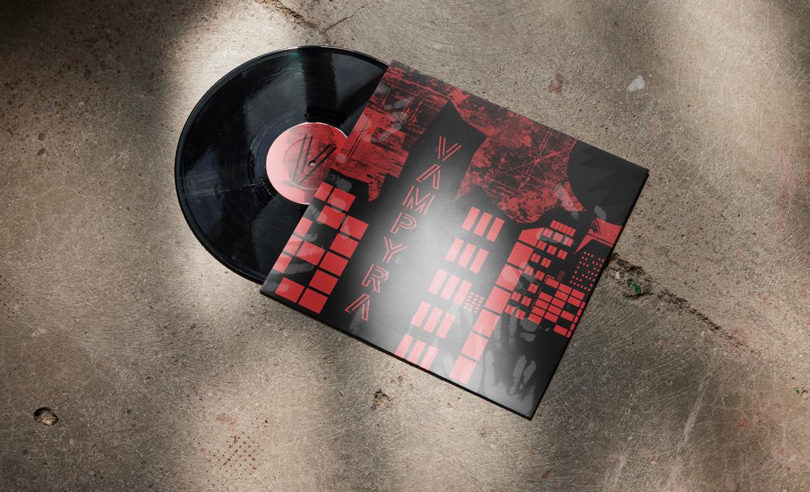
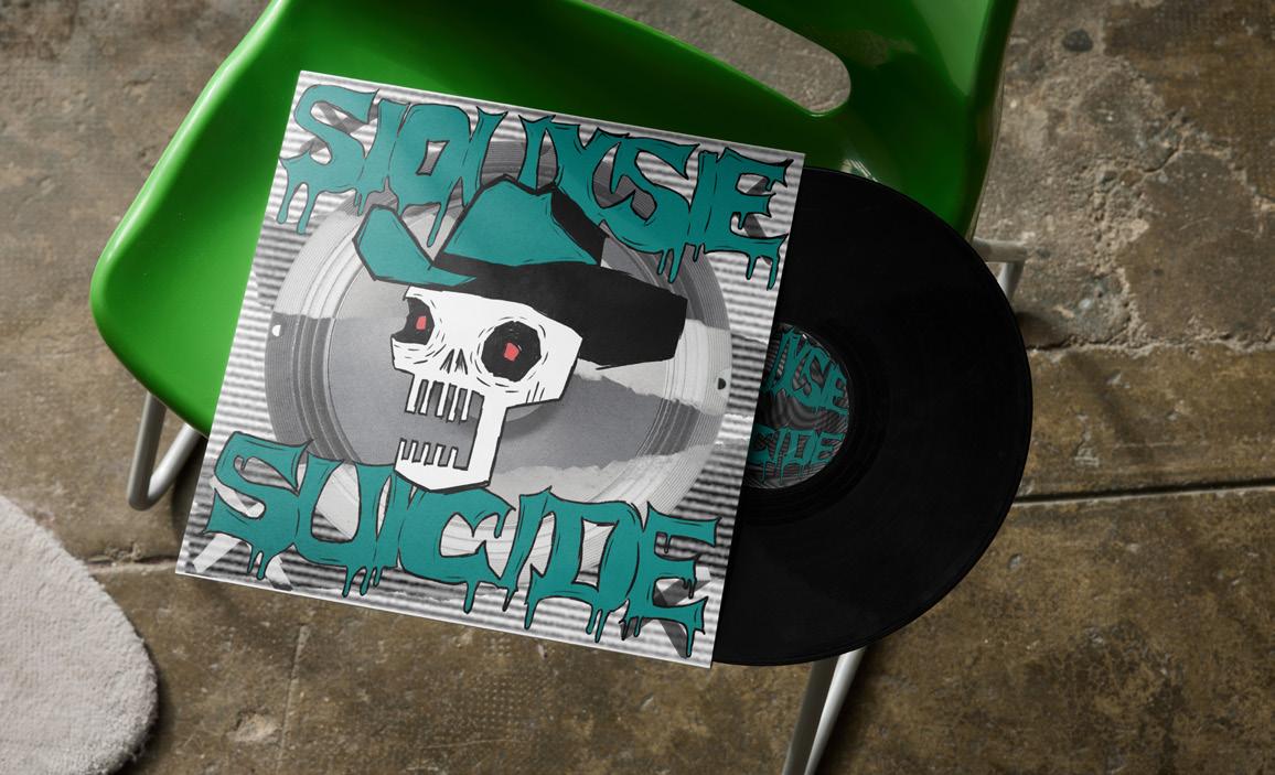
This project explores the revival of punk culture in modern music through the design of vinyl record covers for three contemporary punk bands I have seen perform live. Inspired by the resurgence of vinyl records and the continued influence of punk aesthetics, the work combines traditional punk visual language with modern graphic design techniques. Through typography, collage, texture, and bold imagery, the designs reflect the energy, rebellion, and DIY ethos associated with punk culture. The project also investigates how physical media and live music experiences remain culturally significant in a digital age, highlighting the relationship between music, identity, nostalgia, and visual communication.
AMY DUNN
As a disabled visual communicator, I am inspired by my special interests. One of these being history and how it impacts our dayto-day life. Due to my disabilities, I see life a little differently and can bring new ideas and perspectives to projects. In my professional practice, I draw on skills from illustration and printmaking. However, in my own time I use mixed media to create personal pieces.
Portrayal of a Woman
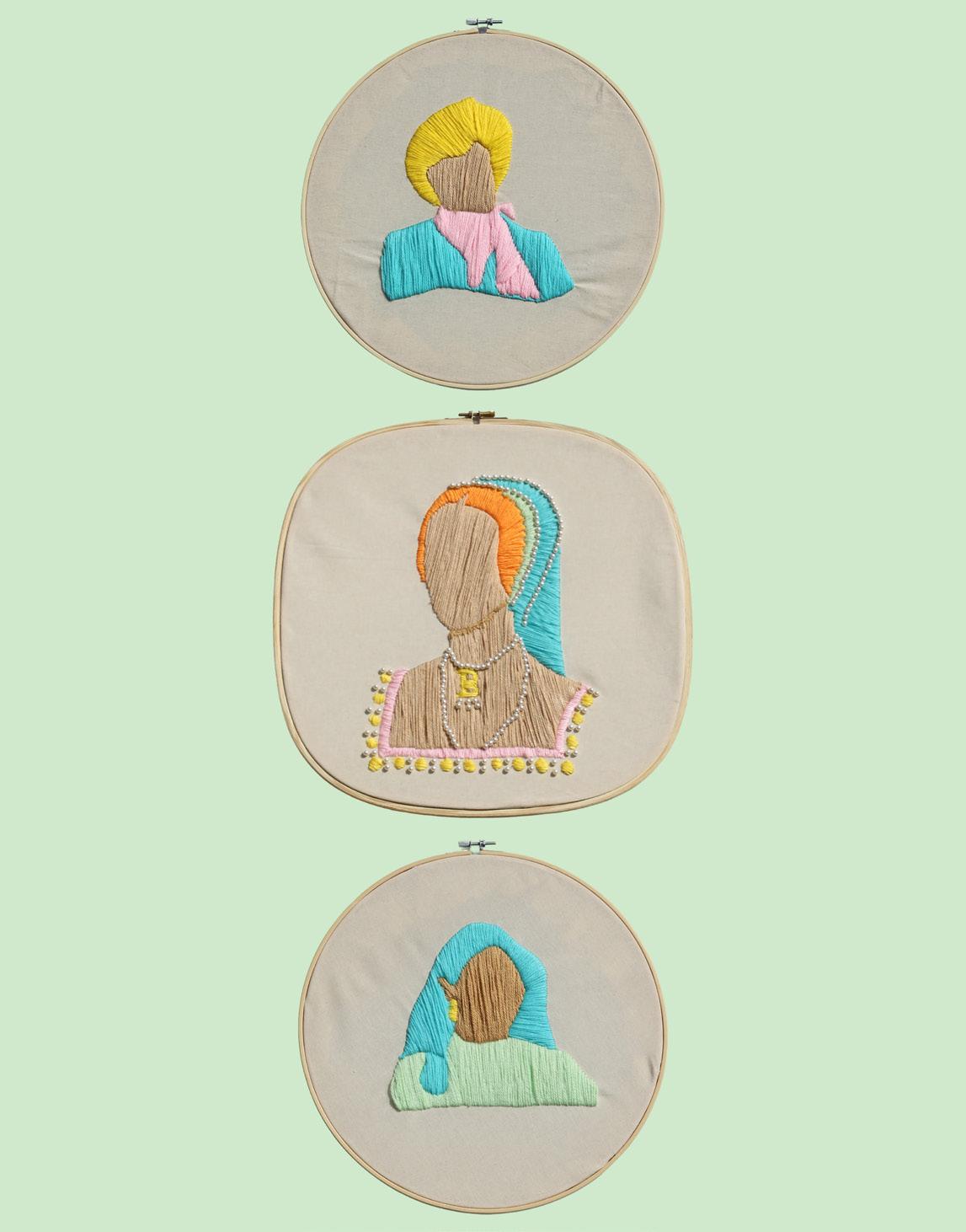
This project brings attention to how women have been treated through history by the media and people in power. To do this, a connection has been drawn between the stories of Anne Boleyn, Princess Diana and Meghan Markle. All three women have had life altering events happen due to the media’s treatment. The use of embroidery brings the pieces back to Anne’s time and the bright colour scheme creates a more modern feel.
TILLY EDGAR-HYDE
My practice explores communication design as a tool for social awareness, focusing on issues that are often overlooked or misunderstood. Through a combination of bold visual language, typography, and concept-driven outcomes, I aim to create work that is both engaging and thoughtprovoking. My recent project shifts from a personal, zine-based approach to a wider campaign format, allowing for greater public interaction and impact. I am particularly interested in how design can challenge assumptions and encourage audiences to reconsider their perspectives. Ultimately, my work seeks to balance aesthetic clarity with meaningful messaging, using design as a way to inform, question, and connect.
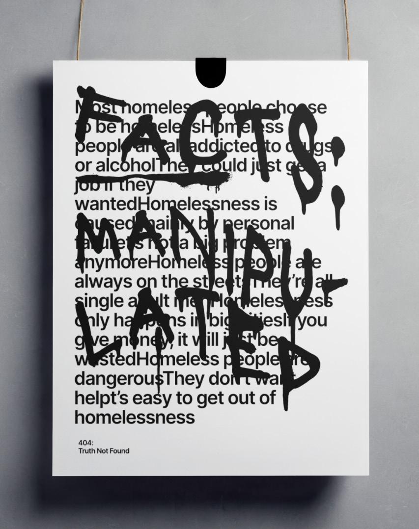
Street Zine: Pavement
This project explores homelessness through informal conversations, portrait photography, and first-person storytelling. I have investigated how editorial design and documentary photography can humanise people experiencing homelessness and challenge dominant stereotypes within urban visual culture.
CHARLIE GEORGE
As a multimedia designer creating textile work, character illustration, 3D art, printed pieces and more, I am mainly driven by themes of anthropomorphism and the symbolism you can convey through it. I find myself captivated by the many creative processes I can use to create personality in my art through purely design aspects. I like to focus on the unusual and disturbing aspects of life and society in my designs and convey message and meaning within my work.
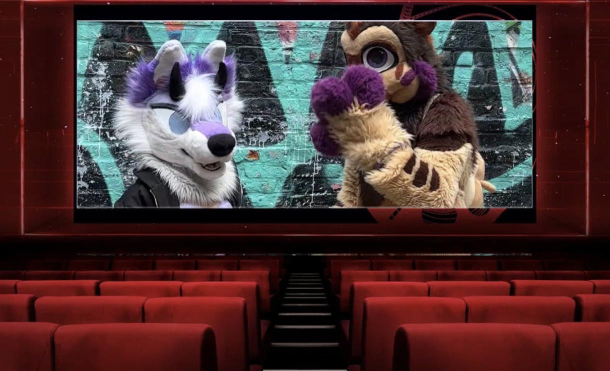
The Hidden Side
The term ‘furry’ describes a diverse community of fans, artists, makers and creators of every kind. Most furries create their own anthropomorphised animal character (fursona) which can function as their avatar within the community. For this project I focus on the lack of representation, products and accommodations made for anyone who is not cisgender male identifying within the fandom. I have based my research around empowering the majorly underrepresented.
EVA GILBERT
My main area of art is illustration. I am a book collector, and I illustrate to one day see my work in books. My favourite way to illustrate is to make my own characters. I design my characters based on what I want to see as a child. I fill in what I wanted to see on television or in books. My main way of illustrating my characters is using the comic format. I love to create a story with my characters so using a very visual medium to show my ideas is the best for me. For the comics I write my own stories. I like it when my characters’ personality plays off each other, so to do this I write what I find is the funniest. I also do other ways of illustrating such as Riso printing. I like to split the colour channels into CYMK and print poster-like illustrations of my characters.
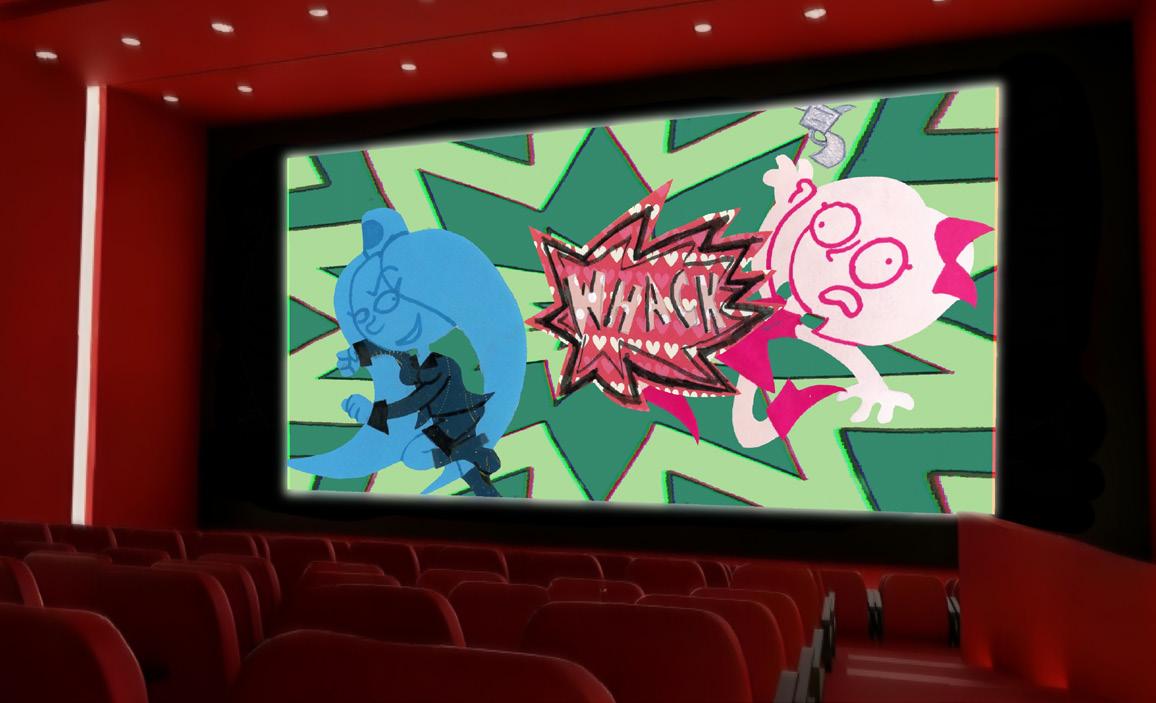
Gva the Reluctant Princess in Gva vs Melic
For this project I have created a franchise. I have created a cartoon styled project that can appeal to an age group that companies have forgot due to not wanting to take risks. I have focused on character design, subverting expectations by not making the main characters fall into stereotypical tropes.
ELLA LOUISE GILBERT
As a graphic and motion designer, I create impactful campaigns that inspire change – particularly regarding environmental, cultural, and health-related issues. My work explores design as a tool for storytelling and sharing awareness, often inspired by my own personal experiences and interests. By translating complex, underrepresented topics into accessible narratives, I use design as a tool to educate and inspire. I am dedicated to driving positive change and applying my skills to causes that truly matter.
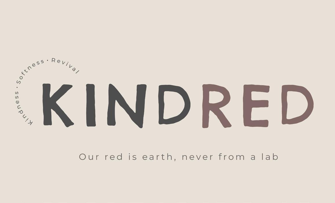
Kindred (Kindness, Softness & Revival)
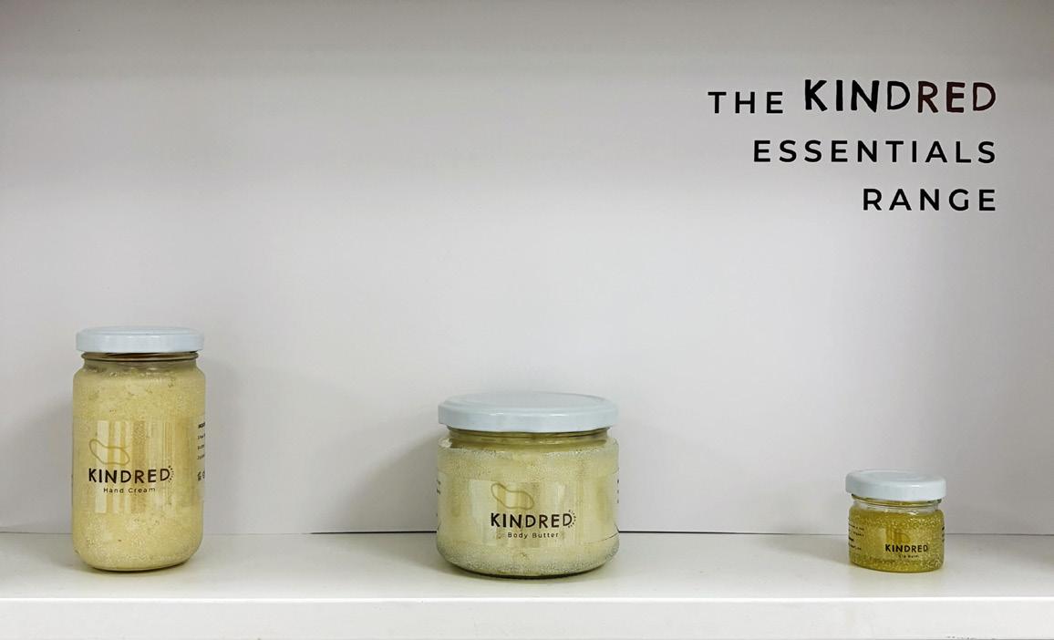
Kindred exposes the hidden realities of animal testing in the beauty industry. This awareness campaign informs audiences surrounding these industry practices and evolves into a transparent brand system, demonstrating how clear packaging and ethical sourcing can encourage conscious consumerism. The brand functions as a cruelty-free, vegan, and eco-friendly identity, as well as an educational system designed to promote transparency and accountability within the beauty world.
OLIVER GODLA
My work is a way of expressing and understanding difficult themes as I hope it helps others who go through the similar experiences through ways of storytelling and illustrations. I am inspired by music. My goal is to see my work in 2D and 3D settings.
Music on the Move
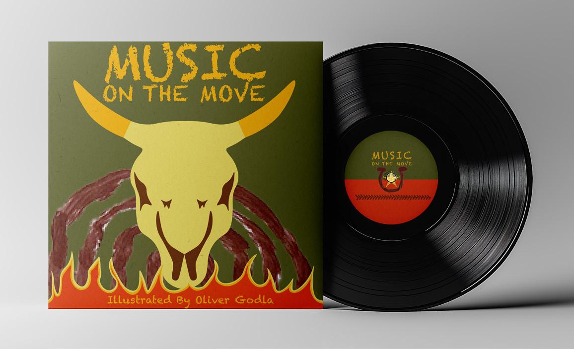
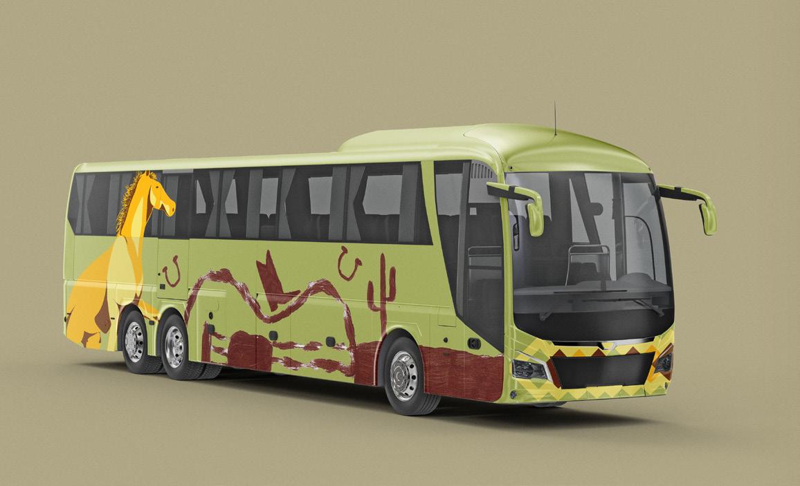
My project engages with music and how it connects people, with the idea of a music bus to be a mobile gallery. I chose this project as music is a big interest of mine and could relate to my research project of aging in portraiture as music can reflect and shape us as we age. It focuses on illustrations on the exterior of the bus, and merch such as bags, caps, record sleeves, and posters.
EDDIE GRAVES
I’m a mixed media illustrator focusing on pen, oil pastels and printing techniques, whilst using a mix of traditional and digital techniques. I want to be the artist that I wanted to find when I was younger. My process begins with an exploration of colour, allowing me to translate my project briefs into a visual explanation I can understand. Through my practice, I aim to comfort, support and educate people – particularly on topics that are often ignored, forgotten or shunned away from, inviting audiences to start conversations, challenge their feelings and maybe even heal a little.
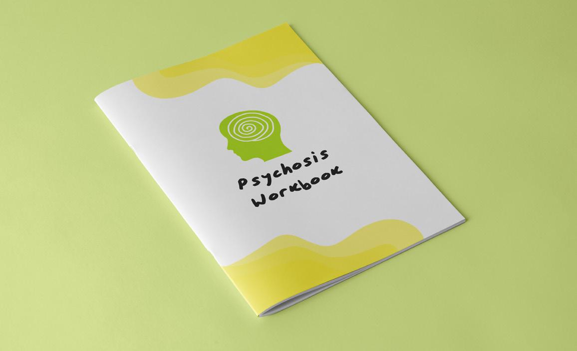
Surviving Psychosis
This project explores both my own experience and the experience of others who are, or have in the past, struggled with psychosis. My goal is to introduce an understanding of psychosis and encourage a sense of not being alone through shared experience, by narrating my experience without the shame or censorship that is often used when addressing similar topics.
LABONI HANNAN
I am an illustrator whose main medium is focused on digital art. I am someone who has a deep passion for character design, which illustration allows me to do by being able to explore visuals, emotion and storytelling within each design of a character. I thoroughly enjoy creating characters with backstories and motivations, because for me it gives life to them, stopping it from just being illustrated designs. Illustration overall has been something that I have done ever since I was a beginner artist at 11 years old. Digital art allows me to have freedom with what I create and lets me share it in an easier way.
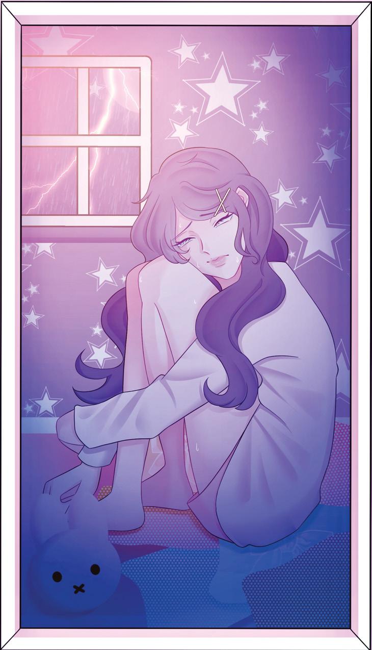
The Comfort of Cute
This project explores how cute and playful aesthetics can communicate experiences of suffering in young women. It shows the contrast between emotional struggles faced by young women like vulnerability, pressure and anxiety using soft visuals. This project shows how cuteness can be used as a visual comfort and a mask to reveal complex experiences.
IZZI HART
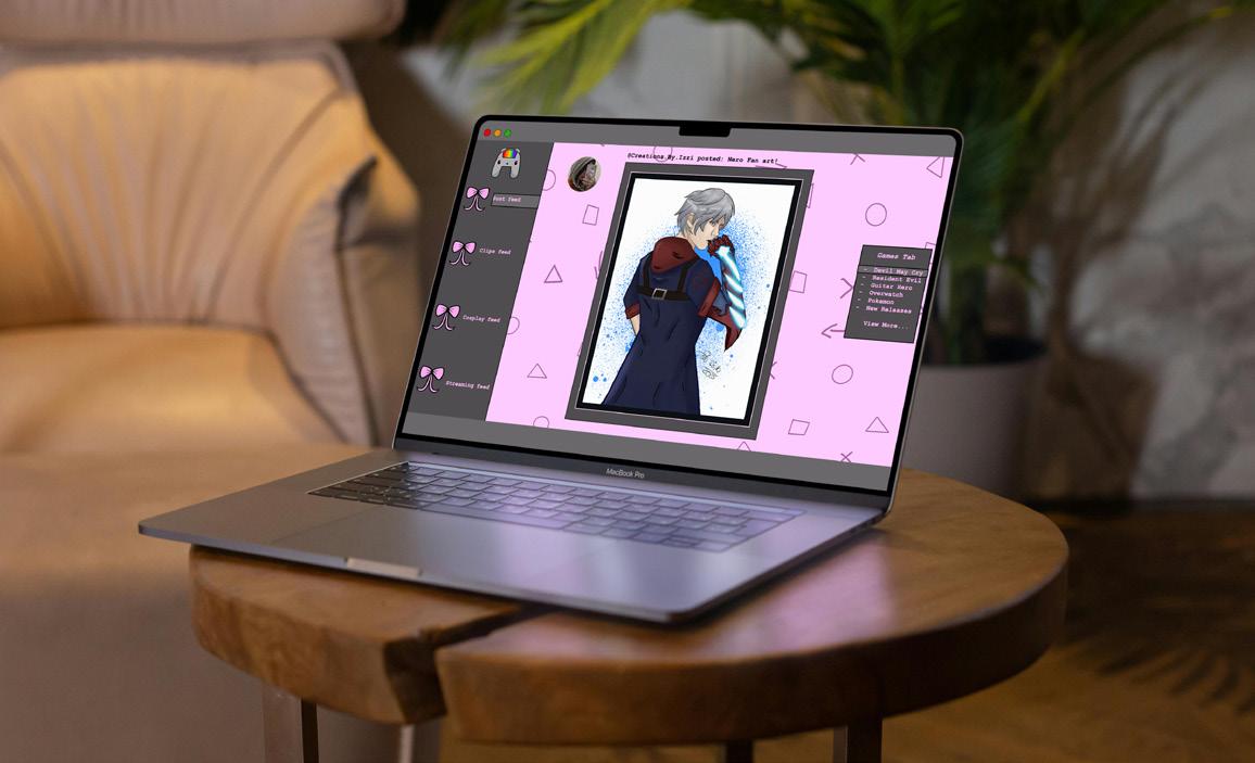
Hi! I’m both an illustrator and graphic designer determined to make your advertising dreams into reality! Using the powers of my iPad, Photoshop and InDesign, anything you think of, I can make. I specialise mostly in video game advertising, posters, mock-ups, you name it. However, I am always up for new challenges. My illustrations are detailed and can come in ranges from sketches to fully rendered works. My graphic design work is bold and eye-catching, merging modern day elements as well as new, futuristic ideas to make it really stand out amongst the rest.
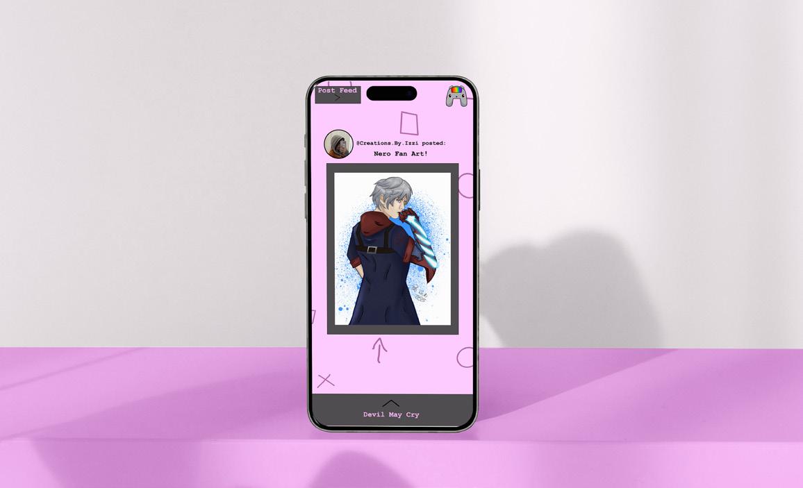
ASD Gaming
This project highlights the autistic community within the gaming fandom. I have created mock-ups of a social media website/app specifically designed for this community, providing gaming updates, a social media aspect for people to post art, cosplays, and screenshots from games. It’s fully customisable to the user for prime accessibility.
SIXUAN HE
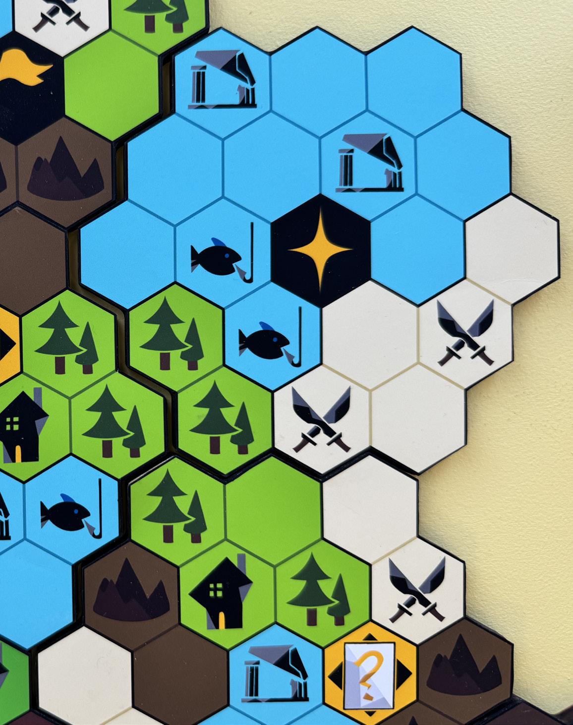
Innovative and passionate about communicating with my audience, I am an illustrator and character designer focused on game development. I create engaging characters and interactive worlds, emphasising player experience, meaningful choices, and visual storytelling that enhances gameplay.
Expedition Seven
Embark on an epic adventure where strategy, teamwork, and careful planning are your keys to survival. In Expedition Seven, players explore a modular map, gather resources, and choose their routes wisely over the course of seven days. Every decision matters, as your team must prepare for the ultimate boss battle at the end of the week. Will you reach the end before time runs out?
MILLY HUNTER
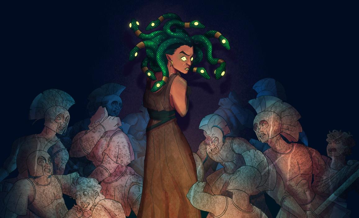
Hello, I’m a multidisciplinary illustrator and animator. My practice blends contemporary storytelling, emotional resonance with bold and graphic visuals. Often working in digital mediums, I find that my creative inspiration often comes from indie animators and from combining classic fantasy and sci-fi conventions.
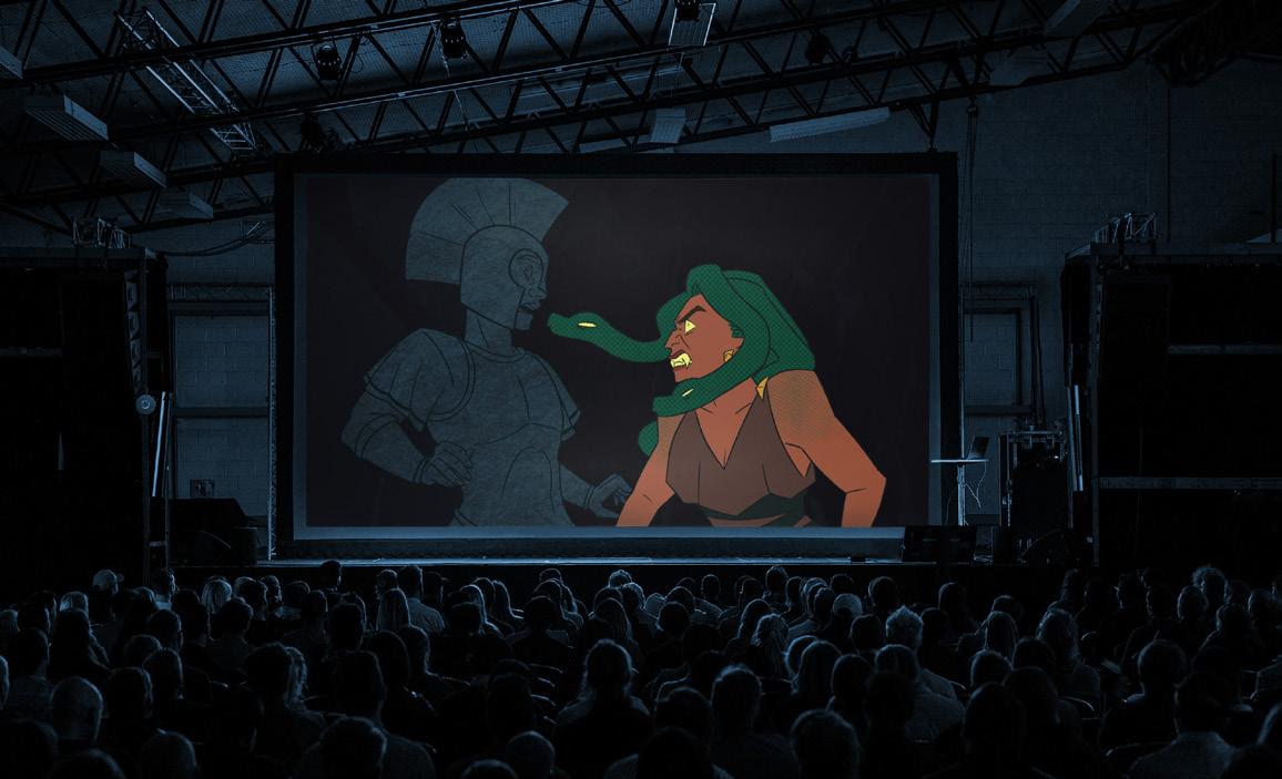
Monstrous Feminine
My project Monstrous Feminine is a reimagining of some of Greek Mythology’s most famous female monsters – Scylla, Lamia and particularly, Medusa – but told through the perspective of their feminine rage. Inspired by my appreciation for unconventional representations of women characters, I wanted to open up a conversation about how we treat women’s emotions – particularly their anger – expressed through illustrations of each character, in addition to a short film, animated frame-by-frame, combining my love for digital mediums and collage.
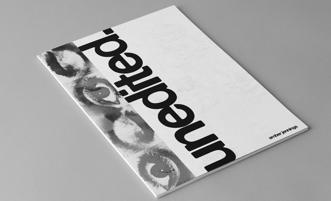
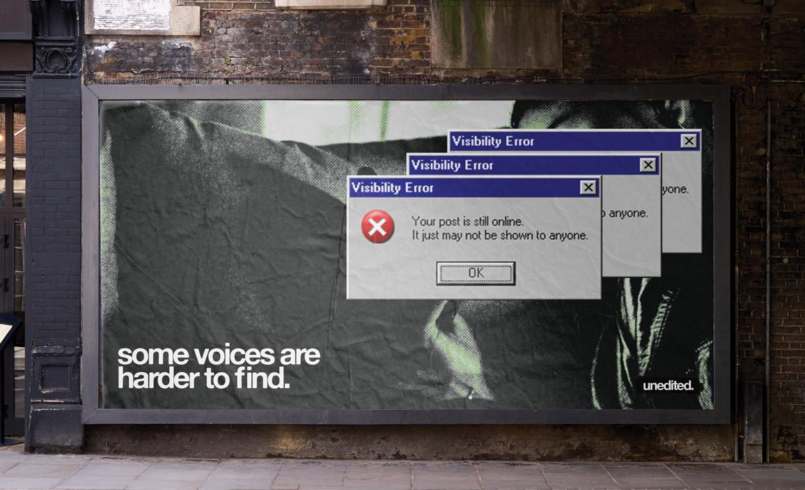
AMBER JENNINGS
Specialising in graphic design, with a background in filmmaking, I have a particular interest in how visual communication shapes meaning and controls what we see.
unedited
My final project, unedited, explores how language is edited, filtered, and removed before it reaches an audience. Focusing on media, institutions, and digital platforms, it uses redaction, absence, and confrontational text to highlight what is missing rather than what is visible. By mimicking familiar formats such as advertising, public notices, and editorial layouts, the work questions how information is presented and who has the authority to shape it.
Presented as a public-facing campaign, unedited spans posters, publications, a website, and interventions in everyday spaces, placing critical messages within environments usually associated with control. Influenced by street-level visual culture and editorial systems, my work aims to challenge authority and encourage audiences to think more critically about the information they consume.
AMANDA JULIER
I am an illustrator who enjoys using a mixture of traditional and digital mediums. My work is inspired by the connection between history, mythology, cultures and people, and I explore this through visual storytelling and imagery. My style changes between realistic design and a more simplistic style, however regardless of which style I’m using, I aim to involve as much detail as I can in my work.
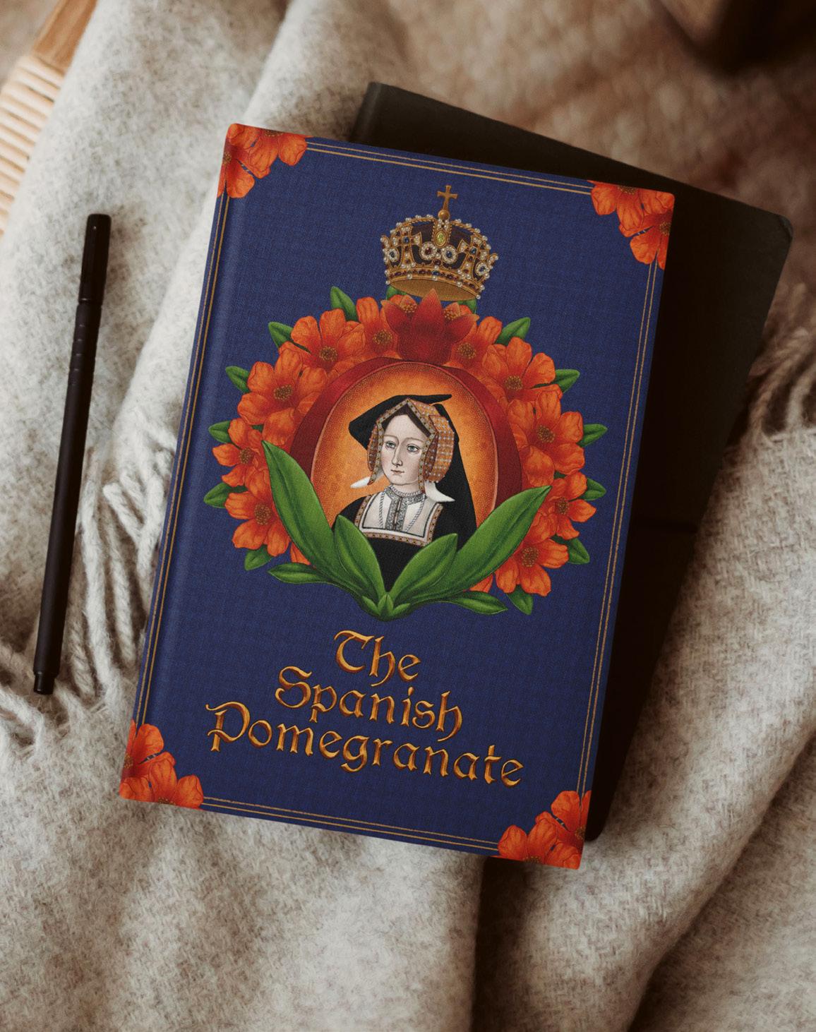
The Spanish Pomegranate
My final major project focuses on the story of the life of Katherine of Aragon, the first wife of Henry VIII. Throughout my life, I have only learned about the six wives through their tragic ends, immortalised through the rhyme of divorce, beheaded, died, divorced, beheaded, survived. These women are so much more than that, and in this project I created a publication, aided by illustrations, to explore and understand the side of them not often discussed.
HALINA KAWIK
Hello, I am a graphic designer working across campaign and pattern design. I enjoy creating bold and engaging work, using strong colour and composition to communicate my ideas. I work digitally, combining photography with graphic elements and type. I like exploring how a single idea can be developed across different outcomes, especially within campaign work. My work often takes inspiration from social, brand, and cultural contexts. I am interested in how design can communicate ideas effectively, while still being striking.
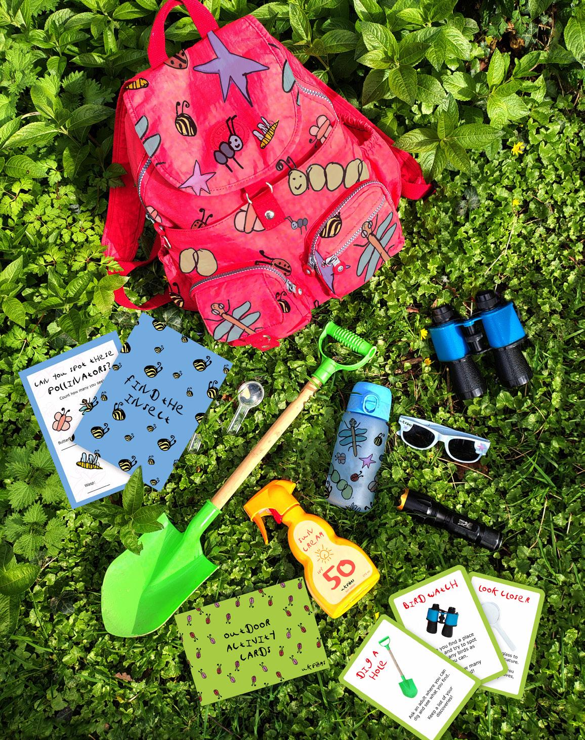
Reconnecting with Nature
I created a campaign that encourages young people to reconnect with nature. This project explores mental health, walking in nature, biodiversity awareness, and environmental responsibility. Research shows that regular exposure to green spaces improves happiness, focus, and emotional regulation, while strengthening community connection. The project experiments with visual identity, information design, and communication to encourage young people to interact with nature.
ZHIROU LI
My creative practice primarily focuses on graphic design, illustration, and character design. The themes of my work often revolve around animals, characters and nature. I am interested in using images to construct characters and scenes, aiming to create works that go beyond single images and convey a sense of narrative and emotional atmosphere. To do this, I like mixing different visual elements on the same page, rather than showing only one image at a time. I also care about visual storytelling: I want readers to be interested enough to read through my work even if they skip the words.
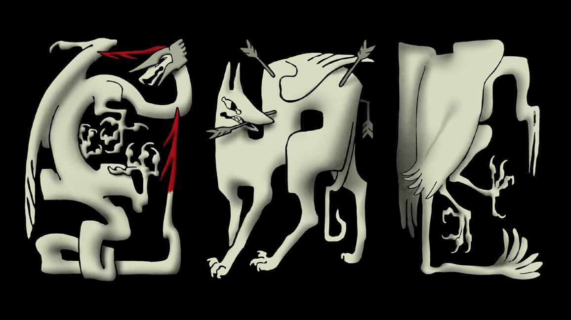
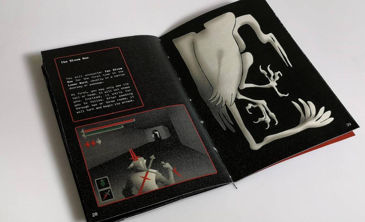
Severed Heads
This illustration collection takes the form of a video game instruction booklet, depicting a fictional medieval fantasy world. It should be noted that the video game described in the book, titled Severed Heads, does not exist in reality. The collection combines different types of visual elements, including character designs, maps, item designs, scene illustrations and texts, to recreate the nostalgic reading experience of an instruction booklet.
ZHIFAN LIU
I am deeply interested in design and strategic management modules, as they provide the frameworks to systematically structure my project management experience. These methodologies allow me to critically examine how design creates value, enabling me to effectively transform a personal narrative into a high-impact, systematic commercial brand.
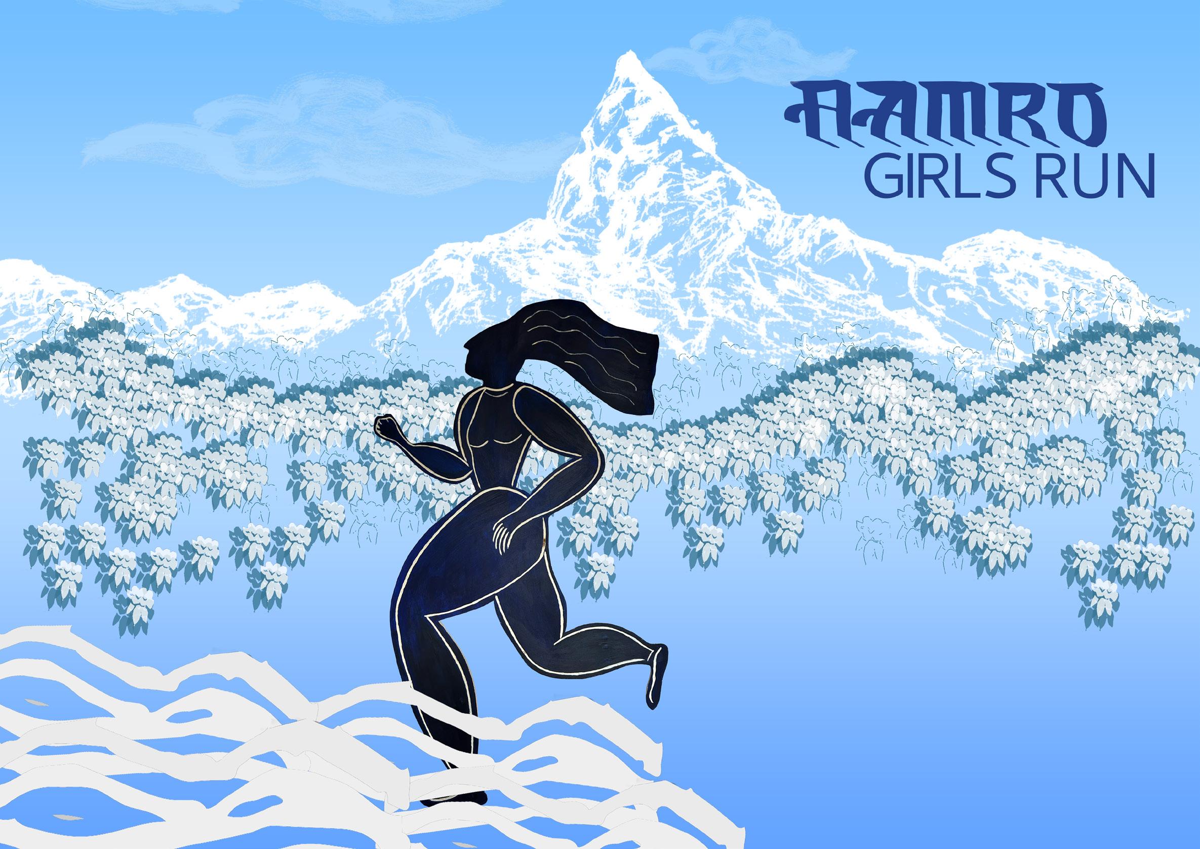
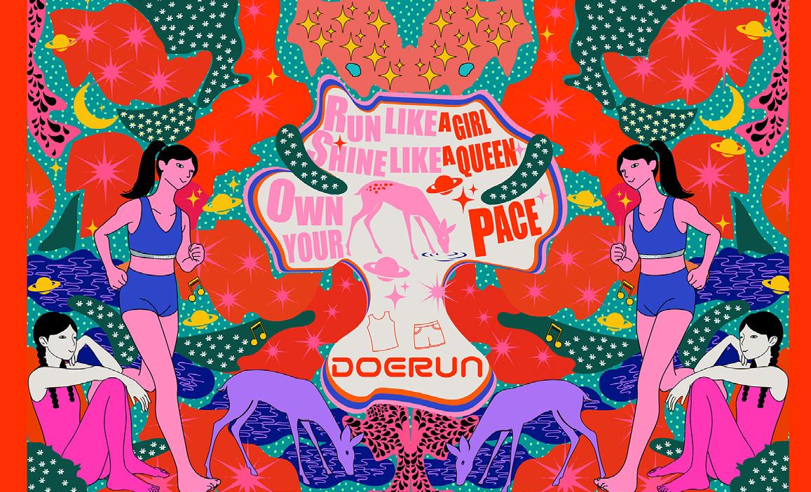
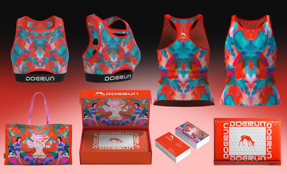
Doerun
Beyond the mainstream narrative of elite sports runners, I am more concerned with women’s sensitive and enduring resilience. The brand originated from my daily records as a runner and female designer: those moments of searching for rhythm in the pressure of life and gently persevering in exhaustion. This project focuses on the deep reflection of ordinary female runners, on elite sports culture, attempting to build a brand vision that is more artistic, quiet, and inclusive. Transforming running from the pursuit of extreme performance to a spiritual pillar that supports women’s daily lives, a process of breathing freely in a noisy world and regaining oneself in the rhythm and pulse.
HALA MADANAT
My practice is based on concept-driven visual communication, with design serving as a tool for challenging social norms, cultural expectations, and everyday behaviours. I’m interested in bold typography, experimental print techniques, and the relationship between text and image, and I frequently use minimalist visual systems to emphasise message and tone. Process is essential to my practice. I prioritise experimentation, refinement, and reflection, and I use both analogue and digital approaches to test ideas and refine results.
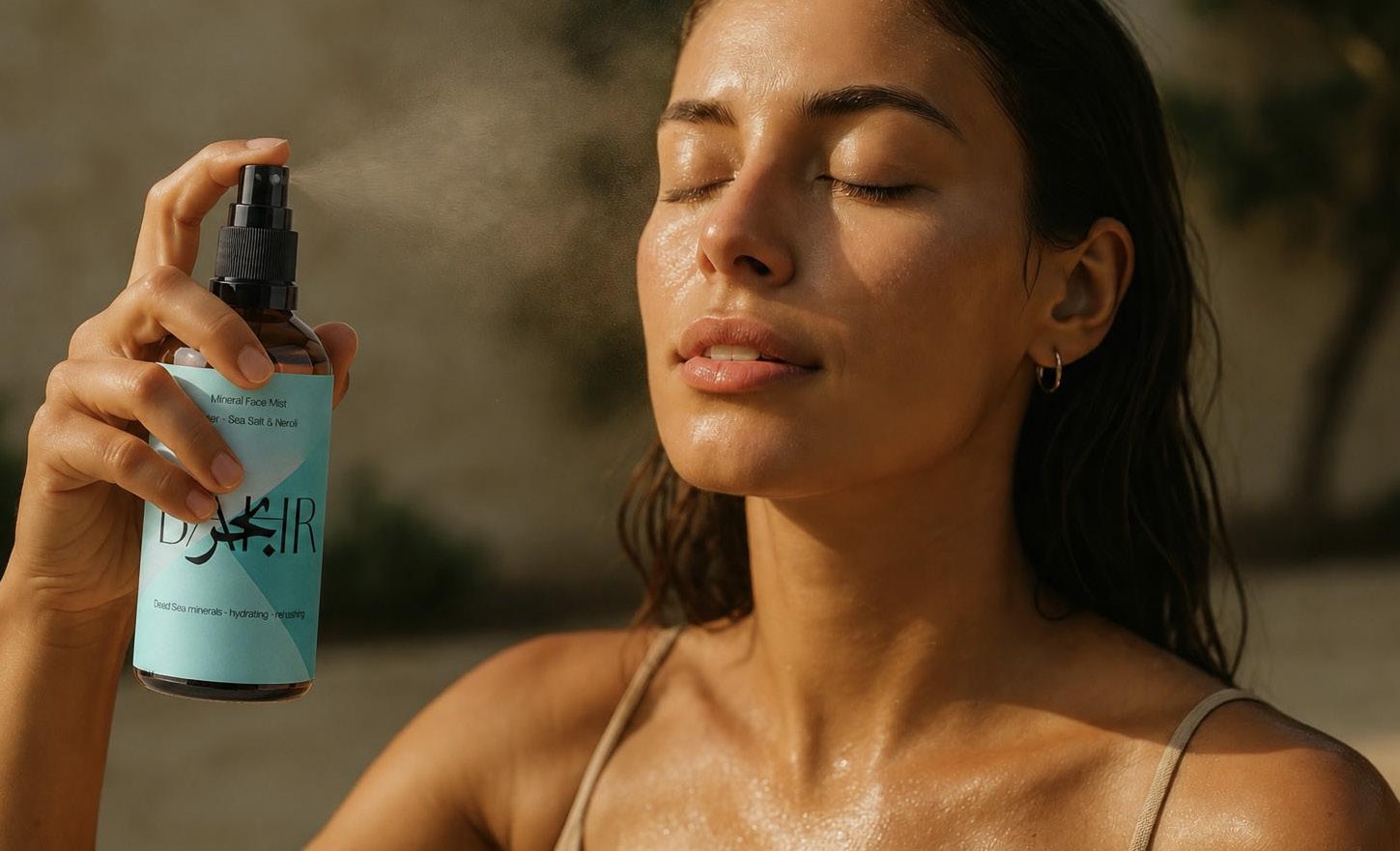
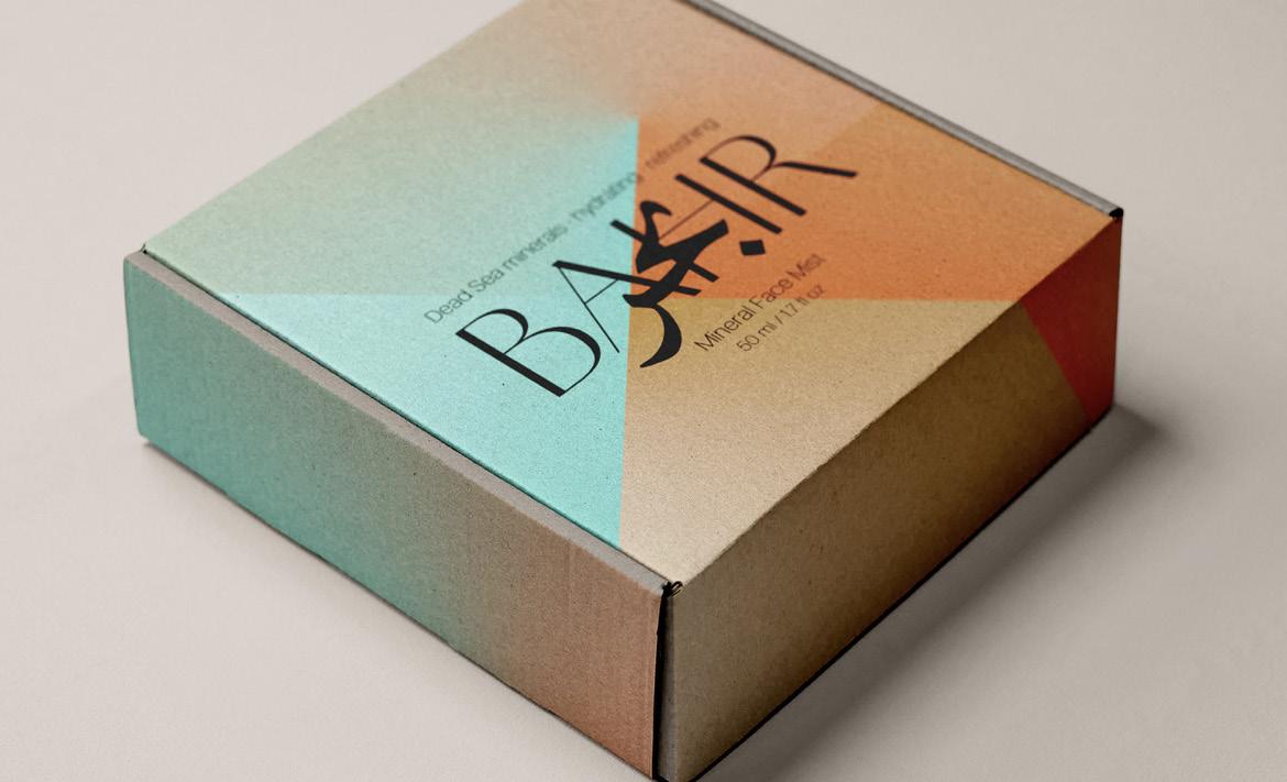
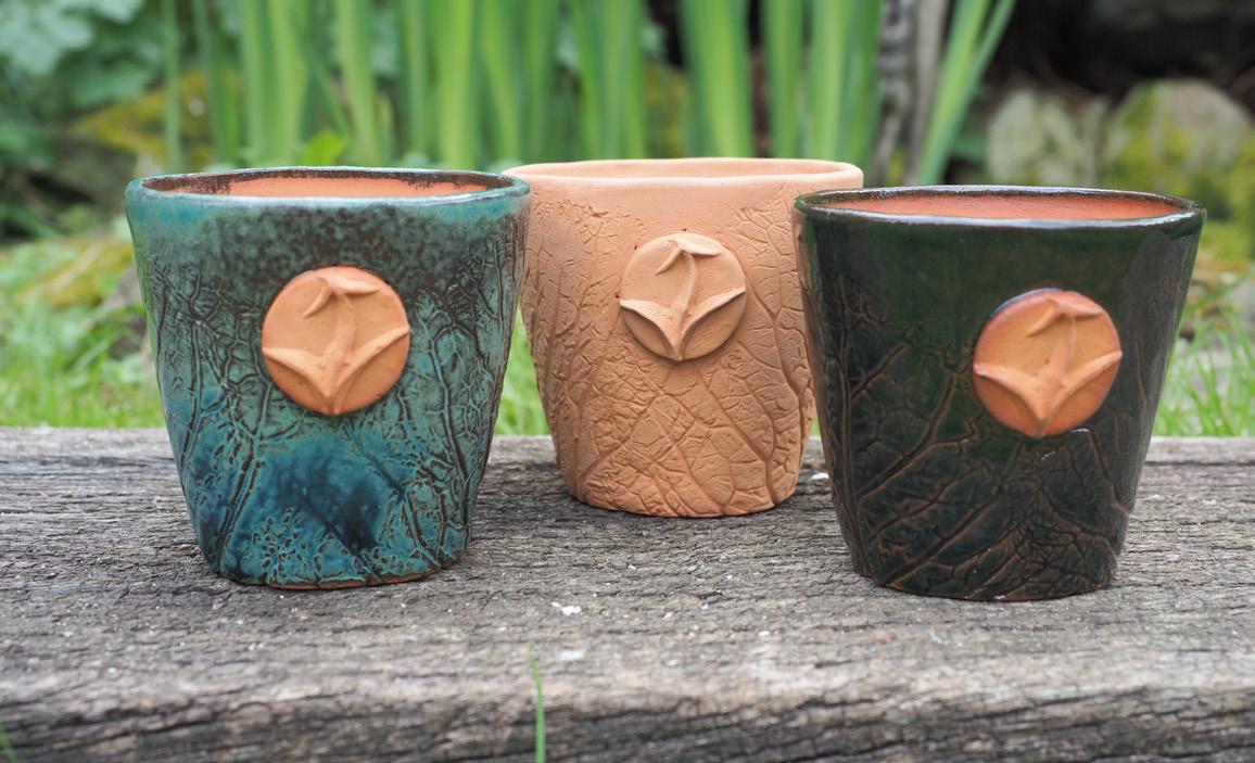
BAHR: Rooted in Nature
BAHR : Rooted in Nature explores the relationship between beauty, culture, and contemporary design through the creation of a culturally and commercially oriented skincare brand. The project aims to investigate how traditional Middle Eastern influences and natural elements can be adapted into modern visual trends within the beauty industry.
Inspired by the landscapes and minerals of the Dead Sea, the visual identity combines minimal aesthetics with sensory storytelling to create a calm and immersive brand experience.
NEISHA MARRIOTT
I am an illustration focused visual communicator, who has a huge enthusiasm for fashion. My work naturally reflects femininity, fluidity and playfulness, reflecting my character and having an emotional nostalgic connection. My inspiration stems from textiles, photography and textures. Having recently built up digital illustration skills, I am interested in progressing into branding and building consumer-brand communities through their visual identity.
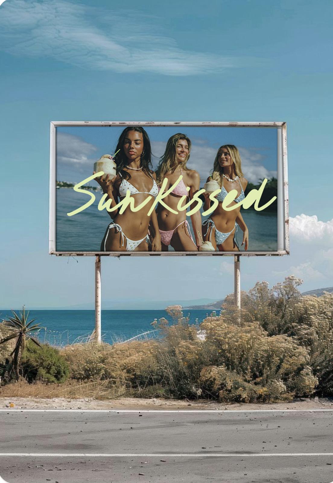
SunKissed
A project focused on the design, illustration and pattern making for a women’s swimwear brand. As part of the project there is a social media campaign, advertisements and package design.
MAISIE MASON
My practice spans photography and visual art, with a primary focus on acrylic painting. I am drawn to bold, bright colours and I utilise them as a language to convey meaning, emotion, and memories. My method is intuitive, letting layers of colour and texture come together to create meaning.
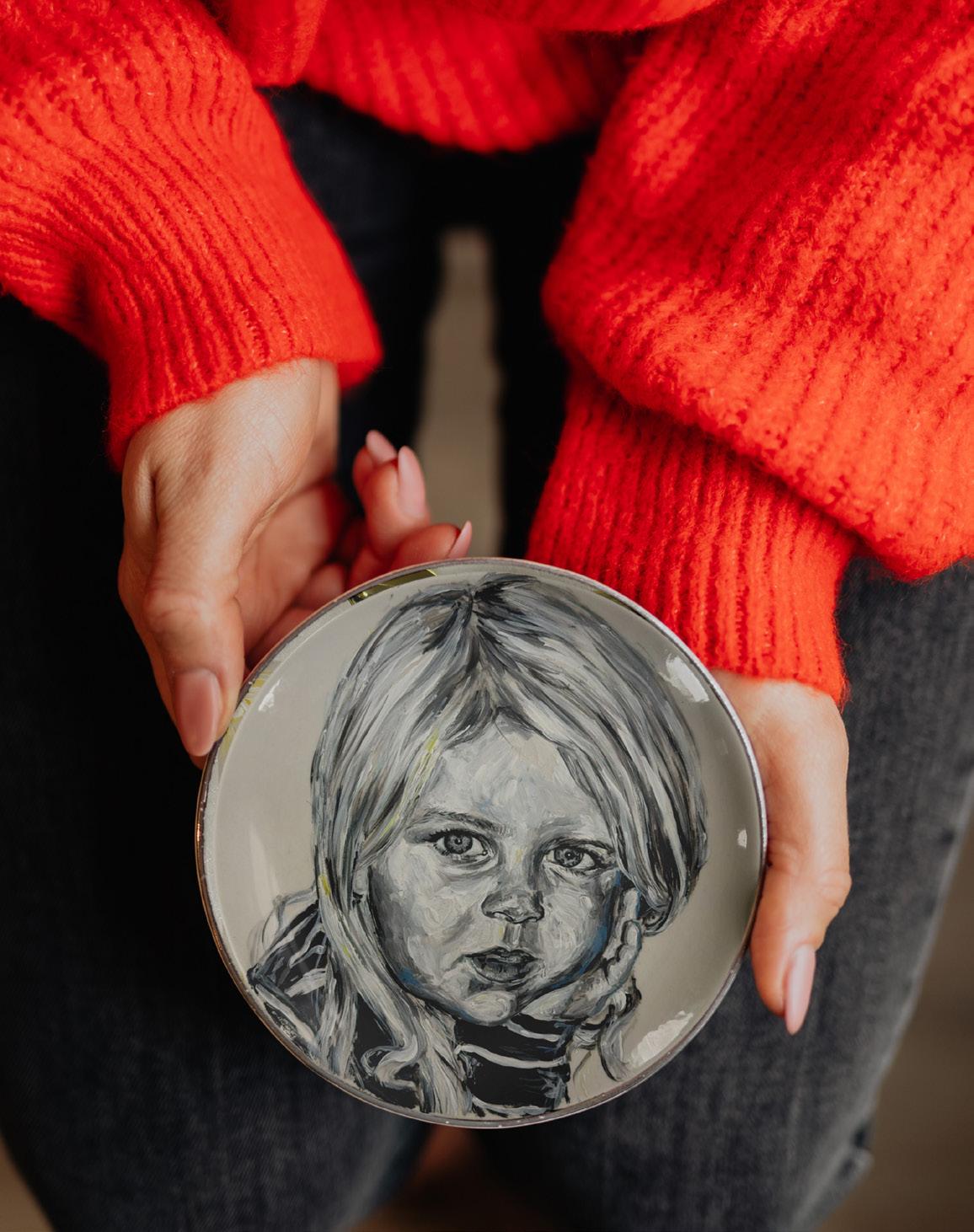
Traces of Us
My project explores how identity is shaped through everyday moments, routines, and relationships rather than major life events. Using childhood photographs and a dinner table installation, I reflect on memory, familiarity, and the passage of time. Each element focuses on everyday life, highlighting how subtle gestures of care and repeated experiences create a sense of comfort and belonging. By including imagery from both past and present, I emphasise how quickly time passes and how these quiet moments often go unnoticed. Ultimately, my work encourages viewers to slow down and appreciate the small, meaningful aspects of daily life that shape who we become.
ROBIN NEWBOLD
I’m a multi-media creative with a love for combining print and digital mediums into bright, bold publications and pitches. My goal is always to inform my audience, by marrying storytelling and strong typography to create cohesive, colourful, and communicative design. From printing and binding my own zines to working on UI design and editorial spreads, my work bridges the gap between the physical and handmade, and modern, bold iconography.
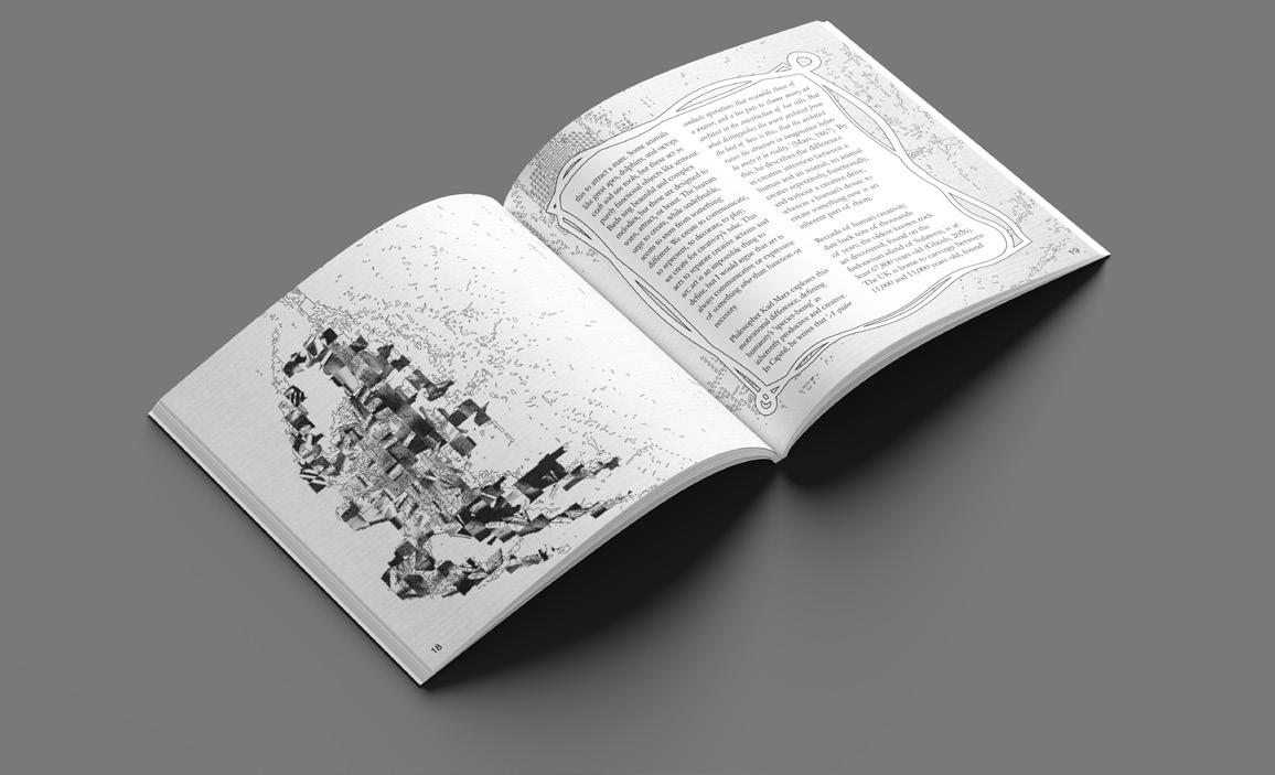
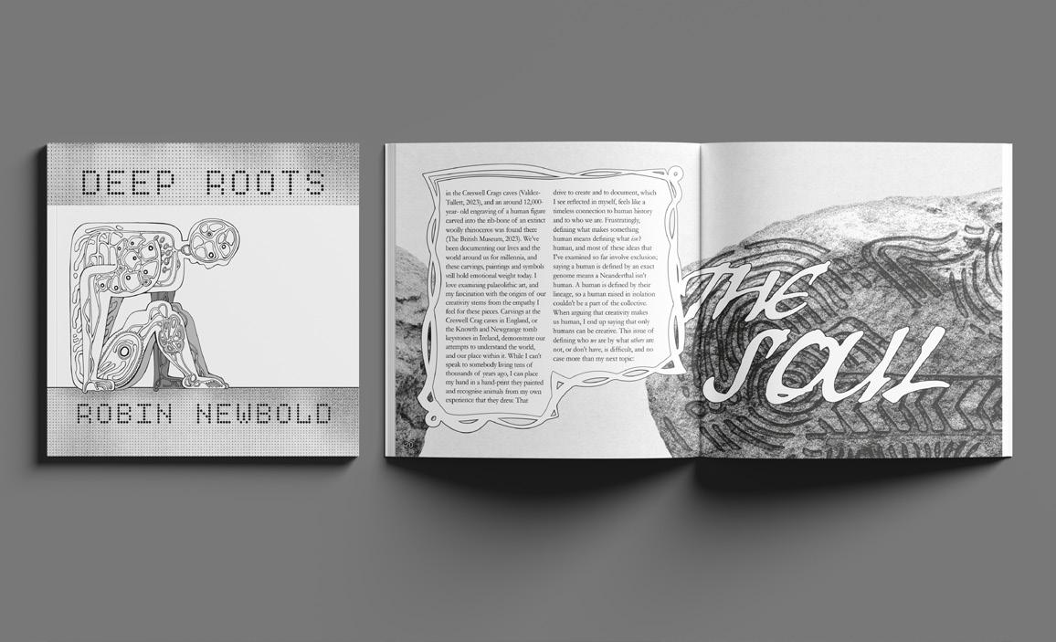
Deep Roots
A publication centred around what exactly it is that makes us human, considering ideas spanning creativity, the soul, lineage, and our DNA. Deep Roots contains writing on personal experience, alongside anthropological and philosophical perspectives, visualised through editorial design and sculpture. I aim to examine the facets of everyday life that can lead us to feeling inhuman, and how the history of our species has shaped who we are today.
ESZTER NOVAK
Hello, I am an artist, illustrator, and graphic designer with an incurable fascination for the weird, the comically obscure, the charmingly odd, and the wonderfully peculiar.
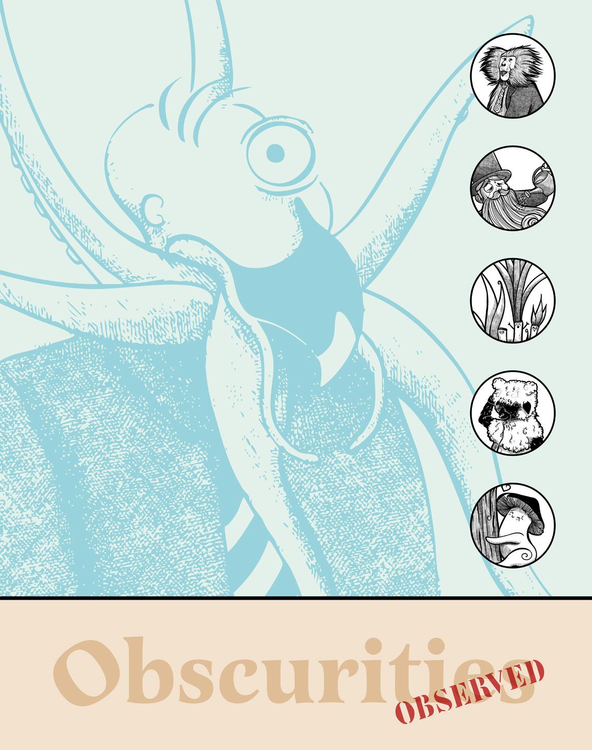
Obscurities Observed:
Sensing Beyond Vision
Have you ever thought about what words might feel like? What might they sound like, beyond their pronunciation? And how might these additional sensory layers shape memory and understanding?
Welcome to Obscurities Observed.
This project expands on my dissertation, the Obscurities book, and accompanying research on how visual humour affects memorability, by turning it into a multisensory installation.
It explores how visual communication can move beyond purely visual formats by incorporating additional senses such as touch and sound. I aim to investigate how engaging multiple senses can make communication more memorable, immersive, and inclusive. ,
RACHEL ORRIDGE
I am a multidisciplinary designer who uses the visual language of whatever feels necessary in the moment. I’m not committed to a single style yet; I’m committed to curiosity. I primarily work with Illustrator and other Adobe tools to create still images digitally. Until my visual voice fully settles, I create as a response to the world around me, with the hope of finding some meaning.
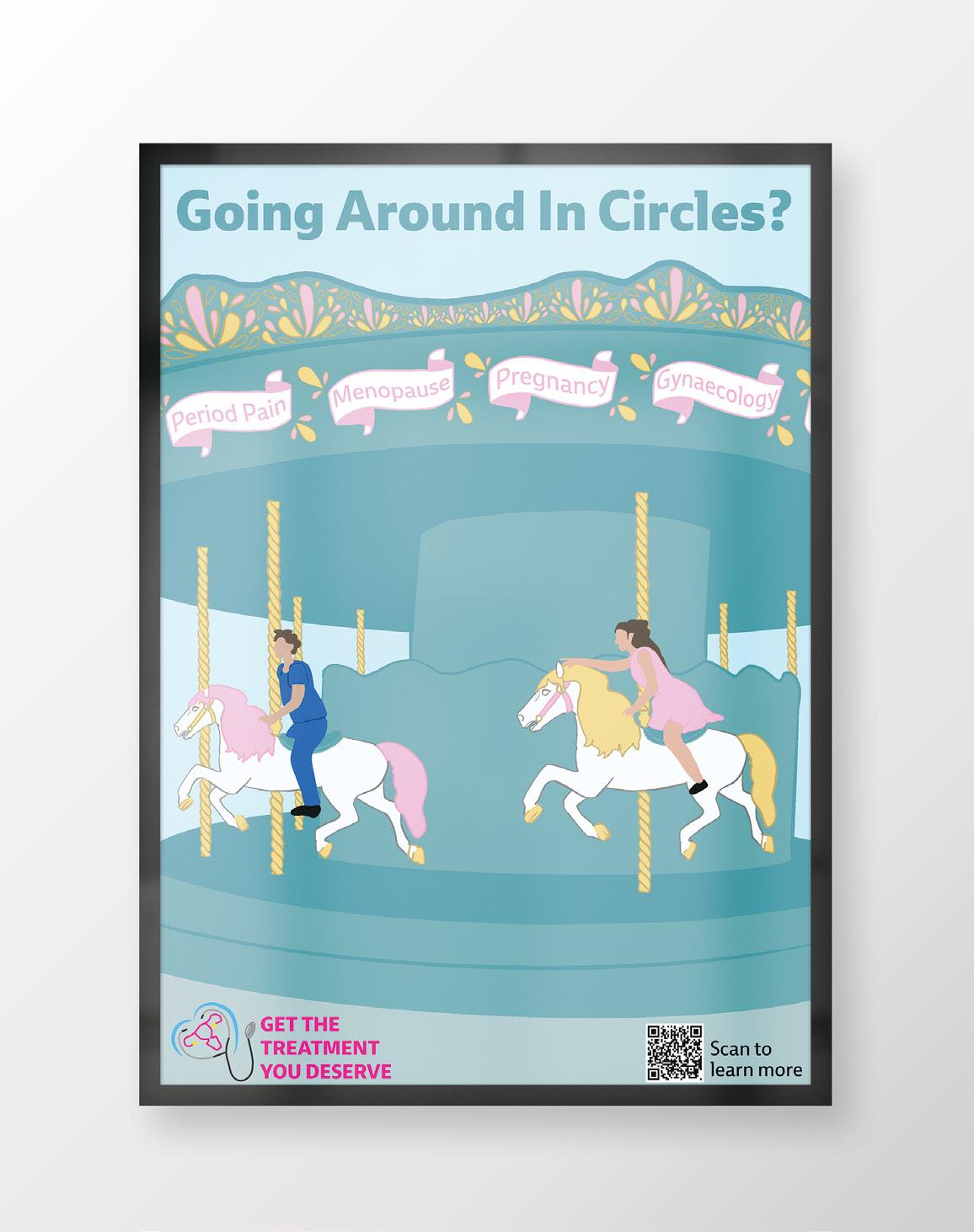
Get the Treatment You Deserve
Did you know that the Barbie movie came out before tampons were tested on real menstrual blood in 2023? Disney’s Frozen came out before female cells were required to be used when testing new medicine in 2013? And even in 2025, no women’s health studies met gold standards? And research is just the root of the problem. When women go to the doctor, their health issues are often dismissed or belittled by medical professionals. This campaign, against medical misogyny, aims to inform people of the disparities, and to help women advocate for themselves.
KAYLEIGH PENFOLD
I am an illustrator who focuses on stipplism and hatch work, inspired mostly by human faces and animal forms. I aim to use my work to showcase the lesser-known details of these figures. I am an avid reader, who loves not just the contents of books, but also the covers. The covers became an excuse to create and keep creating for years to come, anything from the most innocent of pets to the disturbed creations of my own mind as horror films and games took root in my preferences.
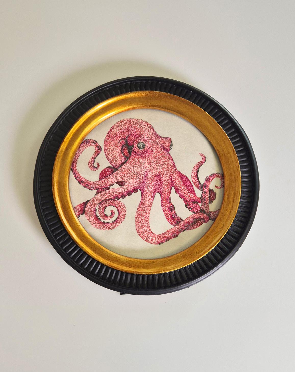
Thalassophobia
I have a deep love for being scared, particularly by things I don’t experience everyday – the fear of the unknown, technically. The theme for this project is nautical horror. I have set out to explore the question of why our deepest fears attract us in media the most.
JESS POWELL
As a visual communicator specialising in visual merchandising, my passion lies in bringing luxury to life through captivating designs and illustrations. I transform ideas into visual experiences that draw people in, focusing on every detail to ensure a fresh and unique final look.
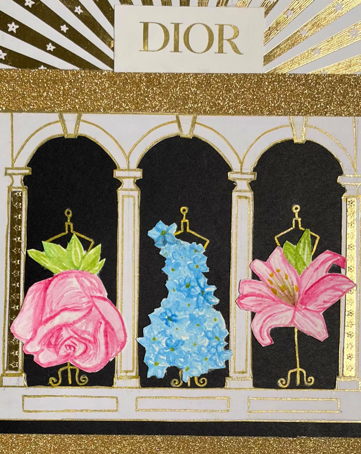
Dior: Stories Beyond Glass
This project reimagines visual merchandising beyond traditional displays, using extravagant props and arrangements to create memorable and inspiring shopping experiences. Inspired by Dior, a luxury fashion brand known for its intricate details and blend of heritage with modern innovation, the concept revolves around storytelling in a commercial setting.
By integrating illustration and mixed media, I aim to portray thoughts and ideas, elevating the retail space into an immersive environment. The goal is to create designs and displays that are not only beautiful but also tell a compelling story, leaving a lasting, highquality impression on visitors.
JEM RUTHERFORD
I am a creative practitioner seeking out opportunities to express myself, and make the world a better place. I am captivated by the natural world around me and I am passionate about human rights and inclusivity for all. I use my work to promote these values, and make a positive impact on society.
I specialise in freehand drawing and Adobe software. I write instrumental music too, which like my visual art, is often inspired by natural environments. I have an acute attention to detail, which is helped by my autism.
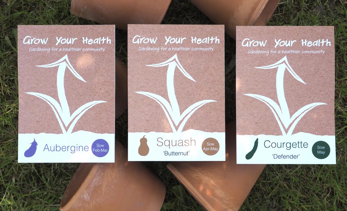
Grow Your Health
An inclusive charity, advocating for gardening to improve people’s mental and physical health. The charity also aims to increase access to green spaces and improve people’s skills, knowledge and social connectivity. Grow Your Health also has the potential to help the environment and reduce pressure on health services. Grow Your Health uses donations and product sales to raise money for its causes.
DEVANSHI SAREEN
I’m a visual communication designer focused on building brand narratives and campaign strategies. I’m particularly interested in media and entertainment – not just what we consume, but how we consume it, and how design can shape those experiences.
The
Ritual
The Ritual is a graphic publication and campaign exploring the shift from collective viewing to isolated consumption. Inspired by Indian performance traditions and histories of gathering, it reimagines media as something we experience together rather than alone. The project moves through themes of isolation, memory, and return, using typography, collage, and material processes to build a layered visual language.
Expanding beyond print, The Ritual extends into a campaign strategy across multiple channels, including OOH billboards, inperson activations, and a social rollout, all centred around the key theme of moving away from isolated viewing and encouraging shared, collective experiences.
AGNIESZKA SEREK
Through the years, I have focused on developing an illustration and graphic design practice, in which nature comes up as an inspiration frequently. I express this work through an eclectic style, combining traditional drawings with digital editing to create unique effects.
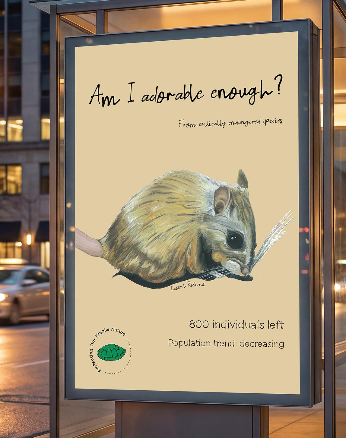
Protecting our Fragile Nature
This project involves unpacking the question: Why is society driven to protect certain species over another? I have researched ignorance towards ‘uglier’/less popular animals and explored the ways environmental organisations operate, for example The IUCN, with critique of these institutions. The work raises awareness of this subject and provokes more questions about the connections between ecology and psychology, and the way the ‘right’ appearance can increase survival rates. The project not only highlights ecological problems but expresses the fragility of nature and its momentariness.
AVNI SUKHIJA
I am a visual designer working across graphic design, illustration, moving image, and 3D spatial design. My practice focuses on communicating ideas with clarity while maintaining expression across physical and digital spaces.
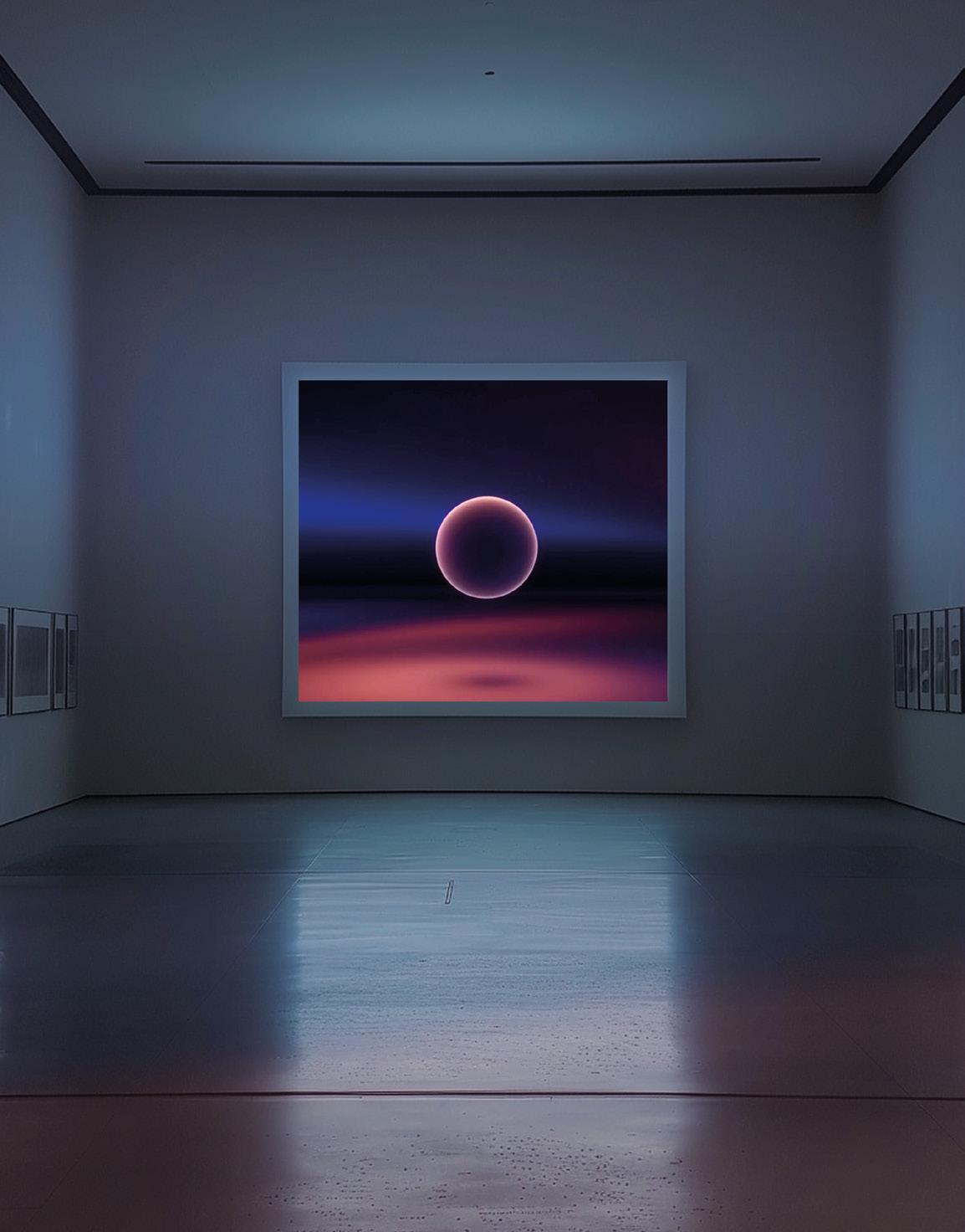
Emotional Simulation
My project, Emotional Simulation, explores how immersive digital environments can represent emotional states through space, light, colour, and movement. Rather than fixed outcomes, I use experimental 3D and time-based processes to create atmospheres that influence perception and feeling.
I’m particularly interested in combining minimal compositions with bold visual elements to guide attention and meaning. Working across mediums, from poster design to motion and 3D, allows each project to define its own visual direction.
My work aims to be intuitive, accessible, and visually distinctive, balancing creativity with clarity and audience engagement.
LILI SZYSZKOWSKA
I delight in entertaining audiences with visual ideas. I have recently realised that creating spatial design experience is not only fun, but a great chance to get my visual ideas to a large audience.
I have found, with designing spatial experience, excitement in seeing my visuals on a large scale. And I love to create bespoke ideas for spaces.
I specialised in branding and design for user experience but with love for spatial and dimensional design. I’m not afraid of new; challenging myself and my disabilities brings me joy. That’s why I started typographic design and user interfaces. I want to shift my design focus to create beyond paper and screen. My goal is to make tactile, real-world-sized work that builds interaction between space and free association of thought in our minds.
Escaping Reality
Escaping Reality is about a metaphorical connection to escaping reality through mental association with materials.
KRISTINA THOMPSON
As a visual communicator who enjoys all media, it is difficult to put myself into a box. My work usually focuses on 3D modelling; however I like to dabble in painting, graphic design, collage, and many other mediums. I tend to centre my work around making people feel good, whether that is through creating something bright and colourful or something that uplifts the person viewing it. I get my inspiration from everyday things like characters, items, and nature to create art that makes me and others happy.
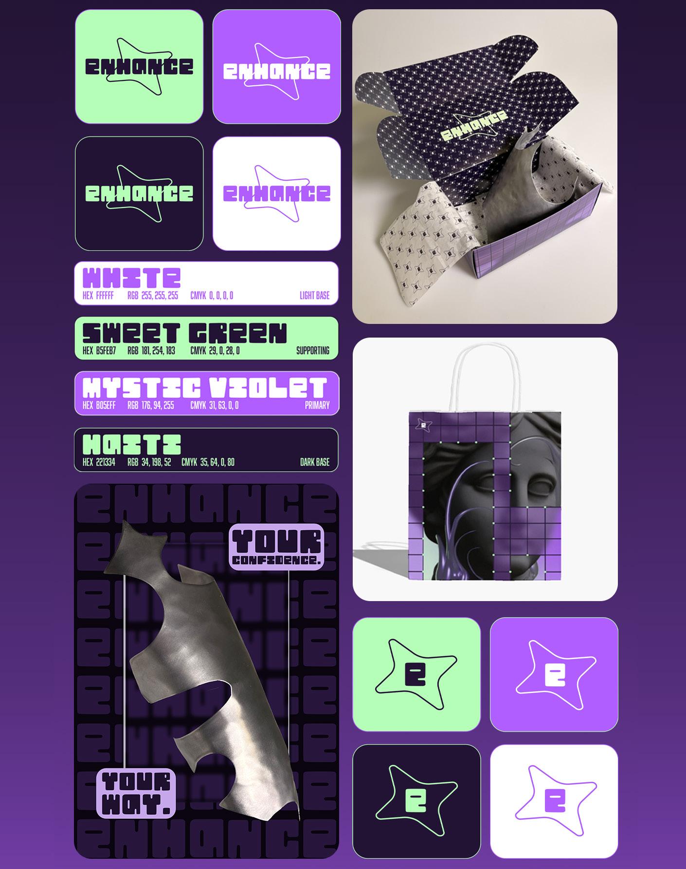
Enhance
Enhance is a confidence boosting body jewellery brand focusing on turning insecurities into parts of your body that you love. This is achieved by enhancing the areas that you are insecure about instead of covering up. You shouldn’t have to hide parts of yourself to fit an imaginary beauty standard.
ARLIE TRUDGILL
I am an illustrator who thrives in storytelling and character design, where visuals build worlds, emotions, and narratives. My work draws on varied interests, with a particular love for fiction and fantasy, allowing me to explore complex ideas through imaginative worlds. I aim to create work that invites emotional engagement, leaving people fascinated and entertained, as others’ creations have inspired me.
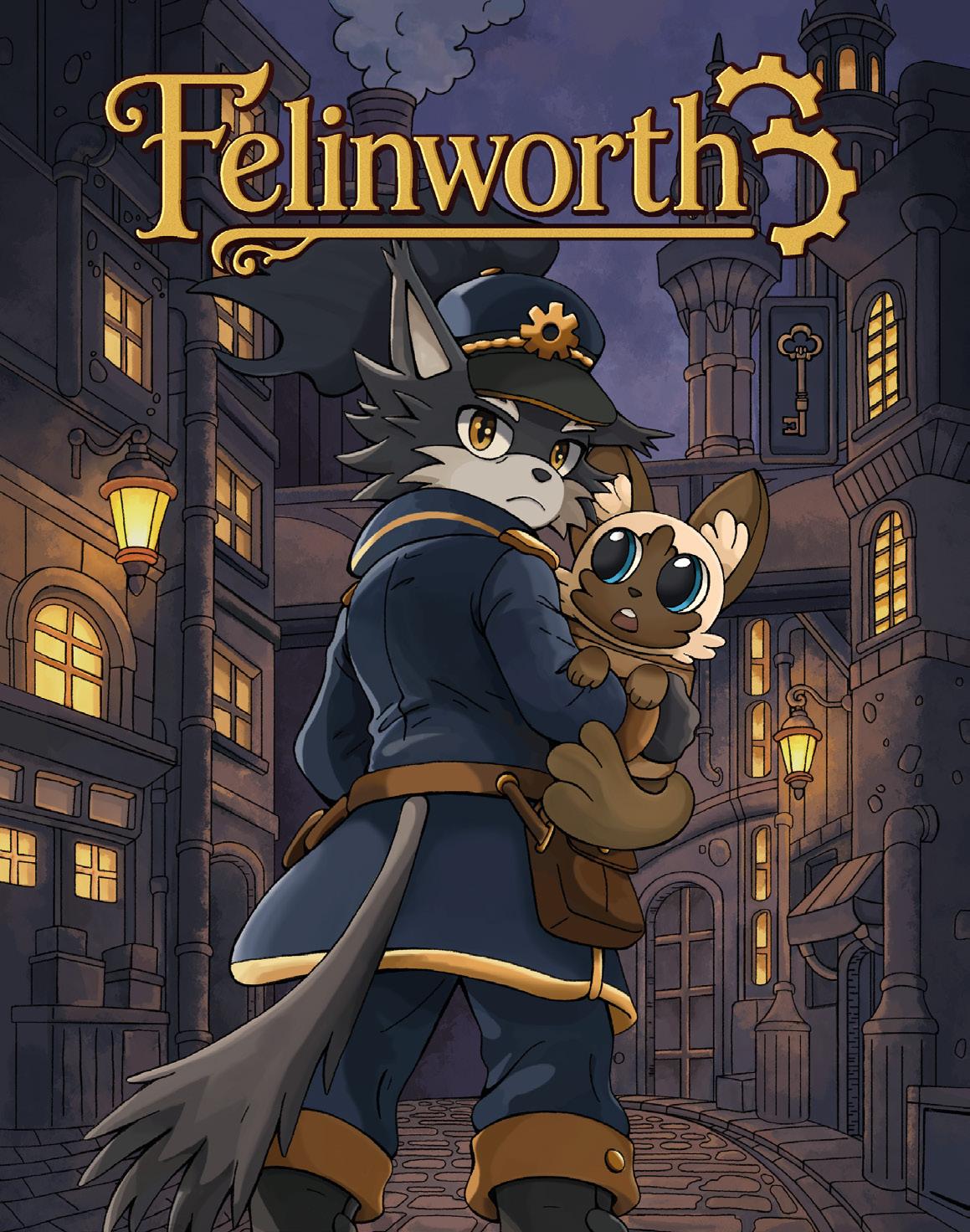
Felinworth
This story responds to narrative fatigue in contemporary entertainment, where stories feel formulaic and shallow. Set in a zero-tolerance functionalist society where any criminal act seen to threaten the city’s progress results in lifelong punishment. The story begins when Donovan, a conformist of the system, rescues a child from being branded a criminal and confronts the system he upheld. Through encounters with other characters and their stories, viewers question whether criminality is choice or circumstance, engaging with moral dilemmas that challenge their beliefs while experiencing an immersive narrative.
ALICE ULVMOEN
I have a passion for painting, using oils and gouache the most. I love photography and specialise in more scenic pictures. I love drawing and sketching using mixed mediums. I found that I have a love for painting women more than anything else. I’ve always wanted to collaborate and sell commissions. I’m hoping to find a career in making and selling my work to people.
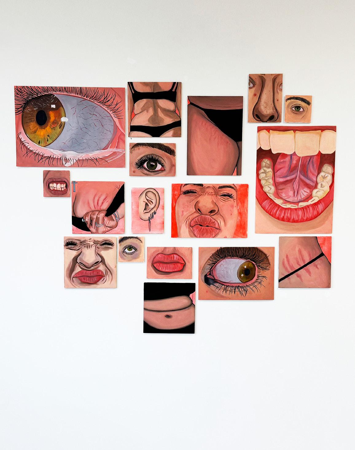
Insecurity: a Project within Myself
My work is based on the intense feeling of insecurity, the idea of feeling like you don’t look good or look ‘bad’. A feeling we all have one way or another to various extents. All the paintings you see are me, on a journey to find peace within myself and to find beauty within my insecurity. Contorting myself and my body in ways that the viewer wouldn’t see but when I look my worst they may find beauty, and I hope I do too.
JANAM VAIDYA
I’m a visual communication designer with a strong interest in branding, graphics and UX/ UI design. I enjoy creating visually engaging and user focused design solutions that combine creativity with clear communication. I am adaptable and flexible within different creative environment, allowing me to respond effectively to different projects, audiences and client needs. My approach is driven by research, experimentation and attention to detail, always aiming to deliver thoughtful and professional outcomes.
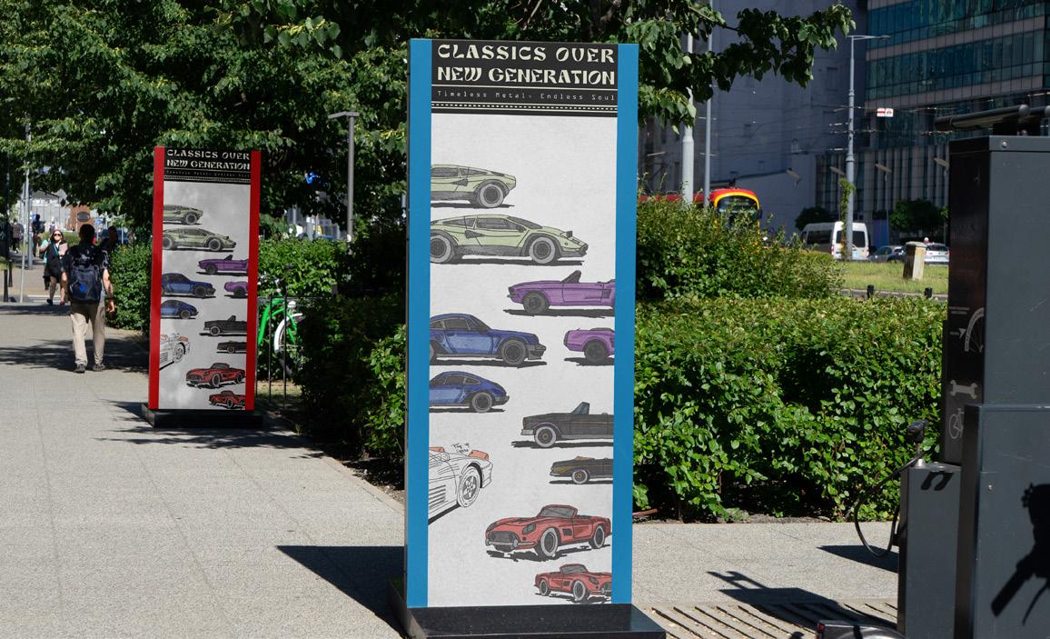
Fading Beauty
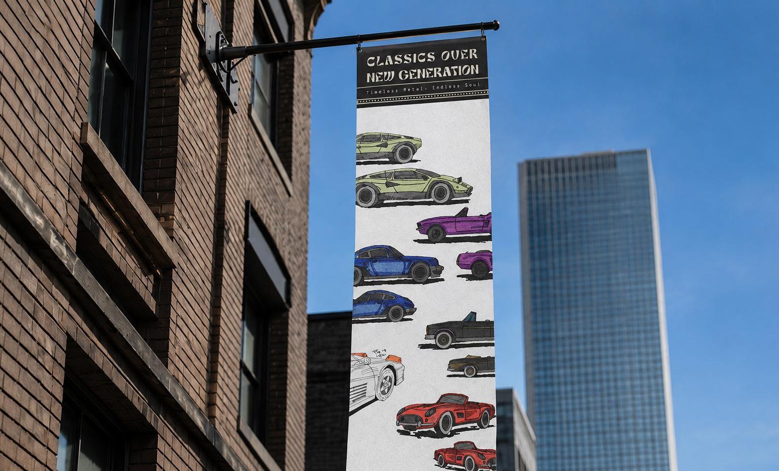
For this project, I have explored the idea of loss of beauty with time by comparing past and present design aesthetics across things like cars, houses and everyday objects. I want to question whether we have lost a certain richness, ornament and emotional quality in design as modernism, minimalism and digital production have become dominant. The project focuses on how form, detail, colour and material choices have shifted, and what that says about our changing taste.
QUINN WALKER
My work explores the unreal spaces we find meaning in. Fictions that become part of our realities, and the parts of reality we bring to fictional spaces. I aim for a careful give-andtake between text and imagery, often working within interactive forms of media to meet my audience where they are. Narrative is my focus while theoretical research creates the bedrock of my work. Ultimately, the goal is to encourage others to explore their relationships to fictional spaces through dialogues about my own experiences communicated through whatever format feels right.
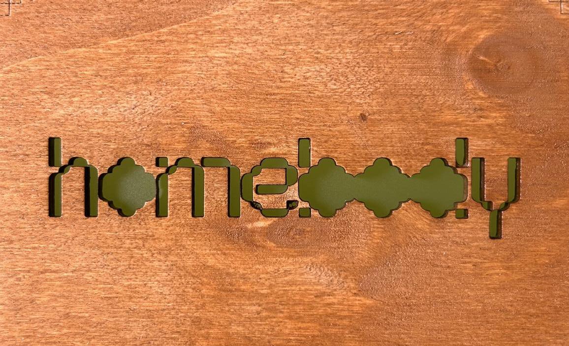
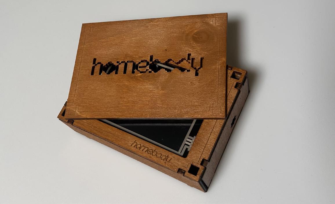
Homebody
Homebody is a digital time capsule archiving my bedroom as it exists now. The archive is hosted on a purpose-built cyberdeck and is intended to be stored away for future reminiscing. Its design is derived from the visual identity of my space and is translated through a format that encourages personal nostalgia – early 2000s video games.
HANIF YE
A design researcher specialising in crosscultural emotional translation. With a background in visual communication in both the UK and China, I have grown up in an environment where the traditional Jingdezhen ceramic craftsmanship and contemporary urban culture intersect. My creative work has always been exploring the emotional dimensions that language fails to reach and establishing a deep resonance between cultures through design.
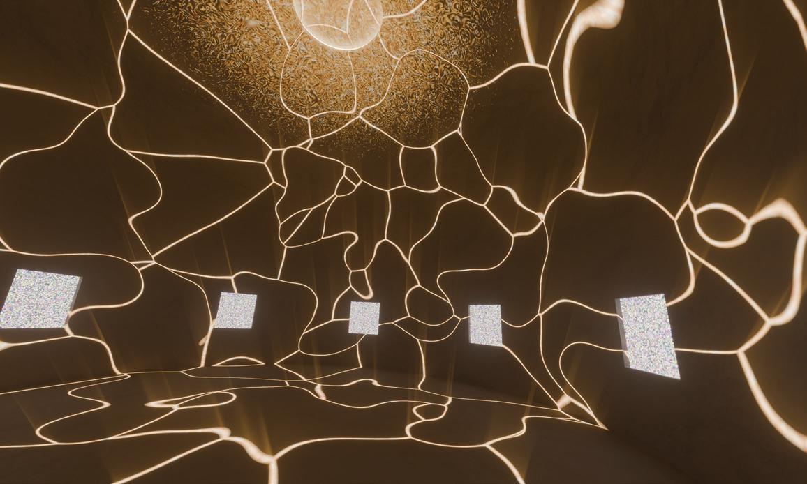
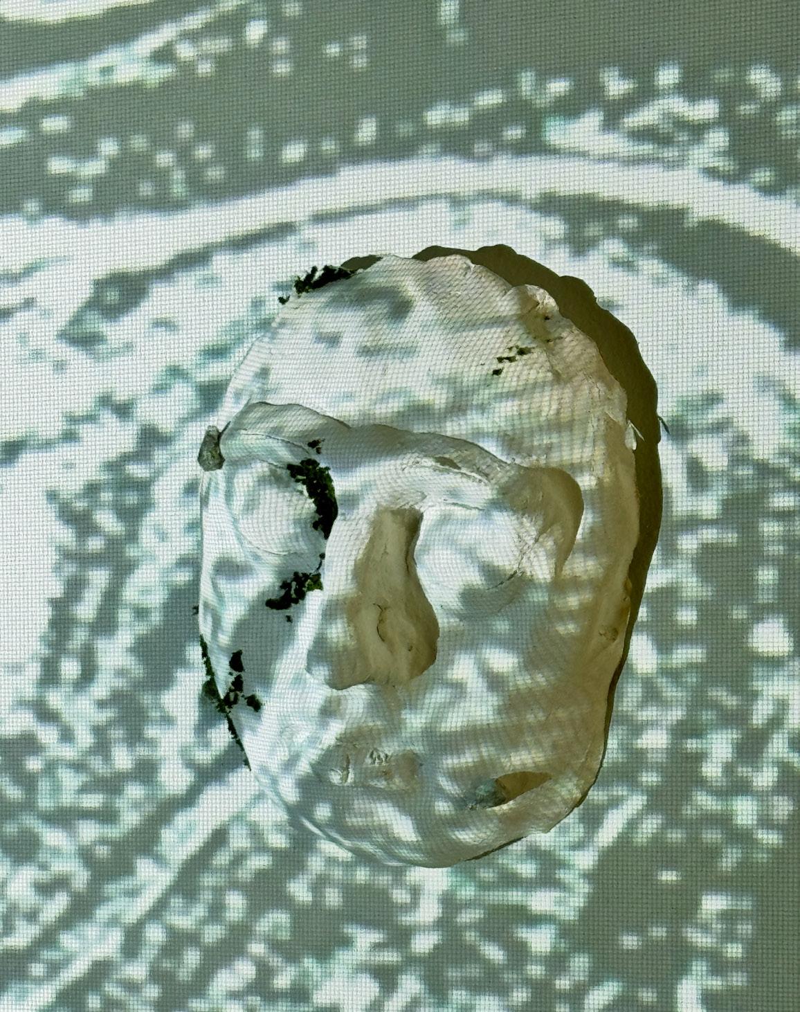
Submerged in Burnout
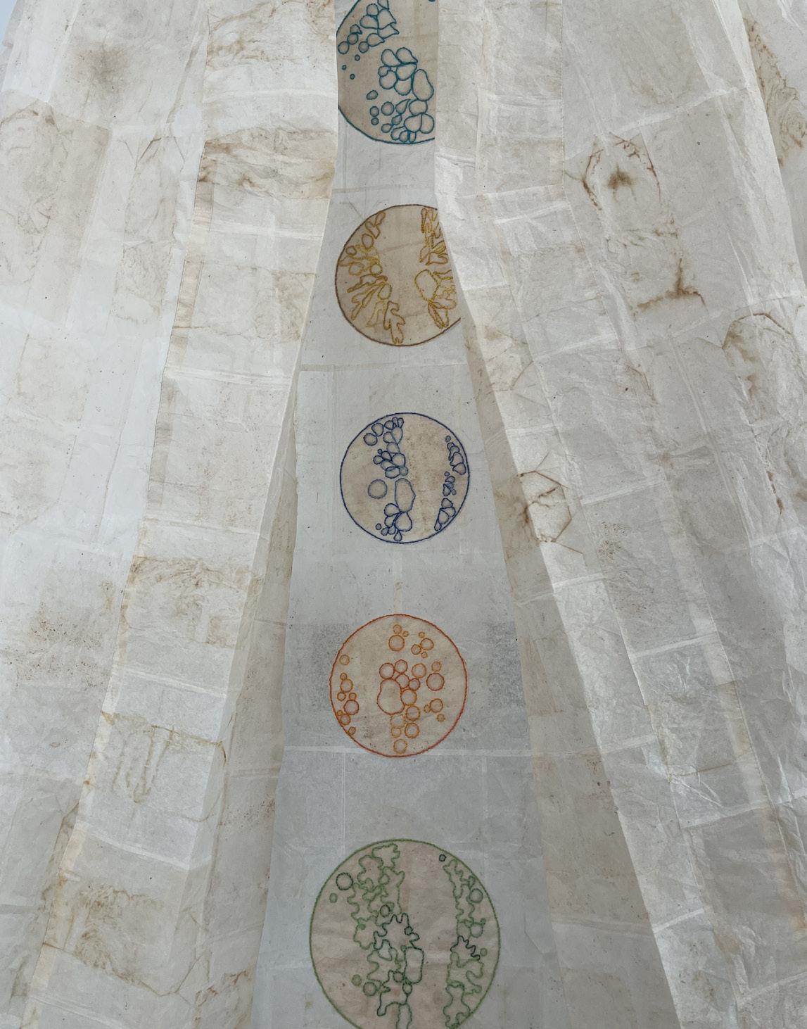
Submerged in Burnout is an installation that explores burnout as a threshold between exhaustion and renewed sensation. Suspended faces appear within a shifting projected field shaped by Ling, an imagined subtle force moving between body, perception, and environment. Rather than presenting burnout only as depletion, the work creates a quiet, uncanny space where calm, intimacy, and sensory awareness might re-emerge. It invites viewers to pause, look closely, and consider whether another rhythm of feeling can still be found within contemporary life.
Identity design
Constance Ng
Catalogue layout
Eszter Novák
Foreword
Catalogue funded by Marten Darkin
Hullabaloo Creative Market
@ucaviscom
To view the online showcase of our work please visit