senior exhibition catalogue
towson university art + design
designed by kayla halbig
Ceramics
Digital Art & Design
Graphic Design
Illustration
Interdisciplinary Object Design
Metals and Jewelry
Painting, Drawing & Printmaking
Photographic Imaging
designed by kayla halbig
Ceramics
Digital Art & Design
Graphic Design
Illustration
Interdisciplinary Object Design
Metals and Jewelry
Painting, Drawing & Printmaking
Photographic Imaging
BRB
digital media / 2d animation
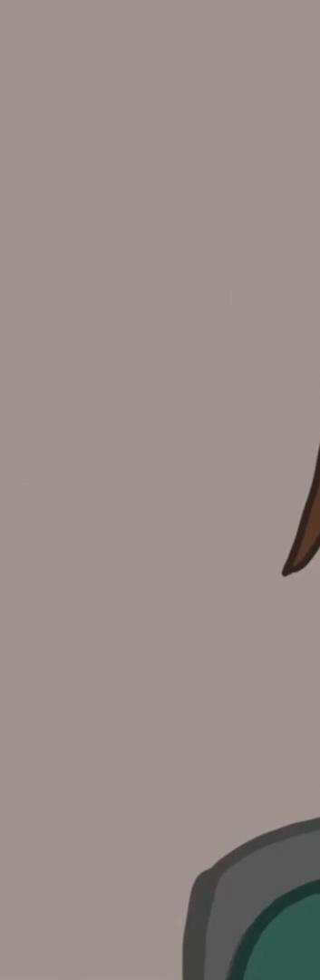
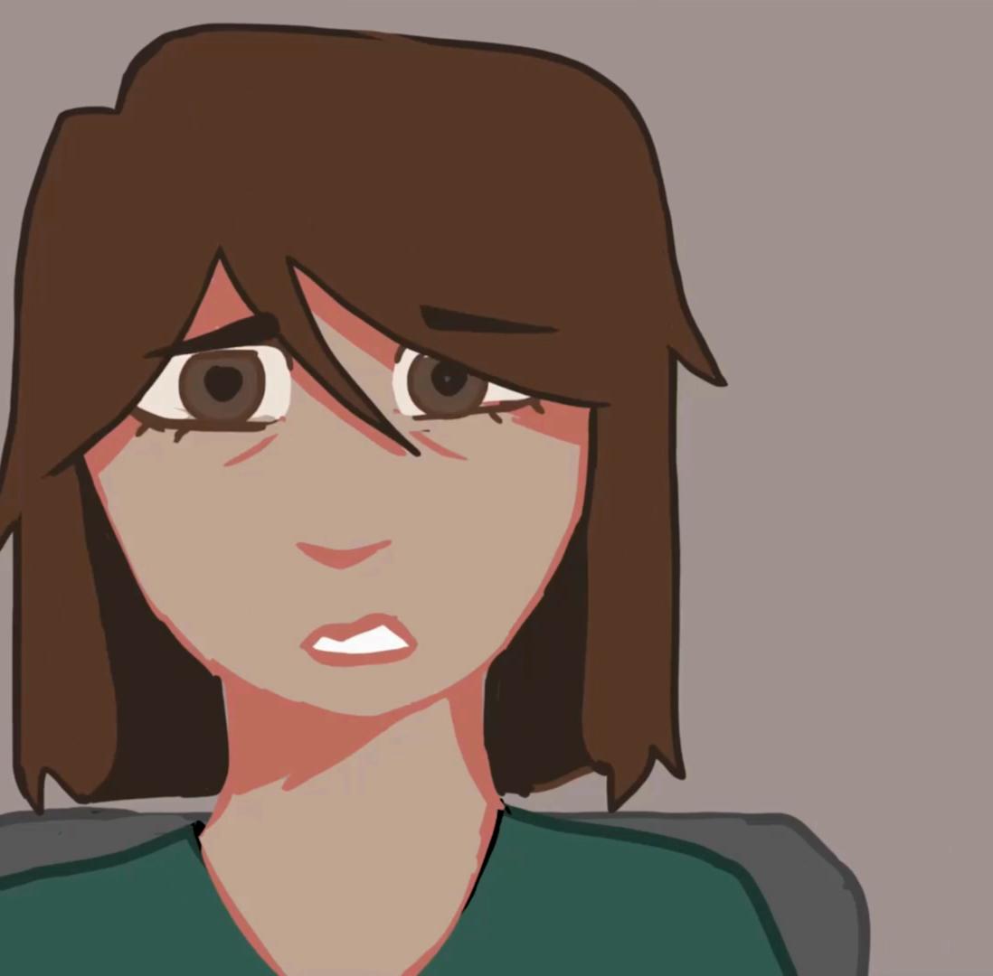
My work explores the space between reality and imagination, using animation as a way to expand how everyday experiences are seen and felt. In this project, I combine 2D digital animation with live-action footage to create an animated music video that blends surreal visuals with real-world environments. I’m interested in how these two worlds—what we see and what we imagine—can exist at the same time. I’ve always been inspired by how music visuals can shape the way we experience sound, and this project allowed me to explore that relationship more deeply. The instrumental track acts as a guide, influencing the pacing, mood, and transitions throughout the video. My process is both intentional and intuitive. I begin with real-world footage to ground the piece in something familiar, then layer in animation to shift that reality into something more expressive and unexpected. Using techniques like animated overlays and rotoscoping, I create moments where the environment transforms where movement, color, and form take on a life of their own. These animated elements aren’t just decorative; they represent emotion, energy, and the internal experiences that aren’t always visible on the surface. Ultimately, this piece is about the connection between sound and image, reality and imagination, and artist and audience. I hope viewers can see themselves in the work or feel motivated to create something of their own. For me, making art is not just about expression, but about influence and community, and this project is a step toward sharing that with others.
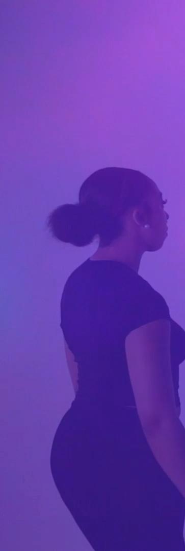
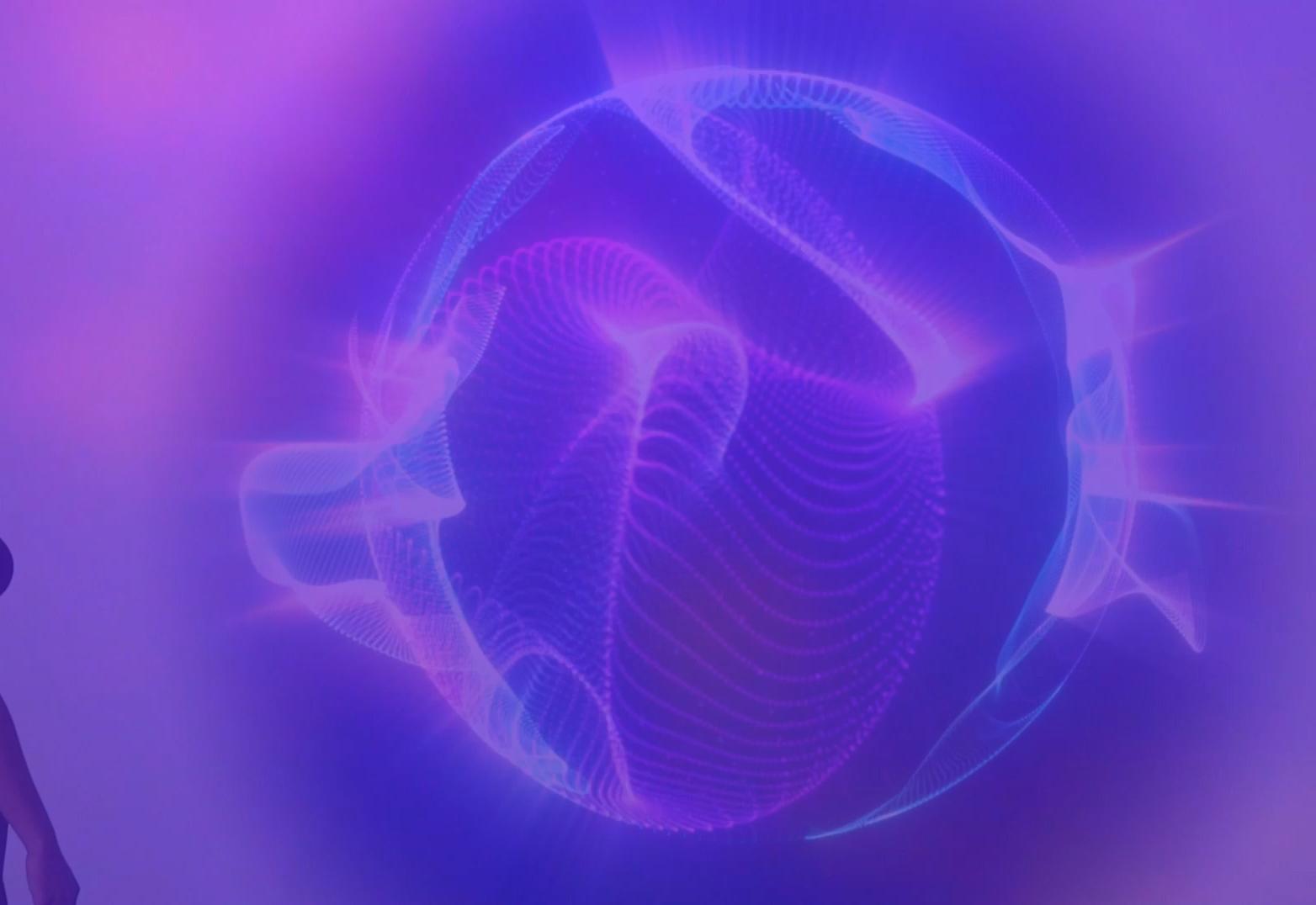
An unknown world… until the night pulled her in. One dream a version of herself Alura didn’t know existed. And when she left, she didn’t come back the same.
Qualified
2d digital animation
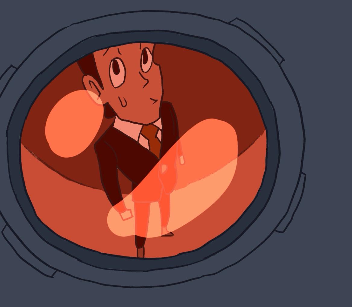
My short film “Qualified” is about my personal struggles with the job market, told in a “Mission Impossible” type of scenario. I wanted to choose something that I’ve personally experienced, and something many other people have experienced. I love making the most out of the mundane. Exaggerating the normal experiences one goes through in life is, in my opinion, the joy of animation. I aim to make stories that are fun and engaging, but also stories that many can relate to. Stories that all ages can enjoy.

SKREWD
digital art / animation
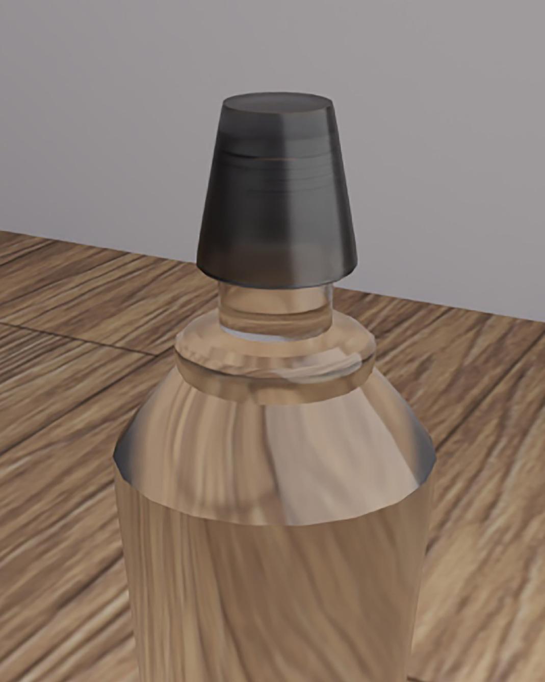
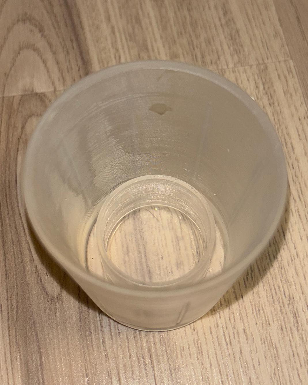
I love to challenge myself in the 3-dimensional world and see what I can create. I take a lot of inspiration from modern advertisements. This product was influenced through living a college life and experiencing the terrible struggle of not having a shot glass when one is needed. This is a new product I am creating called “SKREWD” and hoping to get it patented. The product doesn’t yet exist so my ideas for the commercial aren’t influenced by previous work. I started by creating the product in a 3D software that allows me to print it using resin and get specific dimensions. Printing the actual object out also opens up the idea for mass production and usability. I used a separate 3D software to create the commercial using motion path animation. Not only did I create a commercial for this object but also invented a new product to be used.
bdill3.wixsite.com/brennandill
procreate, adobe photoshop, adobe illustrator
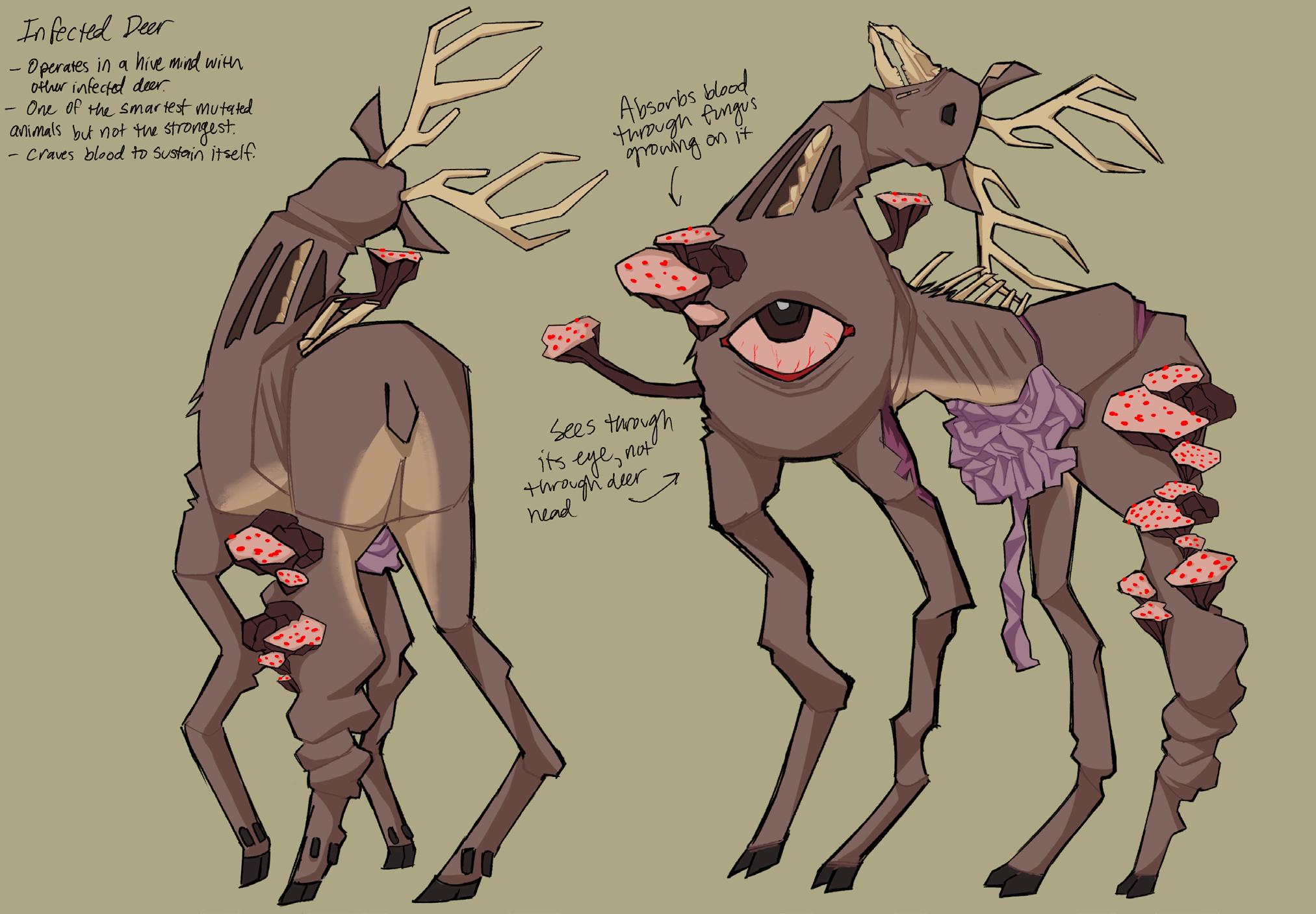
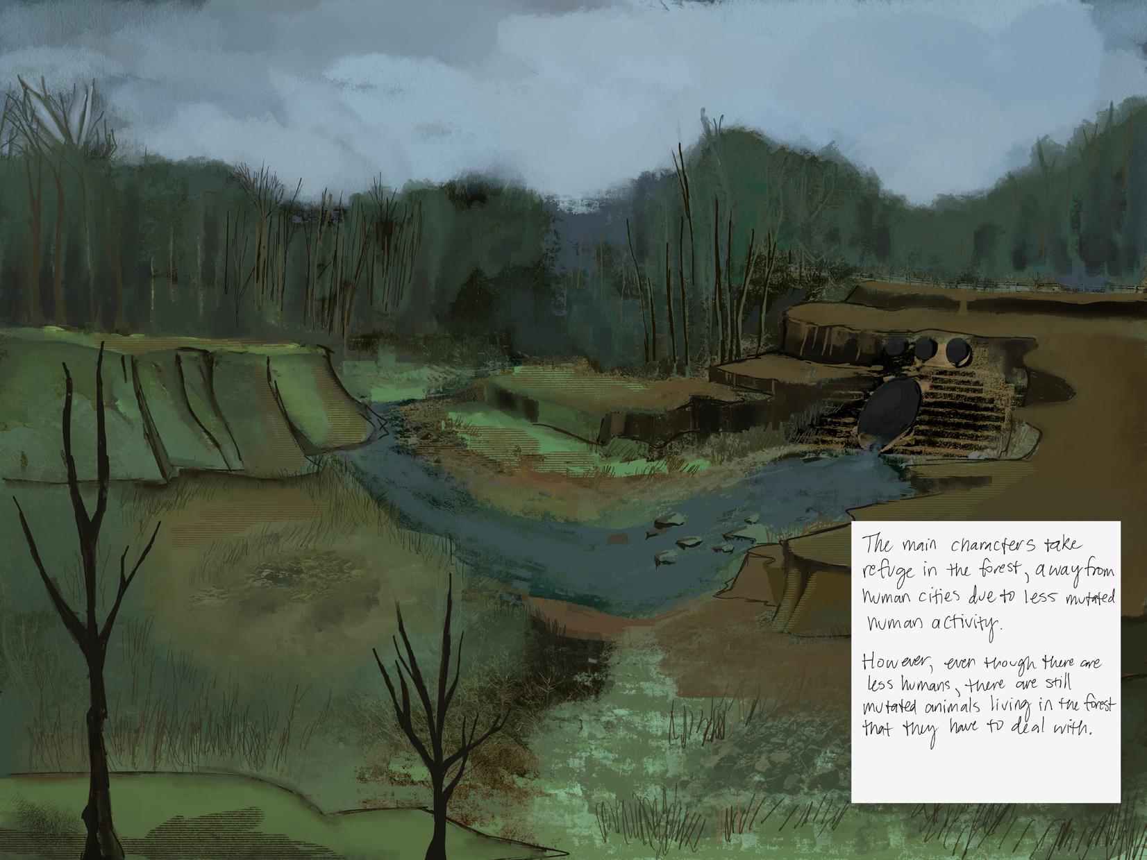
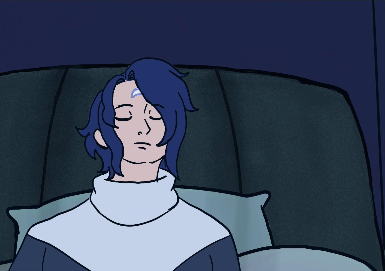
This work was created with the intention of exploring siblinghood, found family vs blood family, survival, and deciding who you can really trust. I chose to center a lot of the story around family dynamics and brotherhood due to my own feelings regarding family and what a family looks like. This work is for people with siblings, especially ones with complicated relationships, along with people who found kinship among people outside their own families. I created this work digitally due to my vision of this project being intended for an animated TV show. I enjoy the process of worldbuilding and being able to tell a story through my work. I wanted to create a piece that felt immersive to viewers, along with exploring the genre of horror. This work also allows me to get a better understanding of how visual development works within the illustration and animation industry, which is a career I would like to pursue post-graduation.
@catgotyoureye
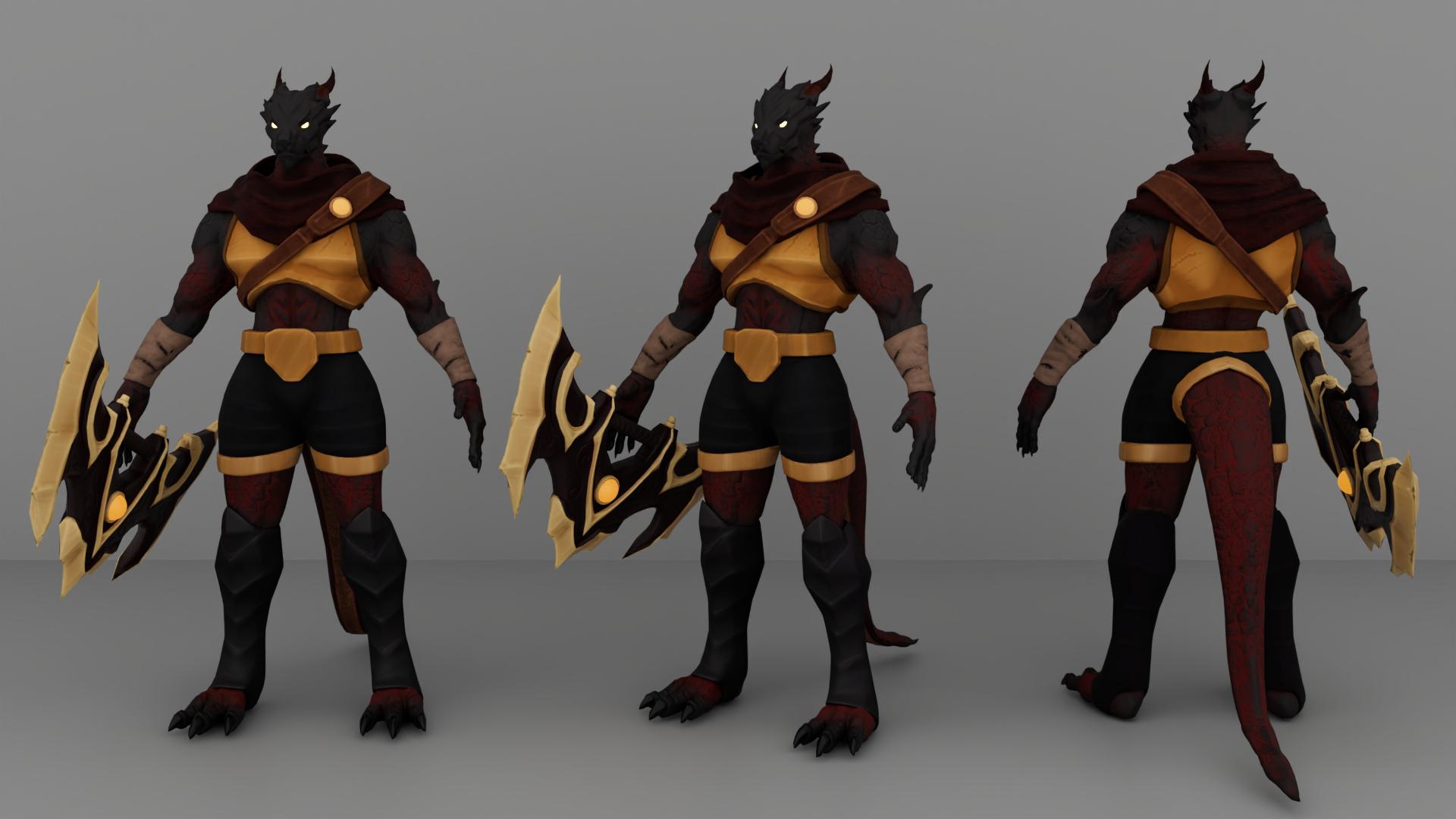
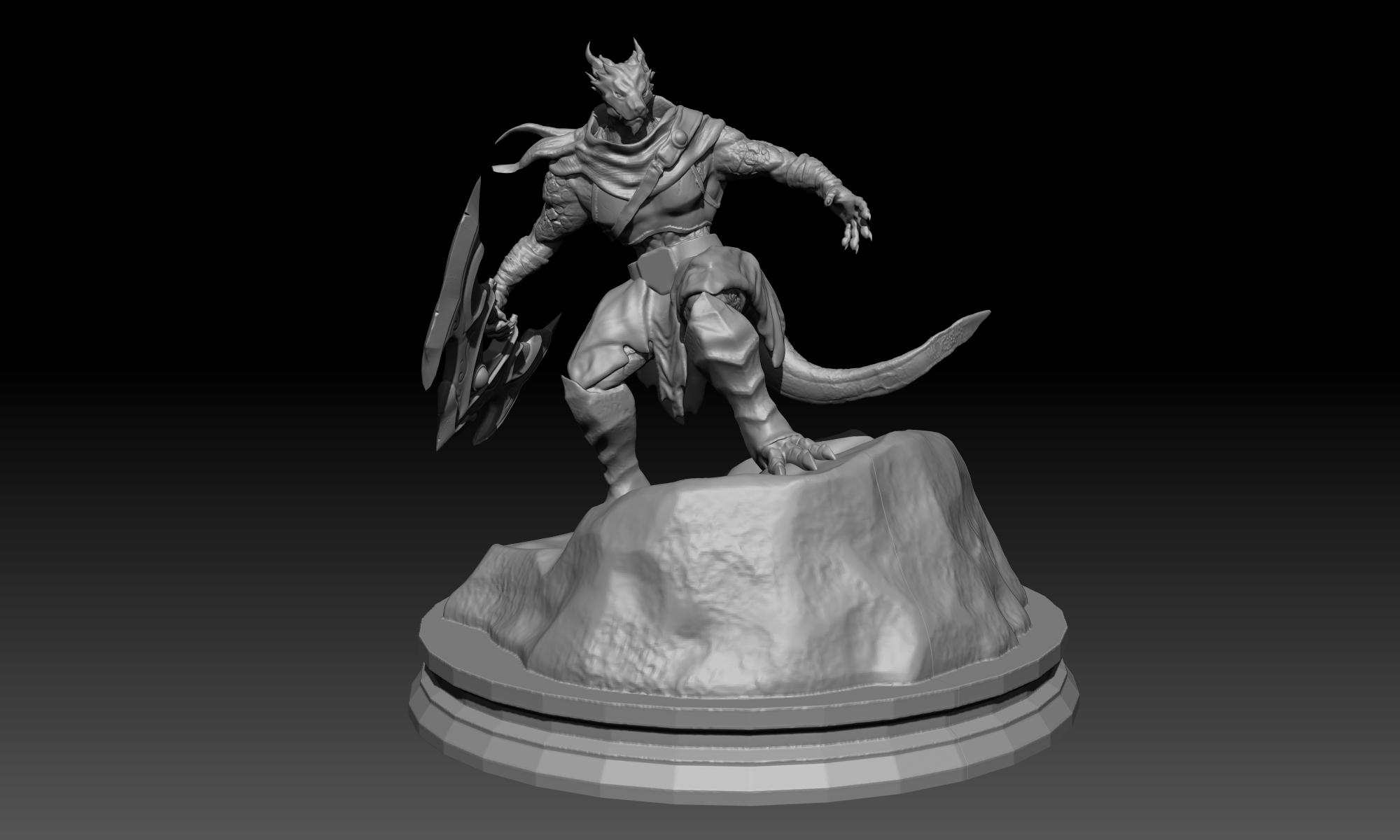
Ejderha the Cursed Raider
digital 3d and 3d print
I am a Turkish American 3D character artist specializing in stylized sculpting and character design. My work focuses on creating fantasy inspired by humanoid characters for games and animations. I am inspired by video games and animation, especially by How to Train Your Dragon. I created a humanoid dragon character for animations. I focused on stylized aesthetics that emphasize strong shapes and silhouettes. My process begins with a concept art and then using 3D software and tools to sculpt them in order to create game-ready assets. I aim to create an immersive experience by allowing viewers to see my character both as a physical 3D print and as a holographic display, giving multiple perspectives of the same design. My goal is to work in the game or animation industry as a character and 3D artist and continue improving my skills in sculpting and design.
fatihmyalcinel.carrd.co @fmyal_
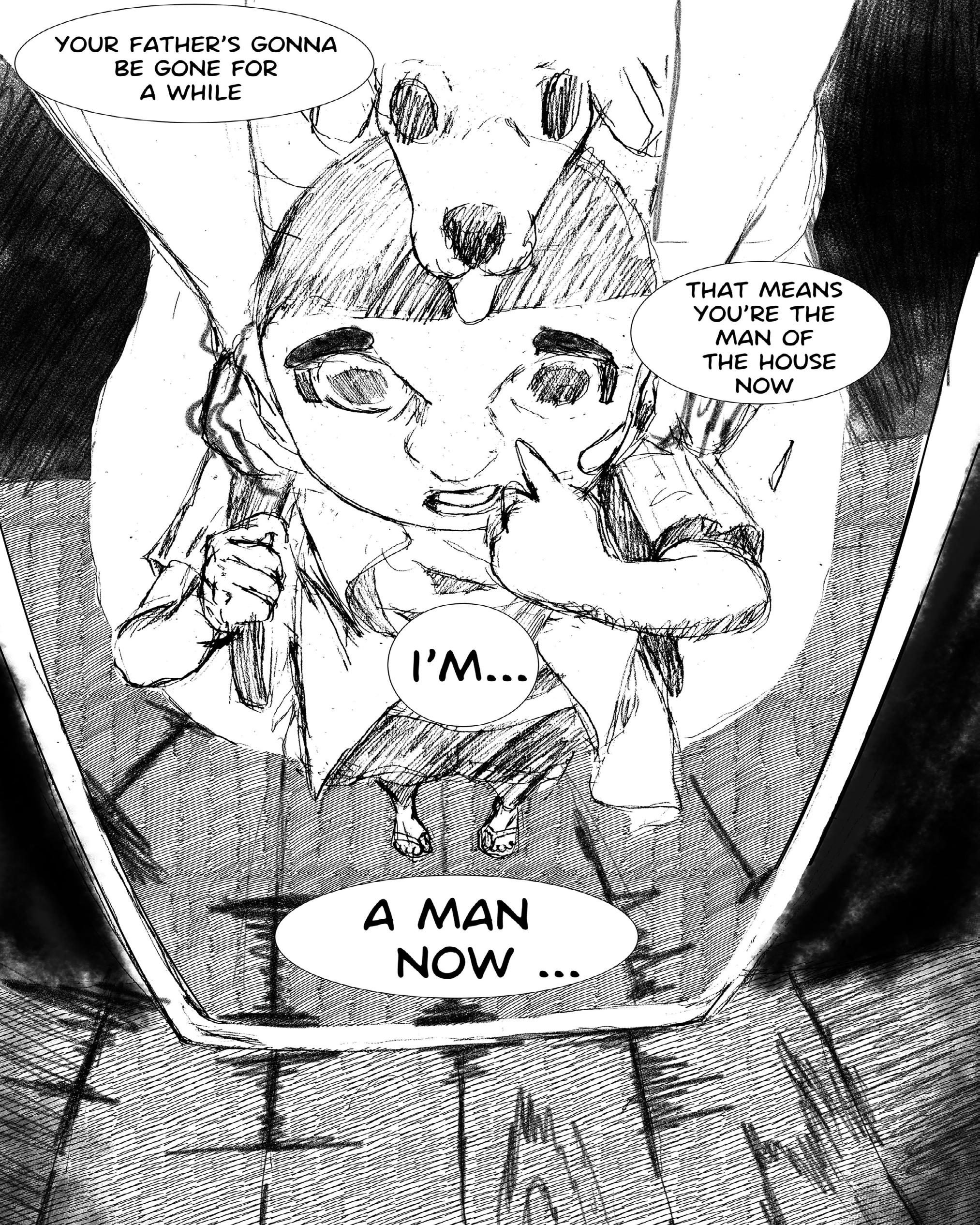
The Lamb web comic
For me, the BFA project represents many things. The culmination of my hard work and efforts at learning the craft of drawing on paper and digitally. This piece heavily emphasizes the combination of highly disparate tones and interests: childlike wonder and grim, unblemished violence and lighthearted comedy paired with genuine and often unpleasant social commentary. To me, art is best when it challenges the creator and the viewer. The creators should be forced to learn and dissect the world around them and code those observations into their work, and in the same breath, good art challenges the viewer to break down and intelligently decode what the creator is saying in dialogue with the artist. My hope in creating this piece is that it will inspire the viewer to sit with the themes it touches on. I hope that it challenges them to think about society's and their own relation to masculinity, boyhood, and youth violence. My goal with any piece I make is to make something interesting, intentional, and genuine.
jamdoesart.weebly.com
@jmitchell327
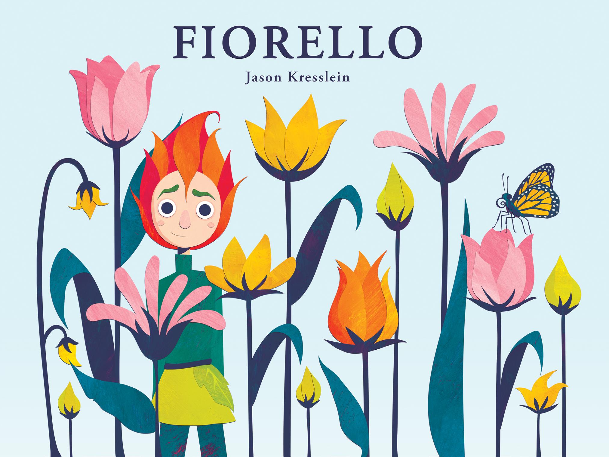
Fiorello picture book, digital illustration
Fiorello began as a desire to create a picture book that would have resonated with me as a child while also offering an important message for readers today. The book’s metaphor of a flower boy originated from the idea of having something commonly seen as feminine, such as a flower, being an integral part of this young boy and his identity. Fiorello (feeoh-RELL-oh) is an Italian boy’s name and translates to “little flower” in English. The illustrations in the book started out from hand painted gouache textures that were scanned to be utilized in a digital collage technique. The notion of a character who is part boy part flower also stems from a childhood memory of when I was a flower boy in my Aunt and Uncle’s wedding. Traditionally it is a flower girl who performs the role, but it was one of my fondest memories as a child.
jtkresslein.wixsite.com/jason-kresslein @art_jasontk
painting
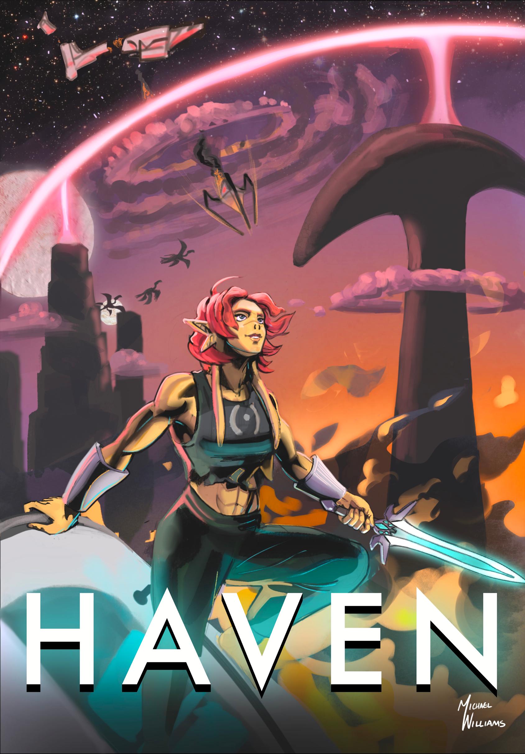
I’m Michael Williams, Co-Creator of the Universe of Haven alongside Emma Arroyo. My goal with these comic cover posters is to showcase our character’s and world’s designs. I wanted the audience to be drawn in and captivated by the composition of these posters, and then to ask “who are these characters?” and “what are their stories?” The heroes of Haven are prisoners aboard an interstellar prison ship that crashlands on an uncharted planet. This grants them their freedom, but they soon find the environment is infected by Blight, a necrotic force. They must choose between braving the wilds together or returning to the security of what is left of the imperial prison ship. I want the viewer to understand their own power, and that If we have each other's backs we can achieve anything..
@easelymichael
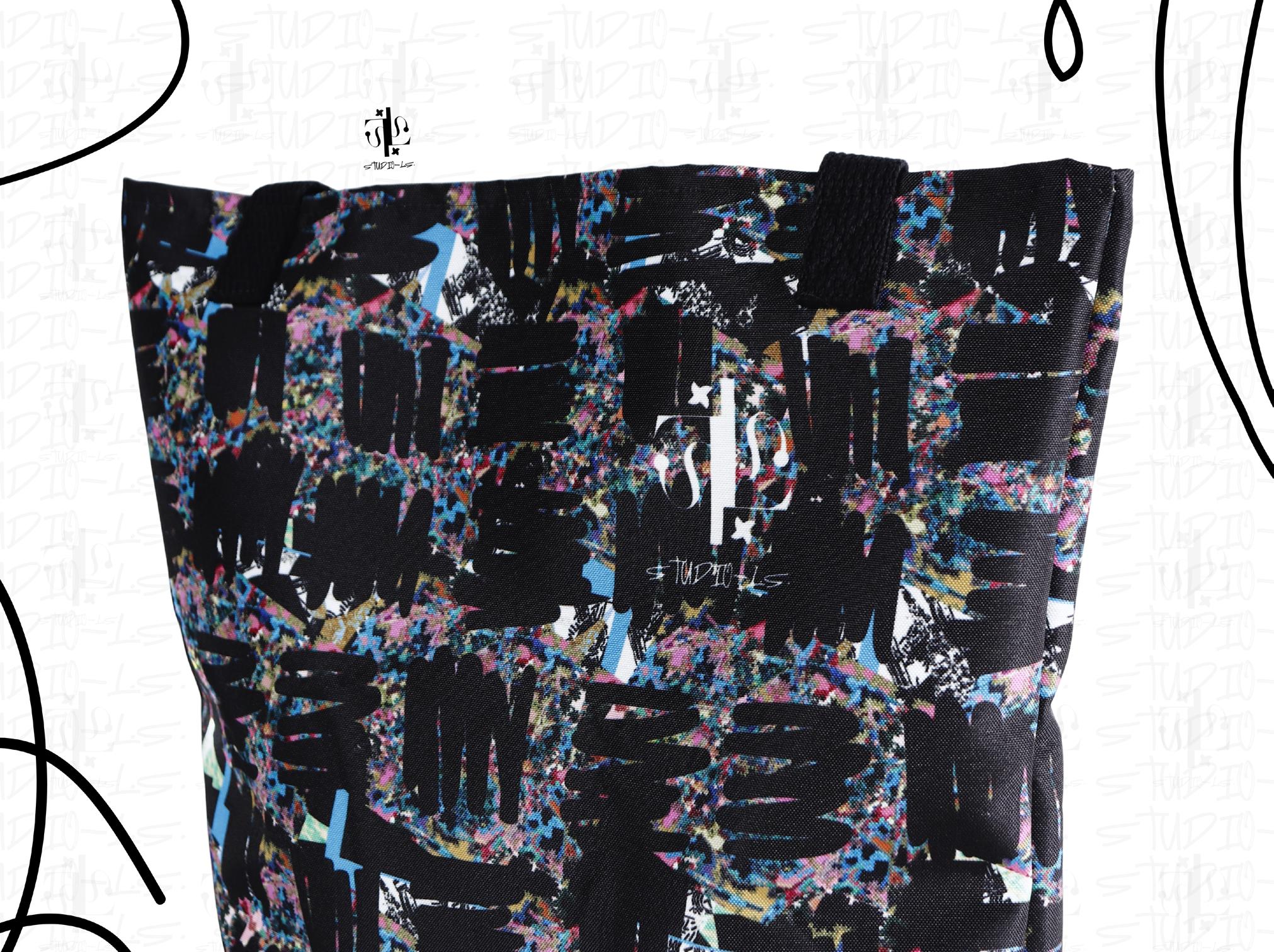
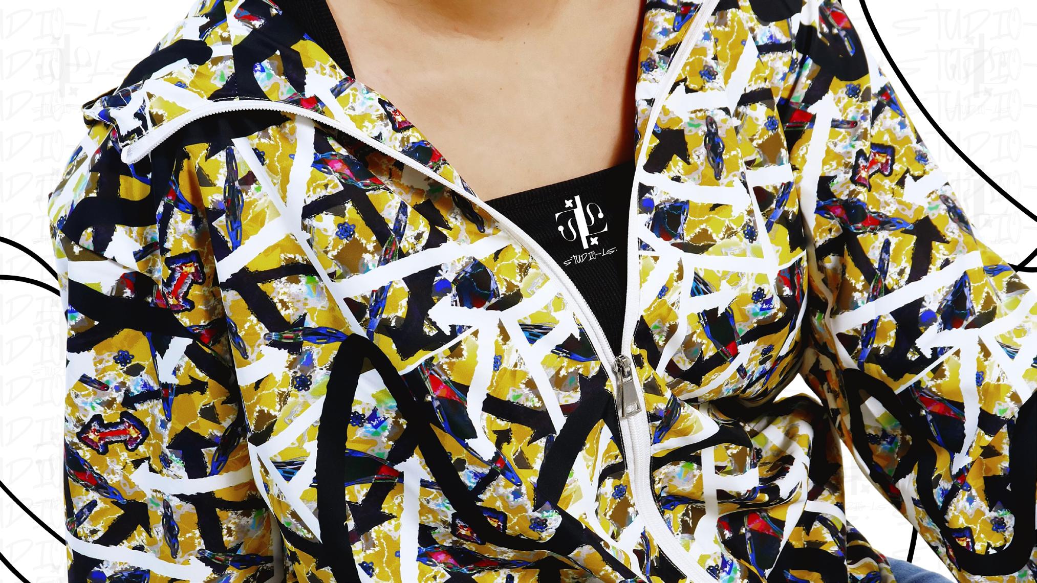
Apothecary
digital 3d
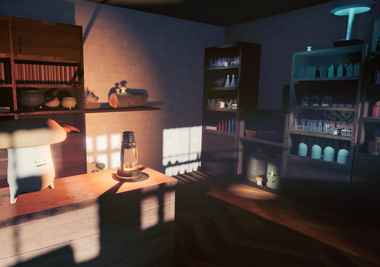
This is the interior of a potion shop, made with 3d modeling software and built inside a game engine. Conceptually, it is for one of my original characters, who is an apothecary, and one small block of a larger worldbuilding project. I chose digital 3d as the medium because I enjoy the combination of the interactivity of 3d and the introversion of virtual media.
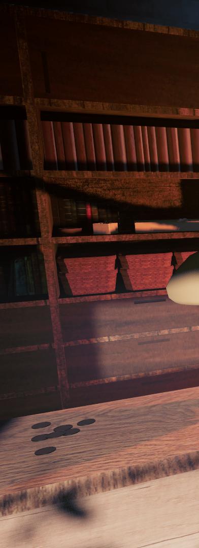
Cozy Duckies
ui/ux design, graphic design, and photography
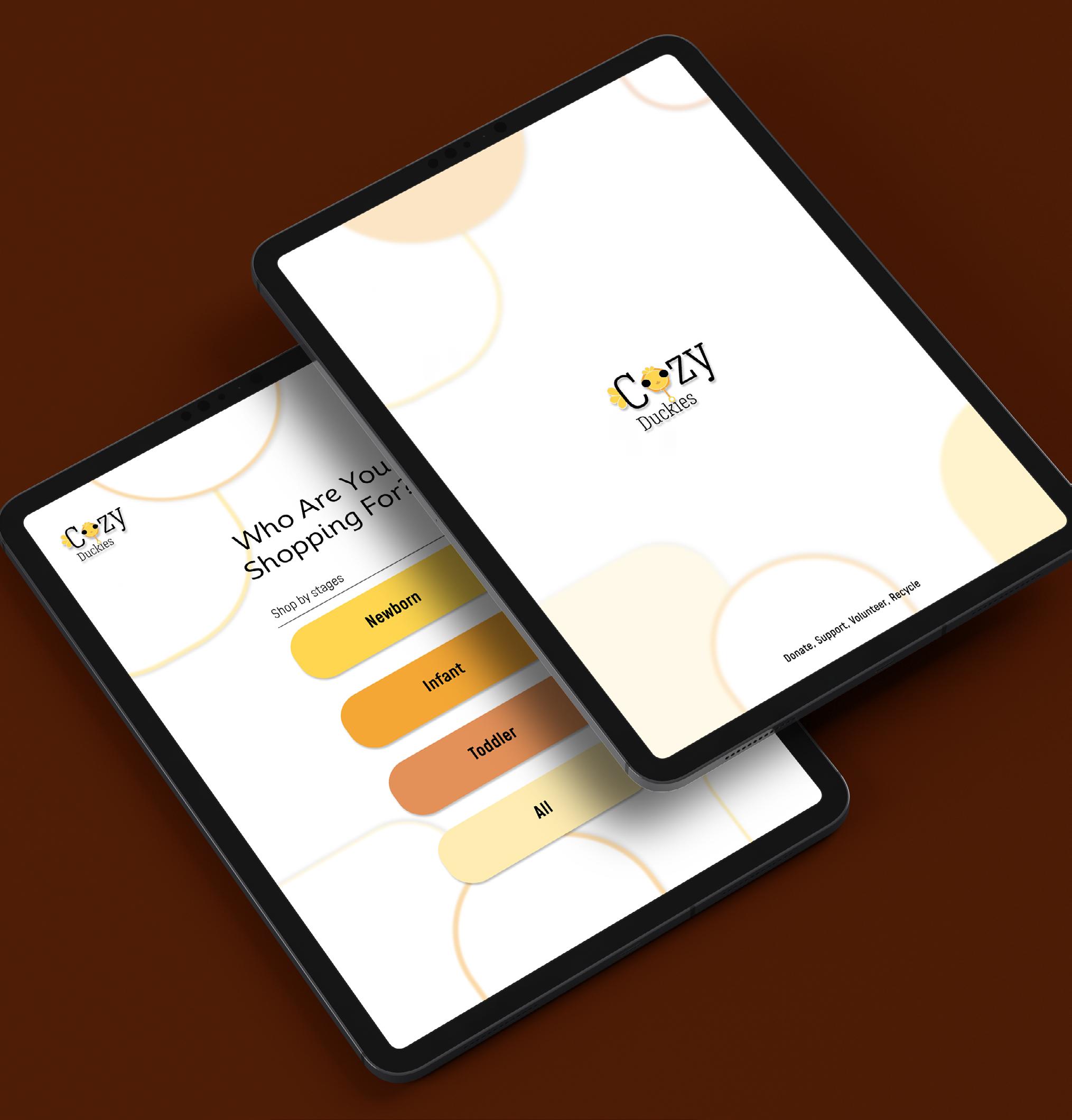
As a Graphic Designer, I always want my art to represent me or things that I care about. With prices going up, I wanted to help a community I know has already been struggling. Hence, the creation of CozyDuckies: a local, free, and reusable business to support new or current parents in need.
ajaamonet.myportfolio.com/
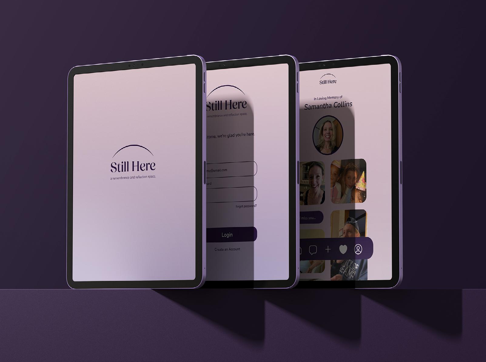
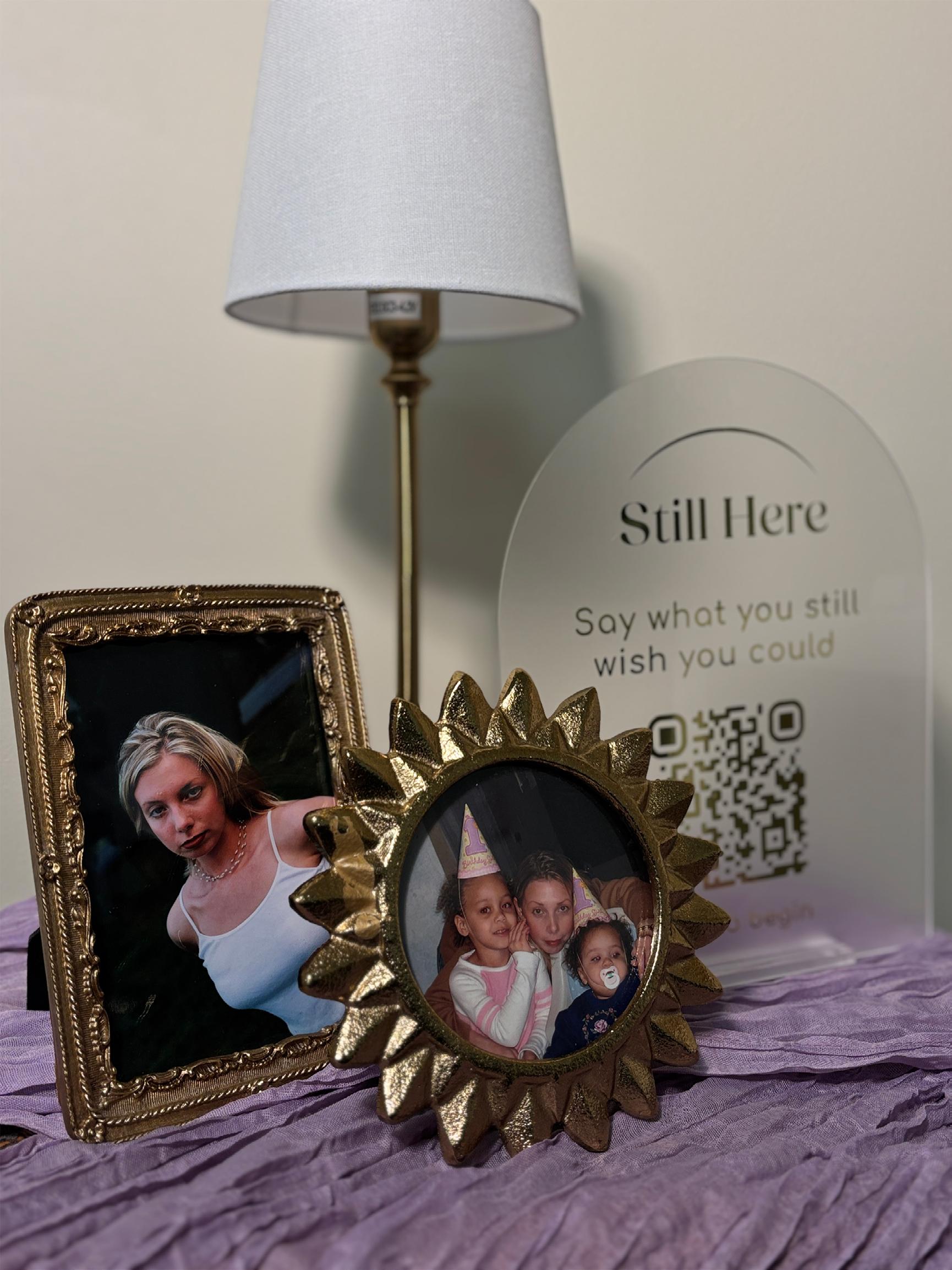
Still Here is a digital app design project that explores grief as an ongoing, personal experience rather than a process with a clear endpoint. I wanted to create this piece as a way of processing my own grief after losing my mom in April of 2025. This project reflects my own experience of navigating grief while still feeling a continued connection. The app centers on the idea that relationships do not simply end with death. Still Here has features such as writing messages to a loved one, preserving memories, or choosing to release thoughts. Interactions inspired by psychological perspectives on grief that emphasize continuing bonds. Rather than attempting to resolve grief, the app acknowledges it as something that can be carried, expressed, and revisited over time.
alexacollins122.wixsite.com/portfolio @alexacollinss
The Doodle Boys Vs Computer John paper, illustration, and clay
When I started my graphic design major, I had no idea where to even begin with design. I had a creative interest when I was younger, but didn’t know what to do when I fully got into college. Now that I’m approaching graduation, I now have a deep understanding and passion towards graphic design and the arts in general. I believe it’s important to have fun with your work and always continue learning new things. When you make work that you’re passionate about, there’s a drive to see it through to the end and to play into your strengths as a designer. Taking risks and staying curious are also crucial to improving your skills as a designer.
calebwilletts.myportfolio.com
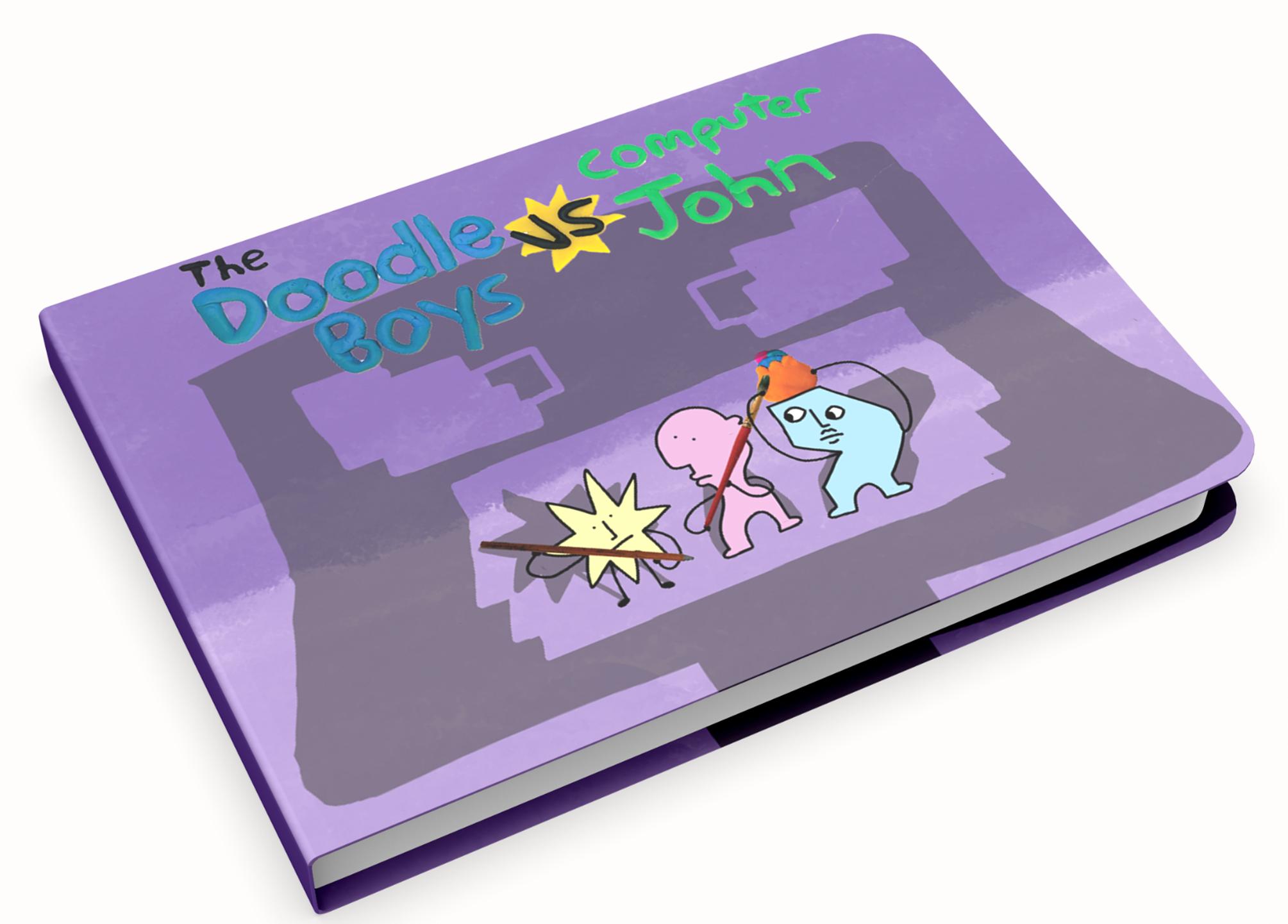
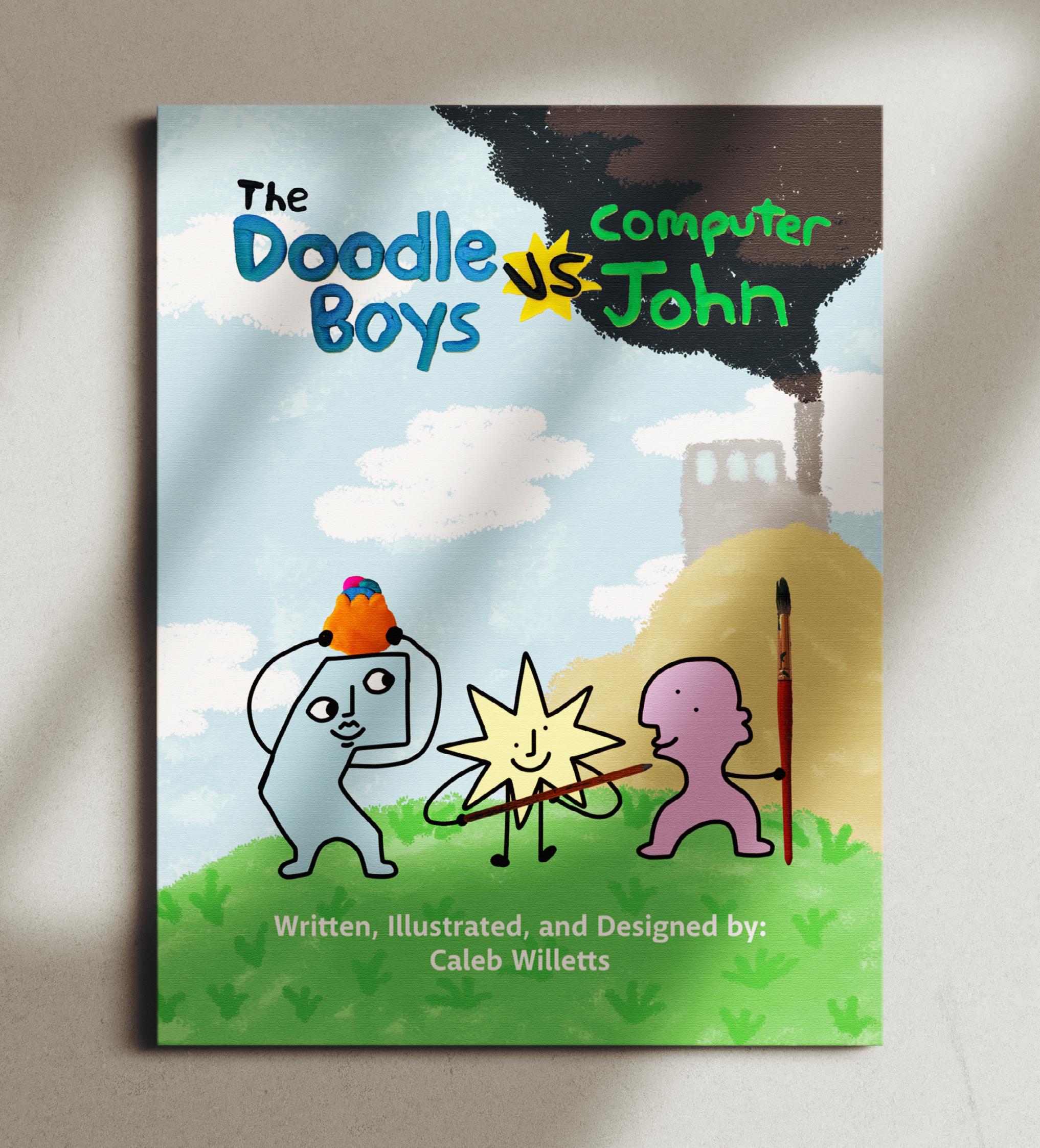
The Doodle Boys Vs. Computer John is a children’s book about creativity vs. AI generated imagery. The story follows the Doodle Boys; a trio of brothers who live in Doodle Town and love to create. Across the river from them is Tech Incorporated, where some of the residents of Doodle Town work. Tech Incorporated is owned by the Tech Brothers. The Tech Brothers are trying to find a way to get the Doodlians to make works of art for them without paying them. That’s when they turn to their latest invention, Computer John. Computer John can make AI generated creatures for free as long as he’s powered by the natural resources that surround Doodle Town. When the Tech Brothers kidnap a bunch of Doodlians to power Computer John, the Doodle Boys spring into action. It’s a head to head battle against the Doodle Boys and Computer John’s army of AI generated creatures. Find out who wins this epic showdown in The Doodle Boys Vs. Computer John!
ux/ui, poster
The Subscription Tracker is designed to simplify the overwhelming task of managing multiple subscriptions. Inspired by the concept of "dark patterns," it empowers users to visualize and control their subscription expenses. By organizing costs and highlighting hidden fees, the tracker helps users make more informed decisions about their spending. The project aims to foster transparency in a system often designed to be confusing and manipulative. Through interactive features and color-coded visuals, it offers a practical solution for users to track, evaluate, and adjust their subscription habits. Ultimately, the tracker is a tool for reclaiming control over digital consumption, encouraging mindful financial decisions in a modern consumer landscape.
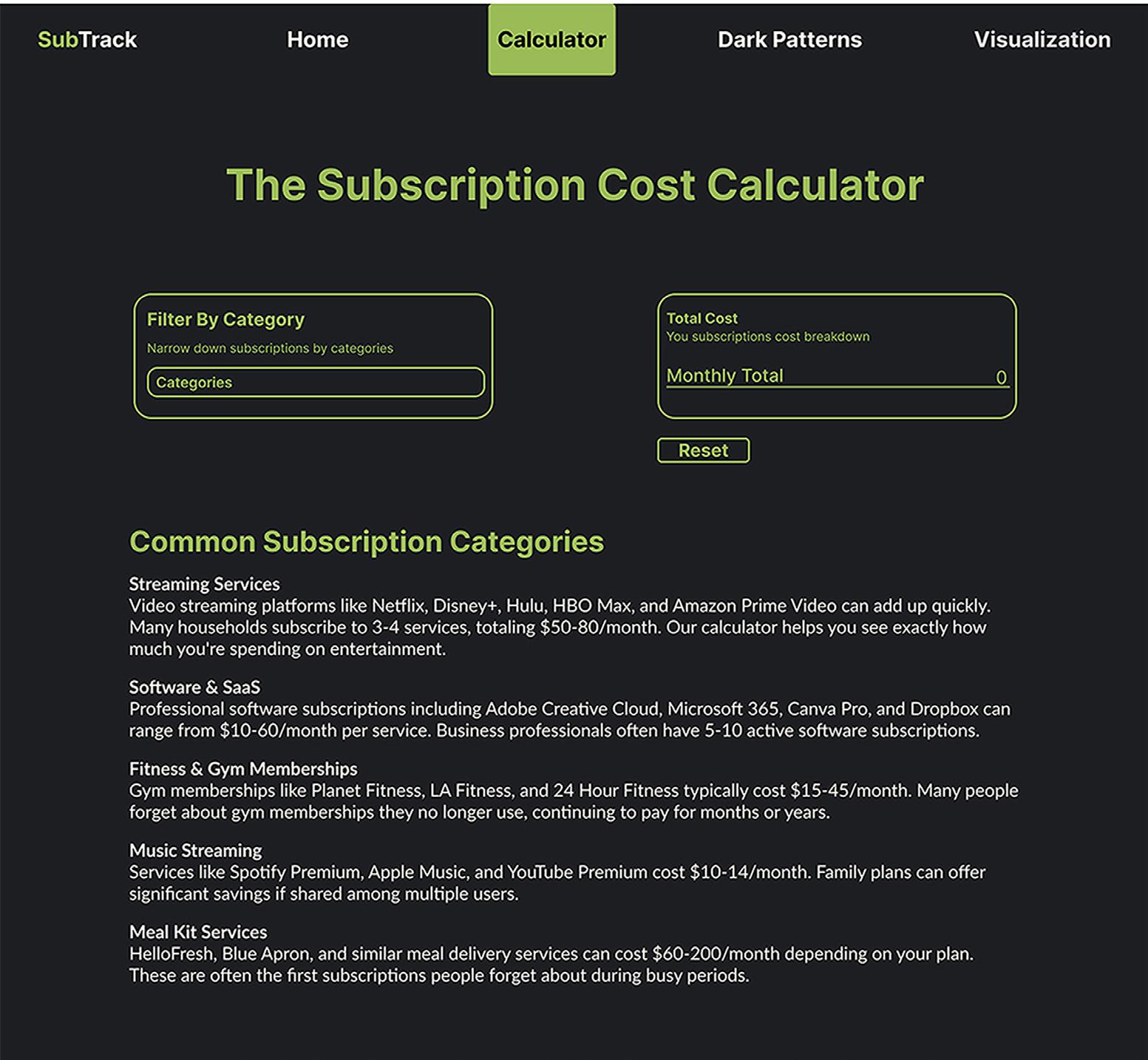
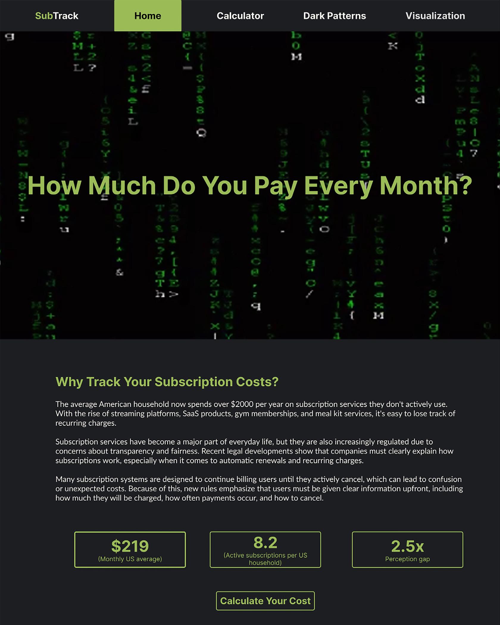
A comprehensive website designed to help users track and manage their subscription costs, offering a cost calculator, visualization tools, and educational resources on dark patterns in subscription designs.
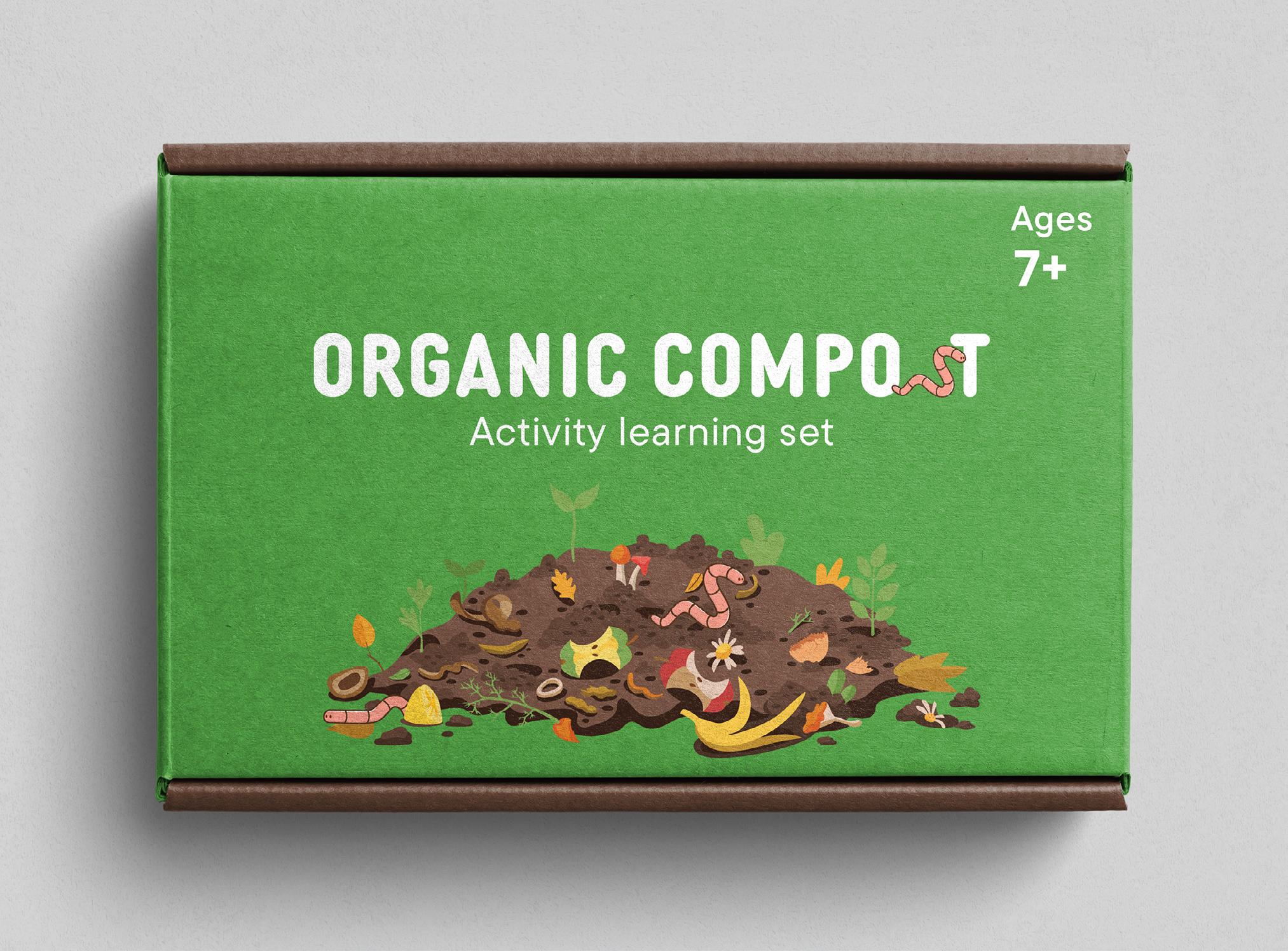
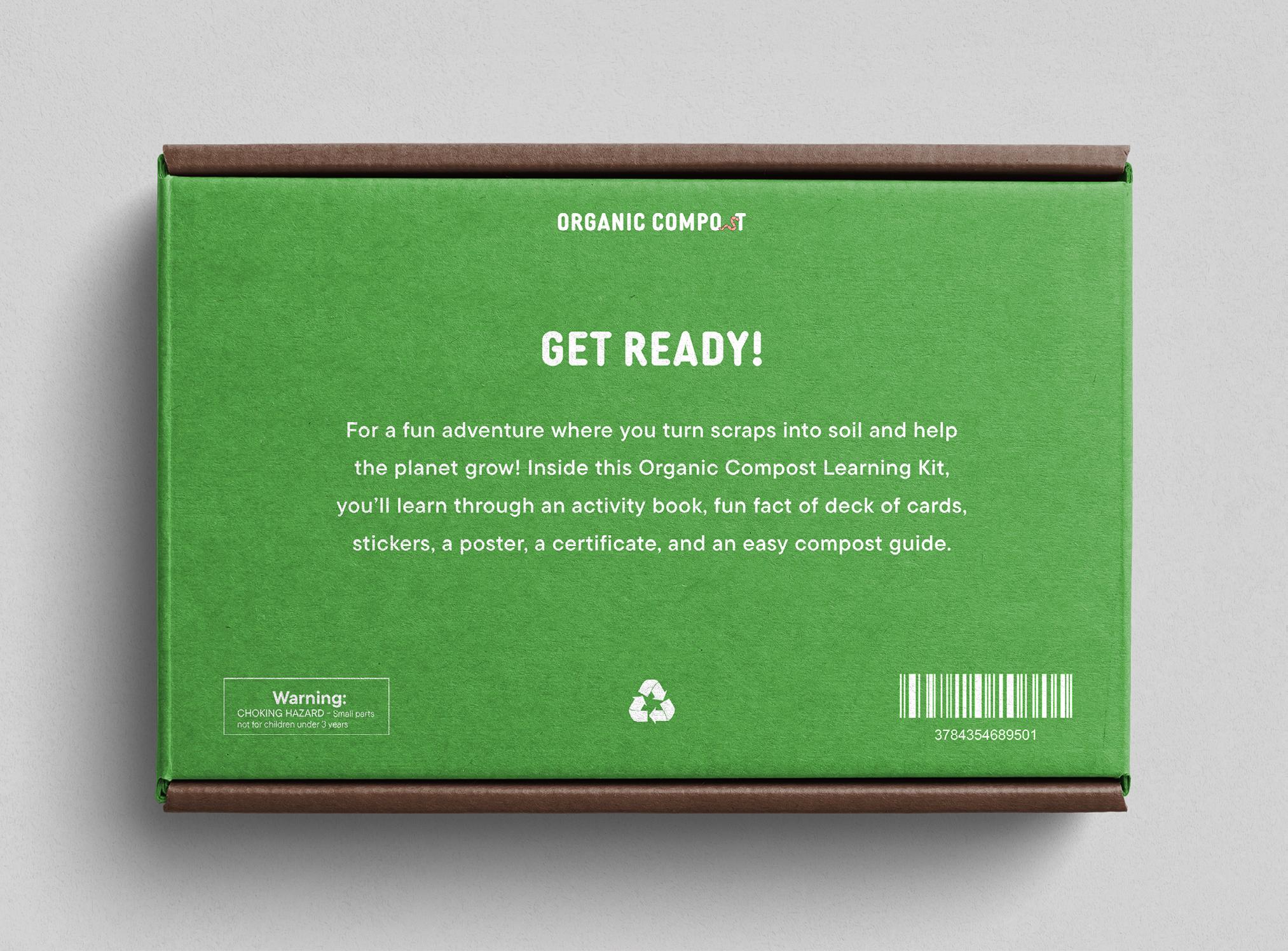
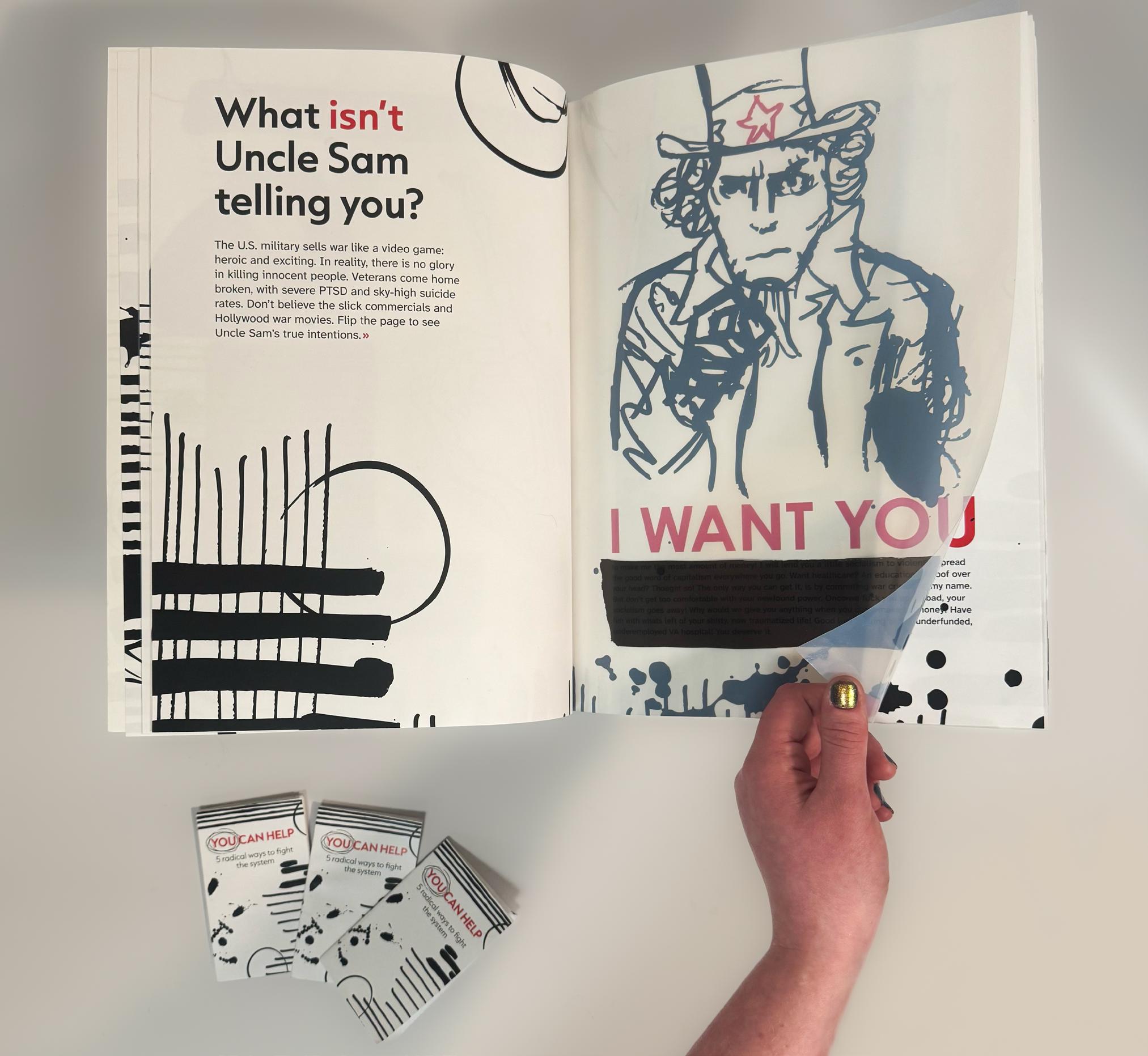
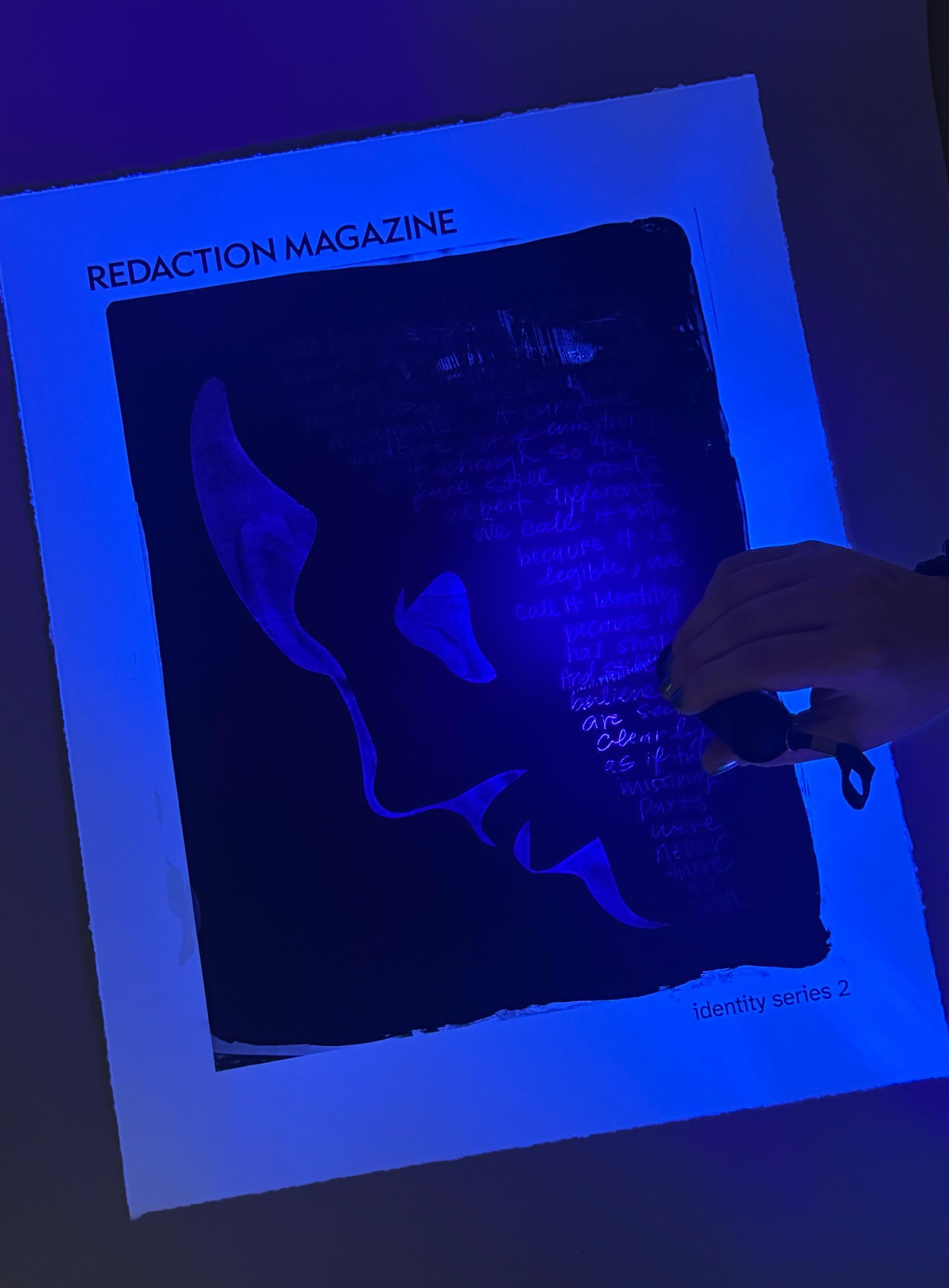
My work focuses on designing packaging for a learning kit about organic compost for elementary school children ages 7 to 12. The kit includes an 8-page activity book, stickers, a guide sheet, a certificate, and other interactive materials. I was drawn to this project because I noticed that many kids are not taught about composting at a young age and often don’t learn about its importance until much later. Composting can make a big difference for both people and the environment, so I wanted to introduce these ideas early in a fun and engaging way. In my work, I use bright colors, friendly illustrations, and clear layouts to create an engaging learning experience for children. My design focuses on simple visuals and easy-to-read text to help young audiences understand composting in an approachable and enjoyable way. I hope my work helps children gain knowledge, become curious about composting, and develop habits that encourage them to compost more and care for the environment.
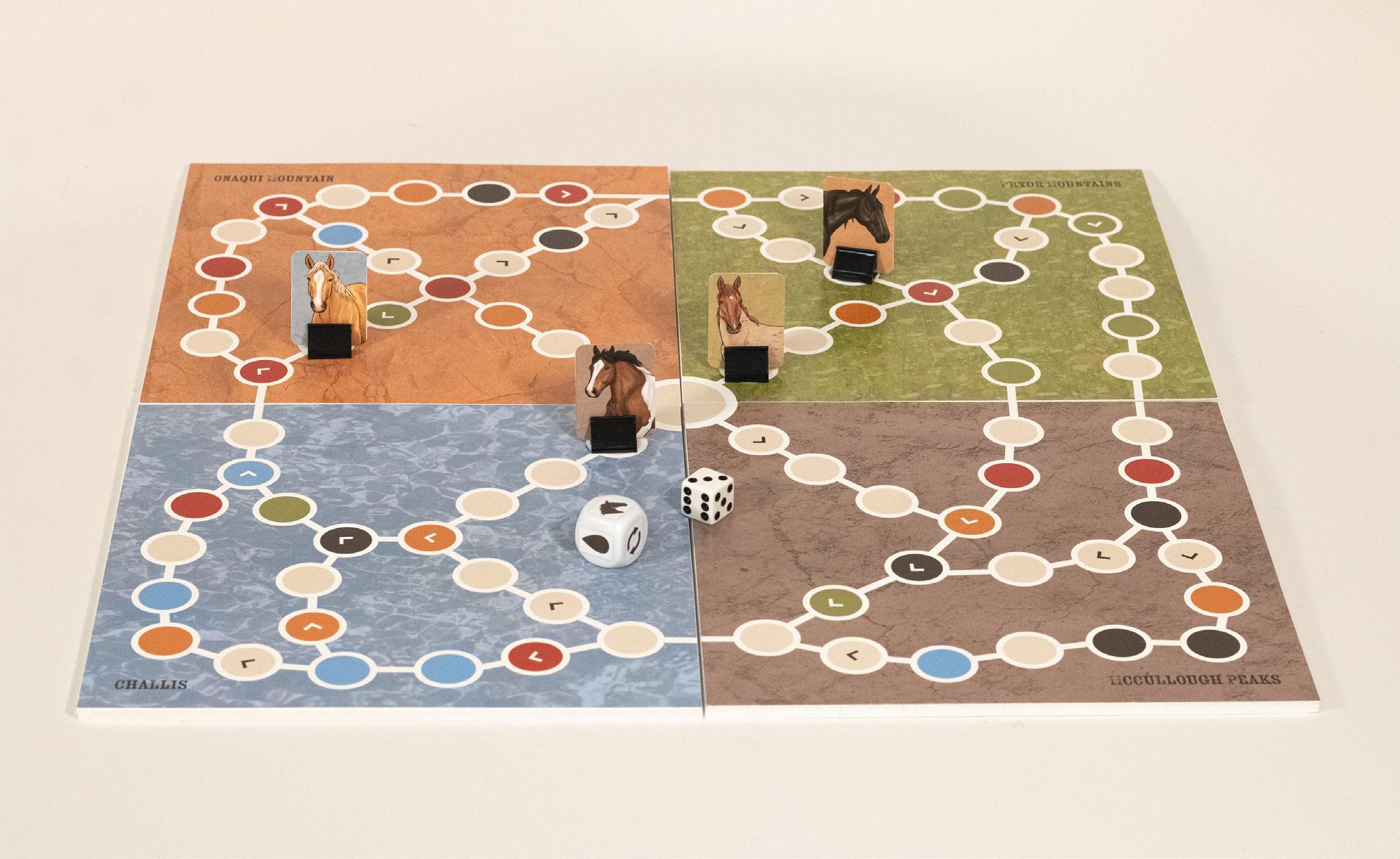
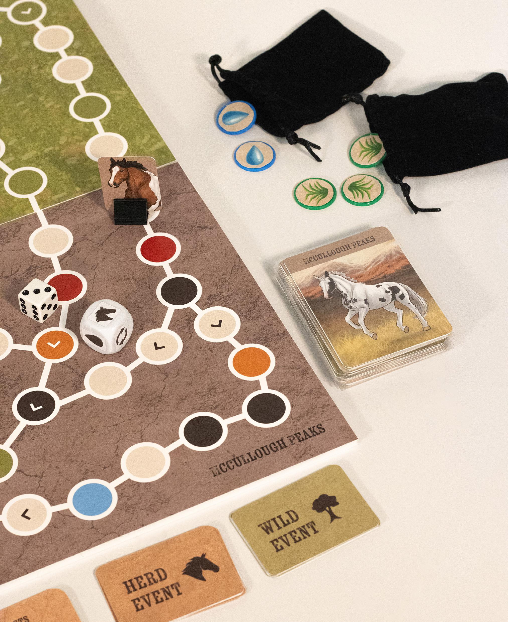
Wild Hooves Board Game
digital print
My passion for animals, horses, and nature drives a lot of my work, and I love creating graphic design work that is meaningful and helpful to others. Wild Hooves is an educational mustang horse board game where the player takes the role of a young stallion, recently kicked out of his natal herd, who is seeking to start his own herd. My goal with this project was to showcase my design and illustration skills driven by my own passions and interests. I hope to get people excited about mustang horses and educate them about their way of life. Mustang horses are an icon of America and a symbol of freedom, beauty, and strength. By creating a board game, I am able to help people learn more about these beautiful, resilient animals in an engaging way.
The Milkshake Series paper, photoshop, indesign
I thrive in anything that lets me be creative. I have art and different stories to share, and with this project, I can do both.
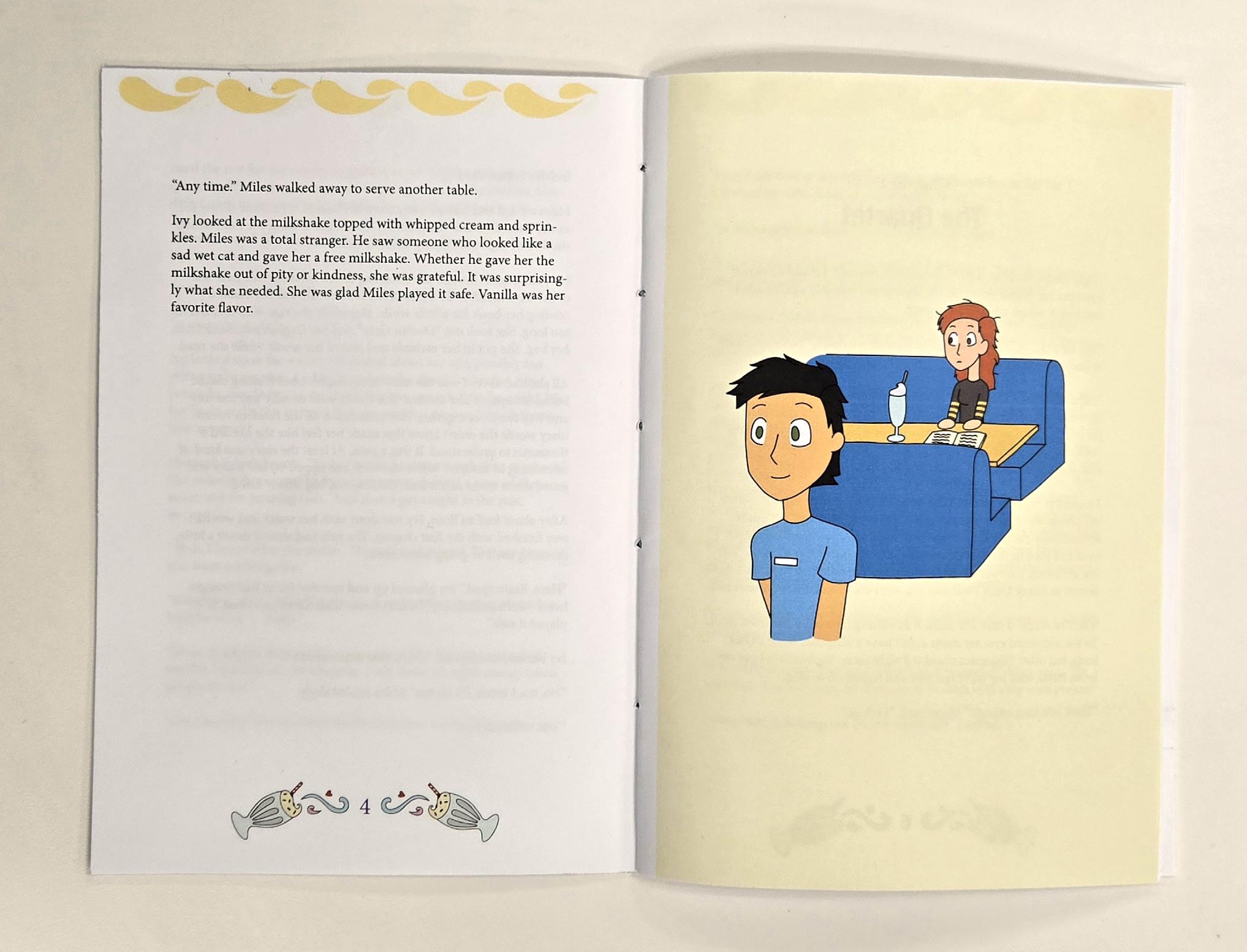
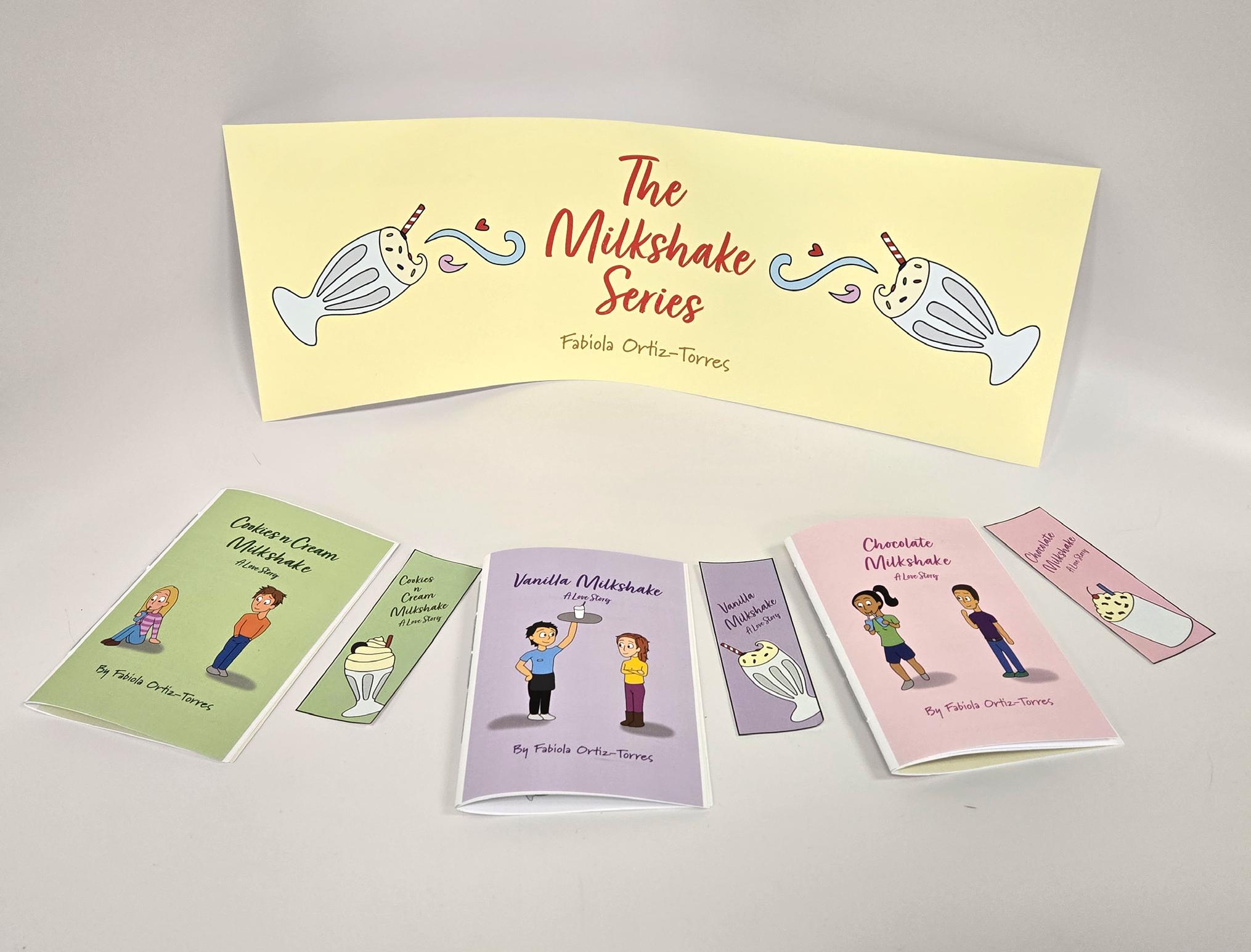
Illustrated, printed, and bound booklets, bookmarks, and banner
figma, digital
I’m a graphic designer who sees design as a balance between clarity and creativity. My work focuses on making ideas simple, bold, and easy to understand while still feeling original. I’m inspired by everyday visuals, culture, and digital experiences, and I like turning those influences into clean, modern designs. I believe good design should communicate first and look good second—it should guide the viewer, not confuse them. Whether I’m working on branding, packaging, or digital layouts, I pay attention to structure, typography, and consistency. For me, design is about problem-solving and storytelling at the same time. Every project is a chance to create something that not only looks strong but also has purpose and meaning behind it.
website, package design, 3d resin print
SNAP/PLAY is a collaborative, snap-fit model kit system designed for pre-teens and beginners. The project addresses how traditional model kits are often too complex, intimidating, and designed for solo use. SNAP/PLAY takes this opportunity for improvement to create a shared, approachable experience through clear instruction design, and modular creature models. Designing for children is one of my favorite kinds of projects, it is always fun and keeps my imagination going.
kaylahalbig.com
@dualt0
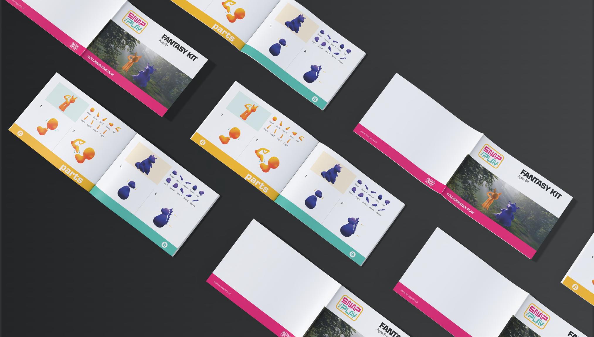
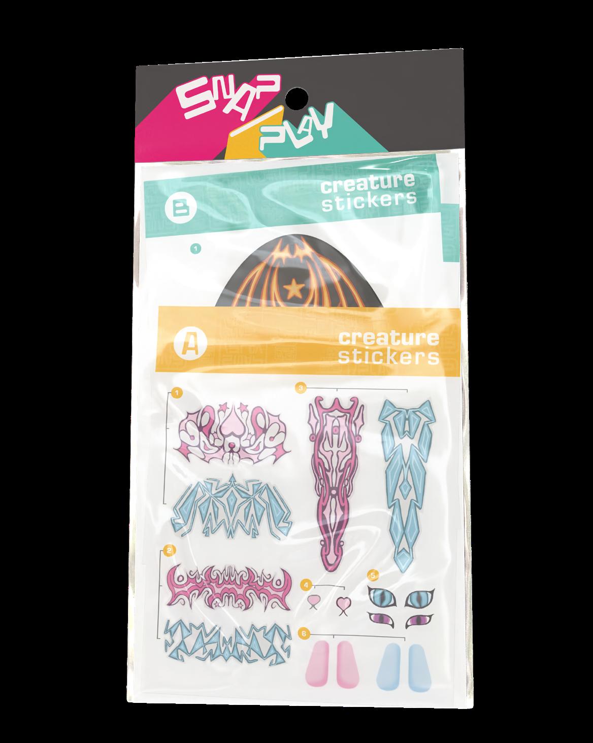
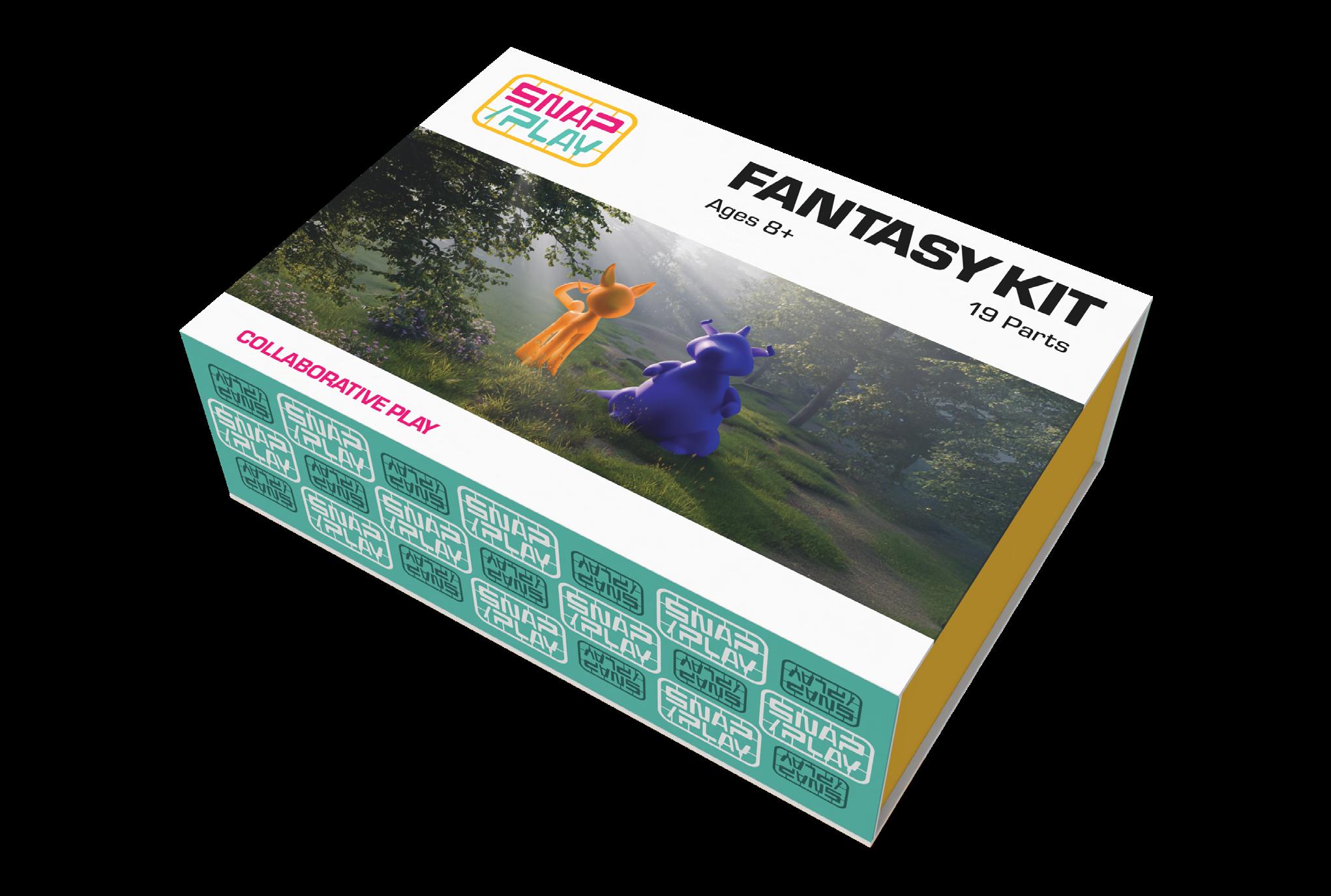
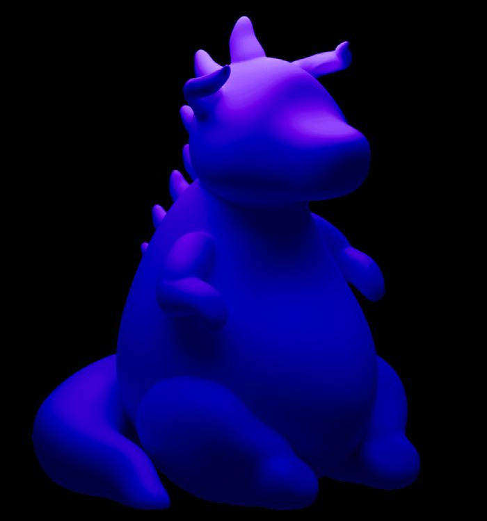
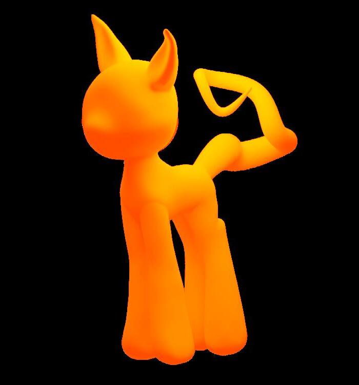
The model kit includes two figures, sticker sheets, instruction booklet, snippers, and the box itself. There is also a supporting website for parents, snapplay.co
Mama Nini
digital print
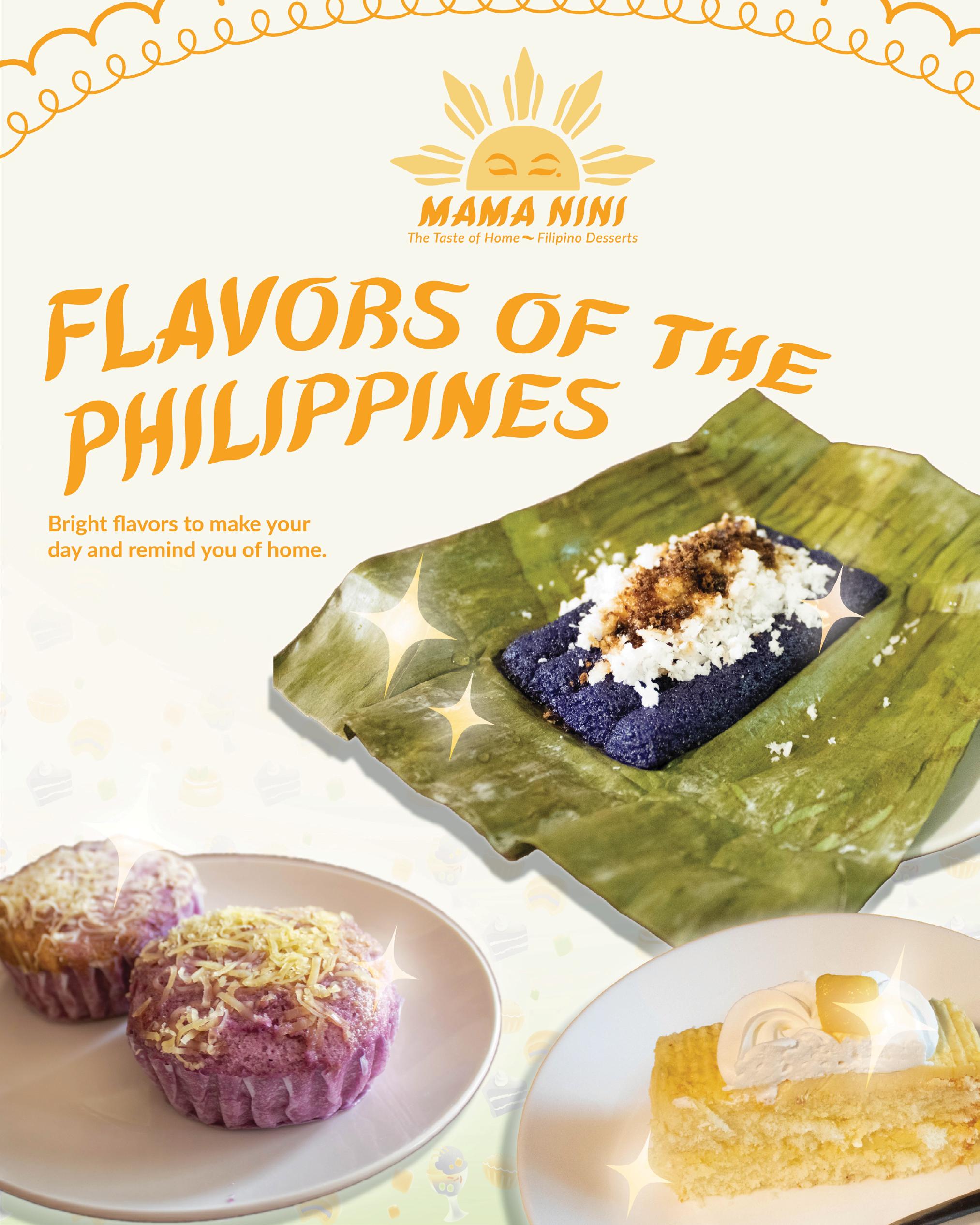
Mama Nini is a concept for a Filipino-American dessert shop based in Baltimore named after my mother’s nickname, Nini being an endearing term for the youngest of the family. The design for this project combines homely aesthetics and Filipino nostalgia to convey a sense of childhood whimsy that appeals to both Pinoy audiences and those unfamiliar with Filipino flavors. This project is more personal for me because of how Asian culture has been treated in recent years. Asian foods and desserts have skyrocketed in trending online, repackaged in different wording and language that disconnects the food from its original culture in order to cater to a palette of what is considered “normal”, enabling consumers to overlook anything regarding the people who regularly enjoy those foods or practice certain cultural rituals. This project also includes promotional material for an event that the shop would host to raise donations towards autistic and special needs children throughout the Luzon region, bridging the gap between American consumers and serious topics concerning Filipinos and the culture.
ktumaob.myportfolio.com
DiChroma
digital, fabric paint and cotton shirts
My approach to DiChroma was to create interesting and expressive clothing that is color accessible to people with low color vision or color blindness. Clothing shopping can be difficult with strange lighting, unclear color labels, and removable tags which cause confusion and frustration. Brands that design for colorblindness often only offer simple neutrals, and limited designs. I wanted to use design to make shopping for clothes accessible without sacrificing creativity and self expression. I accomplished this by creating color labels that are visible when hung on a hanger or folded, and by designing shirts with a red/green colorblind color chart. This allowed me to pick colors that stood out without using a limited palette and create shirts that were unique and expressive that look good to low color vision.
mljsketch.wixsite.com/mjpluto-designs
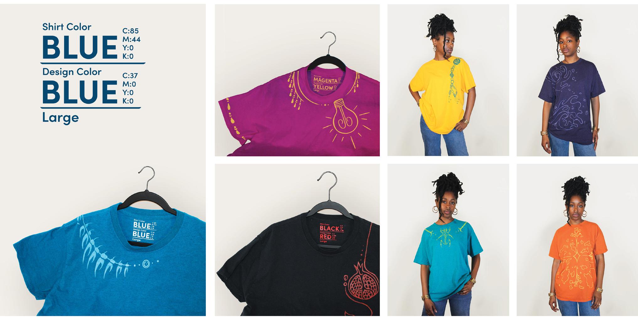
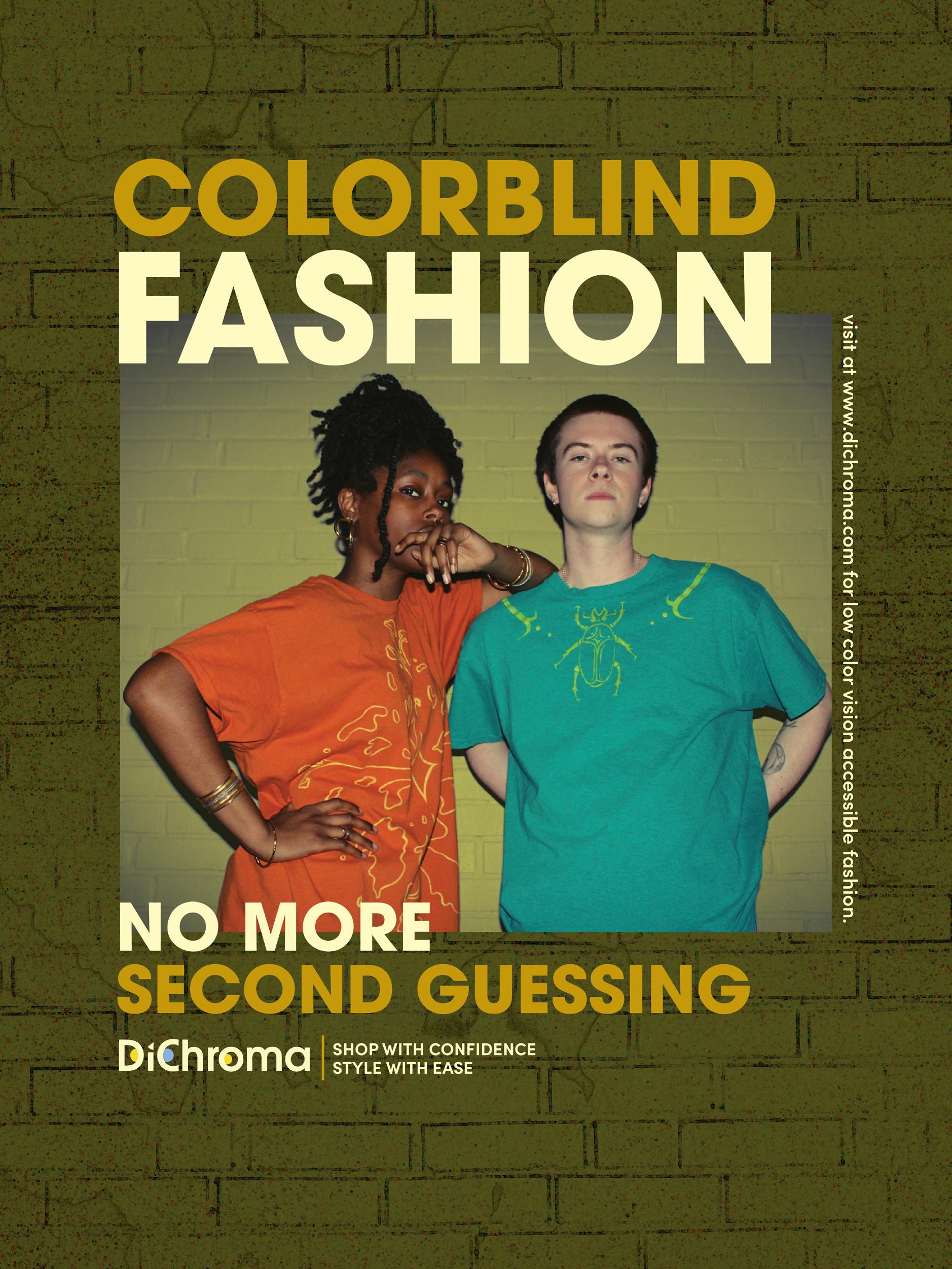
Dichroma advertisement for website.
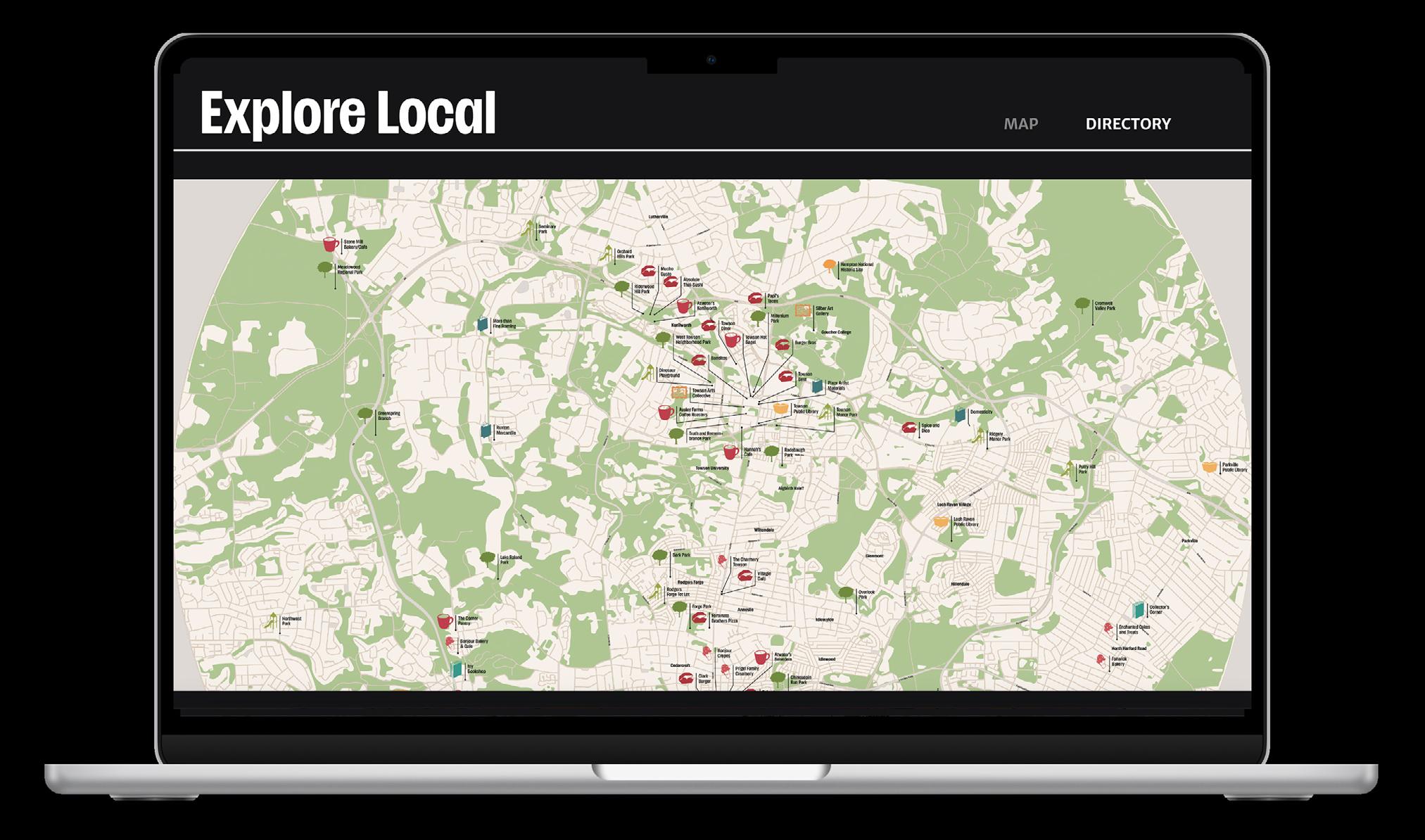
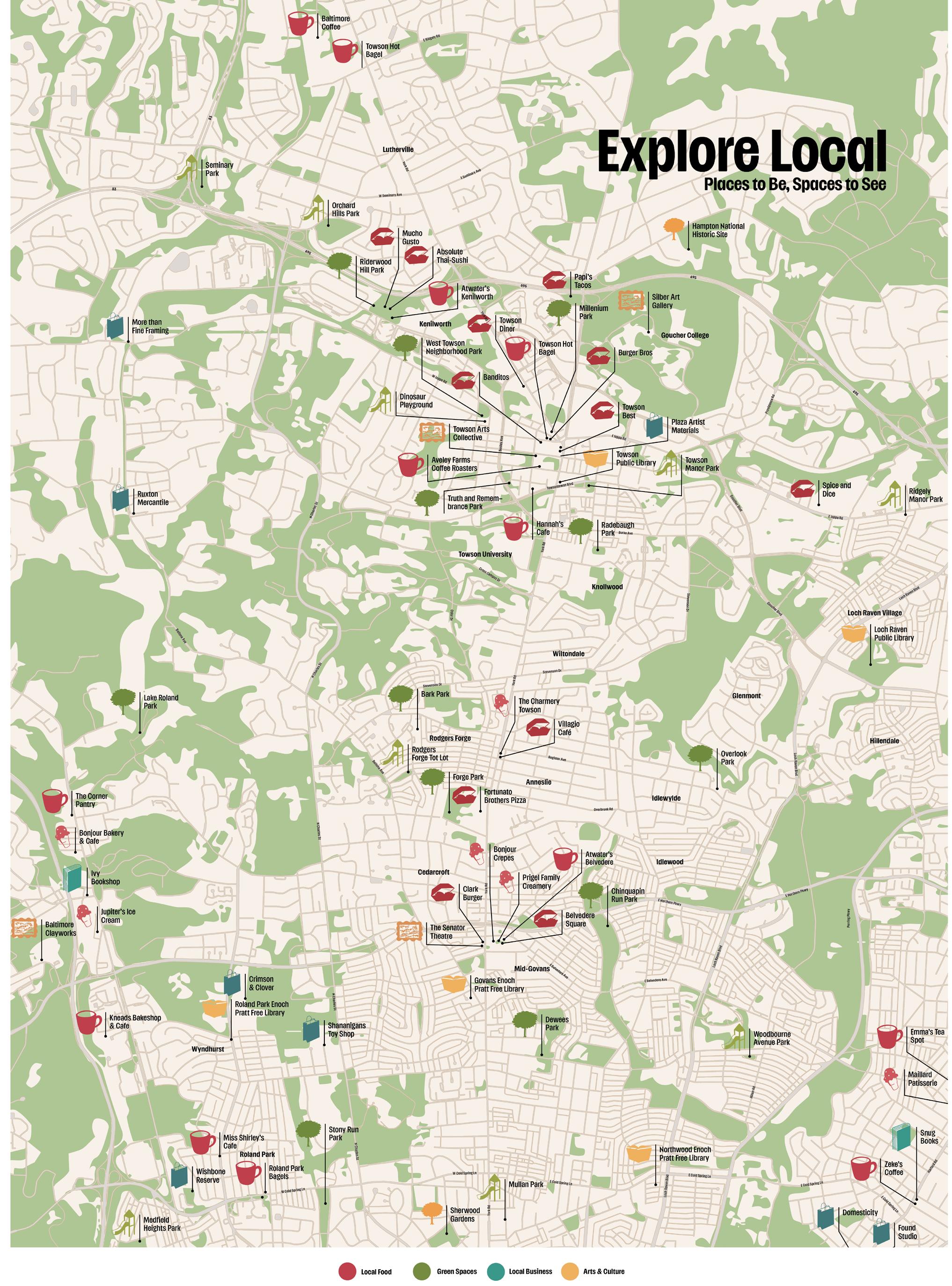
Explore Local is a map of the 5 miles surrounding Towson University, highlighting local businesses, green spaces, and third places with the hope to encourage local students to explore and connect with their immediate local community. Featured as a poster and a website for easy exploration of nearby cafes, parks, museums, bookstores, takeout, shops, and libraries.
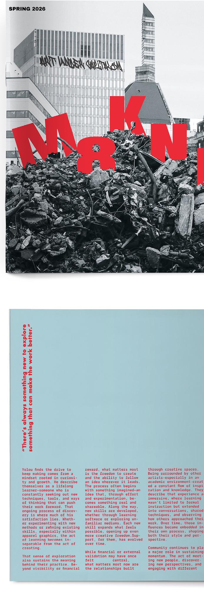
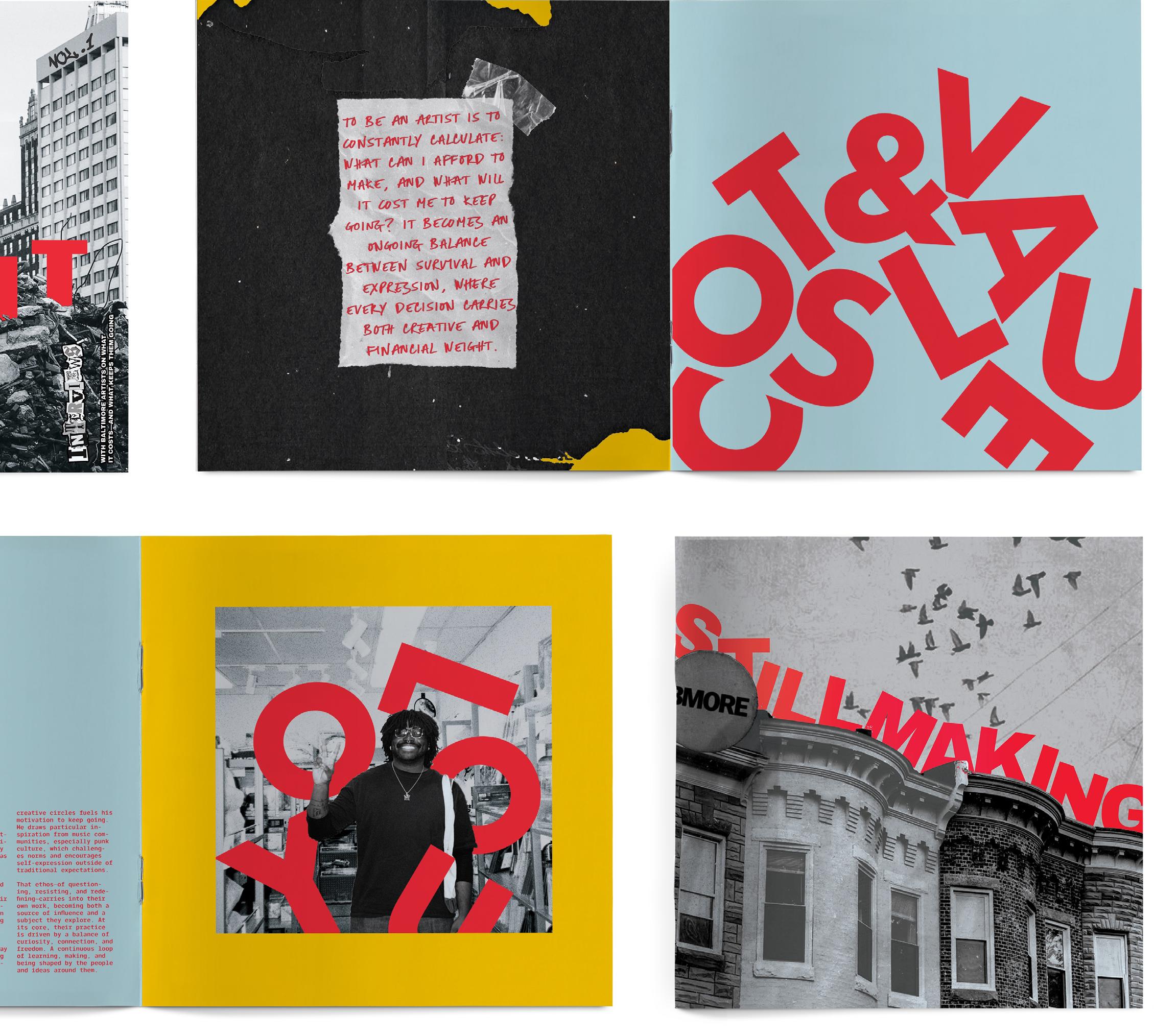
M8KN IT
print media
Making It explores what it means to continue creating within the constraints of everyday life, limited time, financial pressure, and the realities of working under capitalism. Focused on Baltimore’s creative community, the work highlights artists who persist, not for visibility or profit, but out of necessity, connection, and personal meaning. Using collage, handwritten text, and found materials, the piece reflects the fragmented reality of sustaining a creative practice. Receipts, notes, and ephemera act as evidence of lived experience —tracing the labor, time, and resources behind the work. Phrases like “WHY DO WE KEEP MAKING?” shift the focus from individual struggle to a shared experience. Ultimately, Making It frames art as something essential, sustained by community, and by the need to continue, even when it’s difficult.
digital artwork
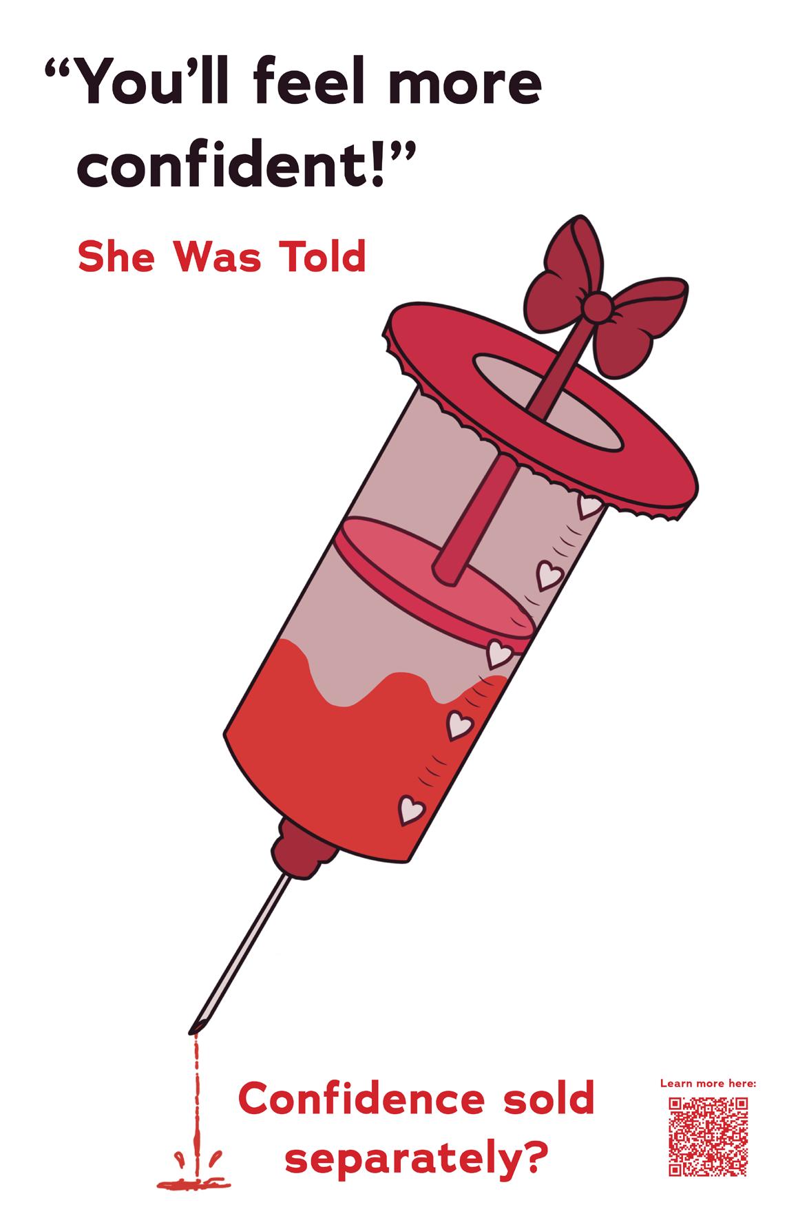
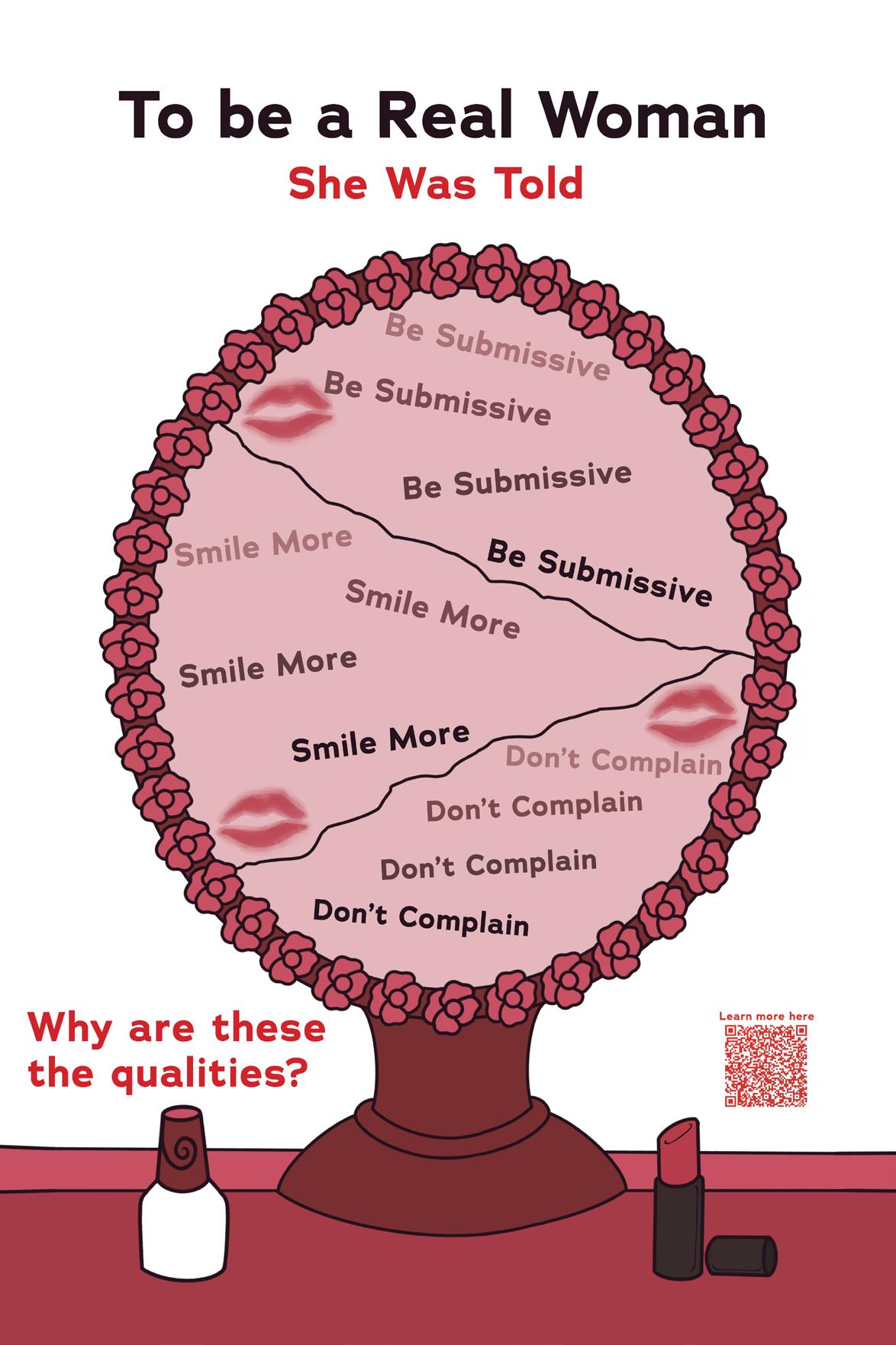
"She Was Told" is a poster series that I created to showcase different things women are told just because they exist. Society has condemned women into roles where any small victory, be it personal or not, is diminished, and if she is to show that she isn't happy about that then she would be ridiculed even further. This can happen from someone randomly or even someone who they trust, it's like a double-edged sword — a lose-lose situation every time.
@xyprim_night
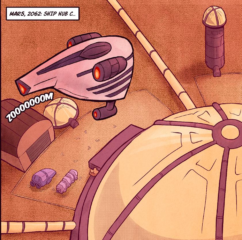
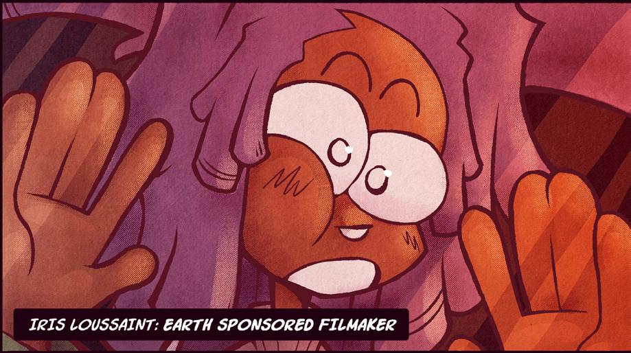
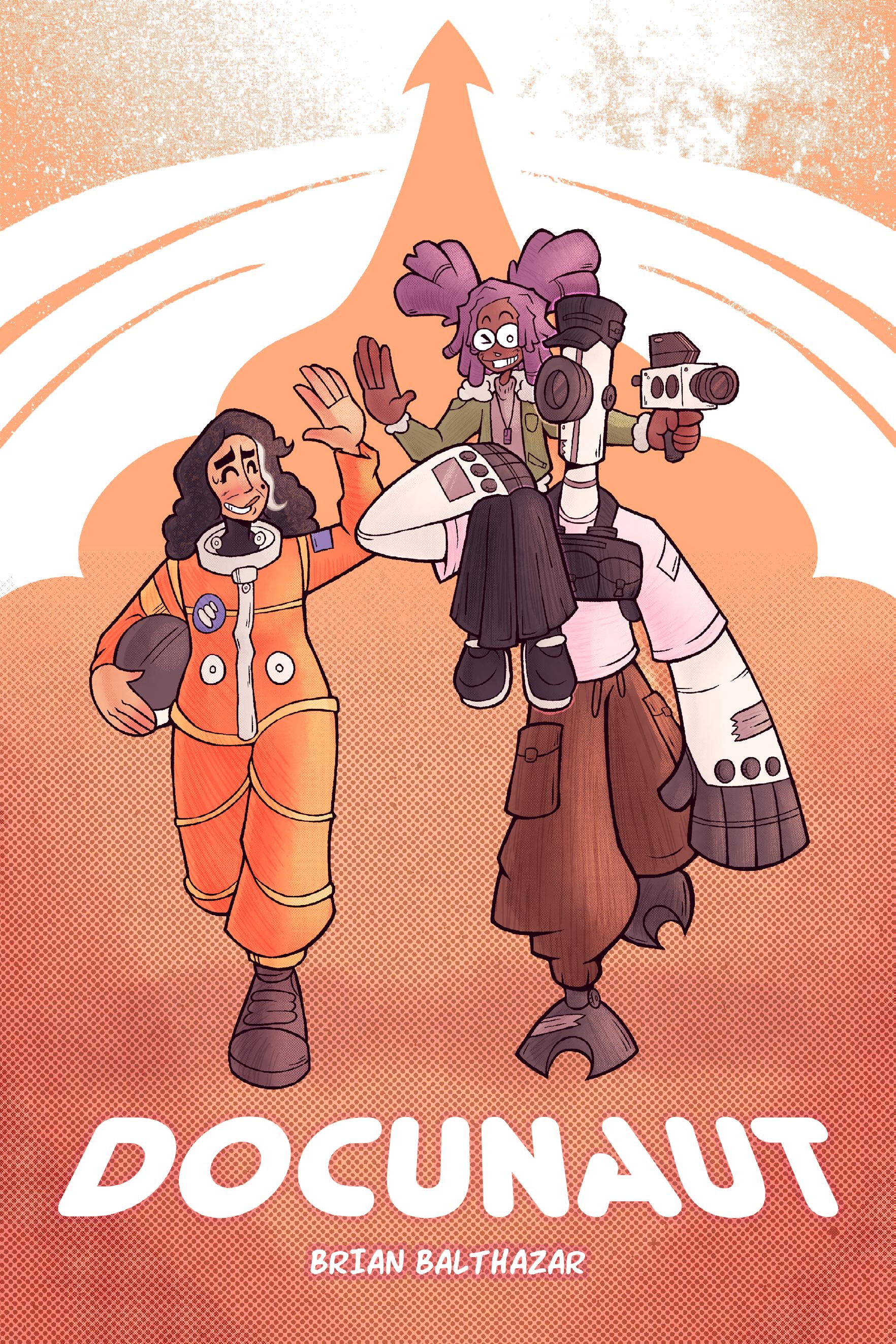
Docunaut digital
My whole life, I’ve enjoyed designing characters and creating worlds for them. This project marks the first time I have fully committed to building a formal narrative. My style features thick lines and cartoony imagery that evoke a sense of whimsy and nostalgia. Growing up, reading Scott Pilgrim vs. The World by Bryan Lee O’Malley was a major influence on my artistic style, my desire to create comics, and my interest in designing compelling characters, alongside my extensive exposure to cartoons, anime, and manga. The two main characters in this comic, Iris Loussaint and LENZ, were originally designed in a character design course I took during my junior year. That experience helped me further develop my style and deepen my understanding of what makes a character truly iconic. Moving forward, I plan to continue designing interesting characters and building vast narrative illustrations around them.
brianbalthazarart.carrd.co
@bbcomics.inc
Target Acquired | Fem Hooded Mosher
digital, screen printing on fabric
BUY MERCH AT YOUR LOCAL SHOW POSER!!! is an encapsulation of the spaces, the music, and the interwoven communities (and careers) that create local live music scenes. While most of the apparel is created as interpretations of music that emboldened me in a period of insecurity, this was also an opportunity to reach out forming connections with local emerging Baltimore based bands. I provided free merch designs to support a scene (particularly H.C.) as much as it has supported me this past year. While I was inspired by various bands, 156/ Silence, Fox Lake, Arms Length, and Brakence resonated with me the most to create my series of work. And of course, events such as Disturbin the Peace Fest and any tiny show I moshed to at (the Ottobar and Metro Gallery, my beloved), I owe so much gratitude to for constantly inspiring me to create.
carleyweed.com @nyroom_art
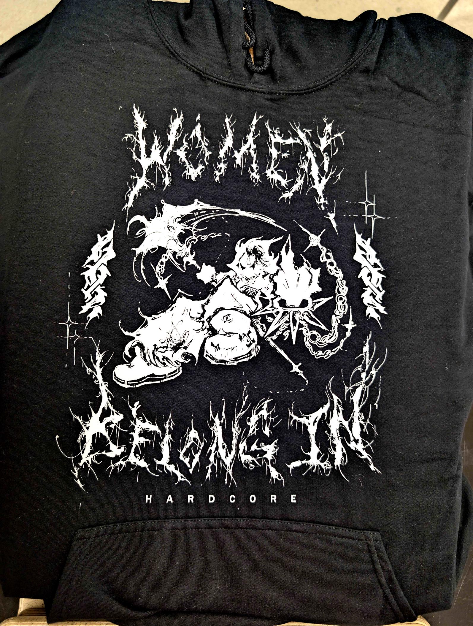
Fem Hooded Mosher, Screen print on fabric, is based off the Hooded Mosher art commonly seen in the hardcore and punk genre but re-imagining it as a female character. These communities particularly focus on empowering voices in the community yet there is still a lack of female participation. I want to encourage women to join or those that are already here, to stay and ESPECIALLY female musicians that constantly get hated on for doing what everyone else does, they belong more than anyone in these spaces.
“Big Sister, Little Brother” is a children’s book that tells the message that a big sister will always be there for her younger brother. Inspired by moments from my own childhood, the story reflects my experiences growing up with my little brother. I was really interested in exploring sibling relationships with significant age gaps, like my own with my brother, which are less often represented. Through this book, I aim to share our personal bond and highlight the unique ways siblings connect, support, and grow together.
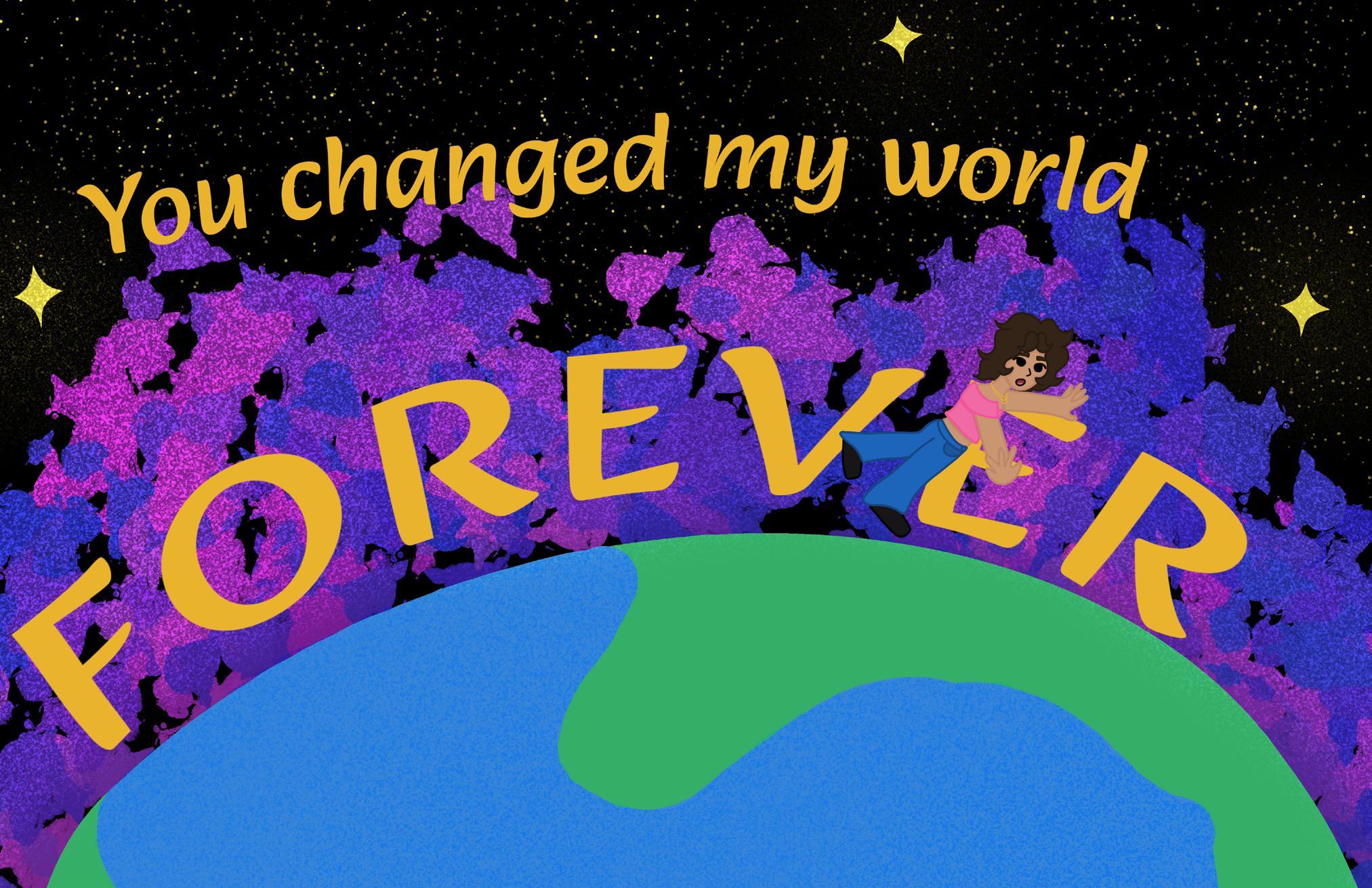
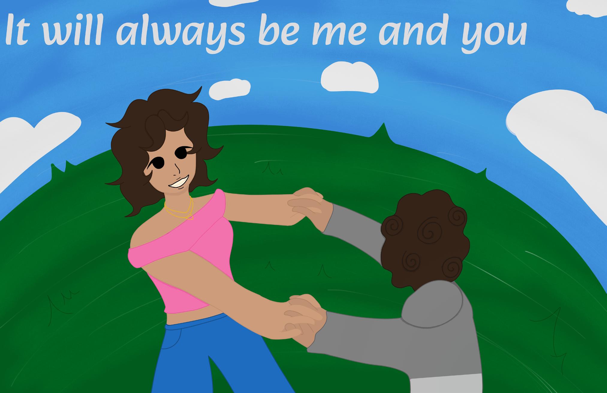
sister and little brother spinning together while being told it will always be them.
digital
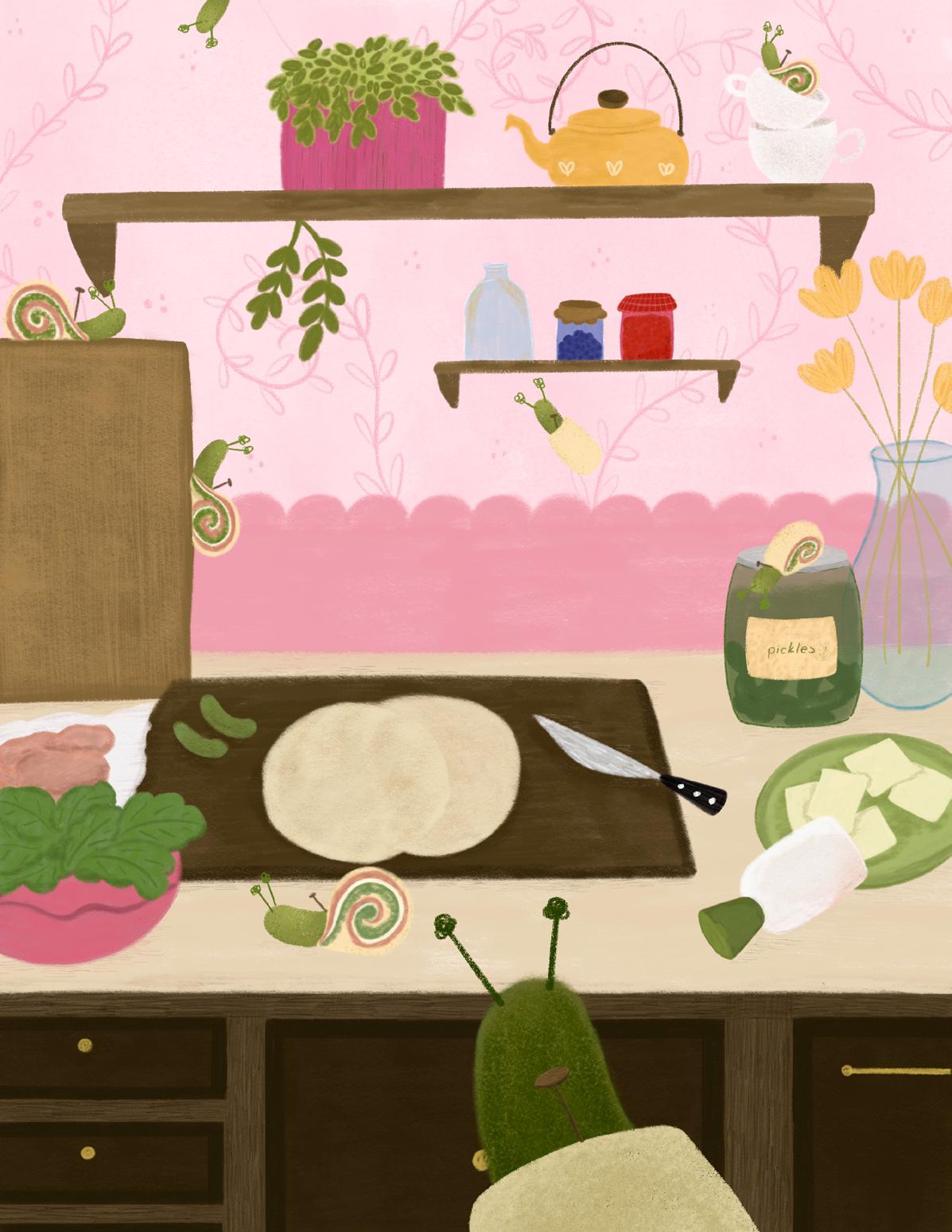
Little Chef Recipes was created as an interactive recipe book for kids and families to create memories together. Growing up I learned the importance of cooking with family and this project is a way for me to showcase that through my artistic practice. Art has always been a constant part of my life, from childhood to now, and it is important to me that my work can bring a sense of happiness and wonder. Through my illustrations, I aim to capture the joys and imagination of children's minds.
elizabethhubal.com
@ elizabeth_hubal_art
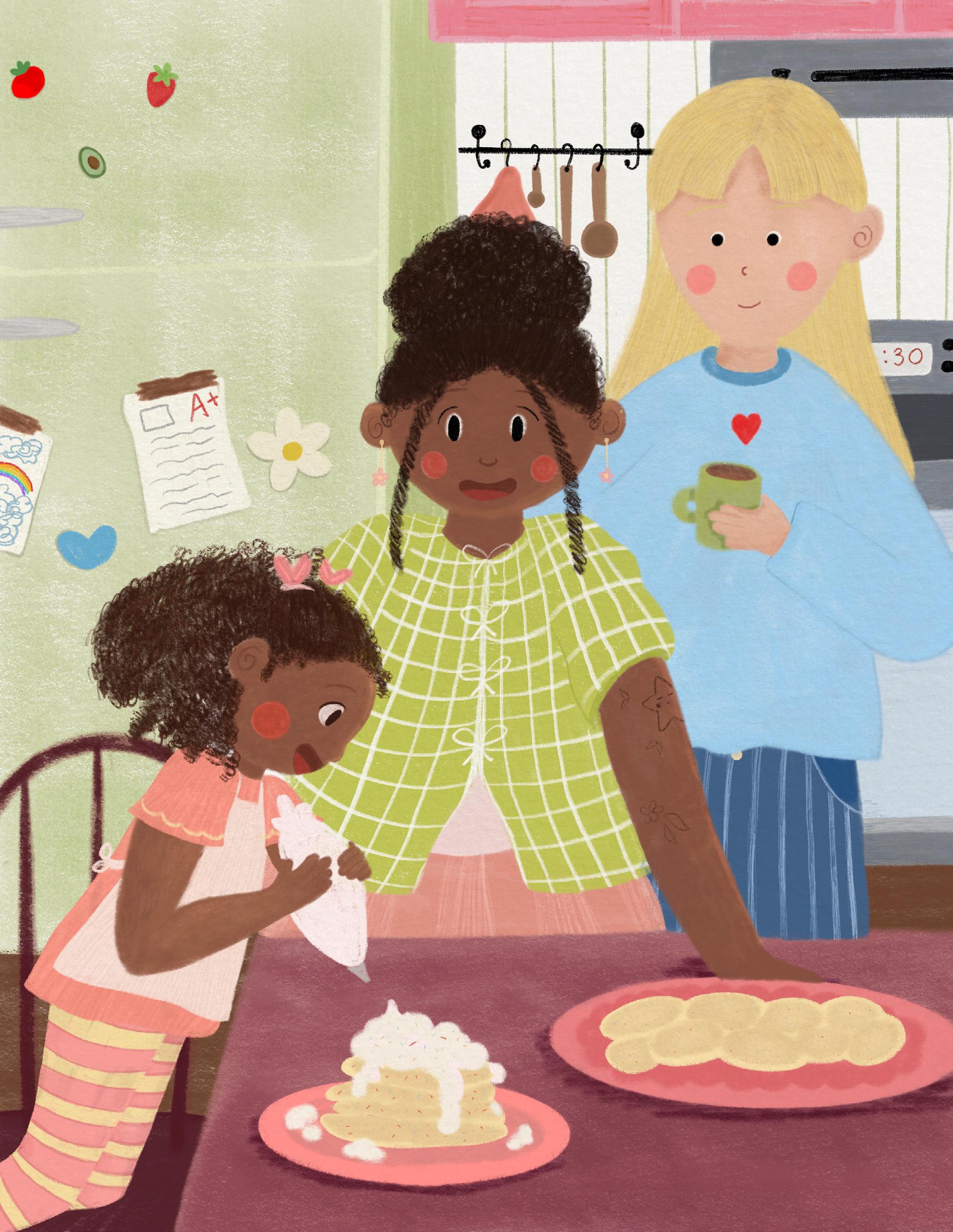
digital painting, digital animation, watercolor, mixed media
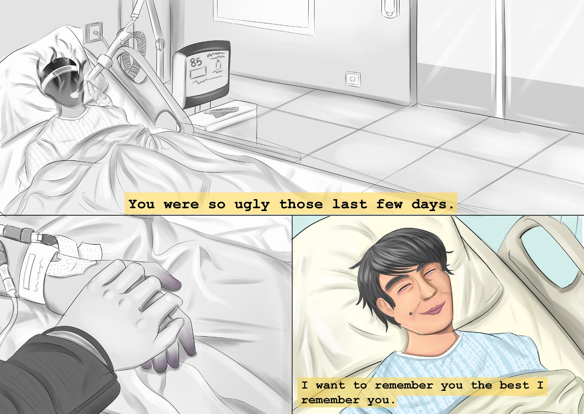
My dad passed away very suddenly this semester. The project was originally about my dad and I, and how much he cheered me up during hard times. I decided to change it to make it a tribute to him and my feelings on grief during this semester. Feel free to ask questions, as I am really happy (sometimes tearful) talking about my wonderful father!
hanaluong.com
@hana.giveshope
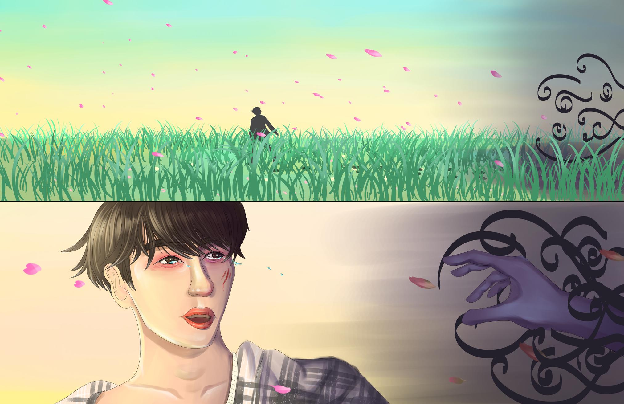
Running
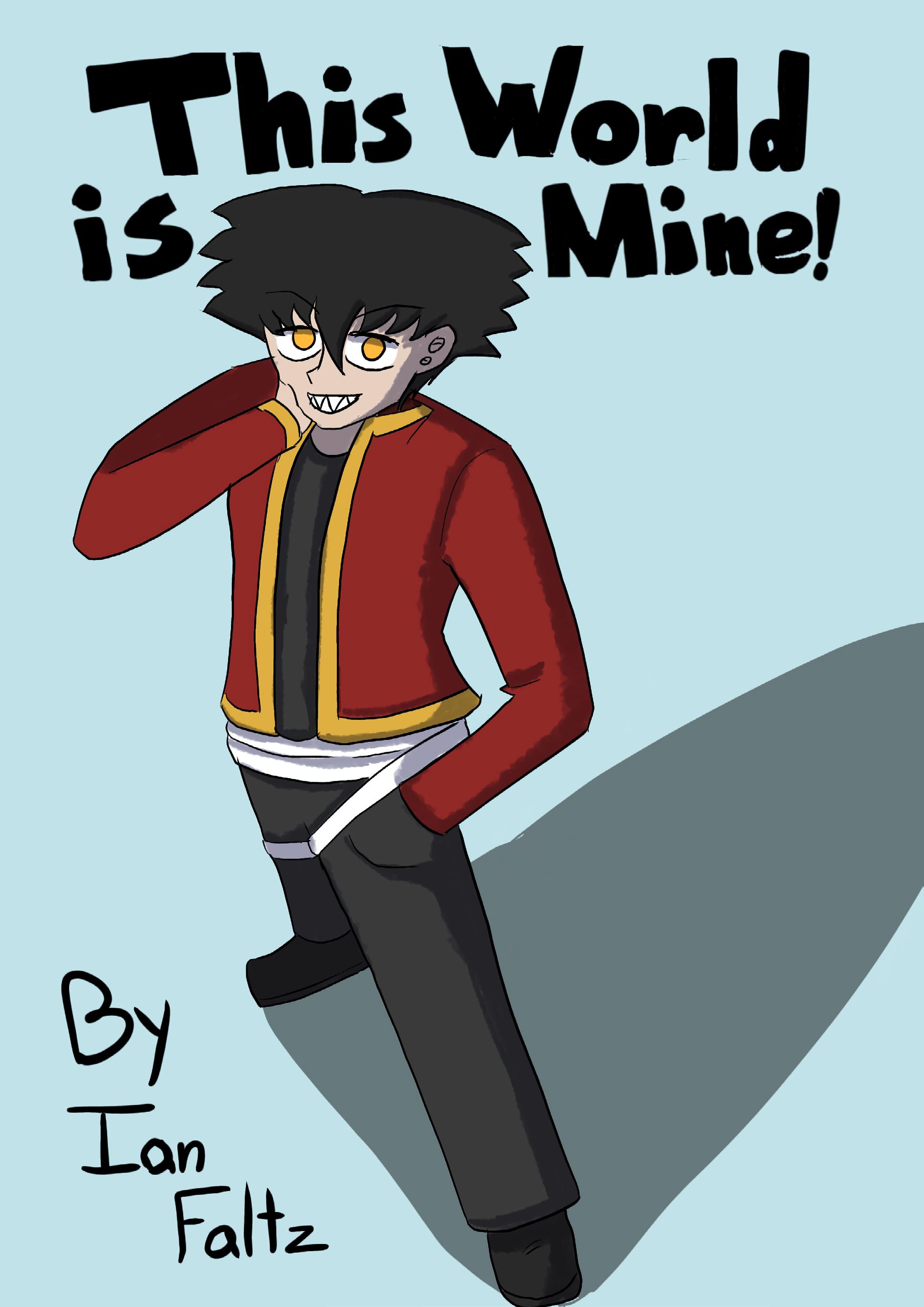
This World is Mine digital
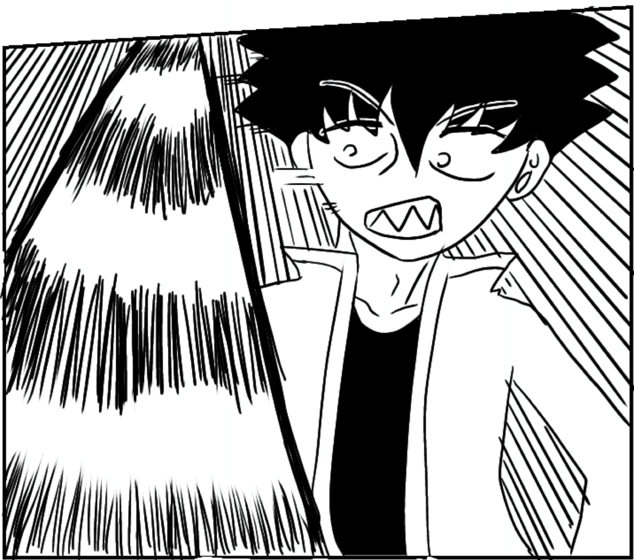
I'm Ian, and I have a strong passion for making illustrated comics and also writing stories as well. This World is Mine is a series I've been wanting to continue making for a few years at this point and this piece was a great chance to show part of what I would want it to look like. I want to be able to make more stories in the future come to life through my illustrations.
@justnovaru
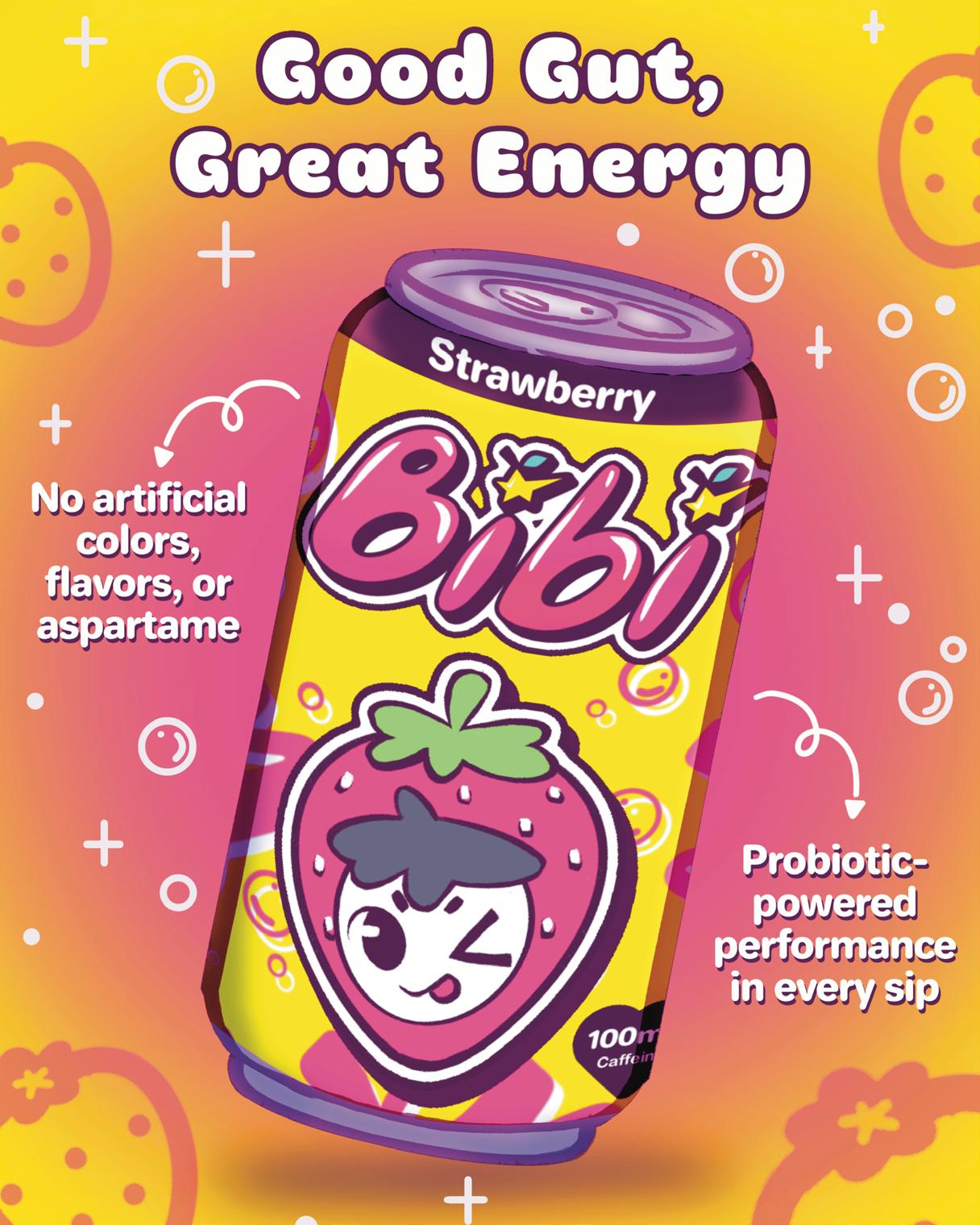
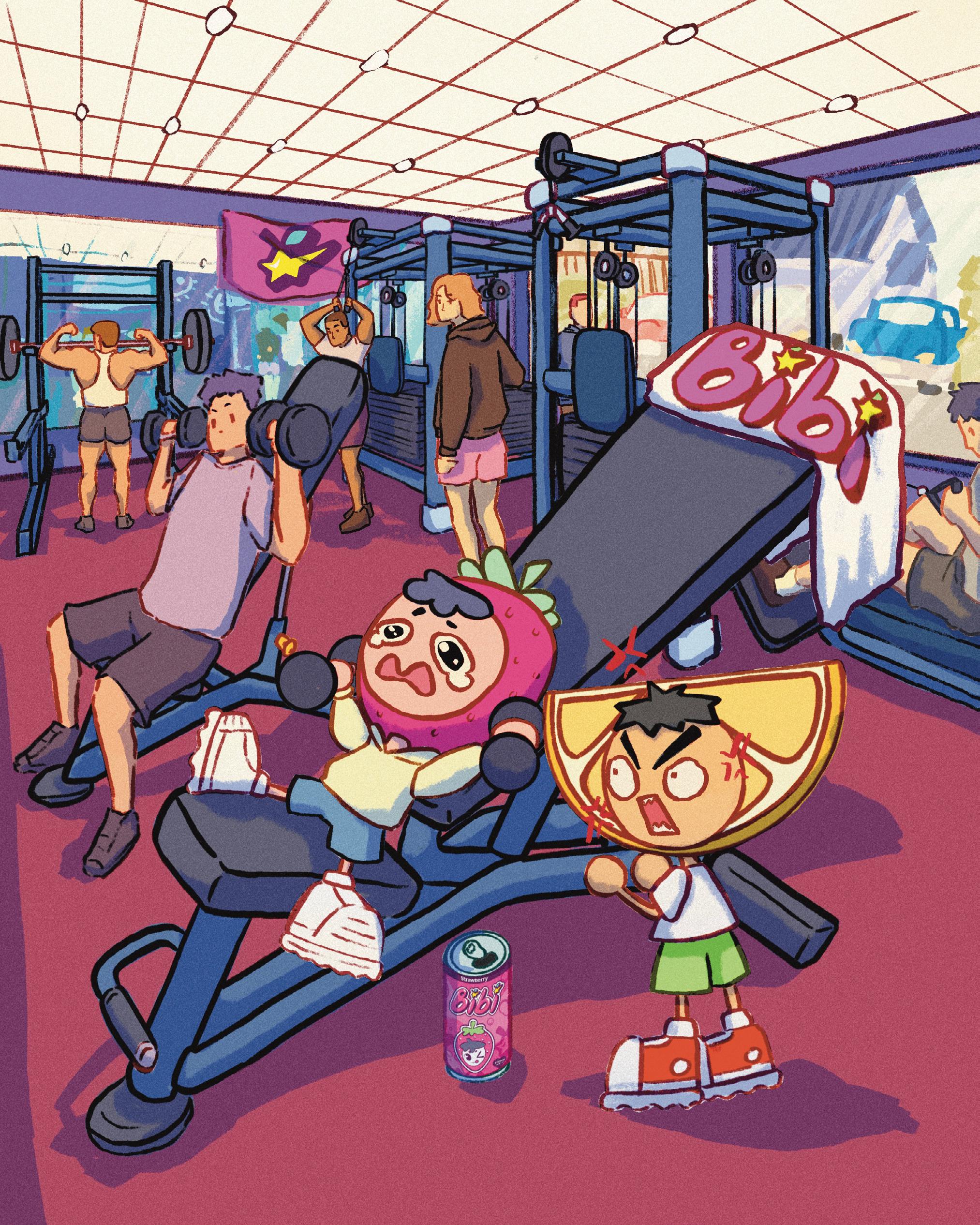
BIBIPOP | Working Out
digital
As an Artist, I want to create playful, colorful work evoking a sense of joy in my audience. Working in digital media, I create work that reflects my interest. In my most recent work "BIBIPOP", I illustrated and designed an energy drink brand. BIBIPOP is a drink that promotes good gut health while providing a serge of energy to get through the day. During this project I was able to study the world of branding and designing products that are associated with the brand.
jannethaiart.com
@ hai_jann3
digital
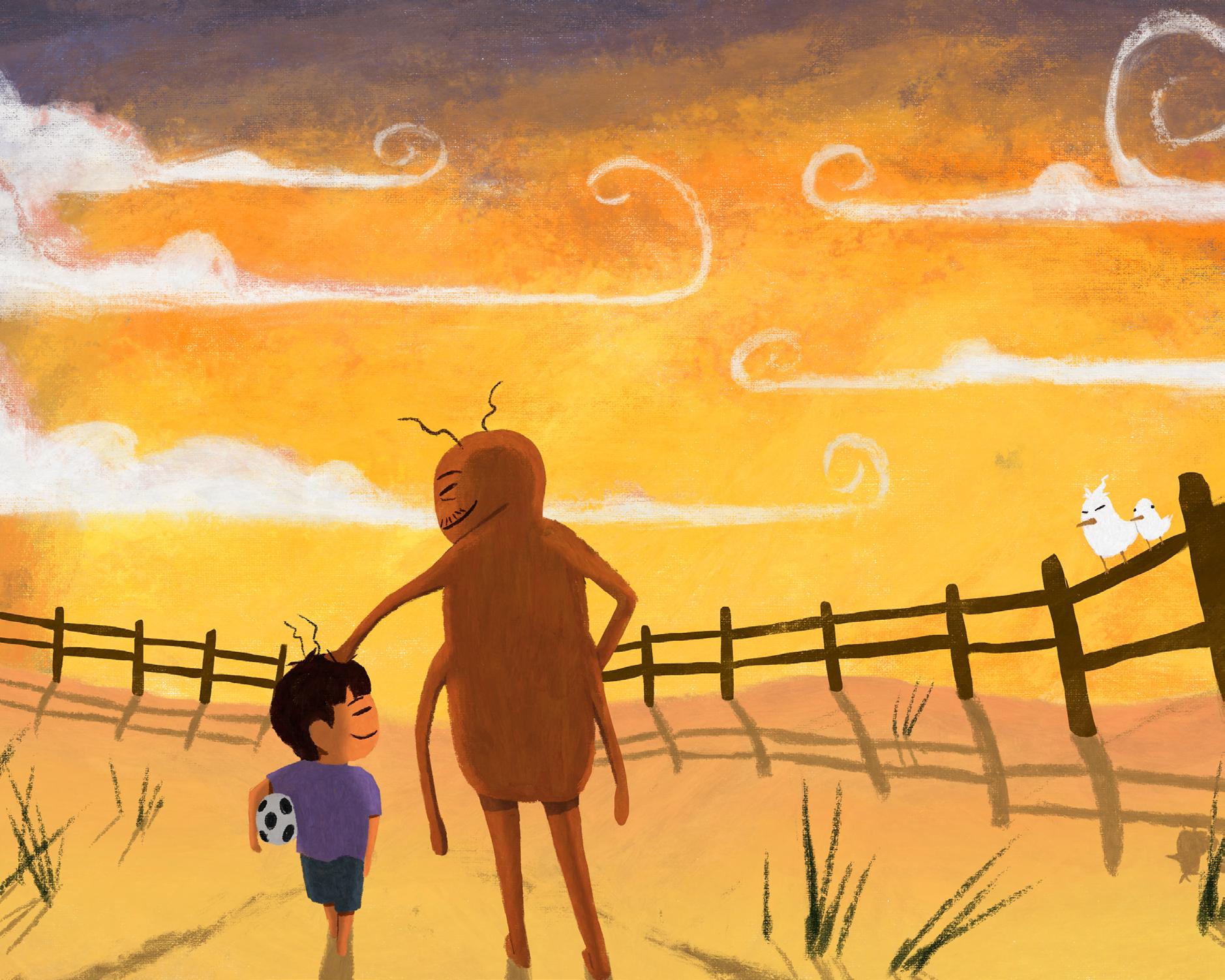
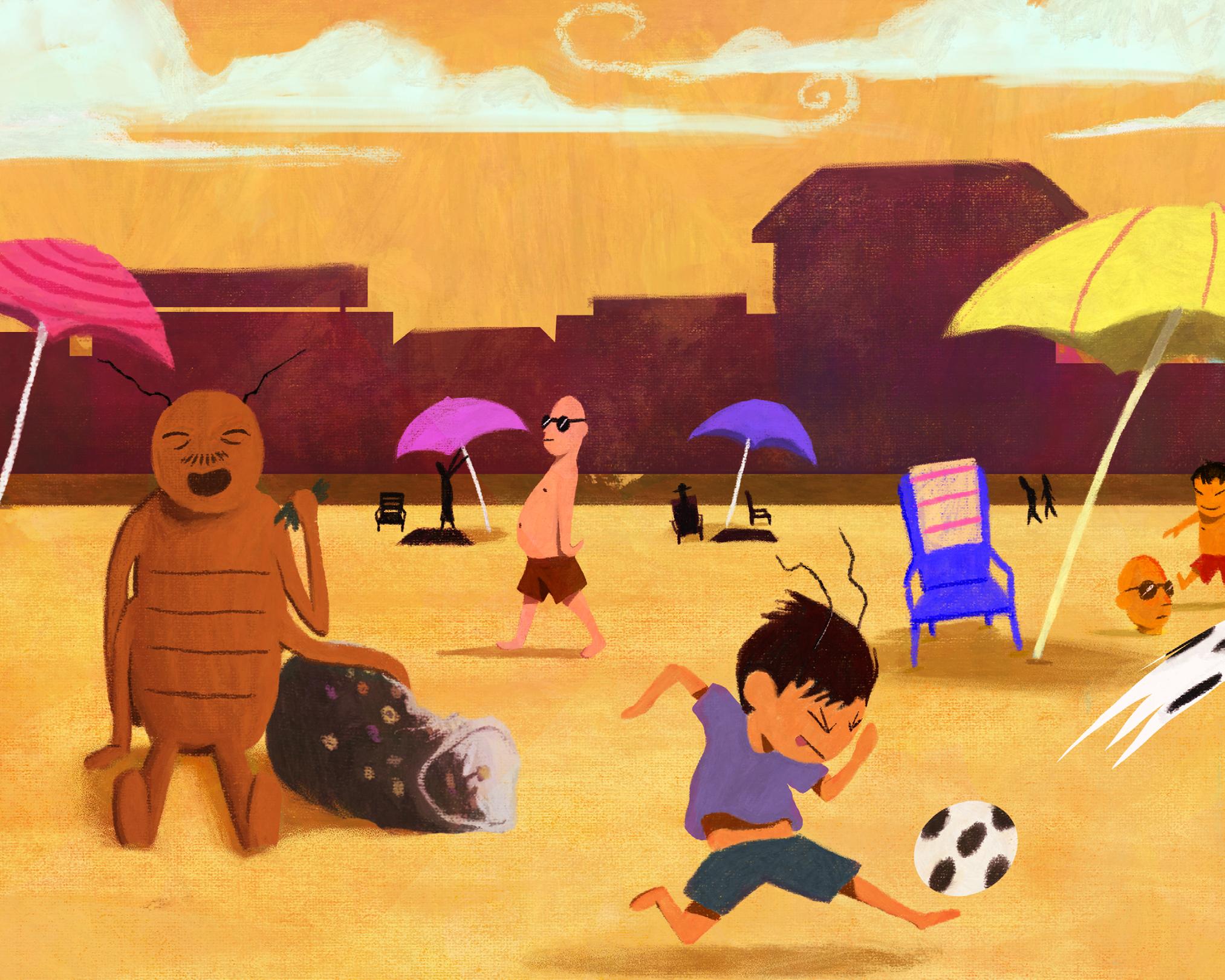
In my book dummy, “Roach Dad”, a boy named Bill, who is half Roach and spending the day with his Roach father, must endure his “embarrassing” and unique Roach behavior. Timid Bill will learn that being a Roach is actually pretty cool. “Roach Dad” explores themes of family dynamics and accepting our own cultural differences. This project pulls from my own experiences with my father growing up, and learning to accept my cultural uniqueness.
jeremynaclia.com @jeremy.naclia.art
Furor Sirenis
digital illustration
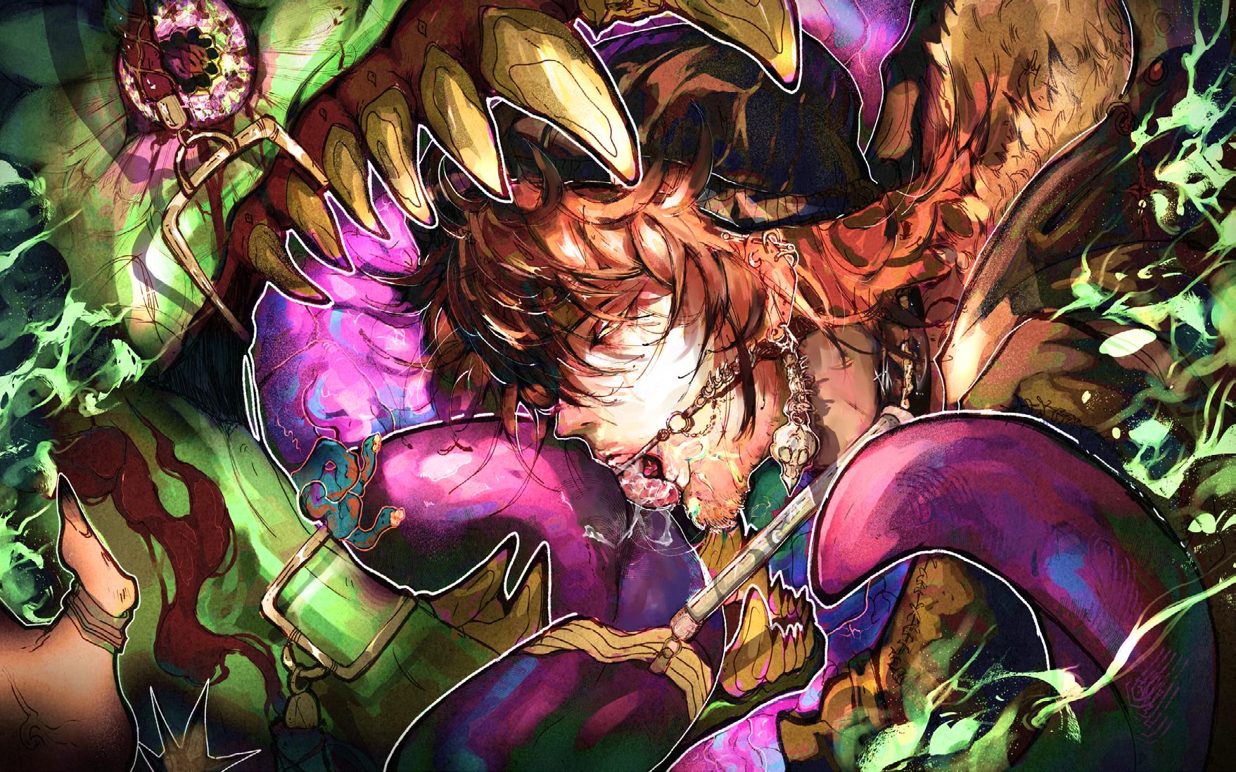
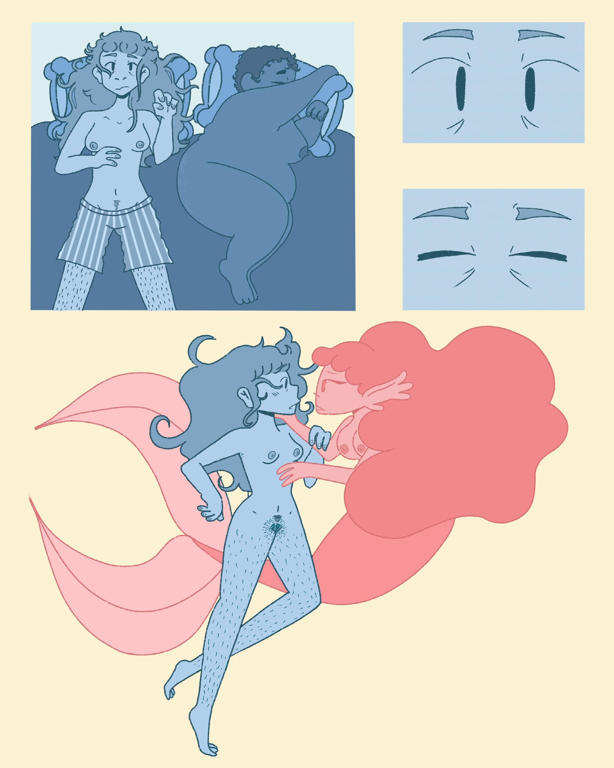
Furor Sirenis (Latin for Madness of the Siren) follows Dr. Lachlan Andersen, an awkward marine biologist, who begins a descent into madness after finding a strange creature on her deep sea cameraone she swears has a human face. Initially started as a loose retelling of the Little Mermaid, Furor Sirenis ended up going down a more unsettling and queer (both in terms of sexuality and oddity) route. It was a lot of fun to work on and I hope to expand on it someday.
@kaleidosel
The One Who Cannot Die
digital media
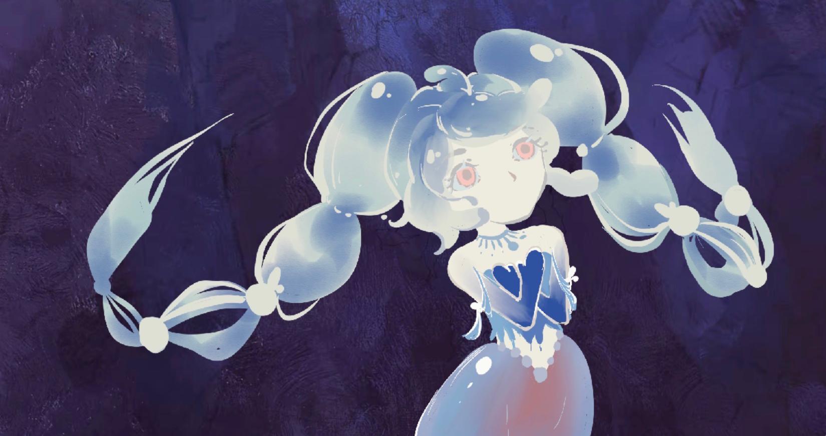
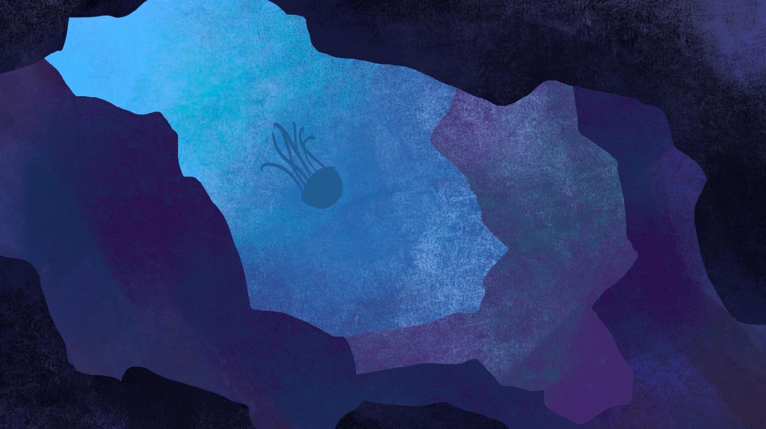
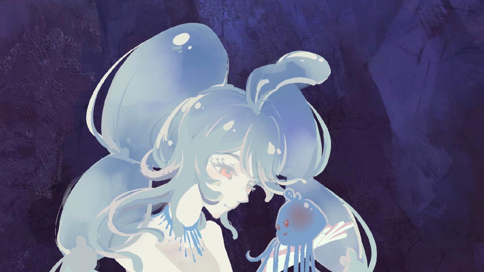
The One Who Cannot Die is a short animated film that explores the heavy burden of immortality through the eyes of a jellyfish which refers to Turritopsis nutricula. While the biological reality of the "immortal jellyfish" is one of endless renewal, this project re-imagines that cycle as a journey through memory and loss. As the protagonist reincarnates, it carries the weight of friendships long forgotten by others, eventually transitioning from profound grief to a quiet acceptance of time’s passage. Created through digital painting and frame-by-frame animation, the film eschews dialogue to rely entirely on visual poetry, color, and movement. By placing symbolic fantasy imagery within a dream-like oceanic environment, the work invites viewers to reflect on how memory shapes identity and how we find peace within the inevitable cycles of life and death.
digital art, printed fabric
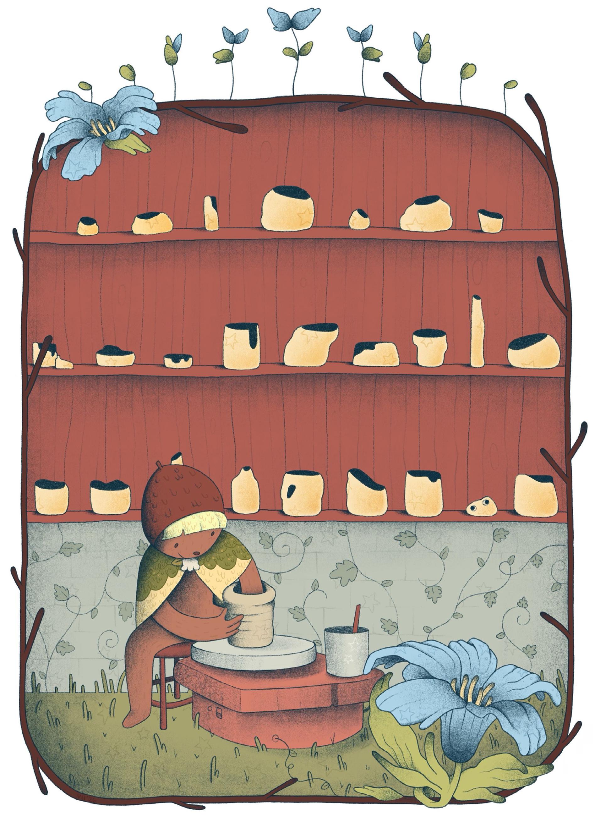
As an interdisciplinary artist, I’m drawn to many kinds of media and material. Starting out, I was drawn to art as a traditional student, relying on drawing and painting. When I continued my studies, I found that I had expanded into other domains and mediums. Along the way I picked up digital art skills, pottery, and sewing. All three disparate parts I wanted to make into one cohesive project, showcasing the range of interest and technical prowess that I had gained as a student at Towson. I had always been drawn to dolls, specifically the resin casted ball-jointed dolls from Japan but was never able to purchase one. As time went by and my skills grew, I had a dream that I could eventually make my own. My goal was to make a custom, one of a kind doll from her body to the very fabric that she was wearing.
@fresh.lynnguini
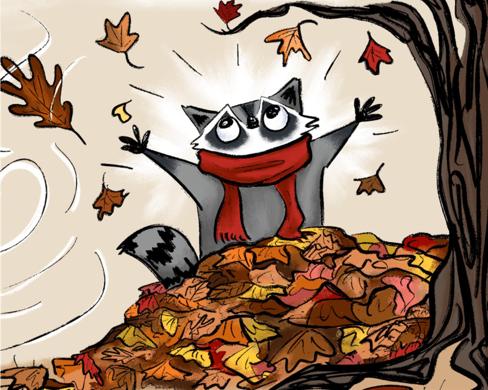
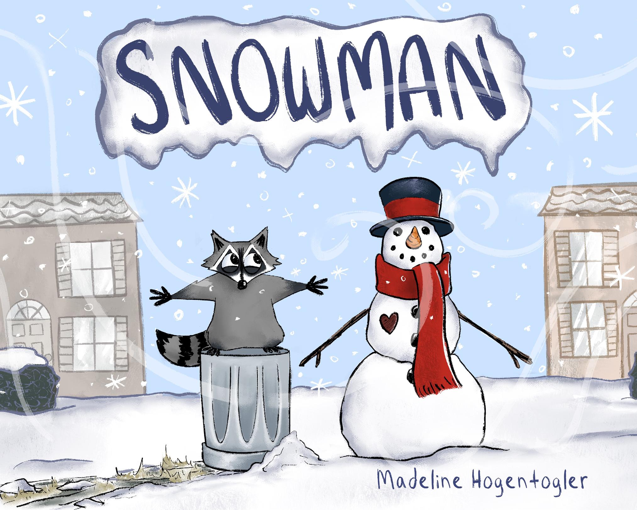
Snowman
digital illustration
Madeline Hogentogler's Snowman book is about her struggle and anxiety in becoming more independent and branching out into the real world. This book marks the transitional period in her life where she has found comfort in solitude. The story is about a raccoon named Rory who struggles adjusting to the winter season full of snow. Trying to escape the snow, Rory discovers a snowman who he grows an attachment to and must learn the hard truth about the temporary nature of the four seasons.
@maddie_rosee48
digital, colored pencil, graphite
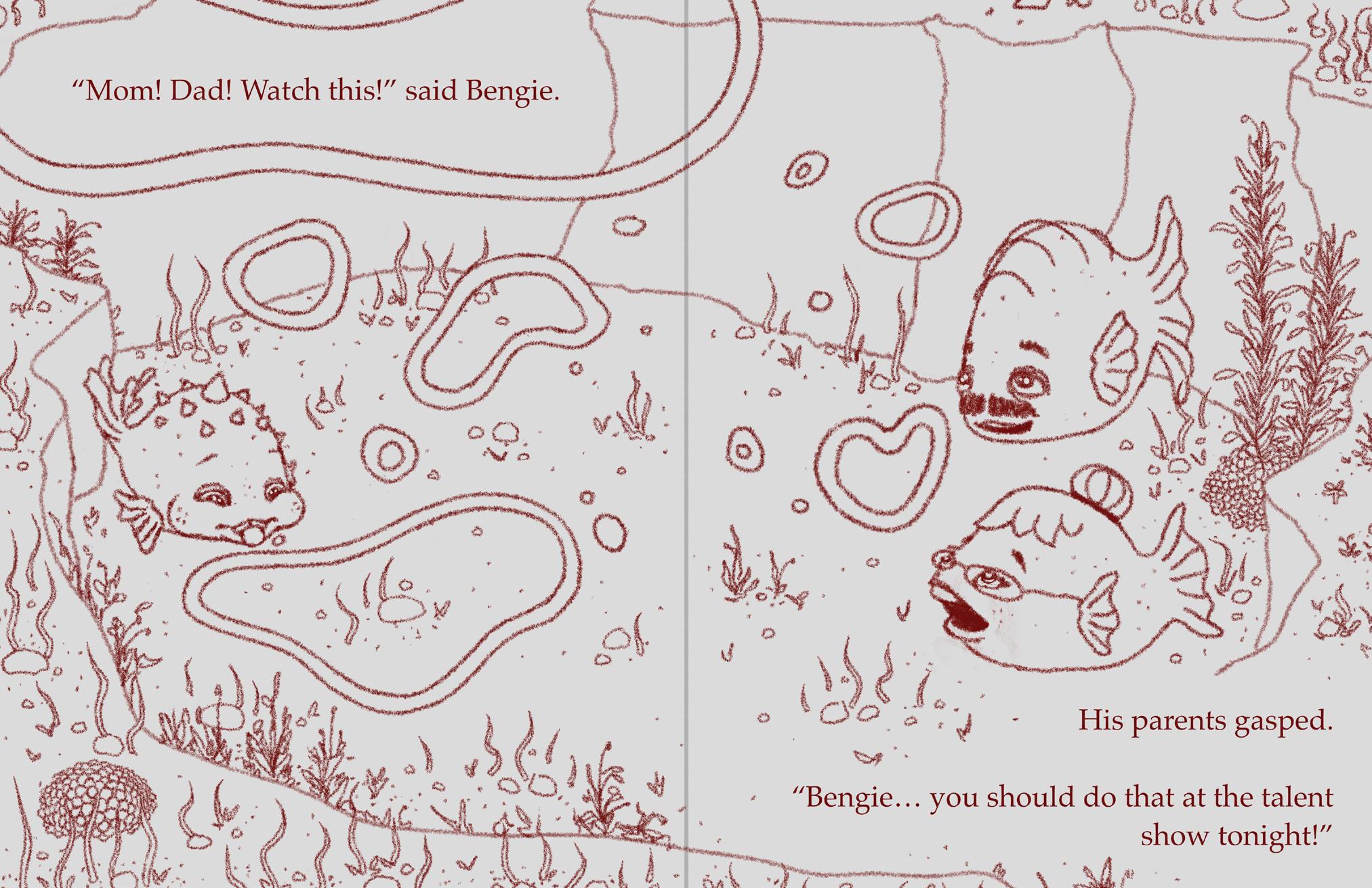
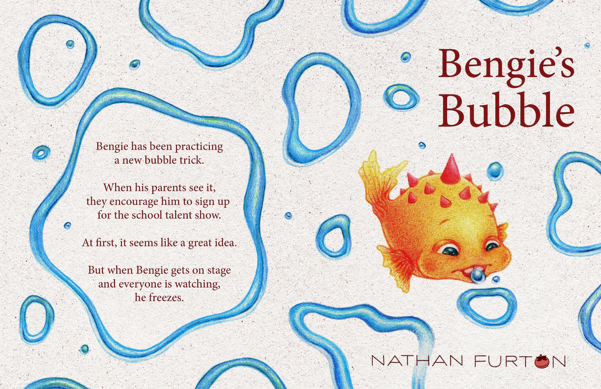
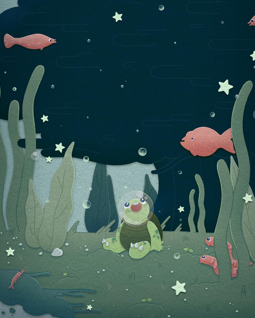
Bengie’s Bubble is about a shy puffer fish getting ready to perform in his school talent show. It centers on stage fright and the shift from excitement to fear when all eyes are on you, inspired by a kindergarten choir performance where I froze when it was time to sing. Bengie’s underwater world is soft, colorful, and playful, built around expressive characters and a vibrant underwater environment. At its core, the story is about finding the courage to be seen, even if it feels scary. nathanfurton.com @nathan.furton
Outliers
digital
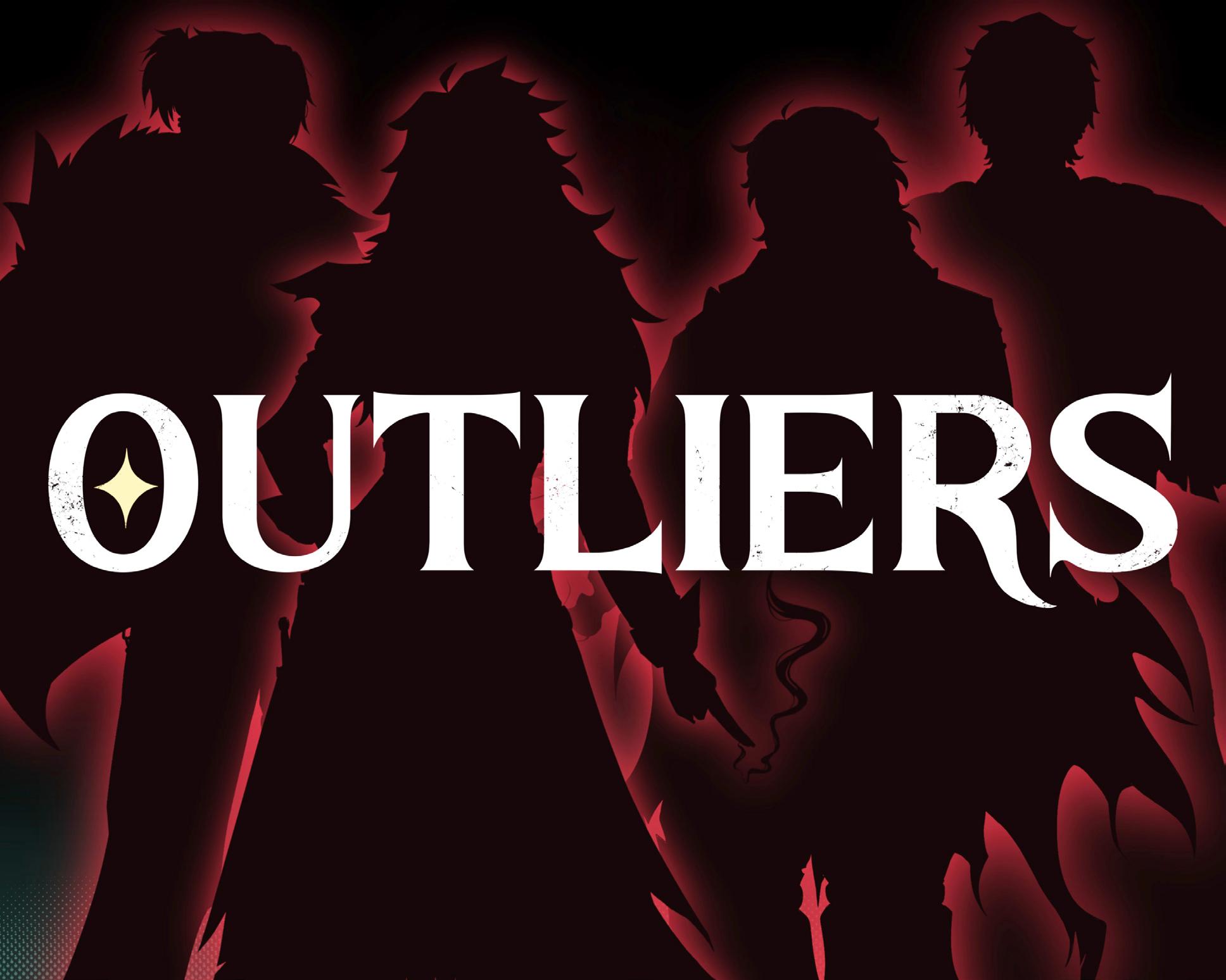
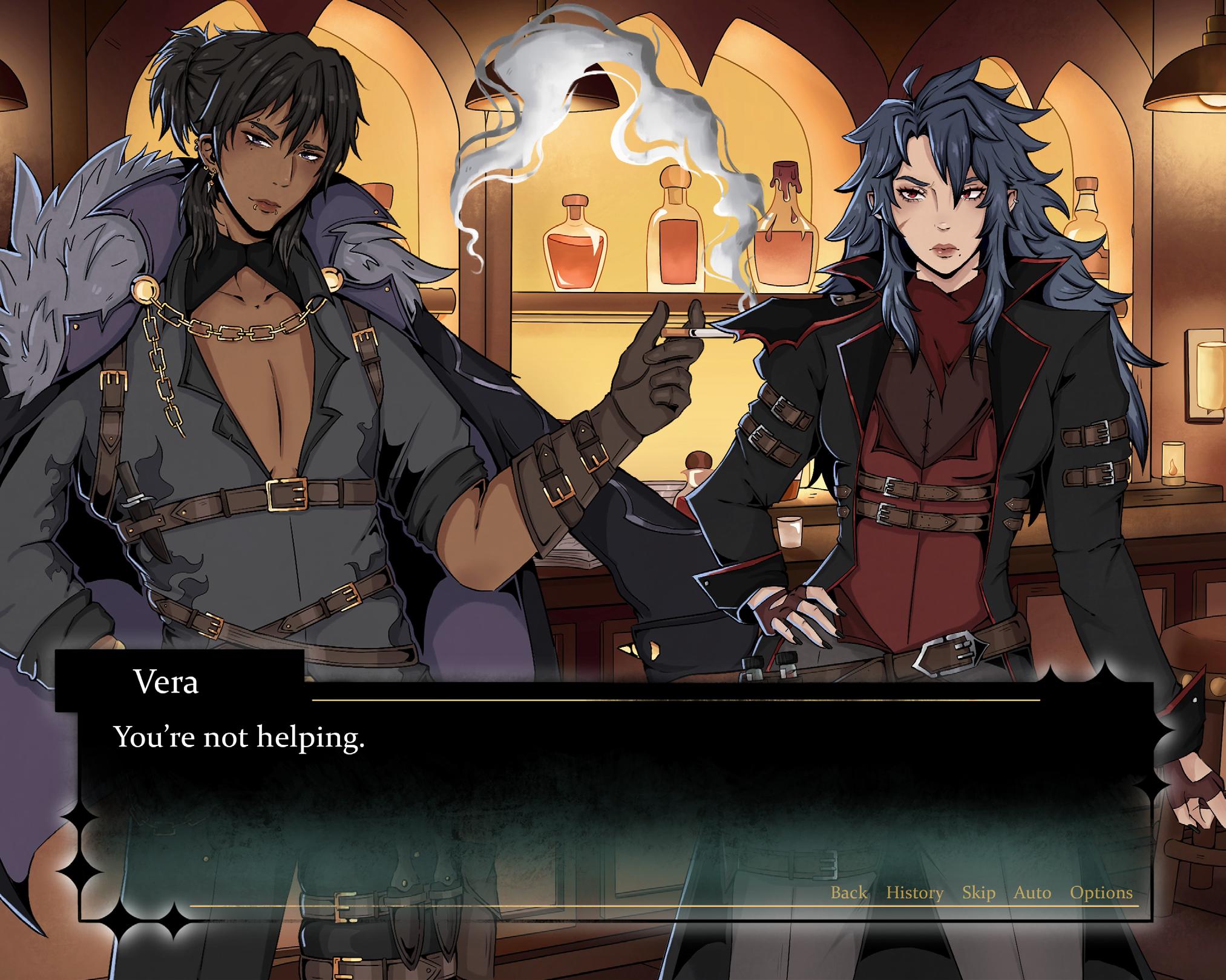
OUTLIERS is a dark fantasy visual novel set in a city of people with supernatural powers who exist on society’s fringes. You play as a newly arrived outcast with your own abilities. One night you stumble upon a job you weren’t meant to see, discovering a morally gray freelance team handling supernatural problems no one else dares touch. Instead of silencing you, they offer you a place on the team. As the story unfolds, you must learn to control your powers, navigate an unfamiliar city, and build relationships within the team, all while facing the dangers that lurk beneath the city’s surface.
sarahbensonart.org
digital illustration
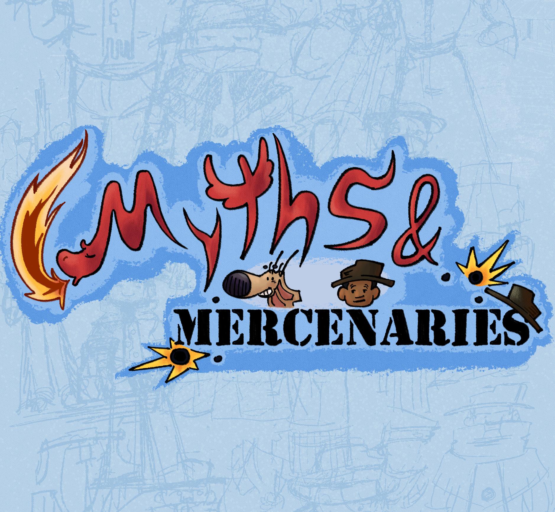
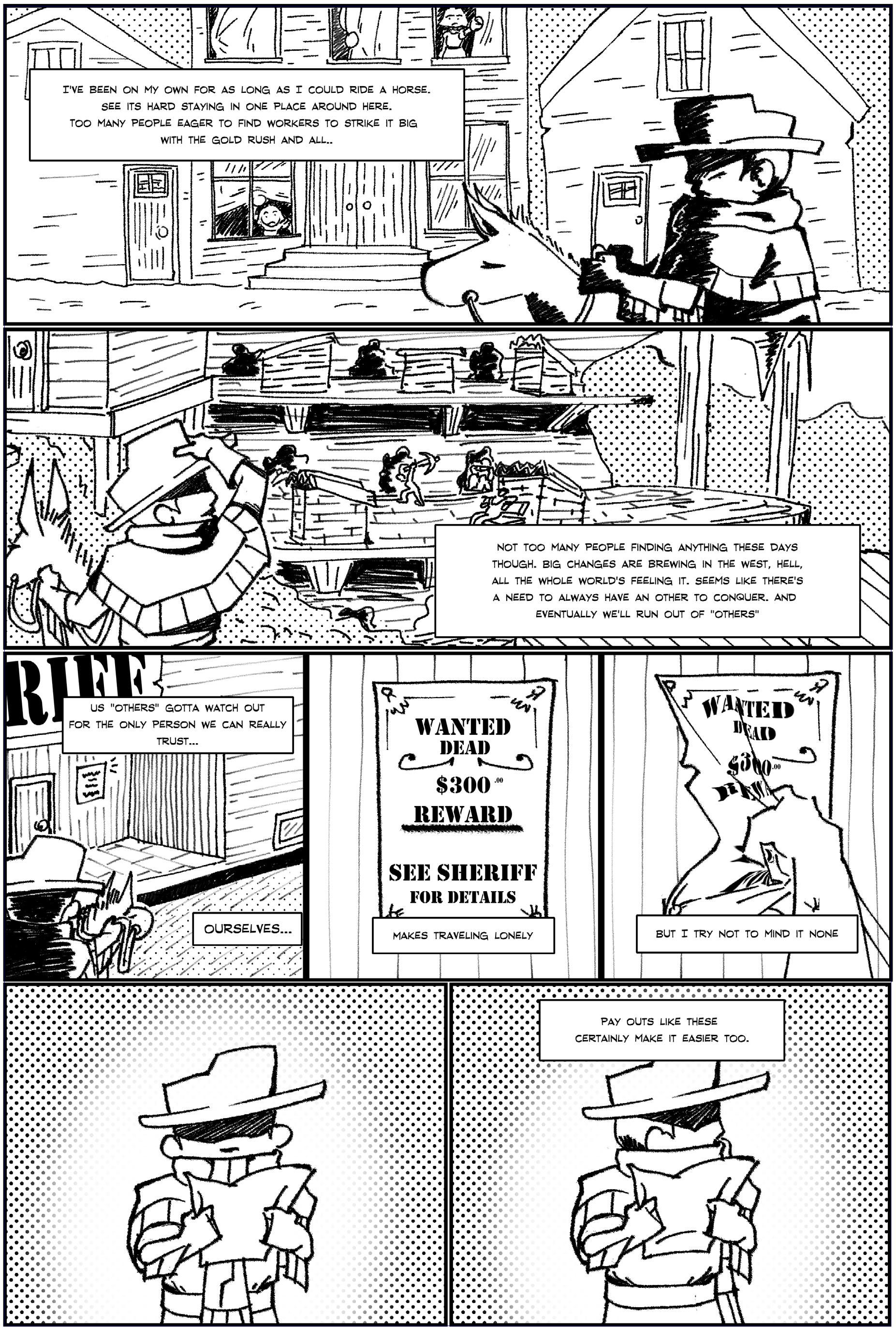
Myths and Mercenaries is a story that is extremely close to my heart. It spawned out of my love for urban legends, cryptids, and action cartoons as a kid. The comic is about finding belonging in a world that doesn't understand you, through the lens of the action-packed (and often humorous) misadventures of a time-traveling zombie cowboy and a talking jackalope. The following is the prologue for that story. I hope that you enjoy this glimpse into the world of myths and mercenaries.
@theee_aster
digital art
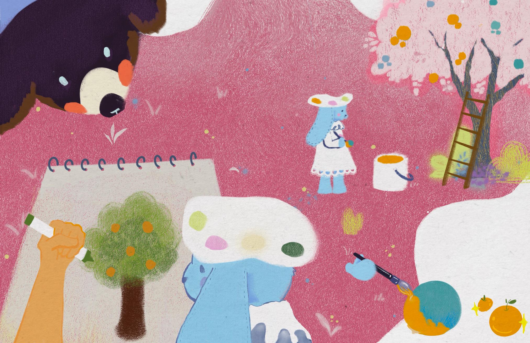
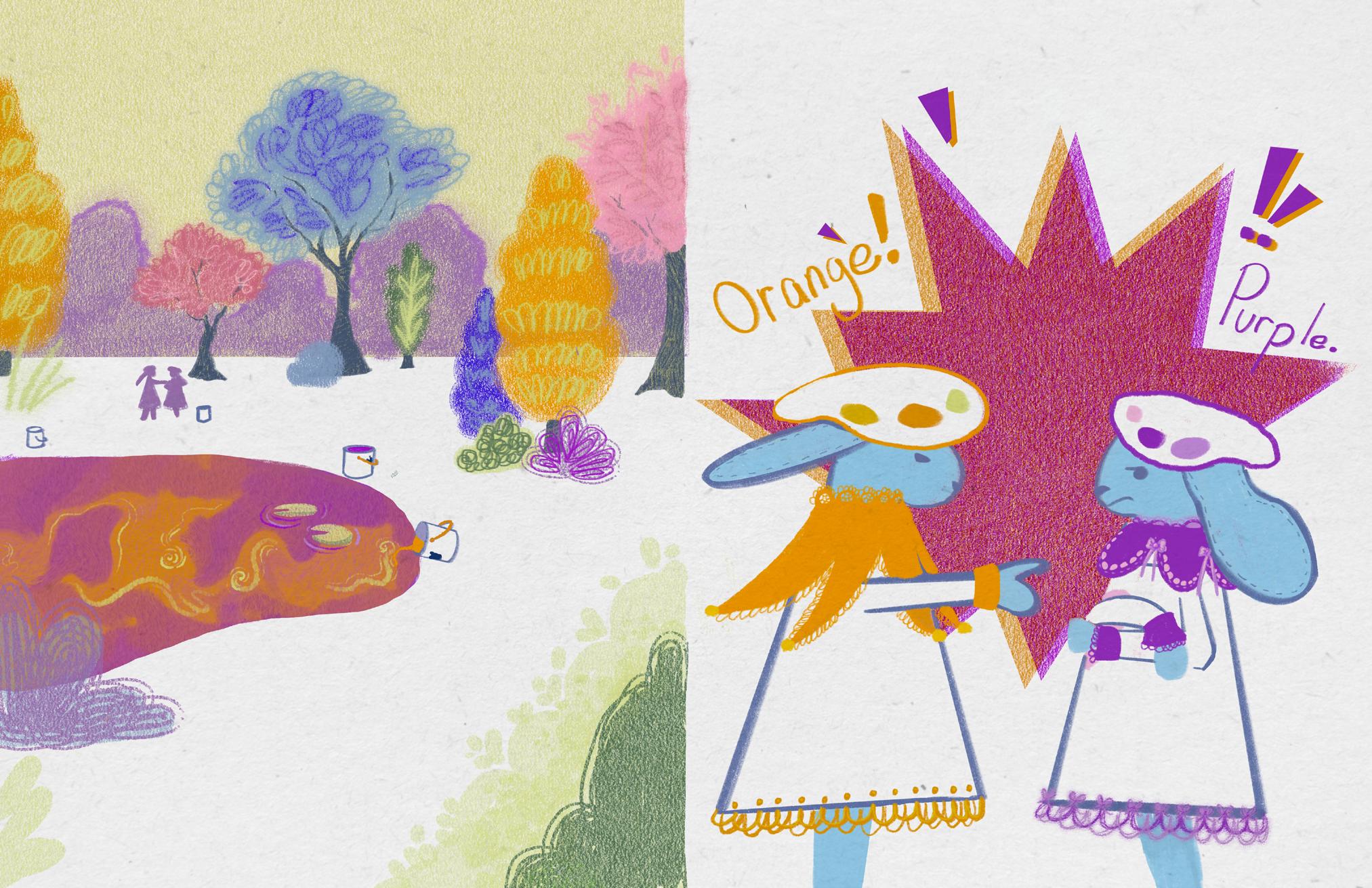
I am an aspiring children’s book illustrator drawn to the magic of imagination, memory, and play. My current exhibition piece is created from a mix of my more fantastical dreams and characters I’ve created in my childhood. My work centers on creating vibrant, colorful imagery that invites curiosity and wonder. I am interested in how children experience the world, playful and full of possibility. Ultimately, I want to create art that is joyful.
digital, zine
My BFA project reflects my goal of becoming an educator coming from an illustration background. Through a series of encouraging and motivating posters alongside self-published instructional guides, I explore how art techniques can be shared in ways that are accessible, adaptable, and encouraging to a wide range of learners. Whether you are unsure of your artistic voice, already have a clear vision but want to strengthen some technical skills, or just have a physical reminder of some simple techniques you can pull out of your back pocket for some ideas- I'm able to break down some useful processes into approachable, visual steps. Art education should meet people where they are while giving them the tools to move forward with confidence, and this my way of making creative growth feel achievable for anyone!
linktr.ee/ijaymilo
@ijaymilo
It's Summer digital
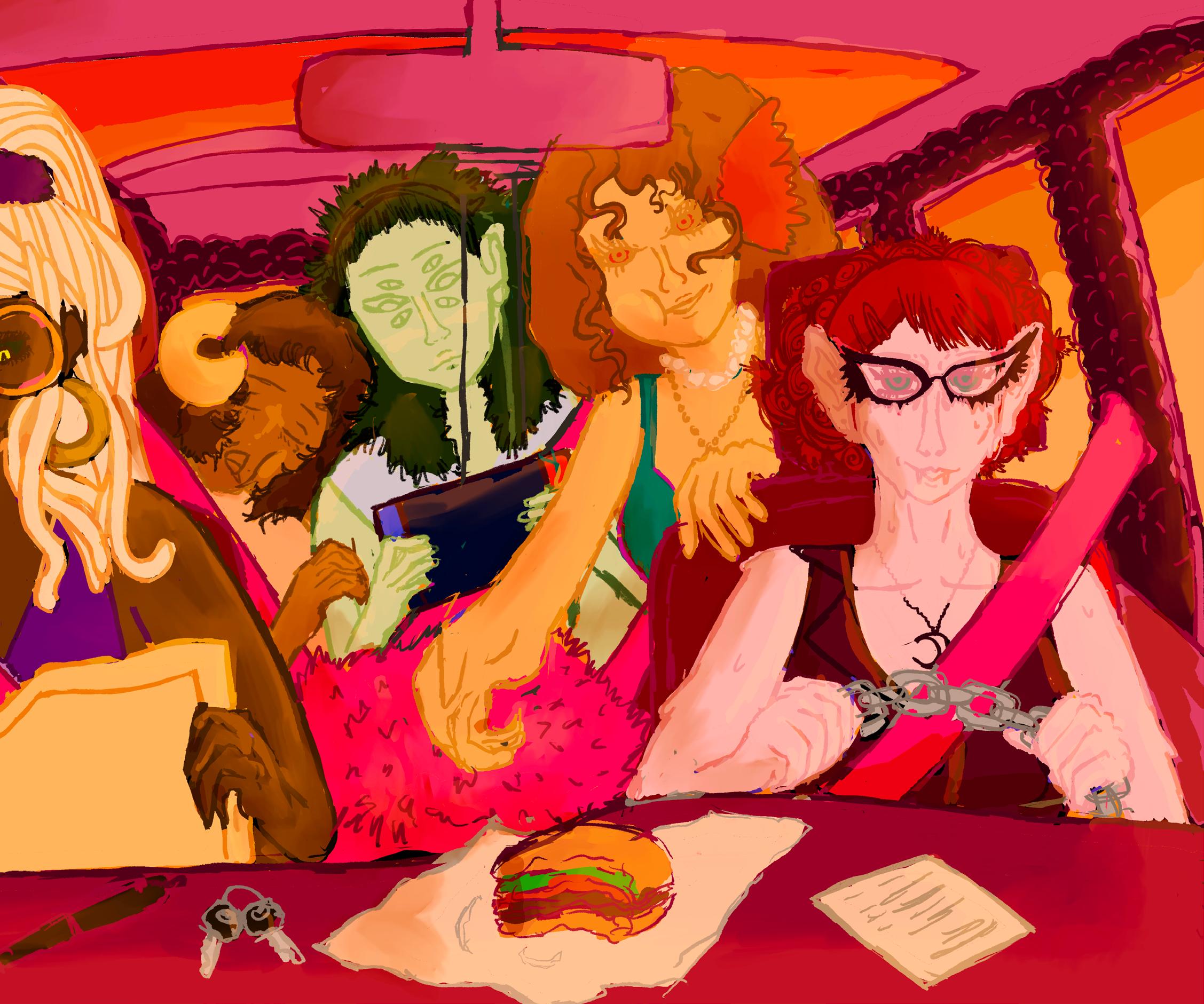
Dwelling in the fantastical and girlish, Zaniya Williams showcases character designs that mix fun with the outlandish and whimsical.. @roseaphile.space
interdisciplinary object design
silver, bronze, salt water pearls, reclaimed wood, fabric, found materials
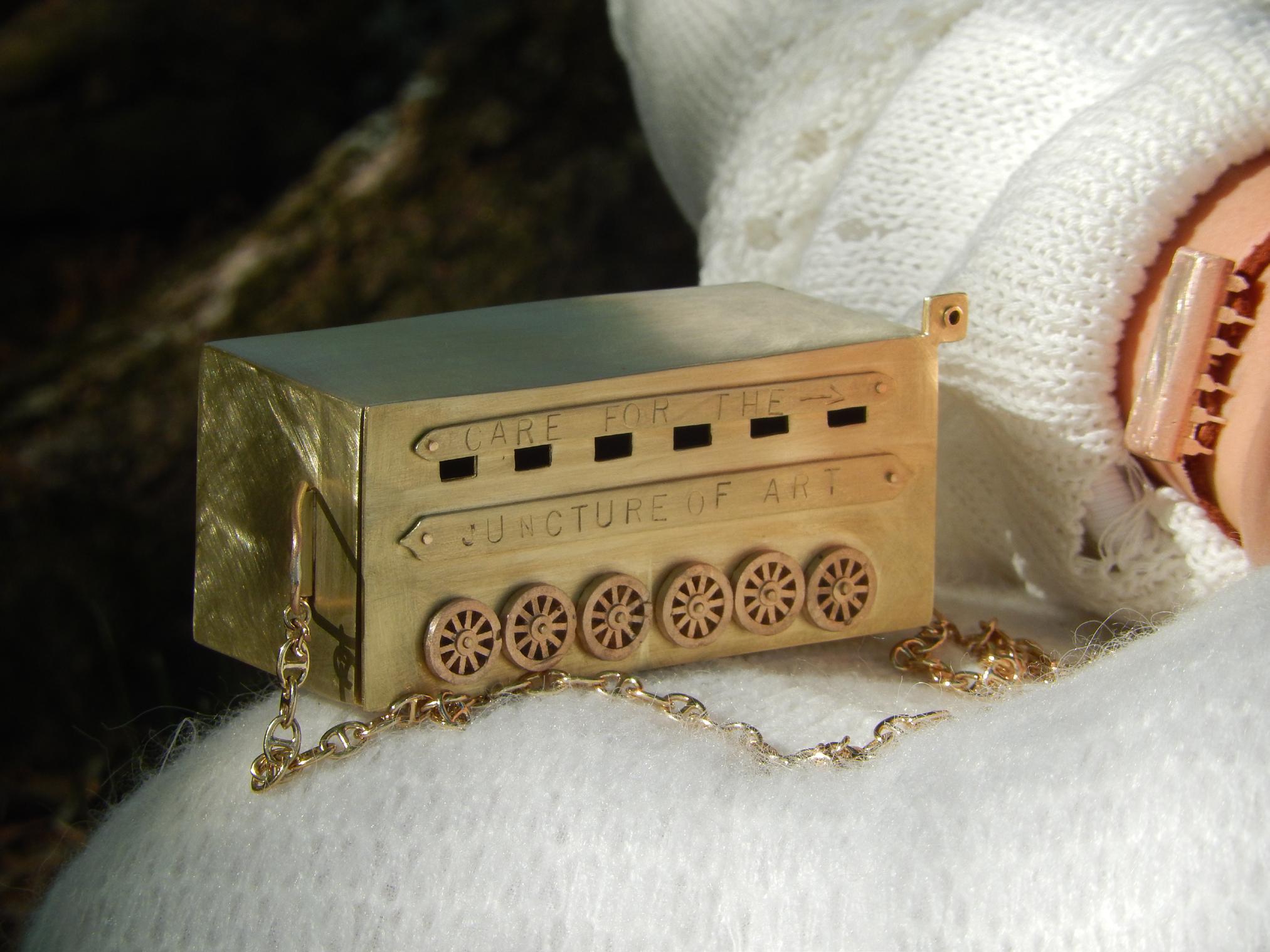
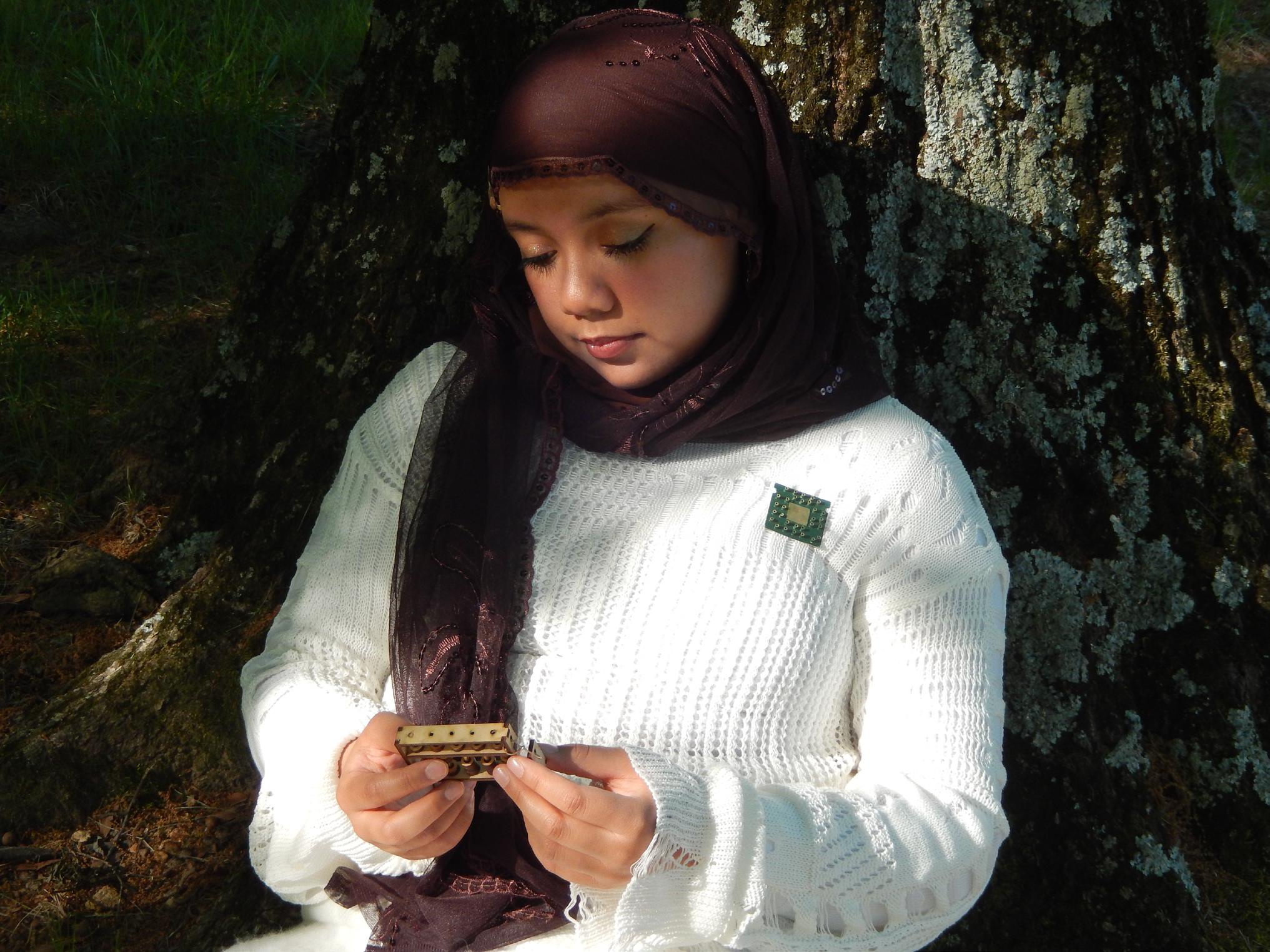
As a jeweler/metalsmith, I create work influenced by nostalgia and the timeless elegance of vintage style. I craft wearable objects that inspire feelings of playfulness and refinement, with a strong focus on high-quality craftsmanship and techniques. I create jewelry alongside decorative objects and small trinkets with metals like bronze and silver, each one thoughtfully shaped with careful attention to detail.Much of my work is influenced by childhood memories and personal experiences, as well as the influence of my mother and late grandmother. I am drawn to the way jewelry can hold emotion, memory, and personal history—transforming a simple material into something far more meaningful. For me, jewelry has always meant to be treasured and worn as a form of self-expression, a way to carry elegance, playfulness, and memory into everyday life within a single piece.
@jordans_artistry_nook
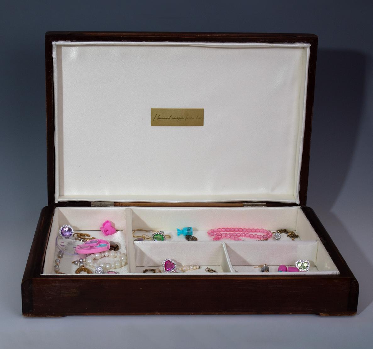
I learned unique from her. Inspired by the magic of playing with my mom’s vanity set as a child this piece reflects the difference between elegant craftsmanship and the playful charm of childhood.
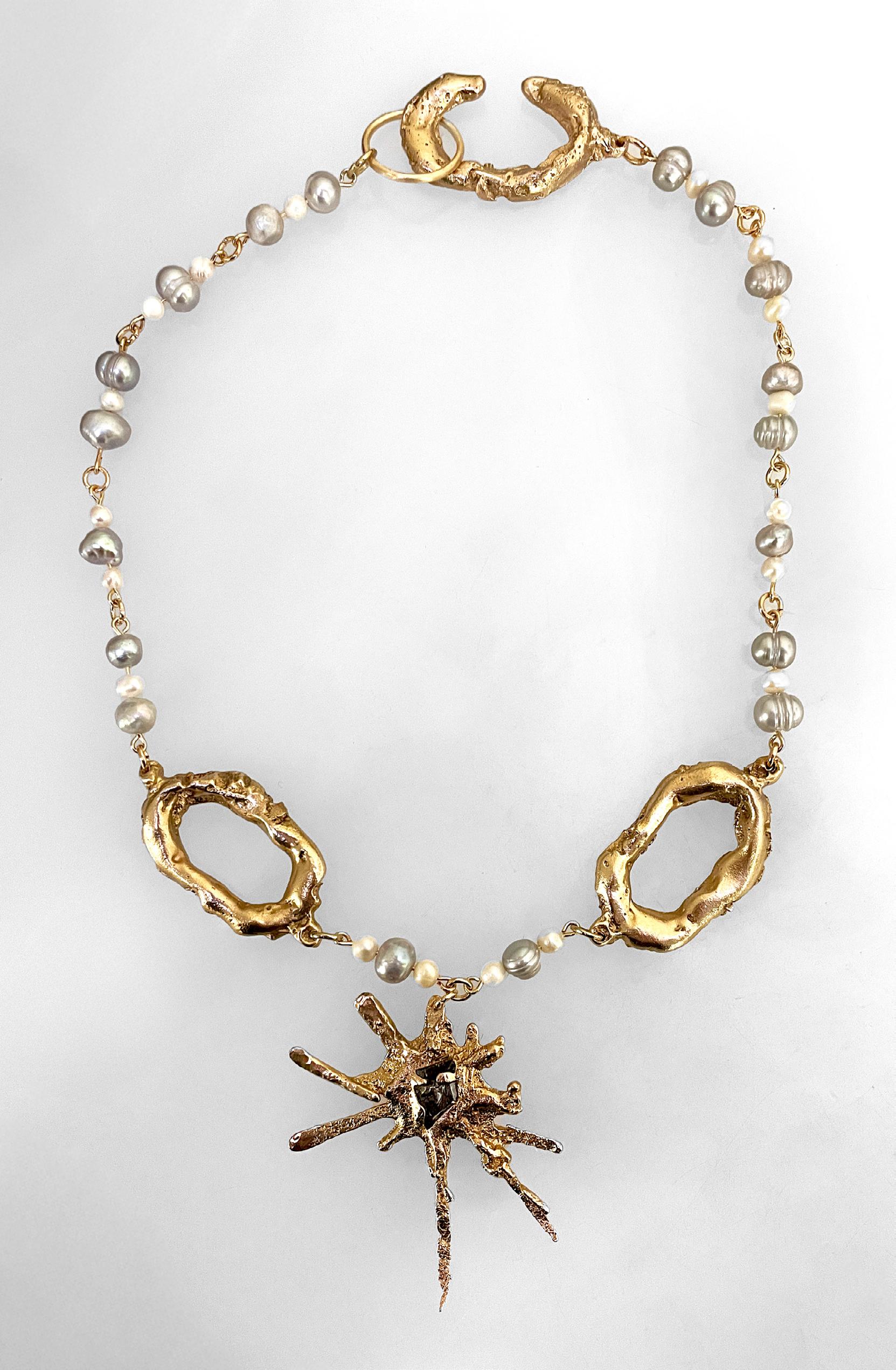
Burst of Memories. Elegant yet playful, this piece balances refined craftsmanship with a whimsical, childlike curiosity, evoking the delight and nostalgia of childhood memories.
For this project, I am forcing myself to go out of my comfort zone and paint using art therapy prompts as a base. I am abstracting real-world subjects because I can’t wrap my head around painting them to look real. I typically paint using random and weird colors painting .platters and shapes. My work tends to me wild and chaotic. I usually paint on big canvases but for this project, I am forcing myself to paint small on paper size canvases.
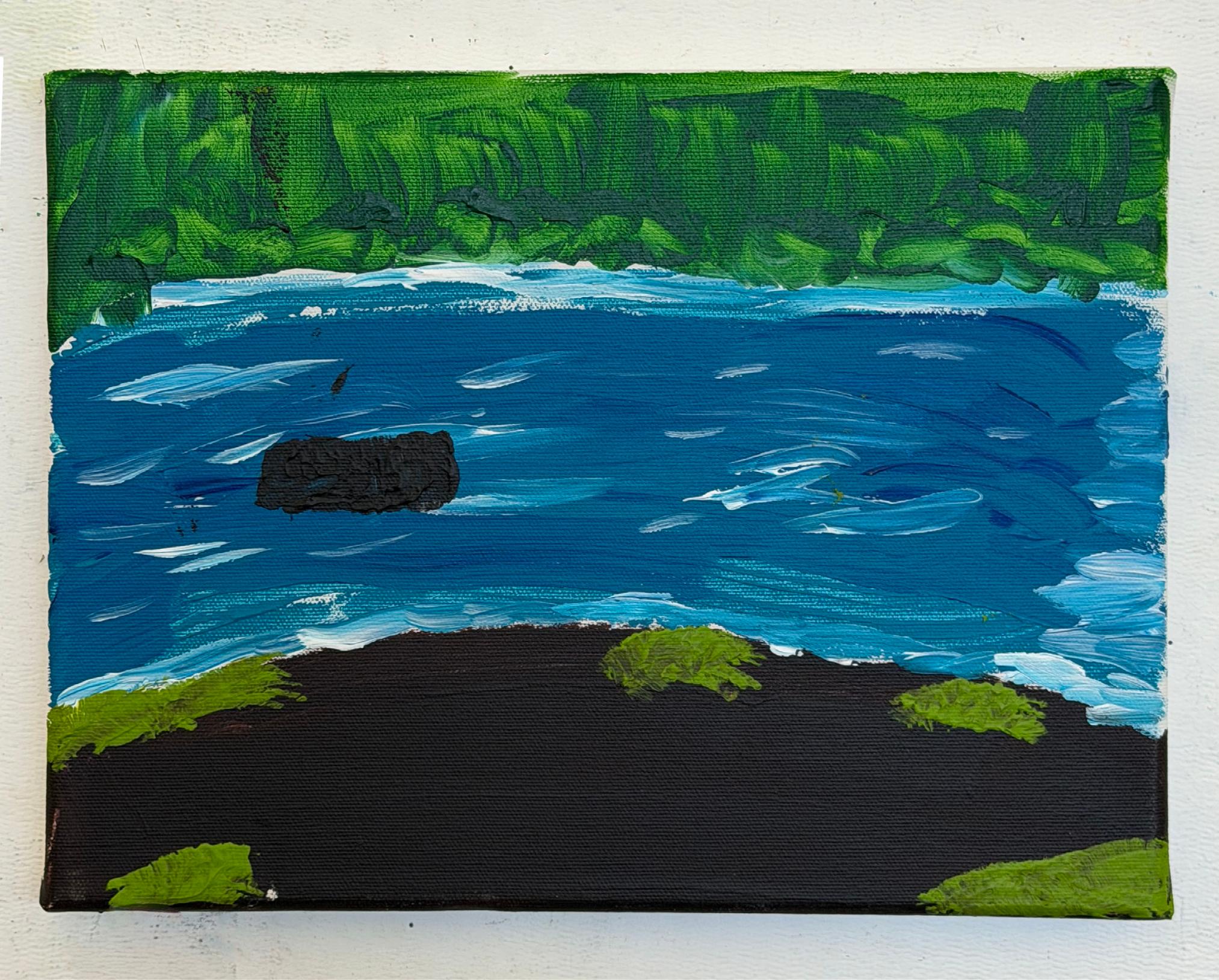
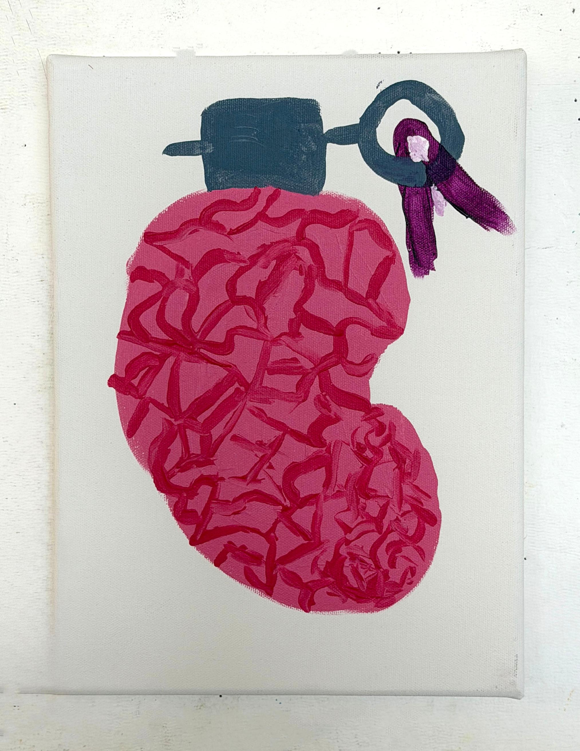
Birth | Benito, the magicians puppet, puts on a penny show oil paint
I am drawn to psychic collage: not necessarily taking collage literally, but piecemealing concepts, words, and ideas into a final concept. My process of painting is to act in a form of intertextuality: the play between genres, words, and worlds such as medieval hagiographies, campy horror, theopoetics, theater, and erotica. Through this, muddied glazes on top of pale layers and repeated signs and symbols are emblematic of this dark luminosity, signaling the intersection of absolute darkness and radiant light. I use unnatural colors to signal the curious condition of an inner world, my love for the mysterious repetitions of literary imagination, and as an homage to visions and dreams.
@carlygm.art
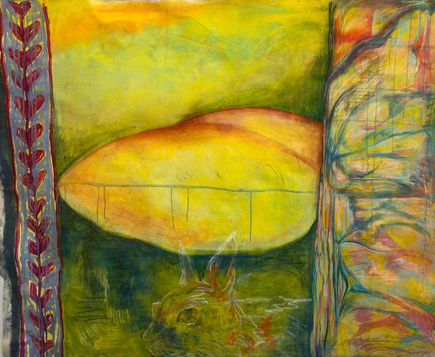
Birth. I was inspired by the look of medieval manuscripts, and I wanted to push myself to make something textual without text. The center image was intended to be a cross between a womb and an egg.
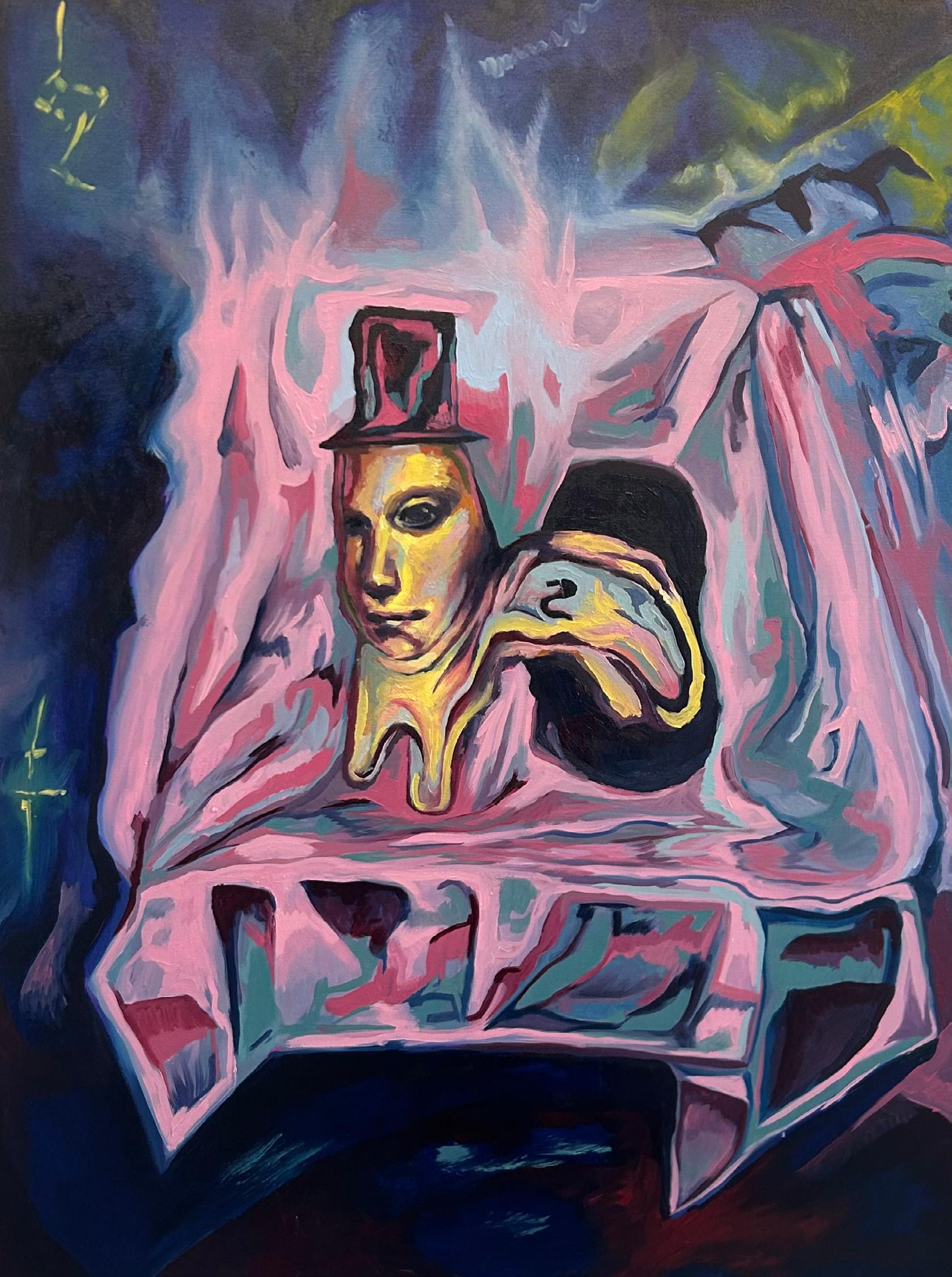
Benito, the magicians puppet, puts on a penny show. A lot of the work I make is dark and mysterious, and Benito came about in my effort to make something lighthearted. It was a great joy to make this, and to see people smile at Benito’s strangeness.
Neo Simplism
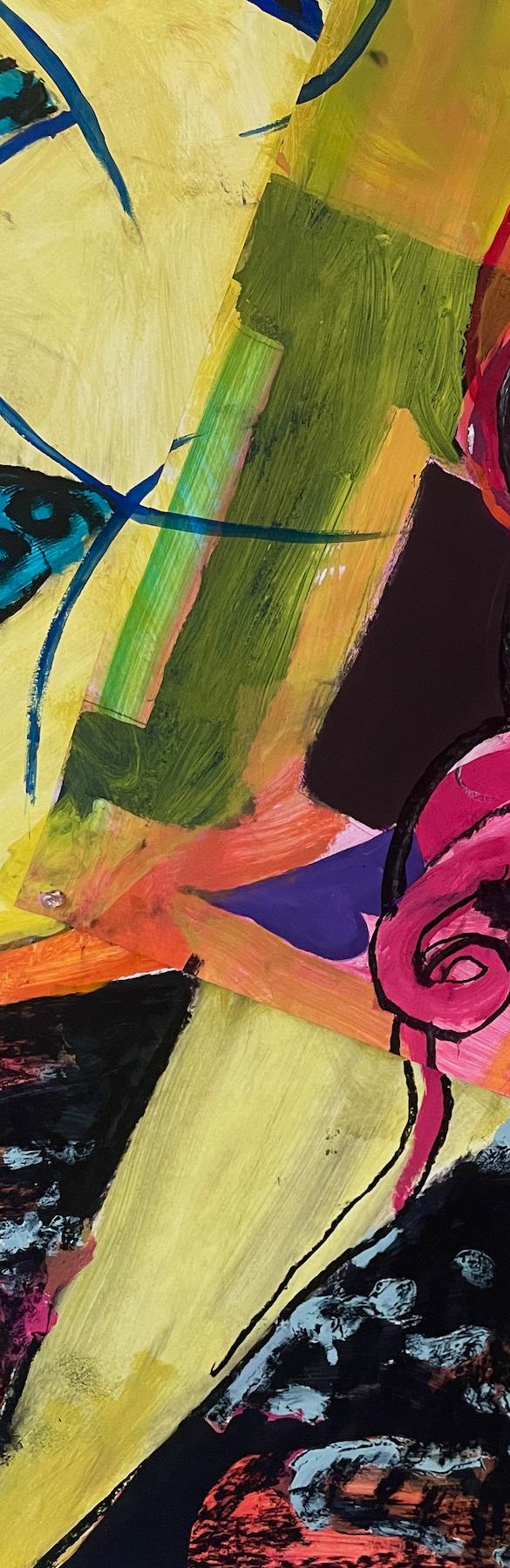
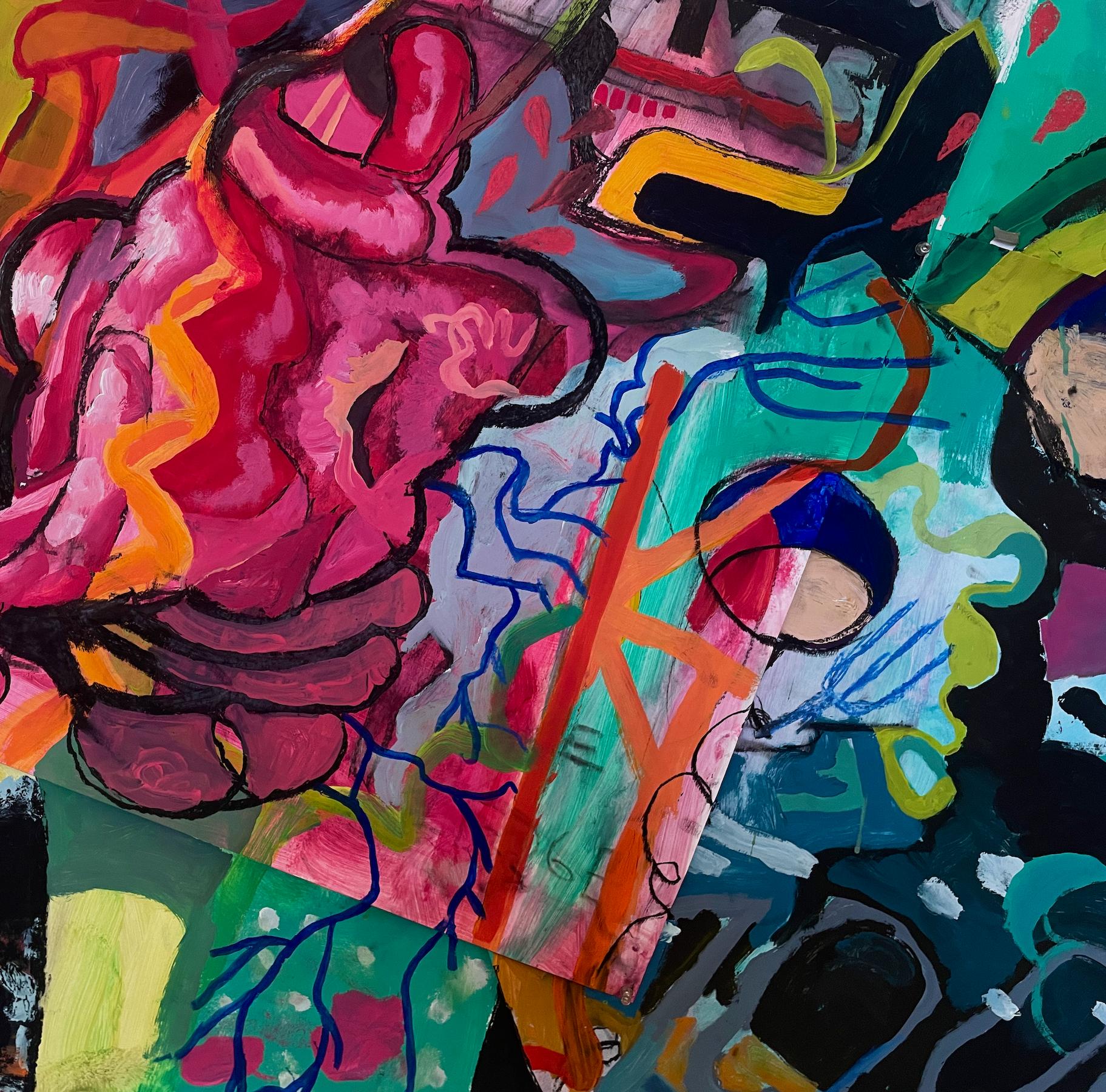
My work explores personal experience, emotion, and connection through portraiture and abstract imagery that blends realism with expressive interpretation. I create emotionally driven paintings using saturated color, layered surfaces, and detailed forms to express how I experience the world internally. I primarily work with oil paint, sometimes incorporating crochet and cross-stitch to deepen my connection to each piece. Color plays a central role, acting as an emotional language through vibrant contrasts and expressive shadows. My portraits often feature centered figures with simplified backgrounds, emphasizing emotional presence, while my abstract works use layered shapes to reflect memory and feeling over time. Recurring imagery includes people, meaningful places, organic forms, and cats. Ultimately, my work invites viewers to connect emotionally, reflect on their own experiences, and find shared meaning.
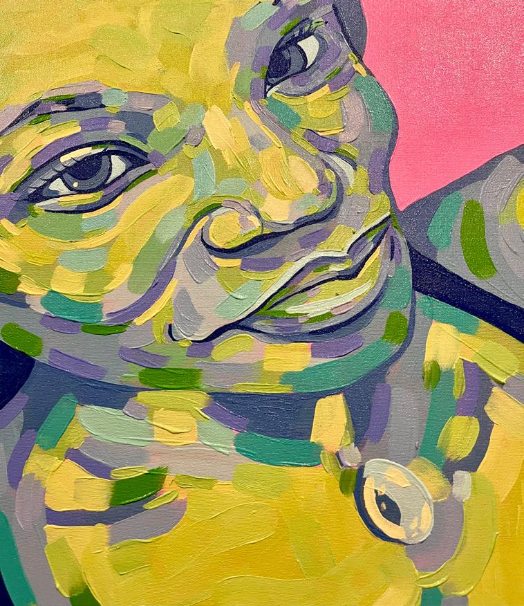
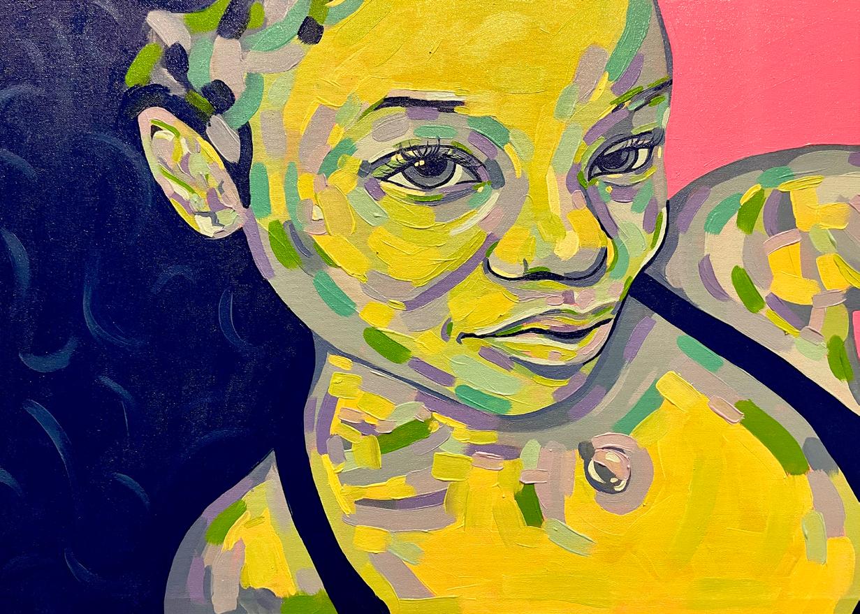
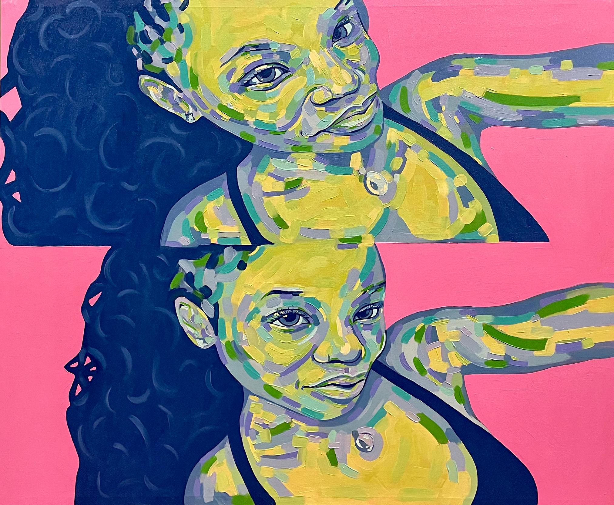
drawing & printmaking
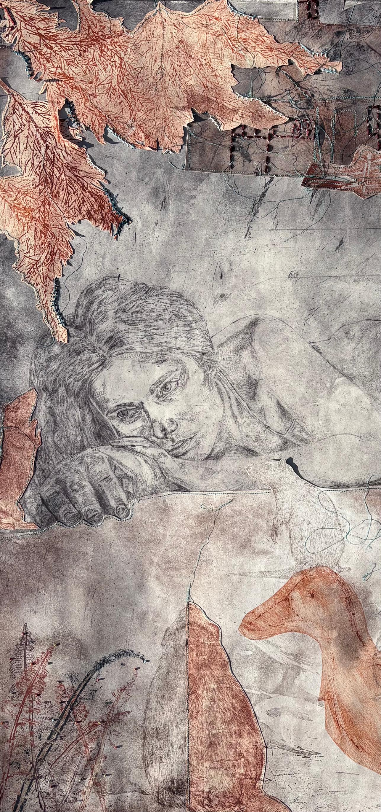
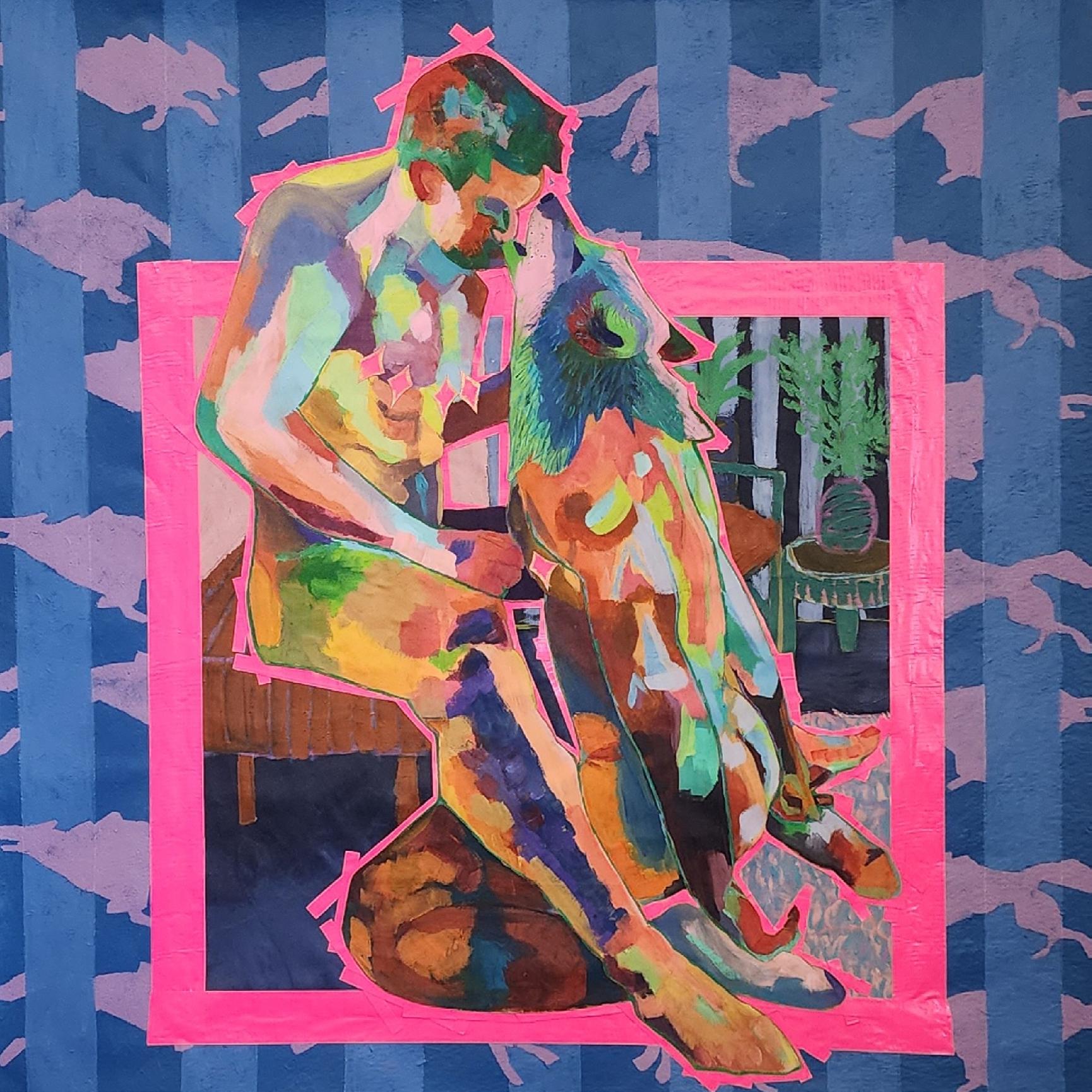
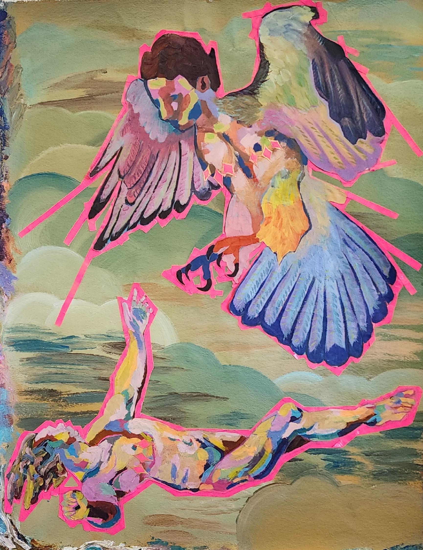
Werewolf | Harpy acrylic on fabric
My artwork is created for queer individuals, kinksters, and those that feel they live on the margins. I am motivated to move beyond self-portraiture toward broader narratives of queer connectivity–especially joyous, unapologetic sex and intimacy–that counter cultural tropes. My work rejects the demand for “palatable” queer art, instead embracing queer joy, deviance, sex, and comradery.
painting, drawing & printmaking
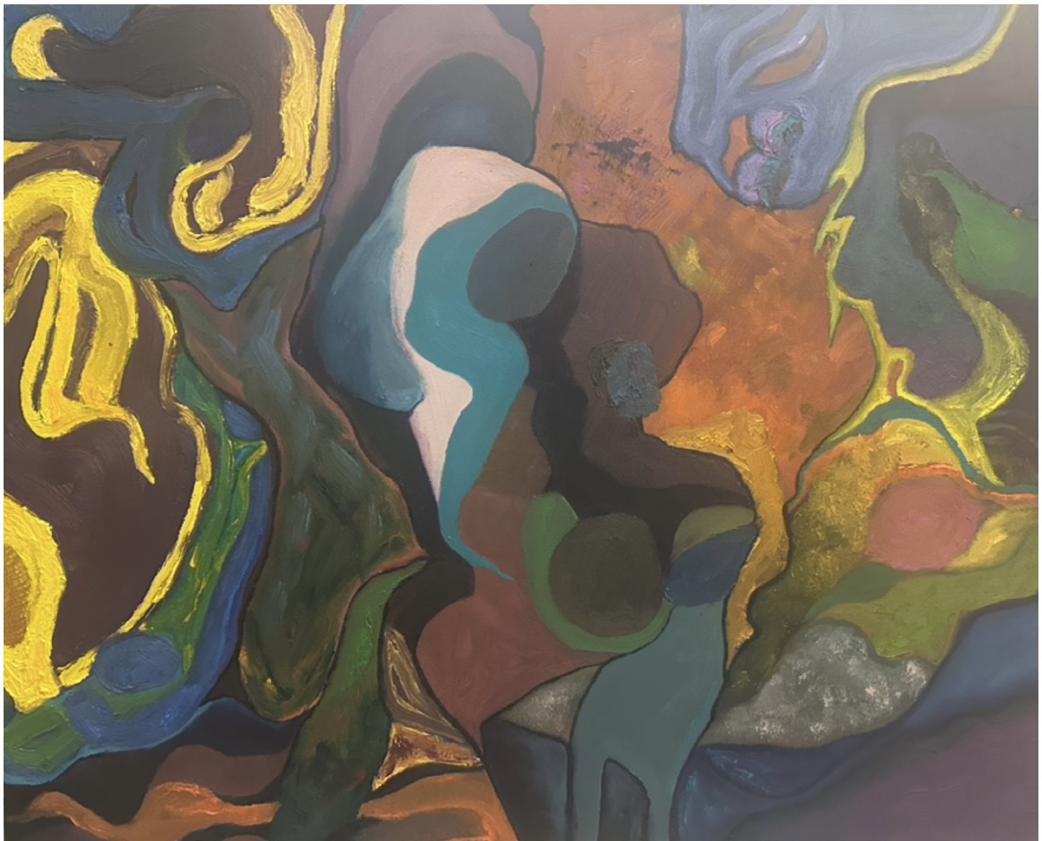
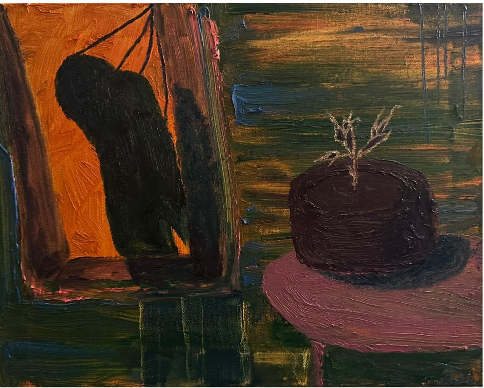
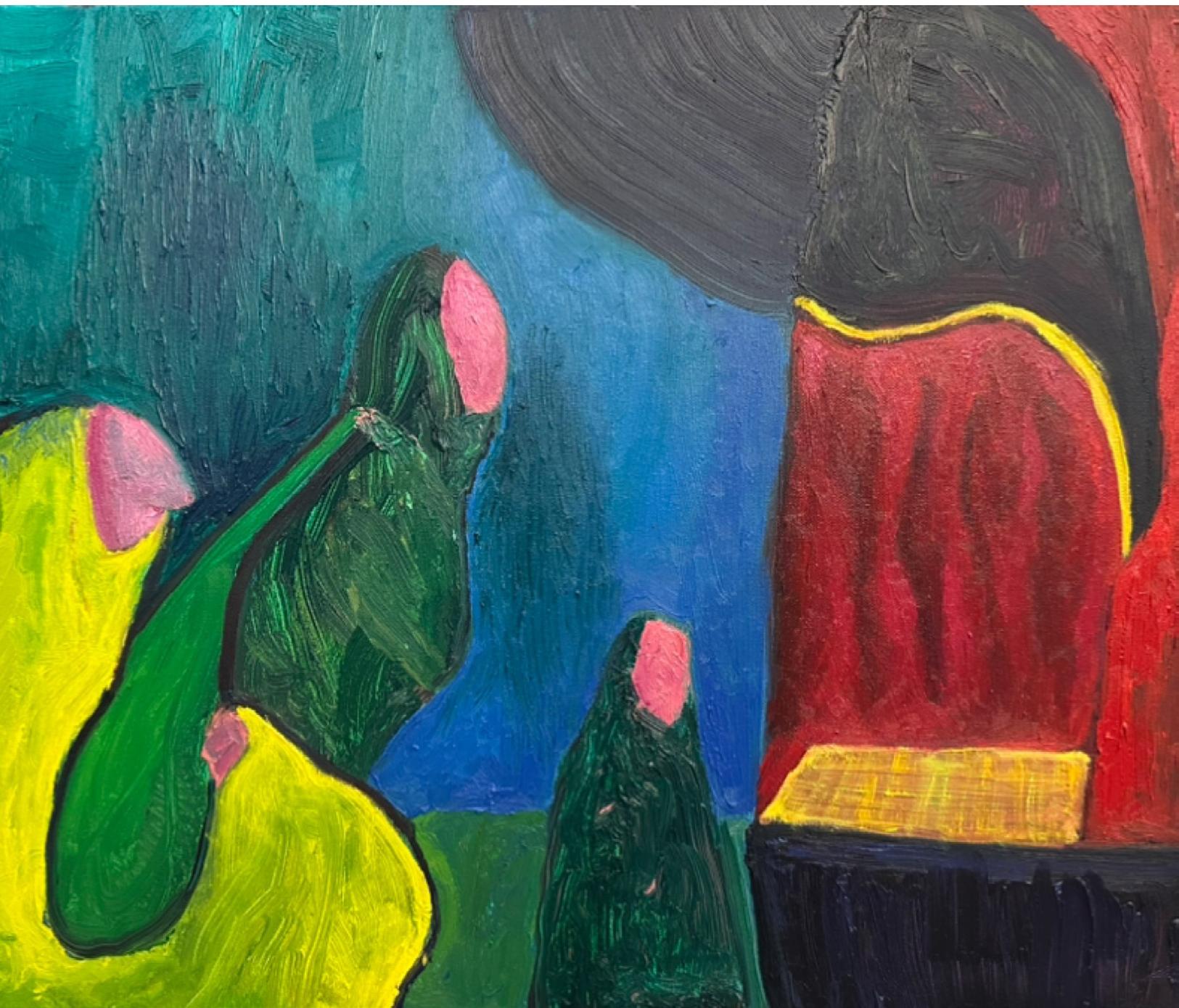
Tangerine Man | Three Eager Observers and a Skeptic | The Deep and Luminous Expanse | Merge and Emerge oil on canvas
My goal is to introduce familiar yet otherworldly spaces through abstraction. Using strong color relationships, varied paint application, texture, and organic shapes to convey an environment or structure, and to encourage the viewer to explore whatever emotions or intrigue these glimpses of these worlds evoke.
@sagebrushforpainting
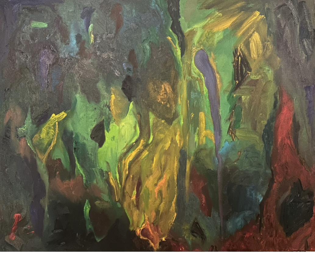
The Deep and Luminous Expanse
Merge and Emerge
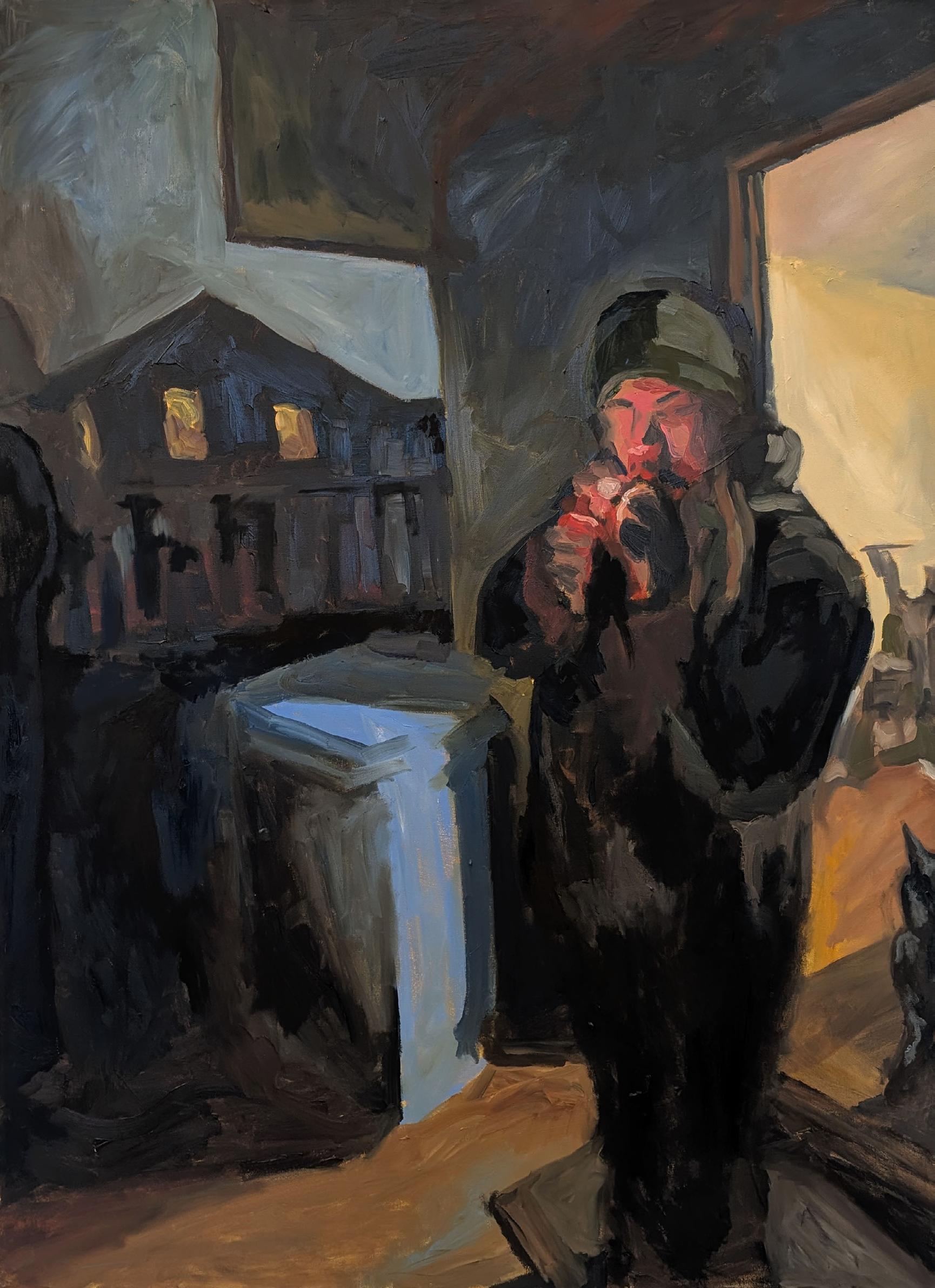
Night Time | Sunday Night
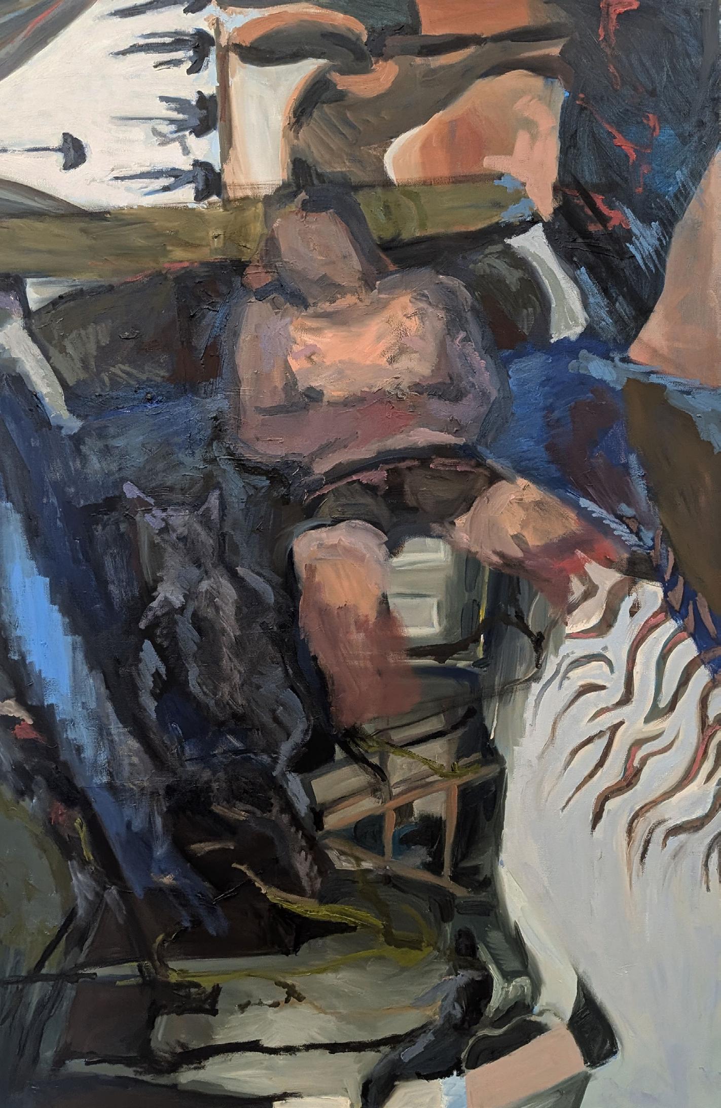
Night Time
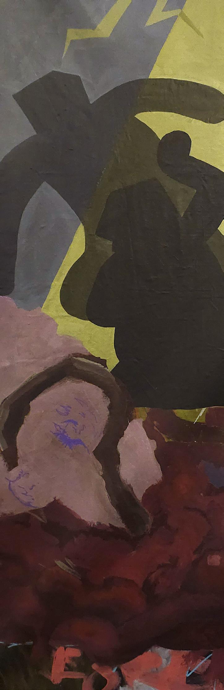
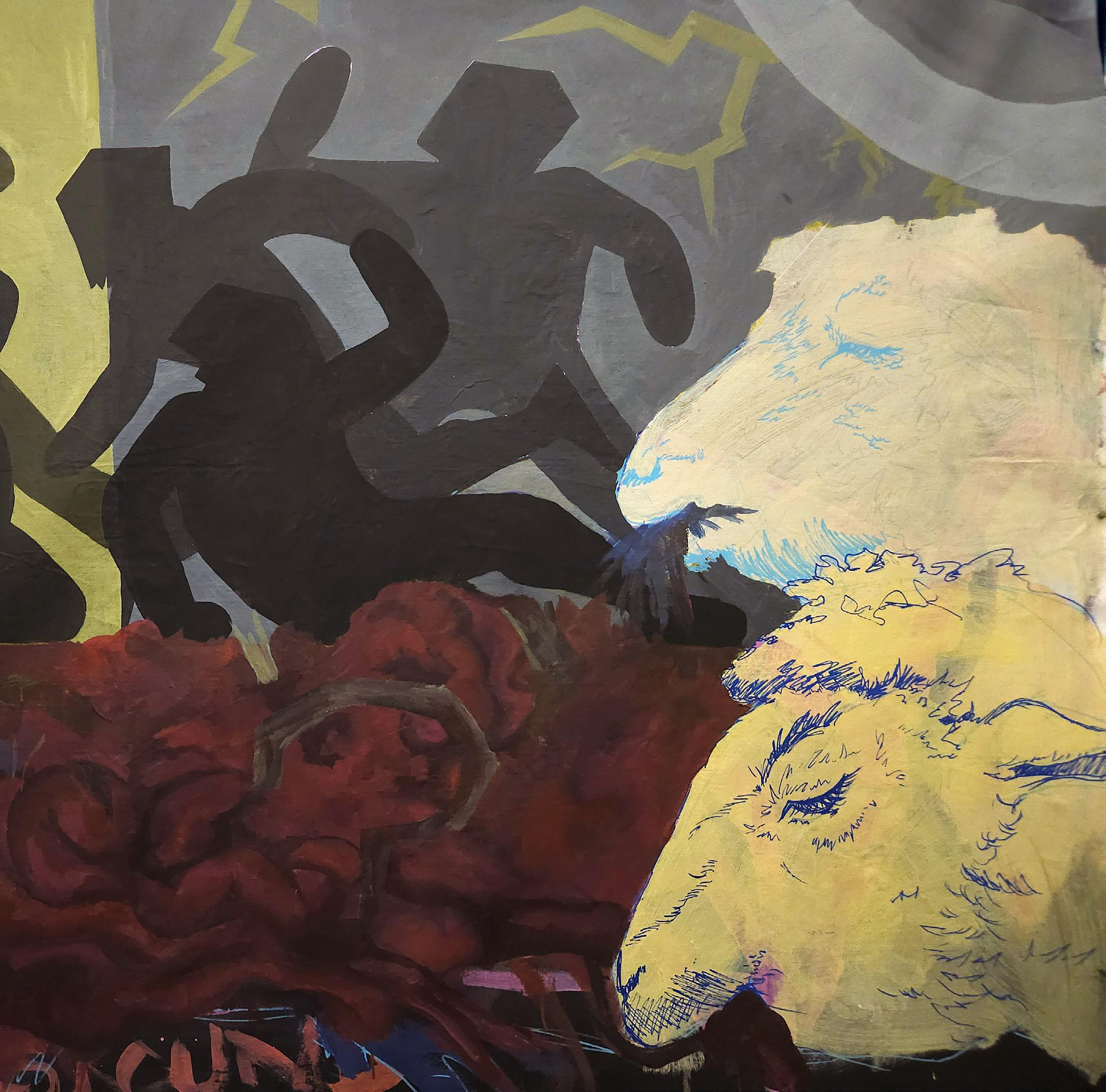
darkroom manipulation
My recent work begins with digital photos that are developed and collaged before being printed in the darkroom. Moving the image from a digital format into a physical form through darkroom manipulation brings the image to life, making objects out of image. The work focuses on this balance between precision and variation, using processes to push the image beyond a single, fixed form.
@alex.petty.photo
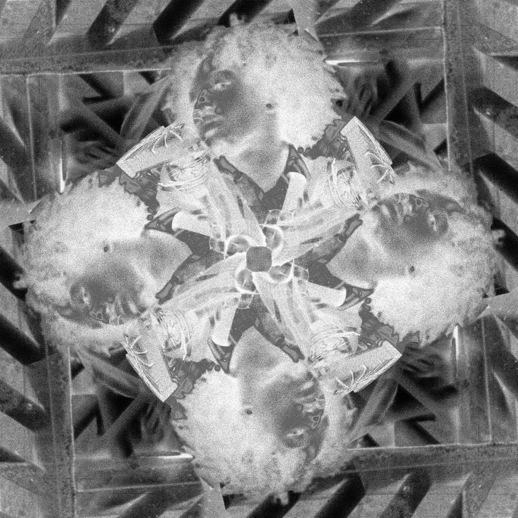
digital photography on luster
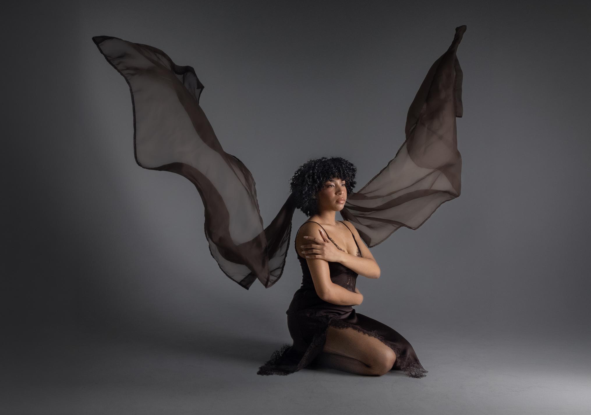
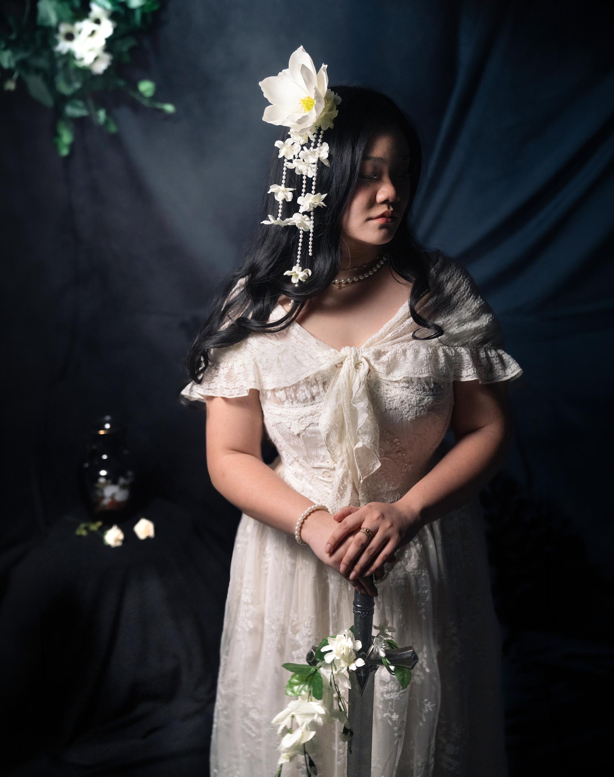
Transience offers glimpses into the multifaceted nature of the feminine experience. It visualizes the yearning for the mystical, the fantastical, and the romantic in place of the constraint and mundane. The yearning for an existence and purpose, one better than our own, that lives within everyone. Transience captures fleeting moments where nature, expression, and femininity converge.
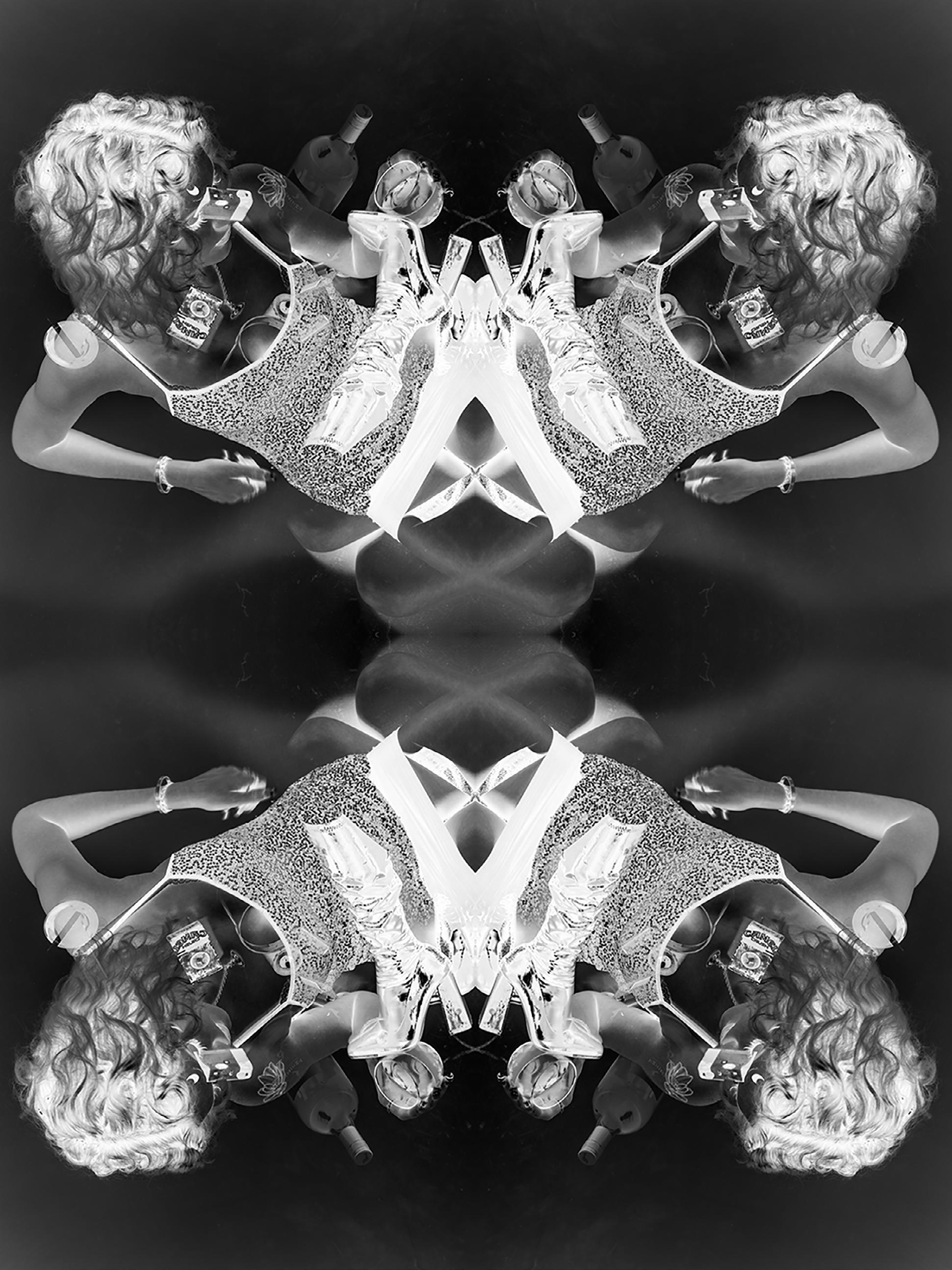
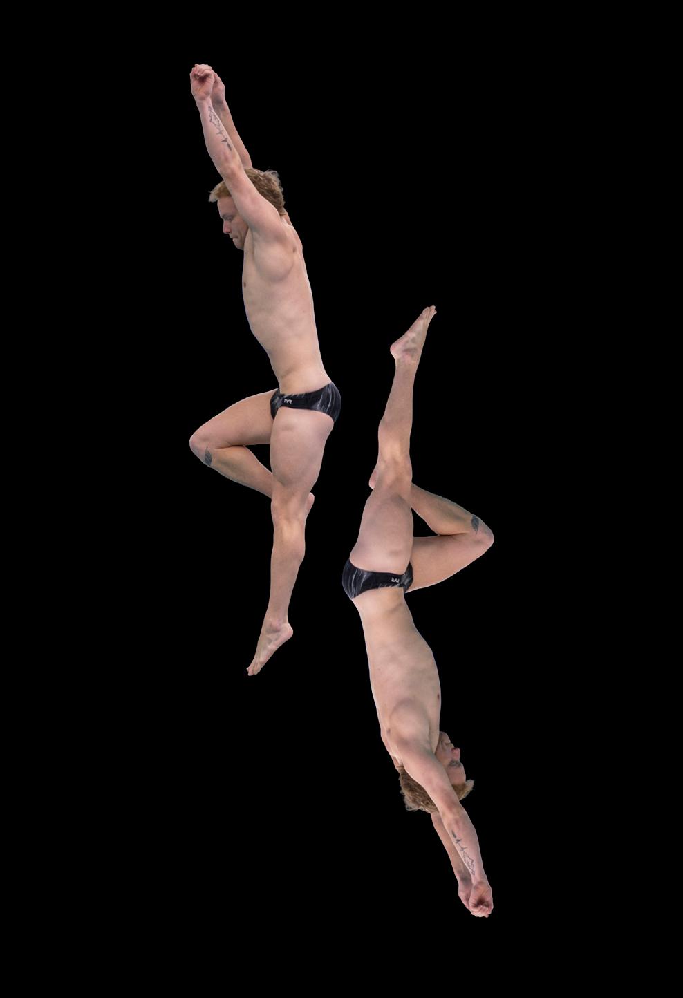
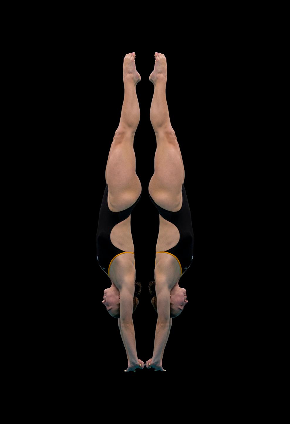
digital collage
My work focuses on athletes in motion and the forms their bodies create in space. By isolating and repeating figures, I turn quick, fleeting movements into clear, structured compositions. The body becomes less about the individual and more about shape, symmetry, and balance. These images highlight how motion can create patterns, transforming athletic performance into something more abstract and visual.
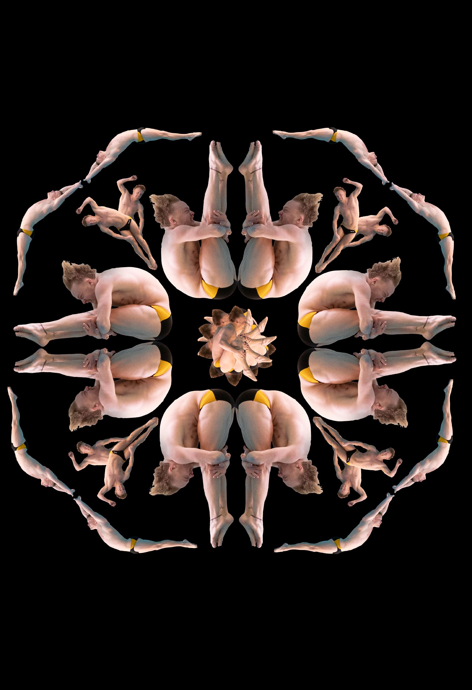
washi torinoko paper
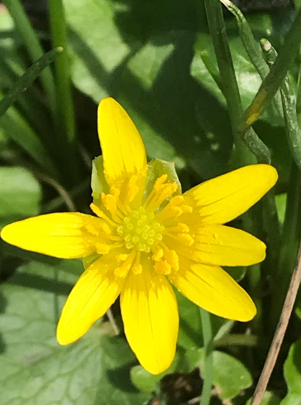
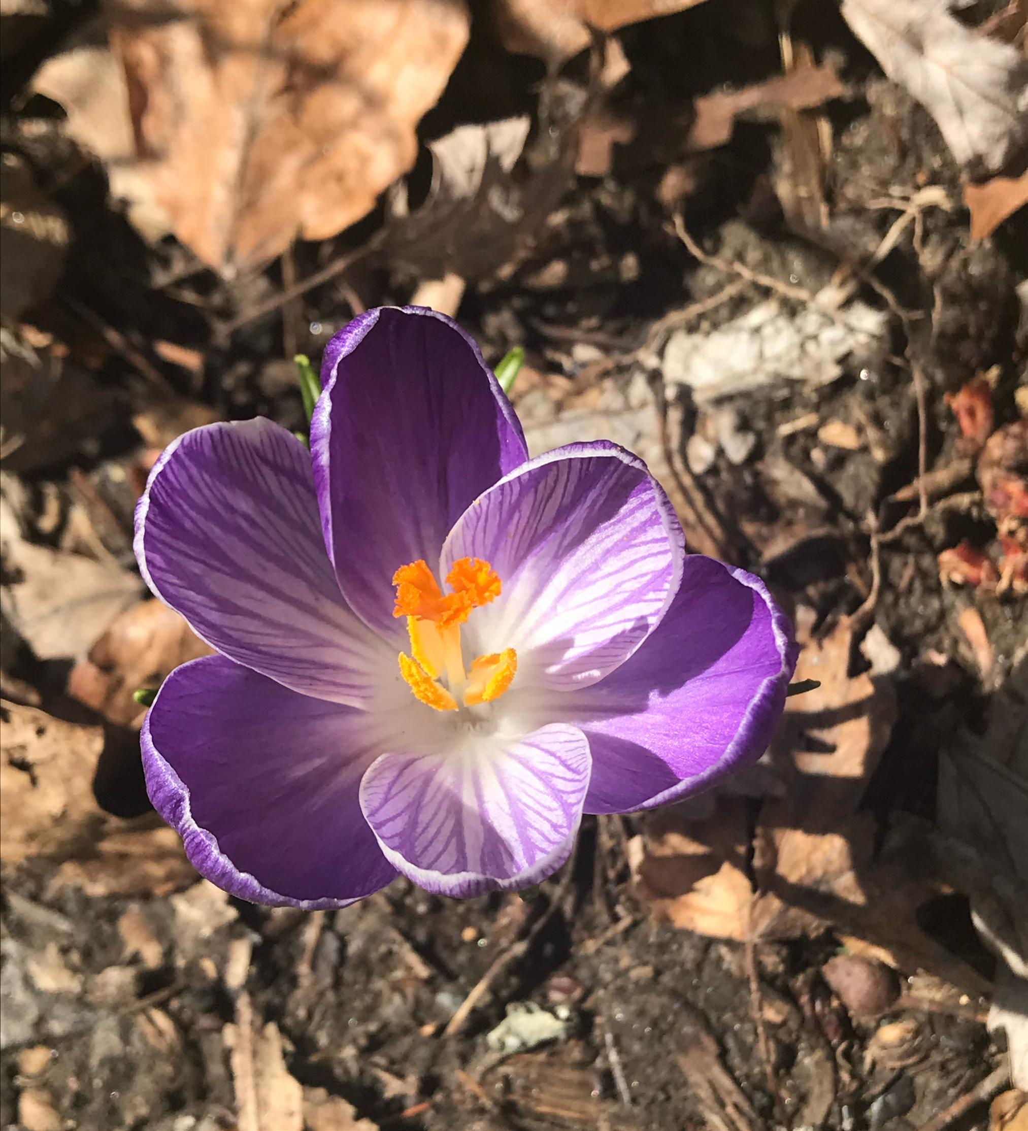
For my project I’d like to take photos of Winter landscapes with wildlife, and that goes into early Spring landscapes, with wildlife. My project will be to take a series of photos of nature in the Winter and Spring, and hopefully some birds and other wildlife. The conceptual development of my project is from the last few years of my photography. I am interested in trying to take photos of animals and nature in the winter and early spring because I think it will be something nice to photograph. One of the key insights that I want to look at is how there are plants and wildlife all around us in Baltimore that are beautiful and that we don’t really notice enough. During the winter, for my project I want to take photos of wildlife in the snow. I like to see the contrast of the animals and the white snow. I would like to see animal footprints in the snow. In the spring part I want to take pictures with new flowers and buds and leaves.
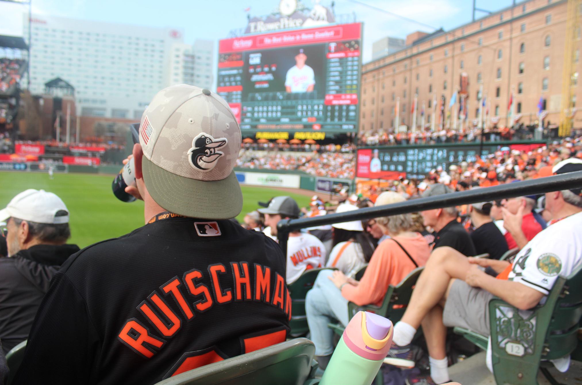
I wanted to do this series of work to show the excitement and joy I receive from baseball. When viewing my work, I hope you can see the excitement and joy I receive. The reason behind my work was because I am a loyal and dedicated Orioles fan. I love everything about baseball whether its Orioles related or not. When viewing my work, I hope you see the fan excitement and enjoy the views from around the ballpark. In my work you can see images ranging from fans cheering to views from around Camden Yard. I also wanted to include the Jackie Robinson statue because he made a huge impact on baseball.
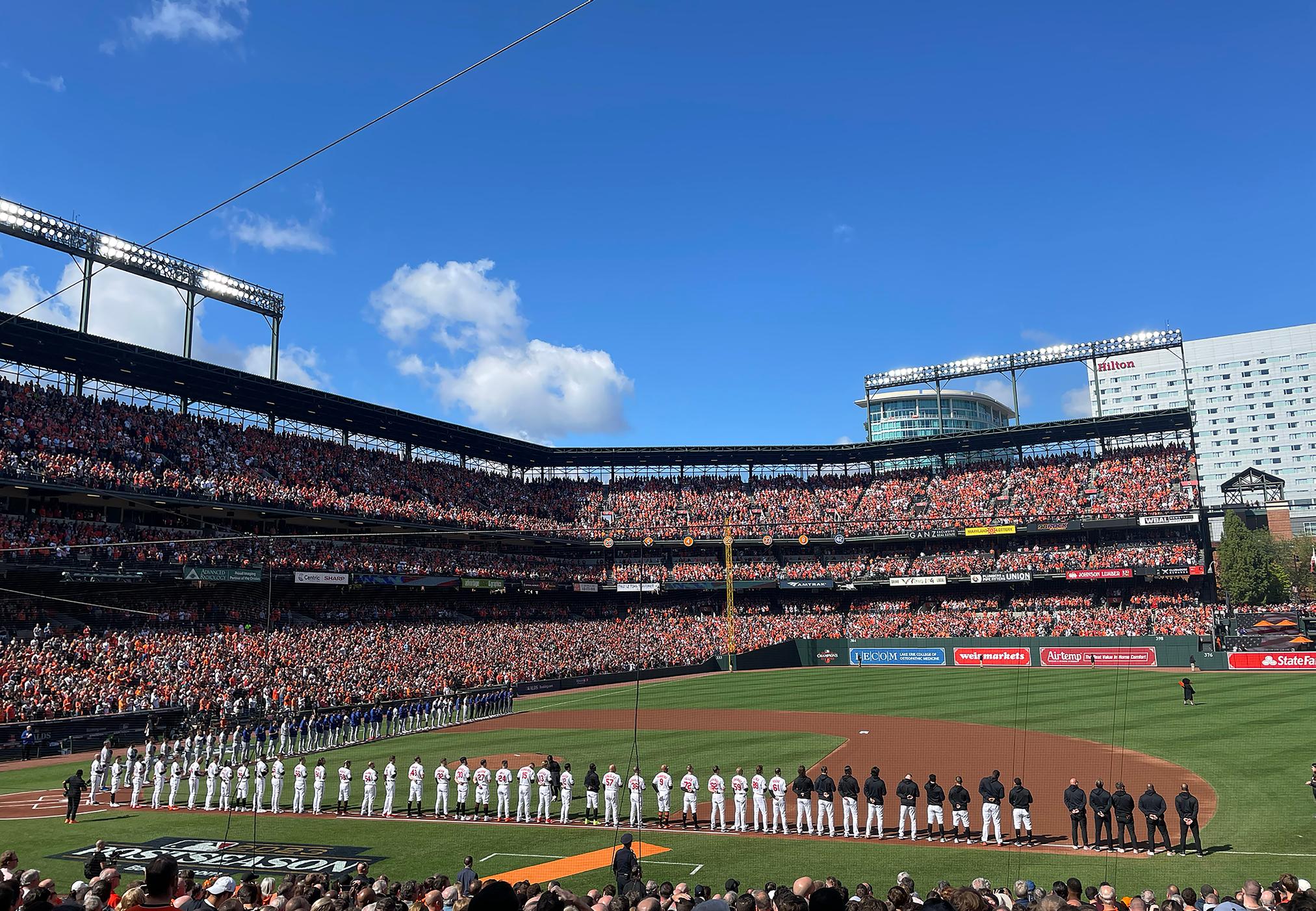
digital photography
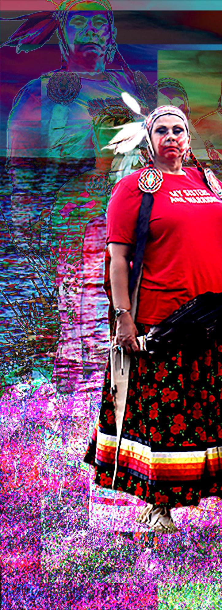
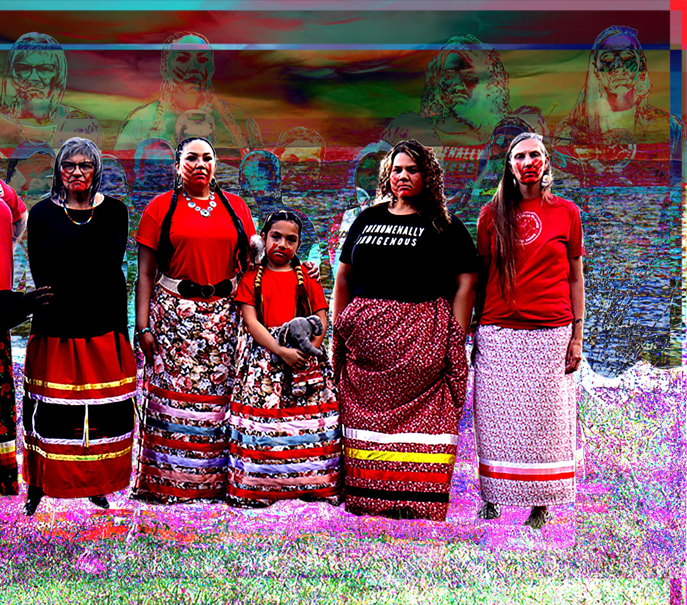
These women stand together in red to honor those who were taken and those who were murdered. The red handprint across their mouths is a reminder of voices stolen, stories cut short, and families left with silence instead of answers. their stance is a refusal to let that silence win. This photograph holds grief, strength, and the truth that our communities remember, even when the world chooses not to!
@t.nelle.s
Art + Design, Art History, Art Education