De
tion
s Tran
velo
pm
ent
Con tras t
ar
Line
D ev elop men t Lin
ea r Clu ste r
Lin
ea r Clu ste r
ast ntr Co t ras nt Co
Con tras t
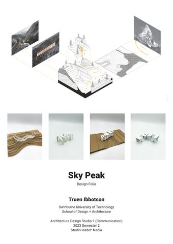
Sky Peak Design Folio
Truen Ibbotson Swinburne University of Technology School of Design + Architecture
D
nt me op l e ev
Architecture Design Studio 1 (Communication) 2023 Semester 2 Studio leader: Nadia
Tra n
siti
on
add student name here add student ID here
Swinburne University of Technology School of Design + Architecture Bachelor of Design (Architecture)
to cite: last name, first name initial. 2023. ARC10001 Architecture Design Studio 1 (Communication) Design Folio, Swinburne University of Technology
ARC10001 Architectural Design Studio 1 (Communication) Project 2, Design Folio 2023 Semester 2 Studio leader: add name here Unit convener: add name here All rights reserved No part of this publication may be reproduced or transmitted in any form or by means, electronic or mechanical, including photography, recording or any other information storage and retrieval system, without prior permission in writing from Swinburne University of Technology. Declaration of Originality Unless specifically, correctly and accurately referenced indicated above, the publication and all other material in this publication is the original creation of the designer submitting this assignment as part of their coursework for ARC10001 Architectural Design Studio 1 (Communication). While every effort has been made to ensure the accuracy, the publisher does not under any circumstance accept any responsibility for error or omission.
Page 2
Swinburne University of Technology ARC10001 Architectural Design Studio 1 (Communication)
Table of Contents
Truen Ibbotson (103985168)
Learning summary
Progress feedback
Phase 1: Idea
Phase 1: Idea
25
Week 1A Design idea
4
Phase 2: Situate
26
Week 1B Interpreting precedent studies
5
Phase 3: Explore
28
Week 2A Notating idea to studies
6
Phase 4: Execute
32
Week 2B Designing through section
7
Week 3A Developing design
8
Week 3B Assessing our work
9
Phase 2: Situate Week 4A Site building, 2D and 3D
10
Week 4B Site annotation 3D
11
Week 5A Site representation
12
Week 5B Process framing (verbal)
13
Posters Idea + Situate
33
Explore + Execute
36
Behind the scenes Appendix 1
37
Appendix 2
40
Phase 3: Explore Week 7A Physical modelling
14
Week 7B Photographing light and time
15
Week 8A Perspective collaging
16
Week 8B Transition diagramming
17
Phase 4: Execute Week 10 Design development
18
Week 11 Design resolution
20
Week 12 Design refinement
22
2023 Semester 2 Studio leader: Nadia
Page 3
Learning summary: Week 1 Design idea My chosen song was Skyfall a rather impactful and intense song packed full of emotion and tension. Through analysing the music scripture along with listening to the song I was able to target key words such as development, transition, linear and what I found most interesting contrast. Through examining this music, it allowed me to become more in sink with how the terminology actually effected both the music itself along with how the terminology could be brought to life. For example, using development directly results in a curved nature in the built environment.
The contrast between vocal and written transcripts.
Development: Refers to the building up of the song this evokes a more curved and suspense filled nature and can directly correlate with the above sound waves graph
Linear: Refers to the constant use of flat Quaver notes throughout the music sheet. This linear approach directly rivals the sound and fluctuating feel of the song further represented in the sound waves graph.
Transition: Focuses on one particular stage in the song, were the intro development transitions into the coarse therefore creating two sides almost separating one another.
Contrast: Most notable is the stark difference between the written dialect and the feel of the song. This is scene through the wavy, flow experience of listening to the song as apposed to the sharp linear transcript.
The 4 key terminology I believe Skyfall represents.
Page 4
Swinburne University of Technology ARC10001 Architectural Design Studio 1 (Communication)
Truen Ibbotson (103985168)
Interpreting precedent studies Interpreting precedents studies was important as it forced you to go and find designs that resemble the chosen words articulated throughout the song. I leant was that this method was very abstract, and all shapes and form were accepted as my thinking was too linear. Being able to express what your key words represent was crucial. I was able to effectively communicate this by aligning Linear to angular structures, contrast with how my buildings juxtapose the landscape, how development results in a gradual incline or curve and finally how transition can create two entirely separate areas that are still linked together. I was able to express my point though the use of annotations, although this was only implemented after several feedback session.
The chosen precedents studies found using ….
Transition Linear
Note: This idea was originally quite a hard to grasp, as it made me think outside my regular mentality. Throughout this process, I learnt and took away an important concept that inspiration for architectural projects don’t just come from already built structures. Instead, inspiration can come from everywhere, even small things like the way trees move in the wind and ripples seen in water. This has greatly opened my development and idea generation stages.
2023 Semester 2 Studio leader: Nadia
Refined precedents studies with additional annotation.
Page 5
Learning summary: Week 2
Notating idea to studies Line drawings and annotations play a crucial role in highlighting the key points and angles that I wished to articulate. After feedback sessions with Nadia, it became clear that I was lacking in this department. Annotations are extremely important to further express and display the points you wish to push to the audience. Using line drawings enable you to highlight exact sections placing enforces on the concepts and ideas you want to push. For my situation I have explored 4 key terminologies by using 4 colours and different line weights in which I was able to make a more detailed and readable diagram, therefore making it more obvious to someone who hasn’t seen my work before.
First attempt at combining precedents directly to Skyfall.
Development
Linear
Transition
Transition
Contrast
Refined connection of precedents to Skyfall.
Page 6
Swinburne University of Technology ARC10001 Architectural Design Studio 1 (Communication)
Truen Ibbotson (103985168)
Designing through section Designing sections quickly meant that you were forced to jot down any idea that came to your head in the moment, no matter how silly and abstract they would be. This therefore allowed you to break generic ideas and instead develop more unique designs. Sketching to scale proved to be challenging but was crucial as it kept your designs realistic. This was also important as it allowed you to get a sense of subdivisions within the room you’re designing as well as the feel of the space. Using a section view is the only way of accurately representing these things as perspective and exterior shots just represent the look not the functionality and feel of the space.
Notes: Whist designing some were not sections although this quick fire ability to get ideas down further heklped undersand my terminolagy and connection tyo skyfall
8 of 16, 5 minuet section sketches with annotations.
2023 Semester 2 Studio leader: Nadia
Page 7
Learning summary: Week 3
Developing design This week’s class we began work on conceptualising and finalising our section sketches. I began by identifying the sketch concepts I liked the most these being the two images on the top right of this text. I then took those sketches and built upon them blending the two together along with adding the more finalised section view aesthetics such as adding thickness to walls, floor, roof and Interior details. This idea was aimed to capture the presidents that we have explored, and I believe mine can clearly be shown through. Linea: Roof Contrast: Roof Development: inclusion of a staircase as well as the curved 2 part to the roof Transition: The use of different floor heights and segmentations within the design.
Final sectional design using illustrator, with previous sketch models above. Located on poster 5
Note: Very happy with outcome of final design, esspecially with hieracy and depth in design
Page 8
Swinburne University of Technology ARC10001 Architectural Design Studio 1 (Communication)
Truen Ibbotson (103985168)
Assessing our work After reflection, it has become apparent that the ideas were only clearly described in my head and not properly represented on my 5 posters. I was able to keep a clear and neat aesthetic quality throughout. Although, my lack of annotations was obvious. Mistakenly, I thought using just the key terminology of Linear, contrast, transition and development coupled with my coloured line work was all that was needed, although this wasn’t the case. For the next submission, additional key words describing the images should be included. This therefore reinforces the visual aspect to make more sense to a viewer. I will aim to design my next posters to expresses my point to someone who has never seen it before.
Note: Connsitancy over first 4 poster is great although lacks in last poster due to lack of annotations Overall challenging first task
All 5 completed posters for task 1.
2023 Semester 2 Studio leader: Nadia
Page 9
Learning summary: Week 4
Site building, 2D and 3D As this assignment was a group effort our first challenge was working out how we would fit our individual sections into 1 larger piece in the end. On top of this, our group wanted to focus on the the grandeur and undulation of the land. Therefore, each person created similar tall sections that compiled with their continuing Skyfall terminology. This allowed for key point to arise, such as valleys and high viewpoint. This therefore meant when positioning our sections together to create a cohesive site plan, I was able to position our key mountains on 3 of the 4 corners looking in towards the central community lake. Therefore, balancing our sites information for an easier comprehension.
Inspiration images for the creation of the site.
My individual section
Pia and Matts parts
The individual segments each group member completed.
Page 10
Working out how to fit each individual section together creation coherent design.
Swinburne University of Technology ARC10001 Architectural Design Studio 1 (Communication)
Truen Ibbotson (103985168)
Site annotation 3D Using this 3-dimensional way of describing the site provides a deeper understanding of the composition. Further accentuating the surrounding mountainous location. Whilst providing a deeper analysis of the soil composition and scale through the use of trees and other surrounding elements. This allows for a more realistic viewing experience than site mapping. A disadvantage of this form is the specific selection of orientation, in order to clearly represent all the desired aspects. This issue occurred due to the height of my section, proving to limit my choice of angles. Finding the right corner to display the best view was crucial or the entire piece would be blocked.
Additional information and the introduction of scale.
2023 Semester 2 Studio leader: Nadia
Stages extruding lines vertically adding depth.
A more refined and informative 3d model before great detail was included.
Page 11
Learning summary: Week 5
Site representation The key features I have learnt when creating my site model were the scales you had to adhere to and the progression each step up would create. Due to needing the model to represent the height differences, when Lazer cutting I was left to make each step up 2mm instead of the 1mm due to it looking to flat and not representing what I was after. This meant that for photography my group was able to capture more of the grandeur and the experience our site map represented. By taking the photos up close, the viewer feels like they are experiencing it from a realistic point of view. Iso and key viewpoint images were crucial in further articulating our sites ideas.
Extraction from the Illustrator file to lazer cut the physical site.
More realistic view of the landscape included in poster 2 project 2
Page 12
Isometric view of physical landscape model.
Swinburne University of Technology ARC10001 Architectural Design Studio 1 (Communication)
Truen Ibbotson (103985168)
Process framing When structuring our verbal presentations, it became apparent you needed to be very concise and to the point. By beginning with framing, you want to open with your key points in order to engage the audience, providing a strong opener that captures the viewers’ attention. Efficient naming relates to expressing key Skyfall terminology in less harsh way, to enhance the understandability of the presentation and audience retention. Physically moving and pointing to key aspects throughout the presentation increases audience engagement and attention. Finally, evaluating techniques helps enforce the key concepts discussed. I believe these steps were achieved by our group on presentation day.
Final poster designs project 2.
2023 Semester 2 Studio leader: Nadia
Page 13
Learning summary: Week 7
Physical modelling Modelling digitally is an extremely effective and time efficient tool. It has its positives; you never have to carry around your models therefore no risk of destroying them. Although the sense of scale isn’t as clear in comparison to a 3D physical model. Through digitalising models, real-world physics don’t apply. Allowing a neat representation of designs without having to use unappealing supports that would be used in physical models. Furthermore, digitally modelling provides no sense of scale. Although, this method is costefficient, accessible and time efficient. On the contrary, physical models, in my personal experience, provide a more tactile experience and allows for deeper sense of functionality, space and scale. Furthermore, enabling creativity.
How each model was built, Using 0.5 mill card, knife and glue.
Page 14
First 4 physical model concepts built.
Swinburne University of Technology ARC10001 Architectural Design Studio 1 (Communication)
Truen Ibbotson (103985168)
Photographing light and time As tasked, once your models have been designed physically the use of time, light, shadows are crucial. We are able to communicate these qualities through taking photos of each of your models at different times of days, representing different light levels and causing different shadowed effects. Without this you might position a building on the wrong asses causing little to no light to penetrate or vice versa. Though my own experiments with this prosses I was able to find the best position each building had along the journey I’m designing, therefore helping me position certain building as well as redesign others. This method can also be achieved digitally using rendering software.
Each of the first physical concepts photographed at 9am and 12am. 3pm not included.
2023 Semester 2 Studio leader: Nadia
Page 15
Learning summary: Week 8
Perspective collaging I was able to stay consistent to my design concept by choosing textures that contrast each other. This directly relates back to my overarching design technique of contrast. As visible in the spaces above, I have experimented with contrasting materials such as wood against metal, glass with fabric and water and stone. Each aspect drastically changes the functionality and atmosphere each architectural structure was designed for. Either giving a more spatial feel or more closed in and cramped experience.
Attempt two of collaging experimenting with contrasting elements of brick and carpet.
Page 16
Attempt one of collaging, exploring contrast between stone, glass and marble.
Further attempt refining still contrasting materials, wood against metal.
Swinburne University of Technology ARC10001 Architectural Design Studio 1 (Communication)
Truen Ibbotson (103985168)
Transition diagramming Whilst designing my circulation diagram I was able to ensure that it stuck to my design concept of “The different experiences each architectural structure has on its built and natural landscape”. Therefore, in my circumstances describing the undulating path, and scenic viewing spots were crucial. Including accessibility and functionality of each space was crucial in the flow of the path, this is identified by using bold line weights and colours to focus on their sections. Creating a more legible and clearer viewer reading experience. All of these aspects have been explored and implemented into my circulation diagram as seen to the right.
39
Sun direction Wind Direction
42
North Point Water Direction
15
views Hight Point
-6
Low Point Water Group selection
-6
Lowest Point Highest Point
39
Attempt one at grasping concept for the transition diagram.
Entrance Point
Internal Path
Individual Exits
Gradiant
Approach
North Point
Horizontal View
Group Central Point Water
Downwards View
Experimenting with layout and line weights.
2023 Semester 2 Studio leader: Nadia
Final refinement highlighting key paths only.
Page 17
Learning summary: Week 10
Design development Throughout my design development stages it has become clearer to perceive my project features although this has taken many iterations to get to this stage. Tweaking project one making it legibly more constant throughout the posters have helped as having a constant colour run throughout helps with clarity. This feature has been constantly development and is still in the process of development right now. The concepts from project 1 have been carried through to the design development stage, although are not obvious to the reviewers. As discovered through the feedback, further explanation of key features and concepts should be included as well as developing clear terminology.
In class mock presentation for feedback and development.
Development of site digitally.
Page 18
Swinburne University of Technology ARC10001 Architectural Design Studio 1 (Communication)
Truen Ibbotson (103985168)
This page represents initial digital constructions of structures whilst also figuring out scale and architectural angles to best represent my theme.
2023 Semester 2 Studio leader: Nadia
Page 19
Learning summary: Week 11
Design resolution During the resolution stages, it has become apparent that my concept has been refined. This week represents the initial final architectural drawings and the progress they entail. The final resolutions involved choosing the camera angle that best represent the journey and concepts from project one. I was able to make sure my terminology linked back to Skyfall. I was able to gather feedback revolving the clarity my designs have on the link with Skyfall. After completing all digital models refining the correct architectural drawing angles was crucial. Through many attempts a 1:150 scale was chosen, as it captures both the architectural structure and the surrounding land within each drawing. Reiterating my overall concept. Note: The prosses of images on the following page represent the process of refining and discovering the correct angles as well as designing the landscape to easily directly represent the surrounding landscape based of the previous assignments map and contour creation. This stage still required feedback and further refinement for the final submission. I was able to gather feedback on clarity of concept and narrative through feedback from the teacher as well as peers. Representation of the work standards I was at by this week.
Page 20
Swinburne University of Technology ARC10001 Architectural Design Studio 1 (Communication)
Truen Ibbotson (103985168)
The progress throughout the week though the addition of line weights and colours.
2023 Semester 2 Studio leader: Nadia
Page 21
Learning summary: Week 12
Design refinement During the refinement stages of this assignment, I was able to gather plenty of feedback revolving the clarity my designs have with the link to Skyfall. After completing all digital models and presenting trial architectural drawings the implementation of feedback was crucial. It was clear I hadn’t quite nailed the direct and obvious link my concept had therefore the inclusion of colour and sharper line weight was added. This served a dual purpose refining the clarity of my work whilst also representing the key terminology of contrast explored throughout my designs. Therefore, small adjustments were needed but my overall design concepts carried through the original features from project 1.
Contrast:
Transition/Linear:
Note: Development:
Contrast:
This week was also a final attempt at producing work for feedback therefore the images to the right and following pages represent the direct comparison between my unfinalised work to a more polished and finalised design. I have laid it out in a contrasting manner split centrally further representing my ideals and features. Is an example of the refinement of poster 3.
Page 22
Swinburne University of Technology ARC10001 Architectural Design Studio 1 (Communication)
Truen Ibbotson (103985168)
Before refinement
After refinement
Progress work.
2023 Semester 2 Studio leader: Nadia
Page 23
Truen Ibbotson (103985168)
Before refinement
After refinement
Progress work.
2023 Semester 2 Studio leader: Nadia
Page 24
Progress feedback: Phase 1
First attempt at annotating precedents.
Refined attempt at annotating precedents.
Week 1
Week 2
1. This week’s design action we were tasked to find the appropriate terminology for our individual songs. 2. These actions were taken as to provide realworld scenarios relating to the terminology. 3. They support my concept through the use of expressive and highlighted annotations. 4. The highlighted sections that relate the precedents to the imagery were clearly communicated. 5. Project work can be improved by creating clearer annotations 6. My precedents are not properly representing the terminology I’ve chosen therefore there is a sort of confusion brewing. 7. First poster annotations are incomplete and are not to enough of a standard for the end of this week.
Page 25
1. Organising Poster layout to represent Contrast my main terminology. As well as this also limiting the written aspects focusing more on emotion and correct annotations. 2. These actions were undertaken to respond to the teachers feedback and create a more completed first 3 posters. 3. These actions support my concepts through linking the layout of the posters to my terminology as well as providing Precedents that directly related to my song 4. Precedents progress is shown through the use of colours and textures, signifying and differing between all 4 of my precedents. 5. My time management can be improved. 6. Precedents still don’t perfectly represent my key terminology. 7. Third poster (Evaluate) wasn’t started.
Swinburne University of Technology ARC10001 Architectural Design Studio 1 (Communication)
Truen Ibbotson (103985168)
Transition Linear
Contrast Development
Positioning precedents onto a finalised page layout.
Attempt 1 of combining precedents and directly linking to Skyfall.
Week 3
1. Finalising chosen precedents and completing Poster 1 - 4. 2. Actions were taken to provide work for feedback from Nadia. 3. Through the use of differing colours I was able to make it more legible and understandable for viewers of my work. 4. The 4 key terminology I am exploring in my work, Linear, Contrast, Development and Transition. 5. Turing down thickness of linework and perfecting layout. 6. I believe all aspects are working, Nadias feedback greatly helped keep me on track. 7. Posters 5 - 6 are still in creation stages as opposed to draft completion stages.
2023 Semester 2 Studio leader: Nadia
Development
Linear
Transition
Transition
Contrast
Finalised attempt and positioning of poster 3 project 1 progression.
Page 26
Progress feedback: Phase 2
My individual site aspect for project 2.
The combination of all group members aspects into one site map after feeback.
Week 4
Week 5
1. This week’s action was designing and conceptualising individual landmass that took characteristics from Skyfall. 2. These were taken to prepare and connect our designs within the group chosen (Pia, Matt, Truen) 3. I designed my mountain incorporating my 4 terms placing enforces on contrast, this was achieved through working with my group creating contrasting developed mountain range with a flat linear lake. 4. This week the term development was clear with the use of tall mountains. 5. How to link the groups sections perfectly together need to be changed. 6. Using the array command was hard and had a few issues with it. 7. Nothing this week was not designed, group worked well together.
Page 27
1. Working as a group to link all sections together with consistency. 2. These actions were taken to create consistency and to allow all 3 individual works to work as one whole piece that looks like it was designed that way. 3. When designs the incorporation of a linear central river connected our terminology to the song supporting our concept. 4. Our connection as a group. 5. Hierarchy or linework and the addition of annotations. 6. Working out our colour scheme and creating focus points of interest for viewers. 7. Annotations are the biggest missing aspects.
Swinburne University of Technology ARC10001 Architectural Design Studio 1 (Communication)
Truen Ibbotson (103985168)
-3
39 24
SR
42
15
-6
30
-6
39
SS
39
18
Feeback section 1 details.
Feedback session 2 refinement of site clarity.
Week 6
1. Creation of hierarchy and an overall more interesting site map with annotations. (3 images in order show the progression to final outcome) 2. To align with the criteria as well as implementing Nadias feedback in class. 3. These actions support the concept by highlighting the terminology present within the work, therefore adding clarity and legibility. 4. After feedback the final product clearly communicated our terminology and criteria points needed such as the inclusion of views, wind, and sun directions. 5. Throughout classes 1 and 2 of the weeks I was able to update work therefore our end product requires no improvements. 6. No aspects we not working. 7. Nothing was missing.
2023 Semester 2 Studio leader: Nadia
Final design with correct annotations and details to accompany.
Page 28
Progress feedback: Phase 3
First completed scale models. (Sketch exercise)
Progression of light analysis for site 3 structure feedback. (Positioning)
Week 7
Week 8
1. Whilst in class and before, we were taked to conceptualise ideas for our structures we are to design for project 3. 2. Using a speed building and in person method I was able to generate micro structure ideas. 3. Designing by hand allowed for more creativity and realism with the design. Similar to our speed section design allowed us to implement our terminology into actual structural designs. (3 favourite examples above). 4. The contrast in sharp and curved structures my key terminology point. 5. My overall theme for the jurney was still not finalised. 6. Designing a further structure was proving challenging. 7. My design turned black and white
Page 29
1. Using my chosen structures creating a lighting analysis. 2. This was to help us locate its possible location along the journey. 3. This helps link the idea to Skyfall by deciding wether I want my structure traversed in a dark, shadowed, or bright feel. 4. The structure at different times of the day and how it reacted to each time. 5. A more finalised model with sharper and cleaner aesthetic qualities. 6. The location the photos were taken in was challenging. 7. Nothing was missing this week.
Swinburne University of Technology ARC10001 Architectural Design Studio 1 (Communication)
Truen Ibbotson (103985168)
Exploring Architextures to gather textures for collages.
Attempt 1 of collaging using photoshop. (Using contrasting materials)
Week 9
1. Designing the layout of the poster 4 based off or previous feedback, as well beginning to texture our structures. 2. To stay on top of work as I was falling behind. 3. First the layout to represent sharp contrast and secondly using textures help represent the structures more realistically. I was able to use contrasting textures to align with my themes. 4. The realism and contrast in textures. 5. Creating a black and white final design with a cleaner overall aesthetic. (Image to the right) 6. Photoshop was hard to understand and learn. 7. More design exploration needed.
2023 Semester 2 Studio leader: Nadia
After valuable feedback final attempt at collaging. (Back and white)
Page 30
Progress feedback: Phase 4
First feedback session on transition map readability. (Lots to change)
Implementing feedback updating look and readability of diagram.
Week 10
Week 11
1. Using the original site map, designing the path with more clarity and enforces on the jurney, as well as finalising and clarifying my concept. 2. As this aspect was a requirement for final submission. As well as presenting an idea for mock speeches. 3. These support my concept by clarifying a path the journey will take whilst connecting the terminology from Skyfall into the design. 4. The path travelled was clearly communicated. 5. Removing surrounding contours and using an accurate key. 6. It was not representing the jey theme behind my designs. 7. A more completed map.
Page 31
1. Refining the site map playing around with the terminology more thoroughly as well as taking my concept (contrast between land and structer further). 2. These actions were taken to create a more concise and readable map. 3. Incorporating contrast with the layout as well as highlighting key aspects using colours was important. 4. The highlighted section and the key aspects needed such as view, path and so on were clearly communicated. 5. Hierarchy and creating less colour. 6. No aspects weren’t working. 7. Nothing was missing.
Swinburne University of Technology ARC10001 Architectural Design Studio 1 (Communication)
Truen Ibbotson (103985168)
Creating 3D digital models.
Finding correct angles to represent theme.
Week 12
1. For the final week my actions were to digitally design my structures and improve upon previous models. Then begin and finalise my architectural drawings. 2. These actions were taken to align with the project brief and to also represent what each structure was designed for in a readable manner. 3. Each action supports my concept in a separate way by talking with Nadia I was able to design each architectural drawing to align with my concept and to represent what the connection my building has to Skyfall. 4. The connection each model has to Skyfall. 5. Line hierarchy and addition of people for scale 6. No aspects weren’t working. 7. My written components are still needed.
2023 Semester 2 Studio leader: Nadia
1:150
0
1
2
4
8
Implementing feedback from mirror dadding additional details and refinement.
Page 32
Posters: Idea + Situate
Page 33
Swinburne University of Technology ARC10001 Architectural Design Studio 1 (Communication)
Truen Ibbotson (103985168)
2023 Semester 2 Studio leader: Nadia
Page 34
Posters: Explore + Execute
Page 35
Swinburne University of Technology ARC10001 Architectural Design Studio 1 (Communication)
Truen Ibbotson (103985168)
2023 Semester 2 Studio leader: Nadia
Page 36
Behind the scenes
Failed Attempts The next 2 pages represent the 3 failed designs I attempted. I first sketched them physically using 0.5 mill paper then digitalized them but after working through my final concept and theme these designs proved not strong enough and therefore, I had to leave them. The first image to the right represents the failed dual curves but due to its complexity it became too challenging to build both digital and more challenging physical. The 2 following designs I liked, although were too simple and didn’t portray my concept well enough.
First Failed model.
Note: Through more trials I have found a way of physically creating these dual curves roughly using an unroll function in rhino although the end product would not look as appealing as my other due to the cuts and creases still required.
Playing around with duel curves in rhino for bridge design. (became to complicated)
Page 37
Swinburne University of Technology ARC10001 Architectural Design Studio 1 (Communication)
Truen Ibbotson (103985168)
RHINO FAILED ATTEMPT 1
FAILED ATTEMPT 2
FAILED ATTEMPT 3
Highlighted above are all 3 failed versions concepts for the architectural structures worked on but not chosen for final design.
2023 Semester 2 Studio leader: Nadia
Page 38
Behind the scenes
Land Creation Furthermore, to design and create my final models was a great challenge. As mentioned throughout my folio the connection my structures have to the land and its contrast was extremely important. Therefore, I decided to make my models to 1:50 scale but also make a surrounding capture of the land there are situated on. This was most important for my first design as it contrasts the sharpness and linearity of the waterfall with a smooth glass-based bridge structure. To enforce the contrast, I made the land out of neat brown cardboard and sprayed all models white. The process I took for painting and land creation physically is represented on the following page.
Designing the surrounding natural landscape for the structures that require it for additional importance and link to the theme.
Page 39
Swinburne University of Technology ARC10001 Architectural Design Studio 1 (Communication)
Truen Ibbotson (103985168)
Process of spray painting the models white as well as designing and cutting the natural landscape out of cardboard from bunnings.
2023 Semester 2 Studio leader: Nadia
Page 40