LOGO & BRAND GUIDELINES
THE EARNEST TEAM A visual identity built around home, trust, and the Earnest name.
BRAND OVERVIEW The Earnest Team logo was designed to create a professional and recognizable identity for Tom Earnest and The Earnest Team, while maintaining a strong visual connection to John L. Scott Real Estate. The identity combines clean, modern typography with a custom real-estate element that feels personal toTom rather than relying on a traditional standalone house icon. The overall brand should feel: Professional • Trustworthy • Established • Approachable • Local • Modern
LOGO CONCEPT
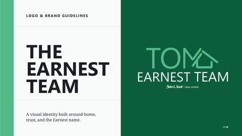
The primary logo centers around TOM, creating a strong personal connection to Tom Earnest and making his name the most recognizable element of the brand. The defining feature of the logo is the custom “M” in TOM, which transitions into the outline of a home. The diagonal stroke extends upward to create a roofline, while the lower portion completes a simplified house shape. This integration represents Tom’s connection to homes, real estate, and the clients he serves while keeping the design clean and distinctive. Rather than placing a generic house symbol beside the name, the real-estate imagery becomes part of Tom’s identity itself.
Below the primary mark, EARNEST TEAM is presented in clean uppercase typography, providing balance and making the team name immediately identifiable. The John L. Scott | Real Estate signature completes the logo and connects The Earnest Team’s individual branding with the established John L. Scott brand.
Forest - Primary Brand Color #006341
Verdant - Secondary / Accent Color #52b67e
BRAND COLORS John L. Scott Green
The green used within the TOM mark creates an immediate visual connection to the John L. Scott brand while allowing Tom's name to become the focal point of the identity. Always use the approved John L. Scott brand green when reproducing the logo. Do not approximate or substitute another shade of green.
Drift - Neutral Background #e6ebea
Black - Primary Neutral #000000
TYPOGRAPHY
SEGOE UI PRIMARY TYPOGRAPHY
Segoe UI is the primary typeface for The Earnest Team and complements the clean, modern appearance of the logo. Droid Serif serves as the secondary typeface and introduces a more traditional, established quality to the brand.
Droid Serif
Secondary Typography
ABCDEFGHIJKLM NOPQRSTUVWXYZ abcdefghijklm nopqrstuvwxyz 1234567890
CLEAR SPACE The safe distance to put your logo in
clear space
elements should interfere with the logo or sit too close to it.
clear space
No text, photography, graphics, borders, or other design
clear space
Always provide adequate clear space around the logo.
As a general guideline, maintain clear space around the entire logo approximately equal to the width of the vertical stroke of the “T” in TOM or greater. More breathing room is always preferred when space allows.
clear space
LOGO VARIATIONS Vertical
Horizontal
Icon
Best for square or portrait
Best for email signatures,
Best for social profile images,
applications where
website headers, banners, and
branded graphics, merchandise,
horizontal space is limited.
wide-format applications.
and small-scale applications.
LOGO APPLICATION Consistent Branding Across Every Touchpoint Consistency builds recognition. The Earnest Team logo should appear the same across business cards, social media, listing materials, signs, presentations, digital advertising, email marketing, and other client-facing materials. The custom TOM + house mark should become a recognizable visual signature for Tom and The Earnest Team while maintaining the professionalism and established reputation associated with John L. Scott Real Estate.
LOGO MISUSE
Rules on logo use to keep in mind
DO NOT change the color.
DO NOT crop
DO NOT add
Use colors in the palette.
the logo.
shadows or effects.
DO NOT rotate
DO NOT place the logo over
DO NOT use tint
the logo.
busy graphics or illustrations.
or opacity.
DOWNLOAD THE RESOURCES
Scan to access approved logos and brand assets.