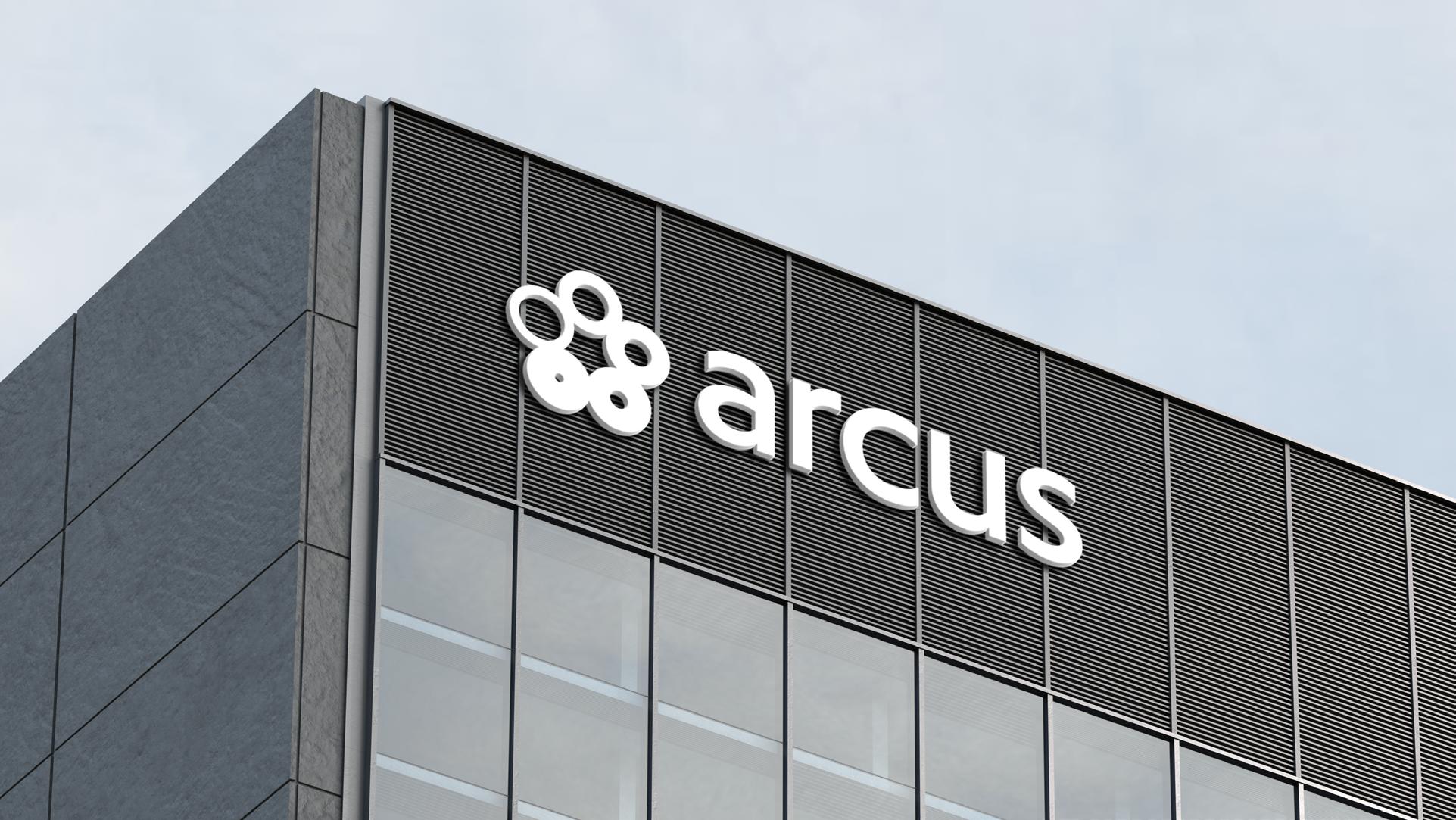
Introducing the new A rcus Group brand
Introducing the new A rcus Group brand
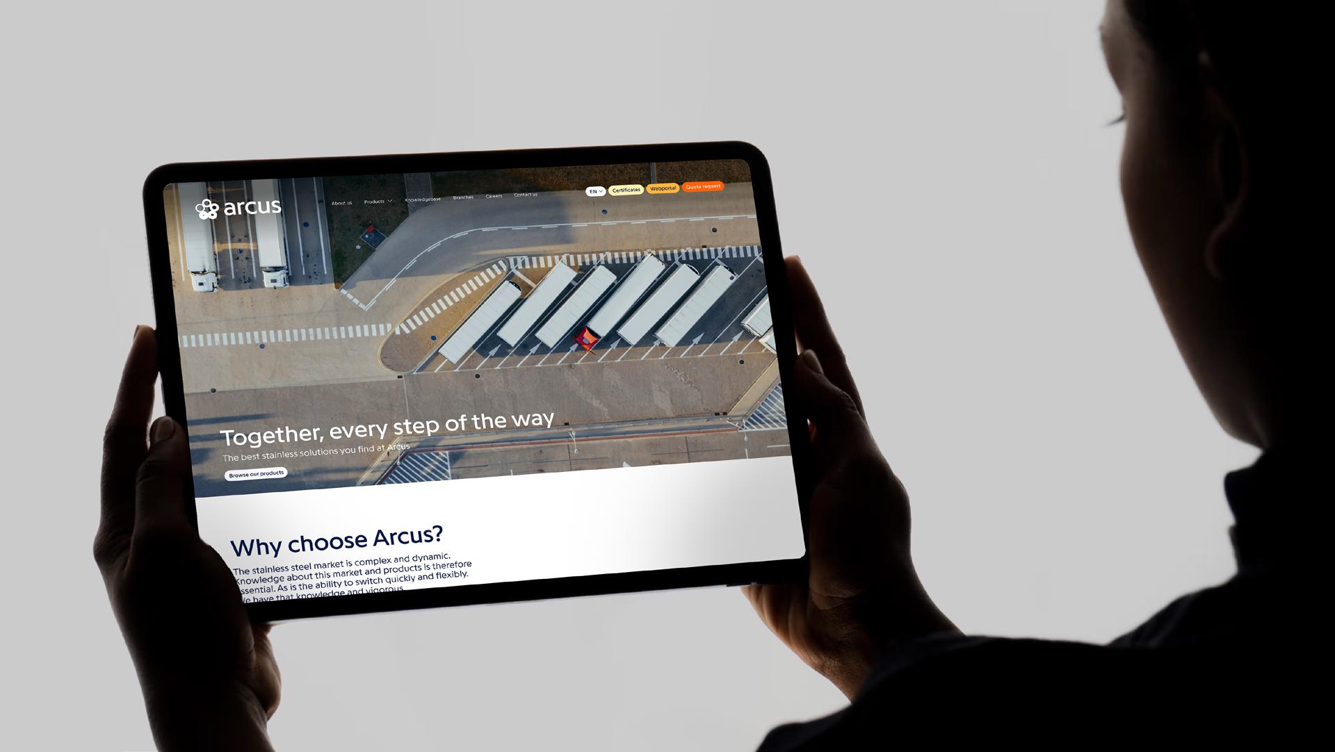
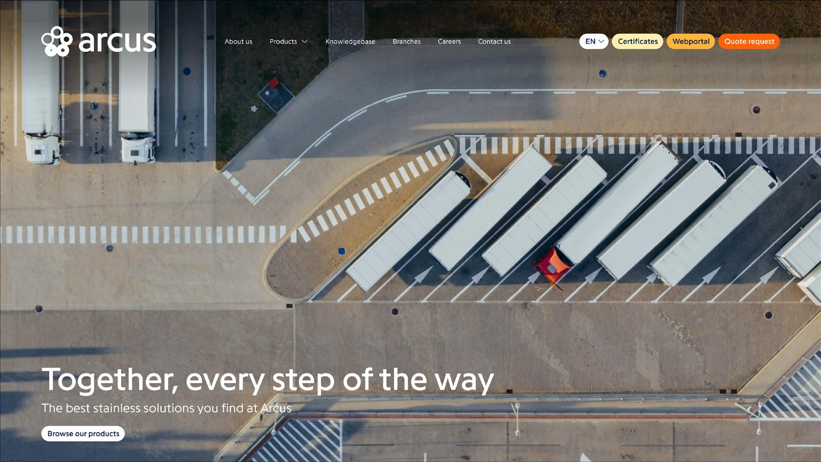
Together, every step of the way
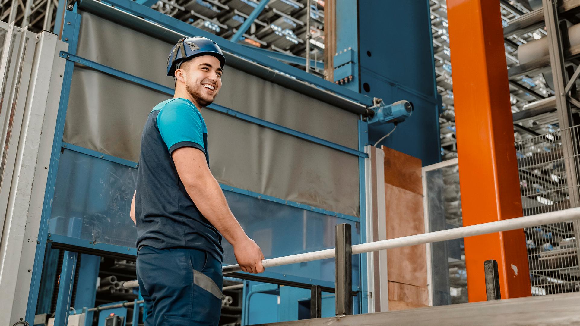
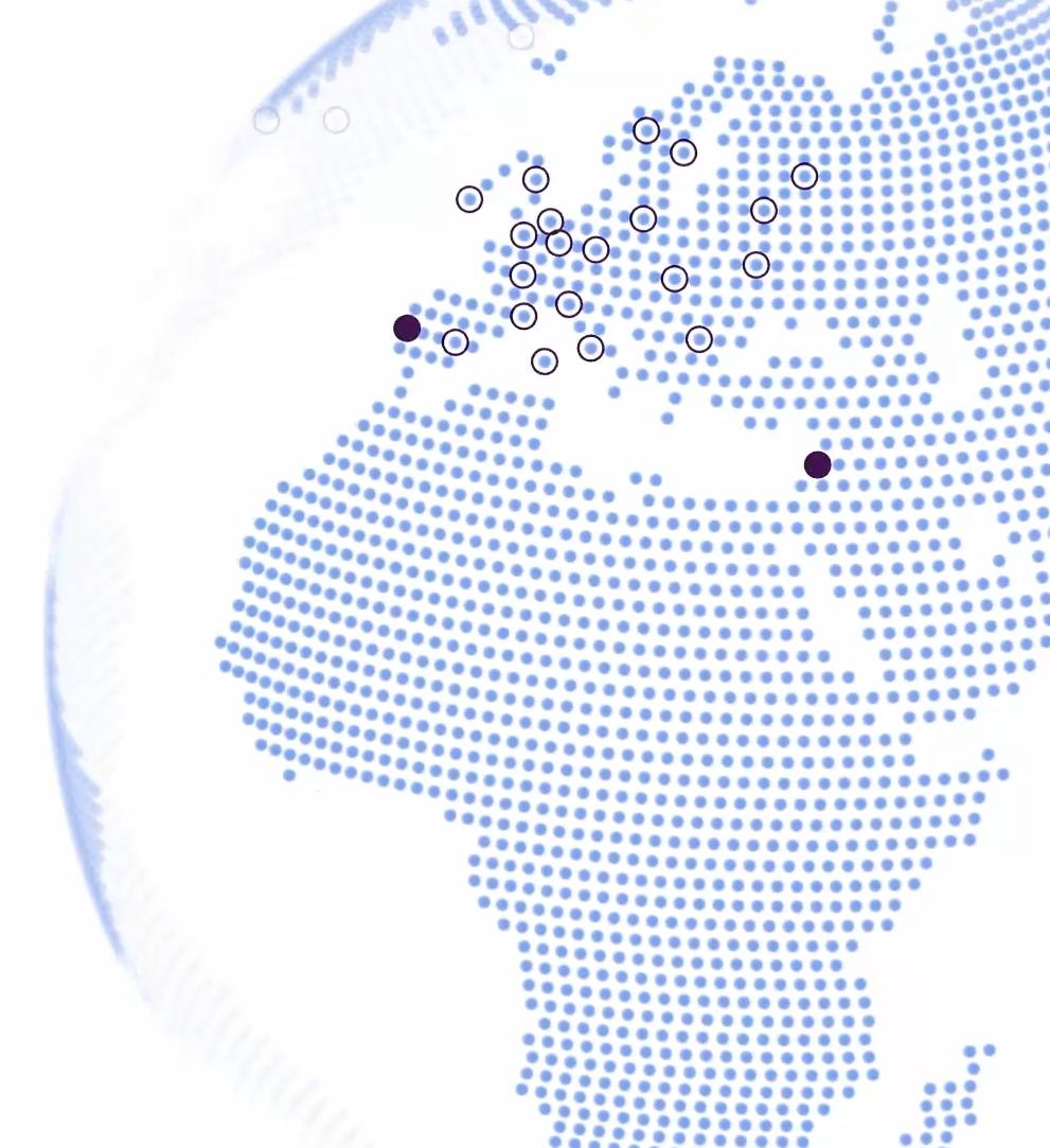
As Europe’s fastest-growing steel resource, Arcus Group's mission is simple: to put customers first and build relationships rooted in trust and collaboration.
Arcus Group's goal is to be the leading resource for steel products in Europe and through the company’s unification of the individual divisions, it will be primed to take a leadership role in the steel products supply industry.
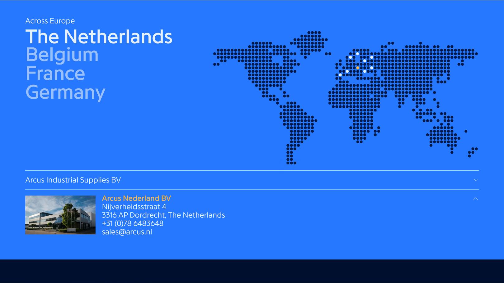
arcus Belgium
arcus Deutschland
arcus France
arcus Industrial Supplies
arcus International
arcus Nederland


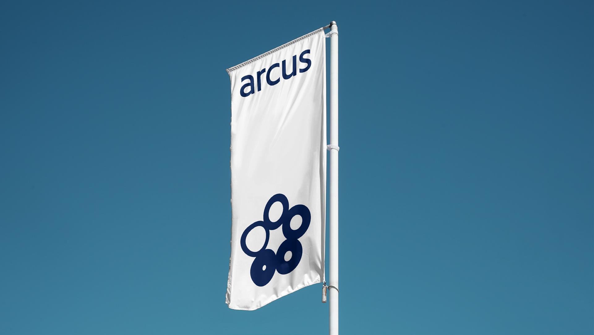
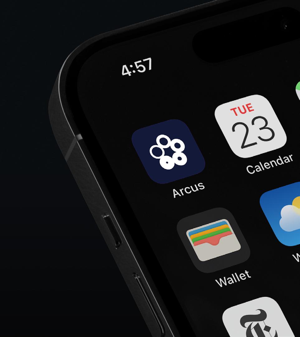
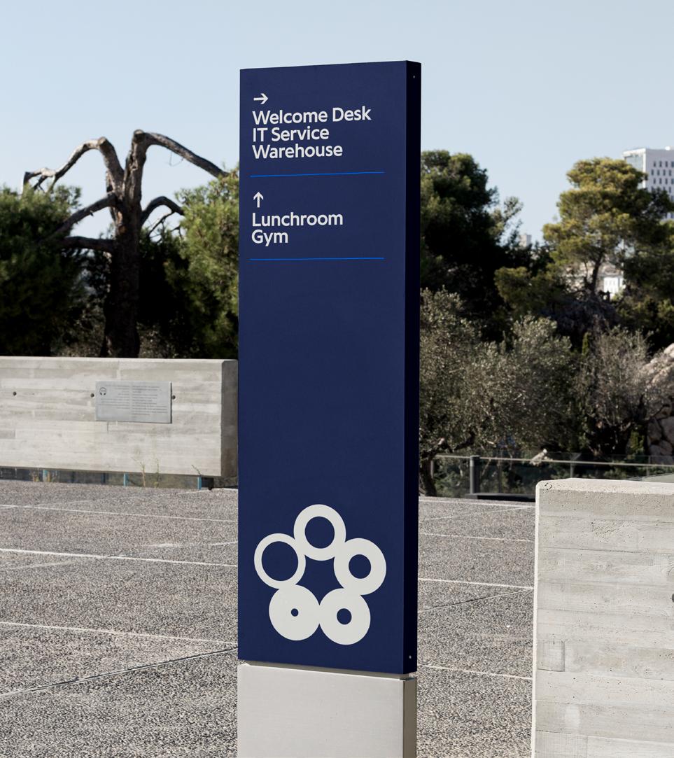
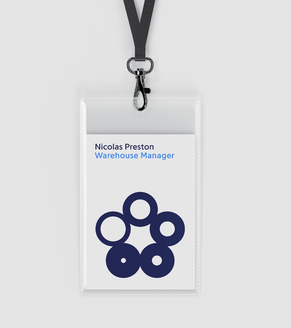
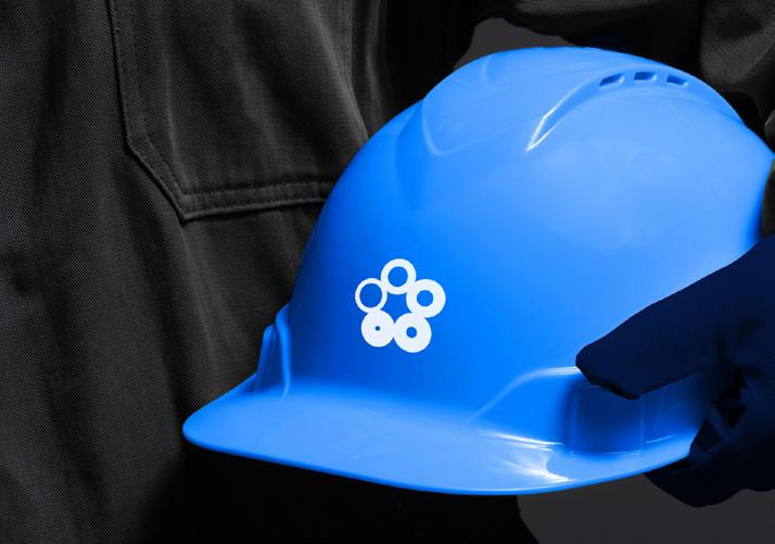
Made of five circles, the logo symbolizes unity as well a direct reference to the tubes. Its precise geometric structure conveys strength, precision, and forward-thinking vision. The design stands on its own and embody Arcus’s expertise as well as acting as a mark of quality and trust.
Programme is a typeface with geometric foundations and open terminations. Its precise construction ensures clarity and legibility, while its balanced proportions reflect both technical precision and approachability
Corbel serves as the system typeface, replacing Programme when unavailable. Its open, straight-ended terminations preserve many of Programme’s key attributes, including its geometry, clarity, and exceptional legibility.
Fast Reliable Innovative Precise Strongggg
Performant Advanced Efficient Sustainable owledgeable Expert United Understandinggg Driven Responsible Dynamic Excellenceeeeee Solution-Oriented Personal Modernnn
Understanding Reliable Pragmatic Goal-Drivennn
nnInnovative Trustworthy Community


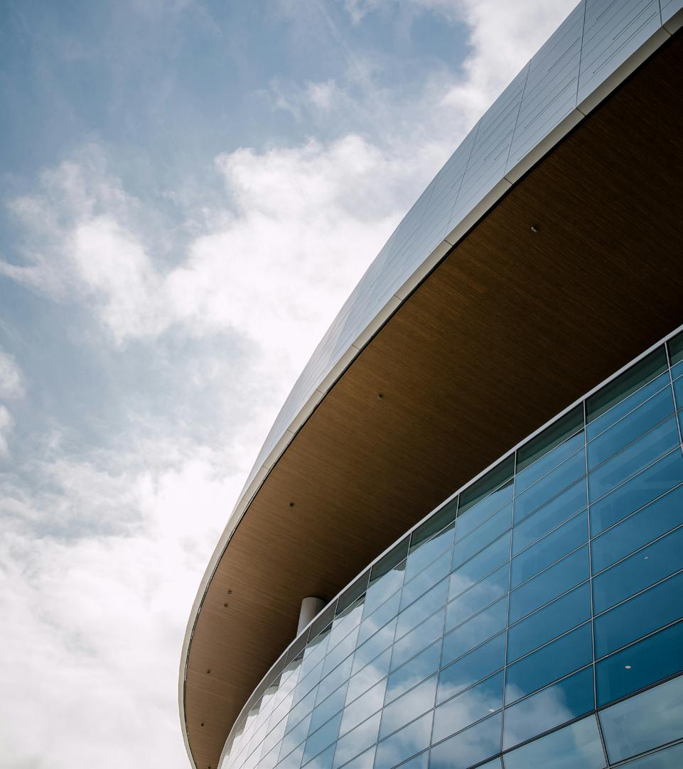
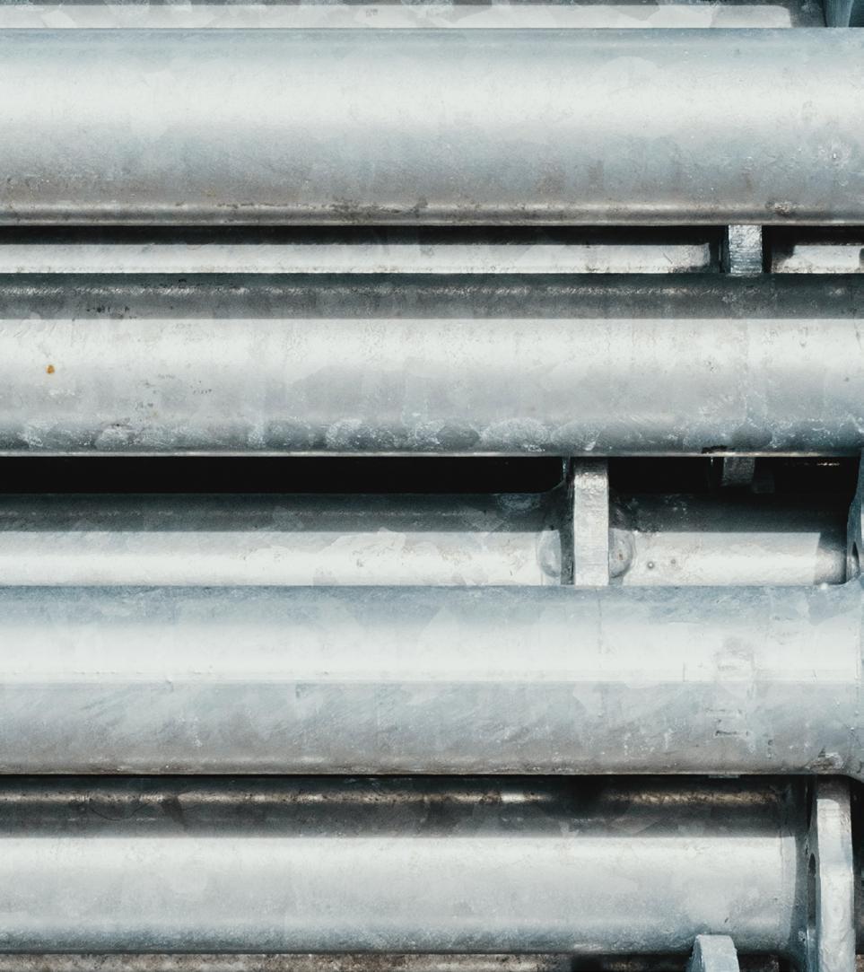
The color palette introduces depth and contrast through rich and vivid tones. The blues reinforce a sense of professionalism, reliability, and international presence, while the oranges bring warmth and energy, evoking the glow of heated metal—a nod to the industry.

The Arcus color palette combines bold and dynamic shades of blue, embodying trust, reliability, and a sense of professionalism. It reflects Arcus' commitment to expert solutions and efficient performance with a modern, approachable touch.
The CSRD color palette introduce green tones, reinforcing a sense of durability and innovation. Just like the blues, by maintaining harmony between light and shadow, it ensure professional approach that aligns with Arcus’ forward-thinking vision.

”Our goal is to make the whole process, as sustainable as possible. Within Arcus Group, we do our best to contribute and work together towards these sustainable ambitions.“
For us, circularity goes beyond just the product itself.
40%

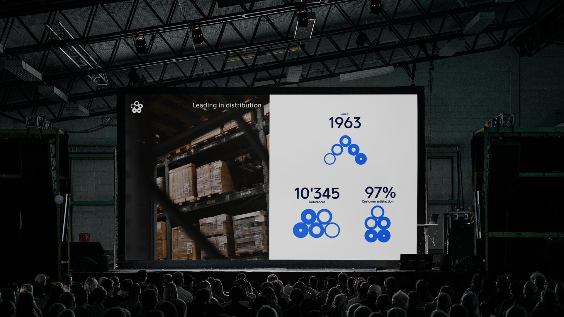
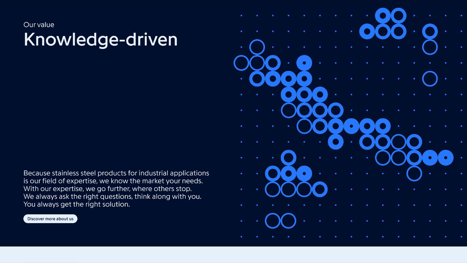
The circle, core element of the brand’s identity, extends into patterns and signs within a structured of unity, movement, and precision.
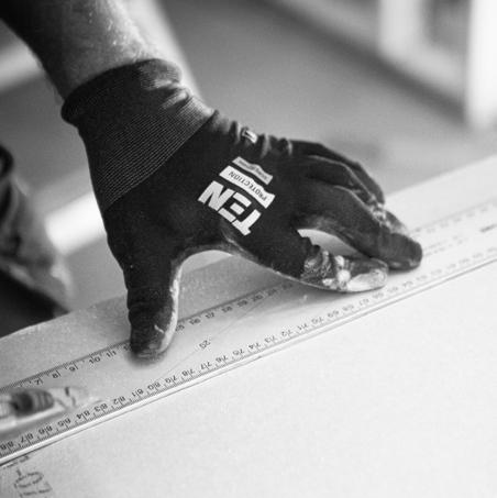
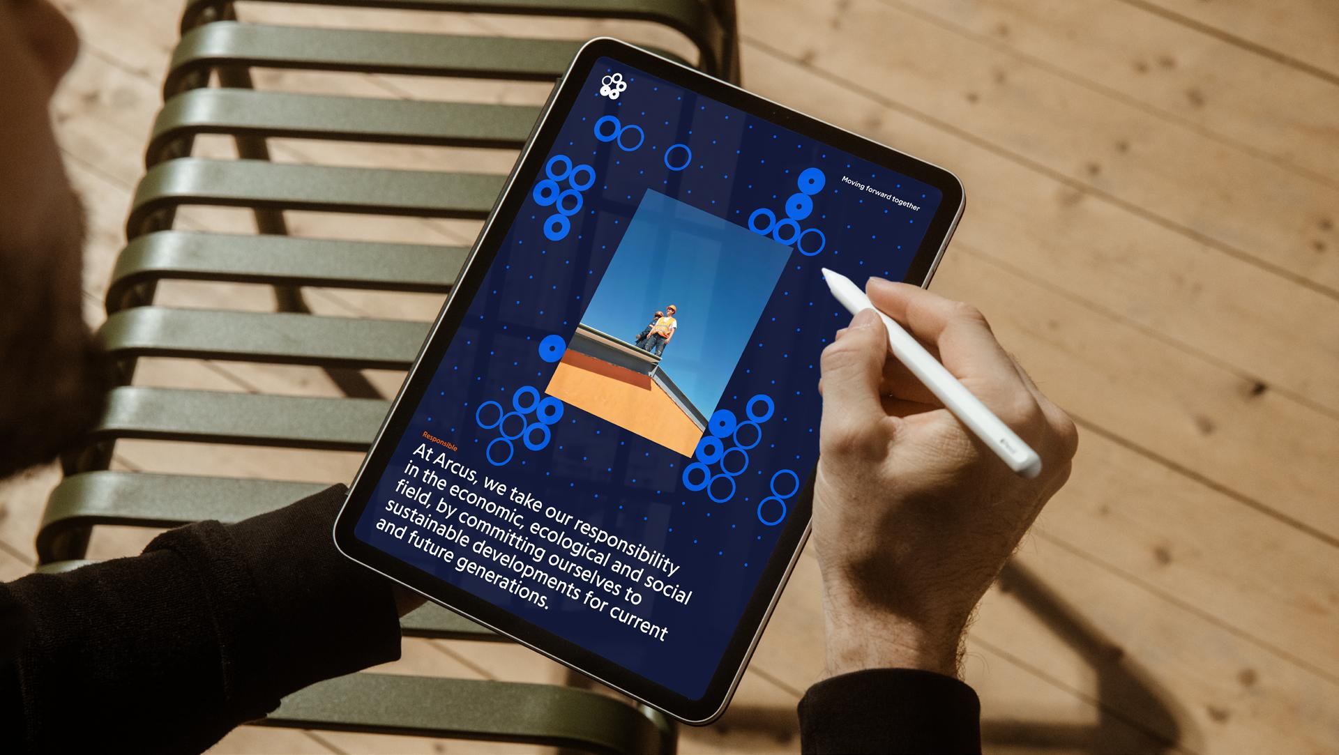


Explore careers at Arcus
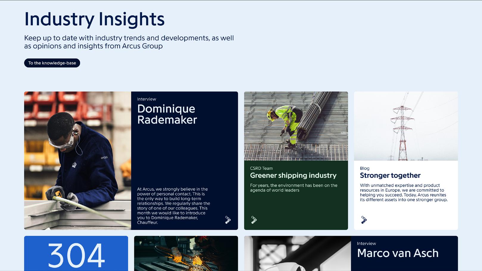
The difference between grades 304 & 316
Read more
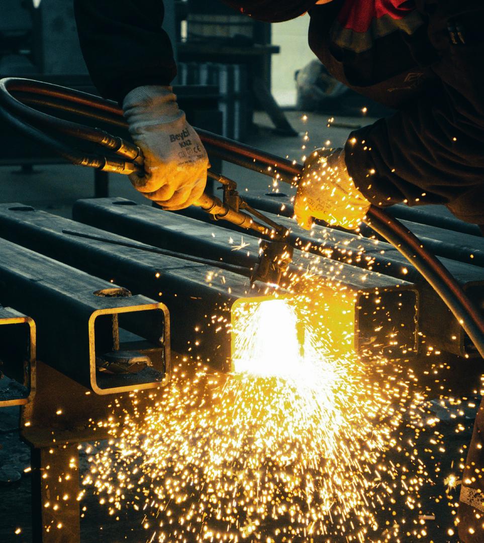


Moving forward, together Fast, efficient, reliable