
2 minute read
PICNICS IN PICTURES


Steve Frykholm’s posters personify American graphic design from the late 20th century
WATERMELON, POPSICLES, BARBECUED
CHICKEN, hot dogs, sweet corn, lemonade and cherry pie. These are quintessential American picnic foods — sticky, drippy foods best eaten with your hands while sitting on a picnic blanket in the summer heat with friends or family by your side. These are symbolic foods, foods that hold memory. When graphic designer Steve Frykholm was tasked with creating a poster to announce his company’s employee picnic, he relied on these foods to communicate much more than a workplace memo ever could.
Born in 1942, Frykholm attended Bradley University and the Cranbrook Academy of Art. Between these degrees, he served in the Peace Corps at a Nigerian government trade school for girls. There he learned how to screen print alongside his students because, “It was a trade school. I thought they should learn a trade,” he recalled. Screen printing agreed with Frykholm. He later explained, “I like the smell of the ink, cutting the stencils, the saturation and the color. It’s the physicality of it. Why do people like to plant vegetables, dig in the dirt and see things grow? You just do it for the joy of doing it.”
Shortly after graduating from Cranbrook, Frykholm was hired at Herman Miller as the company’s first internal graphic designer in 1970 — and he quickly made his mark. One of his first assignments at the Zeeland, Michigan-based furniture company was to design a poster for the summer employee picnic. Inspired by classic picnic foods, his 1970 poster features bright-yellow sweet corn against stark white teeth and red lips on a black background. That first poster became the rubric for what would become a series of 20 — he designed a picnic poster each year from 1970 until 1989. After the first, Frykholm mostly eschewed representations of human form in the posters (but of course, a hand must hold an ice cream cone!) and leaned into using enlarged representations of picnic food.
Frykholm’s picnic posters are some of the best-known examples of American graphic design from the latter half of the 20th century. The glossy, pop-art graphics were beloved by Herman Miller employees, design professionals and museum curators alike. They are held in the collections of numerous institutions, having first been acquired by the Museum of Modern Art in 1980 and by this institution, The Henry Ford, in 1988.
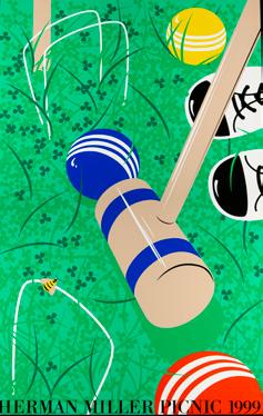
Picking A Successor
Kathy Stanton, a graphic designer on Steve Frykholm’s team, recalled telling him, “If you ever decide to give this [the picnic poster series] up, I’ll be interested.” d
In 1989, after designing 20 posters, Frykholm decided it was time to pass the reins. Stanton designed the next 11 picnic posters, through 2000. She pivoted to focus on classic picnic activities. Her posters feature games like ring toss and croquet, natural features like ducks in a pond, and even a clown.
Steve
Herman Miller is inspired by classic outdoor eats, from sweet corn and hot dogs to salads and suckers. The series represents some of the best-known examples of American graphic design from the latter half of the 20th century.


NAME: Robb and Kate Harper
THE HENRY FORD DONOR SOCIETY: Carver-Carson Society founding members since 2020

WHY BE A MEMBER OF THE CARVER-CARSON
SOCIETY:
“I am so excited about the future of edible education at The Henry Ford because there is still such a tremendous disconnect between the ground and the plate. Through the Carver-Carson Society, we are celebrating tremendous people, their gifts to edible communities and their desire to educate our next generation in a hands-on way about where their food comes from — through smelling, tasting and putting something real in the ground.”
— Kate Harper


