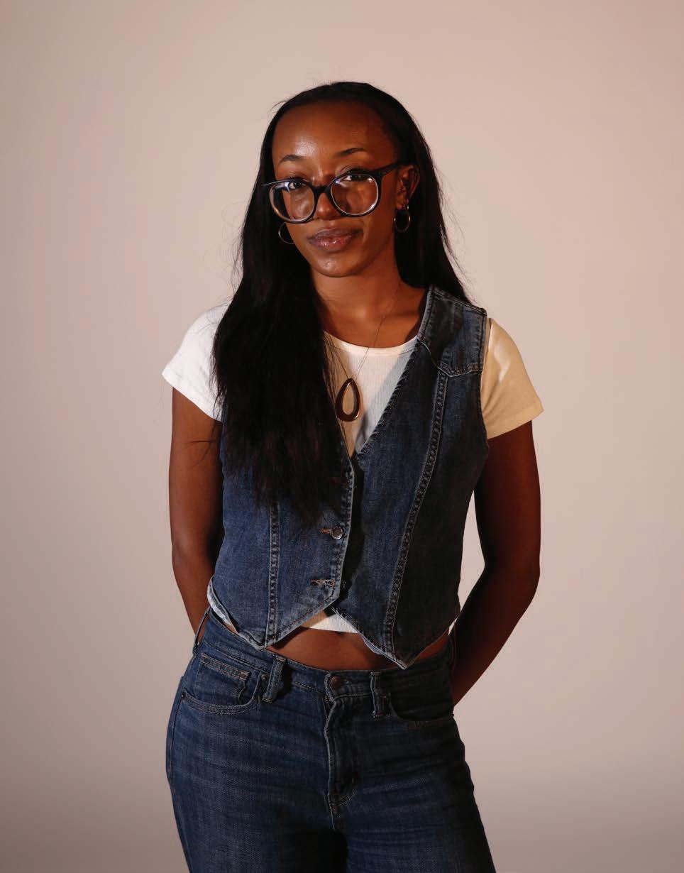
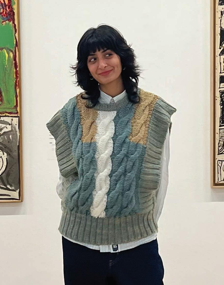
Video Editors Nani Kone, Mohammad Mussa, Catherine Zeng
PHOTOGRAPHY
Photographers Aditi Anakala, Zara Baig, Intel Chen, Alekha Choksey, Philip Dartnell, Noah Jeong, Tania Lau, Hoon Lee, Noel Palomino de la Torre, Chase Ross, Zachary Spain, Ben Tausner, Phoebe Zhang
STYLING AND BEAUTY
Beauty Stylists Doaa Adam, Worth Bergeland, Amy Lee, Serena Lin, Hrishita Mareddy, Siri Paruchuri, Elaine Peng, Simar Soni
Fashion Stylists Chahd Bekari, Remy Lipman, Luna Meline, Felicia Merino, Ifedolapo Ojo, Mayokun Omitogun, Audrey Ostoyich, Sareena Patel, Sahiti Radha, Roman Raboy, Tarini Ruia, Nehir Sunar, Kevin Xu, Tony Zhang
MARKETING
Campus Engagement Coordinators Zoe Champ, George Chang, Caroline Xiong Brand Outreach Coordinators Maggie Goldman, Ava Infante, Sanja Jing, Chloe Lin, Amanda Lo, Pia Sodhi
SOCIAL MEDIA
Engagement Managers Layla Cogsville, Sofia Feng, Madeline Lach, Jamie Salazar, Ria Sood, Isoken Umweni, Heidi Wang TikTok Specialists Hope Applegate, Martina Bulgarelli, Penelope Grapsas, Shannon Hodges, Alisha Luthra, Riley Rosztoczy · TikTok Video
Editors Megan Wu, Michelle Yang · Instagram Manager Rachel Spencer
FINANCE
Analysts Maddie Caldon, Harman Chahal, Dea Dervishi, Nicole Diner, Nadia Duah, Maggie Gao, Hideto Ikehara, Isa Kesselhaut, Eliana Nitkin, Makena Reno, Ella Thimons, Yuki Zhu
ART AND DESIGN
Illustrators Ellen Chen, Sanjana Nalavolu, Yvan Do Phan, Miya Moriuchi
Designer Yvan Do Phan
OPERATIONS
Operations Coordinators Anjali Shah, Eeman Syeda
Social Chairs Jasleen Sidhu, Areen Syed · Merch Coordinators Cesar Murillo, Addyson Rejwan
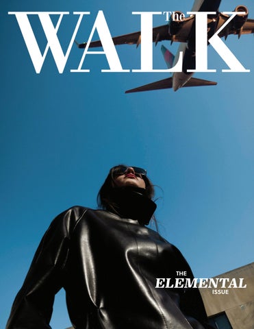
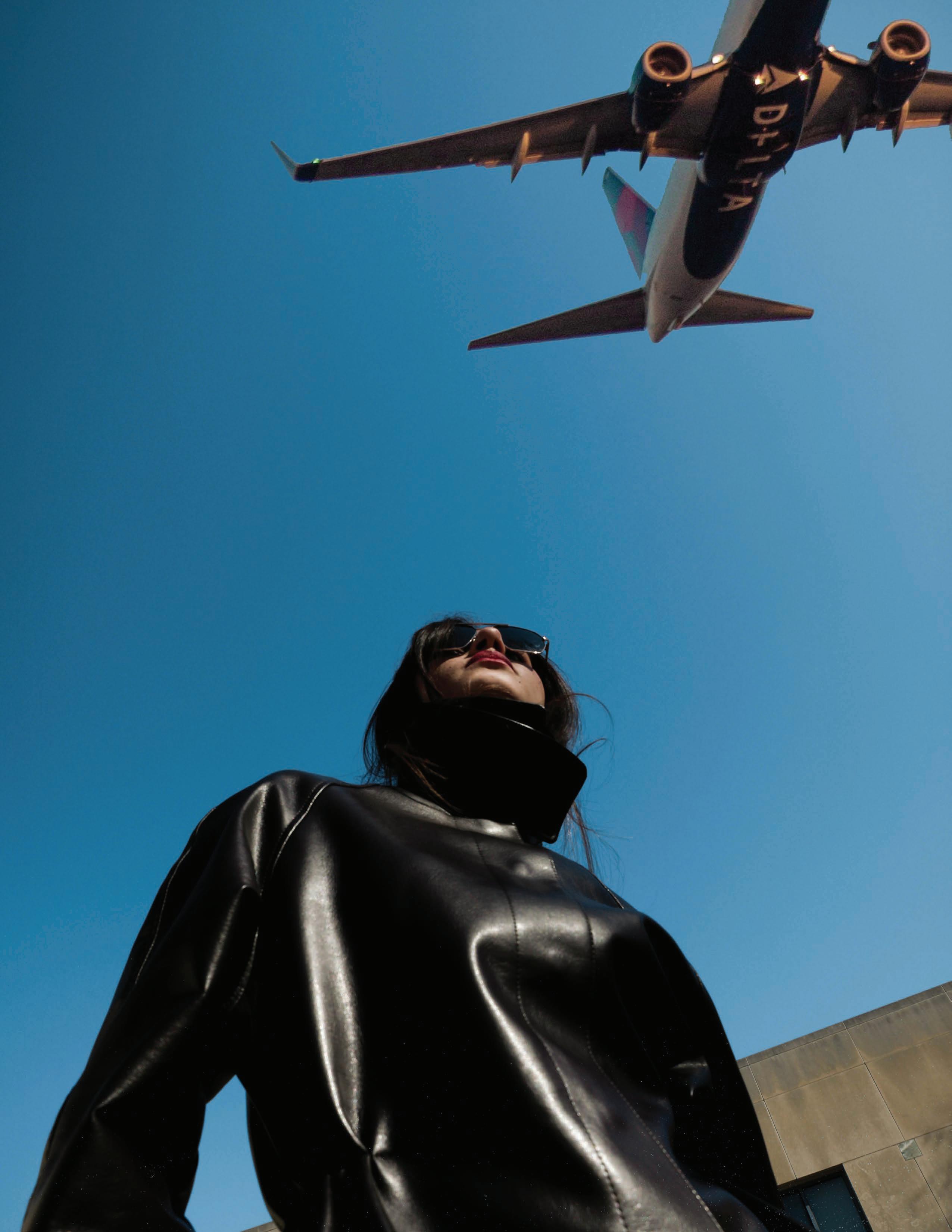
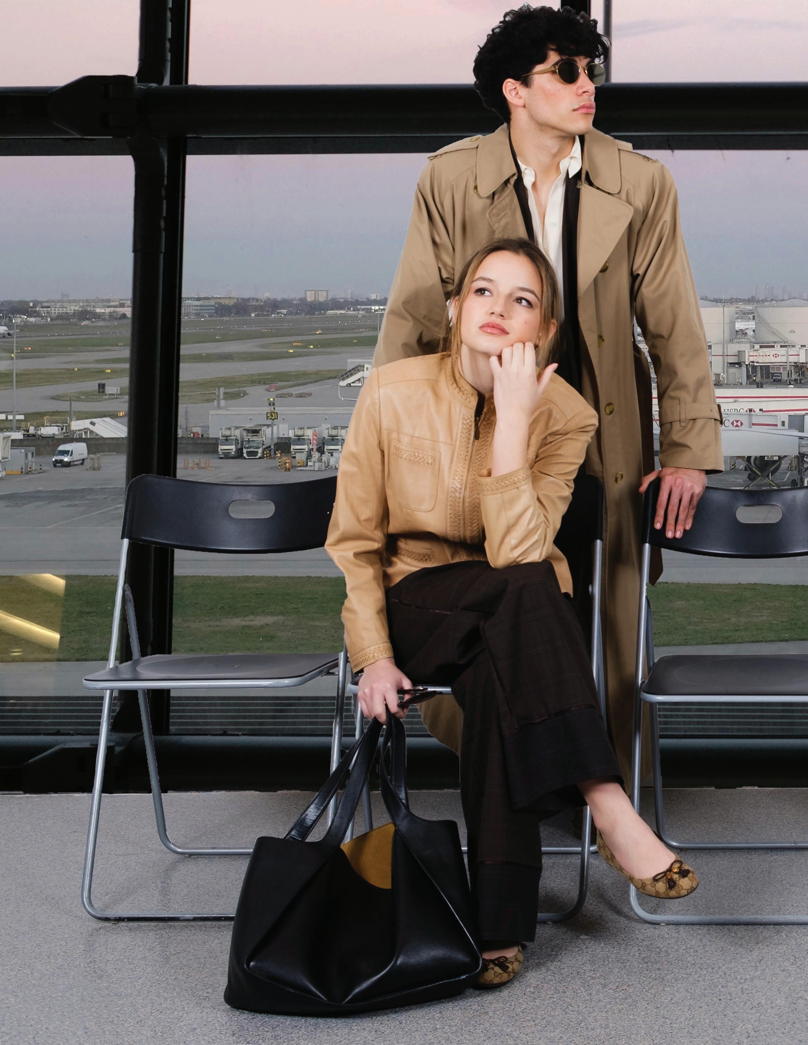
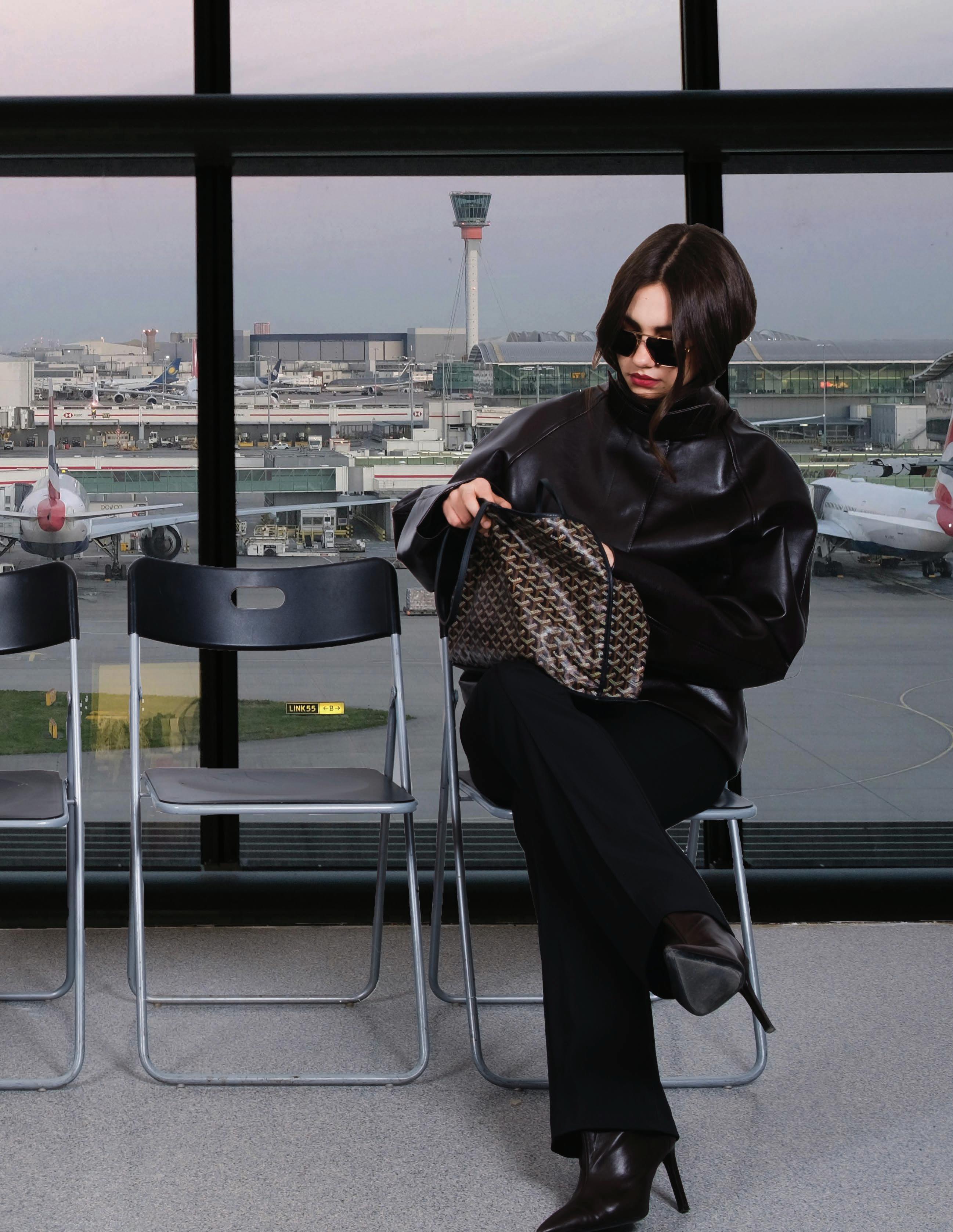
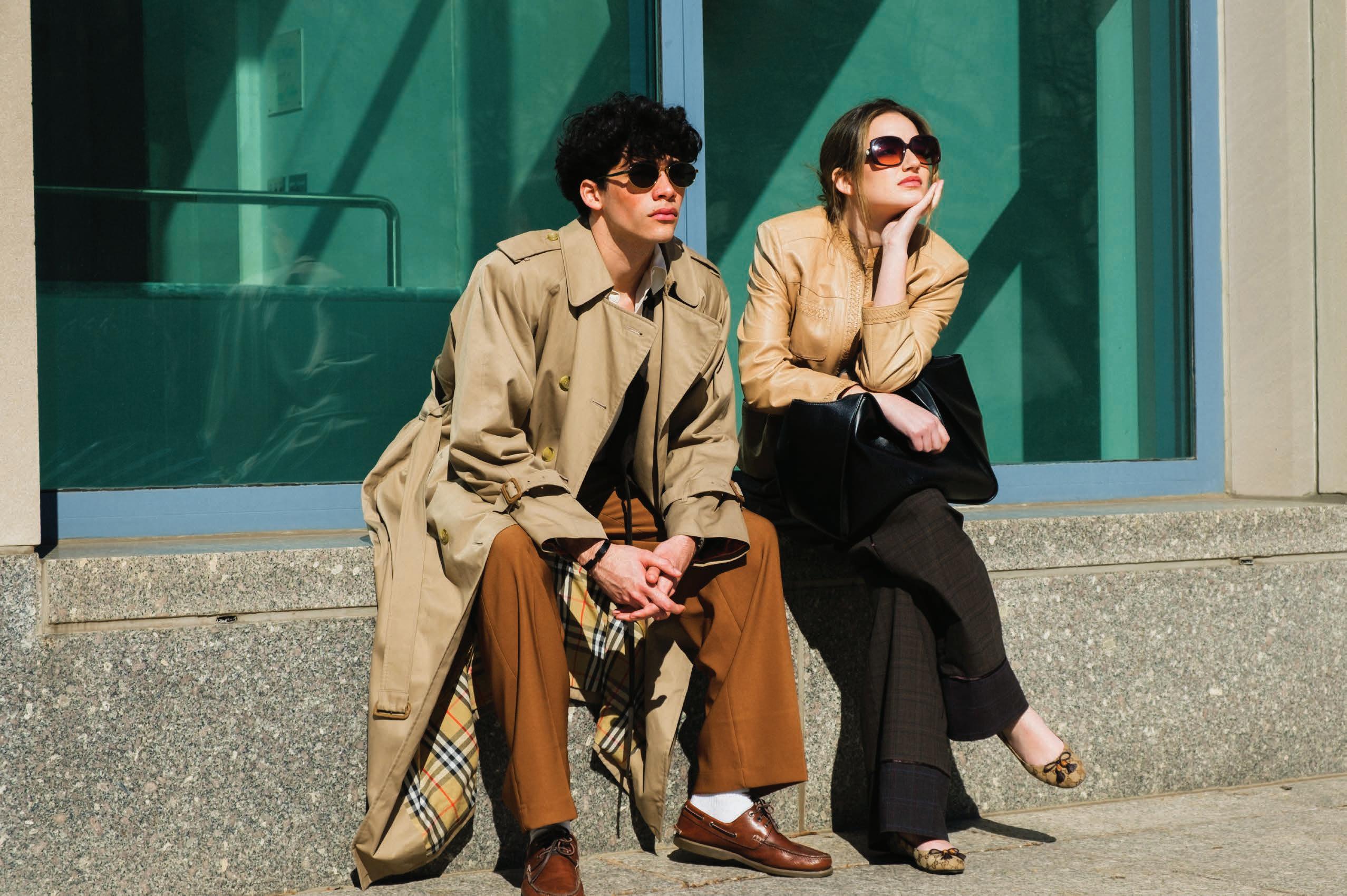
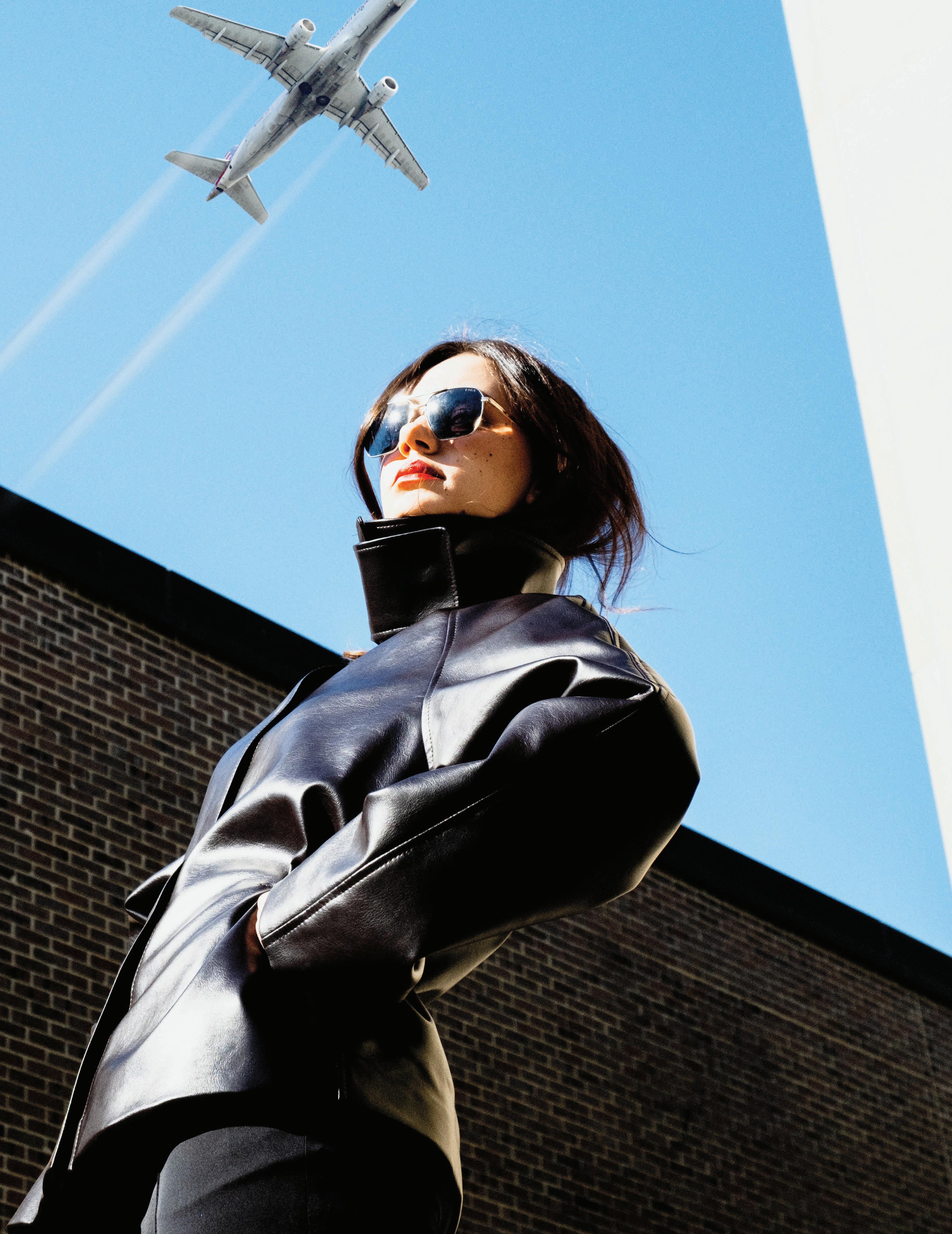
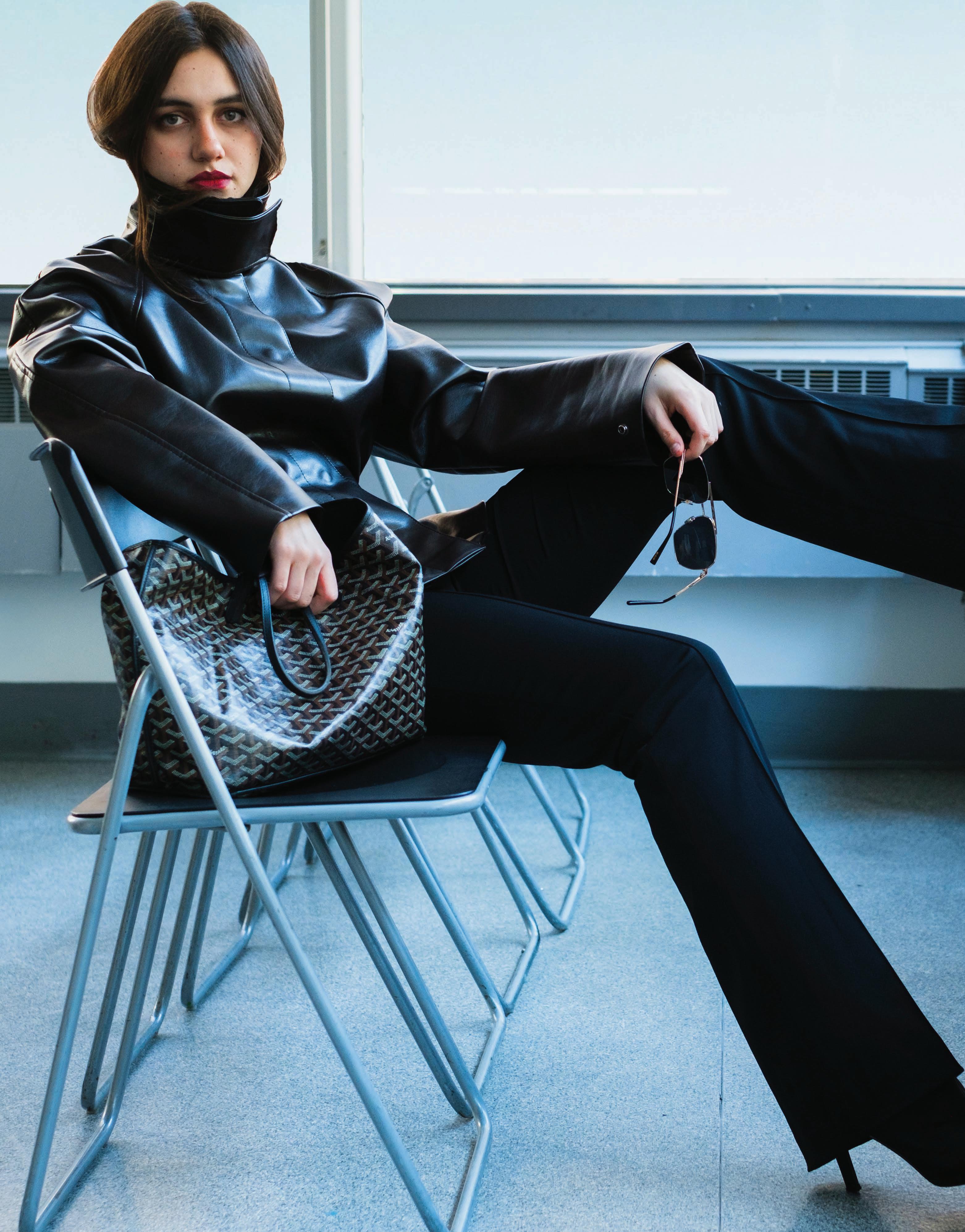
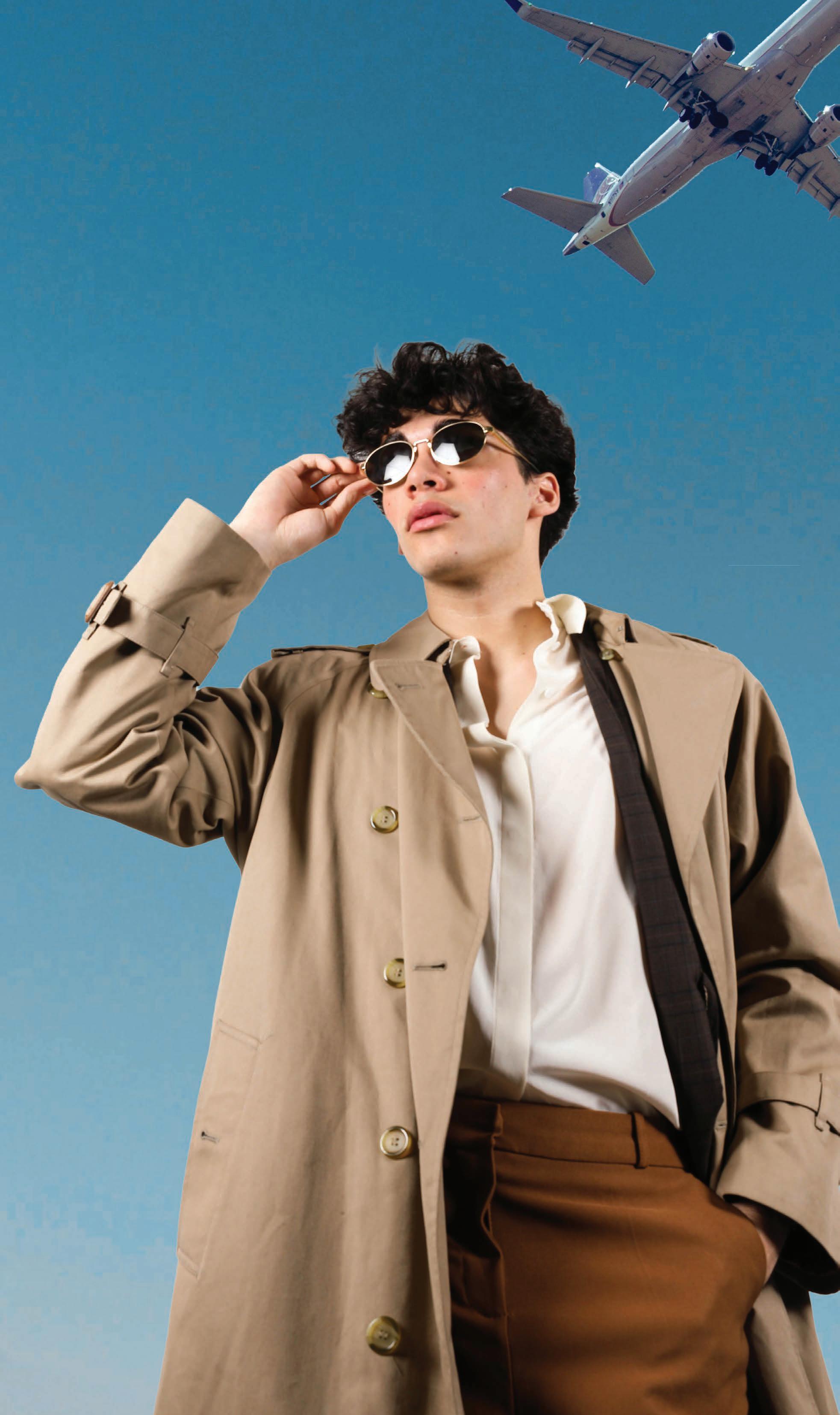
Cover Look: AIR
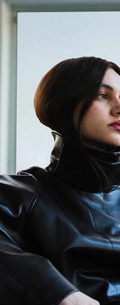
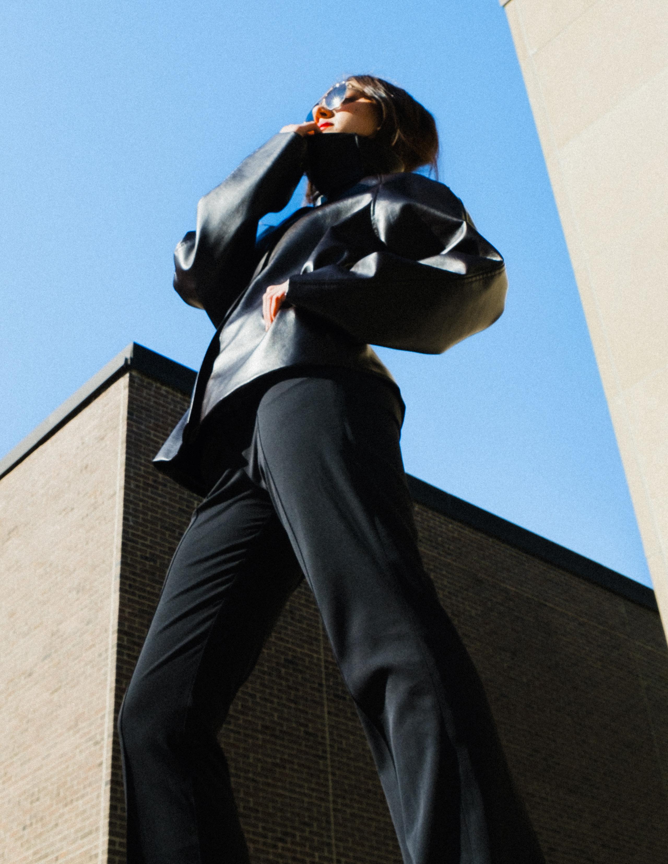
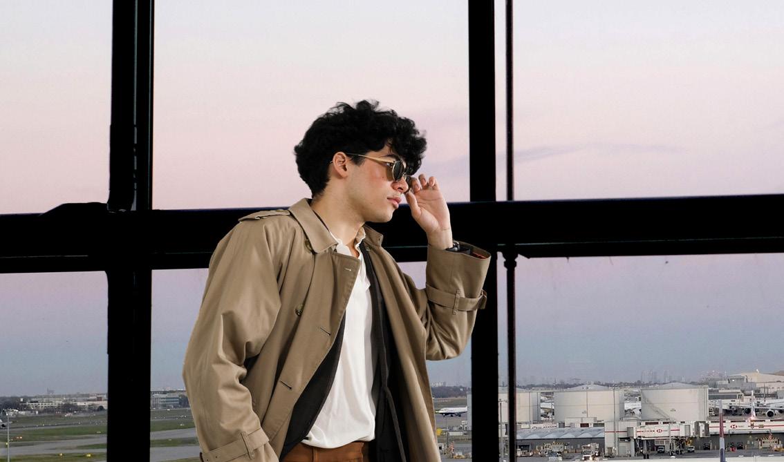
Somewhere between departure and arrival, style takes on a different kind of clarity. There’s a precision to it—measured, intentional, and shaped by movement. As one of the four elements, air exists in constant motion, unseen yet always defining the space it moves through. The Elemental issue’s AIR shoot draws from that atmosphere, where airport interiors, open skies, and fleeting moments in transit create a world that feels both controlled and in motion.
This issue encourages you to consider how the natural elements lend an inspiration to fashion in all of its forms. Move through the pages ahead to see how each look embodies the elements; where earth grounds, air lifts, fire sharpens, and water softens.
View more on page 28.
Letter from the editor
In a world filled with constant noise, we find ourselves searching for moments of stillness: ways to return to something grounded, something real. From a young age, we’re taught to understand the world through the four core elements: Earth, Air, Fire, and Water. We learn how they shape the environments around us and the lives we move and grow through. But what if these elements exist beyond science and structure? What if they offer a way to quiet the noise, to reconnect – not just with the world, but with ourselves? In this issue, we look to creativity, to clothing, and to fashion as a way of returning to those elemental forms.
As we grow, our understanding of the world begins to shift. Like in Plato’s Allegory of the Cave, we come to realize that what we see is only part of a larger reality, something shaped by perception, imagination, and experience. As children, that imagination came naturally. We peered through the looking glass into worlds of wonder, played mermaids in the water, lay in the grass watching clouds drift in the wind overhead. The elements were not concepts, but experiences – something we felt, moved through, and became a part of. That same sense of play and perception continues to take form in what we wear, as fashion becomes a way of shaping and expressing the worlds we once created so freely.
This issue’s opening piece situates the reader in Philadelphia, placing us in Calder Underwood’s (‘29) perspective as we learn about the “inextricably linked” components of fashion, history, and the climate through the lens of a vintage clothing store owner. Sonia Mehta (‘26) draws inspiration from literature in Mona Awad’s Bunny: a hyper-feminine world where nature motifs and stylized dress create something both beautiful and unsettling. Aishani Satia (‘29) journeyed with the WALK to the University of Pennsylvania’s Morris Arboretum & Gardens to interview the creative team and models on what the EARTH theme meant to them, and how that translated into “whimsical” beauty, styling, and modeling.
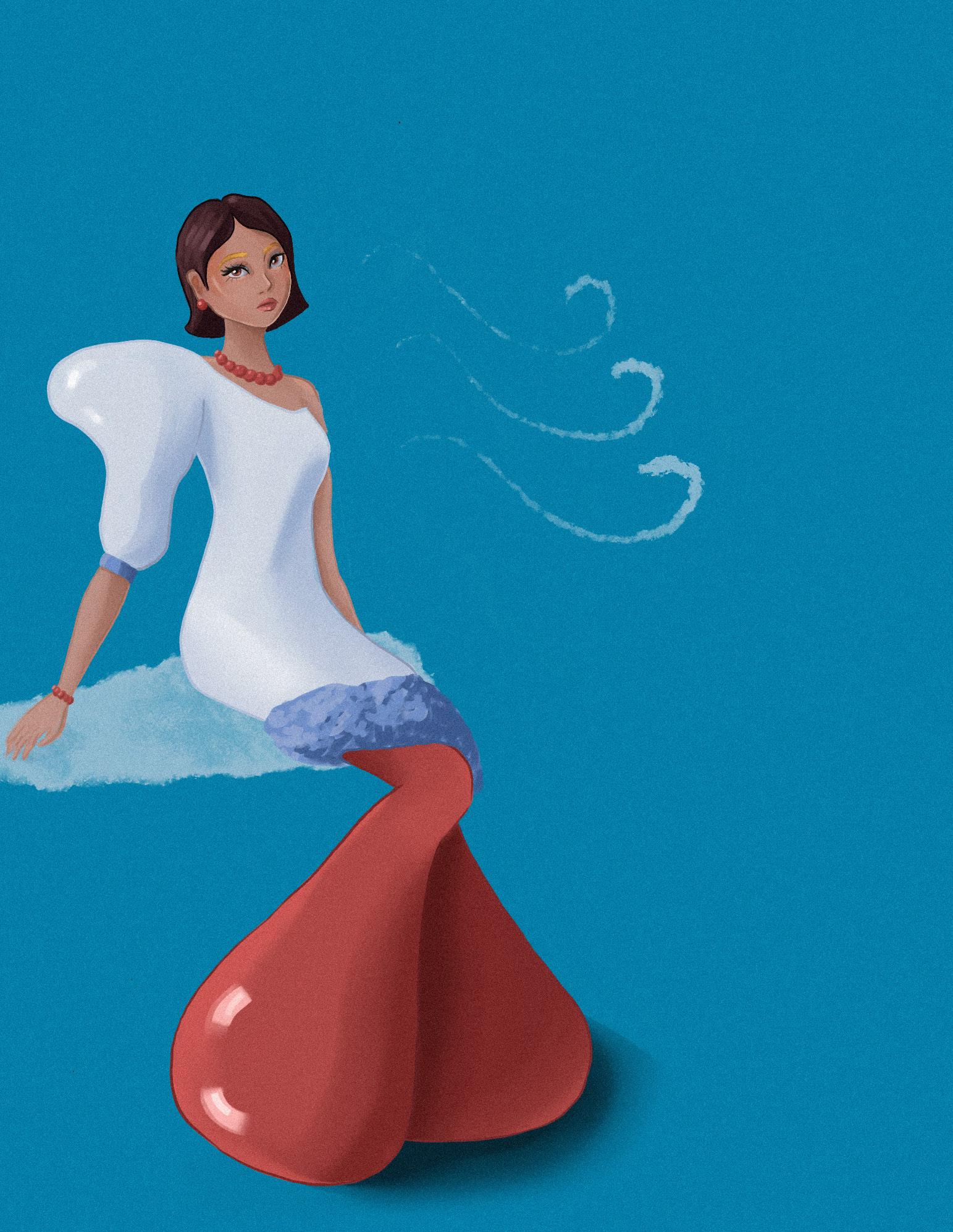
Rachel Lee’s (‘27) piece on minimalist fashion blows the wind and shifts our focus to the element of AIR; specifically, how minimalism reflects air’s qualities of lightness, clarity, and quiet presence. Jordan Millar (‘28) takes a more literal approach to AIR and pieces together how airline fashion has evolved over time, reflecting shifts in culture, travel, and the experience of being in motion. Meera Bholah (‘27) offers an architectural design perspective, explaining how designers have worked to create clothing by harnessing the element of AIR.
Sophia Zhang (‘26) paints a fiery image of blush as the face’s source of heat, looking at the intricate relationship between the biological flush and the artificial pinky-red pigment, thereby bringing us to the blazing-hot FIRE series of this issue. Surina Ramoutar (‘26) makes a fervent observation about the transformation of seasonal fashion, arguing that fashion is rooted in warmer-weather pieces that emphasize exposure above all else. Nina-Rose Smith (‘29) takes a page out of the book of sports fashion, explaining how legendary basketball player Dennis Rodman embodies a free and fiery style that was ahead of his time.
Mariam Ali’s (‘27) piece begins the cooldown of the issue and leads us into the WATER series. She transports us to her home country of
Bahrain, where island fashion is shaped by climate, culture, and tradition, challenging Western notions of “island style.” And finally, Daria Knurenko (‘28) turns to the element in a more literal sense, showing how women in STEM adapt their style across changing environments.
A constant theme throughout all of the elements, and throughout all of the WALK’s issues, is its passionate team of 150+ students. Art & Design Director Yvan Do Phan (‘28) worked tirelessly to illustrate and design countless articles, bringing all of them to life through the power of art. Social Media Director Ash Wright (‘26) harnesses different mediums across the WALK’s many platforms to engage the student body over its love for fashion. Amy Liao (‘28) and Nina Rawal (‘27) spearhead the editorial part of the magazine, in print and online. Giuliana Alleva (‘26), Zachary Spain (‘28), and Kimb Liu (‘28) are the visionaries that lead the photography and videography teams. Without Operations Director Noor Majeed (‘26), Marketing Director Jasmine Gambhir (‘26), and Finance Directors Alexandra Linehan (‘27) and Maddie Caldon (‘27), 27L would not have been possible. Creative Directors Aly Kerrigan (‘26), Roshni Misra (‘28), and Dovi Jakutyte (‘27) offered their time, clothing, and eye for fashion to beautifully style all of the models in this issue. Finally, this magazine would not be where it is today without Co-Editor-in-Chief Jackie Errera, who, even from Washington, D.C, can support me and all of the WALK’s many departments.
As you flip through the pages of this issue, we ask you to return to those early ways of seeing – to the moments when the world was shaped by elements you could feel, not just define. Earth beneath your feet, air moving through your lungs, fire flickering in bursts of color, water carrying you through space. In these pages, they take new forms: through clothing and artistic creativity. What once lived in our imagination now lives in what we wear, reminding us that creativity, like the elements themselves, is constant, evolving, and everywhere.
ABOUT OUR PHOTO ESSAYS
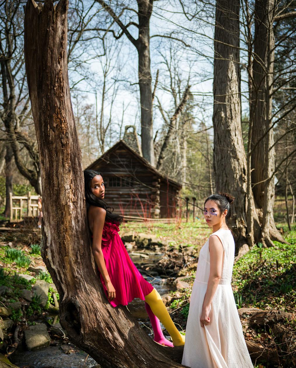
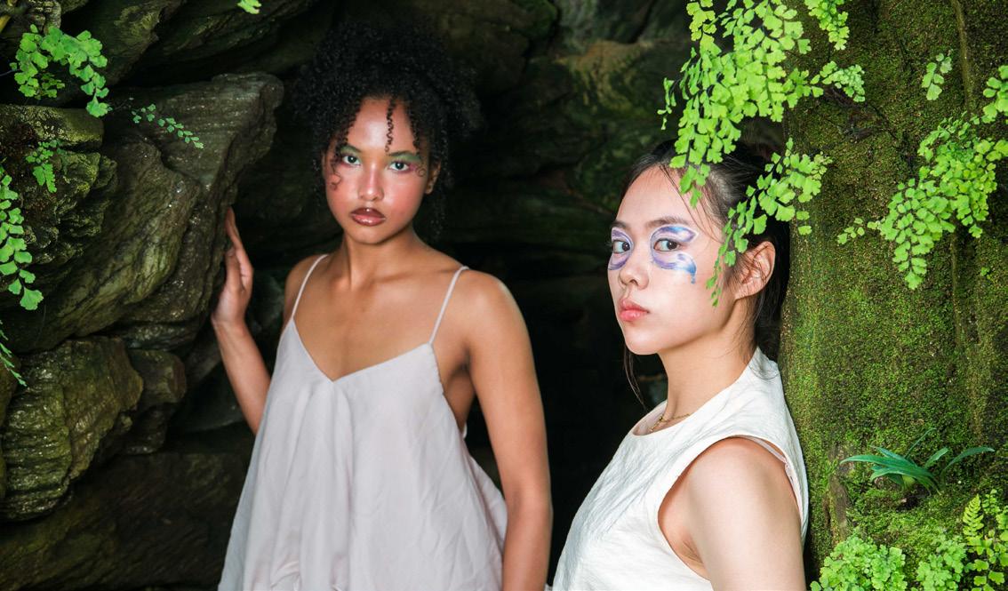
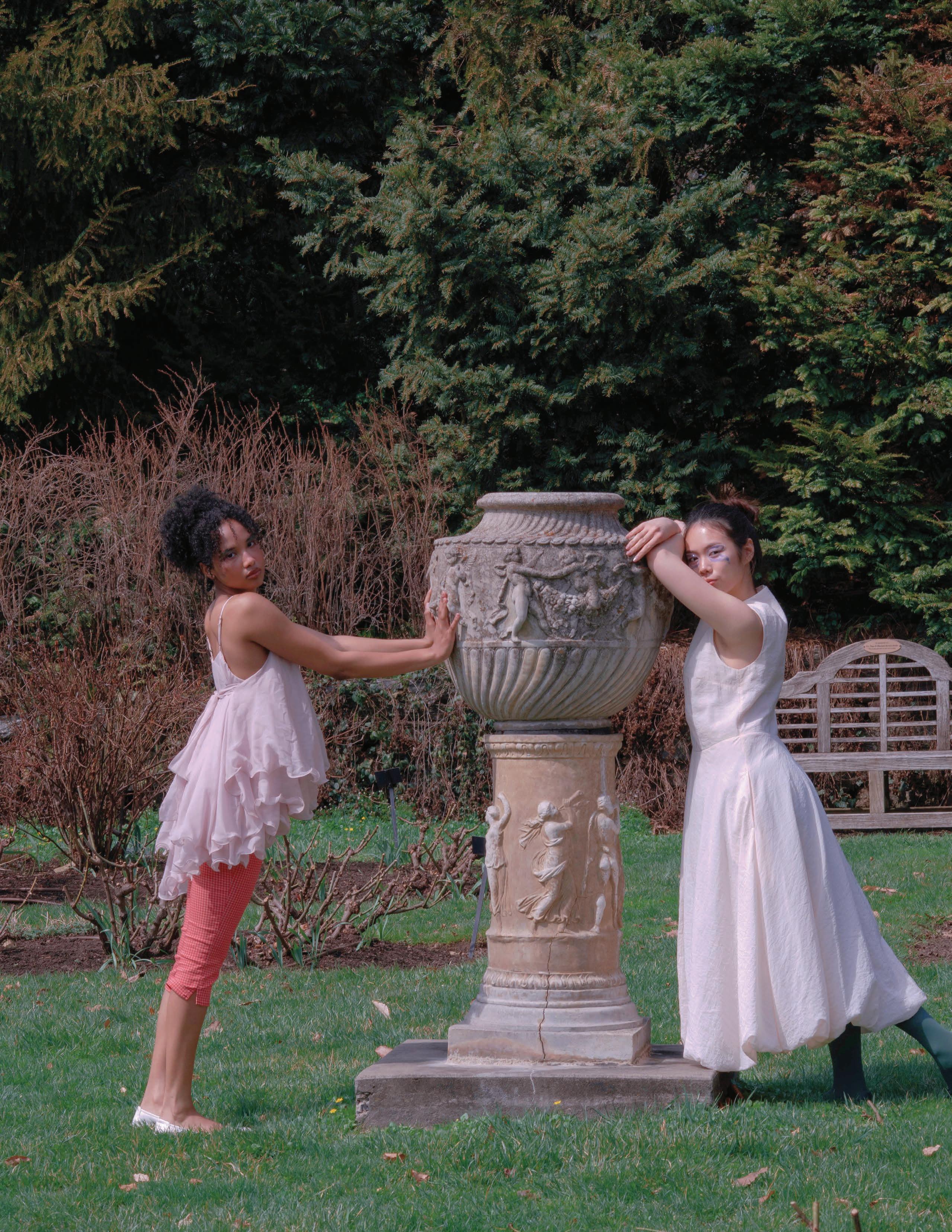
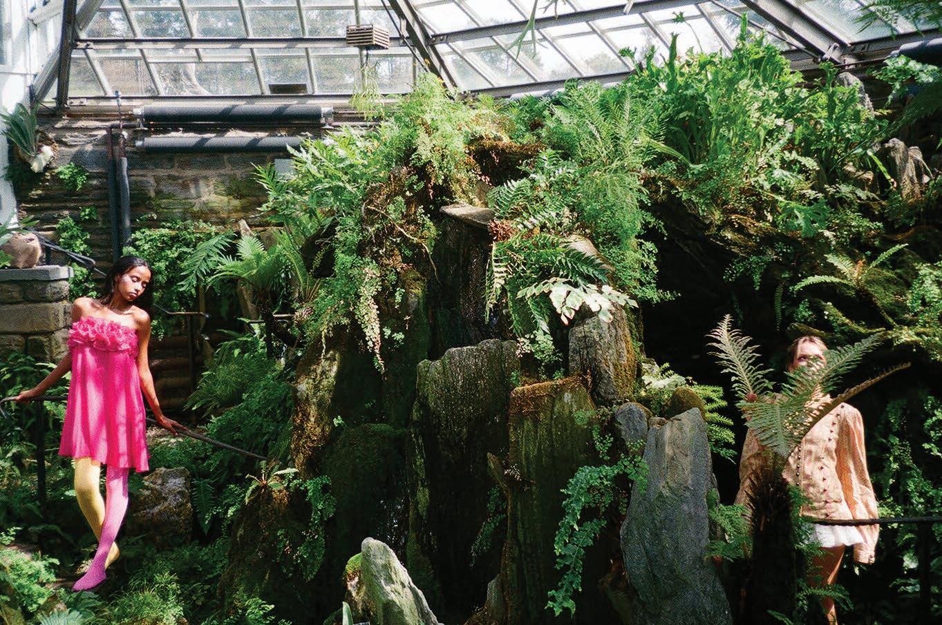
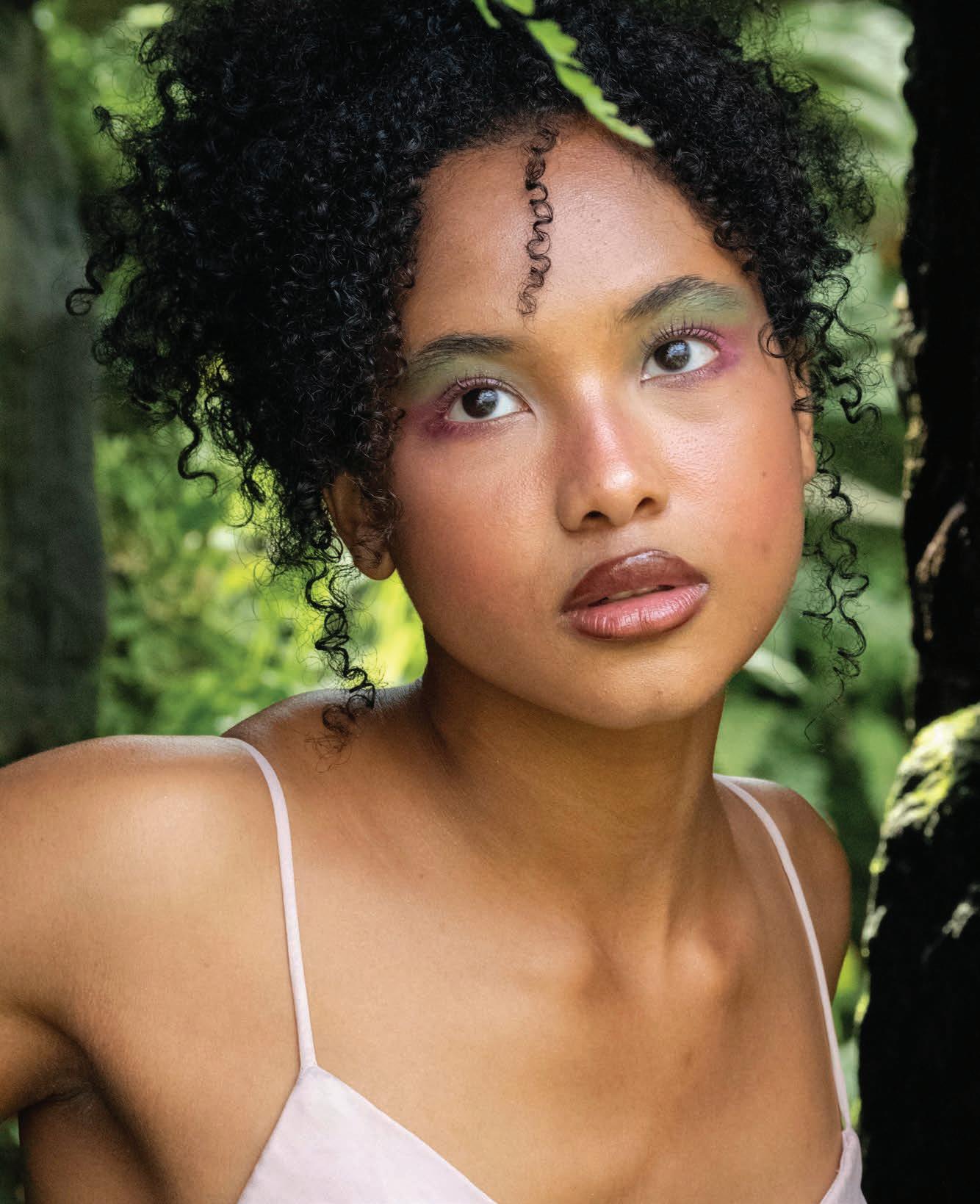
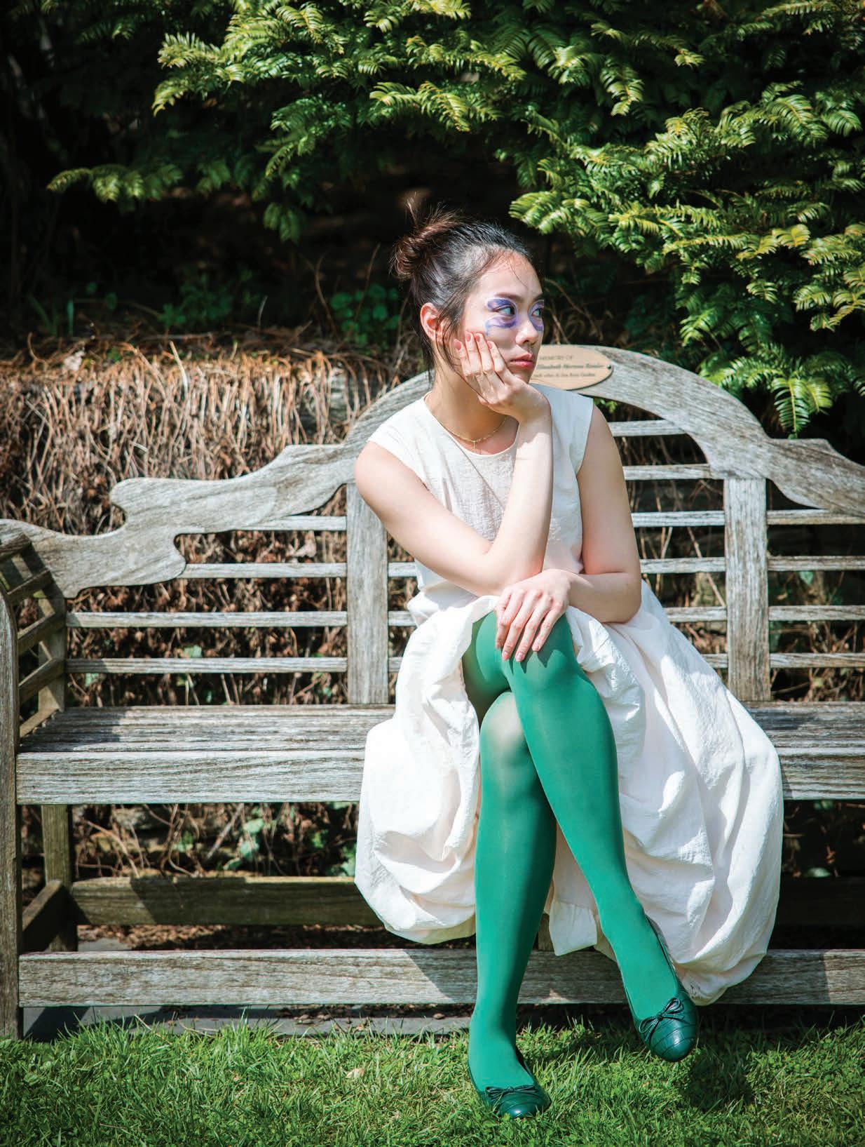
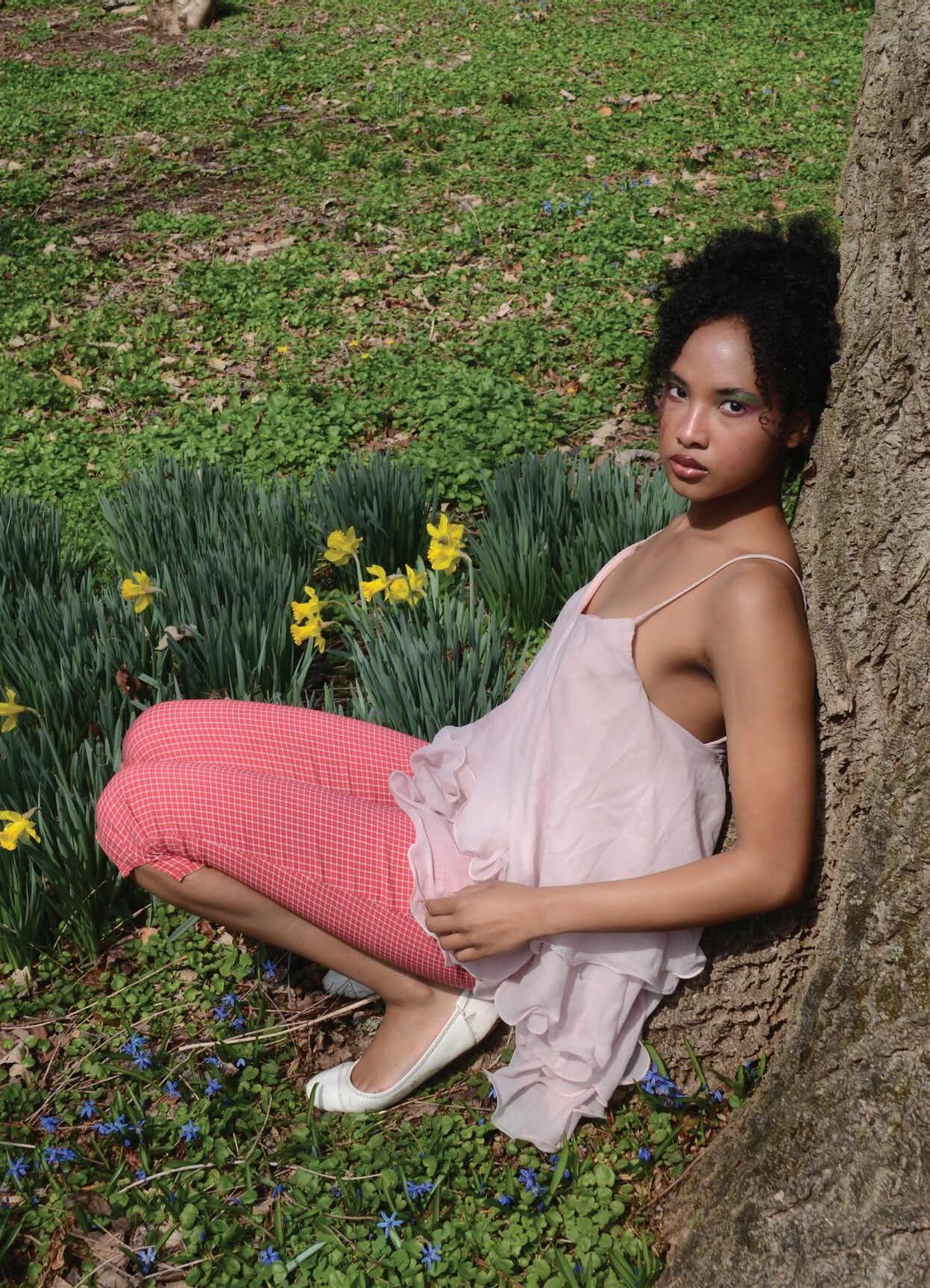
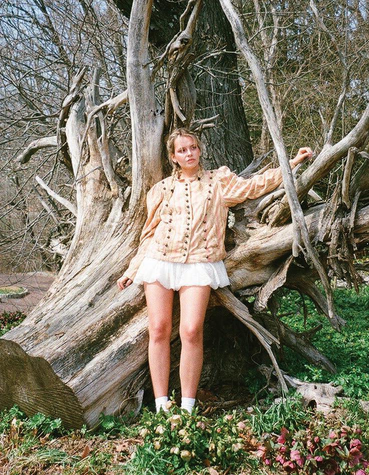
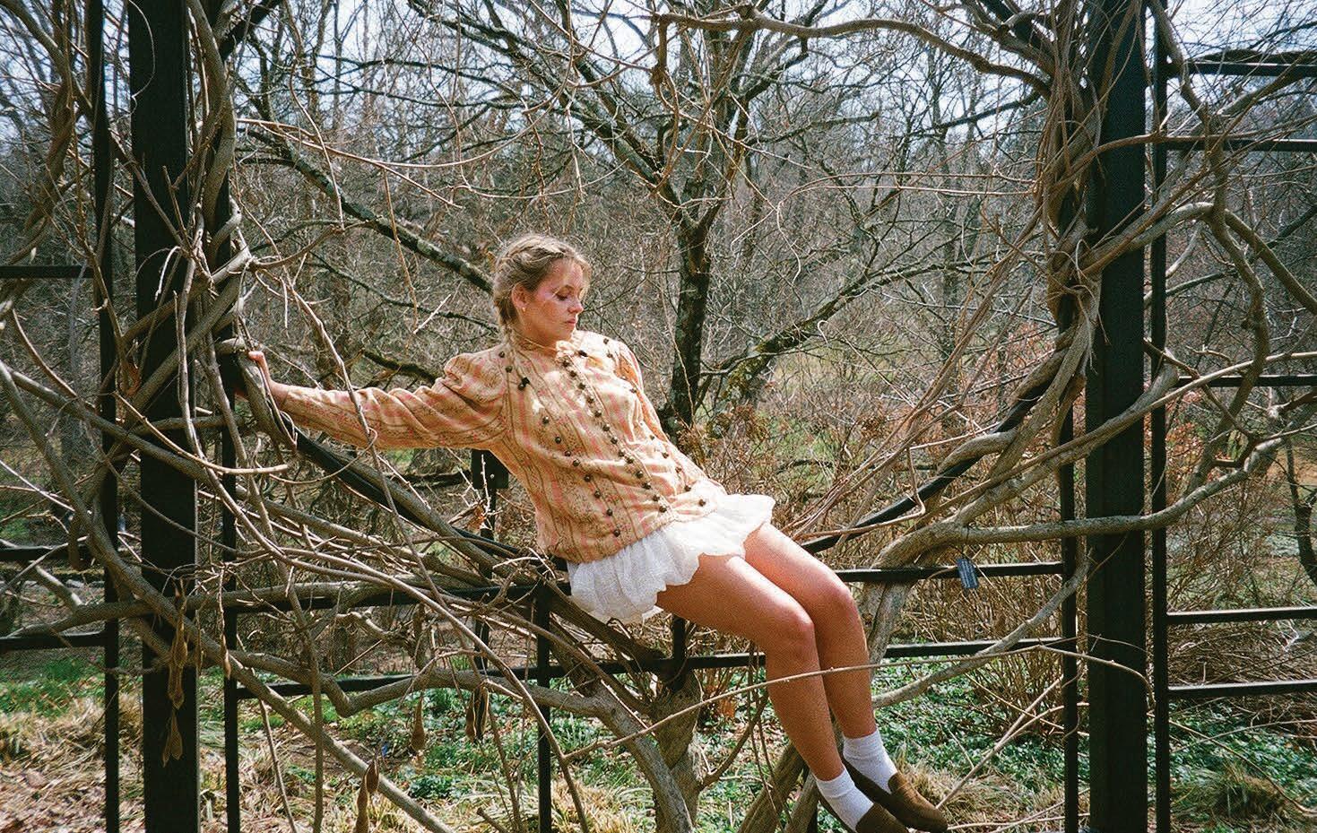
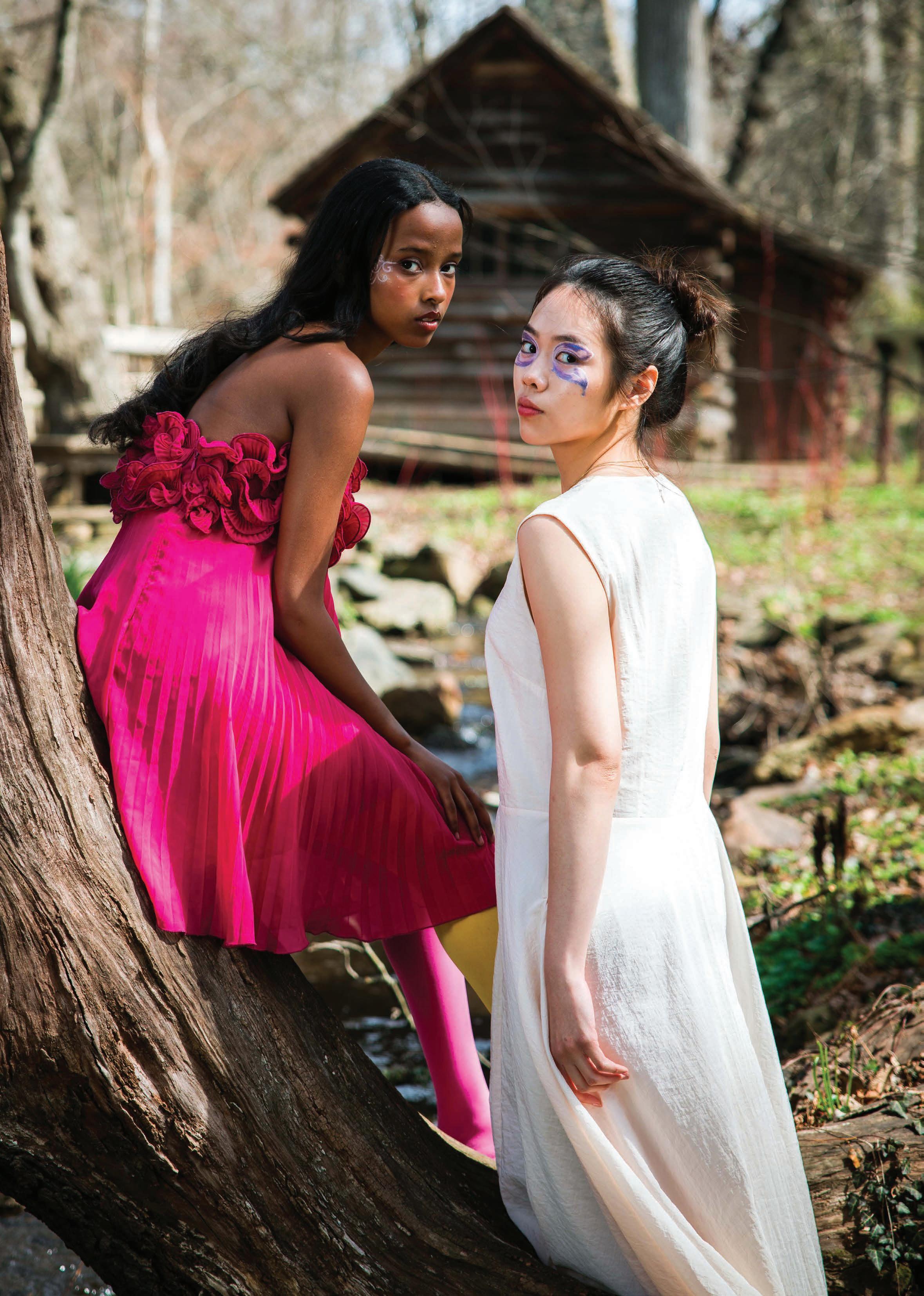
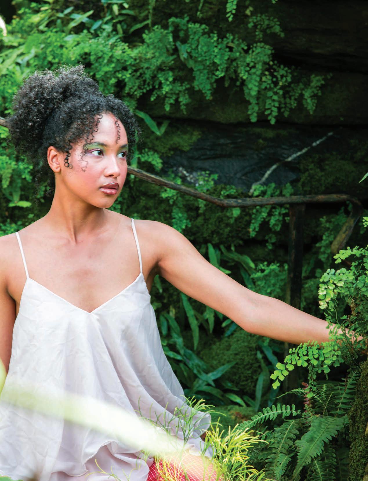
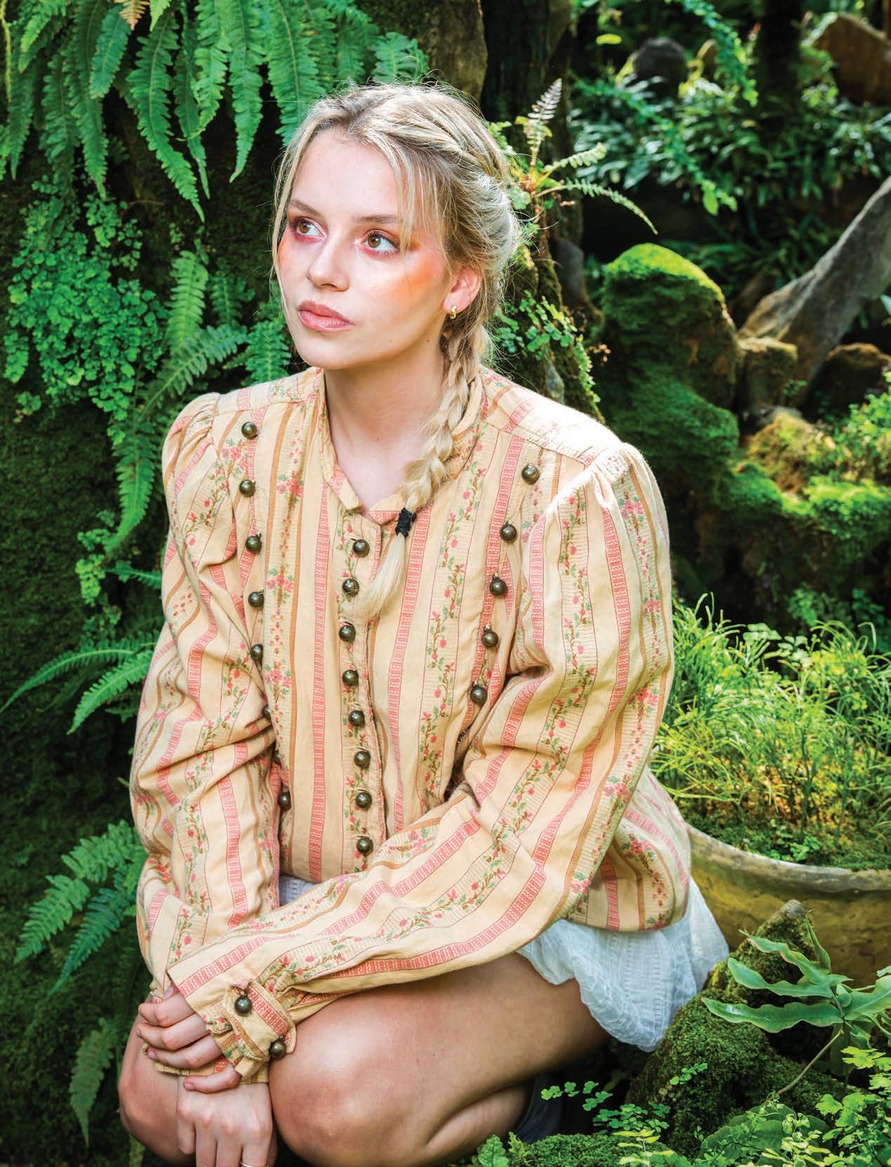
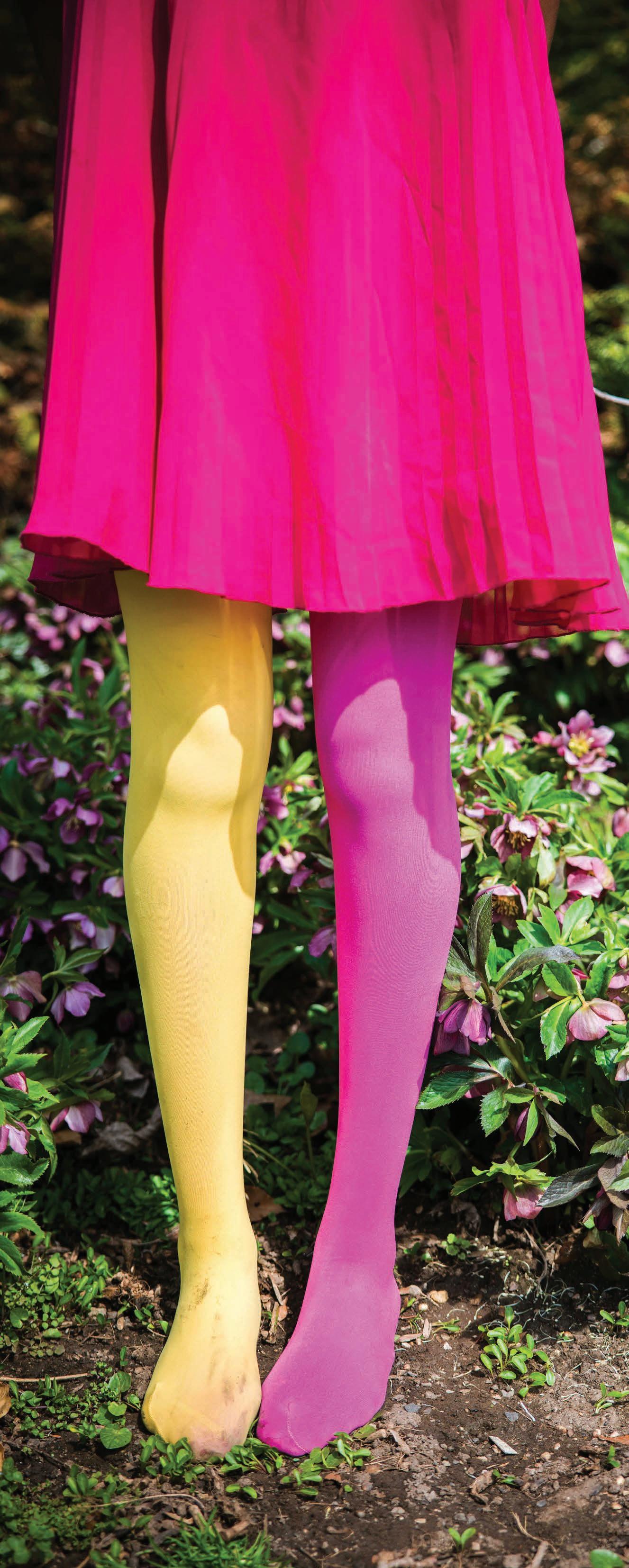
The whimsical “EARTH” shoot centers fashion within its environment. Grounded in natural landscapes, the series moves through greenery, stone, and open ground at the Morris Arboretum & Gardens. Each look settles into its surroundings, shaped by the textures and tones of the landscape itself. In this photo essay, organic textures, natural light, and layered silhouettes capture fashion’s connection to place, growth, and the quiet presence of the natural world.
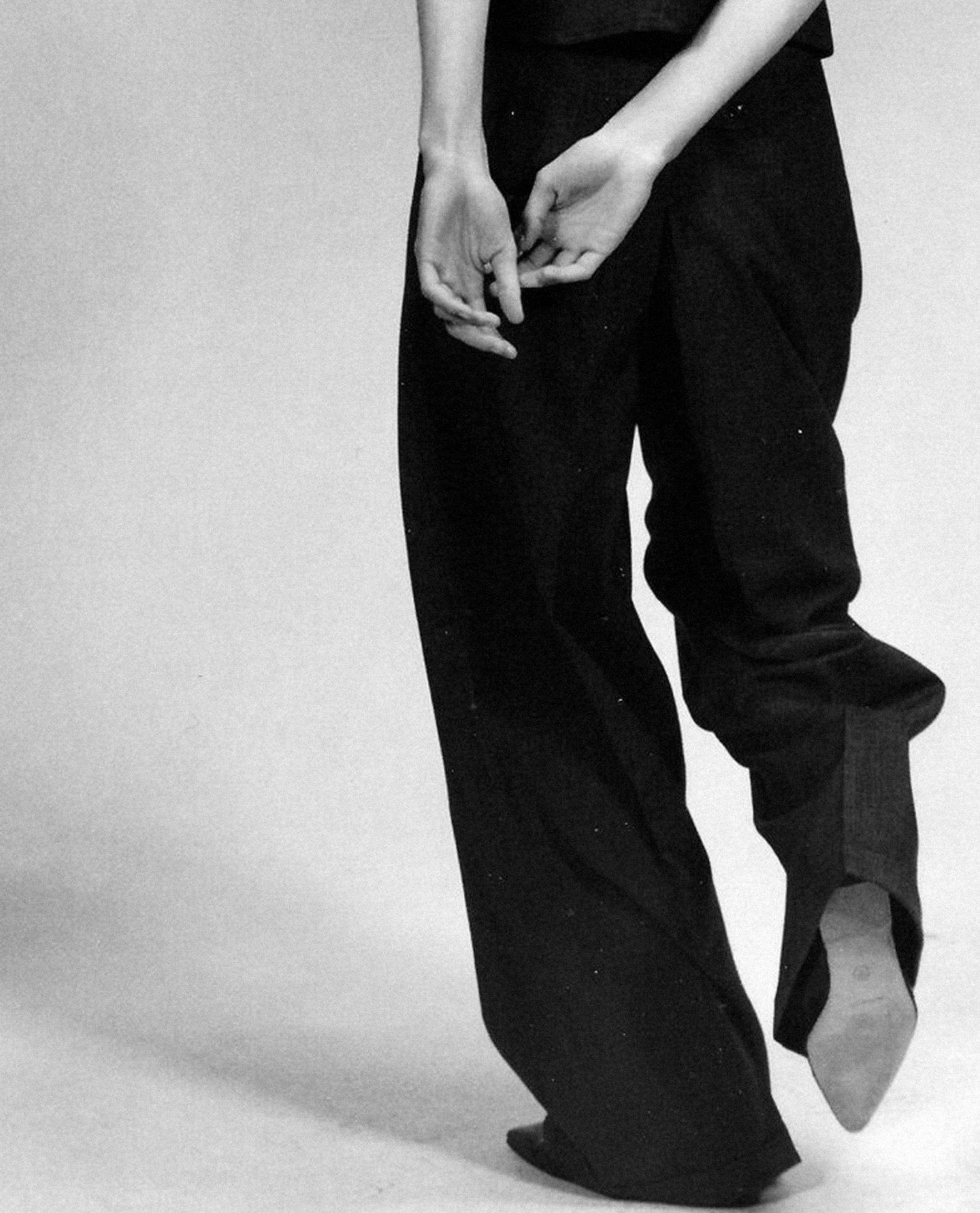
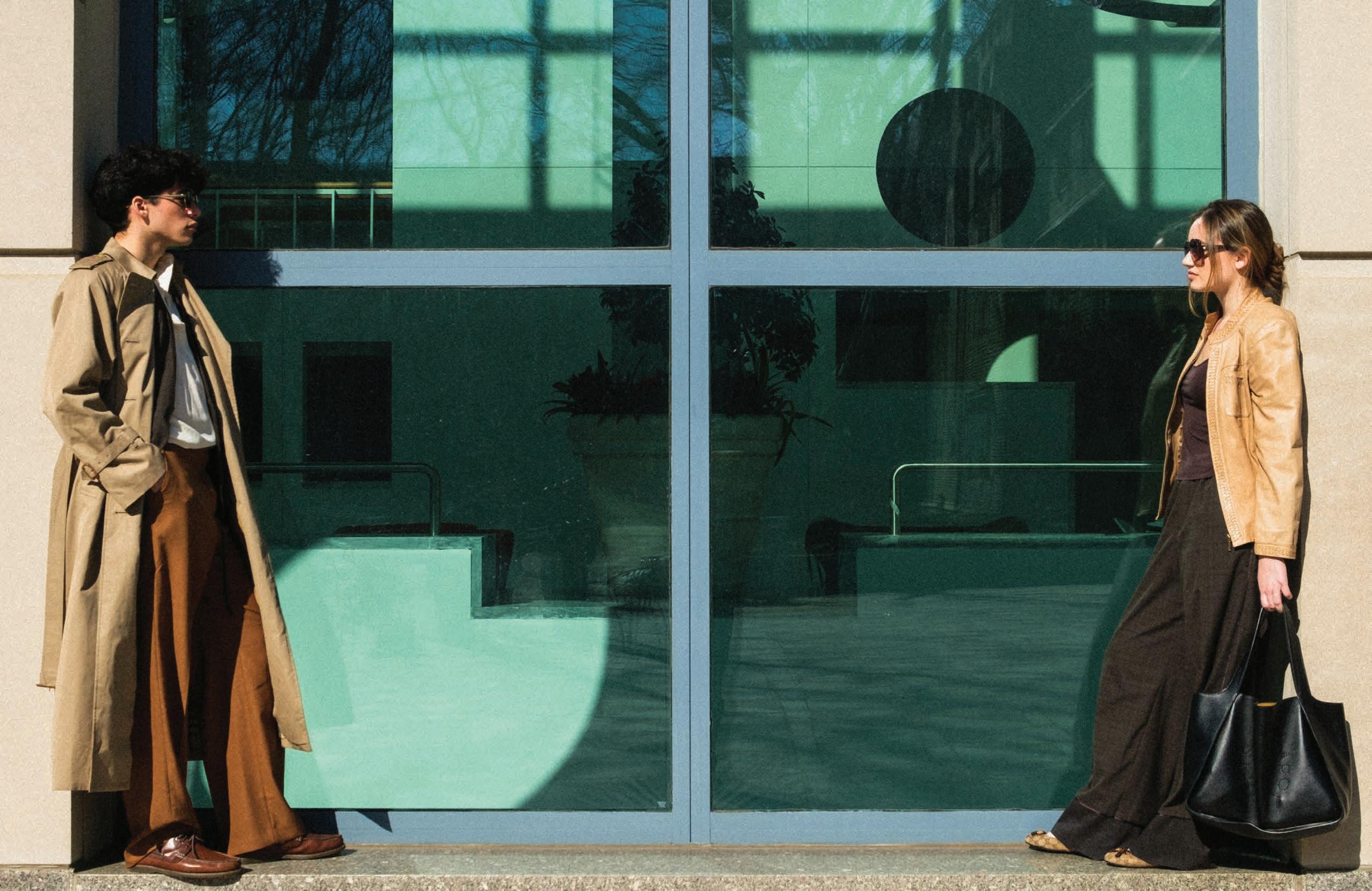
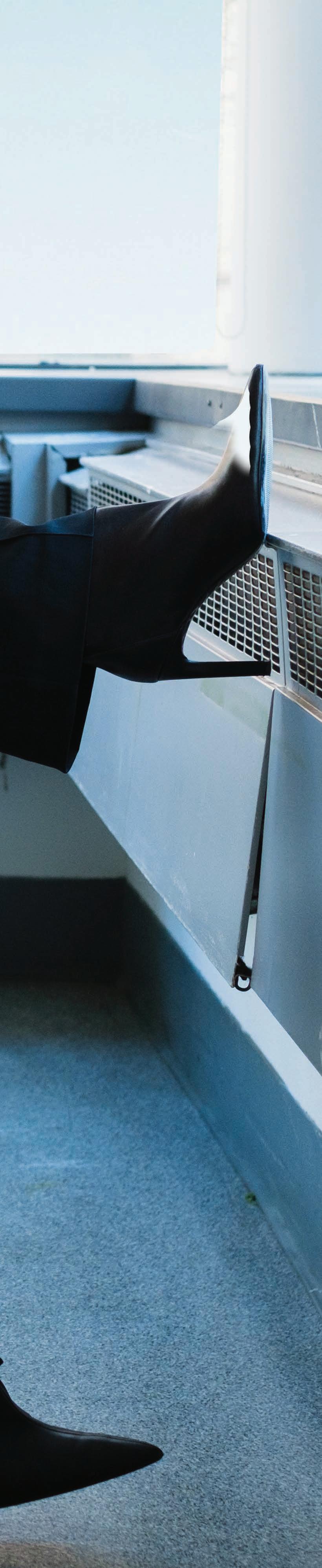
Our cover look “AIR” series explores the relationship between fashion and movement. Drawing styling cues from airport environments and aviator aesthetics, the series moves between terminals, open sky, and in-transit spaces. In this photo essay, flowing layers, sleek leather, and dark lenses capture fashion’s connection to motion and atmosphere.
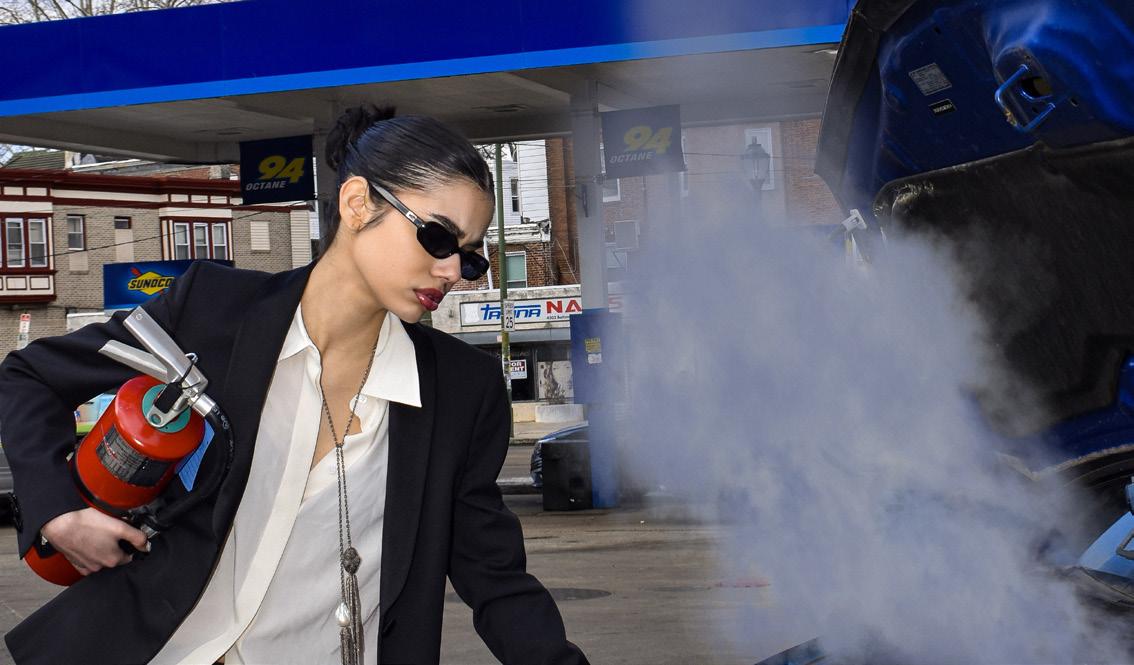
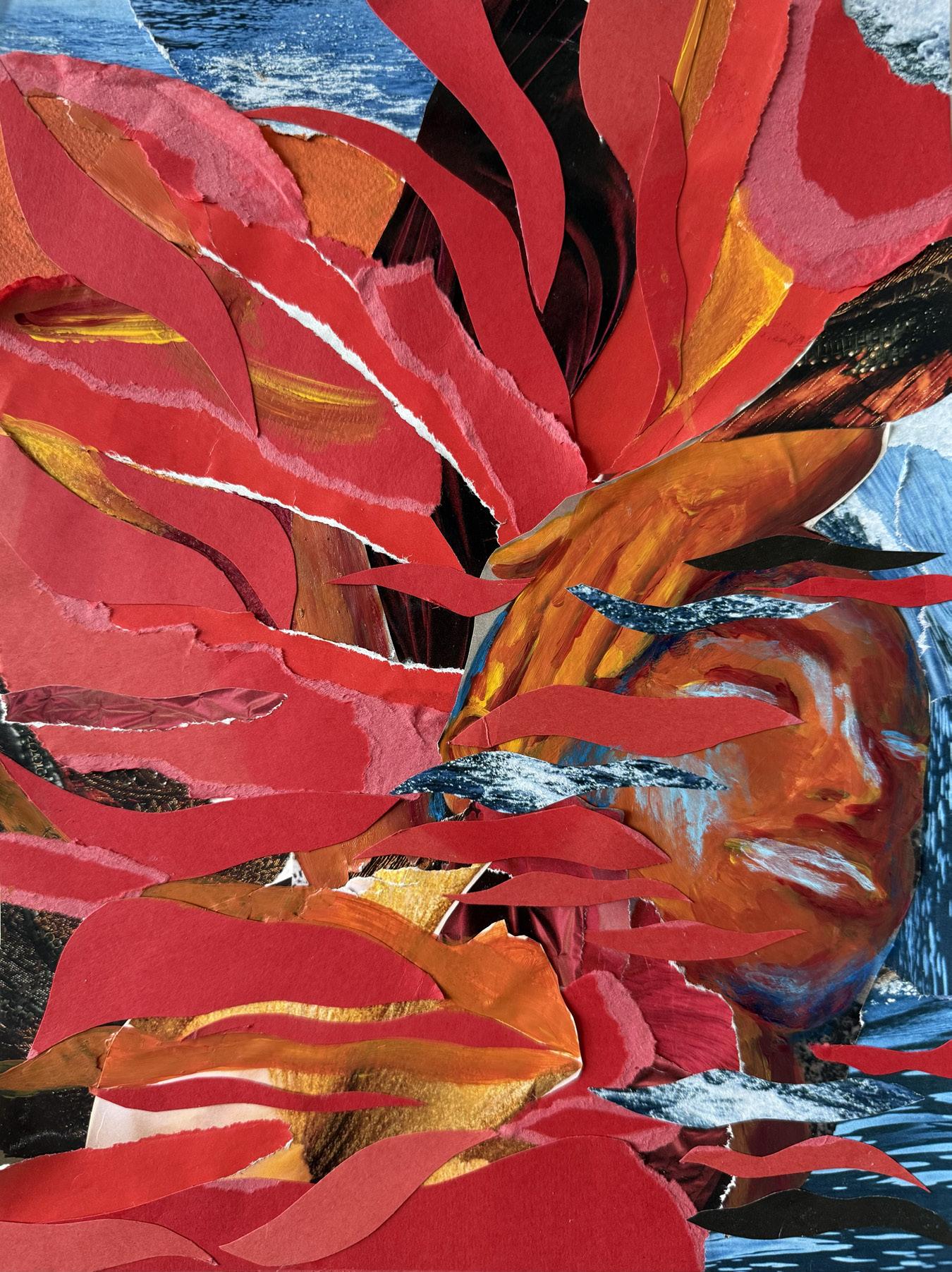
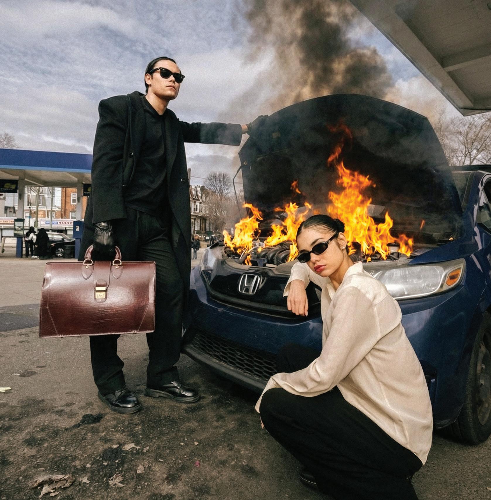
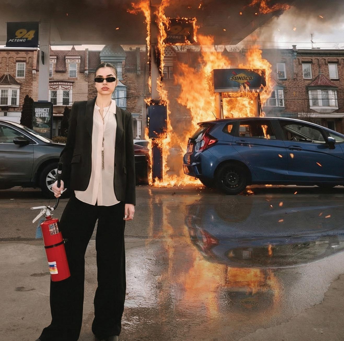
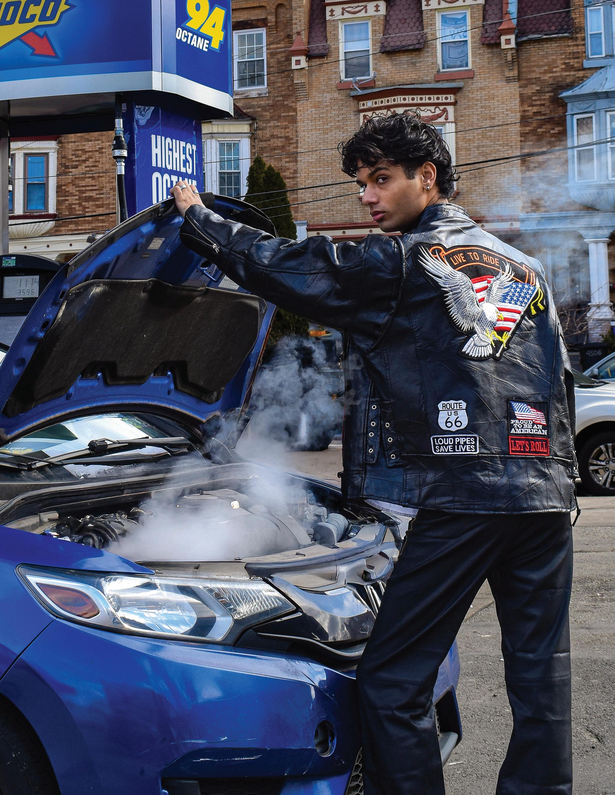
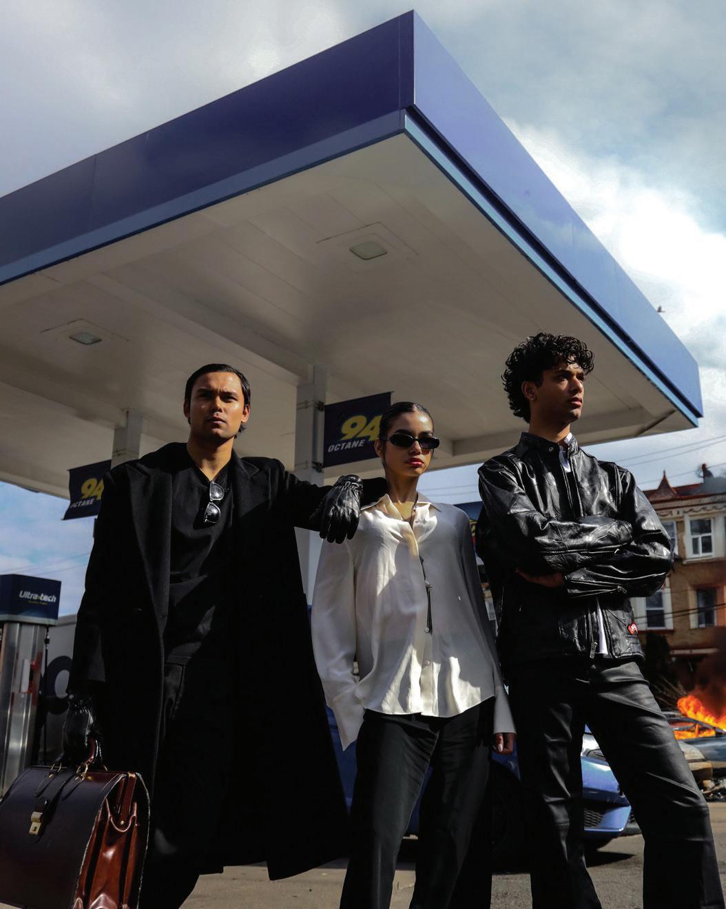
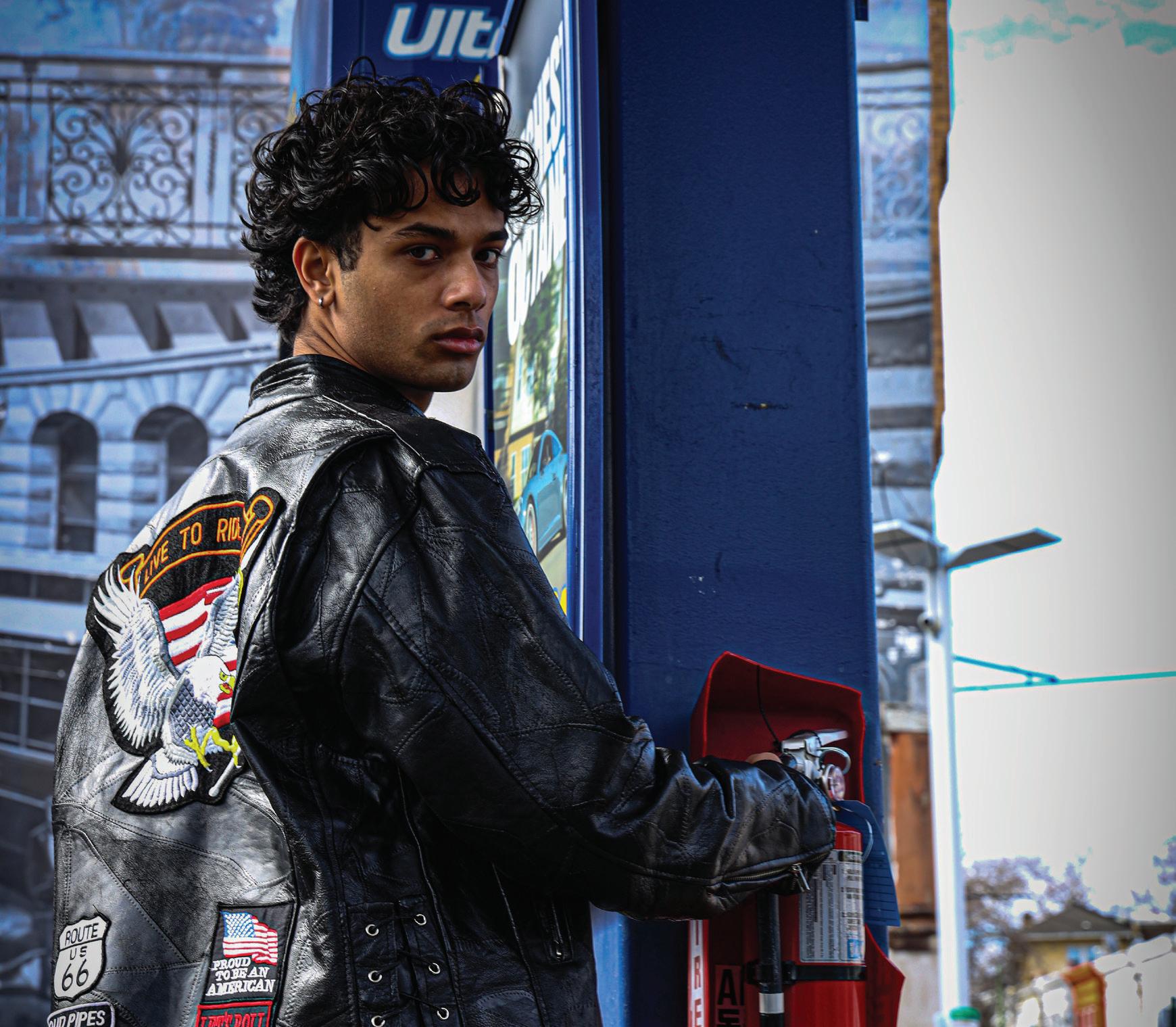
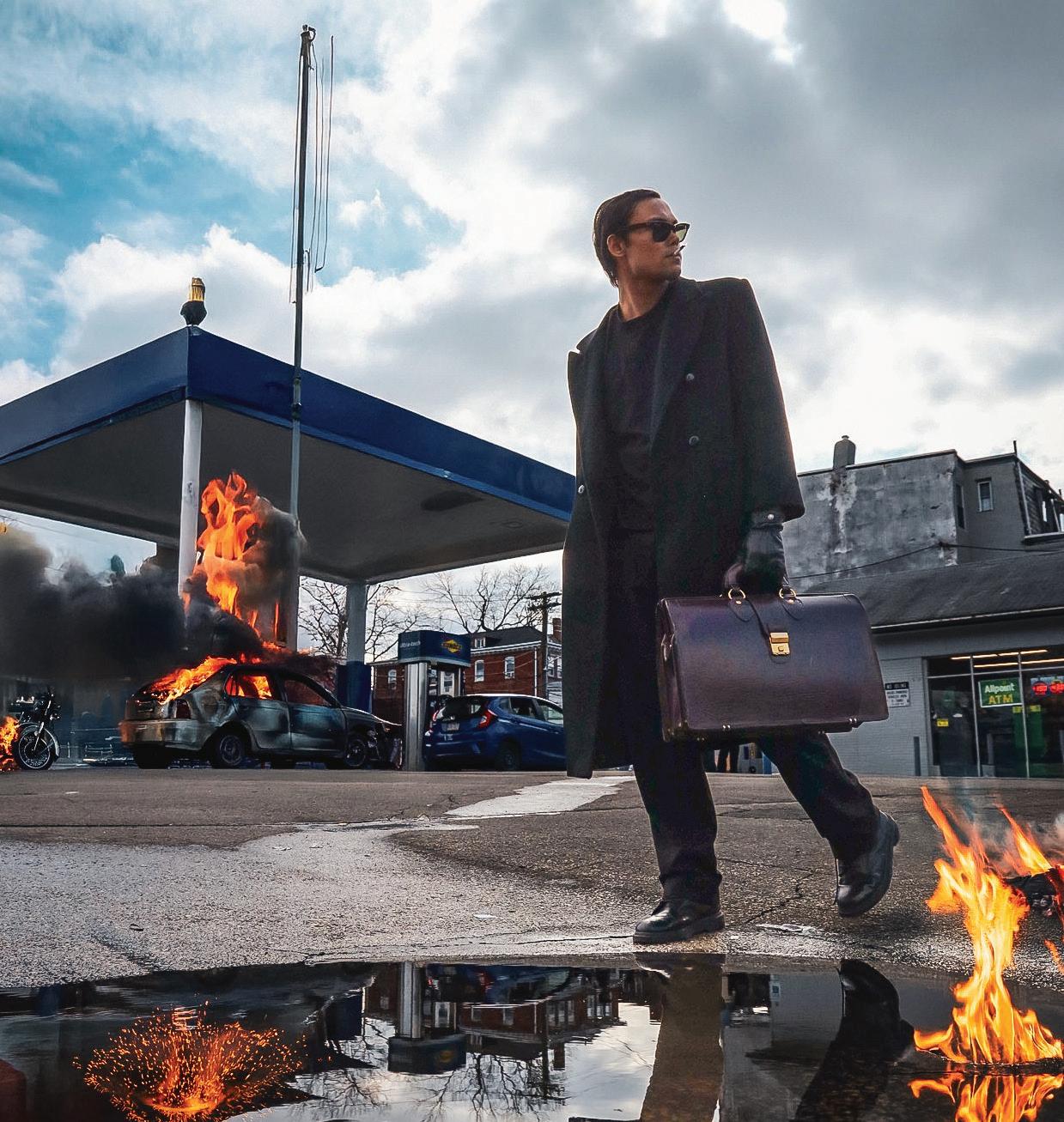
The blazing “FIRE” shoot ignites fashion with energy and intensity. Set against burning cars and city streets of West Philadelphia, the series unfolds within smoke, flame, and heat. Each look cuts through its surroundings, defined by sharp silhouettes and bold contrasts. In this photo essay, scorched tones, glowing light, and competing textures capture fashion’s connection to heat, power, and transformation.
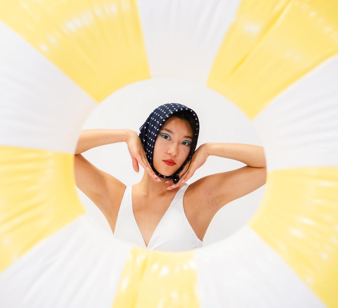
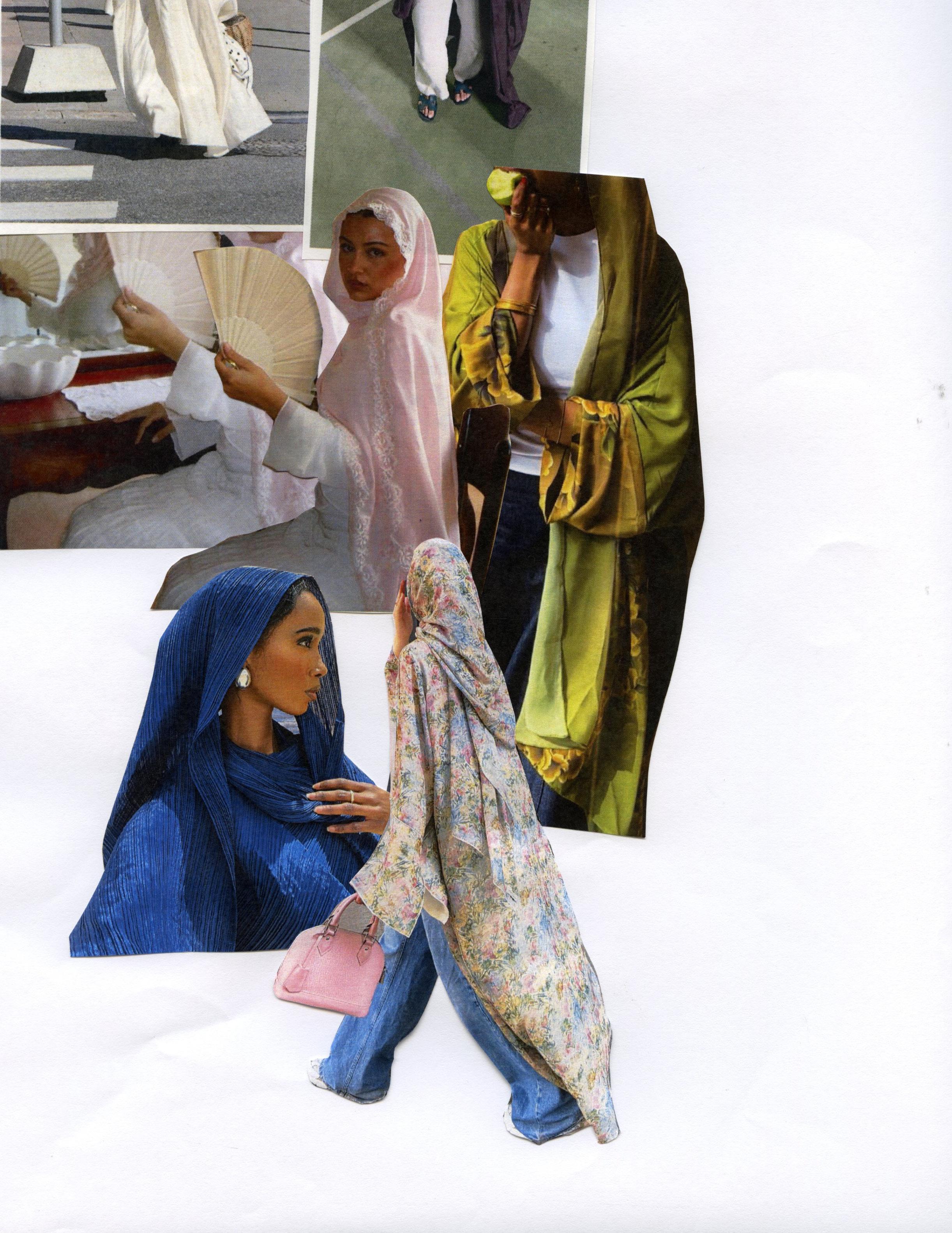
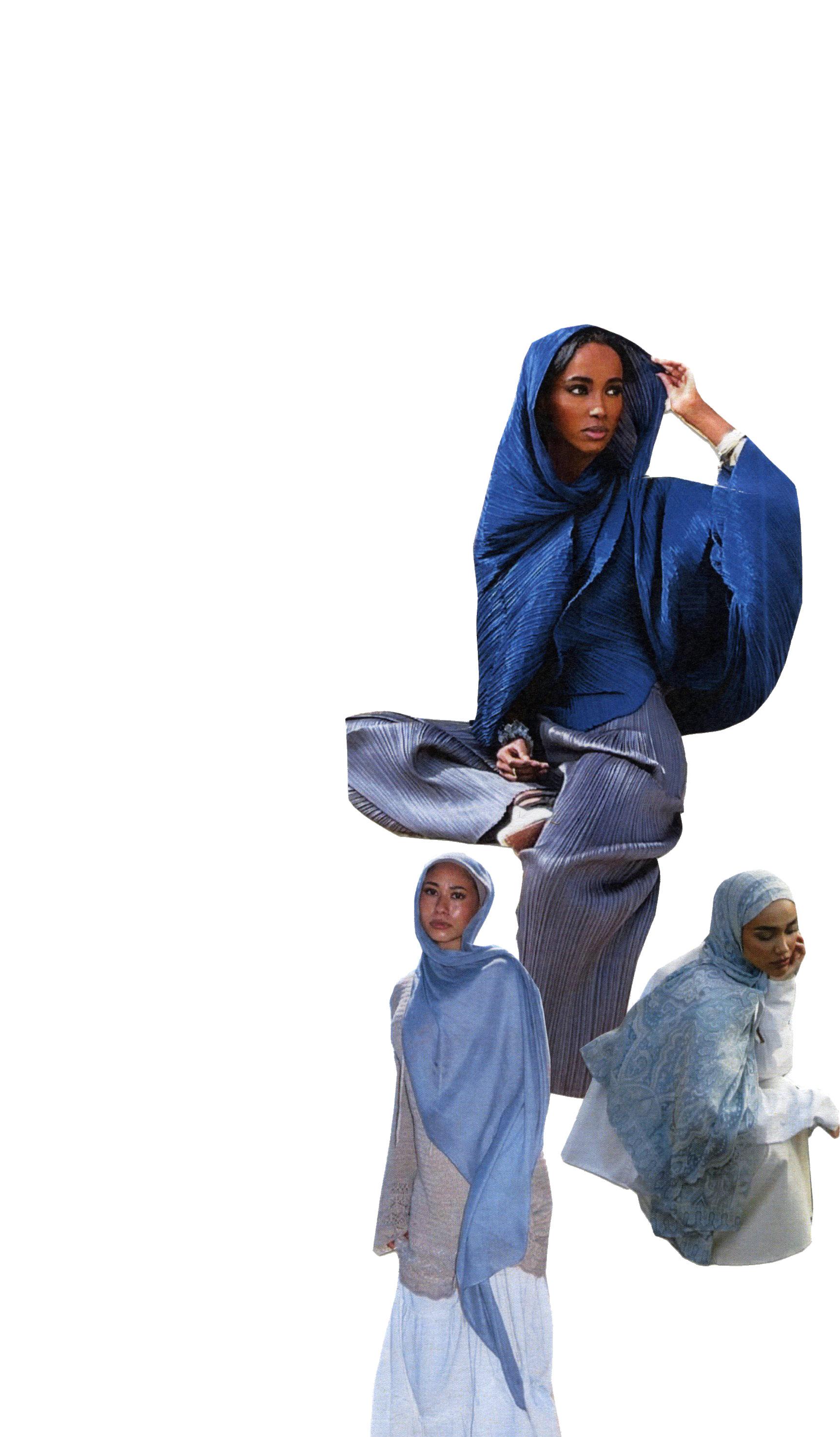
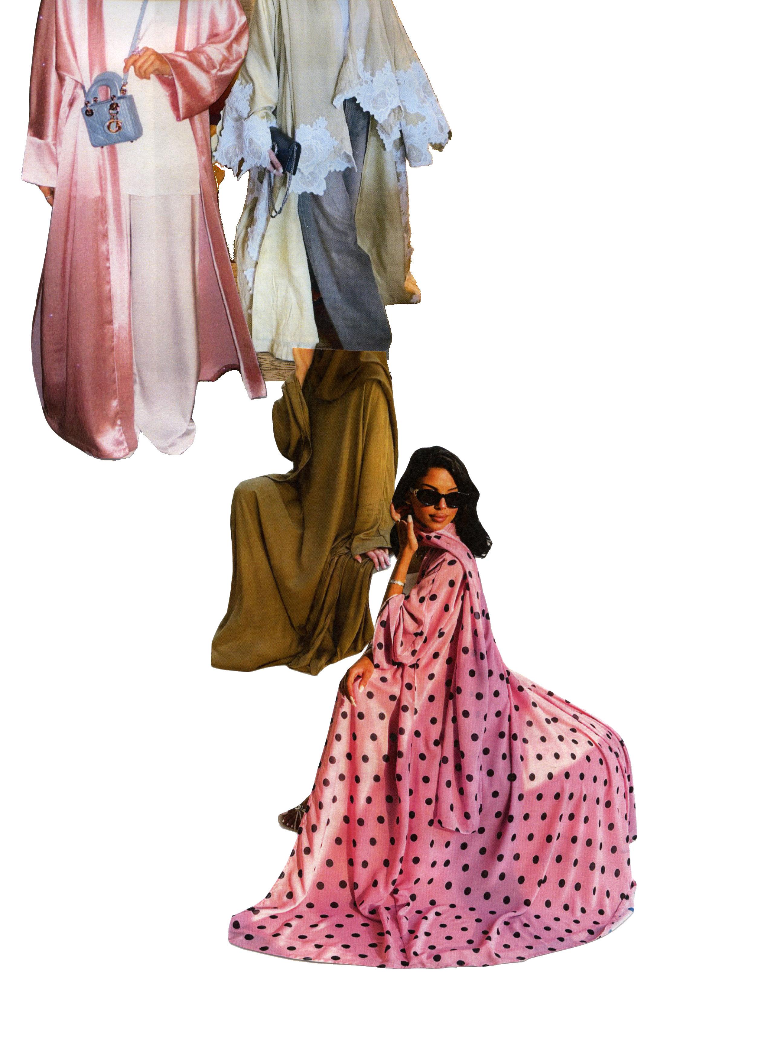
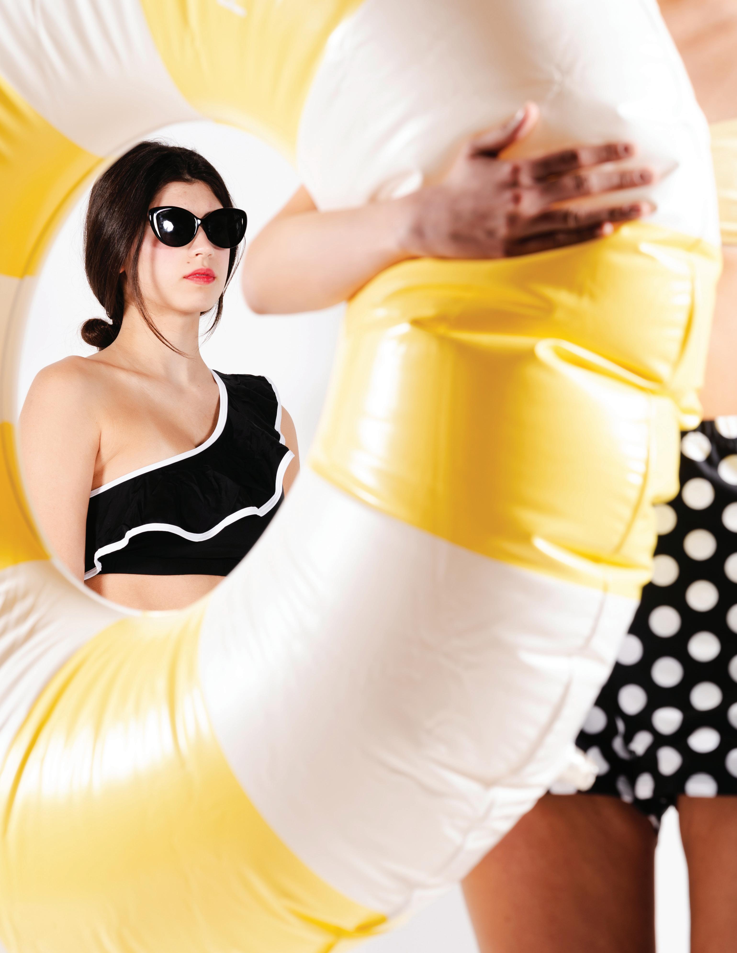
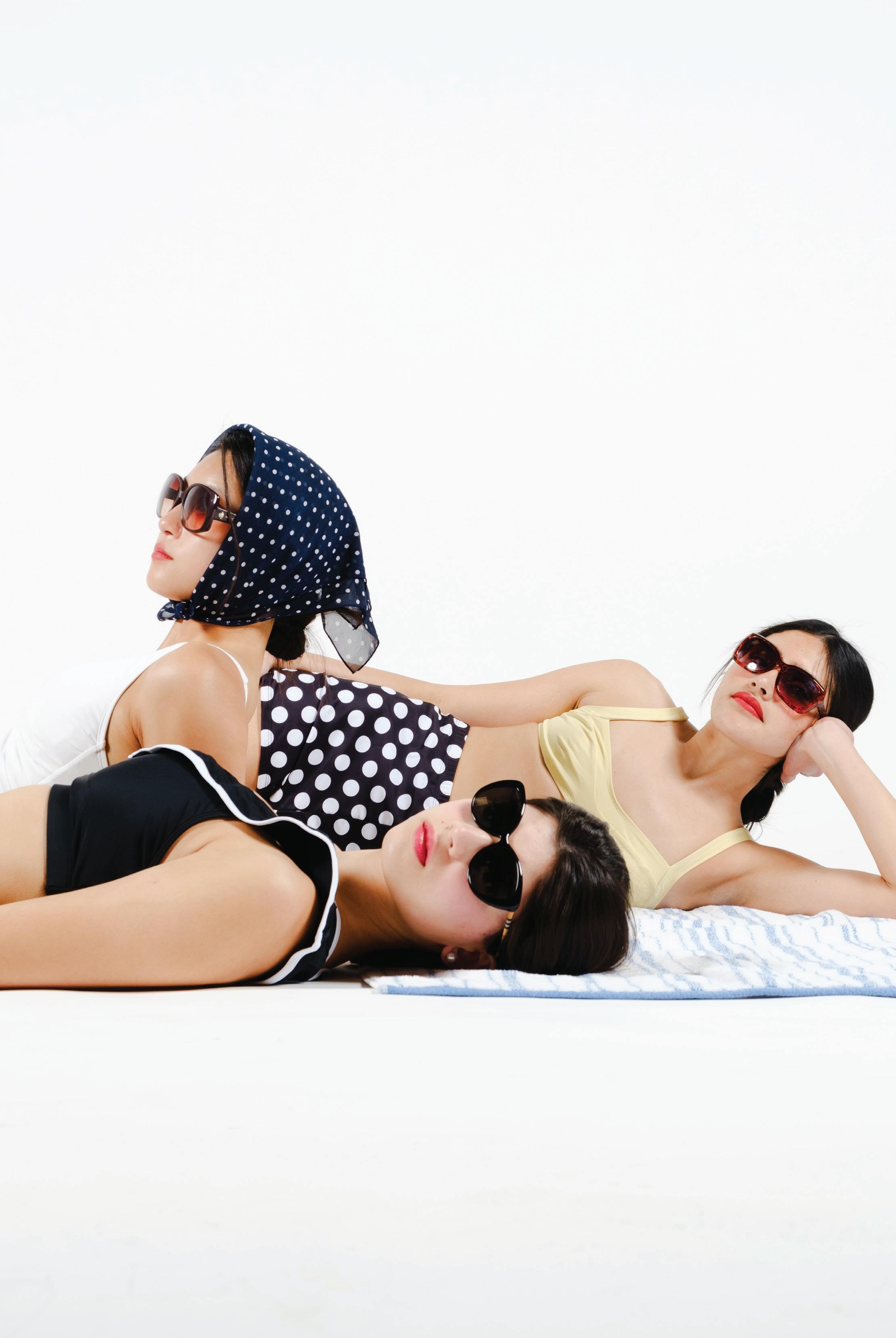
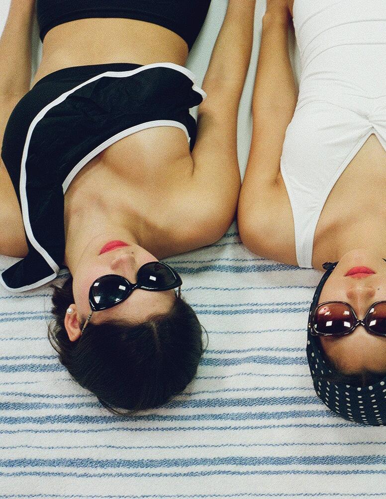
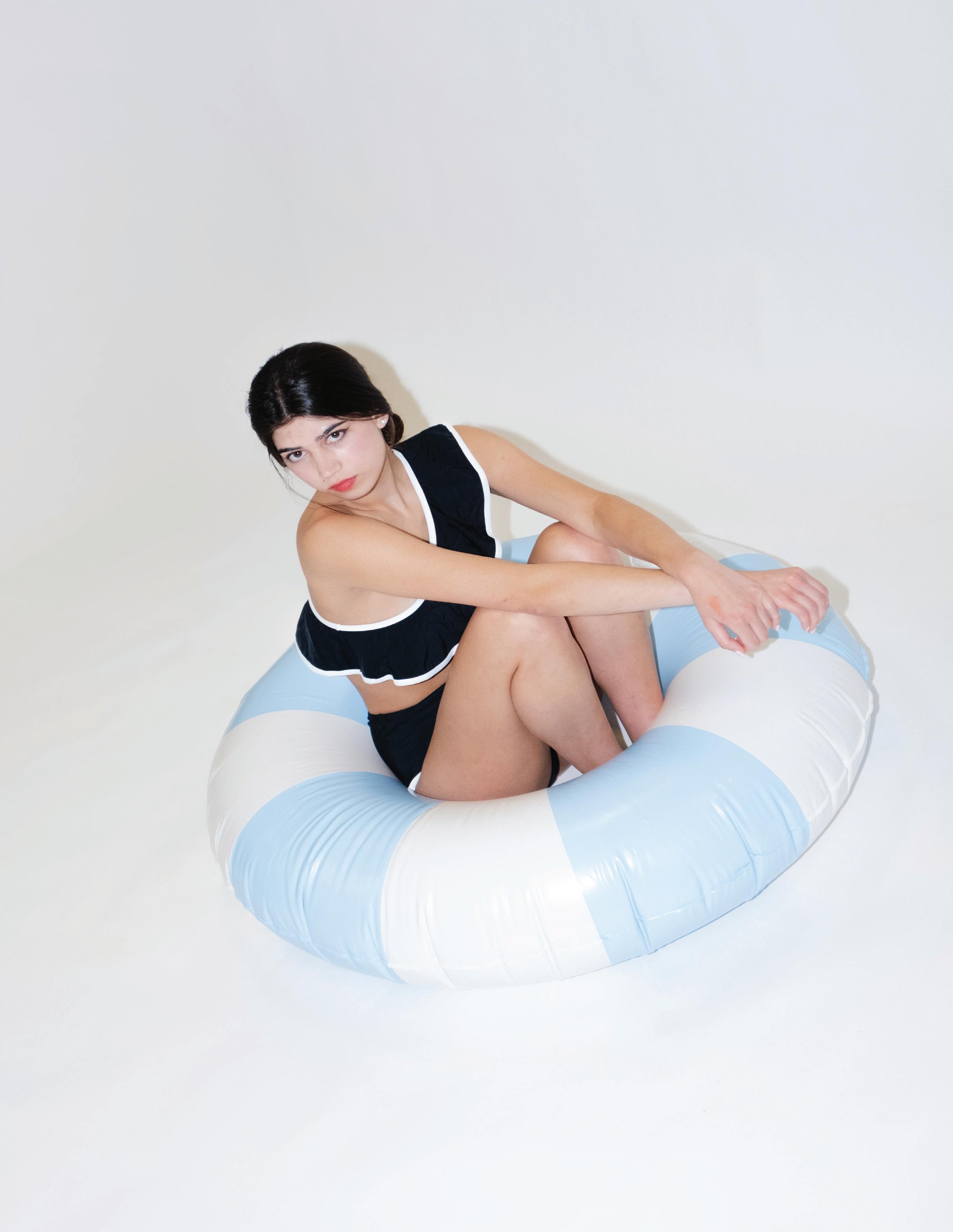
Our “WATER” shoot carries style through fluidity and motion. Set within a bright studio, the series moves through soft surfaces, curved forms, and open space, echoing the ease and drift of water itself. Each look plays with color, pattern, and silhouette, drawing from 60s-inspired styling and buoyant shapes. In this photo essay, glossy finishes, rippling lines, and saturated color capture fashion’s connection to reflection, light, and flow.
DIGITAL FEATURES
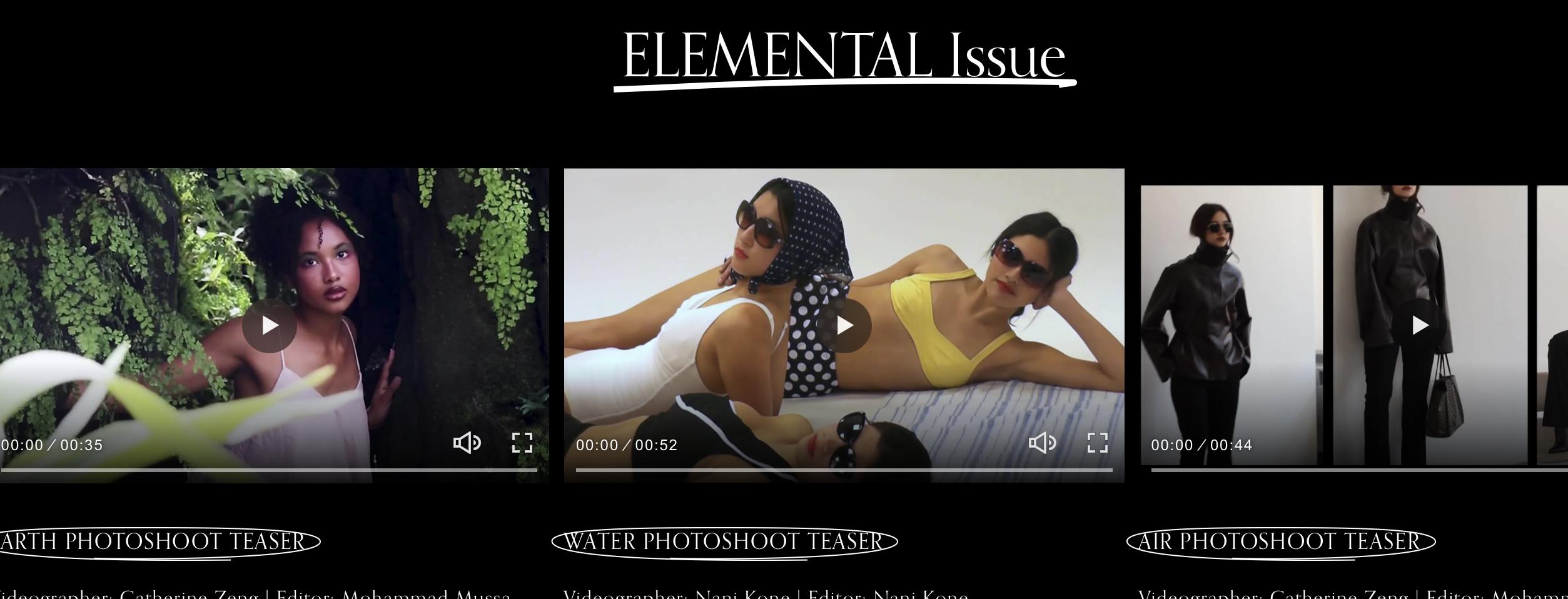
Video Features
Led by Videography Director Kimb Liu
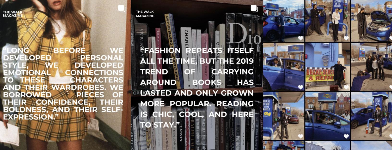
Social Media Features
Led by Social Media Director Ash Wright
WEB FEATURES
Spring/Summer 2026
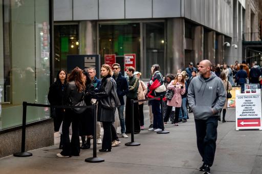
The Economics of the Limited Drop
Annalise Leck | April 1, 2026
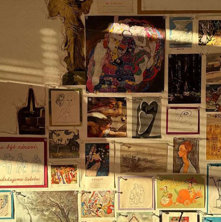
Your Walls Do Talk: Piecing People Together One Poster At A Time
Sasha Rosenfeld | April 4, 2026
Dressed to Write: Literary Icons as Style Influencers
Jenny Le | March 27, 2026
Teen and Young Adult Movies that Culturally Impacted Fashion
Maggie Goldman | March 19, 2026
“Chinese Time of My Life” and Chinese Influence on Fashion
Malia Sanghvi | March 26, 2026
The Rise of Nepo-Babies: Who Fashion Makes Room For Victoria Velasco | April 3, 2026
INTERVIEW WITH
A Vintage Dealer’s Love for Philly’s Past
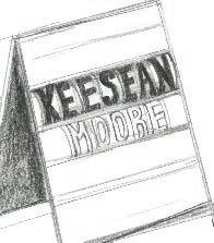
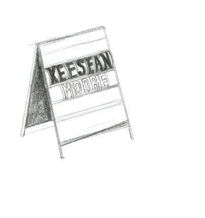
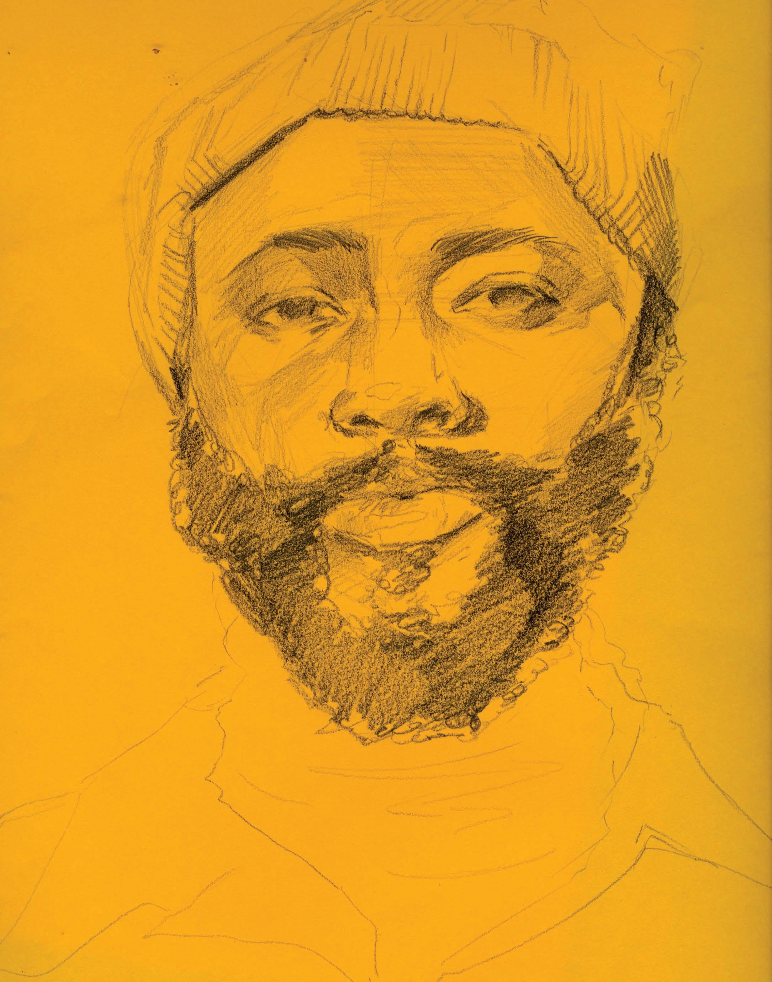
Tsponse to climate, fashion is both a response to and a record of history. The relationship between clothes and history is nowhere more apparent than in Moore Vintage Archive, a boutique located in Queens Village. Its proprietor, Keesean Moore, is a designer who’s worked all across the United States and Western Europe. His store opened its doors in 2021, with a focus on sustainability and donating a portion of its proceeds to local organizations. I sat down with Moore over a Zoom call from New York, where he’s working on opening a new pop-up. Hours after talking to him, I was still buzzing. He is one cool dude. We started by discussing the significance of Philadelphia as a city and its centrality as a nexus of social change.
Which Philadelphia social movements do you connect with?
It started with the 80s, 90s, kind of like queer activists and art movements. I did a lot of work at the William Way Center in Philly because they have an impressive archive. A lot of the writers that I look up to when it comes to developing my worldview, either spent time in Philly, passed through Philly, or were corresponding with other individuals in this city. It’s an inextricable piece of this kind of tri-state connector of culture between New York, Philly, DC, even Baltimore. You can’t really talk about these cities individually; they were all interconnected in these very vital ways.
Your store is located on historic Fabric Row. Would you talk about the of history, location and your work?
I truly believe in this idea of universal alignment, and the fact that my store opened on Fabric Row, I do not take that lightly at all. It is my goal to work to preserve fashion history and to educate people on fashion history. To be at the center of very specific Philadelphia fashion history, especially when you think about the ways that different racial demographics have moved throughout the city, the fact that Fabric Row used to be
moved throughout the city, the fact that Fabric Row used to be a predominantly Black neighborhood, and thinking about how those patterns of movement have changed, be it through geopolitical racism or through just the natural ebbs and flows of immigrant communities, none of those things are lost on me.
There’s a wealth of knowledge that I can tap into just up the block. So many of the people that I use for repairs are on the block. When I want to have clothes custom made, I go to the fabric store, I go to Mr. Baldwin or Miss Anne. I’ll bring in a piece that needs to be repaired and they’re super excited to see it, because a lot of the stuff that I have in the store, some things are included in museum collections. When you go into a fashion archive, very rarely are you able to touch things. So walking into the store, you’re given a very rare opportunity to touch things that are usually behind glass cases.
There are a lot of fabric stores that are no longer there. The person who made the curtains for my fitting rooms, the guy across the street who specialized in curtains and upholstery, he’s no longer there. So there’s this way that just by being there, I am now a part of the history of the block, but I’m also a holder of a lot of these histories and interactions. Fleishman’s is the oldest of the stores that have existed on that block, but there’s so many that are gone, and some of these things just get lost through time. But the block is holding on and I’m very thankful to be a part of it.
How do you see the store’s purpose?
There’s a special magic that comes with vintage shopping where, because there’s
not a full size run, you gotta try a lot of things on to find the piece that is perfect for you. And that process can be incredibly fulfilling because, at its best, you learn something about the past, but you also learn a little bit more about yourself and your own style. When I’m training staff, I always like to say: we’re just playing dress up. With as much pressure as there is on homogenized bodies and societal fat phobia and body dysmorphia, a lot of the joy of playing dress up and trying things on has been lost. People are only shopping online. There’s something very fabulous that happens when you just allow yourself to play in the clothes.
A lot of the questions that I’m asking customers are like, how does this silk feel on your skin? Activating the senses within the body, because fashion is a very sensual thing. It’s the closest thing to your skin. So it’s important to really feel those sensations and acknowledge them. Even that kind of knowledge is important in terms of reestablishing a connection to the body. So much of what exists in this society is about detaching us from this very primal connection to the body. If you’re always detached from your body, how can you access that information? So the store, at least my intention, is always reestablishing a connection with the self and with the body. We’re not just selling you things. We’re literally inquiring: do you like the way that you look in this? And that’s only a question the customer can answer. That philosophy came from walking into stores and not feeling in my body, or feeling ignored, or feeling watched and gawked at, or policed. When you’re given the opportunity to open a store, at least my approach was: what kind of store am I trying to have? How do I want people to feel when they walk in? How do I want people to feel when they leave?
Tell me about The Seeds This Soil Holds and your work with Black queer history.
I’m always doing research around Black queer histories, and when I first got to Philly, I came across an organization in a book I was reading. I reached out to the William Way Center to get more information, and they were able to send me some documents, articles, and ephemera, and that was what started the relationship with the William Way Center. They had a research grant that you had to apply for, and I got it. What I decided to do was spend several months in the archives, essentially looking for evidence of Black queer folk, any picture. There were a couple of queer newspapers that existed in Philly. I was going through their photographic archives just looking for people that look like me. Looking for evidence of me. People that look like me, people that have had similar life experiences.
I collaborated with a printmaker and made these large-scale screen-printed diptychs, where I combined two images and juxtaposed them together to create a different kind of conversation between the images, and then I wrote poems in response to those images. Poetry written in response to art is called ekphrastic poetry. The exhibit mounted these large-scale prints along with my poems, framed and blown up, and there was also archival video footage, this immersive experience where you could hear and watch and see and read, at the William Way Center. Later, I collaborated with Philadelphia Printworks to do a series of t-shirts, and eventually I created a chapbook where I took the images and poems from the exhibit, plus some new poems, and put them into a book. That whole project, devoted to Black
Written by Calder Underwood Illustrated & Designed by Yvan Do Phan
queer Philadelphia history, felt like paying it forward. As many opportunities and as much healing and space and time as the city has provided me, it meant a lot to take that time to create something I could give back to the community, for them to experience and to see themselves in, as much as I was able to see myself within that archive. So it became this offering, because the city itself offered so much to me.
How did you develop your philosophy around history and the archive?
By following my own obsessions. Even outside of fashion, I am endlessly fascinated by the past and by history. On one hand, you have evidence of things that have been tried before. You can learn from the past and avoid repeating mistakes. History becomes an incredibly valuable asset to help you live a more fulfilling life if you choose to pay attention to the patterns. I under-
stand history as being largely cyclical, so understanding patterns in society has always been both fascinating and crucial to my understanding of the world. There’s a scholar, her name is Saidiya Hartman. She works in African diasporic archives, piecing together bits of the past where the archives of those individuals are largely incomplete. She uses the term “critical fabulation,” a technique that writers like Toni Morrison have been celebrated for using, where they use bits of the archive and bits of their imagination, because the archive in itself is only a fragment. But combining all of those things with a sense of integrity, to piece together the clearest vision of the past that could be useful to the present and to the future.
And it’s similar to what I’m trying to do with vintage clothes, putting together a story of the past, a general appreciation of the things that came before us. I’ve been dealing with vintage clothes since I was in high school, but all of that knowledge is cumulative. I would just say: you gotta learn to value the past and value the
importance of the archive, and make use of those resources, because there are so many around us that are there for free, that you can play around in and learn.
Written by Sonia Mehta
Illustrated by Ellen Chen
Designed by Yvan Do Phan
IFashion in Mona Awad’s Bunny
How hyper-feminine style turns bunny imagery into high-fashion horror
f you’ve been anywhere near the “weird girl literature” side of the internet lately, chances are you’ve stumbled down the rabbit hole of Mona Awad’s modern surrealist masterpiece Bunny. Set in the world of a fictional New England college’s elite MFA writing program, the novel follows a cynical outsider named Samantha who gets sucked into the gravitational pull of a clique of incredibly pretentious women who affectionately call each other “Bunny.” But beyond its sharp critique of grad school dynamics, Bunny is a feat in using fashion and aesthetics to build pure dread.
In Bunny, style is a weapon. Awad builds a world where the characters are entirely defined by their highly curated, doll-esque looks and hyper-feminine matching outfits. Take the character Samantha dubs “Cupcake,” for instance. She dresses exactly like her namesake, choosing tasteful, sugary pastels you’d normally see at “weddings or tasteful Easter gatherings” rather than the “forest green and electric blue horrors in the supermarket.” She radiates sugar, typically outfitted in a dress of cerulean blue with white clouds, paired with her endless supply of matchy cardigans and glinty pearl necklaces. This carefully-constructed
costuming acts as a uniform that enforces a specific, rigid standard of belonging. By strictly representing this aesthetic, Cupcake holds the boundaries of acceptable femininity. She ensures that anyone who fails to perform this exact brand of pristine, passive womanhood is marked as an outsider. Her makeup is also calculated: shiny but colorless lips, because as she puts it “lipstick is for whores, Bunny.”
Then, there’s “Creepy Doll,” who embodies a gothic-inflected infantilism. With wide eyes, blood-red curls and velvet dresses, she captures a vintage, uncanny toy aesthetic. Together with the other “Bunnies,” they sit in their workshops with notebooks clutched in their laps. These visual cues serve as potent signifiers of a performative, weaponized femininity. By using their academic notebooks as if they were decorative purses, the Bunnies visually reduce their intellectual environment to a domestic accessory, projecting a more exclusionary image of girlhood that shields their darker intentions. Awad herself notes the specific horror of this aesthetic, stating in an interview: “The Bunnies are so hyper-feminine. They’re so cute. There’s always been to me something kind of horrific about that. It’s a monster that I’ll never be able to resist.”
This spills over into the way the Bunnies interact with the world around them, tying into the book’s surreal, earthy motifs. Their
environments are highly saturated with delicate pink blossoms and cushiony fabrics, creating a feverish, Alice-in-Wonderland-style fantasy. Awad draws heavy inspiration from fairy tales, blending twee aesthetics with elements of the natural world. By forcing this aggressively cute, high-femme lens onto their surroundings, the novel makes nature itself feel artificial and sinister. The floral textures and soft settings signify natural beauty, but they also seem to craft a curated, suffocating terrarium that the Bunnies use to isolate themselves and mask their undercurrents behind a pane of glass.
Central to this world is the bunny itself, serving as the ultimate symbol of the novel’s dark themes. The creature is loaded with cultural meaning, switching between associations of innocence, sexuality and horror. As Awad points out, while rabbits can appear sweet, pop culture is riddled with more monstrous iterations, from the grotesque figure in Donnie Darko to uncanny, suit-wearing Easter Bunnies. In the clique, the bunny represents a subversion of cuteness. The group uses real, live bunnies for blood sacrifices, magically transforming the fragile animals into brooding men. This horrific act strips the bunny of its innocent connotations, turning a symbol into a terrifying reflection of their dark, magical rituals.
This is where the genius of the book’s fashion really shines: the contrast between the group’s soft, delicate style and the deeply unsettling, violent reality of what they actually do. The Bunnies both wear lace, linen and pastels to look pretty, but also to perform as a literal cult engaged in horrifying traditions. Their clothing
makes the violence possible. Fashion here acts as a visual misdirection, disarming both the reader and Samantha by signaling harmlessness, sweetness and even fragility. That same softness, however, becomes uncanny when paired with the brutality of their actions. The more pristine and coordinated their outfits are, the more unnatural they feel. Fashion, then, becomes a narrative device: it deepens the horror not by revealing what the Bunnies are, but by insisting, over and over, that they are something else entirely.
Bunny proves that fashion is about the power dynamics of who gets to be an insider and who is left out in the cold. As Awad observes, there is a distinct terror in the insular language and rules of cliques, much like the iconic teen movies Heathers and Mean Girls that inspired her. In the world of the Bunnies, wearing the right mask might just save your life and the cutest outfits might be hiding the darkest secrets.
written by Aishani Satia
by Yvan Do Phan
Alice in Wonderland, Reimagined T
he day began bright and early, stuffed in the kitchen of
Creative Director Aly Kerrigan. The tables were crowded with palettes, brushes and blush compacts as the makeup and fashion stylists worked away to get the four models ready for the shoot. We were counting down the seconds before leaving for Morris Arboretum Gardens for the WALK’s Earth themed photoshoot.
From the woodsy dynamic to the florals, the vision began to closely resemble a certain Disney scene. “This location and photoshoot were very directly inspired by Alice in Wonderland,” says Kerrigan, when asked about the team’s creative process. “We wanted a very plant-heavy, earthly background. And this location really made that happen.” Just a 30 minute drive from Penn’s campus, Morris Gardens classical set the perfect background with English landscape structures, sculpture gardens and 92acre Victorian arboretum.
On site, we witnessed four distinctive looks take over the ground. Model Oliwia Lubinska wore a warmtoned, floral Napoleon jack-
et in yellow with hints of pink and two braids completing the look. “I actually love my look,” she described, “Even though it’s super creative, that’s something I could wear on a daily basis.”
Meanwhile, a perfect contrast against the garden, model Alana Talbert wore a flowy, light pink ruffled top with striped pants and matching white ballet flats. “I feel very whimsical,” she says, laughing. “Especially with how bouncy and fun the colors go together.”
While Alana and Oliwia leaned towards whimsical and wearable looks, the final two models were complete fantasy. Donned in a stunning, long white dress, Melody Tanudjaja had butterflies across her eyes. Betsmona Alemshowa sported a jubilant pink dress with four roses tucked in at her bosom and yellow highlighted leggings to match. All four looks came together to highlight Earth not as a backdrop, but rather, an adornment.
Behind the looks was a process as organic as the theme. The clothes were all sourced entirely out of the fashion stylist’s closets. Chahd, who is a first-semester stylist, described her initial thought process, saying
“I thought about flowers. Trees. In Morocco, we have a lot of colorful nature.”
The clothes she pulled were pink, yellow, sparkly, textured and saturated in a way that felt true to the natural world rather than a representation of it. The creative process, she mentions, is one that was beautifully constrained. “We source our own clothes,” she says, “So basically it’s our own closets on these models.” That limitation, she quickly notes, is both a blessing and a curse.
What made the shoot, in particular, and the entire Elements series work is a philosophy that Kerrigan articulates with ease: these themes are not instructions, but rather, starting points. Through all the wild scenes, she mentions her favorite moment was before it all started in the hair and makeup room with music blaring and Pinterest boards open. “It’s a really good vibe,” she says simply. That vibe is precisely what this shoot sought to capture: not Earth as a symbol or concept but Earth as a feeling. It was something wild and abundant that needed to be caught and wrapped in the magazine.
designed
BY REDINA RAPI, ALY KERRIGAN, ROSHNI
DOVI
GIULIANA ALLEVA, JACKIE ERRERA. MODELED BY OLIWIA LUBINSKA, ALANA TALBERT, BETSMONA ALEMSHOWA, MELODY TANUDJAJA. STYLED BY MAYOKUN OMITOGUN, LUNA MELINE, SAHITI RADHA, SAREENA PATEL, CHAHD BEKARI. BEAUTY BY ELAINE PENG, SIRI PARUCHURI, HRISHITA MAREDDY, AMY LEE. PHOTOGRAPHED BY INTEL CHEN, PHILIP DARTNELL, PHOEBE ZHANG, GIULIANA ALLEVA.
DIRECTED
MISRA,
JAKUTYTE,
Minimalism and Air
the return of lightness in fashion
The Sound of Silence in Fashion
Where everything competes for attention, minimalism opts out. In moments defined by excess, fashion’s quiet shift towards minimalism almost feels subversive. Where recent years have celebrated maximalist layering, loud prints and visual overload, today’s most compelling looks are defined by absence: clean lines, muted palettes and silhouettes that refuse to shout.
This is not merely conceptual — on recent runways, this shift is unmistakable. At The Row, models move in near-silence, draped in long wool coats and fluid trousers in shades of ivory and charcoal. At Jil Sander, tailoring is reduced to its most essential form: sharp, precise, almost weightless. Even brands once known for excess have softened, favoring restraint over spectacle. This return to minimalism is not merely aesthetic. It signals a deeper cultural recalibration, one that aligns closely with the qualities of air itself: lightness, clarity and space. Like air, minimalist fashion is invisible, yet essential. It doesn’t openly demand attention but captures it anyways.
written by rachel lee designed by yvan do phan
Back to the 90s: When Less First Meant More
To understand this revival, fashion has once again turned to the 1990s, a decade that perfected the language of restraint. Figures like Carolyn Bessette Kennedy became icons not through spectacle, but through precision. Her wardrobe, bias-cut slip dresses, sharply tailored coats, barely-there accessories, embodied a kind of disciplined ease that felt both effortless and exacting. At the same time, designers like Calvin Klein and Helmut Lang stripped clothing down to its structural core. Gone were the excesses of 1980s glamour. Monochrome palettes, architectural silhouettes, and fabrics took their place. A white shirt became more than a basic. It was the whole look. What distinguishes minimalism from mere neutrality is its relationship to space. Minimalist dressing is not about emptiness — it is about intentional absence. Each piece is chosen not for what it adds, but for what it allows.
Fabric plays a similarly important role. Silk slips skim
the body rather than cling to it. Crisp cotton shirts hold structure without stiffness. The art of minimalistic fashion lies in clean lines and careful construction. It is the deliberate cultivation of a quiet, controlled aesthetic that evokes elegance and poise.
Designers like Phoebe Philo have mastered this balance. Her silhouettes –– wide and sculptural, yet fluid –– demonstrate how clothing can occupy space without overwhelming it. The garment moves, but it never dominates. In this way, minimalism is less about reduction and more about refinement. It distills fashion down to its most essential elements: line, texture, and movement.
Quiet Luxury and the Politics of Subtlety
Today’s resurgence of minimalism is often framed through the lens of “quiet luxury,” a term that has come to define understated, logo-less dressing associat-
ed with brands like The Row. But beneath the surface, this shift reflects something more complex than aesthetic preference. Consider a cashmere coat in a soft camel tone. There is no logo, no embellishment, no immediate signifier of value. And yet, its weight, its texture, the way it drapes across the body communicate something that branding can never replicate. In an era saturated with visibility, where fashion is increasingly mediated through social media, branding and rapid consumption, minimalism offers an alternative mode of expression. It resists the pressure to be instantly legible and rejects the idea that value needs to be obvious. This subtlety redefines how fashion signals status, shifting the focus from display to discernment. To recognize quality becomes a form of cultural literacy.
Against the Noise: Why Minimalism Feels Urgent Now
The return of minimalist fashion is not happening in isolation. It is a response to a broader cultural condition, defying the excess and saturation of our current society. In this context, minimalism functions almost as a form of resistance. Fast fashion may thrive on constant novelty and stylistic obsolescence, but minimalism emphasizes its timeless nature. Where trend cycles encourage accumulation, minimalism values curation. Ultimately, the return of minimalism suggests that impact does not require volume and that presence can be achieved through restraint.
from the Streets to the Skies
Spanning from tailored shoulder pad dresses to mod-inspired ensembles with leather boots, the flight attendant’s uniform has been undergoing changes for decades. Such evolutions arguably demonstrate that professional fashion, even thousands of feet in the air, can reflect historically, culturally, and socially significant changes of our time.
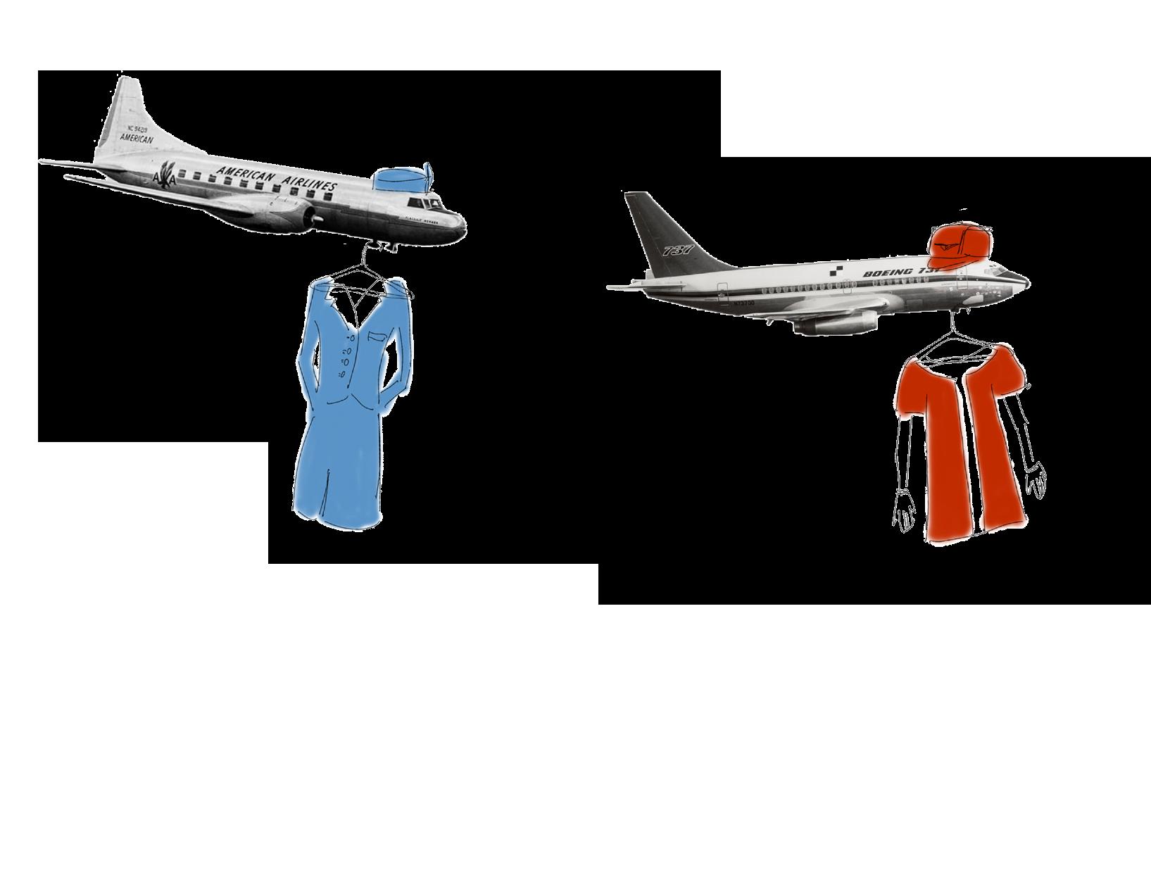
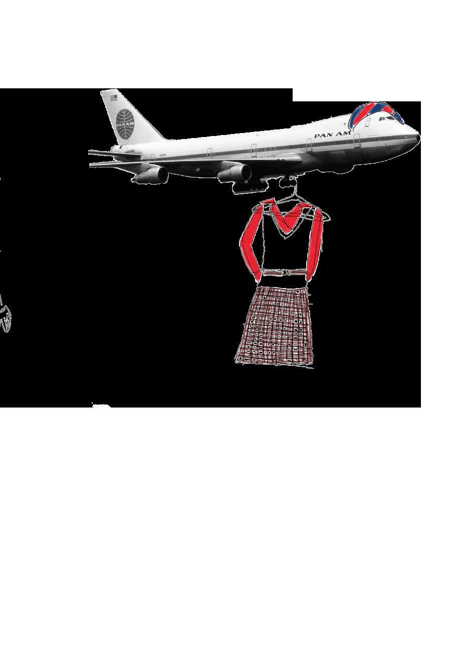
When the word “fashion” comes to mind, it likely conjures up images of runways, models catwalking, or strutting and posing for photos in curated looks. But hundreds of thousands of feet up in the air, on a very different kind of runway than one might imagine, flight attendants have been serving looks up and down the aisles of aircrafts for decades. From chic skirt suit sets with matching pillbox hats during the early 1960s, to long pastel colored dresses with matching cinched belts and shoulder pads during the 1980s, flight attendants have been making critical, yet often unrecognized contributions to the fashion scene. Their style blurs the boundaries between the dichotomies of work and play, practicality and style, uniformity and personal expression.
Dating back to nearly a century ago, the first female flight stewardess is considered to be Ellen Church, who also happened to be a registered nurse and pilot. In 1930, after much convincing on her part, Church was hired by Boeing Air Transport, working on flights. Like Church, the earliest female flight attendants were commonly regarded as stewardesses, working as registered nurses prepared to tend to ill patients onboard flights in the event of an emergency. Photos of the earliest female stewardesses show a prioritization of functionality over fashion: many donned quite traditional and subdued silhouettes such as skirt suits in subtle colors, with accessories such as hats or pantyhose. Throughout the 1940s, such styles continued, with military-inspired ensembles also becoming a popular choice amongst airlines. However, during the 1950s, “The structured wartime silhouette gave way to softer lines, feminine cuts, and a more polished elegance,” Rare Historical Photos states, as evidenced with skirt suit sets, pillbox hats, white gloves, and pumps. The onset of the 1960s marked a critical turning point in flight attendant fashion. Rather than wearing traditional, conservative and strictly functional ensembles, airlines began to introduce exciting, innovative uniforms that showcased self-ex-
pression, reflecting the changing times. As the San Francisco Museum’s website notes, “Women’s fashion transformed dramatically during the 1960s and 70s, driven by remarkable social change and a revolutionary youth culture.” Not to mention, the airline industry as a whole was, literally and figuratively, reaching new heights with further destinations and distances and increased numbers of passengers as air travel became far more accessible.
Competition between opposing airlines began to occur, and uniforms became a critical point of visual distinction and individuality. “Influenced by Mod fashion and other trendy styles, these vibrant uniforms celebrated the allure of the jet-setting flight attendant,” SFO noted. One such example is Braniff International Airlines’ uniforms for its flight attendants, which debuted during the mid 1960s: according to Southern Living, these revolutionary outfits consisted of leather boots, helmets and smocks designed by Emilio Pucci in vibrant colorways. From visors and white gloves to go-go boots, the 60s ushered in a wave of fashion-forward fashion in flight. The 1970s mirrored the same bold, fresh nature of the 60s with bold ensembles in bright hues. Perhaps the most major evolution in flight attendant uniforms was the introduction of pants and pantsuits, repre-
Jordan Millar
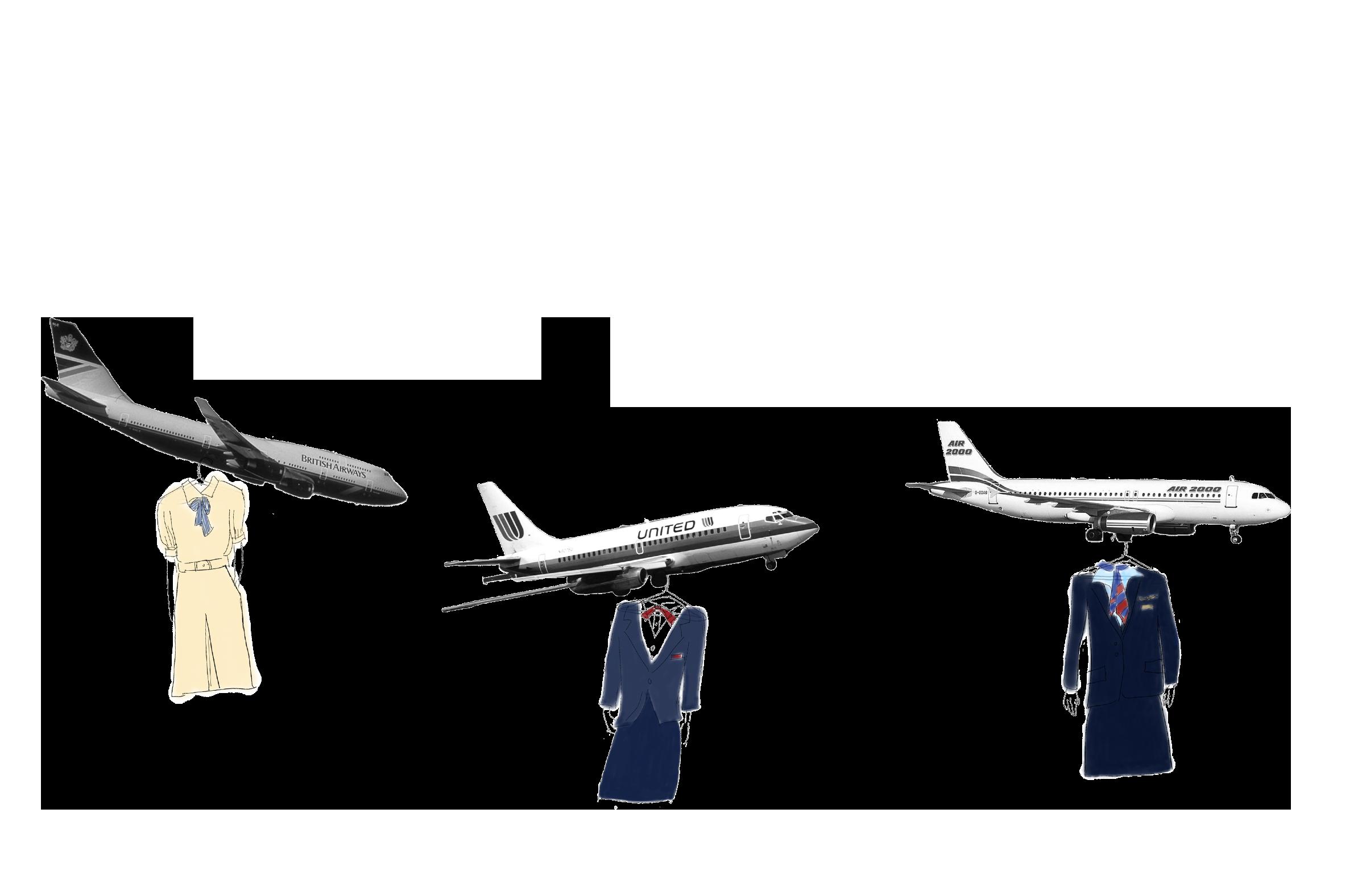
sentative of a massive overall shift in the restrictions of women’s professional and workplace attire. During the 1980s, “The aviation industry was booming with families in the 1980s and utilitarian uniforms became the status quo again— and have largely remained that way ever since. The airlines adapted to a professional business style look for their flight attendant uniforms,” according to Studio 104. Structural, tailored uniforms equipped with longer skirts, shoulder pads, ties, and sometimes cinched belts began to be implemented by airlines. Today, flight attendant and aviation fashion continues to reach new heights. But, compared to some of the more eccentric uniforms of time periods like the 1960s and 1980s, flight attendant uniforms today are far more simplistic and neutral. Airlines often stick to “business casual designs in classic color combinations of navy blue, red, black, and white,” as Business Insider notes. However, that’s not to say that modern flight attendant fashion cannot be exciting. In 2018, designer Zac Posen created all-new uniforms for Delta Airlines, combining classic ensembles with new, exciting colors such as plum. Delta Airlines recently introduced its “Distinctly Delta” uniforms, consisting of four collections produced by Lands End. With hues of red and navy and styles ranging from a chic long sleeve wrap dress to a tailored suit.
The airline even collaborated with designer Italian brand Missoni, “to design a selection of refined accessories — including scarves, ties, and pocket squares — that complement the onboard experience.” From the 1930s to now, flight attendant fashion has grown and evolved, reflecting important social and cultural changes over the decades. Through looking at how their style has changed over time, we see that uniforms are more than just stereotypically “repetitive” or “typical” and carry deep meanings and stories that show how our world is changing.
written by
illustrated by Miya Moriuchi designed by Yvan Do Phan
Designing WITH Air :
INFLATION, COMPRESSION, AND THE ARCHITECTURE OF COUTURE
It begins with something that should not hold. Air, invisible and indifferent, is not supposed to structure anything, and yet in contemporary couture it increasingly does exactly that: gathering, resisting, occupying, becoming the quiet architecture around which everything else is arranged. Designers today are no longer simply dressing the body; they are constructing environments around it.
On the runway, the body no longer functions as the primary form to be dressed but instead becomes something closer to a reference point, a starting outline that is quickly displaced as garments expand outward into shapes that refuse anatomical logic. A leg disappears into a lacquered sculptural extension; hips widen into improbable horizontals; sleeves round outward until they begin to describe space rather than limbs. These silhouettes do not sit on the body so much as negotiate with the air surrounding it.
This manipulation becomes especially explicit in Rick Owens’s Fall/Winter 2023 LUXOR collection, where inflated lateral structures pushed outward from the hips into rigid horizontal extensions that seemed to hold their shape independently of the body. The silhouette hovered somewhere between fragility and monumentality, as though a breath had been held too long and turned architectural. What appeared soft was in fact engineered: quilting, padding, and internal tension stabilized volume that normally belongs to air alone. Owens has often described his work as an attempt to re-proportion the body rather than decorate it and here, the garment reorganized how the wearer occupied space rather than simply enlarging them within it. This strategy has precedents. Rei Kawakubo’s Body Meets Dress, Dress Meets Body collection for Comme des Garçons inserted padded protrusions at the hips, abdomen and back so that clothing no longer followed the body’s natural outline but rewrote it entirely. The body became negotiable, something garments could reshape rather than respond to. In contemporary couture, this logic continues, but with a growing emphasis on air itself as the material through which that reshaping takes place.
There is something almost
anatomical about the way these garments operate, not because they mimic the body, but because they reorganize its proportions. Compression cinches the waist into an impossible narrowness while inflation exaggerates what surrounds it, producing a continuous tension between restriction and release. The wearer becomes simultaneously contained and extended, reduced and amplified, until it becomes difficult to determine where the body actually ends and the garment begins.
A high-collared jacket lifts away from the neck, holding a deliberate pocket of air between skin and fabric, while the waist beneath it gathers tightly before the skirt releases into volume again. The movement between constriction and expansion creates a rhythm across the body, as though the garment itself were breathing, even when the wearer remains still. Increasingly, couture does not simply follow movement; it produces its own internal spatial logic.
Elsewhere, padding takes on a more expressive role. In sculptural couture silhouettes by Viktor & Rolf, exaggerated belllike forms expand outward until the body nearly disappears inside them, transforming the wearer into a moving structure, rather than simply a figure inside clothing. These gestures do not read as decoration so
much as volume made visible, where air becomes something that carries both sentiment and spectacle without fully settling into either.
There is also a subtle anonymity produced through this architecture of air. As garments swell outward, identity becomes less immediately legible. Oversized knits engulf the torso; exaggerated lower forms encase the legs; quilted silhouettes widen beyond recognition. The body becomes secondary, less a subject than a support system for the structure around it. Increasingly, presence is communicated through outline rather than through anatomy. And yet, this entire construction depends on something inherently unstable. Air can escape, collapse, disappear and these garments exist in a constant state of tension because of it. What appears soft or effortless is tightly controlled, with designers shaping not just fabric, but the emptiness it encloses. In Iris van Herpen’s work especially, laser-cut lattices and suspended forms hold space around the body rather than resting on it, turning the wearer into the center of a moving environment rather than a figure contained within clothing. To design with air is to rethink what clothing does. Rather than simply covering or revealing the body, couture increasingly constructs spatial boundaries around it, creating
distance, scale, and presence that extend beyond the wearer’s physical outline. The garment becomes environmental rather than purely visual. In this sense, air begins to carry meaning. To take up space, to expand beyond the body, becomes a quiet assertion, while dependence on something so intangible introduces a persistent vulnerability. These garments hold themselves together through what cannot be seen, revealing how presence, proportion, and even identity can be built from something as unstable as air.
written by Meera Bhola
illustrated by Sanjana Nalavolu
designed by Yvan Do Phan
DIRECTED BY REDINA RAPI, ALY KERRIGAN, ROSHNI MISRA, DOVI JAKUTYTE, GIULIANA ALLEVA, JACKIE ERRERA. MODELED BY ANYA SKRYPNYK, SOPHIA NELSON, MATTHEW LOPEZ. STYLED BY LUNA MELINE, SAREENA PATEL, SAHITI RADHA, CHAHD BEKARI. BEAUTY BY ELAINE PENG, SIRI PARUCHURI. PHOTOGRAPHED BY ZACHARY SPAIN, NOEL PALOMINO DE LA TORRE.
BLUSH
Theory
written by SOPHIA ZHANG illustrated by ELLEN CHEN designed by YVAN DO PHAN
There is something strangely intimate about blush. It mimics a moment rather than a material, something beyond the powdered palette and pressed pigment: the rush of blood after laughter, a sudden bloom of embarrassment, a brisk walk in the cold. We speak of “blushing brides,” “rosy cheeks” and “flushed with excitement,” the reddened cheek communicating warmth, youth, embarrassment, flirtation or health. Even when artificially applied, the color evokes the language of feeling. To blush is involuntary; to wear blush is deliberate. The tension between spontaneous emotion and curated appearance has fascinated people for centuries.
Ancient Color
Blush is far older than the modern beauty industry. Archaeological evidence suggests that people in ancient Egypt used red ochre and crushed minerals to tint their cheeks and lips. In tomb paintings, faces appear subtly warmed by pigment, echoing the desert sun that already colored the skin.
The Romans adopted similar practices, creating pigments from natural sources like plants and insects, including carmine produced by crushing cochineal insects. A healthy flush in Ancient Rome suggested vigor and prosperity, while pale or sallow skin could imply illness or exhaustion. Cosmetics became a way to restore, or to perform, that vitality.
In imperial China, rouge
powders were widely used during the Tang dynasty, when the culture of cosmetics flourished. Women applied vibrant cheek color as part of elaborate court aesthetics, sometimes blending pigments with rice powder to achieve soft gradients of pink and red. These cosmetic traditions reveal an early understanding of blush as a form of visual composition, treating the face as a canvas and laying the groundwork for the more overt uses of color that would follow.
Rouge and Reputation
By the 18th century in France, blush, or rouge, had become theatrical. At the court of Versailles, both men and women wore heavy circles of carmine high on the cheeks, often paired with powdered white faces and towering wigs. Pigments were expensive, and cosmetics were part of the elaborate performance of aristocratic life. The painted cheek became almost architectural: a symbol of refinement and excess.
But cosmetics rarely remain neutral for long. As political and social attitudes shifted toward a more austere and moralizing sensibility, rouge began to attract scrutiny. What had once signaled elegance came to be read as artifice, even deceit. In the nineteenth century, visible blush was often framed as improper, associated with actresses, courtesans and women perceived to be performing femininity too overtly. Underlying these critiques was a deeper unease: the idea that a woman could ma-
nipulate her appearance and in doing so, shape how she was seen. To accuse rouge of deception was, in many ways, to police who had the right to construct their own image.
That tension persists even in modern beauty culture. Blush has long been entangled with ideas of flirtation and desire; this is sometimes celebrated, sometimes weaponized. Today, this dynamic is amplified by the outsized influence of major beauty brands, whose products and messaging shape how increasingly younger audiences understand and experiment with makeup. Few names capture this more explicitly than NARS’ Orgasm, one of the most commercially successful and culturally recognizable blushes of the modern era. Its success speaks to the enduring association between a blush and sex, but also to the discomfort surrounding that association. The same suggestion of heat and attraction that makes blush compelling has often been used to judge or diminish women, casting their self-presentation as either too much or not enough.
Beauty and Illness
The 19th century also produced one of the strangest intersections between beauty and disease, and at its center was the cheek. Tuberculosis, or “consumption,” became deeply romanticized in literature and art, in part because it touched so many of the era’s most revered cultural figures, including writers like Emily Brontë and Elizabeth Barrett Browning.
The illness produced a distinctive look of pale, almost translucent skin set against feverish, reddened cheeks. It was a look that seemed to hold fragility and vitality at once –– all expressed through color.
Some Victorian women subtly recreated this look with cosmetics. The goal was not truly to imitate illness but to exaggerate existing ideals of the duality between luminous pallor and delicate color. Beauty, historically, has had a far stronger relationship with health than sickness, particularly with women, signaling vitality and fertility. Instead, what the consumption aesthetic did was heighten the visual language of fragility already embedded in Victorian ideals of femininity. Blush became a way of performing a carefully balanced contradiction. Even in a moment fascinated with pallor, it was the faintest trace of color on the cheek that completed the ideal.
The Blush Economy
This tension between expression and scrutiny has meant that blush has never been consistently embraced, but instead moves in and out of favor depending on what beauty is meant to signal at a given moment. It sits at the mercy of a larger aesthetic divide: structure versus softness.
When beauty leans toward control, discipline, and definition, blush tends to recede. In the 1990s, the era of “heroin chic,” faces were deliberately hollowed out, drained of obvious warmth; any visible flush would have disrupted
the cultivated languor of the look. The mid-2010s repeated this impulse in a different language. Contour and bronzer dominated, carving cheekbones into architectural lines, turning the face into something sculpted rather than lived-in. Powder blush, while still alive, was often an afterthought, overshadowed by the drama of shadow and highlight. In these moments, the cheek was something to define, not to animate. What makes the current resurgence of blush feel so distinct is not just its return, but its shift in texture and philosophy. Where powder blush once sat visibly atop the skin, today’s formulations aim to disappear into it. Cream blushes, liquid tints, and gel textures melt seamlessly, mimicking the way color naturally blooms beneath the surface. Products like Milk Makeup’s jelly blushes or Benetint’s lip-andcheek stains blur the boundary between makeup and skin, offering translucency rather than opacity. Powder, once the default, now reads as more intentional: used to set, diffuse or heighten color, rather than to create it from scratch. In practice, application has become almost architectural in reverse: less about building angles, more about amplifying warmth. On platforms like TikTok, blush has evolved into both a technique and spectacle. In a digital landscape defined by filters, precision and perfected skin, the embrace of visible blush ––– sometimes too much, sometimes intentionally so –– signals a shift in values. If contour was about mastering the face, blush is about letting it live a little. This phenomenon, often dubbed “blush blindness,” captures the ease with which restraint dissolves in the pursuit of color.
Figures like Sabrina Carpenter have come to define this aesthetic: cheeks saturated in soft pink, almost doll-like, yet still luminous rather than heavy. In this ecosystem, blush is no longer a finishing touch but the focal point. At the same time, placement has loosened, drifting away from the polite geometry that once governed the cheek. Blush now travels across the bridge of the nose, lifts toward the temples, spills onto the eyelids, mapping the face in gradients rather than points. The effect is often described as “sun-kissed” or “wind-flushed,” as though the color were earned rather than applied. This shift is mirrored in the palette itself. Traditional roses have given way to a wider chromatic range of florals: tangerine oranges that suggest heat, cool lilacs that echo natural undertones, berry hues that add depth. The cheek becomes less a fixed site and more a moving field of color, responsive to light, skin and mood.
Conclusion
Ultimately, the enduring fascination with blush lies in its ambiguity. It sits at the threshold between what our bodies do naturally and what we choose to amplify. Across centuries, from Egyptian ochre to French rouge to viral TikTok tutorials, the colored cheek has carried layers of meaning. Yet, this visibility has never been neutral. Blush has long been tied to expectations placed on femininity – asked to signal warmth, but not excess; desirability, but not overt sexuality; expression, but still control.
However, to wear blush can
also be a form of agency and reinterpretation. Contemporary trends, from exaggerated saturation to unconventional placement, suggest a shift away from restraint toward self-expression. The cheek is no longer confined to a fixed point, but can become fluid, expansive and personal. In this way, blush endures not just because it reflects life, but because it allows its wearer, the artist, to shape how that life is seen.
HEAT WAVE
Awritten by Surina Ramoutar
illustrated by Miya Moriuchi designed by Yvan Do Phan
s seasonal boundaries soften, fashion is increasingly anchored in warm-weather pieces that emphasize exposure and dressing for the moment.
A sheer organza dress with knee-high boots no longer feels out of place in colder months. The outfit still reads as warm-weather at its core, even when the temperature doesn’t –– and that same logic carries across seasons. A sheer top paired with silk bottoms might look adapted, but underneath it’s still built like something meant for heat. A sparkly mesh top at dinner catches low light the same way it would in the summer.
The base doesn’t change: sheer fabrics, lighter materials, visible layers, both under and over. What shifts is everything around it – outer layers added just for the commute, knits draped over shoulders, pieces meant to come off once you’re inside. These outfits aren’t really designed for different seasons. They keep the same foundation and simply adjust at the edges.
This idea was pushed further on the runway at Miu Miu Spring/Summer 2024, where the emphasis remained on sheer, skin-forward styling as a fixed base rather than a seasonal variation. Garments typically understood as underlayers, slips, sheer tops and bikini elements, were repositioned as the core of the look. Straps, ties and waistlines were left exposed and as models walked, layers shifted incrementally with mesh lifting, satin catching light, knits slipping. Within this, seasonality functioned at the level of layering rather than design. The underlying garments consistently referenced warm-weather dressing and heavier elements, when present, operated as external modifications rather than integrated
components. They mediated temperature without altering the logic of the base and reflected seasons that feel less defined than they used to.
On both the runway and in the day-to-day, that same sense of immediacy also limits how long these pieces last. A sheer crystal top or ultra-thin organza dress isn’t really a capsule piece, but something worn for a specific moment and then moved on from once it’s had its “moment” . Instead of being worn repeatedly, it’s replaced with something slightly different, a tighter mesh, a lower neckline, a fabric that reflects more light. This cycle creates tension by ignoring the usual rules of longevity, despite broader conversations about buying less and keeping things longer, these outfits don’t follow that logic. They depend on newness. What matters is how well something works in a specific moment.
As seasons warm and blur fashion moves further toward immediacy, everything leans toward lightness and exposure. The value of the outfit is concentrated in the moment it’s worn, not what happens after.
Sheer fabrics and skin-forward styling are showing up year-round, as fashion starts to reflect warmer, less defined seasons.
how Dennis Rodman broke down stereotypes and pushed fashion norms to the extreme with eclectic, gender-fluid fashion, jewelry, and fashion
Recently, the fashion world has become increasingly intertwined with the world of sports, specifically the pre-game tunnel outfits of NBA players. The tunnel has transformed from a simple passage to the locker room to a paparazzi-filled runway. This culture has propelled players into celebrity for their stylistic choices rather than their court skills. From the high-end modern looks of Shai Gilegus Alexander to the edgy nail polish of Jared McCain, it may appear that NBA artistry is a trend exclusive to new-age players; however, this
couldn’t be further from the truth.
The basketball legend Dennis Rodman took the professional court for the first time in 1986.
In the course of his 14-season career, Rodman became a two-time NBA All-Star, was named Defensive Player of the Year twice, and won five NBA Finals. He was a core member of the “Bad Boy Pistons” and afterward played alongside Michael Jordan and Scottie Pippen, forming the legendary Chicago Bulls team. Rodman rightfully earned the nicknames “Secretary of Defense” and “the Worm” for his expert defensive agitation.
a kick to the groin. In addition, his off-court antics attracted notice. Ranging from his scandalous relationships with Madonna and Carmen Electra to his brief crossover into professional wrestling to TV and movie appearances, one might forget Rodman was an NBA player. It was this side of his character that earned him the nicknames of “Demolition Man” and “Dennis the Menace.” As his sidequests grew wilder, so did his stylistic choices.
It was not solely his technical abilities that garnered him the most public attention. On the court, Rodman frequently fought with players and referees, and once, infamously, hospitalized a courtside photographer after
After winning his first ring with the Chicago Bulls, his third overall, his mold-breaking fashion taste was unleashed. With the self-confidence that comes from being a famous basketball player, he began to lean completely into his individuality. Almost every game, Rodman was seen sporting a new hair color. These designs included almost every color of the rainbow and more; from leopard print to neon colors, he did it all. At his introductory press conference after being traded to the Bulls, Rodman showcased a fresh buzzcut with the Bulls’ red and black logo dyed into the
back. He showed support for HIV and AIDS by wearing an AIDS ribbon dyed in his hair during the playoffs, and a year later, he famously dyed his hair pink to raise awareness for breast cancer, supporting the Y-ME National Breast Cancer Organization. Rodman used his hair to express himself, raise social awareness and challenge NBA norms.
Rodman’s plethora of hair colors is definitely one of his most well-known fashion choices, even today. But this is only the tip of the iceberg. His style was bold and gender-fluid, mixing bright colors, patterns and textures, and even wearing cropped tops and skirts. Rodman wore multiple obvious piercings, often including a nose stud, a septum piercing, a labret lip piercing and hoop earrings. He’s considered the first NBA player to have obvious facial piercings.
A personal favorite look of mine is Rodman’s 1995 MTV Music Awards look: a glittering silver cropped tank top paired with baggy black jeans, his classic silver facial jewelry, and a pink buzzcut. One of his most iconic and outlandish looks came in 1996, when, in an effort to promote his autobiography, Rodman married himself and wore an elegant wedding dress, a veil and a blonde bob wig.
NBA players are often looked at as the pinnacle of masculinity. They are towering, buff, wealthy, famous athletes who are expected to have personalities to match. This stereotype led to intense homophobia and massive stigmatization of any sort of femininity.
Rodman, however, continued to display his feminine style despite these stereotypes, setting the stage for players today to feel comfortable expressing themselves through style. Often, he could be seen with paint-
ed nails of various colors and wore gold glitter nails to an event at the White House in 1997. Incorporating elements of rave, emo and hip-hop fashion, he was truly unique in the fashion world, especially in the sports world.
His style was truly ahead of its time, as an online user declared, “Everyone in 2019 looks like dennis rodman in 1996” (@cowboybagel on X). His looks and confident personality have certainly inspired current celebrities.
DK Metcalf, a wide receiver for the Pittsburgh Steelers, cited Rodman’s fearless, unapologetic and “badass” mentality as a personal inspiration. Kanye West, also known as Ye, has also cited Rodman as a fashion influence. With the modern revival of 90s and Y2K fashion, the lasting influence of his style is certainly evident.
If Jared McCain faces criticism for painting his nails in 2026, imagine the confidence it took to do so thirty years ago. Though Rodman has never identified himself as being part of the LGBTQ+ community, he
faced constant scrutiny and homophobic comments for his gender-bending looks. His 1995 Sports Illustrated cover, featuring him in lingerie and makeup, drew intense backlash, but Rodman later said it was one of the best-selling issues. In his own words, Rodman views fashion as a form of freedom, rather than a way to seek attention. By continuing to exercise this freedom despite public opinion, Rodman changed the fashion world, cemented himself as a legend, and paved the way for future athletes to feel more comfortable expressing themselves.
written by Nina-Rose Smith
illustrated & designed by Yvan Do Phan
DIRECTED BY REDINA RAPI, ALY KERRIGAN, ROSHNI MISRA, DOVI JAKUTYTE, GIULIANA ALLEVA, JACKIE ERRERA. MODELED BY VICTORIA VELASCO, HARMAN CHAHAL, LIMAN MIAH. STYLED BY KEVIN XU, CHAHD BEKARI. PHOTOGRAPHED BY HOON LEE, TANIA LAU, ZARA BAIG.
written
Mariam
Rethinking “Island Style”
sunny beaches and a sea filled with pearls. the fashion-forward women of the island nation of Bahrain dress a little differently than you might expect of the climate.
by
Ali illustrated & designed by Yvan Do Phan
When you think of island life, images of sarongs and shell necklaces may be conjured in your mind. But what if I told you that my island nation of Bahrain has a totally different style.
Bahrain is a nation in the Middle East, one of six countries in the Gulf Cooperation Council that have a shared culture and heritage –– also referred to as the “Khaleej”. It is made up of an archipelago of islands, consisting of over 84 natural and artificial islands, but also hosts a variety of deserts. Known for its hospitable people and rich history, you’d be remiss to overlook the nation and its people.
Girls in Bahrain understand how to dress. Casual or formal wear and accessories to boot, Bahraini girls are always dressed to impress. Regardless of personal style, however, there is one item you’ll find in every Bahraini girl’s closet: the abaya.
In recent history, the abaya has typically been a loose black garment worn over the clothes. It covers the body including the arms and shoulders and used to be popularly worn over the head. Nowadays, more modern versions of the abaya sit at the shoulders and are typically worn with a matching head scarf.
While wearing “western” clothing such as jeans or t-shirts are common in Bahrain, girls in Bahrain and all over the “Khaleej” have meshed modern clothing with traditional elements. From funky embroidery, to lace embellishments, the abaya has evolved with the times alongside its wearers.
Abayas come in a rainbow of colors, from the typical black abaya, to a pastel pink or
blue, and are worn atop outfits. Typically seen as modest outerwear, the abaya is now also a statement. Coming in different materials –– chiffon, silk, or even linen for the summer ––or colors, sometimes with embroidered designs, the abaya is a staple in every Bahraini girls’ closet.
You’d think with all those layers, girls would be suffocating in the sweltering summer heat with temperatures reaching over 109F, but the loose sleeves and skirts of the garment allow for airflow. The coverage from the sun also provides sweet respite for the skin from the burning sun. The abaya is not merely a vessel of modesty and culture, but a shield from the harsh rays of the bright desert sun. Bahrain’s winters don’t get too cold, but regardless, there’s a solution to the cool breeze. Winter abayas made of materials such as wool or velvet provide warmth while not forsaking the abaya style. Stylish and functional, the abaya is not just a fashion statement, but one following the needs of the women wearing them.
Other than protection from the sun and heat, the abaya provides comfort. It’s a breathable, loose-fitting garment that can suit the tastes of many. For women who prefer to wear looser clothing, the abaya is a stylish way to keep covered without feeling like they’re compromising personal style. Whether for religious modesty, or personal preference, the abaya serves to answer the needs of many. Abayas evolve with current online trends too. With the resurgence of bows and “coquettish” style, some Arab brands, such as The Concept, have produced abayas to match the styles. Whether that be pale pink abayas with
embroidered bows or lace trimmed edges for an extra feminine touch, abayas have proven to have the capability to evolve. Featured in Grazia Magazine’s online publication, Bahrain’s Mei Boutique is another trendy brand. The resurgence in popularity of polka dots is not lost on this brand, featuring the print in a number of different colors. Other brands such as Bahrain’s AKS, Nafs Designs and Feeya have different takes on the abaya, each bringing a unique take to the garment. These brands have beautiful designs, but are just one avenue to finding the perfect abaya.
Through instagram, brands like Abayas by Blisse, Sara Omaira, and Lin have strong followings. Just searching up the word abaya through hashtags yields a wealth of results. The most exciting experience, however, is to weave through concept stores or small local Bahraini tailors’ shops, offering ready made
abayas in different designs waiting for final sizing adjustments, or the opportunity to custom create your own with fabric, cut, and design all tailored to your preferences. The abaya is an incredibly accessible item of clothing, with a variety of different entry points for different priorities.
I myself am a big fan of the abaya. Last summer, while on the hunt for the perfect summer abaya, I came across the most charming abayas in blues and purples, with embroidered starfish and sea motifs, and some with palm
ishing touch or hide a casual outfit while running errands throughout the day. From running out to pilates or dressing for brunch with the girls, the abaya is a versatile piece and rightfully a staple in every girl’s closet. They can be worn buttoned closed or open to reveal glimpses of an outfit underneath, which has been popular in recent times. Throw on your favorite jewelry stack and a nice handbag (if you’d like to wear Bahraini designers look no further than Touchless or Amina Gallery), and you’re set to navigate the island in style.
The portrayal of island nations is often homogenous, despite the diversity and rich
trees (fitting for a country historically nicknamed “land of a million palm trees”). A cultural and religious symbol that is still wildly popular, it has evolved to also exhibit the personal style of individuals.
The garment was even the center of the attention of Dolce & Gabbana in 2016, who unveiled a collection targeted at a Middle Eastern audience. Luxury fashion houses are no strangers to special regional collections, especially in the Middle East, where women are especially fashion-forward. Brands such as Van Cleef & Arpels and Loro Piana, among others have carefully curated campaigns targeting women of the Middle East, with Ramadan ad campaigns or curated looks and pieces for similar religious occasions. The Arab woman is not forgotten in the realm of luxury fashion marketing, so why shouldn’t a brand cater to her style? The Dolce & Gabbana capsule collection was titled “The Abaya Collection: The Allure of the Middle East”. Though it received mixed reactions from the public and seems to have been forgotten to time, it indi
cates the importance of customer preferences, especially in a region such as the Khaleej and the Middle East, where being well dressed is highly emphasized in daily life. The abaya can either embellish an outfit as a finish-
individual identities of island nations around the world. Bahrain’s island style doesn’t quite match what you’d find on TikTok when searching “island” or “summer” style inspiration, but is shaped by the religion and unique culture of the region. Even thinking of an island probably evokes images of the turquoise waters of the Caribbean or the fine white sands of Greece, each with their own respective fashions, are much different to those of Bahrain. It is a Muslim nation, hence the abayas function as a garment of religious modest dressing, but even those who follow other religions adopt the dress. Whether to experience “Khaleeji” culture or simply because of personal style preferences, many women have found themselves adopting the abaya. It is by no means an enforced dress, but women of the Khaleej continue to wear it out of love for the garment and its significance in Khaleeji heritage and modern life.
It is so easy to subscribe to one version of what stylishness is, but truthfully it is fluid. Style is shaped by environment and personal tastes. Had you not been exposed to the culture in which the abaya flourishes, you may question its popularity, not understanding its significance. But take a look around Bahrain or any other Khaleeji nation, and you would lose count as to how many women wear the abaya. Women from different walks of life, united by this garment. It’s not just a garment; it is a symbol of how despite our differences, we are all cut from the same cloth.
LAB MEETS THE LOOKS
Penn STEM undergraduates discuss style, studies, and the spaces between
written by Daria Knurenko designed by Yvan Do Phan
For STEM students, selecting an outfit is just another equation: what works, what’s allowed and what it communicates. I spoke with four Penn STEM undergraduates about their personal styles, the connections between their style and their field of study, and their aesthetic and practical priorities between the classroom and the closet.
Amanda
Hunt
, a junior studying biochemistry and philosophy, describes her style in three words: “genuine, individualistic, useful.” Usefulness, in STEM spaces, carries a specific weight. There is an unspoken assumption that attention given to one’s appearance signals a lack of commitment to academics. Amanda admits that her outfits are secondary to her packed calendar of problem sets, exams, and lab work. Her style thus walks the line between maintaining her individuality and assimilating into a culture that rewards efficiency and diligence over creative expression.
For Kate He, a sophomore studying biology, the dichotomy is more clear-cut. Her style, “soft, casual, and versatile,” shifts depending on the day’s demands. Lab days are accompanied by a number of rules: no exposed skin, nothing too fitted, and all fabrics must be capable of handling spills, movement, and long hours. But her style doesn’t disappear; it is reorganized around her calendar. Kate’s confidence about her clothing choices comes from knowing that her outfits are aligned with the day’s itinerary. If labs influence what women wear, outside opinions influence how they feel about wearing it.
Luisa López, a sophomore studying biology and anthropology, speaks about this tension directly. Her style, “whimsical, colorful, creative,” is attention-grabbing. That visibility, however, has its consequences. She
has learned to anticipate the stereotypes that follow her unique outfits wherever she wears them. If she “dresses up pretty,” her peers assume that she is unserious and incapable.
Luisa believes that many women in STEM respond to these assumptions by diluting their styles down to hoodies, t-shirts, and other unisex clothing that attracts less attention. She understands the logic, but she refuses to conform. Her creative dressing, color experimentation, and pattern mixing are a statement that intelligence and style are not mutually exclusive. “I can be both,” she insists. And it shows: she sits across from me now in a white shirt and a bright pink cardigan, a perfect blend of her professional aspirations and creative spirit.
Lucia Kulzer, a senior studying computer science and comparative literature, takes a different approach. Her style is “sober, simple, comfortable,” composed mostly of dark colors and consistent silhouettes. This choice is deliberate. In the engineering community, appearance matters less than intelligence, and dressing “too well” can backfire to undermine one’s credibility. Her solution is adhering to a standard cycle of loose pants and fitted tops—a self-imposed uniform, of sorts. By fashioning herself in this manner, she prevents her appearance from factoring into the way that
the building which houses Penn’s English and Cinema & Media Studies departments, quirky clothing and fun accessories are the expectation, not the exception. But in the Engineering Quad, that expectation fades. Her behavior there is influenced by the culture that prioritizes what students say and how they think over how they express themselves physically. In Lucia’s early days as an undergraduate, she took solace in her humanities classes as spaces to experiment with thrifted pieces and unique outfits. In her engineering courses, she settled into the consistency of a simple shirt and jeans.
Luisa experiences a similar cultural divide between her two majors.
While biology necessitates a minimalist wardrobe, she arrives to her anthropology classes in patterned dresses, flowy skirts, and creative layering combinations. Even her professors sport their own expressive outfits.
THE SECRET TO CONFIDENCE
What confidence looks like for each woman in STEM depends on who you ask: some find comfort in using their clothing style to fit into the general culture
her peers and professors evaluate her.
Kate, Luisa, and Lucia sat down with me to offer their perspectives on…
THE UNWRITTEN UNIFORM OF A STEM CLASSROOM
Across interviews, certain patterns recur, like the popularity of jeans and multi-purpose tops, a rotation of practical, low-maintenance pieces that can move from lecture to lab to late-night study sessions without requir-
within their major, while others prefer to stand out and emphasize their uniqueness.
For Amanda, it’s wearing something she chose for herself, regardless of how it’s perceived. For Kate, it’s cohesion—matching the outfit to the environment. For Lucia, it’s simplicity: clothes that don’t demand attention, allowing her to focus on thinking. For Luisa, it’s visibility through color and other forms of self-expression.
ing readjustment. Another such item is backpacks, especially functional, durable ones, that replace handbags.
Lucia describes running into another female student in Amy Gutmann Hall dressed in jeans, a black shirt and a black belt all identical to her own—the “woman in engineering uniform,” she jokes. Kate puts it simply, believing style is typically centered around comfort. Luisa is blunt: “You just use joggers… hoodies… and that’s it.” But even within that simplicity, there are variations (think Luisa’s own pink cardigan). While the uniform is real, it is not absolute.
HOW THEIR ACADEMIC DISCIPLINES INFLUENCE THEIR PERSONAL STYLES
Lucia most clearly notices the difference in personal expression between STEM and non-STEM spaces. In her humanities courses, style is a medium through which students communicate their identities. In Fisher Bennett Hall, the
CLOSET STAPLES
When asked about must-have items, Amanda names a standout jacket, Levi’s jeans, and a patterned dress. Kate chooses boots, skirts, and hoop earrings. Luisa highlights white socks, a brown skirt or pants, and a turtleneck. Lucia focuses on a good backpack, a reliable jacket, and comfortable shoes. All of these items are adaptable to the many different environments that the four find themselves in during the day.
Despite its conciseness, the STEM acronym encompasses countless fields of study, from molecular biology to computer engineering. It is telling, then, that Penn’s women in STEM approach personal style in a diverse number of ways. For some, individuality looks like an explosion of color, while others prefer head-to-toe black. But in every case, clothing is more than just clothing. Something about which all four of our students can agree is that the power of an outfit is in its ability to influence how its wearer interacts with the world around them and how the world interacts back.
DIRECTED BY REDINA RAPI, ALY KERRIGAN, ROSHNI MISRA, DOVI JAKUTYTE, GIULIANA ALLEVA, JACKIE ERRERA. MODELED BY ASHLEY WANG, PAULINA TEPAN, PHOEBE SOOD. STYLED BY MAYOKUN OMITOGUN, CHAHD BEKARI, FELICIA MERINO, NEHIR SUNAR, AUDREY OSTOYICH, IFEDOLAPO OJO. PHOTOGRAPHED BY ZACHARY SPAIN, CHASE ROSS, ADITI ANAKALA, GIULIANA ALLEVA.
SENIOR SPOTLIGHT: CLASS OF 2026
The WALK would not be complete without the creativity, leadership, and drive that our seniors bring to the team. Each of our senior department directors play an integral role in producing our print magazine, digital content, and annual fashion show. ey are an inspiration to our organization, and we are excited to see them continue to succeed and look good doing it.
Here’s a tribute to our class of 2026.
REDINA RAPI
POSITION Co-Editor-in-Chief
MAJOR Philosophy, Politics, and Economics, Hispanic Studies + minor in Consumer Psychology
POST-GRAD PLANS Gap year before law school
FAV CLOSET PIECE A pair of fun sunglasses, which double as a headband most days!
WHAT I’VE LEARNED FROM THE WALK
How much goes into planning, organizing, and directing a magazine—and how fulfilling it is to see it all come together in the final product!
NOOR MAJEED
POSITION Operations Director
MAJOR Finance, Business Economics and Public Policy + minor in Political Science
POST-GRAD PLANS Finance in Boston
FAV CLOSET PIECE My brown suede jacket—a perfect piece for all seasons!
WHAT I’VE LEARNED FROM THE WALK Since my freshman fall, joining a community filled with creatives has been an incredible experience. Organizing our annual charity fashion show, 27L, has been a highlight of my time at the WALK!
OLIVIA WENDEL
POSITION Co-Creative Director
MAJOR Economics, International Relations
+ Chinese Language Certificate
POST-GRAD PLANS Consulting at Bain
FAV CLOSET PIECE Painted leather bag from San Telmo
WHAT I’VE LEARNED FROM THE WALK
How to take more creative risks! Everyone on styling and beauty has such diverse and cool tastes, and I am constantly taking style cues from them.
GIULIANA ALLEVA
POSITION Photography Director
MAJOR Philosophy, Politics, and Economics
FAV CLOSET PIECE A maroon shawl I bought in Italy
WHAT I’VE LEARNED FROM THE WALK
As a photographer, a lot of what you can learn about the art form is from others. I’ve loved ge ing to see how other photographers shoot, how the creative directors conceptualize shoots and theme ideas, and how the models and their clothes come together to form a cohesive look. My time at The WALK has been so meaningful and has taught me a lot about fashion, originality, and selfexpression.
ASH WRIGHT
POSITION Social Media Director
MAJOR Communications, Art History
POST-GRAD PLANS Working in entertainment and applying to law school
FAV CLOSET PIECE A bright yellow “Rhode Island” shirt and a pair of Woodchuck Sato tabis
WHAT I’VE LEARNED FROM THE WALK The power of creative community—I’ve learned how awesome it is to see multiple people’s creative visions come together in a shared project that conveys a bit of everyone’s tastes and perspectives
JASMINE GAMBHIR
POSITION Marketing Director
MAJOR Behavioral Economics, Marketing
FAV CLOSET PIECE Square-toe Miista loafers
WHAT I’VE LEARNED FROM THE WALK Chaos can be good!