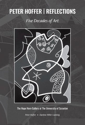
PETER HOFFER | REFLECTIONS Five Decades of Art
Peter Hoffer
T
Darlene Miller-Lanning
The Hope Horn Gallery at The University of Scranton October 19 through November 20, 2026
Peter Hoffer. Red Letter Day. Block print on paper. 24 x 18 inches.
| ii |
CONTENTS
|2| Acknowledgements Darlene Miller-Lanning
|5| Reflections: Fifty Years of Art Peter Hoffer
|9| A Portfolio: Five Decades of Selected Paintings, Prints, and Collages Peter Hoffer
| 44 | Abstracting: Parts and Process Peter Hoffer
| 47 | An Overview of Exhibitions Peter Hoffer
| 1 |
ACKNOWLEDGEMENTS
As an artist and educator, Peter Hoffer has been a steadfast figure in the cultural community of Scranton, Pennsylvania for the past fifty years. During this time, Hoffer has exhibited dozens of paintings, prints and collages in national and regional exhibitions. He has also trained hundreds of students—including me—through foundations and printmaking courses at Marywood University. In a career marked by continuity and innovation, Hoffer is versatile and prolific in his accomplishments. Like his long-lived forebears Matisse and Picasso, with whom he shares an affinity for line, color, paper, and prints, he is quickwitted and hard-working. Synthesizing elements of Surrealism, Abstract Expressionism, Minimalism, and Pop Art in his practice, Hoffer skillfully balances spontaneous energy and technical precision in his oeuvre. It is a privilege to collaborate with him on this project. Many individuals have assisted us in the production of this exhibition and its accompanying catalog. We are grateful to Kathleen Hoffer and Paula Baillie for their assistance in editing texts and assembling images. At The University of Scranton, we thank George Aulisio, Ph.D., Dean, Weinberg Memorial Library; Colleen Carter, Director of Creative and Production Services; Jason Thorne, Senior Graphic Designer; and Kayley LeFaiver, Freelance Designer; for their expertise. This project is also supported in part by grants from the armature initiative of the Northeast Educational Intermediate Unit 19.
Darlene Miller-Lanning, Ph.D. Director, Hope Horn Gallery The University of Scranton
| 2 |
Peter Hoffer. Summer Plants. Mixed media watercolor on paper. 23 x 17 inches.
| 3 |
Peter Hoffer. On Advice. Letterpress and copper engraving on handmade paper. 10 1/2 x 8 inches.
| 4 |
REFLECTIONS: FIFTY YEARS OF ART | Peter Hoffer
In writing this essay my intention is to share some of the experiences leading to and guiding my journey as an artist and educator. Much of my early work such as the black and white linocut Oregon Summer is figurative, based on a recognizable subject, whereas my later work, including Red Letter Day or Mediterranean Mix is more abstract, and in some cases, entirely non-representational. However, dating my work by style alone may be difficult due to my shifting back and forth between approaches. For example, in the early 1970s I did a series of representational linocuts to which Oregon Summer belongs. In the mid 1990s there was a series of abstractions that includes Red Letter Day. In the 1980s, between those decades, I made a series of realistic color pencil drawings. These can be thought of as mini-bodies of work, as are the recent Twelve by Twelve Series on view. As in most art, a meaning or message in the work remains for you the viewer to discern and appreciate. My father, a writer, recognized my talent for art at a young age and encouraged my efforts. My mother was also supportive and expressed her creativity in her professional life and business, referring to her work as her metier or “calling.” Both my parents had attended college in Pennsylvania, my father graduating from Lafayette College in Easton in 1932 and my mother from Cedar Crest College in Allentown in 1934. Soon after my mother’s graduation they moved to New York City, New York to begin work––my father in advertising and my mother in merchandising––perhaps a bold move in the heart of The Great Depression! They stayed a few years in the city until moving to York, Pennsylvania where my mother’s parents were living. In York my mother started a small business selling fabric and provided custom sewing and attire. From that modest beginning the shop grew over fifty years into a highly regarded women’s ready-to-wear boutique, keeping its original name, Alice Hoffer’s Fabric Shop. During this time my father worked in various advertising and public relations jobs but struggled to find his footing. When I was fourteen my parents parted ways and both eventually remarried. Our home was filled with books, including copies of the New York Times, and the New Yorker Magazine. I was attracted to the New Yorker’s cartoons, but understandably, as a youngster, was not much interested in the writing. Classical music often resounded throughout the house on Sunday afternoons opening that world to me. Being well educated and artistically inclined, my parents were part of a group of like-minded friends. They entertained and socialized with creative types and impressed me as genuine and respectful of others regardless of social position. From my parents I gained a sense of independence, confidence, and openness. Although by no means affluent, my parents provided a comfortable upbringing and a pragmatic attitude towards living. Also nurturing my budding creative instincts was my interest in jazz and learning to play the drums. The spontaneity and improvisation inherent in jazz carried over to my later practice of art. In 1962 I arrived in Washington, D.C. at George Washington University and found myself next in line for freshman registration. Required to declare a major I chose art, a rather spontaneous decision I had only vaguely considered. Unknowingly, I had then set my course, not anticipating it would take several years of struggle and indecision to embrace and trust in my initial declaration. At GW my primary studio area of interest was printmaking, as I found its many processes and applications to my liking. During this time, I was attempting to make up lost ground in terms of my knowledge of art history. In addition to my art history courses, I was visiting galleries, museums, and some artists’ studios, including ones associated with the Washington Color School that was beginning to gain national attention. In the mid 1960s the New York School of Abstract Expressionism was losing favor, apparently giving way to Pop Art and representational trends. Spearheaded by Andy Warhol and others Pop Art was making a big splash. I was somewhat cynical about this new rage that seemed to me purely commercial. The public for too long had been put off by the work of Mark Rothko, Franz Kline, Jackson Pollock, Hans Hoffman and other abstractionists, dismissing it as impenetrable and lacking authenticity. I knew better than to dismiss Pop Art entirely and appreciated its graphic qualities, content to view it from the sidelines. Up until this time my interests ranged from representational work to abstraction, from Andrew Wyeth to Hans Hoffman, but leaning toward the figurative.
| 5 |
Toward the end of my third year my enthusiasm must have been apparent to my instructors. The Art Department Chairperson or other faculty encouraged me to take on art related activities, on and off campus. One of note was teaching in an Arts and Crafts program at Fort Belvoir, Virginia, an Army Base near Washington, D.C. That experience was surprisingly positive and boosted my confidence. Another was when I was tasked with making a drawing for a medallion on site at Mt. Vernon in Virginia. Nearing my final year at GW, things dramatically fell in place. In my senior year the Chairperson asked me to start an Art Club and preside over it. Being open to these assignments and carrying them out strengthened my sense of purpose and direction. In my final semester at GW and pondering my future, I was encouraged by the Chairperson, a practicing architect and art historian, to apply to Cranbrook Academy of Art in Bloomfield Hills, Michigan for graduate study, and doing so, was accepted That summer prior to entering Cranbrook I had the opportunity to spend some time on Monhegan Island, Maine, twelve miles off the coast of Portland. The island is a well-known artists’ community. My uncle, Eugene K. Twining, owned a house on the island and from an early age I visited him. Beginning in the late nineteenth century Monhegan became a popular destination for artists. This special and unique island is where my eyes first opened to the world of painters. Among many notable artists linked to Monhegan are George Bellows, Robert Henri, Edward Hopper, Rockwell Kent, and Fairfield Porter, as well as Andrew and Jamie Wyeth. Leo Meissner was among the artists I met on the island. Meissner was raised near Detroit, Michigan, and wanted to attend Cranbrook but was never given the chance. A versatile artist and exceptional wood engraver, his prints often depict Monhegan subjects and themes. It was a privilege to know him, and he generously imparted knowledge and encouragement. Another noted painter on the island I was able to spend time with was my uncle’s friend and neighbor Hans Moller and his wife Helen. As with most artist friends of my uncle, I found Hans to be warm and interesting. One day on Monhegan I was in the company of my uncle and his friend the painter Morris Schulman. My uncle asked Morris what I might do with an MFA degree and without hesitation he said, “He could teach at the college level,” an answer apparently satisfying my uncle’s curiosity and meeting his approval. As an afterthought, Morris casually mentioned, “He should also marry a teacher,” advice likely prompted by his memory of The Great Depression. Without regrets, the irony is I DID become a college professor and I DID marry a teacher. Visiting Monhegan that summer was perfect timing for me. Having just completed undergraduate studies and feeling upbeat about my next steps, the ambience of Monhegan and the company of practicing artists put me in the right frame of mind for what lay ahead. My stepfather, Clair R. Batigne and his family, also significantly impacted my future pursuit of art. His family, prominent figures in French art circles, had an important connection to Vallauris, France. A small town a few miles north of Cannes, Vallauris has historic significance as a pottery center dating back to the ancient Romans, an area where the clay and abundant pine forests facilitated the manufacture of utilitarian ware that was shipped throughout the Mediterranean. My stepfather had been involved in activities with Pablo Picasso who had settled in Vallauris in the late 1940s to pursue an interest in pottery. Clair and his parents, René and Claire, were associates and friends of Picasso and collaborated with him on numerous Vallauris projects and activities. The Batignes owned and operated Tapis Vert (Green Lawn), a pottery atelier catering primarily to artists by providing a workshop to explore their art through the medium of clay. René directed the Vallauris Museum and Claire, herself a potter, facilitated day-to-day studio activities. Because of the Batignes’ connections and standing, many well-known artists came to Tapis Vert for extended stays. Among them were Amédée Ozenfant, Jean-Claude Mayodon, Anton Prinner, Ludwig Bemelmans, and Marcel Vertes. My stepfather was an accomplished photographer and was often present in Vallauris during Picasso’s tenure. Clair photographed and documented Picasso’s work and the artist’s activities in Vallauris, including his visits to Tapis Vert. Through my teenage and college years I became increasingly interested in learning more about Tapis Vert, Vallauris, and Picasso’s extraordinary influence on the town. Occasionally René and Claire visited our home in York for extended stays and one summer, while I was home from college, Clair’s parents were visiting. Clair and René were engrossed in completing a book written by René recalling the Batignes’ experiences with Picasso in Vallauris. I was able to help out in small ways and my involvement in the project further piqued my interest in Picasso, in particular his work in clay and printmaking. René’s book never found a publisher, but years later in 1992 I was able to take the manuscript inherited from my mother and publish it in a limited edition book. My two years at Cranbrook were transformative. Graduate students were seriously committed to their work and | 6 |
spent many hours in their studios. The program was designed for students to work independently, deciding autonomously their creative pursuits and development. It was an environment that tested one’s work habits and dedication. For most students the regimen was received as a unique privilege and opportunity for intensive and prolonged work, a retreat of sorts unencumbered by the usual daily distractions and issues. Periodic feedback was provided by instructors as they individually determined. Other than pass/fail, the program was devoid of many requirements. One exception was that first year students should spend one day a week in studio areas other than one’s major. I elected to take painting and ceramics as a natural continuation my previous study at GW. In order to meet Michigan’s requirements for graduation students also took two academic courses, one in Art History and one in Aesthetics. Every faculty member was a practicing artist, some of whom were Cranbrook graduates and prominent in their fields such as Richard Devore in ceramics and Julius Schmidt in sculpture. My instructor in Printmaking was Lawrence Barker, a Cranbrook graduate, who is recognized for his paper art and his contribution to the renaissance of handmade paper and its fine art applications. The majority of students lived on campus in dorms with room and board provided. Getting around was easy, a short walk from dorm to studio to dining room. Required studio hours were 9-12 and 1-5 but in the evenings most students returned to their studios. Despite being in a community of like-minded peers, the environment could feel secluded, demanding introspection and self-appraisal. Weekends were often given to blowing off steam in spontaneous gatherings on and off campus, no surprise! This was the late 1960s, a time of anti-establishment youth rebellion, war protests, and civil rights riots. Despite this unrest and uncertainty, we directed our energy and attention to making art. In Printmaking I was introduced to setting metal type (foundry type) by hand. The studio maintained a reasonable selection of fonts and housed an old style platen hand press. In addition, there was the recently installed paper mill for the production of handmade rag paper. Barker was perhaps the first to set up a mill at an institution of higher learning and is today considered a major pioneer in the renaissance of handmade paper. All of us paired up to spend two weeks making sheets of various kinds and sizes. On exhibit is a broadside I designed and printed titled RAGS, using paper I made almost sixty years ago at Cranbrook. Rag paper, being ph neutral and without acidity and presumably containing no other additives, will last for centuries if stored properly. Witness old books made during Gutenberg’s time (1450s) and after until the advent of wood pulp based paper (1840s) containing corrosive additives. After Cranbrook I returned to York and secured a job teaching art in a rural public middle school. My homeroom of seventh grade girls and the forty-minute waves of classes put me in a whole new frame of mind, to say the least! I will never forget the day I showed reproductions of art including Piet Mondrian’s painting Broadway Boogie Woogie, a title that my students found hilarious. Teaching art to children that age was often amusing despite its challenges. After that year of teaching, I stayed in York and purchased a small printing press to set up a studio on an upper floor of my mother’s shop. I had enough saved from teaching to continue a modest lifestyle while also intermittently working various jobs to help cover expenses. One job was at an engraving company doing pasteups, preparing art by hand to reproduce metal plates for commercial printing, a method now essentially obsolete. The harmful etchant fumes permeated the establishment and after a few months of boredom and toxicity it was best to take my leave. However, I left with some knowledge and skill about preparing art for reproduction, as well as two functioning lungs. Another art related job spanning a longer period of time was my employment at a construction company that manufactured prefab metal buildings. The title given me was “marketing coordinator,” a newly created position that I presumably might grow into and develop. My work mostly involved doing photography and illustration for marketing purposes. I will never forget the day I spent the better part of an afternoon brainstorming with a vice president to name a new concrete wall product. I believe CarewConWall was one of the contenders. The owner of the business was a gentleman I greatly admired, but at some point, he rightfully questioned me about my intentions and commitment to the company. It was another wakeup call that was needed and I soon left the position to find a better fit. Meanwhile, having saved enough to bankroll more studio time, I enjoyed several productive months making art. During this hiatus I was asked to teach an evening printmaking class at The York Academy of Arts, a school geared to commercial art and illustration. The class attracted an enthusiastic group of adults which culminated with my organizing a group show of their work at Penn State, York Campus. One of my students at The York Academy of Arts was employed at The State Museum of Pennsylvania in Harrisburg and referred me to John Kucera, a private contractor who was installing a permanent Native American exhibit at the museum that included dioramas, paintings, a burial site, and habitats of the Lenape Indians of the Susquehanna River | 7 |
corridor. It was my good fortune to be hired by John, a sculptor and all round technical wizard. Our team made several field trips to archaeological sites around Pennsylvania, gathering specimens and materials for exhibit. Working as an “independent contractor” for the museum suited me. A highlight was casting on site molds of a cliff overhang for a Lenape shelter re-creation and also casting tree bark to construct a Native summer round house and a winter longhouse. While working at the museum, John asked me to tackle a new assignment involving painting two diorama backdrops of African scenes housed at The Vanderbilt Museum in Centerport, Long Island, New York. It was a long haul to get out there and back, so while there I was determined to get as much accomplished as possible. I painted the backdrops in accelerated time spending twelve hours or more a day working alone and lodging on the grounds. I was surprised how much was accomplished in a few weeks and gratified with the outcome. Had not a late summer visit to Marywood University in Scranton, Pennsylvania resulted in a job offer I may have looked for more work in the museum exhibits field. Recently married and with summer drawing to a close, I had already been in search of a college level teaching position. Marywood, with time ticking, had recently opened an entry level position for fall term in the Art Department. In my initial letter of interest to Marywood the Cranbrook name had prompted, as I later learned, an invitation to visit the school. Taking the job at Marywood presented a new adventure and challenges. I had little idea about the baptism of courses to be assigned to me during my beginning years. In addition to printmaking, I taught numerous other courses that included design, intro to drawing, figure drawing, and advertising graphics. Later I taught courses in fashion illustration, typography, history of graphic art, and others. The beneficial thing for me about this course load was the increased knowledge I gained through preparation and teaching. My involvement in other related art disciplines, especially those incorporating typography and graphic design, enhanced my ability to deliver better content to printmaking students while enriching my own art. During my early years duties also included serving as Assistant and Interim Chairperson and directing Marywood’s Suraci Gallery of Art. As the department grew and more specialist faculty came on board, I was eventually able to concentrate more fully on printmaking and directing the Foundation Year program. After six years at Marywood I was granted a one semester sabbatical for study at Rochester Institute of Technology in Rochester, New York. At RIT I was able to take classes in both the School of Printing and the Fine Arts Program. Courses taken in the School of Printing supported the classes in graphic design I taught and the classes in the Art Department enhanced my teaching of printmaking. When I attended the School methods predating the general use of computers were still taught, making my study still relevant to the hands-on work applied in commercial printing. Also available to me on campus at RIT was The Wallace Library housing The Cary Graphic Arts Collection of fine books. Access to the collection allowed me to study fine printing and bookmaking, a growing interest of mine. I was also fortunate while there to arrange a showing of my prints on campus at the Wallace Library. To say I am fortunate and grateful for my life and career in art is definitely an understatement. I was born at a time when the country was on its way to winning World War II and to soon be blessed with a long period of unprecedented growth, prosperity, and an expanding middle class. I was raised in a more positive, peaceful and hands-on analog world. With respect to a livelihood, I was able to heed my grandfather’s counsel to find and pursue my passion, no doubt a more challenging ambition for students today. I was fortunate to attain my degrees and put them to use at Marywood University, with its tradition of appreciation and promotion of the arts. It was a privilege to work with gifted colleagues and friends in building a strong and respected art program. I should also mention the benefit of being part of a vibrant local art network as well as a wider diverse and welcoming community. The many talented regional artists and respected institutions they represent has been inspiring. As I pass through and beyond the trepidation of this new digital age, I can only hope intelligence will prevail in this dubious land of the artificial. Whatever the future of artificial intelligence, I’m fairly confident artists will need to continue using their hands and hearts to make art. As the saying goes, “You gotta have art.”
| 8 |
A PORTFOLIO: FIVE DECADES OF SELECTED PAINTINGS, PRINTS, AND COLLAGES | Peter Hoffer
Peter Hoffer. Boy in Sweater. Serigraph on paper. 16 ½ x 10 ½ inches.
| 9 |
Peter Hoffer. Blues Profile. Linocut on paper. 10 x 7 inches.
| 10 |
Peter Hoffer. Bus Stop. Linocut on handmade paper. 7 ½ x 16 ½ inches.
Peter Hoffer. Animal and Moon. Collograph on handmade paper. 13 x 17 inches.
| 11 |
Peter Hoffer. Turn of the Century. Wood engraving on paper. 9 x 6 inches.
| 12 |
Peter Hoffer. Oregon Summer. Linocut on paper. 10 x 15 ½ inches.
Peter Hoffer. Iowa. Linocut on paper. 10 x 15 inches.
| 13 |
Peter Hoffer. The Marriage of Tom Thumb. Pencil on paper. 24 x 18 inches.
| 14 |
Peter Hoffer. Face at 315. Color pencil on paper. 19 x 24 inches.
Peter Hoffer. Twelve by Twelve Series: 1–2. Paper collage on board. 12 x 12 inches.
| 15 |
Peter Hoffer. Queen. Acrylic on canvas. 24 x 30 inches.
Peter Hoffer. Twelve by Twelve Series: 3–4. Paper collage on board. 12 x 12 inches.
| 16 |
Peter Hoffer. King. Acrylic on canvas. 30 x 24 inches.
| 17 |
Peter Hoffer. Prairie Wind. Collage on paper. 27 x 17 inches.
| 18 |
Peter Hoffer. Shaman. Mixed media on canvas. 28 x 22 inches.
| 19 |
Peter Hoffer. City Blocks. Cut paper on paper. 23 x 16 inches.
| 20 |
Peter Hoffer. Watchful Eye. Block print on paper. 22 ¾ x 18 inches.
| 21 |
Peter Hoffer. Eagle and Owl. Block print on paper. 24 x 18 inches.
| 22 |
Peter Hoffer. Sentinel Two. Relief print on paper. 24 x 36 inches.
Peter Hoffer. Desert Song. Block print on paper. 18 x 24 inches.
| 23 |
Peter Hoffer. Night Fishing. Block print on paper. 18 x 24 inches.
Peter Hoffer. Full Flight. Block print on paper. 24 x 36 inches.
| 24 |
Peter Hoffer. Eyes Have It. Block print on paper. 24 x 18 inches.
| 25 |
Peter Hoffer. Clyfford Still Runs Deep. Collage on paper. 20 x 16 ¼ inches.
| 26 |
Peter Hoffer. Chicago. Collage on paper. 23 x 15 inches.
| 27 |
Peter Hoffer. Dinobird. Collage with drawing on paper. 24 x 19 inches.
| 28 |
Peter Hoffer. Aardvark. Cut paper on paper. 21 ½ x 15 ¼ inches.
| 29 |
Peter Hoffer. Mediterranean Mix. Collage on paper. 19 x 14 ½ inches.
| 30 |
Peter Hoffer. Twelve by Twelve Series: 5–8. Paper collage on board. 12 x 12 inches.
| 31 |
Peter Hoffer. Red Route. Mixed media painting on board. 32 x 24 inches.
| 32 |
Peter Hoffer. Twelve by Twelve Series: 9–12. Paper collage on board. 12 x 12 inches.
| 33 |
Peter Hoffer. Mirror. Collage on paper. 21 x 14 ½ inches.
| 34 |
Peter Hoffer. Twelve by Twelve Series: 13–16. Paper collage on board. 12 x 12 inches.
| 35 |
Peter Hoffer. Summer Dream. Mixed media on paper. 21 x 13 ½ inches.
| 36 |
Peter Hoffer. Thelonious Monk. Paper on board. 18 x 18 inches.
Peter Hoffer. Dizzy Gillespie. Paper on board. 18 x 18 inches.
| 37 |
Peter Hoffer. Deep Water. Mixed media painting on board. 24 x 24 inches.
| 38 |
Peter Hoffer. Wave. Collage on paper. 20 ¾ x 16 ¾ inches.
| 39 |
Peter Hoffer. Boogie Woogie Series: I. Cut paper on board. 23 ½ x 17 ½ inches.
| 40 |
Peter Hoffer. Boogie Woogie Series: II. Cut paper on board. 23 ½ x 17 ½ inches.
| 41 |
Peter Hoffer. Boogie Woogie Series: III. Cut paper on board. 23 ½ x 17 ½ inches.
| 42 |
Peter Hoffer. Boogie Woogie Series: IV. Cut paper on board. 23 ½ x 17 ½ inches.
| 43 |
ABSTRACTING: PARTS AND PROCESS | Peter Hoffer
In every acquisition there is an equivalent loss. That is the law of compensation. – Georges Braque It has been said that all artists’ imagery is abstract, no matter how representational it appears. All imagery, if done conscientiously and with understanding, is both objective and subjective. While an objective reason for making art should be clear to the artist, a subjective element of personal experience inevitably enters the work. Early in my career, I produced representational drawings and prints, yet many of my later prints and collages may be described as abstract or non-objective. Useful markers of style and appearance at best, these terms reveal little about intent and purpose. Beginning a new work is setting out on a journey without a chartered destination. The intention is to elicit (or abstract) an impulse, feeling, or idea that engages and guides one forward to a focused conclusion. It is a process of invention and trust. The journey and image will end, often with satisfaction and occasionally with true delight. Regardless, other routes remain to be explored, locating and connecting pins on an ever-expanding map. This process of creating on different levels of awareness engages me most. By taking existing fragments, or making them, I seek to fashion a unified whole. When the path and outcome is especially good, this quality of discovery and surprise intrigues and at times mystifies me. What this conveys to the viewer is another matter. When asked how he gauged the merits of his art, Picasso answered, “they will judge,” suggesting that such evaluation was out of his hands. Picasso also remarked, “I do not seek, I find.” This state of mind has increasingly resonated with me as I pursue my work. When making prints depicting representational subject matter, having a preliminary drawing for transfer or reference is helpful. Because my early work was mostly representational, preparing a study was my usual practice in making woodcuts, etchings, and lithographs. During my senior year of college I took a course in silk screen printing, then known as serigraphy. This stencil process, more direct and spontaneous than other printmaking methods, opened a new avenue of expression for me, and I explored printing multi-color editions without making preliminary sketches or designs. Screen printing also offered the advantage of working with a positive, right-reading image rather than the mirror image consistent with other processes. I also experimented with non-representational images, working freely from one stencil to the next, allowing a composition to unfold in a more flowing and organic way. After starting my graduate studies, I continued wavering between representational and abstract approaches but carried with me the lessons I learned in serigraphy, applying a new freedom to my work. The development of a print can be seen in a series of trial (test) impressions or “states” from start to finish, known as progression proofs. These are distinct parts that illuminate process. In painting, collage, or the two in combination, there is no record of the progression to the final composition. Conceivably, a video could be made of the whole process, or periodic steps could be photographed, but that is not a physical record as are printed states. A painting or collage may go through innumerable permutations, but what is changed or covered over cannot be retrieved. The process can be viewed as one of addition until there is nothing left to subtract. From mid-career to present, much of my work has been made using traditional collage techniques. The term collage is a derivation of the French verb coller, meaning “to glue,” and is now used as both noun (finished work) and verb (to glue or to collage). Collage began well before the 1900s as a process of arranging and gluing paper ephemera––fragments or scraps taken from photographs, newspapers, magazines, and other similar printed matter––into a cohesive work of art mounted on canvas, board, or heavy paper. After working mostly with paper in the early 1900s, Picasso, Braque, and others, began incorporating various found elements into their paintings. Today, collage as a term is loosely understood and applied in a variety of ways, but among its shared aspects are still the use of glue and the assembly of parts. With a few exceptions, the elements or images I use are ones I have made, usually parts of trial (test) prints or unwanted impressions. In other instances, discarded prints are combined with acrylic pigment, modeling paste, pencils, color tissue papers, and other materials to create a collage-like effect. If a finished composition has enough painterly qualities using acrylics or other pigments, I consider the work a painting. This is where distinctions may be tricky. Is the | 44 |
Peter Hoffer. A Fuller Brush. Linocut from the book Between Mirror and Past. 7 x 6 inches.
work a collage with painted parts or is it a painting with collaged parts? Probably that question would not have troubled Braque or Picasso, nor their followers. I suspect what they thought about was how the viewer perceived the work, not how it was made. And surely they were delighted in their ground-breaking antics, taking this and that and combining these in quixotic and amusing ways. To begin a new collage-related work I start with simple arrangements of papers of various shapes, textures, and colors. I have no preconceived image in mind, trying different configurations that will eventually lead to a more defined composition. At times I will immediately start gluing, painting, masking, scraping, and the like, and building on that a sort of narrative or idea may emerge, pointing to a finish line, as it were. Completion does not mean resolution. Many times, seeing work anew and dissatisfied, I take it up again, or perhaps better said, take it on again. I often regret this because I end up with something inferior to what I already had. As the saying goes, perfection is the enemy of the good. Although resolving a composition is rarely easy, there are those instances when all is smooth sailing, the work seeming to complete itself in a blend of the conscious and subconscious. Inventing a world for escape, for surprise, for discovery–– this is the promise that calls me back and prompts me forward. “And that’s the way it is.” | 45 |
Peter Hoffer. Rags. Hand-set type on handmade paper. 18 3/4 x 14 1/4 inches.
| 46 |
AN OVERVIEW OF EXHIBITIONS | Peter Hoffer PETER T. HOFFER Professor Emeritus. Marywood University, Scranton, Pennsylvania. EDUCATION B.A. in Art. George Washington University, Washington, D.C. M.F.A. in Printmaking. Cranbrook Academy of Art, Bloomfield Hills, Michigan. Sabbatical Study. Rochester Institute of Technology, Rochester, New York. SELECTED EXHIBITION HISTORY * indicates two or more exhibits at same venue. One Person Exhibitions Jerry Gilden Galleries. Baltimore, Maryland. Marion Court Gallery. Lancaster, Pennsylvania. Parliament Galleries. Allentown, Pennsylvania. Jewish Community Center. Scranton, Pennsylvania. William Ries Gallery. Harrisburg, Pennsylvania. Penn State University, Worthington Campus. Dunmore, Pennsylvania. Penn State University, York Campus. York, Pennsylvania. Three Tenses Gallery. Clarks Summit, Pennsylvania. Hope Horn Gallery, University of Scranton. Scranton, Pennsylvania. Wallace Art Gallery, Rochester Institute of Technology. Rochester, New York. York College Galleries, York College of Pennsylvania. York, Pennsylvania.* Widmann Gallery, Kings College. Wilkes-Barre, Pennsylvania. Marywood University Art Galleries, Marywood University. Scranton, Pennsylvania.* MCS Gallery. Allentown, Pennsylvania. Macdonald Art Gallery, College Misericordia. Dallas, Pennsylvania. Soho Gallery. Scranton, Pennsylvania. Everhart Museum. Scranton, Pennsylvania. Linder Gallery, Keystone College. LaPlume, Pennsylvania. Invitational and Faculty Group Exhibitions Afa Gallery. Scranton, Pennsylvania. Pennsylvania Governor’s Residence. Harrisburg, Pennsylvania. Takasaki Art Center College. Takasaki, Japan. Waverly Community House. Waverly, Pennsylvania.*
| 47 |
Artist’s Cooperative Gallery. Ithaca, New York. Marywood University Art Galleries, Marywood University. Scranton, Pennsylvania.* RVS Fine Art. Southampton, New York. Laura Craig Galleries. Scranton, Pennsylvania. Studio Arts College International. Florence, Italy. Endless Mountain Council of the Arts. Tunkhannock, Pennsylvania.* Wilkes-Barre Fine Arts Fiesta. Wilkes-Barre, Pennsylvania.* Afa Exhibition, Everhart Museum. Scranton, Pennsylvania. Print Guild Annual Exhibition. Marywood University. Scranton, Pennsylvania.* National and Regional Juried Exhibitions Everhart Museum. Scranton, Pennsylvania.* Marywood University Art Galleries, Marywood University. Scranton, Pennsylvania.* Afa Gallery. Scranton, Pennsylvania.* Sawtooth Galleries. Winston-Salem, North Carolina. Maryland Federation of the Arts. Annapolis, Maryland. Smithtown National. Smithtown, New York. Navarro Arts Council. Corsicana, Texas.* Elizabethtown College Art Festival. Elizabethtown, Pennsylvania.* State Museum of Pennsylvania. Harrisburg, Pennsylvania.* Central Pennsylvania Festival of the Arts. State College, Pennsylvania.* Endless Mountains Council of the Arts. Tunkhannock, Pennsylvania.* Arts Association of Harrisburg. Harrisburg, Pennsylvania. Bradley University. Peoria, Illinois. University of Texas. Tyler, Texas. F.M. Kirby Center for the Performing Arts. Wilkes-Barre, Pennsylvania, 2006. PUBLICATIONS NorthEast Magazine. Cover of premier issues and various illustrations. Scranton Jazz Festival. Poster and program cover art. University of Scranton Concert Series. Designs and illustrations for numerous years. The Flavor of Waverly. One of four artists contributing a painting for hardcover history/recipe book. Scanlan’s Poetry Anthology. Design and printing of publication for Mulberry Poets, Scranton, Pennsylvania.
| 48 |
Flights. Design and printing of poetry book including work of four local poets. Featuring work by Marywood professors and authors Peter Hoffer and Barbara Hoffman. Metro Magazine. Feature article, “Development of Printmaking.” In cooperation with printmaking survey exhibition at Keystone College, La Plume, Pennsylvania. Between Mirror and Past. Illustrated artist book of poems. Designed, printed, and published by Peter Hoffer, Twin Pines Press, Waverly, Pennsylvania. Picasso at Vallauris. Book documenting the artist’s pottery production from 1948 to 1958. Designed, printed, and published by Peter Hoffer, Twin Pines Press, Waverly, Pennsylvania. The Art of Peter Hoffer. A Retrospective. Full color book of 62 pages surveying over 40 years of drawings, prints, books, posters, and paintings. Designed, printed, and published by Peter Hoffer, Twin Pines Press, Waverly, Pennsylvania.
Peter Hoffer and Darlene Miller-Lanning. Collaborative Electronic Reconstruction. Digital image from paper on board. 12 x 12 inches original format.
| 49 |
Front Cover: Peter Hoffer. Red Letter Day. Block print on paper. 24 x 18 inches.
Back Cover: Peter Hoffer. Boogie Woogie Series: 4. Cut paper on board. 23 ½ x 17 ½ inches.