3 minute read
Hot interior design


CORE VALUES
Now’s the time to think about your home’s decor
Advertisement
They say a change is as good as a rest. And although there will be no respite when it comes to actually getting down to do it, there can be no doubt that, once finished, a home makeover is good for the soul.
The dilemma is whether to follow the herd and opt for the latest fashion, knowing next year you’ll be out of date and will need to do it again. Or opt for comfort and personality, with the emphasis on longevity.
Therefore, it won’t be a surprise to learn there are wildly differing schools of thought when it comes to this year’s summer trends.
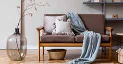
The first is all about comfort and nostalgia, and has been dubbed Cottagecore, because we can’t live without labels. This is a romantic interpretation of simplistic rural life with splashes of glamour – granny chic meets rustic vogue, according to the influencers – with muted, pastel tones offset by statement gold accessories and vintage-style wallpaper. As for furnishings, it’s traditional-shaped sofas with the accent on curves, rather than angular edges, and deep cushions, large footstools and statement lighting.
Plus full-length curtains on wooden poles, something of a throwback to the Eighties.
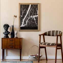
In the opposite corner is Japandi, a blending of the modern, pared back and functional Japanese and Scandinavian styles with simple shapes, rattan and natural wood dominant. Stoneware and ceramics are particularly important with bold, abstract prints on plain grey or white walls adding splashes of colour.
Boucle – a tactile fabric popular in the Fifties and now fashionable again -
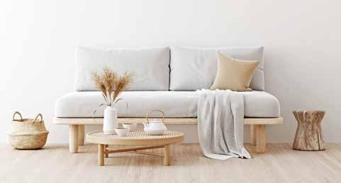
adds texture and softness to upholstery while, instead of flowers in vases, replace blooms with elegant grasses. Similarly, tall vivid green houseplants, such as palms, weeping figs or yuccas are also suitably eye-catching.
As for paint, Dulux’s colour of the year is Brave Ground, a warm natural tone which is the perfect backdrop for sage green - which is expected to be particularly popular in kitchens – as well as pale pinks. Earth colours are said to give us courage to embrace change, so if you’re having a radical rethink, at least it will give you confidence to carry on!
Industry-standard Pantone, on the other hand, went for two shades: Illuminating – a bright yellow – and The Ultimate Grey – a soft neutral – which, when combined, present a warming and optimistic colour scheme certain to lift spirits, and both are equally appealing when used on feature walls or in alcoves. Last year’s colour, Classic Blue, still remains relevant, however, and along with burnt orange, provides a welcoming feel to sitting rooms and snugs alike.
Alternatively, muted colours with folksy and characterful prints creates a modern vibe to brighten a window wall. Less is more seems to be the key phrase when it comes to furniture, particularly if you are after a vintage look. Antique, repurposed or salvaged pieces all have their place, but the key is to provide plenty of contrast and that can only come gradually. Interior designers say it’s a look which needs layering so a few rich fabrics and statement lighting will help retain a modern note until the look is complete.
Some pieces, such as bookcases or cabinets, are useful for displaying ornaments and sentimental objects, but are not as effective as floating shelves, particularly if they are tiered. Being at home more over the last year has made us look at what we have, and treasure them accordingly, while there is something therapeutic about choosing favourite items, moving them around into different patterns and orders.
Plus, they will look good as a backdrop to your next Zoom call from the homeworking space you have managed to create behind that little bit of wall that juts out in your not-so-regularly shaped living room, which you’ve never worked out what to do with. You can zone the different areas with rugs, artwork lighting or plants and even paint the wall a slightly darker shade to the rest of the room just to give it the feel of a separate area.
Boucle – a tactile fabric popular in the Fifties and now fashionable again - adds texture and softness to upholstery