
8 minute read
INTERIOR


BEING COURAGEOUS WITH COLOR
By Tammee Greer Courtesy photos
SSpring represents new beginnings. Birds begin to emerge displaying all their brilliant colors. Bulbs push their way through the soil growing into beautiful flowers exhibiting all the colors of the rainbow. Seeds that have been planted become the unique flowers and plants of every hue of yellow, blue, and red.
As nature sprouts forth each spring with its vibrant array of colors all around us, it is natural to want to bring the beautiful colors of nature into our lives be it the exterior paint on our homes or the interior of our private domains. We bring the colors of nature into our homes even in the simplest of ways, such as bringing flowers inside from our yards.
Colors influence our moods. They can make us feel happy, excited, calm, angry or sad. Colors we choose for our wardrobe can make us feel beautiful or handsome. They represent our personalities to guests in our homes. Picking a color for a new car brings an added element of excitement too. The right hues in our surrounding spaces invite the senses of calmness and serenity.
It is easy to be reminded of spring when the cutest woodland residents of the outdoors reintroduce themselves. We want to replicate the soft pink of a bunny’s nose on the wall of our daughter’s room.
It used to be if we asked for pink paint, it was simply pink. It is not that way anymore. Now we are asked what shade of pink we
want? In the Clark and Kensington booklet of kid-friendly shades for kids’ rooms, found at Child’s Building Supply, there are different shades of pink titled Little Princess, Bunny Slippers, Kinda Sweet and Tutu Cute.
Amazingly, gray appears to be popular this year. In fact, Noah McFarland, a salesman at Sherwin Williams in Orange, states they cannot mix enough of Repose Gray.
Although, gray, being a neutral color, to some of us equals boring, the challenge would be what could we pair with it to cause our eyes to witness an explosion of vibrancy?
Pantone Color Institute advises as to the color of the year. The institute represents colors in the fashion world but can jump over to other categories as well. In 2020, Pantone’s color of the year was Classic Blue. This year it is two different colors, Ultimate Gray, and Illusion. Illusion is a gorgeous shade of yellow. Ah! Yellow, the color of the sun.
Behr Marquee One Coat in Back to nature, available at The Home Depot is considered the color of the year. Matching it up with Child’s Hardware’s Magnolia Home’s Soft Linen, Lit Candles and Sour Apple can create a warm and comforting space
YOU BRING YOUR IDEAS.
WE’LL SUPPLY THE GREAT RATE.

Purchase the perfect location for your future home with as little as 10% down!
LAND LOANS Rates as low as 4.75% APR* Borrow up to 80% of your home’s market value, less any outstanding liens with
no closing costs** .
HOME EQUITY LOANS Rates as low as 2.50% APR**
409.988.1300
Apply today at SabineFCU.org
*APR indicates annual percentage rate. Monthly payment amount approximately $18.76 on $1,000 for 60 months at 4.75% APR. Rates are subject to change without notice. Real estate loans available to qualified members only. Contact the credit union for complete details. ** APR indicates annual percentage rate. Monthly payment amount approximately $17.75 on $1,000 for 60 months at 2.5% APR. Taxes and insurance premiums are not included in the payment example. Rates are subject to change without notice. Real estate loans available to qualified members only and home equity loans are available for Texas property only. No closing costs on loan amounts below title insurance and regulatory appraisal thresholds unless an appraisal is requested. Offer valid on qualifying home equity loans of $25,000 or more in new money. Contact the credit union for complete details.
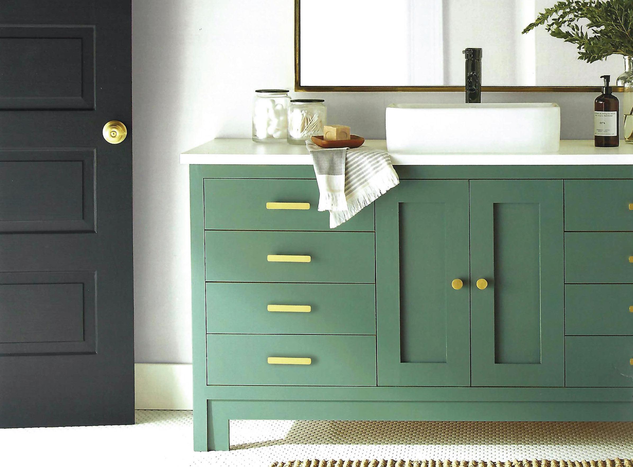
Selecting colors to can call for several colors such as walls in Shiplap, trim in True White, door in Fine Black and the vanity in Demo Day all from Magnolia Home found at Child’s Hardware in Orange.
Sheila Umphrey, owner of The Decorating Depot in Port Arthur, confirms the gray family has been invited to the party for Spring of 2021. Gray has been the chosen trend color for the past seven years.
Sheila recommended playing around with different shades of gray.
“Gray is dramatic,” Umphrey said. “They’re fun to play with.”
She recommended painting three walls in a room varying shades of gray. Then paint one wall a contrasting color to make a room pop.
Umphrey explained trends in color run for a cycle of seven years. Gray took over as the new neutral color from taupe, which is a mixture of beige and gray with a little bit of pink.
Beige had taken the previous seven-year run before taupe.
Umphrey described what happens in the seven years a chosen trend extends.
She said, the chosen colors each year are “caused by industry”. She suggested using the color magenta as an example for a chosen color trend. She explained the first year would be the color magenta. The next year, a little bit of white or black will be added to it to change the shade up a little more and so on and so on. “The premise behind it is to make you feel like everything you have is outdated so you will go out and buy new accessories,” she went on to say.
There are some other beautiful hues which are popular this year.
“Blue is big this year,” Umphrey said. “Blue goes really good with gray.”
She also mentioned greens were popular too.
Umphrey specifically pointed out, “Spring colors are navies with the peaches, yellows and turquoise.”
When Umphrey asked Dian Stampley, interior designer at The Decorating Depot,
what is the decorating color scheme sought after this year, Dian said, “Navy Blue,” therefore confirming the blues.
Dian gave another great occurrence this year. Black-framed windows are all the rage this year. They add such excitement to a room.
It can be overwhelming choosing what colors of the rainbow we want to encompass our spaces with. It is nice to know there are those trained to assist us when needed.
Sheila Umphrey and Dian Stampley can be found at The Decorating Depot located at 2665 Aero Dr., Suite B, Port Arthur, Texas 77640. The phone number is (409) 7246852.
Since the pandemic began, we have been spending more and more time at home. Therefore, there has been more emphasis on making our home our sanctuary, our happy place. Color has not seemed as important as it is now.
Again, simple names are gone, it is no longer blue, red, or green. Different hues are now given more alluring names that evoke feelings of comfort, bring back memories of scenery or sunsets or remind us of our springtime vegetable and flower gardens.
Another popular paint chain is Magnolia Homes by Joanna Gaines found at Child’s Building Supply, which introduces hues titled Vine Ripened Tomato, Aspen Leaf, Countryside, Celery Seed, and Landscape. The latter four titles being different shades of green we would find outside. Additional soft-toned shades are given names such as Local Greenhouse, In Bloom, Morning Calm, Vibrant Horizon and Rainy Days. Let us not forget Lemony reminding us of fresh-squeezed lemonade. Other beautiful colors are Ella Rose, Cabbage Rose, Pink Lemonade, Freshly Cut Stems and Texas Summer.
Benjamin Moore has a Color Trends 2021 collection of twelve colors, including Rosy Peach, Aegean Teal and Silhouette. On their website www.benjaminmoore.com, they offer a fun experiment to visitors to Color A Room. Explorers can pick their preferred room inside their dwelling, the front door or the exterior and pick their favorite selection of brilliance. Their selection can then be applied in any room they choose with a click to get an idea what their selected preference looks like in the kitchen, bathroom, office, dining room, etc. Since the site offers such versatility, an example can also be applied of every varying color to a front door or the exterior of a house. What an awesome chance to have a visual before buying.
The Home Depot supplies a wall of enchanting beauty choices from Behr for any project we desire. Even though the Behr color card wall has endless possibilities, their color of the year is titled Back to Nature, a beautiful shade of green resembling a hue we would see on select leaves or grasses. Behr also has a catalog of Color Trends 2021 which includes some softer options titled Wishful Green and Seaside Villa to bold options titled Caribe and Euphoric Magenta.
Let us not restrict the vibrant participants of the rainbow to our walls. There are other ingenious ways to incorporate colors using different spaces in our homes. For decades we have been painting furniture to accent areas of our homes. We can add brilliance and surprise by painting a ceiling red or painting the front of stair steps, which is darling in a child’s room with each stair front painted a different color.
A common alternative to add the “pop” factor to our homes would be to paint the door a contrasting, but complimentary color, to the exterior of our home or to the walls in our room. Wooden floors are painted turquoise. Forget about painting behind our kitchen counters and stoves and add colorful various blue backsplashes seen in The Home Depot right now.
There are numerous opportunities to be daring, bold, creative, and courageous with all the splendor of nature God gave us. Magazines, books, websites, and designers are all entities that dictate to us what the colors are for this year or next or for this spring or fall. How about this? We all be courageous and dare to say the spring colors of 2021 are our own individual choices of the endless palette of creation.
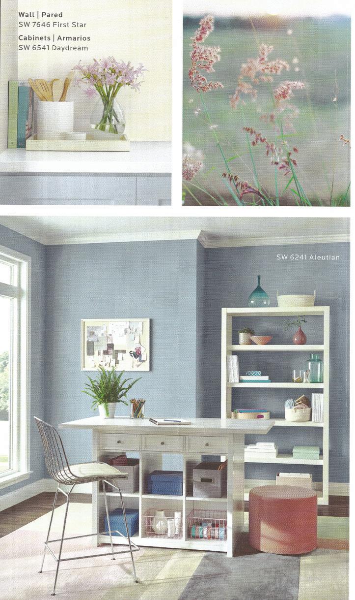
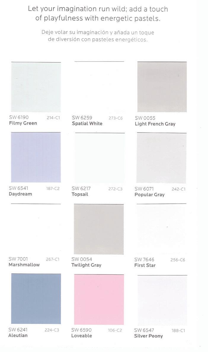
Living Well, found at Sherwin Williams, offers coordinating colors to add more hues to a room.


