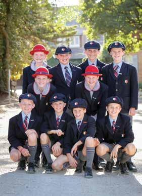
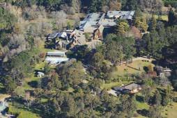
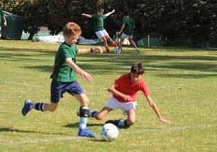
The King’s School is a Christian community that seeks to make an outstanding impact for the good of society through its students, and by the quality of its teaching and leadership in education.
The King’s School Mission Statement
Introduction
Why Branding Matters
Branding is more than advertising and it’s not a logo or a catchphrase. Branding is the entire experience that our Community – prospective families, current families, past families, Old Boys, staff, students and the outside world in general, have with us.
Our brand strategy defines what we stand for, who we are, along with our distinctiveness. While it includes our symbols, colour palettes, mottoes and catchphrases, those are only the creative elements that convey our brand.
Branding is a collective of techniques that come together to generate a social and cultural relevance:
• The narrative that we have that defines our distinctive
• The experiences we offer
• The images we convey
• The messages we deliver vis our advertising campaigns, social media, website, publications
• The way our staff interact with families and potential families
• A family’s disposition to King’s compared to any of our competition
It is universally recognised that for branding to be effective, it must be kept simple.
A guideline such as this for digital and print use of our brand and its elements, will only succeed when we achieve simplicity and clarity.
Our intent is to ensure that we might all be able to understand and use these guidelines to their fullest effect and build recognition of brand of the School in a professional and memorable manner.
What you need to know about using this Style Guide
Effect of this Style Guide
This Style Guide contains the brand architecture and policies that apply to all parts of the School.
In October 2017, Version 1 of the Style Guide was released. Since the release of Version 1, feedback received from the School community, as well as the desire to integrate The King’s School, Tudor House, our Houses, Clubs and Departments, has led to the development of this Style Guide for release in 2019.
Ownership of this Style Guide
The Style Guide is owned by The Council of The King’s School and is managed operationally by the Headmaster or his delegate.
Ongoing exceptions to this Style Guide
Going forward, where the brand policy in this Style Guide cannot be applied or an exception is sought, a request should be sent to the Advancement Office. Depending on the nature of the request, it may be approved as an exception or recommended as an amendment to this Interim Style Guide.
Changes to this Style Guide
Changes to The King’s School brand policies contained in this Style Guide must be approved by the Headmaster or his delegate.
Interpretation of this Style Guide
If you experience difficulty understanding or interpreting the contents of this Style Guide, please contact the Advancement Office.
Phone: 02 9683 8413
Email: marketing@kings.edu.au
Brand Architecture
Brand Matrix
There is a complexity to The King’s School in so much as there are layers of identification to various groups within the School. School Houses, Academic Departments, Sporting Groups, Community Groups, and strong entities like the Cadet Corps, The Future Project and the Foundation all require a brand presence.
School Brand
Campus Brand
Corporate Brand
House Crests
Independent Brands
Sports and Clubs
Endorsed Brands
Other
As an International Baccalaurette School, The King’s School, Preparatory School retains the right to utilise the International Baccalaurette Logo Mark.
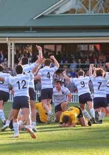
KING’S FOOTBALL
Our Name
The King’s School name encapsulates its history.
The School was founded by command of King William IV of Great Britain. That is why we are called ‘The King’s School’. This is a unique privilege, and one of which the School should be proud. Furthermore, it is a strategic point of difference from all other Schools in Australia.
In typical Australian fashion we have made several diminutives of The King’s School’s name to suit various purposes.
The acknowledged variations of the name and the form they might take include:
The King’s School
When using the School’s name, write it in full (‘The King’s School’) for formal communications.
King’s
‘King’s’ or ‘the School’ may be used for informal communications, or to avoid repetition.
The School
The ‘School’ or ‘King’s’ may be used for informal communications, or to avoid repetition.
The King’s School, Preparatory School
The King’s School, Senior School
The King’s School, Tudor House
When referencing Campuses of the School use: The King’s School, Campus of the approved style.
TKS
This historic abbreviation should not be used in Communications.
K
The use of the King’s ‘K” is limited to identification on clothing, and is predominantly used in the sporting arena.
Our Values
The values of The King’s School are foundational to the life of the School and our community.
They are derived and stand on the teachings of Jesus Christ and God’s Word as revealed in the Bible.
These Christian values are at the centre of the School’s ethos, which means that we will seek to encourage and develop in our students and staff an understanding of the world through the perspective of God’s truth.
A King’s education is not just about a Christian way of understanding. It is also about a Christian way of living.
The values of The King’s School seek to not only inform as to what Biblical truth is, but also inform, invite, and inspire our students to live this way. The King’s School seeks to teach this way of life every day through all that is done and taught. It does this in a setting of a unified community of love and learning between parents, students and teachers.
The story telling and narrative of The King’s School should be derived from our School’s values, mission statement and pillars of excellence.
Excellence
We strive to be excellent for others and ourselves. We do this in order to make an outstanding impact for the good of society. Striving for excellence means seeking to improve and better ourselves, to be always growing. Our striving for excellence is that we may be excellent for the sake of others. Excellence is strongly aligned with a life of compassion, humility, respect, honesty, integrity and responsibility, for it is when we commit ourselves to serve others that we strive to be excellent for others.
Strive for excellence.
Responsibility
We take responsibility for others and ourselves. Responsibility means recognising that we live with others in a shared world. Living and learning in community means taking responsibility for contributing positively and actively to our community and our world. Responsibility for our world means living sustainably. Responsibility is strongly aligned with compassion and integrity, for we reach out with compassion and demonstrate our integrity when we choose to take responsibility for ourselves and others. Take responsibility.
Integrity
We live our lives with integrity. To demonstrate integrity means to live a life that is integrated and balanced, cohesive and coherent. As a community which demonstrates integrity, we are unified and work together for the common good. We are trustworthy and reliable, we follow through with conviction and courage. Integrity is strongly aligned with responsibility and
honesty, for when we are true to ourselves and one another and exercise responsibility, we demonstrate our integrity. Demonstrate integrity.
Compassion
We live to serve one another. Having compassion means caring for others, being kind and gentle. Compassion is stronger than sympathy or empathy, it is much more active and intentional. In a Christian sense, it is going out of one’s way to help others, to be generous towards others, to care for others and stand up for others. Compassion is strongly aligned with humility and responsibility, for it is from an attitude of humility that we choose to take responsibility for others and reach out to them with compassion.
Be compassionate.
Honesty
We are honest. Honesty means being trustworthy, sincere and authentic. We are true to ourselves and one another. We do not mislead or misrepresent each other. As members of our community, our trust for one another depends on our honesty. Honesty is strongly aligned with integrity and respect for it is our commitment to being honest with each other that enables us to be trustworthy and live with integrity and to show respect for one another.
Be honest.
Humility
We do not think more highly of ourselves than we ought. We are human and we share in the humanity of others. Being humble arises from our Christian belief that we are equal in the sight of God because we are all created in His image. Humility is strongly aligned with respect and compassion, for it is when we are humble that we are able to respect one another and are motivated to reach out to others with compassion. Being humble recognises that we are not always right, we get things wrong.
Be humble
Respect
We respect one another and ourselves. Respect involves valuing people and property so that neither is dishonoured. We respect others’ beliefs and points of view. We do not bully or impose our will on others, whether in thought, word or deed. We respect ourselves by adopting a lifestyle that is balanced and promotes wellbeing. Respect is strongly aligned with humility and honesty, for it is when we are committed to the truth and able to recognise we may be wrong, that we are able to show respect.
Show respect.
Visual Identifiers
School Brand
The Arms
The Arms is the primary symbol that identifies the campuses located at Parramatta. It belongs to, and represents, the School, students and staff. The right to use this symbol is a gift to those entitled to use it.
The Arms should therefore be used on Campus communications, sporting and uniform apparel.
ADVERTISING AND PUBLISHING
THE KING’S SCHOOL THE KING’S SCHOOL THE KING’S SCHOOL
THE KING’S SCHOOL
SCHOOL UNIFORM, STATIONERY AND COLLATERAL USE
Usage of the Arms
The Arms is the principle visual identity of the Parramatta Campus.
The King’s School Arms Visual Identifier Rules
• No less than 20mm high.
• The King’s Arms cannot be altered or distorted.
• May only appear in the colours identified in this Guide, reverse white or on an image.
• The King’s Arms cannot be cropped. All elements of the logotype must remain in the frame.
Rules of the Arms Use
• Must not appear smaller than 20mm in height.
• Must not be distorted in any way or appear with a drop shadow.
• Must not be cropped.
To request usage of The Arms visit the Marketing and Communication page on KingsNet.
Campus Brand
Tudor House Rose
The King’s School,Tudor House is now strategically aligned within The King’s School and has been included in the Brand Architecture.
The Tudor Rose remains prominent identifying the campus while drawing close connection to the name of The King’s School.
ADVERTISING AND PUBLISHING
STATIONERY
SCHOOL UNIFORM, MERCHANDISE COLLATERAL USE
Use of the Tudor House Visual Identifier
The visual identifier is the principle visual identity of the School, and this needs to be reflected in its use relative to other visual identities. Principle identification must remain the Arms for all internal communication.
The Tudor House Visual Identifier Rules
• No less than 25mm high.
• The visual identifier cannot be altered or distorted.
• The visual identifier cannot be cropped. All elements of the logo must remain in frame.
To request usage of The Tudor House Rose visit the Marketing and Communication page on KingsNet.
Tudor House Tudor House
Tudor House
THE KING’S SCHOOL
THE KING’S SCHOOL Tudor House
Corporate Brand
The Crown
The Crown is an elegant and appropriate symbol for the broader community of The King’s School. It is a unifying symbol, bringing together all of the campuses, all of the tribes, all of the villages of The King’s School. It serves as a general identifier for King’s where the uniqueness of the Arms, or a Rose, or any other symbol compete for space and meaning.
In instances where two or more subbrands are in use, the Crown must be used.
SECONDARY
For use when the design layout requires a centred logo.
The Crown should be positioned in the top left corner of web pages.
The Crown should be positioned in the bottom right corner of print collateral.
TERTIARY (restricted use)
For use when the design layout requires a centred logo and space is restricted
Should be used in exceptional circumstances and only when design space is restricted.
Use of the Crown
The Crown is the primary identification for all external communication such as marketing and promotion material, advertising, communication, email, digital media, social media, signage and merchandise.
The King’s School Crown Logo Rules
• It may only appear in the colours displayed in this guide or reversed out in white.
• No less than 25mm high.
• The King’s Crown cannot be altered or distorted.
• The King’s Crown cannot be cropped. All elements of the logo must remain in frame.
To request usage of The Crown visit the Marketing and Communication page on KingsNet.
Visual Identifier Size & Clear Space
A minimum size for both visual identifiers is specified. Never reduce to the point where legibility is lost.
Arms Size
The Arms must not appear smaller than 20mm in height.
Crown Size
The Crown must not appear smaller than 15mm in height.
Clear Space
The clear space and safety area around the visual identifier is defined as 25% of the height of the image. In the instance of a 40mm high image, the safety area around the entire image must be at least 10mm.
Incorrect use of Visual Identifiers
The King’s School visual identifiers should not be altered, manipulated or recreated in any way. Please see below for examples of incorrect logo usage.
CREATIVITY CREATIVITY CREATIVITY
CREATIVITY CREATIVITY CREATIVITY
Do not rotate
Do not rotate the visual identifier for any reason.
Do not distort
Do not skew or stretch the visual identifier.
Do not recolour
Do not recolour the visual identifier in any colour except for the approved colour palette colours.
Do not add drop shadows
Do not add a drop shadow to the visual identifier.
Do not add special effects
Do not bevel or emboss the visual identifier.
Do not add a gradient fill
Do not add a gradient fill to the logos.
Austrian Knot (The King’s School Braid)
The Austrian Knot or King’s Braid is a Corporate design element, not a logo. With its strong graphic qualities and history, the Braid has become synonymous with the School.
When to use the Braid
The Braid can be used in King’s Red, Grey and White. (see page 23). It may be used in printed reports, marketing and promotional publications, signage, invitations, programs, advertisements, other informal documentation, online and social media, and Power Point presentations.
Examples of usage can be found on business cards (p28, teardrop banners (p46) and roller banners (p47)
Rules of Usage
• The braid should be used as a design element and should always be secondary to the visual indentifiers.
• It is recommended that the braid be cropped and/or rotated.
• Use of full component to be avoided (apart from uniforms).
Typography
Primary Font 1
Palatino is one of the primary fonts and is to be utilised for headings in documents. Where Palatino is not available the default is Palatino Linotype.
Helvetica Neue is the font to be used in body text throughout documents and within emails. Where Helvetica Neue is not available, the default font is Arial.
Helvetica Neue
Windows Users: Arial
Bold
Regular
Speciality Font
Brandon Grotesque is a speciality font used in design for special events, advertising and marketing collateral.
Merriweather is the font to be used for headings and Lato is to be used for body copy on all of the School’s websites.
Merriweather
Colour Palettes
School Palette
The King’s School
Primary
The King’s School, Tudor House
House Colours
The King’s School – House Colours
Prep School – House Colours
Tudor House – House Colours
Stationery
School Strip
The King’s School Strip is used when further details about the School are required, including contact information, Cricos Number and ABN Number.
Due to the formal nature of this content, the information sits alongside traditional banner text and the Corporate Brand.
The Strip must be displayed on all formal School printed material and publications.
The School Strip Rules:
• It must not be less than 15mm
• It must only appear in the colours dispayed in this Guide and reverse white only
• Elements of the strip must not be altered.
Council of The King’s School,
Incorporated by The King’s School Council Act 1893
Letterhead
A letterhead is as important as the brand, in that it represents the School and needs to convey all it stands for.
Electronic letterhead templates for Senior, Preparatory and Future Project are available for download in the Brand Portal accessible via iLearn. Alternativley, printed stock may be requested through Purchasing.
For access to Headmaster’s Letterhead, please contact Headmaster’s Office.
For access to Foundation Letterhead, please contact Advancement Office.
For access to Council Letterhead, please contact Deputy Bursar’s Office.
Letterhead specifications
• A4 Size
• 297 x 210mm
• The King’s School – 2 PMS colour + K (+Silver foil for Headmaster’s)
• Tudor House – 4 colour
• 120gsm Conqueror Laid Brilliant White
Business Cards and With Compliment Slips
The King’s School Business Cards
The King’s School, Tudor House Business Cards
The King’s School With Compliments Slips
The King’s School, Tudor House With Compliments Slips
Business Card
Specifications
• BC Size Portrait
• 90 x 55mm
• Two colour print both sides
• Qualifications are not included on business cards
• Business cards should be ordered through the Brand Portal on iLearn.
With Compliment Slip
Used when a personal message needs to be written to any person within or outside the School community.
Specifications
• 350gsm Artboard
• Matt cello
• A6 Size Landscape148.5 x 105mm
• Two colour print both sides, Tudor two colour one side, back prints four colour
• Padded on long edge with backing board 250gsm Satin.
Jane Sample
Jane Sample
Envelopes
Envelopes
Specifications
DL, DLX, C4, C5, C6 and 380 x 255mm
One PMS Colour, Tudor House four colour
Ordering With Compliment Slips and Envelopes
Please contact Purchasing to request these items.
NG’S CHOOL
House
Email Signature
The King’s School
87-129 Pennant Hills Road
North Parramatta NSW 2151
T +61 2 9683 8555
W www.kings.edu.au
The King’s School, Senior School
87-129 Pennant Hills Road
North Parramatta NSW 2151
T +61 2 9683 8555
W www.kings.edu.au
THE KING’S SCHOOL
The King’s School, Preparatory School
87-129 Pennant Hills Road
Tudor House
North Parramatta NSW 2151
T +61 2 9683 8555
W www.kings.edu.au
THE KING’S SCHOOL
Tudor House
The King’s School, Tudor House 6480 Illawarra Highway
Moss Vale NSW 2577
T +61 2 4868 0000
W www.tudorhouse.nsw.edu.au
THE KING’S SCHOOL
Tudor House
THE KING’S SCHOOL
Tudor House
It is essential that an email signature is consistent amongst everyone in the School community. The only difference being the name, job title and contact details of the employee sending the email.
This is an important marketing and brand tool as it ensures the reader is getting a consistent message from multiple employees within the School community. Body Copy in the email is to be Arial.
Creating an email signature
To create an email signature use the Signature Generator available on the Brand Portal on iLearn.
Presentation Template
Corporate Template
To be used for external conferences and prospective family events.
Campus Template
To be used for parent presentations.
Our PowerPoint template includes a deck of slides with various layouts as well as colour schemes. In the event of any specialised slides being required, please visit the Marketing and Communication page on KingsNet.
Presentation Template
PowerPoint templates are available for download in the Brand Portal accessible via iLearn.
Icons
Iconography is used to enhance readability of key information. Icons used by The King’s School should be distinctly King’s. The following icons are idicative as we undertake to establish a suite of new icons.
Photography
Photography
STYLE GUIDE 2021 EDITION
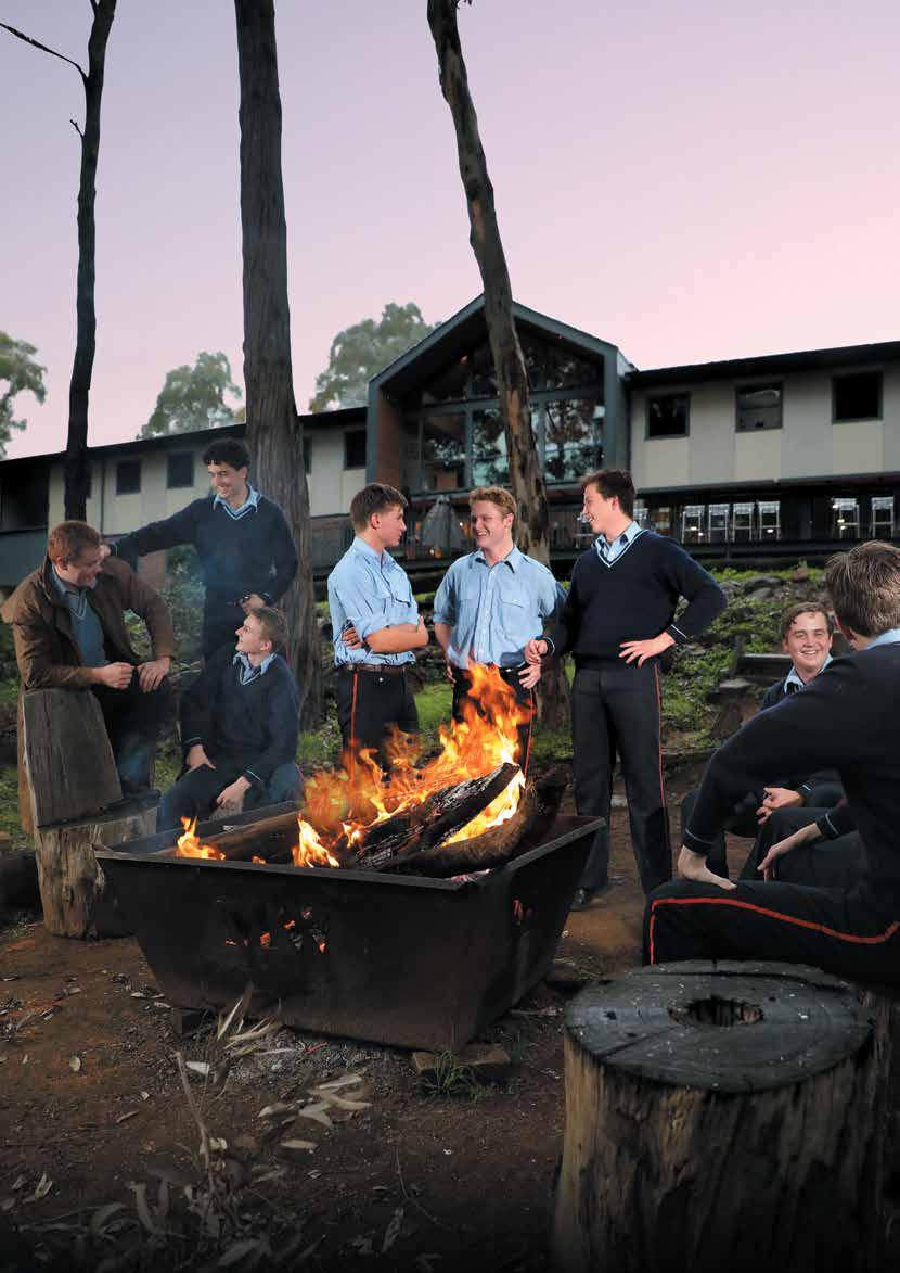
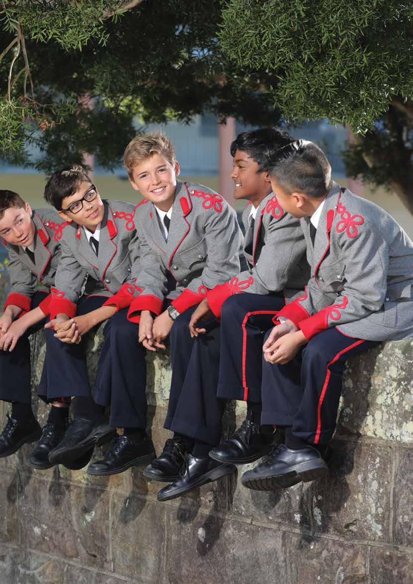
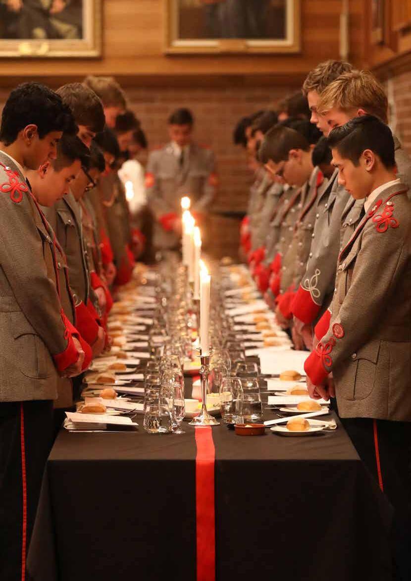
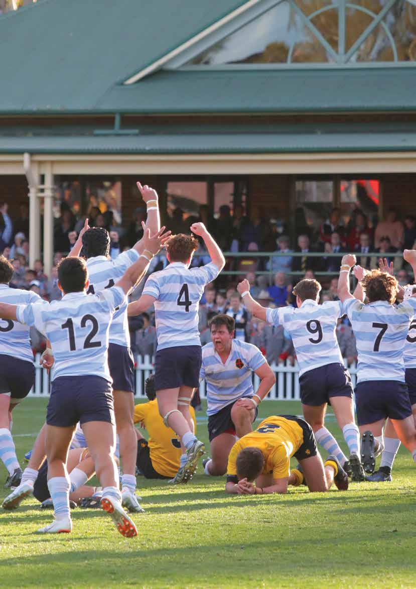
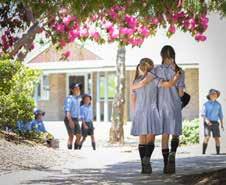
Photography is one of the major components that conveys our brand. There are two styles of photography, Formal and Organic.
Formal Photography is staged by a professional to look set-up but also allows the subjects to appear candid in nature. This style of photography can be used in display advertising, brochures, and social media.
The King’s School, Preparatory School
The King’s School, Senior School
The King’s School, Tudor House
General
Organic Photography
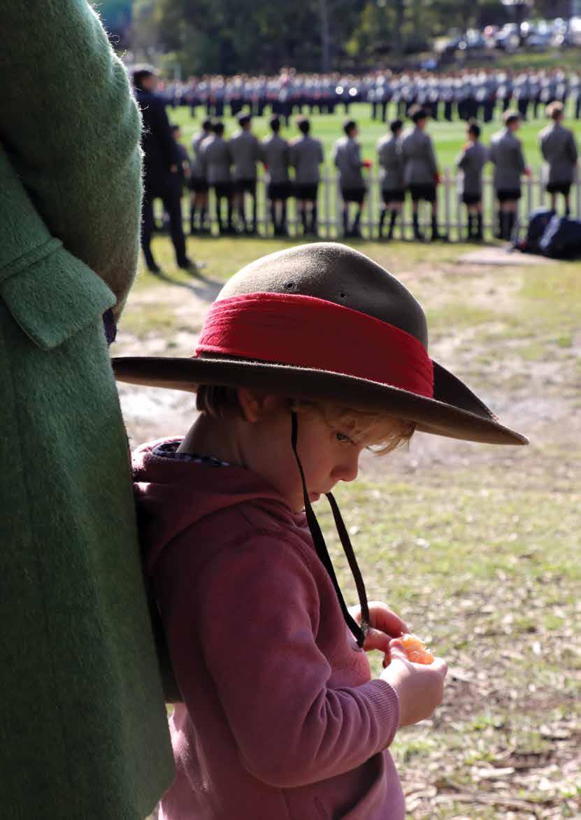
Organic Photography is active, powerful, and emotion generating photography which draws on or connects with the image. Action images are preferred.
The King’s School, Preparatory School
The King’s School, Senior School
Organic Photography
The Organic style should be used to capture the pillars of the King’s distinctives – Academic, Character and Christian Community.
The King’s School, Tudor House
Advertising
Print Advertising Examples
Although traditional readership of ‘paper’ publication is dwindling, a few publications still hold effective readerships in some desired demographics to still make ‘paper’ ads viable. Being disciplined by having design elements structured and common through all advertising keeps our brand experience prestigious, memorable and adds a point of difference in a sometimes, crowded market.
Digital Advertising Examples
The King’s School Animated gif
The King’s School, Tudor House Animated gif
Facebook Post gif 800px X 800px
Print Collateral
Printed Collateral Examples
King’s School publishes Prospectus, Handbooks, Magazines and other printed material.
Key Considerations
• Type on printed publications should have space and be non-threating to the user’s mind. Added leading and paragraph spaces are used to achieve this.
• Copy must also be written to make reading the message as easy as possible for the user.
• The ‘grid’ can be made and broken to allow for a user friendly design.
• Under no circumstances are pictures or pull quotes to be used to ‘fill space’.
The King’s School, Tudor House Cover
The King’s School, Tudor House Spread
The
The King’s School, Boarding Handbook cover.
The King’s School, Boarding Handbook Spread
Signage and Merchandise
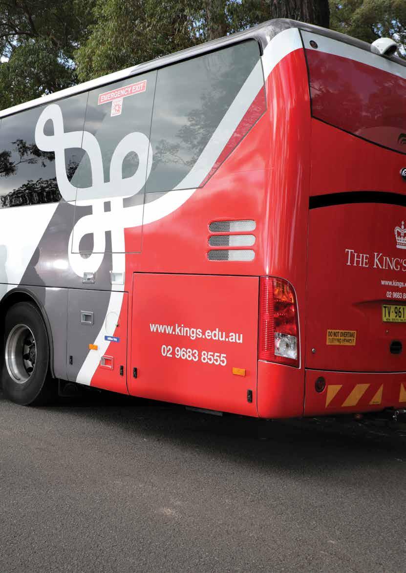
Vehicle Signage
Vehicle Signage also has its own unique guidelines, mainly due to the area and visual impact required, as well as position of regulatory compulsory signs ie 40 etc.
All signage must be bespoke designed for the vehicle type and model.
Vinyl
School Outdoor Signage Examples
Tear Drop Banner 292mm x 100mm
Marquee 3000mm x 3000mm
Writing Guide
Why guidelines for writing?
There is something amazing that is available to everyone at The King’s School. Something that is free, comes with unlimited power and if used correctly can help bring people together, change perceptions and build communities.
That something is language or, more specifically, words. The hard part has been done: we already have every word at our disposal. The trick now is to apply and share them in ways that make sense to people and make The King’s School, well, ‘The King’s School’.
There is very little point in writing or talking simply for the sake of it: people will only really listen – and we will only become truly memorable – if what we say stands for something, has a positive impact and is based on a set of core principles.
And that is where these guidelines come in. These guidelines are first and foremost meant to inspire. They are meant to help you apply the full potential of what we have and make a difference to how The King’s School is heard and understood, and how people engage with us.
There will be many different writers and speakers at The King’s School, but there is only one King’s brand. This simple fact means we must achieve consistency in our communication, aiming to unify how we speak and write. We must embed our distinct personality and reflect what we stand for across everything we share with the wider world.
Words are what allow us to communicate with purpose, passion and personality. If we can do that well, then The King’s School as a whole will benefit.
Lastly, please note that this guide covers only commonly used textual style; it is not intended to document grammar in exhaustive detail. If you have any queries about style or suggestions for additions, please contact the Communications Team.
Voice and Tone
What are Voice and Tone?
How we talk largely defines how we’re perceived – and importantly how we maintain our brand space. To assist with this, we have two integrated but distinct dimensions to our written and verbal communication: Voice and Tone.
People have the same voice all the time, but their tone changes. By way of example: they might use one tone when out to dinner with closest friends, and a different tone when in a meeting with a senior colleague.
Tone also changes depending on the emotional state of the person being addressed. You wouldn’t want to use the same tone of voice with someone who’s scared or upset as you would with someone who’s laughing.
The same is true for The King’s School: our voice doesn’t change from day to day, but our tone changes all the time.
Defining our Voice and Tone
The King’s School has, by its very name, a strategic point of difference from all other schools in Australia. We are responsible for presenting The King’s School as a school of the highest quality and one that maintains the highest standards.
Our voice
Is
Yet not
Confident and assertive Brash or elitist
Friendly and engaging Casual and chatty/gossipy
Open and communicative Verbose and waffly
Trustworthy, authoritative Patronising or condescending
Our tone
Is
And never
Audience-specific Generalist or bland
When considering how to structure the tone of a message, think from the recipient’s perspective and tailor it accordingly:
Message to convey Structure
Unpleasant or sad Being part of the issue, not detached from it.
Being respectful but not overbearing.
Functional or administrative To the point, with warmth and understanding. Not demanding or ‘care less’.
Lighthearted or fun
Warm and friendly, inclusive. Not waffly.
Avoid extensive use of exclamation marks.
Key principles for great content
Adhering to our brand principles
If our content is to be of value, it must be built on our core brand framework (Refer to pages 8 and 9).
Our Mission
A Christian community that seeks to make an outstanding impact for the good of society through its students, and by the quality of its teaching and leadership in education.
Staying active
In simple terms, this means using the active voice in our communication. Doing this helps maintain succinctness and clarity, and delivers greater impact.
The active voice tells what a person or thing does. The subject performs the action and typically comes before the action (verb). The object is who or what receives the action and typically comes after the action (verb).
The general rule is:
Active Subject - verb - object
Passive Object - verb - subject
Consider these examples (active voice is first in each example):
Active The boys [subject] completed [verb] the homework [object] on time.
Passive The homework was completed on time by the boys.
Active The parent [subject] had not paid [verb] the fees [object].
Passive The fees had not been paid by the parent.
Active The entire team [subject] will celebrate [verb] the interschool rowing victory [object] on Saturday.
Passive The interschool rowing victory will be celebrated by the entire team on Saturday.
Avoiding colloquial language or
jargon
School name
The King’s School is always referred to primarily as ‘The King’s School’. This structure is used in all formal communication, including external reports, keynote speeches, introductions and the like.
In general communication, and after careful consideration, the diminutive ‘King’s’ may be used.
These are the only two iterations of our name that reflect our brand appropriately.
Do not use other diminutives or abbreviations such as ‘TKS’ or ‘K’.
Slang and colloquialisms
Slang is used in very informal settings, and more so in speech than writing. It is not to be used in communications of any form, unless the term is very-well known and has become a substitute for its more formal version.
Jargon
We can still communicate effectively by being straightforward. Avoid the use of internal or industrygenerated ‘edubabble’; while it might be understood by the education industry, it is an internalised way of talking and does little to engage our audiences.
Don’t adopt technical or industry jargon in the hope of impressing the reader (unless of course we are writing a technical piece for a technical audience).
Talking externally, not internally
We should always write with the recipient in mind. Try and write empathetically (from the reader’s perspective). Will they get it? Does it explain to them, or only talk at them?
Overall, consider that we should communicate with our audience, not talk at them. For example, rather than saying ‘we’ll teach your son’, it is better to say ‘your son will learn’.
Being positive and collaborative
Be a direct and inclusive part of the conversation - use more personal pronouns such as ‘we’, ‘us’ and ‘you’.
Of course, in formal presentation, we always refer to ‘The King’s School’.
Write as a part of the conversation, not removed from it. This emotion will come through in your content, and will mean more to the reader.
Saying less to convey more
Ensure substance before depth: We have the history and successes to qualify all that we say, so we can communicate knowledgeably and with gravity and confidence, without resorting to extensive, ambiguous explanation.
Using words we like
Yes
No
Teaching methods Pedagogy
Great, excellent
Good Reading and spelling Literacy Mathematics and numbers Numeracy
Avoiding superfluous explanations or qualification
’Here at The King’s School, we …’ and ‘Being a leading independent school, we…’. both begin with statements that the reader will already know either implicitly or from initial interaction and so do nothing to enhance the message. Keep it clear and to the point.
Avoid the race to the bottom
In the global context, communication in education is replete with intangible promises, overused terminology and long explanations. We don’t need to adopt any of this, nor use words and phrases that have become so overused, they cease to mean anything.
Let’s be who we are, stand apart and communicate with clarity, personality and passion.
Grammar and mechanics
Preferred spelling
The King’s School uses Australian English across all its communication. This means that we use:
• –ise rather than –ize (eg realise, organise, specialise)
• –our rather than –or (eg colour, behaviour, neighbour)
• –re rather than –er (eg theatre, centre, metre).
Some other spelling differences include:
• ‘travelling’ rather than ‘traveling’
• ‘focused’ rather than ‘focussed’
• ‘enrolment’ rather than ‘enrollment’.
• ‘benefiting’ rather than ‘benefitting’.
Although there is no official governmental regulator or overseer of spelling and grammar, the Macquarie Dictionary can be taken as an appropriate standard for Australian English spelling.
Ideally, your writing platform (Microsoft Word, Apple Pages etc) should be set to Australian English as the default, but make sure you’ve checked before starting.
Note: SpellCheck can be useful but you are liable to find yourself in trouble if you rely on it too heavily – and it does not act as a guide to grammar. For example:
Spell check will not fined words witch are miss used butt spelled rite.
SpellCheck may hyphenate words that are not hyphenated according to our style.
All content is set range left, and does not adopt end-of-line hyphenation. (ie, the splitting of a word with a hyphen such that it falls across the end of one line and the start of the next).
Punctuation
Apostrophes
Apostrophes have two uses:
1. They can show that some letters have been taken out of a word to shorten it (eg don’t, I’ll). Contractions such as these are not appropriate for formal materials.
2. Can indicate ownership (eg The student’s results were excellent). When the plural form of a word ends in –s, do not add an extra s, but place the apostrophe after the –s, for example: The students’ results were excellent. (In this case, more than one student is being referred to).
Note: Do not use an apostrophe when referring to:
• decades (eg the 1970s)
• the plural form of acronyms (eg URLs)
• individuals in terms of their year level (eg Year 5s, Year 12s).
Lists and bullet points
Short bullet points or lists can make writing easier to read. Each series of points should be introduced by a lead-in sentence or sentence fragment. The lead-in ends with a colon to link it with the information in each list point. Each point must form a complete sentence with the lead-in clause.
Do not use punctuation at the end of each list point (unless they are complete sentences – see below). Insert a full point at the end of the final point in the list. For example:
Our learning advisors can help you develop:
• effective reading and study skills
• time-management and organisation skills
• critical-thinking skills.
If the points in the list are complete sentences, they should start with a capital letter and end with a full point. For example:
To apply to The King’s School, take the following steps:
• Fill in the online application form.
• Submit the accompanying fee ($200 per student).
• Ensure your contact details are kept up to date during your time on the waiting list.
Note: Only use numbers if the points need to be followed in a particular order.
Colons and semicolons
Colons
A colon (:) is commonly used to introduce a series or list. If a colon introduces a complete sentence, more than one sentence, a formal statement, quotation, or speech in dialogue, capitalise the first word of the sentence. For example:
The question is: How can you put a price on education?
If the colon introduces a sentence fragment or list, don’t capitalise the first letter. For example:
We know the number one cause of stress for students: exams.
Semicolons
Use a semicolon (;) to join clauses when a conjunction is omitted or when the connection is close. The clause after a semicolon should be able to form a complete sentence on its own. For example:
At the time, these study areas were revolutionary; today, they are more important than ever.
Semicolons can also separate items in long lists. This is particularly useful when the items in the list contain multiple words and punctuation. For example:
The Boys to Men program includes a number of components: world-class education journeys; wellbeing programs; community service workshops; and Cadet Week.
The word ‘however’ is often preceded by a semicolon. For example:
Applications are due by the end of September; however, you can apply after this date providing you pay a late fee.
Commas
In addition to the usual conventions for the use of commas, please note:
• King’s style does not use commas after salutation or closure in letters or emails.
• A comma may be used before ‘and’ in a list (ie the Oxford or serial comma) if it provides clarity, but is not necessary in most circumstances. No comma is necessary before ‘and’ in this example: The four archetypes are the magician, the sage, the warrior and the carer.
• Use a comma to separate groups of three digits in numbers greater than 999. (see Numbers).
• Do not use a comma:
– between a position and an individual’s name (eg Director of Learning Jacqui Camilleri addressed the Year 10 boys)
– when writing a date (eg 25 September 2019).
Dashes (en dash)
An en dash (–) can be typed using the keyboard shortcut ctrl + Num – (the minus key).
Unspaced en dash
An unspaced en dash is used as a linking device, showing spans of:
• figures (eg Years 7–12; pages 42–59)
• time (eg March –July; 9.00am–2.00pm).
Note: Do not use an en dash as a substitute for and with the words ‘between’ or ‘from’. For example, write ‘the period between 2017 and 2019’, not ‘the period between 2017–2019’.
Spaced en dash
Use an en dash with a space on either side to:
• signify an abrupt change (eg I didn’t realise you were born overseas – but I digress.)
• introduce an explanation or to set apart parenthetical elements within a sentence (eg Einstein authored a number of scientific theories – the Theory of Relativity being the most famous – that changed our perceptions).
Exclamation marks
In general, avoid exclamation marks. They are rarely necessary and overuse is distracting.
Hyphens
Hyphens are used to clarify meaning and avoid confusion.
Use hyphens:
• with double-up vowels to make the meaning easier to understand (eg re-energise); however, ‘cooperate’ does not require a hyphen.
• when a word would be ambiguous without a hyphen or the same as an existing word (eg ‘re-sign’ has a different meaning to ‘resign’).
• when spelling out numbers and fractions (eg twenty-nine, two-thirds).
• with compass points (eg north-east).
• with prefixes such as non-, former- and ex-.
• when a suffix applies to two or more items in a list (eg on- and off-campus).
To check the use of hyphens in specific terms, see ‘Spelling and commonly used words/phrases’.
Italics
Use italics for:
• titles of books, publications (including newspapers and magazines), reports, movies, songs, TV shows, musical compositions etc.
• when referring to foreign words not considered fully part of the English language (eg I just got the weirdest feeling of déjà vu.)
• for proper names of vehicles such as ships, aeroplanes and missiles
• for zoological names (eg Homo sapiens belong to the genus Homo.)
Quotation marks
Use single quotation marks to show direct speech and the work of other writers. For example:
‘But I didn’t do it!’
Use double quotation marks for a quote within a quote. For example:
The Headmaster began with, ‘Even if you’ve never read a word of Shakespeare, I’m sure you’ve heard “To be or not to be” a thousand times.’
If a quote comprises a full sentence, insert the punctuation before the closing quotation mark. For example:
‘We hope this research will lead to a potential new drug therapy for lung cancer,’ said Dr Smith.
Spacing
Only one space should be used after full stops, commas, colons and semicolons.
Subject/verb agreement
The verb should agree with its subject. For example: ‘Jack’s work in spelling and grammar has improved.’
Note that ‘has’ is used rather than ‘have’ because it must agree with the subject ‘work’).
Parentheses
Rule
Example
Parentheses are used to enclose information that clarifies or is used as an aside. He finally answered (after taking five minutes to think) that he did not understand the question.
Punctuation goes inside parentheses only if an entire sentence is inside the parentheses.
Parentheses are not part of the subject.
Commas are more likely to follow parentheses than precede them.
Please read the analysis. (You’ll be amazed.)
Please read the analysis (you’ll be amazed).
Joe (with his trusty dog) was always welcome.
When he got home (it was already dark outside), he prepared dinner.
Contractions, abbreviations and acronyms
Contractions
A conversational writing style that uses contractions (it’s, that’s, you’re, we’ve etc.) is appropriate for less formal communications such as emails, eNews stories and social media posts. Contractions are generally not appropriate for formal communications, such as student reports, strategic reviews and annual reports.
Abbreviations
Generally, abbreviations should be avoided. When space is limited, days and months can be abbreviated to:
- Mon, Tue, Wed, Thu, Fri, Sat, Sun
- Jan, Feb, Mar, Apr, May, Jun, Jul, Aug, Sep, Oct, Nov, Dec.
Avoid using the ampersand (&) for ‘and’ unless it forms part of a proper noun, e.g. Ernst & Young.
Acronyms
If the phrase is well-known, or commonly referred to in its initialled form, then use initials without spacing or punctuation. For example:
HSC (not H.S.C.)
GST (not G.S.T.)
For phrases that require introduction or are likely to be unfamiliar to the audience, always spell out the phrase in full in the first instance and identify it with its initials. For example:
The King’s School reverts to Australian Eastern Standard Time (‘AEST’) on the xx of October. AEST will be in effect until xx April next year.
The King’s School is a member of the Great Public Schools (‘GPS’) and is one of the leading sports and performing arts schools in the land. As a GPS member, The King’s School…
When using the School’s name, write it in full (‘The King’s School’) for formal communications; ‘King’s’ or ‘the School’ may be used for informal communications, or to avoid repetition.
Date and time
Dates
Dates are written in the format [day] [date] [month] [year], with no punctuation. For example:
Friday 18 February 2019.
For date spans, use ‘from’ and ‘to’, or ‘between’ and ‘and’ (eg between 2019 and 2021).
You can use an unspaced en-dash (eg 18–20 February 2019) in a table or for brevity. Be consistent.
Time
A full point, rather than a colon, is used to separate hours from minutes. No space is used between the numeral and am or pm (eg 6.00–8.00pm, 6.30pm).
Where both times are am or pm, only use the abbreviation once (eg 7.30–9.30am).
Where possible, give event details in the following format:
What: New Parents’ Chapel Service (use event title, unless used as a heading).
When: Wednesday 30 January 2019, 8.30–10.30am (Note: Date is listed first, followed by time).
Where: The War Memorial Chapel.
Numbers, percentages, units
Commas in numbers
Numbers 1,000 and above are expressed with commas (eg 1,360, 24,000 and 1,300,000).
Spelling numbers
In general, spell out numbers up to nine and use numerals for numbers 10 and above. Exceptions to this rule are as follows:
• references to headings or expressions from elsewhere that use numerals (eg Year 12, Semester 1, Chapter 5, Appendix 2)
• text that is largely statistical or mathematical in nature (eg text in a table – use numerals)
• numbers accompanied by symbols or measurements (eg 8°C, 3km, 10am, 89%)
• centuries (eg the 21st century)
• decimals (eg 3.5)
• the beginning of sentences, where numbers should always be expressed in words (eg Sixty-five students were involved in the concert).
See Conventions for more on School-specific numerical style.
Phone numbers
Phone numbers should be written in the following formats:
(02) 9683 8555
0400 000 000
To help international callers, adopt the following format:
+61 2 9683 8555
+61 400 000 000
Percentages
In text, percentages are expressed with the words ‘per cent’ for numbers less than 10 and with the symbol ‘%’ for numbers 10 and greater (eg five per cent, 25%). However, in text that contains many statistics, numbers and the symbol can be used throughout.
The symbol should be used only with numerals; ‘per cent’ may be used with either words or numerals. In documents where numerals are generally being used for numbers, show percentages in numerals with the symbol.
Units of measurement
No space is used between units and their associated numerical (eg 25mm, 14km, 4m).
Units of currency
Use A$ for Australian dollars, without a space (eg A$250).
If using the symbol ‘m’ for million or ‘bn’ for billion, do not insert a space between the units and the symbol (eg $25m, $5bn).
Capitalisation
Keep capital letters to a minimum. The following should always be capitalised:
• the school name: The King’s School; King’s
• school years (Year 7, Years 9–12)
• school subject names and Learning Domains (Mathematics, Science, English, Outdoor Education, Guided Reading)
• specific references to semesters and terms (Semester 1, Term 3 – but lower case when writing ‘in the third term’ or ‘each semester’).
Note: Extra-curricular activities are not capitalised (chess, debating) unless writing ‘King’s Chess’, ‘King’s Debating’ or ‘the Debating Program’.
See Conventions for more on capitalisation.
Headings
Use sentence case for headings (ie with a capital letter only for the first word in the heading).
Do not use a full stop at the end of a heading. For example:
Teaching and learning
Emphasis
Use italics or bold sparingly.
Do not use ’inverted commas’ to indicate emphasis.
Do not underline words to indicate emphasis.
Spelling and commonly used words and phrases
The following words and phrases are commonly used within King’s publications. (If you have queries about others, please ask the Communications team, or refer to the Macquarie Dictionary (Sixth Edition).
n = noun
adj = adjective
v = verb
A
A-team, B-team
Aboriginal and Torres Strait Islander
Aboriginal peoples Plural adviser affect (v) / effect (n) His attitude will affect his work.
His attitude has had a positive effect on his work.
age-appropriate ageing
Not aging aid
A thing to assist a student’s learning
We will use electronic whiteboards as an aid in the classroom.
aide
A person assisting a student
A teacher’s aide
alumni Plural alumnus
Singular among Not amongst and Not & anti-bullying
Anzac
the Chapel apps (no capital)
GPS Sport
Use ANZAC only when referring to the army corps itself
No full stops, no need to write out in full
King’s excelled in the GPS Finals.
artwork
Assembly
Australian Government autumn
Initial capital
Friday morning’s Assembly
No capital for seasons
B behaviour benefited, benefiting Single ‘t’ billycart
One word bookwork (n)
boy No capital (but ‘Old Boy’)
Bullet points No punctuation is necessary at the end of each point; however, a full stop should be placed at the end of the last bullet point, or if each point is a complete sentence.
CCapitals
Minimal use except Term 1, Semester 1. subjects, subject strands, sports and activities should all be lower case with the exception of specific languages.
Hon. (eg The Hon. John Smith) House, houses Boarding houses, but Britten House
House Swimming
House Chess competition
No cap if referring to all ‘houses’.
The boys are allocated to houses. They undertake various activities with the rest of their house.
Iie
in-depth (adj)
He has an in-depth knowledge of Australian history.
Indigenous In Australian context; lower case at all other times
interhouse
International Baccalaureate Interschool Interschool Sport, Interschool Debating
internet, intranet
iPad
-ise endings eg organise, rationalise, realise, recognise are correct Australian spellings.
BEWARE Microsoft Word may automatically change the ending to the US form –ize.
italics
names of books, films, organisations, publications and song titles; proper names of vehicles; foreign words/ phrases and zoological terms.
Jjudgement
K
kind-hearted (adj)
L
With an ‘e’
labelled, labelling labour But Australian Labor Party laptop
lead-up (n)
Learning Support
learnt
Not learned, unless used as an adjective in referring to someone’s level of knowledge (eg a learned and considerate man)
letter-sound lifelong lifespan
LinkedIn
M
masterclass One word
masters degree No apostrophe
Mathematics Capital letter for Learning Domains
metre Not meter
mindfulness mini-project
Monitor
Initial capital where the title is specified: Science Monitor
Mothers’ Day ie a day for all mothers
Mr, Mrs, Ms No full stops multicultural multidisciplinary multimedia multipurpose multi-syllable multi-task the Musical
Initial capital when referring to a specific production: He was the lead part in the Musical.
N
no one (no hyphen) non-fiction non-verbal
note reading Two words note taking Two words
O
OB (‘78)
Use abbreviation with peer year after the name of an Old Boy, no space
John Jones (‘60)
Old Boy
Old Boys’ Union (OBU) on task
one-on-one (adj) He received one-on-one tuition.
ongoing online open-ended open-minded
organise Not organize
P panellist
parent groups
Parent Teacher Discussions Not Interviews or Meetings
Use initial capitals
Pavilion
PDHPE
per cent, percentage
PhD
postgraduate PowerPoint practice (n), practise (v) I attend my cricket practice on Monday.
I practise conscientiously every Monday.
Pre-Kindergarten
Preparatory School Or Prep School; Prep prerequisite pre-empt
Prizegiving proactive problem solve, problem solving program
programme
proofread
Not programme
Generic use: Various sports programs are run across the School
Only in reference to a specific program
Year 10 boys participate in the Boys to Men Program. This Program introduces them to…
Only to be used in reference to the name “International Baccalaureate” Programmes
Q
quick-thinking
Quotation marks single quotation marks and double within single: ‘Let’s go out for dinner,’ suggested Martin. ‘When Sally said “what a good idea, everyone will enjoy that,” I was pleased,’ said Martin.
Single quotation marks for the titles of book chapters, sections or scholarly articles.
R realise Not realize rebut, rebuttal, rebutting re-read
retell
risk taker (n), risk-taking (adj)
role model
story telling story time
story writing
School (upper case S only when referring to The King’s School specifically)
The School’s core values are compassion, humility, respect, honesty, integrity, responsibility and excellence.
The School’s website, but school websites in general.
school life
school work
school mate
South East Asia
summer spring
T
Not roll
Not roll role play
S
school year
Senior School
self-confident, selfconfidence
self-corrects
self-edits
self-esteem
self-motivate
Semester 1
Capital ‘S’ when written with a number. Semester 1, Semester 2
Use number and not word. semester last semester, this semester… Matthew worked well this semester.