5 minute read
TRENDS: THE COMFORT ZONE

THE COMFORT ZONE
Is there a new direction for design and the product you select for your store? asks Jo Hutchens, owner and founder of Well Versed Homes.
For some years now, the colours and texture of nature have inspired trends in design and therefore interiors and homewares. Since Covid 19, creating calm environments within our homes has been important and remains so, as home is still the workplace for many—at least a few days of the working week.

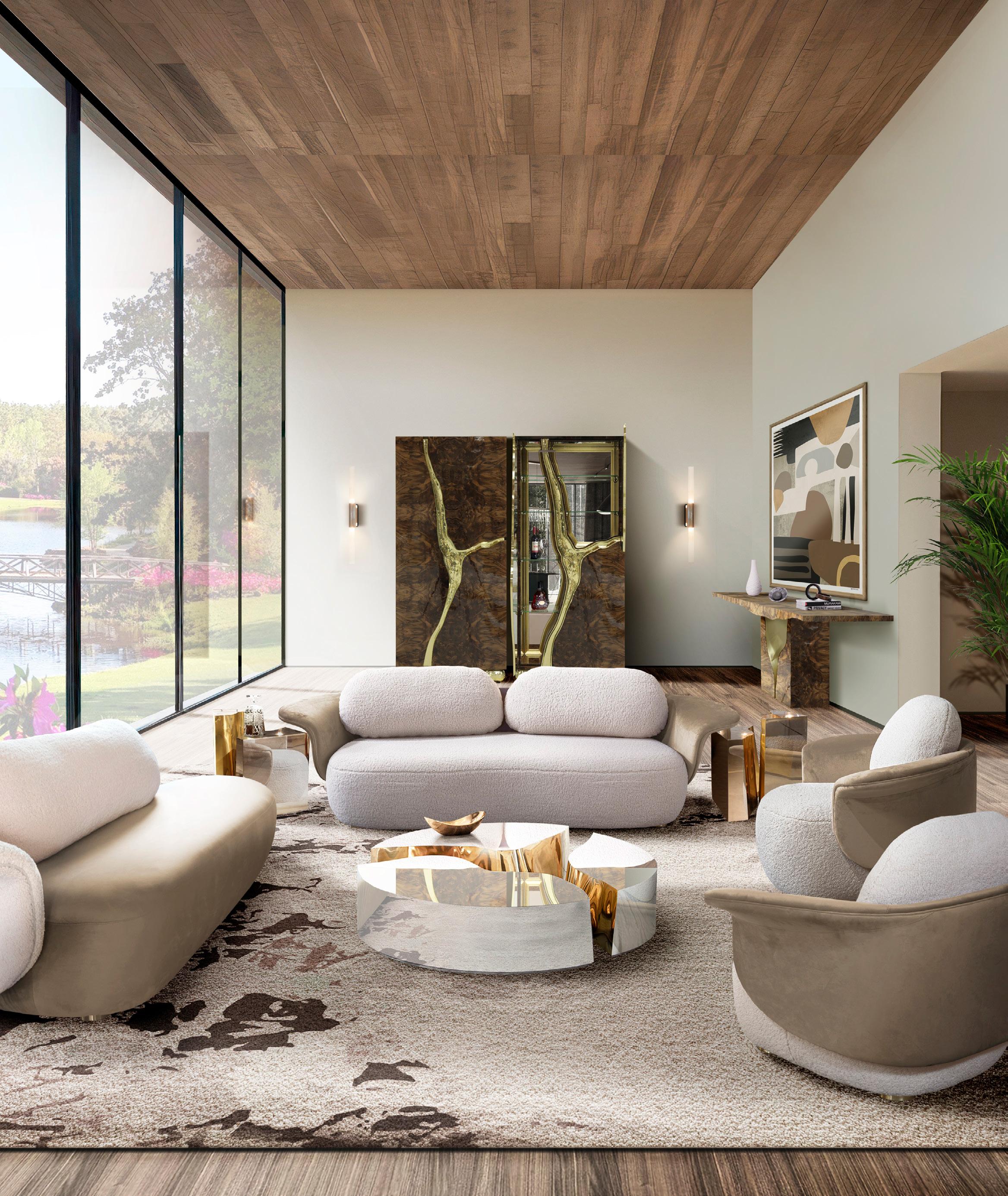
The desire to feel cosy, comforted and calm is supported by a neutral and reduced colour palette, harmonious collections and simplicity. Texture, particularly from hand crafted or collected items, as well as materiality, also help develop this setting.
The Pantone Colour of the Year for 2025 is Mocha Mousse. It is a warm brown hue, imbued with richness—just like a deliciously creamy mousse. It nurtures our desire for comfort, which could definitely be achieved with chocolate or coffee— both, in my case.
How is the colour selected?
The Pantone Colour of the Year program engages the design community and colour enthusiasts in a conversation around colour, highlighting the relationship between colour and culture. Pantone selects a colour each year that captures the global zeitgeist—the colour of the year expresses a global mood and an attitude, reflecting collective desire in the form of a single, distinct hue.

There is a growing movement to align ourselves more closely with the natural world. Characterised by its organic nature, Mocha Mousse honours and embraces the sustenance of our physical environment.
“Underpinned by our desire for everyday pleasures, Mocha Mousse expresses a level of thoughtful indulgence,” explains Lee Eiseman, executive director, Pantone Colour Institute.
“Sophisticated and lush, yet at the same time an unpretentious classic, Mocha Mousse extends our perceptions of the browns from being humble and grounded to embrace aspirational and luxe.
“Infused with subtle elegance and earthy refinement, it presents a discrete and tasteful touch of glamour. A flavourful brown shade, Mocha Mousse envelopes us with its sensorial warmth.”
There is a growing movement to align ourselves more closely with the natural world. Characterised by its organic nature, Mocha Mousse honours and embraces the sustenance of our physical environment. Imbued with authenticity it finds harmony and balance between the demands of modernity and the timeless beauty of artful creation, adds Eiseman.

“The everlasting search for harmony filters through into every aspect of our lives including our relationships, the work we do, our social connections and the natural environment that surrounds us.
“Harmony brings feelings of contentment, inspiring a positive state of inner peace, calm and balance as well as being tuned in with the world around us. Harmony embraces a culture of connection and unity as well as the synthesis of our mental, spiritual and physical wellbeing.
“With that in mind, for Pantone Colour of the Year 2025 we look to a colour that reaches into our desire for comfort and wellness and the indulgence of simple pleasures that we can gift and share with others,” she says.
“An evocative rich brown infused with sensorial warmth, Mocha Mousse blends our desire for comfort and opulence to present a tasteful touch of glamour. An earthy yet refined brown Mocha Mousse nourishes our senses.
“Sophisticated and lush, yet at the same time an unpretentious classic, Mocha Mousse evokes a feeling of the comfort of home whether appearing on flooring or a painted wall, within home décor or in more natural materials including wood and stone, rattan and wicker, leather and linen.”
It’s in the story
Unlike Peach Fuzz of 2024 or Viva Magenta in 2023, I believe Mocha Mousse can be used broadly in interiors and homewares. It works beautifully with the biophilic (nature) colour palette and will provide a wonderfully warm foundation to many design outcomes.
Additionally, the consumer’s desire to know the origin of a product as well as how it could be reused, repurposed or recycled is now key to buying decisions. Knowing the story of where and how an item is produced is more important than ever.

Personally, I feel this has led to more balanced homes, with a mix of affordable everyday items as well as unique one-off collector pieces. There is a sense of freedom to be creative in selecting items because of their story, their maker, their artistry, their whimsy, their sustainability and not their ‘trend’.

As retailers, I feel we can be very encouraged by these directions. It means the need to curate a collection of practical useful items, together with bespoke products for our stores, remains important as are the achievable and stretch price points. Bringing unique collections to our customers should always be a key focus and whilst colour trends are important to observe, it should be for inspirational reference, because, next year we will be referring to something new—did I say red?


