PORTFOLIO
By:
Tewolde Daniel


Hello, I’m TEWOLDE DANIEL
Architect / Creative Director / Graphic Designer / Brand Specialist
I’m excited to present my graphic design portfolio, where creativity meets a bit of fun!
Whether you’re a fellow design enthusiast or just curious, I hope you enjoy flipping through these visual stories as much as I enjoyed creating them.
Design, for me, is more than making things look good (though that’s definitely part of it!).
It’s about bringing ideas to life, capturing attention, and making people feel something.
My portfolio reflects that journey; from bold logos to sleek layouts, all crafted with intention and a bit of flair.
What you’ll see here is a mix of imagination and technical skill, with each project teaching me something new. I’m constantly exploring new ideas, and I can’t wait to see where the next creative spark takes me.
I’d love to hear your thoughts and maybe even collaborate on something great! Let’s connect and chat about design, creativity, or anything in between.
Thanks for taking the time to check out my work!
Contact Information Professional Skills


01 Logo Design
This section showcases my approach to logo design, focusing on creating impactful visuals that represent a brand's identity. Each design includes a carefully crafted logo, a thoughtfully chosen color palette to evoke the right emotions, complementary typography to enhance the brand’s message, and a concept that reflects the brand’s values. Additionally, I demonstrate logo application across various backgrounds, ensuring both versatility and consistency.
INITIALS ARROWS
(National Investors Platform Ethiopia)
GLOBE
ZOOM LENS
INTERLOCKING
Upward arrow symbolizes positive growth, progress, success, and rising value.
Downward arrow symbolizes risk awareness & management, and stability.
Signifies global reach, diversity, and interconnectedness. It highlights its international scope and inclusivity.
Associated with qualities like royalty, luxury, sophistication, and elegance. It can convey a sense of authority, power, and importance.
Additionally, regal blue can also symbolize tranquility, trustworthiness, and stability.
Symbolizes the company's focus on clarity, precise analysis, and growth opportunities.
Signifies collaboration, strength, unity, and trust. Represents the ability to connect diverse entities, fostering reliable partnerships and stable investment opportunities.
TILET PATTERN
Ethiopian “tilet” pattern symbolizes cultural heritage, authenticity and identity, diversity and inclusivity & unique aesthetic.
Symbolizes energy, enthusiasm, creativity, and a friendly demeanor. It is a
Aa Aa
Color Palette
#004A71
PORTLAND ORANGE
Conveys
Get-Ayer ENGINEERING
Primary Logo Concept
Secondary Logo
GEAR HUGGING
Symbolizes the technical expertise and precision that the platform fosters among handymen and technicians. It highlights the company's commitment to providing high-quality, reliable repair solutions. It is a fundamental element of technological advancement and operational efficiency.
Represents collaboration and community within the platform. It symbolizes the connection and support among the team and the customers. This fosters a sense of trust and unity, ensuring that all parties work together towards common goals, thereby empowering each other and promoting a collaborative environment.
Color Palette
BRIGHT BLUE
Represents trust, innovation, and collaboration. It conveys reliability and professionalism, ensuring customers and technicians see the platform as dependable and forward-thinking. Also fosters clear communication and a sense of calm, reinforcing the meticulous care and technological advancement that are core to the platform's mission of revolutionizing the repair industry through collaboration and innovation.
LIGHT BULB
Symbolizes ideas and innovation. It reflects the platform's commitment to fostering creativity and new solutions within the repair industry.
Underlines the importance of sharing valuable repair tips and innovative approaches among the community, encouraging continuous learning and improvement.
TECH SYMBOL
Signifies the advanced technology that underpins the TechSpare market. It highlights the modern, digital aspect of the platform, emphasizing dedication to leveraging technology to revolutionize the repair industry. It reinforces the value of innovation and the seamless integration of technology in providing efficient solutions.
STETHOSCOPE
Represents meticulous care and precision, akin to diagnosing and repairing issues in the most efficient way. This icon underscores the platform’s dedication to ensuring high standards in repair work, mirroring the thoroughness of medical examinations. It signifies the trust and reliability customers can place in the services provided.
ROTATING ARROWS
Symbolize sustainability and continuous improvement. They represent the cycle of sharing knowledge, providing services, and fostering trust, creating a sustainable and dynamic ecosystem. This icon aligns with the values of sustainability and empowerment, highlighting the ongoing cycle of growth and development within the platform.
Embodies
Primary Logo Concept
CIRCLE GLOBE
Symbolizes unity, connectivity, and modernity. It represents the seamless integration of technology into daily life, emphasizing the shop's commitment to providing innovative solutions that keep people connected and enhance their experiences with mobile devices.
Color Palette
Signifies global reach, connectivity, and the ability to serve customers worldwide highlighting its international presence and commitment to connecting people from diverse backgrounds through technology.
FINGERPRINT
Symbolizes security, personalization, and uniqueness. It signifies the shop's focus on providing secure and personalized experiences for its customers, ensuring that their data and information are protected.
Secondary Logo
It convey a sense of freshness, harmony, and trust. It symbolizes innovation and reliability in technology.
The color also evokes a calming and inviting atmosphere, showcasing the shop's commitment to providing a positive and user-friendly experience with mobile devices and services.
WAVE LINE
Represent connectivity, communication, and technology. Symbolize the flow of data, signals, and information, emphasizing the shop's commitment to keeping people connected and facilitating seamless communication through mobile devices.
FIREBALL
Symbolize speed, energy, and innovation. It suggests that the shop is dynamic and fast-paced, offering cutting-edge technology and solutions that are ahead of the curve.
The fireball also conveys a sense of excitement and passion for mobile technology,
ROTATION
Symbolize versatility, adaptability, and evolution. It represents the shop's ability to stay current with technological advancements and adapt to changing trends in the mobile industry.
It represents sophistication, professionalism, and timelessness. It can symbolize the shop's commitment to high-quality products and services, as well as its authority and expertise in the mobile technology industry. It also conveys a sense of elegance and modernity, suggesting that the shop offers sleek and stylish solutions that cater to a discerning clientele.
LIGHT SEA GREEN
#55C1A9
TEDDY STUDIO
By: TEWOLDE DANIEL
Sparkle creative agency
GREETO
Gift Shop
By: TEWOLDE DANIEL
02
Print Design
In this section, I present a selection of print design projects that showcase my ability to create visually appealing and effective materials. From brochures and posters to magazines and packaging, each design reflects a balance of creativity and functionality. I focus on delivering high-quality print layouts that communicate the intended message clearly while maintaining strong visual appeal and brand consistency.

Proposal Layout
In this section, I showcase my expertise in designing proposal layouts for various companies, focusing on clarity, professionalism, and visual appeal. Each design is tailored to meet the specific needs of the client, with careful attention to typography, color balance, and structured layouts that communicate effectively. My goal is to create visually engaging proposals that enhance readability.












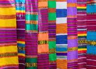







Newspaper Header
In this section, I highlight my experience in designing impactful newspaper headers that capture attention and convey the publication's tone. I focus on creating clean, bold designs with a strong visual hierarchy, ensuring that the headers are both aesthetically pleasing and functional. My designs enhance readability while maintaining consistency with the newspaper's branding.
Magazine
In this section, I present my magazine design projects, where I blend creativity with structure to deliver visually engaging layouts. My designs focus on typography, imagery, and page flow to create a cohesive and polished look. Each magazine is customized to reflect the publication's theme while ensuring an enjoyable reading experience and maintaining a consistent visual identity.




















Brochure
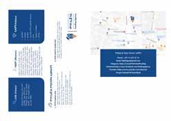
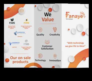
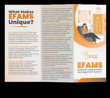
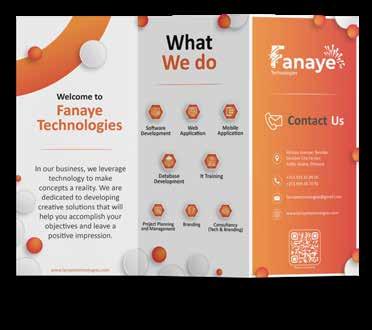
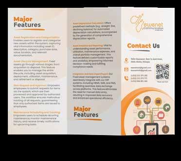
In this section, I showcase my brochure design expertise, where I create visually appealing and informative layouts that effectively communicate key messages. My focus is on balancing design elements like typography, imagery, and space to produce brochures that are both engaging and easy to navigate. Each design is tailored to the client’s needs, enhancing their brand’s visibility and impact.
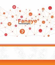
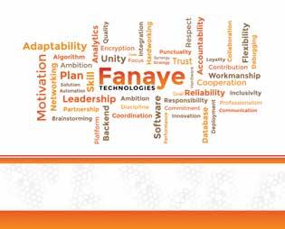
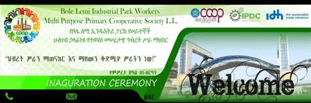
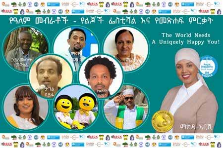
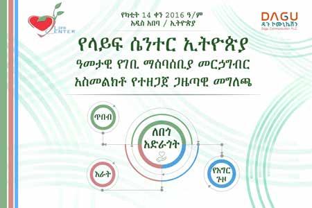
Banner

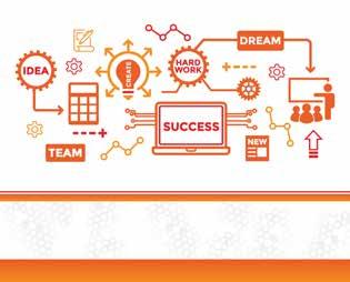
In this section, I feature my banner design projects, where I create eye-catching and impactful visuals for both print and digital use. My designs emphasize clear messaging, strong visuals, and strategic use of color and typography to draw attention and convey information quickly. Each banner is crafted to align with the client's branding and effectively engage their target audience.



Business Card
In this section, I present my business card design projects, where I focus on creating professional and memorable cards that reflect the brand’s identity. I use thoughtful typography, color schemes, and layout to ensure that each design is visually appealing and communicates the client’s key information effectively. My goal is to design business cards that leave a lasting impression while maintaining simplicity and elegance.



Header
In this section, I present my header design projects, where I create visually striking and cohesive designs that set the tone for various print materials. My focus is on clean layouts, appropriate typography, and effective use of space to ensure that each header complements the overall design while maintaining a strong brand presence.


By:
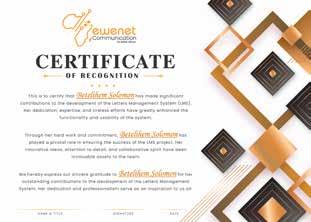
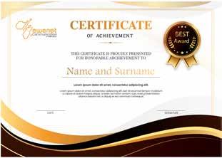
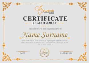
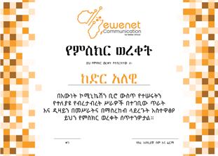
Certificate
In this section, I showcase my certificate design works, where I focus on creating elegant and formal layouts that reflect the significance of the achievement. My designs incorporate thoughtful typography, balanced spacing, and appropriate branding elements to ensure each certificate is both professional and visually appealing.

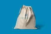
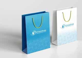
Tote Bag
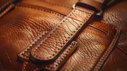
In this section, I highlight my tote bag design created for a business forum giveaway in Johannesburg. The design focuses on bold branding and eye-catching visuals, making the tote both a functional item and a promotional tool. I crafted the layout to reflect the forum's professional tone, ensuring the design resonates with attendees while enhancing brand visibility.



TEWOLDE DANIEL
Company Profile
In this section, I showcase my company profile design projects for various businesses. My designs emphasize clear structure, professional layouts, and visual consistency, tailored to communicate each company's brand identity effectively. I focus on creating profiles that are informative, visually appealing, and aligned with the client’s goals to leave a lasting impression.


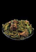
Menu
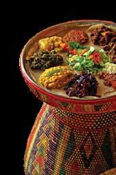
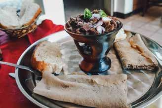
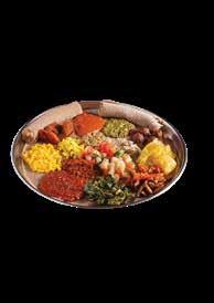
In this section, I present my food menu design projects for Dreams Lounge & Bar. My designs focus on clear organization, enticing visuals, and effective typography to enhance the dining experience. I ensure the design reflects the brand’s identity while making the food offerings visually appealing and easy to navigate.










Brand Guideline
Crafting brand guidelines for diverse companies, I ensure each document serves as a blueprint for consistent, professional visual identity. From logo usage to typography and color palettes, my designs provide clear, structured guidance that empowers brands to maintain a cohesive presence across all media. Each guideline is tailored to reflect the company's unique personality while ensuring polished and professional execution.


Brand Identity
Developing brand identities for various companies, I focus on creating cohesive and visually compelling systems that embody each brand’s values. From logos to color schemes and typography, I design every element with precision to ensure a strong, consistent identity across all platforms. My work aims to build a professional and recognizable presence that resonates with target audiences.
BRAND IDEN TITY
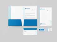
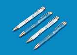
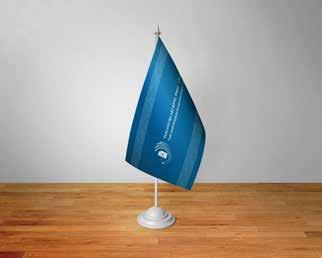
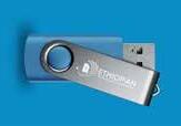
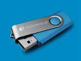
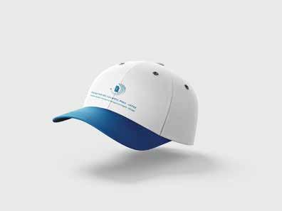
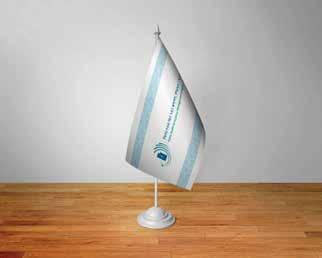
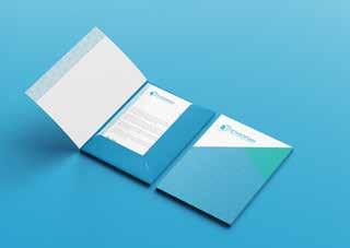
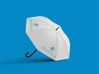
This section highlights my work in digital design, showcasing a range of projects including social media graphics, and digital advertisements. Each design is tailored to enhance user experience and engagement, blending creativity with functionality.
03 Digital Design
My focus is on delivering visually compelling and cohesive designs that communicate effectively across digital platforms.
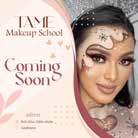
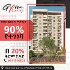
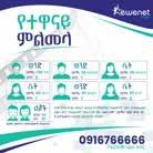
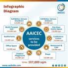
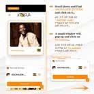
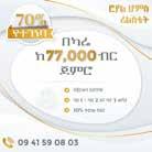
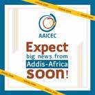
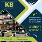
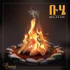
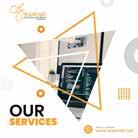
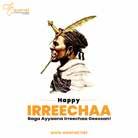
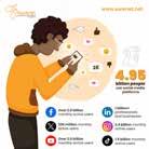
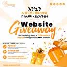
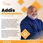
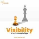
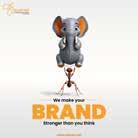
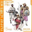
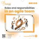
Social Media Post
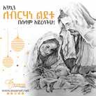

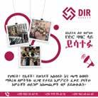
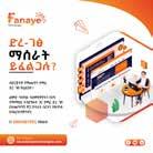
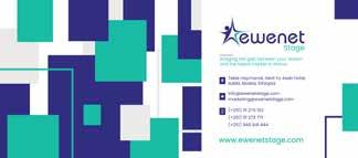
This section highlights my expertise in creating engaging and visually appealing content for digital platforms. Each design is tailored to align with brand identities and marketing objectives, ensuring maximum audience impact. From vibrant promotional posts to clean, minimalist layouts, my work reflects a keen understanding of social media trends and user preferences. Through thoughtful use of color, typography, and composition, I aim to create designs that not only capture attention but also encourage meaningful engagement and brand recognition.
































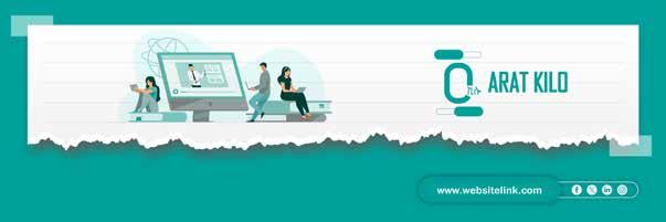
Social Media Banners


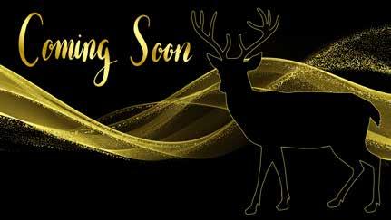
The Social Media Banners section of this portfolio highlights my expertise in designing impactful visuals that enhance brand presence across digital platforms. Banners play a crucial role in capturing audience attention, promoting key messages, and maintaining a strong brand identity. Each design is carefully crafted to balance aesthetics and functionality, using bold typography, eye-catching graphics, and strategic layouts to maximize engagement. Whether for product promotions, special announcements, or corporate branding, my goal is to create banners that not only stand out but also effectively communicate the intended message while ensuring consistency across different social media channels.
Website Banners

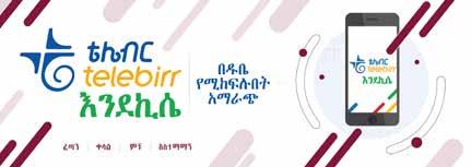
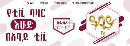
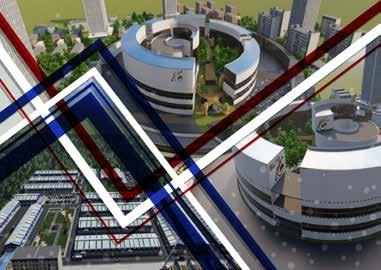
The Website Banners section of this portfolio showcases my ability to design visually compelling and strategically crafted banners that enhance user experience and brand identity on digital platforms. Website banners serve as powerful tools for capturing attention, driving engagement, and communicating key messages effectively. Each design is carefully structured to align with brand aesthetics, ensuring a cohesive look that complements the overall website layout. Through a thoughtful combination of color schemes, typography, and high-quality visuals.







04
Artistic Design
In this section, I present a selection of print design projects that showcase my ability to create visually appealing and effective materials. From brochures and posters to magazines and packaging, each design reflects a balance of creativity and functionality. I focus on delivering high-quality print layouts that communicate the intended message clearly while maintaining strong visual appeal and brand consistency.
Sketches


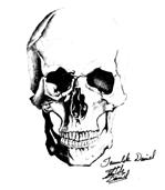
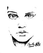
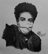
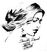
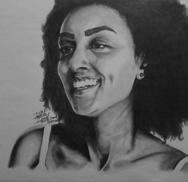
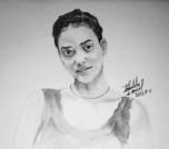
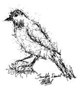
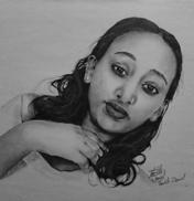
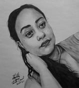
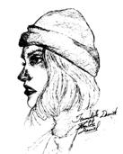
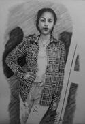
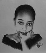
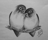
This section of this portfolio showcases my collection of hand-drawn portrait sketches, highlighting my ability to capture expressions, emotions, and intricate details through pencil and ink. Each portrait is a study of light, shadow, and form, reflecting my dedication to realism and artistic depth. Sketching by hand allows me to explore fine details and textures, bringing life to each subject with careful shading and line work. This section provides a glimpse into my artistic process, where raw creativity meets technical skill, resulting in expressive and visually engaging portrait illustrations.




























Character Design
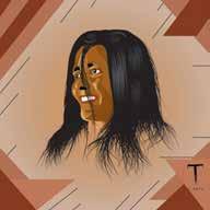
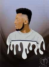
This section features a series of demo characters, each illustrated to showcase the rich and diverse Ethiopian cultural clothing styles. Through these designs, I highlight the beauty and uniqueness of traditional Ethiopian attire, focusing on intricate details, vibrant colors, and culturally significant elements that reflect the country's heritage. These designs offer a glimpse into Ethiopia's cultural identity, blending artistry with respect for tradition, while also showcasing my ability to bring these cultural expressions to life through character illustration.
Illustrations

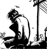
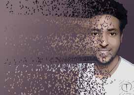
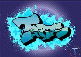
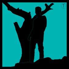
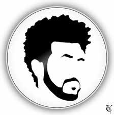
This section highlights my versatility and creative expression through a variety of digital illustrations. Whether conceptual, decorative, or narrative-driven, each illustration is crafted to convey a specific mood, message, or story. I focus on combining strong visual elements with thoughtful compositions, paying close attention to color, texture, and detail to create works that resonate with viewers. This section includes a range of styles, from intricate line art to vibrant, full-color pieces, demonstrating my ability to adapt to different themes and mediums. My goal is to bring imagination to life, offering viewers a dynamic and engaging visual experience that showcases my artistic skill and storytelling ability.










By: TEWOLDE DANIEL