Data Visualization 101: Telling Stories with Data
Transform complex numbers into compelling narratives that resonate. Bridge the gap between data and human understanding through visual storytelling. Unlock powerful insights that drive better decisions and create deeper connections with your audience.

byOzíasRondón

Why Data Visualization Matters
65%
Visual Learners
Most people understand information better through visual means
60,000x
Processing Speed
Visual data is processed faster than text
1
Critical Skill
Essential capability in today's data-driven world
The Anatomy of Effective Data Visualization
Purpose
Clear objective and message
Simplicity
Precision without complexity
Connection
Emotional and logical appeal
Context
Narrative elements that frame data
Understanding Your Audience
Expertise Level
Match complexity to audience knowledge
Stakeholders
Identify who will use your visualization
Decision Context
Understand how data will inform actions
Visual Preferences
Consider cultural and industry expectations
Choosing the Right Visualization Type
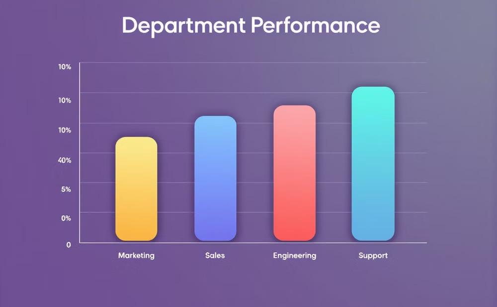
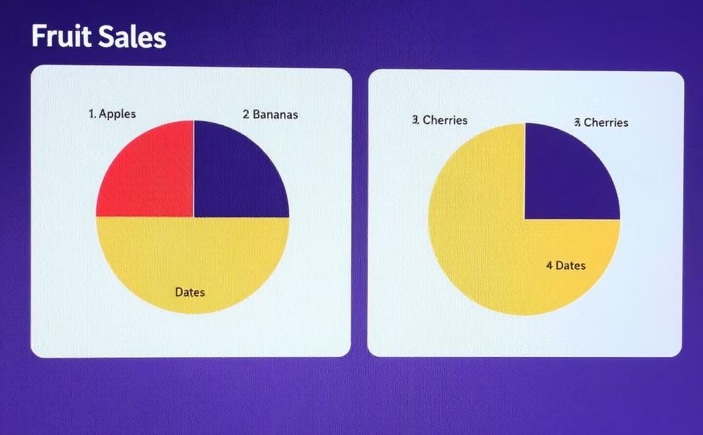
Bar Charts
Perfect for comparing values across categories
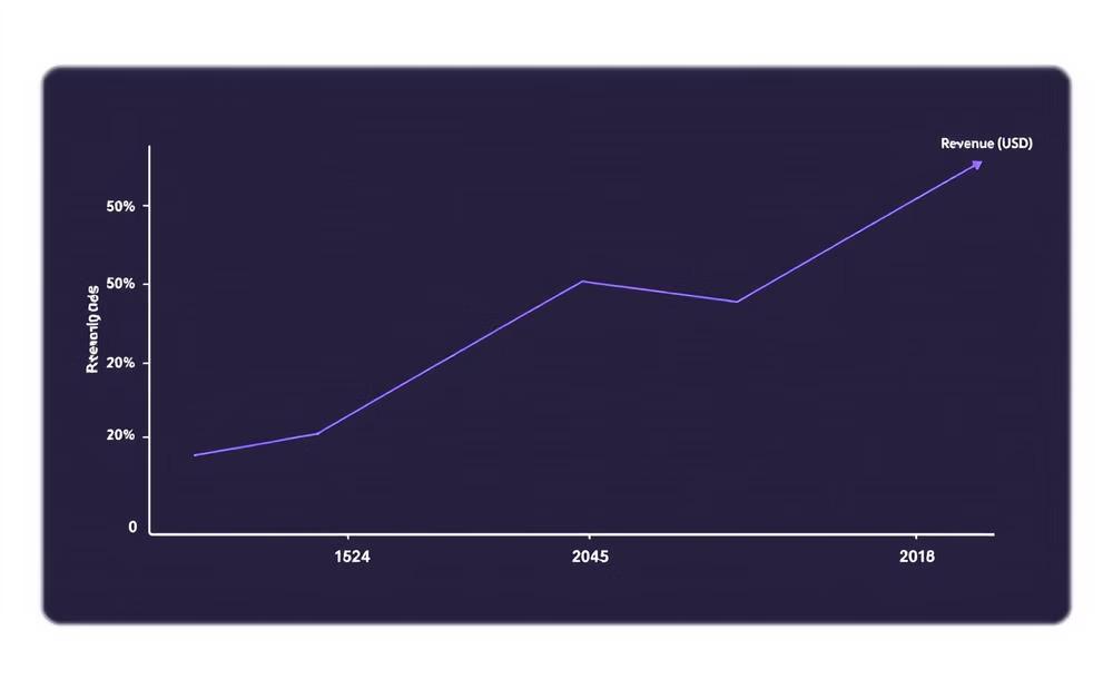
Line Graphs
Ideal for displaying trends and changes over time
Pie Charts
Best for showing parts of a whole
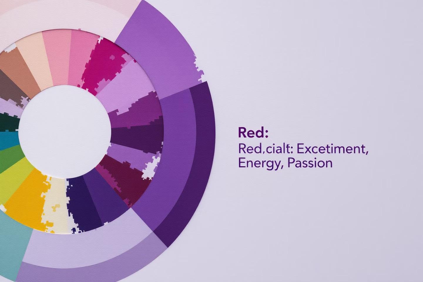
Color Psychology in Data Visualization
Emotional Impact
Colors evoke specific feelings and reactions. Red signals urgency while blue conveys trust. Color choices dramatically influence how data is perceived and interpreted.
Accessibility
About 8% of men have color vision deficiency. Choose color-blind friendly palettes. Ensure sufficient contrast between elements for all users to interpret data clearly.
Principles of Visual Hierarchy
Guide the Eye
Create a clear path through information
Strategic Emphasis
Use size, color, and placement for importance
Highlight Key Insights
Make critical data stand out immediately
Create Visual Flow
Establish natural movement through content
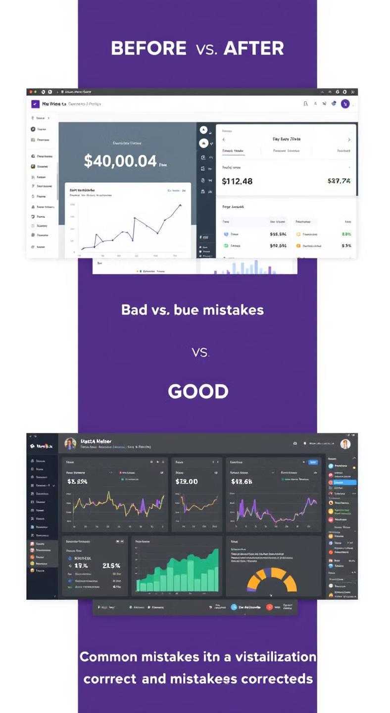
Common Data Visualization Mistakes
Overcomplicated Designs
Adding too many elements creates confusion rather than clarity.
Simplicity enhances understanding.
Misleading Scales
Manipulated axes and scales can dramatically distort data perception. Always maintain proportional representation.
Chart Junk
Decorative elements that don't add value diminish message effectiveness. Remove non-data ink.
Lack of Context
Data without proper explanation leaves viewers confused. Always provide necessary background information.
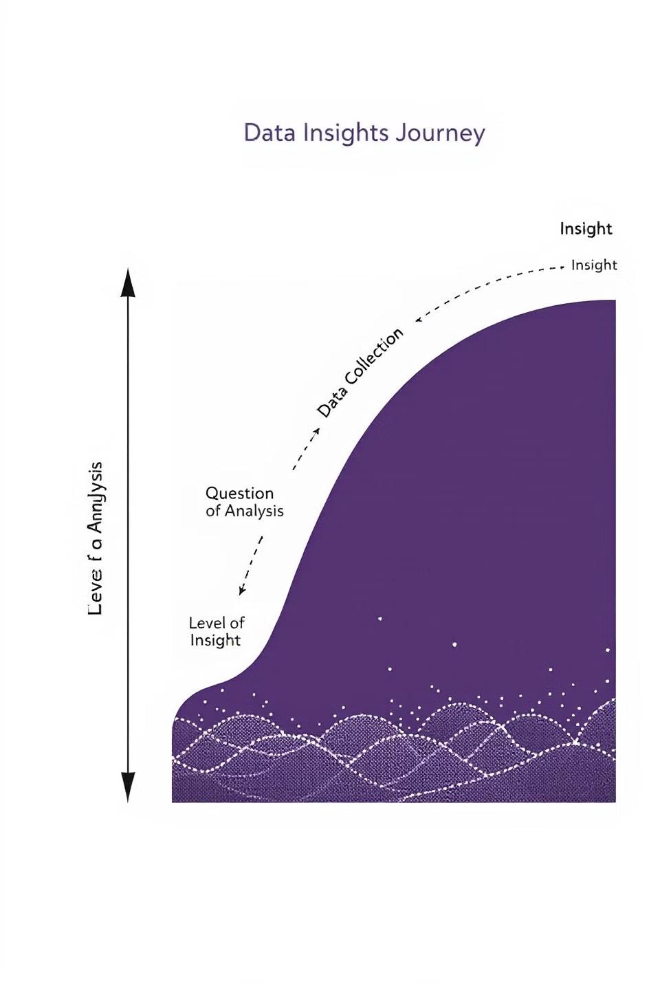
Storytelling Techniques
Beginning
Introduce the context and question
Middle
Build tension through data exploration
Insight
Reveal key discoveries and patterns
Resolution
Present solutions and next steps
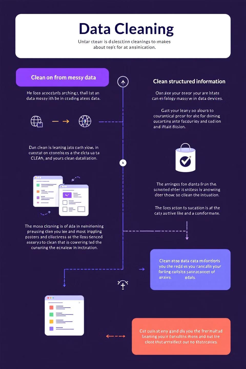
Data Cleaning and Preparation
Collect Raw Data
Gather information from reliable sources. Ensure comprehensive coverage of needed data points.
Clean and Standardize Remove duplicates and errors. Convert to consistent formats and units of measurement.
Process and Transform Calculate necessary metrics. Create derived values and prepare for visualization.
Advanced Visualization Techniques


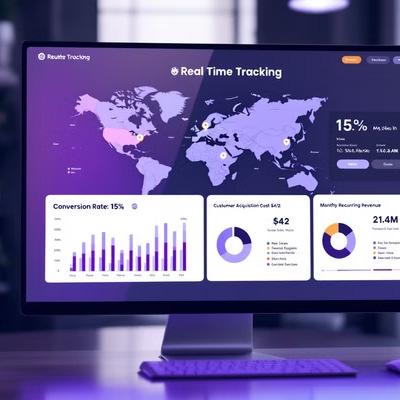
Modern tools enable interactive, animated, and dimensional representations. These advanced techniques transform static data into dynamic experiences.

Tools of the Trade
Tableau Industry standard for interactive dashboards. Supports advanced analytics with minimal coding.
Power
BI Microsoft's business intelligence tool. Excellent for integration with existing Microsoft products. Python Programming language with powerful libraries like Matplotlib and Seaborn. Ideal for custom solutions.
D3.js JavaScript library for custom web visualizations. Offers ultimate flexibility for web integration.

Best Practices for Presentation
Simplify Complex Information
Break down intricate data into digestible components. Focus on the essential message.
Consistent Design Language
Use cohesive colors, fonts, and styling. Maintain visual consistency throughout your presentation.
Clear Annotations
Label important elements and explain key points. Guide viewers through data interpretation.
Narrative Structure
Build a coherent story with your data. Connect insights to form a compelling argument.
Case Studies in Effective Visualization
The Future of Data Visualization
AI-Powered Tools
Automatic insight generation and visualization recommendations
Machine Learning
Pattern recognition and predictive visualizations
Real-Time Global Data
Interconnected visualization of worldwide information
3
Immersive Experiences
VR and AR data exploration environments
Ethical Considerations
Data Privacy
Ensure visualizations don't compromise personal information. Aggregate and anonymize sensitive data appropriately.
Transparency
Clearly communicate data sources and methodologies. Avoid hidden assumptions in representations.
Avoiding Manipulation
Present data honestly without distortion. Choose fair representations that don't mislead viewers.
Responsible Storytelling
Consider the impact of your narrative. Present balanced perspectives when appropriate.
Developing Your Skills
Take Online Courses
Follow structured learning paths through platforms like Coursera and DataCamp.
Practice with Real Datasets
Apply techniques to public datasets from Kaggle or data.gov.
Follow Industry Experts
Learn from leaders like Edward Tufte, Alberto Cairo, and Nadieh Bremer.
Join Communities
Participate in forums and attend conferences to share and learn.


Measuring Visualization Impact
Metric CategoryKey Performance IndicatorsMeasurement Methods
EngagementTime spent, interaction rateAnalytics tracking, heat maps
ComprehensionAccuracy of interpretationUser surveys, knowledge tests
Decision QualityAction rate, decision speedConversion tracking, time metrics
Business OutcomesROI, revenue impactFinancial analysis, A/B testing
Transform Your Data
Storytelling
Leverage AI to create compelling visualizations automatically. Generate insights from complex datasets with minimal effort.
Save Time and Resources
Reduce visualization creation time by up to 70%. Focus on strategy rather than technical implementation.
Download Now
Visit: www.checkout-ds24.com/redir/599320/oziasrondon2/
Start your free trial today and revolutionize your data presentations.


Your Data, Your Story
Powerful Communication
Data visualization bridges complex information and human understanding. It transforms numbers into narratives.
Insight Discovery
Every dataset contains hidden stories. Visualization helps uncover patterns and connections others miss.
Start Today
Begin your data storytelling journey. Apply these principles to create impactful visualizations.