
Qualy Education
1 BRAND GUIDELINES
BRAND GUIDELINES
Table of Contents
________________________________________________________________________
brand
Logotype
Photography
Page
Page
Page
Page
Introduction
Umbrella
Colors
Patterns Typography
Iconography Key visual
03
04
14
06 Page 17 Page 20 Page 32 Page 43 Page 44
Introduction
QualyEducation is a tailored learning platform created exclusively for professionals and institutions in the medical field. Developed with the mission of raising educational standards, QualyEducation offers a unique approach to meet the specific needs of partners, physicians, and other stakeholders. To expand its reach and share knowledge, QualyLive created QualyEducation. Founded by healthcare professionals with extensive experience, QualyLive markets products internationally for various medical specialties.
3 BRAND GUIDELINES
Qualy Live
4 BRAND GUIDELINES Umbrella brand Positive priority version
5 BRAND GUIDELINES
Umbrella brand Negative priority version
Logotype Positive priority version
Qualy Education
6 BRAND GUIDELINES
• 70% black
• 100% Deep Blue #1
Logotype Negative priority version
Qualy Education
7 BRAND GUIDELINES
• 70% Deep Blue #1
Logotype Positive version with pattern background

Qualy Education
• 70% black
• 100% Deep Blue #1
• 80% transparency background with multiply effect over the off white
8 BRAND GUIDELINES
Logotype Negative version with pattern background

Qualy Education
• 70% Deep Blue #1
• Background with multiply effect over the deep blue
9 BRAND GUIDELINES
Logotype Usage Priority versions
Qualy Education
Primary Logo
The anatomy of the main platform logo consists of one line (1.), where both words “Qualy” and “Education” are in title case without a space between them.
Secundary Logo
The secondary version maintains consistent formatting and proportions but introduces two line breaks (2.). This configuration is particularly suited for small and square spaces and should never be modified. The leading must be preserved.
Non-Interference Area
The non-interference area ensures that the logo has sufficient space to remain clearly visible and not compete with other elements of the layout (3.). There should be a minimum amount of clear space on all sides of the logo equivalent to half the height of the logo.
Qualy Education
Qualy Education
10 BRAND GUIDELINES
1. 3.
X 0,5 X 0,5 X 0,5 X 0,5 X
2.
Qualy Education
Qualy Education
Qualy Education
Qualy Education
11 BRAND GUIDELINES
Logotype applications Do’s
Logotype applications Don’ts
Qualy
Qualy
Qualy
Qualy
12 BRAND GUIDELINES
Education Education
Education Education
Qualy Education
Logotype applications Don’ts
Things to avoid It may seem obvious, but it is important to list some practices that distort the use of the brand. Here are some examples of what not to do.
Qualy
Qualy Education
Don’t create an outline version
Don’t change the color of the logo.
Qualy Education Education
Qualy Education
Don’t place the logo in a box.
Don’t distort the logo, always scale proportionally.

Don’t place the logo on a busy background.
13 BRAND GUIDELINES
Colors Priority
Whenever possible, the logo should be used in the preferred color versions. When displayed on colored backgrounds or images, their contrast and legibility must be preserved.
Main institutional dark blue of the umbrella brand and the QualyEducation Plataform
G71 B109 No 42466d
Main institutional color for background of the MM Education Plataform
R237 G237 B237
No ededed
Deep Blue #1 Off White #1 C91 M87 Y47 K0 R67 C6 M4 Y4 K014 BRAND GUIDELINES
Colors Variants
Variant colors are essential to help with the visual dynamics of assets. They will be composed with solid tones, gradients and patterns. They will fill in texts, color boxes and match the parts. The idea is to use colors intuitively, creating contrasts that allow for great legibility and enhancing visual appeal.
Purple #1 Purple #2 Light Blue #1 OrangeM74 Y0 K0 R104 G80 B209 No 6850d1 C40 M40 Y0 K0 R156 G153 B244 No 9c99f4 C0 M80 Y95 K0 R241 G90 B41 No f15a29
C71
M0 Y5 K0 R202 G242 B244 No caf2f4 15 BRAND GUIDELINES
C18
Colors Gradient
The gradient is a design element to be used sparingly. Must not enter overlapping areas or repeatedly. The gradient should generally be used on large backgrounds and not in small areas. Ideally, it should be used as the basis for a conceptual text or linked to something playful.
This gradient was composed of the colors Purple #1, Purple #2 and Light Blue #1
16 BRAND GUIDELINES
Patterns Applications
The umbrella brand Qualylive adopts the principle of using a visual background as a support to evok the organic form of the bone structure.

Example #1
The pattern can be associated with a gradient color...

Example #2
...or used on a neutral or white background with opacity control and gradient feather effect
17 BRAND GUIDELINES
Patterns Applications
For the sub-brand QualyliveEducation, the chosen form embodies the continuous wave motion, evoking the learning curve and the fluidity of the growth experience.

Example #1
The pattern can be associated with a gradient color...

Example #2
...or used on a neutral or white background with opacity control
18 BRAND GUIDELINES
Patterns Applications
Gradient feather linear effect

Gradient feather radial effect

19 BRAND GUIDELINES
Example #3
Example #4
Typography Primary Display type
The typography used in the logo reflects our brand’s identity and values. The font chosen is Fluent Sans Regular, carefully selected for its balance of professionalism and approachability. Its clean lines and distinctive characteristics ensure legibility and memorability across various platforms and sizes.
Additionally, the spacing and arrangement of letters are meticulously crafted to enhance visual harmony and brand recognition. This deliberate choice of typography reinforces our commitment to quality and innovation, establishing a strong and memorable presence in the market.
This type can only be used in the logo.
Fluent Sans
Aa
https://www.dafont.com/fluent-sans.font
20 BRAND GUIDELINES
ABCDEFGHIJKLMNOPQRSTUVWXYZ abcdefghijklmnopqrstuvwxyz 0123456789 ?!(){}[] Regular
Typography Primary typeface weigths
The Neutraface Text typography was chosen for its classic design, featuring open lines and functional characteristics that convey precision, originality, and sophistication.
Neutraface Text
• Neutraface Text Font Family was designed by Christian Schwartz, Ken Barber, Andy Cruz and published by House Industries. https://www.myfonts.com/collections/neutraface-text-font-house-ind?q ueryId=ddea00f51aac50c6e26e83693ee12ae2&index=universal_search_ data&objectIDs=5478325002
Aa Aa
Ligth Book
ABCDEFGHIJKLMNOPQRSTUVWXYZ abcdefghijklmnopqrstuvwxyz 0123456789 ?!(){}[]
ABCDEFGHIJKLMNOPQRSTUVWXYZ abcdefghijklmnopqrstuvwxyz 0123456789 ?!(){}[]
21 BRAND GUIDELINES
Typography Primary typeface weigths
The Neutraface Text typography was chosen for its classic design, featuring open lines and functional characteristics that convey precision, originality, and sophistication.
• Neutraface Text Font Family was designed by Christian Schwartz, Ken Barber, Andy Cruz and published by House Industries. https://www.myfonts.com/collections/neutraface-text-font-house-ind?q ueryId=ddea00f51aac50c6e26e83693ee12ae2&index=universal_search_ data&objectIDs=5478325002
Neutraface Text Bold
Aa Aa
ABCDEFGHIJKLMNOPQRSTUVWXYZ abcdefghijklmnopqrstuvwxyz 0123456789 ?!(){}[]
ABCDEFGHIJKLMNOPQRSTUVWXYZ abcdefghijklmnopqrstuvwxyz 0123456789 ?!(){}[]
22 BRAND GUIDELINES
Demi
Typography Secondary typeface weigths
Neue Helvetica® is an updated version of the original Helvetica font, introduced in 1983 by Linotype. This version brings some improvements over the classic Helvetica, including a wide range of weights and styles, as well as subtle adjustments in letter design to enhance readability across different sizes and digital platforms. Helvetica Neue is often chosen for projects requiring a contemporary aesthetic and a wide range of design options, from print to digital interfaces. Its versatility and adaptability make it a popular choice for designers and companies worldwide.
Helvetica Neue
Aa Aa Aa
ABCDEFGHIJKLMNOPQRSTUVWXYZ abcdefghijklmnopqrstuvwxyz 0123456789 ?!(){}[]
ABCDEFGHIJKLMNOPQRSTUVWXYZ abcdefghijklmnopqrstuvwxyz 0123456789 ?!(){}[]
ABCDEFGHIJKLMNOPQRSTUVWXYZ abcdefghijklmnopqrstuvwxyz 0123456789 ?!(){}[]
23 BRAND GUIDELINES
Ligth Regular
UltraLigth
Typography Secondary typeface weigths
• Neue Helvetica Font Family was designed by Max Miedinger, Linotype Design Studio and published by Linotype. https://www.myfonts.com/collections/neue-helvetica-fontlinotype?tab=individualStyles
Helvetica Neue
Aa Aa
Medium Bold
ABCDEFGHIJKLMNOPQRSTUVWXYZ abcdefghijklmnopqrstuvwxyz 0123456789 ?!(){}[]
ABCDEFGHIJKLMNOPQRSTUVWXYZ abcdefghijklmnopqrstuvwxyz 0123456789 ?!(){}[]
24 BRAND GUIDELINES

Example #1
Use the Fluent Sans font in the qualylive logo along with the slogan or tag line.
Qualy Education

Example #2
Use the Fluent Sans font in the QualyEducation logo.
25 BRAND GUIDELINES
Fluent Sans
Typography Guidelines
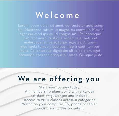
Welcome
Lorem ipsum dolor sit amet, consectetur adipiscing elit. Maecenas rutrum ut magna eu convallis. Mauris eget euismod ipsum, id congue nisi. Pellentesque habitant morbi tristique senectus et netus et malesuada fames ac turpis egestas. Aliquam nec ligula tempor, faucibus magna eget, tempus nulla. Pellentesque dignissim ultricies diam, eget accumsan eros scelerisque sit amet.

Example #3
The Fluent Sans font is exclusively permitted for use in the specified cases: logomarks and selling lines. Its use in any other body of text is strictly prohibited.
small or big
Lorem ipsum dolor sit amet, consectetur adipiscing elit. Maecenas rutrum ut magna eu convallis. Mauris eget euismod ipsum, id congue nisi. Pellentesque habitant morbi tristique senectus et netus et malesuada fames ac turpis egestas. Aliquam nec
26 BRAND GUIDELINES
Typography Guidelines Fluent Sans
Typography Guidelines Neutraface Text
Example #4
The Neutraface Text font serves as the primary typeface for titles, subtitles, and main body text across all brand assets, including pages, websites, brochures and catalogs.
Example #5
The Neutraface Text font, when combined with Helvetica Neue, is not only suitable for titles, subtitles, and main body text, but also for smaller text elements like captions, ensuring readability across all communication materials.

27 BRAND GUIDELINES
Typography Guidelines Helvetica Neue


Example #6
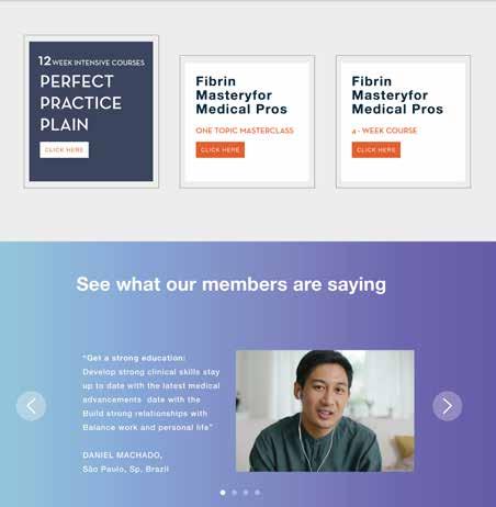
Helvetica Neue is a highly functional font. It can serve as an excellent option to complement the primary font, making the layout dynamic and appealing, while also working well for legal texts or longer passages.
28 BRAND GUIDELINES
We are offering you
Start your journey today. All membership plans come with a 30-day satisfaction guarantee and include:
Access to 200+ classes across 11 categories Watch on your computer, TV, phone or tablet Bonus class guides & content
Example #7
When using the Neutra Neue font, it’s important to maintain proper letter and line spacing. The intentionally larger and more airy spaces should be respected, so it’s crucial to exercise good judgment in preserving this proportion. For titles, the letter spacing can be 2.5 to 3 times the font size. Regarding line spacing, for most text, the ideal is 1.5 times the font size for desktop, and for mobile devices, 1.75 to 2 times the font size. Therefore, if you set the type at 16pt, a leading of 24pt should work well on the web.
Title Kerning
Space: 2.5 to 3 times the font size
Leading Space: 1.5 times the font size
29 BRAND GUIDELINES
Typography Guidelines
Lorem ipsum Mastery for Medical Pros
Everybody move your. Hey DJ can play that songall night On and on and on (on and on and on and on) meaningful content lorem ipsum is a placeholder text commonly used to demonstrate the visual form of a document without
Example #8
For Helvetica Neue, keep the default letter spacing of the font. For line spacing, adhere to the guideline: For most text, aim for 1.5 times the font size for desktop, and for mobile devices, opt for 1.75 to 2 times the font size. For example, if the type is set at 16pt, a leading of 24pt should be suitable for web use.
Title Kerning Space: Maintain the default spacing of the font.
Leading Space: 1.5 times the font size
30 BRAND GUIDELINES
Typography Guidelines
Typography Guidelines
Avoid applying shadows or other graphic effects to fonts
Limit the use of colorful text to two colors maximum. Stick to the designated color palette.
AVOID USING ALL CAPS FOR RUNNING TEXT OR LARGE BLOCKS OF TEXT. IT CAN BE USED FOR SUBTITLES OR BUTTONS. Ensure contrast and readability. Text is meant to be read! Do not rotate the text.
Refrain from mixing various font weights within the same text. Font weights are intended to emphasize, and excessive use will diminish their impact.
sentence.
31 BRAND GUIDELINES
different font sizes within Avoid using the same
Photography

Images have the power to communicate a large part of the brand. Our photographic style reflects humanity with expression, spontaneity, and emotion. People should be real in authentic situations. Respecting the professional’s space, however, brings the focus to the end goal without unnecessary insertions, excessive information, or false attitudes. The light temperature and colors of the environment should relate to the subject intrinsically. Close-up shots reinforce the viewer’s connection. This can be valid for both portraits and videos.
32 BRAND GUIDELINES
Photography guidelines


33 BRAND GUIDELINES
Photography guidelines


34 BRAND GUIDELINES
Photography guidelines
We can consider two directives for still photography: sensory appeal and functionality. Both must adhere to guidelines regarding light temperature and colors. However, it’s crucial to blend these two languages seamlessly to ensure the visual appeal and functional characteristics of the products are effectively communicated, facilitating consumer understanding.



35 BRAND GUIDELINES

Photography guidelines
36 BRAND GUIDELINES
Photography guidelines


37 BRAND GUIDELINES

Photography guidelines
38 BRAND GUIDELINES

Photography guidelines
39 BRAND GUIDELINES
Photography guidelines


40 BRAND GUIDELINES
Photography guidelines
Photography choices should be especific to the medium it would be used, including ads, hero shots for web, or roll-up banners


41 BRAND GUIDELINES
Photography guidelines



42 BRAND GUIDELINES
Iconography guidelines
In the development of a minimalist and bold brand project, iconography plays a crucial role in visual communication. With clean lines, simple shapes, and a restricted color palette, icons must convey messages clearly and concisely. They should be instantly recognizable while remaining faithful to the overall aesthetic. Iconography complements the brand’s visual identity, effectively communicating its values in an impactful manner.
• Some sites to download icons for free:
https://thenounproject.com/
https://www.freepik.com/
https://www.flaticon.com/
43 BRAND GUIDELINES
Key visual
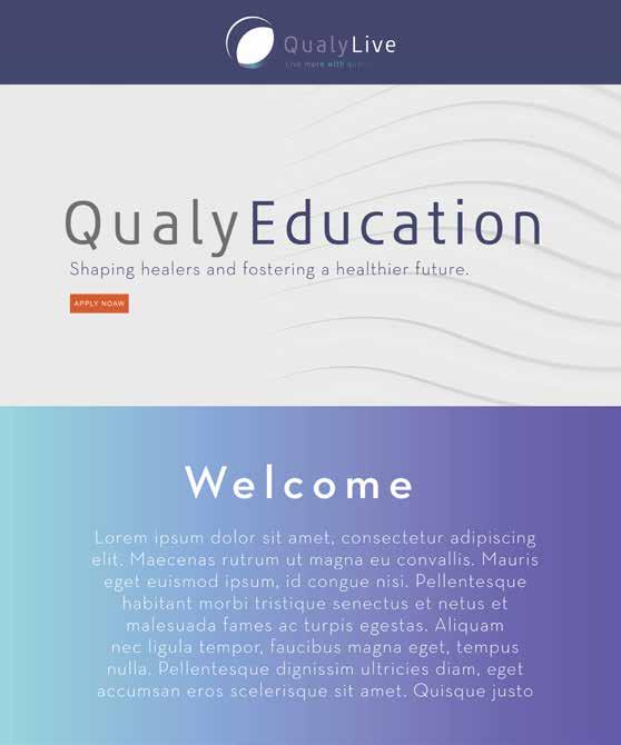
• Layout should be clean and airy.
• Juxtaposed background with gradient fill.
• Use orange color for buttons.
• Use less heavy fonts in long texts, adhering to the letter and line spacing distances defined above in the guide.

44 BRAND GUIDELINES
Key visual
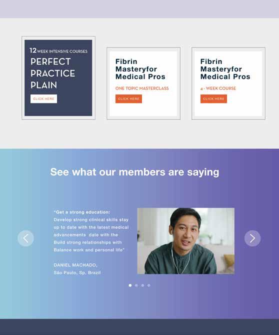
• Boxes of colors juxtaposed with different colors from the palette.
• Boxes with outlines should be used sparingly.
• Explore the use of background without cluttering the layout.

45 BRAND GUIDELINES
Key visual
• Boxes of colors juxtaposed with different colors from the palette.
• Boxes with outlines should be used sparingly.
• Explore the use of background without cluttering the layout.

46 BRAND GUIDELINES
Key visual
• Boxes of colors juxtaposed with different colors from the palette.
• Boxes with outlines should be used sparingly.
• Explore the use of background without cluttering the layout.
47 BRAND GUIDELINES
If you have any questions, comments or feedback, please contact us at qualylive@qualylive.com
You
Thank