SUSAN SHEEHAN GALLERY
BRICE MARDEN PRINTS: FROM LINE TO PLANE 2026
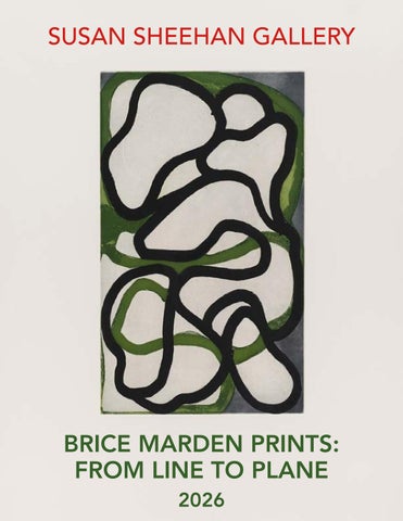
Cover: Brice Marden, Suzhou I, 1998
BRICE MARDEN PRINTS: FROM LINE TO PLANE SEPTEMBER 24 TO NOVEMBER 20, 2026
FOR EXHIBITION INFORMATION: https://www.susansheehangallery.com/current-exhibition/
SUSAN SHEEHAN GALLERY 146 Greene Street New York, NY 10012 212-489-3331 info@susansheehangallery.com www.susansheehangallery.com
Brice Marden in the Gemini artist studio photo © 1999 Sidney B. Felsen
Brice Marden Prints: From Line to Plane Brice Marden created pioneering, postwar era abstractions whose elegant linearity and subtle variations of color and texture possess a complexity that belies their apparent simplicity. From his early monochromes to his later calligraphic works, he pursued a unity of form and surface, texture and color, gesture and composition. This is as evident in his prints as it is in his paintings. Together, these works reveal printmaking not as a secondary pursuit, but as a vital arena in which Marden tested and refined his visual language. Building on his graduate studies in printmaking at Yale, where he studied alongside Richard Serra, Robert Mangold, and Nancy Graves, Marden later collaborated with groundbreaking publishers including Chiron Press, Gemini G.E.L., and Parasol Press. In Ten Days (1971-72), a set of eight etchings, six with aquatint, Marden offers a sustained meditation on the minimalist grid. Repeated hatching and errant marks animate the surfaces, transforming blank voids into scintillating planes rich with incident. As print scholar Jeremy Lewison observed, “Marden eschews the grand gestural marks of Abstract Expressionism in favour of a tighter, more controlled stroke.” By the time of Cold Mountain Series, Zen Studies 1–6 (1991), the modular structures of Marden’s early work had evolved into delicate gestural lattices that tumble and intertwine like moss or weeds. Across these six large-scale etchings, he expanded his graphic vocabulary through aquatint, sugar-lift aquatint, and spit-bite aquatint. Created alongside his Cold Mountain paintings, the prints draw a parallel between viewing an image and reading poetry. In the artist’s words, “You read the characters against each other a little bit. The first phrase joins up with the next phrase. It’s a much more open kind of translating than that which is done in Western poetry.” Here, the seemingly opposing acts of reading and looking, cognition and emotion, become inseparable.
Lana 2 The silkscreen Lana 2 (1966) is among the rarest and earliest prints by Brice Marden and was printed by the artist at Chiron Press in New York. Founded in 1963 by artist Steve Poleskie, Chiron was the first fine art print workshop devoted exclusively to silkscreen in New York and was famous for producing editions of trailblazers of Pop art and Minimalism, from Andy Warhol and Roy Lichtenstein to Ellsworth Kelly. Lana 2 was published by Marden in an edition of only eleven, plus proofs. Characteristic of his early monochromatic work (in paint as well as print), he retains the index of his mark making and the successive layering of colored screens in a strip running along the the composition’s bottom edge. The Lana series consists of three prints. Lana was printed with two screens: one in black, one in grey-blue. Lana 2 and Lana 3 were printed with these two same screens, with the addition of a third screen in warm grey and grey-pink, respectively. In this way, Lana and Lana 2, although editioned as independent prints, are equivalent to proofs for Lana 3.15 In Lana, Marden drew onto the screen with a crayon, emphasizing the strokes in the process, and printed it in black, over which he printed a flat plane of grey-blue. In Lana 2, he added to this a flat, warm grey screen. The texture of this print is almost like a screen-printed equivalent of his paintings from the time, a fact which underscores the conceptual and material give and take between his work in various media.16 Unlike some of Marden’s peers, who strove for a perfect finish, Marden’s romantic sensibility allowed for the indexical mark. This aligns him strongly with the spirit of Abstract Expressionism, where the touch of the artist was often retained as a vehicle of feeling and intuition. Intuition, meaning literally to know through sight, is something that Marden has in great abundance. This applies not only to his making of the works, but in our viewing of them. The more we look, the more we see. Lana 2 asks for the same attentiveness from its viewer: with sustained looking, its colors diverge, its layers come into focus, and its seemingly uniform surface reveals the decisions behind it.
Brice Marden, 1976. Photograph by Robert Mapplethorpe.
Brice Marden Lana 2, 1966 Screenprint Sheet size: 20 x 24 inches Printer: The Artist, at Chiron Press, New York Publisher: The Artist Edition: 11, plus proofs Catalogue Raisonné: Lewison 14 Signed, dated, numbered, and titled
Ten Days Ten Days (1971–72), a set of eight prints published by Parasol Press, New York, was Brice Marden’s first print portfolio. Made at printer Kathan Brown’s workshop in Oakland, California, it reflects both the visual environment in which it was produced and Marden’s sustained exploration of the grid. The work also draws on the examples of Barnett Newman, Mark Rothko, and Alberto Giacometti, whose art offered Marden formal and spiritual points of reference. Marden arrived in Oakland, California at Brown’s workshop with no plan for the project in mind, though he soon acknowledged the influence of Newman’s etchings, one of which he had tried to acquire the same year. However, Marden’s prints have an entirely different feel than Newman’s, evincing a subtler understanding of the etching process than the elder abstract painter’s.1 The portfolio established qualities that would recur throughout Marden’s printmaking: graphic simplicity, formal unity, and material richness. Sameness and difference structure a polarity that is very much of interest to Marden, who described Ten Days as “an exercise in how much you can keep something the same when you make it look different.”2 Utilizing a professional team with experimental approaches, Marden used hard ground etching, aquatint, burnishing, foul biting, overprinting with a second plate, plates which were hand wiped, and those where the ink was dragged up.3 In addition to drawing the outlines, Marden began by scratching ruled lines through the hard ground. While appearing black at first glance, many prints actually have mixtures of tones, including black, silver, grey, and turquoise. The choice of tone was important for Marden, who considered black to be as much of a color as any other. There is no specified sequence to the prints (which did not have a definite number at their outset), and their structure anticipates paintings like those of his celebrated Grove Group (1972-1976). All the plates were hand wiped by Brown, with special consideration given to the so-called “blank” areas, which Marden wanted to have a unified tone. When aquatint was applied, attention was given to avoid obliterating the lines underneath. In collaboration with the printer, aquatinting was done in a step by step process until the desired density of color was achieved.4 The subtle variations in tone and color in these prints is truly admirable, given Marden’s spare, consistent format. This is especially true for such a young artist, one whose talents would be celebrated just three years later at his Guggenheim retrospective exhibition in New York. Other full sets of this seminal portfolio can be found in the collections of The Museum of Modern Art, New York, The National Gallery of Canada in Ottawa, The National Gallery of Art, Washington, D.C., Tate, London, and The Art Institute of Chicago. Brice Marden, Locksley Shea Gallery, Minneapolis, 1974.
Brice Marden Ten Days, 1971-72 Etchings with aquatint Sheet size: Various, approximately 22 x 30 inches, each Printer: Kathan Brown Workshop, Oakland, California Publisher: Parasol Press, New York Edition: 30, plus proofs Catalogue Raisonné: Lewison 20 a-h Each sheet is signed, dated, and numbered The complete portfolio of eight etchings, six with aquatint
Brice Marden Focus I-V, 1979 Etchings with aquatint Sheet size: 15 1/2 x 10 7/8 inches, each Printer: Aero Press, New York Publisher: Brooke Alexander Editions Inc., New York Edition: 75, plus proofs Catalogue Raisonné: Lewison 32/I-V Each sheet is signed, dated, titled and numbered The complete portfolio of five etchings with aquatint
Brice Marden Untitled, 1983 Screenprint Sheet size: 38 1/4 x 50 inches Printer: Simca Print Artists, New York Publisher: The Artist and Simca Print Artists, New York Edition: 15, plus proofs Catalogue Raisonné: Lewison 36 Signed, dated, and annotated ‘RTP’
The annotation ‘RTP’ means “right to print”, which indicates this was the final proof before the regular edition was printed
d
Brice Marden I, II, III, 1983 Screenprints Sheet size: 30 1/4 x 23 3/4 inches, each Printer: Simca Print Artists, New York Publisher: The Artist and Simca Print Artists, New York Edition: 35, plus proofs Catalogue Raisonné: Lewison 37 Each sheet signed, dated, annotated ‘RTP’, and inscribed ‘I-III’ consecutively
The annotation ‘RTP’ means “right to print”, which indicates this was the final proof before the regular edition was printed The complete set of three screenprints
d
Etchings to Rexroth Marden made the portfolio Etchings to Rexroth (1986) during a major shift in his practice. The modular monochrome abstractions that had defined his work since the mid-1960s were giving way to a linear, calligraphic style that brought his drawing, printmaking, and painting into closer dialogue. He had begun drawing from nature with sticks instead of more traditional artist tools, while studying East Asian calligraphy.5 This new direction became visible in his solo exhibition at Mary Boone Gallery in New York in March 1987. The paintings shown there developed alongside the Rexroth etchings, whose formal and material experiments would shape his later prints. This complete set of twenty-five etchings with sugar-lift aquatint features ideographs arranged in vertical columns and grids, but unlike true ideographs, they do not have specific meanings. The initial prints were only sugar-lift, but as the series progressed, he introduced additional media and worked the plates more heavily. The last print is the most heavily worked with considerable scraping and re-biting. In addition to sugar-lift, Marden used hard ground etching, employing razors to cut through the ground and into the copper plate below.6 This series was worked from January to June 1986, with Marden visiting the printer Jennifer Melby in her workshop twice a week. As Melby recalls, “after working quite a while with these images, he brought in some notebooks with a lot of drawings he had done in Greece. Pen and ink drawings.”7 She suggested making similar images on copper plates using sugar-lift, and he tried it out using sticks to apply the solution. Marden named the series Etchings to Rexroth, as he had been reading Kenneth Rexroth’s translations of the Chinese poet Tu Fu from the Tang Dynasty. While not illustrations of the poems, they have a sharpness of line and delicacy which Rexroth described in his lyrics.8 Marden had started work on the series before he discovered the Rextroth translations. At the time, Marden was actually reading Cathay by poet Ezra Pound, who was himself a noted Orientalist. Peter Blum, who published this edition, had given Marden a first edition of the book halfway through the project, which Marden asserts had a greater impact on the prints than Rexroth did. 9 Although prints are numbered in a sequence which roughly corresponds to the order in which they were made, they do not have a set configuration and can be displayed either in a line or in a grid. Other complete sets can be found in the collection of The National Gallery of Art in Washington, D.C., the San Francisco Museum of Modern Art, the Walker Art Center, Minneapolis, the National Gallery of Canada in Ottawa, and the Tate, London.
Brice Marden, Etchings to Rexroth, 21 (detail), 1986
Brice Marden Etchings to Rexroth, 1986 Etchings with aquatint Sheet size: 19 5/8 x 16 inches, each Printer: Jennifer Melby, New York Publisher: Peter Blum Editions, New York Edition: 45, plus proofs Catalogue Raisonné: Lewison 40/1-40/25 Each sheet is signed, dated, numbered, and inscribed ‘1-25’ consecutively The rare complete portfolio of 25 etchings with the title page and colophon that retains its original linen-covered portfolio box
Cold Mountian Series, Zen Studies 1-6 Brice Marden’s Cold Mountain Series, Zen Studies 1-6 (1991) stands as a singular achievement in the history of postwar graphic arts and signals Marden’s mastery of the medium. Drawing both from his interest in Chinese poetry and the history of Abstract Expressionism, these elegant prints demonstrate Marden’s ability to synthesize a range of visual and thematic source materials. These six large-scale etchings, which Marden worked on between January 1990 and August 1991 with printer Jennifer Melby, are combined variously with aquatint, spit-bite aquatint, and sugar-lift aquatint, all of which add to the visual variety and atmospheric richness of each work.10 Completed alongside a series of nine-by-twelve foot paintings of the same name, these works take their point of departure from the celebrated Chinese poet of the Tang Dynasty, Hanshan, (“Cold Mountain”), and are compositionally arranged in four couplets of five characters, arranged vertically on each of the six sheets, a structure which mimics the poems as Marden encountered them in the original Chinese.11 In addition to resonance of Chinese poetry, Marden manifests an affinity with the Abstract Expressionist painter Jackson Pollock, whose rhythmic gestural style deeply inspired the younger artist’s work, especially from the mid-1980s through the early-1990s. Also like Pollock, in these prints Marden unites figure and ground, creating all-over networks of marks, skeins as dense as they are precarious, tumbling with clusters resembling mosses and interlacing like weeds or vines. In all except the last print, number six, the couplets become so intertwined it is hard to make out the individual groupings. Drawing on the visual and material breakthroughs of Etchings to Rexroth (1986), Marden further refined a visual iconography which in its vitality and gesture stood in contrast with the quieter, sensitive monochromatic abstractions of his youth. According to print scholar Jeremy Lewison, in comparison with the angular and jagged lines of the Rexroth series, however, the Cold Mountain prints “are much looser, more cursive and relaxed. The surface does not seem hard-won and remains pure even where aquatint has been scraped out. Indeed they seem effortless. The line is more confident, controlled and fluid as befits the increased scale of the plates, but varied in its width, rhythm and speed.”12
Brice Marden, Cold Mountain Series, Zen Studies 1 (detail), 1991
Unlike Marden’s drawings, which absorb ink and generally remain flat, in Cold Mountain Series, Zen Studies 1-6 the lines are slightly raised due to the printing, contributing a palpable sense of materiality to the otherwise purely graphic signs. He initially got the idea to print white as an undertone in prints one, two, and six after seeing works by Andrew Spence in Melby’s studio. Whatman paper was chosen because of its brilliant white color as well, and trimmed to have a deckled edge.13 While allowing a fair amount of accidents to occur in the process itself—which entailed the use of sticks dipped in a sugar solution applied to the copper plates—the actual etching of these marks in acid baths took great control and timing. Like with his drawing practice, Marden used a slightly tilted table while working the plates, careful as he was to avoid runs of the solution.14 Here, his mastery of print media and deft sense of control complements his use of chance and other impersonal means at his disposal, such as the use of sticks, intended to distance him literally and figuratively from his work. More than any other print portfolio by Marden, Cold Mountain Series, Zen Studies 1-6 presents a unified front, a true sense of call and response between works. There is the perfect balance of variety and visual unity, making them especially powerful when encountered as a full set, where all the differences and similarities reveal themselves simultaneously. Like the Cold Mountain series of paintings, which have become iconic in Marden’s oeuvre and were first shown in full in October 1991 at the Dia Art Foundation in New York, the etchings too have gained special significance. Complete sets can be found in the collections of Tate, London, The Walker Art Center, Minneapolis, and The Art Institute of Chicago.
Brice Marden, photographed by Brigitte Lacombe, Vogue, 1989
Brice Marden Cold Mountain Series, Zen Studies 1-6, 1991 Etchings with aquatint Sheet size: 27 1/4 x 35 1/4 inches, each Printer: Jennifer Melby, New York Publisher: The Artist Edition: 35, plus proofs Catalogue Raisonné: Lewison 43/1-6 Signed, dated, and numbered The exceedingly rare complete set of six etchings with aquatint
Brice Marden Han Shan Exit 1-6, 1992-93 Etchings with aquatint Sheet size: 15 x 11 1/4 inches, each Printer: Branstead Studio, New York Publisher: The Artist Edition: 45, plus proofs Each sheet is signed, dated, and numbered The complete set of six etchings with aquatint
Brice Marden After Botticelli: 1-5, 1993 Etchings with aquatint Sheet size: 26 7/8 x 21 3/8 inches, each Printer: Branstead Studio, New York Publisher: The Artist Edition: 45, plus proofs Each sheet is signed, dated, and numbered The complete set of five etchings with aquatint
Brice Marden Suzhou I-IV, 1998 Etchings with aquatint, drypoint and scraping Sheet size: 26 x 18 7/8 inches, each Printer: Jennifer Melby, New York Publisher: The Artist Edition: 45, plus proofs Each sheet is signed, dated, numbered, and titled The complete set of four etchings
Muses and Meres In the wake of Brice Marden’s monumental painting, The Muses (1991-93), where curvilinear colored bands loop, bend, and overlap across a lively visual field, Marden collaborated on a series of related prints with Los Angeles print workshop, Gemini G.E.L.. Speaking with curator Gary Garrels on the subject of the Ancient Greek Muses, Marden remarks, “Their mother is memory. And the arts are various ways you remember things. And I wanted to make this painting with nine figures wildly dancing in the mountains of the Peloponnese. We have a house in Hydra that faces the Peloponnese, and the Peloponnese is where some of the great ancient classical Greek sites are. And this is a sort of acknowledgment of that inspiration.”17 In the prints from this series, Marden combines multiple printmaking techniques, notably etching and lithography, creating a shimmering layered effect. This is evident in prints like Red Line Muses, Greyer Muses, and Beyond Eagles Mere, the latter of which also references Marden’s studio in Eagles Mere, PA, one which he has described as having one of the most “Zen-like workspaces.” In these particular works, color is kept to a minimum, with its greatest exploration being had in Beyond Eagles Mere, where bands of white, yellow, green, and red snake amidst each other and along the perimeter of a black background, as if caught in a state of perpetual motion. An overlay of etching adds subtle complexity to the already vibrant color lithograph. Examples from these two series can be found in the collections of the Metropolitan Museum of Art, New York, The Brooklyn Museum, and The Museum of Modern Art, New York.
Brice Marden in his studio, New York, 1991. Photograph by Harry Benson.
Brice Marden Beyond Eagles Mere, 2001 Etching and lithograph Sheet size: 22 x 30 1/8 inches Printer and Publisher: Gemini, G.E.L., Los Angeles Edition: 45, plus proofs Signed, dated, and numbered
Brice Marden Greyer Muses, 2001 Etching and lithograph Sheet size: 22 x 30 inches Printer and Publisher: Gemini, G.E.L., Los Angeles Edition: 45, plus proofs Signed, dated, and numbered
Brice Marden Red Line Muses, 2001 Etching and lithograph Sheet size: 22 x 30 inches Printer and Publisher: Gemini, G.E.L., Los Angeles Edition: 45, plus proofs Signed, dated, and numbered
Brice Marden Muses with Graphite, 2001 Lithograph with graphite Sheet size: 22 x 30 inches Printer and Publisher: Gemini, G.E.L., Los Angeles Edition: 45, plus proofs Signed, dated, and numbered
Brice Marden Beyond Eagles Mere 2, 2001 Etching and lithograph Sheet size: 22 x 30 1/8 inches Printer and Publisher: Gemini, G.E.L., Los Angeles Edition: 45, plus proofs Signed, dated, and numbered
References 1. Brice Marden in Jeremy Lewison, Brice Marden: Prints 1961-1991: A Catalogue Raisonné. London: Tate Gallery, 1992, 29. 2. Ibid, 28. 3. Ibid, 27. 4. Ibid, 95. 5. Ibid, 145. 6. Ibid. 7. Ibid. 8. Ibid, 146. 9. Ibid. 10. Ibid, 164. 11. Ibid, 51. 12. Ibid, 54. 13. Ibid. 14. Ibid 164. 15. Brice Marden in Jeremy Lewison, 1992, 21. 16. Ibid. 17. Brice Marden and Gary Garrels in conversation. The Museum of Modern Art, New York, 2006. <https://www.moma.org/audio/playlist/207/2725>.
Brice Marden, Cold Mountain Series, Zen Studies 3 (detail), 1991
SUSAN SHEEHAN GALLERY 146 Greene Street New York, NY 10012 Tel: 212 489-3331 info@susansheehangallery.com www.susansheehangallery.com