corporate design/corporate identity
p o c y l i

corporate design/corporate identity
p o c y l i
your part in protecting and promoting our most valuable asset
t he dental market place has become increasingly crowded and, with several hundred implant manufacturers competing for share of mind and trust of customers, a strong global brand is a powerful, valuable asset. i ndeed, the Straumann brand is one of the most valuable assets we have – which is why we need to protect and promote it effectively. corporate identity and design have an important role in this.
t he key to successful branding is consistency, which makes this corporate d esign m anual so important. i t has been developed with the aim of achieving a higher level of brand consistency and recognition, adding value to our business. t he guidelines presented here reflect our core values of simplicity, specialization, reliability, which should also be reflected in all our marketing and communication materials.
e very effort has been made to keep this manual simple in order to help you and our external partners produce materials that have a uniform corporate style and feel. to complement this manual, which focuses mainly on printed materials, corporate guidelines for presentations are available on my.straumann.
b randing is not an initiative driven by a single department or cost center; it has to be supported by each employee, because each of us influences the perception of the Straumann brand in the market. to draw an analogy with sport: each player is proud (and obliged) to wear the team’s true colors and would not consider playing in anything else. b elonging to the Straumann team gives us the privilege of representing one of the strongest brands in our field and puts us under the obligation of using the correct visual identity and design.
i f you have any questions regarding the contents of this manual please refer to the creative Agency in our b asel headquarters.
b eat Spalinger
president & ceo i nstitut Straumann AG
7. promotio NA l item S
10. electro N ic medi A 10.1
1.1 s traumann company logo
the Straumann logo is one unit consisting of two parts which must never be modified or used in colors different from those indicated in this c orporate d esign policy manual.
c olor defi N itio N
Green
cmyK: 100/0/100/30
rG b: 0/114/45
pantone: 349 u/349 c
Black
cmyK: 0/0/0/100
rG b: 24/23/22
pantone: black u/black c
cmy K
t he abbreviation cmyK stands for cyan, magenta, yellow and key black. t he cmyK color model forms the technical basis for modern color printing. t his version of the logo should be used in highquality print media, e.g. for publications such as corporate image brochures, technical brochures, marketing flyers, etc.
r G b
t he abbreviation rG b stands for red, green and blue. t he rG b color space is used for self-luminous systems (color display). t he rG b logo is used in all screen applications such as the internet, flashbanners, online newsletters, etc.
b l A c K the logo completely in black is to be used in office applications for forms like faxes, memos, advertisements, etc. i t ensures optimal reproduction quality.
pAN to N e
pantone colors are a set of standard colors for printing, each of which is specified by a single number. t hese colors are also used for two-color printing.
b A c KG rou N d color S
b ackground colors can completely change the face of a logo and the recognition of a brand. t he Straumann logo should always appear on a white or very light background (max. 30 % black).
e xceptio NS
e xtremely few situations may require that the logo be placed on a background color other than white (e.g. prints on promotional articles). for giveaways, a negative typeface may be used in the logo. Also, on gray background (min. 30 % black), the negative typeface may be used. please note that if the background is 100 % black, the Straumann “S” may also be white.
d ime NS io NS to maintain consistency between different printed publications, the minimum size of the corporate brand mark has been defined. t he dimensions of the logo depend on the size of the media and on the specific use. please refer to the standard logo sizes below.
smaller A6
A6
A5
A4/uS letter
mm / 1.0 inches
mm / 1.2 inches
mm / 1.6 inches
mm / 2.2 inches A3
mm / 2.7 inches
p o S itio N i NG
t he logo is always placed in a horizontal position. to maintain an optimal effect of the logo in publications, certain distances to texts and pictures have to be observed. t his clear space may not be penetrated by texts or any visual elements. i t is derived from multiples of the letter height of "n"
As a general rule, the Straumann logo always appears at the top center of the page in all publications (e.g. technical brochures, marketing flyers, job advertisements, etc.)
STRAUMANN® GUIDED SURGERY LEADING THE WAY IN YOUR TREATMENT
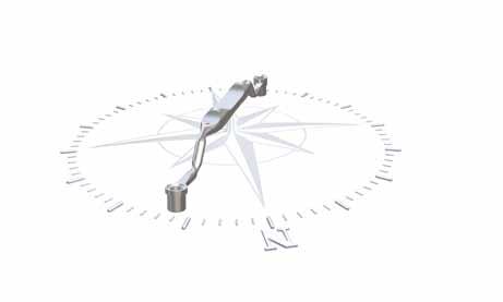
AND MA INTENANC E SURGICAL AND THETIC INSTRUMENTS
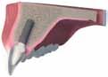


d o N t' S
t hese are typical examples of unacceptable uses of the Straumann corporate brand mark. t hese examples are useful in reinforcing how the Straumann corporate brand mark should actually be employed.
Colour
Never change the colour of the corporate brand mark.
Shapes
Never add shapes to the Straumann corporate brand mark.
Outline
Never use the Straumann brand mark as an outline.
Typeface
Never re-create the Straumann word mark using another typeface.
Straumann "S"
t he Straumann "S" (green, white or black) should not be used as an independent design element.
t he Straumann claim " c ommitted to Simply d oing m ore for d ental professionals" appears on all Straumann marketing materials. t his does not apply for certain exceptional cases such as scientific publications (e.g. white papers, science flashes), and patient materials (see next section).
lANG u AG e
the Straumann claim may not be translated please note that this rule also applies if the claim appears within a foreign-language text. However, it is possible in non-marketing texts to add a translation in brackets to the text for the purpose of explanation.






vA ri Atio NS for specific target audiences, the claim has been modified to the shorter "Simply doing more", for instance in all Straumann patient materials. please note that this shorter version should be restricted to patient marketing.


p o S itio N i NG
o n all publications, the claim is always positioned center bottom of the cover page within the green bar. i t is derived from multiples of the letter height of "n" i ts dimensions correspond to the Straumann logo at the top of the page.







2.1 m ain straumann colors
Straumann documents have a distinct corporate color scheme consisting of primary and secondary colors.
p rim A ry color
t he Straumann green is one of our key visual branding elements. i t is the product of considerable market research, the goal of which was to find a special shade of green that would differentiate our company. t he Straumann green should therefore be used as widely as possible within the scope of the c orporate d esign policy. i t should also be the predominant color in our visual materials.
Seco N d A ry color S
l ime green may be used in marketing documents to complement the Straumann green; it is mostly used as a style element in visuals, for framing illustrations and pictures or as a highlight (headlines, bullet points, etc). lime green is not the Straumann branding color and its use dilutes the branding impact of the Straumann green. l ime green should be used sparingly and only where necessary.
Gray is widely used as typeface color or for scientific tables, framing, borders, headlines, etc. in Straumann documentation; lends a clean, technical look to documentation.
2.2 color definition and usage
i n order to create a lighter and more interesting visual appearance, the main and secondary colors may be broken down into a variety of defined shades.
S tr A um ANN G ree N
l ime G ree N dA r K
Gr Ay dA r K CMYK 0/0/0/70
112/113/114
Gr Ay
155/156/157
Gr Ay l i GH t
Uncoated c ool Gray 10
Coated c ool Gray 10
Uncoated c ool Gray 7
Coated c ool Gray 7
4
2.3 s hading
All Straumann primary and secondary colors may be used in various shades/tints (percentage values of solid color). Shades are used for variety and as style elements, for larger areas of colors or as highlights to support the primary color (Straumann green).
Since Straumann green is such a vital part of our corporate appearance, no tints or shades are permitted for use.
please note that 100 % gray corresponds to 70 % black.
3.1 p rinted matters
All printed matters must be designed with a uniform visual image as depicted in the examples in these guidelines. A uniform corporate font is used to support the uniformity in design. futura is the Straumann Group's main typeface. futura and the other typefaces mentioned below have to be used exclusively. futura can be found on the enclosed cd - rom .*
r u NN i NG text & He A dli N e S
futura light
A bcdef GH i JK lm N op Q r S tuv W xy ZÄÖÜ abcdefghijklmnopqrstuvwxyzäöü/1234567890
Futura Light Oblique
ABCDEFGHIJKLMNOPQRSTUVWXYZÄÖÜ abcdefghijklmnopqrstuvwxyzäöü/1234567890
Futura Medium
ABCDEFGHIJKLMNOPQRSTUVWXYZÄÖÜ abcdefghijklmnopqrstuvwxyzäöü/1234567890
Futura Heavy
ABCDEFGHIJKLMNOPQRSTUVWXYZÄÖÜ abcdefghijklmnopqrstuvwxzäöü/1234567890
futura bold
abcdefghi JK lmnop Q rstuv WXZÄÖÜ abcdefghijklmnopqrstuvwxyzäöü/123 4567890
Futura Extra Bold
ABCDEFGHIJKLMNOPQRSTUVWXZÄÖÜ abcdefghijklmnopqrstuvwxyzäöü/123 4567890
Futura Medium
ABCDEFGHIJKLMNOPQRSTUVWXYZÄÖÜ abcdefghijklmnopqrstuvwxyzäöü/1234567890
futura bold
abcdefghi JK lmnop Q rstuv WXZÄÖÜ
abcdefghijklmnopqrstuvwxyzäöü/123 4567890
3.2 pc fonts for correspondence and screen presentations for correspondence and screen presentations a system font has been adopted that works for office software applications and web/screen functions. Arial has been chosen as this system font because it is installed on most computers. it should be used consistently in order to ensure maximum uniformity in pc communication.
r u NN i NG text
Arial Regular
ABCDEFGHIJKLMNOPQRSTUVWXYZÄÖÜ abcdefghijklmnopqrstuvwxyzäöü/1234567890
He A dli N e
Arial Bold
ABCDEFGHIJKLMNOPQRSTUVWXYZÄÖÜ abcdefghijklmnopqrstuvwxyzäöü/1234567890
A number of design elements are used to maximize the visual appeal of Straumann publications. i n the case of visuals or stamps, they may also represent a specific product or support a respective sales claim.
4.1 v isuals
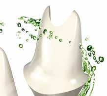
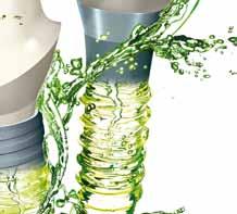
i n contrast to Straumann technical brochures, in which products are depicted photographically, marketing flyers and brochures heavily rely on graphic illustrations (3d visuals).* t hese exclusive Straumann visuals either represent the actual product (e.g. Straumann ® emdogain, Straumann ® gonyx, etc.), a product line (e.g. Straumann ® c A reS ® Guided Surgery) or relate to the claim of the product (e.g. Straumann ® roxolid).

REGENERATION BY DESIGN











* With the exception of patient marketing material, where photographs are an essential part of the layout
4.2 stamps
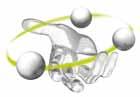
Stamps may be used to announce the launch of a product, sales milestones or umbrella brands and may be designed using lime green or darker shades of green. currently, the following stamps for Straumann® Soft tissue level implants, Straumann® cAreS® digital Solutions and Straumann® roxolid are in use:
OF
Straumann® Roxolid® A ND MATERIAL STRENGTH!·
eye-c Atc H er S
e ye-catchers are rectangular boxes and may also contain additional claims or give more information on a product.
Guideli N e S
e ye-catchers are always lime green and should adhere to a few general rules. With respect to lettering, different styles (e.g. bold, capitals, etc.) may be used; the frame thickness should not be less than 0.5 mm and the distance between box and text should be at least 1 mm. e ye-catchers and stamps can be made to stand out by tilting, in which case an angle of 12° is recommended (for consistency).
4.3 photographs
Technical documentation by Straumann often contains more photographs than 3D visuals. photographic images may also be used in marketing material. t he following guidelines regarding composition, content, quality and resolution have to be observed.
Ge N er A l rule S for pH oto G r A p HS *
t he brightness, lighting and focus need to be perfect and the product has to be clearly visible. professional photographers have the equipment and the skills to solve those issues. 'Snapshots' of the products should be avoided. t he photographic images must follow the technical specifications below, in order to be fit for any kind of reproduction:
File format .psd or .tiff
Resolution 300 dpi at 100 %
Color cmyK
pH oto G r A p HS for m A r K eti NG broc H ure S
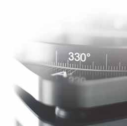
While 3d visuals are the more common form of illustration in marketing brochures, photographs may also be used. they should have a natural feel and be interesting to look at. Atmospheric pictures like those shown below lend themselves well for this type of brochure.

* Whenever you use a photograph, make sure that Straumann possesses or obtains the copyright for that particular or any future publications.
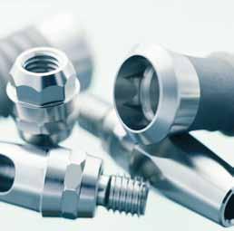
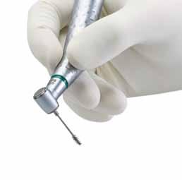
pH oto G r A p HS for tec HN ic A l b roc H ure S
t he background of these photographs should be white or light gray. u sually, there is only one picture in the middle of the page. i n certain situations three pictures may be used in the middle of the page. t he pictures are always in a square format. t he size of the square with one single picture is 56 mm. When there are three pictures, the size of the square is 37 mm. t he three pictures are placed next to each other with a white space between them.
i f the pictures have a gray background, there is no outline. With a white background, there is an outline around the picture of 0.5 point in 50 % black.
CARE AND MAINTENANC E OF SURGICAL AND PROSTHETIC INSTRUMENTS

pH oto G r A p HS for Ad S
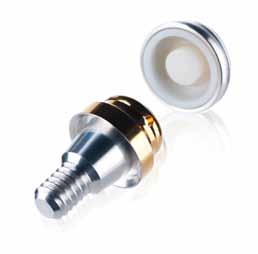
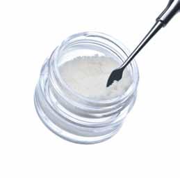
the background of these photographs has to be white (only white). the product is clearly recognizable. t he depicted object is often shown together with a shadow.
pH oto G r A p HS for pAtie N t m Ateri A l
patient materials may use photographs of people in 'real life' situations. i ts very important that the models give the impression of being natural and unposed; naturally, they should have beautiful teeth. t he age, gender and cultural background of the models should be appropriate for the topic of the brochure. t he pictures should be shot by a professional photographer or be acquired from a professional agency like itsockphoto, gettyimages, corbis, etc. i n all cases, Straumann must have signed permission from the model (or, in case of children, the model’s parents) for use in dental promotional material.


Straumann publications can be roughly divided into two categories: technical documentation (e.g. step-by-step instructions/basic information brochures, product catalogs, scientific flashes, white papers, etc.) and marketing documentation (e.g. product flyers, marketing brochures, patient materials, advertisements, banners, etc.)








please note that this booklet only focuses on marketing documents – for more information and guidelines on technical documentation, please contact the creative Agency at Straumann HQ.
5.2 l ayout of b rochure f ront c overs, p osters and a dvertisements Straumann ® advertisements are crucial in representing the company and products at trade shows or in specialist journals. Accordingly, their appearance should correspond to certain general guidelines and a defined structure. the layout for the front cover of a brochure is nearly identical to that of the advertisements – only the body text 4 is omitted.
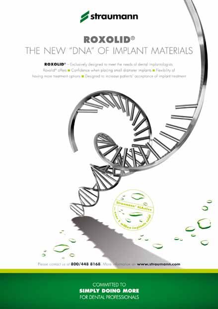
e xplA NAtio N of t H e fro N t cover l Ayout o N A4 f orm At*
1 t he Straumann logo is placed at top center of the page
2 use either the full form (‘Straumann ® product’) or simply ‘product’ in bold capital letters. t he font size of the headline is 24 point
3 place the main claim below the product name in capital letters (usually not bold). this font size is also 24 point the line space of the headline is 34 point
4 Sales proposition for product, usually in a font size of 9 point (min. 7 point).
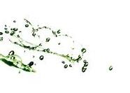
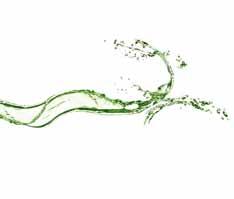
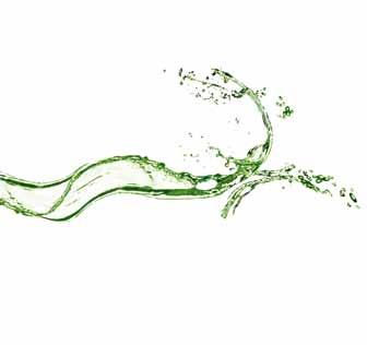
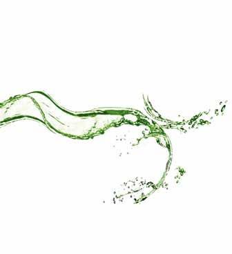
5 3d visual of product or visual representing claim. partial visuals (e.g. water splashes, lines) may be used to complement the main visual (optional).
6 Additional information on the product/product line (optional).
7 t he internet address and phone number of the respective country subsidiary (optional) may be used in marketing materials as a design element (optional). t he font size of this information is the same as in 4
8 t he lime green bar has a height of 4 mm. o n the A5 format, the height is 2.5 mm.
9 Straumann claim; for patient material, the short version is used. t he green Straumann bar has a height of 35 mm. o n the A5 format, the height is 25 mm.
exceptio NS
please note that some Straumann advertisements within the framework of a larger campaign (e.g. ‘esthetics by…’) place additional weight on the main claim. in such cases, the product does not appear in capital letters in the headline and is instead marked bold within the text at least at first mention.
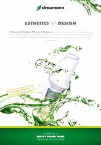
* Please note that all measurements are based on an A4 format and have to be proportionally modified when working in a different format.
5.3 l ayout inner face i n contrast to technical brochures, there is no set of ‘rules’ regarding the content of marketing documents. However, there are certain general guidelines which we recommend you follow when creating a manuscript and visualizing a layout.
“IF YOU REALLY WANT TO MAKE NARROW DIAMETER IMPLANTS, NEW MATERIALS WILL BE NEEDED.” 1
CLINICAL APPLICATIONS OF ROXOLID™ SM ALL DIAMETER IMPL ANTS
There are situations where larger diameter implants may pose some issues With Roxolid™ clinicians can address these situations such as:
Narrow interd ental space p Thin alve olar ridge p Congenitally missing lateral incisors p Maximization of bone and vascular supply p Maximization of facial bone suppor p
Differentiate yourself and your practice by of fering Roxolid™
CONFIDENCE WHEN PL ACING SM ALL DIAMETER IMPL ANTS
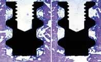
Implants are exposed to high forces and need to demonstrate go od osse ointegration. These factors are especially importan when small diameter implants are chosen due to their reduce d size. The combination of the Roxolid™ material and the SL Active ® surface specifically addresses these two parameters Mechanical te sts have demonstrated higher strength of Roxolid™ implants comp ared to pure titanium implants2,3. This high strength is comb ined with the hydrophilic SL Active ® surface, whose excellent osseointegration proper ties have been shown in various pre- clinical4 and clinical studies.5 This delivers peace of mind for treatments with small diameter implants

e xpl ANAtio N of t H e i NN er fA ce l Ayout o N A4 f orm At*
1 t he green Straumann bar has a height of 13 mm. in the A5 format, the height stays the same.
2 t he lime green bar has a height of 2 mm. i n the A5 format, the height stays the same.
3 t he document should contain an introduction with text/bullet points listing the main features or benefits of the product/system (usually in a font size of 9 point ).
4 t he main text may feature product pictures, additional services, or scientific sources. i t may also mention related products, application range, etc.
5 i n the case of tables or graphs, use a combination of lime green and gray for a fresh, light look.
6 in case of the latter, footnotes in short documents should be limited to a minimum (usually in a font size of 7 point ).
7 to create distinctly product-specific brochures, the respective visuals reappear partially as design elements within the documents.
i n marketing brochures, the dark green bar is usually placed on the top of the page, but may also appear on the bottom. in rare cases, use of a lime green bar may be permitted as a design element. i n technical brochures, the bar must be placed on the top of the page!
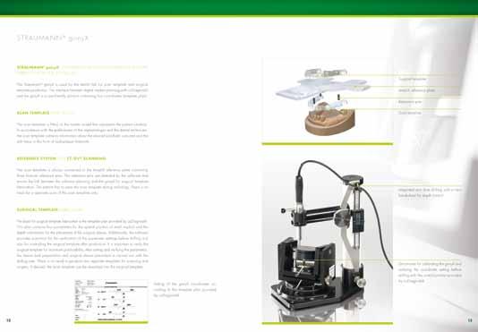
* Please note that all measurements are based on an A4 format and have to be proportionally modified when working in a different format.
5.4 l ayout bac K cover
i deally, the back of a cover presents some sort of ‘overview’ of a system, product application or summary of previously mentioned content (e.g. benefits and features). i n the layout, the partial design elements may be repeated. t he back cover always ends with the green Straumann bar containing the website address in white font. t he dimensions of the green Straumann bar and the lime green bar on the bottom are the same as on the front cover.


5.5 d isclaimers
o n all Straumann publications, products by Straumann or other manufacturers have to be accounted for in a disclaimer. t he following standard texts have been defined for the six Straumann languages; for any other language, please make sure to define your own foreign language version and use it consistently in all publications. t he standard text may not be modified or altered in any way.
on brochures, the disclaimer is placed underneath the Headquarters address. in shorter publications, the disclaimer appears either above the lime green bar or, to save space, vertically on the righthand side of the page.
eNG li SH
Straumann ® and/or other trademarks and logos from Straumann ® that are mentioned herein are trademarks or registered trademarks of Straumann Holding AG and/or its affiliates.
G erm AN
Straumann ® und/oder andere hier erwähnte m arken und logos von Straumann ® sind m arken oder eingetragene m arken der Straumann Holding AG und/oder ihrer verbundenen u nternehmen.
fr e N c H
Straumann ® et/ou les autres marques commerciales et logos de Straumann ® mentionnés ici sont des marques commerciales ou des marques déposées de Straumann Holding AG et/ou de ses sociétés affiliées.
itA li AN
Straumann ® e/o altri marchi e loghi di Straumann ® qui citati sono marchi di fabbrica o marchi registrati della Straumann Holding AG e/o delle sue aziende collegate.
SpAN i SH
Straumann ® y/u otros marcas y logotipos de Straumann ® aquí mencionados son marcas o marcas registradas de Straumann Holding AG y/o sus filiales.
p ortu G ue S e
Straumann® e/ou outras marcas comerciais e logótipos de Straumann® aqui mencionados são marcas comerciais ou marcas comerciais registadas de Straumann Holding AG e/ou suas afiliadas.
5.6 footnotes
footnotes must be clear and easy to read. t hey should be in a font size that is appropriate to the size of font used in the main body. 7 point is the minimum. Where possible and appropriate, footnotes should appear on the same page as the mention in the text.
5.7 references
t he font rules for footnotes also apply for references, which should be consistent with the ' vancouver' style of referencing and may appear on the same page as the mention in the text, or collectively on following pages or at the end of the chapter / text.
5.8 p aper Q uality
paper is more than just a carrier of printed information. l ike the character of a type-face, the nature and feel of paper play an important role in the overall impression made. When selecting paper, it should be remembered that different types of paper also convey different moods, due to structure and surface. the optical and tactile impression of the paper quality of a printed item should therefore not be underestimated. m atte art paper is always recommended for printed matter.
t he minimum requirement for the production should be 100 % chlorine-free bleached cellulose material. t he fineness of the paper, which can be felt, and the matte effect, express understatement and create an impression of high quality. t hey convey the modern thinking of Straumann and have the effect of being pleasant and friendly. printers will be pleased to advise in the selection of paper based on the information below.
Paper brand luxoA rt S il K; white, coated semi-matte
Paper thickness brochure cover/flyer 250 g/m2; content 135 g/m2
6.1 l etterhead
letterheads follow the general rules of the guidelines. t he green fading bar at the bottom has a height of 10 mm (0.39“). No lime green flash is used on business documents! t he size of the logo is 55 mm (2.16“) and the letterheads are di N A4 (210 x 297 mm) / uS letter (8.5” x 11”). All text printed from a pc should use Arial.
Firstname Lastname Road xx xxxx Town
Headline
Rud delismodiam duipsum sandionulla feuguer iliquis doleniam ilit lan ulla autat aliquam dunt utpatem quat, velis nulla alit, quis et, susto corpero core te tat, quatuerat, quipis nismolor aliquip sustie magna faciduipsum zzrit ad te faccum ilit alis eum vendrercinim alismodio doloboreet, velesto dit ea commy num ing ex eril essit nullan vel ut nosto odiamconse magna aliqui tem quis euismol orercin utatis nonse tie volessequi blan ulluptatis exer sit, quamconum ip eliquisi blaorercin et autem irit ulput at. Magnibh ea facinibh etum ercidui blandio odigna feugue ex esent vel iureet ex eum dolobore consequisi ea faccum in ulla feugiam commod modolore velis nonsendre duipsum vel utat praeseq uatetue commy nonsectet lore vel utat velessectet nulla corem veratue veniamet aut ate dolute ea feu feugiam veliscin vero odipis dolor secte doloborem eliqui blandigna facipis modolobore tate venibh ea con eu feugiat
Ed tet, sum num incip ent dignit am, veliquat. Ut ea facipsum il ea alit velit am veros nullum autpatumsan ut ero do eraesto core min utpat
Quat. Estie ex ercilis ad te faciduis nostrud tatuerc illaorperos ea alis am vullam dunt loreetum in henis nostincilit wis dunt velendre commy niam, sustrud magna ad et lorer sim at dolum do dip et lutpatu erilism odigna feu feumsan utem ing endre faci et adignisit velenis sequiss equatueros dignibh eugait numsandit laore magna faci essequisci tat nos nulputem quis adip ex eros er iniat verit, quipsum quat wisim accum velenim ate consequisi exeros ex exero consed tat alit et erostrud eugue commy num nis nulla faccum estrud delessenit incidunt laore vullam, cor accum vercing eugait praesecte eriliquatie dolorpero dolobore delismodo odolore min vulput ilis nibh et amcor autem do el esequis dunt lamet iriusto eliscil ilis eugueros num irilit niam delent veliquat nonsequis dolore consed tat, conullaor sectem quat wissit veliquis nisit ut ulla facil del eumsan.
6.2 f a X paper
fax paper is printed in black and white. please note that this is the only medium on which the 100 % black logo may be used. for improved readability, the margin for text and logo is wider than on other materials. t he green bar is not incorporated on fax stationery.
t he fax Word template is uploaded automatically to all pc s of Straumann employees.
b uS i N e SS m A tter S 1 1.5 mm 2 3 4 1 Straumann logo
telefax message 1 / 2
to: max muster
from: sandra muster
Copy: sven muster
Date: 01. November 2010
Re: Pages: 2 fax-No: 555 5555 55 55
Headline
Rud delismodiam duipsum sandionulla feuguer iliquis doleniam ilit lan ulla autat aliquam dunt utpatem quat, velis nulla alit, quis et, susto corpero core te tat, quatuerat, quipis nismolor aliquip sustie magna faciduip sum zzrit ad te faccum ilit alis eum vendrercinim alismodio doloboreet, velesto dit ea commy num ing ex eril essit nullan vel ut nosto odiamconse magna aliqui tem quis euismol orercin utatis nonse tie volessequi blan ulluptatis exer sit, quamconum ip eliquisi blaorercin et autem irit ulput at. Magnibh ea facinibh etum ercidui blandio odigna feugue ex esent vel iureet ex eum dolobore consequisi ea faccum in ulla feugiam commod modolore velis nonsendre duipsum vel utat praeseq uatetue commy nonsectet lore vel utat velessectet nulla corem veratue veniamet aut ate dolute ea feu feugiam veliscin vero odipis dolor secte doloborem eliqui blandigna facipis modolobore tate venibh ea con eu feugiat.
Ed tet, sum num incip ent dignit am, veliquat. Ut ea facipsum il ea alit velit am veros nullum autpatumsan ut ero do eraesto core min utpat. Quat. Estie ex ercilis ad te faciduis nostrud tatuerc illaorperos ea alis am vullam dunt loreetum in henis nostincilit wis dunt velendre commy niam, sustrud magna ad et lorer sim at dolum do dip et lutpatu erilism odigna feu feumsan utem ing endre faci et adignisit velenis sequiss equat ueros dignibh eugait numsandit laore magna faci essequisci tat nos nulputem quis adip ex eros er iniat verit, quipsum quat wisim accum velenim ate consequisi exeros ex exero consed tat alit et erostrud eugue commy num nis nulla faccum estrud delessenit incidunt laore vullam, cor accum vercing eugait praesecte eriliquatie dolorpero dolobore delismodo odolore min vulput ilis nibh et amcor autem do el esequis dunt lamet iriusto eliscil ilis eugueros num irilit niam delent veliquat nonsequis dolore consed tat, conullaor sectem quat wissit veliquis nisit ut ulla facil del eumsan.
b
6.3 business card
Straumann business cards are the same size as a standard credit card (85 mm x 54 mm/3.375” x 2.125”) and use a horizontal format. o ptionally (eg. for sales representatives), a two-sided business card may be used. for cost reasons, it is recommended that business cards should be printed using pantone color. p lease note that the lime green flash is not used on business cards.
t he template is available for download on the cd - rom
Firstname Lastname Title/Function
Direct Dial +41 (0)61 965 11 11
Phone +41 (0)61 965 11 11
Fax +41 (0)61 965 11 11
Mobile +41 (0)61 965 11 11 firstname.lastname@straumann.com
6.4 message card
Straumann Holding AG Peter Merian-Weg 12 CH-4052 Basel Switzerland www.straumann.com
m essage cards have a format of 148 x 105 mm (5.83” x 4.13”). t he height of the green bar is 15 mm (0.59”) and contains the web address. please note that the lime green flash is not used on message cards.
6.5 e nvelopes
b efore production, please check your national postal requirements. i f necessary, please change the design accordingly and send a specimen to creative Agency for approval. b uS i N e SS m
1 t hese zones must stay white and may not contain any elements.
7.1 givea W ays
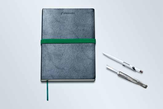
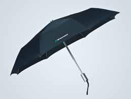
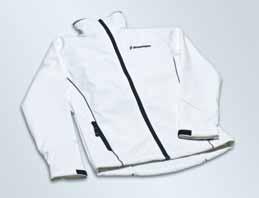
All Straumann promotion material should use white, gray, silver or, in rare situations, black as a basic color. Straumann Green should be used for color accents on gifts (e.g. clip on a pen, collar on a shirt). t he Straumann logo should always be printed in its original colors. However, there can be exceptions (e.g. Straumann notebook).
t he consistent presentation of Straumann products is a key factor in the creation of marketing and other materials. this includes correct usage of product branding, including unregistered and registered trademark symbols.
8.1 u nregistered and registered trademar K s
t he following list provides an overview of Straumann brands and products and their registration status as designated by the symbol.
o G o S
S trA um ANN ® c A re S ® di G itA l S olutio NS
Straumann ® c A reS ® visual
Straumann ® c A reS ® Scan c S2
Straumann ® c A reS ® c A dc A m
Straumann ® c A reS ® Guided Surgery etkon™ etkon™_visual coron ® polycon ® ticon ® zerion™
pr oduct S biora ® emdogain ® prefGel ® b one c eramic™ m embraGel ®
m Ateri A l S & p roduct li N e S
S l A®
syn o cta ®
S l Active ®
Water implant (as a registered design)
c A reS ® cross fit ®
b one c ontrol d esign™ roxolid ®
Slo GANS /tAG li N e S
m ore than implants™
Naturally attractive™ eliminate the dip ®
t he surface with success built in ® c onsistent emergence profiles™
pr oduct S
please note that this list reflects the status of registrations (September 2010) and is subject to change. t his list is not intended to be exhaustive; adhering to this content will not guarantee or substitute for final approval of a marketing document. please also note that some registrations are valid for some regions only.
As a general rule, products should carry their respective trademark or registered sign at least once on each page, preferably at first mention (e.g. in headlines, introductions, etc.). for repeated use within one document, Straumann HQ recommends using the symbols as consistently as possible. i f a product appears together with the registered Straumann ® (e.g. Straumann ® emdogain, Straumann ® S l Active, etc.), the registered sign behind the product is usually dropped to avoid ‘overloading’*. t his particularly applies to highly visible texts in headlines, advertisements, etc.
* Please note that ‘CARES ®’ must always be mentioned carrying its registered trademark sign and may never appear without the preceding ‘Straumann®’. Also, the usage of ® combined with ™ (e.g. Straumann ® MembraGel™) is permitted.
Style AN d tr ANS l Atio N G uide
o ne of the most challenging endeavors of a multi-national, multi-lingual company like Straumann is the development of a ‘c orporate l anguage’ which is internationally understood and recognized. please refer to the following recommendations for the writing of original manuscripts in english and adhere to the translation guidelines in all subsequent processes.
9.1 e nglish manuscript guidelines
As a general rule, documents are written in english and are passed through an approval process at headquarters in b asel, Switzerland before they are released for publication. for stylistic and formal coherence, the following should be observed:
c o N te N t
m arketing documents should place an emphasis on the main sales proposition of the respective product and should be conceived according to the formats usually employed by Straumann (e.g. one-page advertisement, four-page flyer, marketing brochure, etc.).
i n very short documents, footnotes should be avoided whenever possible.
t he use of more than one expression/term for one and the same product/procedure/system should be avoided.
c oherent and correct usage of trademarks and third-party product references should be ensured throughout the document.
Standard texts such as disclaimers or similar (if such exist for the respective product) create a uniform look across our documentation and should be used if available.
f orm At
All Straumann documents follow American english spelling rules: color vs. colour, analyze vs. analyse, enrollment vs. enrolment, center vs. centre, catalog vs. catalogue, check vs. cheque, judgment vs. judgement, license vs. licence, program vs. programme, counseling vs. counselling. for english, Straumann employs the dot as the decimal sign on the baseline (e.g. 5.2).
i n units of measurement, a non-breaking space has to be placed between number and unit (e.g. 100 km, 40 %, 26 ° c, Ø 6 mm), in accordance with the i nternational System of u nits (S i).
c ommas may not be used to separate long sequences of digits (e.g. 200 000). use upper case and singular case when referring to the specific product name (e.g. drill stop as a generic name vs. Straumann ® d rill Stop).
d ouble quotation marks “ ” are reserved for speech. Single quotation marks ‘ ’ are used to highlight / distinguish words / terms in text and to use within quotations / speech, e.g. “ i admire Straumann’s principle of ‘simply doing more’,” he said.
9.2 f oreign language documents
foreign language documents are a vital tool in representing Straumann’s corporate identity products in different markets worldwide. When creating original documents in a language other than english, the points mentioned in the c ontent section of chapter 9.1 should be observed. for translation, the following additional guidelines must be observed:
c o N te N t u nless different legal or regulatory requirements apply, it is vital that the wording of the original document be maintained. c ontent may not be added or modified, unless the requested changes were previously approved and implemented into the english master copy by HQ or have undergone the standard approval process in the jurisdiction of the respective language. to maximize readability and to minimize potential legal implications, it is absolutely vital that technical documentations, user manuals and similar texts always use consistent terminology in all languages.
f orm At for languages other than english, Straumann employs the comma as the decimal sign on the baseline (e.g. 5,2).
With abbreviations, it is recommended that the translator places the abbreviation and its english long form in brackets following the translation, e.g. deproteinisiertes bovines Knochenmineral (dbbm , deproteinized bovine bone mineral). i f an official abbreviation exists and is known in the country, the translator places the official abbreviation in brackets following the translation of the long form, e.g. estados u nidos (ee uu.)
d o N ot tr ANS l Ate
product and company names: institut Straumann AG, Straumann Holding AG, Straumann cAdcA m GmbH, Straumann ® m embraGel™, Straumann ® d ental i mplant System, Straumann ® c A reS ® Guided Surgery, Straumann ® c A reS ® digital Solutions, Straumann ® b one c eramic, ipS e.max ® c A d, etkon™_visual t he Straumann claim: Committed to simply doing more… titles relevant to Straumann ® in the framework of a new corporate marketing appearance, launch, campaign, etc. (e.g. ‘for l ife’).
footnotes, references, bibliography (titles of articles, publications, etc.)
10.1 p o W er p oint presentations
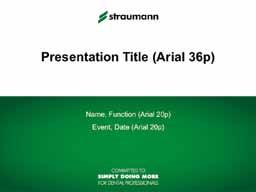
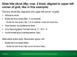
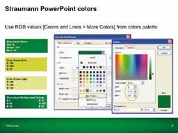
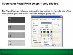
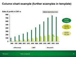
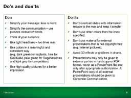
power point is a key tool for sharing information on Straumann externally. i t is important, therefore, that power point presentations have a consistent Straumann feel and look. furthermore, they should reflect our core beliefs of simplicity and reliability (quality). t he Straumann guidelines for power point presentations – with templates, rules and recommendations – are available on my.straumann. t he template is also available directly in power point. t he examples below can be found with further details in the template.
10.2 o nline applications ( W ebsites, portals, etc.)
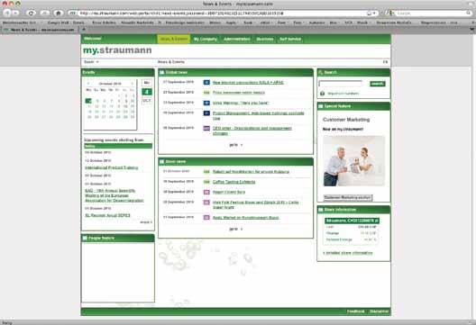
Graphic and layout requirements for online publishing differ from those for print media. Nevertheless, the principles of the Straumann c orporate d esign / c orporate i dentity policy are still valid, although their application may vary. for this reason an Appendix containing rules and guidelines will be developed and published on my.straumann
International Headquarters
institut Straumann AG
peter m erian-Weg 12
cH-4002 basel, Switzerland
phone +41 (0)61 965 11 11 fax +41 (0)61 965 11 01
Straumann AG,