1 minute read
TimelineVisualPowerBi

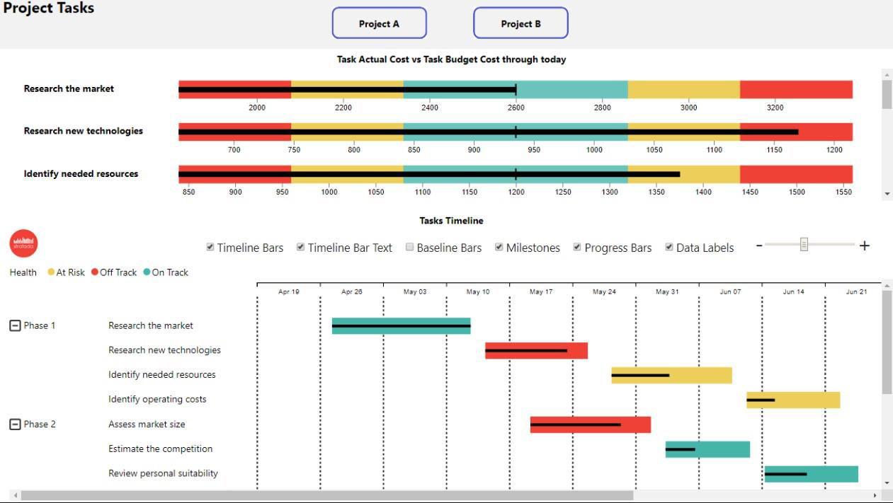
Power BI is a powerful business intelligence tool that can help organizations make data-driven decisions by transforming raw data into visually appealing and insightful reports. One of the key features of Power BI is the ability to create interactive visualizations, including timelines, which allow users to explore data in a chronological order. In this tutorial, we will explore how to create a timeline visual in Power BI.
Step 1: Prepare the Data Before creating the timeline visual, you need to ensure that your data is formatted correctly. The timeline visual in Power BI requires a date or time field, which can be formatted as a date or time value. Ensure that the date or time field is in the correct format, and that the data is clean and accurate.
Advertisement
Step2:CreatetheTimelineVisualTocreateatimelinevisualin PowerBI,followthesesteps:
1. OpenPowerBIandselectanewreport.
2. Selectthedatasourceanddragthedateortimefieldtothe"Values"fieldwellin theVisualizationspane.
3. Clickon the"Timeline" iconin the Visualizations panetoaddthe timeline visual tothereport.
4. Adjust the visual as needed, including changing the date range, formatting the visualstyle,andaddingadditionalfields.
Step3:CustomizetheTimelineVisualOncethetimelinevisualis created,youcancustomizeittofityourneeds.Somecommon customizationsinclude:
1. Changing the date range: You can adjust the start and end date of the timeline visual by clicking on the timeline visual and using the formatting options in the Visualizationspane.
2. Formattingthevisualstyle:Youcanchangetheappearanceofthetimelinevisual byadjustingthecolors,font,andstyleofthevisual.
3. Addingadditionalfields:Youcanaddadditionalfieldstothetimelinevisual,such asacategoryfield,togroupthedatabyaspecificcategory.
Step 4: Interact with the Timeline Visual Once the timeline visual is created and customized, you can interact with it to explore your data. You can use the timeline visual to filter other visuals on the report, or you can filter the timeline visual based on other visuals. You can also click on a specific point on the timeline to highlight the data associated with that point.
Conclusion: Creating a timeline visual in Power BI is a great way to explore data in a chronological order. With a few simple steps, you can create a timeline visual that is customized to fit your needs. By interacting with the timeline visual, you can gain valuable insights into your data and make data-driven decisions.
