55 | 2026
A MAGAZINE ABOUT BRICKWORK AND RESPONSIBLE ARCHITEC TURE
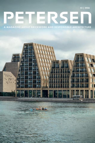
Paper Island (Papirøen), Copenhagen | Photo: Anders Sune Berg
Paper Island is right in the heart of Copenhagen’s inner harbour. From left to right: the Playhouse, the Opera House, the Water Culture House, the big residential development described in the article, and the Inner Harbour Bridge.
FROM ISLAND TO NEW COMMUNITY By Martin Søberg, PhD, architectural historian Photos: Anders Sune Berg In recent years, Paper Island (Papirøen), in the heart of Copenhagen’s inner harbour, has been transformed from an industrial zone with restricted access into a contemporary mixed-use neighbourhood. The large gables on a family of blocks of flats that vary in height now overlook the bend in the harbour channel. Behind their sloping façades lie 255 flats and a hotel, with four large street-level halls beneath them housing restaurants, cafés, cultural venues and shops. The development is arranged as a perimeter block around a communal fifth area – a green, open space densely planted with trees, where markets, concerts and other public activities are held. A water culture centre is under construction at the north-west corner, and a wide wooden jetty on three sides of the island invites visitors to walk along the water’s edge and enjoy views of the city. Along the northern and southern quaysides, rows of terraced houses line the water: The Opera Houses to the north with views of the Opera House, and the Canal Houses to the south with direct access to the historical Trangraven canal. The residential blocks and two rows of terraces on Paper Island accommodate a total of 188 owner-occupied flats, 85 social housing units and a hotel with 130 rooms. Petersen Tegl has supplied the bricks used on all of the façades on the island, ranging from light-yellow on the blocks of flats and halls to black-grey on the two rows of terraced housing and warm-grey on the Water Culture House. The bricks’ materiality binds the buildings together and establishes a dialogue with the old, brickbuilt warehouses that surround the island.
The buildings on Paper Island surround a tree-lined urban space. The paving pattern was inspired by Hans Christian Andersen’s paper cuttings.
Paper Island, Copenhagen Client: Christiansholms Ø P/S (Danica Ejendomme, UNIONKUL and Nordkranen) Architect: Cobe Landscape architect: Inside Outside and Cobe Engineer: MOE (Artelia) Contractor: NCC Denmark Other consultants: Via Trafik and Transsolar Completed: 2024 Brick: The Gable Houses: Custom Christiansholmer brick, developed by Cobe in collaboration with Petersen Tegl, based on D71 The Opera Houses: A darker variant of the brick used on the flats. In both of them, the bricks are embedded in concrete elements produced by Ambercon The Canal Houses: Cover™ C56, 528 x 240 x 37 mm Site plan Both the section and the site plan formed part of Cobe’s winning competition proposal from 2016, which did not include the Water Culture House.
Cross-section
2
Facing the water PERPENDICULAR TO THE HARBOUR CHANNEL, LARGE MULTI-PURPOSE HALLS, CROWNED BY BLOCKS OF FLATS, THE GABLE HOUSES, ECHO THE ORIENTATION OF THE NEARBY BRICK-BUILT WAREHOUSES. LIGHT-YELLOW BRICKS EMPHASISE THE KINSHIP BETWEEN THE NEW BUILDINGS ON PAPER ISLAND AND THEIR HISTORICAL NEIGHBOURS.
Tall, brick-clad arcades mark the transition from the outdoor public spaces to the large halls for food, culture and shopping on the ground floor.
The façades are composed of precast elements. The horizontal or vertical orientation of the bricks creates bands and surfaces that emphasise the construction.
The large gables facing the harbour channel differ in height, width and layout, yet are clearly related to one another, drawing inspiration from the nearby old warehouses.
Officially called Christiansholm, Paper Island (Papirøen) derives its nickname from the large warehouses that stored paper for newspaper printing between 1957 and 2013. The artificial island’s long history dates back to 1696, when it was created to lay ships on their sides for repair. It was later transferred to the Navy and named after King Christian VI, before being designated an industrial zone in the 19th century. For a short period after the paper stores closed, the halls were used as a food market, an art gallery and a hub for creative businesses. The architectural studio Cobe proposed a redevelopment plan for Paper Island that retained the concept of flexible, publicly accessible halls on the ground floor, combined with a warehouse-style typology reminiscent of the old port. The new development is a precast concrete structure, 11 storeys tall at its highest point, with façades that slope inwards and culminate in narrow, flat roofs. The floors housing flats do not cover the full footprint of the halls below, leaving open spaces for residents to use as green roof terraces. The prefabricated nature of the structure is underlined by the façades’ clear divisions into piers and decks. On the ground floor, the piers form tall arcades that continue upwards as ribs with different profiles from building to building. The buildings are clad in light-yellow bricks set in a light mortar, which harmonise closely with the light shades of the concrete. “What works so well about the monochrome aesthetic is that, from a distance, you notice the colour and geometry. But at the human scale, when you get right up close to the buildings, you feel like going over and touching them. It’s a prefabricated structure, but we have adapted it to add texture and materiality,” explains Mette Heide, architect and project manager at Cobe. The ground-floor brickwork was laid on site; the other levels consist of precast elements. Cobe worked with Petersen Tegl to develop a special product for the project, the Christiansholmer brick. It is laid with the mortar side facing outwards, oriented vertically in some places and horizontally in others, to create bands and fields that emphasise the underlying structural framework. In the centre, the brick has an indentation, bevelled on all four sides, creating a relief effect that means the façades change with the light. The bevelling also allows water to run off, regardless of how the brick is positioned. The architects wanted to accentuate and celebrate the building’s prefabricated character, using the flat sides and stack bonds to create a more honest idiom. “We really like working with brick. High-quality ones only become more beautiful with time and require no maintenance,” Heide adds.
3
“We really like working with brick. Highquality ones only become more beautiful with time and require no maintenance.” Mette Heide, architect
The angled indentations in the bricks create a subtle relief on the façades that changes with the sunlight.
NCC, the contractor for the construction project, was responsible for mounting the elements on the façade. Photo: Stine Skøtt Olesen/NXT
“We wanted to build something that doesn’t look too new, so our thoughts quickly turned to brick. The firing process gives bricks a patinated look, helping them blend in with the beautiful old yellow-brick buildings surrounding Paper Island. We have even used bricks fired at the top of the oven, which are a little more well-fired and are usually discarded, to give the new building more of a patina right from the start – and, of course, to make more efficient use of resources,” explains Heide’s colleague, architect and project manager Majbritt Lerche. Between the ribs are windows of varying sizes and rhythms, recessed balconies, or sections of wall in exposed brick or plaster. The gable sections also vary – in some places they consist entirely of balconies with differently proportioned latticework; in others, there are windows or closed, brick-built gables, reminiscent of old firewalls. Together, this creates a varied façade in which the same elements recur, but with variation – much like the bricks. “Petersen Tegl’s bricks are known for their variety. The island is in a port, and in this setting it’s perfectly fine for things to be a bit rough around the edges. It’s just lovely,” Lerche adds.
4
The angled indentations on the Christiansholm brick make rainwater run off the façades, regardless of the orientation of the brick. Cobe and Petersen Tegl developed this custom brick specifically for Paper Island.
The rib-like pillars that span all three storeys of the Opera Houses catch the light and accentuate the recessed doorways.
A row of gables overlooks the Arsenalgraven canal, with social housing, owner-occupied flats, and a hotel situated behind it.
The single long terrace is right on the canal bank, as seen here from the Opera Park. The wooden gates on the ground floor are inspired by the local maritime architecture.
Petersen Tegl supplied the bricks for all of the new buildings on Paper Island: water-struck black-grey ones for the terraced houses, water-struck yellow ones for the gabled buildings and handmade custom bricks in warm grey shades for the Water Culture House.
The brick used for the Opera Houses is the same as on the gabled buildings, but these ones are particularly hard-fired due to being at the top of the tunnel kiln.
Well-fired leftovers BLACK-GREY BRICKS – LEFTOVERS FROM WHEN THE YELLOW ONES USED ELSEWHERE ON THE ISLAND WERE FIRED – GIVE A TACTILE TEXTURE TO THE 11 OPERA HOUSES.
All 11 houses in the row have three storeys and a terrace facing the water. The top two storeys slope inwards, mirroring the façades of Paper Island’s yellow-grey blocks of flats. Double ribs, a whole brick deep, create a relief on the façades and delineate the houses. The dark shades of the brickwork pay homage to the new development’s surroundings. “Some of the buildings have stood for centuries, exposed to smoke and car fumes that have turned the yellow bricks almost black. The new bricks were stacked in Petersen Tegl’s tunnel kiln for firing. It’s only natural that those at the top are fired more heavily than the ones below. We set the darkest aside and used them for these terraced houses,” explains Majbritt Lerche, architect and project manager at Cobe. The large glazed sections on the ground floor are shielded by black wooden gates, a nod to the old ones on Paper Island’s maritime buildings. “When you look towards Holmen and the Arsenal, you see so many beautiful wooden gates. We used the gate motif to integrate the façade into its surroundings,” Lerche explains. Along the quayside, large wooden steps offer space to sit and enjoy views of the Opera House and the lush Opera Park. Each house even has its own private mooring, so residents can step straight out of their front door and into their boat. 5
The Canal Houses almost serve as an outgrowth of the historical boiler forge, the sharply defined forms of which inspired the design of the terraced houses.
Cover is used on both the façades and the roof. Combined with the dark window surrounds and railings, it endows the Canal Houses with a monolithic look.
Quayside homes SEVEN TOWNHOUSES ON PAPER ISLAND’S SOUTH QUAY HAVE DIRECT ACCESS TO THE WATER. BLACK-GREY COVER WRAPPED AROUND THE FAÇADES AND ROOFS ENDOWS THEM ALL WITH A MATCHING, ALMOST CRYSTALLINE LOOK.
The Canal Houses are an extension of the Steam Boiler Smithy (Kedelsmedjen), the island’s oldest building, built in 1909 from red brick and featuring stepped, pitched roofs covered in slate. The terrace of houses continues the Smithy’s design principles, with staggered volumes ranging from one to three storeys and pitched roofs of varying heights. The staggered profile makes it easy to delineate each house, evoking historical urban skylines featuring houses built over many centuries. Loggias spanning the full width of the building, along with timber-clad terraces and boat moorings, offer residents plenty of opportunities for outdoor living. Two of the houses are even connected by a glass orangery. The façades and roofs are clad in black-grey Cover. “The houses are designed to be monochrome, which is why Cover is used like a veil that wraps around them,” explains Majbritt Lerche, architect and project manager at Cobe. The windows, doors and other external features are finished in a similarly dark, warm colour, giving the buildings the appearance of sharply defined monoliths. The houses look over Trangraven canal and the square 'Grønlandske Handels Plads' on the other side of the canal. For centuries, goods from Greenland, Iceland and the Faroe Islands arrived by ship here and were processed and stored in large, brick-built warehouses. To the east, at the end of the row of terraced houses and on the other side of the Arsenalgraven canal, lies Kuglegården, part of the old arsenal. The oldest building in this military complex dates back to 1742 and features yellow-brick façades and pitched roofs of black-glazed tiles – an aesthetic echoed in the townhouses’ black-grey Cover. “In terms of scale, the townhouses are on a par with the Steam Boiler Smithy, but rather than being copies, they are more like refined paraphrases. The black Cover was chosen to match the light yellow of the surrounding buildings and to reference the black roofs of Kuglegården. In doing so, it not only reaches across the canals but also back through history,” explains Mette Heide, architect and project manager at Cobe.
“We wanted to build something that doesn’t look too new, so our thoughts quickly turned to brick. The firing process gives bricks a patinated look, helping them blend in with the beautiful old yellow-brick buildings surrounding Paper Island.” Majbritt Lerche, architect 6
Modern home in romantic parkland SET WITHIN A HISTORICAL PARKLAND IN NORTHERN IRELAND, THE FOOTPRINT AND FAÇADES OF THIS MODERN, LIGHT-GREY BRICK HOME BY THE BELFASTBASED ARCHITECTURAL PRACTICE McGONIGLE McGRATH FIRMLY ROOT IT IN THE LANDSCAPE.
By Associate Professor Morten Birk Jørgensen, architect MAA Photos: Aidan McGrath
Ballyscullion Park, just under an hour’s drive from Belfast in Northern Ireland, dates from the mid-18th century. It was originally intended to be the site of a grand country house for a bishop, but the building was never completed. Half a century later, a more modest residence was erected as the park’s centrepiece, and it still stands today. Partially enclosed by low stone walls, the park consists mainly of an idealised, romantic landscape of expansive green lawns dotted with dense groups of trees. McGonigle McGrath have designed a detached family home for a local business owner, who personally oversaw much of the construction work. The park and surrounding landscape are part of a protected area, and the site for the new build, on the south-west edge of a small woodland, had to be negotiated with the local authorities. The residence consists of a two-part longitudinal building with sections of one and two storeys respectively. The ground floor features a kitchen, living rooms and a single bedroom; the first floor has four more bedrooms, two with en-suites. Most of the services are in a north-facing annexe. In the main living room in the southern end of the residence, a low window encourages occupants to sit, to relax, and when they do, the full extent of the remarkable parkland comes into view.
A parallel wing to the north contains garages and storage rooms. The two wings are linked by a substantial garden wall, which separates the public access point to the east from the more private outdoor areas to the west. The way the different parts fit together makes the overall composition really distinctive. You might be tempted to think that an original, smaller two-storey house has 'grown' and sprouted the small annexe and separate wing, but the materials and detailing debunk that theory. It was all built at the same time, but the way the home has been put together helps integrate it into the old parkland. The architectural composition of the south façade is similarly intriguing. The skylights are arranged symmetrically, and the first-floor openings resemble formal repetitions, suggesting four identical rooms behind them. The ground-floor window arrangement seems to have been determined by a 'from the inside to the outside' approach, while the lower part of the wing connects to the gables via a large, deep-set opening and unbroken sections of brickwork. The brick is D91 in Danish standard format. It has a rough surface in varying shades of greyish-white and is laid with a slightly yellowish mortar to exude a warm air against the backdrop of the surrounding trees. The consistent use of a run-
The house stands on the edge of woodland in Ballyscullion Park, with the trees forming a backdrop to its principal façade facing the park. The way the ground-floor windows are arranged reflects the internal layout of the home, while the slender piers echo the rhythm of the tree trunks in the undergrowth.
Cross-section
Ground floor plan
Longitudinal section
Site plan. The plot is marked in dark grey.
7
The design called for large, unbroken surfaces of exposed brickwork, so the architects went to great lengths to evaluate the shades and variations in the colours of the bricks.
The elongated volumes are discreetly embedded into the vast, open landscape of the park.
Structural details have been reduced to a minimum. The large openings – where the brickwork has been integrated into the window recesses – bring to mind volumes moulded from solid clay.
ner bond underlines that this is a facing wall. The brickwork looks solid, an impression reinforced by the deep set window recesses with full brick reveals and brick heads. A ‘splayed’ reveal on the gable is a gesture to the expansive landscape. The architecture is distinctly restrained. The volumes seem to grow straight out of the terrain, without any visible plinth. The windows have no lintels and only very small sills. At the eaves, the brickwork is crowned only by a minimal fold in the roof’s zinc profiles, with no visible gutters casting shadows onto the façade. This tight aesthetic makes full use of fired brick’s ability to withstand wind, sun and water, as well as its potential for patination – a process already subtly underway after just a few years. Rain and moisture from the ground have begun to produce varied effects across the brickwork. Around the window recesses, run-off water leaves mineral deposits in some channels, while leaving others clean, which emphasises the detailing and composition on the façades. As the years go by, the already understated building will blend even more naturally into the clearing on the edge of the small woodland in Ballyscullion Park.
The light-coloured D91 will develop a patina as the building ages, embedding the house even more deeply into its surroundings over time. The brick was chosen in the knowledge that robust materials help define a building’s lifespan.
8
The garage and living quarters each occupy their own wing. They are linked by a sturdy garden wall, forming the small, open courtyard that visitors encounter on arrival.
Almost all of the service functions are concentrated in an annexe connected to the living quarters. The interior features the same brick as the exterior of the main volume, emphasising the transitional nature of the space. The lower part of the house consists of a single, large living area with high ceilings and an expansive view over the park.
The quality in the building fabric is the thing that lasts longest ARCHITECT KIERAN McGONIGLE, PHD RIBA, ON THE CHOICE OF BRICK Family home in Ballyscullion Park, Ireland Client: Private Architect: McGonigle McGrath Engineer: Design ID Completed: 2022 Brick: D91 DNF
The first time we used Petersen bricks was on a project at the former gasworks site in Belfast. We were interested in K36 and obtained samples from the brickworks. We were drawn by the inherent quality of the samples, the subtle colour variations and, of course, the size – which was unusual for Northern Ireland at the time. Shortly after that, the project at Lough Beg came to the practice. As the site was likely to be in woodland, we thought that a good-quality robust brick would be the right choice. Our first drawings showed the building sitting amongst the trees, with D36 in soft red and orange. We spoke to our clients about how quality in the building fabric is the factor that determines the lifespan of a building. Petersen’s bricks had just that sense of quality, which, combined with the slight variations in colour and shape, making them a unique choice for the project. As the design of the house developed, we had to negotiate the position of it within the woodland with the planning authorities, and the outcome was a site in a clearing at the edge of the trees, with the ancient woodland forming the backdrop. We started thinking about a grey palette that would blend with the tree trunks, and we began to refine the rhythm of the windows to echo the rhythms of the trees. By this time, our client had fully embraced the idea of using Petersen bricks, and had started researching them, obtaining samples, etc. We had suggested a number of shades of grey, and our client added a couple more, including D91. He obtained decent quantities of samples and built sample panels on site to be observed close up and from far away, as well as in wet and dry conditions, to see how the house would fit into the landscape. D91 performed best in all of the tests.
9
Petersen brick as a design constant BY DECIDING FROM THE OUTSET OF A PROJECT TO USE JUST ONE PARTICULAR BRICK, ARCHITECT JOHN SMART ESTABLISHES A KIND OF POSITIVE RESTRAINT THAT CALLS FOR PRECISE AND REFINED SOLUTIONS. PETERSEN TEGL VISITED HIM IN HIS HOME IN SOUTH LONDON TO HEAR HOW HE WORKS.
By Ida Præstegaard, MA in Architecture | Photos: Ida Præstegaard and Edmund Sumner An exposed iroko roof structure gives a sculptural and playful form to the top floor rooms.
Very few architects work the way John Smart does. He set up three companies to consolidate the entire construction process into a single practice. The architectural arm is Craftworks; the Edition Group is responsible for development and financing; and Urban Eye Contractors does the construction work. “Usually, these different interests are separate. We bring them all together. On a good day, the whole is greater than the sum of its parts. This way of working gives us an unusual degree of control, which enables us to complete projects that would rarely be possible with a more fragmented approach.” The model was the prerequisite for the three housing projects, in which brick was not just an aesthetic choice, but a guiding principle for both the architecture and the way Smart worked. A seeker
Smart did not follow a standard, linear path to architecture. He began as a technician before going on to study at the Bartlett in London. After graduating, he worked at major design studios before designing film sets. “I still felt the pull of architecture, just not in its usual form.” His solution was to become an architectural developer. Back when he was a student, Smart bought his first flat. This was the beginning of a practice that saw him gradually build up experience on small projects. In 2003, he bought a plot of land for the first time and completed the first project for which he bore the full responsibility. “It felt like a band recording their debut album. There was no safety net. I was the composer, producer and musician all at once, but we succeeded and it confirmed that my approach may be demanding, but it works. Today, 20 years on, there are still no mediocre days. It’s either great or it’s awful.” Denmark as a turning point
The 2008 financial crisis brought development work to a halt. New projects were impossible. Around this time, his first daughter was born, and the family paid a long visit to his wife’s home country of Denmark. “That visit crystallised my view of architecture. I spent months studying both historical and contemporary brick buildings in Denmark and Sweden, including works by
Lewerentz and Lundgaard & Tranberg. The materiality and craftsmanship, in particular, made a huge impression. I experienced a respect for materials that we just don’t have in the same way in the UK.” Visiting Petersen Tegl was a real turning point. “Holding the bricks in my hand, seeing the variations in structure and nuance and learning about the handmade process, struck a chord deep inside me and shifted my perspective. Until then, I had mainly worked with more industrial materials. Petersen opened up a new way of thinking about architecture. Slower. More precise.” The home as a reference point
When the family returned to London, Smart set about remodelling their own house. Today, 18 years later, it still serves not only as a home but also as a reference. Petersen bricks were used everywhere. For load-bearing walls, cladding and paving. Inside and out. “That house became a dogma and a reference point, a place where the brick could be explored in practice. But the choice of material is also a personal story. It represents a kind of architectural link between Denmark and England, between my wife’s background and our life in London. I don’t think she sees it as an homage,” Smart says with a smile. “But it is.” Brick as a positive constraint
All Craftworks projects are carried out by Smart’s regular team of craftspeople. They have worked for his contracting company, Urban Eye Contractors, for more than two decades. Their experience and skill are just as crucial to the high quality of the finished buildings as the regular group of architects in his studio. While the three recent housing projects in South London are very different in terms of context and challenges, they all use C48 throughout. “It was a conscious choice. The limitation isn’t a hindrance, but a tool. By defining the material from the start, I removed the need to make a multitude of decisions and anchored the design. It’s a kind of positive constraint, one that forces the architecture to be more precise and inventive. C48 connects the buildings and endows them with a clear material identity.”
Craftworks’ Villa Fontaine comprises nine flats. The neighbouring house on the right is where the Smart family lives.
“Making architecture is a privilege. I love the construction process, but working within a commercial reality is an enormous challenge, often balanced on the edge of survival. That is why Petersen is fundamental to our work. Without it, our projects would not be nearly as good.” John Smart, architect 10
John Smart’s love of Petersen bricks is evident throughout the home.
One brick, three narratives OVER THE LAST SEVEN YEARS, THE ARCHITECT JOHN SMART HAS COMPLETED THREE PROJECTS IN SOUTH LONDON, EACH EXPLORING HOW A SINGLE, CONSISTENT CHOICE OF MATERIALS CAN SHAPE VERY DIFFERENT RESPONSES TO PLACE, SCALE AND CONTEXT.
By Ida Præstegaard, MA in Architecture | Photos: Edmund Sumners The wall in the kitchen is made of K57.
Villa Fontaine
The driveway is paved with K57.
The chimney in John Smart’s home office is made from K91. The floorboards are Douglas fir from Dinesen.
The deeply recessed balconies on the façade and the relief sections above the windows create a striking interplay of light and shadow.
Villa Fontaine at 9 Sydenham Hill contains nine flats, but is designed as a compact, contemporary volume that resembles a traditional detached house, rather than a residential development. It stands just two metres from Smart’s own home next door. The approach is classic, with façades that relate very differently to the street and to the rear of the building to the south, where the site drops four metres. Given its volume and the Mansard-style roof, the building could be mistaken for a 19th-century villa at twilight. However, the consistent use of Cover as cladding on three façades, and the detailing, including the large windows, tell a more contemporary tale. The façade to the rear is homogeneous, the Cover cladding interrupted only by rhythmically placed French balconies. Towards Sydenham Hill, the building is tightly symmetrical, with two protruding bay windows in K48 and recessed French balconies on the second floor, on either side of the main entrance. The clear sense of rhythm, combined with the receding and protruding elements, imbues the façade with character and depth. About 150 years ago, a row of villas lined this street. With Villa Fontaine, Smart offers a contemporary twist on that traditional typology. Through genuine, high-quality materials, fine proportions and a clear architectural hierarchy, the building respectfully relates to both its historical context and prominent location. The result is a contemporary residence that pays homage to the street’s unique character. Villa Fontaine, nine flats, 9 Sydenham Hill, Camberwell, London Developer/Client: The Edition Group Architect: Craftworks Contractor: Urban Eye Contractors Completed: 2024 Brick: Cover™ C48, 528 x 240 x 37 mm, Kolumba™ K48
The house’s projecting bay windows have tall, slender windows facing north on both the first and second floors.
The projecting sections and the different types of cladding on them have been joined together with meticulously crafted detail. John Smart’s own team of craftspeople was crucial to this beautiful and demanding work.
11
The façade is tight and rhythmic, with identical windows and timber-clad sections.
A stack bond has been used in the brick piers, with runner bonds elsewhere. The slender joints highlight the elongated shape of the bricks and create a richly textured look.
The cross-laminated timber (CLT) interior provides a tranquil setting from which to look out onto the small garden, where K57 has been used on the terraces.
The geometry of the roof is reflected in the interior, where the angles of the walls, the large windows and the skylights make the spaces bright and varied.
Garden plan
12
Ground floor plan
First floor plan
“I’ve never been tempted to use copies of Petersen’s bricks. There are plenty of imitators out there, but I prefer to stick with the originals because of their tone and quality. To me, the others feel a bit like a tribute band – similar, but not the same.” John Smart, architect Many of the old trees on the site have been carefully preserved and form a green backdrop to the buildings. The Central London skyline is visible in the distance.
The façade and roof appear to fold into one another, creating an origami-like geometric form.
11 Fountain Drive, six homes, Camberwell, London Developer/Client: The Edition Group Architect: Craftworks Contractor: Urban Eye Contractors Completed: 2026 Brick: Cover™ C48, 528 x 240 x 37 mm, Kolumba™ K48
11 Fountain Drive John Smart’s home overlooks the backyards of his latest housing project, which also uses Cover as a recurring theme, and responds sensitively to its surroundings. Fountain Drive consists of two buildings, with six homes on four floors. Together, the trio forms one long soft curve, which is echoed in the zigzag-shaped geometry of the buildings, which might be described as large-scale origami. Apart from the large glass sections at street level, all of the façades are clad in Cover, which facilitates highly complex shapes and angles at the joints. However, the brick surfaces remain smooth and homogeneous throughout. The many creases and folds create natural pockets for skylights in surprising and original positions, which flood the homes with rich, varied daylight. Glass, wood and Cover meet at precise points, almost like fine carpentry, achieving intricate results only possible due to the unique collaboration between Craftworks’ architects, engineers and craftspeople. The kinked façades reinterpret the classic bay window motif in a sculptural and contemporary manner, providing views in both directions along the street. As you walk around 11 Fountain Drive, you feel transported to a hilly landscape, far from the bustle of the city – a place where holiday homes nestle gracefully in natural surroundings. The complex is also known as 'The Woods Edition', due to the carefully chosen site among existing trees. The terraces to the south are paved with Kolumba, right up to the edge of the slope, which is covered with natural vegetation. Thanks to its careful treatment of space and light, as well as the considered response to its surroundings, the building has both sensual and architectural appeal. Here, nature, materials, craftsmanship and competence merge to tell a single, unified story.
The layout makes active use of the undulating terrain, creating a natural privacy screen.
Ground floor plan
13
Full-height glacing on the ground floor and the large windows on the upper floors allow plenty of daylight into the homes. The window frames are made of iroko wood.
161 Denmark Hill The 24 flats on Denmark Hill was the first project, where John Smart worked with a consistent and consciously curtailed choice of materials. The narrow 60-metre-long block was built on a leftover plot with a distinctive, triangular geometry, resembling a small island in the urban fabric. The shape of the sculptural volume is an architectural response to the terrain. Breaking with the British architectural tradition of a decorative front and a more functional rear, the design accords equal importance to all four sides. Access to the flats is via the two long sides, with the entrance towards Denmark Hill sheltered by the slightly cantilevered upper floors. The densely packed, urban South London location is used as an asset, and experiences of the building differ depending on whether you pass it as a pedestrian or a cyclist, or spot it from the top deck of a bus. The shape is at once playful and controlled, and it endows the house with a distinctive identity in the streetscape. C48 has been used throughout and embraces the façade, a bit like a layer wrapped around the block. The brick imbues the façade with weight, texture and a sense of calm, while subtle elements of cork, copper and red-painted window details add subdued contrast without disrupting the holistic look. 161 Denmark Hill, 24 flats, Camberwell, London Developer/Client: The Edition Group Architect: Craftworks Contractor: Urban Eye Contractors Completed: 2025 Brick: Cover™ C48, 528 x 240 x 37 mm
The recessed ground floor is clad in cork, finished in a style reminiscent of Cover, so that it both stands out from and complements the brick façade.
The walls and ceilings throughout the houses are predominantly constructed from CLT. The kitchen floor is finished in microcement, and the kitchen units are made from ash.
John Smart, surrounded by his close-knit team of craftsmen and architects.
“People often stop at houses clad in Cover because it seems recognisable, but difficult to place. Petersen Tegl’s products always strike a calm and precise tone, and the quality of the materials and the craftsmanship catch the eye.” John Smart, architect Coss-section
14
The wedge-shaped residence follows the geometry of the site. Cover’s warm tones echo the red-brick architecture nearby from various eras.
At the narrow end of the building, the geometry of the space and the views in multiple directions make you feel as if you are in the bow of a ship.
Floor plan
The bespoke kitchen units reference the characteristic overlap on Cover bricks.
The windows are all the same height, but vary in width, and are set back 20 cm from the façade, creating a play of light and shadow.
The Cover bricks are tapered at the corners, precisely following the building’s angles.
15
The underside of the cantilevered loggias are also clad in brick, again adding to the minimal, harmonious aesthetic.
The BALTIQUE housing development stands on the waterfront, directly adjacent to the old part of Travemünde, where the River Trave flows into the Baltic Sea.
Quayside life BALTIQUE IS A HOUSING DEVELOPMENT ON THE QUAYSIDE IN THE BALTIC SEA TOWN OF TRAVEMÜNDE. BRICKS IN COUNTLESS WARM SHADES ADD VARIETY AND TEXTURE TO THE CLEAN LINES OF THE FOUR CUBIC BUILDINGS.
By Martin Søberg, PhD, architectural historian Photos: Anders Sune Berg Travemünde, a northern German coastal town, has become a popular destination for day trips and leisure activities since the early 19th century and now attracts more than a million visitors each year. The town, which grew out of an old fishing village, lies at the mouth of the River Trave, not far from the historic Hanseatic city of Lübeck. Travemünde is a hub for pleasure craft and commercial fishing, and several ferry routes connect it to other Baltic ports. BALTIQUE’s location makes it a natural extension of the town to the west, towards the Trave. It forms one half of a larger development project on a site previously used for various purposes, including parking. The northern part comprises rental accommodation. BALTIQUE consists of 251 owner-occupied flats and holiday apartments, as well as 12 commercial units above two large, partially underground car parks. An overall plan by ppp architekten + stadtplaner ensures cohesion between the two parts in terms of structures, open-space design, and material choices. All of the buildings have brick façades. NGEG and FRANK built BALTIQUE as a joint venture. “There’s a fantastic atmosphere here, with fish being sold from boats and small stalls on the quay selling fish sandwiches and other food. It feels very authentic, and people really appreciate that,” explains Arne Biederbeck, managing director and partner at NGEG. BALTIQUE’s flat-roofed cubic units are at right angles to one another and vary in height from two to four storeys. Paths divide the development into four sections. Three of the four blocks are arranged around communal courtyards with winding paths and lush greenery, each of the three with its own colour scheme. The gaps between the buildings offer views of the harbour from the courtyards. The fourth block is set at a right angle to the quay, and gardens run along its full length. The bodies of the buildings vary in size and shape. Facing the promenade, and in a few other places, they have loggias that
provide privacy and shelter from the elements. Most of the flats set further back have a balcony or cantilevered outdoor space that combines a balcony and loggia, and many of them have views to the Trave. Along the promenade are commercial premises that could be used for restaurants, with outdoor seating on the wide, paved area. To protect against storm surges, the residential units and courtyards have been raised by half a storey above ground level, and barriers protect the commercial premises and underground car parks. The façades are clad in water-struck, hard-fired D46, which has a varied play of colours in myriad light, reddish-brown shades. “We used the same brick for the Fünfgiebelhaus residential development in Kiel (the five-gable house, see Petersen No. 51). We wanted a brick that was light, attractive and vibrant. Bricks can be a bit monotonous, but D46 has an exceptionally good mix of shades. The Danish standard format is slightly smaller than its German equivalent and therefore appears more elegant, particularly in residential projects,” Biederbeck explains. The bricks’ warm palette is complemented by the dark-brown colour used on all of the buildings’ metal elements, including windows, balcony railings and downpipes. On the ground floor, every second course of bricks is offset, creating a relief that sharply delineates the base of the buildings. “What I find so beautiful about Petersen bricks is not just the different shades, but also the fact that they look handmade. Slightly uneven here and there, but not excessively so.” BALTIQUE, Travemünde, Germany Client: NGEG Norddeutsche Grundstücks-
The buildings surround lush communal courtyards, each with its own colour scheme.
The brightly coloured bird boxes dotted generously around the garden soon attracted a range of feathered friends.
“We wanted a brick that was light, attractive and vibrant. Bricks can be a bit monotonous, but D46 has an exceptionally good mix of shades.” Arne Biederbeck, managing director and partner at NGEG
entwicklungsgesellschaft mbH and FRANK Immobilien und Lebensformate GmbH Architect: ppp architekten + stadtplaner Main contractor: PORR Hochbau Region Nord Engineer: MO Architekten Ingenieure Completed: 2026 Brick: D46 DNF
Cross-section
16
The development is located on the harbour promenade. The ground-floor commercial premises are suitable for bars and restaurants with outdoor seating.
“The Danish standard format is slightly smaller than its German equivalent and therefore appears more elegant, particularly in residential projects.” Arne Biederbeck, managing director and partner at NGEG
The flats have either loggias, balconies or a combination of both. The courtyards and residential units have been raised half a storey above ground level to protect against storm surges. This also makes the courtyards, which are open to the public, slightly more private.
On the ground floor, the staggered arrangement of the courses creates a simple relief. Water-struck, clinker-fired bricks in light reddish-brown tones bring warmth and variety to the façades.
Site plan
17
The Carlanderska Health Centre Gothenburg, Sweden Tenant: The Carlanderska Hospital Foundation Client: BRAX Projektutveckling Architect: Spring Arkitektkontor
A contemporary take on traditional brick THE NEW HEALTH CENTRE IN GOTHENBURG CONTINUES BOTH THE CARLANDERSKA FOUNDATION’S ALMOST CENTURY-LONG HISTORY AND ITS TRADITION OF BRICK ARCHITECTURE.
By Ida Præstegaard, MA in Architecture Photos: Ulf Celander
Completed: 2025 Brick: D91 DNF
To the south, the ground floor opens out onto a large terrace.
The stair-like profile culminates in the lower-rise volumes to the east. Understated brickwork in light-grey shades accentuates the monolithic look.
The 5,500 m² Carlanderska Health Centre sits at a busy junction on a plot that had stood empty for a long time. The four-storey building lies between an area dominated by blocks of flats based on a 1930s town plan and another consisting of detached family homes from the 1970s. The challenge was to mediate the clash between different scales and architectural styles. Stringent planning regulations determined the new building’s maximum height and overall shape, and required a bevelled corner facing the junction, as well as a gradual reduction in its dimensions to relate to the surrounding homes. The choice of building materials draws on the Foundation’s long history of building almost exclusively in brick, albeit in contemporary styles. “In consultation with our client, we chose a waterstruck, blue-tempered brick in light grey shades, with whitish and medium-grey tones. The brick brings the building together, endowing it with a calm, uniform look, but the brickwork varies to reflect the functions of the spaces behind it,” explains architect Tobias Fasth of Spring Arkitektkontor. On the upper floors, the brick façades look flat, emphasising the building’s simple geometry. On the ground floor, however, the brickwork takes on a more textured character. At several points on the façade, offset bricks create protrusions and recesses that produce a relief effect. “In particular around the windows and entranceways, we sought to make the brickwork an active architectural element. The offset bricks create depth and a shifting interplay of light and shadow, changing the façade throughout the day. Up close, the individual character of the bricks becomes apparent, giving the large institutional building a more human scale,” he adds. The brickwork represents a link to the Foundation’s earlier buildings without copying them. It reinterprets the material in a modern way, through precise detailing, deeply recessed windows and articulated brickwork.
Cross-section
The north-western corner of the building is bevelled towards the junction, creating a smoother transition between the two façades.
Site plan
18
A Flemish bond was used with headers and stretchers, and protruding bricks add variety and a relief effect.
The light-grey façade complements the older, reddish-yellow brickwork of the neighbouring building.
Making a virtue out of constraint The elevation showcases the versatility of the brick: calm brickwork with a runner bond, relief detailing around the corner and handmade Cover on the roof, all in the same shades of grey.
The new building is designed to fit in with the scale of the existing development. The recessed sections break up the façade, giving it a varied look.
The brickwork extends from the façade to the roof, giving the building a uniform materiality across all of its surfaces. The metal-clad dormer and its large window section break up the angle of the roof and draw beautiful natural light into the top-floor flat.
A NEW TENEMENT BLOCK IN A BERLIN MITTE BACKYARD TURNS CONSTRAINTS ON LIGHT, VIEWS AND SPACE INTO ARCHITECTURAL QUALITIES.
By Ida Præstegaard, MA in Architecture Photos: Marc Timo Berg After viewing several generic properties in prime locations, the developer and the architect, B KRAUS Z, decided to build their own block of flats on an infill site in the backyard at Brunnenstrasse 34 in Berlin Mitte. The project turned the site’s apparent limitations, such as the close proximity of other buildings and firewalls, into positive virtues. The new building fills the gap between two neighbouring properties. It follows the existing lines, with large window sections and recessed niches that let daylight penetrate deep into the building. The five types of flat, ranging from 55 m² to 220 m², and a small commercial unit all use space in very different ways, while the landscaped backyard, roof terrace and balconies provide attractive outdoor spaces. The materials – prefabricated concrete elements, D91 and the hand-made C91 – create a calm and coherent building envelope, the architectural idiom of which stems from the interplay between different formats and textures. “We don’t see brick as decorative cladding. We see it as an integral part of our architectural concept. Concrete is characterised by precision and weight, while the water-struck D91 on the façades adds fine detail and subtle variation. We want the brick and concrete to complement rather than contrast with one another. The texture of the brick softens the weight of the concrete, while the concrete’s clean geometry provides a calm framework for the more tactile brickwork,” explains architect Bettina Kraus. Crucially, the same materials are used on all of the building’s surfaces. “We conceived of the roof and façade as integral parts of a single building. This gives the block an almost monolithic character, in which differences in texture, scale and light create variation in the otherwise heterogeneous backyard.” In the entrance areas and inside the flats, exposed concrete provides a calm backdrop for natural stone, wood veneer and stainless steel. The project was nominated for the 2026 Eric Mendelsohn Award. New tenement block in backyard, Brunnenstrasse 34, Berlin Client: Private Architect: B KRAUS Z Construction: Henning Ecker, along with frohloff staffa kühl ecker Structural engineering: Johannes Kasche, Building Applications Ingenieure Shell and brickwork: PERDOMO GmbH Completed: 2025 Brick, façades: D91 DNF Brick, roof: Cover™ C91, 528 x 170 x 37 mm
Site plan
Cross-section
19
Nicolinehus consists of two triangular blocks of flats between the marina and the harbour baths. They have wide, staggered terraces at the top and the profile resembles a staircase.
From the harbour to the sky NICOLINEHUS IN AARHUS REINTERPRETS THE CLASSIC BLOCK OF FLATS AS A SETTING FOR MODERN CITY LIFE ON THE WATERFRONT. THE EXPANSIVENESS OF THE OPEN HARBOUR SPACE AND THE SIMPLICITY OF THE ARCHITECTURAL LINES CONTRAST WITH THE SOLIDITY OF THE MATERIALS, WHICH LEND TEXTURE AND WEIGHT TO THE BUILDINGS.
by Martin Søberg, PhD, architectural historian | Photos: Anders Sune Berg
The brick piers on the façade, along with the horizontal bands of alternating brick-on-edge courses and courses of headers, underline the structural core of concrete piers and decks.
20
Nicolinehus has water all around it, including a marina on one side and harbour baths on the other. The recent development lies at the heart of Aarhus Ø, the new district that extends like a long pier into the Bay of Aarhus. Originally a container port, the area has been undergoing a long-term transformation since 2007. Eventually, it will accommodate 12,000 people, and 10,000 jobs will be based there. A narrow passageway cuts diagonally through the rectangular plot, separating the two triangular blocks of flats. The diagonal orientation is replicated in the roof terraces that rise above the water, reaching for the sky, not unlike the bows of two enormous ships about to pass one another. Effectively a small town in its own right, Nicolinehus is a mixed-use development. “The two buildings are primarily residential but also contain shops. Previously, you couldn’t buy groceries anywhere around here,” explains Anders Tyrrestrup, architect and founding partner at AART. The ground floors were designed for a mix of shops and other commercial premises, including a supermarket and a market hall with street-food outlets, which help create a vibrant urban atmosphere. Other public facilities include a gym, and there is a restaurant and wine bar at the top of the north building. Nicolinehus has 6,000 m² of office space, but most of the space is taken up by residential units – 243 in total, made up of eight townhouses and 175 owner-occupied flats in the south building, plus 60 flats for rent in the north block. Each block is arranged around its own communal courtyard. “The yards are wonderfully lush when they’re in bloom,” the architect points out. The south block stands 17 storeys tall, while the north block has 12 storeys above ground and two underground parking levels. The architects drew inspiration from the perimeter blocks that define Aarhus city centre. The choice of red brick also echoes the architecture of the historical city, especially its cathedral, the tall, brick-built west spire of which is visible
from Nicolinehus, as well as the solid, brick-built industrial workshops and warehouses so characteristic of the waterfront area. “When you speak to people in the street out here, they tell you they like the development, particularly the brick, which works so well in the rugged harbour setting,” he adds. The use of brick, along with timber and concrete, lends Nicolinehus a sense of material solidity. “We used two standard bricks: D23, with predominantly red tones, and D43, which ranges from red through a wide range of brown shades. All of the bricks on the ground floor were laid by hand, and the façade above was constructed from larger elements measuring approximately 3 x 4 metres.” Above the ground floor, two bands of rowlock courses run, with four soldier courses between them, one above the other. Similarly, the transition between each of the higher levels is marked by two bands of rowlock courses, with two soldier courses between them, one above the other. The resulting façade can be read as a latticework comprising continuous horizontal bands and brick pillars, which reflects the underlying concrete pier-and-deck construction method. The spaces in the latticework are filled with windows and brickwork reliefs. Every second course is slightly recessed, creating delicate shadow effects. As a result, these sections appear slightly darker than the rest of the brickwork, which accentuates the latticework look. The windows and balconies are arranged asymmetrically across the façades, in contrast to the volumes’ sharply defined triangular forms. Tall, brick-built arcades along the northwest of the buildings face the marina and the passageway between the blocks. “We like using arcades. They provide shelter on a rainy day, but they also bring the grand scale down to eye level.”
The balconies are arranged asymmetrically across the façade, offering residents views of the city and Aarhus Bay.
Two different types of brick, D23 and D43, interact to create a rich play of colours. Alternating courses in the brickwork create a relief effect that helps bring the façade to life.
Site plan
Nicolinehus, Aarhus, DK Client: Bricks Architect: AART Landscape architect: Schønherr Engineer: Rambøll Main contractor: NCC Danmark Completed: 2022 Brick: D23 (50%) and D43 (50%) DNF A narrow alleyway runs between the two blocks, reminiscent of the streets in Aarhus old town.
The ground-floor façade is built in brick on site, while the upper façades are constructed from prefabricated elements.
21
Urban space and entrance to Bispebjerg Cemetery, Skoleholdervej, Copenhagen Client: The City of Copenhagen Landscape architect: VEGA landskab Contractor: Ebbe Dalsgaard Engineer: Troelsgaard Lighting design: Lightscapes Brick: D48 DNF Completed: 2021
The cemetery looks out towards a residential area built in the 1930s.
Brickwork as boundary and transition The wall is rhythmically constructed as a sequence of solid sections, open spaces and gates.
Sections of perforated brickwork break up the solid surfaces and engender a feeling of weightlessness. The wall is finished with pantiles that slope towards the churchyard, so that they are not visible from the street.
VEGA Landskab has given the area a refreshingly simple urban space featuring two old birch trees, a newly planted maple and a pine tree. Small, stage-like terraces with benches provide places to sit in peace.
22
TWO NEW WALL SECTIONS REDEFINE THE ENTRANCE TO A CEMETERY IN COPENHAGEN. VARIED BRICKWORK, PERFORATIONS AND THE MATURE TREES ON THE SITE CONTRIBUTE TO A STRONG ARCHITECTURAL IDENTITY.
by Ida Præstegaard, MA in Architecture Photos: Anders Sune Berg The long wall on the south side of Bispebjerg Cemetery runs along Skoleholdervej in Copenhagen North-West. A few years ago, VEGA Landskab’s reconceptualisation of the wall section at one of the entrances resulted in a new urban space that serves as an entranceway, meeting place and transition between the street and the cemetery. The concept was simple. VEGA removed 40 metres of the original wall and replaced it with two new sections set back from the pavement to open up a new space. The two sections run along either side of the cemetery path, weaving into the existing network of paths and demarcating a small plaza dotted with benches and mature birch trees. The brickwork played a crucial role in incorporating the new elements into the old cemetery wall. “The wall was built during World War Two as a job-creation project for unemployed workers. It features many shades and variations in colour, suggesting it was built using bricks from various leftover batches. This made it difficult to find a single new brick capable of replicating the full spectrum. We ruled out lighter red and orange tones and instead sought a darker, hard-fired brick with a rich play of colours to complement the character of the older bricks – and Petersen Tegl was able to supply exactly what we needed,” explains Anne Galmar, architect and partner at VEGA Landskab.
Brickwork as landscape Site plan
Urban space and entrance to Bispebjerg Cemetery, Skoleholdervej, Copenhagen Client: The City of Copenhagen Landscape architect: VEGA landskab Contractor: Ebbe Dalsgaard Engineer: Troelsgaard Lighting design: Lightscapes Completed: 2021 Brick: D48 DNF
The architects did not conceive of the new sections as copies of the existing wall. Instead, the material creates the link, and the detailing endows the new section with its distinctive character. “Large segments of perforated, patterned brickwork break up the solid surfaces and imbue the wall with a sense of lightness. From the cemetery, the openings offer snapshots of the city, while passers-by on the street catch glimpses of the greenery within the walls. The perforations in the brickwork serve as both a decorative architectural motif and a functional means of connecting two different spaces.” The wall is about 3.3 metres tall at its highest point, though the sloping terrain introduces some variation in height. One of the large birch trees posed particular challenges during construction. To avoid digging into its root zone and damaging the tree, this section of the wall is supported by a brick-clad steel beam. The plaza is a fine example of the succesful integration of a historical site into modern urban surroundings without detracting from its character. The new addition remains recognisable as a cemetery wall, but by setting it back, perforating the brickwork and opening up new views, its role is transformed from merely marking a boundary to serving as a link, a place to linger and an invitation from the cemetery to everyday life in this corner of the city.
The steeply sloping site of the home just north of Copenhagen drops sharply towards the Sound, so a low wall was needed to form a natural boundary around the terrace. The homeowners wanted more than just a functional wall. They wanted one with an architectural idiom of its own. The look was inspired by one of the most striking examples of recent Danish architecture: Fjordenhus in Vejle, the headquarters of Kirk Kapital, designed by Sebastian Behmann in collaboration with Studio Olafur Eliasson. Rising from Vejle Fjord, Fjordenhus resembles four large, interconnected cylinders. The façades feature 15 shades of brick, including glazed ones, creating a vibrant play of colours reminiscent of a hand-woven kilim rug. The same idea is reinterpreted on a much smaller scale in this garden north of Copenhagen, where low terrace walls follow the site’s contours and create a small but distinct feature in the landscape. The brickwork’s array of colours creates a vibrant yet harmonious whole, with its many shades reflecting the garden’s ever-changing vegetation and the plastered façades of the Italian-inspired house. The result is a wall that stands out as a distinct element while blending naturally into its surroundings. Garden wall, Tårbæk, Denmark Client: Private Completed: 2021 Brick: D33, D34, D35, D36, D37, D38, D42, D43, D46, D47, D48, D49, D73, D91, D99 DNF Photos: Anders Sune Berg
Courtyard unified by simple gestures The small yard between the Wilhelm Hansen Foundation’s properties at 9-11 Gothersgade in central Copenhagen posed a number of practical and aesthetic challenges. Basement stairs, visible ventilation units, an uneven surface and bin sheds in the middle of the space made it look fragmented. Architect Anne Krebs, who has served on the Foundation’s board and acted as its architect for several years, was asked to reimagine the yard and consolidate all essential services within a more integrated architectural framework. The innovations include cobblestones covering the whole surface and three low walls that screen the basement stairs on two of the square yard’s four sides. For the walls, Krebs chose K57 – a 100% handmade, blue-tempered brick made from English clay. K57’s varied shades include dark brown with hints of purple and occasional greenish-yellow patches, the result of adding light clay slurry to the wooden mould. The play of colours contrasts beautifully with the façades, which have been coated with iron sulphate. In the centre of the yard is a standard juneberry tree, chosen for its conical crown, which will not dominate the yard as it matures. Reimagined courtyard, Gothersgade 9-11, Copenhagen Client: The Wilhelm Hansen Foundation Architect: Anne Krebs, architect MAA Completed: 2025 Brick: Kolumba™ K57 Photos: Anders Sune Berg
23
Multidisciplinary artist and designer Henrik Vibskov.
Petersen brick meets Vibskov’s universe During the 3daysofdesign event in Copenhagen this summer, the multidisciplinary artist Henrik Vibskov brought his nearly nine-metre-tall installation, The Umbrico Spiral, to the garden of Designmuseum Danmark. The kinetic sculpture’s 18 red-and-white double spirals flutter like sails in the wind above a foundation of delicate, light-coloured Kolumba K11 from Petersen Tegl. Some of the bricks feature Vibskov’s hand-engraved graphic motifs and are filled with black sand, making the foundation an active element in the work of art. The installation originally served as a preview of 'Henrik Vibskov: The Exhibition', which opened in September and runs until February 2027. This definitive retrospective, Vibskov’s largest solo exhibition to date, celebrates 25 years of stunning work across fashion, set design, music and installations. The Umbrico Spiral will remain in situ throughout the exhibition, so we highly recommend popping into the garden at 68 Bredgade before February 2027!
C O N S U LTA N T S – P E T E R S E N T E G L DENMARK TO R B E N S C H M I D T P : +45 2028 4355 E : TS C @ P E T E R S E N - T E G L . D K E X P O RT M A N AG E R ST I G H . S Ø R E N S E N P : +45 4014 1236 E: SHS@PETERSEN-TEGL.DK N O R WAY M U R D I R E K T E AS SIMEN BØE P : + 47 2339 2010 E : P O ST @ M U R D I R E K T E . N O SW E D E N T E G E L M ÄST E R A B C AT H A R I N A H O L M ST R Ö M P : +46 40 542 200 E : I N F O @ T E G E L M AST E R . S E GERMANY S C H L E SW I G - H O LS T E I N , H A M B U R G J U T TA E N G L E R P : +49 171 7561 943 E: ENGLER@PETERSEN-TEGL.DK G E R M A N Y E AS T, B E R L I N , N I E D E R S AC H S E N , B R E M E N ERIC SCHMIDT-BANDUR P : +49 174 3800 667 E: ESB@PETERSEN-TEGL.DK G E R M A N Y S O U T H / N O RT H R H I N E - W E S T P H A L I A SW I T Z E R L A N D ( G E R M A N - S P E A K I N G R E G I O N ) AUSTRIA B AC KST E I N - KO N TO R G M B H P : +49 221 888785-0 E : I N F O @ B AC KST E I N - KO N TO R . D E B E N E LU X PETERSEN BENELUX B E LG I U M , L U X E M B O U R G B J Ö R N L U C ASS E N P : +31 ( 0) 652362168 E: BLU@PETERSEN-TEGL.DK NETHERLANDS L I N E K E L U C ASS E N P : +31 ( 0) 622529266 E: LLU@PETERSEN-TEGL.DK TO M L U C ASS E N P : +31 ( 0) 646236445 E: TLU@PETERSEN-TEGL.DK
The Umbrico Spiral. Photos: Daniel Rasmussen
K11 handmade in a wooden mould and engraved by hand. Photo: Anders Sune Berg
LARS HOGEBOOM P : +31 ( 0) 625391583 E: LHO@PETERSEN-TEGL.DK U N I T E D K I N G D OM ST I G H . S Ø R E N S E N P : +45 4014 1236 E: SHS@PETERSEN-TEGL.DK
Het Steen, Antwerp Photos: Kim Zwarts
E U R O P E A N B U I L D I N G M AT E R I A L S L I M I T E D P : +44 ( 0) 203 805 0920 E: ENQUIRIES@EBMSUPPLIES.COM POLAND CENTRUM KLINKIERU SCHÜTZ P : +48 58 56 37 201 E: BIURO@CENTRUM-KLINKIERU.PL E AS T E R N E U R O P E ( E X P O L A N D ) , I TA LY I N G R I D K AT H R I N G R O K E P : +45 2047 9540 E : I KG @ P E T E R S E N - T E G L . D K
Erich Mendelsohn Grand Prix to Het Steen
UKRAINE I N G R I D K AT H R I N G R O K E P : +45 2047 9540 E : I KG @ P E T E R S E N - T E G L . D K V I STA R K K L I N K E R P : +380 44 221 47 37 E : V I STA R K . K L I N K E R @ G M A I L . C O M AUSTRALIA AND NEW ZEALAND R O B E R TS O N ’S B U I L D I N G P R O D U C TS P T Y LT D P : +61 3 8199-9599 E : P E T E R @ R O B E R TS O N S . C O
The extension to Het Steen in Antwerp was awarded the Grand Prix at the Erich Mendelsohn Award for Brick Architecture 2026 ceremony in Berlin on 4 September. The studio behind the transformation of the historic castle, noAarchitecten, used a combination of Petersen D190, D55, D96 and D90 bricks in the project. The colours were carefully matched to the original medieval brickwork. The jury highlighted the sensitivity of the transformation, which blended new and existing materials into a unified whole, and noted that it enabled Het Steen to reopen as a major new public space in the city. The Kirchwerder District School in Hamburg, designed by Thomas Kröger Architekten and ZRS Architekten, received a Special Mention. Inspired by the area’s traditional longhouses, the façades are clad in a custom Petersen Cover in K57’s characteristic dark-brown shades. A third Petersen project, Brunnenstraße 34 in Berlin Mitte, designed by B KRAUS Z, was among the 99 projects on the international shortlist. The façades are in D91, and the roof is clad in handmade Cover C91. Read about the project on page 19.
I N D I A A N D T H E M I D D L E E AS T AT L AS D E V E LO P M E N TS I N D I A P : +31642552517 E : I S H A N V I R @ AT L AS D E V E LO P M E N TS . N L SOUTH AMERICA I N G R I D K AT H R I N G R O K E P : +45 2047 9540 E : I KG @ P E T E R S E N - T E G L . D K D E S I G N A N D L I N T E LS ST E E N S PA N G H A N S E N P : +45 2142 7962 E : SS H @ P E T E R S E N - T E G L . D K PUBLISHER PETERSEN TEGL A/S N Y B Ø L N O R V E J 14 D K - 6 310 B R OAG E R P : +45 7444 1236 E: INFO@PETERSEN-TEGL.DK W W W. P E T E R S E N - T E G L . D K EDITORS I D A P R Æ ST E G A A R D , M A I N A R C H I T E C T U R E E: IPR@PETERSEN-TEGL.DK ANNETTE PETERSEN, MA IN ARCHITECTURE E: AP@PETERSEN-TEGL.DK L AYO U T ZANGENBERG DESIGN T R A N S L AT I O N C I TA D E L T R A N S L AT I O N S PRINT ST R A N D BYG A A R D REPRO E H R H O R N H U M M E R STO N PRINT RUN 85,000
Stadtteilschule Kirchwerder, Hamburg. Photo: Anders Sune Berg
Brunnersstrasse 34, Berlin Photo: Marc Timo Berg