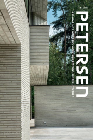
A MAGAZINE ABOUT BRICKWORK AND RESPONSIBLE ARCHITECTURE
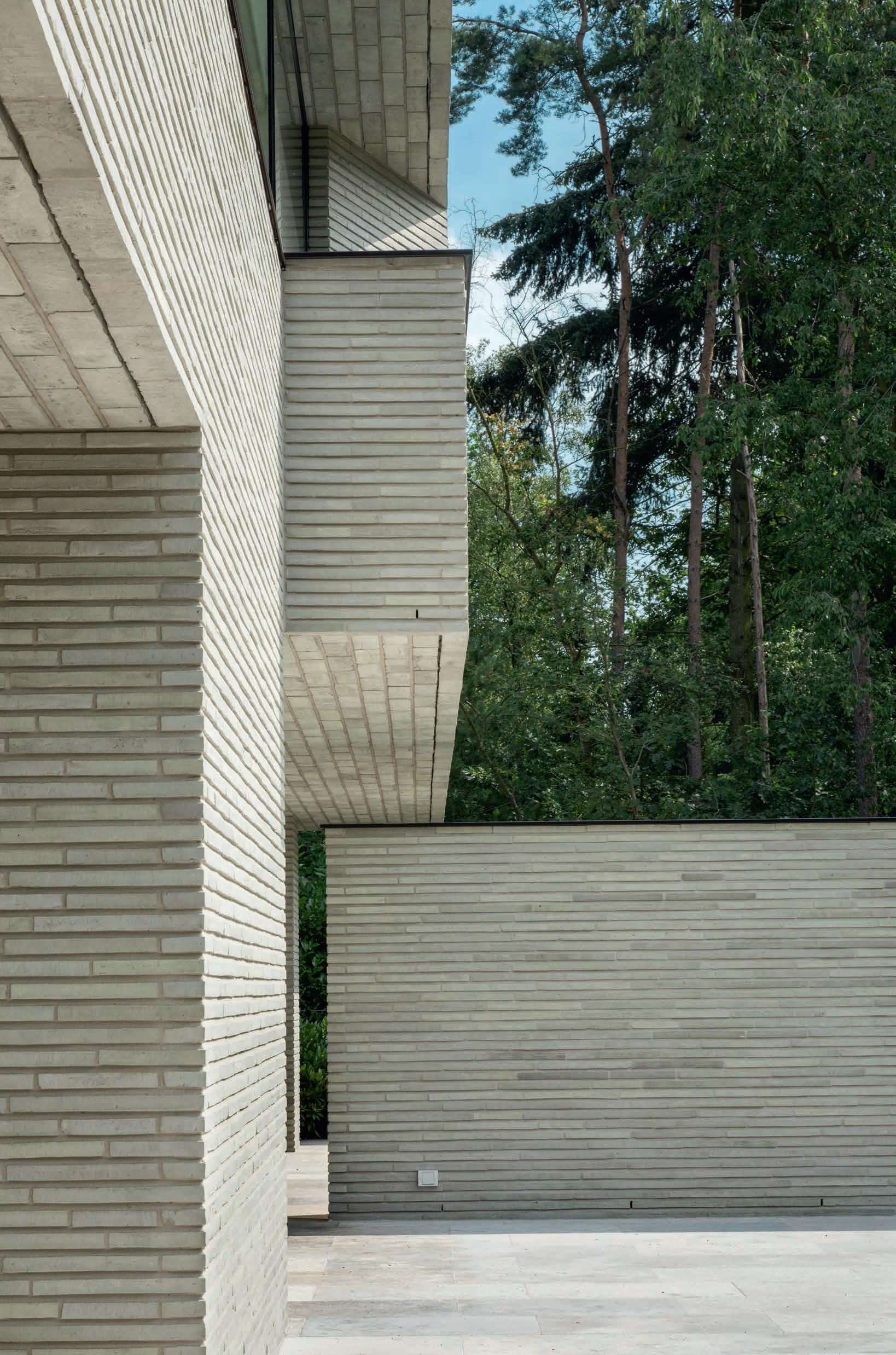
Villa in Vosselaar, Belgium | Photo: Paul Kozlowski
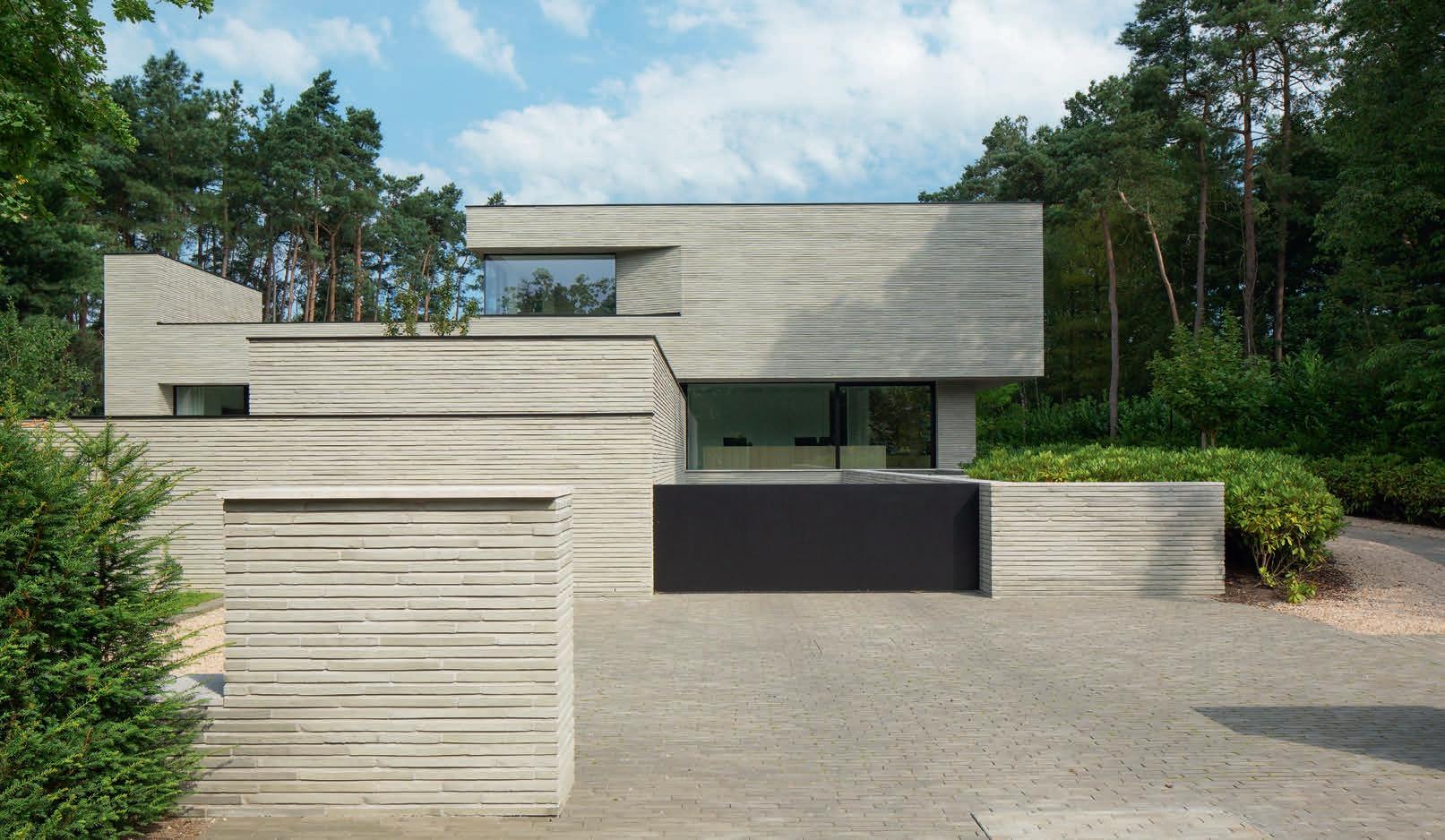
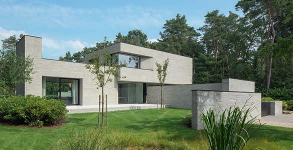
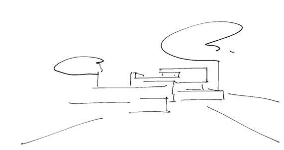
IN A VILLA IN VOSSELAAR, BELGIUM, GARDEN WALLS AND VARIOUS VOLUMES IN LIGHT KOLUMBA GIVE THE IMPRESSION OF THE LANDSCAPE AND HOME BECOMING ONE.
By Associate Professor Morten Birk Jørgensen, Architect MAA | Photos: Paul Kozlowski
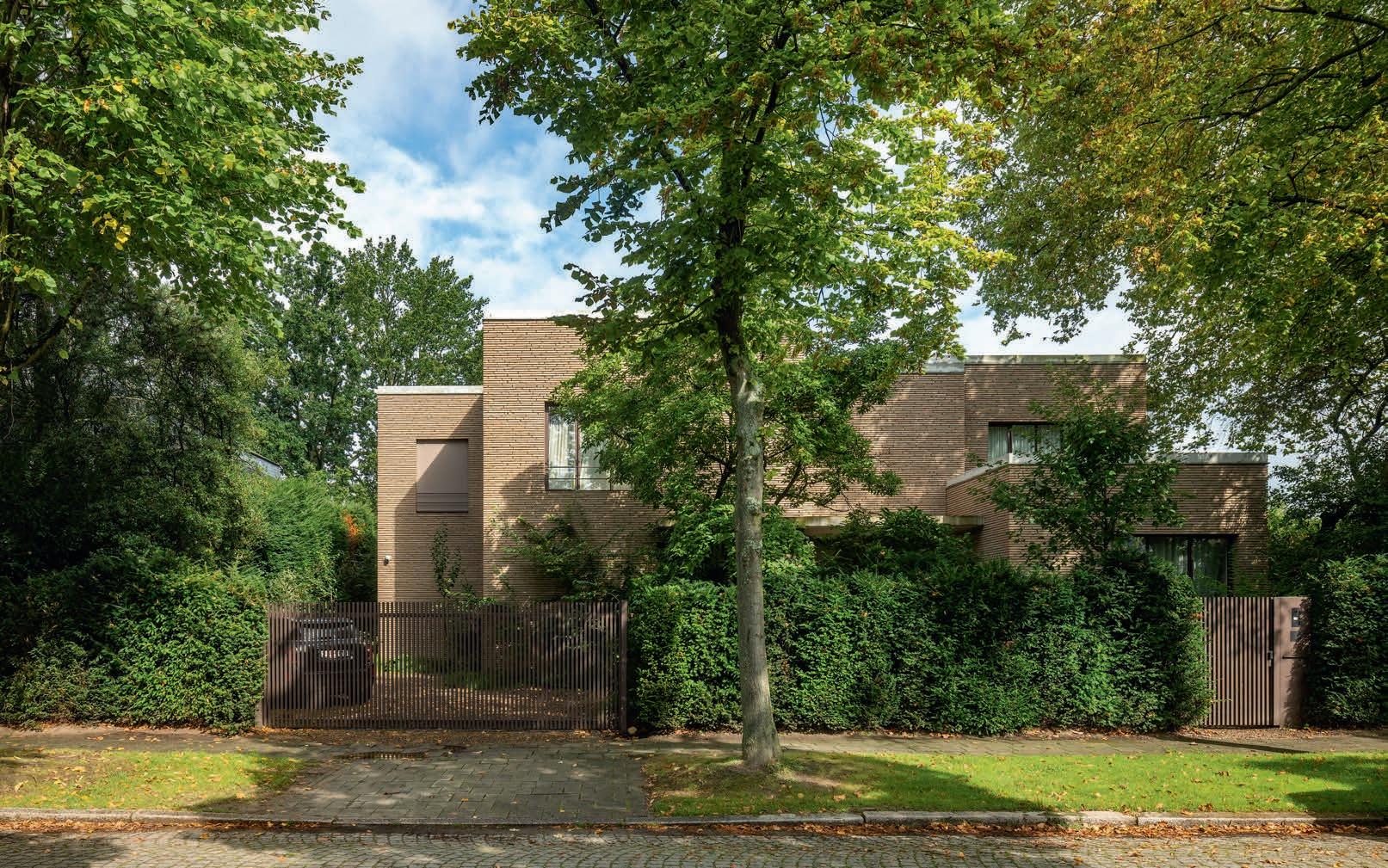
Glenn Sestig Architects, based in Ghent, has a portfolio of projects for a range of Belgian celebrities from the worlds of fashion, music and the visual arts. Some 40 km east of Antwerp lies Vosselaar, a small town surrounded by wooded areas dotted with exclusive villas. One villa, designed by Sestig, is set back from the road in a clearing on the outskirts of town, where the many tall trees make the neighbourhood feel as if it is merging with the forest.
The plot is shielded from the road by a thick hedgerow with an opening flanked by small pillars in light-grey Kolumba brick which act as a stylistic and material preview of what lies within.
The façade facing the road has a collage-like appearance made up of large, predominantly unbroken surfaces in varying dimensions in Kolumba and topped with minimal layers of patinated copper. A dark surface, in the same copper, contrasts with the otherwise light collage. This is the gate to the parking facility, which slides elegantly to the side, disappearing between two walls.
That the façade resembles a collage – a concept originating in the visual arts – is partly because of the absence of familiar architectural motifs. There are no gutters or downpipes, no visible chimney, no front door with a handle to indicate scale. All of which endows the villa with an abstract air.
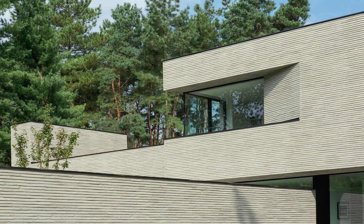
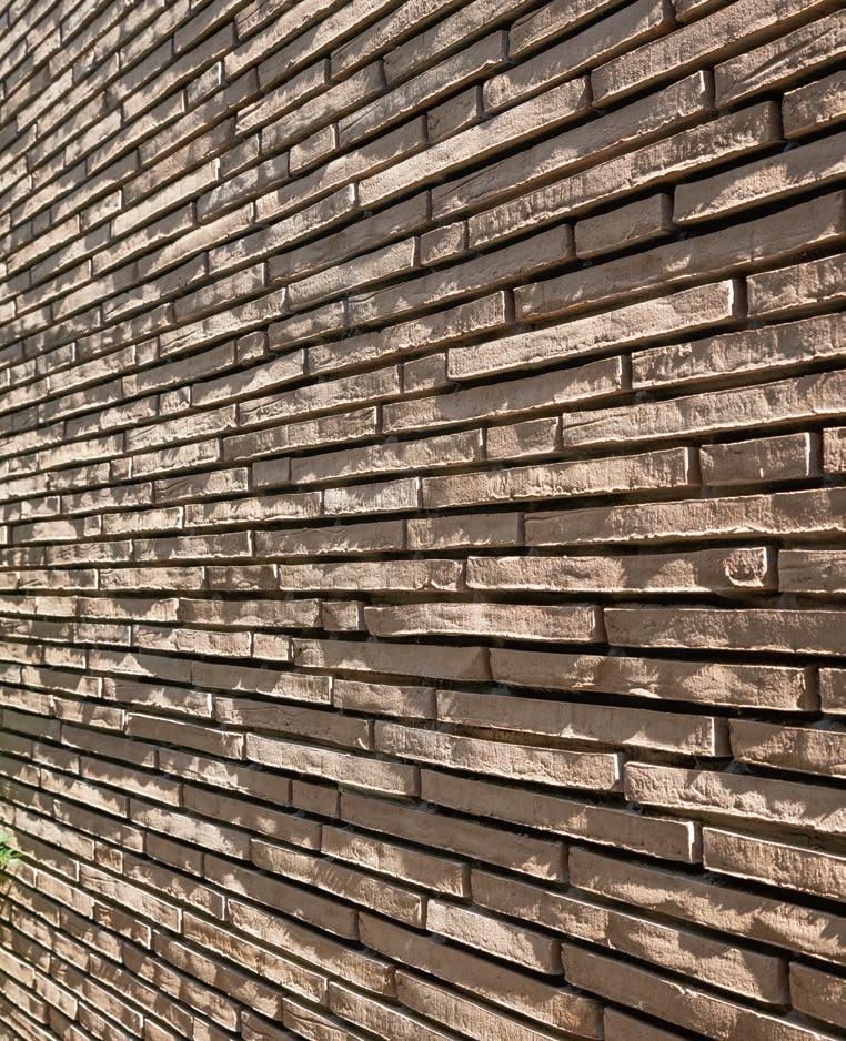
The abstraction is underpinned by the long, narrow Kolumba brick, which blends in with the light-grey joints. The pattern this leaves in the brickwork is dominated by the recurring horizontal shadows the bricks cast onto the joints.
From the road, it is impossible to tell right away which surfaces are garden walls, and which belong to the house. The walls by the road and around the garden make the villa feel less like a house on a plot and more like a landscape of surfaces and volumes in which site and home become one.
The basement plan presents a very different view of the villa’s footprint. Apart from the pool and the foundations for the garden walls, it seems quite compact and angular. Large glass sections, some of which can be slid aside when the weather and temperature allow, soften the boundaries between the interior and exterior in the spacious and flowing ground-floor layout. The first floor is more compact, with rooms, bedrooms, and a range of luxurious bathrooms.
Bevelled openings for the windows are a key design feature that makes the overall structure more dynamic, draws in natural light, and improves the view through the deeply recessed panes.
The main material on the exterior is light-grey Kolumba brick, the shades of which complement the paving stones in the driveway and garden paths, as well as the Pietra dei Medici natural stone on the terraces near the building and around the pool.
As well as integrating the architecture into the site and establishing well-defined outdoor recreational spaces, the garden walls also serve another purpose. Distracting elements like tools and technical installations are elegantly concealed in spaces between them, making them essential to the villa’s minimalist aesthetic.
Every aspect of the design has been meticulously considered, from the way it fits into the plot, to the overall composition, perspective and the choice and combination of materials. The end result is luxurious, the architecture extremely disciplined.
Villa in Vosselaar, Belgium
Client: Private
Architect: Glenn Sestig Architects
Contractor: Fransen Bouwonderneming
Engineer: Studiebureau Van Hoorick
Completed: 2014
Brick: K53
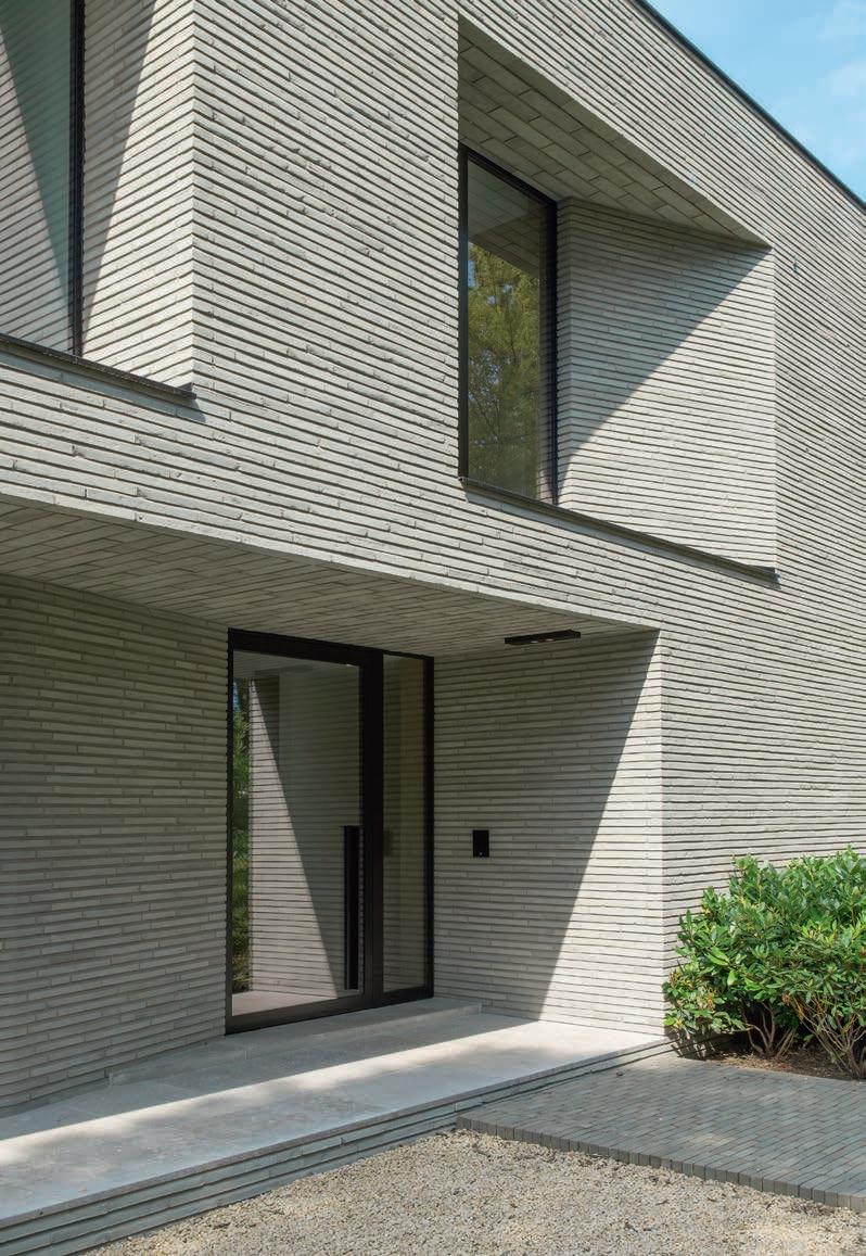

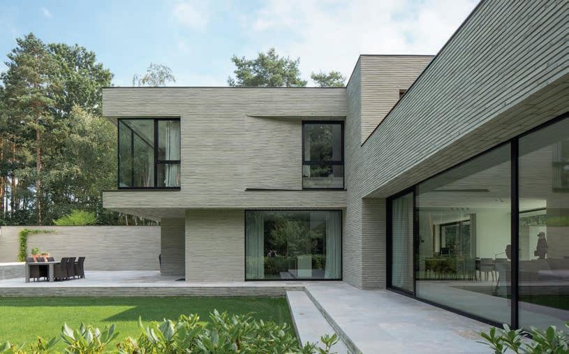
Bevelled openings in the walls give the villa a striking, sculptural look. At the front door, the opening has been pulled back, forming a niche that both defines and shields the entrance.
The colour of the joints carefully matches the brick. The wild bond, with recessed bed joints and flush stub joints, allows the horizontal lines to dominate the look of the brickwork.
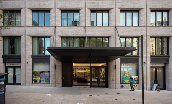
2505 Broadway, apartment building, New York City, USA
Client: Adam America Real Estate
Architect: Office for Design and Architecture (ODA)
Contractor: Cauldwell Wingate.
Engineer: WSP USA
Façade consultant, curtain-wall: Thornton Tomasetti
Completed: 2022
Brick: K50, special format 528 × 92 × 37 mm, as well as two bricks in special formats with different radii
Total: 42,200 custom-made bricks.
IN THE HEART OF NEW YORK CITY, A RESIDENTIAL TOWER EMPLOYS PETERSEN’S SIGNATURE KOLUMBA BRICK TO CREATE A DELICATE BALANCE BETWEEN HANDICRAFT AND INDUSTRIAL CONSTRUCTION.
By Micheal Sheridan, D.Arch and historian
Photos: Justin Hummerston
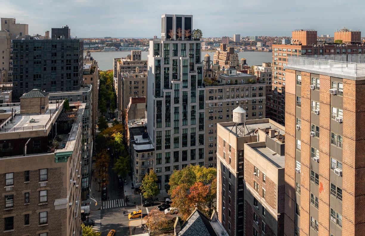
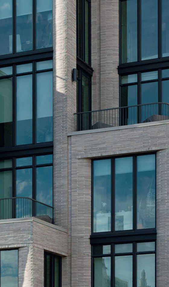
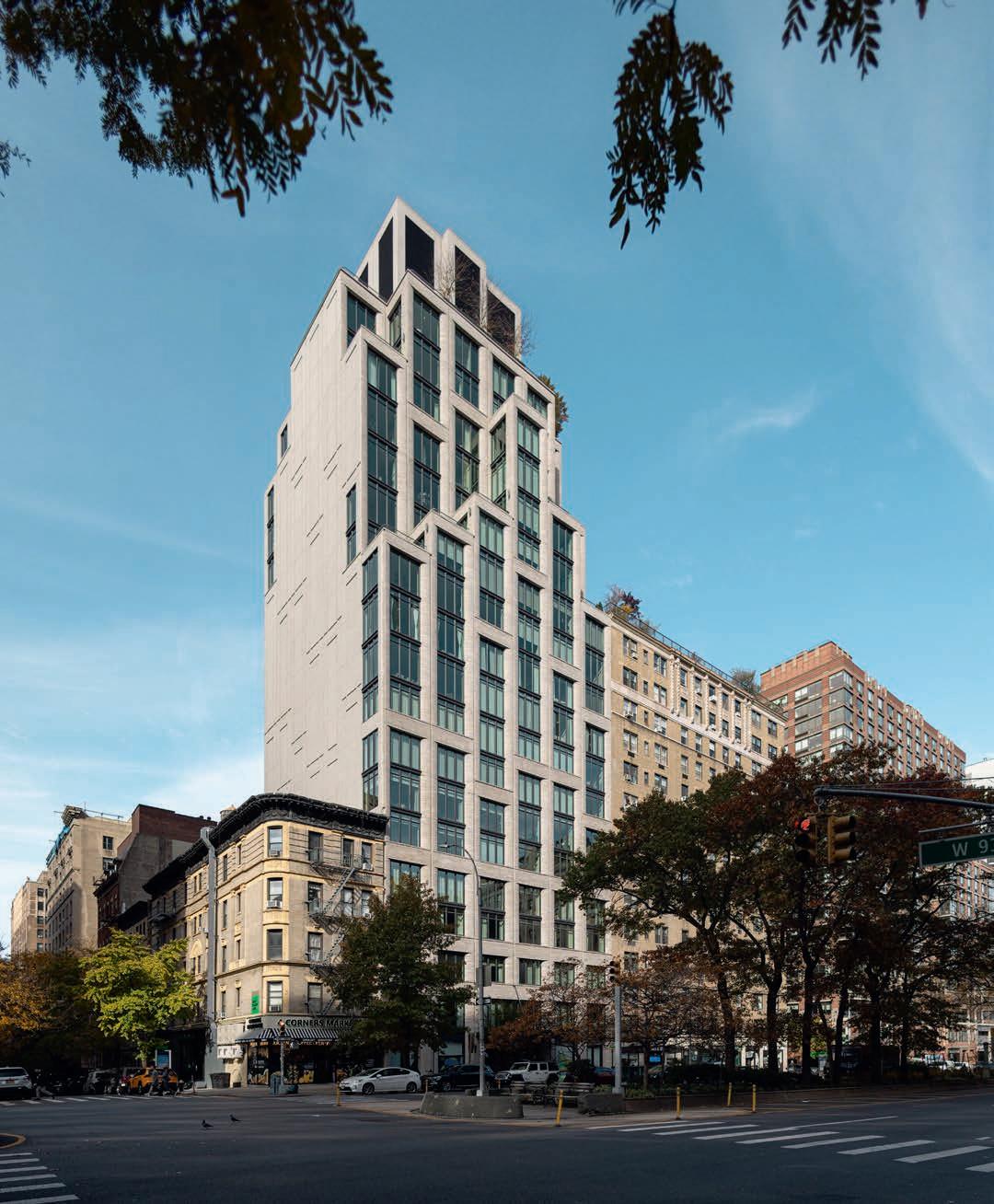
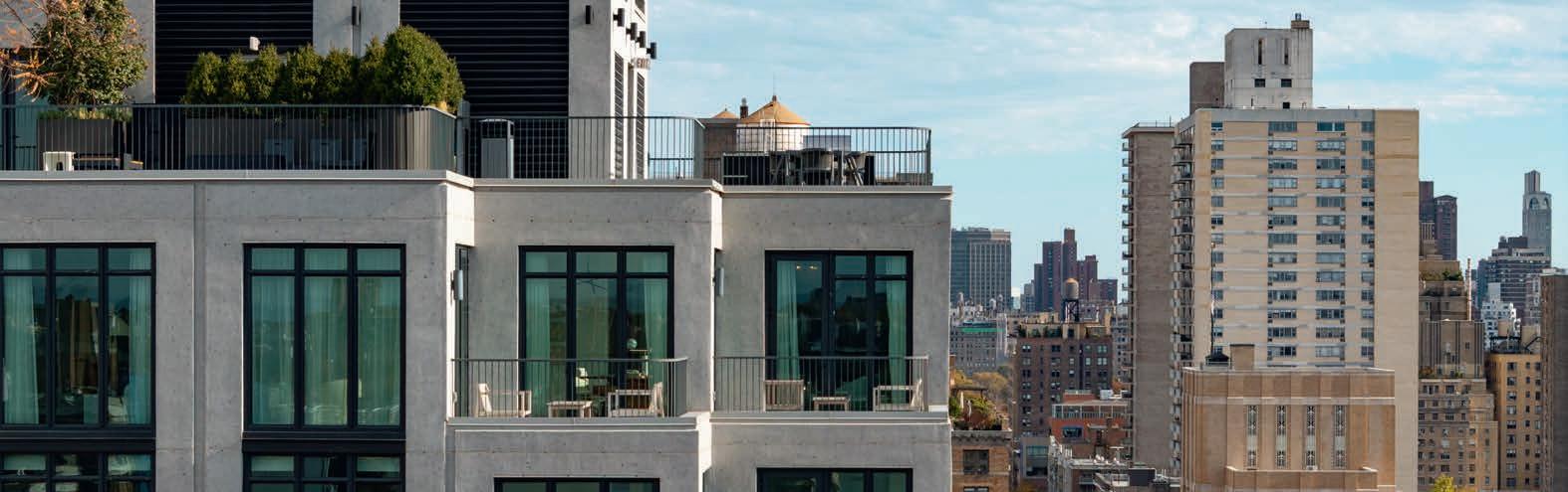
On the Upper West Side of Manhattan, a nineteen-story apartment building designed by Office for Design and Architecture (ODA) provides a site-specific solution to a universal problem. One of the challenges of employing brickwork today is a loss of character due to economic concerns and modern construction techniques. Under those circumstances, the qualities that are inherent to a brick – the sense of mass and an inherently human scale, the potential for imaginative details and resulting interplay of surface and shadow – are difficult to sustain. While high labour costs discourage intricate patterns and details, framed structures of steel and concrete reduce brickwork to a thin cladding. All too often, that cladding has the flat character of wallpaper and might as well be some other material.
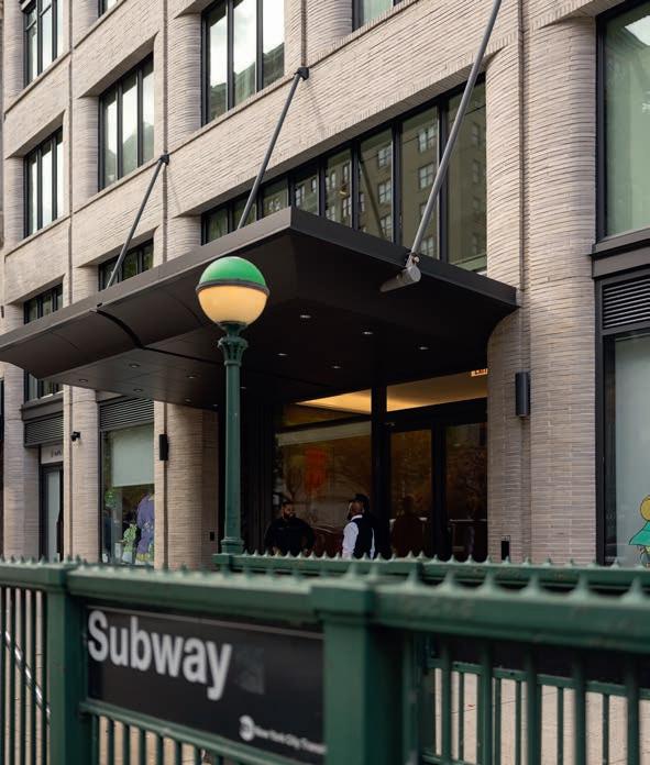
At 2505 Broadway, located between 93rd and 94th Streets, the architects at ODA avoided that problem by designing a brickwork screen that alternately conceals and reveals the concrete structure. Moreover, they enriched the brickwork with subtle details that convey the essential qualities of the material and realise its potential for blending buildings of different styles and eras into a continuous urban setting. The result is a state of equilibrium between industrial construction and handcrafted surfaces that reflects the form of the building. That balance begins along the sidewalk, where piers and spandrels covered with standard and custom-made Kolumba bricks create a simple pattern of openings, which illuminate the double-height lobby and the three lowest floors of apartments.
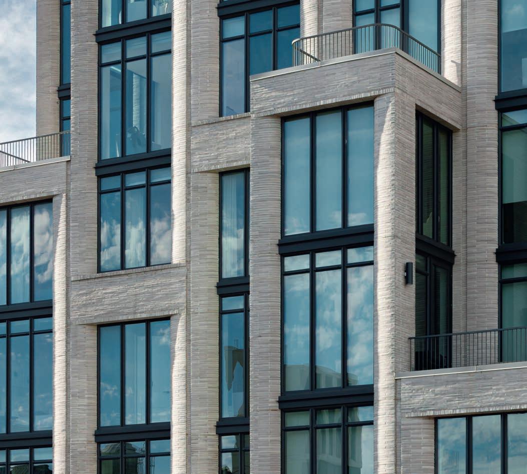
Above that regular matrix, the façade extends skyward in an irregular composition with continuous piers and staggered spandrels, such that the openings in the brickwork vary from two to five stories. The result is a dynamic frontispiece that engages the eye in a tantalizing game of hide-and-seek between facing and structure. While the vertical openings provide visual interest and increase the apparent height of the building, the horizontal bands of black aluminum windows testify to the consistent structure behind the brickwork. As the piers rise, the building steps back to provide terraces overlooking Broadway that receive morning and afternoon light. At either end of the building, the brick facing gives way to embossed concrete panels that reveal the thinness of the masonry facing Broadway.
The architects complemented their crisp geometric composition with rough coursing that accentuates the handmade character of the bricks and creates an en-
“Together with our architect ODA, we chose the Kolumba brick because its elongated format and rich, hand-crafted texture allowed us to reinterpret the Upper West Side’s classic masonry in a way that feels both contextual and distinctly modern.”
Josh Zucker, Head of Development, Adam America Real Estate
The west-facing apartments on the
provide
“Petersen Tegl’s ability to produce the specified custom bricks gave the design team full control over the brickwork’s tone, depth, and articulation, elevating the façade and thereby strengthening the building’s market appeal.”
Josh Zucker, Head of Development, Adam America Real Estate
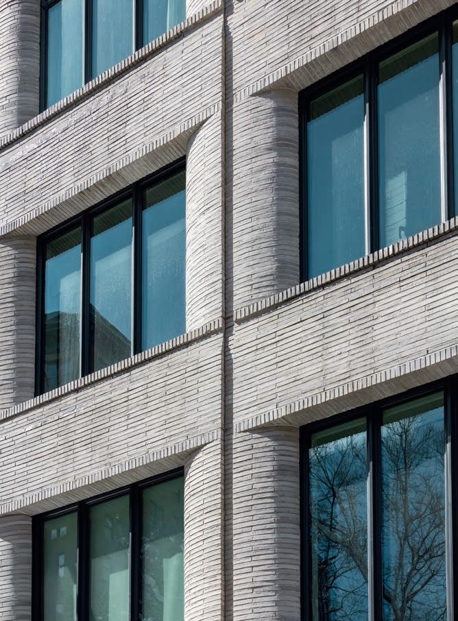
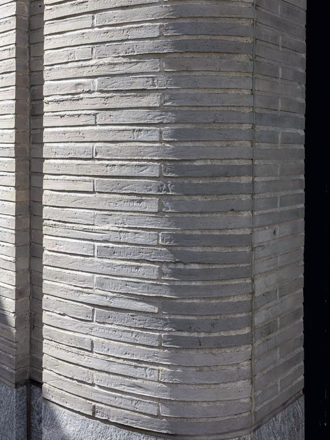






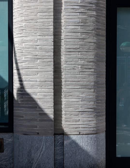
chanting texture that is animated by daylight. As well, a few carefully considered details exploit the innate properties of the material. To reduce shadows on the windows, the edges of the piers were formed with curved bricks that were made especially for the building and emphasize the sculptural potential of masonry. On each spandrel, the five uppermost courses are stepped backwards so that the rowlock sill creates a bold shadow line that reinforces the horizontal proportion of Kolumba brick. At the bottom of the spandrels, another rowlock course extends into the piers, where a continuous channel marks the centerline of a concrete column and expresses the underlying structure.
Ultimately, ODA’s fine-grained addition to the Upper West Side represents the renewal of a local architectur-

al tradition. The stepped form recalls the ‘wedding cake’ buildings that were constructed across New York City during 1916-1960; following zoning laws that ensured daylight on the streets. In contrast to those symmetrical towers, 2505 Broadway employs asymmetry in the service of gracious living and refers to the glamorous past without a hint of nostalgia. Through their sensitivity to material matters, the architects have preserved an artisanal approach to construction that is now more important than ever, as digital technology threatens to negate the physical world. And so the building provides an object lesson in the contemporary use of brickwork that connects public and private realms to the benefit of both.
Architecture in New York City is invariably tied to property development, as investors seek to minimize risk and realise a high rate of return. One of the notable trends of the last decade has been the reconstruction or replacement of single-family houses in working-class neighbourhoods where developers had previously feared to invest. The epicenter of that trend is Williamsburg, in north Brooklyn, where streets lined with inexpensive houses constructed for factory workers around 1900 now offer bargains for investors, who hope to attract buyers priced out of more established parts of the city. As these redevelopments proceed, each new building serves as an element in the gradual reconstruction of a block or street that will attract additional investment, with the goal of transforming the neighbourhood into a wealthy enclave.
One of the leading architects in the reconstruction of north Brooklyn is Wu ‘Woody’ Chen, the principal of Infocus Design & Planning whose residential work most often includes facades of Petersen’s Kolumba brick. A quartet of Chen’s projects demonstrate his imaginative use of a single material to create a variety of residential building types amid a diverse range of existing buildings.
Individually, Woody Chen’s four facades demonstrate his artistic talent and his affinity for the tactile character of Kolumba bricks. Together, the four façades testify to the versatility of the material. As brickwork shifted from load-bearing structure to independent veneer, opportunities for site-specific combinations of openings, bonding patterns and relief effects are now nearly unlimited. Adding colour to the matrix of options dramatically expands the opportunities for architectural variety. While Mr. Chen prefers off-white and shades of grey, Kolumba bricks are produced in thirty-three tones that provide varying levels of brightness and optical weight, while preserving the natural character of the clay.
Beyond the opportunities for individual artistry, the Kolumba brick has a substantial character that makes it ideal for a vast range of projects, from an isolated object in the landscape to an element in a diverse community of buildings. While Chen’s Brooklyn façades are framed by a striking variety of materials, the rich surfaces and neutral colours of the bricks exert a calming and ennobling effect. As such, we can recognise similar processes in the assembly of bricks to create a façade and the aggregation of individual buildings into a dense urban environment.
IN FORMER WORKING-CLASS NEIGHBOURHOODS IN NORTHERN BROOKLYN, NEW SINGLE-FAMILY HOUSES ARE RISING AS PART OF THE AREA’S ONGOING TRANSFORMATION. THE ORIGINAL HOUSES WERE BUILT AROUND 1900, MOST OFTEN IN BRICK. INFOCUS DESIGN & PLANNING IS BEHIND SEVERAL OF THE NEW BUILDINGS ALL USING A LIGHT KOLUMBA. ON THE FOLLOWING PAGES WE PRESENT FOUR EXAMPLES.
By Michael Sheridan, D.Arch. and historian | Photos: Justin Hummerston
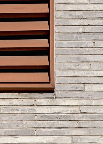
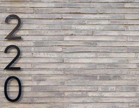
At 220 North 6th Street, Woody Chen transformed a three-story singlefamily house from 1899 by adding a fourth story and a recessed penthouse, and reconstructing the façade with K91 bricks. While the duplex apartment on the ground and first floors features large windows for the bedrooms and a smaller window for the bathroom above the entrance, the third floor unit receives light through a wall of windows that illuminate the living room. The result is a three-unit condominium with the grand scale and stately character of the nineteenth-century townhouses found in more established Brooklyn neighbourhoods. While the modernist composition of the façade appears novel among the mix of buildings and façade materials, the rough texture and irregular bonding of the brickwork allow the building to blend into the diverse surroundings.
Transformation, single family-house, 220 North 6th Street
Completed: 2019
Brick: K91
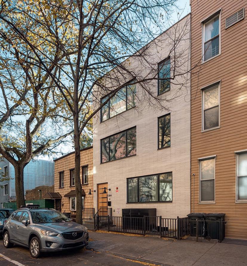
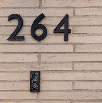
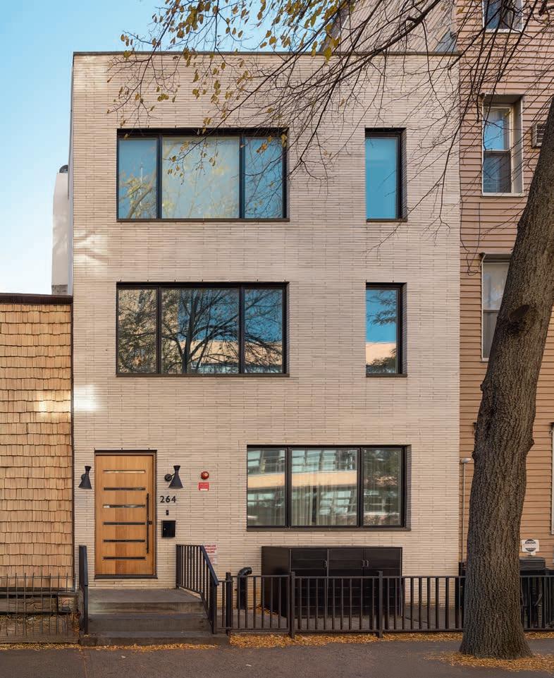
One block west of 220 North 6th Street, the same architect rebuilt another one of the three-story row houses that once lined the street, but retained the single-family occupancy. As a result, 264 North 6th Street contains 370 square metres of continuous living space behind a new façade of K11 bricks. In place of the original façade, he used steel framing to create a dynamic composition with paired openings on the first and second levels that illuminate bedrooms of different widths. The wider openings echo the window on the ground floor, which illuminates one end of the living-dining room that extends to the back garden. To enhance the feeling of a private home, Chen designed a solid wood door for the entrance and used running bond brickwork that conveys stability.
Transformation, single family-house, 264 North 6th Street
Completed: 2022
Brick: K11
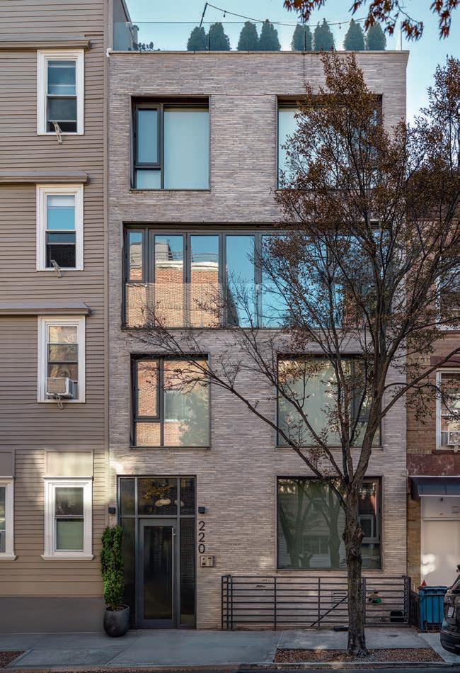
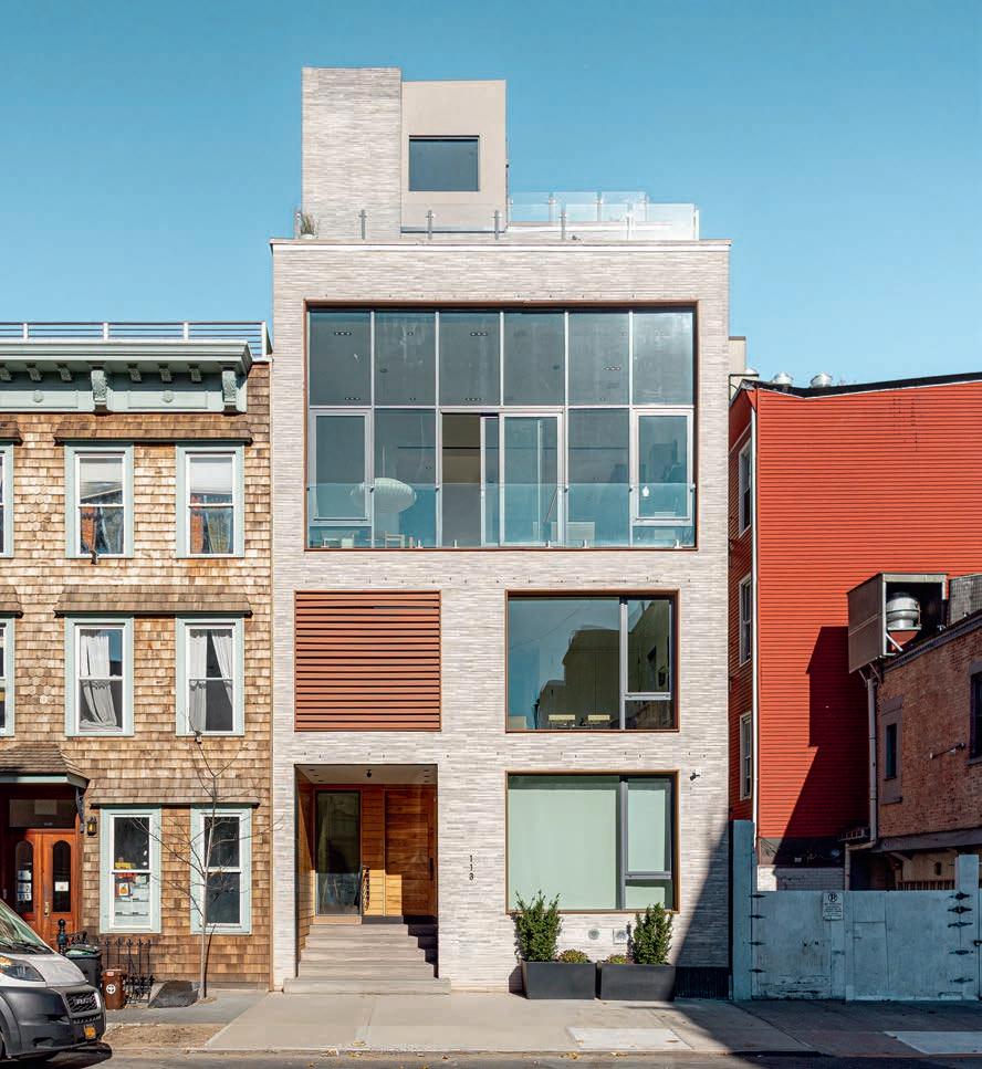
Not far from 6th Street, Woody Chen designed a four-story condominium building – 113 North 9th Street – that includes two duplex apartments and recalls a renovated industrial building by virtue of its irregular composition. The varied sizes and treatments of the openings in the façade emphasize the continuous surface of the brickwork, as though an existing framework has been filled with materials of different types and patterns. Once again, the architect specified K91 brick, which appears neutral among the competing materials of the neighbouring buildings. In a nod to the surroundings, Chen specified irregular brickwork with vertical joints that are offset from course to course. In anticipation of a new neighbour on the adjacent lot, the brickwork wraps around the corner of the building, ensuring the appearance of a substantial block.
Two new duplex apartments, 113 North 9th Street
Completed: 2022
Brick: K91
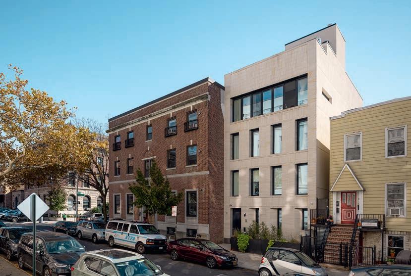
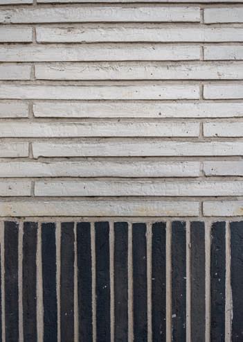
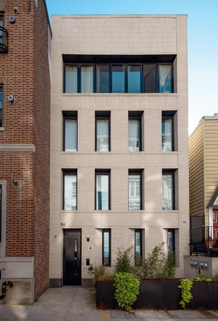
Woody Chen’s most refined addition to north Brooklyn is a four-story condominium at 84 Meserole Avenue in the Greenpoint neighbourhood that borders Williamsburg. Set back from the sidewalk on a base of dark bricks, the symmetrical façade with recessed panels endows the three-unit building with a classical character: self-contained, serene and secure. Alongside the entrance, chamfered openings with narrow windows enhance the privacy of the ground floor unit, while a crowning band of windows illuminates the living room in the upper duplex. The defining feature of this modern twist on traditional manners is the off-white K11 brickwork, which Chen used in a complex horizontal bond around the openings, with soldier courses for the recessed panels. In doing so, he created a façade that transcends style and exerts an ageless appeal.
Three new apartments, 84 Meserole Avenue
Completed: 2022
Brick, façade: K11
Brick, base: K55
Client: Private
Architect: Klas Hyllén Architecture
Contractor: Self Build by client
Engineer: Malishev Engineers
Pool services: Pool Architecture
Completed: 2025
Brick: D72, Flensburg format
“The brickwork isn’t merely cladding, it is the building itself. We consciously opted for materials that could serve both as structure and surface. This reduces consumption and complexity, and results in a more honest architectural idiom.”
Klas Hyllén, architect
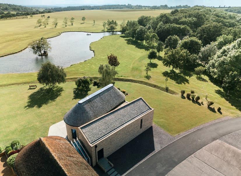
IN THE GENTLE WARWICKSHIRE COUNTRYSIDE, SOUTH-EAST OF BIRMINGHAM, STANDS MALVERN POOL HOUSE, A SIMPLE AND HIGHLY REFINED EXTENSION TO A PRIVATE RESIDENCE.
By Ida Præstegaard, MA in Architecture | Photos: Hide Film
Designed by British studio Klas Hyllén Architecture, the project reimagines the private pool not as a leisure facility, but as a sensuous, almost sacred space. Disciplined design, restrained materiality, and an uncompromising integration of construction and technology result in an almost spiritual architecture, at once timeless and contemporary. The client directly commissioned Hyllén. The two have known each other and worked together for several years, and both understand that complex projects take time.
“We wanted the room to feel almost monastic,” the architect explains. “We took our inspiration from ascetic architecture, such as Sigurd Lewerentz’s Saint Petri Church in Klippan and Niall McLaughlin’s Bishop Edward King Chapel – buildings where the experience is mediated by the light and proportions alone, with no unnecessary interventions.”
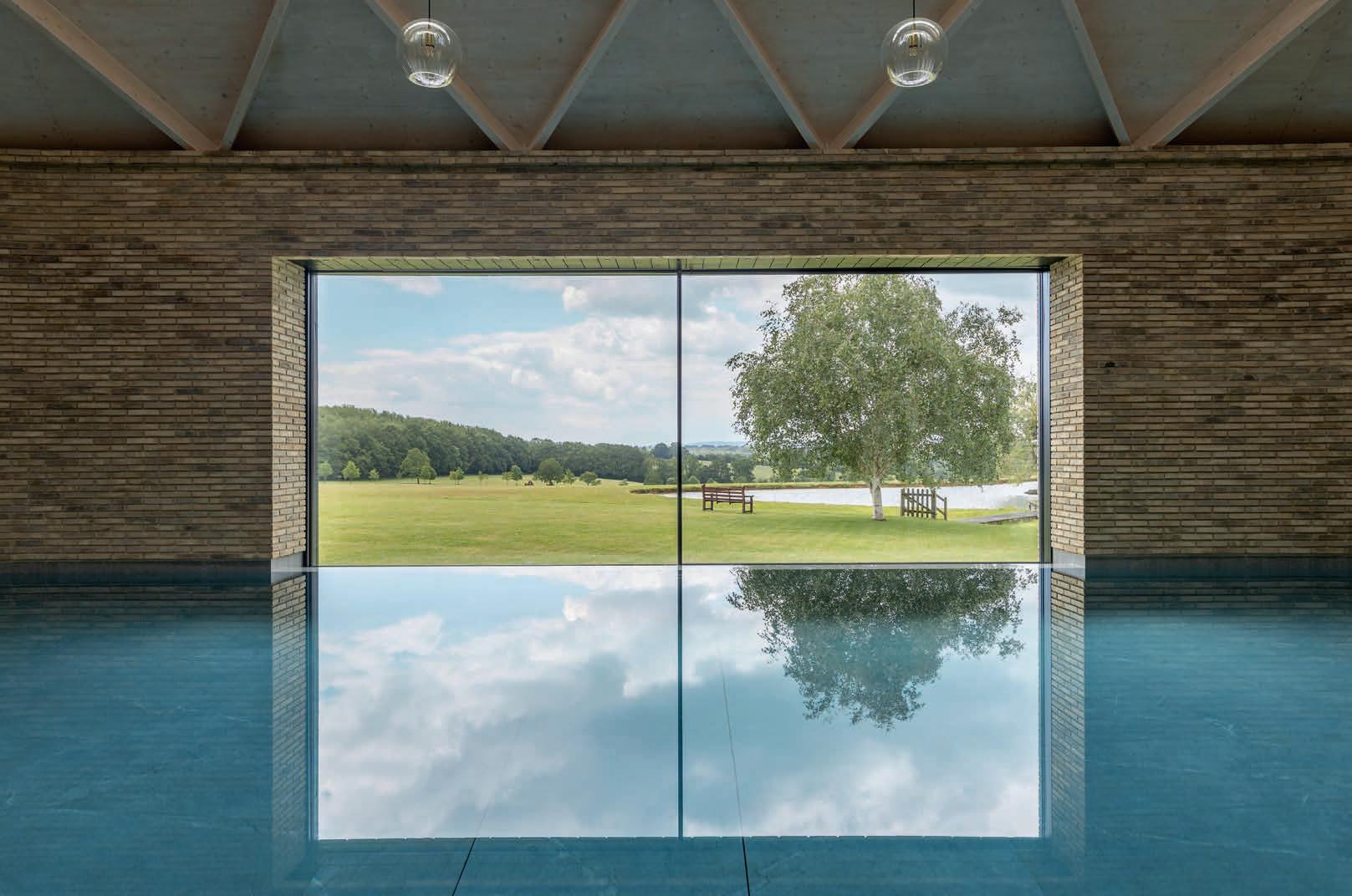
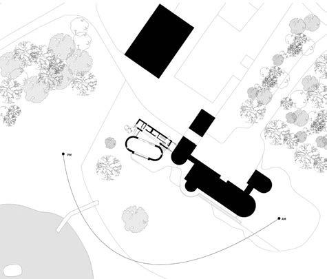
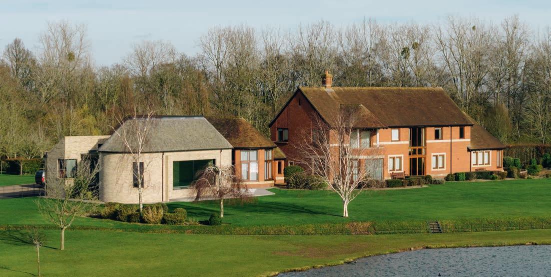
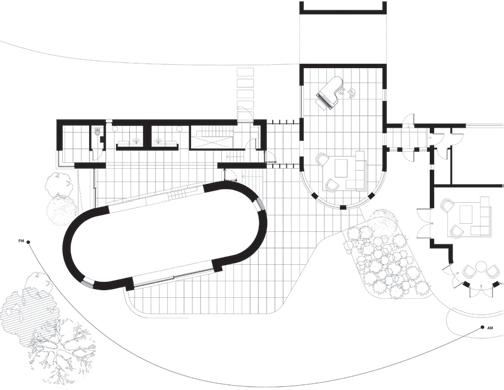
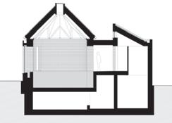
Malvern Pool House consists of two elongated volumes – one trapezoidal, one with rounded corners – connected by a lower, light-coloured structure. Both are built from waterstruck light-yellow brick, which harmonises not only with the existing building, but also with the surrounding landscape. The rounded wing houses the actual pool, while the other contains changing facilities, a meditation room and a wine cellar.
The Arts and Crafts-inspired main building from 1991 is in red brick, so it was natural to continue thinking in similar material terms. A contemporary extension was upgraded and converted into a home gym, connected to the swimming pool via a new glass structure.
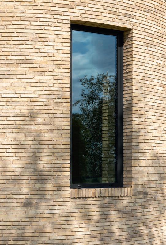
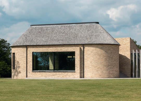
The slightly irregular texture of the waterstruck D brick gives the brickwork a dynamic look.
Klas Hyllén opted for the Flensburg format, which is 40 mm high, compared to the 54 mm of the Danish standard format.
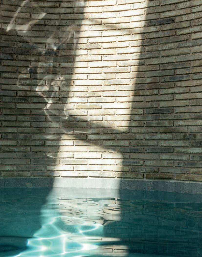
“The interaction between water and brick produces a light mineral scent, and the brickwork influences both acoustics and temperature. All of the senses are engaged. The sound, the warmth, the touch and smell of water on brick. You feel enveloped by the space.”
Klas Hyllén, architect
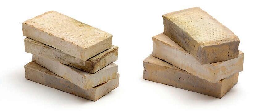
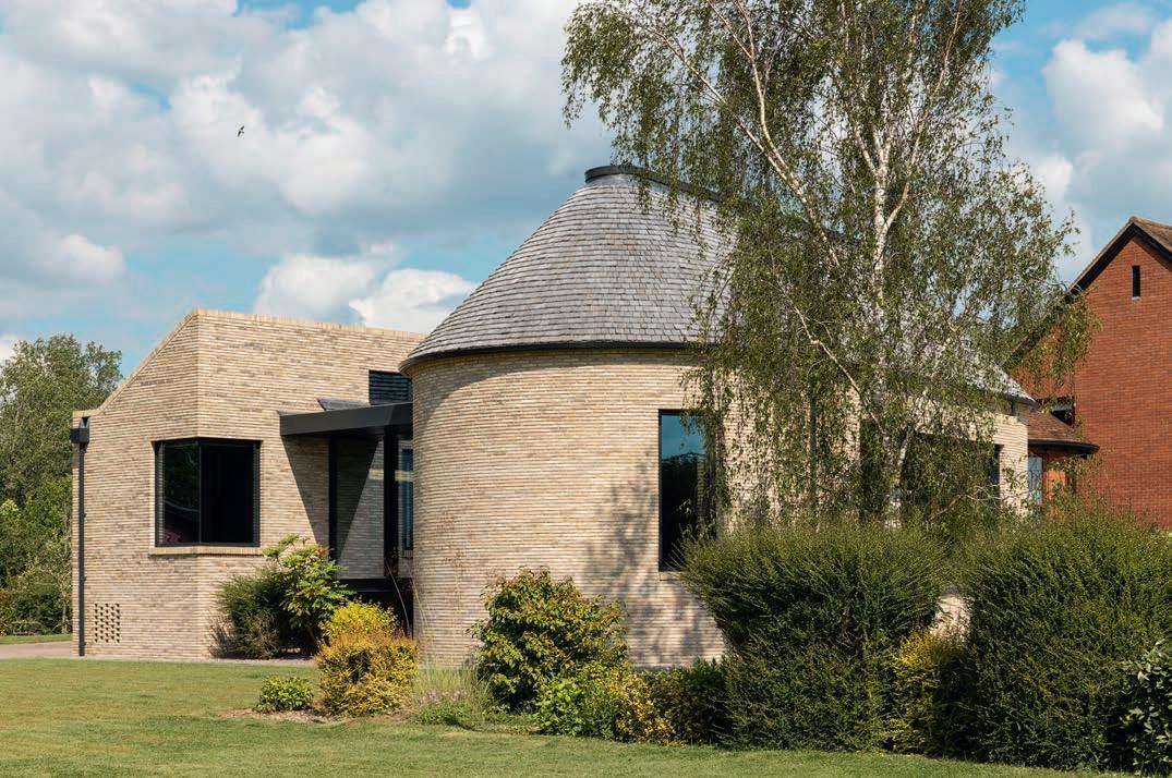
The bricks play a central role in the extension, both structurally and aesthetically. “The brickwork isn’t merely cladding; it is the building itself. We consciously opted for materials that could serve both as structure and surface. This reduces consumption and complexity, and results in a more honest architectural idiom,” says Hyllén.
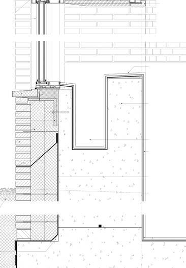
“Our approach was particularly challenging in the pool room. Traditionally, pools are built as self-contained vessels, separated from the building by a void or undercroft containing pipes and other technical elements. We rejected that principle. We spoke to six specialised pool contractors, all of whom said that what we wanted was impossible. They wanted to build the pool inside the building, with a void below the floor. But that would have destroyed the spatial clarity we were striving for.”
Instead, the pool was installed directly in the building’s load-bearing brickwork, in a close collaboration between architect, engineer, client and construction team. The technical elements are hidden in accessible spaces beneath the water, allowing the pool to extend all the way to the walls and a large panoramic window overlooking the Malvern Hills.
Above the pool is a suspended, whitewashed wooden diagonal lattice that resembles a softly vaulted ceiling. A nine-metre-long skylight evenly filters daylight and at night offers views of the stars.
which lets in natural light and offers a view of the night sky.
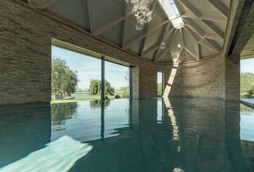
“During the process, we tested six to seven different types of brick, in both light and red shades. We had large sample boards that we could compare directly with the existing building. Although the main building is built in red brick, it quickly became clear that light yellow provided the best balance. It created a clear connection to the main building, while allowing the new one to have its own architectural form.
“The choice of D72 was very much a matter of fine-tuning, as it was the one that worked best with the existing brickwork. I really appreciate the range of slightly darker tones in each brick. They bring depth and variation to the finished result.
“I’ve always had a preference for narrower bricks. The proportions of the Flensburg format, combined with the waterstruck, slightly irregular surface, create a much more dynamic and vibrant texture. We would have used Kolumba had it not been for the curved sections, although the brickworks could have produced a customised rounded version of Kolumba.
The D72 FF brickwork is laid in a staggered runner bond with a one-third offset every other course. We worked with recessed joints to give the façade extra depth.”
“Malvern Pool House is about presence, tranquillity and letting materials, light and water speak their own language.”
Klas Hyllén, architect
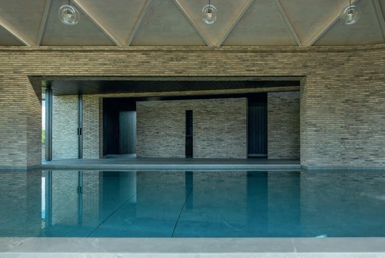
“It’s a very special feeling to float on your back, gazing up at the wooden ceiling and the sky. It’s a quiet, almost cosmic experience,” he continues.
The meticulously selected materials underpin the sensory experience. “The interaction between water and brick produces a light mineral scent, and the brickwork influences both acoustics and temperature. All of the senses are engaged – the sound, the warmth, the touch and smell of water on brick. You feel enveloped by the space,” the architect explains.
Hyllén’s approach to sustainability prioritises simplicity over visible functionality. The building’s structure is fully insulated, while ventilation systems are incorporated into the steel roof beams. The result is an architecture in which technology is invisible, but its effects noticeably enhance the sense of comfort that the space exudes.
For Hyllén, the project is proof that architecture can enhance even the most mundane rituals. “When the technical complexity is resolved discreetly, the experience remains. Malvern Pool House is about presence, tranquillity, and letting materials, light and water speak their own language.”
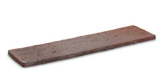
Petersen Tegl is committed to minimising the climate impact of its products. For example, their customised Kolumba is 20 mm thick compared to the standard 37 mm. The new version has the same distinctive look as the standard one, but uses considerably less material. Compared to standard Kolumba bricks laid in the traditional manner, the thinner version, mounted on an underlying surface, uses up to 75% less CO₂. The savings are made in the drying and firing processes, as well as in the volume of materials used.
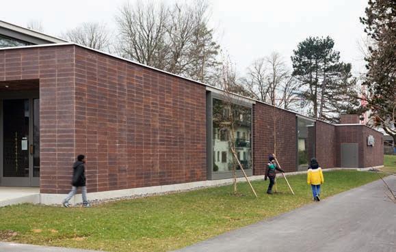
In 2012, Boltshauser Architekten wanted to use hard-fired K43 for a brick façade on an after-school club in Allenmoos, but the local authority decreed that the energy used to produce the materials be kept to a minimum.
The architects asked Petersen Tegl to produce a handmade façade clinker in K43, just 20 mm thick. It was to be fixed directly onto the underlying 250 mm insulation and then pointed with slightly indented cement mortar. To ensure that the façade was durable, they built a 1:1 mock-up, which coped admirably with the wind and weather.
After-school club in Allenmoos, Switzerland
Client: Stadt Zürich
Architect: Boltshauser Architekten
Completed: 2012
Brick: K43, 528 × 108 × 20 mm
Photos: Paul Kozlowski
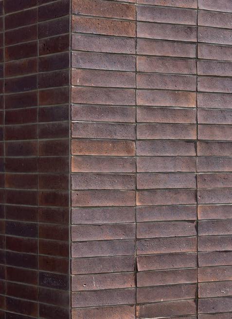
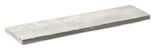
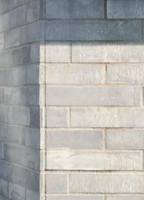
Kolumba’s handmade structure means that the brickwork is never perfectly level. As a result, façades using either standard Kolumba or the thinner variants have a lively, sensory look that clearly differs from the more clinical character of typical brick cladding.
Like the standard version, thinner Kolumba variants are fired in periodic kilns using natural gas and biogas. Petersen Tegl also offers biogas certification and is currently investigating the possibility of switching all production to biogas.
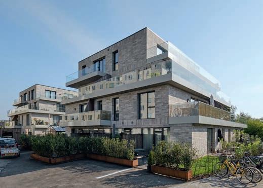
For Terrasserne (The Terraces), a housing development in Copenhagen, the client and the architect, Rodam Arkitektur, wanted to use K91 but with an innovative look and lower CO₂ emissions.
Petersen Tegl produced custom-made K91 in a thinner, 20 mm version that could be mounted directly on the insulation. A vertical wild bond fully exploits the potential of the handmade idiom. At the joins between the floors, the bricks are laid vertically, so that they follow the front edge of the balconies and echo the overall rhythm of the building. Completed in 2024, the project achieved the highest possible energy rating for new buildings, A2020.
Terrasserne, Artillerivej, Copenhagen, Denmark
Client: Terrasserne ApS
Architect: Rodam Arkitektur
Completed: 2024
Brick: K91, 528 × 108 × 20 mm
Photos: Anders Sune Berg
The brickworks also plans to test-fire Kolumba using hydrogen. Burning hydrogen does not emit CO₂, only water vapour. Provided that the hydrogen is produced using green energy, this would make the process significantly more climate-friendly.
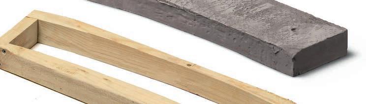
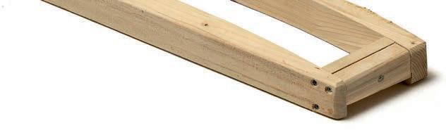
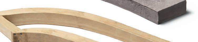
Kolumba bricks are made from a variety of clay types that withstand extremely high temperatures. After processing the clay, the bricks are hand-struck in wooden moulds, dried, and then fired.
Firing bricks at various temperatures creates a range of textures and beautiful shades of colour.
By Ida Præstegaard, MA in architecture | Photos: Luuk Kramer
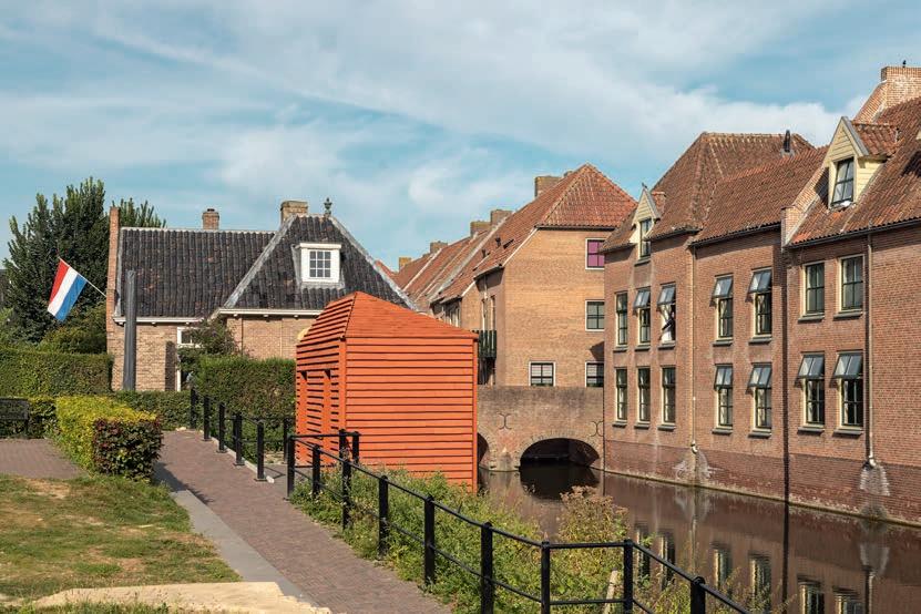
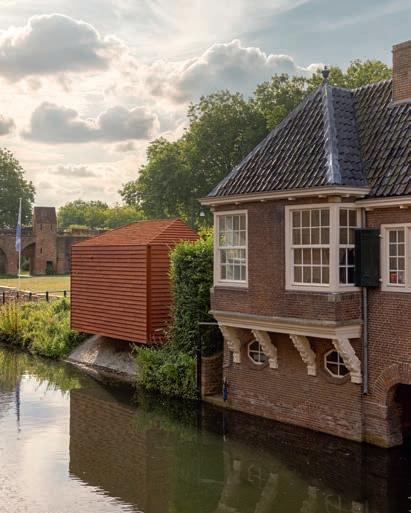
In the heart of Zutphen, a city on the banks of the River Berkel, about 100 kilometres east of Amsterdam, 1m98 architecten designed a small but striking building: a public toilet measuring a mere 14 m². It may be modest in size, but the building and the choice of site embed the new addition firmly in the city’s long architectural history.
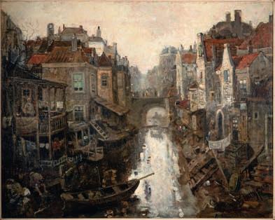
It protrudes over the riverbank, directly referencing the overhanging washhouses, verandas and privies that once lined both sides of the Berkel. Buildings of this type live on in historical photographs and paintings of the area – including A. Boom’s View of the Berkel from 1888, which directly influenced the architects’ cantilevered design.
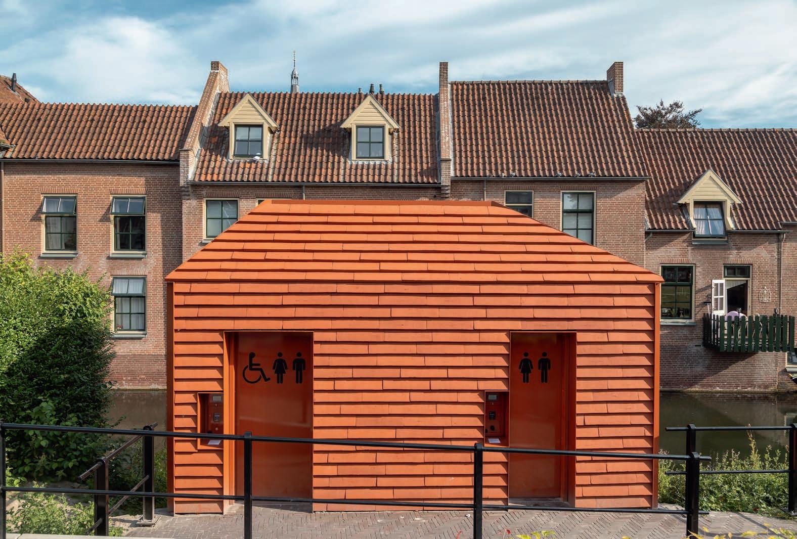
The toilet is a monolithic volume clad with Petersen Cover C33, and the choice of brick was key to the whole project. The architects weren’t interested in traditional bricks and mortar. They wanted a ceramic material that would allow them to create a continuous surface on both the walls and the roof. The material also had to relate to Zutphen’s medieval brick architecture, including the nearby city gates and the old city walls along the river.
C33 met all the requirements: a clay-based product with a handmade texture and architectural character that looks contemporary while echoing local history. The solution also works well with the prefabricated core, which can be replaced by removing the detachable roof.
During construction, the link between past and present became almost literal when archaeologists discovered that a medieval sewer system connected to the Convent of Saint Agnes ran directly under the new building. It’s a remarkable coincidence that a modern public toilet should be located in exactly the same spot that the city built the same kind of infrastructure more than 500 years ago.
Public toilet, Zutphen, The Netherlands
Client: City of Zutphen
Architect: 1m98 architecten
Contractor: Christiaans Bouwbedrijf
the
Engineer: conStabiel, Velp
Completed: 2025
Brick: C33, 528 x 170 x 37 mm
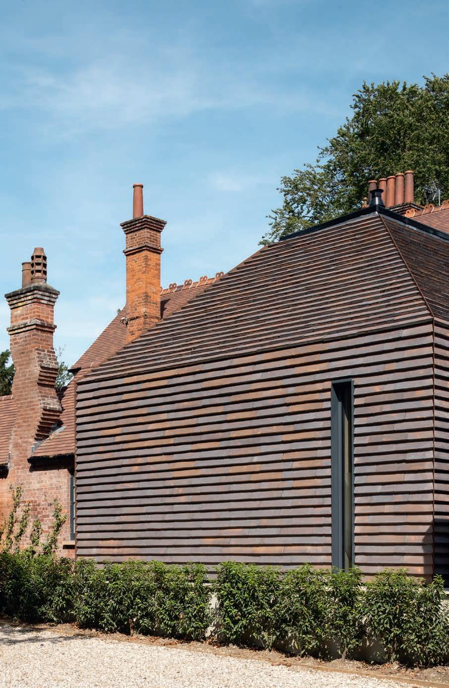
NEW EXTENSION RESPECTFULLY ADDS TO ITS HISTORICAL SETTING IN SOUTH CAMBRIDGESHIRE.
By Ida Præstegaard, MA in architecture | Photos: David Valinsky
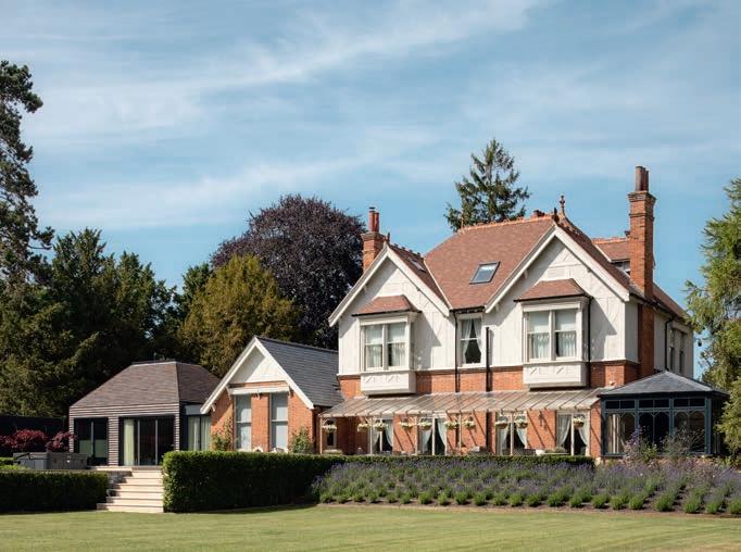
Dating from the 1880s, the Beeches is a residential property on a nine-acre site in the heart of South Cambridgeshire. The red-brick house features characteristic Victorian details, including chimneys that resemble ladders, and a white-painted, timber-framed upper storey. Decorative ridge crests give the steeply pitched, terracotta-tiled roof an instantly recognisable silhouette. The distinctive character of the older house was the starting point for the design when the owner decided to add a swimming pool. It was crucial that the extension be architecturally respectful and not overshadow the main building.
The new 30-m² building, designed by Snell David Cambridge, contains a steam room, changing facilities including a shower and toilet, and a bar that links directly to the kitchen in the main house. The architects knew that the local council would prefer a contemporary extension that reflects the house’s evolution over time. It was also important
that the choice of materials anchored the building in its historical context and complemented the existing red brickwork.
Snell David had long wanted to use Cover. In South Cambridgeshire, they found a client who also views Cover as an exciting way to reinterpret traditional brickwork, thanks to its ability to create a continuous flow from roof to façade, which results in a fresh, innovative look.
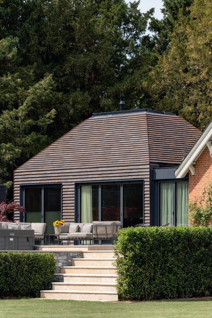
The extension consists of a timber frame structure and Cover mounted on a double batten system. Elegant Corten steel profiling, both at the corners of the house and in the hip of the roof, contrasts with and precisely delineates the rustic, handmade bricks. Several versions of Cover were evaluated on site. Ultimately, the architects felt C44 captured most of the main building’s nuances and chose it to clad the compact extension – affectionately nicknamed ‘the Armadillo’ during construction because of its resemblance to the small, armoured mammal.
C44’s varied play of colour includes shades of dark brown and hints of dark grey and purple. The washes of light grey come from the clay slurry used in the wooden moulds. The shades harmonise beautifully with the brickwork on the main house, which dates from the 1880s.
Extension, private estate, South Cambridgeshire, UK
Client: Private
Architect: Snell David Cambridge
Contractor: Buildmark Construction
Engineer: Andrew Firebrace Partnership
Completed: 2024
Brick: C44, 528 x 170 x 37 mm
Large windows in the small pavilion provide access to and views of both the pool and the garden.
“We chose Kolumba because of the horizontal lines and cornices of the older buildings. Kolumba speaks the same language.”
Martin Krogh, architect
AN EXTENSION LINKING TWIN APARTMENT BUILDINGS IN FREDERIKSBERG, COPENHAGEN, PROVIDES EXTRA SPACE FOR RESIDENTS AND INTRODUCES A CONTEMPORARY TOUCH TO THE TRADITIONAL STREET.
By Martin Søberg PhD, architectural historian
| Photos: Anders Sune Berg
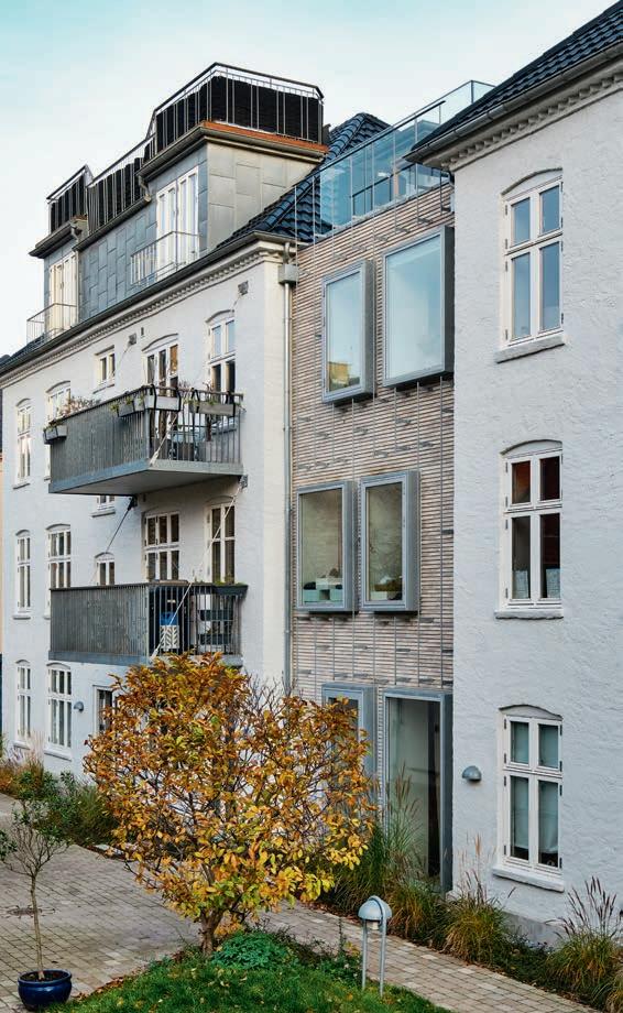
Walking around the streets of central Frederiksberg, you are surrounded by buildings of all sizes, heights and designs, built from the mid-19th century up to the present. Nestled between them, perfectly fitting the available space, are smaller additions that serve a variety of functions: garages, workshops, shops, new entrances and extensions to the buildings next door. These infills often differ from their neighbours in architectural style and materials, illustrating how the neighbourhood has evolved as new needs have arisen.
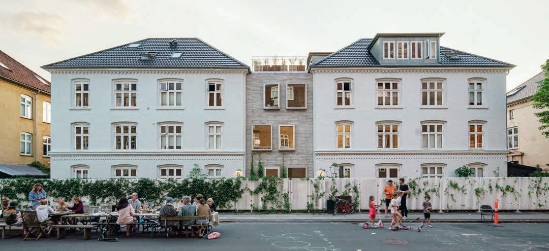
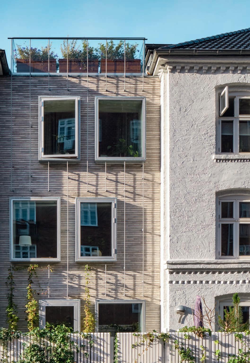
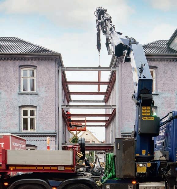
A quiet Frederiksberg side street is home to one of the latest examples of a neighbourhood sprouting new architecture. Designed by ADEPT, the addition has three storeys and bridges the gap between two 1870s apartment buildings containing a total of seven homes. As their families grew, the residents found themselves short of space. Instead of moving out of the neighbourhood they loved so much, the families agreed that the best solution would be an extension that added an extra room to six of the apartments, and a roof terrace to the loft space of the seventh.
The core of the extension is a steel frame that spans the gap between the older buildings. Made from recycled steel, this skeleton is bolted together so it can be dismantled again if necessary. The exterior is clad with Kolumba brick to form a facing wall around the relatively light supporting structure.
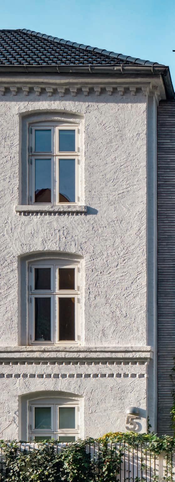
The façades on the older buildings are symmetrical, roughly plastered and painted white, with brick ornamentation consisting of a main cornice with dentils and one with a sawtooth string course. The new façade breaks with this symmetry principle, adding rhythm by moving the windows on each floor either to the right or left. The positions of these offset windows are not random. They point toward the apartments from which there is access to the new space.
Martin Krogh, architect, founding partner of ADEPT and one of the residents, explains the thinking behind the addition: “We asked ourselves how we could bridge the gap between the buildings in a respectful way, so the extension met the need for space and gave something back to the city.”
Based on this thinking, the façade features light-grey Kolumba in a spectrum of different shades, while recessed bed joints and raked stub joints form a subtle horizontal relief.
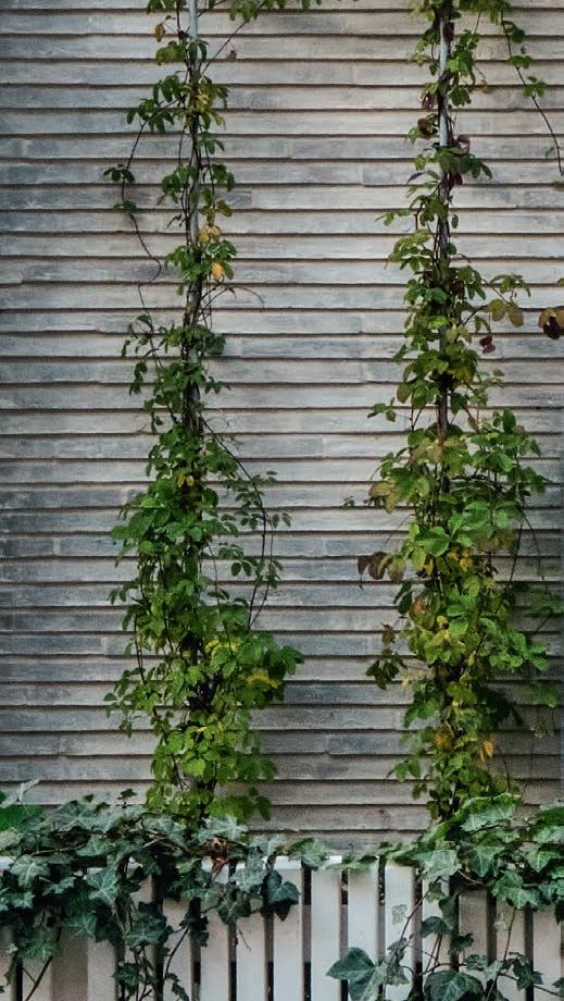
Evenly spaced vertical rods have been installed across the façade to support climbing plants and bring the extension to life. The plants are deciduous, so the façade will consist of a lush, green wall in the summer, and the brickwork will be more visible in the winter.
“At the back are beautiful light-grey bricks that contrast with the light shades of the older buildings. On top of them, we are adding a layer of greenery, but we have found a plant that won’t take over completely. We chose Kolumba because of the horizontal lines and cornices of the older buildings. Kolumba speaks the same language. It forms a surface that works well with the vertical rods and the greenery in front. Together, they create a beautiful interplay,” Krogh explains.
The new architecture that has sprouted between the older apartment buildings has been a great delight to the residents and breathes new green life into the street.
Extension, Svend Trøsts Vej, Frederiksberg, Copenhagen, Denmark
Client: Private
Architect: ADEPT
Contractor: HPH
Completed: 2023
Brick: K91


A VARIETY OF CUSTOM KOLUMBA FORMATS WRAP SMOOTHLY AND PRECISELY AROUND VOLUMES, OPENINGS, STAIRS AND OUTDOOR AREAS IN THIS HOME IN WILRIJK.
By Morten Birk Jørgensen, Architect MAA, Associate Professor, PhD.
Photos: Luuk Kramer
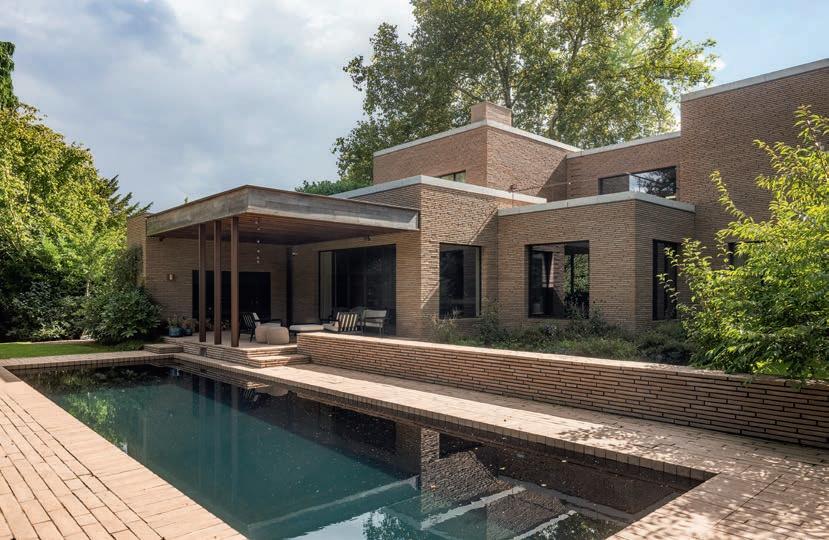
Interwar residential architecture inspired the brief given to Hans Verstuyft Architecten for a new home in the Wilrijk district on the outskirts of Antwerp. Specifically, the clients referenced Mies van der Rohe’s villas for Hermann Lange and Josef Esters in the German city of Krefeld, which consist of horizontal, rectangular volumes with façades of dark-red brick punctuated by floating white canopies. Villa Kaplansky, designed by the Polish-born Nachman Kaplansky, with its flowing, spacious interiors and countless integrated ornamental objects, was a more local source of inspiration for the new home in the Belgian city and served as another model for this cultured and exclusive modern home.
In terms of composition, the villa in Wilrijk shows a clear affinity with the Mies villas, albeit with more compact proportions. The south-facing façade, rising above the street, is particularly reminiscent of the interwar style, and behind it, the profile gradually descends to allow sunlight to reach the garden and outdoor pool. To soften the potentially monolithic impact of the 1,000-m2 home, the architectural concept assigns a single room or function to each volume. The result is an overall form that is highly varied in its vertical and horizontal offsets, both above and below ground. As an architectural strategy, it proved to be a huge success.
The materiality is defined by K21, the hues of which blend beautifully with the very green site. The building’s character emerges not only from the juxtaposition of the volumes but also from the brickwork itself. Each individual brick stands out to an unusually high degree, making each wall a composition in its own right, an effect achieved by leaving the joints on the façades unfilled after the bricks were laid, so that each one of them is framed in a shadow.
Like the Mies villas in Krefeld, extremely disciplined and precise brickwork is the predominant ornamental motif of the villa in Wilrijk. Custom formats were required to make the bricks wrap so elegantly around the many corners in the offset volumes and windows, as well as in the stairways and the many interior and exterior surfaces.
The solid yet sculptural effect is due, not least, to limited and consistent fenestration that insists on a maximum of one window per wall surface. Numerous offsets on the façades allow this principle to be realised without the building feeling closed off. The dark, slender window frames and sills are recessed into the façade, adding further weight to each volume.
On the other side of the copper-clad front door, the brick theme continues on the entrance hall floor. From here, a large, pivot-hinged double door opens into an open, spacious hallway that serves as a hub for the ground-floor functions. At its centre is a sculptural, curved staircase that ascends to the upper floor, opening onto roof terraces overlooking the street and garden.
In the garden, the brick façade folds down into a canopy-covered terrace, extends into the grassy area to form raised benches and continues on to the pool, where moulded bricks establish a solid edge to the pool.
At the apex, the brickwork is crowned with a parapet made of in-situ-cast concrete. On certain parts of the concrete elements, there are signs of early patination in the form of slight rust stains from screws and greenery. The effect of this harmonises proudly with the textural character of the brickwork. As the patina takes hold, the building will beautifully complement the green of the lawns and nearby trees.
Villa in Wilrijk, Belgium
Client: Private
Architect: Hans Verstuyft Architecten
Contractor: 3D Bouwwerken
Completed: 2024
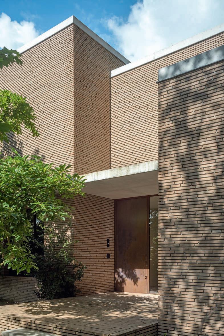
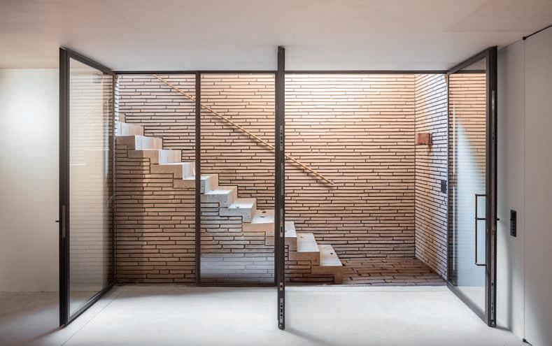
After the bricks were laid, the gaps between them were not pointed. The result is deep, dark joints that highlight the pattern in the wild bond.
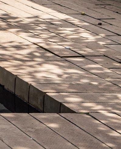
The pool realises the potential of custom bricks, as the tiles wrap around the edge and flow down towards the surface of the water.
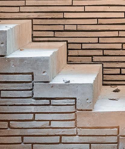
The steps on the basement staircase are also made of custom bricks.
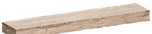
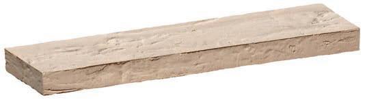
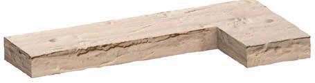
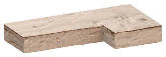
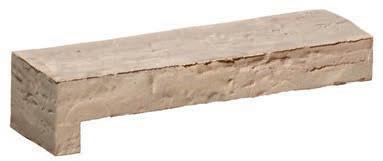
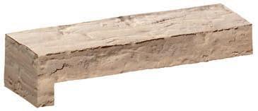
Petersen Tegl hand-made a total of five different bricks in wooden moulds, to produce the house’s many corners and edges. The top brick is a standard-format Kolumba measuring 528 x 108 x 37 mm.
THE INCUBA NEXT OFFICE BLOCK RISES LIKE A TOWER OF STAGGERED VOLUMES FROM ONE OF THE HIGHEST POINTS IN AARHUS. KOLUMBA BRICKS ADD A MATERIAL EFFECT AND COLOUR VARIATION TO THE SIMPLE FRAMEWORK OF THE FAÇADES.
By Martin Søberg, PhD, architectural historian
Photos: Anders Sune Berg
We are in the Katrinebjerg quarter in the northern part of Aarhus, a suburb which emerged in the early 20th century, combining residential areas with industrial and craft production units, and which is now an integral part of the city. INCUBA Next, designed by ADEPT and Aart, is in the INCUBA research park, which brings together research, students, and businesses as part of Aarhus University’s IT and Katrinebjerg Campus, where the focus is on engineering.
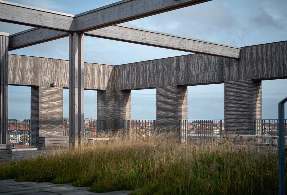
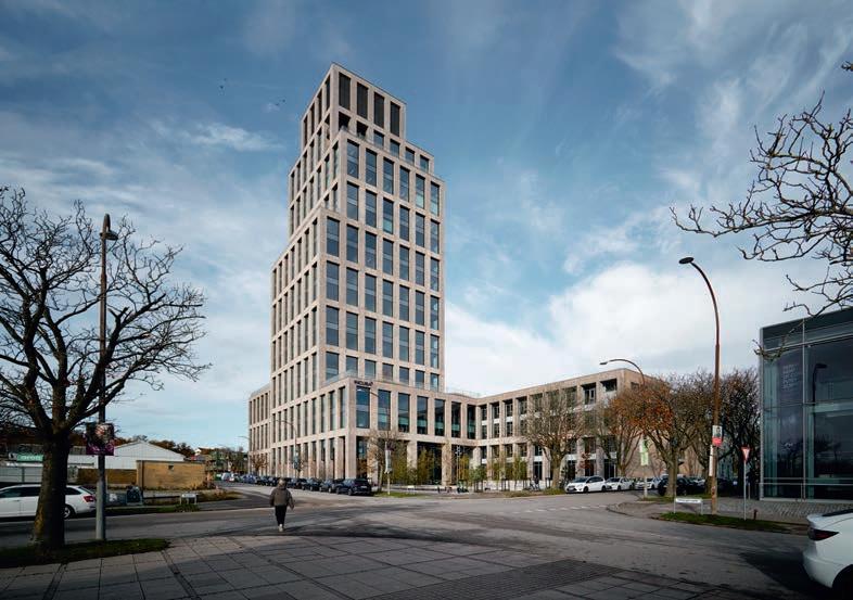
INCUBA Next is an extension to an existing building that has been renovated and transformed. The most striking new element is the 18-storey tower, primarily an office building for scalable tech companies, which soars to 76 metres above ground and offers sweeping views over the city and Aarhus Bay.
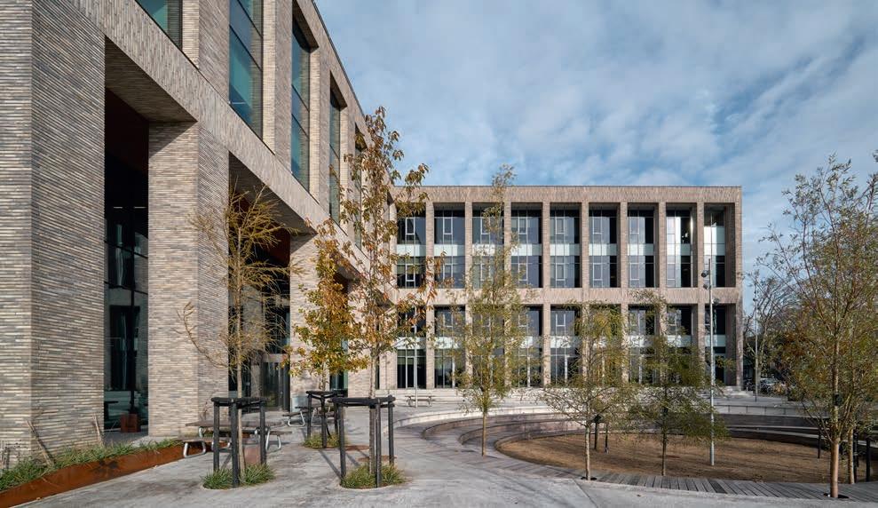
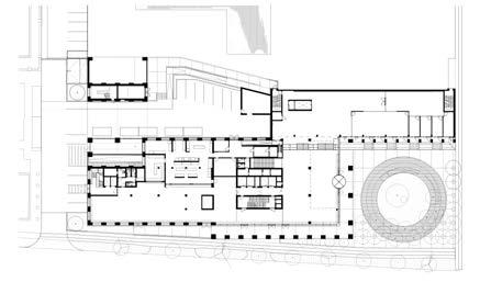
South of the existing building is a new square from which steps lead down to a circular space that doubles as a rainwater basin and an amphitheatre for open-air events. The new building stands to the west of it. The part of it facing the square is four storeys high, topped by a roof terrace, with the tower soaring skywards behind it. Each floor is slightly smaller than the one beneath. Combined with terraces at regular intervals on different sides, this creates a tapering effect as the tower stretches skyward. At ground level, the building is surrounded by arcades, creating a smooth transition between the exterior and interior and fostering an atmosphere reminiscent of an old Italian city.
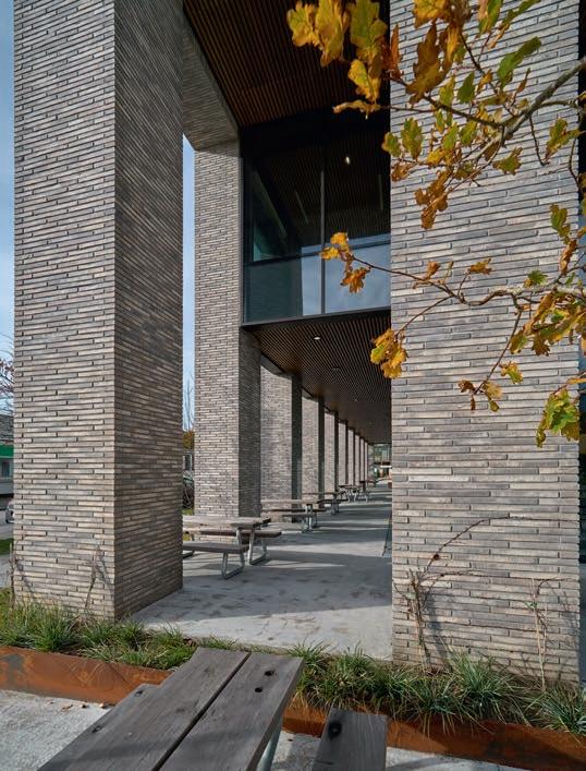
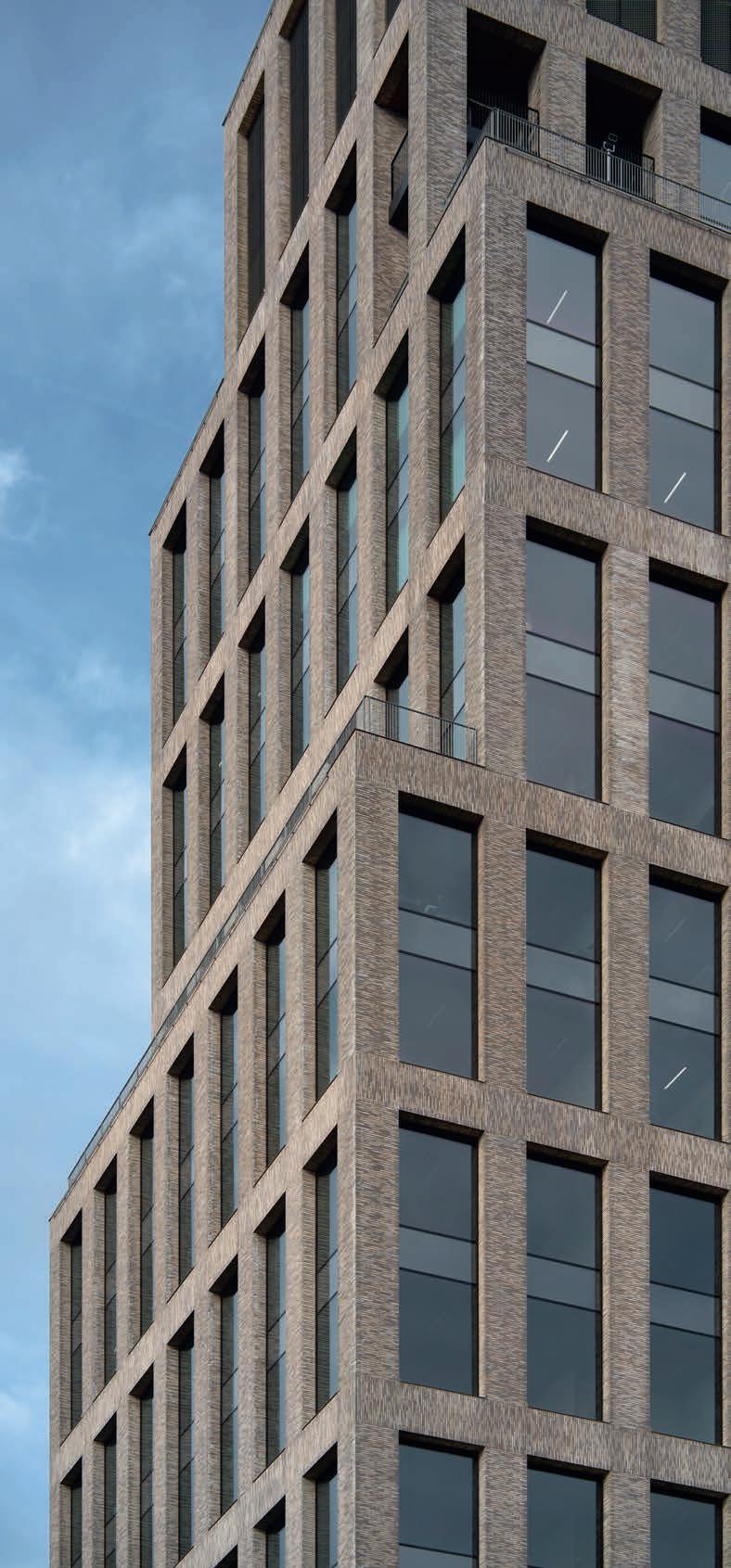
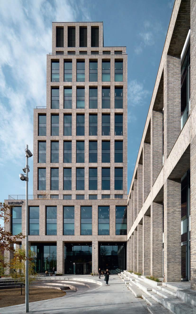
The façade consists of a simple pillar-beam system with deep-set windows that create a relief effect. Its pillars are clad with horizontal Kolumba, the beams with vertical ones reminiscent of the change of course seen above openings in traditional brickwork. The difference here is that bricks have also been laid in this way in bands that continue on across the pillars.
“On the two lowest floors, whole Kolumba bricks have been laid manually, while the floors above consist of two-storey, L-shaped elements in which the bricks have been cut. The elements are assembled section by section, and vertical bricks in the decks conceal the joints. Another advantage of using the 528-mm-long Kolumba is that when producing the prefabricated elements, and the brick is placed upright in the mould, it alone can form the deep recesses in which the windows are set – giving the building its characteristic relief effect,” explains Martin Krogh, architect and partner of ADEPT.
The pairs of floors resemble double-height openings in the brickwork, which lends the building a sense of monumentality while also softening its scale. This makes it look smaller from a distance, as the eye sees half as many floors as the tower actually has. It also makes the individual openings taller and slimmer, underlining just how tall the building is. Kolumba adds texture and multiple shades of colour to the façade.
“The grey in the brick has subtle variations, and brownish hues add warmth. Kolumba endows the building with its robust, monolithic character. When you move around it, especially higher up, it almost feels as if you are making your way through the rocky crags on a mountain,” Anders Tyrrestrup, architect and founding partner of Aart, explains.
“Kolumba endows the building with its robust, monolithic character. When you move around it, especially higher up, it almost feels as if you are making your way through the rocky crags on a mountain.”
Anders Tyrrestrup, architect
INCUBA Next, Katrinebjerg, Aarhus, Denmark
Client: INCUBA
Architects: Aart and ADEPT
Contractor: A. Enggaard
Engineer: Cowi
Completed: 2024
Brick: K92
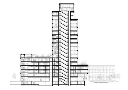
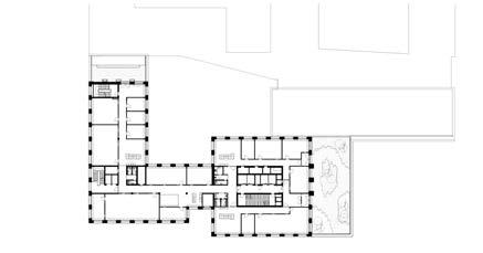
The façade comprises two-storey, L-shaped sections. The Kolumba bricks are set vertically on framework, forming continuous horizontal bands.
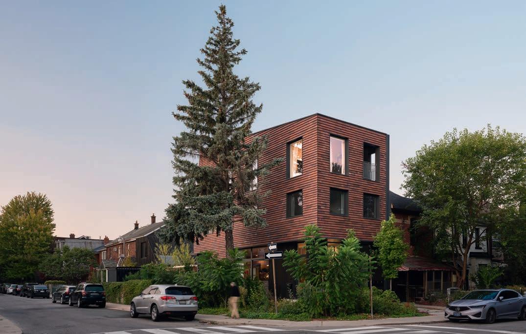
RATHER THAN TALL APARTMENT BLOCKS OR SCATTERED RESIDENTIAL DEVELOPMENT, ULSTER HOUSE POINTS TO A THIRD APPROACH, WHERE MORE HOUSES ARE GENTLY INTEGRATED, TAKING THEIR CUE FROM TORONTO’S HISTORICAL BRICK ARCHITECTURE.
By Ida Præstegaard, MA in architecture
Photos: doublespace photography
In Harbord Village, an attractive residential neighbourhood in downtown Toronto, you will find a new, experimental residential development designed by architect couple Janna Levitt and Dean Goodman, founders of LGA Architectural Partners. As not only the developers of the project, but also future residents, they wanted to explore how a plot intended for a single-family home in a classic brick neighbourhood could accommodate multiple homes without losing its scale, materiality or local anchoring. A key element of their approach was the choice of Cover for the façades.
Brick has long been a defining feature of Toronto’s residential architecture. As it was durable, fireproof and easy to obtain locally, it became the standard building material as the city grew in the late 19th and early 20th centuries. The varied cityscape features everything from deep-red and light-coloured bricks in Victorian and Edwardian buildings, to the more subdued, uniform brickwork of post-war construction. In addition to its practical properties, brick gives Toronto a strong visual coherence. Although architectural styles have changed over time, the streets feel consistently robust, tactile and solid.
As part of Toronto’s brick city, the new development builds on the location’s character, rather than replacing it. The project represents an alternative to the city’s dominant housing strategy, which mainly prioritises tower blocks or scattered developments. Instead, Ulster House is an example of a strategy known as ‘gentle density’, which focuses on increasing housing stock by integrating new types of homes into existing
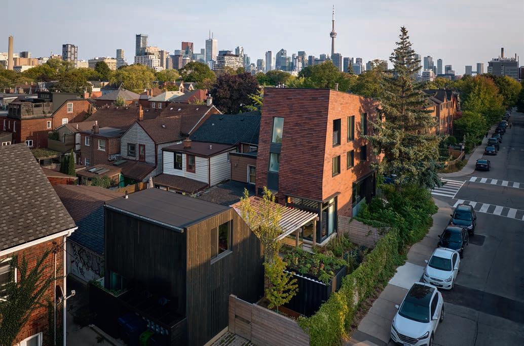
neighbourhoods without disrupting their layout, scale or architectural character.
Ulster House contains a total of five residential units, four of which occupy the three-storey main building. The ground floor is a single 163-m2 space with the potential to be divided into two apartments, with access to the courtyard. On each of the upper floors are two compact two-bedroom apartments with large balconies. All of the apartments prioritise spatial qualities, daylight and storage space over maximising the use of the floor space.
The fifth unit is a Laneway House – a smaller building type often found in Toronto’s neighbourhoods. Typically built in the backyards of houses, these structures were originally used for waste collection or parking. In Ulster House, the existing laneway is part of the ground-floor accommodation, to which it is connected via a courtyard but it can also be relatively easily converted into a separate dwelling. Levitt and Goodman have long been advocates for activating the city’s laneways as a way of increasing housing supply with respect to the streetscape and the city’s physical imprint.
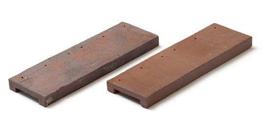
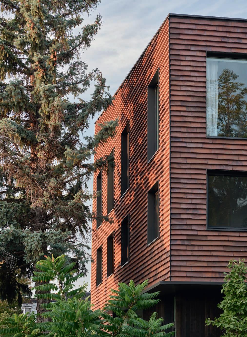
The new building’s façade plays a crucial role in its relationship with its surroundings. From the beginning, it was clear to the architects that it should be clad with brick to echo the surrounding Victorian brick houses. To give the project a contemporary look, the architects chose Cover. They opted for C48, which has a wide spectrum of red, brown and orange shades creating a vibrant façade that echoes the brickwork
of the surrounding buildings. As a result, Ulster House looks unmistakably modern but is also firmly anchored in the neighbourhood’s architecture.
The entire project emphasises sustainability, economy and longevity, partly through the use of energy-efficient systems and solar cells. One advantage of using Cover is that the bricks can be dismantled and recycled. They are mounted on a simple wooden structure, eliminating the need for steel brackets and reducing material-related CO₂ emissions. This solution also supports a simple and honest approach to construction.
Levitt and Goodman were among the earliest proponents of gentle density, a housing concept rooted in low-rise, multi-unit construction and the repurposing of laneway houses. With Ulster House, they wanted to demonstrate how this approach can be tangibly realised in high-quality architecture.
Ulster House, a five-unit residential building, Toronto, Canada
Client: Janna Levitt and Dean Goodman, LGA Architectural Partners
Architect: LGA Architectural Partners
Contractor: Desar Construction Studio Inc.
Engineer: Blackwell Engineering
Mechanical engineer: RDZ
Completed: 2024
Brick: C48, 528 x170 x 37mm
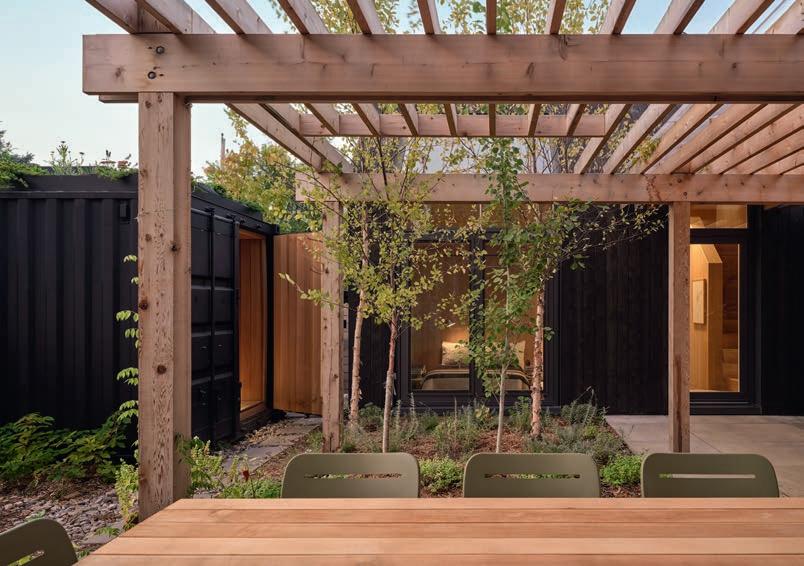
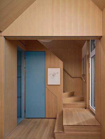
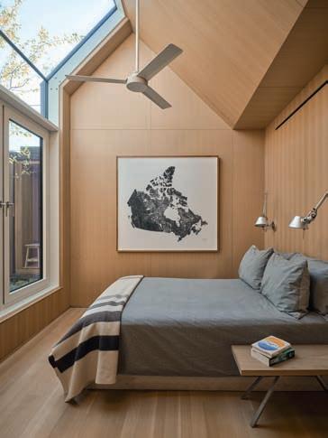

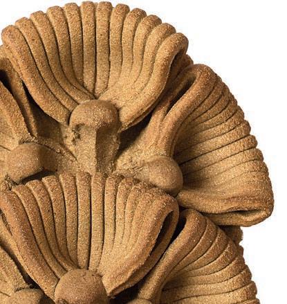
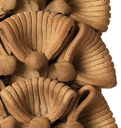
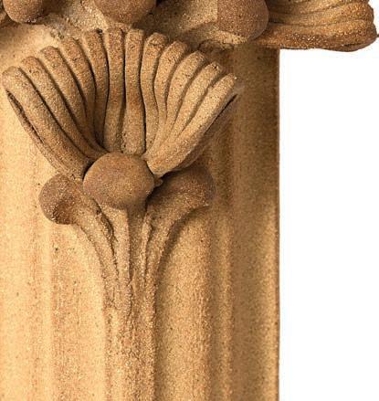
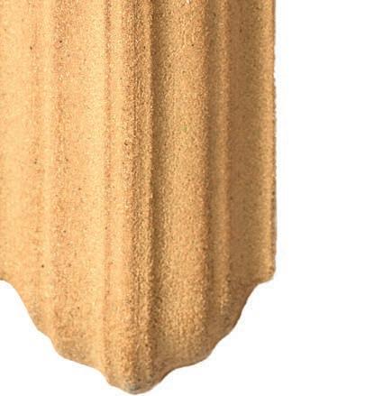
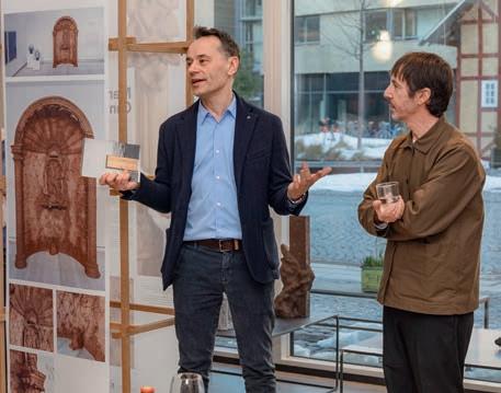
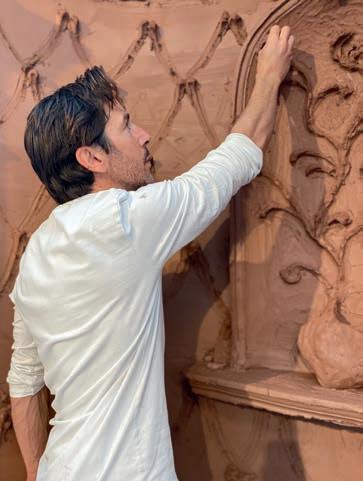
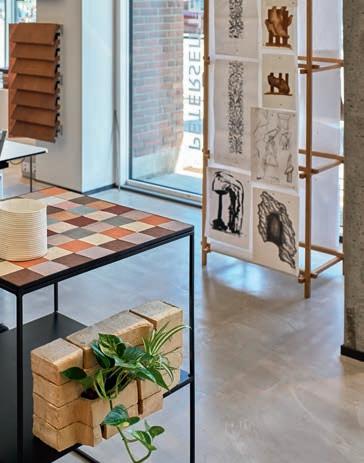
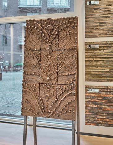
THIS SUMMER, THE PETERSEN TEGL STUDIO IN COPENHAGEN IS HOSTING AN EXHIBITION CELEBRATING CERAMIC ART AS A SOURCE OF ARCHITECTURAL INSPIRATION.
Petersen Tegl was delighted to throw open the doors of its Studio in Copenhagen to celebrate the work of Italian artist Manuel Canu. The exhibition, which opened in mid-February, documents Canu’s residency at the brickworks in Broager. In May and June 2025, he explored ways of establishing a dialogue between ceramics skills, industrial processes and contemporary material research.
Canu has been working with clay for many years. His work explores the historical and symbolic role of nature motifs in architecture, particularly in ornamental features. Drawing on the decorative craft tradition, he reimagines clay as both a load-bearing and narrative material in a contemporary artistic context.
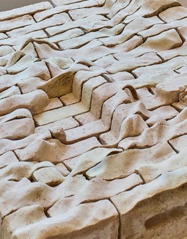
The exhibition acts as a physical bridge between art and industrial processes, offering insight into an experimental collaboration in which artistic methods are intertwined with brick-production techniques. The resulting artworks reference historical traditions while pointing towards new ways of working with ceramics in architecture.
The exhibition runs until 1 September 2026.
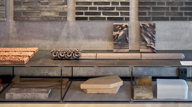
CONSULTANTS–PETERSEN TEGL
DENMARK EAST ARNE GOTFREDSEN P: +45 2967 7030 E: AGO@PETERSEN-TEGL.DK
DENMARK WEST AND FUNEN TORBEN SCHMIDT P: +45 2028 4355 E: TSC@PETERSEN-TEGL.DK
EXPORT MANAGER STIG H. SØRENSEN P: +45 4014 1236 E: SHS@PETERSEN-TEGL.DK
NORWAY MUR DIREKTE AS SIMEN BØE P: +47 2339 2010 E: POST@MURDIREKTE.NO
SWEDEN TEGELMÄSTER AB CATHARINA HOLMSTRÖM P: +46 40 542 200 E: INFO@TEGELMASTER.SE
GERMANY SCHLESWIG-HOLSTEIN, HAMBURG JUTTA ENGLER P: +49 171 7561 943 E: ENGLER@PETERSEN-TEGL.DK
GERMANY EAST, BERLIN, NIEDERSACHSEN, BREMEN ERIC SCHMIDT-BANDUR P: +49 174 3800 667 E: ESB@PETERSEN-TEGL.DK
GERMANY SOUTH/NORTH RHINE-WESTPHALIA SWITZERLAND (GERMAN-SPEAKING REGION) AUSTRIA BACKSTEIN-KONTOR GMBH P: +49 221 888785-0 E: INFO@BACKSTEIN-KONTOR.DE
BENELUX PETERSEN BENELUX BELGIUM, LUXEMBOURG BJÖRN LUCASSEN P: +31 (0) 652362168 E: BLU@PETERSEN-TEGL.DK
NETHERLANDS LINEKE LUCASSEN P: +31 (0) 622529266 E: LLU@PETERSEN-TEGL.DK
TOM LUCASSEN P: +31 (0) 646236445 E: TLU@PETERSEN-TEGL.DK
LARS HOGEBOOM P: +31 (0) 625391583 E: LHO@PETERSEN-TEGL.DK
UNITED KINGDOM STIG H. SØRENSEN P: +45 4014 1236
E: SHS@PETERSEN-TEGL.DK
EUROPEAN BUILDING MATERIALS LIMITED P: +44 (0) 203 805 0920
E: ENQUIRIES@EBMSUPPLIES.COM
POLAND CENTRUM KLINKIERU SCHÜTZ P: +48 58 56 37 201 E: BIURO@CENTRUM-KLINKIERU.PL
EASTERN EUROPE (EX POLAND), ITALY INGRID KATHRIN GROKE P: +45 2047 9540 E: IKG@PETERSEN-TEGL.DK
UKRAINE INGRID KATHRIN GROKE P: +45 2047 9540 E: IKG@PETERSEN-TEGL.DK
VISTARK KLINKER P: +380 44 221 47 37 E: VISTARK.KLINKER@GMAIL.COM
AUSTRALIA AND NEW ZEALAND ROBERTSON’S BUILDING PRODUCTS PTY LTD P: +61 3 8199-9599 E: PETER@ROBERTSONS.CO
INDIA AND THE MIDDLE EAST ATLAS DEVELOPMENTS INDIA P: +31642552517 E: ISHANVIR@ATLASDEVELOPMENTS.NL
SOUTH AMERICA INGRID KATHRIN GROKE
P: +45 2047 9540 E: IKG@PETERSEN-TEGL.DK
DESIGN AND LINTELS STEEN SPANG HANSEN P: +45 2142 7962 E: SSH@PETERSEN-TEGL.DK
PUBLISHER
PETERSEN TEGL A/S
NYBØLNORVEJ 14 DK-6310 BROAGER P: +45 7444 1236
E: INFO@PETERSEN-TEGL.DK WWW.PETERSEN-TEGL.DK
EDITORS IDA PRÆSTEGAARD, MA IN ARCHITECTURE
E: IPR@PETERSEN-TEGL.DK
ANNETTE PETERSEN, MA IN ARCHITECTURE
E: AP@PETERSEN-TEGL.DK
LAYOUT
ZANGENBERG DESIGN
TRANSLATION
CITADEL TRANSLATIONS
STRANDBYGAARD
REPRO EHRHORN HUMMERSTON
PRINT RUN 85,000