17 minute read
Colour Science

Everything you wanted to know about colour temperature and LEDs (but were afraid to ask...)
Kino Flo’s research on the colour science behind LEDs and camera interaction is a complicated affair
Advertisement
Words: Paul Middleton
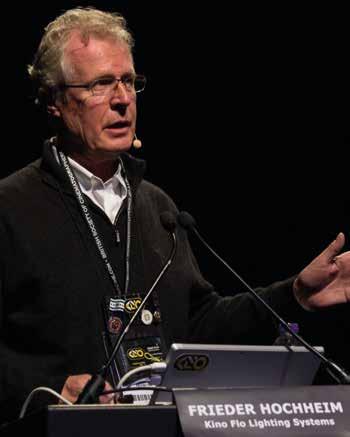
Over the past few years, Frieder Hochheim has been presenting the results of research his company, Kino Flo, has been doing into the colour science behind how LED lights react with different types of video cameras. It was something Bernie Davis first reported on in Set & Light126.
Cirro Lite (who distribute Kino Flo fixtures in Europe) hosted a Zoom meeting in February to help members try and get to grips with why LEDs and digital video cameras don’t always mix as well as you might like (you can watch the video on YouTube). Before watching it, I felt it would help some people, or more probably, a lot of people, understand what Frieder talks about by going through a brief history of colour theory, and give some more background of the terms and concepts he uses, as well as some history of colour on film and TV to see why Colour Temperature is so important.
Sir Isaac Newton first investigated the splitting of white light into its constituent colours via a glass prism in 1666 but until the 1830s, no one had really thought about reproducing a scene by anything other than painting it. There was great debate about whether light was made up of particles or waves of light, and whether the colour of an object was a result of the light it emitted when illuminated by a beam or by the way the wavelengths were reflected, or absorbed, by the object. We now know the latter is the reality. Newton eventually proved that the rainbow effect of a prism was not caused by imperfections in the glass, but by the light waves being refracted in different amounts as it passed through.
Henry Fox-Talbot first produced permanent still pictures around the mid 1830s and Louis Daguerre had a different system around the same time but these were monochrome and because of their low sensitivity needed to be used somewhere there was a good amount of light (i.e daylight).
In 1887, the wavelengths of the different colours of light were first measured by the Michelson interferometer and around 1888, William Friese-Greene was credited as the inventor of ‘Kinematography’. He is probably lesser known for also patenting a two-colour movie process in 1905 that went on to become the basis of the original Technicolor film system in 1916. It was not until ten years later though that John Logie-Baird produced his first monochrome TV pictures and also amazingly went on to demonstrate the first live colour TV pictures using a mechanical two-colour system just two years later.
The various properties of light are due to the behaviour of extremely small particles called photons that are invisible to the naked eye. We cannot see light. We can only see it when it hits something and the colour of that object is revealed. In 1905, Einstein proved that photons have energy (E) equal to (h), Planck’s constant x oscillation frequency. The brightness of light is decided by the quantity of photons. The energy is packed in and each is of a certain wavelength and has a specific fixed amount of energy. The energy of light is thus not the amplitude of the wave, as is the case in acoustical waves. More light means more photons. This discovery led to the formulation of quantum mechanics.
Black and white movie film in the late 1920s had a reasonable grey scale response, but the ASA value was very low so a lot of light was still needed to expose it properly. Shooting outdoors was the norm as lighting levels needed when shooting indoors without any daylight were high. The same restrictions also applied to all early TV scanning systems which were also very insensitive.
Early colour movies used prisms to separate red and green onto alternate frames of a monochrome film running at twice the normal speed. The alternate frames were then printed on separate chemically-tinted reels and physically stuck together to give the full-colour effect.
As the sensitivity of film increased, it became practical around 1930 to shoot in studios using the Tungsten filament lamp that was in widespread use in photographic studios. As
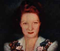
Off TV screen colour picture of aviator Paddy Naismith demonstrated by J.L Baird in September 1941 using the 600-line ‘Telechrome’ camera on a 20-inch
projection monitor 5,500K colour temperature in order to maintain maximum colour consistency. This was of great concern to cinematographers as the leading ladies especially had to be seen consistently in the best possible light at all times. The reason for the choice of daylight colour temperature was due to the insensitivity of the film stock and the fact that it gave economies of scale by only producing one type. When shooting in a studio, huge amounts of lighting were required with the obvious problems of heat affecting the actors.
Colour gamut and the CIE diagram
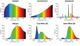
Frieder explains, other light sources were also used, but with varying results and hazards. The colour temperature of these sources was largely irrelevant whilst shooting in black and white as the panchromatic (meaning the film has a luminance response that covers all the spectrum visible to the human eye) nature of early movie film stock meant that it was only the amount of light generated by a lighting fixture that was generally important. If a fixture with a discontinuous spectrum is used to shoot monochrome pictures then the grey scale response will be different and thus colours that are absent from the spectrum will be reproduced darker, or not at all. The same principle applies when shooting in colour with LED light sources that have a discontinuous spectrum. For example, if you shoot a yellow object with just red and green LEDs the yellow will appear darker than if illuminated solely by a tungsten source.
In 1935 Mole Richardson (MR) introduced a major change to studio lighting fixtures by adapting the fresnel lens concept originally designed for lighthouses. The stepped front lens reduced the weight as well as giving a much more even field across the beam. MR initially produced three fixtures – the Inky Senior (5kW), Inky Junior (2kW) and the Inky Baby spotlight (1kW). The high wattages were partially down to the fact that when used with Technicolor film (which initially had a rating of just five ASA and was only available in daylight colour) they had to be fitted with a blue Macbeth glass filter which reduced the output level by over 60%. 1935 was also the year when Kodak introduced the 16mm Kodachrome film, which enabled colour pictures to be produced using multi-layers without the need for prisms or filters to separate it into individual colours. In order to create a ‘colour’ picture, all these early systems relied on the fact that white light (as seen by the eye) is made up of around 30% red, 60% green and 10% blue primary colours.
Despite being known for his mechanical TV scanning systems, Baird also developed an all electronic ‘telechrome’ system using cyan/red-orange pickups and display on a two-sided CRT screen. It gave good reproduction of skin tones, but otherwise had a poor overall colour range of colours or ‘colour gamut’ due to the absence of a specific blue component. In August 1944 it was however chosen as the basis for a UK-wide post war TV standard by the Hankey Committee. Baird’s death in 1946 and post-war shortages curtailed further development of that system.
The importance of consistent colour temperature
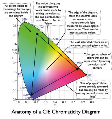
In the cinema, the Technicolor system reigned supreme but required a maximum deviation of 250K from its base In 1931, the Committee Internationale de l’Eclairage (International Commission on Illumination, or CIE) set out to define the RGB colour space using three colours based on reference wavelengths of 435.8nm (violet), 546.1nm (green) and 700nm (red) that cover the range of colours normally able to be seen by the human eye. The outer curve shows the corresponding wavelength in nanometres, whilst the straight line along the bottom is the so-called ‘line of purples’ because it describes the eye’s response to a continuum of ratios between red and blue. There is a central white area that shows the varying ‘white’ colours.
The CIE was also the body that came up with the stylised lighting symbols first used in the 60s to represent spotlights, fresnels, floodlights etc on theatre and TV lighting plots.
Frieder makes reference to the ‘Planckian locus’ (overleaf) in his presentation. This is not, however, the name of a new species of aliens encountered by Jean-Luc Picard in his latest Netflix series. The locus is the range of colour temperatures that match different varieties of white light. A key marker on that line is the D65 point in the centre point of the CIE chart and uses a mixture of 2.77:5.79:1 Rec 709 RGB
For our purposes, the fact that some ‘white light’ sources do not lie exactly on the Planckian locus means that they will exhibit a slight green or magenta shift compared with perfect white light. This can be corrected by the application of plus/
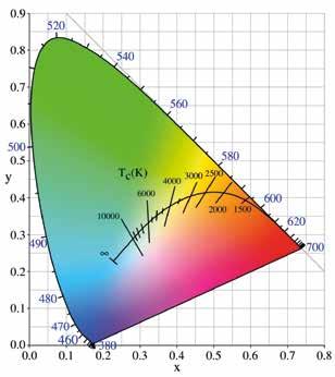
minus green or magenta corrections in camera electronics or by the application of appropriate gels to give a shift back onto the perfect colour temperature white locus. This chart is however missing the third dimension of lightness that would sit on top of this 2D map where all the colours reduce proportionally down to black over the height shown in 3D.
The American NTSC chose D65 as its primary illuminant colour in 1944 and the PAL system followed suit in 1962. This stylised White ‘Daylight’ 6,500K was chosen to define the colour temperature of daylight as seen in the Northern or Southern Hemispheres. 9,300K is the standard white for Japanese NTSC and just for accuracy D65 is not exactly 6,500K! This, of course, does not mean that Japanese videos look bluer than UK ones, but more that Oriental skin tones look more flattering when viewed on their own.
How to improve colour fidelity when shooting with LED light sources?
The reality that Frieder tried to explain is that there is in effect a beat pattern that occurs between the imperfect colour spectrum of different LED fixtures and the variable colour response of different camera sensors. In some circumstances the response of a specific camera and a particular LED fixture match perfectly and the colour seen in real life matches that seen by the camera.
In other cases, gaps in the LED spectrum compared to a Tungsten light source give rise to colour differences that are not visible to the eye, but are seen by the camera. This is shown by the fact that TV cameras have always been sensitive to infrared light. Many electronic camera manufacturers used to include an infrared filter in the internal optical path, but nowadays many cameras (especially those on mobile phones) don’t filter out that IR light. This can have a negative effect in some situations, but also has a positive that you can check whether your TV remote control is working by pointing it at your phone camera, which will show a pale purple glow when you press a key. Modern professional cameras however have significant IR rejection. If it is not filtered out, the resultant RGB code values will be significantly desaturated due to channel mixing from ineffective colour dyes on the silicon pixels in the IR region. It is well known that inadequate IR rejection is the main problem with the use of high-density ND filters on digital cameras. Filter manufacturers have redesigned them to lessen or eliminate the problem.
The problem nowadays is that whilst back in the film days companies such as Kodak were happy to provide the necessary technical information on the spectral response of their film stock, that same information is jealously guarded by the current digital camera manufacturers. So Kino Flo had to create its own system to measure the response of cameras at different colour temperatures.
The Kino Flo system tries to tune the spectral output of its fixtures to match the response of a particular camera sensor when working at a particular colour temperature. This requires Kino Flo to continually test new cameras and measure their response and tune the settings in its software to produce the best match for a particular required colour.
Best practise with LED key lights
What’s the best practice when using LEDs to get different shots to match? The answer is firstly to trust that a given manufacturer will have suitable design principles and manufacturing tolerances to ensure that the colorimetry between different batches of their fixtures will exactly match one another. The next is to take a leaf from the old Technicolor system of ensuring that all the fixtures used on a production match the very limited colour temperature range that they specified. In the current world of LED, the best practise is to always use the same fixture type as the key light when you are lighting people who need to have a consistent skin tone across different shots and scenes and to mask off other light sources from faces that might pollute the spectrum of the chosen reference key light.
LEDs in light entertainment
The next question that arises with the use of LEDs is in the light entertainment field. In this section I’m considering the use of cameras working under Rec 709 colour space for live video. The native colour temperature of current video camera sensors is not something that many manufacturers reveal, but discussion online seems to place it often as somewhere around 4,400K.
Outside that temperature, the electronic correction applied to the RAW camera signal data is unknown but the effect is that looking at colours other than white will appear different to what the eye sees, with an array of cameras giving quite different results. The future perfect system will enable a video camera and monitor to look at a scene and the picture on the monitor will look exactly the same as seen by the eye.
It is well recognised in TV lighting that Sony Broadcast cameras boost the blue level gain of their cameras so much that when shooting at 3,200K it is impossible to display any variation between different shades of purples, pinks and blues. So the question I posed to Frieder was what colour temperature should cameras ideally be set to in order to get the widest range of colours for light entertainment purposes?
His suggestion was that where it is required to have the widest range of colour reproduction, the best solution is to
start with a white LED and then use CMY filters, as that would give a better range of colours than trying to produce a specific colour from a mixture of discreet LEDs. e.g red, green, blue, lime with their combined discontinuous spectra.
Moving the camera colour temperature (CCT) up to around 4,400K is becoming common as it counteracts the blue boost used in the electronic correction of current cameras, but that choice is not favoured by all LDs because of the apparent ‘greyness’ that working at that temperature gives a studio audience. But it is something that will eventually get resolved as the response of the future sensors and the colour spectrum of LEDs is increased.
In the Digital Cinema world, video capture is virtually now all in camera RAW mode and the sensors have a P3, or higher, colour space where the required ISO and CCT settings are stored in the recorded metadata and the RAW data is then graded in post to reproduce the required CCT.
Efficiency of LEDs
• A tungsten lamp produces around 28 lumens/watt along with a lot of Infra-red (i.e heat). Around 95% of the power fed to a tungsten lamp is wasted as heat. • Kino Flo fluorescent tubes produce around 48 lumens/watt from an 8ft tube, but with very little heat. • HMI produces around 100 lumens per watt of light but with a lot of UV and infrared. • The best LEDs can now reach 250 lumens/watt but still with a heat component that comes from the LED junction that can mean 40-50% of power is still used up and a lower lifetime for the fixture. Running at 220 lumens/watt gives a much longer working life for LEDs.
Jargon buster
Colour spaces
You’ve probably heard various phrases relating to colour space. The first definitions applied to computer screens/TV and were defined under sRGB/Rec 709. The white point of an sRGB display is an x,y chromaticity of (0.3127,0.3290). It has only 8-bit resolution in the analogue world and in digital outputs such as DVI and HDMI 1.0 giving a maximum of 16.7 million possible colours. Later, 10-bit video increased that to 1.07 billion colours on HDMI 2.0. The increasing bit depth reduces the banding effects seen on graduated colours on screen.
As the resolution and brightness of video projectors increased and film fell out of favour as a projection medium in the noughties, the first digital cinema DCI-P3 specification was released in 2005. This increased the colour resolution to 12-bits per pixel. The latest standard that TVs try to reach is Rec 2020, which is defined for 4K and 8K displays. It uses 630nm for the red primary, 532nm for the green and 467nm for the blue
Relative to the CIE 1931 colour space, Rec. 2020 covers 75.8% of it, DCI-P3 53.6%, Adobe RGB 52.1%, and Rec. 709 only 35.9%. 12-bits is the maximum that needs to be used as the range of colours and intensities then exceeds those that the eye can distinguish between.
Dolby Vision (as used by Netflix and Apple TV) as an example actually uses some of the overall bit levels and the increased brightness range of OLED to give support for High Dynamic Range (HDR) mode.
Future standards
The next step in colour science is the development of ACES. This defines a system which covers over 100% of the visible spectrum and has a range of around 30 stops. It has a white point equivalent to D60. Search ACES2065-1for more details.
Display quality
The quality achieved with different display standards is: • HD TV – 100% Rec 709 • OLED TV – around 98% of DCI-P3, 75% of Rec 2020 • Quantum Dot TV – 83% of Rec 2020
Two interesting points
Photographers often talk about the ‘Golden hour’ around Sunset being the best for Glamour and Wedding Photographs. In the illustration below, the colour spectrum of Daylight changes to almost exactly match the Incandescent Spectrum during the run up to Dusk. I bet you didn’t know that!
Finally, a question I often ask students is what colour temperature is moonlight? Think about it! Hollywood were the ones who decided that moonlight should be blue! Research by Ciocca & Wang (2013) clearly showed that the spectrum of the moon (normalised to have a similar overall strength as sunlight) is redder than sunlight and so has a lower “colour temperature”. This is a fact, not a perception.
The Purkinje effect (sometimes called the Purkinje shift) however makes us perceive faint light as bluer (higher colour temperature) than we would perceive a brighter light with an identical spectrum. It is derived from the fact that the peakluminance sensitivity of the eye shifts toward the blue end of the spectrum at low illumination levels as part of its natural dark adaptation.
In consequence, reds will appear darker relative to other colours as light levels decrease. So that’s why Moonlight is identified as being Blue, even though it is really only reflected Sunlight..
• Thanks to Frieder Hochheim and Mitch
