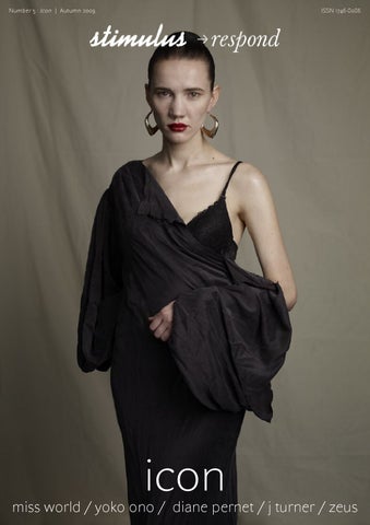
Number 5 : Icon | Autumn 2009
ISSN 1746-8086
icon
miss world / yoko ono / diane pernet / j turner / zeus
Contents Literature
Poetry
076 Landscape as Icon in Contemporary Visual Culture Words by Ola Wlusek
112 Myth-information (excerpt) Words by Christina Lovin
084 Line breaks: iconography <br> Words by Phil Sawdon
117 Assumptions of the Virgin Words by Christina Lovin
090 The Icons of Access: From Exclusion to Inclusion Words by Justin J.W. Powell & Liat Ben-Moshe
114-115 Words by Peter Hughes
96 Eye Contact (Towards a Disavowal of the Iconic) Words by Derek Horton
116 Primal Words by Stephen Mead 117 Torch Singer Words by Christina Lovin
Fashion 018 Everyone Must Stand Alone 040 Eisbar 062 Nichola 100 Miss World
118-121 Visual poetry by Dirk Kome 122 Words by Andy Johnson 124 Zeus Words by Benedicte Wilhelmsen 125 Bus Stop Words by Derek Adams
126 Remy
Features
Music
012 Totem and Taboo Words by Rose Cooper-Thorne
056 Yoko Ono Interview by John Duran
016 Gilles Peterson Words by Jonna Dagliden
060 The Rise And Fall Of The Pop Icon: A Brief History Words by Jeremy Allen
034 Whispers Diane Pernet Interview by Jack Boulton
EROTOKRITOS www.erotokritos.com
i·con (ī′kän′) n. 1. also i·kon (ī′kän′) a. An image; a representation. b. A representation or picture of a sacred or sanctified Christian personage, traditionally used and venerated in the Eastern Church. 2. An important and enduring symbol: “Voyager will take its place ... alongside such icons of airborne adventure as The Spirit of St. Louis and [the] Bell X-1” (William D. Marbach). 3. One who is the object of great attention and devotion; an idol: “He is ... a pop icon designed and manufactured for the video generation” (Harry F. Waters). 4. Computer Science: A picture on a screen that represents a specific file, directory, window, option, or program.
Contributors this Issue Cover image by Edith Bergfors Literature
Music
Ola Wlusek Phil Sawdon Justin J.W. Powell Liat Ben-Moshe Derek Horton
Yoko Ono John Duran
Fashion Harris Kyprianou @ d-tales gr Andreas Koumas Aggelo Patta @ Blow Elina Nicolaide Charis Charalambous Matthew Holroyd Anastasis @ Blow Cy. Yuhi Kim Natsumi Narita Hiroshi Matsushita Sarah Atkinson Maya Angelos Pattas @ Blow Cy. Lena Ramsey Edith Bergfors Ken Nakano Nichola Chrisanthou Junichi Kikuchi Audrey C Akio Nishiyama Misaki Nakamura Charis Charalambous Angelos Pattas @ Blow Andreas Andreou Mehmet Myumyun Poetry Christina Lovin Andy Johnson Peter Hughes Dirk Kome Stephen Mead Benedicte Wilhelmsen Derek Adams
Features Diane Pernet Rose Cooper-Thorne Gilles Peterson For contributors contact details, please email the editor in chief at jack@stimulusrespond.com.
www.stimulusrespond.com Editor in Chief Jack Boulton jack@stimulusrespond.com Editors - Literature Phil Sawdon and Marsha Meskimmon phil@stimulusrespond.com Editor - Fashion Christos Kyriakides christos@stimulusrespond.com Contributing Fashion Editors Matthew Holroyd Andreas Koumas Editor - Art Christopher Thomas christopher@stimulusrespond.com Editor - Music Jeremy Allen jeremy@stimulusrespond.com Editor - Features Jonna Dagliden jonna@stimulusrespond.com Editor - Poetry Ellen Sampson ellen@stimulusrespond.com For advertising opportunities, please contact the editor-in-chief at the address above. We welcome unsolicited material from our readers. If you would like to make a contribution to future issues then please email the editorial team at the addresses above. Stimulus Respond is published by Jack Boulton. All material is copyright (c) 2009 the respective contributors. All rights reserved. No reproduction without prior consent. The views expressed in the magazine are those of the contributors and are not neccessarily shared by the magazine. The magazine accepts no liability for loss or damage of manuscripts, artwork, photographic prints and transparencies. ISSN 1746-8086
Totem and Taboo
What makes some brands endure both time and trends, and why? Rose Cooper-Thorne investigates the appeal of some of fashion’s biggest names and their bestsellers. To really burn itself into the consciousness of an increasingly crowded fashion market, a brand needs three things- creative talent, intelligent marketing and endorsement from cultural icons. Whilst historical archives give a catalogue on which to draw, a brand needs to constantly seek out re-inventions of its classic items, and unsurprisingly those that succeed are those who’s bestsellers can be easily updated to fit in with more passing trends. With the sudden explosion of street style blogs showcasing how real people on the street wear theirs, brands have had to sit up and take notice of what’s really happening outside of the celebrity circuit. The most celebrated looks on the blog-circuit are those that combine new, old, vintage and designer. And if it’s ‘vintage designer’ so much the better. The popularity of auction houses selling designer classics has jumped massively in recent years, with London based Kerry Taylor auction rooms even gracing the pages of British Vogue. The cleverest fashion houses seek out new fashion graduates to bring fresh eyes and take the brand forwards, the recently established Topshop ‘New Gen’ award being a prime example of a brand sponsoring future talent. Here’s our top 5 ‘Iconic Brands’ selected for their timeless appeal and intelligence… and one more on the rise.
Chanel
Louis Vuitton
No 5, the most infamous perfume ever created? Surely the most talked about and enduring - a representation of Chanel’s brand ethos in scent; classic, chic and not too over-powering. In stark contrast to some of the more girly and sweet perfumes on the market, No. 5 is definitely one for the ladies. Famously the only thing Marilyn Monroe wore in bed, and dressing table favourite of women worldwide - the classic bottle and simple advertising have secured its consistent no 1 status in the perfume charts. With Karl Lagerfeld firmly established at the helm of Chanel today, the brand can seemingly do no wrong; a media favourite guaranteed to turn heads; Chanel has become the go-to for young starlets keen to show off their fashion kudos. Recent film biopics re-ignited interest in Coco herself, and with Justine Picardie’s book of the same topic due out in the autumn, the interest shows no signs of waning.
Beloved by the rich and famous for over a century, Louis Vuitton luggage is a perrenial baggage carousel favourite which has never gone out of style. Originally started as a ‘trunk makers’, Vuitton’s first began making travel bags in 1854 from his first Parisian store aged just 16. He was famously commissioned to make specially insect repellent trunks for the explorer Pierre S De Brazza, and from there went on to create personalised items for royalty and celebrities from every field. The LV brand owes its endurance to some of the most creative collaborations from its brand directors. In the 60s, Twiggy’s endorsement secured them a younger audience, and in the 90s collaborations with Stephen Sprouse and Marc Jacobs on design and Olar Eriffson on window displays secured the brand a new audience and notoriety. Vintage LV monogrammed bags are now some of the most sort after by collectors and go for huge figures at auction.
Hermès
Burberry
Ladylike chic is a look which never gets old and never fails to be reinvented come autumn. Nothing screams classic like an Hermès scarf, most famously beloved by Anna Wintour, but seen on chic Parisian women of all ages, and certainly a more affordable way to buy into the brand than the eye-wateringly price tagged and scary waiting listed Birkin bag. Most recently Hermès has teamed up with ‘having something of a moment’ London store Liberty to produce a range of limited edition scarves currently available in the temporary ‘scarf box’ boutique in Libertys Regent Street store. The collaboration perfectly illustrates the way iconic brands need to work to encourage a new generation of shoppers to explore them ‘For most 22 year olds, walking into Hermès is daunting’ explains Victoria Ewen, creative director of communications at Hermès. Going on to reason that the Liberty collaboration is all about persuading the younger generation that Hermès has a ‘sense of humour and good style.’ The collaborative effort is certainly guaranteed to become a collectors item of the future.
The current revitalisation of Burberry owes a lot to its current creative director Christopher Bailey, who has drawn on its rich heritage whilst updating the Burberry style to reflect the demand for a more contemporary aesthetic. The classic Burberry trench, with its timeless, ageless and location less appeal has always been the brands bestseller, but what’s the secret of its success? ‘Its one of the most democratic pieces of clothing’ claims Bailey, and he’s right. Everyone- young, old, male, female, urban or country can make the trench work with their own personal style. This autumn to celebrate the 153rd anniversary of the Burberry trench coat, the brand is launching a website where you can upload images of how you wear yours- logon to www.artofthetrench.com for further details. His return to London for fashion week celebrated the return of a quintessential British brand to its fashion capital and showcased his bravest collection to date.
Levi’s
Emerging: Topshop
From the classic 501’s to the re-launched orange tabs, Levis have always known how to create hard-wearing denim. Originally created to serve the needs of the Californian mining community, 501’s remain largely unchanged since their 1872 launch. Every generation since has adopted Levis as a wardrobe staple- from the Elvis Presley jailhouse uniform of the 1950s, to the bell bottomed flares of the 70s. This summer’s cut off shorts had to be vintage Levis, and DIY rips called for people to showcase their customising skills.
Topshop’s Unique Line stole the show at the autumn/winter London Fashion Week this year. With Kate Moss on the front row, the brand has really demonstrated that it’s up there among the top. An early founder of high street/ designer collaborations, partnerships with some of history’s most iconic fashion names, including Kate Moss, Celia Birtwell and now Christopher Kane, have further covered the brand’s reputation as fashion leader and trend setter.
Gilles Peterson
“In Cuba, every corner of the city, every nook and cranny has a sound.” Get ready to party because this autumn, premium Cuban rum Havana Club is bringing a major collection of contemporary Cuban musical talent to the British shores. The ‘Havana Cultura Collective’ is a series of live DJ and music gigs which will take place in Leeds and Manchester and feature a dynamic, Cuban inspired soundtrack. It is the first international musical project from Havana Club’s global art initiative, Havana Cultura and has been developed in collaboration with producer and DJ Gilles Peterson. “Just like the dancers, music in Cuba never stands still,” he said. “The energy of the music and breadth of talent in Havana is like nowhere else in the world. Every corner of the city, every nook and cranny has a sound.” In addition to the music, there will be exclusive in bar performances from ‘Sonido Callajero’ UK’s hottest urban Latin MC crew. The group consists of two MCs
and a percussionist who play a fusion of hip hop and Latino. The series of gigs in both Leeds and Manchester will culminate in a live gig by Peterson. He will play an original, eclectic set inspired by his time in Cuba. Moreover, there will also be an exclusive performance by the Havana Cultura Band which has been especially created for the project by Peterson. To underpin the collaboration, he has also produced for the first time ever, an album of modern Cuban music. “We wanted an album that showcases the very best of the new generation of musical talent to be found in Havana today. Music is the soul of Havana and this is the freshest sounding soul music coming out of it.” The album was recorded in Havana’s world famous Egrem studios, which has hosted major figures of the Cuban music scene. “This studio is where almost all of Cuba’s great
musicians have recorded for more than sixty years. As one of them put it, they were recording “their passions, their feelings and their music,” journalist Elizabeth Ross says. So we’ll have to see whether Peterson can live up to that. In the meantime, make sure to bring some comfortable shoes. The Havana Club Collective is taking over the Wardrobe Bar, Leeds on 13 November and the Mint Lounge, Manchester, on 19 November. For more information, please visit www.havana-club.co.uk.
everyone
must
stand
photographer charis kyprianou
alone
fashion editor christos kyriakides hair angelos pattas @ blow cy. using alterna hair assistant andreas andreou fashion assistant mehmet myumyun make up elina nicolaide using chanel model anastasis @ blow cy
previous spread left: leggings hache / jacket helmut lang previous spread right: cape vivienne westwood / mask made by stylist opposite: sunglasses cutler and gross stylists own
knit sonia rykiel
jacket erotokritos
cardigan helmut lang
opposite: jack vivienne westwood next spread: coat miu miu
previous spread left: coat miu miu previous spread right: coat maxmara opposite: donna karan signature
Whispers Diane Pernet is a natural choice for the Icon issue. Interview by Jack Boulton.
“Bitchiness is out of character for me. I do realise that that is what people want to read but I just don’t want to go there”
JB: You have a distinctive personal style. What or who are your influences? DP: I don’t think that I was influenced by anyone in particular. I always admired Anna Magnani, loved her smouldering and dark beauty in so many films like Bellissima, The Rose Tattoo, The Fugative kind. She had that just rolled out of bed look, very passionate, beautiful in her own way which was not a traditional beauty. Never got into putting boats in my hair but Marie Antoinette was another vague reference and of course Francisco Goya. JB: Your dignity has an almost Zen-like quality to it, and in many ways it sets you aside from others in the world of fashion. Was it a conscious decision to not be ‘bitchy’? DP: More than a conscious decision, bitchiness is out of character for me. I do realise that that is what people want to read but I just don’t want to go there. JB: Fairly recently you have launched A Shaded View on Fashion Film. What was the impetus behind that? DP: In 2006 I launched You Wear it Well with a collaborator, we called YWITW a film festival but actually it was a 90 minute curated program that like ASVOFF traveled the planet for one year and then was born again. Last September I founded my own festival with the help of my two producers, David Herman and Antoine Asseraf, it was launched at the Jeu de Paume in Paris . The second edition will be September 25, 26 & 27 at the fashion museum of Paris, Musee Galliera and we have a carte blanche to ASVOFF on October 8th at
Centre Pompidou. Film and fashion have always been my two loves so the festival is like the completion of the circle . Nine or ten years ago I had the idea to create a fashion film festival but there were not enough films out there, now there are and it seems like every fashion photographer is learning the possibilities of moving fashion and getting into video and film. With the festival I want to show the diversity of fashion films. JB: Fashion film is a new phenomenon. I remember googling the term a few years ago and the choice of viewing was fairly limited. It’s a good thing, I think, that media are inspiring each other. In a similar vein, I am noticing that many ‘high end’ brands are mingling with ‘high street’ stores. Are these two crossovers signalling an end for the ‘exclusivity’ of fashion? DP: I do think it is a good thing because it’s about reality and the collaborations with the high street and the high end makes fashion available to everyone. The internet took the ‘exclusivity’ out of fashion. JB: I wonder if the art colleges have become a factory line whereby having a degree in art automatically makes you an artist. What would you say about that, and do you think a similar argument could be made for fashion? DP: It could look that way but we know that is not how it works. I wonder how many fashion design graduates actually end up working in fashion? JB: Is style natural or a learnt skill? DP: Style is something that you don’t even have to think
about so I would say it is a natural ability. It all works on instinct. JB: What makes an icon? DP: You tell me. JB: I’m not sure, but then I have funny ideas about Icons. Would you say that an icon is in some way aspirational, or simply the embodiment of a certain feeling or attitude? For example I see the swastika as an icon, and although I appreciate its roots in magic the values that it’s more contemporary usage symbolises are not something that I want to be wholly associated with. DP: Last summer I went to the Palais de Tokyo to see some Kenneth Anger short films and to hear him speak. His most recent documentary was to be screened the following night at Centre Pompidou and it was about Nazi youth. When asked about the symbol of the swastika, he said the amount of time that it was associated with Nazi’s was but ‘a blink of Shiva’s eyes.’ To answer your questions it is others that suggest someone is an icon, certainly not the ‘icon’ themselves. JB: I suppose I am very cynical concerning individuals as icons, and I wonder how much of their iconicity is down to audience and how much is driven by wanting to be that person, wanting to achieve iconic status. Interestingly there are two children outside my window singing ‘Fame... I’m gonna live forever...’. Celebrity and fame have become something of a career path. Do you think the day of the untouchable Hollywood glamour is gone? We know so much about celebrities these days that
in a way it feels somehow discourteous. DP: I really don’t think anyone strives to be an icon, It is a label placed on them which essentially they have no desire to assume. I do think over exposure takes a bit of the mystery away and with it the glamour. Do we really need or want to know everything about everyone? Leave them in peace. I cannot remember which celebrity a friend of mine was visiting but the ‘star’ could not even open their curtains anymore for fear that some paparazzi with a camera was hanging in a tree, imagine life like that? JB: You have to dress Anna Wintour for a horse race at Cheltenham. What does she wear? DP: I cannot imagine anyone but Anna Wintour dressing herself.
EISBAR
Photographer / Harris Kyprianou @d-tales Gr Fashion Editor / Andreas Koumas Hair / Aggelo Patta @ Blow Cy. using Alterna Hair Assistant / Andreas Andreou Fashion Assistant / Mehmet Myumyun Make Up / Elina Nicolaide using Chanel
Image 1: Jacket / Dries Van Noten Image 2: Dress / Givenchy Bracelet / Lanvin Image 3: Coat / Miu Miu Image 4: Body / Armani For Wolford Image 5: Corset Top / Acne Trousers / Miu Miu Image 6: Shirt / Acne Trousers / Miu Miu Image 7: Blouse / Jil Sander Trousers / Dries Van Noten Image 8: Shirt / Chloe Trousers / Stella Mccartney Shoes / Versace Image 9: Fur Stole / Balmain Image 10: Stockings / Wolford Image 11: T-shirt / Maison Martin Margiela
Yoko Ono Words by John Duran
For many Yoko Ono is not an icon but a figure of hate. A woman who is routinely blamed for splitting up the world’s most well known and loved rock band The Beatles – and worse. But blind prejudice aside, in the same month the Fab Four’s entire back catalogue was reissued some forty years after they split, Ono was quietly releasing her own amazing album Between My Head And The Sky. And she must have felt there was something quite special about it because she revived the Plastic Ono Band name for it. This title was chosen for her musical output the night she consummated her relationship with John Lennon. It’s odd that anyone who wrote their first piece of music in 1955 and turned 76 this year should have finally got round to releasing her crowning glory. And if it was John Lennon who initially provided the impetus for her to begin her recording career in the late 60s, this time round it was their son Sean. The album is released on his Chimera label and features a breath taking band of his associates including Yuka Honda of Cibo Matto and electronica artist Cornelius. When asked what the difference between working with father and son, she says: “With John I could say whatever I liked really – as regards to my music anyway, not so much his, I was very respectful of his music. And John was very respectful of my music as well. So we were independent of each other, even when we were on the same album. But with Sean I felt like saying ‘Let’s do it this way’ but half the time
instead I would bite my tongue! I thought ‘No, I am not going to be one of those . . . control freaks!’” She may not be an expert musician herself (her vocal range is not broad and her talents do not venture much further than some classical piano) but she exists as a supreme facilitator on this record in the same way that James Brown, or Mark E Smith of The Fall does. Her earthy ululations and surreal lyrics may have egged the musicians on to even greater heights but you have to wonder how poor Sean felt recording his mother making such outlandish and sexual noises. She laughs: “I think he’s used to it! In a way of course! He’s not used to it in real life, just in my music! That’s another thing you see, John and I, we didn’t want to burden him with our history. John didn’t even tell him that he was a Beatle until Sean found out from somewhere else and one day he came home and said: ‘Are you a Beatle dad?’” Yoko – whose name literally translates as Ocean Child - has led a fascinating life. She was born in 1933 to one of the richest families in Japan, descended as she is from 9th Century shogun nobility. Her mother Isoko, while just a child was rewarded for good performance at school with handfuls of diamonds. But during the Second World War, when Yoko was just a girl, they also suffered extreme hardship because her family’s wealth was confiscated to help fund the war effort. They were rendered homeless and reduced to foraging and begging for scraps of food in the countryside. After the war she was sent to an all-girls boarding school in the US where she composed her first piece of music at the age of 22. Tellingly it was more of a conceptual affair, which attempted to transpose bird song into musical notation, called Secret Piece. It was here in the mid 50s in New York that she developed a fascination with bohemian art culture, composers such as Cage and Schonberg and the beatniks. She insists firmly that her gender rather than her nationality was an issue in her gaining acceptance into the avant garde art world of New York in the early 60s: “It was always a battle being a female artist or composer or whatever. The avant garde world was not different to the jazz world or whatever in that sense. It was very macho.” Her book Grapefruit - a collection of instructional art – began to take shape. For better or worse, people like Yoko were kicking over the last remaining conventions of art. It was a much misunderstood time of radicalism, whatever it has bequeathed to us in the long run. She admits that wanting to choose radical experimental art was a form of rebellion against her family’s wealth: “Well, I’m sure that they wouldn’t have minded if I had become a kind of accepted artist
“It wasn’t like I was intending to be rebellious but that mode really appealed to me”
or an accepted composer in the sense of me being a classical artist. But I don’t think they liked the fact that what I was doing was rebellious. It was just in my nature, it wasn’t like I was intending to be rebellious but that mode really appealed to me.” Fluxus artists were much mocked at the time but at least there was a reasonable rationale behind the art of ‘Grapefruit’: “It was a book of instructions so that people can do it. The way it came was – it came naturally. Because I came from a musical world, in the sense of classical music and in classical music you read scores and you write music scores for one of your works then people can play it and 100 years later people can play it even. And that’s the difference between music and painting. Painting is something that you do and then maybe someone says ‘Just don’t touch it! It’s done!’ I wanted painting to be instructional as well!” Even though, this sense of artistic freedom and open mindedness kicked over the last remaining boundaries in the art world in the 60s, perhaps there is still something to be learned from that period: “I hate to be one of those old fashioned people who say ‘Well, in my day . . .’ [laughs] It’s getting to be like that though. I just think we were very, very different. In New York in those days we were just very creative and feeling good about it and each one of us felt that we were doing something exciting and thinking that other people were not! There were so many big headed people! So many big headed artists! It was very, very exciting!”
The Rise And Fall Of The Pop Icon: A Brief History
I read the news today, oh boy. Alexandra Burke hopes one day she’ll be a gay icon. Amy Winehouse parades her pendulous new breasts in public saying they’ve given her a new lease of life and she might go bigger. Mr Hudson is seen out in a bar with Fern Cotton, and Jamie Cullum celebrates ten years in the music business. The age of the true pop icon is fast approaching its conclusion. Call me a traditionalist, call me morbid, call me pale... Morrissey crumples in a heap on stage, Bowie is nowhere to be seen and Michael Jackson is all over the news again, his dancing spectre performing one last miracle before an empty auditorium. This is it, apparently. Like rock stars being paid inordinate amounts of money, icons of pop were an aberration, luxuriating in a time when the media was far more quantifiable and controllable. It could be argued that the period between the 1950’s until the present was merely a blip. Of course it could also be argued that what, say, Annie Lennox represented in the 80’s to a fledgling pop fan aspiring to be different is the same as what La Roux might represent to a teenager now, that these conclusions are based merely on retrospective and distorted nostalgia; our age and experience influencing our reasoning that culture now feels condensed and reconstituted. Pop was a wild frontier to us, but surely to fresh eyes it represents something innovative and exciting. Where Johnny Rotten was smart and nasty and iconic, Johnny Borrell may well have the same effect on a disaffected 14-year old picking up a guitar for the first time. It makes you think. Punk came to burn idols, and it was ironic then that it made bedroom iconoclasts of some of its key purveyors: Sid Vicious, Joe Strummer and Lydon. Their mission was to eliminate all that came before them: the bloated, the indulgent, the bearded bores, having a J Arthur over five minute guitar solos and cocaine blown up their arseholes by dwarves, and yet with the help of the knickerless soft-focus tennis girl with pruritus ani and that buff bloke holding a baby in black and white, these reformist punks managed to keep Athena afloat for longer than was strictly palatable. Bedroom walls weren’t interested in Emerson, Lake and Palmer. The DIY ethic of learning three chords, getting up and plugging in in hindsight was far more egalitarian than the shocking affront it apparently represented to middle Englanders with values - the idea that anyone could join in wasn’t so much anarchy as communism. Punks were just ribald hippies terrified of looking as naive as the previous generation. Bowie, Bryan Ferry, Freddie Mercury, even Elton John all knew that the stage wasn’t for civvies. Why go under the lights in Burton’s smart casuals when you can appear in a flamboyant duck costume. The 80’s was awash with wonderful pop icons who embraced this idea: Grace Jones, Boy George, Jackson, Morrissey, Prince, Adam Ant, Gary Numan... wonderful weirdos the lot of them. They were sexually ambiguous and intelligent, and they made us all want to appear on Top of the Pops, that once great show which for whatever reason is condemned to pop’s dustbin of history, replaced with nothing in particular, other than the middle-class tedium of Later... with Jules Holland on the BBC, and the anodyne manna for the masses that is the X-Factor on ITV. So where did it all go wrong? Britpop had it’s idols, but the the gloriously preposterous attire once the preserve of bonkers performers had been consigned to the dressing-up box by the dreary and insidious grunge movement. If Britpop had it’s fair
share of eccentrics, Jarvis Cocker, Graham Coxon, Brett Anderson even, it was the generic meat-and-potatoes indie plod of Oasis that famously won the day but destroyed innovation and inspired mediocrity. Liam Gallagher used to brag about being the last great rock star with attitude and probably still does, and yet there was a man too afraid to move on stage in cases his friends laughed at him. It all started to go wrong in 1997, the year New Labour hammered the Tories at the polls. Firstly Princess Diana died, and people stopped caring about the Royal Family. You will hear wailing and gnashing of teeth on a daily basis where ‘celebrity culture’ is concerned, and yet it was always there, it has simply transmogrified, shifting and broadening its focus. The rest of the Royal Family were really fucking ugly, so the Red Tops had to go somewhere. More pertinently 1997 was the year the Spice Girls barged their way into our consciousness. Girl Power wasn’t just a girl thing, it represented possibilities, for every girl and the every man. The Spice Girls were a riot of hair and boots, a motley bunch of pranksters, pretty, but not stunning. Their songs weren’t bad, but their generic appeal crossed waters and conquered nations. Everything about the Spice Girls was obtainable, and it resonated in a way punk could only dream of. As the lottery slogan told us, ‘it could be you’. Geri Halliwell had the temerity to storm record company buildings like a glitter-booted guerrilla, imposing while the others posed. Soon people wouldn’t even have to leave their bedrooms to get something recorded and get noticed. All the mystery evaporated with the dawn of the internet. Blogging, MySpace, GarageBand, FruityLoops, these are all tools that everyone can use and everybody does, but out of the swathes of mediocrity rarely comes a Dizzee Rascal. The internet is a great leveler and it achieved what punk never quite managed, although Christ knows the world is full of millions of punk bands equally as shit at each other, trying and failing to emulate the Sex Pistols, Green Day, Nirvana... Why there are probably 10,000 versions of Hole in Blackburn, Lancashire alone.
“The rest of the Royal Family were really fucking ugly, so the Red Tops had to go somewhere”
Nichola
Photographer / Edith Bergfors Fashion / Christos Kyriakides Hair / Hiroshi Matsushita using Bumble&Bumble Make-Up / Ken Nakano using MAC Fashion Assistant / Audrey Model / Nichola Chrisanthou
First spread: T SHIRT / stylist own TROUSERS / Acne Second Spread Left: SHIRT / B store JACKET / Calvin Klein UNDERWEAR / Unconditional Second Spread Right: SHIRT / Pudel Left: X MEN TOP / by stylist TROUSERS / Acne
Previous Spread: BOMBER JACKET / Margaret Howell Left: SHIRT (on head) / B store JACKET (around waist) / Acne
COAT / Acne SHIRT / Calvin Klein HEADBAND / Stylists own
Landscape does not need to be iconic in order to be an icon. Yet it is somehow more transfixing to gaze into an abyss-like sky dissected with twisted branches of the leafless trees than it is to witness a land invaded by industrial plants and car polluted streets. Or is it? Our emotional responses towards landscape, any landscape, assign it the charged status of an icon, the equivalent to a religious relic, as does the physical and psychological construction of the landscape itself. The belief system based on the concept of an eternal continuum of the natural world as something separate from us, a higher power capable of preexisting and out-existing us, can be sightless. We simultaneously adore and dismiss the opportunistic vast spaces before us by taking them for granted by indulging in their splendor and not always assuming responsibility towards them. Later, we lament over the cruelty of nature when disaster strikes and our landscapes are victimised.
Landscape as Icon in the Contemporary Visual Culture Words by Ola Wlusek
There is a difference between observing a landscape from afar and experiencing it from the inside. And there is also the option to witness it as simulacrum. But is it possible to refer to a representation of the landscape as experience? Is it wise to rely on one’s or someone else’s memories of a place in order to recreate the feeling of being present within it and develop an emotional attachment? Can a reconstruction of a landscape be a fulfilling practice of capturing its true potential, and its accurate condition? Perhaps when we have our feet planted firmly on the ground, we are no longer experiencing a landscape, only a certain space. Once we feel, an event occurs, and the space transforms into a place. Only when we look beyond the immediate space we are capable of detecting a scape offering an escape into a world of fantasy of travel, a potential for a journey, an adventure, all capable to deliver us from this place into a newness of a different space. We must be removed, in order to be looking at landscape. Landscape → Aural and visual experience +
Solitude and faith
↓ (disclosed and shared) ↔
↓
(personal and private)
↔
Time ↕
↔ Icon
The above diagram attempts to illustrate the way in which one can receive a landscape as represented in the visual culture today. I would like to propose that this diagram is a constant, even though we encounter many landscapes on a daily basis. The variables consist of the specificity of the individual experiences, memories and feelings we may arrive at when encountering the depicted places, events which shape our beliefs about a particular location. As a viewer/participant we can rely on the fact that even a simulated landscape evokes an impression of the real thing. Unlike being presented with a real landscape we
cannot count on the representation of it to assure us that the sky will be above our heads, we will always have our feet firmly planted on the ground, standing somewhere, perhaps in the exact spot where we are right now. We can have faith in the conditions of this simple concept, but those may change within the artwork itself. Yet when one hears the term landscape, a certain genre comes to mind and a feeling of reassurance follows – the sky, the horizon line, and the land located where they often are to be found. But not always. I have always been fascinated with the Canadian prairies. The freedom associated with the wide open space and the abstracted horizontal layering of the world fulfils the romantic idealism associated with a sublime landscape available for consumption. Prairies, even though they consist of highly cultivated and controlled terrain, enhance the idea of solitude and wandering. From a distance the prairies are an immense mass of land waiting to be explored. I have emailed a friend of mine who grew up on a farm in Saskatchewan and since has relocated, and invited him to share a memory from this particular landscape. This is what he wrote: “One time I was riding in the tractor with dad while we were cultivating. It was a clear day that was hot and muggy (it normally isn’t muggy)...the sky got dark and we turned around to see a brown wall of dust coming towards us (a dust storm). It was like that scene in The Mummy with the sand storm. And it is always cold in the mornings there...even if it gets to forty degrees during the day. Also, the antelope are always walking around in herds there...and there are birds all over the place... and the dark topsoil is only a couple inches thick, and below it is clay, lots of clay. And it doesn’t rain much, and the wind is always blowing, but that is ok because the mosquitoes can’t fly in the wind so they stay indoors and have sex with their wives until the weather gets better.” In this short paragraph written in an obvious haste, my friend manages to describe the atmospheric conditions, the fauna and flora, the topography and the temperature of the place, not omitting to insert a true-to-his-persona crude joke. From his description I can extract a powerfully animated yet hazy picture of a rapidly expanding and forward forging wall of dust, the presence of the antelopes barely visible in the distance and betrayed by their rapid movements. I can imagine my hair being uncontrollable in the determination of the strong wind and my attention constantly being distracted by yet another bird hopping from one branch onto another. I do believe in the observations noted by my friend and I trust his report to be accurate. I can imagine what it would be like to be there, looking into the distance, focusing on the defined horizon line, persistently present, seducing me. I can only make assumptions about the way I would react towards the characteristics of his landscape, which is vaguely yet personally constructed for me. Similarly, just like in the activity of sharing and receiving stories, the romanticism of a landscape is extracted, assessed, reworked and imported back into it within the contemporary art practices, where sentiments become images. In the case of Richard Fung, the sentiments are translated into moving images based on J.M.W. Turner’s etchings and watercolour Stoll, K., 2009. Discussion on memories and landscapes. [Email] (Personal communication, 15 September, 2009)
“One hears the term landscape, a certain genre comes to mind and a feeling of reassurance follows”
paintings of the British rural areas. Fung’s three large projections offer dynamic vistas filled with undulating formations of treed escarpments, green pastures occupied by grazing cattle, ruined castles, and wooden churches with pointy triangular roofs. In Landscapes, Fung brings to our attention the act of visiting a landscape, worshiping it by meticulously re-capturing it on film, as well as paying homage to the ritualistic event of re-visitation of a place. Inside both of the artists’ videos the landscapes come to life. Turner’s past merges with Fung’s present. Two histories are confused and given equal prominence. The changing screens are accompanied by recorded sound effects from the corresponding sites visited by Fung. Because what is a landscape without its soundscape? The cheerful twittering of birds, the distinct noise of waves splashing against the rocky beach and a faint jingle from the distant church’s bell surround the trees and the architecture, echoing away into the sky and dissolving within the gallery space. The sound effects correspond with each image where the European rural landscapes of the past merge with Ontario’s urban areas. Historical locations unknown to me exchange places with very familiar locations and collide inside the shared rectangular boxes of projected screens. Suddenly, the scene with cattle lounging in the sun morphs into a gloomy view with stormy clouds. The serenity often associated with a humid summer day in Ontario is interrupted by the nearing roar of thunder portrayed in Turner’s
“What is a landscape without its soundscape?”
Arundel Castle on the River Arun (1824). But I am safe from the rain. I am standing in a third dimension, the white cube, looking into a fictional horizon where I begin to question the realness of each place. I am aware of my own presence within the space. For Fung, I am the solitary romanticised figure in the landscape. I am a cliché. The digital videos resemble time capsules as they shift between Turner’s and Fung’s temporal coordinates. In the catalogue essay accompanying the exhibition, Monika Kin Gagnon refers to Fung’s Landscapes as “temporal collages” . Fung controls scenarios where the past and the present of the two countries, along with the industrial revolution and the natural environment coexist and mutate, are threatening and serene. The gracefulness of his poetic compositions and the subtlety of the audio recordings allow for effortless time travel. When I step outside the gallery space, I am reminded that my own landscape is also temporary. It will be different in the future, perhaps even gone. This constant motion of the morphing images and transformation of the places from a historical one to the present-day, from one continent into another, makes obsolete the notion of an idiosyncratic landscape. Turner wanted to preserve his real landscape in his artworks but Fung is destroying the eccentricity of each place by exposing the similarities contained within them. The threat of a doomsday future is always present according to Fung, and histories are shared and overlap. All are subjected to the relentless forces of nature, civilisation, and time. Fung’s Landscapes were shown in 2009 at the McMaster Museum of Art in Hamilton, Ontario, Canada. The neighbouring room showcased engravings by Turner. Those were selected from the museum’s permanent collection, including the three etchings referenced by Fung along with one painting. The space served as a sanctuary for the exquisitely framed engravings, like remainders, suspended against a red wall. Interestingly, Fung refers to his early creations as “Frankenstein Turners” as he originally intended for the merging of the images to be rough and visible. Now, the final product reveals a digital technique that is seamless. He plays with my trust and creates an illusion of irrelevant time; yet time is all I can think about. How much time do I have left in my present landscape before I alter it somehow, or leave it behind again? Kin Gagnon, Monika. The Enchantments of Richard Fung’s Unsettling Landscapes. Richard Fung: Landscapes. McMaster Museum of Art, McMaster University, Hamilton, Ontario, November 20, 2008 – January 17, 2009, p 17. Fung, Richard. Artist Statement. Richard Fung: Landscapes. McMaster Museum of Art, McMaster University, Hamilton, Ontario, November 20, 2008 – January 17, 2009, p. 10.
Our relationship with nature is based on faith even though the landscape is persistently “there” and will continue to exist well beyond our time. Landscape is a manifestation of the physical presence of something awesome, which first came to be without our intervention or even our desire for it to exist. It is there, always the same in concept, yet forever changing in the appearance, in its details, sometimes so small of gestures and conditions, that we cannot perceive them with a naked eye. Nature did not need us then. What makes us think that nature and its landscape need us now? An old concept, explored since the beginnings of the history of art, the landscape is still a burning question addressed by contemporary artists. I consider Fung’s videos to scrutinise landscape as an icon, portraying it as a myth. His works test my own faith in chronological time and urge me to reflect in my role within my current experiential space, as well as the one far away in which I am only an observer and someday perhaps a variable.
Line breaks: iconography <br> The sighting of graphite <C> A paper [thin] dream <avatar> … and why some travelling sheep are symbols of drawing Phil Sawdon <© 2009> <165> Note♪ to magazine (Stimulus → Respond) editors <mgmpjs> A dream is proffered on the understanding that any reader will not stir <z> Dérive … we know you’re only dreaming <db1972> The proposal that pencils align with scholarly consequence and time <S→R’08> and again René’s [straying pantomime] sheep wander through the <g║aps> in the field to check that extended field boundaries edge the cliff <WHH1852 > → Oh no they don’t <baa> Oh yes they do <baa baa> Oh no they don’t <baa> ← Oh yes they do <baa baa> Paper explores what happened to the donkey that ate the pencil <?> and why the travelling sheep (escorted by a bear) are marked with smit <?> Note♪ that given ample opportunity, most donkeys will bond with sheep <baa> The sighting of graphite, a lack of definition (ambiguity) enables spaces <4> some more concepts to graze and scratch [additional tools] in the dust <…> … becoming drawing an analogy … becoming an icon <psrmAAH’09> Commencing in 1502 the year of a sweating sickness and some storms <dec> Our study is ongoing and currently incorporates twelve participants <snt> including René Hector (humhyphenhum), Monsieur Âne, Madame Pipe <│> Monsieur Lièvre, Jacques Taché, a donkey (Gabriel Chêne) and 6 <an> [pantomime] sheep <6Z> Line breaks, allotropic dreaming and meaningful play, enhanced </arial10> with, livers, honey, and almonds, riffing pummelling percussive tattoos <400rbt> The screams and swoops of pencil and pen as they weave in and out <of> the mêlée spouting cosmic space prattle enable analysis to be ongoing <…> … automatic … to ascertain whether there is anybody inside <93keys→’09> → What … pardon? ... did we learn from conducting this study <?> ← What … I’m sorry?... story are we able to tell <?> → What … beg your pardon? … were we able to know from this line <?> ← What … could you repeat that? … are the boundaries <?> → What … come again?... are the implications of our work <?>
<risqué> Paper supports a position … you shouldn’t do that <b/t1972> <breakfreeiconoclast> [It] argues that the discovery of Wad in the early 1500s in the Borrowdale area of Cumberland should not be constrained by the requirement of unambiguous language. Following violent storms trees were uprooted leading to the discovery of a black material underneath. This material turned out to be graphite, and the shepherd (René Hector) initiated using it to render sheep. [A passing sheep bleats] … Réne try to fly … you get nowhere René Hector: [after a small silence]: Lamb fat, worth rendering? There is the sound of a clock ticking and a pen scratching into dust Monsieur Âne: [affected and with admiration]: Render it! You could make a couple of batches of soap with that. I’ve used beef, pork and duck fat for drawing so far. I heated [mon] agneau very slowly until as much liquid fat as possible … drip … drip … drip … had been extracted, leaving small and crisp remains. The year might be 1502 through 1504 Jacques Taché:[recounts] [spilling ink]: We were on our fourth voyage when storms and disease forced us ashore near Seathwaite. I had a sense of apprehension, followed by violent cold shivers … unsteady … a headache … exhausted and severe pains in my neck … this must have continued for three hours. I then started with a hot sweat … delirium … headache … a rapid pulse and such a thirst like never before. My heartbeat was chaotic … chest pains and I collapsed on numerous occasions … I was desperate to sleep however we agreed it may be fatal … Madame Pipe chopped off her tail with a carving knife to keep us occupied and she promised we wouldn’t go blind. The sweating sickness continued … Poor Arthur, poor Abraham. As research revealed Rene Hector appropriated the fat (now cooled) from Monsieur Âne and messily combined it with the black allotropic material and some of the hollow sticks from one of the uprooted trees (an ash) and he called it a pencil of smit. Later referred to in the infamous sheep trials of 1789 as The Devil’s Crayon for the devil’s mark. Gabriel Chêne (a donkey) is thought to have been a verbatim reporter and the court illustrator. <fragments> → The year might be 1789 …<PB> ← … Abraham Werner … graphein … use it in pencils … no it’s not lead … metallic element lead … <Pb> → … [continued to] daub smit [and] pencil marks [on] the sheep’s paper thin fleece <400> ← … let’s cut their ears … cut mark their lugs [with] lug marks … <M&S>
→ …the combination … unique … local sheep… local areas …<sq> ← … marks … strokes … pops … letters … shapes … crosses ……bugle horns …words … <∞> <mind the gap(s)> On blank and open paper and on common land, sheep are a travelling drawing wandering through the spaces in the boundary of the extended field. Identification is only an important issue if artist researchers need to know which sheep belong to them and which to their field. Interdisciplinary and allotropic … LOOK … the sheep are wandering through the spaces in the boundary dressed as diamonds. They are trying so hard to get somewhere … let’s cut their hair … … with pen and ink ? No … now we have pencils … with trees and flowers growing their hair to get nowhere … so we do. I’m getting aware <b/t1972> And as for what happened to Gabriel Chêne … I found him in a dream looking for … me. Drawing the knife and weighing the meat <=> Returning from the colloquium, Jacques Taché … an ANYTIME DAY S … the body … added £15.40 … render my head? From YORK * To SHEFFIELD * He’s wearing … dark woollen cap, white shirt open to the chest, pure white knee-length apron covering the trousers, dark hose and my shirtsleeves are not rolled up above the elbows. He scratches Start date, remembering that one ear is bent down. 8263-59 … two arms … Route Validity … the eyes, an Adult … the nose … Class STD … my teeth. Gabriel please take great care with those scales … hang the meat in such a way that … SGL … the legs … feet … a spot of hyper realism Price inside the eyes … the pupils. ONE and NIL for the details … eyebrows, ears, mouth, teeth, the knife and sharpening steel hanging from the belt Tussock ON DATE SHOWN … the head. Trace the final lines on the arms and legs. René herd what you want to keep and erase any extra. Icon <baa>
MA and MPhil/PhD Loughborough University School of Art and Design The School provides excellent opportunities for postgraduate students in areas relating to Art and Design practice and the history and theory of Art and Design. We are particularly interested in encouraging research that includes reflection on practice within and across the boundaries of our disciplines; students can take advantage of expertise in new technologies present both within the School and in other departments and faculties across the campus. The School of Art and Design offers several pathways for postgraduate study. We currently run three MA programmes and an MPhil/PhD:
• MA/MSc 2D and 3D Visualisation • MA Art and Design • MA Studio Ceramics: Methodology and Practice • MPhil/PhD Art and Design/History of Art and Design
For further information contact: School of Art and Design Inquiries: +44 (0)1509 228903 www.lboro.ac.uk/departments/ac/mainpages/postgraduate.htm
Image courtesy of Felicity Lloyd-Coombes, Ceramics 2008
The Icons of Access: From Exclusion to Inclusion Icons collected and words by Justin J.W. Powell & Liat Ben-Moshe
When integrated into signage, the international symbol of accessibility designates accessible spaces and facilities.a In just a few decades, this icon has become ubiquitous throughout the world, now seen in nearly every airport, parking lot and public space. The diverse local interpretations of the icon mirror the shift from exclusion to inclusion of disabled people in the human rights revolution witnessed since the end of WWII. The traditional icon displays a figure and a real life object. In so doing, the access icon unwittingly creates a cyborg (see Haraway 1991): the wheelchair and its human user become one. Paradoxically, this global icon refers simultaneously to disability, and its ameliorating factor, accessibility. Only recently has a new type of access icon developed, dissolving the cyborg as it features an active rider—asserting the primacy of personhood and participation. The (wheelchair) mobility icon—and related icons for vision, hearing, and information access—have become among the most widely recognised representations of disability. The icons attest to early attempts to support wayfinding and communicate issues of physical access to places. Alongside disabled individuals themselves, these icons provide daily interactions with issues of accessibility and disability. In fact, in many countries, this icon is the most commonplace visual representation of disability, becoming virtually synonymous with it. Thus, its metaphorical importance far exceeds the marking of accessible spaces. Traditional icons of access, today used in a tremendous range of locations to represent accessibility, have attained this global ubiquity through remarkably fast diffusion. These pictograms, which seeing people continuously encounter in everyday life, provide directions or instructions independent of written texts, thus are especially useful in culturally diverse, multi-lingual locations. Enhanced accessibility through the reduction of environmental barriers offers considerable benefits for wheelchair users, bicycle riders, parents with prams, and travelers with luggage alike. Universal design, or the creation of spaces and products that aim to serve all potential users instead of some mythic average man (see Preiser & Ostroff 2001), also promises sustainability far into the future of societies with increasing longevity and thus more disability. By the late 1960s, a variety of access icons had begun proliferating to designate building constructions that eliminated physical barriers, largely in North America and Europe. Taken together, however, these did not abide by two cardinal rules of public signage, namely consistency and reduction (Bilak 2001). Among the forerunners engaging the ambition to communicate across cultures and linguistic boundaries was the organising committee for the Olympic Games.
The Olympic committee sought a system of pictograms to facilitate the movement of athletes and spectators from every country. If the search for an icon of access started during preparations for the international exhibition (Expo 67) held in Montréal, Otl Aicher’s pictogram system for the 1972 Olympic Games in Munich would set a new benchmark that every such event since has tried to match. In 2008, the pictograms for both Olympic and Paralymic games met officially established international standards for public information symbols. The twenty sports pictograms for the Paralympic Games, designed by the Central Academy of Fine Arts, reflect the traditional calligraphy of Chinese seal script. These gave visitors to Beijing help in finding their way. Yet the problems of wayshowing (Møllerup 2006) and navigation are posed every day in the urban environment, not just every four years.
Intent on establishing a global standard, New York-based Rehabilitation International partnered with the United Nations and the International Standards Organisation in Geneva to initiate a design competition to find an icon that could be applied consistently everywhere. The search began for a suitable symbol that would be identifiable from a reasonable distance, self-descriptive, simple and aesthetic, practical, and have no secondary meanings (Groce 2002). The aim was to replace the surfeit of local designs with an authorised international icon recognisable to travelers throughout the world. The evolution of the resulting access icon shows a clear progression from social exclusion to inclusion. During the long first stage, of social exclusion, few if any barriers were recognised or removed. No icon was needed. During the short second stage, representations of wheelchairs were devised and deployed. Indeed, all symbols submitted to the international design competition were graphic representations of
“In 2008, the pictograms for both Olympic and Paralymic games met officially established international standards for public information symbols”
wheelchairs or wheelchair users, indicating that access for this group, powerful in disability circles, was paramount. Many leaders in the disability rights movement worldwide have been wheelchair users and Rehabilitation International has focused on physical impairment since its founding in 1922. A clear majority of jury members voted for the design submitted by Danish design student Susanne Koefoed in 1968 (Goldsmith 1976). Originally, the winning design included only a white outline of a wheelchair within a black square, which clearly represented a technical assistive device (see Watson & Woods 2005 on the history of wheelchair access). During committee discussion, however, an important modification was suggested and approved: A head was added to the icon, creating instead the white outline of a wheelchair user within a blue square, known today as the “international symbol of accessibility” and regulated by ISO 7001:1990 for public information symbols. The modified icon, displaying a cyborg of wheelchair and person, not merely the assistive device, represents the third stage of development. While adding a head to this icon of access was an improvement, even this “revised” symbol has been increasingly criticised. The growing significance of participatory rights for disabled people demands a distinction between person and wheelchair, emphasising specific needs and accommodations. On-going cross-cultural research currently seeks to clarify whether the icon is primarily perceived as a person with a mobility impairment or rather the general concepts of disability and accessibility—and to expand the array of symbols beyond a wheelchair user. The differences between these connotations are crucial in evaluating the icon’s social and political significance and its utility in fulfilling its varied functions. As we travel down increasingly accessible pathways in communities that value diversity, the focus has shifted to access provided for persons that help to ensure their participation in all areas of life. Ideas of social inclusion have challenged the centrality of diagnosis and clinical treatment of individual deficits. The symbol functions to communicate accessibility in the built environment, to indicate the presence of accommodations, such as elevators, and to designate who may legitimately use particular spaces, such as widened parking spaces near entrances or enlarged restrooms. The key function is to guide persons in finding their way to and within such spaces. Yet recognition, awareness, boundary drawing, and identity formation also result from the symbol’s myriad applications in built environments (see Ben-Moshe & Powell 2007). Indeed, today even Google uses the icon, transporting the access icon into the virtual world—for when you forget your password, are barred from accessing your account, and wish to regain access. But, the function of the access icon remains most closely tied to issues of navigation in real time and space. Wayfinding refers to individuals’ orientation and the architectural, design, and signage elements that assist them in choosing their paths to desired destinations. People navigate urban areas by creating mental maps of space; signage is crucial, especially when we venture
forth beyond our own neighborhoods. In terms of access and the built environment, wayshowing refers to the social process of helping individuals to orient themselves in space (Møllerup 2006; see also Abdullah & Hübner 2006). The emphasis is on environmental characteristics and using signage, less on the individual’s experience of navigation important in wayfinding. Analogously, recent shifts in disability theory and policy replace the focus on individuals with attention to disability’s social and political aspects; the structures and cultures that lead to disablement. Indeed, the icon developed in the context of a nascent social-political models of disability, which emphasise not impairments and their treatment, but rather environmental and attitudinal factors and social policies as factors leading to disablement. The access icon was conceptualised in an era in which advocates, architects, and policymakers had begun to recognise that disability can be reduced or eliminated without changing the individual. The symbol was designed as a way to standardise signage indicating accessible facilities. In the battle for increased access, the labeling of types of access is a necessary development, but the ultimate goal of universal design is to obviate the necessity for such devices by reconstructing environments to have the fewest possible barriers. Universal designs consider, from the beginning, the needs and abilities of the broadest possible range of (potential) users. Paradoxically, the access icon, chosen to represent this ideal of barrier-reduced architecture, was that of an assistive device for people with mobility impairments, with the consequence that the access icon signifies disablement as much as it signifies facilitated access. The access icon not only directs individuals to accessible facilities, but also raises consciousness around accessibility, and establishes boundaries between those who are “legitimately” disabled, and thus eligible for services and accommodations, and those who are not. Awareness raising effects are crucial for any minority groups that assert their rights and specify their claims. Some may argue that the awareness raised is done with a negatively connoted tool, namely, an individual’s needing specific adaptations to access particular spaces. Yet the existence of the access icon simultaneously testifies to attempts to facilitate disabled individuals’ full participation in society. However, at the same time, this symbol often directs persons needing accommodations to “special,” often segregated, locations. If universal design ideals would have been carried out fully, we would have no need for such a symbol, because places and objects would have been designed, from the start, for a diverse population. Yet current urban planning is inscribed by a “design apartheid” where urban planners, architects and related officials are guilty of constructing spaces that exclude or segregate disabled people and prioritise the dominant values of the temporarily able-bodied community (Imrie 1996). This is exemplified in the “three sexes” signage that designates segregated toilet facilities for men, women, and wheelchair users (such as this one in Cascais, Portugal). In contrast, this new Austrialian sign, with Braille and roman text reading “unisex toilet”, also marks mobility impairment as a “sex” category, but without segregating the diversity of users— everyone benefits from an accessible restroom.
“Recent shifts in disability theory and policy replace the focus on individuals with attention to disability’s social and political aspects”
Perhaps more than any other aspect, boundary drawing incites controversy and battles over who belongs and whether the symbol is an adequate representation. Given that the boundaries around the group that benefits from accessibility can never be drawn absolutely and are forever being (re-)negotiated, this function of the access icon will always be fraught with conflict, as it gives much power to those who plan spaces and regulate policies even when these decision-makers have insufficient experience or knowledge about disability and access needs. At the same time, we must also address the environments given at present, acknowledge desirable changes completed, and suggest how access policies and practices can be achieved. Indeed, awareness-raising is positive in that sensitivity for issues of accessibility is crucial for all individuals as they age and will most likely be confronted with their own disability in the future (Zola 1982). This life course argument can be complemented with positions that put positive value on human variation and bio-diversity and call for inclusive environments and societies. Importantly, many disability groups have already adapted the access icon for their own purposes to help them reach their goals, such as the disability activist organisation Not Dead Yet. This logotype, which serves as a pride symbol, emphasises the access icon’s symbolic importance for disability activists as they achieve their goals, such as the passage of human rights and anti-discrimination legislation. It renders a marginalised community recognisable as it asserts positive feelings to replace the negative experiences of oppression and discrimination. Such logotypes emphasise that graphical representations reduced to the essential pictorial outlines of the wheelchair (user), as the access icon depicts, are not only popular, but have also been modified for diverse purposes, as groups fight for inclusion. Thus, debate and dialogue about access icons reflects—and should refer to—the politics of disability representation, especially given the lack of democratically organised decision-making about such a key symbol of and for disabled people. In all kinds of political campaigns, the access icon is being used to attract voters, symbolising the enhanced power of the disability movement—on both sides of the political spectrum. In the 2008 American presidential campaign, Obama liberated the access icon with the torch of the Statue of Liberty. The access icon even served as the capital C in some campaign materials for contender John McCain. Yet these access icons, in which the person is clearly emphasised, still pay homage to the rigid structure of the original access icons. The fourth stage in the access icon’s evolution shows an active person using a wheelchair, taking advantage of accessible spaces. The icon’s adaptation around the world will continue and as it does, the meaning of the symbol may become even less about physical access per se and more about participation and activities. For example, the Museum of Modern Art in New York City features an access icon that reduces the wheelchair to a filigreed semicircle and instead foregrounds a selfpropelling person.
Alternatively, as more access icons are developed and older models are renewed with shifting paradigms, technological advances, and universally designed environments, the need for such signage may recede. While it attempts to reduce disadvantages, the access icon may also be (ab)used to reinforce ableist beliefs about individual performances in particular situations. Until universal design (and the universalising social policies likely needed to support it) succeeds in reducing the barriers in environments and in attitudes and in maximising the usefulness of products and services during the design stage, identity formation processes are among the most positive aspects of the access icon. As shown here, the icon’s influence and implementation extend far beyond marking modifications to the built environment. Whether taken-for-granted, modified or critiqued, the current icon for access has spread around the globe, where it exists on doors, throughout buildings, and on the streets leading to them. It can now be found wherever people move in physical space, finding their way. The access icon testifies to the on-going shift from exclusion, along a slow and winding road, to social inclusion and full participation of disabled people.
References Abdullah, R. & Hübner, P. (2006) Pictograms, Icons & Signs, London: Thames & Hudson. Ben-Moshe, L. & Powell, J.J.W. (2007) ‘Sign of our Times: Revis(it)ing the International Symbol of Access’, Disability & Society, vol. 22, no. 5, pp. 489–505. Bilak, P. (2001) ‘Stereotypes on the street’, Icograda Email News 41/01. http://www.icograda.org. London: International Council of Graphic Design Associations. Goldsmith, S. (1976) Designing for the Disabled, 3rd edition, London: RIBA Publications Ltd. Groce, N. (2002) From Charity to Disability Rights: Global Initiatives of Rehabilitation International, 1922-2002, New York: Rehabilitation International. Haraway, D.J. (1991) Simians, Cyborgs, and Women: The Reinvention of Nature, New York: Routledge. Imrie, R. (1996) Disability and the City: International Perspectives, London: P. Chapman. Møllerup, P. (2006) Wayshowing: A Guide to Environmental Signage Principles and Practices, Baden, Switzerland: Lars Müller Publishers. Preiser, W. & Ostroff, E. (2001) Universal Design Handbook, New York: McGraw-Hill. Watson, N. & Woods, B. (2005) No Wheelchairs Beyond this Point: A Historical Examination of Wheelchair Access in the Twentieth Century in Britain and America, Social Policy and Society, vol. 4, no. 1, pp. 97-105. Zola, I.K. (1982) Missing Pieces: A Chronicle of Living With a Disability, Philadelphia: Temple University Press.
(Endnotes) a This contribution is based on the international research project “The International Symbol of Accessibility: Global Diffusion and Local Diversity” carried out by Liat Ben-Moshe at Syracuse University in New York and Justin J.W. Powell at the Social Science Research Center Berlin (WZB), Germany (see Ben-Moshe, L. & Powell, J.J.W. 2007). For an international exhibition, please submit access icons to AccessSymbol@gmail.com
Eye Contact (Towards a Disavowal of the Iconic) Words by Derek Horton
I confess that I contemplate iconic images as voraciously as any consumer, but I confide in you that rarely do I connect with those cultural icons of the thing called “art”. In fact I convulse with irritation when faced with artists who believe in art like the religious
believe in God.
I con myself, and more often others, into the idea that I’m some kind of artist, but I contribute no icons to a world already replete with them. Indeed I connive to avoid the iconic. I contract further and further into a narrower but deeper furrow and I contort myself into whatever shape is necessary to wriggle through the gaps between our culture’s existing ways of seeing the world and portraying ourselves in it. I conclude that in the best works of art, anything can happen, best of all nothing. I congratulate Garry Winogrand for making more than a million exposures he never even looked at. I conquer my own tiredness of looking at some things by looking at something else. I consider that people who are bored with other people’s ideas are what some people call the avantgarde. And I convince myself that that’s the only avant-garde we need. And I console myself with this as our best hope for progress. I conceal little. I concede the impossibility of this aspiration. But I conceive of something that might achieve an inconceivable completeness. Accordingly I concentrate on the minutest details, delving into the microscopic geometries of every crevice, mining the limits of any given space until it becomes an inexhaustible plenitude of worlds within worlds, and so I configure words within words to place a tiny cracked mirror up to those worlds within worlds. I confine myself to using language left ajar, like a door. I don’t want anyone having to go looking for keys. I confirm that language is all there is, beyond mere existence. I constitute nothing more than the words in my head. I constrain myself by making pictures out of words, knowing I have no choice, and consequently I
hope that I constrict aesthetics with information. I contest that images are machines made of words, even when the words can’t be seen. I confiscate the world’s visual and textual flotsam and jetsam as it floats around my eyes. I conjure figments of the real world into artefacts of the imaginary. I consort freely with other people’s words. I concoct ideas out of found words the way Bruce Conner described making films, when he said, “only the splices belong to me”. I conspire as much as possible only to make words with a keyboard. I construct words using digital processes and screen technologies to extend what was possible when the only way to write words was to draw them with your hand. I condescend to think that most critics and theorists haven’t begun to keep up with the pace of this change, either in what they write about or how they write about it. I conciliate between the banal and the sophisticated. I condemn nostalgia for its seductive lies. I concern myself with how to overcome the vulnerability of portraying intimacy without appearing trite and self absorbed. I concur with bartenders and drunks more often than with critics and artists and I contest that the former will usually have more to offer than the latter. I confer significance on the neglected wherever I can because every moment the sun is setting somewhere and another day is slipping away undocumented. I condone the cheap and nasty, and the rough and ready. I conflate lofty incantation and humble expletive. I confront morbid symptoms with optimistic prognoses. And yet, sometimes, I confuse the two. I consign most of my imaginings to the obscurity they deserve, but I conserve a few for some imagined posterity. I conform only to my own aesthetics. I confound myself with the anonymity of self-expression. I condense my thoughts as much as I can. I like the idea of them as sweet, sticky milk.
I confabulate dreams of seamless sound and vision. I contain no beginning, middle or end. I consist of equal proportions of boredom and attention, and I consummate boredom with attentiveness. I consolidate failures by obscuring or erasing them. I continue to believe that how we arrive at profound thoughts has a lot to do with what we aren’t thinking about beforehand. I contaminate attention with distraction. I consume purposelessness purposefully. I consult Google image search more often than the dictionary. I contradict my own intentions, intentionally. I convert investigation into expression, and vice versa. I converse pragmatically more than dogmatically. I contravene assertions with questions. I contrast fugitive politics with the politics of the fugitive. I consecrate the owned with use rather than the useful with ownership. I consent to giving up ownership of all my thoughts as soon as I can. I contrive to reconcile the simultaneous with the successive whilst I convey ideas through writing without, I hope, writing about ideas. I contend that footnotes are unnecessary but I acknowledge my debt to the words of Paul Auster, George Wildman Ball, Andre Breton, John Cage, Diane di Prima, Geoff Dyer, Allen Ginsberg, Antonio Gramsci, Keith Jarrett, Dee-Dee “The Diamond Kid” O’Connell, Frank O’Hara, Rebecca Solnit, John Szarkowski and William Carlos Williams in my attempt to convey these ideas about the Icon.
Miss World
Photography by Edith Bergfors Fashion Editor Matthew Holroyd Hair by Yuhi Kim Make-up by Natsumi Narita using Mac Fashion Assistant Sarah Atkinson Model Maya
First Page: Dress Ann Demeulemeester, earrings stylists own Previous spread left: Tee Max & ChĂŠ , skirt Acne, earrings stylists own Previous spread right: Top and skirt Paul & Joe, earrings stylists own Opposite: Dress Gemma Slack, earrings stylists own
Previous spread left: Top Bryce d’Anice Aime, skirt Karin Peterson, earrings stylists own Previous spread right: Top Paul & Joe, trousers Rag & Bone, earrings stylists own Opposite: Jacket Qasimi, trousers Rag & Bone, earrings stylists own
Body Bora Aksu, skirt Paul & Joe, earrings stylists own
Myth-information (excerpt) Words by Christina Lovin
In a time of universal deceit, telling the truth is a revolutionary act. - George Orwell
I “I don’t mind living in a man’s world as long as I can be a woman in it” - Marilyn Monroe
“How do you find your way back in the dark?” Marilyn Monroe asks in her last screen shot on the set of Something’s Got to Give. Hard to do Norma, when what you’ve got on your hands is not one but two pretty boys with full heads of hair and perfect teeth (not to mention their wives and the secret service). You emerged on the stage, shimmied in your shimmery sheath, and purred the tune they told you to sing. Watched as Narcissus blew out his candles in the gloom, and too soon your flame too was snuffed, so we will never know how you felt about dying in that man’s world where the night is littered with your broken pearls. Entire sonnet sequence forthcoming in Anthropology and Humanism
Assumptions of the Virgin Words by Christina Lovin
Cast in light as bright as rococo gilt that frames and bears her upward on the crescent moon’s silver blade, El Greco’s untouched Virgin rises from the mouth of opened stone she’s slipped, away from earth and toward the arch of gold-domed Heaven where reverential angels wait. But somewhere along the dim lit hall, Our Lady of forgotten corners and the unnamed sculptor—Mary of the marble gaze, Virgin of the chipped away and what remains— assumes her stance: arms outstretched to balance on her shattered toes, time-grimed face alert as if to catch the crack and crash of falling stone, the silent rising of the dust. First appeared in Poemeleon
an unexpected distance in the line thrums from the lure kinks & glimmers silver frisking the picture froth with whitebait jerk a sea-bass & from an open upstairs window the song again yearns to enter a Tuscan rearrange the word order then change the words into a kind of lay-by song that will one day be known as dolce stil nuovo long after these three midges try to rub something out on the sky & infiltrate the illusion of authorial presence
& blu e fug ative a church full of ang ry bees when some one brok e a window first vail rabbit cap then patch together others to make the sail I thought
Both pages: Words by Peter Hughes
Primal Words by Stephen Mead For Yoko A dress to be snipped, black satin, Victorian----Before knees, these regal buttons, a pair of scissors: “Please, cut.” To some such openness becomes ammunition, misunderstanding galore. Hard stuff for someone whose main intention was conveyance. Too shocking, such risk. Too arrogant, Such need. So, an anomaly, blossom in spite----White, white canvases, the hue-less beauty: A ladder to the ceiling inscribed with just the word: “Yes.” What soul-mate would recognize, what mind-weaver, survivor of the star-maker machine? John, John simply, but of course dissent entered: “Dragon lady, Jap princess, don’t you know your place?” No. She had eluded the foot binding & hence went beyond, strength compounded, a primal scream: “A chance...Give peace...” It’s still the same anthem echoing out of The Dakota, The widow unearthing pain to glean light after glass seasons, light the touchstone of strawberry field skies... This time will the public at last see & understand?
Torch Singer Words by Christina Lovin
I lift my lamp beside the golden door
Do not forget that I am French. My bosom strains in moirĂŠ satin soutien-gorge beneath this deshabille of weeping green, and when the harbor heat runs molten copper through the silks that gathers under catches on my corset bands, I clench my thighs just so, but you will never know unless I let you see the vacant pleasure in my rolled back eyes and feel the quiver shudder down into my curling toes. First appeared in Off the Coast
Visual poetry on this spread and next by Dirk Kome
Words by Andy Johnson
It’s crashed its crashed Your memory has forward slashed You java when you talk There’s wingdings in your walk Your Outlook lacks Expression The Default says ‘depression’ I feel a nasty omen And want for Times New Roman I’m a comic sans ms My outbox is a mess My heart’s got CD burn I want to prompt return Apple Mac Apple Mac Can I get you back? Your icons were iconic Our relationship ironic Its only binary code Lets reopen in safe mode Instead all this cyber-grieving, Let’s have some sending and receiving
Boot me up, boot me up and boot me up again Come out and meet me by the printer! You little office sprinter! Double click my, Double click my mouse Hit my homepage, take my house! Excite dot com excite dot com Ram me with your rom! I’ve got the urge for a fe-mail merge So won’t you Press down hold and save me Laptop dance and rave me Control alt delete me Insert scroll repeat me Megabyte my ram Fill my shorts with Spam!!! Aaaah ....... ........Microsoft You peachy PC stack But not my Apple Mac Were you wearing a screensaver? I think I may have a virus
Zeus Words by Benedicte Wilhelmsen
i remember the first time i saw him, gleaming gold and god like perched like a statue on a mountain top, proud and sincere. or so i believed then, self assertive as he was, set in his ways. a gleaming bacon into the night, (oh what a cliche) but the truest things in life sometimes are. and he guided me to the tower of pisa, he guided me through the desert. he led me when times were tough and laughed with me when times were golden. all the while spinning tales that formed the glittering, distant sky, filled with stars and constellations, which he handed to me, one by one (two by two) he promised them to me. and soon he owed me the moon and the stars and even the sun, and all the while i believed. because i didnt want to be decieved by my idea of truth (clean and pure) the closest thing to perfect i had
Bus Stop Words by Derek Adams
The girl at the window of the Greyhound is smiling to herself again, she is reading Cosmopolitan, the pages reflect the light softly onto her face. The sun catches her from the side making a halo of her hair like an angel, like Marilyn.
Remy
PHOTOGRAPHER Junichi Kikuchi FASHION Christos Kyriakides FASHION ASSISTANT Audrey HAIR Akio Nishiyama, using Bumble and Bumble MAKE-UP Misaki Nakamura, using Chanel
SHIRT Unconditional / TROUSERS Margaret Howell
WAISTCOAT AND TROUSERS Margaret Howell / JACKET Vintage Helmut Lang
JACKET Acne TROUSERS Kostas Murkudis
WAISTOAT vintage Maison Martin Margela / JACKET (turned inside out) and SHORTS Acne
JACKET Acne / SHIRT Prada / TROUSERS Kostas Murkudis
Icons Acne www.acnestudios.com
Erotokritos www.erotokritos.com
Max & Ché www.no-one.co.uk
Ann Demeulemeester ww.anndemeulemeester.be
Gemma Slack www.gemmaslack.com
Max Mara www.maxmara.com
Armani www.giorgioarmani.com
Givenchy www.givenchy.com
Miu Miu www.miumiu.com
B Store www.bstorelondon.com
Hache www.hache.it
Paul & Joe www.paulandjoe.com
Balmain www.balmain.com
Havana Club www.havana-club.com
Prada www.prada.com
Bora Aksu www.boraaksu.com
Helmut Lang www.helmutlang.com
Pudel www.pudel.co.uk
Bryce d’Anice Aime www.bryce-danice-aime.com
Hermès www.hermes.com
Qasimi www.qasimi.com
Bumble and Bumble www.bumbleandbumble.com
Jil Sander www.jilsander.com
Rag & Bone www.rag-bone.com
Burberry www.burberry.com
Karin Peterson www.kontoret.com
Sonia Rykiel www.soniarykiel.com
Calvin Klein www.calvinklein.com
Kostas Murkudis www.kostasmurkudis.net
Stella McCartney www.stellamccartney.com
Chanel www.chanel.com
Lanvin www.lanvin.com
Topshop www.topshop.com
Chloe www.chloe.com
Levi’s www.levistrauss.com
Unconditional www.unconditional.uk.com
Cutler And Gross www.cutlerandgross.com
Louis Vuitton www.louisvuitton.com
Versace www.versace.com
Donna Karan www.donnakaran.com
Maison Martin Margiela www.maisonmartinmargiela.com
Vivienne Westwood www.viviennewestwood.com
Dries Van Noten www.driesvannoten.be
Margaret Howell www.margarethowell.co.uk
Wolford www.wolford.com
Next Issue
Circus January 2010 www.stimulusrespond.com