JUNE 2026
JOHN MITCHELL
EST 1931
JOHN MITCHELL FINE PAINTINGS
EST 1931
17 AVERY ROW, BROOK STREET, LONDON W1K 4BF
TEL: +44 (0)20 7493 7567

JUNE 2026
JOHN MITCHELL
EST 1931
JOHN MITCHELL FINE PAINTINGS
EST 1931
17 AVERY ROW, BROOK STREET, LONDON W1K 4BF
TEL: +44 (0)20 7493 7567
Our debut participation in Master Drawings New York this winter coincided with a prolonged cold spell of such severity that even the well-adapted New Yorkers may have thought twice about venturing out to visit the exhibitions and auctions. However, it turned out to be ‘business as usual’ and many dealerships put on some impressive displays of drawings and paintings, matched by some exceptional results in the salerooms. The unbeatable formula of connoisseurship and a rigorous eye for quality came to the fore, and collectors remained stimulated and busy.
Following on from an eclectic selection of paintings in oils, pastels, watercolours and drawings offered by us at MDNY, nearly a third of the pictures in this summer’s edition of Gallery Notes® are drawings too. Running a long-established family firm that mostly deals in works from the past, we are often reminded that one must not live in a bygone era. There is neither the space nor the need in this introduction to reflect on how much the business of selling art has transformed over the last two decades but if one adage remains true, it is that the pictures should speak for themselves. Increasingly, with such a premium put on finding ‘fresh’ material, or, in other words, art not offered for sale in the last few decades, the role of the dealer has become even more that of an investigator; an enquiring scholar ready to exercise some intellectual independence on behalf of his or her collectors. This also sometimes means being willing to look beyond the trends and the facts and figures now readily available in our age of information overload and countless art ‘platforms’. To complement our more frequent digital editions of Gallery Notes®, we are enhancing this ninety five year-old business’s online presence with a more advanced and enjoyable website, soon to be launched, to match our continued commitment to traditional advertising, hosting exhibitions and publishing articles and catalogues.
Longer-standing readers of Gallery Notes® will spot the names of painters indelibly associated with our firm such as the Van de Velde brothers, Antoine Berjon, Dominic Serres, Alfred Stevens, Gabriel Loppé and Antoine Guillemet, but in an attempt to balance the category between still life, landscape and ‘figure’ pictures, we are pleased to offer such a variety of European and British art spanning three centuries with some fine newcomers to our gallery.
WILLIAM MITCHELL
June 2026
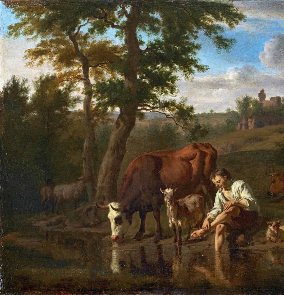
A Herdsman and Cattle at a Stream oil on canvas, laid down on panel, 12¼ x 16⅜ in. (32 x 41.5 cm.) indistinctly signed lower right.
Provenance:
Sir Francis Cook, Bt. (1907-1978), Doughty House, Richmond, Surrey; with G. Cramer, The Hague, Netherlands, 1963; Private collection, Europe.
Literature:
Hofstede de Groot, Catalogue Raisonné of the Works of the Most Eminent Painters of the Seventeenth Century, Vol. IV, no. 129; Bart Cornelis & Marijn Schapelhouman, Adriaen Van de Velde – Dutch Master of Landscape (London 2016), p.154 & fig. 151 as ‘Present whereabouts unknown.’
Exhibited:
Sheffield, Graves Art Gallery, March – April 1956, Dutch Masterpieces, no. 53
The younger brother of the great marine painter Willem Van de Velde the Younger (see pp. 8-9), Adriaen Van de Velde was the subject of a major exhibition held at Dulwich and at the Rijksmusem, Amsterdam in 2016 and 2017. The show and accompanying monograph (see Literature) not only revived general appreciation of this extraordinarily versatile artist but also reminded connoisseurs of Dutch art of Adriaen’s exalted stature among collectors in the eighteenth and early nineteenth centuries, with bucolic idylls such as this one being among his most coveted subjects. Painting in early modern Europe was often a family business, particularly in the Low Countries, and so Adriaen, who was according to his earliest biographer Houbraken ‘impelled by an inherited natural passion for the arts of drawing and painting’, grew up in the flourishing Van de Velde studio in Amsterdam. It seems, however, that the endless canvas, cordage and canons of his father’s and brother’s ships may not have been to this gifted young man’s taste, and a spell working in Haarlem in the 1650s with a master of Dutch Italianate landscape painting, Jan Wijnants, seems to have determined his future direction. Over the next twenty years or so he produced an extensive body of paintings, drawings and prints of sunlit views with herdsmen and cattle, beaches, dunes, forests, winter scenes, portraits in landscapes and historical pictures. Moreover, a handful of religious subjects, most notably his large Annunciation of 1667 (Rijksmuseum), attests to a further break with his upbringing and his leaning towards the Roman Catholic faith. In 1657 he married Maria van Ouderkerk, herself a Catholic, and managed to have all five of their children baptised as Catholics in resolutely protestant Amsterdam. Adriaen not only fell under the influence of the great Jacob Ruisdael but also added the figures, or ‘staffage’, in a handful of his pictures, while Paulus Potter seems to have set the example for Van de Velde’s forest scenes, his sensitive and detailed rendering of animals and the sharp, clear light of his pictures from the 1650s.
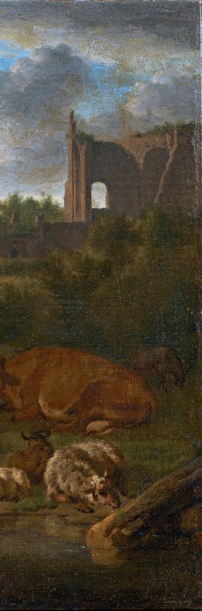
Our resting shepherd epitomises the rather dreamy, tranquil Italianate landscapes to which the artist turned in the 1660s, and of which a celebrated example is to be found in Cambridge’s Fitzwilliam Museum (Landscape with Cattle and Figures, 1664). As is well-documented in Van de Velde’s oeuvre, there exist preparatory drawings for many of the figures – both human and animal – in his oil paintings, and in ours the boy cooling his feet in the shady pool is a motif known from a fine chalk drawing in the Amsterdam Museum (Two studies of a seated young man). The whole scene is suffused with a feeling of peace and repose, with the sheep and cows appearing to be appreciating the respite as much as the herdsman himself. Only the exquisitely drawn goat appears to take notice of us, staring alertly at the viewer.
The Cook collection of Old Masters was a particularly notable one, and, until 1958, included the much-publicized Leonardo da Vinci painting of Salvator Mundi sold at auction in 2017.
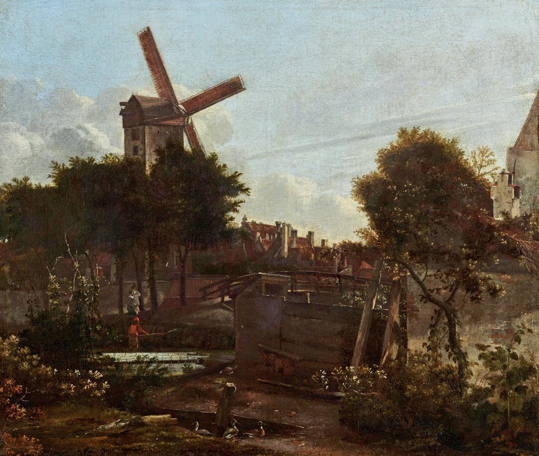
A windmill beside a canal on the ramparts of Amsterdam near the Prinsengracht. oil on canvas, 19¾ x 23¼ in. (50 x 59cm.) bears signature: Mey..dt Hobb.ma
Looking into the entrance of a canal, a windmill overlooks a town wall and a stand of trees beside a wooden bridge. On the near side of the canal, a man in a red doublet appears to be bleaching linen pegged out in rows. On the opposite bank, below the windmill, a man and woman are making their way to the bridge past some wooden palisades beyond which a row of roofs and chimneys recede into the distance. Ducks meander by a small sluice in the foreground and behind them are two nesting baskets with a plank across the top. A stone and wooden wall extends across the foreground with the sloped roof of an outhouse positioned above the canal. Two sawn tree trunks are propped against the wall and above the shrubs and tree to the near right is a distinctive gable end with a larger property, or possibly a church steeple, abutting the house.
Jan van Kessel’s hitherto unpublished cityscape is almost certainly a miscellany of topographical features; what is known in Dutch as a ‘composiet’. Judging from other Amsterdam paintings by him such as the Eenhoornsluis aan de Prinsengracht (Boijmans Museum, Rotterdam) and, with the same dimensions as ours, De Kloveniersburgwal met het Bushuis, Amsterdam (Amsterdam Museum) and in particular a series of sketchbooks now in the Fondation Custodia -Collection Frits Lugt in Paris, van Kessel made detailed records of views in his native city. Many of these locations were earmarked for destruction as in, for example, the fourth expansion of Amsterdam in 1663, around the period this picture is dateable to. As time passed, in particular with the old city ramparts, their military purpose faded. The walls were gradually absorbed into urban growth, as canals, quays, neighbourhoods and the daily lives of Amsterdam’s citizens evolved. What had once been a bulwark against danger became part of the living city. Proud of the economic success and rapid growth of their towns, there was a willing market for these specialist townscapes by painters such as Jan van Kessel, who was not related to the Antwerp dynasty of still-life painters Gerrit Berckheyde, Jan Beerstraten and, best known of them all, the prolific Jan van der Heyden. Indeed, just as Dutch landscape and townscape images have long been associated with pride in the young nation, it is known that walking the city walls had long been a popular pastime for town dwellers. It is tempting to think that the elegant couple seen below the windmill here were out on a similar stroll.
One of the best-known maps of seventeenth century Amsterdam was produced in 1625 by the cartographer, Balthasar Florisz. van Berckenrode. The beautiful and intricate map shows over a dozen large gates stationed on the western, northern and eastern flanks of the city. Beside each triangular shaped fortification, Florisz. included a windmill, such as the post mill (standermolen) seen in this canvas. As the city grew and expanded outwards, like the ramparts, these mills were inevitably taken down, and this seems the most plausible explanation as to why van Kessel may have made so many sketches of similar views even though they may well have ceased to exist by the mid-1660s. Despite a good deal of research by scholars of Dutch townscapes, the nearest plausible location has been loosely pinpointed by Dr. Norbert Middelkoop of the Amsterdam Museum to the end of the Prinsengracht where it meets the Overtoomsevaart canal. Crucially, the lack of any precise topography might justify why the picture bears a faint signature by Meindert Hobbema who was living in Amsterdam and working alongside Jacob van Ruisdael during the late 1650s and mid-1660s. Whilst a relatively brief timespan, this was the decade when townscape painting came to the fore. From Jacob van Ruisdael to one off canal scenes by the likes of Jan Wijnants, Allaert van Everdingen, Emmanuel de Witte and even Adam Pynacker, like Hobbema and his Haarlem Lock, Amsterdam (The National Gallery, London) with only one fully attributed pure city view to their names, many painters tried their hand at the genre and so did Jan van Kessel. However, unlike his contemporaries, he remains first and foremost best known for his townscapes. He also produced a handful of large winter skating pictures depicting various gates in Amsterdam, sometimes confused with Jan Beerstraten. Interestingly, most of his drawings too were made in and on the outskirts of Amsterdam, Deventer and Alkmaar.
As one of Ruisdael’s pupils and closest imitators, many of his 140 surviving oil paintings were once attributed to his master and there is no doubt that collectors and dealers have historically and rather unfairly ‘upgraded’ his paintings. In the case of this enigmatic work, it was to his fellow guildsman, Hobbema.
I am grateful to Norbert Middelkoop for his precious help with the topography having inspected this canvas with me in Amsterdam.
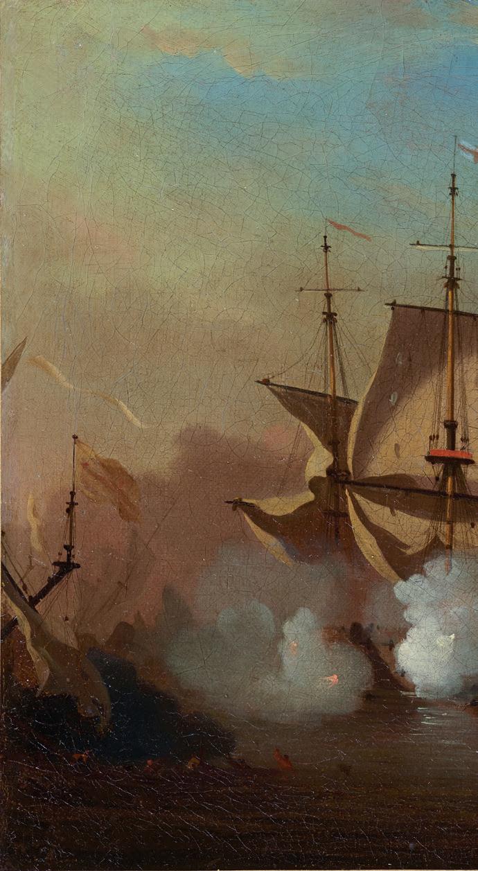
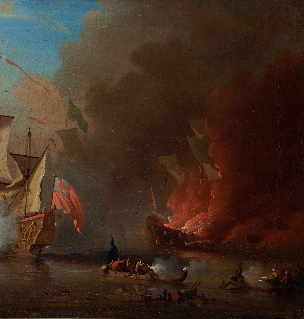
An English Ship in action, with a burning vessel beyond, and a fight in boats between seamen and Barbary pirates oil on canvas, 13¾ x 20 in. (35 x 51 cm.)
This dramatic picture portrays one of the many actions which took place between British ships and Barbary corsairs in the latter part of the seventeenth century. The corsairs posed a constant threat to merchant shipping, particularly to traders in the Mediterranean. These skirmishes became one of the Van de Velde studio’s regular subjects, in both oils and in pen and wash drawings. Of the former the prime example must be An Action with Barbary Corsairs of around 1675 at the National Maritime Museum (canvas, 43 x 77 in. (BHC0893) and this flamboyant composition comprises all the elements of our smaller one: the fighting between small boats, burning ships, cascading sails and masts and roiling clouds of gunsmoke obscuring most of the sky. The Barbary pirates in our painting are seen in distinctive headdresses at the lower right and their arrangement , including men in the water clinging to gunwales or wreckage, clearly follows at least three drawings also at Greenwich (e.g. PAF6895).
Our painting was probably not intended as a literal depiction of a specific engagement, but rather as an opportunity for Van de Velde to paint something faintly exotic and to show off his skills as a marine painter, full of atmosphere and with a lively palette. There is some blue sky but much of the picture is plunged into darkness by smoke from cannons, muskets and a ship aflame. At the Yale Center for British Art there is a painting very similar to ours in palette, handling and size (B.1981.25.641) with the burning ship on the right and the same prominence given to the small-boat fighting, and it may date from as late as 1695. In ours the stabbing flames of gunfire seen inside billowing clouds of white smoke are a hallmark of Van de Velde’s mastery of his subject, and add to the depth of the composition, while cannonball holes in the sails attest to the closequarters fighting, evoking much tension in a small picture.
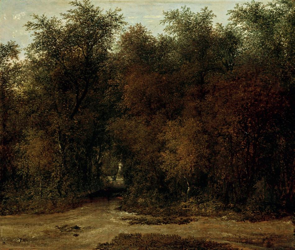
A path in a wooded landscape. oil on panel, 14¼ x 17in. (36 x 43cm.) signed with initials, ‘JVR’
This Dutch painter of forest scenes –‘boslandschap’- came from Haarlem and as a result fell under the influence of Salomon van Ruysdael and his nephew, the greatest forest painter and arguably landscapist of them all, Jacob. Indeed, Rombouts often signed his work with an intertwined J and R which has led to some ambitious attributions in the past.
Dating back to the late sixteenth century to the time of Hendrick Goltzius (1558-1617), the first specialist painters of trees came from Haarlem, and it was Cornelis Vroom (15911661) whom the great historian of Dutch Art, Wolfgang Stechow, credits with bringing ‘a kind of glossy darkness of the trees and undergrowth’ to this genre of landscape.
In this serene composition, one of deep solitude rather than gloom, Rombouts’s feeling for the compactness of a grove of trees and how it prevents the light intruding into its shelter owes more in fact to Vroom’s pictures than those of his teacher, Salomon van Ruysdael.
Together with the other Haarlem landscapists from the Rusidael circle, such as Cornelis Decker, Roelof van Vries and Anthonie van Borssom, Rombouts’s woodland scenes retain a romantic animation of trees and their surroundings. With limited staffage, if any in this case, these landscapes avoid the sober, everyday mood to be found in some Dutch pastoral pictures where the woodland remains more of a setting than anything else.
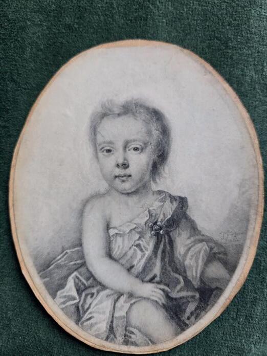
Portrait of an Infant plumbago on vellum, oval, 4¼ x 3¼in. (11 x 8.5 cm.) signed and dated 1697 lower right
Provenance: James Byam Shaw (1903-1992)
Drawn just before the close of the seventeenth century, this may be the earliest recorded miniature by Forster, who is known exclusively for a small group of about twenty portraits in plumbago on vellum. Plumbago is an archaic term for natural graphite, a crystallised form of carbon that was, in the past, mistaken for lead and came from a single, large deposit in the Lake District. As can be seen here, Forster’s work is, in Ellis Waterhouse’s words (see Bibliography), ‘of great elegance and minuteness.’ A very similar example is his portrait of a young boy called John St. Lo (Sotheby’s Childhood: A Loan Exhibition, 1988, no. 94; sold at Sotheby’s 11th July 1991, lot 31), one of five of members of the same family, with another being in the collections of the British Museum. The only art historians to have published on Forster (see below) rather interestingly speculated that Forster only worked privately and upon recommendation of word of mouth as there exist no
portraits of notables: ‘he was a miniaturist whose portraits had a considerable vogue amongst people in a private station in life.’ It is not possible to say for certain that ours is of a boy or girl, as in the period both were frequently dressed in shifts such as this one when very young, but it was certainly drawn from life, and it is remarkable how sharp Forster’s graphite stick must have been and how exacting his technique, given the extreme fineness of the work, and the irreversible nature of vellum as a medium for drawing.
Bibliography: Bell, C. F., Poole, R., & Poole, R. L.,‘English Seventeenth Century Portrait Drawings’ in The Volume of The Walpole Society, no. 14, 1925-6, pp. 43–80; E. Waterhouse, The Dictionary of 16th & 17th Century BRITISH PAINTERS, p.91
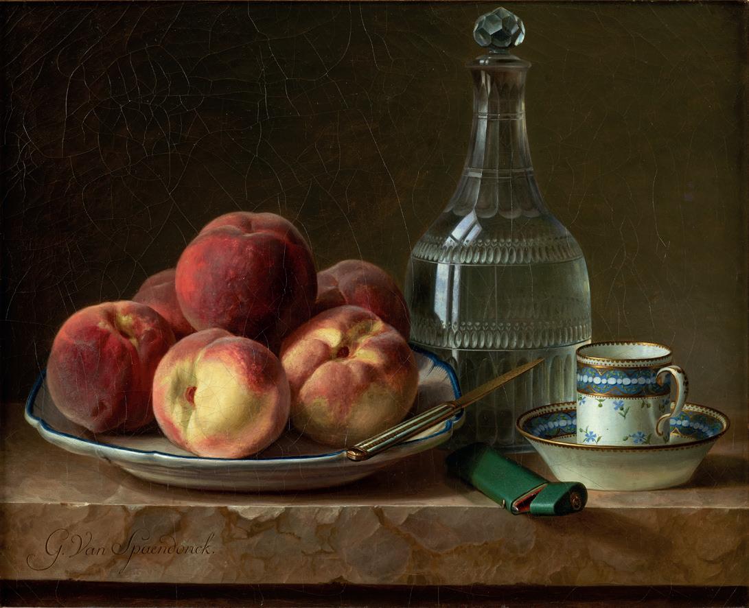
Nature morte aux pêches
oil on unlined canvas,13¾ x 18 in. (35 x 45.5 cm.) signed with fine Louis XVI frame
Provenance: Private collection, Chantilly, France; auction at De Muizon-Le Coёnt, Senlis, 25th March 2001; with John Mitchell & Son, London. Private collection, England, 2001.
Exhibited: Salon de Paris, 1783, no. 91.
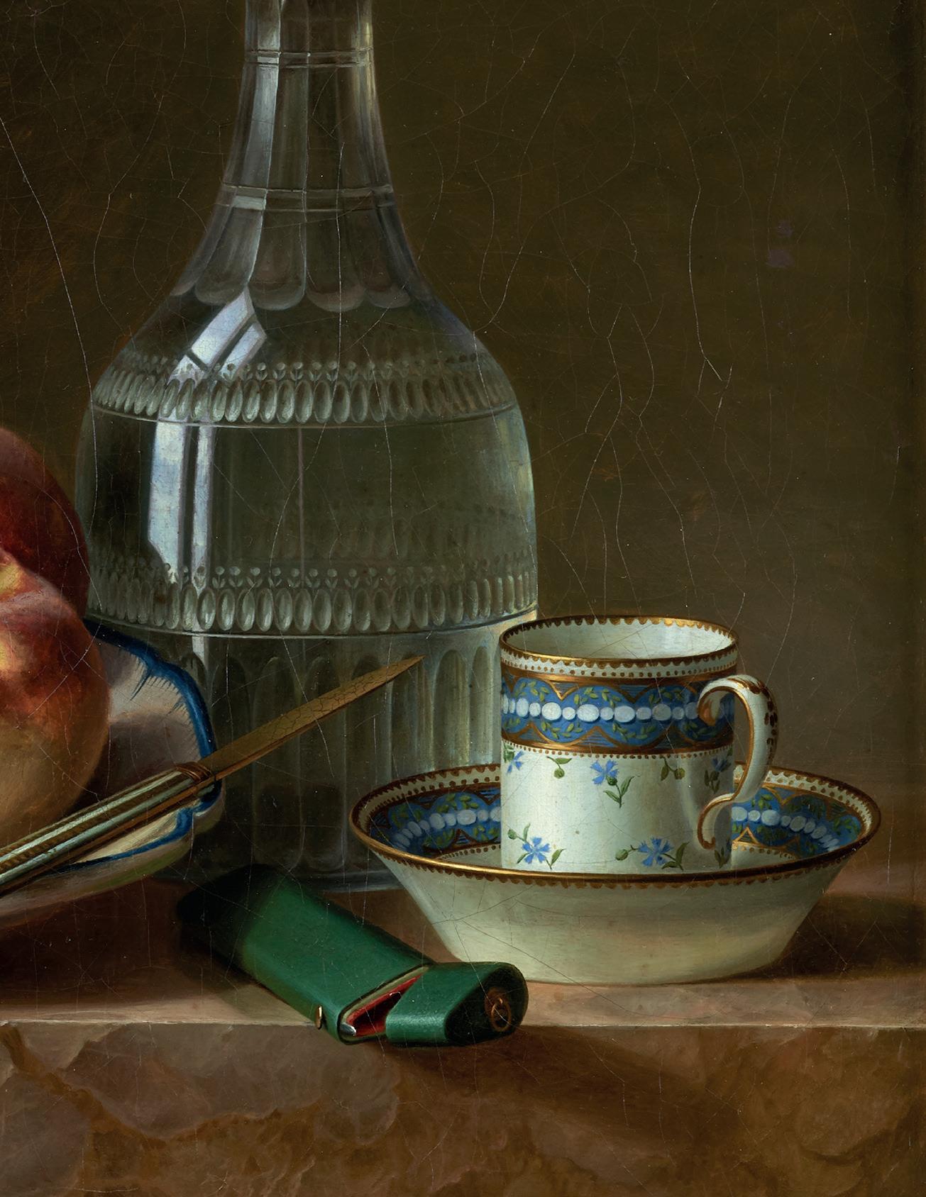
This rare still life from Gérard van Spaendonck’s early period is in a remarkably undisturbed state of preservation.
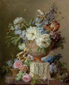
It was shown at the Paris Salon in 1783 alongside a composition by him entitled Still Life of Flowers in an Alabaster Vase (see fig.1) which is now in the Rijksmuseum in Amsterdam. That flowerpiece is arguably one of his best-known compositions today even if Spaendonck did not make a great number of oil paintings.
Van Spaendonck was a leading and active figure in the Parisian art world and a teacher of countless French and foreign artists. As illustrator to Louis XVI’s botanical collection at the Jardin du Roi, a highly prestigious position and one in which he would be succeeded by his famous pupil Redouté, much of his time was devoted to his watercolours of plants, and to teaching. Indeed, his Fleurs dessinés d’après Nature, a book of twenty-four engraved flower drawings, is considered the finest instructional work of its kind. He is nonetheless considered to be his era’s best painter of flowers of still lifes. When he left his native Tilburg for Paris
in 1766, it could be argued that this was the first time that the focal point of flower and still life painting had ever left the Netherlands.
Instinctively, he was able to adapt his style to the elegance and sophistication of French taste and by 1774, the twenty-eightyear-old painter was the leading designer for the decoration of porcelain at Sèvres and appointed ‘painter of miniatures’ to Louis XVI as well. Under Napoleon, van Spaendonck was awarded the légion d’honneur and made a count in 1808.
The absence of flowers in this painting makes it an atypical work from this specialist in the genre who had succeeded Jan van Huysum as the heir to the age-long tradition of extreme technical and specialist ability. Van Spaendonck’s mastery extended to all mediums, on every scale, from metre-high Salon canvases to miniatures, and on all supports – canvas, panel, marble (see fig.2) vellum, paper, ivory and porcelain.
Given its date, there is no doubt that van Spaendonck would have studied and absorbed some of the magic seen in similar compositions by Jean-Siméon Chardin. Interpreting Chardin in a decidedly aristocratic and neoclassical manner, he surely included the elegant Sèvres ‘tasse à café’ seen here as a reference to his role at the eponymous ‘Manafacture nationale’.
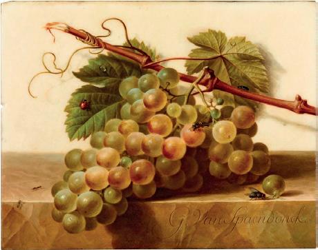
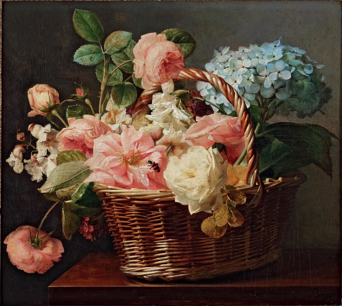
A Basket of Roses and a Hydrangea on a Marble Ledge with a chequered Beetle oil on oak panel,14⅜ x 19 in. (36.5 x 48 cm.), signed. With fine Louis XVI carved and gilded antique frame
Provenance:
With Galerie Charpentier, Paris, 1965; Sotheby’s Monaco, 3rd December 1989, where acquired by John Mitchell & Son, London; Private Collection, Europe, until 2023.
Literature: Jacqueline Custodero, Antoine Berjon (1754-1843), peintre lyonnais (doctoral thesis, University of Lyon, 1985), no. 91, as whereabouts unknown; Elisabeth Hardouin-Fugier & Etienne Grafe, Les Peintres de Fleurs en France de Redouté à Redon, (Les Editions de L’Amateur 1992) , col. pl. pp.128-9.
The appearance of this painting at an auction in Monte Carlo in 1989 coincided - perhaps happily for Sotheby’s - with the height of my father’s obsession with this elusive flower painter, and his commensurate desire to buy and acclaim the artist’s work whenever possible. Few, alas, were the opportunities to do so, and in the intervening thirty-five years only a handful of paintings and drawings have been added to Berjon’s recorded oeuvre, confirming my father’s theory that, in spite of his long life, Berjon painted very few oils. In recent years two have been wisely bought by the Toledo Museum of Art and Stockholm’s Nationalmuseum, this latter once discovered in a private collection in Lyons by our firm. Thus Berjon’s fabled reputation today hangs on a handful of justly celebrated still-lifes and the anecdotes of his rather cantankerous nature and reclusive ways.
Here, then, is one of them, a magical flowerpiece which my brother and I have always been intrigued to see, but which, until now, has been hidden away for a generation. In terms of quality it compares favourably with the exclusive cadre of museum examples, in particular the Louvre’s Bouquet de lis et de roses dans une corbeille posée sur une chiffonière of 1814, in which there is the same interplay between luxuriant flowers and the hard textures of woven basket and marble. With the composition filling all the pictorial space, and flowers or leaves reaching into three of the four corners, this is unmistakably Berjon at his best; everyday summer flowers mysteriously achieve monumentality and neo-classical grandeur, and one is reminded why an early critic claimed, more than a century ago, that his paintings have ‘la sensation de réalité et de beauté des meilleurs Chardin.’
GEORGE BARRET, RA (?1728/32-1784)
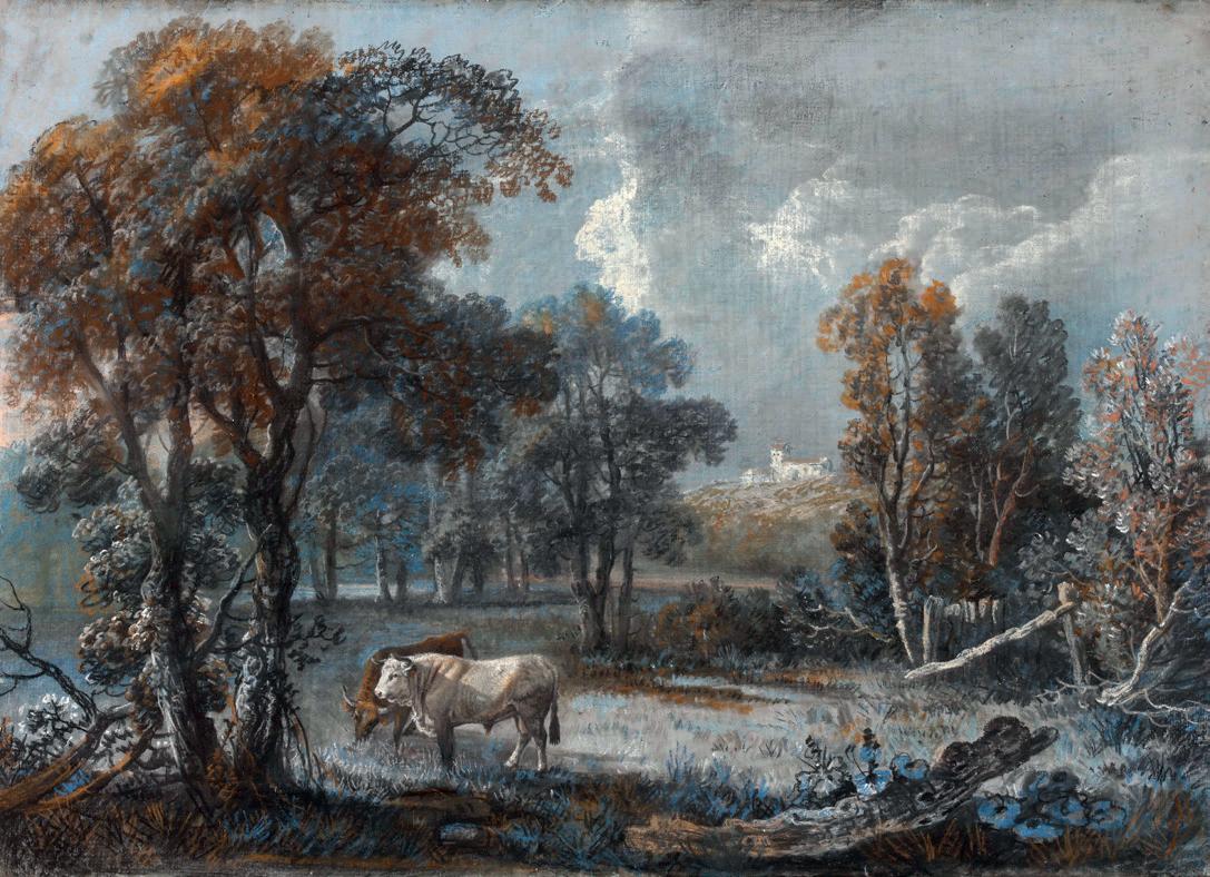
Cattle in a wooded landscape, with a church on a hill beyond pastel on paper, laid down on canvas, 16 x 23 in. (40.4 x 58.5 cm.)
Provenance:
Christie’s, 20th May 1999, lot 143; The Ross Collection, Knockmore, Co. Wicklow.
Literature:
N. Jeffares, Dictionary of Pastellists before 1800 (online edition), no. J.1282.101636
Forty years ago George Barret could still be described as ‘[b]y far the best-known Irish landscape painter’ – no casual hyperbole in some dealer’s catalogue, this, but the verdict of the leading scholars of traditional Irish art, Crookshank and Fitzgerald (see Bibliography). Today, however, to most picture collectors the term ‘Irish landscape’ means towering clouds over the Connemara uplands by Paul Henry (1896-1958), and Barret’s tranquil parkland scenes, with their imposing trees and romantic waterfalls have fallen into comparative obscurity. In some ways I can identify with this shift in taste: I have always admired the luminosity and veracity in Henry’s work, and he captured a version of Ireland that we recognise. Barret, on the other hand, was not really a painter of Ireland, but more a naturalistic landscape painter who happened to come from Dublin, and who made his career in England after 1763. His early Irish work is not thoroughly understood, although it is accepted that he matured early and was capable of an unexpected variety of styles, for example a series of overdoors and inset panels for Russbrorough in Wicklow, depicting Italianate scenery and Roman ruins. Scarcely any paintings from this period could, however, be said to be topographically accurate views, and it was more for its wild nature, with rocks, gullies and overhanging trees, that Barret felt inspired by the Dargle valley outside Dublin, where he worked for Lord Powerscourt.
George Barret was acquainted with Edmund Burke when he was studying at Trinity College, and would not only have known of the student’s ideas on the Sublime, famously to be published in 1757, but must as a result have actively sought contrast and drama in his compositions. Dispensing with ‘the airy rococo quality’ of his earliest work, Barret now established himself in this vein in England, first as a successful exhibitor at the Free Society and then as a Foundation Member of the Royal Academy in 1768. His work drew favourable comparisons with Claude and, perhaps because of his early appreciation of Irish landscape, Barret, along with the native Richard Wilson and Paul Sandby, was a pioneer of the Welsh picturesque view,
and was described by his friend Burke as ‘a wonderful observer of the accidents of nature.’ His clients came to include many of the distinguished patrons of the day, including the Duke of Portland, Lord Dalkeith, Lord Rockingham (of Whistlejacket fame) and Lord George Cavendish, while his panorama of the Lake District at Norbury Park for William Locke was considered his masterpiece.
One of the enduring pleasures of dealing in the work of less exalted artists of the Georgian age is their capacity to surprise us more than two centuries later. This gracefully subtle work on paper by Barret turns on its head the accepted wisdom of our Irish scholars that ‘[h]e does not seem to have used pastel.’ They were, of course, well aware of his skill as a draughtsman and there is a late group of gouaches, mostly inspired by the Lake District and marked by a florid palette and clever use of light. There is no precedent in Barret, however, for the consummate use of coloured chalks seen here, and I should confess that at first glance the name Gainsborough came to mind, not an outrageous coincidence given that he and Barret were exact contemporaries. The most telling clue to Barret’s authorship lies in the splendid white bull, for even as early as 1808 a fellow artist, Edward Edwards, noted that Barret ‘sometimes painted animals which he executed in a bold and masterly manner’. Barret exhibited A Bull at the new Royal Academy in 1770, and there exist numerous drawings of cattle by him.
Careful examination of the fragile support has shown that Barret worked on a very fine sheet of paper, prepared with a wash of blue-grey bodycolour, and laid down on a piece of linen, unlined and still on its original stretcher. In this delicate, autumnal composition, said to be of Powerscourt but really rather timeless and ethereal, Barret indulges his fascination with Claude, and shows, in the words of Martin Hardie, ‘his fine sense of drawing combined with fluency and quiet, graceful colour.’
Bibliography: Edward Edwards ARA, Anecdotes of Painters (1808); Thomas Bodkin, Four Irish Landscape Painters (1920); Martin Hardie, Watercolour Painting in Britain, 3 Vols. (1966); Anne Crookshank and Desmond Fitzgerald, The Painters of Ireland c.16201920 (1978)
Provenance:
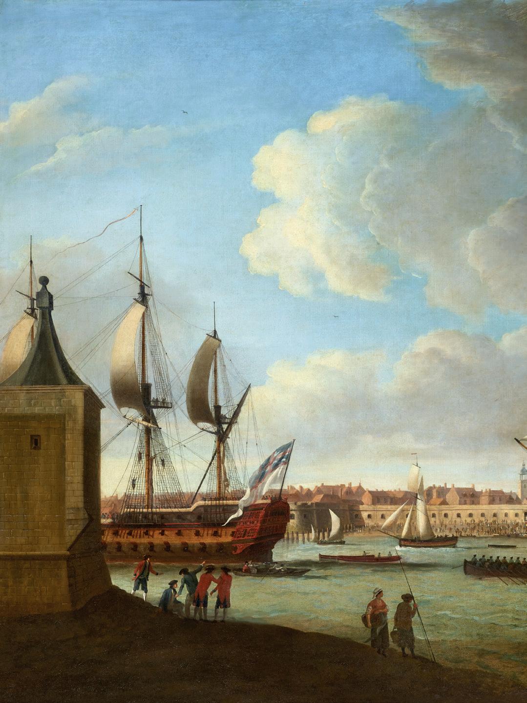
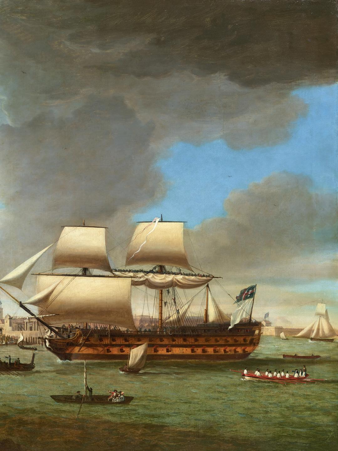
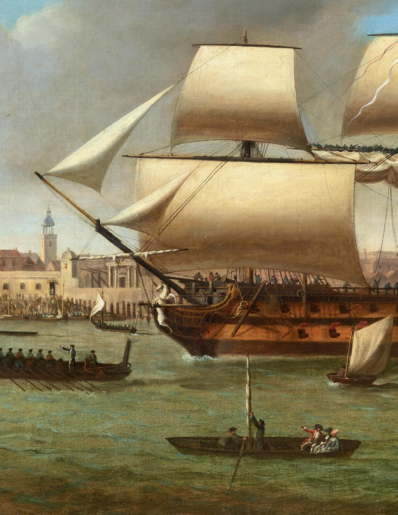
The ‘Foudroyant’, commanded by Sir John Jervis, bringing the ‘Pégase’, a French ‘74’, into Portsmouth oil on canvas, 48 x 72 in. (121 x 182 cm.) signed and indistinctly dated 179*, with fine original frame
John Jervis, 1st Earl of St Vincent (1735-1823); thence by descent in the family until 2025.
Exhibited:
London, Royal Academy, 1793, no. 126
A British ‘man o’ war’ escorts another ship into Portsmouth Harbour, accompanied by a flotilla of small craft and watched by hundreds of spectators ashore. At the stern of the second ship a large white flag is overflown by the Royal Navy jack, signifying that it has been captured, and so one probably assumes this is another episode in the long war with Revolutionary and then Napoleonic France. In fact the subject is the aftermath of a notable engagement some years earlier, in April 1782, during the American War of Independence and when France had seized the moment to try and recapture French possessions in India taken by the British in the Seven Years’ War. In a battle off Brittany the 74-gun Pégase was captured by HMS Foudroyant under Captain John Jervis, along with two-thirds of the French convoy of transports laden with troops and stores. For his actions Jervis was made a Knight of the Bath, and would become best known for his victory at the Battle of Cape St. Vincent in 1797 (from which his title derived), as a principal patron and champion of Horatio Nelson and, from 1801, as First Lord of the Admiralty.
It is probable that, as one of the leading marine painters of the day, Serres was there at Portsmouth to witness the arrival of Pégase, a moment which must have had added poignancy for him as his son Dominique Michael was serving on board Foudroyant Pégase is seen jury-rigged after losing her topmasts, and manned no doubt by a prize crew from Foudroyant This stirring scene is replete with details which will appeal to collectors of marine painting and enthusiasts of the great age of fighting sail. Despite the fierce skirmish and resulting damage, the figurehead of Pegasus the winged horse is shown gleaming white and unscathed, while just aft on the port side a large anchor has been readied. Another anchor is towed ahead in a launch off the port bow in readiness for mooring within the
harbour, while onlookers crowd the waters around the French prize, including naval officers pointing at it in a smart gig at the right-hand edge of the composition. Of interest too is the heightened interest in the topography of Portsmouth as seen from the artist’s viewpoint in Gosport. (It is worth pointing out that, in the way of the naval wars of the time, Foudroyant herself had once been a French ship taken in the Seven Years War, the same one in which Dominic Serres (originally from Gascony) had initially been taken prisoner, while, for all the acclaim of her capture here, Pégase was only to see out her days as a lowly prison hulk and broken up in 1815.)
Such was the gratification with which Jervis looked back on this triumph, it seems, that he ordered from Serres a second version of this painting. The first, signed and dated 1782, is now in the Art Gallery of South Australia, Adelaide, and was thought at the time of Alan Russet’s monograph (see Bibliography) to be the only one. It was not known that the Jervis family had for more than two centuries quietly retained the present painting, being the one shown at the Royal Academy in the last months of the artist’s life. The most compelling explanation is that a decade on, Jervis required a slightly larger rendition - perhaps for a second home – while his friend the artist, getting on in years, no doubt appreciated the commission.
It is rewarding that, occasionally, important examples from the heyday of British marine painting such as this one still emerge from obscurity to remind us of the huge significance in the period of the events shown.
For some information about Dominic Serres, please see pp.22-23
Bibliography: Alan Russett, Dominic Serres – War Artist to the Navy, Antique Collectors’ Club 2001, pp.148-9
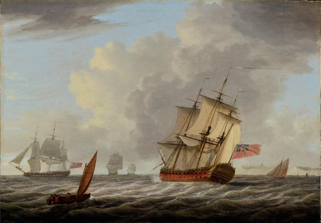
A British ‘74’ in the Straits of Dover oil on panel, 12 x 18 in. (30 x 45.7 cm.) signed and dated 1772
Bibliography:
E. Hughes et al., Spreading Canvas – Eighteenth Century British Marine Painting, Yale 2016, p.8
The cosmopolitan Dominic Serres (1719–93), originally from Auch in Gascony, is remarkable for becoming Britain’s leading marine painter and the only one to be a founding member of the Royal Academy in 1768. As a merchant sea captain, he had been captured by the British and brought as a prisoner to London, where he soon established himself as a painter of maritime subjects. His mastery of English, Latin and several foreign languages must have elevated him socially and later in his life he became the RA Librarian, as well as Marine Painter to HM the King. As a result Serres was, as Eleanor Hughes has rather elegantly put it (see Bibliography), ‘neatly poised between the realms of nautical expertise and gentlemanly engagement with art.’ He is best known for his large paintings of naval engagements in the Seven Years War and in the American War of Independence, and as most were commissioned by sea officers who had been involved, it is not surprising that one referred to the artist as ‘the famous Serres, the Van de Velde of his day.’ His pair of Barrington’s action at St Lucia (December 1778) exhibited at the Royal Academy in 1780, approach the subject in a cool topographical manner, possibly under the influence of Serres’s neighbour and friend, the landscape painter and engraver Paul Sandby. These paintings are likely to be those of which it was noted, in one of the earliest comparisons with British marine painters rather than Willem Van de Velde the Younger, that ‘the events represented in them are rendered highly interesting: the shipping very highly finished and the sea expressed with that accuracy of colouring, which distinguishes the works of Brooking and Monamy.’ Serres courted the international market despite his status as a marine painter in England. In 1785, through his acquaintance with Vernet, he was poised to paint a series of large paintings of ‘France’s glorious deeds performed by the navy in this last war to decorate the
walls of the naval training establishments at Brest, Rochefort, and Toulon’, a project which did not come to fruition. A number of his late watercolours depict naval shipping in the English Channel and may have been calculated to appeal to the nationalistic sentiments stirred up by the prospect of imminent war with Revolutionary France. Our panel here of 1772, perhaps anticipating this patriotic strain, is typical in palette and composition of his ‘home waters’ subjects and was probably not painted to order, as there is nothing specific to identify the principal vessel. Nonetheless the excellent state of preservation of the paint surface and the stability of the oak panel make this a highly desirable example of Dominic Serres’ smaller oil paintings.
Serres died in November 1793, a few months before the outbreak of the French Wars, the events of which were greatly to occupy his successors, and a few months after his work for Sir John Jervis (see pp. 20-21) had been seen in the Royal Academy exhibition. The sale of his collection and studio contents took place at Christie’s in March and April 1794, with another sale in April 1795. The contents reveal Serres’s broad and extensive interest in European art and that of his British contemporaries, in addition to marine art such as his Van de Velde drawings. At the time of his death, he had begun work with on Liber Nauticus with his son, John Thomas Serres (1759-1825), who was to become an established sea painter in his own right. Liber Nauticus was a compilation of engravings after their own drawings of ships and their equipment, studies of harbours and even the vagaries of the surface of the sea, and it was intended as an instruction manual for all aspiring marine artists. One of the plates, identifying all the sails on a frigate, is to be found as the frontispiece in every paperback edition of the well-known Patrick O’Brian books.
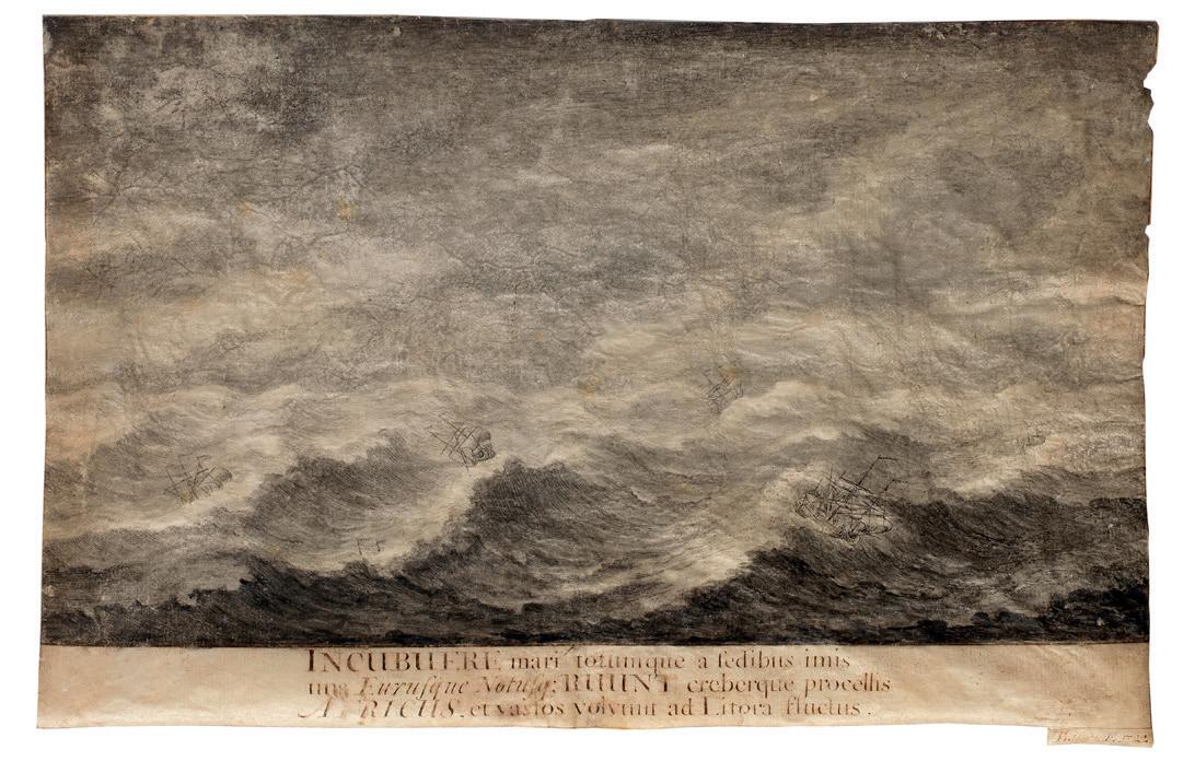
Aeneas in the Storm
signed and dated ‘TBaston F.1722’ and extensively inscribed lower centre graphite, pen and ink and wash on vellum, 7¼ x 113/16 in. (18.4 x 28.4 cm.)
Baston appears to have been a draughtsman and printmaker working from the late Stuart period into the start of the Hanoverian age. There are numerous prints of his in the collections of the V&A Museum, the National Maritime Museum and the British Museum and they are nearly all slightly primitive ‘portraits’ of the leading warships of the age, dedicated variously to King William III and Queen Anne. An album of them was published by Thomas Bowles in 1723 entitled Twentytwo prints of several of the capital ships of His Majesty’s Royal Navy with a variety of other sea-pieces after the drawings of T. Baston
Our vellum is one of three original works by him known today, the other two being HMS Royal Sovereign (sold at Christie’s, 5th June 2014, lot 10) and A First Rate in a calm (Royal Museums Greenwich, PAJ2865). Both are worked in pen and ink on vellum, as here. Even though Baston remains a very obscure figure, the significance of these three vellums lies in their status as the earliest marine drawings by a domestic British artist, at a time when only the dominant, Dutch-born Van de Veldes
produced drawings of ships in England, and when watercolour drawing in England was still in its infancy. In spite of the naive and rudimentary handling, Baston was clearly struck by the fashionable appeal of the motif of the diminutive ship at peril in mountainous seas, and used a scene from Book 1 of the Aeneid as a pretext for his storm. An engraving after our vellum is at Royal Museums Greenwich (PAG6949), along with several others by Baston on the theme of Virgil’s storm.
Juno has sent a tempest to shipwreck Aeneas and his battleweary companions as he sails south of Sicily in search of a safe harbour, and the inscription tells how the east, south, and southwest winds churn the sea from its depths and drive huge waves toward the shore.
INCUBUERE mari totumque a fedibus imis/ uns Eurusque Notusq; RUUNT creberque procellis/ AFRICUS et vastos volvunt ad Litora fluctus
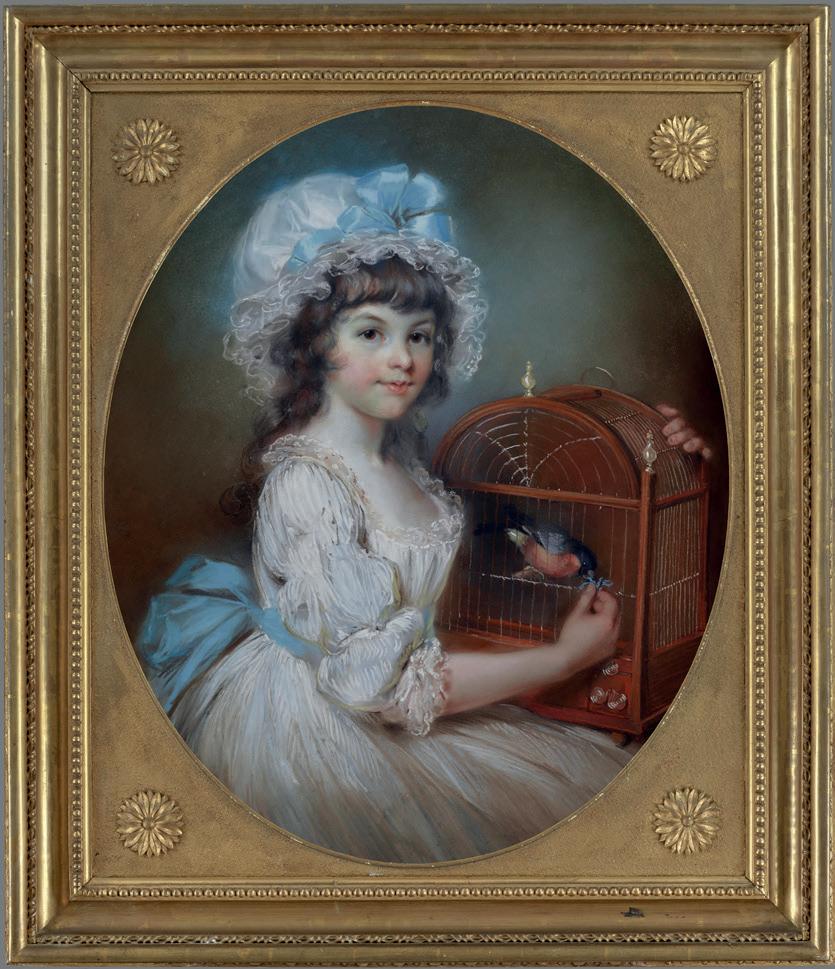
Portrait of Elizabeth Freeman (1779–1808) later Mrs Thomas Freeman-Heathcote, with her pet bullfinch pastels on paper, laid down on linen on an oval stretcher, 4 x 20 in. (75 x 61 cm.) signed and dated centre left in pencil ‘J Russell R.A. / 1790’
John Russell was a fashionable portrait painter in late eighteenth-century London who perfected the art of pastels. Of the many examples featured in our Gallery Notes over the years, this tender portrait of a thirteen year-old girl ranks among the best of them. Russell’s pastel portraits are not rare as he was very prolific, but very few are as well-preserved as this one, which has suffered from neither from losses (where the chalks fall away from the paper) or the unsightly discolouration of pigments. As the fragile nature of pastel does not lend itself in any way
to restoration, they are by their very nature very much as one finds them. Russell’s lively draughtsmanship is seen throughout the composition, and the remarkable status of preservation allows us to enjoy this portrait as it would have looked upon completion. Worthy of note, too, is the irreplaceable, original carved and gilded frame, complete with finely carved rosettes in the spandrels.
Provenance:
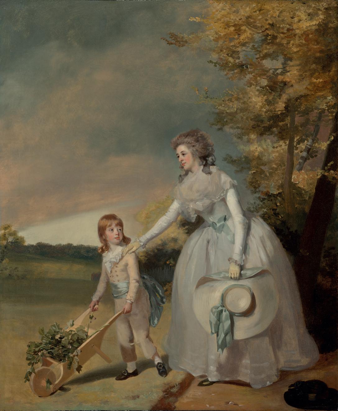
Portrait of Harriet Fuller, née Carter (1753-1803) with her son Edward (1782-1856) pushing a Wheelbarrow oil on canvas, 30 x 25 in. (76.2 x 63.5 cm.)
Edward Fuller, Carlton Hall, nr. Saxmundham, Suffolk (as above); Sir Charles Tennant, Bt. (1823-1906); With Leger Galleries, London, 1989; Irene Roosevelt Aitken (1931-2025), New York.
Literature:
Evelyne Bell, ‘The Life and Work of Henry Walton’ in Gainsborough’s House REVIEW 1998/99, no. 60, p.59.
Walton came from a relatively humble background in south Norfolk, and left for London in 1765 when he was nineteen years old. He trained under Johann Zoffany (1733-1810), and the influence of this important artist can be detected in the small-scale group portaits, known as ‘conversation pieces’, which Walton made his speciality. In 1772 he was elected a Director of the Society of Artists and exhibited four pictures in their exhibition, while at about this time he painted the first of several portraits of his most famous sitter, the historian Edward Gibbon (1737-1794) (see for example London, National Portrait Gallery (1443)).
After being unsuccessful in being elected as a member of the Royal Academy in November 1778,, Walton began to spend more time back at his property in Burgate, near Diss. As a result, the majority of the sitters in his portraits were friends, or friends of friends known to him through local East Anglian connections. As in our picture, Walton’s sitters are simply yet elegantly attired, and often set in extensive landscapes. Walton also gave advice to a number of private collectors of Old Masters, and appears to have acted in the role of ‘marchand amateur’.
The grace and refinement latent in our lovely double-portrait belie the relative modesty of Henry Walton’s position in the golden age of British painting, and the painting would not look amiss on the walls of that temple of collecting in ‘the Gilded Age’, the Huntington Library in San Marino, California, home to Gainsborough’s Blue Boy, Lawrence’s Pinkie and many other gems of British portraiture.
View from Halnaker Down, Sussex, looking over Goodwood towards Chichester, and the Isle of Wight
watercolour and bodycolour, 16½ x 28½ in. (42 x 72 cm.) signed lower right ‘W Turner / Oxford’; inscribed with title and ‘No. 7’ and signed on the reverse.
Provenance: Private Collection, England.
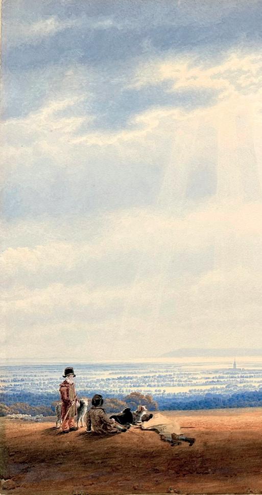
In its size, remarkable state of preservation and quality, this unpublished drawing is an important addition to the known oeuvre of the engaging English watercolourist, WIlliam Turner of Oxford. It comes to us five years after we were able to offer another, equally imposing and newly-discovered work by the artist, a sublime view of Loch Torridon at dawn. Before his seminal tour of Scotland in 1838, Turner had also found inspiration right at the other, most southerly end of the British Isles, here in the South Downs, and his numerous scenes of this region are among his most popular with collectors. In the Royal Academy’s landmark exhibition of English watercolours in 1993, two of the four pictures representing Turner of Oxford depicted Halnaker Mill, near Chichester (c.1837, National
Galleries of Scotland) and Portsmouth Harbour from Portsdown Hill. Ours may be seen as a fusion of both compositions, with the Edinburgh drawing’s arrangement of the distinctive windmill on the right and staffage at left, and the extensive vista looking west from the second. In the present example we see the spire of Chichester Cathedral and the inlets and creeks of Portsmouth harbour well to the right, with the Isle of Wight in the far distance stretching across almost all of the horizon. In Turner’s characteristic way the sheep are arranged into several separate flocks, hinting perhaps at the downland vastness, while his shepherds, with their ruffs and white, ‘scarecrow’ faces, and ever-present dogs are so distinctive that they are as much a signature of his work as his written name. Most alluring of
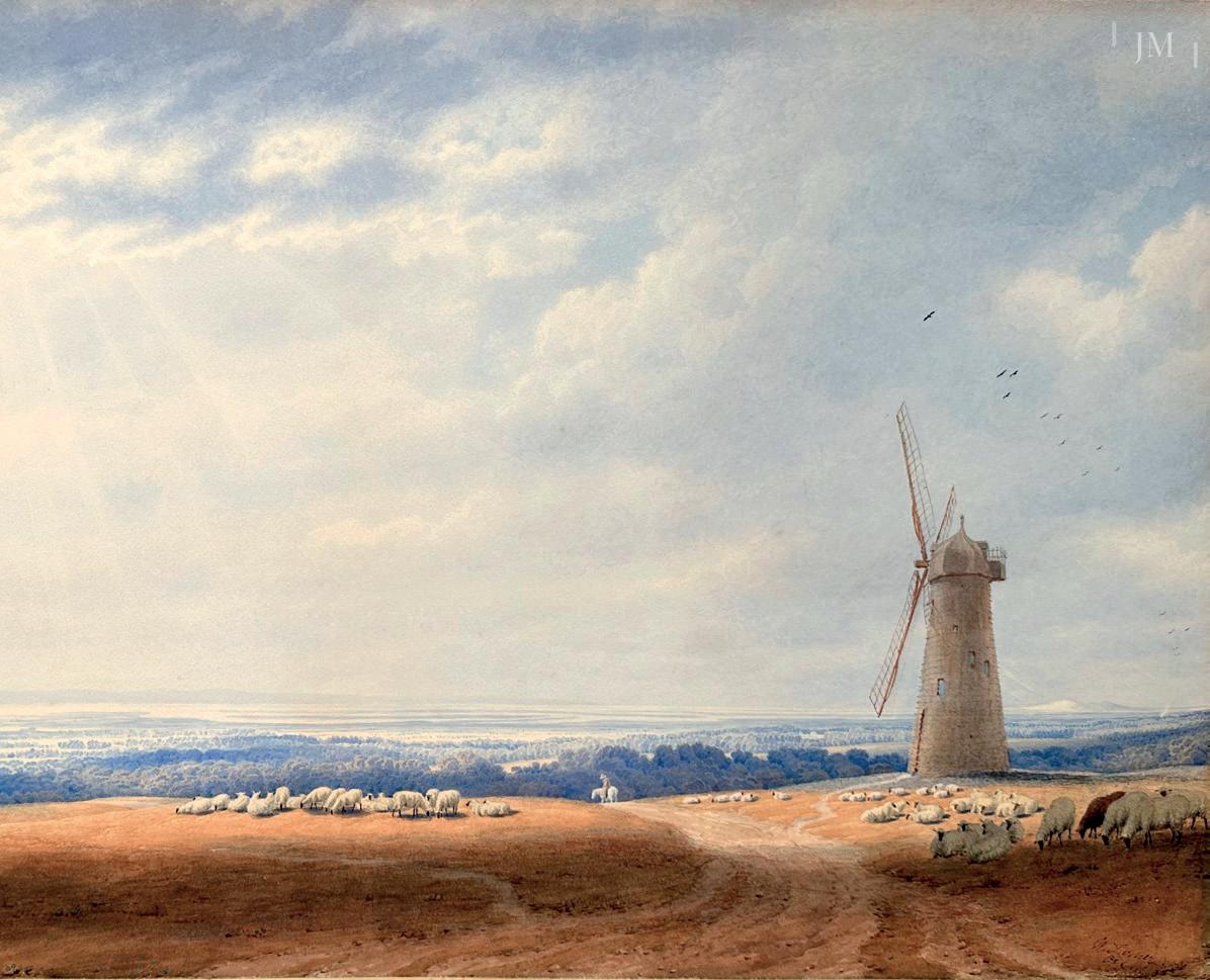
all is the glorious sky, which fills more than three-quarters of the panorama, and which the artist has suffused with a beautiful silvery light, punctuated by the carefully rendered rays of sunlight, all of which is in keeping with his interest in atmospherics and his finest work.
William Turner was sent to London at the age of fifteen to take up an apprenticeship under John Varley, and was elected a full member of the Old Watercolour Society in 1808. It was in this period that J.M.W.Turner rose to fame, and as a result the younger artist became known as ‘Turner of Oxford’. His own reputation firmly established, he returned to his uncle’s estate at Shipton-under-Cherwell in 1812 and began to build up his practice as a drawing master in Oxford. His range of subject
matter was vast, and he travelled throughout the British Isles in search of subjects – from the Wye Valley to the Lake District, from Wales and the Hebrides to the Isle of Wight, and he was a loyal exhibitor at the Society of Painters in Watercolour, submitting a total of four hundred and fifty-five works. Turner of Oxford was described as follows: ‘Worthy and dignified, looking like a parson of the old school, dressed in black and wearing a white tie, he lived a hum-drum life at his house, 16 John Street, near Worcester College, where he resided from 1833 till his death on 7th August 1862’ (quoted in Martin Hardie, ‘William Turner of Oxford’, Old Watercolour Society’s Club, Vol. IX (1931-32).
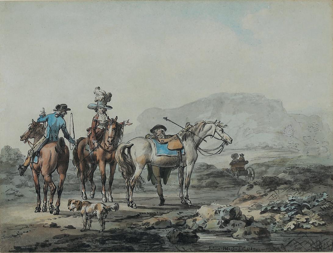
A riding party with travellers in a carriage beyond pen & ink, and watercolour, 6 x 7 7/8 in. (15 x 20cm.) signed and dated 1784
This is among the earliest pictures by Ibbetson our firm has had in seventy years of dealing in his work. They belong to the period when he lived in London and still worked as a picture restorer, while at the same time striving to make his own way as an artist, with his inaugural, single exhibit at the Royal Academy coming the following year.
It was with small ‘tinted drawings’ such as these that Ibbetson first began to be noticed. His distinctive technique with pen and ink, his exquisite draughtsmanship and sparing use of colour were ideally suited to these imaginary scenes of travellers in rugged scenery. Often we see - as here - horsemen and women ‘of quality’ stopping to ask the way of rural types, and Ibbetson delights in the rendition of the elegant costumes, the plumes of the lady’s hat and all the trappings of the horses.
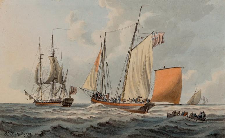
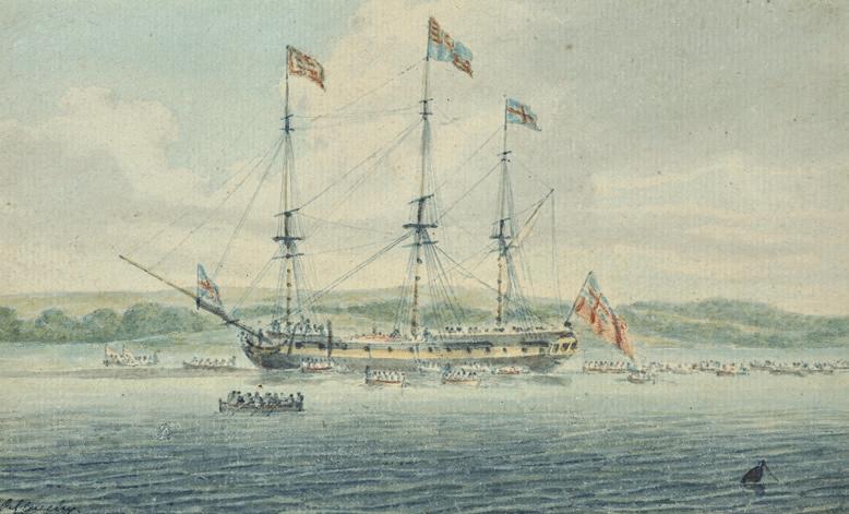
Robert Cleveley invariably features in any survey of British sea painters, as does his twin brother John (1747-1786), and yet little is known about his life other than the oft-repeated anecdote that he left his work as a caulker in Deptford dockyard to go to sea. In the 1780s he enjoyed the title, Marine Painter to HRH the Duke of York, as well as Marine Draughtsman to the Duke of Clarence, producing watercolours associated with various visits made by this latter, the sailor, friend of Nelson and future King William IV. Perhaps the highpoint of Cleveley’s
Taking Crew out to a British Frigate pen and ink, and watercolour, 3¼ x 5¼ in. (8.5 x 13.5 cm.)
signed and dated 1784
HM King George III going on board a Frigate, with numerous boats lying off pen and ink and watercolour, 4¼ x 7 in. (11 x 17.5 cm.), signed
career, the exhibition in Bond Street of his paintings of Howe’s victory at the Battle of the Glorious First of June in 1794 is well known through both preparatory watercolours and engravings after the oils. From the few examples known, Robert Cleveley was clearly an adept painter in oils, and exhibited regularly at the Royal Academy for more than twenty years The last, rather terminal chestnut usually trotted out is that Cleveley died after falling from cliffs at Dover!
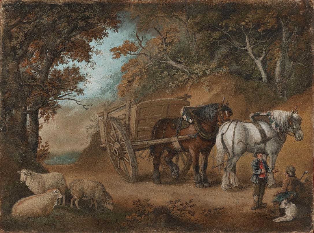
Carthorses at a Halt, with figures and sheep – a ‘marmotinto’, circa 1798 coloured sand on board, 19¾ x 26¼ in. (50 x 67 cm.) signed ‘B.Zobel’ with antique ‘Morland’ frame
At first glance one does not appreciate that this ‘rare visitor’ to Gallery Notes is not an oil painting. The colouring and subject matter resemble those of any number of traditional British landscape painters, and, not without reason, from across a room one might even say, ‘Ah, there’s a George Morland.’ The picture is in fact made entirely out of grains of coloured sand which have been painstakingly laid on to a board prepared with glue.
Zobel began his career working in the family confectionery business in Bavaria, and, once settled in London, it is said that he prepared tables at the court of George III with patterns of sugar dyed different colours, often adorning large tarts and pies in this manner as well. In an effort to make something more lasting, he turned to using sand and ground marble, and an idea of his working method has been given as follows:
The method of making these sugar patterns and of making the sandpictures was identical. The sugar, or sand, was shaken from a simplyconstructed ‘sprinkler’ that was nothing more than a cut and pleated playing-card. This was held between the thumb and middle finger, with the forefinger on top. The fall of the sugar was regulated by squeezing the mouth of the sprinkler, while the tapping of the forefinger kept it moving. When a large area was to be covered, the sprinkler was held high above the surface and the mouth allowed to be wide open; conversely, when small portions or lines were being done, it was kept low and the mouth squeezed together. In exactly this way was Zobel later able to make his permanent pictures of sand.
(see Bibliography)
The subject matter of Zobel’s sand-pictures ranges from battles and biblical scenes to landscapes and flowers, although animals, particularly horses, sheep and pigs held a particular fascination for him. His compositions were often taken from the paintings of his close friend, George Morland, as with our example; further inspiration came from the zoology of Stubbs, Paulus Potter, Rubens, and the battle scenes of Philip de Loutherbourg. His works are now rare, not least due to the fragile nature of their construction and their age, and also because a large collection of them was destroyed during an air-raid on Southampton in the Second World War. Two were exhibited at the Royal Academy in 1798. Most of Zobel’s sand paintings carry no signature, so it is gratifying to be able to offer this signed one. (His ‘Farmyard’ in the V&A Museum is also signed.) JFM
Bibliography: D.A.Ponsonby, ‘Zobel the Sand Painter and Morland’ in Connoisseur, April 1955
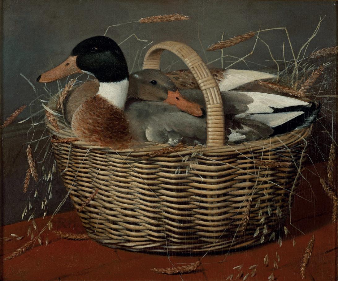
Ducks in a Basket oil on panel, 15⅝ x 18¾ in. (39.7 x 46.6 cm.)
Among the two hundred and twenty or so recorded paintings by Walton (see pp. 26-27) are a handful of subjects which might be termed ‘domestic genre’, and which reveal a knowledge of the great French artists Chardin and Greuze. Walton’s friend the Norfolk antiquarian, Dawson Turner claimed that in 1774 and 1775, when he did not exhibit, Walton ‘with a view of studying or of buying pictures….made frequent journeys to Paris.’ Here, where genre paintings and engravings were widely available, he must have seen and admired Chardin’s quiet interior scenes of kitchen maids at work, children and other domestic activities. Perhaps in search of fresh subject matter, a change from his portrait work and rejecting religious and allegorical subjects, Walton seems to have readily embraced this more contemplative style of painting, as seen in his next exhibited work, Girl plucking a Turkey (Society of Artists, 1776, now Tate Britain, NO2870), a painting that was bought for the National Gallery in 1912, not long after passing for an authentic Chardin at auction. Before the idea of these ‘fancy pictures’ became ‘vulgarised’ (in Waterhouse’s word) by Francis Wheatley and George Morland, Walton explored the idiom further with Girl buying a Ballad (1778) (Tate Britain, TO7594), Figures with a Fruit Barrow (1779) The Hand Maid, The Tobacco Box and others, all of which were engraved and published. Among them was The Market Girl of 1776-7 (Yale Center for British Art, B1981.25.650), renamed in the popular mezzotint by John Raphael Smith as The Silver Age, in which a girl rests by the wayside, wrapped up against the cold and carrying her basket of chickens either to or from market. No doubt mindful of the still life paintings he had seen in Paris, Walton elaborated upon the idea of domestic fowls neatly carried in straw-lined baskets on at least two occasions, here in our unrecorded painting of mallards and its pendant, The Chicken Basket (oil on panel, sold Christie’s 8th July 2016, lot 184, Bell no. 200 – see below). The wicker basket in both is identical, and not very unlike the one carried by The Market Girl In all three the artist’s handling of the loose straw and ears of corn around the edge is distinctively similar, as is the skilful handling of the birds’ plumage.
It is stimulating to be able to offer this valuable new addition to the relatively obscure school of still life painting in Georgian England, and to broaden our appreciation of the work of this dignified and versatile artist.
Bibliography: Dawson Turner (1775-1858), Outline of Lithography, Yarmouth, 1840; Evelyne Bell, ‘The Life and Work of Henry Walton’ in Gainsborough’s House REVIEW 1998/99, pp. 39-104.
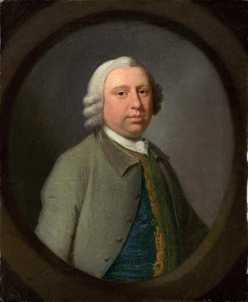
Portrait of a Gentleman, small bust length oil on canvas, in a painted oval, 11¾ x 9 ¾ in. (30 x 25 cm.)
It has not so far been possible to make a cast-iron attribution for this pleasing portrait, and the name of the subject has been lost to history. Nonetheless the sitter, who would of course have been much younger than his fashionable ‘perruque’ suggests, closely resembles those seen in the portraits and conversation pieces of the notable English painter of the first half of the eighteenth century, Highmore. To us, these questions of identity might
seem negligible when compared to the palpable advantages of a fine and sensitive portrait nearly three hundred years old, in remarkable condition and on a canvas that has never been lined, virtues which are all too scarce in early paintings coming on to the market today.
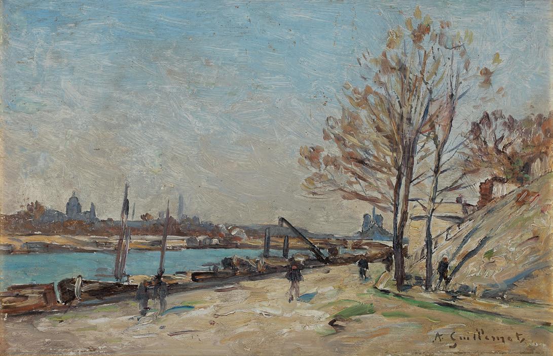
Quai Henri IV, Paris oil on panel, 6 ¾ x 10 ½ in. (17 x 27 cm.) signed.
‘Antoine Guillemet…un des peintres officiels du Paris-moderne.’ Charles Yriarte reviewing the 1893 Paris Salon in Le Figaro.
Although Guillemet spent his summers painting in Normandy, he also lived in Paris during the last third of the nineteenth century. It was a time of intense activity in the city’s history and none more so than in the arts with the staging of remarkable international exhibitions, the expositions universelles, the all-important Salons and the rise of Impressionism. As in the reviewer’s words ‘one of the official painters of Modern Paris’, Antoine Guillemet submitted eighteen Paris views to the Salon over nearly three decades. Many of these were two-metre-wide canvases and at least five of them were acquired by the State, the best known being his Quai de Bercy en décembre shown in 1874 and now on display in the Musée d’Orsay.
Our ‘plein air’ sketch presented here was made for his 1895 Salon picture (fig.1). Looking west along the Seine, he included many well-known Paris landmarks such as the cathedral of Notre Dame, the dome of Les Invalides, the Panthéon and the recently erected Eiffel Tower.
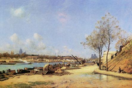
fig 1. Quai Henri IV, Paris, oil on canvas, 51 x 78 ¾ in., (130 x 200 cm.) signed and dated 1895, exhibited Paris Salon 1895 with John Mitchell Fine Paintings, 1999.
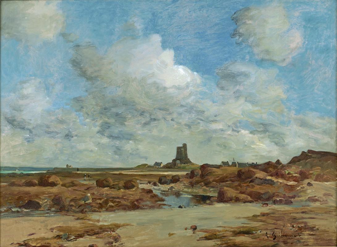
La Tour Vauban, St. Vaast-la-Hougue, Normandy. oil on canvas, 21¼ x 29 in. (54 x 73.5 cm.) signed lower right with fine antique Salon frame
For more than fifty years John Mitchell Fine Paintings has specialised in the paintings of Antoine Guillemet, the Normandy-born Impressionist. The firm has hosted three major exhibitions of his work since the 1980s and has been responsible for the rediscovery of several of Guillemet’s twometre ‘Salon’ paintings, including three panoramic views of Paris (see p. 37).
Guillemet came from a family of a wealthy Normandy shipowners in Normandy and had wanted to go to sea as a boy. His father did not allow it and, as he often told art critics, he had instead to content himself with painting the sea and shore, the river and its banks. Under the guidance of Corot to whom he was devoted, Guillemet submitted his first Salon exhibits in the 1860’s. Although Corot is always referred to as his teacher, Guillemet was eager to learn from others as well. He delighted to go out painting on the Seine with the Daubigny’s in their quaint floating studio called ‘Le Bottin’, with ‘Father’ at his easel and young Karl Daubigny at the oars. Undoubtedly, he was impressed by the vigorous grandeur of Courbet’s work. Amid these different experiences the influence of Manet was decisive, and the ambitious landscape painter made friends with an exceptionally wide circle of artists through the famous Cafe Guerbois meetings of the 1860s.
Most of his contemporaries were the future Impressionists. However, when in 1874, they decided to exhibit independently of the official Salon, in the face of constant rejection, Guillemet, like Manet preferred to keep to traditional paths. When repeated successes at the Salon won a place on the Salon jury for Guillemet in 1881, it gave him the right to introduce one painter without opposition. He seized the chance for Paul Cézanne and thus the painter from Aix-en-Provence, destined for greatness, exhibited at the Salon for his one and only time - listed as a pupil of Guillemet! When Guillemet became one of the ‘Establishment’ figures with high rank in the Legion of Honour, many Salon medals and several paintings in French museums, he was always respected because of his encouragement to others.
Indeed, Guillemet could also count Edouard Manet, Alfred Stevens, the Morisots and, closest of all, Emile Zola as his friends. But appearances were deceptive. Although his winters were spent in Paris where his wit and charm were as highly prized as his paintings, every summer he would leave for six months to make make his home among the oyster gatherers and fishermen on the Normandy coast, nearly always on the Cotentin peninsula near St. Vaast-la-Hougue. Dressed in a shabby smock and boots, the familiar, tall figure must have resembled something of a weatherbeaten and distracted recluse with his easel and paint box in tow.
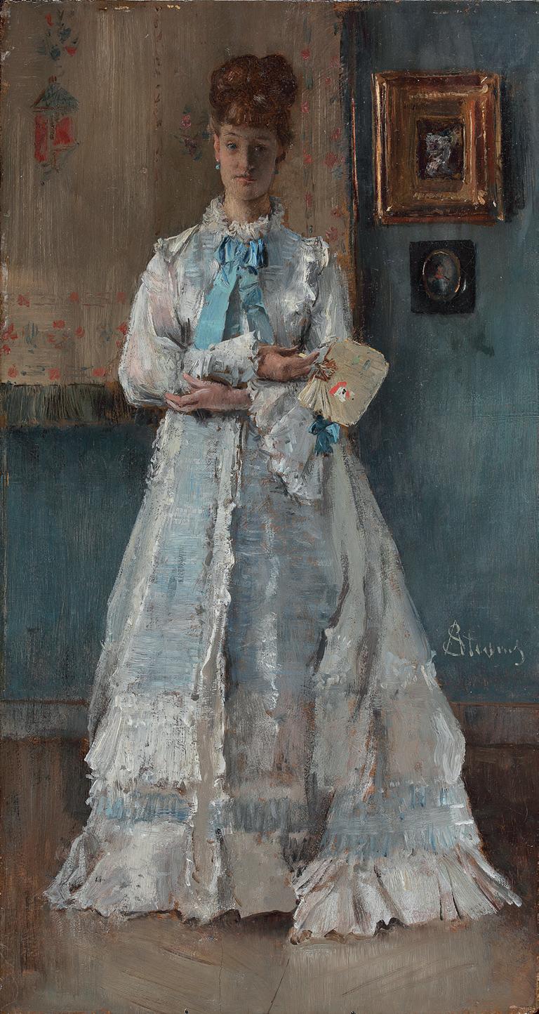
La Dame en blanc
oil on panel, 14½ x 8 in. (37 x 20.3 cm.) signed ‘AStevens’ lower right
After a rather fallow period of having no fresh Alfred Stevens paintings to offer, it is all the more rewarding to be able to publish this peerless example of his small figure subjects - on one of his distinctive mahogany panels and as fresh as the day it was painted, probably in about 1875.
As readers of Gallery Notes will know, our family has been writing about and dealing in the work of this famous Belgian artist for nearly sixty years, and our steadfast conviction of his merits continues to be rewarded by periodic ‘discoveries’ such as this one. As we have seen so often before, he is able to make a complete painting of une élégante in her salon on a panel barely a foot high. Showing Stevens at his painterly best, this oil study probably took him no more than a few hours, and yet in spite of the rapid brushwork and unwavering touch, no part of the composition is left incomplete or neglected - the perfect
synthesis of on the one hand his own, oft-professed preference for Gerhard Ter Borch and the Dutch masters, and on the other his friendship with Edouard Manet and awareness of the Impressionist methods. This picture should not be admired as a portrait so much as an evocation of mood and sophistication. After all, this model is no stranger to his paintings, and here, one feels, Stevens revels in a virtuoso rendition of her dazzling dress and the shimmering blue satin at her neck rather than wishing to tell us very much about the young lady posing for him. It is enough that she bears the faintest of smiles, and that her beautifully-rendered hands express repose and contentment. Classic Stevens trademarks, as well, are her small fan, the two pictures on the wall (perhaps one of his own scarce flowerpieces?) and the clever reflection of fabrics on the polished parquet floor.
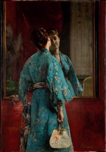
In spite of the great commercial success and renown enjoyed by Alfred Stevens in Paris in the 1870s, in France today he continues to be overlooked as a minor painter from Brussels, even though it is plain to see from paintings such as this one that he was innately gifted and that very little separated him artistically from his now-famous Impressionist friends. Unlike their productions, however, those of Alfred Stevens are not yet all located and recorded, and remain accessible to collectors - some compensation, surely, for his overlooked reputation. Indeed, it was of great encouragement to see his lovely The Japanese Robe from around 1872 (see illus.) on display in the Metropolitan Museum of Art’s recent exhibition all about fans; the Japanese uchiwa fan is identical to the one held by the model in our, smaller picture and was almost certainly one of the artist’s own studio props. The Met’s painting was commissioned by an early patron of the museum called Catharine Lorillard Wolfe and bequeathed in 1887 – within the artist’s lifetime, and among the first of many Alfred Stevens paintings to be given or bought for American institutions.
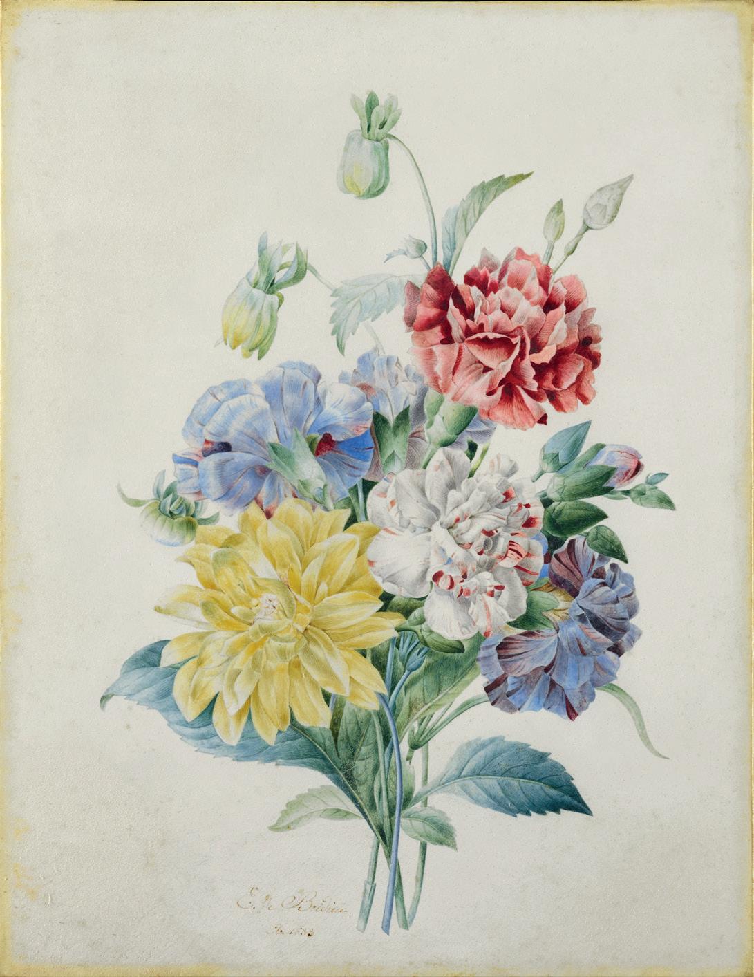
Carnations and a yellow Dahlia watercolour on vellum, 13¾ x 10¼ in. (35 x 26 cm.) signed and dated 1837
Born into a well-to-do family in Limoges, the wonderfully-named Eulalie studied from 1825 onwards with the great Redouté at his academy in the Tuileries in Paris, as was common for many refined young ladies in the period. She then worked at the ‘Muséum national d’Histoire naturelle’ on designs for the silk industry and on illustrations for various scientific journals. Two of her vellums are kept in the collection there today.
Redouté had brought the art of painting flowers in watercolour on vellum to its zenith working for Joséphine de Beauharnais, the Empress, and the tradition was continued well into the nineteenth century by little-known figures like Eulalie de Bridieu and hundreds of others. Even if not quite of the perfection achieved by the master himself, vellums like the present one, surviving in unblemished condition and with the pigments still vibrant, allow us to marvel at the difficult and unforgiving technique.
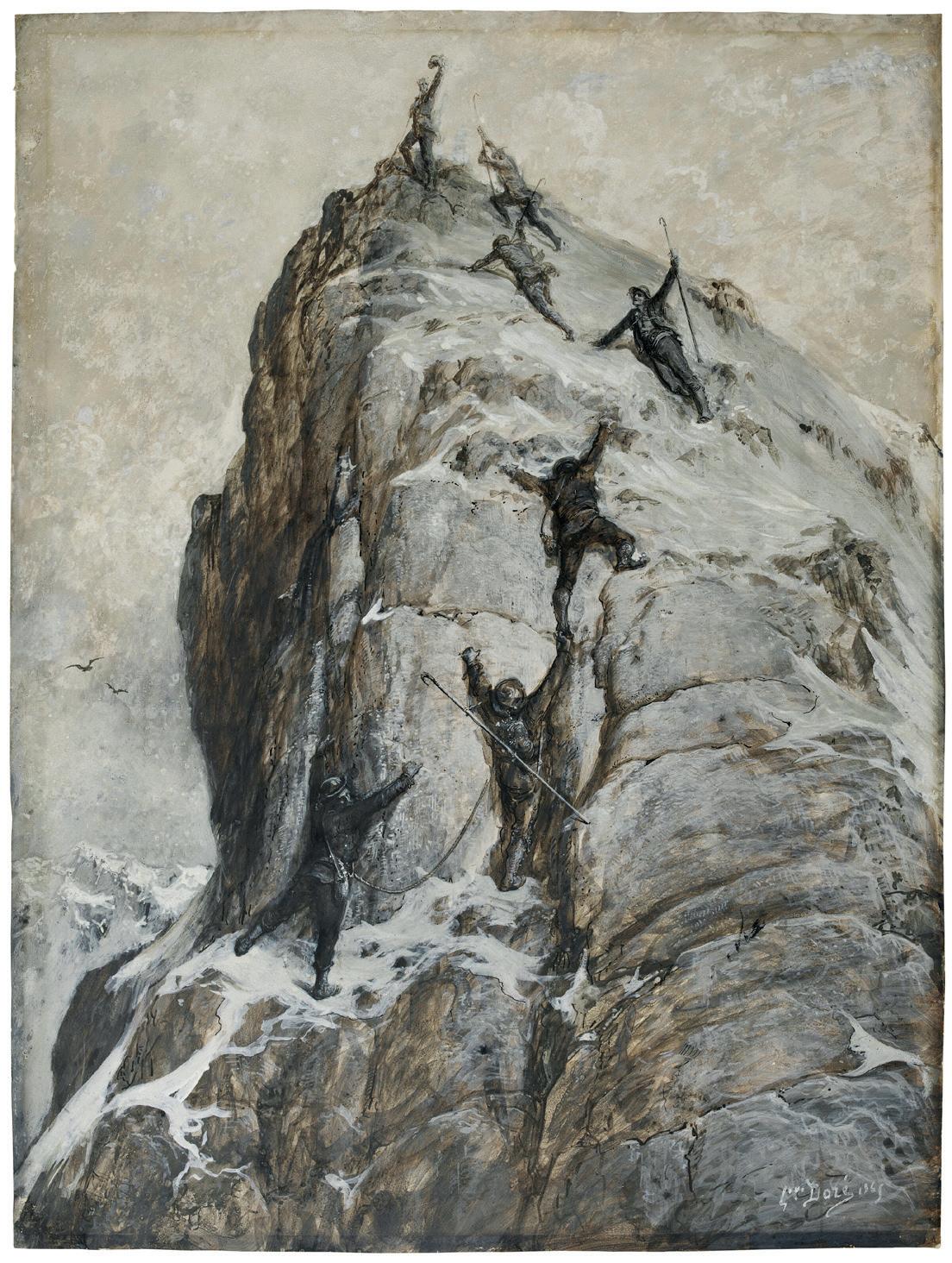
The First Ascent of the Matterhorn, Arrival at the Summit watercolour and bodycolour, heightened with white 30 ½ x 22 ¼ in. (77 x 56.7cm.), signed and dated G.ve Doré 1865
This dramatic composition by the French Romantic illustrator, painter and sculptor, Gustave Doré, depicts the moment the Matterhorn was first conquered by the English mountaineer and artist, Edward Whymper and six other climbers on 14th July 1865.
The race to the top ended in a now all too familiar disaster, arguably one of mountaineering’s most famous and notorious episodes. Four of the cordée perished soon after they began the descent: Douglas Hadow lost his footing and pulled off three other climbers, Lord Francis Douglas, Charles Hudson and their highly experienced Chamonix guide, Michel Croz. The narrow shelf from which they fell is perched at a steep angle above a daunting void and traversing it today still ignites a feeling of dread. Luckily for Whymper and the Zermatt guides, Peter Taugwalder and his son, the rope broke below them leaving them to look on helplessly as their companions plunged over 4,000 thousand feet down to the Zmutt Glacier.
The conquest of the Matterhorn became a cause celèbre and the accident threw up big questions about mountaineering and, vicariously, masculinity, religion and morality. Indeed, the day after the broken-spirited Whymper returned to England from Zermatt, The Times published a leading article which debated the folly and waste of life brought on by climbing mountains. This extract reveals the poetic but savage language it employed: “Why is the best blood of England to waste itself in scaling hitherto inaccessible peaks, in staining the eternal snow, and reaching the unfathomable abyss never to return?”
As a prolific printmaker at the time, with over 10,000 illustrations now to his name, Doré, seized upon the story and this hitherto unpublished drawing is from a series of four destined for lithography. They were done in a monochrome palette like so many of his illustrations to exploit the dramatic effects. Two of the original watercolour and gouache drawings are now in the Musée d’Orsay. One depicts all of the climbers together on the summit and the other is a grisly and haunting vision of the four climbers plummeting to their death. Two lithographs by Doré entitled Ascent of the Matterhorn were published in the year of the ascent in 1865 (Paris, BnF, Department of Prints and Photography, inv. AA-4 (Doré, Gustave); G. Forberg, Gustave Doré. L’Œuvre Graphique, Paris, 1976, II, pp. 1226-1227).
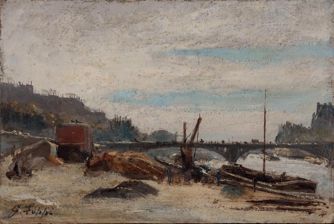
Quai Voltaire and the Pont des Saints-Pères, Paris. oil on card, 6 x 9 in. (15.5 x 23.5 cm.), signed.
In The Painter of Modern Life (La Modernité), written in 1863, the leading French poet, writer and art critic Charles Baudelaire caught the spirit of the age better than any of his peers. Even if his observations and thoughts about La Modernité could have applied to many artists of the time, the following lines from his essay seem particularly relevant to Loppé: ‘And off he goes! And he watches the flow of life move by, majestic and dazzling. He admires the eternal beauty and the astonishing harmony of life in the capital cities, a harmony so providentially maintained in the tumult of human liberty. He gazes at the landscape of the great city, landscapes of stone, now swathed in the mist, now struck in full face by the sun. Baudelaire’s essay testifies to the irrepressible desire for modernity.
The yearning for the new was everywhere. Railways were shrinking distances and advances in science were to the fore. Another writer, Maxime Du Camp, commented:
“Everything is on the move, everything is growing, everything is increasing around us…Science is working wonders, industry is making miracles.”
Although Loppé became known for his paintings of la haute montagne, he was fundamentally a provincial artist, a meridional, but one who fully embraced ‘la modernité’. This was an enduring contradiction in his life: Loppé the theatre-going bon-viveur who adored the new and bewildering environments of Paris and London where he painted the Thames a good deal too, and yet someone who was just as at home in a wind-blown mountain refuge. Loppé could tolerate the most rudimentary comfort and whilst eschewing convention in many ways, he neverheless thrived in urban life.
Loppé’s oil study was painted from below the Quai Voltaire looking towards the Louvre’s Pavillon de Flore on the other side of the Seine. The slender Pont des Saints-Pères bridge made from a lattice-work structure in iron was replaced in 1935 by the Pont du Carrousel.
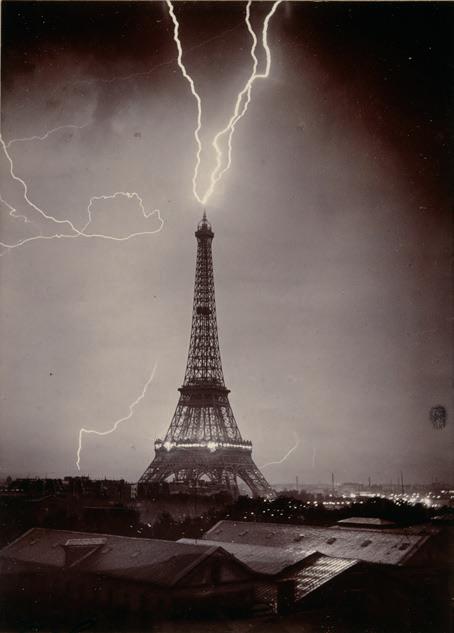
Tour Eiffel foudroyée
gelatin - silver bromide print, 170 x 120 mm. 3rd June 1902, stamped G. Loppé Paris
This small but remarkable photograph -one of only three surviving prints, one being in the Musée d’Orsay -may have indelibly linked Loppé’s name to the history of photography but after a lifetime of studying meteorological effets in his landscapes: dawns, sunsets, mist, fog, clouds and, above all, snow, it seems ironic that this one cosmique shot would, over time, eclipse nearly everything else he had achieved.
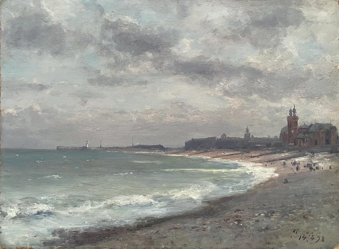
Dieppe and the old Casino Mauresque, France. oil on card, 7 ½ x 10 in. (19 x 25 cm.), dated: 14.4.1898
Loppé was in his mid-seventies when he painted this atmospheric study of the beach at Dieppe and had been crossing the English Channel frequently since the early 1860s. Depending on his exhibition commitments, he sometimes made up to half a dozen trips a year to London and further afield. Often, he took the ferry between Dieppe and Newhaven and his diaries state that, weather permitting, he tried to paint most days
even when travelling. The Casino Mauresque was completed in 1886 and would have appealed to Loppé whose fascination with bridges and steel structures had led him to apply for a special permit to take photographs of the pavillons and the Tour Eiffel under construction at the Exposition Universelle a decade before.
GALLERY NOTES ® is published to acquaint readers with the paintings offered for sale at John Mitchell Fine Paintings. We hope that in receiving them you will share the interest and enjoyment which they have brought to collectors throughout the world for over sixty years.
JOHN MITCHELL FINE PAINTINGS
EST 1931
17 AVERY ROW, BROOK STREET, LONDON W1K 4BF
TEL: +44 (0)20 7493 7567
WWW.JOHNMITCHELL.NET ENQUIRIES@JOHNMITCHELL.NET