

Timeless
About me
Education
Universiti Tunku Abdul Rahman
2014-2017
Bachelor of Arts (Hons)
Graphic Design & Multimedia
2013-2014
Foundation in Arts
Experiences
Feb 2024 - Present
Muse Creative - Freelance Senior Designer
Oct 2022 - Feb 2024
Cheil Malaysia
- Designer
April 2020 - June 2022
Affects Studio
- Graphic Designer
Sept 2019 - April 2020
Dot Creative Design
- Graphic Designer
Jan 2018 - June 2019
Archmosphere Design
- Graphic Designer
Dec 2016 - April 2017
Baruku Pictures
- Internship as Graphic Designer
& Video Editor

Skills Art
Softwares
Adobe Photoshop
Adobe Illustrator
Adobe Premiere Pro
Adobe After Effects
Figma
Sarina Yeow Shi Rong
A Wholesome Woo-hoo Time / 3 Min Express Branding / Conceptual MySejahtera App Design / Key Visuals Collection / Vikid Packaging Design / L'Oréal Paris Packaging Design / Social media and EDM /
Objective: The
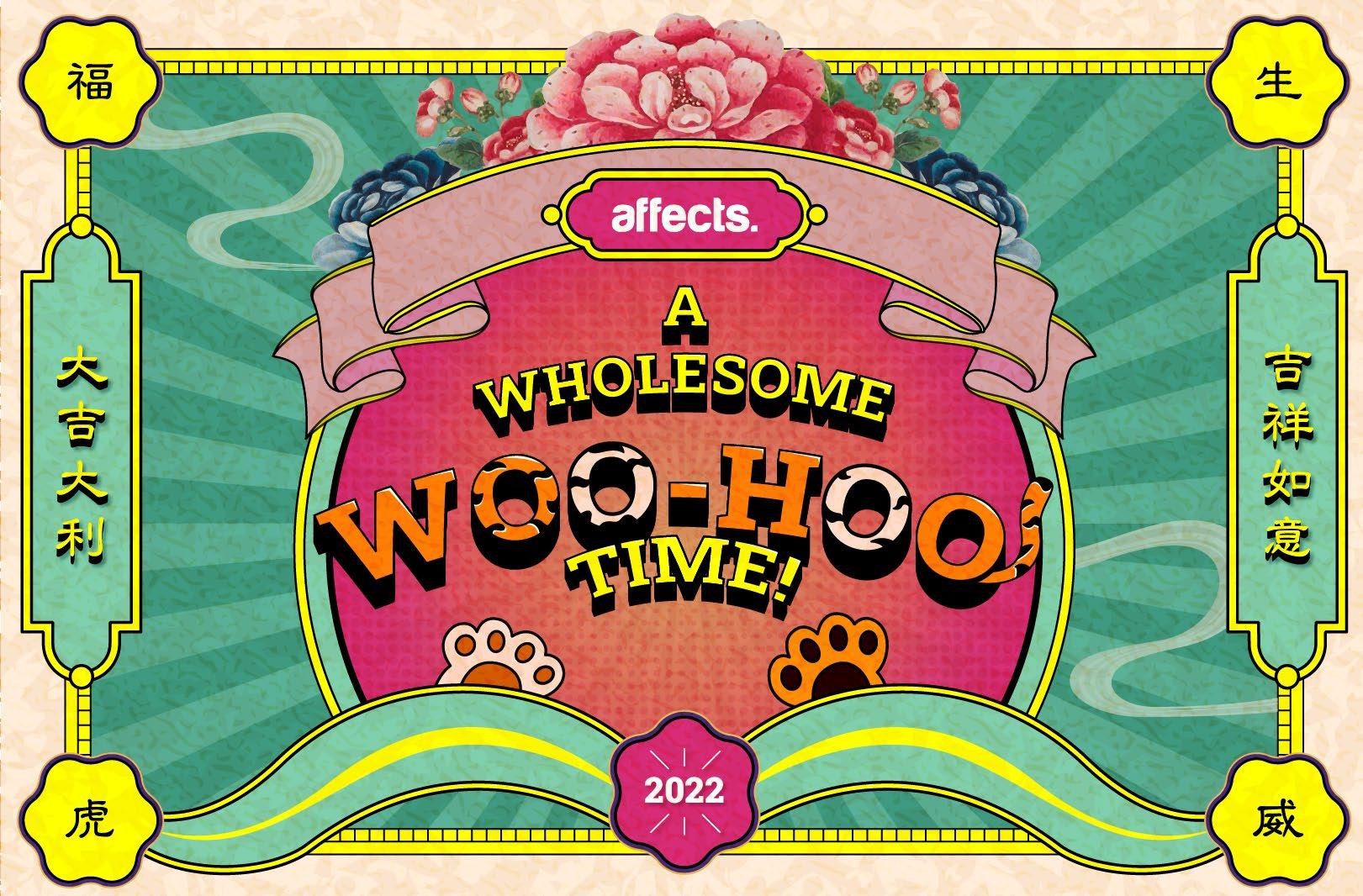
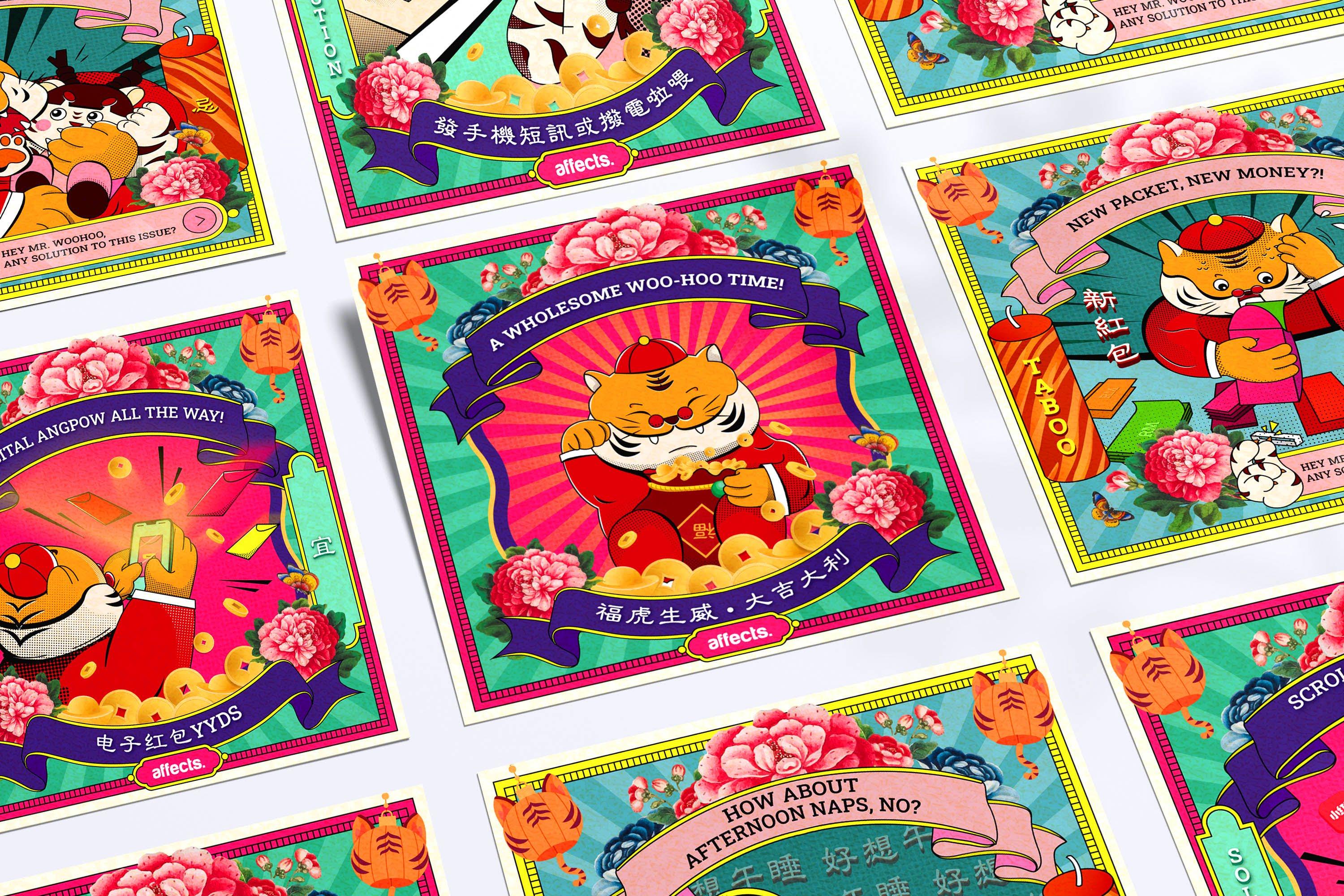
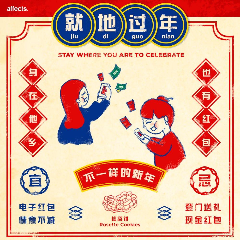
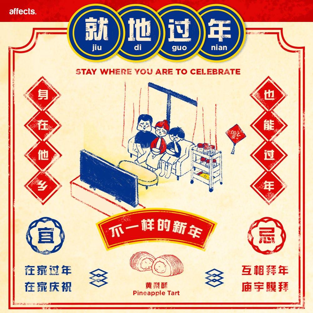
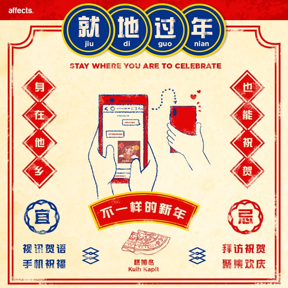
Festive posts should never bore anyone. Taking old practices of taboos during Chinese New Year and modernising the concept were the intent. Thus, modern solutions with visuals that seamlessly blend cultural elements and contemporary design are being introduced.
Solution: The
In order to create a culturally rich yet harmonious visual, traditional Chinese design elements such as the colours and ornaments are incorporated. The significant Chinese New Year colours such as magenta and yellow which symbolize good fortune and happiness are being applied throughout the art pieces while balancing with the contemporary tints for a fresh and modern touch.
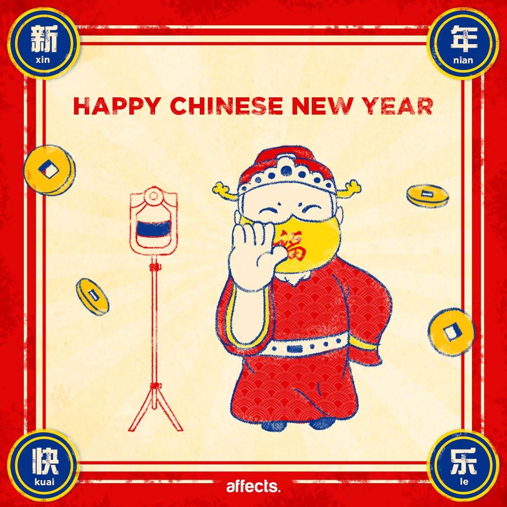
Introducing Mr. Woo-Hoo, the main character of this festive post a.k.a the legend of the year of 2022. He is sandwiched between a series of taboos and solutions– nothing better to express the visual concept using his exaggerated expressions and postures.

Inspired by Bu2ma, a cartoonist in China whom created a series of serious looking yet funny comical tiger from “Alexander the Fat Tiger”.
Starting with sketches of the main character by experimenting various exaggerated facial expressions, body gestures and postures to inject humour into the character.
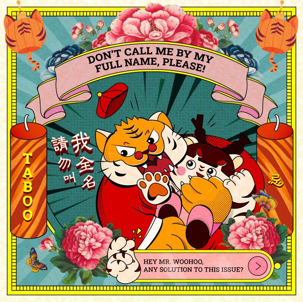

In order to create a cultural fusion through visuals, the overall layout and elements such as the textures , exaggerated strokes and typography treatments lean towards tradition while adjusting the colour tints to bring up the contemporary design tone.
At the same time, the characters with exaggerated gestures and modernized behaviours are kept within a traditional yet modern layout create an engaging and balanced composition.
Mr. Woohoo and his sister
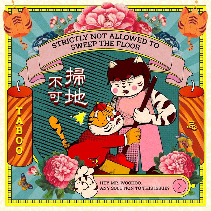
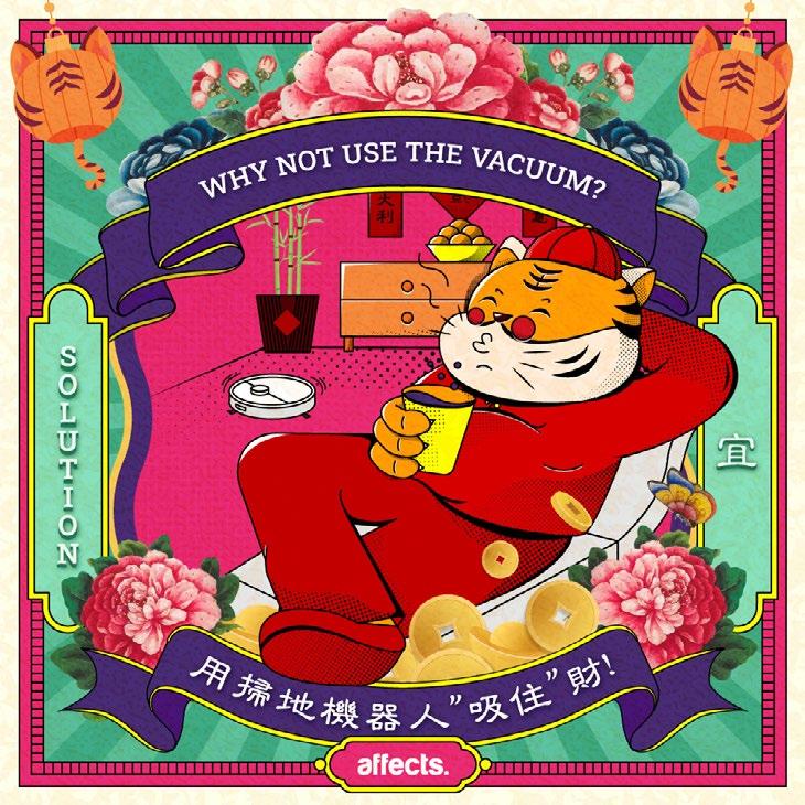
Taboo
/ Art Direction / Branding / / UI/UX Design / Layout /
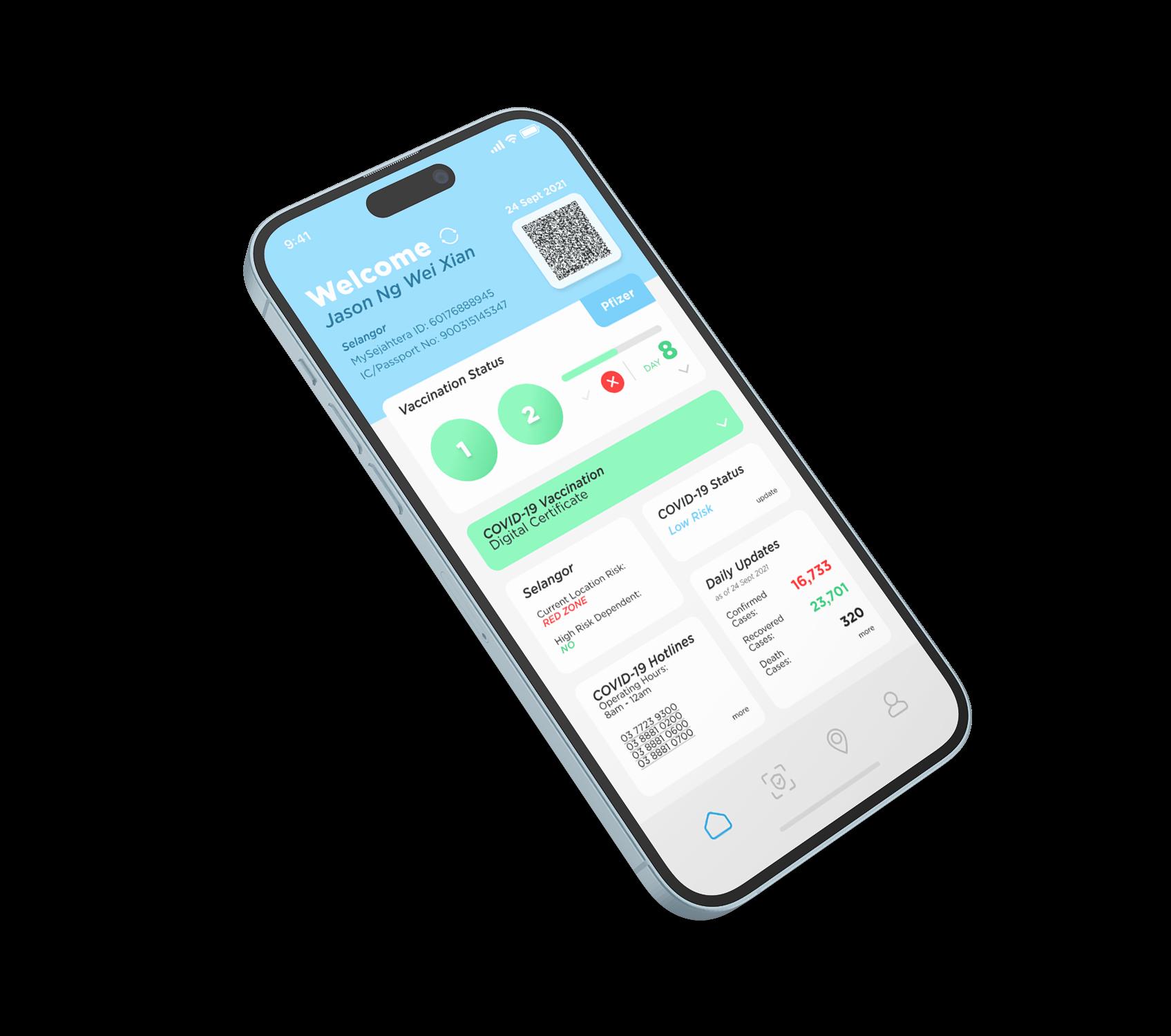
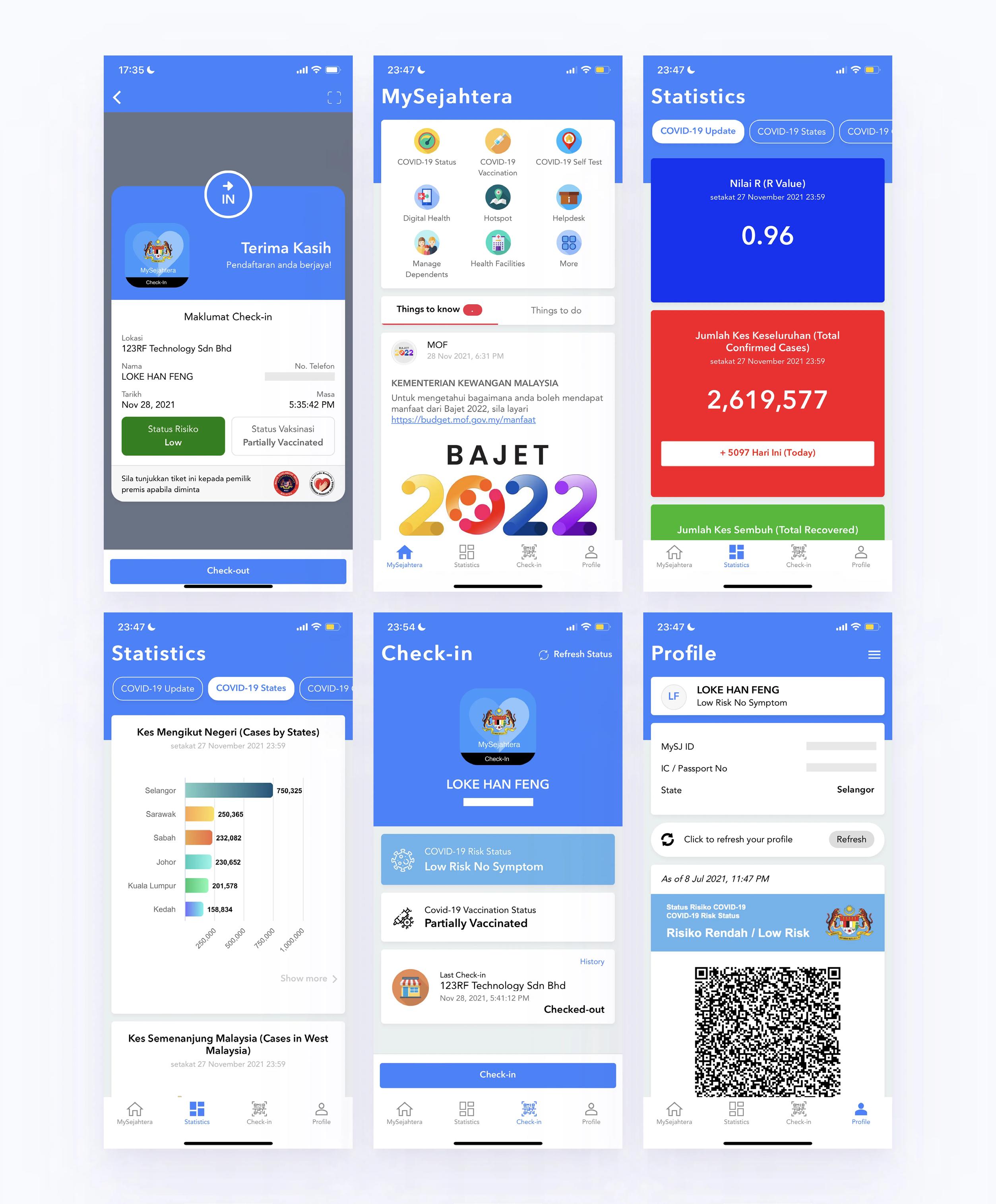
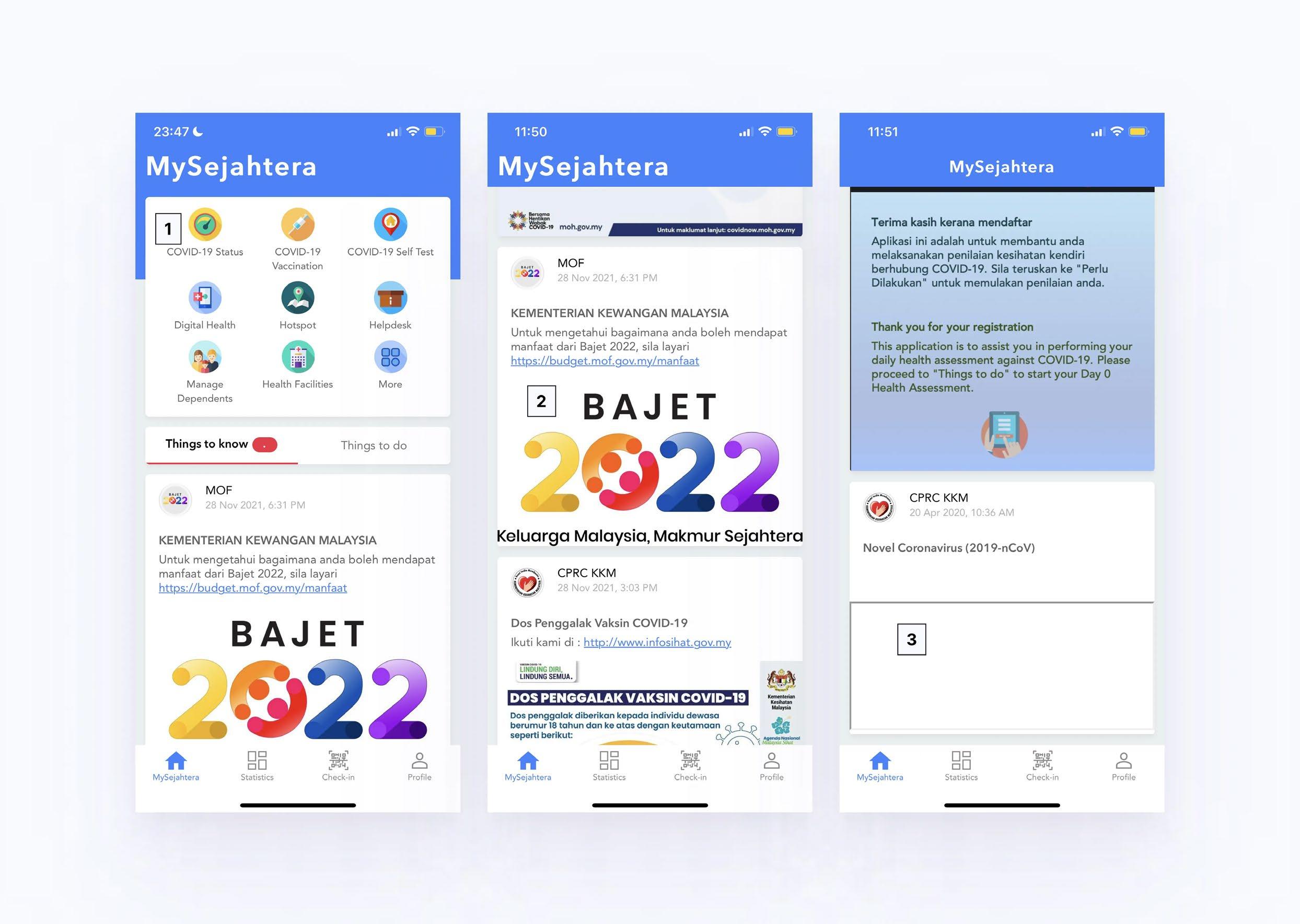
Homepage


Objective:
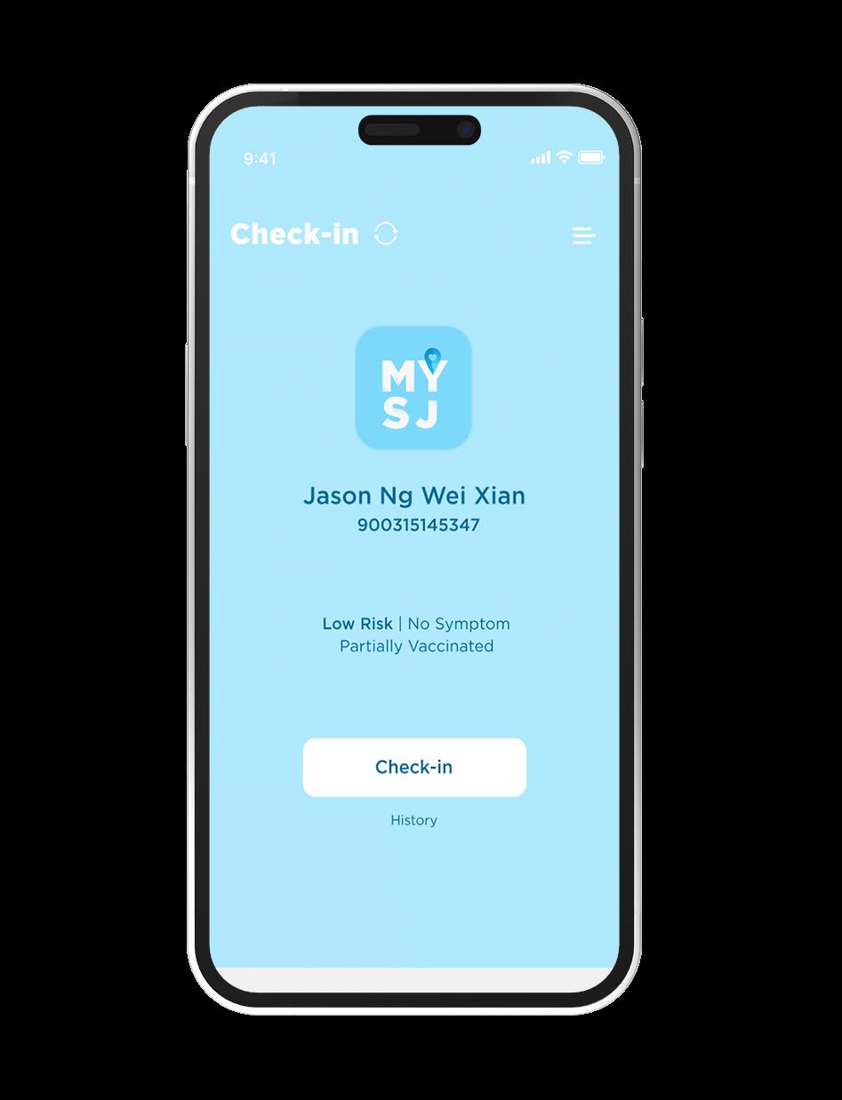
Check-in Page with Vaccination Status

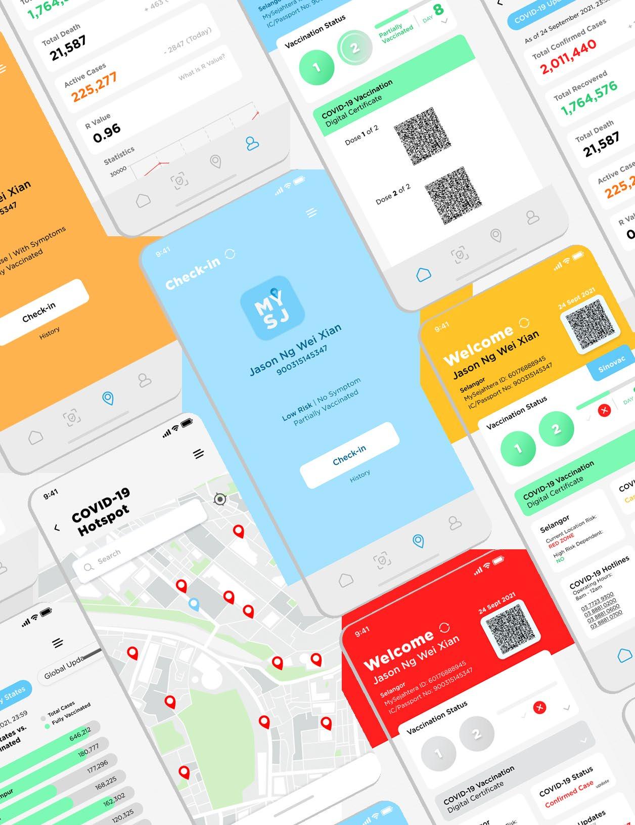
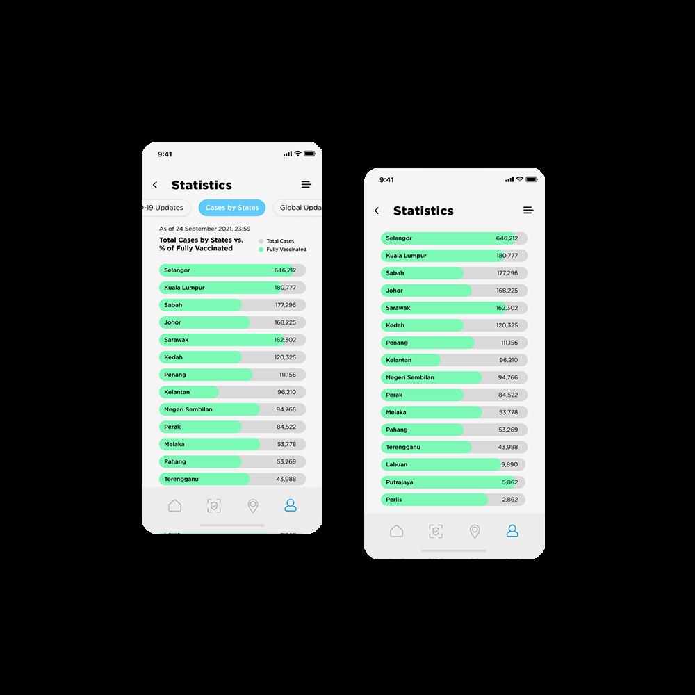
A user-friendly app is what matters today. The goal is to simplify the steps, and improvise the overall design so a more harmonious look would help users obtain information on COVID-19 daily updates.
The
Solution:
Undoubtedly a younger approach was the solution to adhere to the mobile app design with an online prototype for a better user experience. Colours are mainly used to highlight important information and for buttons to stand out more as an important alert of a contagious person. The app is simplified through sections of personal information and updated news, yet easy to the eyes of users.
Check out here: https://bit.ly/3xemjvo
3 Min Express Client: The /Art Direction/ /Branding/ /Packaging Design/ /Layout/

THREE HEAT WAVE SPEED
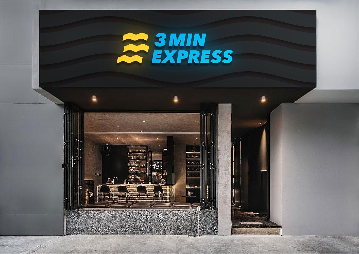
The logo consists of a combination of three elementsthe “3” from the name, the heatwave and the speed, which are all related to the name and the service provided by the company.
Objective:
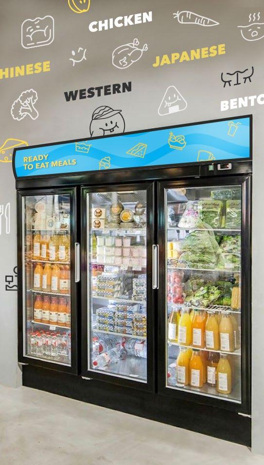
A ready-to-eat meal concept store is needed to cater the current fast-paced lifestyles in the city centres. However, the combination of visual direction and store functionality is crucial to attract

Solution: The
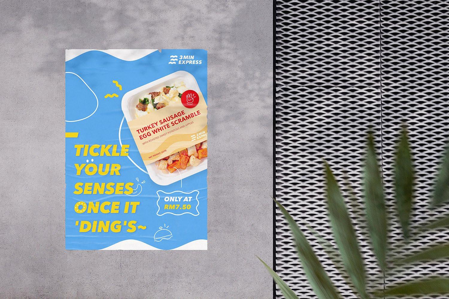
By infusing a lively and fun identity through illustrated graphics with emotions, strong combination of warm and cool colour, and the wavy logo icon create a memorable visual identity. Thus, customers are more likely to remember and recognize this brand.
The implementation of warm colours and lively graphics contribute a positive and inviting perception of the store. Also, each food packaging is designed in a color-coded system to differentiate between types of meals that provides a seamless experience for customers. Food name is labelled clearly and prominently on each packaging to optimize the functionality of the design, making it both visually appealing and user-friendly for customers in a fast-paced environment.

Client:
The / Art Direction / Layout / Digital Imaging /
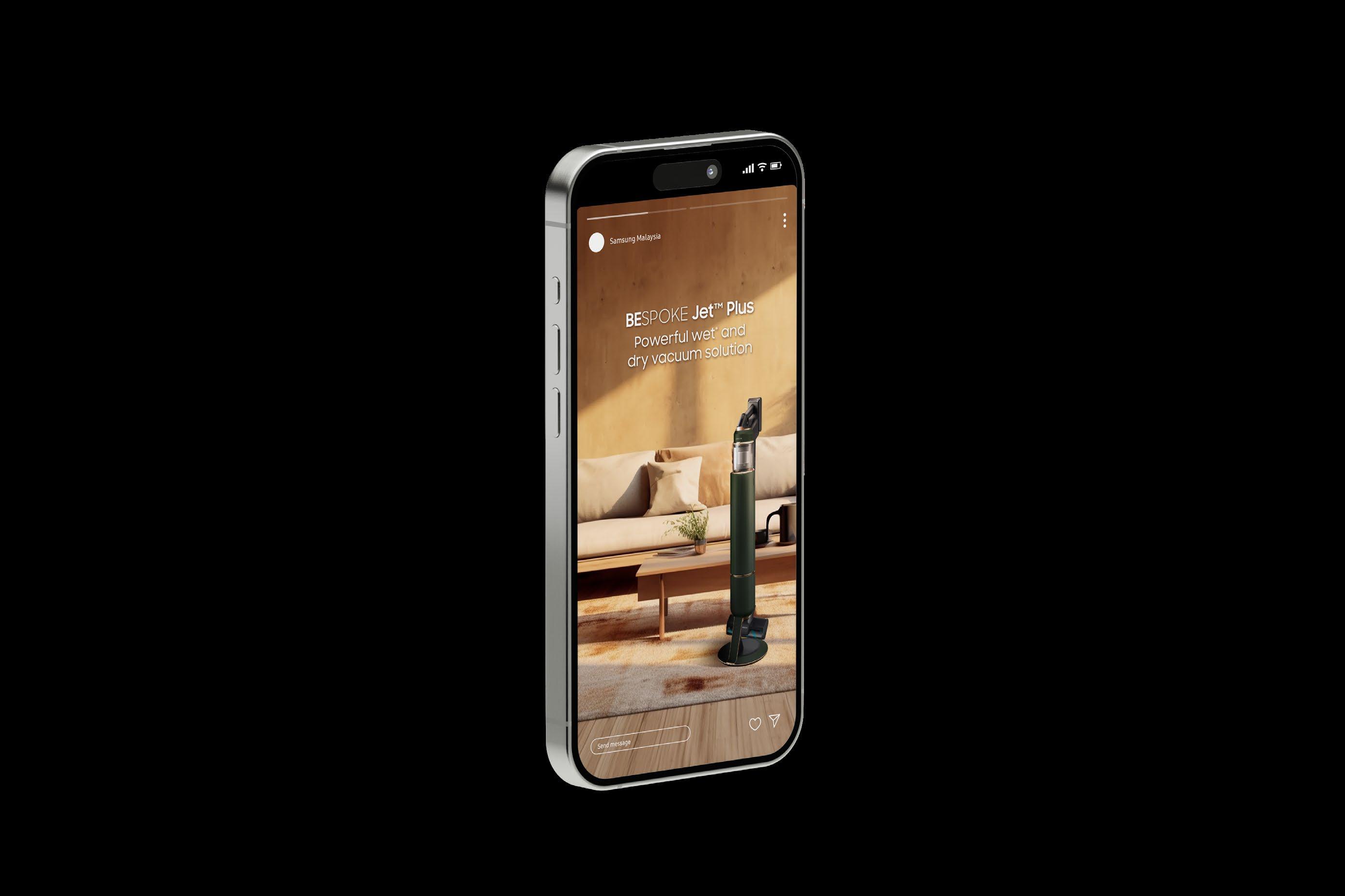
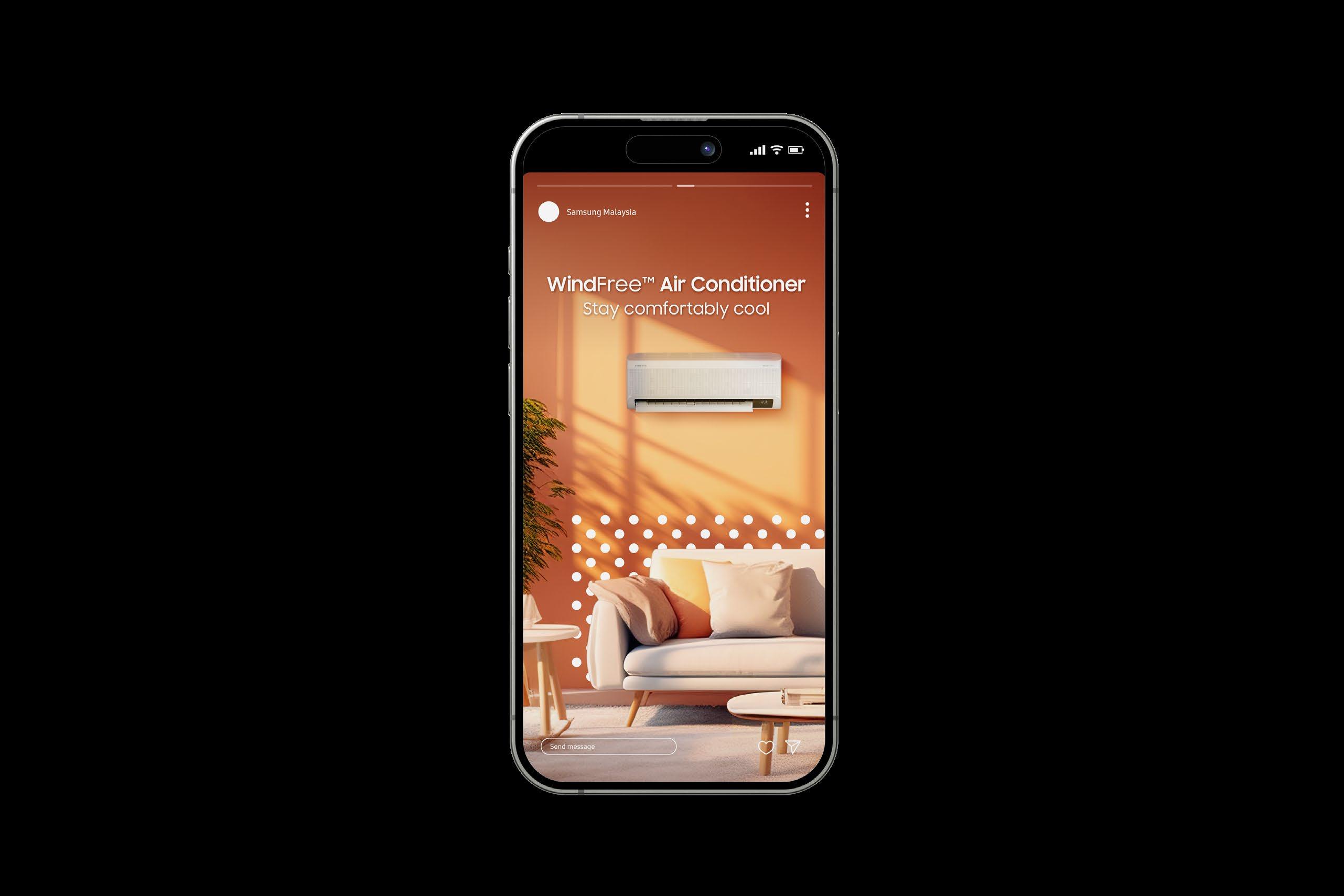
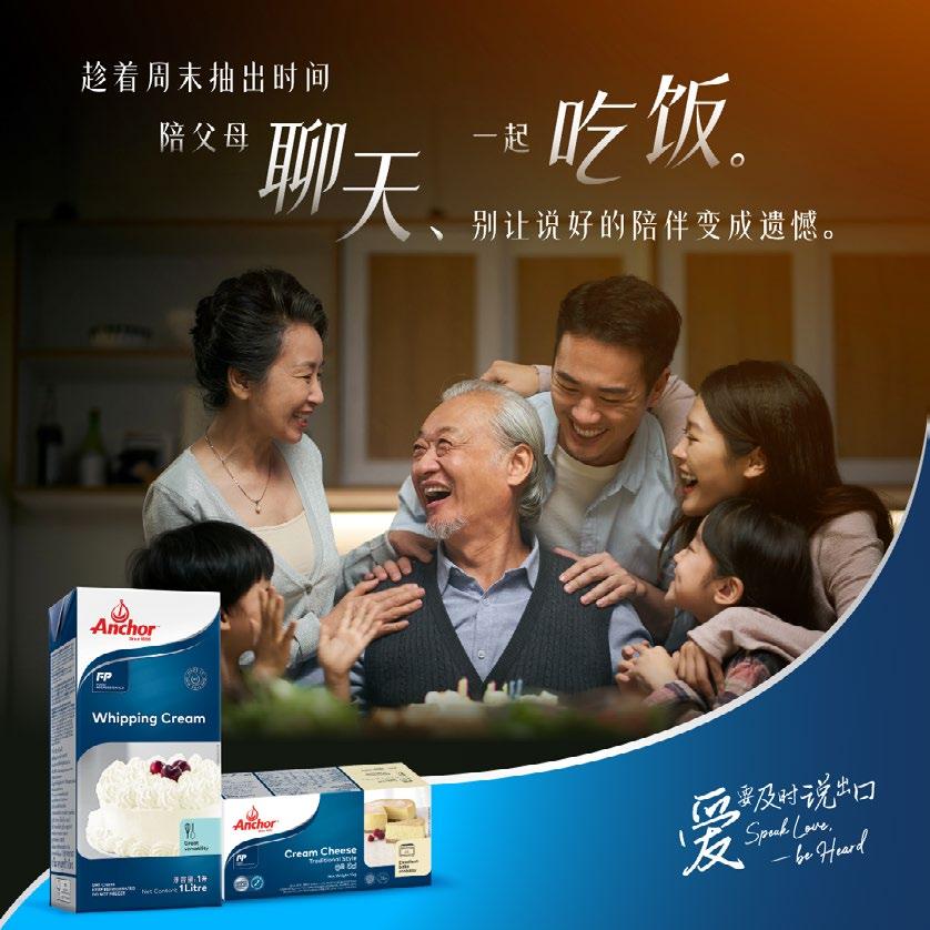
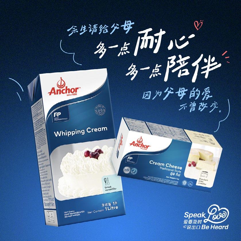
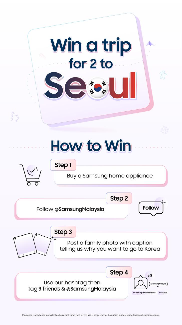
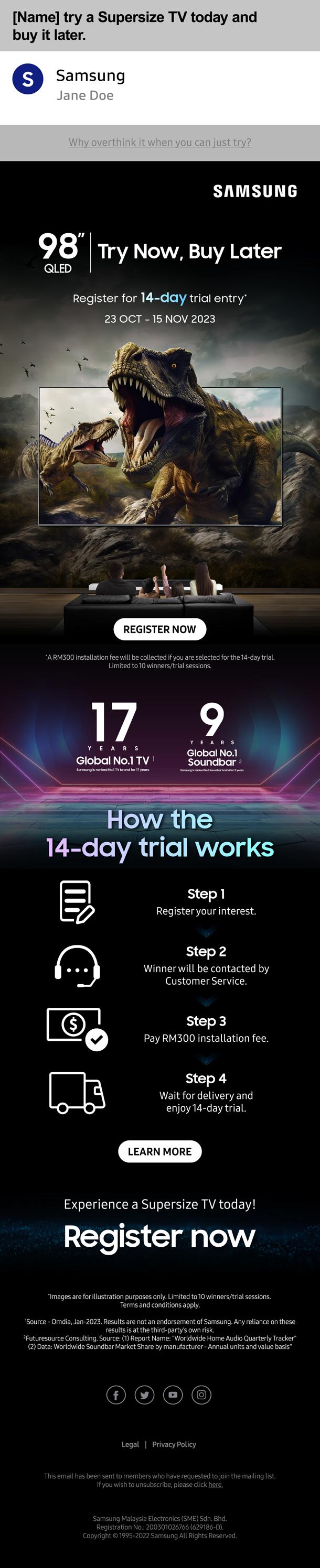
Shopping Centre | Samsung Malaysia | Anchor | Mamee





Jaya
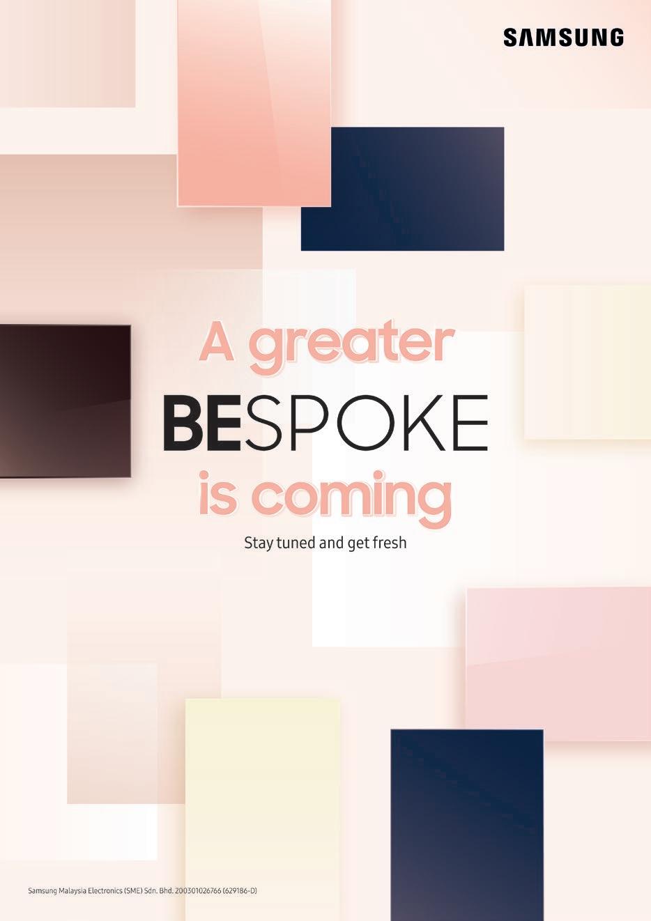
Bespoke Top Mount Freezer (TMF) ROI KV
A Register of Interest (ROI) key visual for Samsung Bespoke TMF’s launch is created to generate market awareness. This KV concept focuses on abstraction and aesthetics to showcase the range of colours available without revealing the product itself. Thus, freezer door panels featuring the seven colours are implemented in a subtle and sophisticated manner aims to create intrigue in the market.
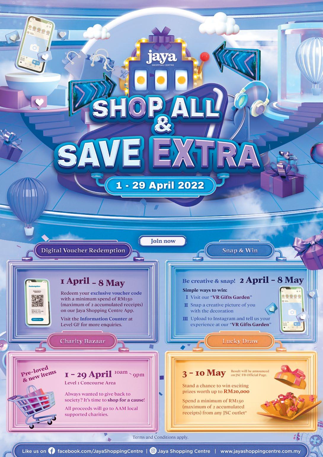
In order to create an appealing key visual that able to drive awareness in the market, a 3D approach key visual is created for a “Shop and Save” campaign. The concept of this key visual is to create a dreamy and VR interactive visual that allow the audiences to experience exciting stations of the campaign. Soft, inviting colours, and cloud are implemented to add a dreamy and surreal ambiance into the visual. Also, the visual is decorated with elements such as gifts, hot air balloon, stereo and etc. to infuse exciting and attractive atmosphere.
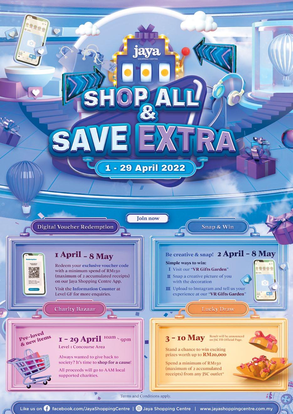
Jaya Shopping Centre Monthly Event KV
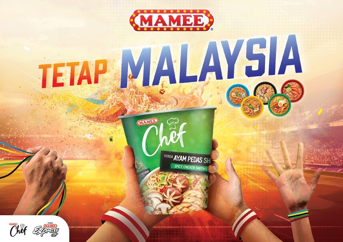

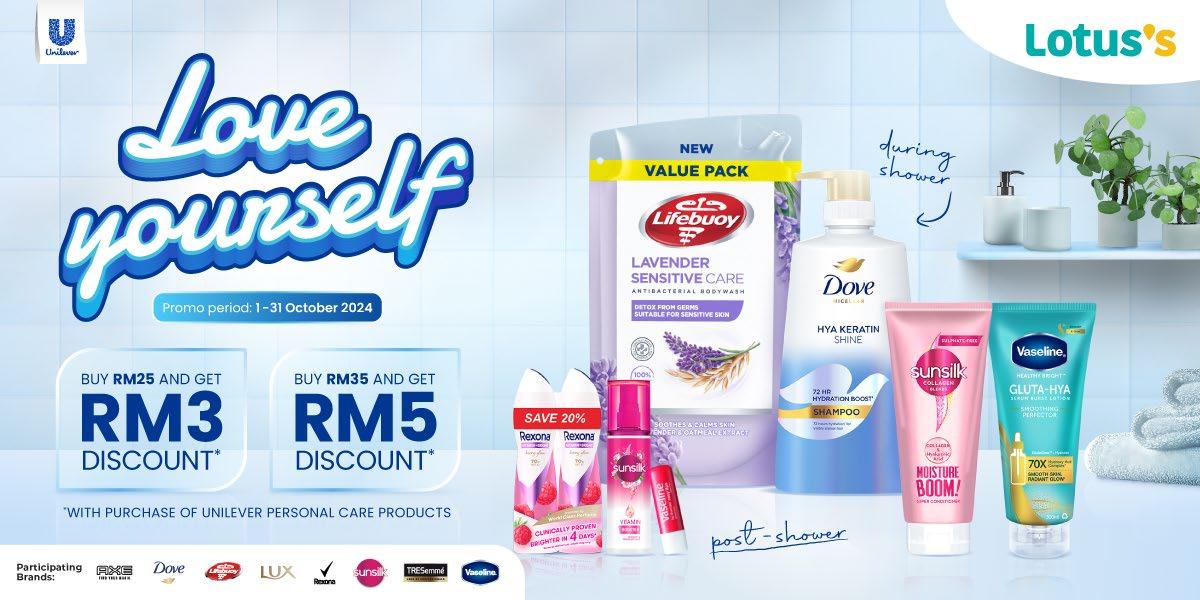
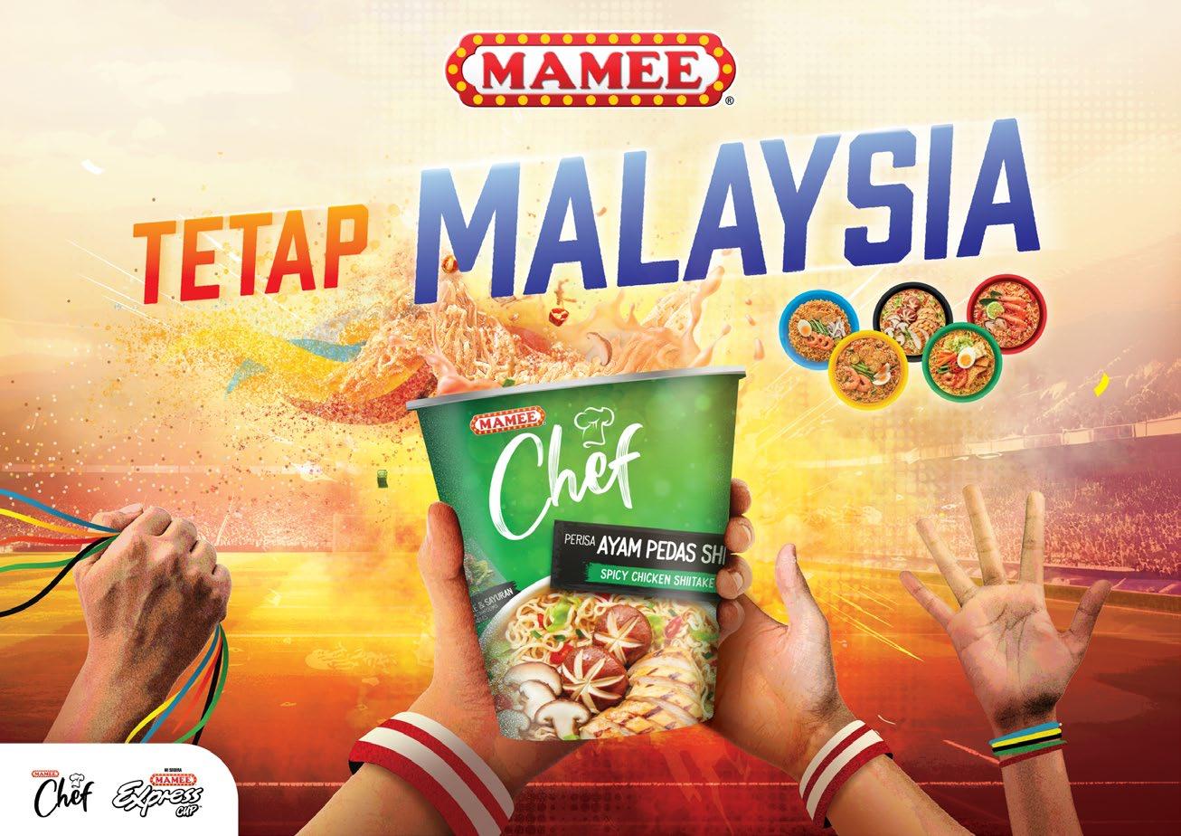
Mamee Chef x Olympic - Tetap Malaysia KV
Anchor - Chinese New Year 2025 KV
Unilever - Love yourself Campaign

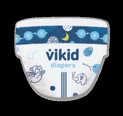

Get to know the Animals
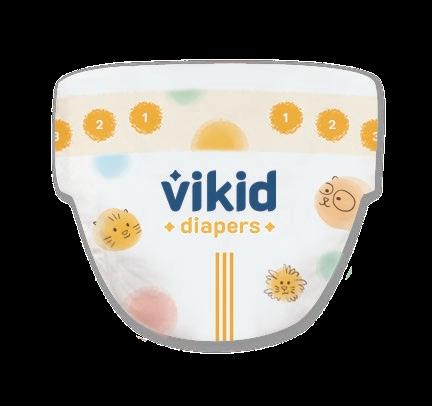
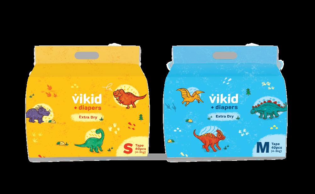
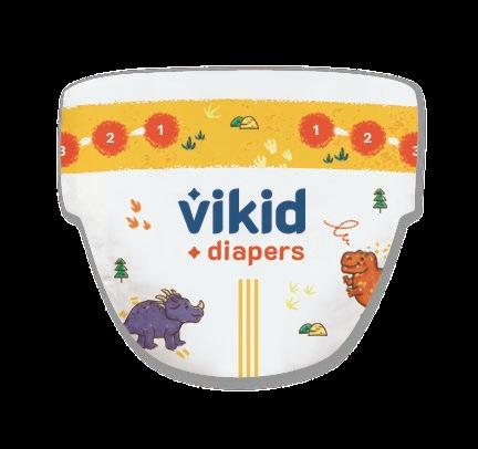
Vikid Client: The / Art Direction / Branding / Illustration / Layout /
Nighty Night
Dinosaurs Rawr
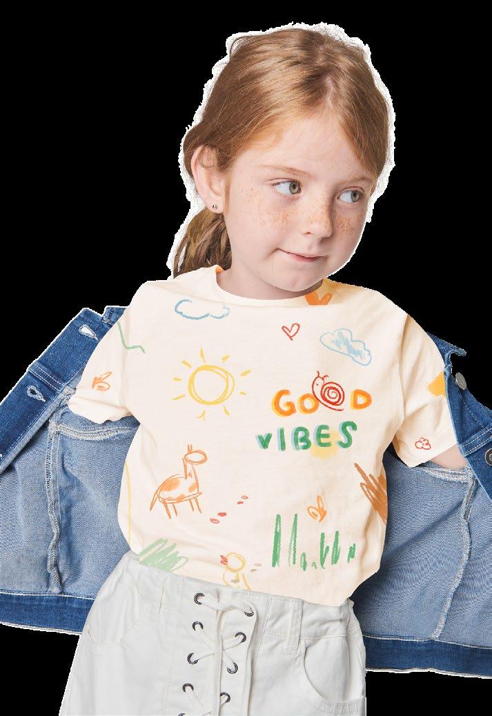

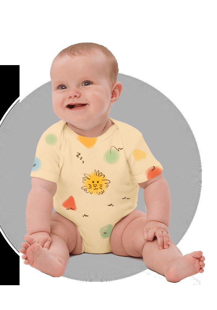

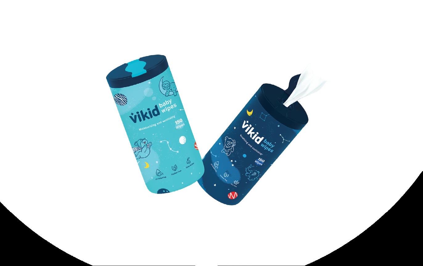
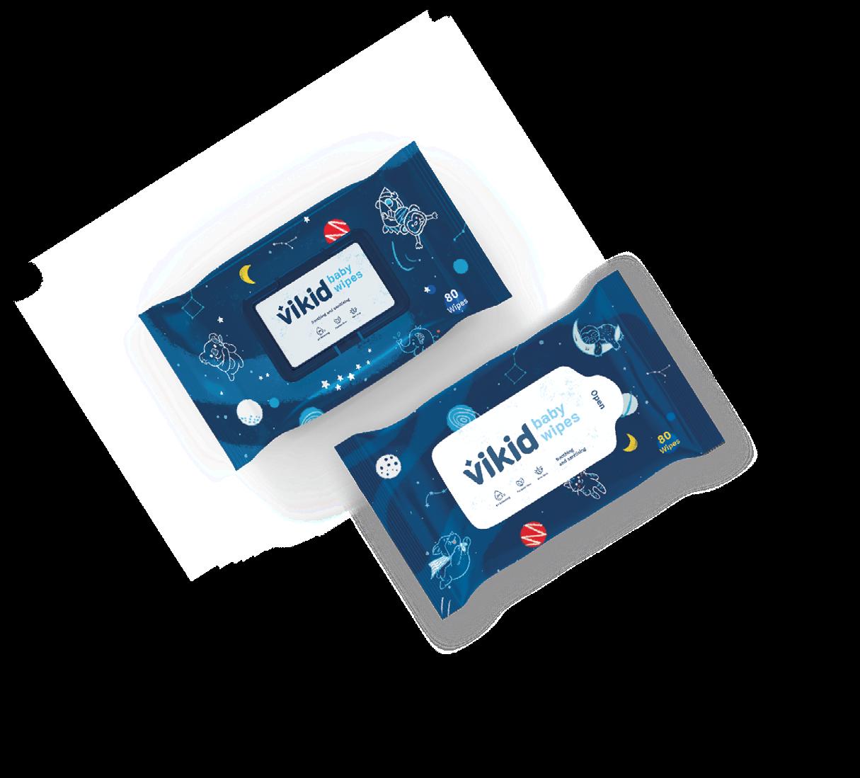
Current diaper packaging in the market tends to be more focused on the functionality rather than aesthetics. Thus, creating a packaging design that stands out as fun, creative and remarkable is the aim of this project.
Objective: The Solution: The
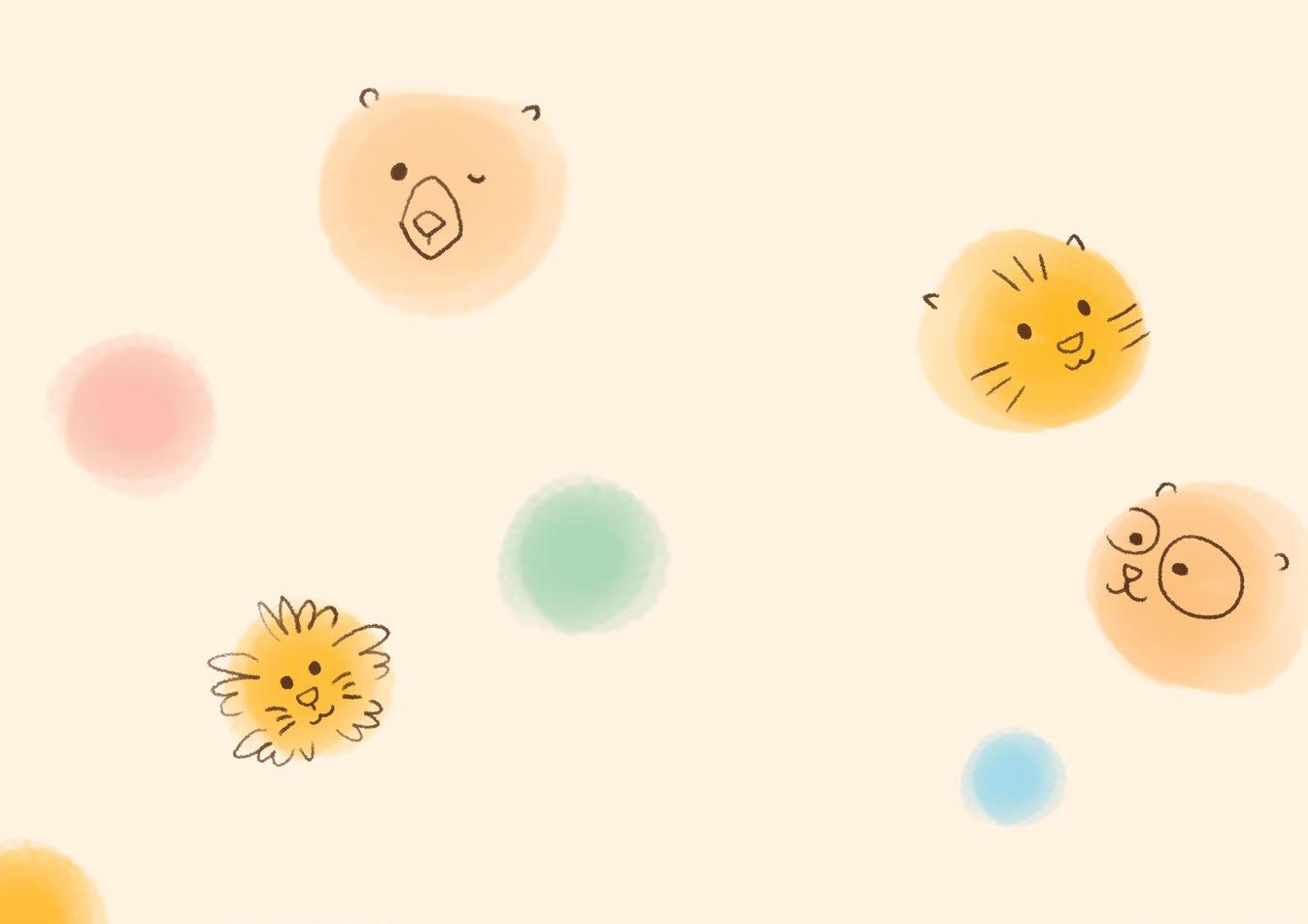
Three fun and imaginative series– Nighty Night, Dinosaurs Rawr, Get to know the Animals, were charmingly crafted. Here, the elements of children’s daily lives are implemented to improve the interaction with them as recognising the animals, especially dinosaurs are their absolute forte! By infusing themes into the packaging design create a delightful and engaging experience for both the parents and children.

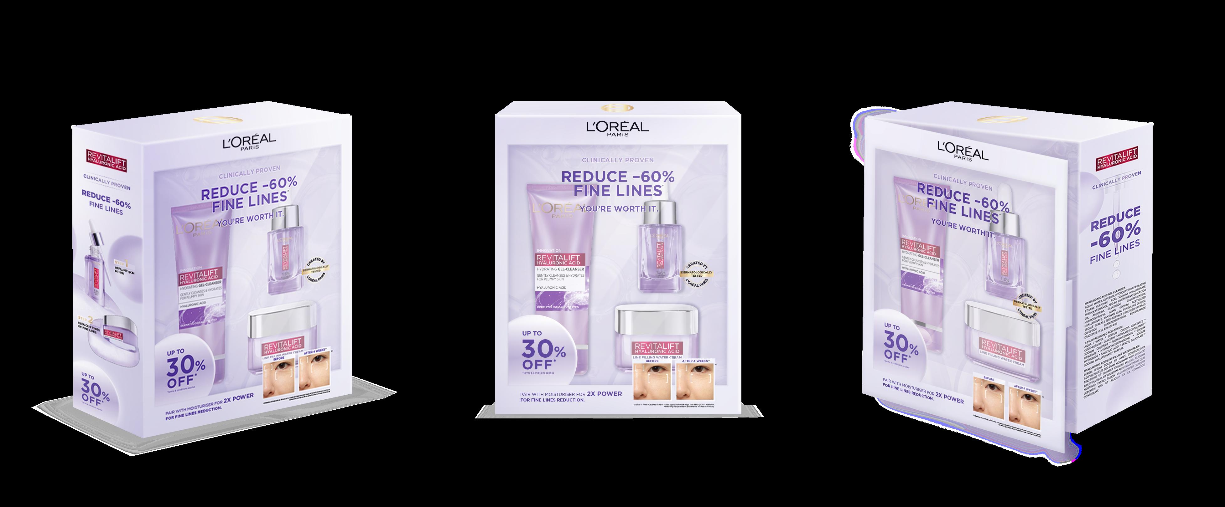
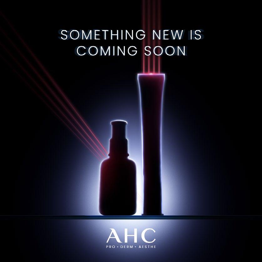
Paris Client: The / Art Direction / Concept / Packaging Design
L'Oréal

Anchor
Samsung Malaysia
Anchor









Thank you