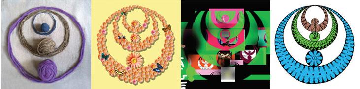
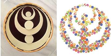
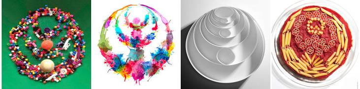
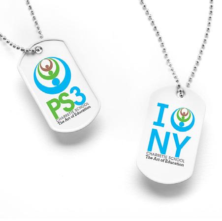
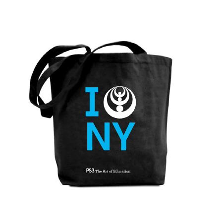
It’s time for a group hug.
Embracing PS3.
PS3 STYLE GUIDE
Our Logo. Over time our logo will become synonymous with PS3. We’re making history here.
It’s as easy as 1, 2, 3
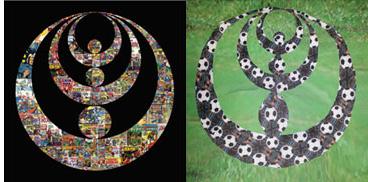
3 figures embracing from above.
3 unique entities coming together. Represents the dual grade system.
3 for PS3, the power of 3.
Our Logo is a very valuable asset. We must treat it nicely. Never abuse our logo, it has arms but it can’t fight back (our branding committee however, is another story).
What it stands for It represents our dual grade system. Teachers, students and parents. Community, classroom and home. Innovation, independence and community. Past, present and future.
02 Full Color
PS3 Blue Pantone 2995 C
PS3 Green Pantone 368 C
PS3 Brown Pantone 479 C
03 One Color
PS3 Blue Pantone 2995 C
04 B&W
40% Black Small
60% Black Medium
80% Black Large
Our Tagline.
You get the picture
Our tagline expresses PS3’s key strengths.
It demonstrates PS3’s deliberate approach to education.
It plays with the notion of an integrated arts curriculum without saying it.
It honors the seriousness with which we take education.
It’s playful but still serious and academic.
It differentiates us from other schools.
Our School Seal. It looks rather official doesn’t it, well it’s supposed too. Old school meet the new school.
01 Full Color Grey
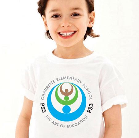
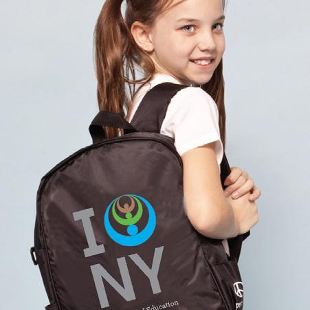
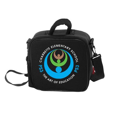
For everything officially PS3. From flags to stickers to embroidered patches. Look for it on students backpacks.
02 Full Color white
This version has all of our official colors, blue, green and brown with a dash of black and grey.
03 One Color
The perfect shade of blue when you can only afford one color.
04 B&W
Use this version for xeroxing. It’s perfect every time.
Lockups. Wherever possible, the logo and the tagline should appear together. We know that’s not always possible so we’re created lots of versions. Pick the one that’s right for you.
Embrace it.
This version is to be used for all print collateral. As well as all digital work, including websites, banners and presentations. It’s our hero.
01 Horizontal Lockup Color
In this version the logo sits on the left, and the exact same height as PS3.
02 Vertical Lockup Color
The logo, PS3, full name and tagline all sit happily on top of one another. It’s the perfect sandwich.
03 Vertical Tagline Color
PS3 is the same length as the tagline in this version. It’s our sandwich without the crust.
04 Horizontal Full Name Color
PS3 is the same height as Charrette School and tagline combined.
05 Horizontal Tagline Color
PS3 is twice the height of the Tagline.
B&W Please. You got it! Created for photo coping over and over and over again. You know you will.
02 Horizontal Lockup B&W Perfect for the top of a letterhead or report card.
01 Vertical Lockup B&W Shades of grey. Dark 80%, medium 60% and light 40%.
03 Vertical Tagline Black
Need to make a report, use this version please.
04 Horizontal Full Name Color
Photo copies perfectly.
05 Horizontal Tagline Black
I think you got the idea.
Our Typeface. Headlines.
Avant Garde Gothic for MAC Adventor for PC
Our very own PS3 corporate font. Not that any of us wear suits too often.
A nice, simple font, good for bold (or witty) headlines. Use in our PS3 Blue please.
ABCDEFGHIJKLMNOPQRSTUVWXYZ
abcdefghijklmnopqrstuvwxyz (.,:;?!$&@”) 0123456789
Our Typeface. Subheads.
Archer Semi Bold for MAC & PC
We used Archer Semi Bold for our tagline. It compliments Avant Garde Gothic very well, they’re BFF’s.
Archer is a modern serf font great for subheads. Use Archer Semi Bold in our PS3 Blue.
ABCDEFGHIJKLMNOPQRSTUVWXYZ
abcdefghijklmnopqrstuvwxyz (.,:;?!$&@”) 0123456789