SPEAR DESIGN GROUP
VERSION 1.0


SPEAR DESIGN GROUP
VERSION 1.0
A brand is a shorthand representation of everything a company is, does and stands for. More than a name or a logo on a page. And more, ultimately, than what that page contains.
The guidelines that govern all communications for Apogee Building are part of a much larger effort to gain awareness, understanding and preference for the brand in markets in which you compete.
To build a brand that endures.
These are your brand guidelines which explain how to use the new visual identity with confidence and clarity.
Your guidelines have been designed to ensure consistency within your brand, helping to create strong, recognizable and innovative communications.
The following pages demonstrate the flexibility within the identity and should be used to inspire and motivate creative expression.
Your unique identity and typographic style creates a distinctive framework for your brand which help you stand out from your competitors.
- It’s crucial to come up with name that your target audience will respond to
- Use a name that conveys some meaning
- Is it authentic?
- Does it represent you?
- Remember to make sure your name can scale
- Has longevity, can grow with you
Apogee
- The highest point in the development of something.
- A climax or culmination.
- Apogee is often used in its figurative sense, signifying the high point of a career or endeavor.
- At the apogee of your profession.
- Apex, crescendo or pinnacle.
Astronomy
- The point in the orbit of the moon or a satellite at which it is furthest from the earth.
The new logo is the most important asset to your organization and should serve as a foundation for all visual communications.
The identity can only make a positive impact if used consistently and correctly throughout all brand communications.
To maintain a strong brand image it is important that the logo is always applied consistently wherever it appears.
It should never be manipulated or distorted.
Its color, position and size are all specified within this document.
Why?
Incorrect usage of the Apogee Building Logo compromises their integrity and effectiveness.
Building Size Don’t change the size of Building.
Building Position Don’t change the position of Building.


Primary
Secondary
PANTONE 565 C
CMYK 30 / 0 / 18 / 00
RGB 161 / 214 / 202
HTML #A1D6CA
PANTONE 5415 C
CMYK 56 / 24 / 11 / 34
RGB 91 / 127 / 149
HTML #5B7F95
PANTONE 7543 C
CMYK 24 / 9 / 8 / 22
RGB 152 / 164 / 174
HTML #98A4AE
PANTONE COOL GREY 3 C
CMYK 8 / 5 / 7 / 16
RGB 200 / 201 / 199
HTML #C8C9C7
PANTONE 468 C
CMYK 6 / 13 / 41 / 4
RGB 221 / 203 / 164
HTML #DDCBA4

4.0 Typography Section
Consistent, frequent use of our corporate typeface creates trust and familiarity with viewers. It helps them make an immediate association with our company, and contributes to a harmonious look and feel among all of our designs.
Usage
Garamond should be used for headlines, sub headers, secondary headlines.
Use all caps for short headlines or labels.
Never use Garamond for body copy.
Garamond Regualr
abcdefghijklmnopqrstuvwxyz
ABCDEFGHIJKLMNOPQRSTUVWXYZ
01234567890$&?/+”(.,:;)
Character Tracking: 100
Garamond Italic
abcdefghijklmnopqrstuvwxyz
ABCDEFGHIJKLMNOPQRSTUVWXYZ
01234567890$&?/+”(.,:;)
Character Tracking: 100
Garamond Bold
abcdefghijklmnopqrstuvwxyz
ABCDEFGHIJKLMNOPQRSTUVWXYZ
01234567890$&?/+”(.,:;)
Character Tracking: 100
Gill Sans
Usage
Gill Sans should be used for body copy only.
In sizes smaller than 8 point please use 20 tracking in order to help legibility.
Never use Gill Sans for headlines, sub headers, secondary headlines.
Gill Sans Light
abcdefghijklmnopqrstuvwxyz
ABCDEFGHIJKLMNOPQRSTUVWXYZ
01234567890$&?/+”(.,:;)
Character Tracking: 0
Gill Sans Regular
abcdefghijklmnopqrstuvwxyz
ABCDEFGHIJKLMNOPQRSTUVWXYZ
01234567890$&?/+”(.,:;)
Character Tracking: 0
Gill Sans Bold
abcdefghijklmnopqrstuvwxyz
ABCDEFGHIJKLMNOPQRSTUVWXYZ 01234567890$&?/+”(.,:;)
Character Tracking: 0
360 Branding encompasses all visual touchpoints of our brand from print and digital. Everything from logo treatments, business cards, website and signage designs. Color, design, text, and photography merge to make a compelling and lasting impression on the viewer.


The brochure designs feature layouts what encompass our brand philosophy: A less-is-more approach.
With a compelling use of images and typography, a well-designed layout can be one of the most effective tools to clearly communicating your brand message.
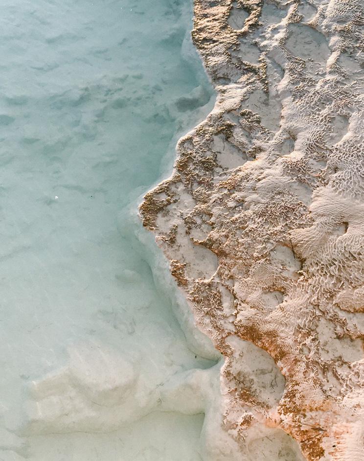
Stunning exteriors and interiors; Closeups of details and materials; Are paired with well curated artsy Hamptons lifestyle and nature stock photography that subtly stays within our corporate color palette.
The overall look and feel is classic, minimal and elegant.
Primary & Secondary Color Palette

DEVELOPMENT
DESIGN
CONSTRUCTION HAMPTONS
Primary & Secondary Color Palette
Stock Photography Hamptons Nature


DEVELOPMENT DESIGN
CONSTRUCTION
Primary & Secondary Color Palette
Stock Photography Details & Materials


DEVELOPMENT
DESIGN
CONSTRUCTION


DEVELOPMENT
DESIGN
CONSTRUCTION
HAMPTONS

BUILDING
DEVELOPMENT
DESIGN
CONSTRUCTION
HAMPTONS


DEVELOPMENT
DESIGN
CONSTRUCTION
HAMPTONS
Photography
Primary & Secondary
Color Palette
Exteriors & Interiors
Details & Materials
Hamptons
Lifestyle & Nature


Photography
Primary & Secondary
Color Palette
Exteriors & Interiors
Details & Materials
Hamptons
Lifestyle & Nature



Apogee Buiding photography represents the brand with a distinct, consistent, and proprietary visual language, creating an emotional connection with people in ways that words alone can’t.
It is a key tool for showcasing our caliber of work. Our photography style is light, airy and natural.
Photography
Primary & Secondary
Color Palette
Brochure Cover
Hamptons Lifestyle


DEVELOPMENT
DESIGNCONSTRUCTION
HAMPTONS
Photography
Primary & Secondary
Color Palette
Exteriors & Interiors
Details & Materials
Hamptons
Lifestyle & Nature





Apogee Building
Hamptons, NY
Office 631 909 7115
Web apogeebuilding.com
Email info@apogeebuilding.com
Spear Design Group
16 Greene Street
New York, NY 10013
Office 212 431 0512
Web speardesigngroup.com
Email contact@speardesigngroup.com
