Robert Mnuchin: Collector at Heart Evening Auction
Front cover
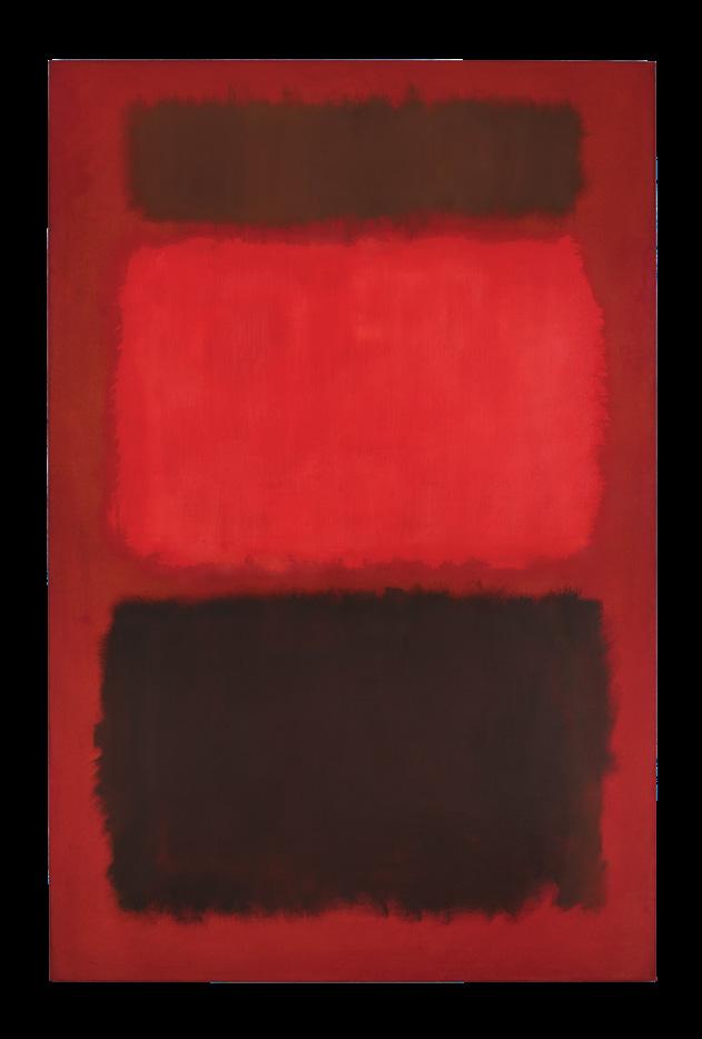
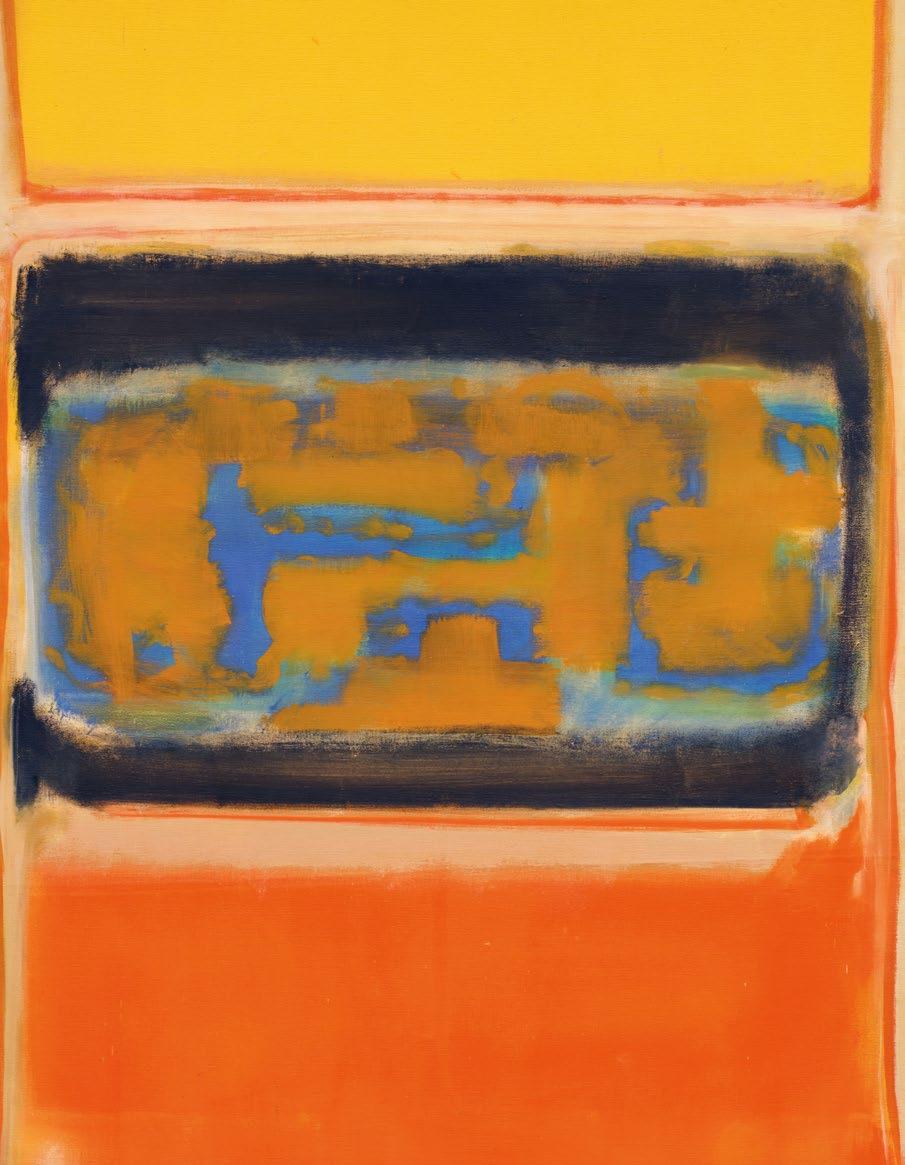
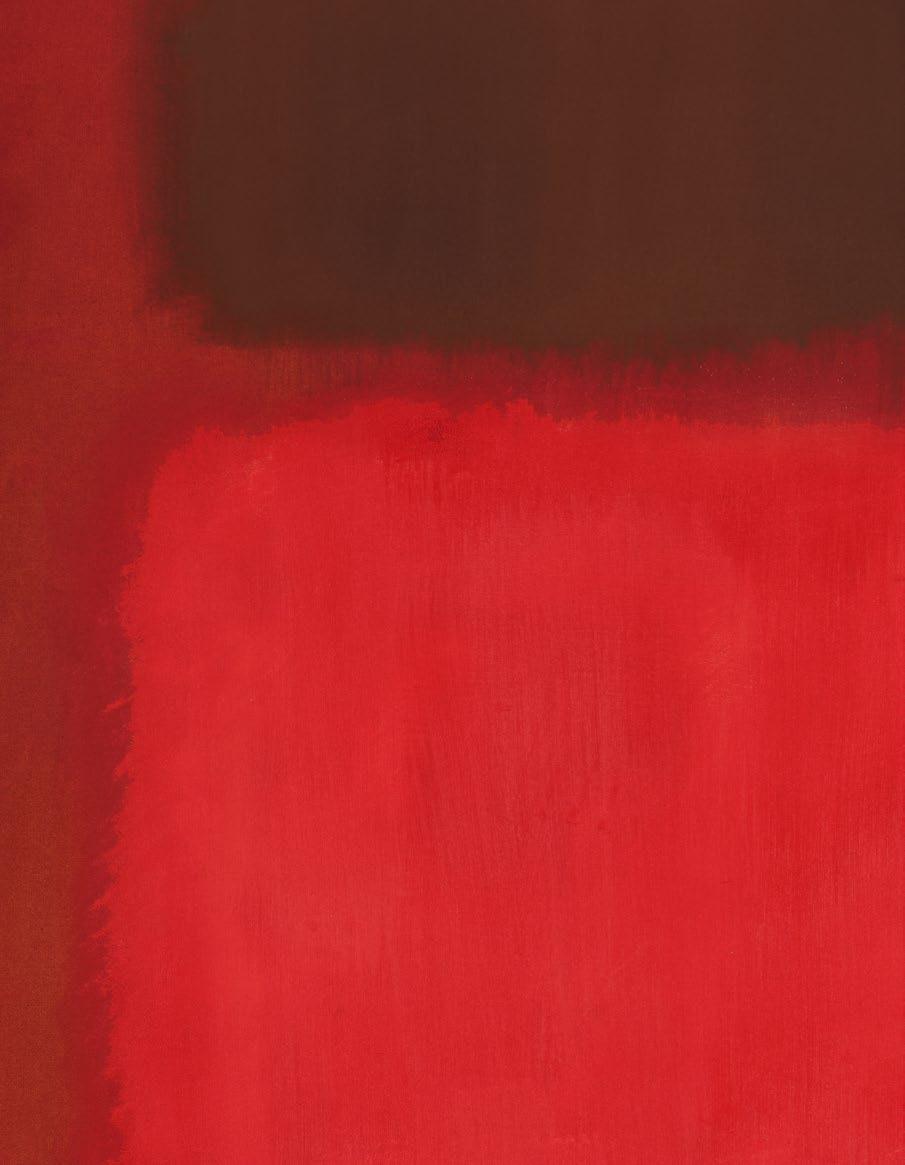
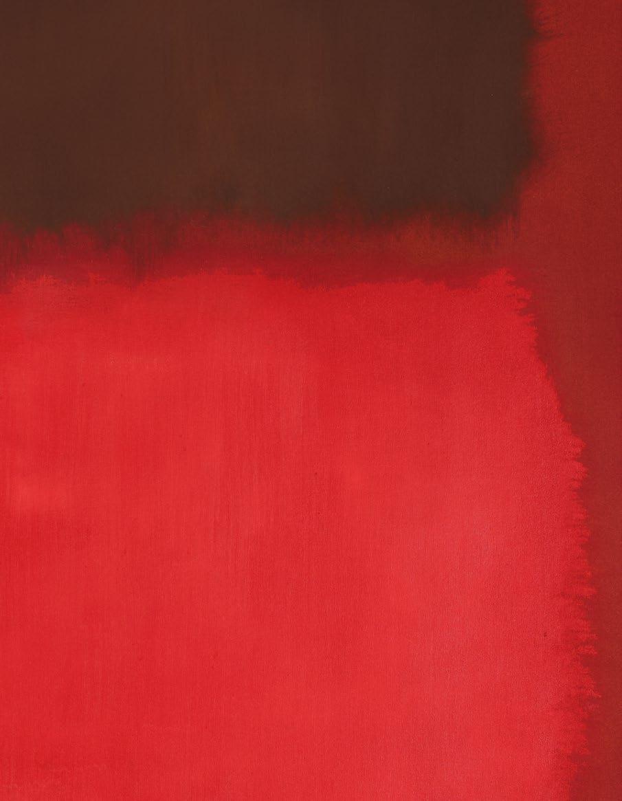
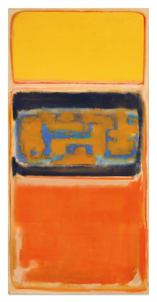
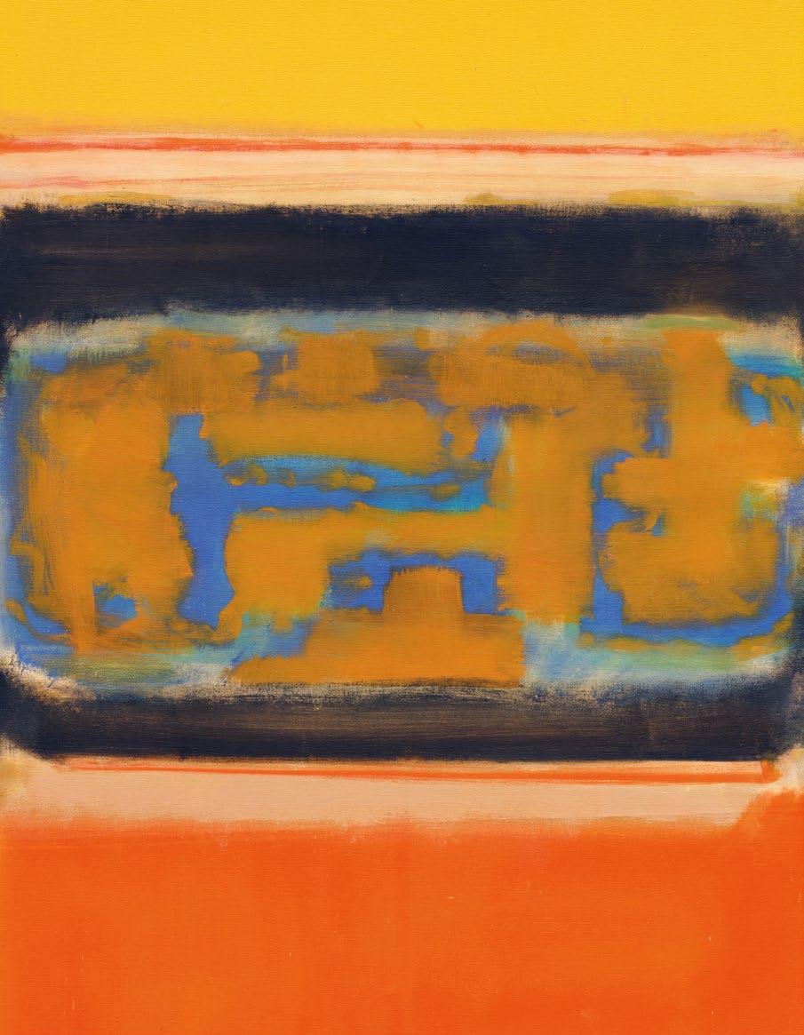
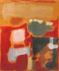
Lot 5, Rothko
Front flap
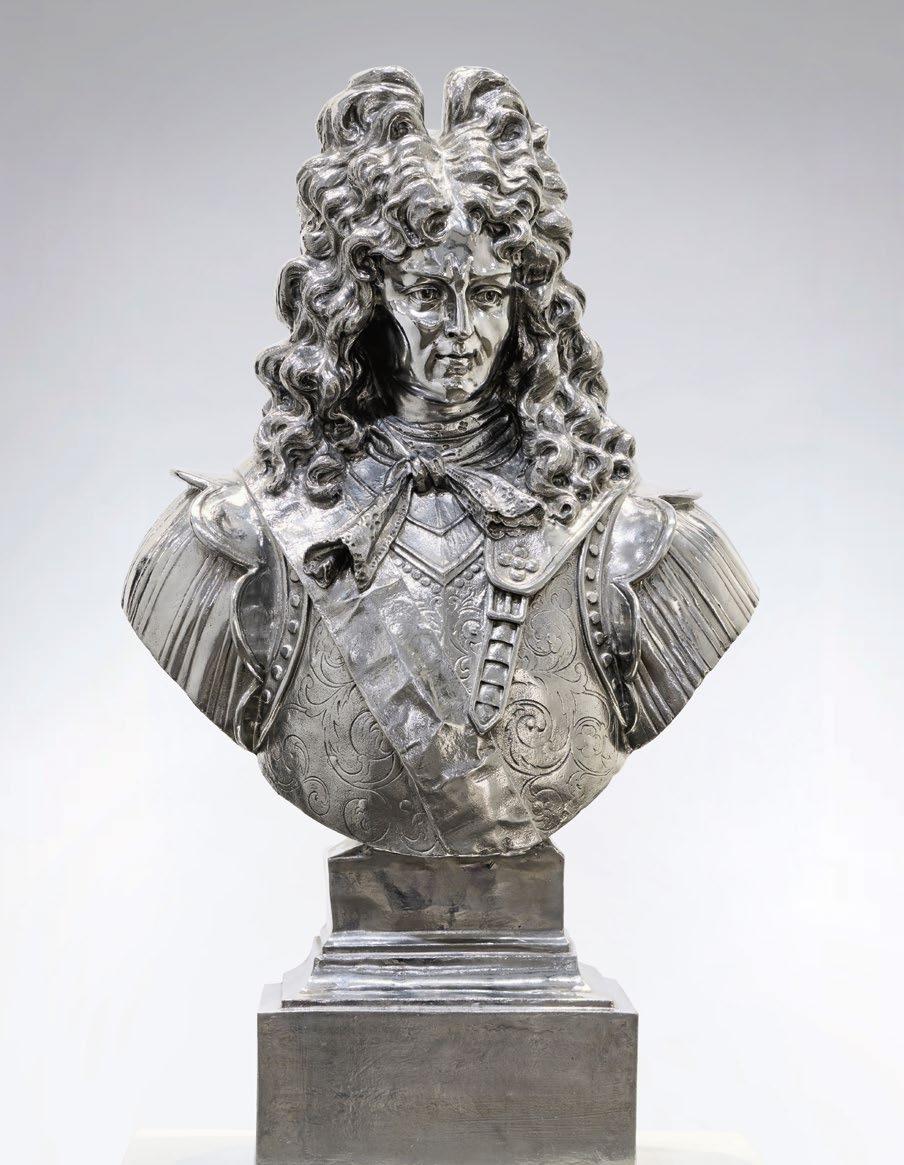
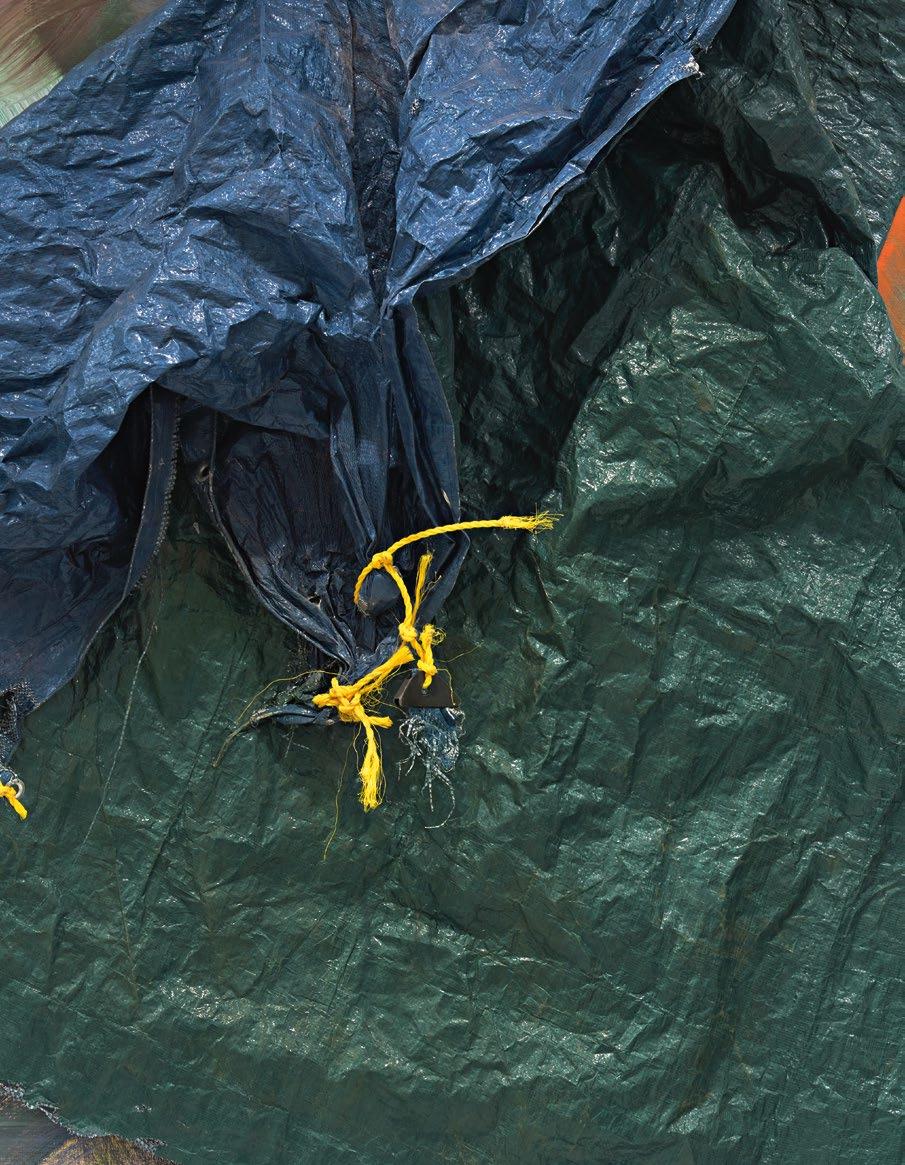
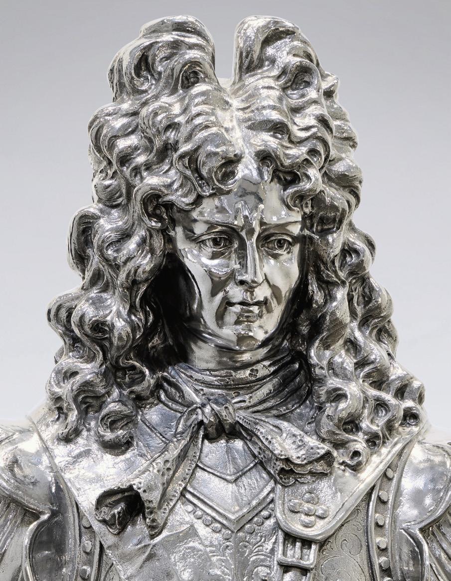
Lot 7, Koons (detail)
Back cover
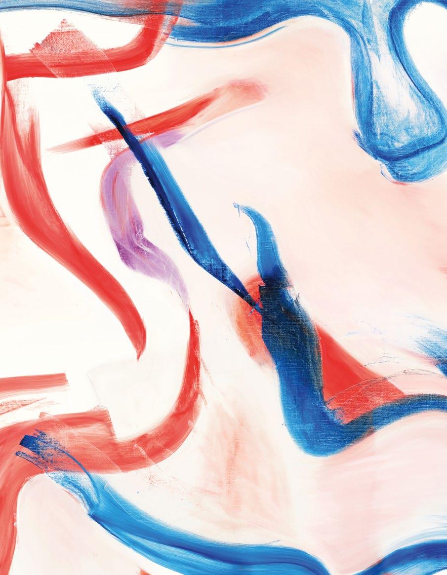
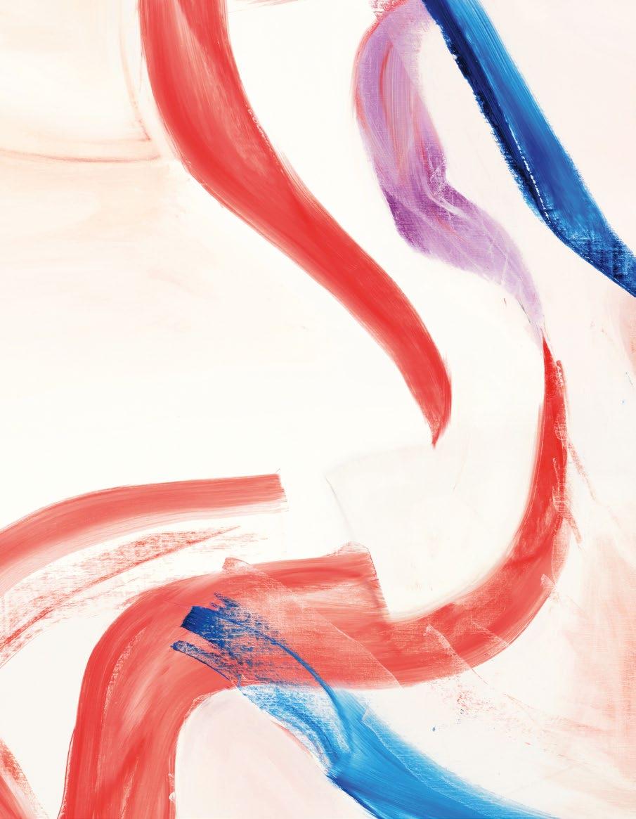
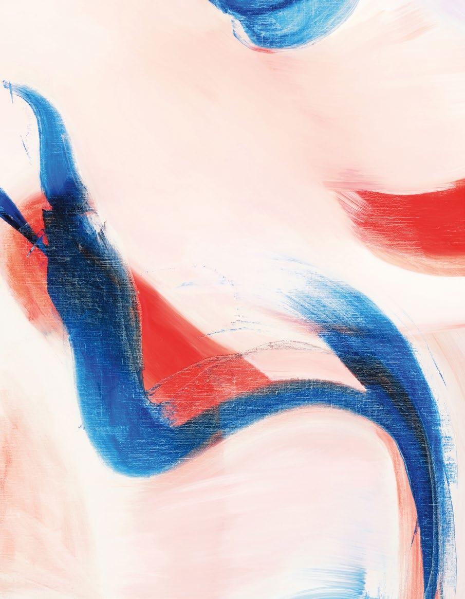
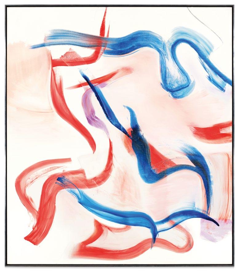
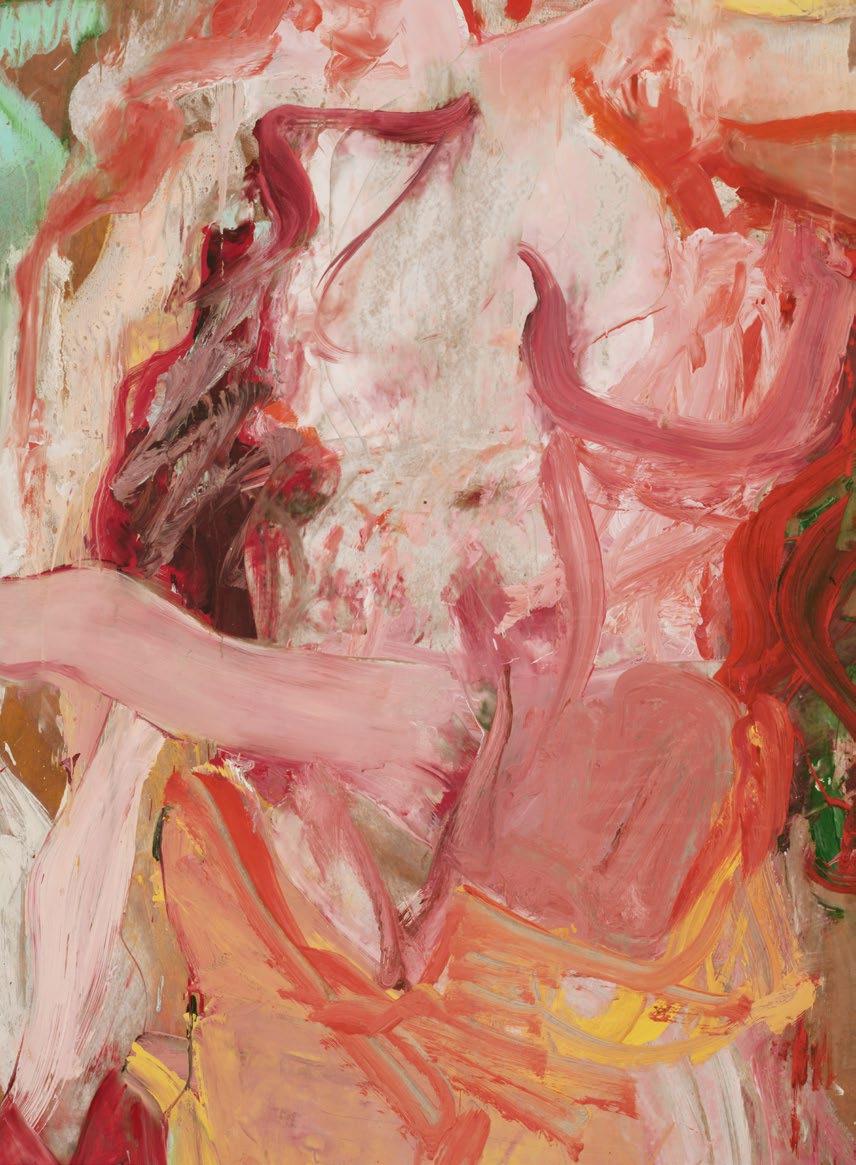
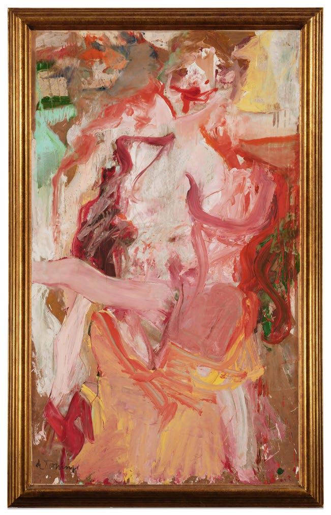
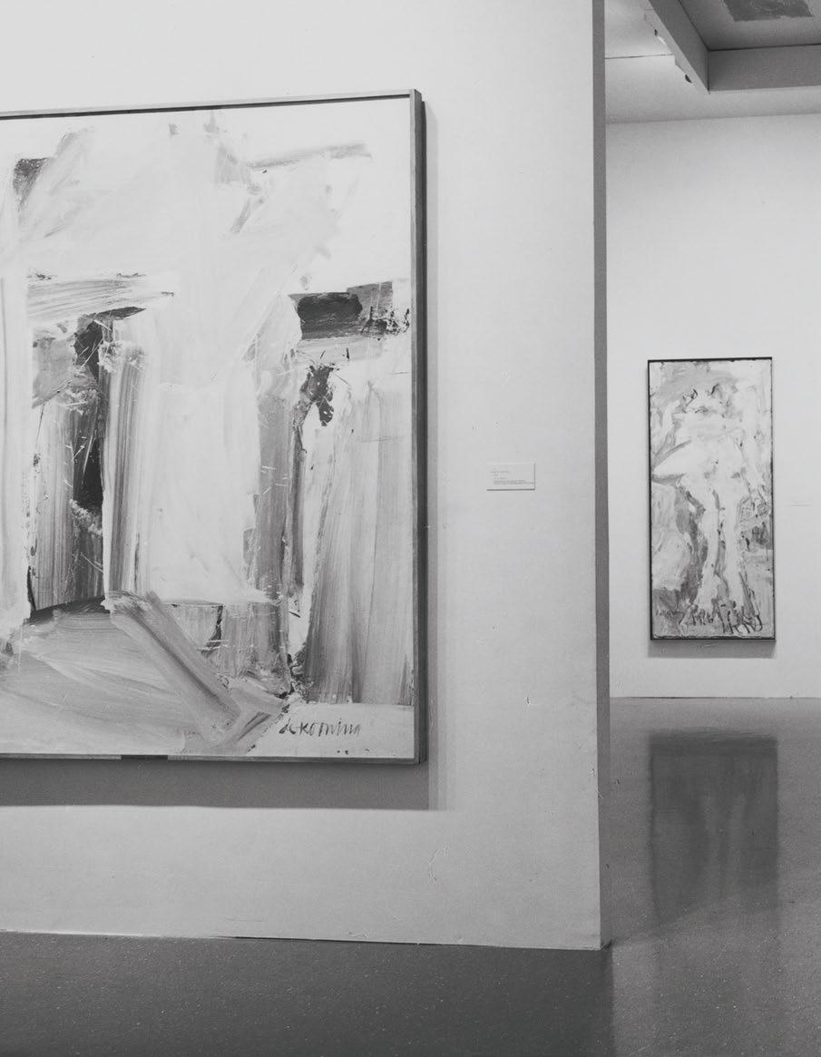
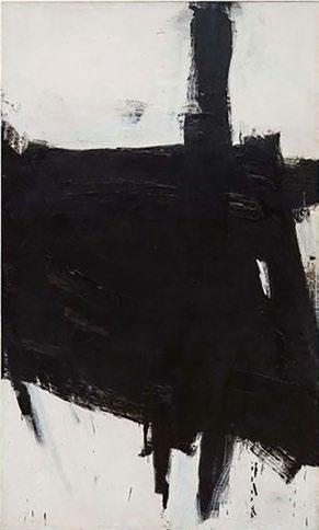
4, de Kooning
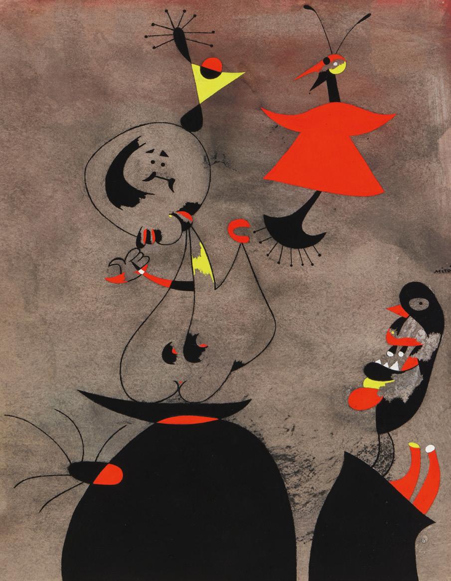
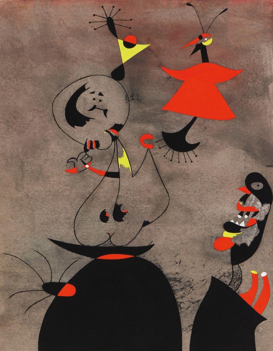
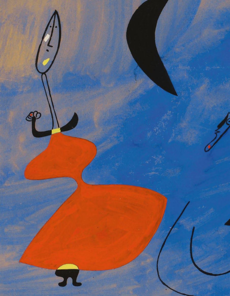
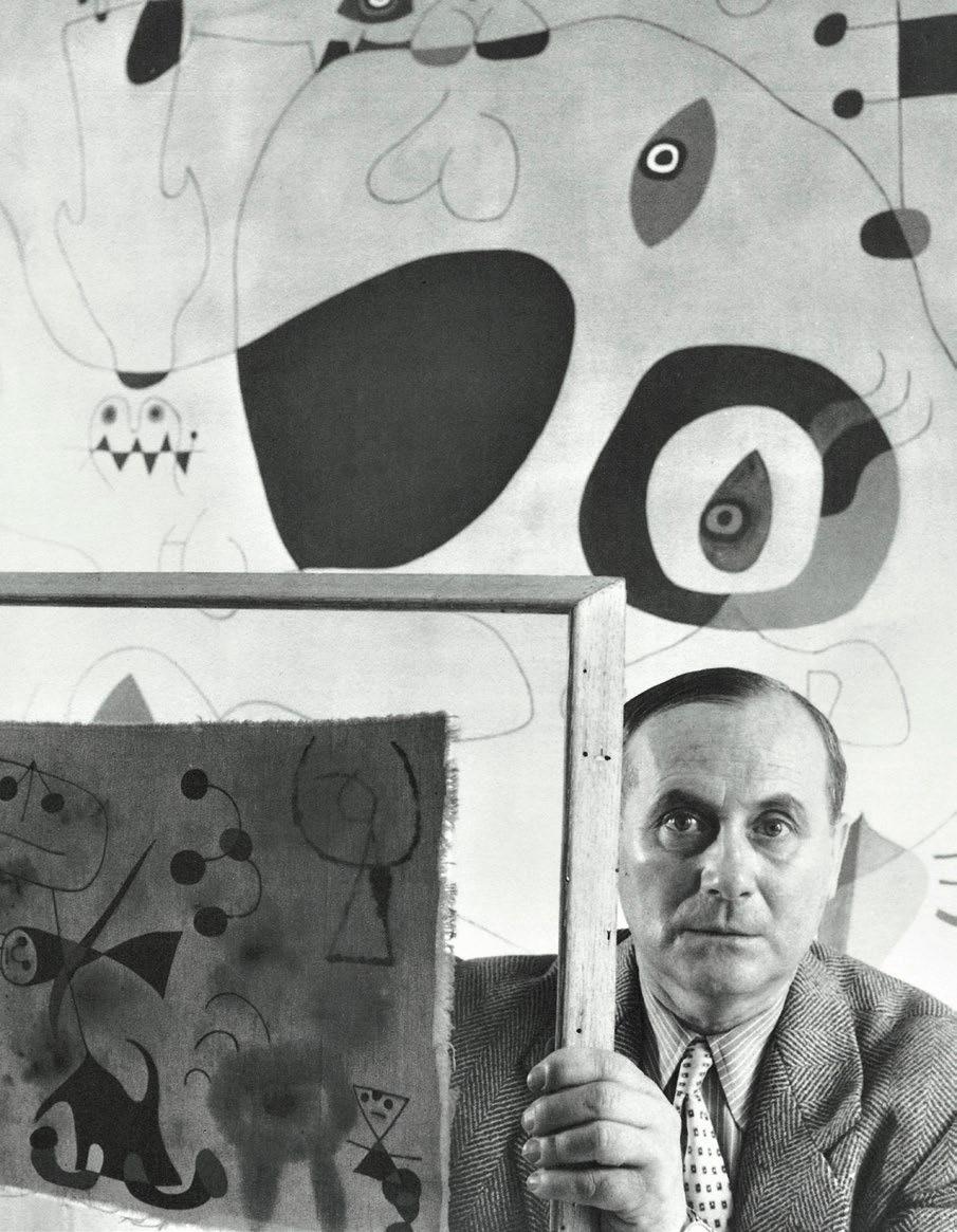
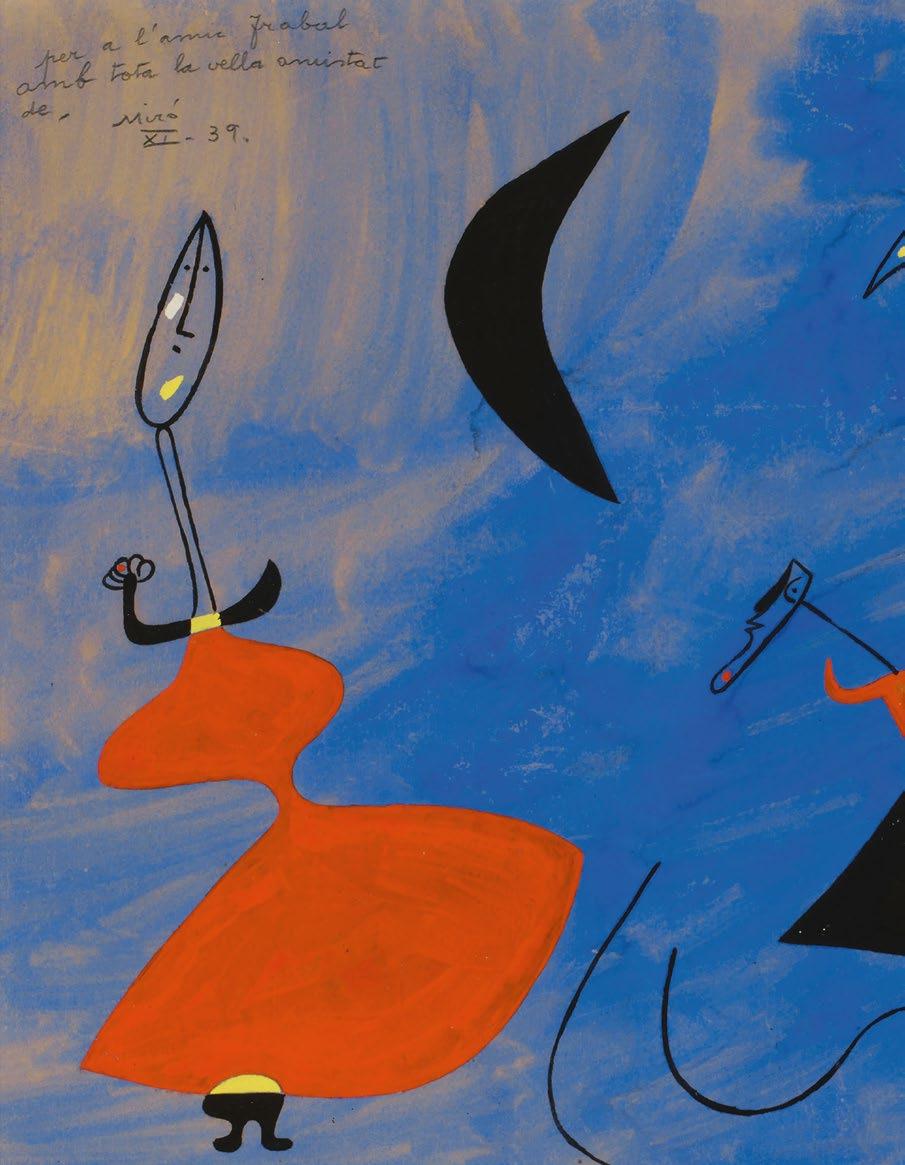
Back flap Lot 3, Miró (detail)
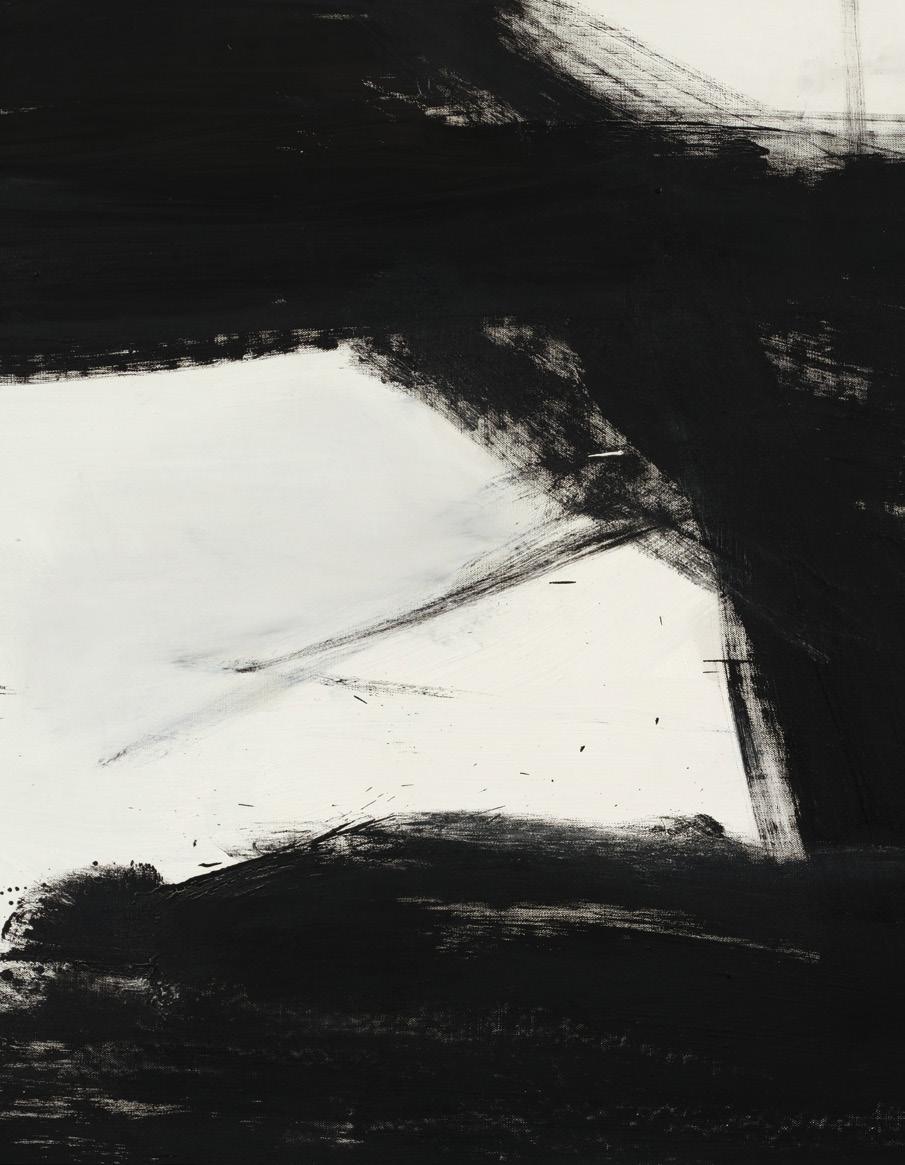
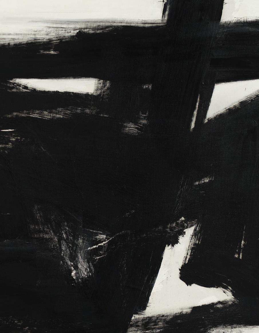
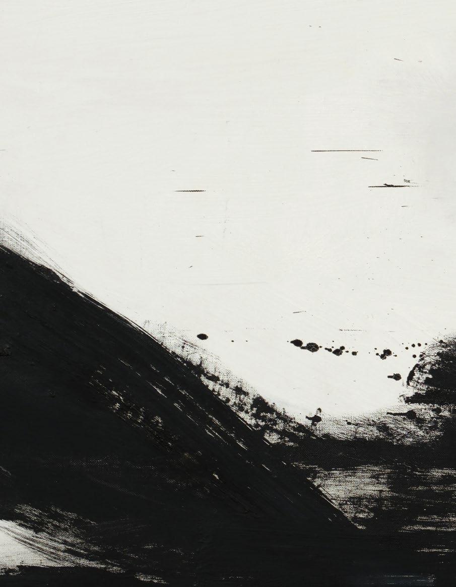
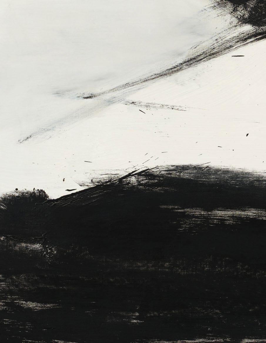
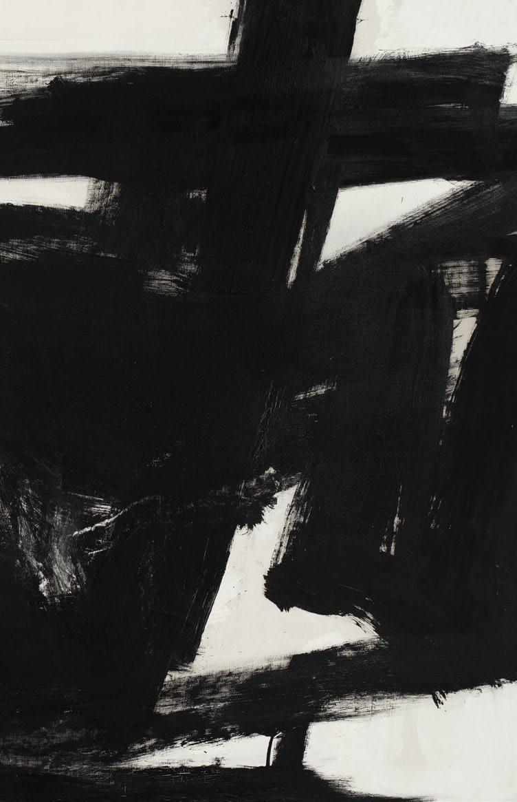
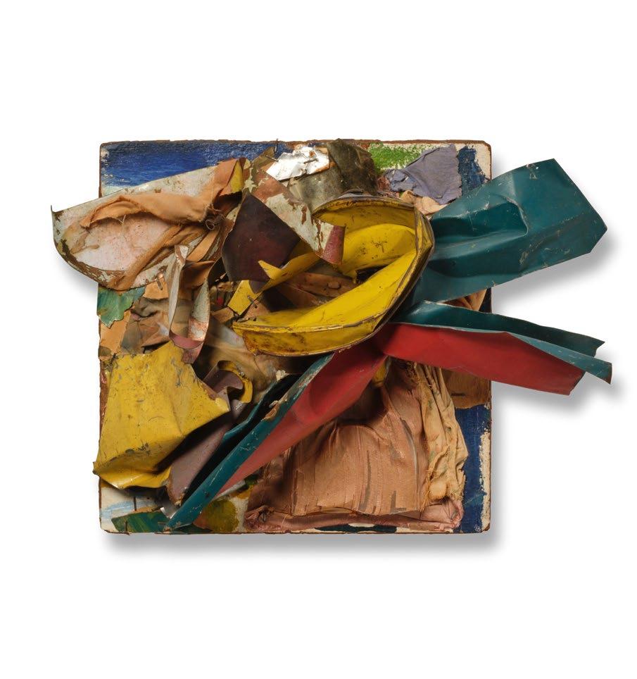
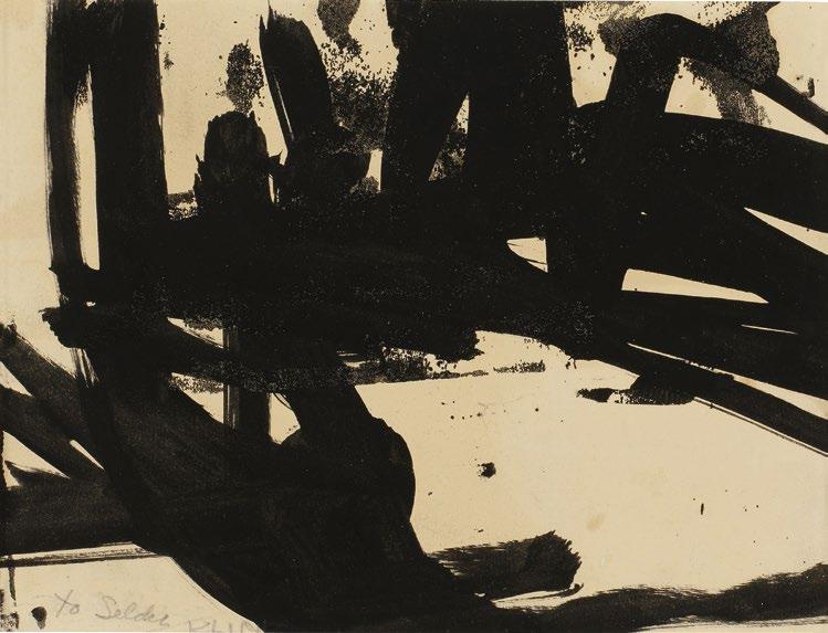
6, Kline (detail)
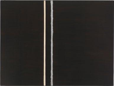
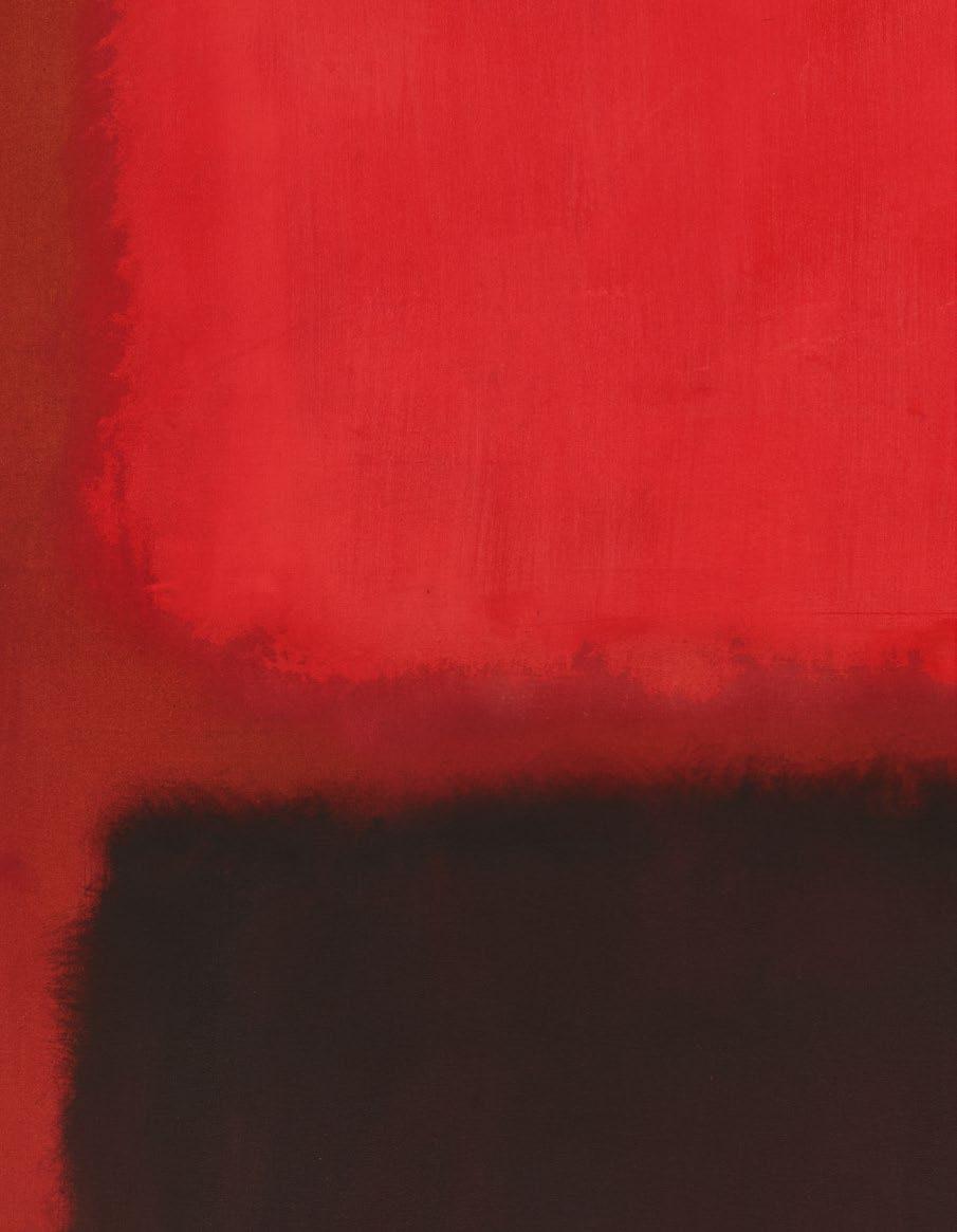
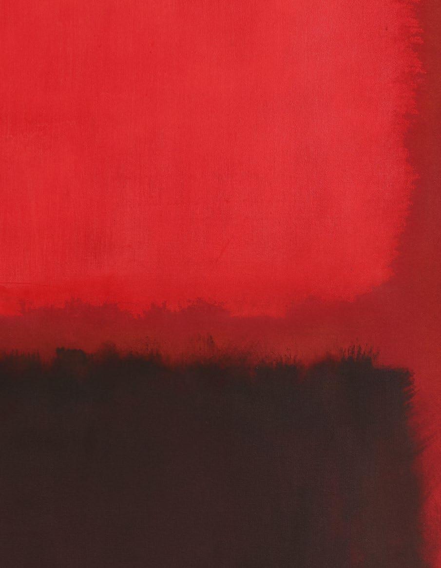
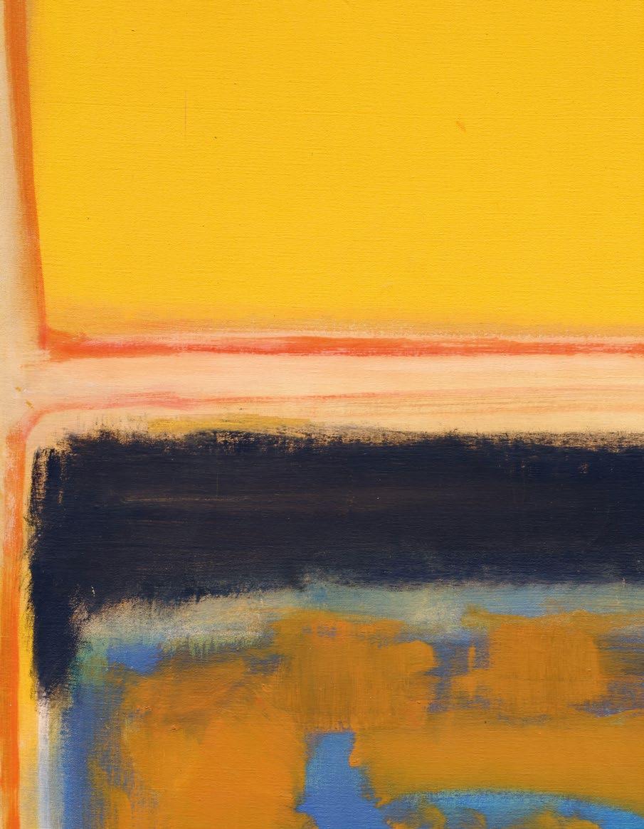
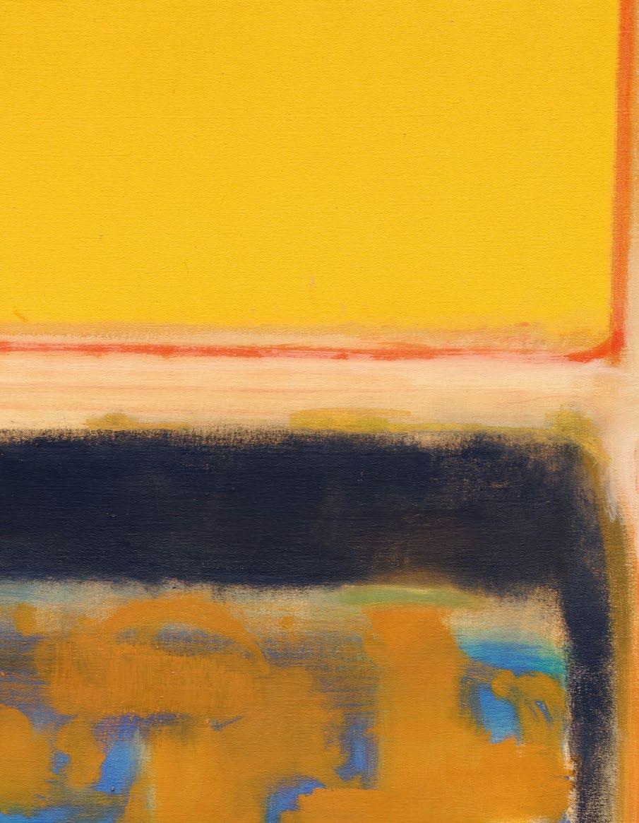
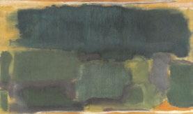
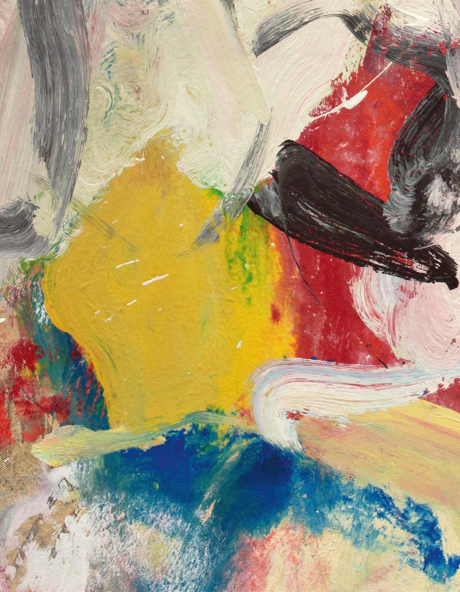
8, Rothko (detail)
AUCTIONS IN NEW YORK
Robert Mnuchin: Collector at Heart Evening Auction 14 May 2026
Contemporary Day Auction 15 May 2026
Modern Day Auction 20 May 2026
945 Madison Avenue New York, NY 10021 +1 212 606 7000 sothebys.com FOLLOW US @SOTHEBYS
CHAIRMEN
LISA DENNISON
Chairman, Americas Lisa.Dennison@Sothebys.com
GREGOIRE BILLAULT
Chairman, Contemporary Art Gregoire.Billault@Sothebys.com
SPECIALISTS
CONTEMPORARY ART
COURTNEY KREMERS
Vice Chairman
Head of Private Sales, Americas Courtney.Kremers@Sothebys.com
DAVID GALPERIN
Vice Chairman
Head of Contemporary Art, Americas David.Galperin@Sothebys.com
LUCIUS ELLIOTT
Head of Contemporary Marquee Sales Lucius.Elliott@Sothebys.com
SERENA HILDEBRANDT
Specialist Serena.Hildebrandt@Sothebys.com
DEVON MIFFLIN
Associate Specialist Devon.Mifflin@Sothebys.com
CAROLYN KIM
Associate Specialist Carolyn.Kim@Sothebys.com
ASHKAN BAGHESTANI
Head of Contemporary Day Auction Ashkan.Baghestani@Sothebys.com
ALYA SAMA
Specialist Alya.Sama@Sothebys.com
IMPRESSIONIST & MODERN ART
JULIAN DAWES
Vice Chairman
Head of Impressionist & Modern Art, Americas Julian.Dawes@Sothebys.com
SCOTT NIICHEL
Vice Chairman
Head of Middle Market of Modern & Contemporary Art Scott.Niichel@Sothebys.com
ALLEGRA BETTINI
Head of Modern Art Marquee Sales Allegra.Bettini@Sothebys.com
EDITH EUSTIS
Global Head of Research, Modern Edith.Eustis@Sothebys.com
SARA LAND
Specialist Sara.Land@Sothebys.com
GENEVIEVE RICHARDSON
Cataloguer
Genevieve.Richardson@Sothebys.com
ZOE ZANETEAS
Deputy Head of Modern Day Auctions Zoe.Zaneteas@Sothebys.com
RACHEL HANSEN
Associate Specialist
Rachel.Hansen@Sothebys.com
ENQUIRIES
SALE NUMBER
EVENING N12122
CONTEMPORARY DAY N12129
MODERN DAY N12125
BIDS DEPARTMENT
+1 212606 7414
FAX +1 212 606 7016 bids.newyork@sothebys.com
Telephone bid requests should be received 24 hours prior to the sale. This service is offered for lots with a low estimate of $5,000 and above.
PRE-SALE COORDINATOR
Abbey Flamm Contemporary Art Abbey.Flamm@Sothebys.com
ACCOUNTS RECEIVABLE
For invoices and payment inquiries, please contact Olivia Hu
Client Accounts Receivable Manager Contemporary Art Olivia.Hu@Sothebys.com
CLIENT EXPERIENCE
For delivery and collection, please contact +1 212 606 7444 US.CX@sothebys.com
IMPORTANT NOTICE
ALL LOTS IN THIS COLLECTION ARE GUARANTEED. The seller of all lots in this collection has been guaranteed a minimum price. Sotheby’s may engage a third party to provide an Irrevocable Bid that would be executed during the applicable sale at a value that ensures the lot will sell.
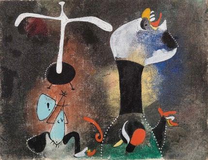
Lot 3, Miró (detail)
“ I LOVE TO BE AROUND ART. I REALLY BELIEVE I HAVE THE HEART OF A COLLECTOR.”
Robert Mnuchin
Alifelong collector, Robert Mnuchin’s illustrious second career as a dealer and trusted advisor, following his first in banking, indelibly shaped the tenor, texture, and spirit of this generation’s most formidable collections—one of which is his own. Led by pivotal Abstract Expressionist masterworks by Mark Rothko, Willem de Kooning, and Franz Kline, the works Robert and Adriana collected reflect a true continuity in vision and instinct. Mnuchin’s steadfast dedication to championing these artists not only guided his gallery’s programming but also reflected in his personal collection, culminating here in some of the most significant examples created by each artist. Driven by a sophistication of taste and indefatigable conviction when pursuing works of the highest quality, Robert Mnuchin: Collector at Heart stands as a capsule of Robert and Adriana’s incomparable eye and intuition.
The story of the art world today cannot be told without the legacy of Robert Mnuchin. Born in 1933, Mnuchin’s encounters with American postwar art were cultivated early on, with his family having collected works by Franz Kline and Mark Rothko in their home, first in Manhattan’s Upper West Side and then in Scarsdale, New York. His career, however, began on Wall Street. Today heralded as one of the great elder statesmen of American banking, Mnuchin joined Goldman Sachs in 1957 and was made partner a decade later. At the helm of the firm, he revolutionized the then-nascent block trading industry and, in 1980, went on to join Goldman Sachs’ management committee.
All the while, Robert and his wife Adriana had been assembling one of the most significant private collections in the country. Refined over decades through carefully considered yet always deeply instinctual acquisitions, the collection has seen countless masterworks. In addition to the major paintings, sculptures, and works on paper included in Robert Mnuchin: Collector at Heart, the Mnuchins’ holdings have spanned Barnett Newman’s The Promise from 1949, one of the artist’s earliest Zip paintings donated by the Mnuchins to the Whitney Museum of American Art in New York, Franz Kline’s Untitled from 1957, which later achieved a record price of $40.4 million for the artist in a 2012 auction and the study for which is included in the Contemporary Day Auction, Willem de
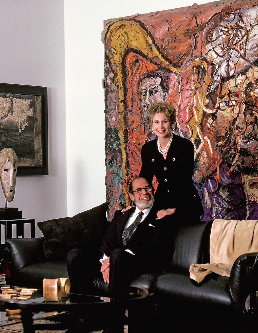
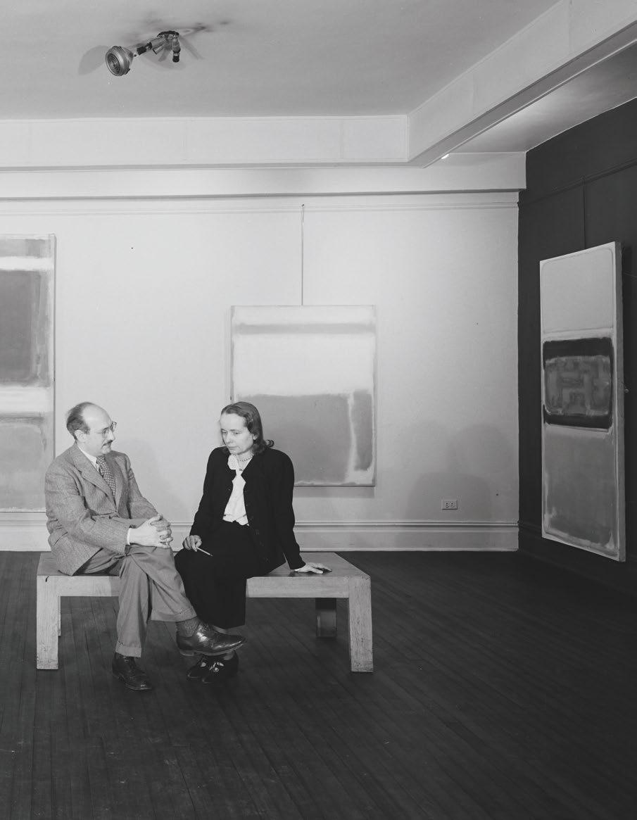
Adriana and Robert Mnuchin photographed by William Waldron for Galeries Magazine (1988)
“ THE PAINTINGS LIT MY DAD UP. THEY WERE HIS FRIENDS AND HIS CHILDREN. SOMETIMES WHEN WE COULDN’T GET HIS ATTENTION, WE KNEW HE WAS HANGING PAINTINGS IN HIS HEAD.”
Valerie Mnuchin
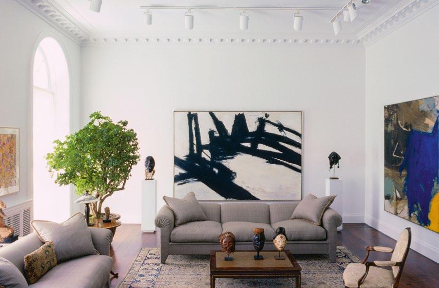
Kooning’s seminal …Whose Name Was Writ in Water from 1975, again donated by Robert and Adriana to the Solomon R. Guggenheim Museum in New York, to Frank Stella’s Orphir from 1962, a rare and monumental Copper Painting now at the Yale University Art Gallery in New Haven, among numerous important examples by Mark Rothko, Cy Twombly, Brice Marden, and Andy Warhol, and others. These works not only adorned the walls of their home but were the sole reason for having walls at all: each residence they occupied functioned as a backdrop for the collection, refined and minimal so that the art could sing. In fact, Robert and Adriana’s townhouse on East 78th Street, which later became Mnuchin’s gallery space, was purchased to serve as the most optimal gallery for their collection.
So irrepressible was Mnuchin’s love for art that collecting alone couldn’t contain the bounds of his interest. Following his retirement from Goldman Sachs in 1990, he converted part of his townhouse on the Upper East Side and opened C & M Arts in partnership with James Corcoran. His conviction, curatorial eye, and infallible instincts immediately proved as adept at running the gallery as they did for his and Adriana’s personal acquisitions. In 2005, he partnered with Dominique Lévy and renamed the gallery L & M Arts, and in 2013, following her departure, he inaugurated Mnuchin Gallery. Across the various iterations of Mnuchin’s operation, the gallery was simultaneously the respected voice for blue chip postwar art and a wellspring for the cutting-edge twentieth-century avant-garde, often placing the two in an extraordinary, electrifying dialogue. At every juncture, the constant, of course, was Robert himself.
For thirty years, Mnuchin organized and oversaw seminal exhibitions of Mark Rothko, Jackson Pollock, Willem de Kooning, Franz Kline, John Chamberlain, Frank Stella, Donald Judd, and Philip Guston—many of whom are represented in Mnuchin’s private collection and all of whom reflect the sincerity and consistency of his tastes. His tributes to the giants of postwar abstraction were complemented by breakthrough presentations for Alma Thomas, Lynda Benglis, and Lynn Drexler, artists who—largely through Mnuchin Gallery’s intrepid support—were recovered from relative obscurity in the iron-cast lin-
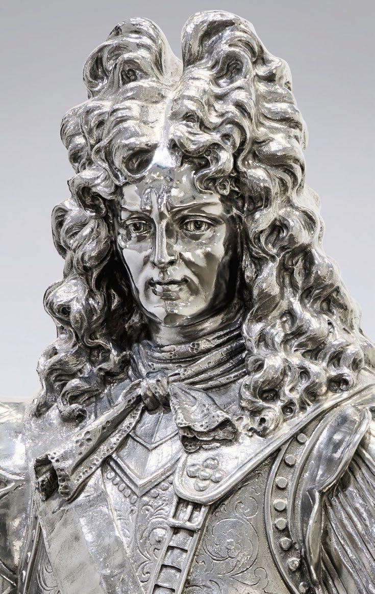
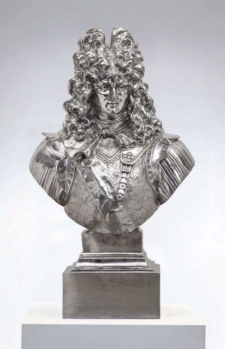
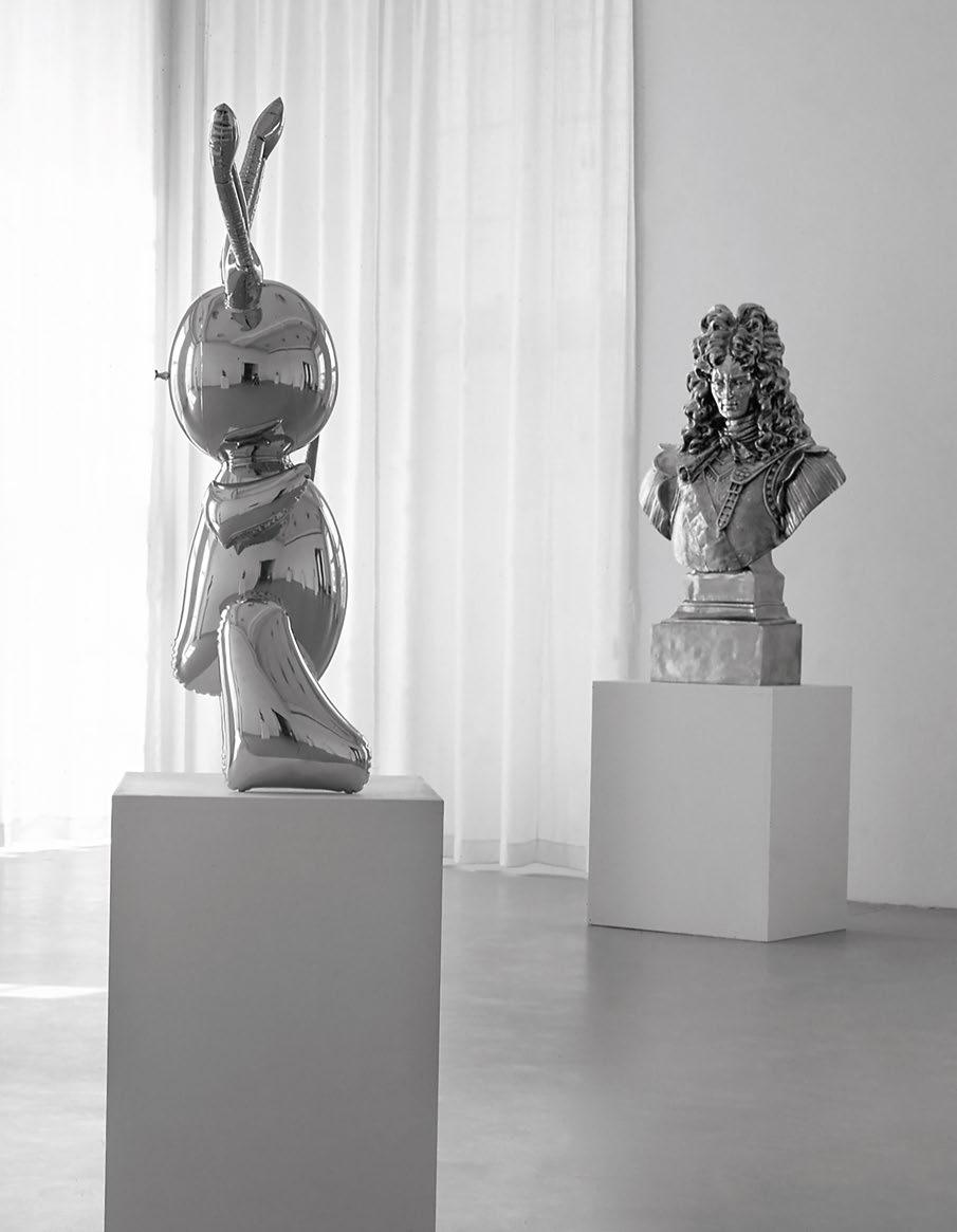
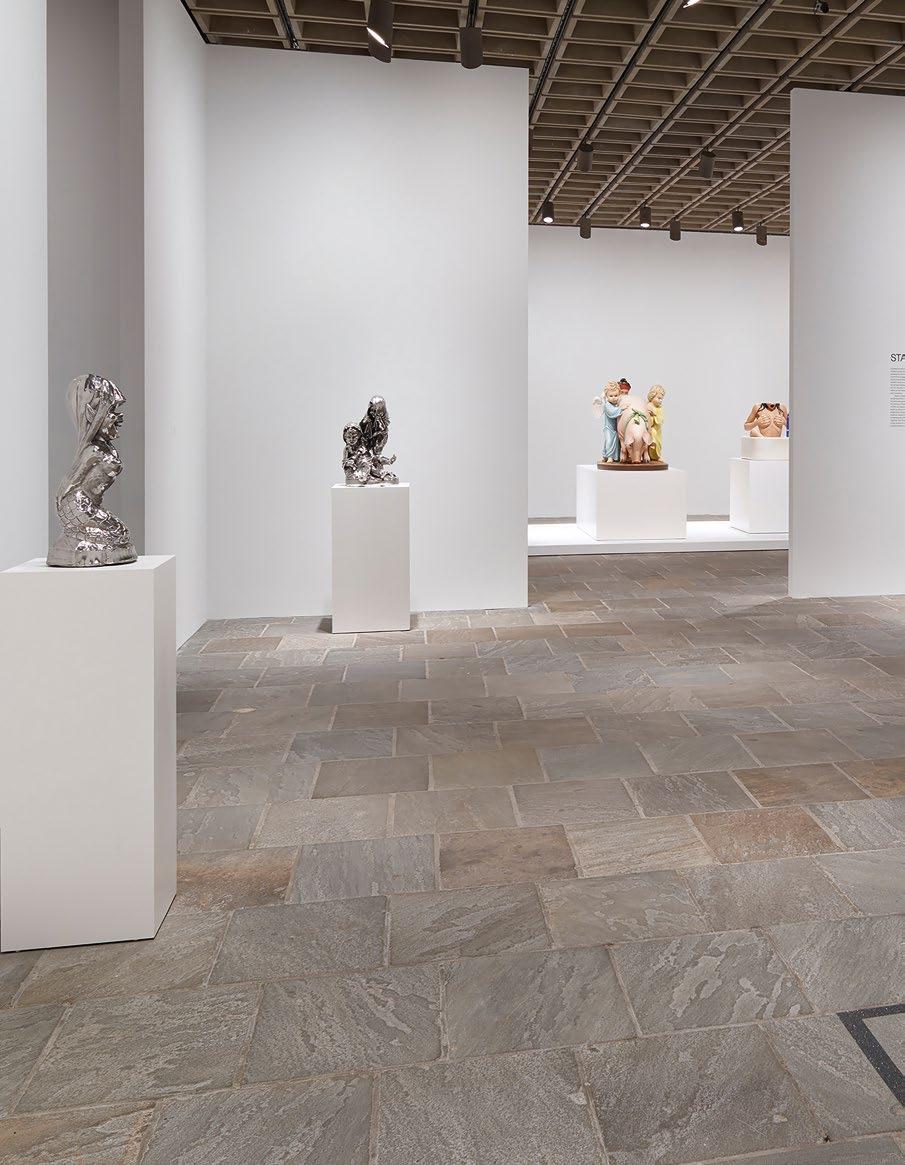
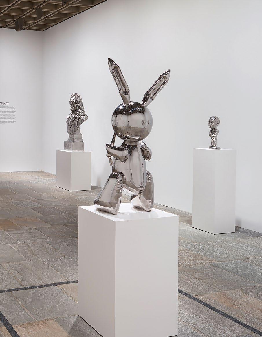
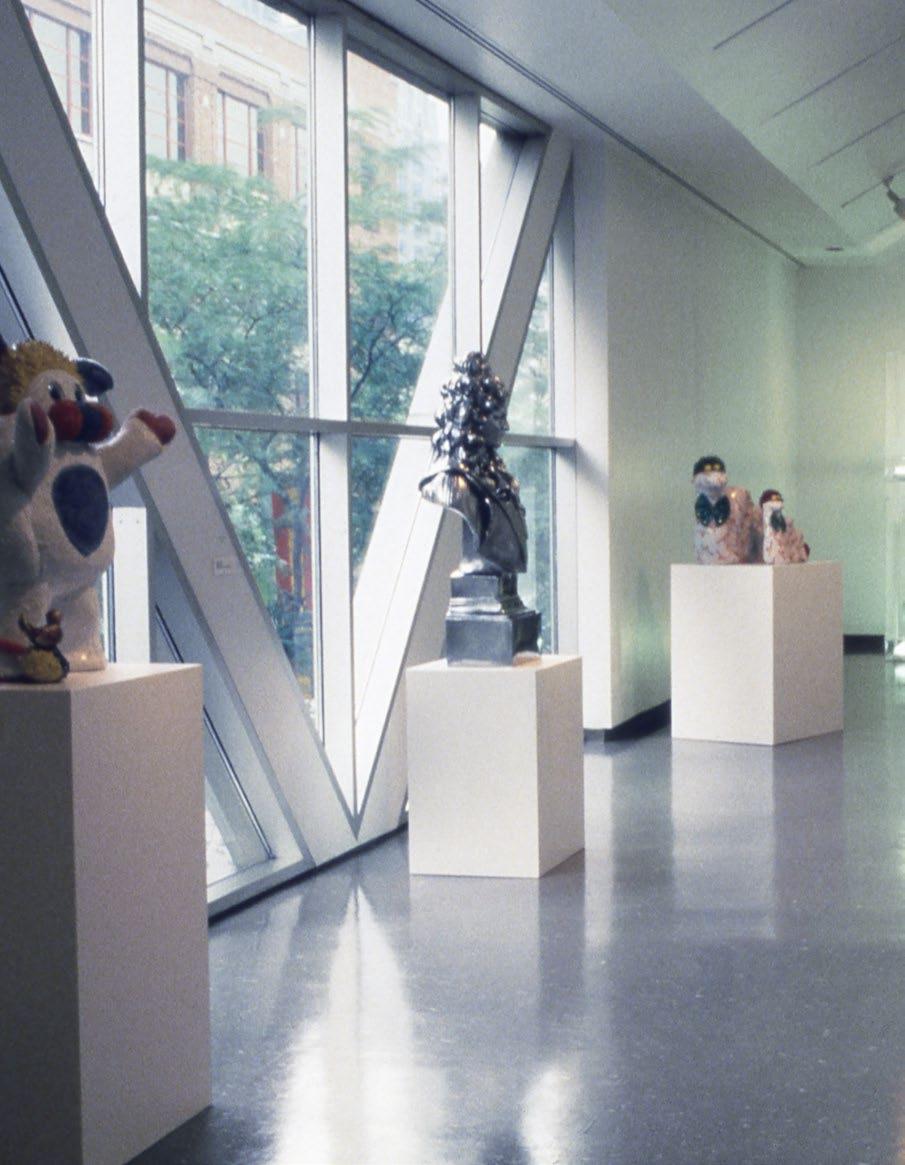
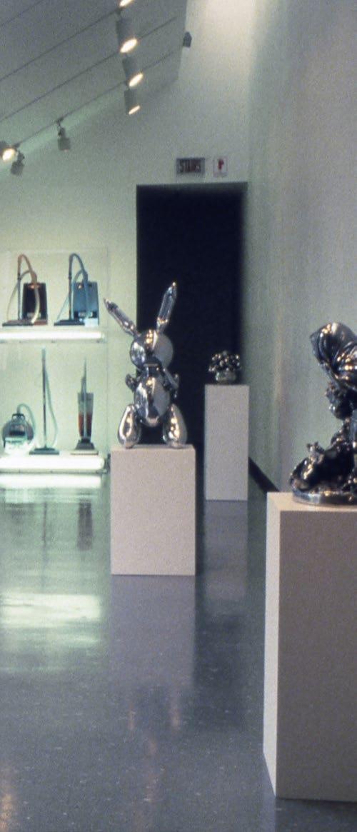
eages of Western art history. Collecting and dealing, selling and buying, to Mnuchin, were always grounded in the same spirit: a tireless and unyielding love for objects of incomparable beauty. In 2004, he mounted a watershed show of Jeff Koons’ work, one often credited with cementing Koons’ status and reputation. Fitting, too, that Mnuchin would make history when he placed the winning bid on Koons’ Rabbit at auction in 2019 on behalf of a collector—a sale that made Koons the most expensive living artist in history. A longstanding supporter of Koons’ oeuvre, Mnuchin acquired another major work from the Statuary series, Louis XIV from 1986, over a decade ago.
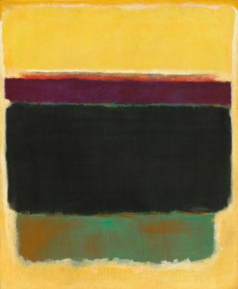
Mnuchin proudly shared his love of art, and the collection he and Adriana cherished and treasured is perhaps the greatest testament to this remarkable life and legacy of all, elegantly summarizing the curiosities that simultaneously absorbed and fulfilled him during his life. The ambient and atmospheric fields of feathered reds and blacks in Mark Rothko’s extraordinary masterpiece, Brown and Blacks in Reds from 1957, is met by the architectonic muscularity of Franz Kline’s panoramic Harleman from 1960. The constellations of primary color and line in Joan Miró’s Dormeurs réveillés par un oiseau
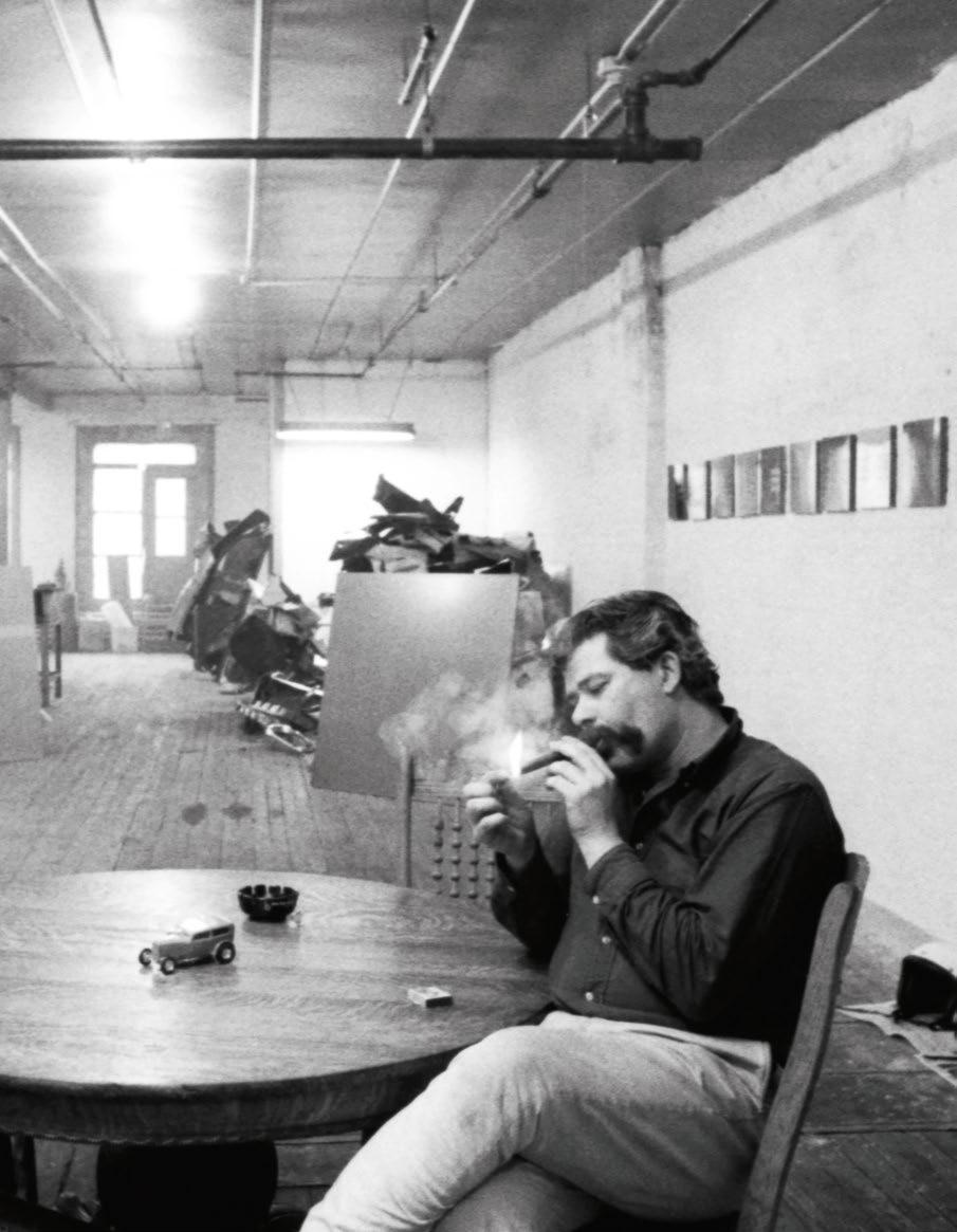
Opposite: Franz Kline in the Mnuchin Collection photographed by William Waldron for Galeries Magazine (1988)
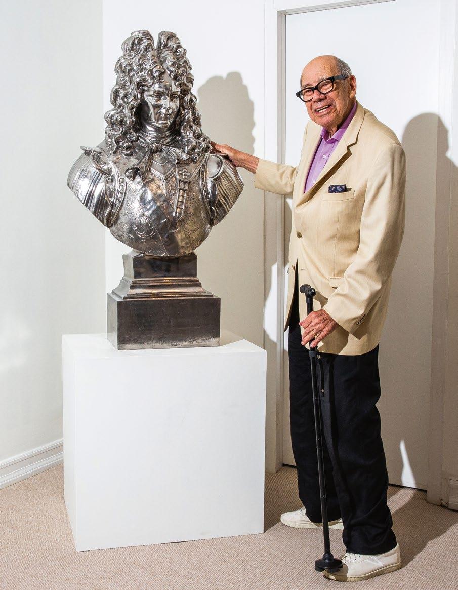
This page: Robert Mnuchin with Lot 7, Koons in 2019
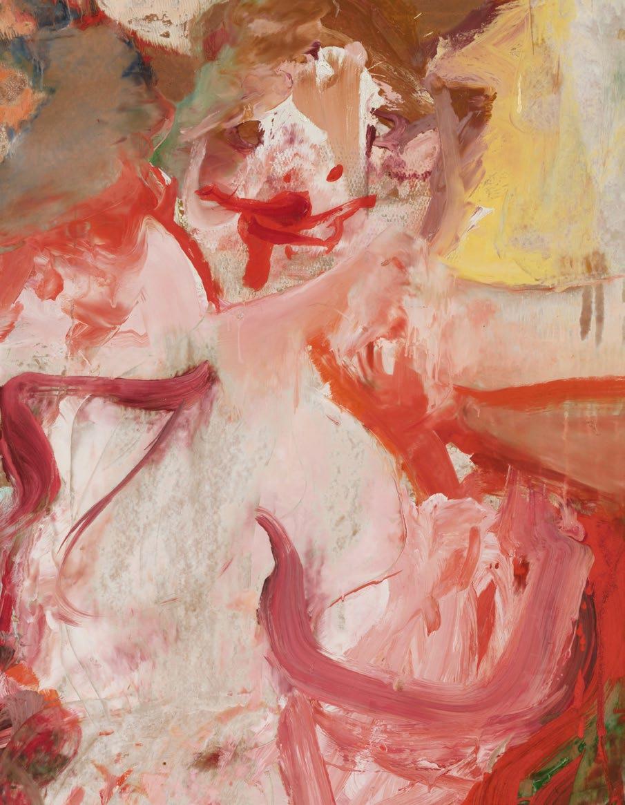
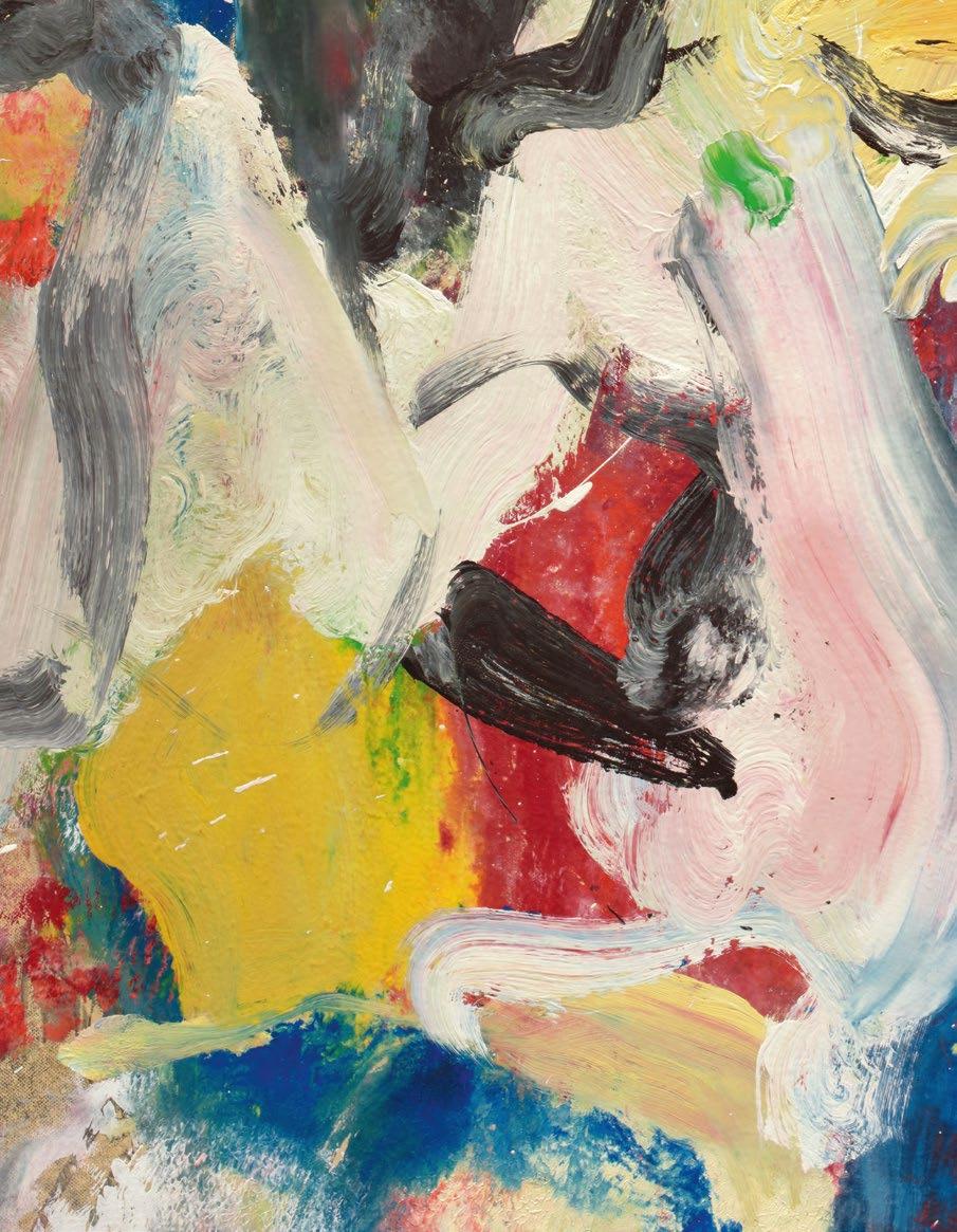
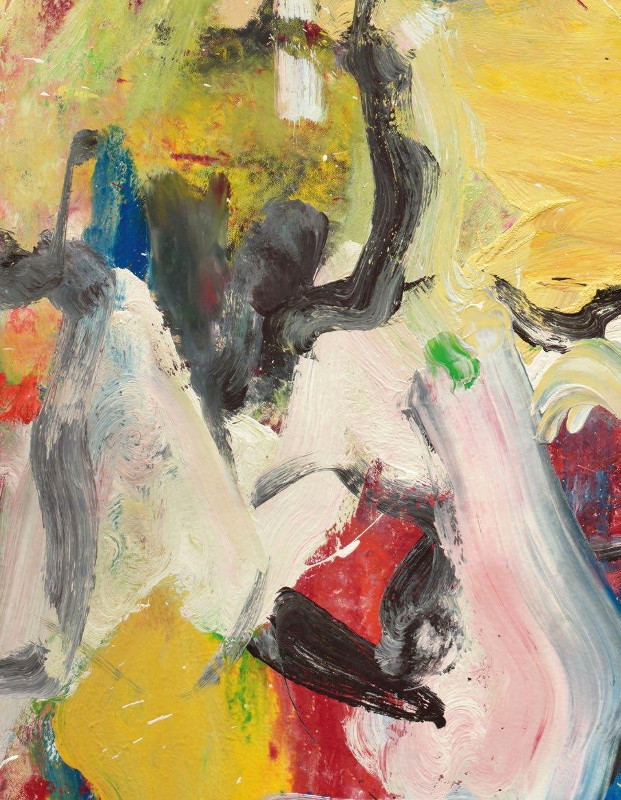
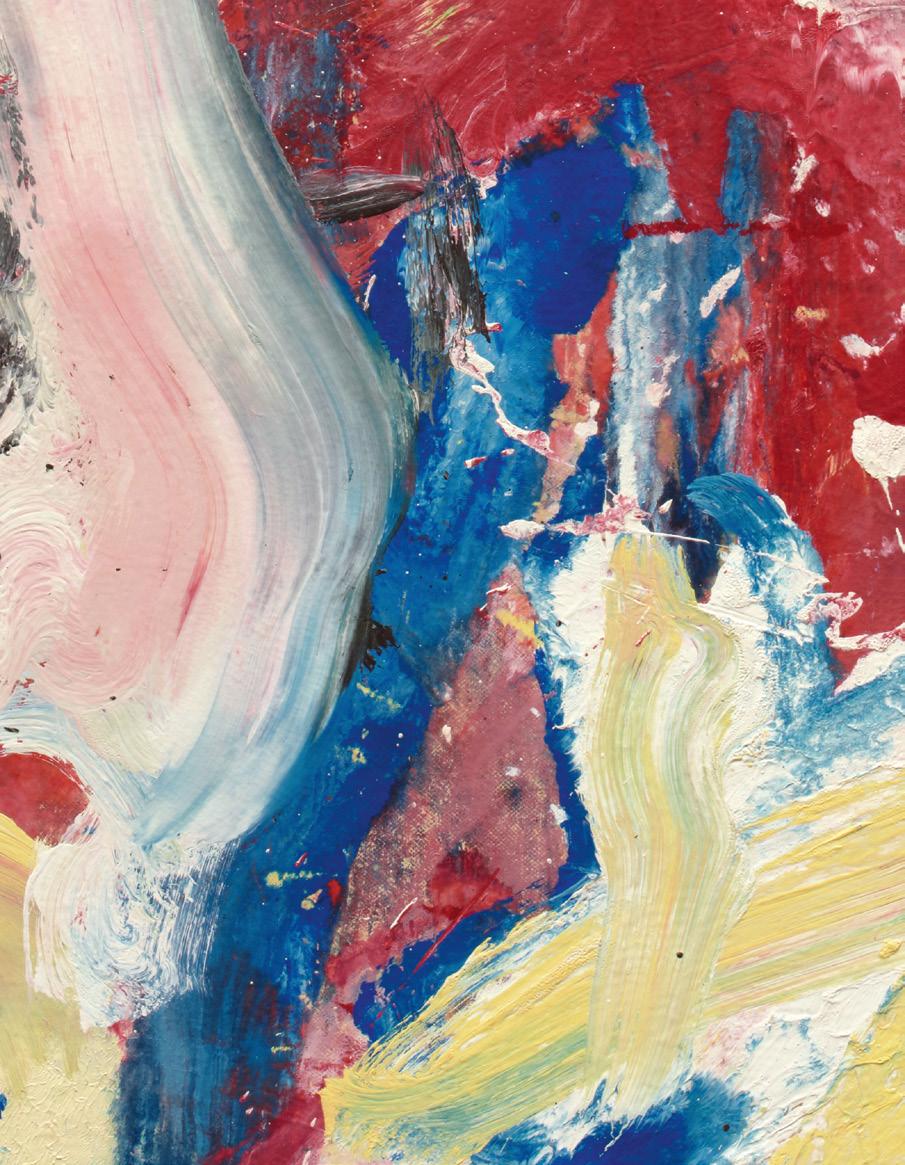
This page: Lot 9, de Kooning (detail)
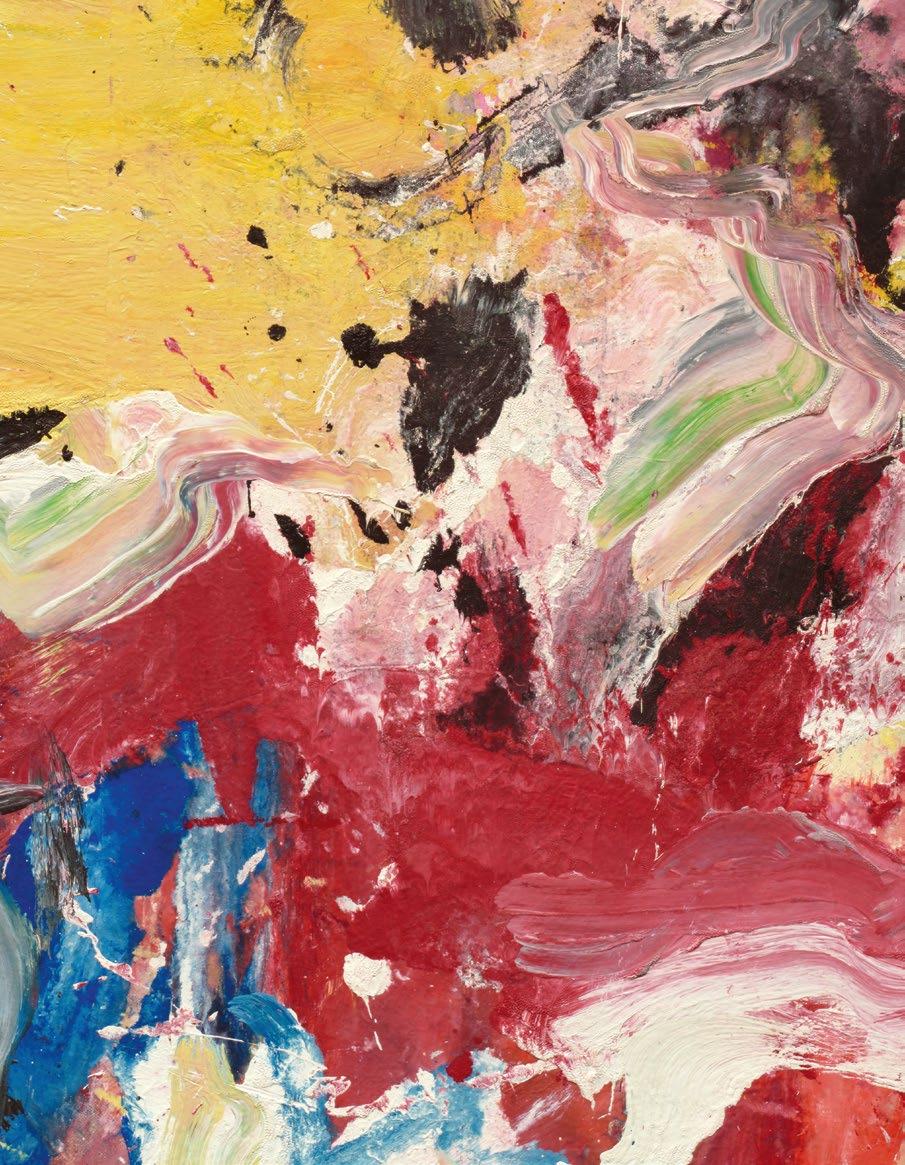
Following spread: Lot 2, de Kooning (detail)
from 1939 couples with the sculptural seated muses of Pablo Picasso’s Deux femmes nues assises from 1921, which together constitute a triumph of European Modernism.
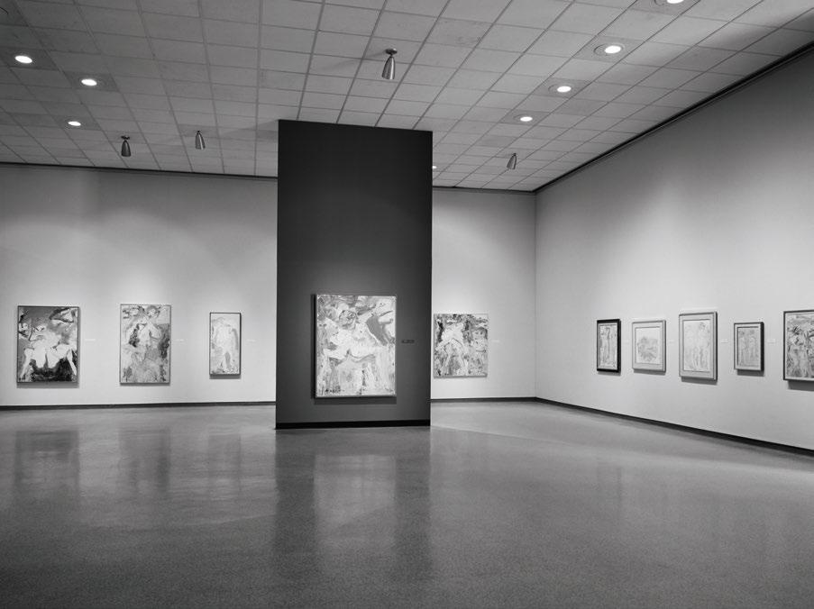
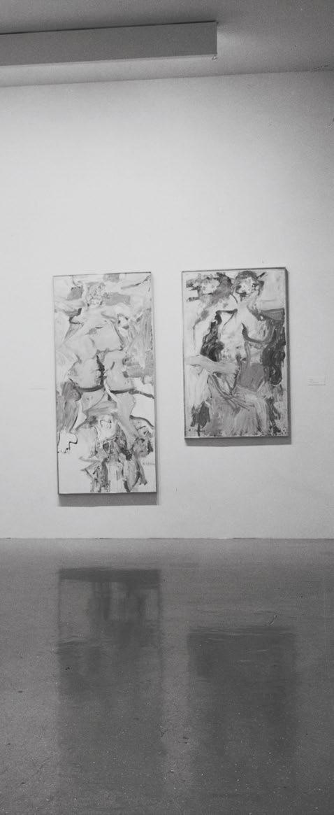
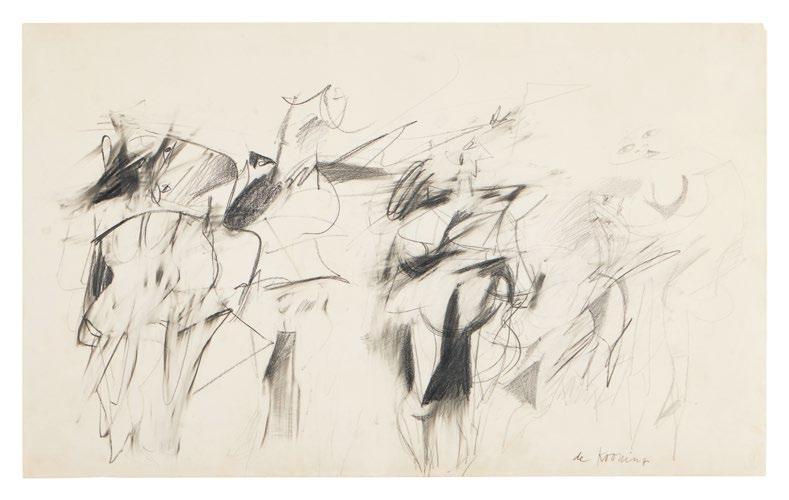
Particularly impressive is the miniature retrospective of Willem de Kooning captured in Mnuchin’s collection, whom he referred to as “the chairman of the board.” The five works here offer a window into the most pivotal developments across four decades of de Kooning’s protean, ever-evolving practice, beginning with the sharp interchanges of the intimate Untitled #4 into the aqueous and widely exhibited Two Women, which at once evokes both flesh and nature, continuing through to the theatrical physicality of the frothy Untitled and ending with quiet, balletic lyricism of Untitled XLII.
“I love what I do,” Mnuchin shared in a 2021 interview with ARTnews, “I’d be lost without it.” (Robert Mnuchin quoted in: Daniel Cassady, “Robert Mnuchin, Goldman Sachs Power Broker Turned Influential Art Dealer, Dies at 92,” ARTnews, 20 December 2025 (online)) The collection exuberantly presents a dissertation on abstraction’s enduring power through the objects that grounded Robert, who, through varied acts in life, found direction and unending inspiration on his very own walls. What remains so remarkable is the continuity in Mnuchin’s taste: from the gallery to his personal collection, he knew what he wanted and loved, and more than anything, believed in it.
Barnett Newman, The Promise, 1949. Whitney Museum of American Art, New York Willem de Kooning, …Whose Name Was Writ in Water, 1975. Solomon R. Guggenheim Museum, New York
EVENING AUCTION | 14 MAY 2026
PABLO PICASSO
1881 - 1973
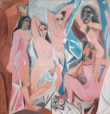
DEUX FEMMES NUES ASSISES
signed Picasso and dated 4-4-21- (lower left) pastel and pencil on paper
8 ¼ by 9 ⅛ in. 21 by 23.2 cm.
Executed on 4 April 1921.
$ 700,000-1,000,000
PROVENANCE
(probably) Richard Goetz, Paris and New York (acquired directly from the artist)
Max Moos, New York
M. Knoedler & Co., New York (acquired from the above on 17 November 1945)
Mrs. Tomás Regalado, El Salvador (acquired from the above on 16 July 1947)
Private Collection (acquired by descent from the above)
Christie’s London, 1 July 1998, lot 1 (consigned by the above)
Acquired at the above sale by the present owner
EXHIBITED
New York, C & M Arts, Picasso: The Classical Period, October - December 2003, no. 3, n.p., illustrated in color (with inverted dimensions)
LITERATURE
Christian Zervos, Pablo Picasso, oeuvres de 1920 à 1922, Vol. IV, Paris 1951, no. 265, pl. 95, illustrated
“ TO ME THERE IS NO PAST OR FUTURE IN ART. IF A WORK OF ART CANNOT ALWAYS LIVE IN THE PRESENT, IT MUST NOT BE CONSIDERED AT ALL. THE ART OF THE GREEKS, OF THE EGYPTIANS, OF THE GREAT PAINTERS WHO LIVED IN OTHER TIMES, IS NOT AN ART OF THE PAST; PERHAPS IT IS MORE ALIVE TODAY THAN IT EVER WAS.”
Following the revolutionary breakthroughs of Analytical and Synthetic Cubism, Pablo Picasso’s artistic production underwent one of its most striking transformations as the artist turned to a Classically-influenced representational mode that would predominate his output at the beginning of the 1920s. This novel style arose in tandem with the sweeping cultural and aesthetic shift that unfolded across Europe following the upheaval and destruction of World War I, known as the rappel à l’ordre —the call to order—in which the currents of abstraction among the pre-war avant garde were repudiated in favor of fine art traditions that offered solace in values
of harmony, structure and realism. Picasso’s pictorial investigations were invigorated during this time as he vacillated between an increasingly dynamic mode of abstraction and a uniquely modern take on Neoclassicism, plumbing a wide range of artistic precedents, from Greco-Roman antiquity to the Italian Renaissance, as well as the great eighteenthand nineteenth-century French masters, to envision a new ideal of human figuration. Executed in April of 1921, Deux femmes nues assises is an exquisite pastel of Picasso’s Neoclassical period that is directly related to the famed painting of the same title held in the collection of the Kunstsammlung NordrheinWestfalen, Dusseldorf.
The artist quoted in: Exh. Cat., New York, The Museum of Modern Art, Picasso: Forty Years of His Art, 1939, p. 11
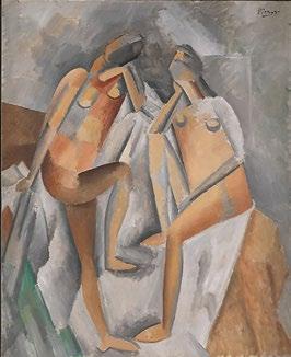
Opposite left: Pablo Picasso, Deux nues, 1909, The Metropolitan Museum of Art, New York
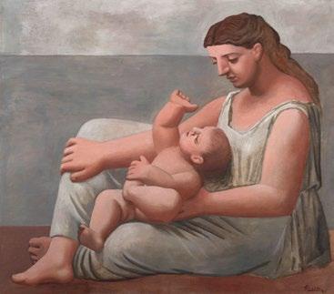
Opposite right: Pablo Picasso, Mère et enfant au bord de la mer, 1921, The Art Institute of Chicago
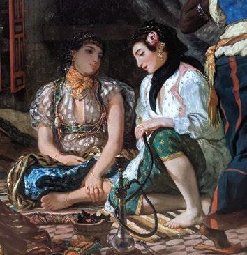
Above left: Eugène Delacroix, Femmes d’Alger dans leur appartement (detail), 1833, Musée du Louvre, Paris
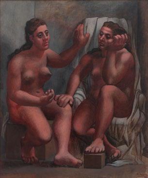
Above right: Pablo Picasso, Deux baigneuses assises 1920, Kunstsammlung Nordrhein-Westfalen, Dusseldorf
This development in Picasso’s oeuvre was deeply informed by a seminal trip to Italy that the artist took in 1917 as he designed stage sets and costumes for Serge Diaghilev’s debut production of Parade in Rome with the Les Ballets russes dance company. Accompanied by friends including composer Igor Stravinsky, writer Jean Cocteau and choreographer Léonide Massine, Picasso traversed the country to visit icons of culture—from the Pompeii ruins and the Colosseum to Naples’ Farnese Collection and the Florentine masters of the Uffizi. In the ensuing years, these travels would impact his mode of expression and subject matter, resulting in grand, timeless figures represented across medium and scale, from small studies in oil to richly-worked pastels and refined drawings.
Picasso’s Italian sojourn coincided with his meeting and courting of Olga Khokhlova, who was then at the apex of her career as a dancer for Les Ballets russes. The couple married shortly thereafter, taking up an apartment on the rue La Boétie, at that time a burgeoning nexus for the Parisian art world. Olga’s elegant visage and poised presence—the sweeping arch of her brow, her long, straight nose and the graceful roundness of her face—embodied the Classical ideals of Picasso’s early 1920s portraiture. This reached an apex in the months following the birth of their son, Paulo, in February 1921, as the novel maternal qualities of his muse spurred an even more profound creative flourishing. While the women that populated Picasso’s works would take on an archetypal appearance, conveying an abiding immutability
and universality, they would always find their basis in Olga as a paragon of Apollonian beauty.
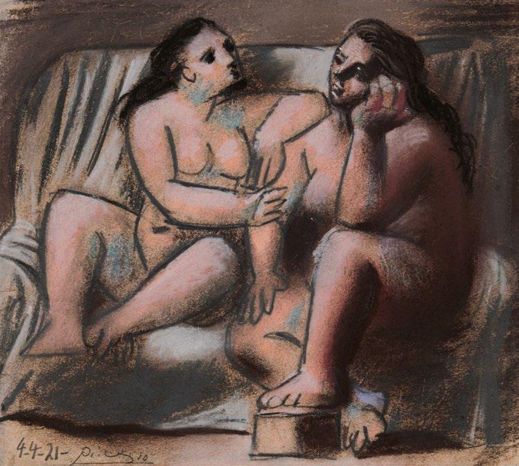
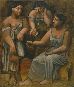
Deux femmes nues assises typifies Picasso’s capacity to harmonize myriad artistic influences to achieve a new—and wholly modern—artistic mode. The duo of magisterial female nudes possess the idealized features, serene expressions, swept hair and sculptural grandeur redolent of both Greco-Roman statuary and Italian Renaissance portraiture. These figures equally achieve the solidity of form that the artist sought to convey in his Cubist portraits. Presenting a potent formal and narrative dialogue, Deux femmes nues assises demonstrates Picasso experimenting with various groupings of female figures, which would culminate just months later during the artist’s storied summer in Fontainebleau with the monumental Trois femmes à la fontaine, considered the magnum opus of
the artist’s Neoclassical oeuvre. As John Richardson, biographer of Picasso, affirms of the present work, “The way Picasso combines figures and draperies into a single configuration—a feature of the Two Nudes as well as the… small paintings, drawings, and pastels that derive from it—has to do with his ever-growing urge to become a sculptor… In the Two Nudes it looks as if they are carved out of a single block of stone…. The magnification in these paintings afflicts those parts of the body—hands, feet, and noses—which protrude and are closest to the viewer. In his quest for gigantism Picasso has looked back at the devices that enabled classic sculptors to monumentalize their figures—devices he had learned from studying the Farnese Marbles in Naples. However, he did not make off with the sacred fire of classicism for mere stylistic considerations. He did so because he wanted to bend classicism to his will,
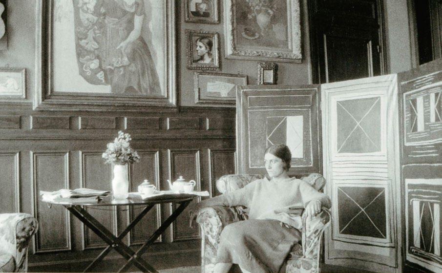
Above: Olga Khokhlova in the salon of Pablo Picasso’s studio at 23 rue La Boétie, Paris, circa 1923
Opposite: Pablo Picasso, Trois femmes à la fontaine (La Source), 1921, The Museum of Modern Art, New York
Picassify it, question its sacrosanct proportions and the time-honored notions of ideal beauty on which they were supposedly based. In parodying classicism, he subverts it.” (John Richardson, A Life of Picasso, The Triumphant Years, 1917-1932, New York 2010, p. 158)
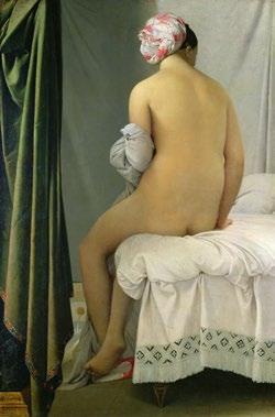
In its virtuosic handling of pastel, Deux femmes nues assises represents the height of Picasso’s draftsmanship. Delineating form with the sparest of contours in some areas and delicately attenuated modeling in others, Picasso endows the figures with a palpable corporeality akin to the nudes of Nicolas Poussin. Both the remarkable strength of line and localized color passages also reference the figuration of Jean-Auguste-Dominique Ingres, among Picasso’s greatest influences of this period. Picasso’s chosen medium allows for an unparalleled textural richness, subtlety of gradation and luminosity. Through the use of blue-toned paper, coupled with a constrained palette, Picasso is not only able to amplify the contrasts between light and dark values, but also consciously align himself with the great eighteenth century French pastellists, including Jean-Baptiste Perronneau and Maurice Quentin de la Tour.
The present work emerges from Picasso’s continued probing of his own role within the canon of masters in Western art, a preoccupation that would endure through the final years of his career. Michael Fitzgerald writes, “...Picasso’s Neoclassicism is better understood as a renewal of the avant-garde. By
explicitly embracing history, Picasso escaped the strictures of an increasingly rigid modernism to define a more vital alternative. He repudiated the convention of modernism’s ahistoricism in order to acknowledge its maturity, as well as his own, and rejuvenate the avant-garde by immersing it in the rich humanistic traditions that many cubist artists and theorists denied in a search for formal purity.” (Exh. Cat., New York, The Museum of Modern Art (and traveling), Picasso and Portraiture: Representation and Transformation, 1996-97, p. 297)
WILLEM DE KOONING
1904 - 1997
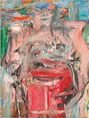
UNTITLED
oil on paper mounted on canvas 72 by 42 ½ in. 182.9 by 108 cm. Executed in 1970.
$ 4,000,000-6,000,000
PROVENANCE
William Pall Fine Art, New York Waddington Galleries, London
Private Collection, USA
Private Collection, Switzerland
Thomas Ammann Fine Art, Zurich Daros Collection, Switzerland (acquired from the above circa 1993)
L & M Arts, New York
Private Collection, New York (acquired from the above)
Lévy Gorvy, New York
Private Collection, San Francisco (acquired from the above)
Acquired from the above by the present owner
EXHIBITED
Zurich, Thomas Ammann Fine Art, Willem de Kooning, June - September 1995, no. 3, n.p., illustrated in color
Kunstmuseum Basel, De Kooning: Paintings, 1960-1980, September 2005 - January 2006, no. 12, p. 72 (text) and p. 73, illustrated in color
Lausanne, Fondation de l’Hermitage, Passions partagées: de Cézanne à Rothko, chefs-d’œuvre du XXe siècle dans les collections privées suisses, June - October 2009, no. 19, p. 119, illustrated in color
LITERATURE
Exh. Cat., Berlin, Heiner Bastian Fine Art, A few remarkable paintings by Picasso and De Kooning, 1990, no. 8, n.p., illustrated in color
Ingo F. Walther, ed., Art of the 20th Century, Vol. I, Cologne 1998, p. 276, illustrated in color
Richard D. Marshall, “Willem de Kooning and Joan Mitchell: The Late Paintings,” in: Peter Fischer, ed., Abstraction, Gesture, Ecriture: Paintings from the Daros Collection, Zurich 1999, fig. 21, n.p., illustrated in color and p. 41 (text)
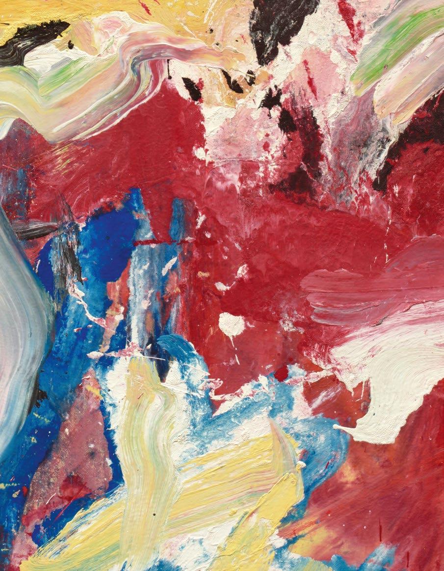
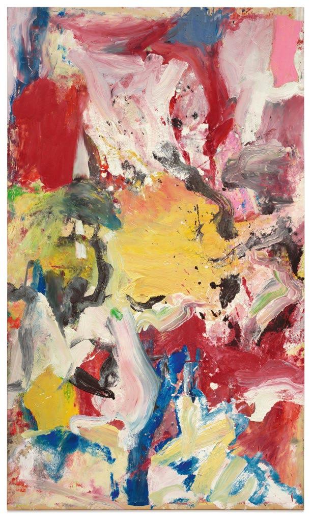
Lucious, balletic strokes of turquoise, pink, lemon yellow, and celadon green swell, crest, and collide into one another in Willem de Kooning’s spectacular theater of paint: Untitled from 1970. Stretching an extraordinary six feet in height, pure and unadulterated abstraction simultaneously conjures the sand and spume of East Hampton and the somatic, fleshy essence of the human body, marking yet another spellbinding chapter in the radical experimentation that transpired every decade of de Kooning’s working life. Here, his ceaseless, repeated investigations of line, color, and form embody a visceral, aqueous interplay between strength and sensuality, delicacy and mass, shepherding the palpable vigor of his earlier Women and Merritt Parkway pictures into a softer, lusher fullness. Exhibited internationally, most notably in the historic 2005-06 retrospective at the Kunstmuseum Basel, Untitled not only stands for this pivotal aesthetic turn in the artist’s career but also as a figure of immense significance to the legendary gallerist, dealer, and collector Robert Mnuchin, who fiercely championed the poetic and protean quality of his practice and from whom the present work hails.
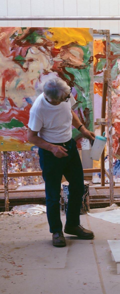
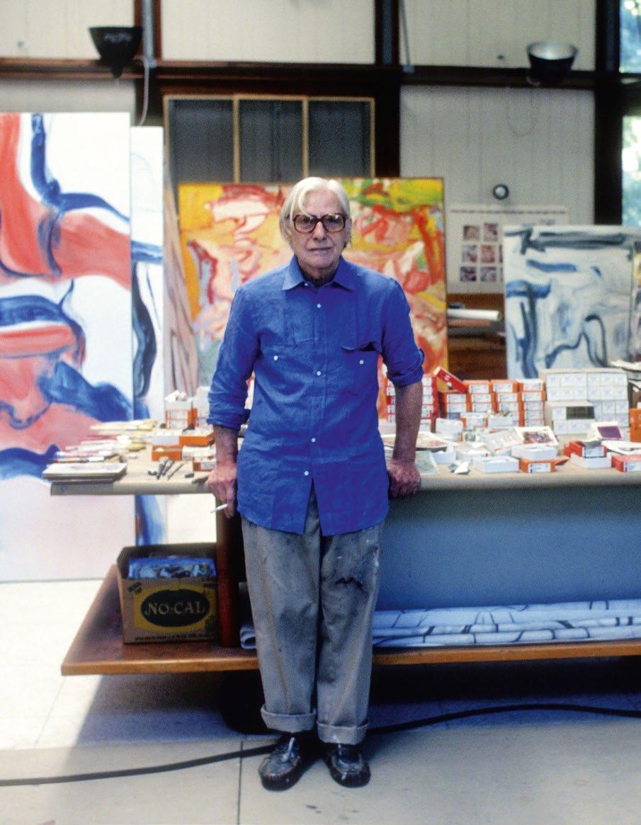
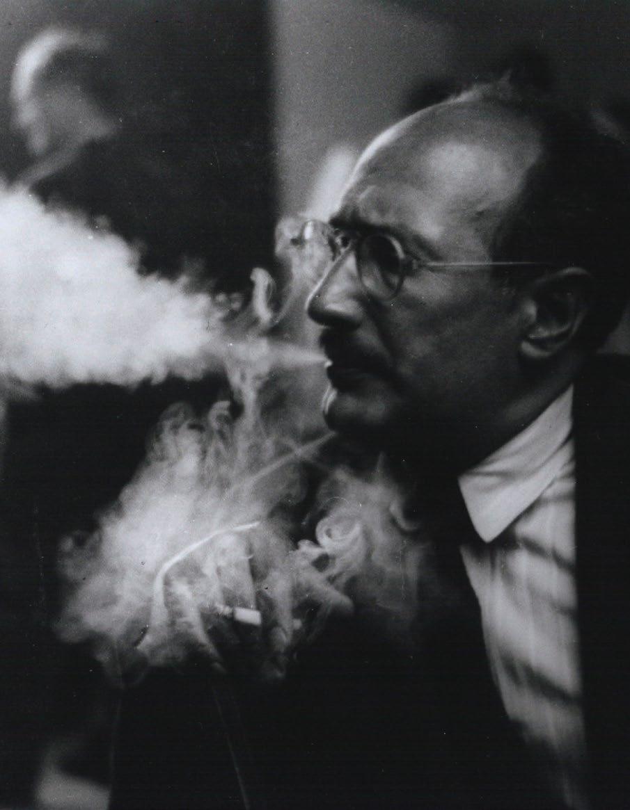
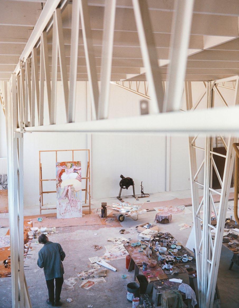
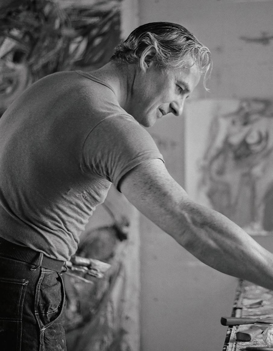
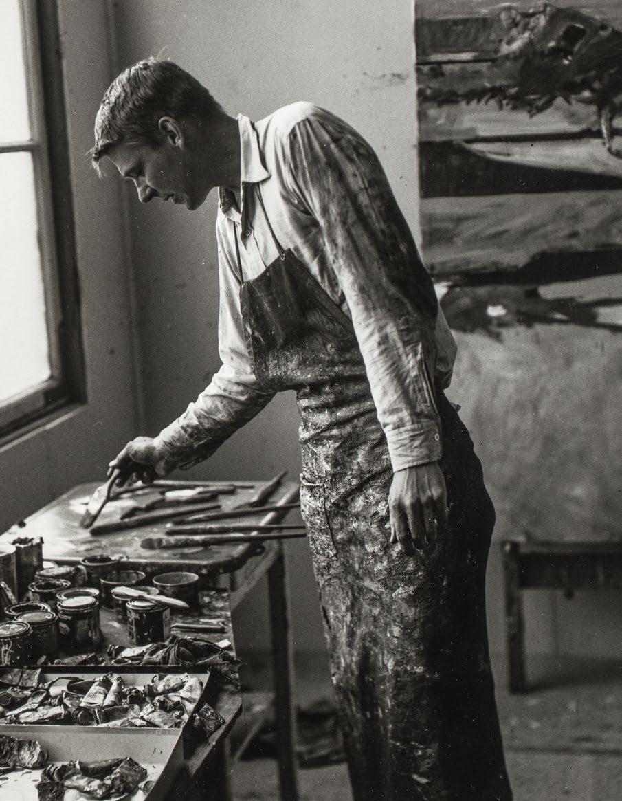
The artist in his studio
Here, richly impastoed passages wind and meander—laconically dragged in some places, splashed and splattered in others, even swirled by the artist’s fingertips—as if uncontainable by the picture plane and extending beyond the edges of the canvas. Shimmering ruby crashes into verdant swaths; oceanic cerulean coalesces with frothy, luxurious white, bringing to life the impression and essence of long grass, cresting waves, and coastal mist. This polychromatic splendor translates directly into the untamed paradisiac quality of Long Island, invoking the incredible heat, sky, and sea of de Kooning’s surroundings.
“When the light hits the ocean there is kind of a grey light on the water,” the artist described, “Indescribable tones, almost. I started working with them and insisted
that they would give me the kind of light I wanted. […] I got into painting in the atmosphere I wanted to be in. It was like the reflection of light. I reflected upon the reflections on the water, like the fishermen do.” (The artist quoted in: Exh. Cat., New York, The Museum of Modern Art, de Kooning: A Retrospective, 2011, p. 352) Indeed, the full breadth of de Kooning’s mastery unfolds before us, liberally and lyrically.
Untitled boasts a particularly enlivened spirit, confidence, and appetite for adventure. The artist’s celebration of line had been ascendant throughout his career: from the sharp interchanges of the early 1950s, through the muscularity of the Women , to the indulgent richness of the 1960s. It was in the late 1960s and early 1970s, however, that de Kooning’s
“ DE KOONING’S PAINTINGS OF THE SEVENTIES ARE AN ANNIHILATION OF DISTANCE. THE CLOSE-UPS ARE ABOUT CLOSENESS, A CONSUMING CLOSENESS. THESE PAINTINGS ARE CRYSTALLIZATIONS OF THE EXPERIENCE AND AMAZEMENT OF HAVING BODY AND MIND DISSOLVE INTO ANOTHER WHO IS ALL DELIGHT.”
newfound love for his surroundings joined his longtime obsession with the human form, and one was never lost entirely on the other. This development began in 1963, prompted by his retreat from Manhattan to Springs. “When I moved into this house, everything seemed self-evident. The space, the light, the trees – I just accepted it without thinking about it much. Now I look around with new eyes. I think it’s all a kind of miracle.” (the artist quoted in: Exh. Cat., Washington, D.C., National Gallery of Art, Willem de Kooning: Paintings, 1994, p. 197) The “new eyes” brought on by this sanctuary saw a kind of euphoric harmony between space and body, man and earth,
all buoyed by the magisterial, indiscriminately beautiful light of his new environment. From this radiant sun-drenched Atlantic seascape, hints and clues to a human body emerge, as if the artist fused his earlier figures right into the transcendental natural elements of Long Island.
By way of de Kooning’s prodigious instincts and the immutable certainty of his hand, Untitled bears every sign of the artist’s many gifts at their most intense: chromatic brilliance, formal balance and counterbalance, and an overwhelming sense of dynamism. Here, poetry is made plastic, music made material, and an exacting, pristine equilibrium is found.
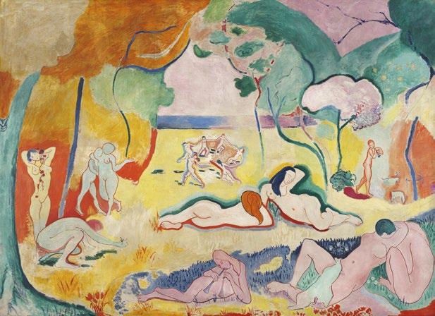
Opposite: Henri Matisse, The Joy of Life, 1905-06. The Barnes Foundation, Philadelphia
Above: Joan Mitchell, Ladybug, 1957. The Museum of Modern Art, New York
David Sylvester, About Modern Art: Critical Essays 1948-1996, London 2001, p. 34
JOAN MIRÓ
1893 - 1983
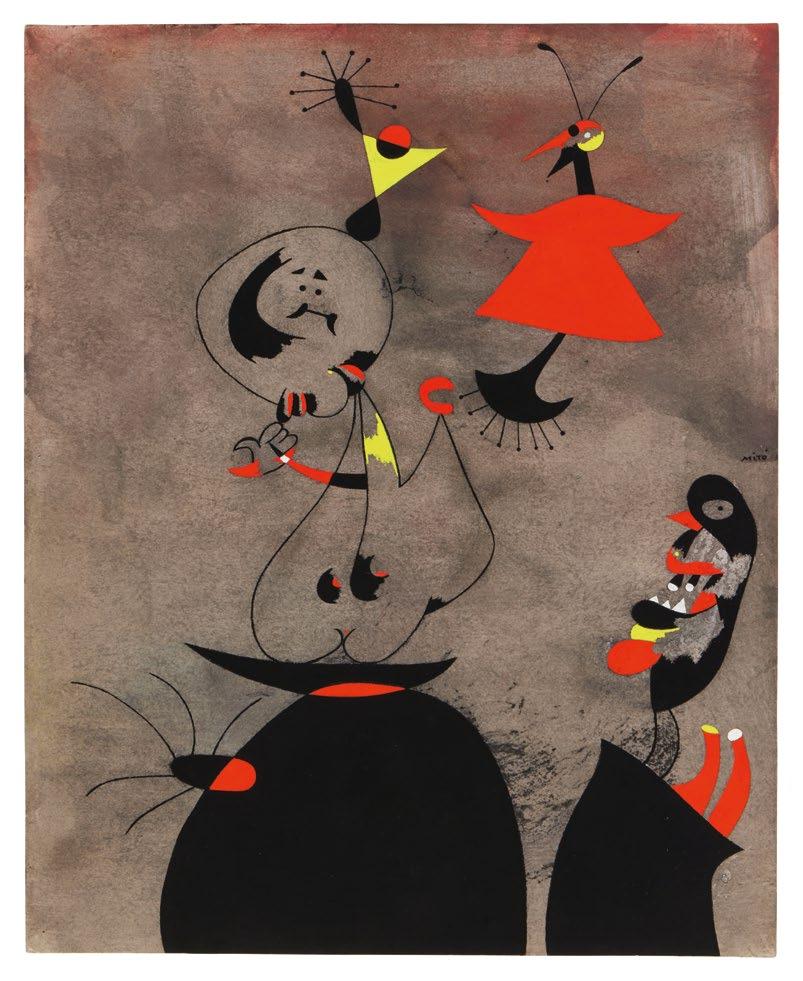
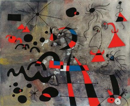
DORMEURS RÉVEILLÉS PAR UN OISEAU
signed Miró (center right); signed JOAN MIRÓ., dated 9/8/939. and titled (on the verso)
gouache and watercolor on paper 16 by 13 in. 40.61 by 33 cm.
Executed on 9 August 1939.
$ 3,000,000-5,000,000
PROVENANCE
Pierre Matisse Gallery, New York (acquired by 1942)
Fritz Bultman, New York
Vivian Horan Fine Art, New York
Private Collection (acquired from the above in 2000)
Christie’s New York, 7 November 2012, lot 22 (consigned by the above)
Acquired at the above sale by the present owner
EXHIBITED
New York, Pierre Matisse Gallery, Joan Miró. Paintings, Drawings, Gouaches, Pastels, Watercolors, December 1942, no. 17
LITERATURE
“The Passing Shows,” ARTnews, Vol. XLI, No. 5, 15-31 December 1942, p. 34
Exh. Cat., New York, The Pierpont Morgan Library, Pierre Matisse and His Artists, 2002, p. 194
Jacques Dupin and Ariane Lelong-Mainaud, Joan Miró Catalogue raisonné. Drawings, Vol. II, Paris 2010, no. 886, p. 56, illustrated in color
“ ONE DAY I WILL PLUNGE IN AGAIN AND SET OUT ON THE DISCOVERY OF A PROFOUND AND OBJECTIVE REALITY OF THINGS, A REALITY THAT IS NEITHER SUPERFICIAL NOR SURREALISTIC, BUT A DEEP POETIC REALITY, AN EXTRAPICTORIAL REALITY, IF YOU WILL, IN SPITE OF PICTORIAL AND REALISTIC APPEARANCES.”
The artist in a letter to Pierre Matisse, September 1936
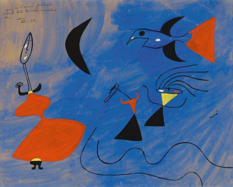
Executed on 9 August 1939, Dormeurs réveillés par un oiseau stands at a pivotal juncture in Joan Miró’s artistic development—at once the culmination of his late1930s experimentation and a powerful antecedent of the masterworks of the early 1940s. Rendered with delicate precision, this work is a mastery of economy of color; the palette—restricted to red, yellow, white and black—belies a world of psychological tension, lyricism and coded narrative that captures the precariousness of its moment. As Europe hovered on the cusp of unimaginable upheaval, Miró’s composition emerged as both an introspective drama and a poetic precursor to the cosmic language he would fully articulate only months later with his Constellations
The late 1930s had brought Miró to a deep internal crisis, shaped profoundly by the Spanish Civil War and his unforeseen exile in France. Having left Barcelona for Paris in November 1936 to show recent works to his dealer Pierre Matisse, Miró found himself stranded when political danger made his return impossible. The disruption that followed—emotional, political, existential—seeped inexorably into his painting. As the war in Spain intensified, Miró’s work in Paris came to reflect the times, expressing an internalization of external conflict. Margit Rowell writes of this period: “Despite his sense of dislocation, Miró produced some of his greatest works, which expressed an inner turmoil.” (Margit Rowell, Joan Miró: Selected Writings and Interviews, 1987, p. 14)
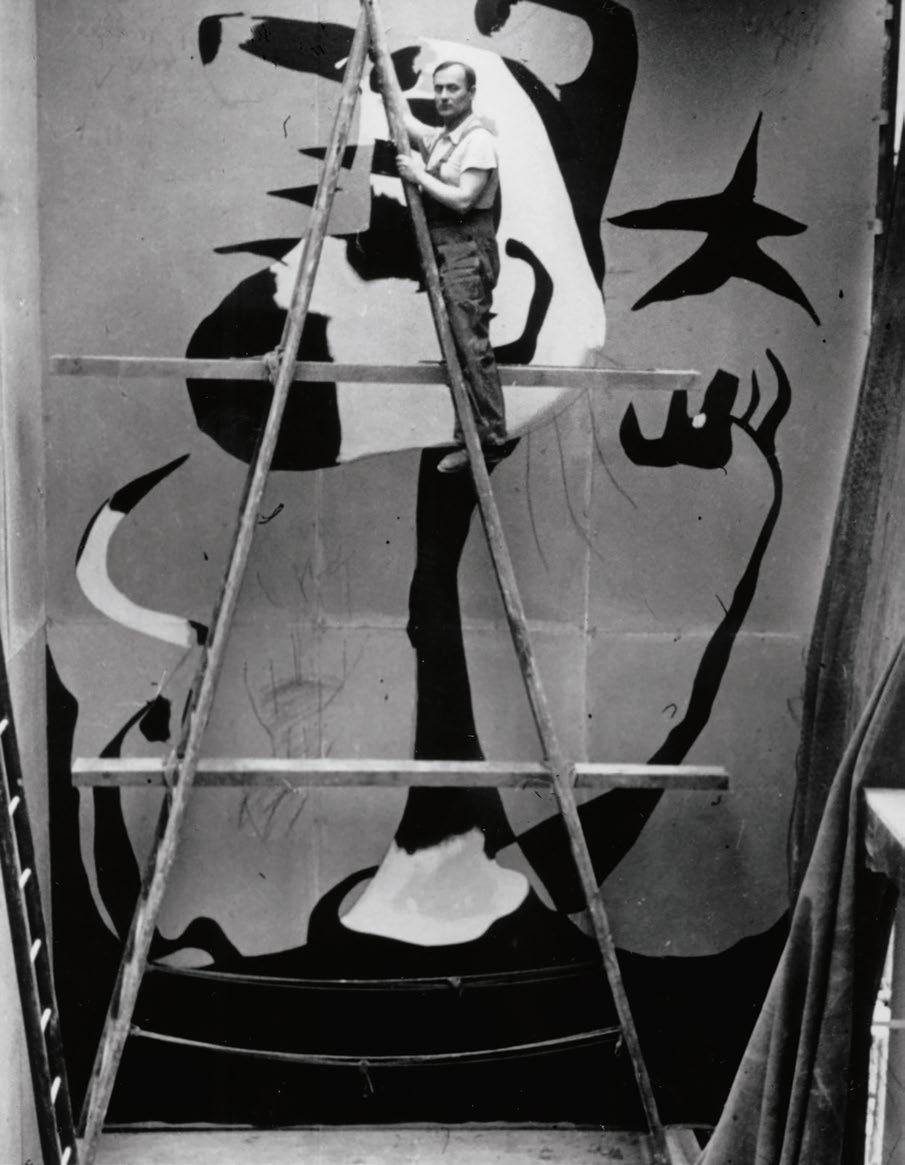
Right: Miró working on The Reaper (now lost) for the Spanish Pavilion at the Paris World Fair, 1937
In the summer of 1939, Miró rented a house in Varengeville-sur-Mer, a small fishing village on the Normandy coast which provided a rural reprieve for the avant-garde in the 1920s and 30s. Like his trip to Paris in 1936, however, Miró’s brief sojourn was soon prolonged by political strife. With the outbreak of the Second World War in September, Miró decided to stay in Varengeville, where he’d remain until the German bombings of Normandy in May 1940. It was this crucial period which would give rise to some of the greatest masterworks of his career.
His own words from 1939 confirm the emotional tenor of this moment with searing clarity:
“The outer world, the world of contemporary events, always has an influence on the painter... If the interplay of lines and colors does not expose the inner drama of the creator, then it is nothing more than bourgeois entertainment. The forms expressed by an individual who is part of society must reveal the movement of a soul trying to escape the reality
of the present, which is particularly ignoble today, in order to approach new realities.” (the artist Joan Miro: Selected Writings and Interviews, 1987, p. 166)
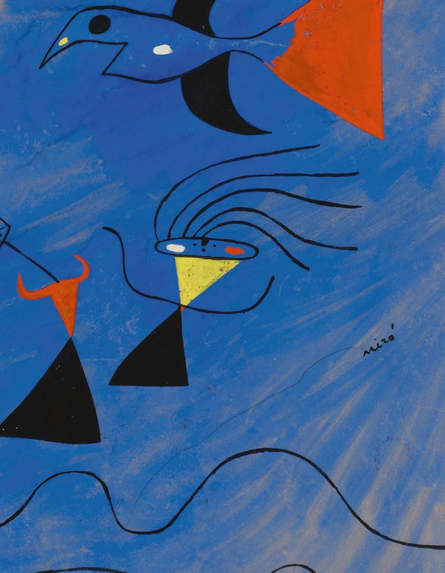
Few works dramatize this “movement of a soul” with as much charged delicacy as Dormeurs réveillés par un oiseau . Its title frames a poetic paradox: sleepers roused by a bird, an emissary of freedom interrupting the inertia of slumber. Yet the awakening it initiates is ambiguous, perhaps even foreboding. In the upper right corner, the red and black bird spreads its wings in an elegant arc, its assured draftsmanship set against the dusky washes of pigment that shape the expanse behind.
This creature, whose function in Miró’s work often verges on the symbolic, adds a note of whimsy while simultaneously serving as a harbinger of events to come. Seen in the context of its creation on the 9th of August 1939—mere weeks before Germany invaded Poland—the creature is endowed with a portentous presence.
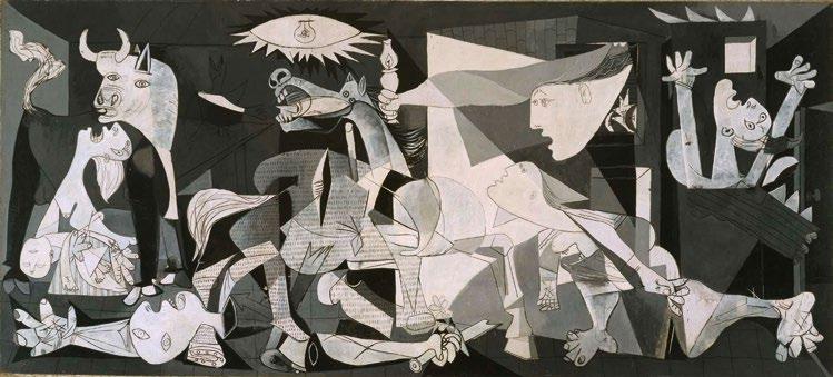
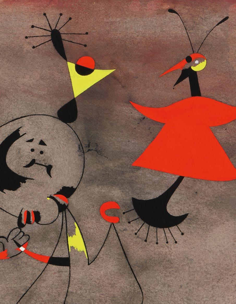
Below the avian apparition rise two biomorphic earth-bound figures, perhaps tinged with anxiety from the “ignoble” present from which Miró sought escape. At left, a female form emerges, her round head and curvaceous torso rising above a black void, ostensibly clothing, even mourning attire. Opposite her stands a smaller figure, its saw-toothed mouth and jutting jaw evoking the monstrous beings of Miró’s peintures sauvages and pastels of the mid-tolate 1930s—creatures whose anguished contortions explored the violence and cruelty of the Spanish Civil War. The figure’s raised red arms further recall works like Miró’s Le Faucher or Groupe de femmes, as well as the famed Guernica of his fellow countryman Pablo Picasso—both designed in reaction to the war for the 1937 Spanish Pavillion of the World’s Fair in Paris.
In an interview with Lluís Permanyer late in his life, Miró spoke of this period and the works it inspired: “I had that unconscious feeling of impending disaster. Like before it rains; a heavy feeling in the head, aching bones, and asphyxiating dampness. It was a physical rather than a moral sensation. I had a feeling a catastrophe was about to happen, but I didn’t know what: it was
the Spanish Civil War and the [Second] World War” (the artist quoted in Exh. Cat., Madrid, Museo ThyssenBornemisza, Miró: Earth, 2008, p. 123).
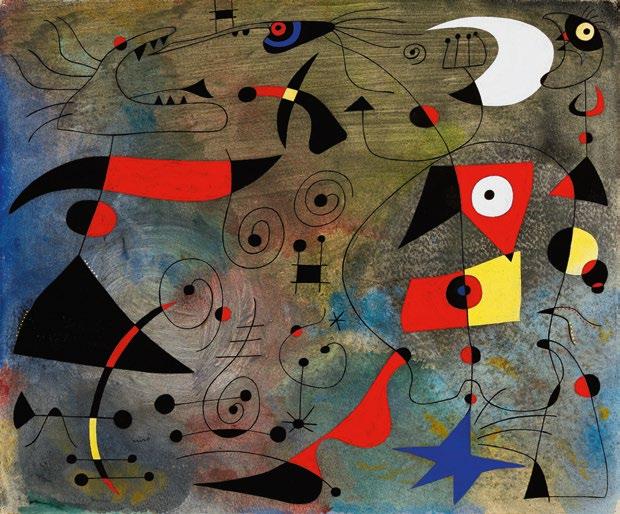
If Dormeurs réveillés par un oiseau encapsulates the anxieties of 1939, it also announces the transformation of 1940. Stylistically, its crisp graphic lines, delicate interplays of void and form, and sparing yet radiant palette prefigure the technical and lyrical innovations of the Constellations, the landmark series Miró commenced just a few months later. “At Varengevillesur-Mer, in 1939,” Miró later recalled, “I began a new stage in my work which had its source in music and nature. It was about the time that the war broke out. I felt a deep desire to escape... The night, music, and the stars began to play a major role in suggesting my paintings.” (the artist quoted in: Madrid, Museo ThyssenBornemisza, Miró: Earth, 2008, p. 209)
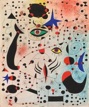
Indeed, the present work’s fusion of linear delicacy, floating forms and an increasingly abstracted pictorial field points directly to the poetic universe of the Constellations, the series of twenty-three gouaches completed between January 1940 and September 1941, widely considered the apogee of the artist’s
Opposite left: Joan Miró, Femme, 1934, The Metropolitan Museum of Art, New York
Opposite right: Joan Miró, Groupes de femmes, 15 July 1938, Barnes Foundation, Philadelphia
Above: Pablo Picasso, Guernica, 1 May – 4 June 1937, Museo Reina Sofía, Madrid
career. Dormeurs réveillés par un oiseau is thus situated at a vital threshold in the artist’s work, presenting a concise “awakening” not only of the sleeper, but of the artist himself. The piercing clarity of its figures, the underlying pulse of the background and the heightened, symbolic density of media all mark Miró’s transition from the weightiness of the 1930s to the cosmic arabesques of 1940-41.
As a close precursor to the Constellations , Dormeurs réveillés par un oiseau prefigures what, as Tomàs Llorens states, “scholars working on Miró almost unanimously agree…are the culmination of his creative trajectory—a paradigmatic expression of his artistic character.” Llorens continues: “It must be acknowledged that from the very beginning, Miró himself attributed the utmost importance to this group of paintings. That they are characteristically Mironian, in any case, is immediately apparent, and so much so that one might almost say that if Miró had not painted them, we would have had to invent
them for him.” (the artist quoted in: Madrid, Museo Thyssen-Bornemisza, Miró: Earth, 2008, p. 146) In much the same way, one might also assert that had Miró not painted Dormeurs réveillés par un oiseau in August 1939, that his Constellations of 1940-41 may never have been born.
Exquisitely rendered and profoundly symbolic, Dormeurs réveillés par un oiseau is the fulcrum of two worlds. It encapsulates the anguish of Miró’s late 1930s, yet its symbolic architecture and formal innovations anticipate the celestial lyricism and escapism of 1940-41. The sleepers, the bird, the delicate contours and ethereal surrounds—each is a sign of an artist poised between devastation and transcendence.
A further testament to its artistic brilliance, the present work was previously in the collection of the Fritz Bultman, member of the New York School and The Irascibles, whose 1950 protest of the Metropolitan Museum of Art helped define the Abstract Expressionist movement.
13
Above: Joan Miró, Femme et oiseaux
April 1940, sold: Sotheby’s, London, June 2017 for $31.1 million
WILLEM DE KOONING
1904 - 1997
UNTITLED XLII
oil on canvas
80 by 70 in. 203.2 by 177.8 cm.
Executed in 1983.
$ 9,000,000-12,000,000
PROVENANCE
The Willem de Kooning Foundation Private Collection, New York
Acquired from the above by the present owner
EXHIBITED
San Francisco, John Berggruen Gallery, Willem de Kooning: Paintings, 1967-1984, OctoberNovember 2002, p. 34, illustrated in color
Munich, Pinakothek der Moderne, March 2008September 2010 (on long-term loan)
New York, Gagosian Gallery, Willem de Kooning: Ten Paintings, 1983-1985, November - December 2013, p. 13, illustrated in color, p. 14, illustrated in color (detail) and p. 15 (text)
London, Skarstedt Gallery, Willem de Kooning: Late Paintings, October - December 2017, p. 27, illustrated in color
New York, Mnuchin Gallery, De Kooning: Five Decades, April - June 2019, p. 83, illustrated in color
New York, Mnuchin Gallery, Highlights of PostWar and Contemporary Art, January 2022
New York, Mnuchin Gallery, De Kooning/Shiraga February - April 2022, pp. 13, 69 (text) and p. 55, illustrated in color
LITERATURE
Kenneth Baker, “de Kooning Show Runs the Gamut,” San Francisco Chronicle, 12 November 2002, illustrated in color (online)
Karen Painter and Thomas Crow, eds., Late Thoughts: Reflections on Artists and Composers at Work, Los Angeles 2006, pl. 6, p. 66, illustrated in color
Nina Siegal, “Willem de Kooning: Late Paintings,” Blouin Modern Painters, Vol. XXIX, No. 11, November 2017, p. 128, illustrated in color
Jan-Peter Wested, “Entering a New Landscape,” Tank Magazine, 10 October 2017, illustrated in color (online)
Opposite:
“ OF THESE WORKS, A SIGNIFICANT NUMBER COUNT AMONG THE MOST REMARKABLE PAINTINGS BY ANYONE THEN ACTIVE AND AMONG THE MOST DISTINCTIVE, GRACEFUL, AND MYSTERIOUS DE KOONING HIMSELF EVER MADE.”
Robert
Storr, “At Last
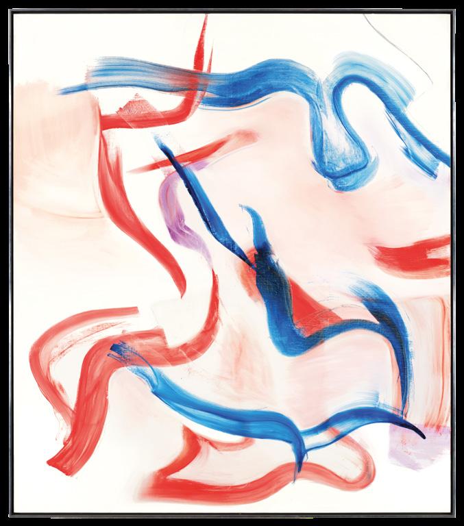
Sumptuous, swirling strokes of cerulean, scarlet, and lavender glide across the composition of Untitled XLII, forming lyrical ribbons, embodying the paradoxical delicacy and fortitude of Willem de Kooning’s celebrated late period works. A paragon of de Kooning’s unparalleled command of color and form, Untitled XLII is composed of elegant arabesques of pigment which dance through diaphanous pink clouds against a gleaming white surface. Painted in 1983, Untitled XLII is a consummate masterwork of de Kooning’s seminal late period: the triumphant apogee of the evolution of his abstraction. In 1981, following a five-decade career of pioneering abstraction, de Kooning began a corpus of paintings defined by an elegant fluidity, arresting tension and poetic balance unlike any works that had preceded them. This entrancing body of work, which would occupy de Kooning for the remaining years of his life, demonstrated both an unbridled expression and an intentionality completely unique within his oeuvre. Distinguished by its breathtaking palette and sublime composition, Untitled XLII epitomizes the union of fortitude and tranquility that defines de Kooning’s mature corpus.
With his final body of work, de Kooning achieved a new paradigm of abstraction: the figure-ground relationship reached an unprecedented dynamism through a careful balance of tension and grace. The artist observed this moment: “I am becoming freer. I feel that I have found myself more in the sense that I have all my strength at my command. I think you
can do miracles with what you have, if you accept it… I am more certain the way I use the paint and the brush.” (the artist quoted in: Din Peters, “Willem de Kooning: Paintings 1960-1982,” Studio International , No. 196, August 1983, pp. 4-5) In Untitled XLII, de Kooning juxtaposes a radiant white surface with sweeping strokes of fiery red, azure, and amethyst in sinuous streams. Passages of blue dance across the surface, forming arabesques as red strokes flicker across the composition like rising flames. As observed by Carter Ratcliff, de Kooning’s works of this period were the product of both accumulation and reduction; he writes: “A process of subtraction makes an addition, a stately flurry of draftsmanly gestures. De Kooning has always layered and elided his forms. Now, he reminds us that he does
Willem de Kooning in his studio, circa 1982
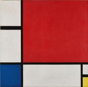
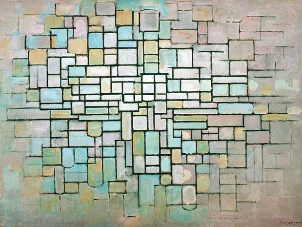
Right: Piet Mondrian, Composition No. II, 1930. Private Collection. Sold at Sotheby’s New York in November 2022 for $51 million
Light,” in: Exh. Cat., San Francisco Museum of Modern Art (and traveling), Willem de Kooning: The Late Paintings, The 1980s, 1995-97, p. 39
the same with his methods.” (Carter Ratcliff, “Willem de Kooning and the Question of Style,” in: Amsterdam, Stedelijk Museum (and traveling), Willem de Kooning: The North Atlantic Light, 1960-1983, 1983, p. 22) De Kooning’s works of 1981 onward represented a superficial departure from the previous decade, which was defined by abundant, layered strokes of pigment reaching edge to edge across the canvas. But, in fact, de Kooning’s late works harken back to his earliest compositions, and the defining explorations of his career: the dialogue between line, gesture, and color. In paintings such as Untitled XLII, line returns to the fore, guiding the viewer’s gaze around the composition.
Across de Kooning’s legendary praxis, the articulation of line remained foundational to his process. From the staccato gestures of his 40s abstractions to the vigorous strokes of his earliest Women, the organic quality of his 60s compositions, the liberal impasto of
his 70s abstractions to the glorious, lyrical articulation of his 80s paintings, the essence of his practice was always line itself. John Elderfield poignantly wrote of de Kooning’s final act: “Volume switching to void, and vice versa, had long been a preoccupation of de Kooning’s…so much has been surrendered, but so much gained. Density has been replaced by clarity, tonality by chroma, resistance by mobility of line, a granulated surface by a pristine one. Most audacious of all, pictorial containment has given way to the giddy thrill of sheer open space.” (John Elderfield quoted in: Exh. Cat., New York, Gagosian Gallery, Willem de Kooning: Ten Paintings, 1983-1985, 2013, p. 27) Painted in de Kooning’s capacious, light-filled studio in East Hampton, Untitled XLII bears an entrancing incandescence. Surrounded by the lush natural environment surrounding his studio, de Kooning was undoubtedly influenced by the spectral progression and chromatic
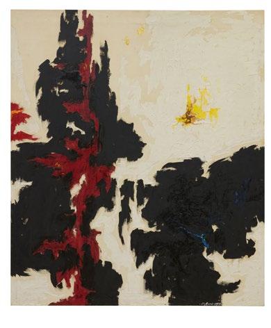
Above left: Clyfford Still, PH-144 (1947-Y-N0.1), 1947. Private Collection. Sold at Sotheby’s New York in June 2020 for $28.7 million
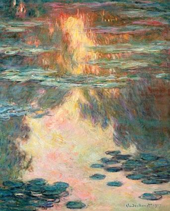
Above right: Claude Monet, Waterlilies, 1907. Private Collection
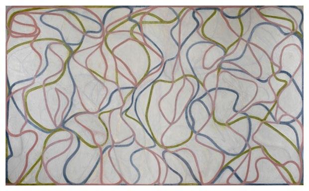
Opposite: Brice Marden, Study for the Muses (Eaglesmere Version), 1991-94. The Art Institute of Chicago
“ IN THEIR ABSTRACTNESS, THE PAINTINGS OF THE 1980S SURELY CONFOUND BODY AND LANDSCAPE, THEIR SINUOUS FORMS ECHOING NOT ONLY THE BODILY FRAGMENTS THAT WERE DRAWN AND UNDERLIE THE PAINT BUT ALSO THE REFLECTIONS OF LANDSCAPE THAT RESIDED IN THE ARTIST’S MIND. THE SURFACES OF THESE PAINTINGS, IMPOSSIBLE TO CAPTURE IN REPRODUCTION AND FUNDAMENTAL TO THEIR EXPERIENCE, SKATE BETWEEN SHIMMERING REFLECTINESS AND MATTE SOFTNESS.”
Gary Garrels, “Three Toads in the Garden: Line, Color, and Form,” in: Exh. Cat., San Francisco Museum of Modern Art (and traveling), Willem de Kooning: The Late Paintings, The 1980s, 1995-97, p. 18
possibilities as light conditions changed. Untitled XLII evokes the optical splendor of early morning light, as shades of blue, red, pink, and purple overtake the sky.
The work of de Kooning indeed held a central place at the heart of Robert Mnuchin’s celebrated collection. In a 2021 interview, Mnuchin said of the artist: “I think the de Kooning is the chairman of the board… De Kooning is Picasso-esque. He really has at least five totally distinct periods, and I think that really separates him from anybody that didn’t have many periods. Nobody else has done that.” (Robert
Mnuchin quoted in: Marion Maneker, “It Took a Lot of Courage for Robert Mnuchin to Become an Art Dealer,” Artnews , 2 April 2021) Both personally and professionally, Mnuchin greatly admired de Kooning, organizing several exhibitions of the artist’s work, including the historic exhibition, de Kooning: Five Decades in 2021. A consummate masterpiece of de Kooning’s final period, Untitled XLII expresses a graceful confidence that de Kooning had garnered after a long career defined by both evolution and continuity.
MARK ROTHKO
1903 - 1970
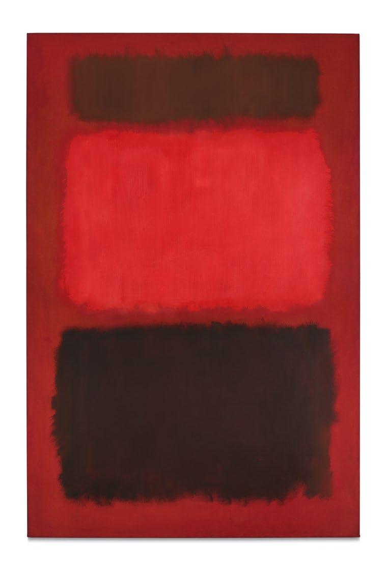
BROWN AND BLACKS IN REDS
signed and dated 1957 (on the reverse) oil on canvas
90 ½ by 60 ⅝ in. 229.9 by 154 cm. Executed in 1957.
$ 70,000,000-100,000,000
PROVENANCE
Sidney Janis Gallery, New York
The Seagram Collection, New York (acquired from the above circa 1957)
Christie’s New York, 14 May 2003, lot 35 (consigned by the above)
Acquired at the above sale by the present owner
EXHIBITED
New York, Whitney Museum of American Art, Business Buys American Art, March - April 1960, no. 18, p. 18, illustrated (titled Brown and Black in Reds) (installed in New York, The Seagram Building)
New York, Whitney Museum of American Art, Art of the United States: 1670-1966, SeptemberNovember 1966, no. 236, p. 153 (text) (titled Black and Brown on Red)
New York, Solomon R. Guggenheim Museum; Houston, The Museum of Fine Arts; Minneapolis, Walker Art Center; and Los Angeles County Museum of Art, Mark Rothko, 1903-1970: A Retrospective, October 1978 - September 1979, no. 145, n.p., illustrated in color (traveled to New York only)
London, Tate Gallery, Rothko, June - August 1987, no. 60, p. 149, illustrated in color and p. 187 (text)
New York, Mnuchin Gallery, Church & Rothko: Sublime, September - March 2021, illustrated in color (on the cover), p. 3, illustrated in color (detail), pp. 26-27, illustrated in color (in installation), pp. 31, 83, illustrated in color and p. 83 (text)
Paris, Fondation Louis Vuitton, Mark Rothko, October 2023 - April 2024, no. 76, p. 135, illustrated in color and p. 300 (text)
LITERATURE
Barbara Cavaliere, “Notes on Rothko,” Flash Art, No. 86/87, January - February 1979, p. 38, illustrated in color
David Anfam, Mark Rothko: The Works on Canvas, New Haven and London 1998, no. 602, p. 467, illustrated in color
Andrew Shea, “The Critic’s Notebook,” The New Criterion, 13 October 2020, illustrated in color (in installation)
Mary Hrbacek, “Church and Rothko: Sublime at Mnuchin Gallery,” Whitehot Magazine, 27 October 2020, illustrated in color (online)
Arthur Lubow, “3 Art Gallery Shows to See Right Now,” The New York Times, 4 December 2020, p. C12, illustrated in color
Mark Rothko sought many aims in painting: clarity, contemplation, a purity and honesty in the picture’s ability to convey human emotion. The canvases that poured forth in his “Classic Years,” what David Anfam calls the artist’s mature period beginning around 1951 and continuing until his death in 1970, were epic, beautiful, literally and figuratively monumental, but were—above all else—conduits for accessing the fullest range of feeling. Each chronicles a fundamental state of being: hope flung into ecstasy; melancholy plummeting toward despair; the vulnerable, brooding, romantic, and sublime. Yet it is a rare few paintings
that Rothko created in his life that see the whole spectrum of human drama cleaved open at once. In Brown and Blacks in Reds, the singular masterpiece at the heart of Robert Mnuchin’s collection, we see his aims realized, simultaneously and operatically announcing what it is to paint, to perceive, to live, and to feel.
By 1957, Rothko had well mastered the format that would define his life and work—feathered, atmospheric fields of color caught in exquisite, inimitably precise suspense—and for the first time could earn a living from his painting alone. The thirty-seven paintings executed that year offer a remarkable, wholly abstracted exploration of the human condition, and in only fifteen of these
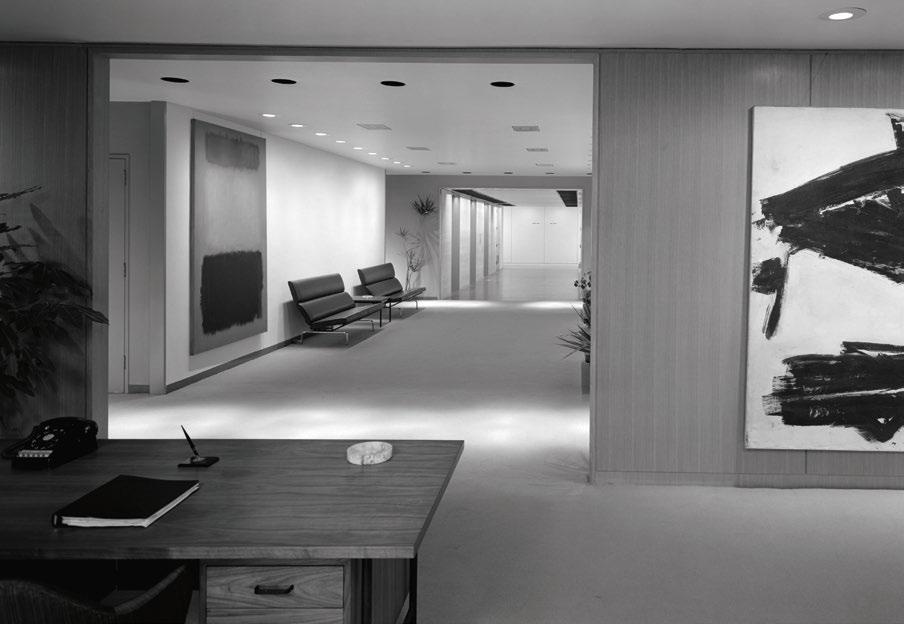
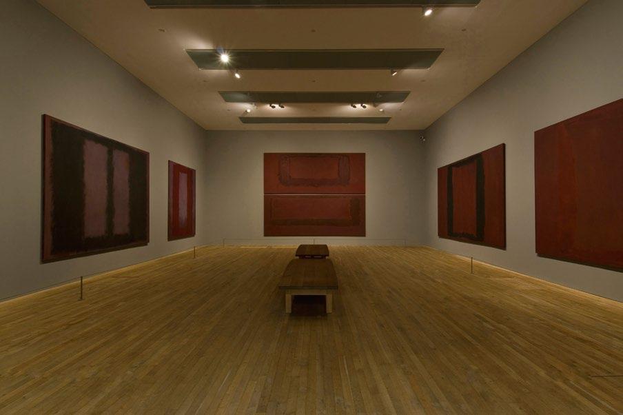
Above: The present work installed in the lobby of the Seagram Building
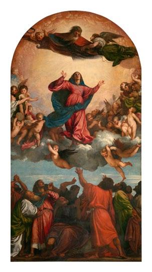
Opposite: Titian, Assunta, 1516-18. Santa Maria Gloriosa Dei Frari, Venice
“ I WOULD LIKE TO SUGGEST THAT THE PALING EDGES, THE QUAVERING AREAS OF LIGHT, THE COMPLETELY AMBIGUOUS EXTREMITIES OF ROTHKO’S FORMS – PRESENT FOR THE PAST FIVE YEARS – ARE THE CRUCIAL CARRIERS OF ROTHKO’S COMPLEX EXPRESSION.”
Ashton,
Arts & Architecture, Vol. 75, No. 4, April 1958, p. 8
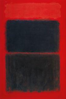
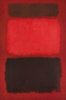
canvases did Rothko soar to the Herculean scale of the present work, measuring over ninety inches. Here, black and radiant red pose not the image of but an encounter with the artist at the height of his powers, giving a material identity to the extraordinary, often ineffable sense of passion felt by humanity. So successful and intense was the effect engendered by the palette and tripartite compositional structure seen here that Rothko explored this in three crimson, maroon, and black works that year: Black Over Reds {Black on Red}, Light Red Over Black, and the present work, the former two held by the Baltimore Museum of Art and the Tate in London, respectively.
Of all its technical and psychological accomplishments, which place it alongside the greatest masterworks by Rothko, Brown and Blacks in Reds ranks incomparable for its storied provenance and place in the artist’s career. Brown and Blacks in Reds was first owned by Joseph E. Seagram & Sons, Inc., who acquired the work from Sidney Janis Gallery in New York and proudly installed it in the lobby of the eponymous Seagram Building in Manhattan—the only work by the artist to bear the honor of hanging in the Mies van der Rohe and Philip Johnson-designed space. This fortuitous accession would prompt the Seagram Corporation to commission the Seagram Murals, the staggering series of red and black paintings originally meant to line the walls of the Four Seasons restaurant in their lobby. Rothko, however, eventually grew disturbed by the potential reduction of these works as decoration, as opposed to experiences unto them-
selves. He ultimately withdrew, retained the works, and presented nine canvases to the Tate, whose galleries could honor their sovereignty and aural authority. Other groupings from the commission today reside in the National Gallery of Art in Washington, D.C., and the Kawamura Memorial Museum of Art in Japan.
Dore
“Art,”
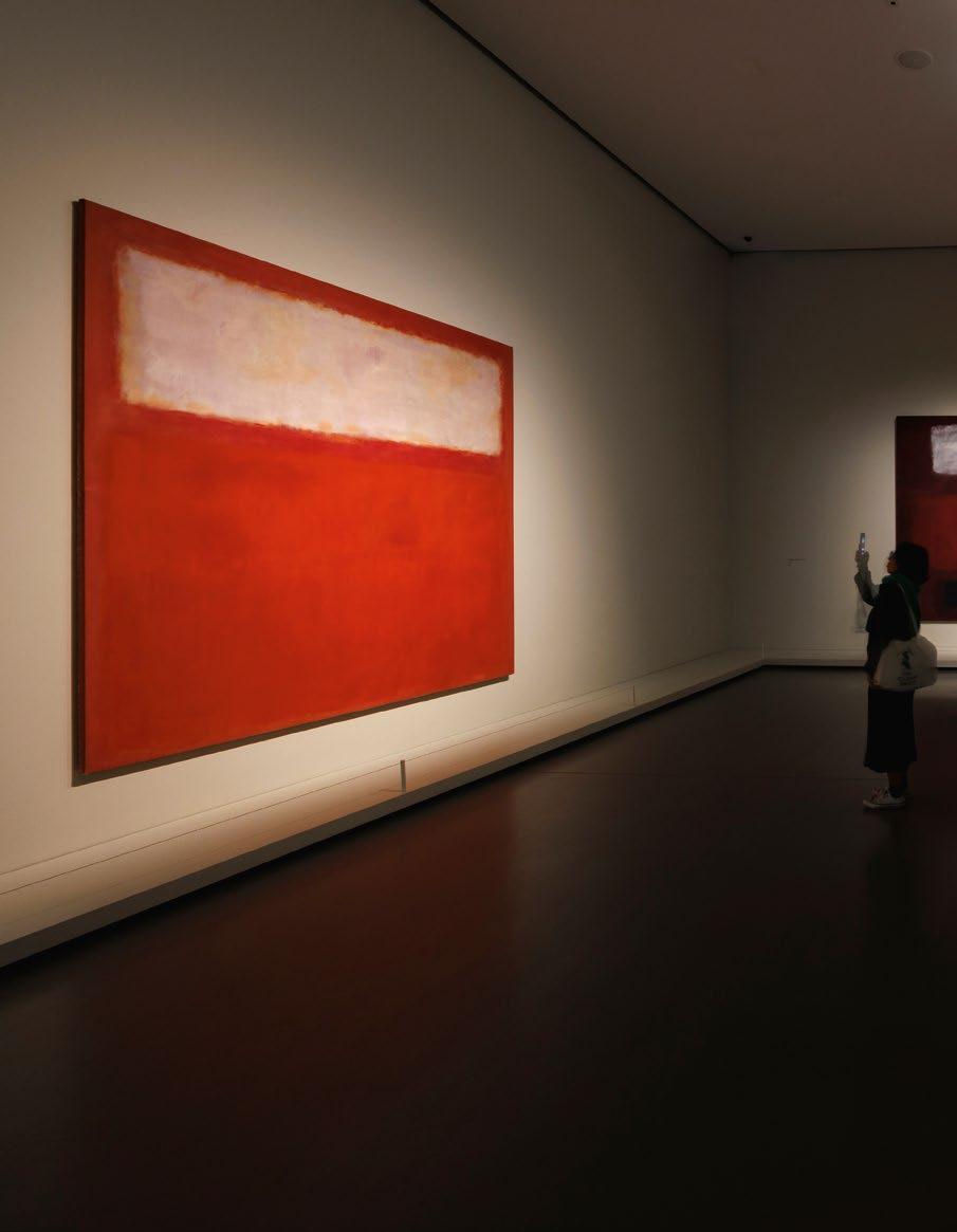
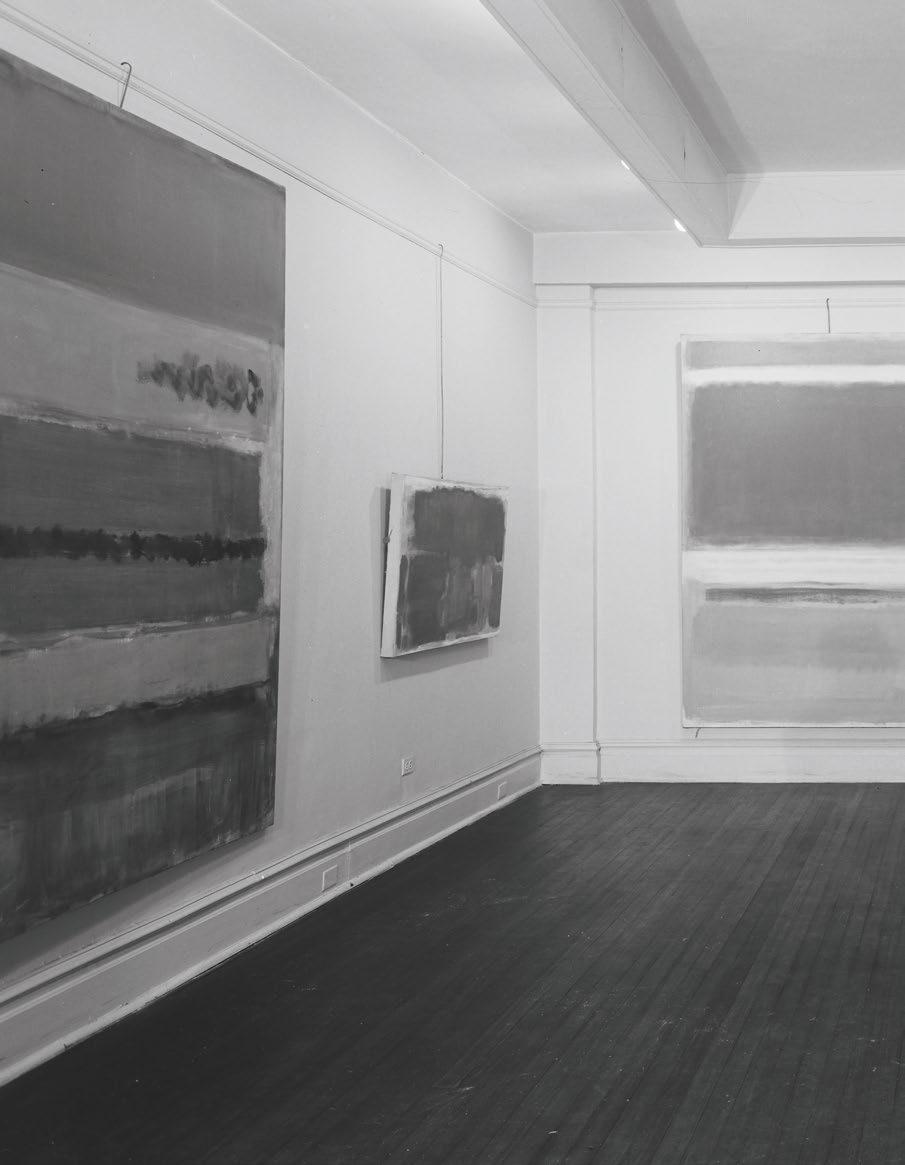
The present work installed in Mark Rothko at Fondation Louis Vuitton, Paris, October 2023 - April 2024
“HIS REAL GENIUS WAS THAT HE HAD CREATED A LANGUAGE OF FEELING.”
Though the palette anticipates that of the Seagram Murals, the effect of the present work hardly mimics the somber, sepulchral profundity of that series, here, rather, Rothko summons a heady panoply of emotion, channeling apprehension in maroon and peril in black; what triumphs, however, is the brilliance of hope, impressed upon the viewer in innumerable diaphanous veils of incandescent and incomprehensibly luminous red. “Pictures must be miraculous,” Rothko concluded, “the instant one is completed, the intimacy between the creation and the creator is ended. He is an outsider. The picture must be for him, as for
anyone experiencing it later, a revelation, an unexpected and unprecedented resolution of an eternally familiar need.” (Mark Rothko, “The Romantics were Prompted…,” Possibilities, No. 1, Winter 1947-48, p. 84) The feathered perimeters of each rectangle, organized in his characteristic tripartite structure, embody this revelation entirely, taking on a kind of autonomy unbeknownst to artists or artworks prior. The longer one looks, the longer one feels, as ruby, mahogany, smoldering crimson and exuberant raspberry hues oscillate into a field beyond the surface of the picture plane, as though hovering and receding in real time.
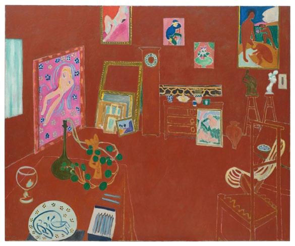
Above: Henri Matisse, The Red Studio, 1911.
The Museum of Modern Art, New York
Opposite: The Seagram Murals at the Tate, London
Robert Motherwell quoted in: Exh. Cat., Paris, Fondation Louis Vuitton, Mark Rothko, 2023-24, p. 12
“For me,” art historian and curator Katherine Kuh wrote, Rothko’s work possesses “a kind of ecstasy of color which induces different but always intense moods. I am not a spectator—I am a participant.” (Katherine Kuh, 18 July 1954)
The spirit, composition, and coloration of Brown and Blacks in Reds invite a wealth of art historical comparisons. The obsessive choreography of light and color echoes that of Claude Monet’s incendiary sunrises; the unshakeable belief in the divine possibilities of paint recalls the Romantics’ pursuit of the sublime. None, though, proved so impactful as Henri Matisse’s The Red Studio, which hung in The Museum of Modern Art and was often visited by Rothko himself. The absorptive, abstracted treatment of space
was indelible: there, space and object were collapsed, and in Rothko’s own work, he set out to collapse that distance between the painting and the person before it. We thus cease to perceive the present work as a dialogue between medium and support. “The progression of a painter’s work, as it travels in time from point to point, will be toward clarity: toward the elimination of all obstacles between the painter and the idea and between the idea and the observer… To achieve this clarity is, inevitably, to be understood.” (the artist quoted in: Exh. Cat., New York, The Museum of Modern Art, 15 Americans, 1952, p. 18)
Alongside his contemporaries, Rothko, a name and lion figure inseparable from the achievements of the Abstract Expressionists, did not share the
MARK ROTHKO
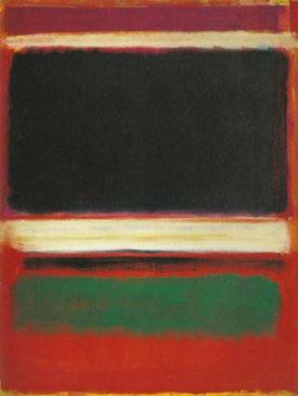
Mark Rothko created 37 paintings in 1957, a significant year during which he experimented considerably with the palette and format of his famed, signature abstractions. Of this group, Rothko created a commanding trio of three paintings in this striking palette of reds and blacks, executed in succession as evinced by the organization of David Anfam’s authoritative Catalogue Raisonné of the works on canvas. All monumental in scale, measuring over 90 inches, the other two works reside in prestigious institutional collections.
NO. 600
BLACK OVER REDS {BLACK ON RED} 1957
95 by 81 ½ in. BALTIMORE MUSEUM OF ART
NO. 601
LIGHT RED OVER BLACK 1957
91 ⅝ by 60 ⅛ in. TATE, LONDON
NO. 602
BROWN AND BLACKS IN REDS 1957
91 by 60 in. THE PRESENT WORK
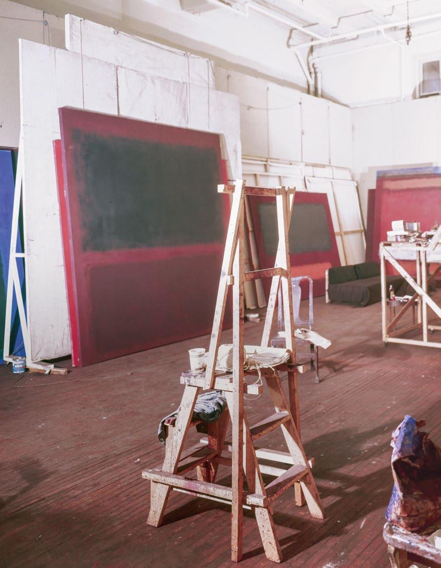
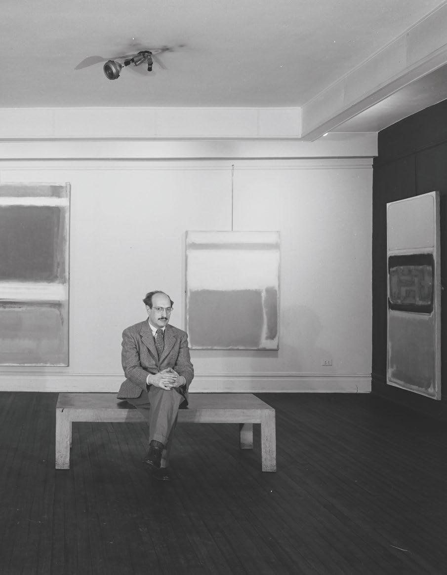
Mark Rothko’s studio at 222 Bowey
Greenbergian ethos of painting for paint’s sake. By no means a Formalist, Rothko sought not to strike representation or any tangible, lived experience from the surface of his pictures but rather labored tirelessly to intensify them. The radical aesthetic distillation he arrived at was an effort to translate man’s very “eternally familiar needs,” and while Rothko did not mimic or describe those subtleties of human sentiment, it remained a chief and principal aim of his work. “His pictures,” John Elderfield describes, “are designed to deliver transcendence… to provide access to hidden
but immanent truths of the universe—not merely to struggle with that transcendence, those truths (what would be a doubter’s way), but to actually convey them. For Rothko, in an interpretation that we can scarcely fathom now, a picture could offer immediate access to the divine.” (John Elderfield, “Transformations” in: Glenn Phillips and Thomas Crow, eds., Seeing Rothko, Los Angeles 2002, p. 101)
In a 1959 Life magazine article, Dorothy Seiberling described Rothko’s mystifying output: “Just as the hues of a sunset prompt feelings of ela -
“ FROM 1951 ONWARD, ROTHKO’S ARTISTIC SELF-CONFIDENCE WAS EVERYWHERE VISIBLE – FROM THE METICULOUSNESS, AUTHORITY AND RANGE OF THE PAINTINGS TO HIS VERY ATTITUDE TOWARD THEM.”
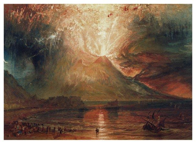
Left: Joseph Turner, Mount Vesuvius in Eruption, 1817. Yale Center for British Art, New Haven
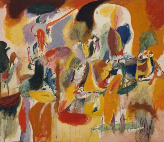
Opposite: Arshile Gorky, Water of the Flowery Mill, 1944. The Metropolitan Museum of Art, New York
David Anfam, Mark Rothko: The Works on Canvas: Catalogue Raisonné, New Haven and London, 1998, p. 71
tion mingled with sadness or unease as the dark shapes of our night close in, so Rothko’s colors stir mixed feelings of joy, gloom, anxiety or peace. Though the forms in the painting seem simple at first glance, they are in fact subtly complex. Edges fade in and out like memories; horizontal bands of ‘cheerful’ brightness have ‘ominous’ overtones of dark colors.” (Dorothy Seiberling, “Abstract Expressionism, Part II,” Life , 16 November 1959, p. 82) For the majesty of its scale, the myth of its provenance, and the miracle that is, in Seiberling’s worlds, stirring such acute and fiercely primal feelings, Brown and Blacks
in Reds is an utter and unequivocal masterwork. Toured internationally in most of the artist’s seminal presentations—from the 1978-79 traveling retrospective organized by the Solomon R. Guggenheim Museum in New York; the Rothko exhibition at the Tate in London; to the celebrated recent show at the Fondation Louis Vuitton in Paris—Brown and Blacks in Reds marks a historic accomplishment, conjuring in oil the “language of feeling” that no artist has ever dared to replicate since. (Robert Motherwell quoted in: Exh. Cat., Paris, Fondation Louis Vuitton, Mark Rothko , 2023-24, p. 12)
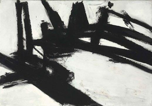
6 FRANZ KLINE
1910 - 1962
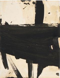
HARLEMAN
signed and dated ’60 (on the reverse) oil on canvas
53 ⅛ by 102 ¼ in. 134.9 by 259.7 cm. Executed in 1960.
$ 12,000,000-18,000,000
PROVENANCE
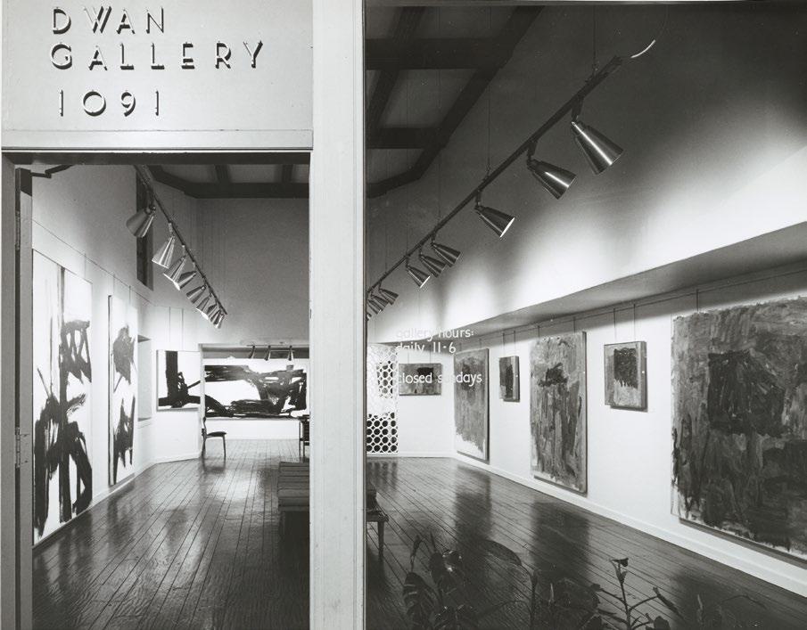
Dwan Gallery, Los Angeles (acquired directly from the artist on 14 January 1961)
Pauli and Melvin Hirsh, Los Angeles (acquired from the above in 1963)
Christie’s New York, 8 November 1983, lot 10 (consigned by the above)
Shigeki Kameyama, Tokyo (acquired at the above sale)
PaceWildenstein, New York
Acquired from the above in November 2003 by the present owner
EXHIBITED
Los Angeles, Dwan Gallery, Philip Guston, Franz Kline, April 1961, no. 2
Los Angeles, Dwan Gallery, Franz Kline Paintings 1950-1961, March 1963, no. 7, n.p., illustrated
New York, C & M Arts, Franz Kline, April - June 2003
New York, L & M Arts, Franz Kline, FebruaryMarch 2008
New York, Mnuchin Gallery, Spring Fever, MayJune 2024
New York, Mnuchin Gallery, Franz Kline, AprilJune 2025, p. 49, illustrated in color and p. 65 (text)
LITERATURE
Leslie Judd Ahlander, “Franz Kline at The Washington Gallery of Modern Art,” Art International, Vol. 6, No. 8, 25 October 1962, p. 48, illustrated
Rita Reif, “Painting Draws $506,000,” The New York Times, 9 November 1983, p. C24 (text)
Exh. Cat., Cincinnati Art Museum, Franz Kline, 1994, p. 157 (text)
Ken Johnson, “Art in Review; Franz Kline,” The New York Times, 23 May 2003, p. E36 (text)
Exh. Cat., Castello di Rivoli Museo d’Arte Contemporanea, Franz Kline 1910-1962, 200405, p. 331, illustrated (installed in Los Angeles, Dwan Gallery, 1961)
Eric Banks, “Franz Kline, Castello di Rivoli,” Artforum, Vol. 43, 1 September 2004, no. 1, n.p., illustrated (online)
Scott Christian, “Tim Coppens Meets Franz Kline,” GQ, 12 February 2013, illustrated in color (online)
Rebecca Finsel, Franz Kline in Coal Country Havertown 2019, pp. 122, 133 (text) and p. 123, illustrated in color (installed in New York, Mnuchin Gallery, 2018)
Michael Klein, “Franz Kline: Mnuchin Gallery,” Whitehot Magazine, 20 May 2025, illustrated in color (installed in New York, Mnuchin Gallery, 2025) (online)
Brian T. Allen, “Franz Kline Gets a New Look in Two Gallery Shows,” National Review, 7 June 2025, illustrated in color (installed in New York, Mnuchin Gallery, 2025) (online)
Robert Mattison, ed., Franz Kline Paintings, 1950-1962: Digital Catalogue Raisonné, ongoing, no. 203, no. FKN1CWP9, illustrated in color (online) (accessed 29 March 2026)
“ SO WHILE THE WIDE SWATHS OF BLACK THAT TUMBLE EVERY WHICH WAY LIKE GIANT LOGS ACROSS THE EIGHT-AND-A-HALF-FOOT-WIDE EXPANSE OF ‘HARLEMAN’ AND THE RAGGED EDGES AND THE SPLATTER SUGGEST PAINTING OUT OF VIOLENT IMPULSE, THE COMPOSITION TELLS A DIFFERENT STORY: A TALE IN WHICH ORDER AND CHAOS ARE CAPTURED IN AN INSTANT OF PERFECT EQUILIBRIUM.”
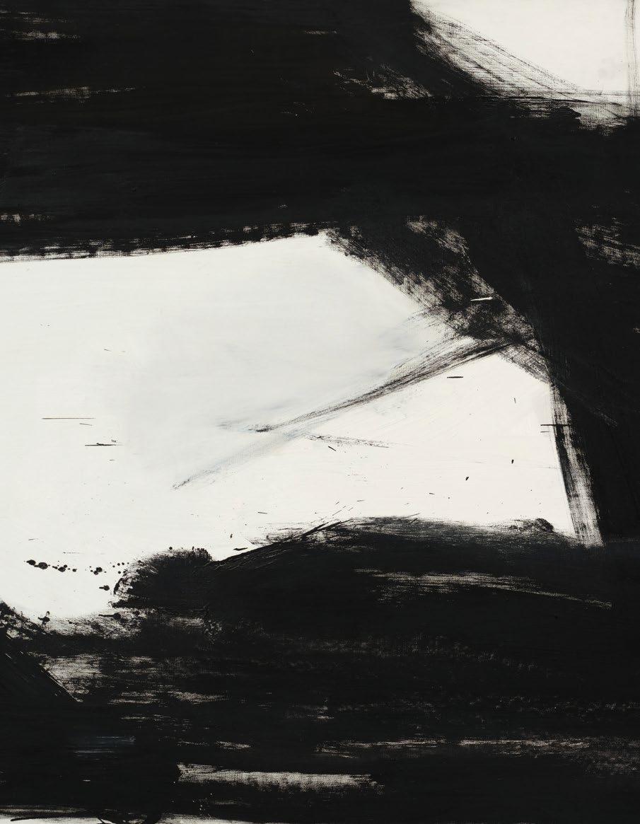
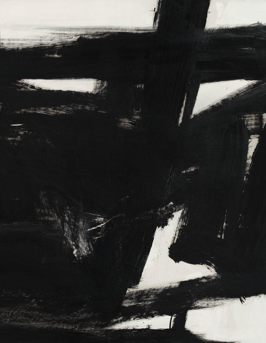
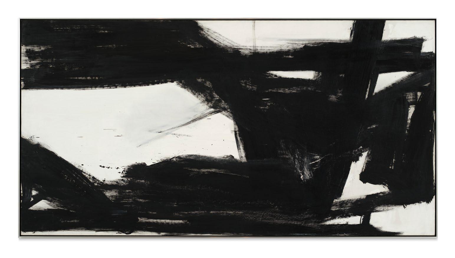
Acommanding and unequivocal embodiment of Abstract Expressionism, Franz Kline’s Harleman from 1960 exemplifies the visceral energy and unrestrained gesture that characterize Kline’s iconic black-andwhite paintings. Perhaps more than those of any of his contemporaries, the series Kline produced between 1950 and his untimely death in 1962, powerfully encapsulate the radical liberation and triumphant energy of American painting in 1950s New York. Distinguished by sweeping architectural strokes and a stark interplay of black against white, Kline’s composition invokes the dynamism of towering structures and roaring automotive forces of his native Pennsylvania and surroundings
in New York, capturing the tantalizing rhythm of the urban metropolis. Painted in 1960, Harleman dates to the mature apex of Kline’s gestural abstraction, a critical moment when his bold, architectonic compositions had garnered widespread international acclaim, affirmed by his selection for the United States Pavilion at the 30th Venice Biennale that same year.
Like many of the most significant works in Kline’s oeuvre, Harleman’s title subtly anchors its radical abstraction in the personal geography of his upbringing. Akin to paintings such as Mahoning, housed at the Whitney Museum of American Art, and Chief, at The Museum of Modern Art, whose titles evoke the people and places of Lehighton, Pennsylvania, the
Ken Johnson, “Art in Review; Franz Kline,” The New York Times, 23 May 2003, p. E36
present work is named after Kline’s friend Stanley Harleman. Following its debut at Dwan Gallery in the year of its execution, Harleman was subsequently included in the landmark exhibition Franz Kline Paintings 1950–1961 at Dwan Gallery in 1963. Over the past two decades, the present work has been housed in the distinguished collection of Robert Mnuchin—renowned for his authoritative and deeply discerning eye for Franz Kline’s work—where it has been the centerpiece of several notable Mnuchin Gallery exhibitions. Mnuchin acquired Harleman from the celebrated Japanese collector Shigeki Kameyama, who, when he acquired this work at a record price at Christie’s in 1983, declared that his intention was
to collect “only the very best.” (Shigeki Kameyama quoted in: Rita Reif, “Auction Review,” The New York Times, 9 November 1983, p. C24) Attesting to the exceptional caliber and vision that underpin the provenance of the present work, Kameyama’s subsequent acquisitions during the same era included Willem de Kooning’s Interchange and Picasso’s Le Miroir, now housed in The Museum of Modern Art.
Constrained within the confines of a single canvas yet seemingly unbounded in its spatial ambition, the painting unfolds as a dynamic interplay of emphatic black-and-white brushstrokes, whose muscular verticals and thrusting diagonals coalesce into a dramatic pictorial scaffolding. “So while the wide swaths of black
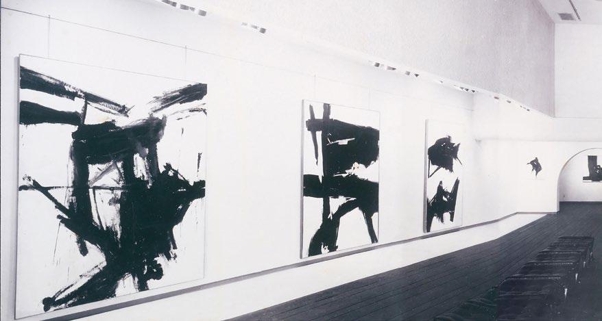
Above: The present work installed in Franz Kline Paintings 19501961 at Dwan Gallery, Los Angeles, March 1963
that tumble every which way like giant logs across the eight-and-a-half-foot-wide expanse of ‘Harleman,’ and the ragged edges and the splatter suggest painting out of violent impulse, the composition tells a different story: a tale in which order and chaos are captured in an instant of perfect equilibrium.” (Ken Johnson, “Art in Review; Franz Kline,” The New York Times, 23 May 2003, p. E36) As Johnson describes, Harleman represents a paradox central to Kline’s practice: the dichotomous translation of vigorous, animated gesture into a composition of rigorous formal clarity. Many of Kline’s greatest paintings are marked by an impressive and iconic simplicity, as evinced by the tectonic elegance and epic horizontality of Harleman. No less an observer than Elaine de Kooning famously stated, “It was Kline’s unique gift to be able to translate the character and the speed of a one-inch flick of the wrist
to a brushstroke magnified a hundred times.” (Exh. Cat., Washington, D. C., Gallery of Modern Art, Franz Kline Memorial Exhibition, 1962, p. 16)
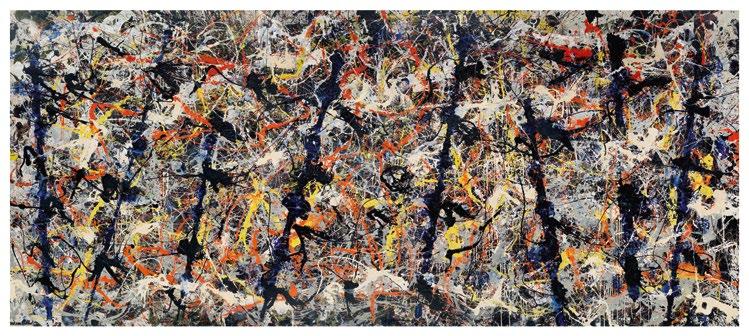
Across the canvas, flickers and splatters of paint recall the encompassing and enthralling dynamism of Jackson Pollock’s drip paintings, invoking a shared commitment to the primacy of gesture and the physicality of process that defines Action Painting. Yet where Pollock disperses energy across an immersive, continuous field, Kline charges it, harnessing the immediacy of the gesture into a composition of striking formal clarity. In Harleman, each stroke bears the trace of its execution, urgent and resolute. As the artist Robert Motherwell explicates, “Who could not be moved by his sense of push and thrust? Kline’s great black bars have the tension of a taut bow, or a ready catapult. And his sense of scale, that sine qua non of
Below: Jackson Pollock, Blue Poles, 1952. National Gallery of Australia, Canberra
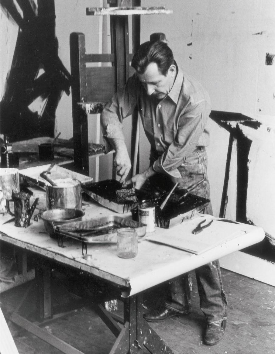
Opposite: Franz Kline in his studio, 1961
“ WHEN I LOOK OUT THE WINDOW… WHAT I DO SEE—OR RATHER, NOT WHAT I SEE BUT THE FEELINGS AROUSED IN ME BY THAT LOOKING—IS WHAT I PAINT.”
good painting, is marvelously precise. His big paintings can be as good as his small ones, a rare mastery in this period concerned with the power of magnitude” (Robert Motherwell, “Homage to Franz Kline, August 17, 1962,” quoted in: Exh. Cat., Washington, D.C., The Phillips Collection (and traveling), Franz Kline: The Color Abstractions, 1979, p. 43) This sense of thrusting movement and expansive magnitude, what Robert Motherwell so vividly describes as the “push and thrust,” underscores why Kline’s black-and-white paintings have long been championed as the ultimate examples of “Action Painting,” a phrase coined by Harold Rosenberg in 1953.
Born in Wilkes-Barre in 1910, Franz Kline was immersed in a coal-mining city defined by heavy industry, railroads, and steel infrastructure. Informed by the industrial landscapes of his upbringing in eastern Pennsylvania, Harleman’s interlocking armatures and
forceful linear structures evoke the aesthetic of construction and mechanization, recalling the machinic language of Fernand Léger’s “mechanical period” (1918-23). Grounded in the aesthetic and psychological realities of industrial America, Harleman illustrates the structural rhythms of the modern metropolis. Sweeping verticals surge upward like steel girders, while intersecting diagonals cut across the canvas with the urgency of speeding automobiles or the crisscrossing trajectories of an urban grid. Though entirely abstract, the work articulates Kline’s enduring fascination with the industrial and infrastructural forms that defined the modern age.
In his later years, having spent the majority of his life in New York, Franz Kline seemingly internalized the city’s relentless energy, translating it into a language of gestural abstraction. As the artist himself reflected in 1960, “When I look out the window… what
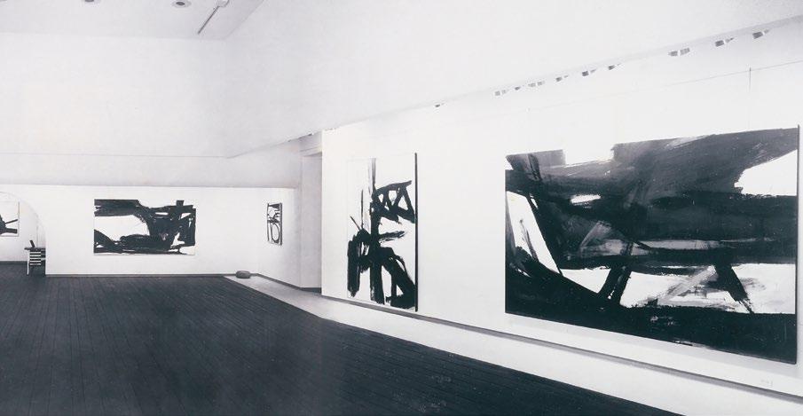
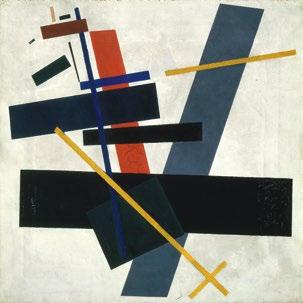
Above right: Kazimir Malevich, Suprematism, 1915. Russian State Museum, St. Petersburg Opposite: The present work installed in Philip Guston, Franz Kline at Dwan Gallery, Los Angeles, April 1961
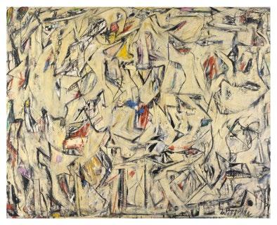
Above left: Willem de Kooning, Excavation, 1950. The Art Institute of Chicago
The artist quoted in: Exh. Cat., Washington, D.C., The Phillips Collection (and traveling), Franz Kline: The Color Abstractions, 1979, p. 16
I do see—or rather, not what I see but the feelings aroused in me by that looking—is what I paint.” (the artist quoted in: Exh. Cat., Washington, D.C., The Phillips Collection (and traveling), Franz Kline: The Color Abstractions, 1979, p. 16) Harleman is infused with a rhythmic intensity that evokes the pulse of urban life its horizontal dynamism, its tensions, and its ceaseless motion. Its broad brushstrokes, which bisect each side of the canvas, recall the experience of traversing the dense intersections of downtown Manhattan. As Leslie Judd Ahlander describes, “Kline’s purpose was the expression of pure dynam-
ics, a brilliant, often brutal, explosion of forms on canvas... Kline wanted no particulars: he wanted a symbol, direct, individual, monumental, epic, of here and now. Perhaps no artist has better expressed his time and place than Kline: what he had to say could only have been said now in America. It is American painting, about America.” (Leslie Judd Ahlander, “Franz Kline at The Washington Gallery of Modern Art,” Art International, Vol. 6, No. 8, 25 October 1962, p. 47) The majestic summation of Kline’s legendary aesthetic language, Harleman stands as an ideal achievement of American abstract painting.
JEFF KOONS
b. 1955
LOUIS XIV
stainless steel
46 by 27 by 15 in. 116.8 by 68.6 by 38.1 cm.
Executed in 1986, this work is the artist’s proof from an edition of 3 plus 1 artist’s proof.
$ 7,000,000-10,000,000
PROVENANCE
The artist
Benedikt Taschen, Cologne (acquired from the above in 1993)
Christie’s New York, 13 May 2015, lot 58B (consigned by the above)
Acquired at the above sale by the present owner
EXHIBITED
New York, Sonnabend Gallery, Group Show: Ashley Bickerton, Peter Halley, Jeff Koons, Meyer Vaisman, October - November 1986 (another example)
Paris, Centre national d’art et de culture Georges-Pompidou, Cartes Blanches, Les Courtiers du Desir, April - May 1987, pl. 28, p. 32 (text) and p. 33, illustrated (another example)
Milwaukee Art Museum, Simulations, New American Conceptualism, November 1987January 1988, no. 6, illustrated in color (on the back cover) and n.p., illustrated in color (edition 2/3)
Chicago, Museum of Contemporary Art, Jeff Koons: Works 1979 - 1988, July - August 1988, no. 20, p. 3, illustrated in color and pp. 9, 39 (text) (edition 2/3)
Dayton, Wright State University, University Art Galleries and Cleveland Center for Contemporary Art, Redefining the Object, MayJune 1988, p. 7, illustrated (edition 3/3)
Boston, Institute of Contemporary Art and Museum of Fine Arts; Düsseldorf, Städtische Kunsthalle; Kunsthalle Bremen; and
Württembergischer Kunstverein Stuttgart, The BiNational: German Art of the Late ‘80s, American Art of the Late ‘80s, September 1988 - June 1989, no. 41, p. 127, illustratedin color and p. 249 (text) (edition 2/3)
Kassel, Museum Fridericianum, Schlaf Der Vernunft, February - May 1988, p. 22 (text)
The Art Institute of Chicago, Affinities and Intuitions: The Gerald S. Elliott Collection of Contemporary Art, May - July 1990, pl. 179, no. 75, pp. 223, 291, illustrated in color (edition 2/3)
San Francisco Museum of Modern Art and Minneapolis, Walker Art Center, Jeff Koons: Retrospective, December 1992 - October 1993, no. 32, pp. 33, 132 (text) and p. 82, illustrated in color (edition 2/3)
Amsterdam, Stedelijk Museum; Aarhus Kunstmuseum and Staatsgalerie Stuttgart, Jeff Koons: Retrospektiv, November 1992 - April 1993, p. 51, illustrated in color and p. 90 (text) (edition 1/3)
Baltimore, Walters Art Gallery, Going for Baroque, September 1995 - February 1996 (edition 3/3)
Athens School of Fine Arts; Copenhagen, Everything That’s Interesting is New: the Dakis Joannou Collection, January - April 1996, p. 154, illustrated in color and p. 293, illustrated (in installation) (edition 1/3)
Santa Monica, Eli Broad Family Foundation, Group Show, December 1997 - July 1999 (edition 2/3)
Modern Art Museum of Fort Worth, House of Sculpture, May - August 1999 (edition 3/3)
Athens, DESTE Foundation Center for Contemporary Art, Jeff Koons: A Millennium Celebration, December 1999 - May 2000, pp. 8, 46 (text) and p. 90, illustrated in color (edition 1/3)
Cyprus, The Nicosia Municipal Arts Centre, Forever: Shortcuts: Works fromThe Dakis Joannou Collection, November 2001 - March 2002, pp. 70-71 (text) and p. 76, illustrated in color (in installation) (edition 1/3)
Naples, Museo Archeologico Nazionale, Jeff Koons, June - September 2003, p. 54 (text) and p. 55, illustrated in color (edition 1/3)
Dallas Museum of Art, Celebrating Sculpture: Modern and Contemporary Art from Dallas Collections, September 2003 - March 2004 (edition 3/3)
Madrid, Museo Nacional Centro de Arte Reina Sofia, Collection Taschen, October 2004January 2005, p. 123, illustrated (the present example)
Athens, DESTE Foundation for Contemporary Art, Monument to Now: The Dakis Joannou Collection, June - December 2004, p. 206, illustrated in color (edition 1/3)
Dallas, Nasher Sculpture Center, Variable States: Three Masterworks of Modern Sculpture, September 2004 - January 2005, p. 206, illustrated in color (edition 3/3)
Berlin, Deutsche Guggenheim, Douglas Gordon’s The Vanity of Allegory, July - October 2005, n.p., illustrated in color
Durham, Nasher Museum of Art at Duke University, The Evolution of the Nasher Collection October 2005 - May 2006 (edition 3/3)
St. Louis, The Pulitzer Foundation of Arts, Portrait/Homage/Embodiment, November 2006 - June 2007 (edition 1/3)
Los Angeles, Country Museum of Art, Broad Contemporary Art Museum, Inaugural Installation, 2008 (edition 2/3)
Dallas, Nasher Sculpture Center, In Pursuit of Masters: Stories from the Raymond and Patsy Nasher Collection, September 2008 - January 2009 (edition 3/3)
Chateau de Versailles, Jeff Koons: Versailles, October 2008 - April 2009, pp. 53-55, illustrated in color (in installation), pp. 116, 185 (text) and p. 144, illustrated in color (edition 1/3)
London, Victoria & Albert Museum, Postmodernism: Style and Subversion 19701990, September 2011 - January 2012 (edition 3/3)
Frankfurt, Liebieghaus Skulpturensammlung, Jeff Koons: The Sculptor, June - September 2012, p. 144, illustrated in color and pp. 144, 190 (text) (edition 1/3)
New York, The Metropolitan Museum of Art and Pittsburgh, Andy Warhol Museum, Regarding Warhol: Sixty Artists, Fifty Years, September 2012 - April 2013, no. 95, pp. 63, 196-97, 290 (text) and p. 68, illustrated in color (edition 3/3)
New York, Whitney Museum of American Art; Paris, Centre Pompidou, Musée National d’Art Moderne and Guggenheim Bilbao, Jeff Koons: A Retrospective, June 2014September 2015, pl. 46, p. 21 (text), n.p., illustrated in color and fig. 10, p. 97 (installed in Pittsburgh, Andy Warhol Museum, 2013) (edition 3/3)
Geneva, The Museum of Art and History of the city of Geneva, Urs Fischer-False Friends, April - July 2016 (edition 1/3)
New York, Mnuchin Gallery, Summer 2018, June - August 2018 (the present example)
Dallas, The Warehouse, The Sensation of Space, May - November 2019, p. 4 (text) and p. 6, illustrated in color (another example)
New York, Mnuchin Gallery, Highlights of PostWar and Contemporary Art, March - April 2021 (the present example)
New York, Mnuchin Gallery, Highlights of PostWar and Contemporary Art, June - August 2021 (the present example)
Florence, Palazzo Strozzi, Jeff Koons: Shine, October 2021 - January 2022, no. 8, pp. 83, 84, illustrated in color (detail) and p. 187, illustrated in color (edition 1/3)
LITERATURE
Roberta Smith, “Art: 4 Young East Villagers at Sonnabend Gallery,” The New York Times 24 October 1986, p. C30 (text)
Jeff Koons, “A Text by Jeff Koons,” Spazio Umano, No. 4, October - December 1986, p. 109, illustrated
Robert Kleyn, “Neuva Concetti,” Tema Celeste, January/March 1987, p. 80
Giancarlo Politi, “Jeff Koons,” Flash Art January/February 1987, p. 44, illustrated in color
Giancarlo Politi, “Luxury and Desire. An Interview with Jeff Koons,” Flash Art, No. 132, February/March 1987, p. 74, illustrated in color
Tricia Collins and Richard Milazzo, “Radical Consumption and the New Poverty,” New Observations, No. 51, October 1987, p. 15 (text)
Allan Schwartzman, “Corporate Culture: The Yippie-Yuppie Artist,” Manhattan Inc., December 1987, p. 141 (text)
Exh. Cat., Milan, The Saatchi Collection, NY Art Now: The Saatchi Collection 1987, p. 11 (text)
Georg Herold, Jeff Koons and Isabelle Graw, “Atlantisches Bündnis,” Wolkenkratzer January 1988, n.p. (text)
Dirk Schwarze, “Schlaf der Vernunft,” Kunstforum, No. 94, April/May 1988, p. 249, illustrated (installed in Kassel, Museum Fridericianum, 1988)
Roberta Smith, “Rituals of Consumption,” Art in America, Vol. 76, No. 5, May 1988, illustrated in color (on the cover) and p. 170 (text)
“Schamlos schön,” Der Spiegel, No. 12, March 1988, p. 231, illustrated in color
Suzi Gablik, “Dancing with Baudrillard,” Art in America, Vol. 6, June 1988, p. 29 (text)
Laurie Palmer, “Jeff Koons: Museum of Contemporary Art Chicago,” Artforum, Vol. 27, No. 2, October 1988, p. 153 (text)
Exh. Cat., Carnegie Museum of Art, Carnegie International - 1988, 1988, p. 90 (text)
Klaus Honnef, ed., Contemporary Art, Hamburg, 1988, p. 27, illustrated in color
Peter Plagens, “International Shows: Under Western Eyes,” Art in America, Vol. 77, No. 1, January 1989, p. 36 (text)
Thomas Dreher, “Jeff Koons: Objekt-Bilder,” Artefactum, January - February 1989, pp. 7-8 (text)
Henry Hanson, “Art Works: Highbrow, HighPriced Tchotchkes,” Chicago, February 1989, p. 23 (text)
Judith Russi Krishner and Fernando de Azevedo, ed., Encontros Luso-Americanos de Arte Contemporanea/Portuguese-American Meetings on Contemporary Art: Contemporary American Sculpture, Signs of Life, Lisbon 1989, p. 55, illustrated in color
LITERATURE CONTINUED
Exh. Cat., New York: Whitney Museum of American Art, Image World, Art and Media Culture, 1989-90, p. 153, illustrated in color
Jane Greenstein, “Double Vision: Two Court Battles Decide When Appropriation is Inappropriate,” Art & Antiques, Vol. 7, No. 1, January 1990, p. 23 (text)
William Wilson, “A Sculpture Show That Runs on Empty,” Los Angeles Times, 10 April 1990, p. F-6 (text)
“Artifacts. Brief Art World Updates,” Art Cellar Exchange, May 1990, p. 11 (text)
Michael Tarantino, “Gone Soft?: The 44th Venice Biennale,” Artforum, Vol. 29, No. 1, September 1990, p. 137 (text)
Exh. Cat., Newport Harbor Art Museum, OBJECTives: The New Sculpture 1990, p. 83, illustrated in color and p. 173 (text)
Exh. Cat., Jerusalem, The Israel Museum, Life-Size: A Sense 1990, pp. 128-29 (text)
Exh. Cat., Indianapolis, Indiana University, Power: Its Myths and Mores In American Art, 1961 - 1991, 1991, p. 87, illustrated in color
“Fräls oss i vår banalitet” Konstnären, March 1991, p. 6, illustrated in color
Jörg-Uwe Albig, “Jeff Koons, ein Prophet der inneren Leere,” Art, December 1992, p. 56, illustrated in color
Angelika Muthesius, Jeff Koons Cologne 1992, no. 8, p. 91, illustrated in color and p. 167 (text)
Robert Rosenblum, The Jeff Koons Handbook, London 1992, pp. 20, 76, 158 (text) and p. 77, illustrated in color
Jeff Koons, “Baby & Eimer Cover Story,” Suddeutsche Zeitung Magazin No. 46, 13 November 1992, p. 34 (text)
Anton Beeke, “Jeff Koons,” Stedelijk Bulletin, November 1992, p. 76, illustrated
Hildegund Amanshauser, “Pornographic Scenes of Normal Married Life,” Camera Austria Vol. 39, 1992, p. 36 (text)
Pamela Haskin, “The Real Cliche,” The New Art Examiner, December 1993, p. 19, illustrated
Christos M. Joachimides and Norman Rosenthal, eds., American Art in the 20th Century: Painting and Sculpture 1913-1993 Munich 1993, p. 457 (text)
Frank Hettig, “Jeff Koons,” Kunstforum International, Vol. 121, 1993, p. 109, illustrated
“Dakis Joannou: Can Art Reconstruct Paradise?” The Art Magazine, February 1994, p. 38, illustrated in color
Zoran L. Bozovic, Razgovori O Likovnoj Umetnosti II, Belgrade 1994, pp. 62, 64 (text) and p. 65, illustrated in color
Lisa G. Corrin and Joaneath Spicer, eds., Going for Baroque: 18 Contemporary Artists Fascinated with the Baroque and the Rococo, Baltimore 1995, p. 48, illustrated in color
Paul Richard, “’Going for Baroque’ & Coming Up Short,” The Washington Post, 1 October 1995, pp. G1, G4, illustrated)
Bruce Ferguson, “Everything that’s interesting is new,” Flash Art, March/April 1996, p. 109, illustrated in color (in installation)
Exh. Cat., New York, Solomon R. Guggenheim Museum, A Century of Sculpture: The Nasher Collection 1996, pp. 308, 332 (text) and p. 309, illustrated in color
Linda Weintraub, Arthur Danto, and Thomas McEvilley, Art on the Edge and Over: Searching for Art’s Meaning in Contemporary Society, 1970s-1990s Litchfield 1996, p. 203 (text)
Rainald Goetz, Jeff Koons, Schaupielhaus Programmhefte, Berlin 1999, p. 39, illustrated in color
Robert Rosenblum, On Modern American Art: Selected Essays, New York 1999, p. 334 (text)
Alison M. Gingeras, “Easyfun: Superfici Opache,” Flash Art International, No. 240, April - May 2000, p. 79 (text)
Ingrid Sischy, “Koons, High and Low,” Vanity Fair No. 487, March 2001, p. 271 (text)
Laura Tansini, “Mai dire Kitsch...Sedurre con le immagini,” ARS No. 45, September 2001, p. 87 (text)
Steven A. Nash, ed., Nasher Sculpture Center Handbook, Dallas 2003, pl. 46, p. 181, illustrated in color
Thomas Crow, Jasper Johns to Jeff Koons: Four Decades of Art from the Broad 2001, pp. 28, 199 (text)
Kirk Varnedoe, “Jeff Koons’s Rabbit,” Artforum, Vol. 41, No. 8, April 2003, p. 90 (text)
Telma Miguel, “Oh Senhor Taschen,” Taschen, Fall 2003, pp. 9, 49, illustrated in color (installed in Taschen residence), p. 32, illustrated in color (detail) and p. 146, illustrated in color
“Top Art Publisher: Benedikt Taschen,” Brutus, 15 June 2004, p. 87, illustrated in color
Jessica Kerwin, “The Golden Greek”, W Magazine, October 2004, p. 364, illustrated in color
Wendy E. Solomon, “Koons: the artist matures,” York Sunday News, 10 December 2005, pp. A1, A12 (text)
Isabelle de Wavrin, “Les Bonnes Pioches de Dakis Joannou,” Beaux Arts, 2005, pp. 70-71, illustrated in color (in installation)
Mia Fineman, “My Big Fat Post Modern Wedding,” The New York Times Magazine 8 January 2006, p. 74, illustrated in color
Paola Dezza, “Guarda Come Volano,” Ventiquattro, 7 March 2006, p. 124 (text)
David Bonetti, “Promising Portrait Show will open at Pulitzer St.,” St. Louis Post-Dispatch, 2 November 2006, illustrated (on the cover) and p. 8 (text)
David Bonetti, “Face Painting: An Exhibit at the Pulitzer Foundation Looks at the Art of Portraiture,” St. Louis Post-Dispatch 26 November 2006, pp. F1, F5, illustrated in color
Calvin Tomkins, “The Turnaround Artist,” The New Yorker, 23 April 2007, p. 64 (text)
“Pairs - Die Paare: Jeff Koons/Yan Pei-Ming/Emil Nolde,” Die Welt Spring 2007, p. 2 (text)
Ariane Grigotert, Affinities: Deutsche Guggenheim 1.9.97-2007, Frankfurt 2007, pp. 64-65, 109, 209, 237 (text)
John Stourton, Great Collectors of our Time: Art Collecting Since 1945, London 2007, p. 405 (text)
Hans Werner Holzwarth ed., Jeff Koons Cologne 2007, p. 217, illustrated in color and p. 600 (text)
“Jeff Koons at Museum of Contemporary Art Chicago,” artdaily.org, 18 March 2008 (text) (online)
“King Koons,” Elle, August 2008 (text)
Judith Benhamou-Huet, “Exposition: Le roi du kitsch trone a Versailles,” Le Point 4 September 2008, p. 84, illustrated in color
Laetitia Cenac, “Le Roi Koons a Versailles,” Madame Figaro, 6 September 2008, p. 142, illustrated in color
Jean-Max Colard and Judicael Lavrador, “L’impromptu de Versailles,” Les Inrockuptibles, No. 668, 16 September 2008, p. 77 (text)
Jennifer Vogelson, “How is That Art?” York Daily Record 19 September 2008, p. 5A (text)
Angela Doland, “Koons zany sculptures on display at Versailles,” Associated Press September 2008, (text) (online)
Laurence Dreyfus, “En Grande Pompe,” Le Magazine de l’optimum, No. 6, September 2008, p. 113 (text)
Laurent Le Bon and Emanuelle Lequeux, “Jeff Koons: Versailles,” Beaux Arts éditions, September 2008, p. 27 (text)
Hans Werner Holzwarth ed., Jeff Koons Cologne 2009, p. 215, illustrated in color and pp. 224, 228-29, 234 (text)
David Colman, “Jeff Koons,” Interview, December/January 2009, p. 120 (text)
Exh. Cat., Sydney, John Kaldor, 40 Years Kaldor Public Art Projects 2009, p. 166 (text)
Exh. Cat., New York, Gagosian, Jeff Koons: Hulk Elvis, 2009, p. 12 (text)
Laurence Mouillefarine, “Jeff Koons un roi a New York,” Madame Figaro, November 2010, p. 158 (text)
William Jeffett, Dali Doubled: From Surrealism to the Self, A New Critical View of Dali, St. Petersburg 2010, p. 302, illustrated in color
Patrick Javault, “Le Bon Exemple: Jeff Koons,” 20/27, No. 5, 2011, p. 136, illustrated in color
Bill Powers, Interviews with Artists, New York 2013, p. 278 (text)
Scott Indrisek, “All Aboard That ‘Great Koonsian Adventure’,” Artinfo, 26 June 2014 (text) (online)
Peter Schjeldahl, “Selling Points,” The New Yorker, July 2014, p. 93 (text)
Michael Polsinelli and Sasha Burkhanova, “The Words,” Garage Magazine, No. 7, Fall/Winter 2014, p. 91, illustrated in color
Jed Perl, “The Cult of Jeff Koons,” The New Yorker, 25 September 2014 (text) (online)
Rachel Harrison, “Thanks for the Memories,” Artforum, Vol. 53, No. 1, September 2014, p. 317 (text)
Thomas Crow, “American Idol,” Artforum, Vol. 53, No. 1, September 2014, p. 314 (text)
Myriam Boutoulle, “Jeff Koons, a star in Paris,” Connaissance des Arts, December 2014, p. 72 (text)
Jeff Koons and Norman Rosenthal, Jeff Koons: Conversations with Norman Rosenthal, London 2014, p. 129, illustrated in color and pp. 125, 128, 201 (text)
Julie Champion and Caroline Edde, Jeff Koons: La Retrospective: The Album of the Exhibition, Paris 2014, p. 20, illustrated in color
Exh. Cat., New York, Gagosian Gallery, Jeff Koons: New Paintings and Sculpture, 2014, p. 11 (text)
Sylvia Edwards Davis, “Reviewed: Jeff Koons at the Centre Pompidou, Paris,” France Today, 28 January 2015, illustrated in color (online)
Linda Yablonsky, “A Christie’s Auction Brings Together the Art, and History, of Jeff Koons and Martin Kippenberger,” The New York Times Style Magazine, 21 April 2015, illustrated in color (online)
Exh. Cat., Modern Art Museum of Fort Worth, Urban Theater: New York Art in the 1980s, 2014, p. 94, illustrated in color
Hans Werner Holzwarth, ed., Koons, Cologne 2015, p. 38, illustrated in color (installed in Kassel, Museum Fridericianum, 1988) and p. 39, illustrated in color
Exh. Cat., Athens, DESTE Foundation for Contemporary Art, Urs Fischer: False Friends, 2016, p. 35, illustrated in color
Agnes Berecz, 100 Years, 100 Artworks: A History of Modern and Contemporary Art, Munich 2019, p. 156 (text)
Lietta Joannou and Dakis Joannou, An Album: Lietta & Dakis Joannou, Home Installations 1998-2019, Athens 2019, pp. 74, 75, 76, 101, 102, 103, 108, 109, 131, 133, 157, illustrated in color (installed in Joannou residence)
Massimiliano Gioni and Natalie Bell, Jeff Koons: 2000 Words, Athens 2019, pp. 58, 122 (text) and p. 59, illustrated in color
David Hopkins, DARK TOYS, New Haven 2021, p. 152 (text)
Exh. Cat., Katara, Qatar Museum Gallery, Jeff Koons. Lost in America, 2021, p. 70, illustrated in color
Exh. Cat., Marsaille, Pinault Collection, Jeff Koons: Mucem. Works from the Pinault Collection, 2021, p. 97 (text) and p. 177, illustrated in color
Julie Poole, “’We apologize for the inconvenience’: The unsightliness of labor at the Blanton’s ‘Day Jobs’,” Scalawag Magazine, 11 May 2023 (text)
Joaquim Dos Santos, Kemp Powers, Justin K. Thompson, (dirs.) Spider-Man: Across the Spider-Verse, 2 June 2023, illustrated in color (animated) (film)
Max Lakin, “When Spider-Man Met Jeff Koons,” The New York Times, 13 July 2023, p. C11 (text)
Helene Gheysens and Nicolas LiucciGoutnikov eds., Amis: 120 Years with the Museé National d’Art Moderne, Paris 2023, pp. 132-33, illustrated (installed in Paris, Centre national d’art et de culture GeorgesPompidou, 1987)
Exh. Cat., Hong Kong, Art Intelligence Global, Jeff Koons: 1979-1999, 2024, p. 15 (text)
“LOUIS WAS A SYMBOL OF WHAT HAPPENS TO ART UNDER A MONARCH (WHOEVER CONTROLS IT, IT WILL EVENTUALLY REFLECT HIS OR HER EGO AND SIMPLY BECOME DECORATIVE). I WAS MAKING REFERENCE TO THAT BECAUSE IF I WANTED THAT RESPONSIBILITY OR HAD THAT OPPORTUNITY, THE SAME THING WOULD EVENTUALLY HAPPEN.”
The artist in conversation with Susan Sollins, “Jeff Koons: Art Changes Every Day,” Art21, January 2014 (online)
Athrilling paradox rendered in royal pomp and steel, Louis XIV, from 1986, is the ultimate embodiment of Jeff Koons’ insurgent oeuvre, a gleeful assault on the hierarchies and hegemonies of taste rendered with immaculate finish and imposing presence. Simultaneously a homage, a critique, and a self-portrait of ambition, the life-size bust of the so-called “Sun King” embodies the tension between sovereign grandeur and contemporary mass production. Executed in 1986 as part of an edition of three plus one artist’s proof, Louis XIV is, as Robert Mnuchin himself noted, “Koons from the very best period”, emerging from the seminal Statuary series in which Koons first incorporated canonical “high” art into his practice. A measure of the work’s enduring significance, all other editions of Louis XIV are held in esteemed museum collections, including the Nasher Sculpture Center, Dallas; The Broad, Los Angeles; and DESTE Foundation for Contemporary Art, Athens. Further testament to its importance, Louis XIV has been included in nearly every major retrospective of the artist’s work.
Koons’s gleaming bust of the King of France cuts an impressive figure. His steely gaze pierces the viewer beneath a turret of tumbling curls whose peaks rise in impressive heights and cascade into gleaming ringlets. Decoration abounds, and the proportions are exaggerated and excessive, a visual bravado that results in something more than life-size. Everything gleams and reflects, in effect transmuting the Sun King’s image into a manifestation of the most potent symbol of his absolute power: the Hall of Mirrors. Fittingly, Louis XIV was prominently featured in Koons’ 2008 exhibition at the Palace of Versailles. Juxtaposed with the variegated surface of his elaborate coif and detailed attire, the smooth, broad planes
of Louis’ face form a pristine looking glass. Face to face with the sculpture, the viewer’s own visage gazes back. Louis XIV acts as both icon and mirror, a forceful assertion of monarchical power that is democratized by the viewer’s implication in the image.
Louis XIV is an integral work within Koons’ groundbreaking Statuary series, created alongside the artist’s record at auction, Rabbit, whose winning bid was achieved by Robert Mnuchin himself in the auction room. It is in this pioneering group of artworks that Koons first established a direct reference to canonical “high art” in his practice, a theme he would continue to explore throughout his career. Executed with cool precision, the Statuary series exploits the breadth of canonical art history and popular kitsch, probing the nature
Opposite: The present work installed in Schlaf Der Vernunft at Museum Fridericianum, Kassel, February - May 1988
Right: Donatello, David, 1430-35. Museo Nazionale del Bargello, Florence
“ IT’S ABOUT AFFIRMING THE VIEWER, TELLING HIM, ‘YOU EXIST!’... WHEN YOU MOVE, IT MOVES. THE REFLECTION CHANGES. IF YOU DON’T MOVE, NOTHING HAPPENS. EVERYTHING DEPENDS ON YOU, THE VIEWER.”
of cultural hierarchy and taste. Describing the spontaneous and fortuitous nature of its nascency, Koons said: “I remember walking down Canal Street and seeing a fibreglass bust of Louis XIV in this place called Canal Plastics, where I would get a lot of my plastic sheets. I thought it was fantastic. I carried that with me in my head and then when I was walking around somewhere, probably somewhere around Times Square, I saw a little plaster cast of Bob Hope. Then this narrative started to develop. I realised they were really symbols of what happens when you put art in the hands of either the
mass, with Bob Hope, or an individual, in Louis’ case of a monarch.” (the artist quoted in: Norman Rosenthal, Jeff Koons: Conversations with Norman Rosenthal, London 2014, p. 125)
Central to Louis XIV’s conceptual force is its material, polished stainless steel, which Koons deploys with both formal precision and philosophical provocation. Interacting with the work, the viewer’s own image is reflected back from the seductive surface. “It’s about affirming the viewer, telling him, ‘You exist!’”, says Koons. “When you move, it moves. The reflec-
Opposite: Another edition of the present work installed in Jeff Koons: Versailles at Chateau de Versailles, October 2008 - April 2009
Above left: Jean-Honoré Fragonard, The Swing, 1767. Wallace Collection, London
Above right: Hyacinthe Rigaud, Portrait en pied de Louis XIV, 1701. Château de Versailles
The artist in conversation with Isabelle Graw in: Matthias Ulrich, Jeff Koons: The Painter and The Sculptor, Frankfurt 2012, p. 78
tion changes. If you don’t move, nothing happens. Everything depends on you, the viewer.” (the artist in conversation with Isabelle Graw in: Matthias Ulrich, Jeff Koons: The Painter and The Sculptor, Frankfurt 2012, p. 78) Further, steel is a practical, even proletarian material, one familiar to Koons given his upbringing in a steel industry town in Pennsylvania. “I chose high-grade stainless steel as my material for the sense of security it emanates”, says Koons. “The polish only emphasises that security, as does the fact that the saucepans Mom used to cook with were steel too.”
(the artist quoted in: Angelika Muthesius, Jeff Koons, Cologne 1992, p. 71) Simultaneously, steel exudes the gleam and glimmer of luxury and sanctitude. “In the high-grade steel works, there’s a direct link with religious relics, which are polished too. So they make a spiritual appeal to the beholder and fill him with confidence”, says the artist. (the artist quoted in: Angelika Muthesius, Jeff Koons, Cologne 1992, p. 71) At once proletarian and luxurious, the material enacts in its very surface the cultural hierarchies it sets out to dismantle.
Another edition of the present work installed in Jeff Koons: A Retrospective at the Whitney Museum of American Art, New York, June - October 2014
Both art-historical statement and trophy object, Louis XIV is perhaps the work that most directly addresses the mythology of power that surrounds Koons as an artist. Depicting the first celebrity monarch, the original master of image-making, Koons draws a parallel between King Louis XIV’s use of image and his own use of popular iconography, thereby implicating his own ego in the same cycle of vanity and decoration he sets out to expose. “Louis was a symbol of what happens to art under a monarch (whoever controls it, it will eventually reflect his or her ego and simply become decorative). I was making reference to that because if I wanted that responsibility or had that opportunity, the same thing would eventually happen.” (the artist in conversation with Susan Sollins, “Jeff Koons: Art Changes Every Day,” Art21, January 2014 (online)) As Koons concludes, “if you put art in the hands of the monarch it will reflect his ego and eventually become decorative. If you put art in the hands of the masses, it will reflect mass ego and eventually become decorative. If you put art in the hands of Jeff Koons it will reflect my ego and eventually become decorative.” (the artist quoted in: Robert Rosenblum, The Jeff Koons Handbook, London 1992, p. 76)
Another edition of the present work installed in Jeff Koons: Works 1979–1988 at the Museum of Contemporary Art, Chicago, July - August 1988
MARK ROTHKO
1903 - 1970
NO. 1
signed and dated 1949 (on the reverse) oil on canvas
78 ¼ by 38 ⅝ in. 198.8 by 98.1 cm. Executed in 1949.
$ 15,000,000-20,000,000
PROVENANCE
Estate of the artist
Kate Rothko Prizel and Christoper Rothko, New York (acquired from the above in 1988)
Private collection, New York
L & M Arts, New York
Private Collection (acquired from the above in 2008)
Christie’s London, 7 March 2017, lot 11 (consigned by the above)
Private Collection, New York (acquired at the above sale)
Acquired from the above by the present owner
EXHIBITED
New York, Betty Parsons Gallery, Mark Rothko, January 1950
New York, PaceWildenstein, Rothko: A Painter’s Progress The Year 1949, January - February 2004, illustrated in color (on the cover) (installed in New York, Betty Parsons Gallery, 1950), p. 40 (text) and p. 41, illustrated in color
New York, Di Donna Galleries, Paths to the Absolute: Kandinsky, Malevich, Mondrian, Newman, Pollock, Rothko, Still, OctoberDecember 2016, pl. 10, pp. 17, 68 (text), pp. 23, 44, 66, illustrated in color (in installation) and pp. 69, 90 illustrated in color
New York, Mnuchin Gallery, Church & Rothko: Sublime, September 2020 - March 2021, p. 28, illustrated in color (in installation), pp. 57, 83, illustrated in color and illustrated in color (detail) and pp. 57, 85 (text)
Paris, Fondation Louis Vuitton, Mark Rothko, October 2023 - April 2024, no. 45, p. 27, illustrated (installed in New York, Betty Parsons Gallery, 1950) and p. 82, illustrated in color and p. 300 (text)
LITERATURE
Exh. Cat., New York, Solomon R. Guggenheim Museum (and traveling), Mark Rothko 1903-1970: A Retrospective, 1978-79, p. 280, illustrated (installed in New York, Betty Parsons Gallery, 1950)
Exh. Cat., London, Tate Gallery, Mark Rothko 1903-1970, 1987, p. 48, illustrated (installed in New York, Betty Parsons Gallery, 1950)
David Anfam, Mark Rothko: The Works on Canvas, New Haven and London 1998, no. 408, p. 312, illustrated in color
Exh. Cat., Washington, D.C., National Gallery of Art (and traveling), Mark Rothko, 1998-99, p. 339, illustrated (installed in New York, Betty Parsons Gallery, 1949) and p. 342 (text)
David Cohen, “Arts and Letters Gallery-Going: Mark Rothko/PaceWildenstein,” The New York Sun, 12 February 2004, p. 18, illustrated in color
Alison de Lima Greene, ed., Mark Rothko: An Essential Reader, Houston 2015, p. 164, illustrated in color (installed in New York, Betty Parsons Gallery, 1950)
Exh. Cat., London, Royal Academy of Arts (and traveling), Abstract Expressionism, 2016-17, p. 95, illustrated (installed in New York, Betty Parsons Gallery, 1950)
Sarah P. Hanson, “Modern art’s Magnificent Seven: Emmanuel Di Donna opens new gallery on Madison Avenue with show of abstract masterworks,” The Art Newspaper, 13 October 2016, illustrated in color (online)
Exuding the metaphysical, majestic quality of his classical period, Mark Rothko’s 1949 masterwork No. 1 marks the watershed moment in which the artist ascended to his signature mode of artistic expression. The cosmic, flaming glow of the painting’s upper and lower strata juxtaposed with the central register of aqueous, azure blue, forms a sublime paradox encapsulating the supernatural beauty of Rothko’s pioneering corpus. Executed at the inflection point of Rothko’s transition from his Multiforms (1946-1949) to the development of his signature abstractions, No. 1 is the confluence of the artist’s two greatest bodies of work. This pivotal work was first unveiled at the legendary Betty Parsons Gallery in January 1950 in a seminal exhibition which marked the inception of Rothko’s distinctive use of rectangular forms. The pivotal exhibition took place across two galleries, with twelve works, including No. 1, exhibited together in the larger space. Among these works, No. 1 is one of only three executed at a monumental scale, exceeding 70 inches, and engulfing the viewer in a chromatic expanse of profound optical transcendence. Furthermore, of these twelve works exhibited together in the primary gallery space, all but three now reside in major institutional collections, including The Museum of Modern Art, New York; The National Gallery of Art, Washington, D.C.; and the Los Angeles County Museum of Art, among others.
Mark Rothko with the present work installed in Mark Rothko at Betty Parsons Gallery, New York, 1950
Composed of emblazoned fields of resplendent color, No. 1 radiates as if ignited from within. Saturated strata of scorched, golden yellow, primordial cerulean blue, and fiery orange reverberate from the composition in three registers. Each segment of the composition is defined by lyrical strokes of orange and white, as if each register is a window. As observed by David Anfam, the composition of No. 1 vividly harkens back to late Bonnard paintings. He writes in the introduction to the Catalogue Raisonné: “...the yellow, cinnamon, gold, cerulean blue, white and black of No. 1—the quintessential palette of late Bonnard.” (David Anfam, Mark Rothko: The Works on Canvas, New Haven 1998, p. 62) In the central form, interlocking, Multiform-
like elements are suspended in a galactic expanse, circumscribed by a halo of rich black pigment deep as the night sky. The tripartite vertical composition of No. 1 foreshadows Rothko’s mature corpus, forming a composition which evokes the proportions of the human body. Soaring nearly 80 inches tall, the radiant chromatic surface of the composition wholly submerges the viewer into an epic and limitless vista. With its monumental scale, No. 1 heralds Rothko’s classical works and installations designed to completely immerse the viewer.
Painted at a moment of profound transformation in Rothko’s aesthetic evolution, No. 1 is the nexus of Rothko’s Multiform paintings and his later towering
Above: Pierre Bonnard, The Studio with Mimosa 1939-46. Musee National d’Art Moderne, Centre Pompidou, Paris
Opposite: Vincent van Gogh, The Sower, 1888. Rijksmuseum KröllerMüller, Otterlo
abstractions. Indeed, No. 1 marks a culmination of nearly two decades of artistic development as Rothko progressed from a figurative painter to a paragon of abstraction. Up until 1940, Rothko worked primarily in figuration, focusing on the human form. Then, radically at the beginning of the decade, he abandoned the human subject, remarking: “I belong to a generation that was preoccupied with the human figure, and I studied it. It was with the most reluctance that I found that it did not meet my needs. Whoever used it mutilated it…. I refuse to mutilate it, and had to find another way of expression.” (the artist quoted in: Ludovic Delalande, “Rothko before Rothko: Early Works,” in: Exh. Cat., Paris, Fondation Louis Vuitton, Mark Rothko, 2023-24, p. 217) After a brief hiatus from painting and coinciding with the United States entering World War II, Rothko turned towards a Surrealist period, embarking on a body of dream -
like, biomorphic work inspired by myth, tragedy and ancient dramas. Then, beginning in 1946, Rothko evolved his practice even further towards abstraction: “These works, the multiforms... they paved the way for the much simpler, more unified compositions of rectangles that Rothko unveiled at the Betty Parsons Gallery in January 1950.” (Harry Cooper, “Rothko’s Multiforms,” in: Exh. Cat., Paris, Fondation Louis Vuitton, Mark Rothko, 2023-24, p. 227) In this period, Rothko distilled his compositions into cloud-like fields of color suspended in the canvas plane, hovering in tension with one another. Still, Rothko considered these paintings as theatrical expressions, writing at the time: “I think of my pictures as dramas; the shapes in the pictures are the performers.” (the artist quoted in: Nancy Spector, “Mark Rothko’s Classic Paintings: Theatres of the Mind,” in: Exh. Cat., Paris, Fondation Louis Vuitton, Mark Rothko, 2023-24, p. 233) In the his-
“ THE QUALITY THAT SPRINGS TO MIND IS A MIXTURE
OF
BLURRING AND LIGHT-FILLED SPACE, OF DRAMA TRAPPED
WITHIN RECTANGULAR
CONFINES,
OF AN ART AIMING TO HYPNOTIZE THE OBSERVER WITH ILLUSIONS OF PRESENCE THAT SUSPEND NORMAL TIME AND THAT MAKES THE LARGENESS OF THE CLOSE-UP VIEW A PRIMARY EXPRESSIVE TOOL… THE HISTORIC CLIMAX OF THESE DEVELOPMENTS WERE IN THE PAINTINGS ASSEMBLED IN TWO GALLERIES AT BETTY PARSONS IN JANUARY 1950.”
David Anfam, Mark Rothko: The Works on Canvas, New Haven and London 1998, pp. 61-62
toric January 1950 exhibition at Betty Parsons Gallery, the sixteen works on display encapsulated the epic transformation of Rothko’s practice. A centerpiece of the exhibition, No. 1 embodied the culmination of his experimentation with the Multiforms, realizing what would become his iconic tripartite format.
Indeed, the years between 1948 and 1950 marked a historic turning point not only for Rothko, but also for the course of Contemporary art. As Rothko was on the precipice of realizing his signature mode of abstrac-
tion, Barnett Newman had achieved his iconic “Zip” form with Onement, I (1948); Willem de Kooning had painted his early masterpiece Attic (1949) and would soon begin Woman I (1950-52); and Pollock, who was also exhibiting with Parsons at the time, was reaching the pinnacle expression of his Drip paintings with works like One: Number 31, 1950 (1950). This was a moment of radical invention in abstraction in the United States. The transformations of this moment would dramatically alter the course of Contemporary art.
Above left: Mark Rothko, Multiform, 1948. National Gallery of Australia, Canberra
Above right: Mark Rothko, Untitled, 1949. National Gallery of Art, Washington, D.C. Opposite: Mark Rothko at the California School of Fine Arts, 1948
Mark Rothko with Betty Parsons and the present work at the Betty Parsons Gallery, New York, 1950
“A PICTURE LIVES BY COMPANIONSHIP, EXPANDING AND QUICKENING IN THE EYES OF THE SENSITIVE OBSERVER. IT DIES BY THE SAME TOKEN.”
Mark Rothko, “Statement,” Tiger’s Eye, New York, Vol. 1, No. 2, December 1947, p. 44
Rare, ethereal and utterly entrancing, Rothko’s No. 1 is a masterpiece which marks the onset of not only the artist’s classical period but also his revolutionization of abstraction. Rothko wrote: “A picture lives by companionship, expanding and quickening in the eyes of the sensitive observer. It dies by the same token.” (Mark Rothko, “Statement,” Tiger’s Eye, New York, Vol. 1, No. 2, December 1947, p. 44) For the artist, the participation of the viewer was intrinsic to the realization of his work. Therefore, Rothko’s
paintings and the viewer are mutually dependent: his abstractions are brought to life by the eyes of the viewer and the viewer too is enlivened by his work. No. 1 ’s golden yellow, sun-drenched orange, and cerulefiean blue pigments emanate from the surface, engulfing the viewer in a sea of light. The chromatic brilliance of Rothko’s work resonates beyond two dimensions, transporting the viewer into an atemporal, enlightened world beyond the confines of the picture plane.
Above: Piet Mondrian, Composition No. II, 1913. Rijksmuseum KröllerMüller, Otterlo
MARK ROTHKO’S 1950 EXHIBITION AT BETTY PARSONS GALLERY
THE EARLY EXPRESSIONS OF THE MATURE STYLE
In January 1950, Betty Parson Gallery held a seminal exhibition of Mark Rothko’s works which marked the inception of his distinctive use of rectangular forms. The pivotal exhibition took place across two galleries, with twelve works exhibited together in the larger space. Of those twelve works, only three remain in private hands. Among these, No. 1, No. 3, and No. 5 stand apart for their monumental scale—each exceeding 70 inches—and their fully articulated rectangular bands, announcing the decisive emergence of the mature compositional language that would come to define Rothko’s practice.
NO. 1, 1949
78 ¼ BY 38 ⅝ IN.
THE PRESENT WORK
NO. 3 / NO. 13 {MAGENTA, BLACK, GREEN ON ORANGE}, 1949
85 ¼ BY 64 ½ IN.
THE MUSEUM OF MODERN ART, NEW YORK
NO. 5 {UNTITLED}, 1949
85 BY 63 IN.
THE CHRYSLER MUSEUM OF ART, NORFOLK
NO. 2 (YELLOW AND ORANGE), 1949
55 ¼ BY 43 ¼ IN. MUSEUM OF CONTEMPORARY ART, LOS ANGELES
NO. 9 / NO. 24, 1949
88 BY 57 ½ IN. THE HIRSHHORN MUSEUM AND SCULPTURE GARDEN, WASHINGTON, D.C.
NO. 6 [?] / NO. 12, 1949
67 ½ BY 42 ½ IN. THE WALKER ART CENTER, MINNEAPOLIS
NO. 7 / NO. 11 {UNTITLED}, 1949
68 ⅛ BY 43 ¼ IN. NATIONAL GALLERY OF ART, WASHINGTON, D.C.
NO. 10, 1949
60 ¾ BY 29 ¼ IN. PRIVATE COLLECTION
Sold at Sotheby’s Hong Kong in March 2026 for $8.5 million
NO. 8 {MULTIFORM}, 1949
89 ⅞ BY 65 ⅞ IN. NATIONAL GALLERY OF ART, WASHINGTON, D.C.
NO. 11 / NO. 20 {UNTITLED}, 1949
93 ¾ BY 55 IN. PRIVATE COLLECTION
NO. 18,1948-49
67 ⅝ BY 54 ⅛ IN. THE FRANCES LEHMAN LOEB ART CENTER, VASSAR COLLEGE, POUGHKEEPSIE
NO. 4 / NO. 32, circa 1949
29 ⅜ BY 49 ¾ IN. LOS ANGELES COUNTY MUSEUM OF ART
WILLEM DE KOONING
1904 - 1997
TWO WOMEN
signed (lower left)
oil on paper mounted on canvas
60 ½ by 37 in. 153.7 by 94 cm.
Executed in 1964.
$ 3,000,000-4,000,000
PROVENANCE
Joseph H. Hirshhorn III, New York (acquired directly from the artist in 1964)
Hirshhorn Museum and Sculpture Garden, Washington, D.C.
Xavier Fourcade, Inc., New York (acquired from the above in 1982)
Private Collection
Private Collection, Düsseldorf
PaceWildenstein, New York (acquired from the above)
Acquired from the above in January 2001 by the present owner
EXHIBITED
Northampton, Smith College Museum of Art and Cambridge, Hayden Gallery, Massachusetts Institute of Technology, Willem de Kooning, April - June 1965, no. 37, illustrated (traveled to Northampton only)
New York, Whitney Museum of American Art, 1965 Annual Exhibition of Contemporary Painting, December 1965 - January 1966, no. 25, n.p. (text)
New York, M. Knoedler & Co., De Kooning: Paintings and Drawings Since 1963, NovemberDecember 1967
Amsterdam, Stedelijk Museum; London, Tate Gallery; New York, The Museum of Modern Art; The Art Institute of Chicago; and Los Angeles County Museum of Art, Willem de Kooning, September 1968 - September 1969, no. 93, p. 129, illustrated and p. 164 (text) (New York); no. 81, n.p., illustrated (Amsterdam)
Bonn, Rheinischen Landesmuseums; Rome, Galleria d’Arte Moderna; Warsaw, National Museum of Poland; and Baltimore Museum of Art and The Maryland Science Center, Two Hundred Years of American Painting, June 1976 - February 1977, no. 52, p. 52 (text) and p. 53, illustrated (Bonn); no. 53, n.p., illustrated (Rome); no. 48 (Baltimore)
Akron Art Institute, Ten Paintings and Sculptures from the Hirshhorn Museum, July - September 1978
Amsterdam, Stedelijk Museum; Humlebæk, Louisiana Museum of Modern Art; and Stockholm, Moderna Museet, Willem de Kooning: The North Atlantic Light, 1960-83, May - October 1983, no. 5, p. 21 (text) and p. 28, illustrated in color
New York, Whitney Museum of American Art; Berlin, Akademie der Künste; and Paris, Musée National d’Art Moderne, Centre Pompidou, Willem de Kooning: Drawings, Paintings, Sculpture, December 1983 - September 1984, no. 216, p. 202, illustrated in color and p. 203 (text) (New York); p. 119, illustrated in color (Paris)
Berlin, Galerie Georg Norhelfer, Die Wurde und er Mut ‘l’art moral’, April - May 1991, p. 219, illustrated in color
Berlin, Martin-Gropius-Bau and London, Royal Academy of Arts, American Art in the 20th Century: Painting and Sculpture 19131993, May - December 1993, no. 102, p. 295, illustrated in color and p. 481 (text)
New York, C & M Arts, American Works 19451975, October - December 1997, n.p., illustrated in color
New York, C & M Arts, Willem de Kooning: Selected Paintings and Sculpture 1964-1973 October - December 2000, n.p., illustrated in color
New York, C & M Arts, Naked Since 1950, October - December 2001, no. 9, n.p. (text)
New York, Mnuchin Gallery, De Kooning: Five Decades, April - June 2019, pp. 61, 87, illustrated in color
LITERATURE
Roy Alexander, ed., “Prisoner of the Seraglio,” Time, 26 February 1965, p. 75, illustrated in color
Thomas B. Hess, “De Kooning’s New Women,” ARTnews, Vol. 64, No. 1, March 1965, p. 37, illustrated
Lucy R. Lippard, “Three Generations of Women: de Kooning’s First Retrospective,” Art International, Vol. IX, No. 8, 20 November 1965, p. 27, illustrated
Thomas B. Hess, de Kooning: Recent Paintings, New York 1967, p. 44, illustrated
Walter Darby Bannard, “Willem de Kooning’s Retrospective at the Museum of Modern Art,” Artforum, Vol. 7, No. 8, April 1969, p. 48, illustrated and p. 49 (text)
Gabriella Drudi, Willem de Kooning, Milan 1972, p. 36 (text) and p. 128, illustrated in color
Harold Rosenberg, Willem de Kooning, New York 1974, pl. 148, n.p., illustrated
Exh. Cat., New York, The Metropolitan Museum of Art (and traveling), The Painterly Print: Monotypes from the Seventeenth to the Twentieth Century, 1980-81, fig. 37, p. 52, illustrated
Andre van Weesperkarspek, “De Kooning in het Stedelijk,” Arts en Auto No. 49, 11 June 1983, pp. 826-29 (text)
Catherina Bauer, “Willem de Kooning: still Ar Bedrageri,” Svenska Dagladet 27 August 1983 (text)
Roelie Meijer, “Weerzien met Willem de Kooning,” De Gooi-en Eemlander, 18 May 1983 (text)
Janneke Wesseling, “Expositie van Willem de Kooning in het Amsterdamse Stedelijk Museum: Uren bij het water,” NRC Handelsblad, 20 May 1983 (text)
Ed Wingen, “De Vrouw als Landscap, Het Lanschap als Vrow,” Kunst Beeld No. 7, May 1983, pp. 16-20 (text)
David Rosand, “Willem de Kooning: An American” Dialogue, No. 67, January 1985, pp. 49-57 (text)
Philippe Sollers, de Kooning, Vite Vol. II, Turin 1988, no. 53, n.p., illustrated in color
Richard Shiff, “The Gravity of Willem de Kooning’s Twist,” in: Exh. Cat., Institut Valencià d’Art Modern (and traveling), Willem de Kooning, 2001-02, fig. 8, p. 83, illustrated in color
Alfred Mac Adam, “Willem de Kooning: C&M Arts,” Art News 100, January 2001, p. 151 (text)
Richard Shiff, “de Kooning’s ‘Twist,’” in: Barbara Wittmann, ed., Spuren Erzeugen: Zeichnen und Schreiben als Verfahren der Selbstaufzeichung, Berlin 2009, fig. 11, p. 164 (text) and p. 165, illustrated in color
Exh. Cat., New York, The Museum of Modern Art, de Kooning: A Retrospective, 2011, fig. 4, p. 346, illustrated (installed in New York, M. Knoedler & Co., 1967)
Richard Shiff, “Moving,” in: Exh. Cat., New York, The Pace Gallery, Willem de Kooning, The Figure: Movement and Gesture, 2011, fig. 7, p. 15, illustrated in color
Richard Shiff, Between Sense and de Kooning London 2011, no. 69, p. 178, illustrated in color and pp. 179-80 (text)
Richard Shiff, “De Kooning: The Kick, The Twist, The Woman, The Rowboat,” Australian and New Zealand Journal of Art No. 14, 5 September 2014, p. 15 (text)
Tom McGlynn, “De Kooning: Five Decades,” Brooklyn Rail, June 2019 (text) (online)
“ I BELIEVE IN PARADOXES, NOT GOING WITH IT, BUT GOING AGAINST IT. THE FIGURE IS NOTHING UNLESS YOU CAN TWIST IT AROUND LIKE A STRANGE MIRACLE, UNLESS IT’S LIKE A PARADOX, IT IS LIKE NOTHING.
A FIGURE IS A MYSTERY, IT’S LIKE A PSYCHEDELIC TREE.”
Revisiting one of the most daring and controversial motifs of his oeuvre, Two Women from 1964 is a quintessential example of de Kooning’s figurative explorations of the 1960s, capturing the physicality and exuberance of his 1950s Women with a newfound gestural abstraction at a moment when total abstraction dominated the discourse of postwar American painting. Distinguished by its sumptuous palette of fleshy pinks, reds, cool mint green, tangerine, and gleaming white pigment, the present work achieves a newly fresh and intimate reevaluation of his most iconic subject and revitalizes the artist’s affinity for the role
of a subject at all within the Abstract Expressionist idiom. Included in two major international retrospectives during the artist’s lifetime, Two Women garnered widespread contemporary appreciation, reflected in its exceptional and illustrious provenance. Prior to entering the esteemed Collection of Robert Mnuchin, the work was owned by Joseph H. Hirshhorn before entering the Hirshhorn Museum and Sculpture Garden, Washington, D.C., as well as featured in the landmark 1968–69 retrospective as well as the celebrated 1983–84 retrospective, firmly situating the painting among the most recognized and critically endorsed examples of de Kooning’s output.
The artist quoted in: Exh. Cat., Washington, D.C., National Gallery of Art, Willem de Kooning: Paintings, 1994, p. 179
In the heyday of action painting, with its emphasis on the artist’s inner life, de Kooning reintroduced the human form at a moment when pure abstraction increasingly defined the art world. Eschewing the wholly abstract thesis of many of his contemporaries in his milieu, he pursued a harmony between gestural immediacy and painterly figuration, challenging the boundaries of both. He famously asserted, “flesh was the reason oil paint was invented.” (the artist quoted in: “The Renaissance and Order,” talk delivered at Studio 35, 8th Street, New York, Autumn 1949), reaffirming his commitment to the tangible presence of painting even within abstraction. By returning to the art historical motif of the female form, he positioned
himself in direct dialogue with the canon while simultaneously subverting it.
Not only were his works figurative, but they were, at first glance, carnal images of the female form, twisted and contorted with outsized eyes, voluminous breasts, and haunting smiles, epitomized in Woman I (1950–52). This pursuit drew both sharp criticism and fervent admiration. Accusations of misogynistic distortion were met with praise from those who recognized the radical force of his vision. As de Kooning later reflected, “beauty becomes petulant to me. I like the grotesque. It’s more joyous.” (The artist quoted in: John Elderfield, “Woman to Landscape,” in: Exh. Cat. New York, Museum of Modern Art, de Kooning, a
Opposite left: Jean Dominique Ingres, The Bather, 1808. The Louvre, Paris
Opposite right: Peter Paul Rubens, The Three Graces, 1636-39. El Prado Museum, Madrid
Above: the present work installed in Willem de Kooning at The Art Institute of Chicago, May - June 1969
“ TWO WOMEN (1964) BEST EXEMPLIFIES DE KOONING’S TECHNIQUE OF ALLUSION, HOMAGE, AND PARODY. THERE ARE TWO WOMEN IN THE COMPOSITION, ONE SUPERIMPOSED ON THE OTHER. THEY ARE FUSED INTO A MASS OF SKIN, LEGS, AND A RED
HIGH-HEELED SHOE,
A
CELEBRATION OF RUBEN’S VIRTUOSITY IN TRANSFORMING ALL-TOOSOLID FLESH INTO BAROQUE UNDULATIONS.
AT
THE SAME TIME,
IT SPOOFS THE HIGH SERIOUSNESS OF RUBENS’S SUBJECTS—MADONNAS, NYMPHS, PRINCESSES. THE COLOR HERE AND IN THE OTHER PAINTINGS ALSO EXUDES THE LUSH-BUT-LURID EDIBLE QUALITY FOUND IN FRAGONARD’S MYTHOLOGICAL SCENES.”
Alfred Mac Adam, “Willem de Kooning: C&M Arts,” Art News 100, January 2001, p. 151
Retrospective, p. 277) It was this embrace of vulgarity that excited de Kooning, not as an insult to the female form, but as a daring revelation of its sensual and confrontational immediacy—figures at once fleshy, at times horrific—remained unmistakably feminine and more complex than simply beautiful. “The landscape is in the Woman and there is Woman in the landscapes...when people say they are not really figures...that is true to a certain extent, but they were figures to me.” (the artist quoted in: Exh. Cat., New York, Museum of Modern Art, de Kooning: A Retrospective, 2011, p. 281) Rather than the drip canvases of Pollock or the emotional expanses of Rothko, de Kooning chose the female form through which to project his Expressionist ideals. Their bodies become a landscape, an impetus, and a microcosm for modern hopes and anxieties laid bare.
Emerging from the breakthrough Women series of the 1950s, Two Women represents both continuation and transformation of this motif. Created shortly after the artist’s move from Manhattan to Long Island, the painting reveals a notable shift in tone and atmosphere. Leaving behind the colder blues and blacks of the earlier decade, de Kooning approaches his subject with a warmer, more luminous sensibility. The figures are rendered with scarcely any dark outline to separate them from their environment or from each other. At times,
blood-orange and red paint blend seamlessly with the warm-toned paper, dissolving the boundaries between figure and space. The women themselves, legs kicked up, skirts flying, are caught in animated motion, their forms constructed through vigorous brushstrokes that both describe and activate their presence. Simplified, almost cartoonish faces replace the menacing visages of the 1950s, while fleshy pink bodies, flowing orange hair, and crimson lips emerge and recede within the composition. Maintaining key visual anchors, a red high heel, sumptuous haunches, slender legs cutting across prominent breasts, de Kooning sustains the tension between figuration and abstraction.
Central to de Kooning’s practice was not a return to pure figuration, but the development of a unique style that negotiated the best of both, sparking sustained contemporary debate. “The function of the figure In action painting was, to illustrate and bear witness to its own fate — destruction by the tensions of style and disenfranchisement as a focal image.” (Sidney Tillim, Artforum, September 1965, p. 47) Yet rather than succumbing to such a fate, de Kooning’s women reassert their place as a mainstay within art history and mid20th-century discourse. While the surrounding field whirls and brushstrokes dissolve spatial boundaries, their bulging eyes and commanding chests reannounce the centrality of the figure, even as all else falls away.
Opposite: The artist in his studio
As Alfred Mac Adam describes “Two Women (1964) best exemplifies de Kooning’s technique of allusion, homage, and parody. There are two women in the composition, one superimposed on the other. They are fused into a mass of skin, legs, and a red highheeled shoe, a celebration of Ruben’s virtuosity in transforming all-too-solid flesh into baroque undulations. At the same time, it spoofs the high seriousness of Rubens’s subjects—Madonnas, nymphs, princesses. The color here and in the other paintings also exudes the lush-but-lurid edible quality found in Fragonard’s mythological scenes.” (Alfred Mac Adam, “Willem de Kooning: C&M Arts,” Art News 100, January 2001, p. 151) In a riot of flesh and pink hues, one can’t help but fall into the two protagonists’ hushed whisper, only to get lost in the brushstrokes the closer one gets. The painting resists fixed interpretation, its forms resolving most fully at a distance, reinforcing the elusive nature of the figures themselves. Celebrated in its own time and continuing to command critical admiration, Two Women stands as a triumphant synthesis of de Kooning’s ambitions and an enduring testament to his radical reinvention of the figure and his central role in the trajectory of postwar art.
The present work installed in Willem de Kooning at The Museum of Modern Art, New York, March - April 1969
DAVID HAMMONS
b. 1943
UNTITLED
signed and dated 2017 (on the reverse)
acrylic and tarp on canvas
canvas: 64 by 46 in. 162.6 by 116.8 cm.
Executed in 2017.
$ 800,000-1,200,000
PROVENANCE
Acquired directly from the artist by the present owner
EXHIBITED
New York, Mnuchin Gallery, Off the Wall, AprilJune 2021
New York, Mnuchin Gallery, Highlights of PostWar and Contemporary Art, June - August 2021
New York, 125 Newbury, Wild Strawberries September - November 2022, p. 32, illustrated
New York, Mnuchin Gallery, Spring Fever, MayJune 2024
LITERATURE
Exh. Cat., New York, Mnuchin Gallery, Sam Gilliam, 1967-1973, 2017, p. 10, illustrated in color
“ THE ART AUDIENCE IS THE WORST AUDIENCE IN THE WORLD. IT’S OVERLY EDUCATED, IT’S CONSERVATIVE, IT’S OUT TO CRITICIZE NOT TO UNDERSTAND, AND IT NEVER HAS ANY FUN. WHY SHOULD I SPEND MY TIME PLAYING TO THAT AUDIENCE?”
The
The viewer’s access to the resplendent abstraction of Untitled is obscured by an unflinching piece of found tarpaulin—such is the searing refutation of the canon and commercial art world that David Hammons poses in his tarp paintings. The levity and lyricism of Hammons’ luxuriously broad strokes of lilac, cerulean, emerald and orange parodies Formalism’s delight in nonrepresentation, anti-narration, and abstraction’s apocryphal promise of objectivity. Instead, employing plastic bags and dirtied sheets, he makes his ultimate statement on the expectations of the art world and the cultural, political, and socio-economic structures that uphold it. Executed in 2017, Untitled paints a portrait of the artist decades into his career, one largely motivated by ephemerality, nonconformity, and an evasion of the formats, media, and spaces sanctified as High Art: what does Hammons say by, for years, refusing to create flat, traditional, and hangable works, returning to them in time for his first overtly “commercial” gallery show, only to deface his canvases of easy, unequivocal beauty with discarded objects recovered from the street? Acquired
directly from the artist, Untitled not only speaks to Hammons’ unyielding artistic, social, and political statement but to Robert Mnuchin’s long championship of Hammons’ work, having acted as the trusted gallerist and partner to this famously elusive artist, mounting Hammons’ extraordinary survey exhibition at Mnuchin Gallery in 2016, to choosing the present work for his own collection.
Though Untitled draws aesthetic and technical parallels to a number of art historical predecessors, from the buttery gesture of Willem de Kooning’s later abstracts, Robert Rauschenberg’s Combines, to the humble materiality of the Arte Povera movement, Hammon’s here doesn’t merely offer an extension of an extant canonical lineage. What is so radical and revolutionary about Hammons’ work is its direct engagement and preoccupation with race, class and the Black American experience. Indeed, Kellie Jones writes, “the bones, sans the missing/consumed barbecue, type of hair and grease… were employed by Hammons specifically as intimate and personal comments on the [African American] culture.” (Kellie Jones, “The
artist quoted in: Kellie Jones, Eye Minded: Living and Writing About Contemporary Art, Durham 2011, p. 150
Opposite: David Hammons in Harlem, New York, 1990s
Structure of Myth and the Potency of Magic” in: Exh Cat., New York, MoMA PS1, David Hammons: Rousing the Rubble, p. 24) His continuous appropriation of and return to found materials is highly specific, and the materials he curates expose the absence of African American voices in the world he’s expected to participate in. The found and associative materials collected by Hammons from the sides of streets in Harlem literally block our view, metaphorizing the inequities that prevent Black individuals, artists, and visionaries from entering and engaging with the art world. Not unlike the assemblages of John Outterbridge and Noah Purifoy, the symbolic racial charge of Untitled’s constituent parts is not just a part but the point of this body of work, one that would go on to inspire the likes of Mark Bradford, El Anatsui, and Nari Ward in their own incorporations of found objects.
Hammons’ undermining of artistic tradition continues a storied personal legacy of cultural and capitalist commentary: from his now-legendary “Bliz-aard Ball Sale” in 1983, the neither artwork nor performance during which he sold snowballs outside of Cooper
Union, to spray-painting and singing expensive fur coats for a 2007 show. Here, by forcefully collapsing detritus and fine art, Hammons challenges the preciousness of painting. “Hammons,” Lowery Sims observes, “confronts our commodity-predicated perception of the dear, the beautiful, and transforms our perception of and reception to the humble detritus of our society”, and in doing so parodies the emphasis placed on the value of objects over and above their meaning. (Lowery S. Sims, “Art as a Verb: Issues of Technique and Content” in: Exh. Cat, Baltimore, Maryland Institute College of Art, Art as a Verb: The Evolving Continuum, 1988-89, n.p.)
A superlative example of Hammons’ most conceptually potent output, Untitled is far more than an iconoclastic gesture or material juxtaposition. Hammons—in a characteristically and inimitably shrewd coup—subverts our expectations, a lampoon of the art world and its audience. Here, the social, political, and artistic resonances of American abstraction have been turned in on themselves, reconstructed, obscured, and presented anew.
Right: Alberto Burri, Nero Plastica, 1965. Private Collection. Sold at Sotheby’s London in February 2012 for £2 million
Right: Franz Kline, Blueberry Eyes, 1959-60. Smithsonian American Art Museum, Washington, D.C.
“
HAMMONS CONFRONTS OUR COMMODITYPREDICATED PERCEPTION OF THE DEAR, THE BEAUTIFUL, AND TRANSFORMS OUR PERCEPTION OF AND RECEPTION TO THE HUMBLE DETRITUS OF OUR SOCIETY...”
Lowery S. Sims, ‘Art as a Verb: Issues of Technique and Content’ in: Exh. Cat, Baltimore, Maryland Institute College of Art, Art as a Verb: The Evolving Continuum, 1988-89, n.p.
JOHN CHAMBERLAIN
1927 - 2011
UNTITLED
painted metal, fabric, paper collage, metal staples, plastic and acrylic on paper mounted on board 12 by 17 ¼ by 6 ½ in. 30.5 by 43.8 by 16.5 cm.
Executed in 1961.
$ 400,000-600,000
PROVENANCE
Allan Stone, New York (acquired directly from the artist)
Sotheby’s New York, 9 May 2011, lot 2 (consigned by the above)
Private Collection (acquired at the above sale)
Sotheby’s London, 8 March 2018, lot 131 (consigned by the above)
Lévy Gorvy, New York
Private Collection, San Francisco (acquired from the above)
Acquired from the above by the present owner
EXHIBITED
New York, Solomon R. Guggenheim Museum, John Chamberlain: A Retrospective Exhibition, December 1971 - February 1972, no. 22, p. 40, illustrated (alternate orientation) and p. 92 (text)
New York, Allan Stone Gallery, John Chamberlain: Early Works, October - December 2003, no. 12, n.p., illustrated in color
New York, Lévy Gorvy, Intimate Infinite: Imagine a Journey, September - October 2018, p. 14, illustrated in color (in installation), pp. 74, 256 (text) and p. 75, illustrated in color
LITERATURE
Phyllis Tuchman, “Review of Intimate Infinite: Imagine A Journey,” Artforum, November 2018, Vol. 57, No.3, p. 242 (text)
“ SOME SEEM TO THINK THAT I WORK WITH FOUND PIECES, BUT I DON’T. THEY’RE CHOSEN, YOU SEE. THE IDEA IS THAT THERE HAS BEEN A LOT OF MAGIC IMPLIED IN THE CHOICE.”
An elegant maelstrom of gesture, material, and form, Untitled is a rare example of John Chamberlain’s coveted early three-dimensional paintings: mixed-media works that dissolve the boundaries between painting and sculpture. Executed during the artist’s effervescently creative early period, the present work occupies a pivotal position within Chamberlain’s oeuvre, capturing a moment of radical experimentation in which the principles of Abstract Expressionism and Pop art collide. Notably included in the artist’s landmark 1971 retrospective at the Solomon R. Guggenheim Museum, Untitled is further distinguished through its exceptional provenance, having originally belonged to the legendary dealer and collector Allan Stone. At once intimate in scale and yet monumental in presence, the work embodies the audacious innovation that defined Chamberlain’s early practice.
At first encounter, Untitled unfolds as a dense, pulsating relief, its torqued metal, fragments of automobile parts, and passages of pigment coalescing into a surface that appears simultaneously meticulously constructed and passionately unconstrained. Echoing the gestural ferocity of Abstract Expressionist painting, the work captures a sense of arrested motion:
John Chamberlain in his studio
The artist quoted in: Exh. Cat., New York, Solomon R. Guggenheim Museum, John Chamberlain, Choices, 2012, p. 18
“ EVERYONE IS SO ENAMORED WITH THINGS THEY ALREADY RECOGNIZE… THE KEY ACTIVITY IN THE OCCUPATION OF ART IS TO FIND OUT WHAT YOU DON’T ALREADY KNOW.”
The artist quoted in: Adrian Kohn, “Understanding Unlikeness,” in: Exh. Cat., New York, Solomon R. Guggenheim Museum, John Chamberlain: Choices, 2012, p. 46
its twists, compressions, and torsions register the force of the artist’s hand with visceral immediacy. Chamberlain’s materials—discarded automotive steel, glints of shimmering fabric, and chromatic accents of paint—bear witness to a choreography of the artist’s hand in each fold and brushstroke through pressure and release. The resulting composition is rhythmically charged, oscillating between compression and expansion, density and void.
Through the juxtaposition between order and chaos, Chamberlain’s work resonates with the same existential urgency that underpinned the achievements of his contemporaries. Like the ethereal expanses of Mark Rothko or the tectonic structures of Barnett Newman, Chamberlain’s constructions engage with the fundamental conditions of perception and experience. Chamberlain’s employment of color in the present works evokes the fractured planes of Willem de Kooning’s 1950s painterly abstractions Indeed, Donald Judd likened Chamberlain’s to de Kooning’s voluminous paintings of 1955-56, such as Gotham News in his review of Chamberlain’s January 1960 exhibition at the Martha Jackson Gallery in New York. (Donald Judd quoted in: “Chamberlain: Another View,” Art International, 1963 in: Donald Judd: Complete Writings 1959-1975, New York 1975, p. 109)
Chamberlain’s practice does not move linearly from painting to sculpture, rather, it inhabits both simultaneously, collapsing the distinction between image and object into a unified, irreducible whole.
Executed during a pivotal period in the late 1950s and early 1960s, Untitled emerges in dialogue with a generation of artists who were fundamentally rethinking the ontology of the art object. Produced contemporaneously with Jasper Johns and Robert Rauschenberg, whose own practices dissolved distinctions between painting and objecthood, Chamberlain’s early works similarly participate in a broader postwar interrogation of medium and material. Like Robert Rauschenberg’s Combines , Untitled incorporates found elements drawn from the detritus of everyday life, embedding the visual language of mass culture within its structure. Yet Chamberlain’s project diverges
Opposite: Robert Rauschenberg, Satellite, 1955. Whitney Museum of American Art, New York
Right: Willem de Kooning, Ruth’s Zowie, 1957. Private Collection
fundamentally from Pop’s cool detachment. His use of salvaged automobile parts, fragments of a quintessential symbol of American industry and aspiration, does not seek to celebrate or critique consumerism, but rather to excavate the latent formal and material possibilities embedded within these objects.
Stripped of their functional identity, Chamberlain’s found materials are reconstituted as pure vessels for formal tension, color, and surface. Where Rauschenberg often embedded cultural signifiers and coded imagery, Chamberlain pursued a more elusive objective: an exploration of form unmoored from narrative or symbolism. As the artist himself asserted, “Everyone is so enamored with things they already recognize…the key activity in the occupation of art is to find out what you don’t already know” (the artist quoted in: Adrian Kohn, “Understanding Unlikeness,” in: Exh. Cat., New York, Solomon R. Guggenheim Museum, John Chamberlain: Choices, 2012, p. 46). This resistance to classification is central to the con-
ceptual potency of Untitled. Drawing upon the techniques of collage and assemblage pioneered by early modernist movements, Chamberlain transforms these Dada-esque tenants into a new sculptural iconography indebted to the material culture of postwar America. The automobile, emblematic of mobility, prosperity, and the American dream, is here reduced to its elemental and simply aesthetic properties.
Untitled is a consummate expression of Chamberlain’s singular vision, a work that transcends categorical boundaries to articulate a new sculptural language rooted in gesture, materiality, and transformation. Both intimate and expansive, chaotic and controlled, it embodies a moment in which the conventions of painting and sculpture are challenged and reimagined. As Chamberlain himself reflected, “I never thought of myself as making sculpture. I thought I was making something.” (the artist quoted in: Julie Sylvester, John Chamberlain: A Catalogue Raisonné of the Sculpture 1954–1985, New York 1986, p. 17)
WILLEM DE KOONING
1904 - 1997
UNTITLED #4
signed (upper right)
pastel and charcoal on paper mounted on paper 23 ¼ by 21 ½ in. 59 by 54.6 cm. Executed in 1956-58.
$ 500,000-700,000
PROVENANCE
The artist Fourcade, Droll, Inc., New York (acquired by 1974)
The Pace Gallery, New York Mnuchin Foundation, New York (acquired by 1983)
C & M Arts, New York
Private Collection, Washington, D.C. Acquired from the above in December 2009 by the present owner
EXHIBITED
Minneapolis, Walker Art Center; Ottawa, The National Gallery of Canada; Washington, D.C., The Phillips Collection; Buffalo, Albright-Knox Art Gallery and Houston, The Museum of Fine Arts, Willem de Kooning: Drawings/Sculptures, March 1974 - April 1975, no. 88, fig. 46, n.p., illustrated in color
Chicago, Museum of Contemporary Art, Drawings by Five Abstract Expressionist Painters: Arshile Gorky, Willem de Kooning, Jackson Pollock, Franz Kline, Philip Guston, January - February 1976
Los Angeles, James Corcoran Gallery, Willem de Kooning: Paintings, Drawings, Sculptures, MayJuly 1981
Pittsburgh, Carnegie Institute, Museum of Art, Willem de Kooning, October 1979 - January 1980, no, 91, p. 120, illustrated
East Hampton, Guild Hall, Willem de Kooning: Works from 1951-1981, May - July 1981
New York, Whitney Museum of American Art; Berlin, Akademie der Künste and Paris, Musée d’Art Moderne, Centre Georges Pompidou, Willem de Kooning - Drawings, Paintings, Sculpture, December 1983 - September 1984, no. 78, p. 80, illustrated in color
Seattle Art Museum, Willem de Kooning in Seattle: Selected Works from 1943-1985 in Public and Private Collections, November 1995March 1996
Los Angeles, L & M Arts, Willem de Kooning: Figure & Light, November 2010 - January 2011, no. 16, pp. 46-47, illustrated in color
New York, Mnuchin Gallery, De Kooning: Five Decades, April - June 2019
New York, Shelter Island Historical Society, Once on this Island, June - September 2022
New York, Mnuchin Gallery, Spring Fever, MayJune 2024
LITERATURE
Thomas B. Hess, Willem de Kooning Drawings, Greenwich 1972, no. 82, pp. 198-99, illustrated Jonathan Goodman, “Willem de Kooning at Mnuchin Gallery,” Tussle Magazine, 2018, illustrated in color (in installation, New York, Mnuchin Gallery, 2018)
Willem de Kooning’s legendary and singular practice finds itself distilled into an intimate scale in Untitled #4. Executed in 1956-58, the present work marks a pivotal moment in Willem de Kooning’s career when the artist was pushing the boundaries between figuration and abstraction; while most pastel on paper works from this era belong to his Women series, Untitled #4 is an exceptionally rare work where de Kooning explored gesture, structure, and form in a more abstract composition. Indeed, de Kooning’s use of pastel here is strikingly anomalous, as the medium during this period was more typically reserved for his Women , making its application in an abstract composition such as Untitled #4 all the more distinctive. Testament to its quality and rarity, it has been included in numerous exhibitions over its history, most notably his 1974-75 retrospective de Kooning: Drawings/Sculptures organized by the Walker Art Center, Minneapolis and the 1983-84 retrospective Willem de Kooning: Drawings - Paintings - Sculpture organized by the Whitney Museum of American Art, New York. It is also featured in Thomas B. Hess’ seminal 1972 publication Willem de Kooning: Drawings, the first major survey of the artist’s works on paper all of which cements its position as a critical work from this period of early production from de Kooning’s career.
Vibrant passages of cobalt, violet, vermillion, and ochre dash across the picture plane, de Kooning’s sweeping strokes and energetic marks animating the surface with immediacy and spontaneity. Reflecting the pivotal mid-1950s transition when the artist began dissolving the female form into gestural language, Untitled #4 juxtaposes linear elegance with raw painterly gesture and sumptuous fields of color. This variegated surface calls to the richly
The present work installed in The Drawings of Willem de Kooning at the Whitney Museum of American Art, New York, December 1983 - February 1984
“ I’M NOT INTERESTED IN ‘ABSTRACTING’ OR TAKING THINGS OUT OR REDUCING PAINTING. I PAINT THIS WAY BECAUSE I CAN KEEP PUTTING MORE AND MORE THINGS IN IT—DRAMA, ANGER, PAIN, LOVE, A FIGURE, A HORSE,
MY IDEALS ABOUT
SPACE.”
The artist quoted in: “Six Abstractionists Defend Their Art,” The New York Times Magazine, 21 January 1951, n.p.
textured compositions of collage found in de Kooning’s masterworks such as Asheville (1948) at The Phillips Collection, Washington, D.C., Attic (1949) at The Metropolitan Museum of Art, New York, along with the lyrical language of his later landscapes. However, perhaps its most important relationships are with de Kooning’s masterful large scale abstractions made during this same time period such as the landmark painting Interchange (1955), sharing its dynamic interplay of sweeping black lines and vibrant pink and orange passages as it oscillates between figuration and abstraction. Here, Untitled #4 captures in its pastel strokes the pulsating emotions and energy characteristic of de Kooning’s now legendary praxis on an jewel-like and intimate scale: “I’m not interested in ‘abstracting’ or taking things out or reducing painting.
I paint this way because I can keep putting more and more things in it—drama, anger, pain, love, a figure, a horse, my ideals about space.” (the artist quoted in: “Six Abstractionists Defend Their Art,” The New York Times Magazine, 21 January 1951, n.p.)
The contextual chronology surrounding the present work’s creation spans momentous events in the New York art world and in de Kooning’s own life and work. The late 1940s was a culmination of creative ferment in post-war New York and de Kooning was at the heart of an artistic community that changed the course of Modern Art. Alongside the Action Painters like Franz Kline and Jackson Pollock, de Kooning’s works from this period catapulted the burgeoning school of Abstract Expressionism to the forefront. In 1957, when Untitled #4 was being created, de Kooning began to shuttle frequently between New York City and Long Island, deriving inspiration from the frenetic energy of the motorways. His paintings and works on paper of the late 1950s reflect the landscape as seen from a moving car, evoking the subjective vision of blurred horizons, fields, and intersecting roads. His technique mirrors the irrepressible and ceaseless energy of New York City as the new center of the art world, shifted from Paris in the years following World War II; the frenzied interplay between voluminous matter and tempestuous strokes fills his composition to the edges, expressing the teeming life, grit, and cacophony of the city all tightly compressed within the four edges of the intimately scaled sheet.
As evidenced by the bold presence and painterly quality of Untitled #4, there was little divide for de Kooning between drawing and painting during this period in his career. As he explored the depths of
Opposite: Willem de Kooning, Interchange 1955. Private Collection
his innovative style, de Kooning was known to work and rework a sketch before, during, and after the application of pigment. As John Elderfield describes, “He often adapted shapes used in one work to fit into another, refitting a figural shape to make it work with the abstraction, and vice-versa. In fact, he would often trace them from one work to another, thereby producing a recurrence at the same size” (Exh. Cat., New York, The Museum of Modern Art, de Kooning:
A Retrospective , 2011, p. 13) Therefore, drawings were not simply created as preparatory studies for paintings or as an arena for the artist to work through moment’s of creative impasse, but rather they were the critical arena for pushing the boundaries of his own abstraction, of testing the limits of his gesture and ultimately works on paper have become a key critical aspect of his oeuvre. De Kooning’s passionate
mark-making here builds up a start of not only line and color but also of emotion and memory, as the artist himself explains: “The pictures [I have] done since the Women, they’re emotions, most of them. Most of them are landscapes and highways and sensations of that, outside of the city—with the feeling of going to the city or coming from it.” (the artist quoted in: David Sylvester, “Content is a glimpse…,” Location, No. 1, Spring 1963, p. 45) Overall, Untitled #4 encapsulates a critical juncture in de Kooning’s practice, distilling the artist’s radical negotiation between figuration and abstraction into a rare and intimate work on paper that powerfully conveys the energy, experimentation, and emotional intensity of mid-century Abstract Expressionism. At once graphic and painterly, Untitled #4 is itself a masterwork of de Kooning’s signature invention.
Above: Philip Guston, Dial, 1956. Whitney Museum of American Art, New York
WILLEM DE KOONING
1904 - 1997
FIVE WOMEN
signed (lower right) graphite on paper
17 ½ by 28 ½ in. 44.5 by 72.4 cm. Executed in 1952.
$ 600,000-800,000
PROVENANCE
Wayne Anderson, Boston
Christie’s New York, 6 May 1987, lot 119
Private Collection, Geneva
Philip Samuels Fine Art, St. Louis
Christie’s New York, 2 May 1989, lot 28
Private Collection, New York
Fayt Gallery, Belgium
Countess Viviane de Witt, Paris (acquired from the above in 1994)
Sotheby’s Paris, 5 June 2013, lot 11 (consigned by the above)
Herbert Kasper, New York (acquired from the above)
Christie’s New York, 12 November 2021, lot 235 (consigned by the above)
Acquired at the above sale by the present owner
EXHIBITED
New York, Solomon R. Guggenheim Museum; Baden Baden, Staatliche Kunsthalle and Bremen, Kunsthalle, Twentieth-Century American Drawing: Three Avant-Garde Generations, January - August 1976, no. 105, p. 69
Pittsburgh, Museum of Art, Carnegie Institute, Willem de Kooning: Pittsburgh International Series, October 1979 - January 1980, no. 84, p. 114, illustrated
New York, Whitney Museum of American Art; Berlin, Akademie der Künste and Paris, Musée d’Art Moderne, Centre Georges Pompidou, Willem de Kooning - Drawings, Paintings, Sculpture, December 1983 - September 1984, p. 58, no. 53, illustrated
New York, Pace Gallery, De Kooning / Dubuffet: The Women, November 1990 - January 1991, no. 15, illustrated
Willem de Kooning in his studio, New York, 1953
In June 1952, Willem de Kooning stood in his Greenwich Village studio as he completed Woman I, a masterwork among his early paintings that would open the doors to one of the most celebrated series of works in the artist’s decorated career. Amidst the New York School’s triumphant celebration of pure abstraction and gesture, de Kooning’s singular aesthetic vision in the 1950s kept the female form at the center of his pictorial universe, dancing upon the boundaries of figuration with abstraction. Executed in the very same year, Five Women presents a passionate maelstrom of graphite strokes that presage the graphic immediacy and emotional intensity that would continue to blossom in de Kooning’s works to come. An exquisite work on paper suffused with dynamism, Five Women has been exhibited in landmark exhibitions such as Twentieth-Century American Drawing: Three Avant-Garde Generations organized by the Solomon R. Guggenheim Museum, New York in 1976 and the retrospective Willem de Kooning—Drawings, Paintings, Sculpture at the Whitney Museum of American Art, New York, in 1983.
In Five Women , de Kooning’s handling of the figure reflects the lasting impact of the Abstract Expressionist artists, but particularly captures an early artistic dialogue with his fellow European émigré, Arshile Gorky. Like Gorky, the present composition reveals de Kooning’s unique ability to fuse figuration and abstraction into a fluid, evolving form, where sinuous contours and shifting anatomies emerge through an assertive process of drawing and redrawing. De Kooning himself did not shy away from acknowledging Gorky’s influence on his early practice: “When, about
“ WHEN, ABOUT FIFTEEN YEARS AGO, I WALKED INTO ARSHILE’S STUDIO FOR THE FIRST TIME, THE ATMOSPHERE WAS SO BEAUTIFUL THAT I GOT A LITTLE DIZZY AND WHEN I CAME TO, I WAS BRIGHT ENOUGH TO TAKE THE HINT IMMEDIATELY. IF THE BOOKKEEPERS THINK IT NECESSARY CONTINUOUSLY TO MAKE SURE OF WHERE THINGS AND PEOPLE COME FROM, WELL THEN, I COME FROM 36 UNION SQUARE... I AM GLAD THAT IT IS ABOUT IMPOSSIBLE TO GET AWAY FROM HIS POWERFUL INFLUENCE.”
The artist quoted in: “Editor’s Letters,” ARTnews Vol. 47, no. 9, January 1949, p. 6
fifteen years ago, I walked into Arshile’s studio for the first time, the atmosphere was so beautiful that I got a little dizzy and when I came to, I was bright enough to take the hint immediately. If the bookkeepers think it necessary continuously to make sure of where things and people come from, well then, I come from 36 Union Square... I am glad that it is about impossible to get away from his powerful influence.” (the artist quoted in: “Editor’s Letters,” ARTnews Vol. 47, no. 9, January 1949, p. 6) Much like how the biomorphic compositions of line and color were a lens through which Gorky explored his own personal history and his aesthetic vision for abstraction, in Five Women, de Kooning’s strokes press, erase, and reconfigure the
figure, imbuing it with a restless energy and sense of perpetual transformation.
The angularity and gesture of De Kooning’s Five Women also perhaps echo another modern virtuoso in Pablo Picasso’s Les Demoiselles d’Avignon (1907). Picasso’s retrospective exhibition organized by Alfred Barr in 1949 left an indelible impression on the minds of New York’s younger artists of the mid-century; it is not difficult to imagine de Kooning roaming throughout the galleries of The Museum of Modern Art, inspired by the spatial distortion and vibrant brushwork found in the five seductresses of Picasso’s masterpiece. In Five Women , de Kooning responds to Picasso decisively, lending a fierce new momentum to the
interlocking planes of Cubism and electrifying them with the nervous, automatic energy of the gestural line. “Of all movements I like Cubism most,” said de Kooning, “It had that wonderful unsure atmosphere of reflection—a poetic frame where something could be possible, where an artist could practice his intuition.”
(the artist quoted in: “What Abstract Art Means to Me: Statements By Six American Artists,” The Museum of Modern Art Bulletin, 18, No. 3, Spring 1951, p. 7)
Beginning in 1950 and periodically explored throughout his career, de Kooning’s celebrated Women constantly oscillated between figuration and abstraction, foregrounding his dramatic and dynamic strokes suffused with vigor and energy. In Five Women, each stroke of the artist’s hand is at once a building block for the resulting figures but individual records of speed, agitation and tension; here, de Kooning continues his interrogation of the female figure as a site to explore physicality, gesture and rhythmic tension all with the immediacy that comes with graphite on paper.
Five Women reveals de Kooning’s process at its most immediate and unguarded, the hand fast and the line unmediated. The frenetic energy and fast pace of de Kooning’s hand seems to radiate from the
sheet itself. The composition pulsates with a rhythmic tension that recalls the dense physicality of his large scale paintings, while achieving an airy and graphic directness. This constant oscillation between gravity and levity, figuration and abstraction, motion and timelessness finds its roots in de Kooning’s superlative technique, elegantly described by curator and editor Thomas B. Hess: “He used an ordinary pencil, the point sharpened with a knife to expose the maximum of lead but still strong enough to withstand pressure. He made a few strokes, then almost instinctively, it seemed to me, turned the pencil around and began to go over the graphite marks with the eraser. Not to rub out the lines, but to move them, push them across the paper, turn them into planes… De Kooning’s line—the essence of drawing—is always under attack. … It is the characteristic open de Kooning situation… in which thesis and antithesis are both pushed to their fullest statement, and then allowed to exist together.” (Thomas Hess quoted in: Sheila Schwartz, ed., Modern Art: Selected Essays, Chicago 2023, p. 81) Captured here in Five Women is the genius of de Kooning’s singular brand of mark-making, articulated with remarkable complexity and dynamism, at once elegant and fervent.
Right: Arshile Gorky, Fireplace in Virginia 1946. Private Collection
Opposite left: Pablo Picasso, Les Demoiselles d’Avignon, 1907. Museum of Modern Art, New York
Opposite right: Willem de Kooning, Woman in Landscape, 1954-55. Private Collection
FRANZ KLINE
1910 - 1962
UNTITLED (STUDY FOR UNTITLED AND STUDY FOR SABRO) [DOUBLE-SIDED WORK]
signed and dedicated to Selden (on one side)
oil and ink on paper
8 ½ by 11 in. 21.6 by 27.9 cm.
Executed circa 1957.
$ 150,000-200,000
PROVENANCE
Selden Rodman, New York (acquired directly from the artist)
Allan Stone, New York
Allan Stone Gallery, New York (acquired from the above in 2006)
Private Collection, Florida (acquired from the above in May 2013)
Sotheby’s New York, 12 March 2021, lot 2 (consigned by the above)
Acquired at the above sale by the present owner
EXHIBITED
New York, Mnuchin Gallery, Highlights of PostWar and Contemporary Art, March - April 2021
New York, Mnuchin Gallery, Highlights of PostWar and Contemporary Art, June - August 2021
LITERATURE
Robert Mattison, ed., Franz Kline Paintings, 1950-1962: Digital Catalogue Raisonné, ongoing, no. 107, FKO68QNP, illustrated in color (online)
The verso of the present work
“A LOT OF THE PAINTINGS HAVE DEVELOPED THROUGH PAINTING OUT OTHER PAINTINGS AND THEN, IN SOME WAY, I CAN USE SOME REFERENCE MAYBE FROM PART OF ANOTHER DRAWING, THAT MAYBE I HAD DONE THREE YEARS AGO, OR SOMETHING LIKE THAT.”
The artist quoted in: Exh. Cat., Washington, D.C., The Phillips Collection (and traveling), Franz Kline: The Color Abstractions, 1979, p. 135
Executed circa 1957 at the apogee of Franz Kline’s meteoric rise within the New York Abstract Expressionist milieu, Untitled (Study for Untitled and Study for Sabro) distills the raw dynamism and architectural grandeur of Kline’s singular visual lexicon into an intimate and concentrated work on paper. Through boldly graphic passages of oil and ink rendered in his signature bichromatic palette on two sides of the sheet, Kline here achieves a compositional tension that vibrates with visceral ferocity while at once offering a rare window into the artist’s process of negotiating between the spontaneous and the deliberate, between improvised gesture and rigorous structure. Heralding from the collection of Robert Mnuchin, the work foregrounds the visionary collector’s incisive eye for boundless energy and freedom captured in masterful works of art.
A draftsman to his core, Kline often relied on works on paper as an essential component of his artistic process, using them to rehearse, revise, and refine the force of his broad brushstrokes or the delicate balance of layering black upon white. A double-sided work, Untitled (Study for Untitled and Study for Sabro), captures the frenetic energy that defines Kline’s distinctive visual vernacular. In an interview with art historian David Sylvester, Kline underscored the significance of self-reference in the composition of his works: “A lot of the paintings have developed through painting out other paintings and then, in some way, I can use some reference maybe from part of another drawing, that maybe I had done three years ago, or something like that.” (the artist quoted in: Exh. Cat., Washington, D.C., The Phillips Collection (and traveling), Franz Kline: The Color Abstractions, 1979, p. 135) The present work reflects this importance of draftsmanship in Kline’s
Above: Franz Kline, Untitled, 1957. Private Collection
Opposite: Franz Kline, Sabro, 1956. The Berardo Collection, Sintra Museum of Modern Art, Sintra, Portugal.
celebrated oeuvre as it is a preparatory study for Untitled from 1957, an expansive canvas once also held in the collection of Robert Mnuchin and which holds Kline’s auction record of $40.4 million that stands to this day. Furthermore, the verso of this drawing is also a study for a major canvas from 1956, titled Sabro making this drawing doubly significant as a preparatory work for not just one, but two paintings ultimately realized by the artist. Thus, the present work gives us an intimate glimpse into the artist’s working process, a contemplative balancing of thick, spontaneous marks that fervently interrogate the intense energy and conceptual complexity lying in its composition.
In Untitled (Study for Untitled and Study for Sabro), Kline’s broad and confident gestures of spontaneity harmonize with his deliberate and architectural planning in an unrestrainedly vivacious dance, creating an impression of velocity and a palpable sense of movement. The pitch-black structure represents the liberation of line from likeness that Kline began nearly a decade earlier in 1950, following his shift from the semi-representational to his mature style. Through
thick, spontaneous marks, Kline creates grid-like forms, in which the charcoal-black masterfully balances against the thick strokes of titanium white. The simple monochrome color palette juxtaposes the intense complexities of the composition, Kline’s fevered strokes simultaneously appearing utterly precise and improvisational. As Kline describes, “the immediacy can be accomplished in a picture that’s been worked on for a long time just as well as if it’s been rapidly.” (the artist quoted in: David Sylvester, “Franz Kline”, 1960, in: Interviews with American Artists, New Haven 2001, p. 71) The composition that results is not a static image but rather a picture plane of depth, overlap, and a dynamic interplay of figure and ground, a true distillation of movement and experience onto a sheet of paper: “These are painting experiences. I don’t decide in advance that I’m going to paint a definite experience, but in the act of painting, it becomes a genuine experience for me. … I paint an organization that becomes a painting.” (the artist quoted in: Katherine Kuh, The Artist’s Voice: Talks with Seventeen Artists, New York 1962, p. 144)
By 1957, Kline had firmly established himself as one of the figureheads of Abstract Expressionism and among the foremost New York painters of his generation. Similar to Jackson Pollock’s drips, Barnett Newman’s zips, Robert Motherwell’s blots, and Mark Rothko’s ethereal stacks, Kline’s powerful brushstrokes and angular compositions have become a truly iconic style that represents the liberation of line from likeness informed by the relentless energy of New York City. The present work thus articulates both the artist’s fascination with the revolutionary industrial and urban forms of the modern age and the New York School’s intellectually rigorous upheaval of the art historical canon, as the artist himself explained: “When I look out the window—I’ve always lived in the city—I don’t see trees in bloom or mountain laurel. What I do see—or rather, not what I see but the feelings aroused in me by that looking—is what I paint.” (the artist quoted in: Exh. Cat., Washington D.C., The Phillips Collection (and traveling), Franz Kline: The Color Abstractions, 1979, p. 16) Intimate in scale yet monumental in its presence, Untitled (Study for Untitled and Study for Sabro) stands as a testament to the unparalleled urgency and power of Franz Kline’s artistic vision.
RICHARD DIEBENKORN
1922 - 1993
INGLESIDE II
signed, titled, numbered 9 and dated 1963 (on the reverse) oil on canvas
29 ¾ by 70 ½ in. 75.6 by 179.1 cm.
Executed in 1963.
$ 800,000-1,200,000
PROVENANCE
Waddington Galleries, London
Hansen Gallery, San Francisco
Harry W. and Mary Margaret Anderson (acquired from the above in 1969)
Poindexter Gallery, New York
Marlborough Gallery, New York
Marjorie and Duncan Phillips, Washington, D.C. (acquired from the above in 1975)
Laughlin and Jennifer Phillips, Washington, D.C. (acquired from the above in 1979)
Christie’s New York, 15 May 2013, lot 69 (consigned by the above)
John Berggruen Gallery, San Francisco (acquired from the above)
Private Collection, San Francisco
Acquired from the above in May 2022 by the present owner
EXHIBITED
San Francisco, M. H. de Young Memorial Museum, Richard Diebenkorn: Paintings 19611963, September - October 1963
New York, Poindexter Gallery, Richard Diebenkorn, October - November 1963
White Plains, Westchester Art Society, Invited Artists Show, January 1964
London, Waddington Galleries, Richard Diebenkorn, September - October 1964, no. 18, n.p., illustrated
Edinburgh, Scottish National Gallery of Modern Art, Sam Francis, Richard Diebenkorn: Two American Painters, Abstract and Figurative, May - June 1965, n.p., no. 32
Mason City, Charles H. MacNider Museum, American Artists: An Invitational, July - August 1973, n.p. (text), and n.p., illustrated San Francisco John Berggruen Gallery, David Park, Richard Diebenkorn, Nathan Oliveira, Manuel Neri: Figures and Landscapes, September - October 2014, pp. 36-37, illustrated in color
LITERATURE
Hilton Kramer, “Pure and Impure Diebenkorn,” Arts Magazine, Vol. 38, December 1963, p. 46, illustrated and p. 49 (text)
Alan Gussow, A Sense of Place: The Artist and the American Land, San Francisco 1972, pp. 14243, illustrated in color
Exh. Cat., Buffalo, Albright-Knox Gallery, Richard Diebenkorn: Paintings and Drawings, 1943-1976 1976, p. 58 (text)
John L. Ward, American Realist Painting 19451980, Ann Arbor 1989, p. 87 (text)
Barbara Matusow, “To See Beautifully,” Washingtonian, September 1999, p. 69, illustrated in color
Exh. Cat., Fine Arts Museums of San Francisco, Richard Diebenkorn: The Berkeley Years, 19531966, 2013, pp. 25-26, 74 (text)
Jane Livingston and Andrea Liguori, Richard Diebenkorn: The Catalogue Raisonné, Volume Three: Catalogue Entries 1535-3761, New Haven 2016, p. 578, no. 3376, illustrated in color
Sasha Nicholas, ed., Richard Diebenkorn: A Retrospective, New York 2019, pp. 108-09, illustrated in color
Resplendent with vibrant color and lush, confident brushstrokes, Richard Diebenkorn’s Ingleside II from 1963 stands as a vivacious example of the artist’s illustrious contributions to the canon of American art. While San Francisco, Albuquerque, Berkeley, and Ocean Park regularly featured in Diebenkorn’s exploration of the American landscape, there are only two paintings where the artist captured the familiar yet alluring streets of his childhood hometown; testament to the significance of the present work in the artist’s celebrated oeuvre, its sister work Ingleside has been in the collection of the Grand Rapids Art Museum for over four decades. Painted at a pivotal moment leading up to the first Ocean Park paintings that would come to define Diebenkorn’s practice, the present work distills the sunlit geometry of a remembered California childhood into a composition of remarkable formal and emotional resonance.
Born in Portland, Oregon and raised in San Francisco, California, Diebenkorn showed interest in the visual arts from a very young age. After studying art history and studio art at Stanford University, the artist spent time in the United States Marine Corps where he became enamored by the spatial compression of Georges Braques and Paul Cézanne or the intricate grids of Piet Mondrian, but also the sinuous black and white lines of Arshile Gorky and the quiet, unpeopled scenes of Edward Hopper. Particularly influential was his encounter with the vibrant use of color and virtuosic reduction of space found in Henri Matisse’s works; after encountering Matisse’s The Bay of Nice from 1918 in the collection of Sarah Stein, the artist found a new abstract composition to distill his vision of the world, as he recalled: “Right there I made contact with Matisse, and it has just stuck with me all the way.” (the artist quoted in: Timothy Anglin Burgard, “The Nature of Abstraction,” Richard Diebenkorn: The Berkeley Years 1953-1966, New Haven 2013, p. 14)
Rose Mandel, Richard Diebenkorn, 1956
A major conceptual breakthrough came when the artist formed a visual framework influenced by his birds-eye view of the Earth that transformed landscape into a unique spatial strategy: “One thing I know has influenced me a lot is looking at landscape from the air. I was flying back from California to Albuquerque in 1951… Of course, the Earth’s skin itself had ‘presence’—I mean, it was all like a flat design—and everything was usually in the form of an irregular grid.” (the artist quoted in: Douglas Hofstadter, “Profiles: Almost Free of the Mirror,” in: The New Yorker, 7 September 1987, p. 60) Diebenkorn’s singular visual lexicon finds its roots here, in the artist’s masterful marrying of the unbridled chromatic freedom of European Modernism with the painterly immediacy of Abstract Expressionism and the beauty of American landscape, culminating in his profound and intensive investigation of color, light, and the language of abstract form.
The panoramic picture plane of Ingleside II unfolds in a sweeping orchestration of paved asphalt roads, white plaster façades, and their pristinely manicured lawns that in their vivid color resolve into interlocking
planes of nearly abstract geometry. Ingleside, the neighborhood where the artist spent his childhood, is fondly reminisced in the present work as Diebenkorn looks back upon his artistic roots from his Berkeley studio: “Ingleside is a residential area west of Twin Peaks in San Francisco where I lived as a boy. Visiting there thirty years later presented me with a peculiarly concentrated subject matter, one which represented much that I had rejected in intervening years but which at the same time referred largely to what I am.
A sense of place was built into my use of this material.” (the artist quoted in: Alan Gussow, A Sense of Place: The Artist and the American Land, New York 1972, p. 143) Working from brief on-the-spot sketches, Diebenkorn returned to his Berkeley studio where the paintings’ details, as he described, filled in with ease.
The viewpoint of the present work incorporates a traditional perspectival recession into space with a more flat and planar demarcation of space as Diebenkorn’s brushstrokes break up the planes of the composition into cascading fields of vibrant color, resonating with the dramatic scaffoldings of his
Above: Edward Hopper, Road and Houses, South Truro, 1930-33. Whitney Museum of American Art, New York
Opposite left: Richard Diebenkorn, Ingleside 1963. Grand Rapids Art Museum
Opposite right: Henri Matisse, Tangiers: Landscape Seen Through a Window, 191112. Pushkin Museum of Fine Arts, Moscow
Berkeley and Ocean Park paintings to come. The curvilinear intersection that traverses the canvas before receding into deep illusionistic space also carries both formal and cultural weight, reflecting the new primacy of the road in a Bay Area undergoing dramatic postwar transformation—the very urban exodus and freeway expansions that would ignite the San Francisco Freeway Revolts of the early 1960s. These rigorous interrogations of memory, change, and formal abstraction are ultimately enlivened by the ephemeral, ineffable warmth of Diebenkorn’s brushstrokes, the cloudless sky and sundappled grass telling a story of both formal reinvention and heartwarming nostalgia. What results in Ingleside II is a painting that transcends mere topographic specificity to become something all the more elemental: meditations on memory, light, and the peculiar gravity of place.
While the present work’s subject is firmly placed in his childhood, the provenance echoes much of Diebenkorn’s adult biography. It was once owned by Harry and Margaret Anderson, whose eponymous
collection was endowed to Stanford University, where Diebenkorn was a student and a teacher. The work was later acquired by Marjorie and Duncan Phillips, whose extraordinary collection and home became the country’s first modern art museum. The Phillips Collection was foundational for Diebenkorn’s artistic education. While serving in the Marine Corps and stationed at Quantico in the 1940s, the artist described his experience visiting for hours on end: “Here was Duncan Phillips’s magnificent house which he opened to all comers, and the marvelous thing about it was… it wasn’t like at a museum… you could smoke, there were concerts, it was a refuge… a kind of sanctuary for me, and I just absorbed everything on those walls.” (the artist quoted in: Janet Bishop, “Making Matisse His Own…,” in: Matisse/Diebenkorn, pp. 21-22) After spending over five decades in the Phillips Collection and most recently acquired by legendary collector, art dealer, and financier Robert Mnuchin, Ingleside II has continued to capture the hearts of the world’s most discerning and dedicated collectors.
“ INGLESIDE IS A RESIDENTIAL AREA WEST OF TWIN PEAKS IN SAN FRANCISCO WHERE I LIVED AS A BOY. VISITING THERE THIRTY YEARS LATER PRESENTED ME WITH A PECULIARLY CONCENTRATED SUBJECT MATTER, ONE WHICH REPRESENTED MUCH THAT I HAD REJECTED IN INTERVENING YEARS BUT WHICH AT THE SAME TIME REFERRED LARGELY TO WHAT I AM. A SENSE OF PLACE WAS BUILT INTO MY USE OF THIS MATERIAL. I MADE ON-THE-SPOT SKETCHES THAT WERE VERY BRIEF THAT WHEN I PAINTED FROM THEM IN MY BERKELEY STUDIO THE RELEVANT DETAIL FILLED IN EASILY. THE PICTURES THAT CAME OUT OF THIS DON’T REFER TO SPECIFIC STREETS AND HOUSES BUT I BELIEVE ARE VERY MUCH ABOUT THE PLACE, INGLESIDE.”
The artist quoted in: Alan Gussow, A Sense of Place: The Artist and the American Land, New York 1972, p. 143
Ingleside II is an undeniable testament to Diebenkorn’s control of the medium and his poetic evocation of place. The present work is a painting of rare intimacy and grandeur—a luminous distillation of childhood memory, art historical legacy, and modernist aesthetic vision. Exuberant in color and form and expertly composed, it is a delicate rendering of the Californian landscape as only Richard Diebenkorn could see it, underscoring his place at the forefront
of Post-War American painting. As art critic Robert Hughes elegantly remarks: “Some landscapes were invented by painters and carry their names. The stone farmhouse on a lavender Provençal hill proclaims Cézanne; the shuttered hotel room with a blue glimpse of sea beyond a curlicued balcony announces Matisse. … It happens in California too, through the work of Richard Diebenkorn.” (Robert Hughes, “California in Eupeptic Color,” Time Magazine, June 1977, p. 58)
Above left: Richard Diebenkorn, Ocean Park #30, 1970. The Metropolitan Museum of Art, New York
Above right: Wayne Thiebaud, Ripley Ridge, 1977. Whitney Museum of American Art, New York.
JOHN CHAMBERLAIN
1927 - 2011
CONEYISLANDDORIC
painted and chrome-plated steel
16 ½ by 17 ½ by 15 in. 41.9 by 44.5 by 38.1 cm.
Executed in 2008.
$ 120,000-180,000
PROVENANCE
Private Collection (acquired directly from the artist)
Gagosian Gallery, New York
Shirley Ross Davis, San Francisco (acquired from the above)
Christie’s New York, 13 March 2024, lot 48 (consigned by the above)
Acquired at the above sale by the present owner
EXHIBITED
Rome, Gagosian Gallery, Chamberlain / Mitchell, February - March 2013
Hong Kong, Gagosian Gallery, Group Show March - May 2013
JOHN CHAMBERLAIN
1927 - 2011
ZAPOTILLA BENDAY
painted and chromium-plated steel
18 ½ by 20 by 23 in. 47 by 50.8 by 58.4 cm.
Executed in 2005.
$ 120,000-180,000
PROVENANCE
Buchmann Galerie, Lugano
Private Collection, Vale do Lobo (acquired from the above in 2006)
Sotheby’s London, 2 March 2023, lot 345 (consigned by the above)
Acquired at the above sale by the present owner
EXHIBITED
New York, Mnuchin Gallery, John Chamberlain: Five Decades +, April - June 2023, p. 95, illustrated in color
New York, Mnuchin Gallery, Abstraction, February - March 2024
ADOLPH GOTTLIEB
1903 - 1974
SUMMER 1955-5
titled (on the reverse) oil on canvas mounted on board 14 by 18 in. 35.6 by 45.7 cm.
Executed in 1955.
$ 80,000-120,000
PROVENANCE
Leon Mnuchin, New York (acquired from the artist)
Robert Mnuchin, New York (acquired as a gift from the above in May 1960)
Christie’s New York, 18 May 1979, lot 83 (consigned by the above)
William Pall Fine Arts, New York
Barbara Mathes Gallery, New York (acquired from the above in 1980)
The Greenberg Gallery, St. Louis
Christie’s New York, 18 November 1981, lot 3 Arij Gasiunasen Fine Art, Toronto
Private Collection
Acquired from the above by the present owner
JEAN ARP
1886 - 1966
TORSE
signed Arp (on the base)
plaster height: 19 in. 48.2 cm.
Executed in 1931; this work is unique.
$ 150,000-250,000
PROVENANCE
Marcel Janco, Israel (acquired as a gift from the artist after 1962)
Private Collection (acquired by descent from the above)
Christie’s Paris, 28 November 2012, lot 61 (consigned by the above)
Hauser & Wirth, London
Arquebuse Sarl, Geneva (acquired from the above in 2014)
Private Collection, Europe (acquired from the above in 2014)
Private Collection (acquired from the above)
Christie’s New York, 4 March 2022, lot 477 (consigned by the above)
Acquired at the above sale by the present owner
LITERATURE
Carola Giedion-Welcker, Jean Arp, Stuttgart 1957, pp. 86-87 and 106, illustration of the larger marble
Ionel Jianou, Jean Arp, Paris 1973, no. 8a, p. 66
Margherita Andreotti, The Early Sculpture of Jean Arp, London 1989, no. 21, n.p., fig. 69, illustration of the larger marble
Arie Hartog and Kai Fischer, Hans Arp, Sculptures–A Critical Survey, Ostfildern 2012, no. 8a, p. 242, illustration of the bronze version
“ARP KNOWS ONLY THE TORSO, BUT NOT AS A FRAGMENT OF SOMETHING ORIGINALLY WHOLE. THE TORSO BECOMES AN INDEPENDENT COMPLETE FORM.”
Eduoard Trier,
Arp: Sculpture, 1957–66, London 1968, p. XI
Executed in 1931, Torse is a foundational example of the organic abstraction that defines Jean Arp’s sculptural practice. A central figure in both Dada and Surrealism, he sought to liberate form from direct representation, privileging intuition, chance and processes akin to natural growth. This unique plaster marks a decisive breakthrough: namely, the release of fluid, biomorphic forms from the planar constraints of his earlier wooden reliefs into fully realized sculpture in the round.
The form unfolds in soft, swelling contours that resist fixed interpretation. Limbs dissolve into curvature, musculature into volume and anatomy into a continuous, rhythmic flow. Its smooth, unbroken
surface reinforces a sense of organic emergence, as though shaped by natural forces rather than deliberate construction. In this way, Arp realizes what he described as “concrete art”: forms that do not imitate nature but exist as autonomous entities governed by their own internal logic.
In Hellenistic sculpture, the torso was one of the most expressive sites for exploring the human body, with artists conveying movement and musculature through nuanced modeling of flesh and drapery. In Torse , Jean Arp transforms this Classical legacy into a distinctly modern language of form. Smooth, flowing volumes and continuous, undulating contours replace anatomical detail, paring down the
“ FOR MANY YEARS, ROUGHLY FROM THE END OF 1919 TO 1931, I INTERPRETED MOST OF MY WORKS. OFTEN THE INTERPRETATION WAS MORE IMPORTANT FOR ME THAN THE WORK ITSELF. SUDDENLY MY NEED FOR INTERPRETATION VANISHED, AND THE BODY, THE FORM, THE SUPREMELY PERFECTED WORK BECAME EVERYTHING TO ME… I ENGAGED IN SCULPTURE AND MODELED IN PLASTER. THE FIRST PRODUCTS WERE TWO TORSOS.”
Brâncuși - All rights reserved. ADAGP, Paris and DACS, London
body to its essential presence. Not to be understood as a mere part of the human figure, here the torso asserts itself as a complete, autonomous form—self-contained, balanced and fully resolved. Its swelling surfaces and curves radiate dynamism and sensuous vitality, exemplifying Arp’s ability to render the human figure as a timeless, universal expression of sculptural purity.
Torse’s elongated proportions and seamless surfaces recall the refinement associated with Constantin
Brâncuși, with whom Arp shared a commitment to essential form and reduction. Like Brâncuși’s Torso of a Young Girl, the body is conceived as a self-sufficient whole (see right); yet here, Arp advances this language through a more natural sensibility. His sculpture appears to have grown rather than been constructed; its subtle allusion to the female nude— articulated through curvature rather than detail—is distilled into a fluid, autonomous presence of remarkable vitality and poise.
The artist quoted in: Francis M. Naumann, The Mary and William Sisler Collection, New York 1984, p. 38
Left: The Winged Victory of Samothrace, marble, 2nd century BCE. Musée de Louvre, Paris
EDGAR DEGAS
1834 - 1917
FEMME À SA TOILETTE
signed Degas (lower right)
pastel and black chalk on paper mounted on board 17 by 18 ⅝ in. 43.2 by 47.3 cm.
Executed circa 1884.
$ 300,000-500,000
PROVENANCE
Ambroise Vollard, Paris
Baudin, Paris
[with] Durand-Ruel, Paris (consigned by the above on 19 November 1906 and returned 12 November 1907)
Mrs. C. Suydam Cutting, New York (acquired by 1949)
Private Collection
Hirschl & Adler Galleries, Inc., New York (acquired from the above in 1963)
Galerie René Drouet, Paris (acquired from the above in December 1964)
The Lefevre Gallery (Alex, Reid & Lefevre, Ltd.), London
Palais Galleria, Paris, 2 December 1973, lot 3 Christie’s New York, 15 May 1997, lot 238
Acquired at the above sale by the present owner
EXHIBITED
New York, Wildenstein & Co., A Loan Exhibition of Degas for the Benefit of the New York Infirmary, April - May 1949, no. 70 (titled Woman Drying her Arm)
New York, The Lefevre Gallery, 19th and 20th Century French Paintings, October - November 1965, no. 5, illustrated
Tokyo, Nihon Bijutsu Koryu Kyokai, Watercolors, 1977
LITERATURE
Ambroise Vollard, Degas: quatre-vingt-dix-huit reproductions signées par Degas (peintures, pastels, dessins et estampes), Paris 1914, pl. LVI, illustrated
Paul-André Lemoisne, Degas et son oeuvre, Vol. III, Paris 1946, no. 795, p. 452, illustrated; p. 453
“ MAKE A DRAWING, BEGIN IT AGAIN, TRACE IT; BEGIN IT AGAIN, AND RETRACE IT.”
The artist quoted in: Exh. Cat., London, National Gallery, Degas: Beyond Impressionism, 1996, p. 81.
Aprolific pillar of the Impressionist movement, Degas’ central role in modernizing the female nude is considered to be one of his most important contributions to the history of art. In Femme à sa toilette, Degas a nude woman dries off after a bath. Perched on an upholstered chair, she faces away from the viewer, whom the artist invites into the intimacy of her boudoir through deft strokes of charcoal and pastel.
Alongside ballet dancers and horses, the bather was one of Degas’ most celebrated motifs, one which he explored serially in drawings, pastels, paintings and sculpture. This iterative artistic approach was also being championed by Degas’ fellow Impressionist Claude Monet in his great series of haystacks, cathedrals, poplar trees and later, famed paintings of his garden at Giverny. The sustained explora-
tion of a single subject was a central tenet of the movement, and both artists found an inexhaustible source of fascination in the ephemerality of the world around them. Discussing Degas’ bathers, Richard Kendall observed, “Many were linked by the process of tracing or serial extension, but all demonstrated the artist’s extraordinary ability to find visual and psychological drama in the humblest incidents of everyday life. Some models appear in their domestic surroundings, others against stark, anonymous walls; some are seen close-to, others from a distance, from above or from an oblique angle; most are decorously clothed, but occasionally a figure appears naked; almost all are solemnly engaged with their toilette, but, again, this can seem serene or indolent, hasty or near-desperate in its intensity.”
(Richard Kendall quoted in Exh. Cat., London, National Gallery, Degas: Beyond Impressionism, 1996, p. 218).
Above: Edgar Degas, Femme s’essuyant le bras, pastel and charcoal on paper, circa 1890, Metropolitan Museum of Art, New York, H. O. Havemeyer Collection, Bequest of Mrs. H. O. Havemeyer, 1929
The minute adjustments that Degas made between works of the same motif offers a rare and fascinating view into the artist’s expansive working process. Rather than the artwork being an end in itself, this process yielded a cohesive series of works that offered an in-depth, studied view of the subject. One of approximately eighteen works featuring a bather in this outstretched position created during the 1880s and 90s, the present pastel is distinguished by its delicacy of line and heightening. Feathery taches of rust and aqua give depth to the figure’s red curls, her towel and the drapery upon which she sits, Degas’ superb draughtsmanship evident in just the merest intimation of form.
From his early nudes depicting prostitutes at the brothel to his later bathers, such as this work, Degas traded the Academic precedents associated with the French Classical tradition in favor of the everyday modern women. Degas first exhibited works featuring nude figures in the third Impressionist exhibition in 1877, Throughout the 18th and 19th centuries, the nude was the pinnacle of artistic expression in the French tradition, and an anti-classical approach to the subject was seen
as deeply subversive. In the present work, Degas defies tradition: his model does not pose, instead, she is turned away from the viewer, caught in the midst of her hurried task. With her left leg lifted and body bowed forward, her contorted pose lacks the measured sensuality and poise of the bathers modeled after the classical tradition. The
Right: Edgar Degas, Femme assise dans un fauteuil s’essuyant l’aisselle gauche, bronze, circa 1890. National Gallery of Art, Washington, D.C., Collection Mr. and Mrs. Paul Mellon
figure’s fleshy figure and imperfect proportions belie a realism that points to Degas’ truthful representation of the live models from which he sketched. Rather than conjuring a mythological Venus or an exotic odalisque, Degas truly paints from life, capturing a snapshot of a contemporary woman in her private space.
Degas’ body of work, most notably his nudes, has served as a wellspring of inspiration for generations of artists. For French artists who were the direct inheritants of Impressionism like Pierre Bonnard, Degas’ bathers opened a world of possibilities for the depiction of the intimate spaces. Degas’ unidealized, naturalistic approach to representing the body has strongly influenced other great artists of the twentieth and twenty-first centuries including Lucian Freud, Jenny Saville, and Joan Semmel, demonstrating the indelible impact that this series of works has had on the trajectory of the history of art.
signed Miró, dated XI.39. and dedicated to Francesc Trabal (upper left); signed Miró (center right) gouache on paper
12 ⅝ by 15 ⅞ in. 32 by 40.3 cm.
Executed in November 1939.
$ 800,000-1,200,000
PROVENANCE
Francesc Trabal (acquired as a gift from the artist in November 1939)
Perls Galleries, New York
Mary Loeb and Lewis N. Umlauf, Washington, D.C.
Jane Krauss Loeb, New York (acquired by descent front the above in 1967)
Private Collection, United States (acquired by descent from the above)
Christie’s New York, 5 November 2014, lot 2 (consigned by the above)
Acquired at the above sale by the present owner
LITERATURE
Jacques Dupin and Ariane Lelong-Mainaud, Joan Miró Catalogue Raisonné. Drawings, Vol. VI, Paris 2018, no. A49, p. 350, illustrated in color
Bursting with a defiant joie de vivre, Sans titre captures the fusion of lyricism, experimentation and complexity that characterizes the best of Joan Miró’s practice on the precipice of the Second World War. Painted in November 1939, the present gouache not only anticipates the haunting cosmic mythology of his magnum opus, the Constellation series–a suite of twenty-three gouaches begun just two months later–but also marks a decisive shift in his artistic language. Jacques Dupin describes this transition as an “inward flight” toward a personal universe where linear precision and radiant color represent psychological escape (Jacques Dupin quoted in: Miró, New York 1993, p. 242). Replete with playful terrestrial figures and an avian creature rendered in primary colors, Sans titre evokes an expansive landscape that thwarts the encroaching darkness of its time.
Miró painted the present work in the French coastal village of Varengeville-sur-Mer during a period of relative normalcy between the Spanish Civil War and the onset of the German invasion of France. Having traveled to Paris in 1936 to deliver new works to his dealer, Pierre Matisse, Miró found himself in involuntary exile, unable to return to Spain. By late 1939, as the threat of war loomed over France, Miró relocated his family to Les Clos des Sansonettes, a cottage on the Normandy coast where the artist could descend into the private world of his imagination. Whereas much of his work from the mid 1930s had grappled with the plight of the Spanish Republic and the rise of Fascism, Miró now renounced political engagement in favor of lighter subjects and introspection. Reflecting on this period, he recalled: “At Varengeville-sur-Mer in 1939, I felt a deep desire to escape. I closed myself within myself purposely. The night, music, and the stars began to play a major role in suggesting my paintings…” (the artist quoted in: “Interview with James Johnson Sweeney,” Partisan Review, New York, February 1948).
Miró dedicated Sans titre to his friend, the Catalan writer, Francesc Trabal (1899-1957), one of the most notable voices in the resurgence of Catalan literature during the 1930s, who conducted Miró’s firstever interview for Catalan nationalist newspaper La Publicitat, published in 1928. Miró gifted him the present work while the writer was passing through France while fleeing Barcelona following the Spanish Nationalists’ victory on 1 April 1939. Trabal would ultimately land in Chile where he too would live in exile. The composition likely alludes to the narrative of Trabal’s novel, Vals (Waltz), in which the protagonist finds himself attracted to different women for unique reasons, as if changing partners in a waltz: “Even with
Opposite: Joan Miró, New York, 1947. Photo by George Platt Lynes
“ THE OUTER WORLD, THE WORLD OF CONTEMPORARY EVENTS, ALWAYS HAS AN INFLUENCE ON THE PAINTER–THAT GOES WITHOUT SAYING. IF THE INTERPLAY OF LINES AND COLOURS DOES NOT EXPOSE THE INNER DRAMA OF THE CREATOR, THEN IT IS NOTHING MORE THAN BOURGEOIS ENTERTAINMENT. THE FORMS EXPRESSED BY AN INDIVIDUAL WHO IS PART OF SOCIETY MUST REVEAL THE MOVEMENT OF A SOUL TRYING TO ESCAPE THE PRESENT, WHICH IS PARTICULARLY IGNOBLE TODAY, IN ORDER TO APPROACH NEW REALITIES, TO OFFER OTHER MEN THE POSSIBILITY OF RISING ABOVE THE PRESENT…”
Margit Rowell, ed., Joan Miró. Selected Writings and Interviews, London 1987, p. 166
his eyes shut, he kept seeing figures spinning around, a never ending parade.” (Francesc Trabal quoted in Vals, Barcelona, 1935). Both artist’s and writer’s tale of perpetual motion, displacement, and emotional drift finds a visual counterpart in Sans titre, where themes of escape and transformation emerge from Miró’s singular visual vocabulary.
The theme of escape plays a central role in Sans titre. In it, three humanoid figures, clad in reds and yellows, dance weightlessly against a blue expanse that suggests both sea and sky. Their buoyancy defies gravity, evoking liberation from earthly tethers. Their ascent is underscored by the leitmotif L’Echelle de l’évasion
(the Escape Ladder), a metaphor for the artist’s own escape from reality to the world of his art; here, a narrowing path beckons the figures to an unknown destination, serving as a bridge between worlds (see above left). A bird, perhaps a harbinger of distant events, personifies the freedom Miró longed for amid mounting geopolitical tension. The crescent moon, much like the wiry stars in his Constellations, hovers over the path dissolving the line between heavens and earth. The scene is untethered from gravity or linear narrative, presenting instead a symbolic cosmos where terrestrial and celestial forces coexist and creating an image that transforms anxiety into poetic defiance.
Above left: Joan Miró, L’Échelle de l’évasion, gouache, watercolor, and ink on paper, 1940.
JOAN MIRÓ
1893 - 1983
PERSONNAGE
signed Miró (center right); signed Joan Miró., dated 23/8/35. and titled (on the verso)
gouache, watercolor, brush and ink and pencil on paper 14 ⅝ by 11 ⅞ in. 37.1 by 30 cm.
Executed on 23 August 1935.
$ 700,000-1,000,000
PROVENANCE
Pierre Matisse Gallery, New York
Pierre Matisse, New York
Jacqueline Matisse Monnier, Paris (acquired by descent from the above)
Christie’s Paris, 13 April 2022, lot 41 (consigned by the estate of the above)
Acquired at the above sale by the present owner
EXHIBITED
New York, Mnuchin Gallery, Abstraction, February - March 2024
New York, Mnuchin Gallery, Spring Fever, May - June 2024
LITERATURE
Jacques Dupin and Ariane Lelong-Mainaud, Joan Miró Catalogue Raisonné. Drawings, Vol. I, Paris, 2008, no. 509, p. 246, illustrated in color
Executed on 23 August 1935, Personnage belongs to a seminal period in Joan Miró’s career. At the beginning of the decade, he began gradually distancing himself from the Surrealist movement and the expectations of its leader, André Breton, to chart a course that would define his oeuvre. A year earlier, Miró had coined the term “peinture sauvage” to describe a body of phantasmagoric works featuring menacing yet playful creatures. Mirroring the anxieties of the decade, and informed by the artist’s personal correspondence which reveals his growing unease as Fascist leaders gained popularity both in Spain and across the continent, these fantastical creatures produced during the summer of 1935–with their distended limbs, distorted features and exposed genitalia–capture the madness of a nation on the brink of civil war. The series thus marks a turning point in Miró’s oeuvre: his work could no longer be purely whimsical or celebratory, but instead became increasingly confrontational over the next few years.
As Glenn Lowry observes in his introduction to The Museum of Modern Art’s 2008-09 exhibition, Joan Miró: Painting and Anti-Painting, 1927-1937: “The work [of the 1930s]—experimental, erotic, carnal, and figurative, defiantly refuses to add up; it persistently tests the limits of representation and of abstraction in an increasingly troubled Europe, demanding to be seen as symptomatic of the larger social and political forces leading up to World War II” (Glenn Lowry, Joan Miró: Painting and Anti-Painting, 1927-1937, 2008-09, p. vi).
By the summer of 1935, the fear of war, not only in his home country, but also in greater Europe, had permeated Miró’s psyche and his studio. In a quest to subvert traditional figuration, what he deemed “anti-painting,” his figures became increasingly lurid, androgynous and abstracted. Equal parts grotesque and seductive, humorous and horrifying, Personnage embodies both the artist’s anger and impotence in the face of a world in disarray. Striding from left to right with clenched fists and pursed lips, the figure personifies the artist’s feelings of confusion, agitation and futility.
Successió Miró / Artists Rights Society (ARS), New York / ADAGP, Paris
“ FROM THE VERY BEGINNING OF 1935, NO MATTER WHAT MIRÓ SET OUT TO DO, HIS BRUSH CONJURED NOTHING BUT MONSTERS.”
Jacques Dupin, Miró, Paris 2012, p. 189
At this moment, Miró’s only recourse was to put brush to paper, though despite the emotional intensity of the present work, the subject is rendered with control and precision. This attention to detail contrasts with the hallucinatory background, where graduated washes of gouache create a volatile, almost disorienting atmosphere. Discussing this series, Jacques Dupin writes: “The gouaches done in the summer of 1935 have shown us how Miró was sometimes surprised and overwhelmed by the images of terror that pursued him. We saw, too, how sometimes he succeeded, by force of will or trickery, to drive them away or otherwise get free of them. He had not accepted their intrusion as an irresistible fatality, still less as a possible means of salvation. In the end, however, the monsters defeated him; they came to stay. In the fall of 1935 he realized that he would be able
to free himself from them, if ever, only by putting all his resources at their disposal—his palette, his line, his sensibility, and his intelligence” (Jacques Dupin quoted in: Miró, London 1970, p. 199)
By this stage in his career, Miró was recognized internationally. His work was featured in solo and group exhibitions in New York, San Francisco, and Paris, and his financial security was strengthened by his representation by the New York dealer Pierre Matisse. Matisse, the first owner of Personnage, met Miró in 1930 and officially became his dealer two years later. Their professional relationship quickly grew into one of mutual respect and enduring friendship. Beyond providing crucial financial support, Matisse offered encouragement and companionship, remaining one of the most important figures in Miró’s life until the artist’s death in 1983.
PABLO PICASSO
1881 - 1973
NUS, TÊTE D’HOMME ET PERSONNAGE ASSIS
signed Picasso and dated 7.5.69. and 13.5.69. (upper center); dated 4.5.69. (upper left); dated 6.5.69. (center left) felt tip pen, pen and ink, colored crayon and ink wash on paper
23 by 31 ½ in. 58.4 by 80 cm.
Executed on 4, 6, 7 and 13 May 1969.
$ 400,000-600,000
PROVENANCE
Heinz Berggruen, Paris
Private Collection, Japan
C & M Arts, New York
Private Collection, United States (acquired in 1998)
Mnuchin Gallery, New York (acquired by 2016)
Private Collection, San Francisco (acquired in 2017)
Acquired from the above in 2018 by the present owner
EXHIBITED
New York, Mnuchin Gallery, Summer 2018, June - August 2018
New York, Mnuchin Gallery, Post-War and Contemporary Highlights, January - April 2019
New York, Mnuchin Gallery, Highlights of PostWar and Contemporary Art, March - April 2021
New York, Mnuchin Gallery, Highlights of PostWar and Contemporary Art, June - August 2021
New York, Mnuchin Gallery, Highlights of PostWar and Contemporary Art, January 2022
LITERATURE
Christian Zervos, Pablo Picasso, oeuvres de 1969, Vol. XXXI, Paris 1976, no. 196, pl. 65, illustrated
“ [PICASSO’S LATE DRAWINGS] OFFER A RICHNESS OF IDEAS AND ICONOGRAPHY FOR WHICH NO COMPLETE LEXICON IS LIKELY TO EXIST… THE UNABASHEDLY FIRST-PERSON, DIARY-LIKE ENTRIES, COMPULSIVELY DATED AND FREQUENTLY SERIALISED, PROBABLY ONCE HELD TOGETHER MORE TIGHTLY, LIKE A VAST CONFESSIONAL EPIC NOVEL.”
Nus, tête d’homme et personnage assis exemplifies the vitality of Pablo Picasso’s late period. Executed over four days in May 1969, when Picasso was 87 years old, the drawing demonstrates his sustained engagement with a single surface, layering figures, gestures and revisions into a dense, evolving palimpsest. Its energy and complexity capture the hallmarks of his late style and attest to his capacity for reinvention even in the final years of his career.
The present work retains the immediacy of a sketch while achieving the richness of a fully realized work. Serial dating across the sheet underscores Picasso’s iterative process, each addition marking a moment of return, revision and renewed inquiry. The sheet unites a striking cast of characters: multi-dimensional nudes, an assertive male head and a seated jester-like figure.
These forms are threaded through an energetic web of cross-hatching that alternately obscures and animates the pictorial field. Figures emerge, dissolve and reassert themselves, giving the drawing its dynamic, almost cinematic rhythm, each vignette offering a glimpse into a different aspect of Picasso’s psyche.
The seated jester at right is reminiscent of the melancholy saltimbanques who populate Picasso’s Blue and Rose period masterpieces. Picasso used these peripatetic figures, symbols of transience, poverty, and tragedy, to express feelings about his existence and would return to this motif throughout his career.
The jester in the present drawing, however, unlike those he depicted in his earlier works, sports a wry smile, no longer haunted by the ruminations of his youth, but fully able to bask in the humor and amusement of his station in life.
Recalling the African masks that inspired Picasso’s early Cubist works, the uppermost nude bears a mask-like face. Serving as a point of entrance to the complex composition, the face imbues the upper register with a bold and frontal stability that is offset by overlapping contours and doubled forms, breaking the figure into multiple viewpoints an additional allusion to Cubism. A recurring motif throughout Picasso’s oeuvre, masks allowed Picasso to experiment with new forms of imagery, but also to explore the human body and ideas of transformation.
The central women’s features recall Jacqueline Roque, Picasso’s wife from 1961 until his death. Her aquiline nose and almond-shaped eyes are hallmarks of Picasso’s depictions of his final muse, whom he met in 1954 at his ceramic studio in the South of France. Drawn to her distinctive, classically beautiful features, which he almost always depicted in profile, Picasso began painting Roque immediately after they met. Appearing in more of Picasso’s works than any other woman, Roque served as a catalyst for the artist’s prolific late career.
While the figure’s head is distinct to the last decades of Picasso’s career, the elongated leg
and carefully rendered foot introduce a moment of anatomical clarity, recalling the classical solidity of Picasso’s earlier Neoclassical phase. After travelling to Italy for the first time, and on the heels of a ‘rappel à l’ordre’ dominating France in the aftermath of World War I, Picasso pivoted from Cubism and began working in a Neoclassical style, which he maintained for the first half of the 1920s. With a renewed interest in order, tradition, and art history, the focused markmaking and precision of line characterizing Picasso’s figures during this period—especially in his drawings—recall the sculptures of antiquity and the draftsmanship of the Renaissance masters.
Picasso’s interest in the Old Masters reached its pinnacle in the 1960s. The intensely worked male head at the lower left introduces an introspective dimension to the present work. Its gravity and graphic density evoke the legacy of Rembrandt, with whom Picasso felt a profound affinity in his later years. This dialogue reflects Picasso’s awareness of his own place within the canon of art history. The figure’s aged yet vigilant expression suggests an artist confronting both mortality and posterity, underscoring a late-career urgency to create and endure.
Left: Michelangelo Buonarroti, Studies for the Libyan Sibyl, red and white chalk on paper, circa 1510-11. Metropolitan Museum of Art, New York
Right: Rembrandt van Rijn, Self Portrait at the Age of 63, oil on canvas 1669. The National Gallery, London
MAURICE DE VLAMINCK
1876 - 1958
MAISONS AU BORD DE L’EAU
signed Vlaminck (lower right) oil on canvas
25 ⅝ by 19 ¾ in. 65.1 by 50.2 cm.
Executed in 1910-12.
This work is accompanied by an Attestation of Inclusion from the Wildenstein Plattner Institute, and it will be included in the forthcoming Vlaminck digital database, being prepared under the sponsorship of the Wildenstein Plattner Institute, Inc.
$ 200,000-300,000
PROVENANCE
Etienne Bignou, Paris
Private Collection, Zurich (acquired circa 1920)
Private Collection, Zurich (acquired circa 1970)
Galerie Koller, Zurich, 9 December 2011, lot 3219 (consigned by the above)
Private Collection (acquired at the above sale)
Christie’s New York, 13 November 2021, lot 737 (consigned by the above)
Acquired at the above sale by the present owner
EXHIBITED
Saint-Tropez, L’Annonciade, Vlaminck: Les années décisives (1900-1914), July - October 2013, pp. 41 and 74, illustrated in color (titled Maison au toit rouge and dated circa 1911-12)
“ WHEN PAINTING I EXPERIENCED A SOURCE OF JOY, A CONSTANTLY RENEWED PLEASURE, AN INTENSE CEREBRAL EXCITEMENT… I WAS IN COMMUNION WITH THE SKY, THE TREES, THE CLOUDS, WITH LIFE… AN UNCEASINGLY RENEWED BUT FLEETING ILLUSION… IT WAS PRECISELY THAT APPEARANCE, CONTINUALLY RENEWED, ALWAYS UNGRASPABLE, THAT I WORKED FURIOUSLY AT CAPTURING, AT FIXING ON THE CANVAS…”
Synthesizing the bold outlines and saturated hues of Fauvism with the subtly geometric, flattened forms of his Cézanne period, Maurice de Vlaminck’s Maisons au bord de l’eau is an expressive landscape exemplative of the artist’s distinct pre-war style. A dazzling sensitivity to light asserts the artist’s own emotional response to his surroundings, while radical cropping and volumetric articulation of form demonstrate the influence Paul Cézanne exerted on the young artist after the latter’s fruitful collaboration with Henri Matisse and André Derain at the turn of the century.
Throughout his career, landscape painting was central to Vlaminck’s practice, reflecting the artist’s love for the natural splendor he found along the banks of the Seine. Working in and around Chatou in western suburbs of Paris, the artist returned to the subject of the river again and again, refracting its landscape through a succession of artistic lenses. Vlaminck’s first great artistic success came in 1905 when, alongside Matisse and Derain, he exhibited his works in the annual Salon d’Automne. The artists’ free use of non-naturalistic color and reductive approach to form shocked audiences, leading the famed art critic Louis Vauxcelles to label this group of artists the
The artist quoted in: Maithe Vallès-Bled, Vlaminck: Catalogue critique des peintures et céramiques de la période fauve, Paris 2008, p. 39
‘fauves’, or ‘wild beasts’. Fauvism, an explosive but brief movement, came to an end in 1907, but while short lived, its impact was crucial to the development of later expressionist movements throughout the 20th century. While Vlaminck turned down the chromatic intensity of his palette from 1908 onward, his singular ability imbue his artworks with expressive energy through his use of color, as exemplified by Maisons au bord de l’eau, would always remain one of the artist’s greatest strengths.
As the potency of the Fauvist movement waned, the landmark Paul Cézanne retrospectives at the Salon des Indépendants and the Salon d’Automne in 1907 had a tremendous impact on Vlaminck and his contemporaries. For Picasso, this exhibition stirred revelations that were foundational to Cubism. For Vlaminck, this cultural experience also marked a definitive artistic shift at a time when he was frustrated by the limitations of the Fauvist style. He explained, “Working directly in this way, tube against canvas, one quickly arrives at an excessive facility… The play of pure colours, the extreme orchestration into which I threw myself unrestrainedly, no longer satisfies me. I could not stand being able to hit harder, to have to reach the maximum intensity, to be limited by the blue or red of the paint dealer…” (the artist quoted in: Denys Sutton, Dangerous Corner, London, 1961, p. 15) Where his earlier Fauve canvases prioritized the expressive content of pure color over tonal modeling to express depth, Vlaminck’s post-1907 compositions demonstrate a new attentiveness to volume and structure. In Maisons au bord de l’eau, his technique of layering patches of color successively to create form echoes Cézanne’s painterly technique, resulting in a resplendent, sun-soaked landscape that hums with vitality.
As observed by Richard Brettel, this new departure in Vlaminck’s art,”borrows most of the structural principles of Cézanne’s mature landscape paintings and exaggerates them for expressive purpose[s]... Each form and color vie for dominance over others, and an ordinary landscape is given a heightened level of energy” (Richard Brettel quoted in: An Impressionist Legacy, New York 1986, p. 102) This period encapsulates Vlaminck’s voracious curiosity and refinement of the groundbreaking contributions of other great artistic minds to expand and refine his own distinct artistic style.
Go to sothebys.com or the Sotheby’s app to find works you are interested in.
Sign up to place bids.
FOR ASSISTANCE WITH REGISTRATION AND BIDDING Enquiries@sothebys.com US +1 212 606 7000 UK +44 (0) 20 7293 5000 HK +852 2822 8142 sothebys.com/bidonline FOLLOW US @SOTHEBYS
Bid before and during the auction, from anywhere in the world.
2. REGISTER
3. BID
We have provided these materials as a convenience for our clients. Please note that all lots are being offered for sale subject to Sotheby’s Conditions of Business for Buyers (which include our Authenticity Guarantee) that can be located on the relevant sale page on www.sothebys.com or by scanning the QR code below, the Conditions of Business for Sellers (which are available upon request), glossary of terms, and any other notices or announcements in the sale catalogue on the relevant sale page on www.sothebys.com or in the saleroom. Please contact enquiries@sothebys.com to request a physical copy of our Conditions of Business.
SYMBOL KEY
□ Reserves
Unless indicated by a box (□), all lots in this catalogue are offered subject to a reserve. A reserve is the confidential minimum hammer price at which a lot will be sold. The reserve is generally set at a percentage of the low estimate and will not exceed the low estimate of the lot. If any lots in the catalogue are offered without reserve, such lots will be designated by a box (□). If every lot in a catalogue is offered without a reserve, the Conditions of Business for Buyers will so state and this symbol will not be used for each lot.
○ Guaranteed Property
The seller of lots with this symbol has been guaranteed a minimum price from one auction or a series of auctions. This guarantee may be provided by Sotheby’s or jointly by Sotheby’s and a third party. Sotheby’s and any third parties providing a guarantee jointly with Sotheby’s benefit financially if a guaranteed lot is sold successfully and may incur a loss if the sale is not successful. A third party providing a guarantee jointly with Sotheby’s may provide an irrevocable bid, or otherwise bid, on the guaranteed property. If this auction has a printed catalogue, a PDF catalogue or both and the guaranteed property symbol for a lot is not included in such catalogue or if there is no printed catalogue or PDF catalogue and the guaranteed property symbol for a lot is not included at the time the digital catalogue is initially available for viewing, then Sotheby’s will notify bidders that there is a guarantee on the lot by one or more of the following means: the lot’s specific webpage will be updated to include the guaranteed property symbol, a notice will be added to the Sotheby’s webpage for the auction, or a pre-sale or pre-lot announcement will be made indicating that there is a guarantee on the lot.
⋑ Irrevocable
Bids
Lots with this symbol indicate that a party has provided Sotheby’s with an irrevocable bid on the lot that will be executed during the sale at a value that ensures that the lot will sell. The irrevocable bidder, who may bid in excess of the irrevocable bid, may be compensated for providing the irrevocable bid by receiving a contingent fee, a fixed fee or both. From time to time, a Sotheby’s shareholder may be an irrevocable bidder. If the irrevocable bidder is the successful bidder, any contingent fee, fixed fee or both
(as applicable) for providing the irrevocable bid may be netted against the irrevocable bidder’s obligation to pay the full purchase price for the lot and the purchase price reported for the lot will be net of any such fees. From time to time, Sotheby’s may enter into irrevocable bid agreements that cover multiple lots. In such instances, the compensation Sotheby’s will pay the irrevocable bidder is allocated to the lots for which the irrevocable bidder is not the successful purchaser. Under such circumstances, the total compensation to the irrevocable bidder will not exceed the total buyer’s premium and other amounts paid to Sotheby’s in respect of any lots for which the irrevocable bidder is not the successful bidder. If this auction has a printed catalogue, a PDF catalogue or both and the irrevocable bid is not secured until after such catalogue is finalized or if there is no printed catalogue or PDF catalogue and the irrevocable bid is not secured until after the digital catalogue is initially available for viewing, then Sotheby’s will notify bidders that there is an irrevocable bid on the lot by one or more of the following means: the lot’s specific webpage will be updated to include the irrevocable bid symbol, a notice will be added to the Sotheby’s webpage for the auction, or a pre-sale or pre-lot announcement will be made indicating that there is an irrevocable bid on the lot. From time to time, Sotheby’s or any affiliated company may provide the irrevocable bidder with financing related to the irrevocable bid. In addition, from time to time, an irrevocable bidder may have knowledge of the amount of a guarantee. If the irrevocable bidder is advising anyone with respect to the lot, Sotheby’s requires the irrevocable bidder to disclose his or her financial interest in the lot. If an agent is advising you or bidding on your behalf with respect to a lot identified as being subject to an irrevocable bid, you should request that the agent disclose whether or not he or she has a financial interest in the lot.
⊻ Interested Parties
Lots with this symbol indicate that parties with a direct or indirect interest in the lot may be bidding on the lot, including (i) the beneficiary of an estate selling the lot, or (ii) the joint owner of a lot. If the interested party is the successful bidder, they will be required to pay the full buyer’s premium and overhead premium (as applicable). In certain instances, interested parties may have knowledge of the reserve. If this auction has a printed catalogue, a PDF catalogue or both and the interested party’s possible participation in the sale Is not known until after such catalogue is finalized or if there is no printed catalogue or PDF catalogue and the interested party’s possible participation in the sale Is not known until after the digital catalogue is initially available for viewing, then Sotheby’s will notify bidders that an interested party may bid on the lot by one or more of the following means: the lot’s specific webpage will be updated to include the interested parties symbol, a notice will be added to the Sotheby’s webpage for the auction, or a pre-sale or pre-lot announcement will be made indicating that an interested party may bid on the lot.
◉ Restricted Materials
Lots with this symbol have been identified at the time of cataloguing as containing organic material which may be subject to restrictions regarding import or export. The information is made available for the convenience of bidders and the absence of the symbol is not a warranty that there are no restrictions regarding import or export of the Lot. Please also refer to the section on Endangered Species in the information on Buying at Auction.
∏ Monumental
Lots with this symbol may, in our opinion, require special handling or shipping services due to size or other physical considerations. Bidders are advised to inspect the lot and to contact Sotheby’s prior to the sale to discuss any specific shipping requirements.
✧
Premium Lot
In order to bid on “Premium Lots” (in print catalogue or ✧ in the lot’s specific webpage) you may be required to complete a Premium Lot pre-registration application. You must arrange for Sotheby’s to receive your preregistration application at least three working days before the sale. Please bear in mind that we are unable to obtain financial references over weekends or public holidays. Sotheby’s decision whether to accept any pre-registration application shall be final. If all lots in the catalogue are “Premium Lots”, a Special Notice will be included to this effect and this symbol will not be used.
⊖ US Import Tariff
Please note that this lot is subject to an import tariff. The amount of the import tariff due is a percentage of the value declared upon entry into the United States. The amount of the import tariff is not based on the final hammer price. The buyer should contact Sotheby’s prior to the sale to determine the amount of the import tariff. If the buyer instructs Sotheby’s to arrange shipping of the lot to a foreign address, the buyer will not be required to pay the import tariff. If the buyer instructs Sotheby’s to arrange shipping of the lot to a domestic address, or if the buyer collects the property in person, or if the buyer arranges their own shipping (whether domestically or internationally), the buyer will be required to pay the import tariff. The import tariff is included in the purchase price and, where applicable, sales tax will be added to the purchase price as per our Sales and Use Tax section.
Cryptocurrency Payments
We will accept cryptocurrency as payment for lots with this symbol, within the parameters specified in the Conditions of Business for Buyers (or where applicable, in the Conditions of Sale and Additional Conditions of Sale for Payment by Cryptocurrency) applicable to the sale and only on the terms and conditions set out therein as of the date of the sale. Please review those terms and conditions if you are interested in paying in cryptocurrency, and contact Post Sale Services for more information.
¤
Financing Eligible
Lots with this symbol indicate that financing of up to 50% of the lot’s low auction estimate is available for eligible borrowers through Sotheby’s Finan-cial Services. More information is available at sothebys. com/bidnowpaylater or by speaking to your Sotheby’s Relationship Manager.
❖
National Heritage Lot
Lots with this symbol are part of the National Heritage of Mexico and cannot be permanently exported from Mexico. Accordingly, the lot will be offered for sale in New York but will not be available in New York for inspection or delivery. The lot will be released to the buyer in Mexico in compliance with all local requirements. Prospective buyers may contact Sotheby’s representatives in Mexico City and Monterrey at sothebys.mexico@sothebys.com for an appointment to view the work.