Stay Awesome After all that hard work put into creating a cohesive brand design we want to make sure it stays that way when it heads out into the world. Following these guidelines will ensure the logo is used in a way that upholds the authentic standards and keeps your brand looking professional and consistent.
ORGANIC, BOTANICAL, RUSTIC. Moodboard
Black Eyed Suzie’s brand is organic and
fresh with a whimsical touch inspired by concepts of eco-friendly living, the charming visuals conjure feelings of happiness, sunshine, and comforts of home. The overall vibe is like stepping into a meadow of dasies. The use of clean white space and farmhouse typefaces help give the brand a more local comforting vibe.
BLACK EYED SUZIE home & gift
Minimum Size
The smallest the logo should be
BLACK EYED SUZIE home & gift
represented is 1.75� wide.
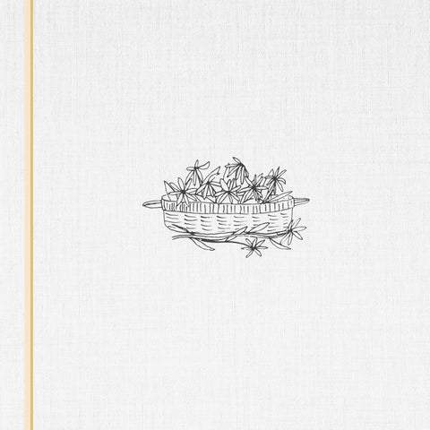
Primary Logo Black Eyed Suzie’s primary logo is rustic and nostalgic with an organic feel. The rough quality of the serif letters is reminisent of a vintage book, giving it a cozy and comforting vibe. The wide spread spacing helps it feel open and welcoming. The icon features a really loose hand-drawn basket of back eyed suzies comissioned by an artist held dear by the owner. It’s style makes it feel relateable and attainable adding to the local handcrafted feel of the brand. The main logo will be used across primary brand applications. This trademark helps audiences easily identify the website, social media presense, ads, and other materials, and it enhances the vibe of the brand. It is essential to the success of the brand that the logo always be applied with care and respect in every application according to these guidelines.
Secondary Logo Black Eyed Suzie’s secondary marks can supplement the primary logo (E) however never use these marks directly
lockup
a. stacked
next to the primary logo. For instance, don’t use F as the
e. short stacked
profile picture if the primary logo is used for the header - it
marks
looks repetitive and isn’t a good use of the brand elements. Some can be used in replace of the primary logo (A,C,G). The Monograpms and badges can be used when the full primary logo is not necessary (B, D, F) or in cases where the brand name is already displayed in plain text. For example, option D could be used as a profile picture on Instagram since the username will be adjacent to it in plain text.
e. Built In
badges
b. Square Badge c. Circle Badge
mongrams d. Letter
f. Stacked Monogram
a.
c.
BL
E
H
e.
f.
BU ILT IN
d.
EYED S K U C
ZI
A
b.
OM
E & G
IF
g.
T
Color Usage
The color usage for Black Eyed Suzie is fairly minimal. The logo will mostly be used in black or white (A.B.D). When necessary, it can also be presented in a solid brand color (C).
BLACK EYED SUZIE home & gift
BLACK EYED SUZIE home & gift
Clear Space
To ensure
legibility, always keep a minimum clear space around the logo. The space isolates the mark from any competing graphic
BLACK EYED SUZIE home & gift
elemets like other logos or body copy that might conflict with, overcrowd, and lessen the impact of the mark
Photo Background There are a couple ways the logo can be used on photographic backgrounds, but each option should be exercised with care, making sure the logo and type aren’t obstructed by the image. In most cases, you can use either a solid white or solid black logo on top of a background image. TIPS: 1. Photos with shallow depths-of-field work best. 2. Avoid busy images with too much detail 3. Applying darker transparent overlay on an image helps make the text more readable.
E STA B L IS H E D I N 2 0 1 9 Quality home goods and gifts bought locally Home & Gift Online Shop Lo cated in New England
Typography Typography is a powerful brand tool when used consistently. This set of typefaces best represent the whimsical and rustic feel of the brand and should be used across all print & web applications.
SMART CHAMELEON abcdefghijklm nopqrstuvwxyz 1234567890
White Angelica
a b c d e f g h i j k l m n o p q r s t u v w x y z
1 2 3 4 5 6 7 8 9 0
Color Palette Color is an integral part of the brand identity. Consistent
MOOD LIGHTING C=4 M=7 Y=20 K=0
use of the color palette not only reinfoces the cohesiveness of the brand, but also serves a psychological purpose by communucating a certain feeling to your audience. Gold is elegant and high-quality, but the warmth also makes it feel inviting. To offset the richness of the gold muted sea and navy tones bring the brand back to it’s rustic, local roots and focuses on its reliable commitment to quality, sustainablity, and relatability.
PABLO HONEY C=12 M=24 Y=66 K=0
SEA & SKY C=22 M=8 Y=15 K=0
NOVELTY WAVE C=82 M=73 Y=33 K=18
CHARCOAL C=0 M=0 Y=0 K=90
CK
EYED S U
OM
IF
E
BL
ZI
A
BU ILT IN
H
E & G
T
Final Comments If ever in doubt, just refer back to this guide or feel free to get ahold of me (sonikaur.creatives@gmail.com). These guidelines are fairly flexible and should allow for enough creative freedom to use the logos as you see fit while making sure the brand looks its best across all applications.
branding & design
sonikaur creatives