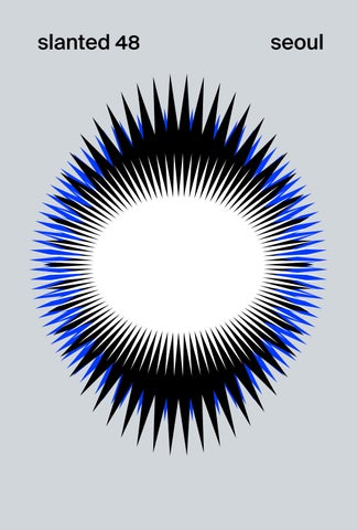
slanted 48
seoul
seoul digital tools visits and authors
type & typography graphics illustration 3d motion image publishing And thanks to the more than 1,000 people who web responded to our call for entries, a selection of their work is presented in this issue starting on page 78. playground work surroundings handle type deep dive
6699Press, A Studio A, AABB, Minkee Bae, Bokdo, Géraldine Borio, Bowyer, James Chae, Hwashin Choi, Sulki and Min Choi, Daeki and Jun, DDBBMM, Everyday Practice, Hyyeun Gim, hongbaksa, JANGHERO, Taehyoung Jeon, Soo-Hee Kang, Andy Khun, Chang Sik Kim, Nuri Kim, Sujin Kim, Youjin Kim, Miran Lee, Noheul Lee and Loris Oliver, Major Minority, Jeong-in Mun, Hezin O, Ordinary People, Paika, Practice, Chris Ro, Rojotype, Kathleen and Christopher Sleboda, Sparks Edition, The Book Society / Mediabus, WORKS, Choong-geun Yoon, Zombies, Cults & Hoarders
Slanted #48
Seoul
1
NA KIM → Rise up for our lives!, Image courtesy of The May 18 Memorial Foundation, 2025 Poster for Zeitgeist Project initiated and curated by Everyday Practice
압박 속의 디자인 DESIGNING UNDER PRESSURE
The first time I came to Seoul, in March 2024, I was struck by the facades covered in air-conditioning units, the cooling sprays and sunshades at pedestrian crossings, heated toilet seats, and the strange obsession with controlling temperature everywhere. Every evening we drifted through the night markets, drank beer in the hip Euljiro district (을지로), then warmed up in a tiny corner bar we fell in love with. The toilet was next door, inside a print shop where an old Heidelberg GTO rattled day and night, printing flyers for the shops around it. Then, last summer, the heat hit like a hammer. Seoul is everything: brutally cold and hot as a fire-breathing dragon. The asphalt boils, the subway freezes. Slowly the city opened up to me, less through monuments than through rhythm, acceleration, visual density. Storefronts, public space, fashion, consumption: everything seems to change, reinvent itself. Whole neighborhoods look as if they have been redesigned overnight. I visited 15 studios, publishers, and educators across the city. Out of taxis, into subways, up towers and narrow staircases into small workspaces. I found design practice driven by ambition, improvisation, and fantasy, but also exhaustion and survival strategies. Seoul seems built for graphic designers: pressure, visual overload, explosion, and above all, speed. Works (pp. 24) describes Seoul like this: “Consuming fashion, consuming food, consuming music, consuming consuming consuming.” It sounds like a song lyric, then turns into a diagnosis. Consumption here is less an activity than an atmosphere. South Korea’s rise to global economic and cultural power happened at breathtaking speed. After war, authoritarian modernization, and radical industrialization, the country moved within generations from postwar poverty to a global tech power. Samsung, Hyundai, and LG led the way, followed by K-pop, soaps, and digital culture. But acceleration has consequences. Chris Ro (pp. 32) talks about an “oversaturation of designers.” The same boom that elevated the profession created new instability. Competition rises. Pressure rises. Looking back on ten years of independent practice, Paika (pp. 14) says casually: “During these ten years burnout came repeatedly.” We heard similar undertones everywhere. Criticism was rarely direct. It appeared in small remarks, hesitation, matter-of-fact descriptions of exhaustion. K-pop is not my music. But I am interested. Not necessarily as entertainment, but as infrastructure: economy, image production, a design system operating at national scale. From the outside, it’s pop music; from the inside, every release is a full brand launch. Storytelling, typography, fashion, packaging, and space all connect. Sparks Edition (pp. 46) describes K-pop as identity building, where every release “functions almost like a brand identity,” creating visual worlds where fans “experience the story physically.” For Bowyer (pp. 20), this rise connects directly to Korean history. “Our country doesn’t really have a continuous modern history,” says Hayam Lee. “Our history was interrupted through colonization and war. Rather than identity or tradition, our strongest identity became survival.” K-pop became a projection of collective ambition, with success somewhere
at its core.
2
Slanted #48
Seoul
Paju Book City sits just a few kilometers from the North Korean border, concentrating publishing and printing close to the Demilitarized Zone (DMZ), a 4-km-wide buffer zone separating North and South Korea). PaTI (Paju Typography Institute) is here too. I drank tea with founder Ahn Sang-soo, then spent two days at SAA, the screen-printing workshop run by Lee Sanha and Jung Sung-hun, printing posters with Hezin O (pp. 58) and Lee Yunho of DDBBMM (pp. 62). North Korea itself came up surprisingly rarely in our conversations. Its absence was more striking than its presence. At some point my phone vibrated with an emergency alert: balloons carrying waste from North Korea had entered South Korean airspace. North Korea is permanently there, yet permanently distant, overshadowed by the immediate pressures of Seoul’s everyday hustle: work, visibility, competition. For many studios, independence is no longer a romantic ideal; it is a survival strategy. Works (pp. 123) says of their beginnings: “We had many difficult things, but eventually we created our own attitude toward work ourselves.” Alongside client work, designers run archives, publishers, and collectives. At the AABB (pp. 54) book archive, books become a form of resistance against disappearance. Founder Jaewon Seok recalled studying under Ahn Sang-soo: WFor the first time I realized that letters themselves are designed by someone. I didn’t know that letters are the foundation of all design.” AABB built an archive for independent print, preserving physical work before it vanishes. Visibility is personal too. Not only in relation to books and archives, but to people. For Kyung-min Lee from Bokdo (pp. 28), publishing connects to queer culture and social presence, using books to “convey a message that is a little more sensitive or a little more taboo in everyday life.” The contrast is sharp: queer positions are highly visible in Seoul’s design scene, even as Korean law remains conservative, without comprehensive anti-discrimination legislation or legal recognition of same-sex marriage. Still, things shift; in 2024, the Supreme Court ruled that same-sex partners were entitled to equal treatment under the national health insurance system. Power dynamics surface too. Works spoke of environments where authority is coded through age and gender: “People sometimes don’t trust us because we were too young and women.” Eunji of Major Minority (pp. 38) remembered entering pitch rooms dominated by male clients: “They looked at me like trying to say: what the hell are you doing here?” Then there is type. Designing Korean typefaces can mean drawing around 11,000 characters. Hezin O remembers a generation educated through imported Western modernism: “Teachers always told us: use Helvetica or Univers.” Later, designers began choosing ugly typefaces. A new generation broke the rules, embracing raw type and building its own visual language. Contemporary Korean design is becoming more confident, independent, and less referential. Seoul doesn’t feel like a design scene with a unified identity, but like a city negotiating itself in real time. Identity here is less a style than a condition. No finished language, but an ongoing process. Seoul keeps designing itself. Lars Harmsen Slanted #48
Seoul
3
일상의실천
Dongdaemun Festival: Moving Stage, 2024
EVERYDAY PRACTICE
4
Slanted #48
Eojin Kim, Kyungchul Kim, and Joonho Kwon
Seoul
10 Years of Everyday Practice, 2023
일상의실천 EVERYDAY PRACTICE
Slanted #48
Seoul
5
The Postmodern Child—Part 2, 2023
일상의실천 EVERYDAY PRACTICE
Slanted #48
Seoul
13
파이카
RE:PLAY, 2026
PAIKA
14 Slanted #48
Jihoon Ha and Suhyang Lee
Seoul
The 2nd Humanities & Culture Festival, 2025
파이카 PAIKA
Slanted #48
Seoul
17
19 / 21, 2025 • MODAFE, 2026
Chungju Mokgye Byeolsinje, 2026 • 16 / 24, 2025
파이카 PAIKA
18 Slanted #48
Seoul
메이저마이너리티
L. Practice, 2022
MAJOR MINORITY
38 Slanted #48
Eunjin Lee and Ted Hyunhak Yoon
Seoul
Into The Rhythm, 2025
메이저마이너리티 MAJOR MINORITY
Slanted #48
Seoul
39
Reference Library System, SeMA Art Archives, 2023
로호타입 ROJOTYPE
44 Slanted #48
Seoul
A Year in Korea / Korean Life Passages, 2025
로호타입 ROJOTYPE
Slanted #48
Seoul
45
Design without discrimination, 2023
6699프레스 6699PRESS
72 Slanted #48
Seoul
Happyend, 2026
6699프레스 6699PRESS
Slanted #48
Seoul
73
call for entries
오픈 콜
78 Slanted #48
209 OUT OF 1586
Seoul
Slanted #48
Seoul
79 BYUNGROK CHAE → Beauty, 2019
HONGBAKSA → Masquerade, 2022
BYUNGROK CHAE → Bigriver Poster Festa, 2018
우즈베키스탄·카자흐스탄 수교 30주년 기념 고려인 사진 기증 특별전
한국문화예술위원회-백남준아트센터
아르코예술극장 대극장
백남준 20주기 국제학술심포지엄
Arko Arts Theater Grand Theater
International Symposium on the 20th Anniversary of Nam June Paik’s Passing
2026.04.23.
국립민속박물관 기획전시실
STUDIO FWB → Paik After Paik, 2026
82 Slanted #48
LIFT-OFF → Корейцы, Корё сарам, 2022 Seoul
Slanted #48
Seoul
83 MINHEE SON → Home Sweet Home, 2023
88 Slanted #48
Seoul
ZEROANDJUNE → Starfish, Starfish, 2023
HAERI CHUNG → There is an error in the output value, 2023 • STUDIO HIK → Silent Noise, 2024 • DVRP → <푸른 눈동자 속에> 포스터, 2026
Slanted #48
YERIM CHOI, PATRICIA ZADRIMA → mixed typography, 2026 • STUDIO WOONG → Most Ideal Pose to Throw Water Surf, 2025 • HAERI CHUNG → Dental Critic, 2025
GIHONG PARK → World Premiere, 2025 • SUNHO LEE → When Clouds Appear in a Clear Sky, 2024 • MOONANHAN → MARS151, 2025 Seoul
89
MOON JANG → Writing the World, Doing Feminism, 2019
JUNHEUM NA → The Typesetter’s Route Map, 2024
JUEUN KANG, ZEROANDJUNE → Disassembly & Reassembly, NAO LEE → APOCRYPHAL2, 2023 2024
96 Slanted #48
Seoul
JIN & PARK → Homage to the Work of Philip Henry Gosse, 2021 JOONGHYUNCHO → Poster for the jackingcong, 2023
CHAEWON SHIN, SEUNGHEON SHIN → Viewfinder: Homo Panoptes, 2024
MANO AN (AHN GRAPHICS) → Dasi Gaebyeok, 2020 Slanted #48
Seoul
97
110 Slanted #48
Seoul
STUDIO.MAUS → Bat-Community Gardening Planting Korean Herbs, 2026
STUDIO WOONG → Visual Arts Support Project, 2026 • JIN & PARK → Gwangju Media Art Festival, 2018 • SAROK → Gourd Flower (Bakkkot), 2024
Slanted #48
JAEMIN LEE → Pause—Gleam—Thread, 2025 • JAEMIN LEE → Scenes in Lesser Fullness, 2025 • GIHONG PARK → & because my mother was crazy, 2024
KIMYOUNGSUN → “Nostalgia” by Jeong Ji-yong, 2024 • LIFT-OFF → Roadkill in the Theater, 2020 • YAO SUN → Come Back to Dongnae Harbor, 2025 Seoul
111
TRIANGLE-STUDIO → DMZ PEACE TRAIN MUSIC FESTIVAL, 2024
GUHO CHOI → The Real Man, 2026
CHRISTOPHER SCOTT → K-Design Culture, 2023
114 Slanted #48
STUDIO WOONG → NEXT HI-LIGHT, 2025 Seoul
HAERI CHUNG → SYNTHESIZE III, 2024 JIAE KIM → 2000’s, 2025
HAERI CHUNG → A Plane settled on A Ball resting on A Pen, 2026
BULLDOZER → WESS Exhibition / Publication, 2024 Slanted #48
Seoul
115
NAO LEE → Soo Yoo Sangwhal, 2024
JINHO KIM, FARRAH LEE, MINJUNG LIM, SOOJIN SON → Text, Typography, Books: Connecting the Dots, 2025
00GRAPHICSTUDIO → k-culture crowdfunding poster, 2026
120 Slanted #48
NAO LEE → Youth Lab, 2024 Seoul
NAO LEE → DOTSTORM, 2025 SUNG KOO KIM → Fifty Sounds, 2022
EUNJOO HONG, HYUNGJAE KIM → Oblivio 1: Fragments, 2025
SEUNGHEE HONG → Baekseok University Digital Image and Animation Major 22nd Graduation Exhibition Key Visual Design, 2025 Slanted #48
Seoul
121
ANT GRAPHICS → 10, 10, 10, 2024
SAROK → BIG IDEAS make no little plan, 2023
STUDIO MNEE → Dawn market on the Lawn, 2024
122 Slanted #48
MISUN CHOI → Nopo Table, 2025 Seoul
Slanted #48
Seoul
123 YOUNGHUN JUNG → VOICE OF EULJIRO, 2021
slanted video interviews 260+ figures of the design scene
Lars Harmsen & Marian Misiak, captured by Patryk Wiśniewski in Seoul
switzerland istanbul paris new york marrakech portugal warsaw helsinki athens tokyo dubai prague rwanda los angeles stockholm amsterdam cairo seoul
slanted.de/seoul
fontnames illustrated
폰트네임즈 일러스트레 이티드 AG BANCHAN — Hwashin Choi — 최화신 DS DDUNGSANG — Hyyeun Gim — 김희은 210 TAEGEUK GIRLS — Taehyoung Jeon — 전태형 210 SALTY SHRIMP — Andy Khun — 앤디 쿤 AG TECHNOJOY — Nuri Kim — 김누리 JTT BAREUNSAENGHWAL — Sujin Kim — 김수진 DS PANGPANG — Miran Lee — 이미란 Slanted #48
Seoul
145
210 Taegeuk Girls
Taehyoung Jeon → @marimarijeon
148 Slanted #48
Seoul
210 Salted Shrimp Andy Kuhn → @kokoon
Slanted #48
Seoul
149
DS pangpang Lee Miran → @uniquist
152 Slanted #48
Seoul
10×10
인터뷰
Minkee Bae — 배민기 Sulki and Min Choi — 슬기와 민 Chang Sik Kim — 김창식 EVERYDAY PRACTICE — Joonho Kwon — 일상의실천 DDBBMM — Kangin Kim and Yunho Lee — 김강인 / 이윤호 A STUDIO A — Jaehwan Lee — 이재환 WORKS — Yeonjeong Lee and Harim Lee — 워크스 THE BOOK SOCIETY / MEDIABUS—Kyung Yong Lim — 임경용 Hezin O — 오혜진 PRACTICE — Yoon Seok Yoo — 유윤석 1. Skip the studio biography. Who are you beyond the portfolio? What keeps you attached to design, and who might you have become if design had never claimed you? Also: where does work actually begin for you? In research, language, intuition, irritation, form, or somewhere less controllable? Minkee Bae Born in the 1980s, I experienced my teenage years during Korea’s rapid rise as a consumer society. The popular culture of the 1990s reached me through FM radio, magazines, record shops, and imported media. NBA, Nike, alternative music, cyberpunk, Japanese animation, and global subcultures coexisted without hierarchy. Absorbing and recombining these influences shaped my approach to design. My relationship with design comes not only from a visual interest, but from a desire to understand how cultural materials can be translated and given new meaning. In commercial design, I see the designer’s role as questioning the boundary between originality and reference. Creation is not about making something from nothing, but about selecting, interpreting, and transforming existing cultural resources.
Slanted #48
This becomes clear in communication with clients. Requests such as “make it classic” or “make it in a street and hip hop style” can refer to very different visual languages, from Gothic printing and Victorian aesthetics to graffiti, workwear, or comics. The designer’s task is to unpack these broad categories and understand what is truly being requested. Through research, intuition, language, and visual analysis, design takes shape in the negotiation between references and interpretation. Sulki Choi and Min Choi Choi: I do design because it’s the only thing I like doing and can do relatively well. I would have been a depressed nobody if I hadn’t had the call. Graphic Design Saved My Life. Choi: Where does the work begin? On a better day, a work would start with irritation. But normally, we would follow intuition disguised as research. We don’t care too much about form. Chang Sik Kim I have always considered myself a dreamer, drawn to curious ideas and the hidden structures that shape human life. As a designer, educator, and lifelong learner, I see design as a way of understanding the world and connecting perspectives. What continues to fascinate me is its ability to reveal
Seoul
153
What engages me is that, despite its highly modular but reciprocal. As a result, even though we work with structure, it is actually very difficult to turn into different writing systems, I think the formal boundsuccessful typeface. Conventional ideas of beauty and aries between national design cultures have become public expectations of legibility often make designing increasingly blurred. with Hangeul far more challenging than its systematic I don’t see Korean design and international design logic would suggest. as fundamentally different. Contemporary design Whenever I work with Hangeul, I begin with a across cultures is shaped through continuous mutual simple question: should I follow the system of Hangeul influence, and our understanding of letterform, proitself, or the conventions of Hangeul type? To put it portion, rhythm, and visual composition is largely simply, choosing the former often means creating shared within the same global moment. I no longer custom lettering, while choosing the latter means believe these visual languages belong exclusively to selecting the typeface that best serves the intention any particular culture, nor do I think there is a hierof the project from among those that already exist. archy among them. In reality, however, Hangeul is rarely used on its Yoon Seok Yoo I agree that Hangeul has shaped own. That is both a benefit and a consequence of the Korean designers’ typographic sensibilities, although I linguistic environment we live in. Korean typography can’t say whether my own sense of rhythm and spacing almost always has to coexist with Western punctuation, comes from Hangeul specifically. Korean designers Arabic numerals, and, in most cases, the Latin alphabet. work strongly influenced by Latin typography. We’re At that point, international typographic standards expected to work with Hangeul and Latin side by side and conventions naturally become part of the process. all the time. Designing with two writing systems is In my own practice, when designing multilingual uneconomical. It doesn’t just double the typesetting typography, I usually choose the Latin typeface first. labor, but you also have to wait for translations. Two Yeonjeong and Lee Harim H: Someone who languages take up more space on the page and make uses Hangeul also sees Latin differently. In a mixed- everything denser and more complex. We’ve learned script setting, the intent behind using Latin—there’s to make use of the dissonance and the textural contrast a clear difference from how native Latin-script users between the Hangeul and Latin text. Perhaps that approach it. constant negotiation has shaped Korean designers’ Y: It’s not that it permanently altered something— sense of rhythm, spacing, and composition. you’re simply born into thinking differently, with no other option. Even the idea that it’s “modular” and 4. “geometric” is information we learned later, through Ahn Sang-soo once said: “Letters are the key to other people’s eyes looking at us. For us, it was just our how much of a culture can be preserved, and how own language, our own sense of form—but lately, with much it will shine in history.” But today culture travels more and more foreigners using Hangeul, it’s starting through algorithms, feeds, platforms, and endlessly to feel international too. It’s an interesting moment. recycled imagery. Has typography lost cultural authority Kyung Yong Lim To be honest, I’m not a graphic to digital visibility? And if culture now moves at the or type designer, so I don’t feel qualified to answer speed of platforms, what power does graphic design this from a professional standpoint. As someone who still realistically have? works with books, however, I find Hangeul to be a Minkee Bae The ideal of the designer as someone remarkably beautiful writing system with a visual who questions how society constructs taste, meaning, structure and rhythm fundamentally different from and value through visual forms emerged under specific the Latin alphabet. Many Korean type designers historical conditions in Western Europe and North have developed original approaches that build on the America. Korea followed a different path, shaped by unique characteristics of Hangeul rather than simply industrialization, advertising, popular culture, and adapting Latin typographic conventions. constant translation between local and international I also appreciate that many companies, institutions, influences. That tension became one of Korean graphic and local governments have made high quality Hangeul design’s defining strengths. fonts freely available, making good typography more Today’s platforms and algorithms have not accessible. While international standards continue to degraded graphic design into something completely influence Korean design, I believe Hangeul has developed different, but have made more explicit the unstable through its own visual logic and cultural context. character that graphic design had always possessed. Hezin O One of Hangeul’s defining characteristics Rather than relying on lasting cultural authority, is its structural system, in which each syllable block is design now creates moments of meaning within a concomposed of initial, medial, and final consonant and tinuous flow of images. Its power has not disappeared; vowel elements. That structure can certainly influence it has been redistributed. the way I develop graphic systems from time to time. Sulki Choi and Min Choi Choi: Typography, along At the same time, however, I sometimes feel uncom- with printed media, might have lost its traditional fortable with questions that attempt to distinguish authority, but we don’t think about it all the time, design practices according to nation or language. partly because we don’t care whether our culture Today, designers constantly share their work maintains its place in the future. through social media and influence one another in real Choi: Who wants such power if it means a bunch time. These exchanges are no longer one-directional of men in black suits gathering in a private club to
158 Slanted #48
Seoul
discuss, over a glass of wine, the exquisite details of lost its leadership. The terrain has simply expanded, swash italics? If typography is a minority concern and typography remains essential across all media. today, so be it. We still like it, and as long as we have While we mostly handle analog media, we do not things to do, we’re good. view it as superior to digital feeds. We just personally Chang Sik Kim The Korean typographer Ahn dig deeper into physical objects because we like Sang-soo once said that “letters determine culture,” them. Typography finds its rightful place and utility arguing that writing carries a society’s history and in any medium. Even if culture moves at the speed of collective memory. I believe this remains true, even platforms, graphic design still holds practical power. though culture today is shaped by digital systems. (Though, admittedly, churning out those rapid visuals is Algorithms and platforms now influence how exhausting.) When data and images exist in a scattered information spreads, leading some to question the state, the designer’s role—to find a visual order and relevance of typography. However, its role has not utility that fits the context, regardless of the medium— disappeared; it has shifted. If typography once pre- remains unchanged. If anything, the fact that AI is beginserved culture, it now interprets it by shaping how we ning to replace this role is a much more urgent matter. read, understand, and experience information. Jaehwan Lee As a means of communication, In digital environments, typography exists between I often feel that not only typography but written language and image. While platforms can distribute language itself no longer holds the cultural authority content, they cannot create meaning or collective it once did. This has been one of the questions in my memory. Design therefore remains essential, not only own research for quite some time. Three years ago, I as a tool for communication but as a way to question, published a paper in Letter Seed (글짜씨), the journal reveal, and encourage reflection. of the Korean Society of Typography, titled Changes in As AI and algorithms increasingly shape our deci- Channels for Consumption and Distribution of Graphic Design sions, typography and design should create moments Works and Their Formal Characteristics (그래픽 디자인 작품 of critical distance. Trends may be driven by platforms, 의 소비 및 배포 창구 변화와 그 형태적 특성). but cultural meaning is still formed through language, At the time, I was interested in the shift of graphic typography, and design. design’s primary site of consumption—from printed Joonho Kwon You could see it that way. In the matter to digital screens, especially the Instagram digital environment, letters and typography are in a feed. Through a series of case studies, I examined how different position than before. People consume short designers responded to that transformation. Today, videos and images before long texts, and platforms the balance has tipped even further. Print is often circulate new images at an ever faster pace. It can regarded as a secondary by-product rather than the seem as though cultural authority has shifted from primary medium. the word to the image. Another issue comes from the platforms themselves. But I don’t think the image can replace the word Fixed aspect ratios, predefined templates, and limited completely. Images move fast, while words linger. typographic options increasingly determine how we Images create immediate emotion, while sentences communicate. This is particularly uncomfortable in hold thoughts in place. When we remember important Korean typography, where multilingual typesetting social moments, there is usually a sentence connected is almost always unavoidable. I am often forced to to the image: a declaration, a slogan, a single line. combine Hangeul and Latin typefaces that were never Working on Zeitgeist confirmed this for me. We intended—either historically or visually—to coexist. began by reading manifestos from Korea’s modern In this environment, I think the role of a graphic history. Written decades ago, these sentences still designer is, ultimately, to protect the (designed) page. carried force. What moved people before any poster We continually wrestle with surfaces that have not was not the image, but the words behind it. been designed—or perhaps cannot truly be designed— I don’t see image and text as competitors. They and try to make them more readable and give them work differently. The image stops a person; the word better form. I believe that remains one of the most makes them stay. Graphic design connects the two. As important responsibilities of graphic designers today. culture moves faster through digital platforms, graphic Yeonjeong and Lee Harim H: If letters have design’s role becomes even clearer. We are not only moved toward digital visibility—toward image—that’s creating images; we are deciding what to remember, just another change we need to adapt to, nothing more. what to connect, and what to preserve. The faster Y: At this point, I feel like images have started everything becomes new, the more valuable it is to functioning as letters. If we think of letters as a hold on to meaning. That is the power graphic design medium for carrying a message, we’ve been more or can still have today. less forced to develop the ability to communicate Kangin Kim and Yunho Lee We don’t believe abstractly through all kinds of things beyond letters letters and typography have ever held an independent too. I think typography’s intensity hasn’t faded— authority that transcends the platform itself. Typog- if anything, it’s gotten stronger. raphy has always coexisted with its medium. Its Kyung Yong Lim First of all, I think this is a really past authority was simply manifested on the “book,” thoughtful question. I don’t think I have a definitive which was the mainstream platform of that era. Now, answer. Platforms have undoubtedly transformed as platforms diversify, the mainstream has merely the way culture circulates. Images and information shifted to screens and algorithms; typography hasn’t move at incredible speed, and algorithms increasingly
Slanted #48
Seoul
159
create out of a belief in authentic cultural roots and those who view those roots purely as export commodities, all collide. Jaehwan Lee When it comes to cultural authenticity, I sometimes feel I am both too much of an insider and not enough of one. I was born and raised in Korea, but I grew up after many of its traditional social structures had already begun to dissolve. Rather than inheriting tradition directly, I belong to a generation that has experienced it as part of its cultural environment. From time to time, I notice a subtle sense of superiority in the way some designers—or visual artists more broadly—approach Korean vernacular visual culture. Surprisingly, that attitude can even appear in works that aim to appreciate or preserve it. Whenever I encounter this, I find myself asking the same question: is this perspective justified because we are insiders, or is it precisely because we are insiders that we should be more cautious? I believe cultural authenticity can be a valuable cultural resource and a meaningful material for creative work. But it demands humility. The moment it becomes entangled with superiority, elitism, or the objectification of the people and cultures it draws from, authenticity is easily transformed into just another product for cultural consumption. Yeonjeong and Lee Harim H: Korean aesthetics— dynamism itself is the aesthetic, and that feels like an unchangeable character trait. But there is also a huge range of individuals who don’t fit into that single mold—they’re not dynamic, they don’t accelerate. That said, there’s no denying that the popular export product is the dynamic one. Kyung Yong Lim I have never been particularly interested in the idea of cultural authenticity. To be honest, I don’t think it helps us understand contemporary culture very well. I’m much more interested in surfaces—not because they are superficial, but because they are where different histories, technologies, memories, and desires become visible. When people talk about K-culture, they often imagine something that originates in Korea and is then exported to the rest of the world. I think the story is almost the opposite. Much of what we now call K-culture has developed together with global platforms such as YouTube, Netflix, Instagram, and TikTok. These platforms do not simply distribute culture; they actively shape the conditions under which culture is produced, circulated, and even imagined. In that sense, K-culture is not only Korean. It is also a product of the infrastructures through which it travels. Every culture contains multiple histories and memories. Korea is not unique in that respect. What feels distinctive to me is the way Korean culture works on the surface. It seems remarkably comfortable borrowing, remixing, accelerating, and recombining images, narratives, and visual languages without becoming overly anxious about origins. I don’t see this as imitation, nor as a search for authenticity. It feels more like a way of reading the present through existing cultural materials.
170 Slanted #48
Perhaps this is why I sometimes think of Korean culture less as an identity than as a practice. It absorbs global influences, reorganizes them, and sends them back into circulation in unexpected forms. Rather than preserving an original essence, it often produces small glitches within larger cultural systems—moments when familiar forms begin to behave differently. That, to me, is far more interesting than authenticity. As a publisher, I have become increasingly convinced that we are living in a post-digital condition where originality matters less than circulation. Culture survives because it continues to move—through translation, publishing, distribution, and now through platforms. Perhaps the question is no longer whether something is authentic, but whether it is capable of generating new relationships as it travels. Hezin O I don’t think Korea’s cultural authenticity lies primarily in things like Confucian traditions or the memory of colonialism. Rather, I think it lies in a contemporary, universal agenda where all of these different influences are mixed together. Because of its history of colonization, war, and rapid modernization, Korea has, in many ways, experienced a break from much of its past. But perhaps for that very reason, contemporary issues tend to matter more than preserving long-standing legacies. Rather than defining itself through what has been inherited, Korea is constantly negotiating what is happening in the present. Take Parasite, for example. I think it resonated around the world not because it was uniquely Korean, but because it addressed the universal issue of economic inequality. By engaging with a theme that transcends national borders, it was able to connect with audiences regardless of their culture, religion, or background. Yoon Seok Yoo I’m not sure this is unique to Korea. Culture is always shaped and reshaped through exchange with the outside world. It’s not very useful to define what cultural authenticity really is. Whether a project is aimed at a global audience or a local one, I’ve seen many fail because they tried too hard to express “Koreanness.” I think authenticity is more likely to be found in the small details of today’s Korea than in the idea of “Korean style.”
Seoul
essays
에 세 이
NOHEUL LEE AND LORIS OLIVIER — 이노을 / 로리스 올리비에 GÉRALDINE BORIO — 제랄딘 보리오 JANGHERO — 영웅 HONGBAKSA — 홍박사 KATHLEEN AND CHRISTOPHER SLEBODA — 캐슬린 / 크리스토퍼 슬레보다 ZOMBIES, CULTS & HOARDERS — 좀비, 사이비 종교, 그리고 수집광들 JAMES CHAE — 제임스 채 SOO-HEE KANG — 강수희 YOUJIN KIM — 김유진 JEONG-IN MUN — 문정인 Slanted #48
Seoul
171
muht (멋) vs. sachi (사치) JAMES CHAE James Chae is a Korean-American designer and educator passionate about K-pop, design and music culture. He publishes Pudding Label, co-hosts Graphic Support Group Podcast, and directs Pudding Projects.
K-pop and Korean pop culture is now known for immaculate production, unattainable beauty standards and super spicy sweet flavors. There are some roots to these characteristics that have long been part of the contemporary history of Korea, but the level of polish we experience today wasn’t always a defining feature. It took a while for me to grasp the essential power that Korean style possesses. When I was able to find it and make distinctions between all the different Korean design, music, film, TV, dramas and foods I thought of two colloquial words muht (멋) for stylish and sachi (사치) for excess. The story of my confused denial started early on. I grew up in the US and lived through the video tape era. An experience that many Korean-Americans of my generation share was the weekly trip to the Korean market accompanied by a stop at the video store. Around the age of nine or ten, I started making requests for certain shows. A couple tapes of Sunday, Sunday Night or Inkigayo sat in the trunk with a whole season of Hourglass or whichever weekend drama had captured Korea the previous year. At first, I watched my videos in private, in awe of Seotaiji and Turbo, but it was when Kim Gun-mo’s Wrong Meeting was released that the shows became a family affair. This hit song, even to my young ears, felt Korean. My parents nodding their heads along to the rapid fire lyrics and pulsing techno kicks was a validation of the same recognition. In retrospect, their approval may have been more about their delight in my enthusiastic dancing, but the reception was welcome to me.
198 Slanted #48
Seoul
I felt validated of being Korean and having my own culture to connect to. In 1996, right as I was at the age of trading CDs and recording mixtapes, we moved to Korea where I lived until I was eighteen. So, it was with these few intimate experiences with music shows on tape that formed my sense of Korean pride up until the move. In addition to the culture shock I experienced I immediately had issues with the popular Korean music acts who I could now easily watch on TV. The jarring dissonance of groups like H.O.T. or g.o.d is described by what Crystal S. Anderson calls cultural hybridity. Anderson diplomatically navigates the tricky distinction between appropriation and inspiration that early Korean music producers drew from Black American culture. Her examination provides a more nuanced view of how the genres hip hop, rap, R’n’B, new jack swing and soul became part of popular Korean music. But before encountering Anderson’s research as an adult, my sophomore self was too cool for school, so I felt all these acts were scammers and thieves.
Fig. 1 Majah Flavah logotype, a distinctive design commonly featured on the brand’s T-shirts. Logo: © Majah Flavah
The best distillation of my disdain was embodied in YG Entertainment’s fashion brand Majah Flavah. The brand was started by Sean of YG’s Jinusean group in 1997 and capitalized on the expanding wallets of Korean youth. To me, Majah Flavah was an abomination and the exact opposite of its brand name, which symbolized specialized taste. Everything about the brand was a direct lift from the boom of hip hop fashion and merchandising growing in America. This was the time of Pelle Pelle, Phat Farm, ECKO and Sean John. I didn’t find anything unique about Majah Flavah and I was insulted by the M.F.! logo (Fig. 1). How dare you call me a motherfucker?! Beyond the anger that MF! ignited in me, my rejection of Korean pop culture in my past fills me with regret. Had I paid deeper attention I could’ve witnessed more carefully the evolution of Korean popular culture out of a stage of appropriation into one of hybridity. One group whose creative achievements I undervalued in my youth was Deux. Members Lee Hyundo and Kim Sungjae were active during my video tape years, but I was too enamored by Seotaiji’s rock fusion to really pay attention. In High School, a friend taught me a lesson in Korean style, or muht (멋). He was one of the few friends with whom I could talk about art, anime and art films in the same sentence and he was a huge fan of Deux. I tried to argue with him that they were posers. His main argument was that Deux was pure in their Koreanness. He felt that they were uncompromising in how they presented themselves and resisted mimicking American trends. He had a better idea of why Kim Sungjae was driving a low rider in his music video for As I told you. “But why the hell is he wearing hockey gloves? Why are they wearing flannel blazers? Why does Lee Hyun-do have a single dreadlock under his red bandanna?” I’d argue back. To which he’d reply, “because it looks good. It’s not what they’re wearing, it’s how they’re wearing it.” I ignored his praises for many years. It was after working as a graphic designer that I grew an appreciation for the duo while searching back at their album covers. Looking at Deux’s self-titled debut album today, the styling and typography of the album jacket Slanted #48
Seoul
199
is constantly sidestepping potential ugliness. In this context, ugly does not just mean aesthetically unpleasing; anything outside the norms of K-pop aesthetics can inspire displeasure. This essay will compare two series of images by photographer and art director Cho Gi-seok. Cho, best-known for his direction of Jennie’s “ZEN” music video, is one of the most wanted creatives in K-pop today. Yet, the difference between his work in collaboration with the K-pop industry and his work outside it reveals what kind of beauty is permissible within the bounds of K-pop. 2. By the time Cho Gi-seok made his first foray into the K-pop industry in 2023, he already had a robust career as a fashion photographer and art director. This is an important industrial context because he did not start as a direct hire of an entertainment agency, while many other creative directors are. He was an established creative who collaborated with a major agency on a K-pop project, a practice that has become more prevalent recently. The strength of K-pop as an entertainment form has long stemmed from its wide reservoir of references. As early as the 1990s, the era of the industry’s inception, K-pop drew visual inspiration from diverse cultures like hip-hop, Japanese visual Kei, and “girl power” media such as the Spice Girls. Today, decades later, anything from Korean Buddhism to Marilyn Monroe can serve as the basis for concepts. Thus, more often than it creates completely new trends, K-pop creative direction is adept at selecting and remixing trendy visual tropes. Like the coolhunters of the ’90s, creative directors must keep a finger on the pulse of global fashion, design, photography, and videography trend. Because of this strong tradition of collecting visual references and reinterpreting them for the context of K-pop, allegations of plagiarism and cultural appropriation abound. One major way the industry has resolved this problem is by collaborating directly with the sources of visual inspiration, that is, subcontracting creatives outside the entertainment agency. An anecdote that exemplifies this problem-solving perfectly is that of SM Entertainment and NYC-based creative / visual director Bryan Huynh. In 2020, SM released debut teaser images for their new girl group aespa. Shortly after, Huynh posted a story on his Instagram account accusing SM of plagiarizing one of his photographs. Although SM never formally addressed Huynh’s allegations, they turned out to be true. In early 2021, some K-pop fans found a public Pinterest account under the name of an art director employed by SM Entertainment. The pins were recognizable as references for various SM artists’ logos and concept photos, including the photograph of Hunter Schafer that Huynh had taken for PAPER Magazine, the exact image he had accused SM of plagiarizing. Yet, by May of 2021, Huynh had apparently made amends with SM Entertainment. He had partnered with SM as photographer and art director for the teaser images of aespa’s digital single “Next Level.” Huynh and SM Entertainment’s case is not the first of such official collaborations, nor will it be the last. It is now common for the hottest photographers, graphic designers, animators, etc., of the moment to be recruited to participate in the production of a K-pop concept. The hard work of creatives is recognized, the K-pop agency gains legitimacy, everyone should be happy. But what is lost when a creative is subcontracted by the K-pop industry? 3. In April 2023, HYBE’s sub-label Source Music released a series of concept photos for girl group LE SSERAFIM’s first full-length album “UNFORGIVEN.” The press releases for the images highlight Cho Gi-seok’s involvement, and he is described as a “prominent photographer and art director” who made the Business of Fashion 500 list in 2022. The surreal, slightly unsettling imagery of the concept photos was in line with Cho’s established style. The visual trope of the schoolgirl featured heavily, with LE SSERAFIM members wearing identical outfits, standing on school desks, and burning old books.
202 Slanted #48
Seoul
Interestingly, in the year prior, Cho Gi-seok had photographed an editorial that shared many similarities with the concept photos. Titled “Girls Don’t Cry,” the images were published in Paris-based photography journal Sixteen’s seventh issue. The issue was dedicated to the theme of “womanhood,” and the magazine aimed to “bring[s] together a chorus of perspectives on the feminine gaze, intimacy, legacy, and identity.” There seem to be two strands in “Girls Don’t Cry,” each featuring a different set of models. The strand that presumably served as the reference for LE SSERAFIM’s concept photos features several young models dressed in identical uniforms, while the other strand stars fat models with their hair in thick, glossy braids. The resemblance between the former strand and Cho’s collaboration with LE SSERAFIM is immediately apparent in the styling, the props (eye bandages, angel wings, etc.), and the subdued, mysterious lighting and colors. There is also an overarching sense of unease and sorrow in both series. Most of the images feature subjects who look contemplative, lonely, sad. Interestingly, the PR release by Source Music claims that the concept photos “visually represent LE SSERAFIM’s new album’s message, to make one’s own way no matter what others say.” However, I am less interested in the similarities between the Sixteen editorial and LE SSERAFIM’s concept photos than the differences—what gets lost, or filed down, when a creative has to work within the industrial and aesthetic boundaries of K-pop. The component most central to the Sixteen editorial but missing from the LE SSERAFIM photos is a narrative that contextualizes the sorrow. The story the editorial tells is specifically that of teenage outsiders. The girls in the story are sad because they are on the margins of polite society, because their desires eliminate them from being the ideal schoolgirl. 4. The photograph of Cho’s chosen for the magazine’s cover depicts an angelically beautiful model in a school uniform-like dress, with a pained expression and part of a box cutter blade on her lower lip. The box cutter being Korean teenagers’ preferred instrument of self-harm, it is clear that Cho’s editorial will feature darker themes than a cursory glance lets on. This composition, reminiscent of a yearbook photo, is multiplied in a spread that features eight models in identical clothes. Each has half of a three-dimensional, transparent heart on her chest. Every girl holds a different object inside her “heart,” ranging from a cigarette lighter to a figurine of a plucked chicken to her own ID photo, with blood being sucked out of it via an IV line. Tragic lesbian romance is another recurring theme. One image shows one model on her knees in a desolate landscape, embracing another wearing angel wings. The same pair is featured in another photograph, holding hands, bound by the red string of fate. The models also wear eye bandages and neck braces, and hold blood-red flowers inside their plastic hearts. A sense of violence underlies their relationship, whether it comes from the ache of love itself or outside gazes. Arguably, the beauty of the aforementioned photographs in the editorial lies in the clash between two things. The ideal image of the schoolgirl, who is supposed to be bright and innocent, and her inability to fit in with society, which involves forbidden love and manifests in cutting, smoking, etc. This discordance is also referenced within the editorial. A couple of images show the models in more natural, happy expressions, much closer to how schoolgirls are traditionally depicted in mainstream Korean media. Yet in another eerie group photo, the same girls stand hand-in-hand in a misty field. High-rise apartments loom in the background, but they turn their backs on them. The group seems to be a band of outsiders, comforted only by each other’s presences. 5. To be clear, LE SSERAFIM’s concept photos are not devoid of violence and melancholy. Props like scissors, bandages, and broken mirrors are used. Some members are made up to have cuts on their faces, and some have their fingertips dyed red. There is no laughter, Slanted #48
Seoul
203
A society will always be confronted with weaker members. There is the saying that you should measure the quality of a society by how they treat their weak. Not only because the likelihood of becoming weak at some point is high. But also because humans are very depended beings to begin with. Instead of denying that fact, we should embrace it and care for each other. Humanity didn’t get to the point it is now without cooperation. We should build a society wherein being weak is not a detriment. At least raising ones voice against discrimination shouldn’t be met with anger, but with attention. Inequality is a stable in human society, and all the social movements looking for serious change have caused discomfort for those privileged. Nothing can be achieved without struggle, and therefore the fight against misogyny and patriarchal structures in South Korea continues. Korean feminists stand together in solidarity in order to build a better society. Contrary to what anti-feminists claim, those changes would benefit the whole society—men included. A gender war or a simple role-switch is no feminist goal. Solidarity is the most powerful weapon for those without power. In the Korean society where feminists are not welcomed for the most part, communities of those affected start to form in order to help each other. One such group is the Feminist Designer Social Club (FDSC). The “club” was found by Inah Shin, Somi Kim, Yuni Ooh, and Meanyoung Yang. The four women all work in graphic design and proudly call themselves feminists. The initial reason to start this community was to address the lack of opportunities for female designers. They wanted to build the network to share information and console each other. With the community growing a set of principles were established. Those are: “To respect each other and pursue equal relationships no matter of age, gender identity, gender orientation, disability, nationality, color, origin, educational background, etc.” “Questions and suggestions, mistakes and failures are all welcome.” With these two simple principles the FDSC tries to create a culture wherein women can confidently talk about their work. Allowing for questions establishes that no one has all the answers and every question is sure to help someone. To include mistakes and failures into their credo was a deliberate choice, because the pressure of leading the charge on feminism in the graphic design industry can be crushing. The more so because people that point out the need for change are often held to a higher standard (often unrealistic standard). Learning about gender-based institutionalized discrimination and the goals of feminism helped me to sort many of my own professional experiences. It means so much to hear that the discrimination one received is not just imagined. Getting outside confirmation that you were treated wrong goes a long way. Therefore I’m very glad to have found out about this community of designers that strive towards solidarity and change.
208 Slanted #48
Seoul
Island Woman JEONG-IN MUN Jeong-in Mun (she / her) is an illustrator and comic author. She was born in 1998 in Jeju, South Korea, and majored in illustration at the HEAR (Haute école des arts du Rhin) in Strasbourg, France. Inspired by the works of Munch & Gorey, she delights in creating black and white ink drawings using dip pens. Her works often discusses questions of identity and belonging. Long Breath, her debut graphic novel, tells the story of her Haenyeo grandmother who has inspired her since her childhood.
Audre Lorde once wrote, “Island women ... Whatever happens, they’ve seen worse.” As the daughter and granddaughter of island women, I recognize the truth in those words. I was born on Jeju Island, South Korea’s largest island. To outsiders, Jeju is often imagined as a peaceful paradise of emerald seas and volcanic landscapes. However, beneath this idyllic image lies a different reality. Haenyeo are female free divers who plunge into the sea without breathing equipment. They are often reduced to mythical mermaids or symbols of selfsacrificing motherhood, leaving little room for the real lives of women behind these romanticized images. My grandmother is one of those Haenyeo. The woman I know is nothing like the gentle, selfless divers so often portrayed in books and documentaries. Born in Sagye, a small village on Jeju Island, she never wanted to become a Haenyeo. As a child she thought the work looked unbearable. She couldn’t imagine how anyone could make a living that way. Hoping to leave the sea behind, she married a man from a village far enough from the coast that she thought diving would never become part of her life. Slanted #48
Seoul
209
The Haenyeo I met were also wary of outsiders. Too many people had come to Jeju to fantasize, consume, or profit from the island without understanding the lives rooted there. At first they assumed I was just another tourist, but when they learned I was my grandmother’s granddaughter they accepted me as an insider. Diving itself follows a similar logic. It is communal work, but everyone must protect their own territory and harvest. During one interview, my grandmother said, “The best fighters in the world are the Haenyeo.” They are nothing like the idyllic mermaids people imagined. The longer I interviewed my grandmother, the less our conversations were about diving and the more they became about her life. I had always imagined she was simply born to be a Haenyeo. I never knew she had spent her entire childhood hoping never to become one. She once told me that the Haenyeo were the most pitiful people in the world. “No one dives because they want to,” she said. “It’s simply the fate of island women. Even the old Haenyeo song asks, ‘Mother, why did you bring me into this world to live such a hard life?’” And yet my grandmother still goes to sea. She no longer has to dive to survive, but she says staying at home makes her body restless. At eighty-six, she still takes pride in earning her own money. The woman who once wanted to escape the sea now can’t imagine life without it. When I began drawing the graphic novel, I tried to portray her as a person and not only as a Haenyeo. That’s why I told the story not only through her eyes, but also through my mother’s and my own. She is a strong and independent Haeneyeo, but also the mother her daughter rarely saw. To me, she is the grandmother who taught me about the sea and about life. And one day, she told me something I had never imagined. When she was pregnant with her third child—my mother—life had become so difficult that she went to a midwife to talk about an abortion. However, the midwife scolded her: “You only have two children. What are you complaining about?” So she went home. Decades later, the daughter of her third child was listening and drawing her stories. As I worked, every storyboard went back to my mother and grandmother. I wanted the story to be as truthful as memory would allow. I was drawing places I had never seen, from a time before I was born, guided only by their memories and conversations. During one interview, my grandmother suddenly said, “No one has ever asked me these questions before.” This summer, I will return to Korea and visit my grandmother. When I show her the book, she will probably complain that I made her look too old. Then she will cook noodles for me, mix fresh sea urchin into my rice, and slice watermelon after, just as she always has. When autumn comes, she will go back to the sea. The sea will still be alive. So will she.
Rotopol, 2026, Illustration: © Jeong-in Mun
212 Slanted #48
Seoul
contemporary typefaces
현대적인 서체 CROSSWORD — 크로스워드 NORMAL GOSHIKKU FAMILY — 평범한 고시쿠 가족 310 PU-HAHA — 310 푸-하하 NU PLUMB FAMILY — NU 플럼 가족 Slanted #48
Seoul
213
310 Pu-haha by Ahn Sam-yeol 310, agfont.com/en/fonts/310-Pu-hahah, 2022 Weight: Black Language support: Hangeul, Basic Latin Optimized for web. Pu-haha features thick, heavy strokes that fully occupy each letterform, blending horizontal and vertical contrast according to each character’s unique structure. By strategically applying partial reverse contrast to complex glyphs with many strokes, it maximizes space efficiency while creating an exceptionally bold and impactful design.
고모Hhg ㄱㄴㄷㄹㅁㅂㅅ ㅇㅈㅊㅋㅌㅍㅎ ㄲㄸㅃㅆㅉ ㅏㅓㅗㅜㅡㅣㅐㅔㅑㅕ ㅛㅠㅒㅖㅘㅙㅝㅞㅚㅟㅢ 0123456789!?@%☞
생강, 닭다리, 미림, 볶은 참깨, 마늘, 케첩, 고추장, 꿀, 흑설탕, 간장, 참기름
다강정 216 Slanted #48
Seoul
NU Plumb Family by Jinhee Kim Nutype, agfont.com/en/fonts/nu-plumb, 2025 Weights: 2 Weights. Regular, Bold Language support: Latin Trial version available. NU Plumb Family is the result of Objet Type, a collaborative project between Nutype and Slorence that explores type beyond the digital realm through ceramic craft. Inspired by the inherent stability of ceramics, each character is designed for visual balance and a stable stance. Generous proportions at the base create a low center of gravity, while characters such as T and V reinforce this balance with horizontal or diagonal elements.
agrKGR abefghiklmqrstvwxyz ABEFGHIKLMQRSTVWXYZ 0123456789!?@$%& abefghiklmqrstvwxyz ABEFGHIKLMQRSTVWXYZ 0123456789!?@$%&
Teaspoon Cheongjang, Salt, Minced Scallion, Soybean Sprouts, Minced Garlic, Sesame Oil
Bean Sprout Namul Slanted #48
Seoul
217
index—appendix
목차 부록 INDEX — 목차 IMPRINT — 발행 정보 THANKS TO ALL WHO JOINED — 참여해 주신 모든 분들께 감사드립니다
218 Slanted #48
Seoul
00GRAPHICSTUDIO 00graphicstudio.com @00graphicstudio
85, 92 100, 120
JAEHOON CHOI 104, 107, 112 werkgraphic.com @studio_werk, @pranky26
130
MISUN CHOI @c30k100
101, 122
6699PRESS 6699press.kr @6699press
70–73
YERIM CHOI @00__rim_
89, 112
AABB aabb.kr/home @aabb.inc
54–57
HAERI CHUNG supersaladstuff.com @supersaladstuff
86, 89, 100 115, 133
AHN-CORPUS corpus.kr @ahn.byunghak, @corpus.kr
125
DAEKI AND JUN daeki-and-jun.com @daeki.and.jun
50–53
AKI @its.ak1_
84
DAJURO STUDIO dajurostudio.com @dajurostudio
61
MANO AN anmano.kr, @an__mano
97
DAY STAY HAY daystayhay.com @day.stay.hay_info
133
42MXM @42mxm
ANT GRAPHICS @ant.graphics
122, 125, 127
ASIT9 thegreatcreativeshark.com @_asit9_
86
DDBBMM ddbbmm.kr @ddbbmm.kr
129
JUNYEOL BAEK aabb.kr @aabb.inc
95
HANQULE DO Mojoind.kr @mojoindustry
113
BOINDA STUDIO boinda.co @boinda.co
128
DON’T WORRY BABY dontworrybaby.co.kr @dontworrybabystudio DORKACHE @dorkache
116
BOKDO kmkm.kr @bokdo.walks
28–31
GÉRALDINE BORIO geraldineborio.ch @geraldineborio
E 175–179
BOWYER bowyer.kr, @bowyer_kr
20–23
BULLDOZER meanyounglamb.com @meanyounglamb
115
BYUNGROK CHAE @chae_byungrok
79, 81, 82 104, 108
JAMES CHAE puddingprojects.com @drchae
E 198–200
DONGJUN CHOI vor-forms.com @dongjun.obj
90, 93, 125
GUHO CHOI guhochoi.com @guhochoi GUNHYUK CHOI chgnhyk.com @ch_gnhk Slanted #48
95, 114
118, 124, 126
DVRP @__.dvrp EVERYDAY PRACTICE everyday-practice.com @hello_ep
62–65
89, 104 4–13
STUDIO HIK hxx.kr, @studiohik
89, 116, 129
EUNJOO HONG, 101, 121, 125 HYUNGJAE KIM hongxkim.com @repetitivelyrepeat, @hk_of_ehhk SEUNGHEE HONG iststudio.com @ist__studio
121
HONGBAKSA 82, E 183–187 hongbaksa.com @studio.hongbaksa SEUNGWOO HUH @seungwoo.huh
95
DAHYUN HWANG dahyunhwang.com @da_hyonni
86, 90, 104
HYPERPENSION @Hyper.pension
127
MOON JANG moonjang.com @borderrider
96
JANGHERO (NO-NAME)PRESS nonamepress.kr @nonamepress.kr
E 180–182
STUDIO JAYULDO @studio.jayuldo
86
HAEJI JEONG @haeggg_
118, 133
JIYOUNG JEONG @00.11.00.000.000.001 JIN & PARK jinandpark.com @jinandpark
107
97, 98, 111
STUDIO FNT studiofnt.com @studiofnt
106, 108
JOONGHYUNCHO joonghyuncho.com @joonghyuncho
FOROURPLEASURE @forourpleasure.kr
102, 125
DAEUN JUNG @gyopgyop.lab
130
FRONT-DOOR frontdoor.kr @studio_frontdoor
102, 128
YEWON JUNG @spxlforx
125
STUDIO FWB studiofwb.com @studiofwb
82
HEICH GEE @heich_gee
119
GUTE FORM guteform.kr @guteformseoul
98, 99
MANO HAN hanmano.com @han.mano
92, 107
80, 95 97, 107
YOUNGHUN JUNG younghun.net @young.hun.jung
108, 123
GOO-RYONG KANG hellogriong.com, @griong
104
JUEUN KANG @jueeeun_
96
SOO-HEE KANG
E 201–204
BEOMJUN KIM super-context.com @b.junkim
104
Seoul
219
SLANTED MAGAZINE TYPOGRAPHY & DESIGN CULTURE FALL / WINTER 2026 48 SEOUL PUBLISHER Slanted Publishers UG (haftungsbeschränkt) Nördliche Uferstraße 4–6 76189 Karlsruhe Germany T +49 (0) 721 85 14 82 68 magazine@slanted.de slanted.de TEAM Editor in Chief (V.i.S.d.P.) Lars Harmsen Co-Editor Franziska Müller Managing Editor Julia Kahl Creative Direction Lars Harmsen Graphic Design Franziska Müller, Samira Niedermayer Final Design Julia Kahl, Franziska Müller Cover Lars Harmsen SLANTED WEBLOG Editor in Chief (V.i.S.d.P.) Julia Kahl Editors slanted.de/editors VIDEO Video Interviews slanted.de/videos
PRODUCTION Printing, Binding & Embossing printmedia experts Mannheim / Germany printmedia-experts.de Spot Colors Pantone 2736 C, Pantone Silver C (Cover), Pantone 032 U Fonts Arvana, 2020 Design: Noheul Lee, Loris Olivier Label: lo-ol / lo-ol.design Neutronic Hangeul, 2020 Design: Minjoo Ham, Mark Frömberg Label: Hypertype / hypertype.xyz ABC Grow Hangeul, 2025 Design: Fabian Harb, Johannes Breyer Label: Dinamo / abcdinamo.com AG Ahnsangsoo 2012, 2012 Design: Ahn Sang-soo, AG Typography Institute Label: AG Typography Institute / agfont.com Suisse Int’l, 2011 Design: Swiss Typefaces Design Team Label: Swiss Typefaces / swisstypefaces.com DISCLAIMER The publisher assumes no liability for the accuracy or completeness of the information provided. All materials are believed to be free of third-party rights; if you believe your rights have been infringed, please contact the publisher. No part of this publication may be reproduced or distributed without prior written permission. While every effort is made to credit sources correctly, errors may occur. The publisher assumes no liability for unsolicited submissions. Opinions expressed in signed articles are those of the authors and do not necessarily reflect the views of the publisher or editor. The German National Library lists this publication in the German National Bibliography; detailed bibliographic data is available on the Internet at dnb.de.
ISBN: 978-3-69202-011-2 ISSN 1867-6510 © Slanted Publishers, 2026 All rights reserved.
222 Slanted #48
Seoul
SUBSCRIPTIONS
ACKNOWLEDGEMENT
Subscribe to Slanted Magazine and support what we do. Magazines via subscriptions are at a reduced rate and get shipped directly at release, for free within Germany. Magdalena Barszczak (distribution manager) subscribe@slanted.de, T +49 (0) 721 85148268 slanted.de/subscription
We would like to sincerely thank everyone who took part in our call for entries. Your enthusiasm, commitment, and creative energy are what made this issue possible. Looking back at how it all came together, we feel incredibly lucky to have had so many wonderful people involved along the way. A huge thank you goes to Rene Marcin Wawrzkiewicz, who made so much of this journey possible, connected us with countless people, and opened more doors than we could have imagined. We still have no idea how you managed to pull it all off. It borders on magic. It was a real honor for Poster Rex to spend a session at SAA—probably the best screen-printing workshop for posters in the country—together with O Hezin and Lee Yunho of DDBBMM. Lee Sanha and Jung Sung-hun: you are simply the best. And what a pleasure it was to print alongside Kuki Iwanski and Martyna Wędzicka-Obuchowicz, while Patryk Wiśniewski documented us through just about every situation imaginable. What a crew. What a ride. THANK YOU! And speaking of making things happen: a big thank you to our intern Luna Şenyurt, who helped us with the first round of contacts to studios and offices across Seoul and got so many conversations started. We also want to give a very special thank you to Franzi Müller for the incredible amount of work you put into helping us bringing this magazine together. What a job! It was a real pleasure and a lot of fun working with you throughout the process. We will miss you! Of course, none of this would be possible without the support of our advertising partners. By supporting the magazine and placing your work in its pages, you actively contribute to making an ambitious, independent, and high-quality production like this possible. We are truly grateful for your trust and support. A special thank you to Marcus Grunvinck and the entire team for the wonderful production of this issue. In collaboration with our friends from brandbook we produced a high-quality notebook as a limited special edition. A big thank you to Sabine Kochendörfer and her team: Available exclusively online: slanted.de/product/special-edition-seoul And finally, we want to thank all of our interview partners and authors, who generously shared their thoughts, experiences, and perspectives with us during such an exciting and challenging time. Your openness, curiosity, and insight give this issue much of its depth and relevance. Thank you all. This issue is the result of many people, many conversations, a lot of work, and more than a few unexpected turns along the way. We are incredibly grateful to everyone who was part of it.
Frequency 2 × p. a. (Spring / Summer, Fall / Winter) 2-Issues-Subscription € 44.– + shipping 4-Issues-Subscription € 88.– + shipping Student Subscription 2 issues for € 41.– + shipping Gift Subscription 2 issues wrapped as present for € 46.– + shipping 2-Issues-Subscritpion + related Special Editions 2 issues + 2 special editions for € 64.– + shipping 4-Issues-Subscritpion + related Special Editions 4 issues + 4 special editions + free issue for € 128.– + shipping SALES AND DISTRIBUTION Slanted Magazine can be purchased online, in selected bookstores, concept stores, and galleries worldwide. If you own a shop and would like to stock Slanted Magazine or other publications from us, please get in touch: Contact / Distribution DE Magdalena Barszczak distribution@slanted.de, T +49 (0) 721 85148268 Distribution UK Public Knowledge Books publicknowledgebooks.com Distribution US Small Changes / smallchanges.com Distribution EU & WORLD Idea Books / ideabooks.nl Slanted Shop slanted.de/shop Retail & Distribution slanted.de/distribution ADVERTISING We offer a wide range of advertising possibilities online and in print. For advertising inquiries please get in touch with: Klementyna Sęga (advertising manager / sales) klementyna.sega@slanted.de slanted.de/publisher/advertising AWARDS (SELECTION) ADC of Europe, ADC Germany, Annual Multimedia, Berliner Type, DDC, Designpreis der BRD, European Design Awards, Faces of Design Awards, iF commu nication design award, German Design Award, Laus Awards, Lead Awards (Weblog of the Year & Visual Leader),red dot communication design awards, Type Directors Club NY, Tokyo Type Directors Club, Werkbund Label
Slanted #48
Seoul
223
Lars Harmsen — Kuki Iwanski — Martyna Wędzicka-Obuchowicz — Patryk Wiśniewski from the punk band THE POLES joined us on our trip to Seoul. Unforgettable moments from a fantastic tour!
Lars Harmsen — Ahn Sang-soo
224 Slanted #48
Seoul
Tools are never neutral. Not software. Not AI. From the ruins of the 1950s to today’s high-tech economy, the country compressed industrialization into aspots, few decades. What took much longer Every tool carries the values, blind and power structures of those elsewhere happened here within two generations. The rise was driven by who build it. Even computers—sold as universal machines—are culturally discipline, education, state planning, export, adaptation. And the urgency biased objects. They reduce reality to what they can process. Limits are to survive. It created extraordinary prosperity. And Constraints a society under permanent framed as flaws. Yet limits produce difference. generate aes pressure. thetics. Boundaries force invention. The fantasy of infinite capability is not creative It is standardization. Infreedom. the Yongsan district stands the War Memorial of Korea. I’m not has lived in permanent disruption over forty a greatDesign fan of such places, but this one made mefor realize how years. youngPro this fessions vanish, new ones emerge, workflows mutate. Every new technology history is. By the end of the war in 1953, Seoul was in ruins. The economy had is announced as was the final blow. As Tim Rodenbröker notes (→ p. was 179),on thelife collapsed, there no electricity, hardly any food. The country panic isn’t new. Only theaid. concentration of powerwere is. Monopolized technology, support from American Millions of families separated, hundreds largely controlled from the the ruins. US and China, now dictates howaccelerating we work, of war orphans roamed People poured into Seoul, communicate, and think. a housing crisisdesign, that produced sprawling informal settlements across the
city’s hillsides: the daldongne, the “moon villages.” Consider Adobe. Founded in 1982 LosRevolution Altos, it set standards After political failure and the in April ofindustry 1960 came Park Chungwith Photoshop, Illustrator, InDesign, Premiere, After and the PDF. hee’s military coup in 1961. Out of necessity emerged an Effects, iron doctrine: economic With a market valuation exceeding 200 billion USD, it doesn’t just make growth at any cost. Extremely hard work, state-directed megacorporations tools—it defines what “professional” means: standards became dependency, (chaebols such as Samsung, LG, and Hyundai) and an uncompromising ownership became subscription, prices rise at will. Competitors disappear: focus on exports. The population was mobilized around collective survival. FreeHand—once beloved—was absorbed along with Flash and Dreamweaver. In 1987, mass protests pushed the country toward democracy. Ten years later Figma came. Collaboration over authorship. Browser over desktop. came the Asian financial crisis. Millions lost their livelihoods overnight. Teamplay over lone geniuses. UI and UX design didn’t evolve—it jumped plat The state responded with massive investment in IT infrastructure and forms. Adobe tried to buy it for around 20 billion USD. Regulators intervened. cultural exports. Design moved with it: from serving industrial production For once, friction worked. towardAt shaping products, brands, media, cities eventually the image the same time, Canva trains millions to and design without ever learning Korea projected to the world. design tools. Templates replace process. Speed replaces understanding. Thisishistorical rhythm still shapes the cityscape. Seoul has no historical The result not democratization—it’s dependency at scale. memory in the Western sense. The old, village-like layout stands side by side with the smooth, antiseptic glass skyscrapers. The past is builtundergrowth over before Beneath the monopolies, something else is growing: a dense it can become history. Until the 1980s, traditional wooden hanok houses and of small, strange, radical tools. Built by individuals. For specific needs. Often labyrinthine neighborhoods shaped the city. The state radically demolished inefficient. Often useless. Playful. Fast. Software slips out of massmarket them andbecomes replaced personal them withagain. gigantic, numbered high-rise blocks. The logic and Robin Sloan writes in *Bless the Tool makers* (2011): don’t think about of Steve Jobsmodernity, when I’m using my MacBook. apartment danji“Ibecame a symbol hygiene, middle-class life I don’t think mobility. about Thomas Knoll when I’m using Photoshop. I don’t think and upward about the sublime inventor ofwait the kitchen table when I sitold. here at mine.” Seoul doesn’t always for things to become It overwrites Good tools question them. In Euljiro, wedisappear. found our Power favoritedoesn’t. bar nextYet to we oldrarely printing shops growth beneath itself—faster platforms, smarter automation. We call it progress glass giants. tools, This isbigger not nostalgia. It is what remains of a niche before the because itball feels good.Gentrification Meanwhile, hardware is discarded, energy burned, wrecking arrives. doesn’t happen gradually, butisabruptly. and lifespandisappear, is treated blocks as an inconvenience a responsibility. Tools Workshops are rebuilt, andrather muchthan of what looks “old” has don’t just serve us. They shape us. They define what is possible, what is already been reconstructed, curated or redesigned. visible,In what is worth doing. And if we’re honest, this isconsumption why we keepforms building a city that constantly reinvents itself, where them: we don’t just want to solve problems. We want to impose ourselves. the atmosphere, design becomes a survival strategy, a creator of identity, a release valve. The visual overload, speed, and excess of modern K-culture
All Slanted Magazines are accompanied bywith video This issue of Slanted Magazine goes along interviews—with exception of this issue. a look additional video the interviews which have beenHave conducted at the interviews from Tokyo … Enjoy! in September 2025 by Amsterdam the Slanted to team in Seoul. To watch the videos, please scan the the QR QR code, code, or visit slanted.de/seoul slanted.de/videos
slanted 48 typography & design culture
fall / winter 2026 / 27 de € 24 uk £ 27 issn 1867–6510 slanted.de
978-3-69202-011-2