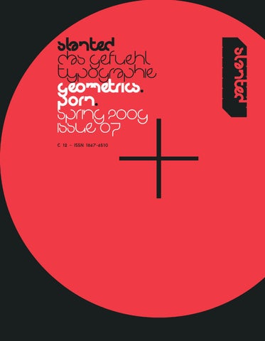
�������� ������������� ������������ ���������� �������������� �������������
���
�������� ������������ ��������� ����������� ��������� ���� �����������
�������
������� ����� �
��� ����������������������������� ������������������������������������ �������������������������������������
��� ����������������������������������� �������������������������������������� �����������������������������������������
����������� ������������������������
� �
���������� ����������
� �� ����������� � ��������������� � ������� � �� ����������� � ������������������������ � ������� � �� ������������ � ����������������������������������������� � �������
�
� �� ��������������� � ������� � �� ����������� � ������� � �� ������ � ����������� � ������� � �� ���������������������� � �������� � �� ����������������������� � ��������������� � ��������
������� ������������������
� �� ����������������������������� � �������
Section 1 Geometrics
Slanted #7
020 021
1 emil kozak shapin shapes
020 Folio : Planeta Light (14 pt) Headline : NeoPop S7 Bold (72/54 pt) NeoPop S7 Light (72/54 pt) Type Specs : Planeta Light (6,5/8 pt)
021 Running Title : Planeta Medium (7,5/9 pt) Caption : Planeta Light (6,5 pt)
Geometrics Slanted #7 / Spring 2009
1
01 Emil Kozak Shapin’ Shapes
028 029 I might be totaly wrong, but my name sounds more Danish than yours, although I’m from Germany and you’re from Denmark. Where are your roots, Emil Kozak? I’m Danish, and “Emil” is not an unusual name in Scandinavia. The origin of the “Kozak” surname has Polish roots. Was it the sun that made you move from Denmark to Barcelona, the other end of Europe? My girlfriend is from Valencia, and when she had to do her medical residency, we decided to go to Barcelona. Plus, the food is pretty tasty. What do you miss about Denmark, living in BCN? Overcast grey indoor coziness and friends + family. Does BCN have an influence on your design? Sure, there is a lot of stuff going on in the city. Graffiti, skateboarding and lots of good art shows. Plus, it’s pretty having the ocean on one side and the mountains on the other. When did you start skateboarding and how did it influence your life? I got a skateboard when I was around 7 years old (a little orange plastic board) that I used to play with in my grandparents living room. Throughout my early teenage years I got obsessed with skateboarding, and I spent many years studying magazines, movies and skating. I guess, that what really hooked me on skateboarding was the creativity. Seeing people ripping with style, the colors, the music, the visual marks and how skaters costumized their equipment blew my mind. From there on it kinda influenced every part of my life, and my way of thinking. I saw a lot of skateboarders in front of the museum for contemporary art last time I came to BCN. Where,when you find time, are your favourite spots? I had a knee injury and after the operation, rehabilitation and training I stopped throwing myself down stairs anymore. But I still skate a lot. The other day we found a sweet spot; an abandoned motor-racing circuit from the 1920’s with some wicked transitions.
How many are you? Alicia (my girlfriend) who takes care of management, PR and general administration ... and me. I handle the clothing collections with a very good friend of mine, Pablo Escámez. We are double trouble :-). And besides I have a small team of freelancers I use when productions get “heavy”. Who is the girl beside you on the press photo? Alicia, Miss Management. When I look at your work, it seems extremly fresh, positive and playful to me. It feels like it’s been done by someone who loves to play, to dream, to build stuff with Lego and collect colourful things? Thank you. Oh, if you only knew how much I have been playing with Lego! As a kid I used to get up extra early before kindergarten/school to finish up whatever project I was doing. I constantly had some unfinished project in my room.
1 Kelly x 2 Lab Anatomi Deck 3 3 Lab Anatomi Deck 2 4 Emilkozakskate Ride The Dark Side 5 Pressphoto 08 6 Por Los Siglos 7 Emil Kozak Logo 8 Hooha Fillspill 9 Element Summer OG Sol 10 Vallery Expo Tee 11 Pressphoto 06 12 Element One Love 13 Element Construct 14 Vallery Expo Drawing 15 You’ll All Die In Your Cars 16 Get Out Of The City 17 Whales With Attitude 18 Vans Skinbones 19 Catalogue Clothing 2008 Wolke
Does your work just happen or does it take a lot of sketches before becoming what it is? I constantly brainstorm future projects and write down associations with a certain topic. When I’m happy with the idea, I start sketching up some rough drafts, and from there on the rest is done on the computer! The typography in your work is very clear, well formed. Which comes first, the project or the font? Usually the project ...
Are you designing fonts that later on evolve to match a design? How did you learn to be a designer? Yes, once in a while. I always have someSchool, millions of hours doodling, countless, sleepless nights and way too many hours spent in front of the screen. thing cooking. Please give me a little more information about your company: When did it start? 2003
028 Folio : Planeta Light (14 pt) Columns : Planeta Medium (9,5/11,5 pt) Margin : Planeta Light (6,5/8 pt) Type Specs : Planeta Light (6,5/8 pt)
029 Columns : Planeta Medium (7,5/9 pt) Margin : Planeta Light (6,5/8 pt) Running Title : Planeta Medium (7,5/9 pt) Caption : Planeta Light (6,5 pt)
Geometrics Slanted #7 / Spring 2009
Is it possible to purchase some of your fonts? No, the ones I use for commercial projects I’m not giving out. But once in a while, the subscribers to my newsletter have recieved free fonts. You work for clients like Vans, Element, Graniph, Eastpak, Burton & Uniqlo. Lab Skateboards are taking an important place in your work. How did this happen? They where, basically, my first client. They are friends from way back ... I used to skate with them. You are being commissioned for your typical handwriting. Do you have to work hard to get new clients or does it “just happen”? I worked to get clients in the beginning, but now it “just happens”. Vans, Nike, Element and all those, just contacted me out of the blue one day. Are there any brands you would love to work for? I don’t have any brands in particular on my mind. But generally I love working on identity work. So anything related to that is on the top of my list. I love the board you designed for Kelly Slater. On your website you wrote, that both of you came up with the tree idea. You made the illustrations, and Al Merrick at Channel
19
Islands shaped them. In 2008 Kelly got his 9th world title with this graphic. Did you meet him or did you even surf a few waves with him? No, unfortunately, we never hung out at pipeline with Machado and Jack or anything like that. We just mailed back and forth ... He is a busy dude.
WWW. EMILKOZAK. COM
What inspires you most? Skateboards, Alicia, the city, nature, sentences out of context, logos, typography, my brother, ping pong, surfing, family, guitars, handwriting, polaroids, books, paint, doodles, animals, children, pop culture and pretty much everything in between, are things that inspire me. Do you look at other designers and their work? I’m a big fan of Milton Glaser, Lubalin and all those graphic designers from that period. How many hours a day do you work and how many holidays can you take a year? Workhours = more than average, holidays = more than average.
01 Emil Kozak Shapin’ Shapes
And: Do you consider yourselves as typographers or illustrators? My typographic work is usually display-typography, that is leaning more toward the illustrative realm of typography.
032 033 Before you met and started with Non Format in 2001, you worked for other agencies. Was there a crucial experience there that convinced you to start your own company? Were there many teething problems at start-up? What were your first projects? We both have a background in design for the advertising industry, and I think that shaped the way we both approach design solutions. We have also spent some time working for the publishing industry, which is how we were introduced to each other. It became apparent that the similarities in our approaches to design might complement each other, so we decided to work together on a couple of freelance projects. These were mostly music packaging projects, and this was at the very end of the 1990s. The projects we worked on together at the time seemed more creatively rewarding than the projects we’d been working on separately, so we were keen to continue collaborating together on more and more projects. When we were offered the chance to become art directors of The Wire magazine, we decided this was the opportunity we were looking for to start our own design studio. Our art directorship coincided with the The Wire magazine’s buy-out by the editorial and admin staff, and they decided to move to new premises. We decided to join them, renting some studio space in the same office. Having the backbone of The Wire magazine as regular income, which offered a great deal of financial security, we were able to quickly establish our own design studio, so there weren’t too many teething problems to begin with. We were lucky. How where your “Wire”-years from 2001–2005? What did you change? How big was your creative freedom? We took on The Wire on the condition that we would be able to implement a complete redesign of the magazine, which we started work on straight away. The magazine had a much busier, more 70s rock magazine aesthetic before we took it on, so the biggest change we made was to strip the design back to a very simple Modernist grid structure, with very little typographic embellishment. We also introduced a new masthead/logo for The Wire which remains unchanged, despite the magazine having subsequently appointed two other art directors since we left the position in 2005. Once we had established a new design for the magazine that the editors/owners of the magazine were happy with, we were given a great deal of creative freedom to get on with the magazine’s design direction. However, the new design wasn’t the first proposal we presented to them. We had a couple of fraught meetings in which we presented ideas for the magazine that were met with very stony faces. The owners were worried that we’d make the
032 Folio : Planeta Light (14 pt) Columns : Planeta Medium (9,5/11,5 pt) Margin : Planeta Light (6,5/8 pt) Type Specs : Planeta Light (6,5/8 pt)
magazine too trendy and that it would lose its core readership as a result of too radical a design change. But, once we hit upon the simple structure and started to implement it from one issue to another, we found that we were able to introduce some of the ideas that had been met with suspicion in some of the earlier meetings. We learned quickly to take things slowly, so that we built confidence in the magazine’s staff and allowed for our most challenging ideas to be more readily accepted.
1 Hanne 02 2 Cover Love Song 3 Design + Music Poster 4 The Chap Mega Breakfast 5 Rykestrasse Front 6 Moog Acid LP 7 Charlize Spread 8 Galerina Spread
In Germany, the editorial designer Mario Lombardo worked for the music magazine “Spex” for quite a long time. His popularity today is partly based on his time as art director. Was “Wire” your steppingstone? Did the industry take notice of your work in “Wire” and commission you? Our design for The Wire was certainly seen by a rather broad audience, and we received quite a few commissions from clients outside of the publishing industry. One example is our headline treatments for an issue that were seen by an advertising agency who commissioned us to work on a print campaign for the mobile phone company, Orange. This exposure then led to more projects in this vein, so there was a kind of snowball effect. It’s probably fair to say that our work for The Wire, which has been reproduced in many design magazines and books, as well as our own book, is still garnering interest from clients to this day, despite not having worked for the magazine for nearly four years. How did the work for the journal of illustration, “Varoom” (by Adrian Shaughnessy, also author of this wonderful book “How to be a Graphic Designer Without Losing Your Soul”) come about? To be honest: I think it’s a great magazine. Tell us something about the typefaces, the design, and the concept of your work? How much freedom does Adrian give you? What is the difference between working for “Wire” and “Varoom”?
033 Captions : Planeta Light (6,5 pt) Running Title : Planeta Medium (7,5/9 pt)
Geometrics Slanted #7 / Spring 2009
02 Non-Format Kjell Ekhorn & Jon Forss
4
6
5
7
8
040 041
3 type essays
040 Folio : Planeta Light (14 pt) Headline : NeoPop S7 Bold (72/54 pt) Type Specs : Planeta Light (6,5/8 pt)
041 Headline: Planeta Bold (30/36 pt) Author : Planeta Bold (14 pt) Running Title : Planeta Medium (7,5/9 pt)
Geometrics Slanted #7 / Spring 2009
Geometric Type and Where it Comes From
Graphic design has been engaged with geometric letters for almost a century. Designers pride themselves on their ability to create complex systems from simple elements, and the alphabet is no exception. By repeating a series of basic shapes, all of the forms of our writing system may be easily recreated, or at least approximated. This article will highlight some of the most prominent examples. The starting point for many investigations into this theme is work from the Bauhaus.1 However, the role that Bauhaus designers played in the popularization of geometric letter styles is minimal, and their role in the development of geometric typefaces is tangential. Some contemporary designers may assume that typefaces were developed at the Bauhaus, but this is not the case. While a number of letter drawing experiments were undertaken there, no typefaces were created. 2 During the 1920s and 30s, typecasting was still an industrial activity. Fonts were produced, sold, and distributed by large companies with hundreds of employees working in factory settings. The Bauhaus did not have the facilities to accommodate this sort of activity. Herbert Bayer’s drawings for Universal, often reproduced, would go on to inspire later typeface designs in later de-cades, most notably the 1975 ITC Bauhaus family drawn by Ed Benguiat and Victor Caruso in New York (figure 1). Looking to the German typefounding industry proves more fruitful for those searching for authentic geometric type created during the 1920s. A number of typefaces were created in succession that would became popular at the time, and are still in use today. The first of these is Erbar (figure 2), which may be the “John the Baptist” of the geometric sans serif genre; Erbar had a successful release, but this only prepared the way for the typeface that followed it: Futura (figure 3). Much has been written about Futura, so we need not go further into the topic with
this article. 3 While Futura is the most successful of all the geometric sans faces, a rival design was released at roughly the same time, Rudolf Koch’s Kabel (c. 1927). More idiosyncratic than either Erbar or Futura, Kabel also found some degree of success, and is the author’s personal favorite of the three (figure 4). Along a visual spectrum, this trio of 1920s German sans serifs lies at quite a distance from Bayer’s Universal drawings. Intended to be legible in text sizes, they were marketed as all-around jobbing typefaces that general printers should purchase. To find a commercial typeface created during the 1920s bearing a closer relationship with the Bauhaus lettering experiments, one must look to France. In 1929, the Parisian Deberny & Peignot foundry released A.M. Cassandre’s Bifur, an ingenious, slightly impractical design that would not turn a profit.4 On one level, Bifur and Universal have little to do with each other. Bifur is caps-only, whereas Bayer favored reducing the Latin script to lowercase or unicase letters (figure 5). In hindsight, however, both Universal and Bifur can be seen as display letter experiments pay tribute to the idea of a geometrical structure behind a unicameral alphabet. Although the story of geometric type continued into the 1930s, the next significant chapter of their development would
03 Geometric Type and Where it Comes From Dan Reynolds
Dan Reynolds
042 043 begin in 1970, at a time when type itself was beginning to disappear. By this time, foundries were switching their release of new faces from lead type or machine matrices to phototype solutions. Whereas type had previously been rearrangeable pieces of metal – truly something physical — phototype fonts were small designs living inside some sort of chemical-me-chanical system, usually as a series of negatives. Many of the most popular phototype-era typefaces were not directly designed by the foundries themselves, but licensed artwork from the International Typeface Corporation in New York. ITC’s library would eventually include several geometric typeface designs. Although the first, Herb Lubalin and Tom Carnese’s ITC Avant Garde Gothic, was in the vein of Futura, the most relevant for our discussion are ITC Bauhaus and ITC Kabel, from 1975 and 1976 (figure 6 & figure 7). Letraset and other phototype setters would create countless geometric experiments, long before digital type became popular; even into the 1990s. Despite its influence, ITC Bauhaus is not a literal adaptation of Bayer’s Universal drawing into type. First, the form of ITC Bauhaus’s lowercase a is very different. Then there are the gaps present in ITC Bauhaus’s b, e, g, p, and q. Additionally, ITC Bauhaus includes capital letters, which Bayer avoided during some of his Bauhaus years. However, it is easy to forget that many iconic Bauhaus pieces did employ capital letters — even all-caps text — including a Joost Schmidt’s poster for the 1923 Weimar exhibition and even the very letters on the side of the Dessau school building. Finally, it should be written that ITC Bauhaus is simply better than Bayer’s Universal drawing, because it is a real functioning typeface family with several weights. It has proved its use for decades; Universal is artwork on paper. Designers searching for a 1980s-style may consider Neville Brody and his magazine work in Britain. At that time, he created a number of lettering experiments employed in his work. In 1990, Linotype released three commercial typefaces designed by Brody: Arcadia, Industria, and Insignia (figure 8). These typefaces do seem to share a certain stylistic vein with some 1920s German lettering styles, but they were never marketed as specific revivals in the way that ITC Bauhaus pays tribute to Bayer, for instance. During the 1990s, more geometric type styles would be released, including Emigre’s Base 9, Base 12, and Base Monospace (1995–1997). In 1997, Linotype released three
042 Folio : Planeta Light (14 pt) Columns : Planeta Medium (9,5/11 pt) Margin : Planeta Medium (7,5/9 pt) Type Specs : Planeta Light (6,5/8 pt)
symbol fonts that were only collections of geometric shapes, not even letters at all: Linotype Circles, Linotype Squares, and Linotype Triangles. Perhaps this was a more mainstream adaptation of Gerard Unger’s Decoder, a font he designed for FUSE in 1992. Decoder includes no letters either, but rather a number of shapes that may be resized and combined to form any letter. Even Decoder seems to partake in ideas that have long been in the designers’ milieu; at the Bauhaus, Josef Albers experimented with stencil letters created out of a series of repeated, repositioned shapes as well. By the 21st century, the combination of cheap font design tools like FontLab and easy-to-join sales platforms like MyFonts. com had led to an explosion of the number of fonts that graphic designers could license. Today, 1,190 fonts on MyFonts.com are tagged with the keyword “geometric”.5 Since geometric styles remain popular, one may attempt to predict which specific examples will help define the graphic landscape of the near future. The author’s suggestions for 2009 and 2010 follow. Perhaps it is best to differentiate between text and display typefaces. For text, the choice must fall to Hypatia Sans, designed by Thomas Phinney for Adobe. Hypatia Sans is a large family, which for a time was bundled with specific Adobe products. An Italic extension may be forthcoming. Interesting to note are what may be seen as homages to Kabel and Dynamo in certain letterforms (figure 9). In terms of display faces, very little comes close to the scope of Dessau, from Gábor Kóthay for Fountain. The Dessau family includes 11 separate fonts, and references at least four styles of lettering popularized in Bauhaus artwork. In this regard, it reminds of ITC Bauhaus. Yet the Dessau family’s letter palette is more diverse, even though some of it bases itself more literally on 1920s examples.
043 Captions : Planeta Light (6,5/8 pt) Running Title : Planeta Medium (7,5/9 pt)
1. The Bauhaus was an early 20th century German design school founded in Weimar, which later moved to Dessau and Berlin before closing in 1933. 2. The Bauhaus posters and use of typography in printed items — such as the Bauhaus Books series — were avant garde. This work was considered new, and was documented in external sources, such as Jan Tschichold’s »Elementare Typographie«, Typographische Mitteilungen. Berlin: Verlag des Bildungverbandes der deutschen Buchdrucker. Special issue (1925). 3. For more information about Paul Renner and Futura, the author recommends Christopher Burke’s Paul Renner: the art of typography. London: Hyphen Press (1998). 4. http://ellie.rit.edu: 1213/dphist4.htm, accessed on January 30, 2009. 5. http://new.myfonts.com/ tags/geometric/, accessed on January 30, 2009.
Geometrics Slanted #7 / Spring 2009
Figure 3: Scan from a 1930s Bauer catalog showing Futura Buch. Image shown at 200 percent actual size. Futura was designed by Paul Renner, and was first released by the Frankfurt-based Bauer type foundry in 1928.
03 Geometric Type and Where it Comes From Dan Reynolds
Figure 1: Universal vs. ITC Bauhaus. Above, P22 Bayer Universal. This 1997 digital font approximates letters drawn by Herbert Bayer at the Bauhaus, c. 1926. Below, ITC Bauhaus Demi, first released in 1975. This is a more stylized typeface, less tightly based on Bayer’s drawings. Note the gaps in the letters a, b, d, e, g, p, and q. ITC Bauhaus also includes uppercase letters (not pictured).
Figure 2: Scan from an undated, post-1963 Ludwig & Mayer catalog showing Erbar Kräftig. The alternate lowercase a was original design for that letter. Kabel’s a has a similar form (fig. 7). By the 1960s, when this sample was printed, the foundry had substituted in a single-storey a as the default, making the typeface appear more similar to Futura (fig. 3). Image shown at 150 percent actual size. Erbar was designed by Jakob Erbar, and was first released by the Frankfurt-based Ludwig & Mayer type foundry in 1926.
052 053
4 font labels fonts and families
052 Folio : Planeta Light (14 pt) Headline : NeoPop S7 Bold (72/54 pt) NeoPop S7 Light (72/54 pt) Type Specs : Planeta Light (6,5/8 pt)
053 Running Title : Planeta Medium (7,5/9 pt)
Geometrics Slanted #7 / Spring 2009
04 Fontlabels, Fonts & Families Geometrics
054 055
04.01 BEANS PRO Foundry : Lineto Location : Zurich, Switzerland URL : www.lineto.com Font : Beans Pro Font Styles : Regular Year : 1973 & 2008 Design : Charles Grant, Dieter Zembsch URL : www.charlesgrant.co.uk
Originally designed by German designer, Dieter Zembsch, Beans was the winning entry for Letraset’s International Typeface Competition for 1972/73. Zembsch describes the design process for the font which set up his career as an independent graphic designer in the early 1970s: “I was working as a designer in the packaging department of a pharmaceutical company. Being trained to work under pressure, I often finished assignments quickly and then sat around bored. It was in these breaks that I started drawing the alphabet, letter by letter, with ruler and compass. The studio was up on the first floor, which gave me enough time to hide my drawings under the packaging designs I was hired to do whenever anyone came to check up on me.” Charles Grant about the digitalization of Beans: “After falling in love with its curious charms it was clear to me that Beans deserved a digital afterlife. In addition to recreating the original character set, I decided it would be a great opportunity to exploit OpenType technology by adding many special characters and alternative glyphs – hence the ‘Pro’ title. The original Zembsch set (opposite) is accessed with caps-lock activated, whilst new characters & alternates are mapped to the lowercase and to OpenType Stylistic Sets respectively – acting almost like ‘Easter eggs’ for designers. Beans – you don’t have to be crazy to understand this typeface, but it helps!”
054 Folio : Planeta Light (14 pt) Headline : Planeta Bold (18/21,5 pt) Subhead : Planeta Bold (12/14,5 pt) Column : Planeta Medium (9,5/11,5 pt) Margin : Planeta Medium (7,5/9 pt) Type Specs : Planeta Light (6,5/8 pt)
055 Specimen : Beans Pro
CHARLES GRANT Charles was born in Macclesfield, England in 1981. That’s all you need to know.
DIETER ZEMBSCH (ca. 1975)
Geometrics Slanted #7 / Spring 2009
AaBCDEFGHIJKLlMn OPQRSTtUVWXYZ &!?£$ (;:,.) «» AaBCDEFGHIJKLlMNnOPQRSTtUVWXYZ 0123456789 1234567890 &!?£$ (;:,.)
056 057
04.02 PLANETA Foundry : DKGD Location : Lucerne, Switzerland URL : www.dkgd.ch Font : Planeta Font Styles : Light, Medium, Bold, Plakat Year : 2009 Design : Dani Klauser URL : www.dkgd.ch
“Planeta” is a new geometrically constructed font developed by the Lucerne based design studio DKGD. It was created for use as a text font, headline and with the special “Plakat-cut” for display. The intention of creating “Planeta” was the transportation of beauty and the geometric simplicity of constructed typefaces. “Planeta” reinterprets the form of the nineteen twenties and conveys its spirit with contemporary freshness. The specific shape of “Planeta” has all the features of a classic european font of the early 20th century. It is created according to Edward Johnston’s “Johnston” for London Underground in 1916, Eric Gill’s “Gill Sans” from 1920 and Paul Renner’s “Futura” from 1928. The construction of “Planeta” was mainly inspired by the clean shapes of Geometry. The foundation of the face is based on squares and circles in different sizes. This strict attention to the form of each char-acter in combination with a constant thickness give the font a graphical appeal.
DANI KLAUSER DKGD Studio was founded in 2006 by Dani Klauser and is based in the heart of Switzerland in Lucerne. He works in the fields of magazine, book- and type design. The systematic way of designing a font is the primary interest in type design and it helps attain a geometric and graphic look in a character set. “Planeta” is the first commercial font family form DKGD. Early works are some freefonts like “Clinker”, “Circle” and “Odeon”.
“Planeta” comes in four cuts. Light, medium and bold form the basis for daily use. The plakat-cut was drawn for character sizes over 100 points and is intended – as the name already suggests – for the use in “Plakat” design and large scaled letters.
056 Folio : Planeta Light (14 pt) Headline : Planeta Bold (18/21,5 pt) Subhead : Planeta Bold (12/14,5 pt) Column : Planeta Medium (9,5/11,5 pt) Margin : Planeta Medium (7,5/9 pt) Type Specs : Planeta Light (6,5/8 pt)
057 Specimen : Planeta
Geometrics Slanted #7 / Spring 2009
Discover a new Font PLANETA Light — Medium — Bold — Plakat
abcdefghijklmnopqrstuvwxyz ABCDEFGHIJKLMNOPQRSTUVWXYZ 1234567890 Design: Dani Klauser — www.dkgd.ch
090 091
7 pools taro hirano
090 Folio : Planeta Light (14 pt) Headline : NeoPop S7 Bold (72/54 pt) NeoPop S7 Light (72/54 pt) Type Specs : Planeta Light (6,5/8 pt)
091 Running Title : Planeta Medium (7,5/9 pt)
Geometrics Slanted #7 / Spring 2009
07 Pools Taro Hirano
098 099
07 Pools Taro Hirano
102 103
8 font names illustrated kuratiert von raban ruddigkeit 102 Folio : Planeta Light (14 pt) Headline : NeoPop S7 Bold (72/54 pt) NeoPop S7 Light (72/54 pt) Type Specs : Planeta Light (6,5/8 pt)
103 Running Title : Planeta Medium (7,5/9 pt)
Geometrics Slanted #7 / Spring 2009
08 Fontnames Illustrated Georg Wagenhuber / Braten Fat
08 Fontnames Illustrated Katharina Gschwendtner / Human
104 105
08 Fontnames Illustrated Orlando Hoetzel / Disco Deck
112 113
9 royan ville nouvelle dirk altenkirch
112 Folio : Planeta Light (14 pt) Headline : NeoPop S7 Bold (72/54 pt) NeoPop S7 Light (72/54 pt) Type Specs : Planeta Light (6,5/8 pt)
113 Running Title : Planeta Medium (7,5/9 pt)
Geometrics Slanted #7 / Spring 2009
09 Royan Dirk Altenkirch
120 121
Section 2 Interviews, Works, Studienplatz, Gr端nes Drucken
Slanted #7
124 125
10
IN TER VIEWS 124 Folio : Copy Bold (9 pt) Number of Chapter : Geomi (150/125 pt) Headline : Geomi (300/125 pt) (150/100 pt) Type Specs : Copy Regular (6/8,5 pt)
125 Headline : Geomi (40/48 pt) Subhead : Planeta Light (24/30 pt) Running Title : Copy Bold (7/9 pt)
GEOMETRICS Slanted #7 / Spring 2009
10 I‘ve never really worked a day in my life Ed Benguiat
ED BENGUIAT I’VE NEVER REALLY WORKED A DAY IN MY LIFE
156 157
12.04 See before reading Susanne Stahl & André Gottschalk In der Arbeit »SEE BEFORE READING! A SIGN SYSTEM TO VISUALISE NOVELS« wurde ein System zur Visualisierung von Romanen entwickelt, welches einerseits abstrakte Inhalte intuitiv vergleichbar macht, zum anderen eindeutige Informationen auf die jeweiligen Wesensmerkmale der Romane gibt, wie etwa die Stimmung, die Sprache oder das Genre. Wichtig ist uns, gerade dem normalen bis unerfahrenen Leser die Orientierung zu vereinfachen. Deshalb wurden interessante Buchkriterien visuell greifbar gemacht, die den Roman kurz umreißen und von theoretischen Interpretationsansätzen abweichen. Die daraus entstandene Anwendung ist eine Buchreihe, die mit den generierten Zeichen der unterschiedlichen Romane bespielt ist. www.susannestahl.com www.andregottschalk.com
156 Folio : Copy Bold (9 pt) Column : Copy Bold (7/9 pt) Type Specs : Copy Regular (6/8,5 pt)
157 Column : Copy Bold (7/9 pt) Running Title : Copy Bold (7/9 pt)
GEOMETRICS Slanted #7 / Spring 2009
KURZKONZEPT textauszüge aus dem buch ROT. GRÜN . BLAU . CODE . ÄHNLICHKEIT. DAZWISCHEN . die anwendung unternimmt den versuch , leeren raum als fl äche neu zu organisieren. — WEGE . WEISS . LÄDEN . LEERE . neuer graben 8. antiquariat. schmaler, einsamer gang nach hinten. die funktion, dass hier dinge verkauft werden liegt brach. BESETZUNG . streifen bilden das visuelle werkzeug, rhythmisieren die bildfläche. ... die anfänglich zweidimensionale verwendung der streifen im schaufenster wird durch bewegung und umordnung zu einer räumlichkeit verändert . VERWANDLUNG . AUFLÖSUNG . VERLASSEN. zwischen zwischen zwei punkten wo man sich befi ndet . MOMENT.— FÜNF. LÄDEN . WOCHEN . ICH . STREIFEN. von momenten , weile und bewegung – der raum als refl exion , ein moment beginnt , ... . es beginnt ein neuer. ein zustand des zwischen. die weile ... sie lädt ein , scheint ein eingefrorener moment . dehnt sich , hält inne , verlorenes schwelgen . umherwandeln , kreise ziehen , irgendwo ein außen verfolgen. und hängen bleiben , starrend . warten . aus der ferne zurückkehren und sich selbst fragen : — ELEMENTE . WERKZEUG. WIRKUNG . ERSCHEINUNG. das verworfene betrachten und für die möglichkeit eines neuversuchs halten ? und manchmal muss man erkennen , dass die dinge , die zeit benötigen , die sie dauern . eben diese weile . — WIEDERAUFLÖSUNG . VERLASSEN . WEITERZIEHEN . WIEDERHOLUNG . was passiert aus der bewegung heraus ? www.vonwegenstreifenundprozessen.de
12 Studienplatz Diverse
12.05 Von Wegen, Streifen und Prozessen Julia Majewski
168 169
13
GRĂœ NES DrUcK en 168 Folio : Copy Bold (9 pt) Number of Chapter : Geomi (150/75 pt) Headline : Geomi (175/75) & (175/100 pt) Type Specs : Copy Regular (6/8,5 pt)
169 Column : Copy Bold (7/9 pt) Running Title : Copy Bold (7/9 pt)
GEOMETRICS Slanted #7 / Spring 2009
KLIMAERWÄRMUNG Forschungen im Bereich Klimawandel haben ergeben, dass sich die Durchschnittstemperatur der Erde in den letzten 100 Jahren stetig erhöht hat. Dies ist auf zwei grundlegende Faktoren zurückzuführen. Zum einen sind dies natürliche Ursachen, wie z. B. die Sonneneinstrahlung (Erdbahn um die Sonne, Solarenergie, solare Schwankungen) oder auch der Vulkanismus (Asche in der Atmosphäre). Zum anderen wird die Erde durch den Klimafaktor Mensch erwärmt. Hier spielt die Verbrennung fossiler Energieträger eine große Rolle. Seit der Industrialisierung ist deutlich eine CO2-Zunahme in der Erdatmosphäre nachweisbar. Die globale Durchschnittstemperatur hat sich seither um 7°C erhöht. Nachrichten über die Erderwärmung, wie z. B. Dürren in der Sahelzone, Wirbelstürme, Zunahme an Überschwemmungen oder die Verschiebung der Jahreszeiten, belegen dies.
MECHANISMEN Im Kyoto-Protokoll gibt es drei Mechanismen, die Industrieländern dabei helfen sollen, ihre in Kyoto vereinbarten Emissionsreduktionsziele zu erreichen. Einer davon ist der »Emissionshandel«. Hierbei erhält jedes Land Emissionsrechte zugeteilt. Reduziert ein Land mehr, als es in Kyoto vorgesehen hatte, könnten die überschüssigen Rechte an ein anderes Land veräußert werden. Als zweiter Mechanismus dient »Joint Implementation«. Finanziert oder führt ein Industrieland in einem anderen Industrieland ein Klimaschutzprojekt durch, kann es sich die daraus resultierenden Emissionsminderungen in Form von Minderungszertifi katen auf sein Reduktionsziel anrechnen lassen. Dritter und letzter Mechanismus ist »Clean Development Mechanism (CDM)«. Die Funktionsweise ist ähnlich zu Joint Implementation. Wichtigster Unterschied ist jedoch, dass CDM Projekte gemeinsam von einem Industrieland mit Reduktionsverpfl ichtung und einem Entwicklungsland ohne Reduktionsverpfl ichtung durchgeführt werden. KLIMANEUTRALES DRUCKEN Obwohl die Druckproduktion selbst kein energieintensiver Prozess darstellt, haben auch Druck- und Medienunternehmen erkannt, dass auch sie sich als moderne und zukunftsorientierte Dienstleister der Thematik stellen müssen. Zudem Printprodukte überall präsent sind. So entwickelte z. B. der Bundesverband Druck und Medien in Zusammenarbeit mit dem Bundesumweltministerium eine Software für das Klimaneutrale Drucken. Was steckt genau hinter dieser Bezeichnung? Bei sämtlichen Produktionsvorgängen entstehen CO2-Ausstöße, die für die Erderwärmung verantwortlich gemacht werden. Ziel des Klimaneutralen Druckens ist es, die angefallenen Emissionen durch Klimaschutzmaßnahmen an anderen Orten auszugleichen. Basis ist die Berechnung des CO2-Ausstoßes in der Herstellungskette. Hierfür werden in der Rechensoftware sämtliche auftragsbezogene Daten eines Druckprodukts, wie z. B. Aufl age, Farb- oder Energieverbrauch, Lieferentfernungen u.v.m. zu Grunde gelegt. Ergebnis ist die dabei verursachte CO2-Menge. AUSGLEICH Die angefallene CO2-Menge wird mit ca. 17 Euro pro Tonne bewertet. Dieser Betrag fließt in Klimaschutzprojekte. Je nach Kompensationspartner wird in unterschiedliche Projekte auf der Welt investiert, wie z. B. in der Türkei oder Indien in Biomasseanlagen oder Windkraftwerke. Belegt wird die Investition durch ein Zertifi kat, welches der Kunde bei Abschluss des Berechnungsvorgangs erhält. Gleichzeitig kann im Druckprodukt das Logo »Print CO2 kompensiert« abgebildet werden. Zusätzlich müssen die Abwicklungskosten berücksichtigt werden.
13 Grünes Drucken E&B Engelhardt und Bauer
NACHWEIS Nach einer Statistik des UNFCCC (United Nations Framework Convention on Climate Change) konnten die USA, Japan, Kanada und Italien ihre CO2-Emissionen seit 1990 nicht reduzieren. Die Emission der Schwellenländer China und Indien wird aller Voraussicht nach ansteigen. Um diesen Mechanismen entgegen zu wirken, wurde 1997 das Kyoto-Protokoll abgeschlossen. Ein Zusatzprotokoll zur Ausgestaltung der Klimarahmenkonvention der Vereinten Nationen mit dem Ziel des Klimaschutzes. Das in 2005 in Kraft getretene und 2012 auslaufende Abkommen legt erstmals völkerrechtlich verbindliche Zielwerte für den Ausstoß von Treibhausgasen in den Industrieländern fest, welche die hauptsächliche Ursache der globalen Erwärmung sind. Die Industriestaaten verpfl ichteten sich, die Treibhausgase (CO2, FCKW, CH4) bis 2012 global um bis zu 5,2% zu senken (Im Vergleich zu 1990).