The publisher assumes no responsibility for the accuracy of all information. Publisher and editor assume that material that was made available for publishing, is free of third party rights. Reproduction and storage require the per mission of the publisher. Photos and texts are welcome, but there is no liability. Signed contributions do not necessarily represent the opinion of the publisher or the editor. The German National Library lists this publication in the German National Bibliography; detailed bibliographic data is available on the Internet at dnb.de. *
Klaudia Kozińska ——— graphic designer, poster artist, illustrator, and visual artist. A graduate of the Faculty of Graphic Arts at the Academy of Fine Arts in Warsaw, she earned her diploma in painting and book design. She favors traditional tools such as colored pencils, graphite, markers, colored paper, and ink. Equally drawn to abstraction and representation, she often brings the two together within a single visual language.
THREE DOTS TYPE is an independent type foundry from Wrocław (PL), founded in 2017, creating professional typefaces. Each font grows from a clear idea and story. Beyond type production, the foundry actively contributes to typographic culture through publishing, education, and collaboration with cultural institutions and international partners such as The New York Times Magazine, Slanted Publishers, Zięta Studio and Grid Arthub.
SLANTED PUBLISHERS is a globally recognized and acclaimed design, publishing, and media house. Collaborating closely with authors, artists, and editorial teams, they value the integral relationship between form and content. With their profound understanding of typography, layout, typesetting, and visual language, Slanted Publishers creates distinct visual identities for each medium, resulting in captivating design and compelling content.
THE POLISH GRAPHIC DESIGN FOUNDATION is one of the few institutions in Poland dedicated to education, professional exchange, and the promotion of Polish visual design. The Foundation has initiated and organized numerous festivals, competitions, exhibitions, workshops, and research-oriented activities both in Poland and internationally. Its key projects include the international Festival Eastern European Design, held between 2023 and 2025 in Warsaw, Vilnius, and Kyiv; a series of design-focused events in Asia developed under The Design Network programme; the conference cycle Polish Graphic Design Talks; and the Polish Graphic Design Awards competition, alongside many other initiatives.
Editorial:
Poster now
When we started PLOP, we decided that we would not begin with the history of Polish design culture. We wanted to avoid the most obvious topics and associations. That was the plan.
And we broke it already in the second issue. The poster came back to us by itself. Not because we changed our minds, but because it is hard to avoid when speaking about Polish graphic design. It has its own history, weight, and power of attraction. Even if we did not want to go this way, we quickly understood that it was worth stopping there.
But we do not want to tell the history of the Polish poster once again. We are not interested in the canon, a list of masters, or a museum-like celebration. We want to look at the poster from today’s perspective and ask what it actually is now.
Does it still work as a medium? Does it still communicate something? Or has it mainly become a beautiful object that we look at in archives, galleries, and books?
This issue does not give one clear answer. It rather asks questions. For us, this is more important than having a ready “critical” thesis.
We want to look, ask, and check what the poster means today.
So maybe breaking our own rules in the second issue is not a problem. Maybe it is simply a good beginning for a conversation. If you have answers, ideas, or opinions, please get in touch with us:
magazine@plop.news
Editorial fragments: Fragment 1
In Poland, the poster is almost like a religion for designers. You can be a believer, you can be against it, or you can see it as an old tradition but not practice it yourself. Some Polish designers love the poster tradition and treat it almost like a sacred thing. Others strongly reject it. For them, this tradition is a source of delay and something that keeps Polish design away from modernity. But many designers simply work on other things. They design books, printed matter, websites, identities, and systems. For them, the poster is just part of the landscape. It is always there. It is so present that sometimes it becomes almost invisible.
Fragment 2
But the myth is still alive. The legend is bigger and more complex than it may seem. It is not only history. It still shapes how people think about design in Poland today.
Fragment 3
In Switzerland, designers have to deal with Helvetica. In Poland, designers have to deal with the poster. It is part of the history. It is part of the image of the country. It is also part of the pressure.
Fragment 4
It is not easy to live and work in the shadow of a legend. Especially when this legend is admired, repeated, and well known. There are different strategies. You can believe in it. You can use it. You can fight it. You can accept it. Or you can simply explain it to others. The approach depends on the type of design. It also depends on the designer.
Fragment 5
Usually, a poster is a tool. It can be a tool for propaganda. It can be a tool for information. It can be a public message. But in communist Poland, the poster became art. How this happened is a separate story. Still, the
tension remains. Is the poster art? Or is it design? Is our work a personal expression? Or is it a service for others? This question is still present in Polish design. It creates doubt. It creates hesitation. Sometimes it creates a kind of schizophrenia. And many Polish designers still work with this tension today.
Fragment 6
It is not easy to live and work in the shadow of the Polish poster. Its history is famous, strong, and often admired. But is this old fame a chance for contemporary design, or is it also a burden? Do the successes of past generations motivate today’s designers, or do they sometimes make them feel weaker?
Fragment 7
This is not only a Polish question. It is a more universal question. How does the great history of a place, a field, or a community shape what we do today? Does it give us strength? Or does it put us in a difficult position, where we always have to compare ourselves with the past?
Fragment 8
And what is the poster in Poland today? Is it a living heritage? A new active movement? A weak copy of the past? A school of repetition and retro nostalgia? A space for experiment and radical graphic work? Or maybe a strong potential that is still waiting to be discovered?
Fragment 9
For many Polish designers, the Polish poster is like a very famous relative. Wherever they go, people ask about this well-known family member. How is he? What was he like? What did he achieve? But people ask less often: what is happening now? What are Polish designers doing today?
To Be or to Have: The Polish Poster D
uring the times of the Polish People’s Republic (PRL ), the poster both was and had. It was a showcase of Polish culture abroad. More than that, it was an export product proving the uniqueness of Polish art and design. It also had that special “something” that made it stand out: an aesthetic which, although it was never one single style, was clearly different from the design languages of other countries. Freedom, expression, and hand-made typography were promoted internationally by state institutions. The International Poster Biennale in Warsaw, magazines such as Projekt and Polska, as well as foreign publications and exhibitions, were proof that artistic individuality and experiment could develop behind the Iron Curtain. In this way, the Polish poster showed not only the uniqueness of Polish art and design, but also of the system that supported such design.
However, this was not only propaganda. Graphic designers were given very good conditions for this special design culture to really appear and develop. The creation of the “Polish school” was not an isolated case internationally. Cold War tensions and the rivalry between the capitalist and communist systems also influenced culture and art. Stressing the differences between schools of graphic design—Japanese, Swiss, Finnish, German, or Polish—was part of this political game.
And today? The poster no longer has to be an export product. And even if it wanted to be one, it simply is not. In fact, it does not even have to be a “product,” because a product is something shaped by ideology or by a political system. Or at least we want to believe that those times are behind us. The poster is no longer supported by state institutions. Instead, it has regained full freedom to be what it wants to be: a functional communication machine, an object that blurs the border between applied art and art, or simply an aesthetic image to hang on a wall.
So does it still make sense to ask whether the Polish poster still has, or should have, some kind of “national character,” its own identity similar to the “Polish School of Posters,” something that could make it stand out? Or is this question rather an unconscious reflection of a deeply rooted Cold War mentality, which forces us to mark national borders and build walls?
This question issue?, however, is not only political. In a world where the possibility of using global trends, general overload, and designing with AI or by AI all bring the risk of aesthetic unification, the question of identity appears naturally. So does the need to stand out—or at least not to get lost in too many possibilities.
Today, for many contemporary Polish designers, a return to the broadly understood culture of the PRL becomes such an anchor. It helps them not to get lost in waters where everything seems allowed. But this is no longer only about the famous poster tradition of the “Polish school.” It is rather about everything that did not receive such a high artistic status at that time: advertising graphics, editorial design, type design, vernacular typography, or the work of women graphic designers. All of this now becomes a carrier of a certain kind of Polishness—sometimes a very local one. A Polishness that is apolitical, and maybe for this reason even more attractive.
Another remedy for the threat of globalization of visual languages could be to look for identity more in the process of making the poster than in the constant race for formal novelty. This would mean more responsible, reflective, and conscious design. Conscious not only of who I am as an author, but also of the world in which I live, with all its tensions, threats, and problems. Because today probably no one doubts that a poster is not only an ephemeral object meant to disappear, and not only a tool of advertising. Even posters made by the strongest supporters of functionalism are collected, take part in competitions and biennales, and after many years appear in museum exhibitions or digital databases. Exhibitions and the Internet have become the natural environments in which posters function today.
As someone who visits both these spaces, I would like to meet there, above all, posters that more “are” than “have.” Possession itself is no longer a value today. And in a state of permanent overload, not only designers get lost, but also viewers. At the same time, a conscious choice—or an equally conscious lack of it—can become the beginning of something new: maybe a new form of “Polishness,” and if this category is no longer necessary then at least a more conscious and responsible design.
Because perhaps this is what should make the poster stand out today: not a specific style or aesthetic, but the author’s attentiveness, their ability to reflect, to select, and to create images that do not disappear in the excess of visual messages and do not pollute our collective memory.
Katarzyna Matul ——— art historian, graduate of the University of Warsaw, former curator of the International Poster Biennale in Warsaw, and recipient of a scholarship from the Swiss National Science Foundation. In 2018, she completed her PhD at the University of Lausanne. Her research focuses on art and graphic design after 1945 from the perspectives of art history, social and cultural history, and the sociology of art. She is the author of the books Jak to było możliwe? O powstawaniu Międzynarodowego Biennale Plakatu w Warszawie [How Was It Possible? On the Creation of the International Poster Biennale in Warsaw] (Universitas, 2015; second edition 2026).
New type from PL Dioda:
Dioda AàBbCćDd
j-KkLlM mNnOoPp 123456789 !,.[(č)}?
Proof of Presence
Debate: Too Many Poster Biennials
We asked seven leading curators, and thinkers to reflect on the current state—and possible futures—of the poster. From AI image generation and disappearing national styles to the role of biennials and festivals, the conversations move between skepticism, optimism, and critical observation. What emerges is not a single answer, but a snapshot of a medium still trying to redefine its place in visual culture.
What is the future of the poster in an age of AI-generated everything? Is AI opening new possibilities—or pushing the poster toward irrelevance? What excites you? What worries you? And what, realistically, can designers do about it?
We often talk about “poster schools”: the Polish poster school—with figures like Henryk Tomaszewski, Jan Lenica, and Waldemar Świerzy—or the Swiss poster school with designers such as Josef MüllerBrockmann, Armin Hofmann, and Emil Ruder. Do “schools” still exist—or did they ever? Are national styles still real, or just comforting myths the design world keeps repeating? Ⅲ.
What should poster events actually be today? With festivals, biennials, and competitions multiplying everywhere, are they driving new ideas— or just circulating the same scene? What purpose should they serve, and how should they change?
Maria Norazyan
4th Block [UKR] Ⅰ.
Artificial intelligence is radically transforming the field of graphic design, and poster design is no exception. Yes, it opens new possibilities but it also creates a dangerous illusion of speed and ease. Visual solutions are becoming more accessible, but not necessarily more meaningful.
What excites me is AI’s potential as a tool for experimentation and for expanding visual language. What seriously concerns me, however, is the standardization of thinking: when designers begin to operate within algorithmically predictable solutions instead of developing their own position.
There is a real risk that the poster as a medium will lose its critical edge and turn into a stream of fast, decorative content.
So the question is not whether to use AI, but how. Designers need to reclaim their role as authors, not merely operators of tools. This requires more responsibility, more critical thinking, and a resistance to ready-made solutions. Otherwise, we risk losing the very essence of design as a form of expression.
Ⅱ.
The idea of “national poster schools” today is often romanticized and oversimplified. We tend to repeat these narratives without questioning them.
Yes, historically they existed and had a significant impact. But it is crucial to understand that these schools were not only about aesthetics—they emerged within specific political, social, and economic conditions. To strip them of this context and reduce them to stylistic templates is a form of simplification.
In my teaching practice, I deliberately approach “schools” not as a canon, but as an analytical tool. We do not replicate styles— we unpack the logic of thinking behind them.
Today, “schools” exist more as networks of influence than as geographically bounded entities. And if we continue to refer to them, we need to do so critically—not as myths to preserve, but as structures to rethink.
Ⅲ.
Most poster-related events today operate in a mode of self-reproduction. They showcase the same works, the same approaches, and often the same names. This creates the illusion of an active scene, but does not necessarily contribute to its development.
If these events fail to question the medium of the poster itself and its role today, they risk becoming formal platforms for display rather than spaces for discourse.
I believe such events need to be more radical: they should not only present work, but also challenge it, create friction, and open new contexts.
Historically, the poster has been a medium of reaction and position. Therefore, the events dedicated to it should be uncomfortable, critical, and alive. Otherwise, they merely preserve the status quo instead of transforming it.
Dennis Elbers Graphic Matters [NL] Ⅰ.
AI is not the end of the poster—it’s a stress test. Much of what AI produces is meant to confirm: if design is reduced to pattern recognition, it quickly becomes predictable. That’s exactly where the poster loses relevance. Not because of AI, but because of a lack of attitude. Designers or commissioners who rely on AI without critique, risk flattening their output into something that feels familiar, frictionless—and forgettable. But in the hands of a designer with a strong frame of reference, AI can be useful: a sketching partner, a way to surface clichés, even a tool to exaggerate visual habits until they break.
The real question is not what AI can make, but what it cannot. A poster that challenges, slows down attention, or resists instant readability still depends on human intent. In that sense, AI doesn’t replace designers—it exposes them.
“Poster schools” are easy to name in hindsight. The Polish or Swiss schools were shaped by very specific political, cultural and educational conditions. What we now call a “style” was often a response to constraints.
Today, those conditions have shifted. Visual language circulates globally, accelerated by the internet, education and festivals. As a result, stylistic differences blur. What remains local, however, is context—political, social, and institutional.
Maybe future “schools” won’t be defined by how things look, but by what they respond to. Less visual coherence, more conceptual alignment. Not a shared style, but a shared urgency.
A poster in a white cube is not a poster. Especially if it has never existed in the street. Stripped from its context, it becomes an image about a poster, not a functioning one.
Many poster events risk circulating the same aesthetic language within a closed circuit. What’s missing is friction with reality: how a poster competes with its surroundings, how it is read—or ignored—by an incidental audience.
If poster events want to remain relevant, they should shift focus. Show not only what a poster looks like, but where it lives and what it does. Or better yet: create new contexts in the public realm where posters can actually perform.
Because a poster is not just something you see. It’s something you encounter—and cannot swipe away.
Posters Without Walls
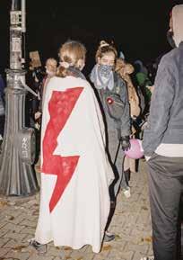
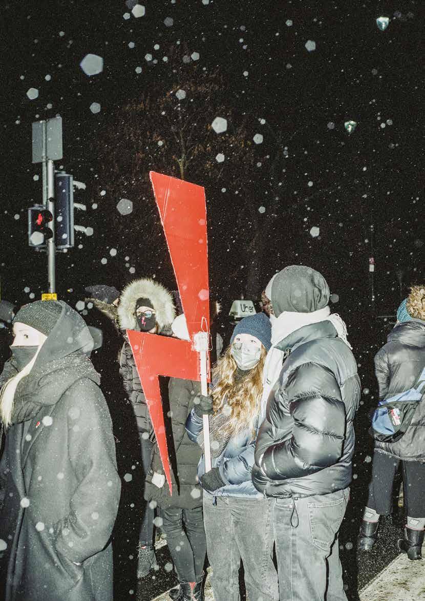
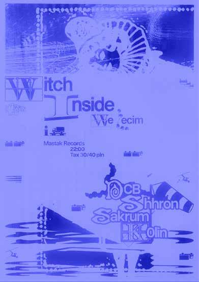
What even counts as a poster today? In this selection of works by emerging female designers, the format constantly slips away from its traditional definition. Some pieces lived briefly as Instagram posts, some circulated through private mailing lists and underground networks, others existed only once—taped to a club entrance, printed overnight, or painted directly onto a wall. What connects them is not format, but function: the urge to announce, gather, provoke, invite, and leave a visual trace in public space—even if that space is now fragmented, temporary, or partially digital.
The following projects are part of an exhibition taking place during the The Poster Festival in June 2026. The exhibition is a snapshot of new Polish club posters and independent visual design. It will be presented at BWA Warszawa, curated by Kuki Iwański and Rene Wawrzkiewicz.