
Type & Tools
GRID TYPE TYPE& TOOLS
TYPE VOL.1 TYPE& TOOLS
GRID TYPE VOL. 1
INDEX
ABOUT GRID TYPE
GRIDS
1. GEOMETRIC
1.1. RECTANGLE
1.2. TRIANGLE
1.3. CIRCLE
2. DISPLAY TECHNOLOGY
2.1. PIXEL
2.2. SEGMENT
2.3. DOT
3. TYPE HISTORY
3.1. ROMAN DU ROI
3.2. PLAQUE DECOUPÉE UNIVERSELLE
3.3. BAUHAUS
3.4. WIM CROUWEL
GRID TYPE VOL. 1
PIXEL BY JULIE WERENSKJOLD SØRENSEN
DOT BY ANNA CAIRNS
TRIANGLE BY STUDIO HANLI
RECTANGLE BY HANNA BOSLAU
DOT BY MIQUEL HERVÁS GÓMEZ & CÉSAR ROGERS (FANFARE)
CROUWEL BY BOOM PROMPHAN
SUKSUMEK & ANNA SRIKITKUL
RECTANGLE BY TRANG HÀ
SEGMENT BY ÖZGÜR DENIZ KOLDAŞ
DOT BY SVATOPLUK RUČKA
PLAQUE DÉCOUPÉE UNIVERSELLE
BY CHARLOTTE ROHDE
INTERVIEWS
LENA WEBER
CÉLINE HURKA & STUDIO POINTER*
IMPRINT
About GridType
From early cathode-ray tube displays to today’s high-resolution Retina screens—the way fonts are rendered and perceived has evolved increasingly, with each advancement in hardware introducing new possibilities for typography.
The evolution of digital displays began with the cathode-ray tube (CRT) in 1946, followed by IBM’s first Graphics Display Unit in 1964, and later the first home computer from Apple, the Macintosh in 1984, introducing a graphical user interface.
SEGMENT
WIM CROUWEL
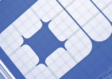
Dutch designer Wim Crouwel gained a reputation for his radical, grid-based typography through his work for the Van Abbemuseum and the Stedelijk Museum in the 1950–70s. One of these typefaces was created for the 1970 exhibition catalogue of sculptor Claes Oldenburg at the Stedelijk. Crouwel designed the typeface with soft, padded lettershapes, mirroring Oldenburg’s use of pliable forms. This typeface was later published as Architype Catalogue Soft Solid by The Foundry Types.
GridType Vol. 1
TYPEFACES
GRID TYPE VOL. 1
PIXEL BY JULIE WERENSKJOLD SØRENSEN
DOT BY ANNA CAIRNS
TRIANGLE BY STUDIO HANLI
RECTANGLE BY HANNA BOSLAU
DOT BY MIQUEL HERVÁS GÓMEZ & CÉSAR ROGERS (FANFARE)
CROUWEL BY BOOM PROMPHAN
SUKSUMEK & ANNA SRIKITKUL
RECTANGLE BY TRANG HÀ
SEGMENT BY ÖZGÜR DENIZ KOLDAŞ
DOT BY SVATOPLUK RUČKA
PLAQUE DÉCOUPÉE UNIVERSELLE BY CHARLOTTE ROHDE
&T RS
HANNA BOSLAU
UV XY Z W . , ‘ THE TYPEFACE WORKS AS A FLAVOUR ENHANCER.
ABCDEFGHIJK LMNOPQRSTU-
CAPITALS
NEKaTOENEa
lowercase Fauna & Flora
01234567890 Geology
!^#$%(*@ History & Heritage
Character structure of the typeface developed for NEKaTOENEa
S
How would you describe your process?
MIQUEL As a graphic designer, pedagogue, and cultural producer, I function at the stepping stone of design, experimental publishing, typography, tools and visual communication. Working as a link, I explore how design and experimental publishing can serve as tools for storytelling, collaborative action, and knowledge sharing.
CÉSAR My visual language is rooted in analogue methods, as for me, text is intertwined with the gesture of the hand, of writing and printing. I start by inventorying surrounding content as material archives, then process it into fonts and graphical objects. I like the tension created when different tools dialogue: slow/fast, analog/ digital, ancient/contemporary.
iWhat is your favourite typeface, and why?
MIQUEL That’s a tough question. But if I had to bring just one font family to a desert island, I’d choose Computer Modern by Donald Knuth. My choice is based on its history, the wide range of styles it offers, its open source nature, and the fascinating way it was created using METAFONT—also developed by Knuth.
CÉSAR The typeface I love the most is from the work Grapho by Inna Kochkina. It is not type-able, so it is more like a lettering. The letters were written using inking rolls for letterpress printing. The thickness of the lines is varying, depending on the width of the inking roll used, and makes the letters very lively. I also find it very interesting that Inna disrupted the usual way of using tools in a letterpress workshop, to open up alternatives in designing type.
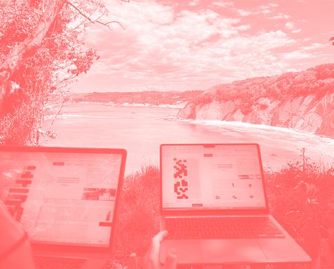
Drawing glyphs during a field study in the Domaine d’Abbadia in Hendaye (FR) for the art residency at NEKaTOENEa
DOT BY (FANFARE)
4
E
J
M P I K N Q O B
L
t
kDo you use open source tools? What is your relationship with open source?
MIQUEL Yes, as much as I can. I’m always trying to push through the frustration of having to rely on big tech bro corporations—it’s not easy. In my view, open source isn’t just about the software you use; it’s also about how you approach your own practice and collaborate with others. Awareness is essential, but strictly following open source orthodoxy is another matter entirely.
CÉSAR I really like the open source mentality, because it places sharing at the heart of creation, instead of money. But in the meantime, authorship is very precious for us designers. It raises questions on how we can sustain a practice based only on open source. I am interested in how it can be more present at the core of creation, creating alternative models of economy. Otherwise, I find contradictions in it becoming “a hobby” financed by our commissioned work.
What is your relationship to type design and typography?
BOOM I work independently as a type designer. I design both Thai and Latin scripts. So my work revolves around the design and production process related to the type.
ANNA I am a graphic design student with an interest in type design, letters, and typography. I love to use language to communicate something through its literal meaning, how it is read, and how it takes shape. Therefore, my work ranges from visual poems to typefaces.
KLMNOPQRST
789?!@#$%&
J
M P I L N Q O
K
NOT LEGIBLE AND REFUSING MODERNITY
What is your favourite typeface, and why?
My favourite typeface is one that looks deeply unserious but is quietly plotting something. A font that looks like it just crawled out of a medieval manuscript and immediately started questing neoliberalism. It’s not legible and it refuses modernity. But politely. It’s dramatic, slightly haunted, and wildly out of place. It’s a font that stages a slow protest against sans-serifs.
S TV U
How would you describe your practice?
My practice moves between research and design, grounded in a critical, often ironic investigation of labour, fashion, and selfhood. I use language as both a tool and a trapdoor. In my writing I try to expose systems while slipping out from under them. Whether through visual work or text, there’s always a sharp awareness of performance: how we present, sell, and sometimes sabotage ourselves in the process. It’s reflective, semi-funny, and quietly resistant, but always orbiting around the tension between visibility and withdrawal, sincerity and spectacle.
What are you experimenting with at the moment, or would like to experiment with?
Right now, I’m low-key studying what it means to quit your dreams just a little bit each day, but make it chic. Think quiet quitting, but in a matching linen set. I’m experimenting with the fine balance between ambition and nap-taking, between flirting and vanishing. Mostly, I’m just trying to see how far I can get in life powered by oat milk, semi-consensual screen fatigue, and the occasional mental breakdown in Notes app format. Future experiments may involve rebranding emotional unavailability as “mystique” and calling my burnout a “soft launch.”
WBUT MAKE IT CHIC
YZ X
TYPE TYPE TYPE TYPE TYPE ๑๒๓ TYPE TYPE TYPE
TYPE
PIXEL BY JULIE WERENSKJOLD SØRENSEN
DOT BY ANNA CAIRNS
TRIANGLE BY STUDIO HANLI
RECTANGLE BY HANNA BOSLAU
DOT BY MIQUEL HERVÁS GÓMEZ
CROUWEL BY BOOM PROMPHAN
SUKSUMEK & ANNA SRIKITKUL & CÉSAR ROGERS (FANFARE)
RECTANGLE BY TRANG HÀ
SEGMENT BY ÖZGÜR DENIZ KOLDAŞ
DOT BY SVATOPLUK RUČKA
PLAQUE DÉCOUPÉE UNIVERSELLE
BY CHARLOTTE ROHDE
www.lenaweber.com
Moving between digital and analog is the ultimate
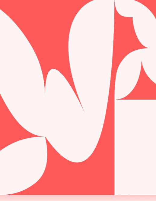

In my Master’s thesis, I shifted focus to the aesthetics of code itself. I wanted to understand why I’m drawn to systematic, rule-based, and technologically inspired aesthetics. For me, a compelling code-based visual has two aspects: first, it reflects the underlying logic and data, almost like a visualisation of the code; second, it invites human interpretation. For example, a gradient made with coded values might just represent numerical data, but we could also see a sunset or associate it with a mood. That interpretation is part of the design decision. When both logic and emotion—structure and interpretation—are present and balanced, a unique aesthetic emerges. That tension between the systematic and the human is what fascinates me.
Where does the human aspect come in within strict systems?
LW The brain craves both simplicity and complexity. Too much chaos is overwhelming; too much simplicity is boring. The most engaging systems balance structure with exceptions or glitches, elements that can’t be completely generated. I think that’s where the human touch comes in.
You’ve built analog as well as digital systems. How do they influence each other?
LW Moving between digital and analog is the ultimate test for a system. Digital allows scaling and impossibilities, like ignoring gravity. Analog imposes stricter rules, shapes become harder to reproduce, and aesthetics shift. So changing the medium is always a good strategy to reveal new possibilities in a project.
What is interesting when building your own design tools?
LW When you build tools, you realize every limitation is a decision someone made. That awareness is inspiring; you see where to push
https://variabletime.pointer.click https://variablelab.pointer.click
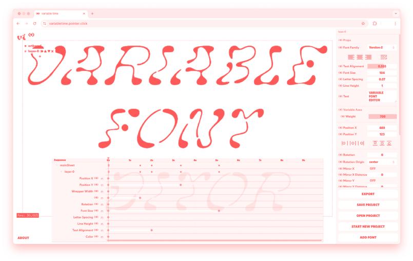
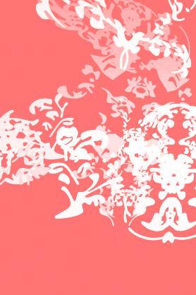
compositions. We also tried different input methods, like MIDI controllers, to interact with the type in real time. We’re using the tool as a playground for experimental controls.
CH Those experiments introduced ideas I would not have thought of myself. For example, transparency in animation is common in creative coding, but as a type designer, I didn’t think of it until I saw how interesting the results could be.
Céline, in your own type design, which tools do you use? Do you focus on one, or try many?
CH I mainly work in Glyphs now, because it lets me draw between characters easily and suits my drawing-based approach. But I’ve also used other tools previously. In workshops I try to show alternative tools like GridType. I enjoy mixing analogue and digital—scanning books with my phone, tracing handdrawn shapes.
I think it’s important not to depend too much on one tool. File formats change, and type design is fragile in that way. At Type & Media, we encourage students to save in universal formats, for example, so their work is archived better.
For graphic design, I still use InDesign, but for animation, I now only use our own tool Variable Time. JS Which makes sense: it was built for you!
CH Exactly. Being part of creating a tool makes it intuitive in a way that ready-made software never is. That’s why I understand why people build their own.
Can you tell me more about how you approach tools and processes while teaching?
CH At Type & Media I teach typography and guide graduations. In workshops, I also help students to design their own typefaces in a few days. I always start with drawing on paper, so their voice comes from their hand, not just through digital precision.
I encourage them to use any medium: printing with RISO, experimenting with colour instead of just black on white. Students also bring in new tools I haven’t heard of, which is refreshing. I try to emphasise